Featured
A look at the gold market and stock market
Stock markets rolling over for at least a pullback but we still see possible new highs later following a pullback. Gold consolidating below next breakout points. Some believe gold is topping for good but no real extremes yet so gold should break through. Cryptos have probably topped with both Bitcoin and Dogecoin crashing. An omen? Oil looks toppy as well and lumber has pulled back sharply from its high.

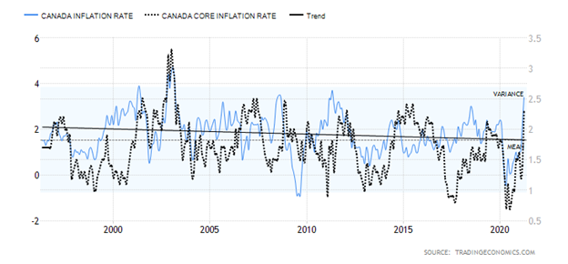
The debate continues. Are we headed for a super-inflationary period as some are predicting? Or is the inflation story blown out of proportion? Canada followed the U.S. with an unexpected sharp rise in inflation in April 2021. The CPI increased at the fastest rate in nearly a decade, led by a rise in gasoline prices. Statistics Canada reported a 3.4% year-over-year rise in the CPI for April vs. 2.2% in March. It was the highest reading since May 2011. Grant you, some of the key reasons for the rise in April 2021 in both the U.S. and Canada were that April 2020 saw a huge plunge in inflation because of the pandemic. Inflation was coming out of a deep hole. The increase was actually largely in line with expectations. The core inflation rate also rose up 2.3% year-over-year. The market was looking for a gain of 2.1%. The rise so far is not much different than what was seen back in 2011 as the economy came out of the 2007–2009 Great Recession.
One of the biggest gainers was gasoline prices that leaped 62.5% year-over-year. However, recall that gasoline prices a year earlier in April 2020 were at their lowest levels in years. If gasoline prices were removed from the CPI the gain was only 1.9%. Despite cries that we are headed for an inflationary depression as the core rate was above the Bank of Canada’s (BofC) threshold of 2.0%, the likelihood of the BofC reacting to this report is probably nil. The BofC is not going to be shaken by a one-month report. As with the Fed, the central bank will probably need to see a few reports and a trend developing. The BofC has already noted that they may begin to taper their bond purchases. The BofC remains more concerned about the huge run-up in house prices than they do about inflation.
It is noteworthy that, despite the big rise in prices of food stuffs, lumber, oil and gas, and more, there has also been some retrenchment of late. WTI oil, after hitting a high of $67.02—short of the March 8 high of $67.98—plunged almost 7%. Lumber, whose prices had been going through the roof has now plunged roughly 25% from its recent high. Have lumber prices topped? That’s a distinct possibility. WTI oil continues to trace out of what could be a double top pattern with the recent $67.02 high and the March high of $67.98. Things start to break down under $60 and the neckline of the top pattern is at $58. Oil prices are facing headwinds as production increases in the U.S. and the U.S. and Iran continue to try and find a solution to their differences. Increased production from Iran would hurt oil prices despite production cuts led by Saudi Arabia.
Canada Inflation Rate and Core Inflation Rate 1996–2021
With all the talk of inflation many believe gold will protect them. Yes, gold rose during the inflationary 1970s. However, at the same time gold was rising because gold was now free trading after President Richard Nixon took the world off the gold standard in August 1971. Bretton Woods was now dead and the world embarked on an experiment in fiat currencies. Currencies, which were previously fixed to the U.S. dollar were set free to float. Following the end of the gold standard and the start of free-trading currencies, the overvalued U.S. dollar started a long decline. Gold prices rose as the U.S. dollar fell. Russia invaded Afghanistan in December 1979 and gold prices doubled into January 1980 for their peak. Fed Chair Paul Volcker, by hiking interest rates to 20%, helped kill the gold rally and for the next twenty years gold prices were on a downward trajectory.
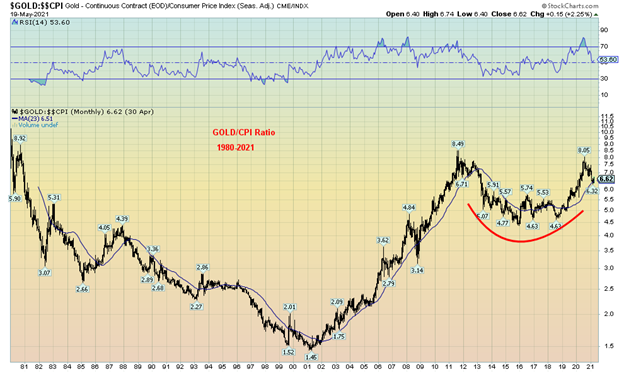
Gold rose during the 2000s even as inflation remained low. Our chart below of the Gold/CPI ratio shows gold’s long decline vs. inflation from 1980 to 2001 and the long climb from 2001 to 2011. The gold/CPI ratio has pulled back from its recent high but appears to be trying to find support at the 23-month MA. As with gold’s recent low at $1,673, the recent low for the gold/CPI ratio was at 6.32. It is key now that these levels hold if gold is to go higher. The chart of the gold/CPI ratio largely mimics the chart of gold itself. But, as we can see, the gold/CPI ratio is still not back at the highs of 1980 when it hit 11.19.
The recent FOMC minutes raised the spectre of the Fed tapering its bond purchases. That proved to be a little negative for gold as gold sold off. The Fed is also concerned about inflation and asset inflation but for the time being they are going to maintain their dovish posture. The Fed believes that the economy is coming along but, despite rising employment and vaccines getting into arms, there remain dislocations and supply bottlenecks as well as shortages that could impact prices. But shortages can disappear as more production comes online and supply bottlenecks are broken up.
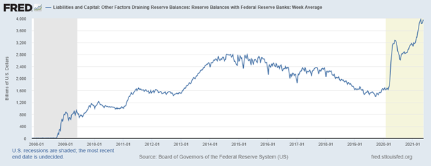
There was one thing the Fed did this past week that was not fully expected: reverse repos. What are reverse repos? Well, they are the opposite of repos. Repos occur when the Fed buys securities from the market with a fixed maturity date and gives the banks cash. Reverse repos the Fed sells securities to the market for cash. Repos provide liquidity to the market. Reverse repos drain liquidity from the market. So why would the Fed do that?
It seems the banks were clamoring for the Fed to ease off on QE. They have too much cash and nowhere to put it. Not in the stock market either, it seems. It appears that the banking system is struggling with all that cash and the pressure to taper could come from the banks. The banks have a lot of cash and it is held on their balance sheet as bank reserves. But in buying treasuries from the Fed, they lower their reserves and increase treasury holdings. So, the Fed, it now appears, is giving with one hand ($120 billion/month buying treasuries and MBS for QE4) and taking with the other (reverse repos). Bank reserves are an asset on the banks’ balance sheets but a liability on the Fed’s balance sheet. Bank reserves had spiked to $3.9 trillion.
Apparently, it had got so bad with cash at the banks that the banks were doing repos at negative rates. Usually, the Fed does these types of monetary operations at year end. However, not at this point in time. Has the Fed lost control in the market? Rather than the fear of tapering being bad for gold this might actually be good if the sense is that the Fed and the banking system have a problem. Gold sold off on the potential for tapering but steadied quickly and closed higher for the third week in a row, up 2.1%. Silver was a little quieter, closing up only 0.5%, but its recent gains are still leading gold. The gold stocks also enjoyed a good week with the Gold Bugs Index (HUI) up 4.5% and the TSX Gold Index (TGD) up 3.5%. Both indices are now positive on the year after being down through the first few months.
Bank Reserves at the Fed, $ trillions
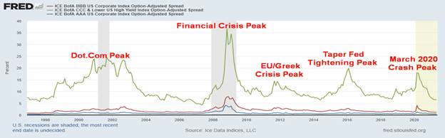
The Fed also recognized the narrow credit spreads of corporate bonds to U.S. treasuries. Credit spreads are at their lowest levels in years. The current AAA spread to U.S. treasuries is 0.47% vs. 1.26% a year ago during the March 2020 pandemic crash. Similarly, for BBB spreads at 1.14% vs. 3.96% and CCC spreads at 6.52% vs. 17.94%. Over half of U.S. corporate bonds outstanding are rated BBB, the lowest investment quality spread. At current levels, which are as low as they have been in years, credit spreads have only one way to go and that is up. Credit spreads this low are not sustainable.
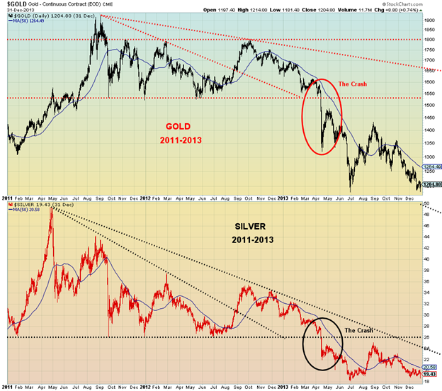
Still, the talk of taper from the Fed brought back memories of the 2013 gold crash that saw gold fall $229 over the weekend of April 12, 2013 to $1,335. Silver fell over $5 to $22.52. Taper talk was one of the reasons, along with talk of central bank gold selling to bail out bankrupt Cyprus banks. Our chart below shows the period 2011–2013 that included the top in August/September 2011 and the April 2013 crash. Before that, both gold and silver had appeared to be breaking out following a corrective period from the 2011 top. But the long downward drift got underway in the latter part of 2012 and that led to the crash as the bottom fell out. Massive selling of futures and the triggering of stop losses as significant support gave way at $1,525/$1,550 also helped the collapse. For silver, the collapse accelerated under $26. Gold and silver did not make their final low until December 2015 with gold at $1,045 and silver at $13.62, a decline of 46% for gold and 72% for silver from the 2011 highs.
Given both gold and silver topped back in August 2020, the question now is, can they recover to the 2020 highs and go even higher? The street consensus is that we will. However, while the potential is there, one should not underestimate the resistance zones that remain for both gold and silver to move higher.
We have stated that we believe we saw our 31.3-month cycle low in March at $1,673. The question, however, is will the third and final phase of the longer 7.83 cycle as well as the coming due 23–25-year cycle low skew left, center, or right? The ideal is a right skew that takes gold to new heights late in the cycle. The nightmare skew is the left skew where gold fails at critical levels. Thoughts of a taper have us poised to hope for a right skew, but be aware of a left skew. The reverse repos performed by the Fed seemed to stop gold’s fall this past week as the perception was that there might be a problem.
The 2011 high was a left skew of the second 7.83-year cycle, out from the major 23–25-year cycle lows seen in 1999 and 2001. The first 7.83-cycle low bottomed in October 2008 (7.5 years from the April 2001 low) and the second bottomed in December 2015 (7.2 years from the October 2008 low). The high came three years from the October 2008. For the next four years gold moved increasingly lower. We cannot rule out that the third top was the August 2020 high at $2,089. Recall that, at that high, gold made new highs above the 2011 high but silver did not, a divergence. In February 2021 silver made new highs for the current move, while gold did not. As well, gold made new lows on the recent move to the downside but silver did not. These divergences should not be ignored.
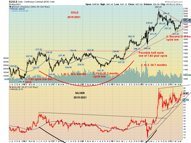
There remains considerable potential for gold (and silver) to move higher from here. Silver has held nicely above its 40-week MA and appears to be making a rising triangle. But silver still needs to successfully break above $29 to suggest to us that we could make new highs above $30.35 the February high. Targets could be minimum up to $39/$40 if that happens. Gold is breaking its downtrend line from the August 2020 high and is breaking above its 40-week MA, both positive developments. However, gold has resistance at $1,880/$1900 to break through, then further resistance at $1,960 and again at $2,000. Above $2,000 the odds increase that new highs could be seen above $2,089, the August 2020 high. Targets could be up to $2,200 to $2,500.
Similarly, silver needs to break above $29 to suggest to us that the August 2020 high and the February 2021 high could fall. Silver needs to hold above $26.50 at minimum on any pullback, while gold needs to hold above $1,750 and preferably above $1,800 if this rally is to continue.
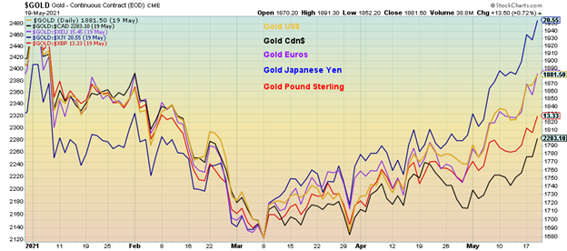
There are other positives. Gold is rising in all major currencies as shown by the chart below.
Gold in Currencies 2021
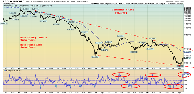
Gold has been a huge underperformer to Bitcoin. It is possible that is about to change given Bitcoin’s recent collapse (along with the other cryptocurrencies). Has the bubble burst for the cryptos? Our target on Bitcoin is minimum $25,000. It could be even lower. Our chart below of the Gold/Bitcoin Ratio shows gold is starting to outperform Bitcoin. However, this is by no means confirmed as gold has more work to do to break that downtrend line that has been in place since 2015. Currently at 0.0512, the ratio needs to break out over 0.125 to confirm that gold has bottomed against Bitcoin. The accusation has been that Bitcoin has taken away from gold. Could that relationship be changing so that, as Bitcoin comes down, some of the funds are switching into gold? Currently the ratio is extended, according to the RSI, now well over 70.
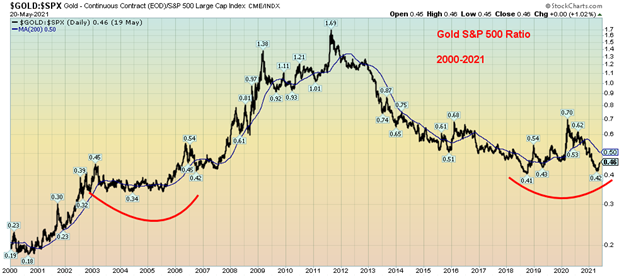
Could gold be making a bottom against the S&P 500? Our chart of the Gold/S&P 500 ratio shows the ratio made a low recently at 0.42. In 2018 the low was seen at 0.41. Could this be a multi-year double bottom, not dissimilar to the lows made from 2002 to 2006 before gold took off to its ultimate high in 2011? Again, there is considerable work to do first to regain above 0.50 the 200-day MA. However, at 0.46 we are closing the gap.
Gold/S&P 500 Ratio 2000-2021
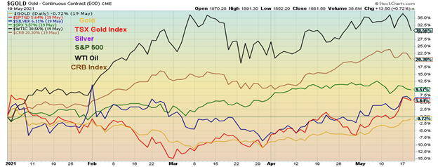
Gold, silver, and the gold stocks represented here by the TSX Gold Index are starting to rise while WTI Oil and the S&P 500 could be rolling over. The CRB is tipping a bit as well so an eye needs to be kept on that. Gold/silver are negatively correlated to the stock market so we could be seeing here a shift out of the markets that have been rising in the early part of the year (stocks and cryptos) and into gold. We note that silver and the gold stocks have recently turned positive on the year and gold is not far behind. This could be a positive sign for gold going forward, subject to the challenges that gold still faces as noted above.
Gold as money has been around for over 3,000 years. Gold is money and the latest experiment with fiat currencies is not the first. All other experiments with fiat currencies eventually failed. Fiat currencies are just paper, whereas gold and silver have held their value throughout history. Man has gone back and forth with gold standards (and silver). Fiat currencies fail when no one will accept what the government has issued any longer. Translation: it isn’t worth the paper it is printed on. Gold has been used primarily in jewellery along with electronics and is a powerful electricity conductor. Central banks universally (with exceptions—Canada?) maintain gold reserves and some such as Russia and China have been adding to their gold reserves to help boost the value of their currency. Gold is nobody’s liability. Gold is non-correlated to other assets such as stocks and bonds.
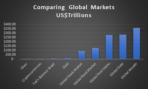
Gold represents a small proportion of global assets. Above ground gold supplies, all the gold ever mined in the world is worth about $11.8 trillion at current prices. Above ground silver supplies are worth only about $700 billion. All the cryptocurrencies are worth about $1.5 trillion. But the global stock market is about $95 trillion, the global bond market $130 trillion, global real estate market $280 trillion, global debt $281 trillion, and global wealth $360 trillion. All the gold stocks in the world are only worth about $500 billion, making them about the same size as JP Morgan Chase. Bitcoin is still worth over $750 billion more than all the gold mining companies in the world. Gold, silver, and gold stocks represent a very small portion of global assets, less than 4%. For the record, the notional value of all the world’s derivatives is estimated to be around $600 trillion, although some have pegged it in excess of $1 quadrillion. That’s notional value. Its actual market value is about $12 trillion.
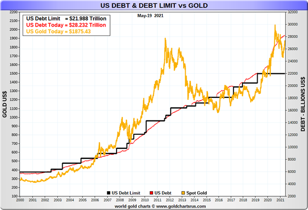
Gold has been rising as global debt rises. When looking at the U.S. alone we note that U.S. government debt is roughly $28.2 trillion. The U.S.’s gold reserves of 261.5 million ounces are worth today about $490 billion. They are carried on the books of the Federal Reserve at about $11 billion. It is interesting to note that the U.S. debt limit is currently $21.988 trillion. Following a 2-year suspension the U.S. debt limit next comes up for renewal on July 31, 2021. The U.S. Treasury has already raised the potential for this to be a major problem, especially given how tight things are in the U.S. Congress and Senate. Legislative action is essential and a hung Congress and Senate could see a debt limit fight stretched out, putting the U.S. at risk of default. Unless a deal is agreed upon beforehand or another suspension is agreed upon there remains the real risk of a default or, at best, significant closings and shutting down of programs in order to stay onside. Given the current political situation, the odds of an agreement on the debt limit could be low. A fight over the debt limit would be positive for gold.
What would gold be worth if it was to back the U.S. monetary base? The U.S. monetary base is estimated to be $5.8 trillion. To fully back the monetary base the gold price would need to be at $22,239. Even to reach 30% backing, gold would need to be at $6,670. We have a long way to go.
Taper talk and inflationary scares may be just that. Talk and scares. The U.S. economy still has a lot of slack. The Fed would consider tapering only if the economy were to show sharp improvement towards their goals. Although the Fed doing reverse repos throws a bit of a wrench into tapering. However, even at the most recent meeting all Fed participants agreed we were not there yet. The Fed would want to see real improvement, not just forecasts that things might improve. As to inflation, the reports at this time are a one-off. The Fed and the BofC are going to want to see a series of reports above their inflation guidelines before they might react. They both have ways they can control the long end of the yield curve if necessary. Note that bond yields made their high back in late March. Since then, the U.S. 10-year treasury note yield has been slowly rolling over.
All of this should be good for gold going forward. We just need to successfully break above our points to confirm the breakout and move to potentially new all-time highs. And, of course, not breach any important downside points. We have long memories, unpleasant ones, of what happened in 2013.
The Stock Market
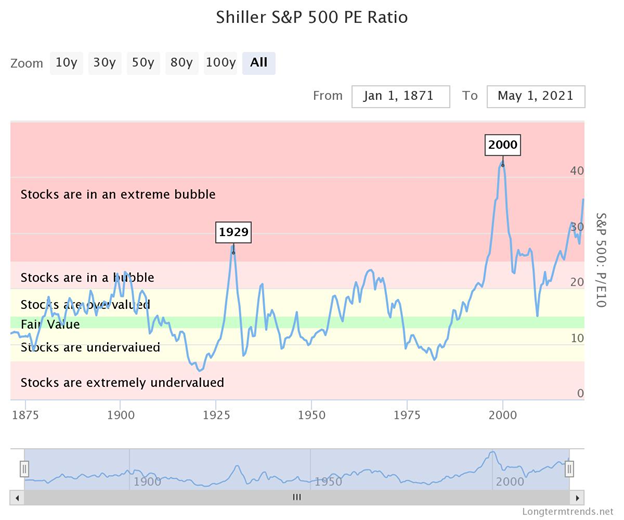
It is, we admit, hard to imagine what an extreme bubble is. But extreme bubbles happen more often than people think. Tulip bubble, South Sea bubble, and the Mississippi land bubble are the bubbles of lore described in Charles Mackay’s book Some Extraordinary Popular Delusions and the Madness of Crowds (1841). But Charles Mackay’s book remains relevant today. Since then, there have been numerous bubbles, almost too many to describe. Many of them over the past century live on in lore. The Dow Jones bubble (1921–1929), the Japanese land and stock market bubble (1982–1990), the gold and silver bubble (1976–1980), and the NASDAQ bubble (1995–2000). Then there were the bubbles of individual stocks. Their names live on in infamy: Bre-X, Nortel, Fanny Mae are but a few that soared, then crashed, and even just disappeared, never to be seen again. Where art thou, Bre-X? Alas, we once knew you.
Today, the most visible bubble has been Bitcoin (with a nod to Dogecoin) that has soared over 1,500% from lows seen in March 2020 to its recent top in April 21. Reality bites as Bitcoin is now down 43% from that lusty high and appears poised to fall a lot further. And that wasn’t even Bitcoin’s most spectacular bubble. From July 2016 to a peak in December 2017 Bitcoin soared over 4,100%, only to crash and burn over the next year, falling 84%. Did we mention that Amazon is up over 10,000% since 2008? A reminder that what goes up fast comes down even faster. We have previously noted what appears to be a large topping pattern on Amazon. It breaks down under $3,100 and $2,900. From there the fall could be swift. When the bubble bursts there are no prisoners.
The Roaring Twenties saw the Dow Jones Industrials (DJI) soar 497% from 1921 to 1929. Then the DJI crashed 89% from 1929 to 1932 during the Great Depression. It took another 25 years for the DJI to recover the 1929 high. Japan’s Nikkei Dow soared almost 1,900% in the 1980s. Thirty-two years later the Nikkei still hasn’t recovered that high. Gold soared over 2,200% in the 1970s, topping in 1980. It took gold another 27 years to see that price again. On an inflation-adjusted basis gold still hasn’t recovered that 1980 high.
So, what of now? Since the financial crash low in March 2009 the S&P 500 has soared 527%, actually surpassing the DJI of the Roaring Twenties. Yet many would say we are not in a bubble. Push interest rates to zero and keep them there and supply endless amounts liquidity to the markets through QE1, 2, 3, and now 4 and some of that money might find its way into the stock market. Since 2008, U.S. Federal Government debt has soared 177%, money supply (M2) is up 163%, total U.S. debt (government, corporations non-financial and financial, and households) is up 72% while the Federal Reserves balance sheet has soared 755%. That last item is the real clue as to why the stock market has soared over the past dozen years.
Yes, along came the pandemic and interrupted things. Wall Street had a hiccup and fell over 35% in the March 2020 crash. Main Street lost 22,362 thousand jobs as the official unemployment rate soared to 14.75%. Despite billions in rescue packages of pandemic cheques, enhanced unemployment benefits, and more as of the last jobs report in April, the U.S. was still short over 8,000 thousand jobs from where they were in February 2020. Yet all of a sudden, the big worry is inflation?
Wage inflation is not something they need worry about. It is interesting to note that the employment-population ratio for the key working group age of 25–54 years is currently 76.9%. It was 80.5% in January 2020 and if we go back further to 2000 it was 81.9%. The numbers for Blacks and Latinos are even lower. The number employed when compared to the working age population has fallen sharply for all ages. Yes, jobs are opening up, but most are at the low end of the wage scale where the minimum wage remains $7.25/hour the same as it was in 2009. Adjusted for inflation, a minimum wage worker in 1970 was paid in 2021 dollars $11/hour. Wage and wealth inequality are a major problem and longer term a society cannot survive with massive inequality without the intervention of a strong military force to protect the wealthy. Without stimulus cheques and enhanced unemployment benefits, the homeless population and those living in poverty would no doubt be a lot higher.
If we adjusted the S&P 500 for inflation, we can note that the 1970 S&P 500 would today be equivalent to 618. Instead, the S&P 500 is over 4,100. While 53% of Americans own stock in some form or another, back in 2002 67% owned stocks. Arguably it is better than, say, in 1989 when only 32% owned stocks. The top 10% of households today hold 84% of all stocks. Stock ownership is largely skewed to whites, high income earners, and the wealthy. Inflation for the stock market and Wall Street—not so much for minimum wage earners and Main Street.
Yes, prices for commodities such as oil, copper, and lumber have been soaring. But a lot of this is being caused by bottlenecks and supply shortages. Oil prices a year ago were too low and many companies were facing bankruptcy. Production cuts, coupled with lower demand, have helped raise oil prices. When one strips out the fastest rising prices for commodities the overall picture doesn’t look as dire. Playing a bigger role in disinflation over the past three decades has been globalization and technological advances. Consider this: does one go to a book store to buy the latest book? No, one goes online and finds it for half the price at the book store. The result of all of this is that most companies are going to be reluctant to pass on price increases. Some commodities may already be topping as we noted that lumber prices have already fallen 25% from the top. Unless it is necessities (food and energy?), consumers can keep their hands in their pocket. We’ve noted that the Fed is not likely to overreact to a one-month spike in inflation. It would take a few months of rising inflation to spark a Fed response.
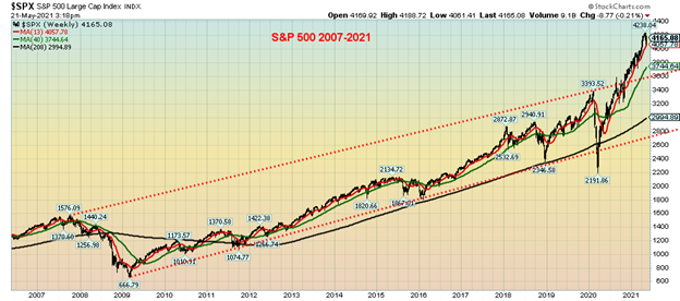
Our weekly chart of the S&P 500 shows a stock market that has gone into the stratosphere. This is a straight linear chart as opposed to a log chart where the look is somewhat different. We haven’t seen an index fly into the stratosphere like this since the NASDAQ in 2000. No, it hasn’t become the NASDAQ of dot.com bubble fame yet. A comparable period with the NASDAQ was the 1998 stock market mini-crash sparked by the Russian debt crisis and Long-Term Capital Management (LTCM) collapse that in some respects was not much different than the March 2020 pandemic crash. From roughly April through October 1999 the NASDAQ went through a corrective period before it made its final bubble peak rush, gaining 95% in the six months from October 1999 to April 2000. The biggest rush always comes at the end of the bubble.
Could we see that happen again? A pullback now followed by a rush to new all-time highs? The S&P 500 is fine as long as we hold above 3,700 on any significant pullback. The March 2021 low was at 3,723 highlighting that zone. However, the first good sign of a stronger pullback is under 4,000. If the markets were to fall much further, it might generate a response from the Fed.
As we noted. Talk of tapering is just that—talk. We are more concerned about what is sparking the reverse repos. Does it repeat itself going forward? It might actually be highlighting another problem. We also remain concerned that there are potentially more Archego Capitals out there.
MARKETS AND TRENDS
| % Gains (Losses) Trends | ||||||||
| Close Dec 31/20 | Close May 21/21 | Week | YTD | Daily (Short Term) | Weekly (Intermediate) | Monthly (Long Term) | ||
| Stock Market Indices | ||||||||
| S&P 500 | 3,756.07 | 4,155.86 | (0.4)% | 10.6% | up (weak) | up | up | |
| Dow Jones Industrials | 30,606.48 | 34,207.84 | (0.5)% | 11.8% | up | up | up | |
| Dow Jones Transports | 12,506.93 | 15,475.78 | (2.8)% | 23.7% | up | up | up | |
| NASDAQ | 12,888.28 | 13,470.99 | 0.3% | 4.5% | down (weak) | up | up | |
| S&P/TSX Composite | 17,433.36 | 19,527.30 (new highs) | 0.8% | 12.0% | up | up | up | |
| S&P/TSX Venture (CDNX) | 875.36 | 957.22 | 2.8% | 9.4% | up | up | up | |
| S&P 600 | 1,118.93 | 1,343.46 | (0.8)% | 20.1% | up | up | up | |
| MSCI World Index | 2,140.71 | 2,322.49 (new highs) | 2.4% | 8.5% | neutral | up | up | |
| NYSE Bitcoin Index | 28,775.36 | 37,899.54 | (25.5)% | 31.7% | down | up (weak) | up | |
| Gold Mining Stock Indices | ||||||||
| Gold Bugs Index (HUI) | 299.64 | 320.20 | 4.5% | 6.9% | up | up | up | |
| TSX Gold Index (TGD) | 315.29 | 333.33 | 3.5% | 5.7% | up | neutral | up | |
| Fixed Income Yields/Spreads | ||||||||
| U.S. 10-Year Treasury Bond yield | 0.91 | 1.62% | (0.6)% | 78.0% | ||||
| Cdn. 10-Year Bond CGB yield | 0.68 | 1.55% | (0.6)% | 127.9% | ||||
| Recession Watch Spreads | ||||||||
| U.S. 2-year 10-year Treasury spread | 0.79 | 1.47% | (0.7)% | 86.1% | ||||
| Cdn 2-year 10-year CGB spread | 0.48 | 1.21% | (0.8)% | 152.1% | ||||
| Currencies | ||||||||
| US$ Index | 89.89 | 90.01 | (0.3)% | 0.1% | down | down | down | |
| Canadian $ | 0.7830 | 0.8290 (new highs) | 0.4% | 5.8% | up | up | up | |
| Euro | 122.39 | 121.82 | 0.3% | (0.5)% | up | up | up | |
| Swiss Franc | 113.14 | 111.38 | 0.5% | (1.6)% | up | up (weak) | up | |
| British Pound | 136.72 | 141.51 | 0.4% | 3.5% | up | up | up | |
| Japanese Yen | 96.87 | 91.78 | 0.4% | (5.3)% | up (weak) | down | down | |
| Precious Metals | ||||||||
| Gold | 1,895.10 | 1,876.70 | 2.1% | (1.0)% | up | up (weak) | up | |
| Silver | 26.41 | 27.49 | 0.5% | 4.1% | up | up | up | |
| Platinum | 1,079.20 | 1,169.40 | (4.4)% | 8.4% | down | up | up | |
| Base Metals | ||||||||
| Palladium | 2,453.80 | 2,784.70 | (4.0)% | 13.5% | neutral | up | up | |
| Copper | 3.52 | 4.48 | (3.7)% | 27.3% | up (weak) | up | up | |
| Energy | ||||||||
| WTI Oil | 48.52 | 63.58 | (2.7)% | 31.0% | neutral | up | up | |
| Natural Gas | 2.54 | 2.98 | 0.7% | 17.3% | up | up | up |
New highs/lows refer to new 52-week highs/lows and in some cases all-time highs.
—
(Featured image by Jingming Pan via Unsplash)
DISCLAIMER: This article was written by a third party contributor and does not reflect the opinion of Born2Invest, its management, staff or its associates. Please review our disclaimer for more information.
This article may include forward-looking statements. These forward-looking statements generally are identified by the words “believe,” “project,” “estimate,” “become,” “plan,” “will,” and similar expressions. These forward-looking statements involve known and unknown risks as well as uncertainties, including those discussed in the following cautionary statements and elsewhere in this article and on this site. Although the Company may believe that its expectations are based on reasonable assumptions, the actual results that the Company may achieve may differ materially from any forward-looking statements, which reflect the opinions of the management of the Company only as of the date hereof. Additionally, please make sure to read these important disclosures.
David Chapman is not a registered advisory service and is not an exempt market dealer (EMD) nor a licensed financial advisor. We do not and cannot give individualised market advice. David Chapman has worked in the financial industry for over 40 years including large financial corporations, banks, and investment dealers. The information in this newsletter is intended only for informational and educational purposes. It should not be considered a solicitation of an offer or sale of any security. The reader assumes all risk when trading in securities and David Chapman advises consulting a licensed professional financial advisor before proceeding with any trade or idea presented in this newsletter. David Chapman may own shares in companies mentioned in this newsletter. We share our ideas and opinions for informational and educational purposes only and expect the reader to perform due diligence before considering a position in any security. That includes consulting with your own licensed professional financial advisor.


The World’s Largest Insurers Have ESG Blind Spots, According to ShareAction
The evaluation of the 65 insurance companies carried out by ShareAction confirms the need for constant evaluation of the sustainable...


Spending on R&D in Biotechnology Increased by 13% in 2022 and Reached 2.56 Billion
In 2022, spending on biotechnology Research and Development (R&D) increased by 13% to reach 2.56 billion euros. Company expenditure grew...


Consolidation in Sight in the Italian and European Crowdfunding Sector
The trend towards the creation of “super platforms” could materialize well beyond a single isolated case: according to the European...

JuicyFields – the Largest Investment Fraud in the Cannabis Industry
The JuicyFields case is a warning to investors around the world, illustrating the risks associated with attractive but unverified investment...


AI Will Revolutionize Mental Health, Generating 2.5 Billion in Spain
The AI boom extends to mental health, with startups emerging in Spain aiming to leverage technology for patient and professional...
 |
|
 |  |
 |
|
-

 Crypto2 weeks ago
A Critical Look at the Progress of IOTA in the First Quarter of 2024
-

 Business4 days ago
Gold & Silver Continue Looking Strong
-

 Crowdfunding1 week ago
Crowdfunding Campaign to Preserve the Tradition of the Navatas of the Gállego River
-

 Crypto2 days ago
Hong Kong Approves Bitcoin and Ethereum ETFs: A New Chapter for Cryptocurrencies