Featured
Gold continues its bull market advance
The Dow Jones is continuing its upward trend, making a new all-time high on Wednesday. Since the end of September the Dow Jones has seen a nice advance. It wasn’t only the Dow Jones making market history this week. Gold is just 16% away from making a new all-time high. Both gold and the Dow Jones are advancing, and showing no indication that anything bearish is heading their way.

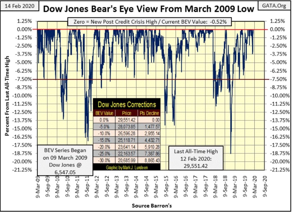
Dow Jones is hugging its BEV Zero (0.00%) line in its BEV chart below, making a new all-time high on Wednesday, then closing the week half a point from this mid-week high. I expect more of the same for as far as the eye can see. And how far is that? Looking at this chart; for as long as the Dow Jones stays north of its red BEV -7.50% line.
What happens should the Dow Jones fall below that red line? I’ll call that when I see it. But since the Dow Jones’ March 2009 -54% bear market bottom (23,000 points ago), the Dow Jones usually made a double-digit percentage correction whenever it did, before recovering to new all-time highs.
On the next break down below the BEV -7.50% line, I’ll be looking at the 18.75% correction from December 2018 to see what kind of floor to the market decline it provides. Should the Dow Jones break below its BEV -20% line (23,641); it could be bad.
All this will happen someday, but as things are now it’s more profitable being bullish than bearish in this market, so I remain short-term bullish.
The Dow Jones continues trending upward in its daily bar chart below.
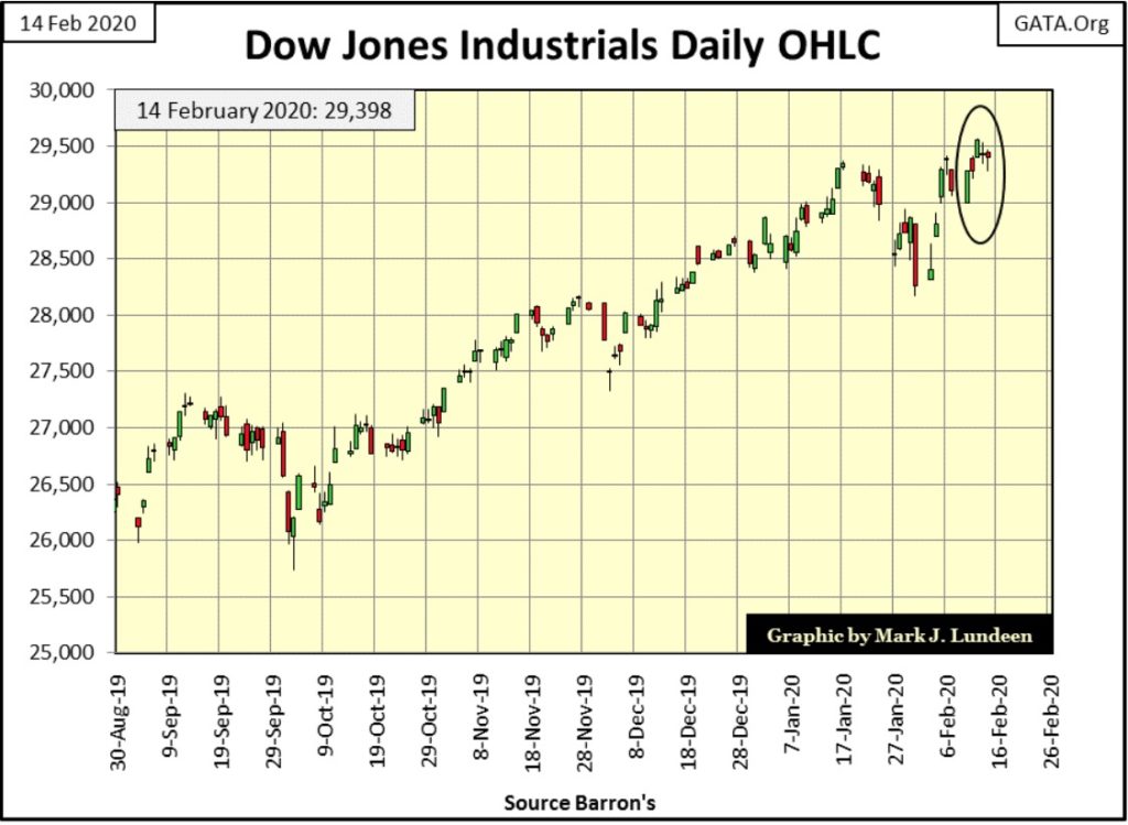
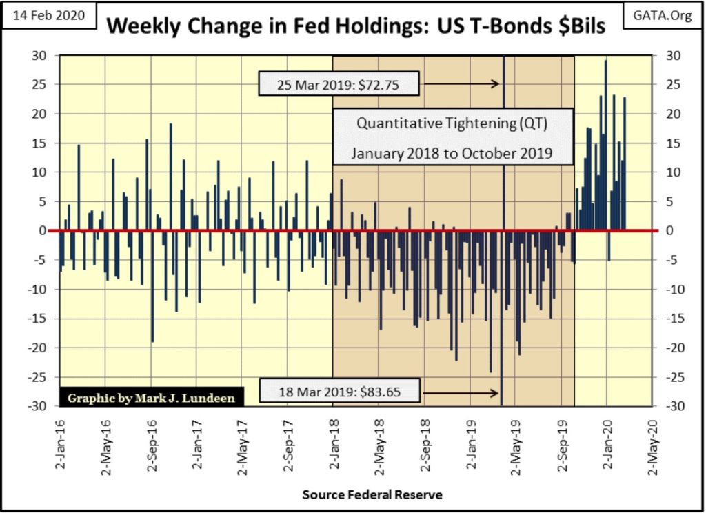
Since the end of September the Dow Jones has seen a nice advance in the chart above. But then as seen below in the weekly changes in the Federal Reserves’ holdings of US T-debt, it was also at this time the FOMC began their Not QE#4. This week the FOMC monetized another $22.79 billion dollars of the national debt.
Are you wondering how long the Dow Jones can continue advancing? Maybe the question you should be asking is how long can the FOMC continue its Not QE#4 in the chart below without causing a panic in the financial markets. It could be a long time from now, and then maybe not. In either case this, whatever the Federal Reserve wants to call it, the current expansion of their balance sheet is something worth following.
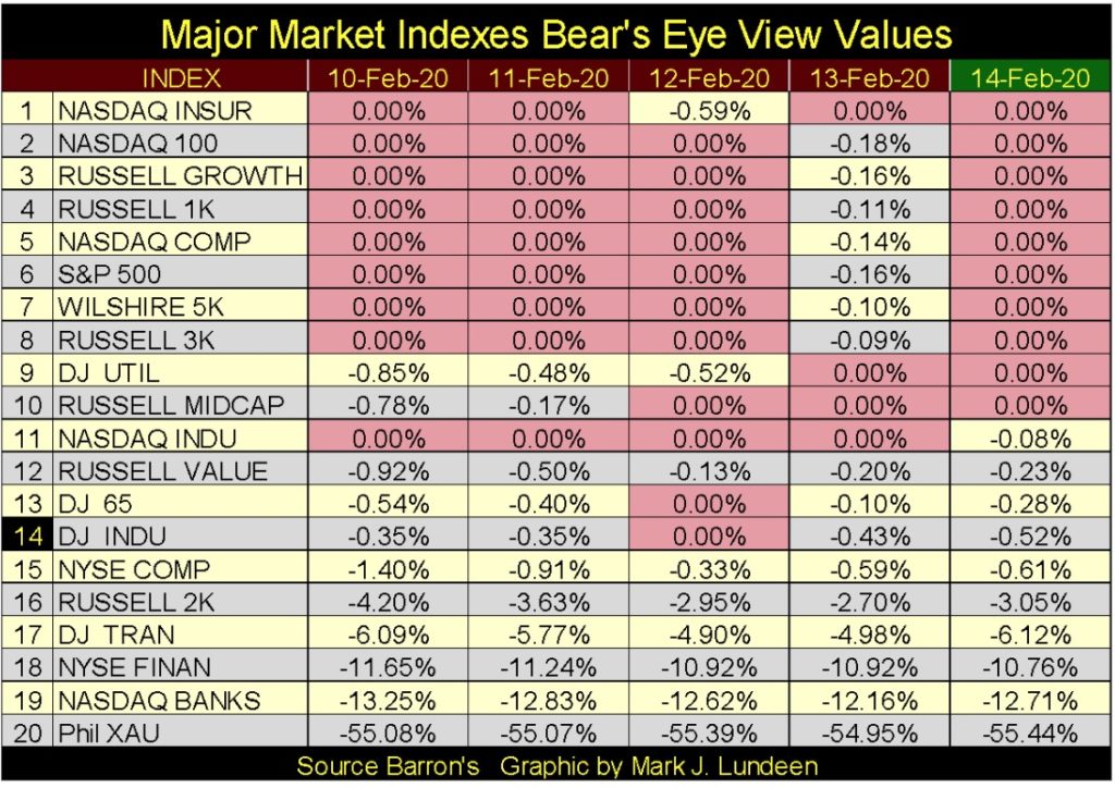
It wasn’t only the Dow Jones making market history this week, as seen in the table below. And those major market indexes that didn’t close the week at a BEV Zero closed in scoring position (within 5% of a BEV Zero) down to #16.
All and all I’d say the FOMC is having success keeping market valuations inflated with its current Not QE#4, and likely will continue to until the November Presidential Election.
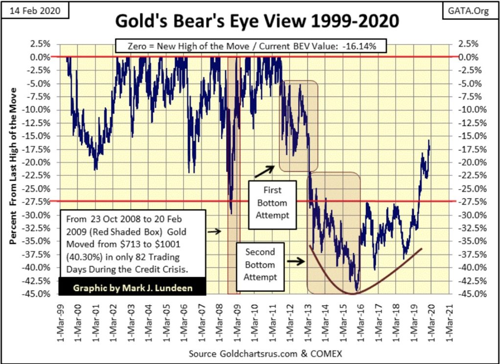
Take a moment to study gold’s BEV chart below. What has gold been doing since August 2018? It’s been going up. Not so much that it would attract the attention of those risking their capital in today’s glamorous social-media stocks, but advancing for the past eighteen months nonetheless.
This is typical early-stage bull market action; a rise in a market with little attention paid to it by the “market experts.” Which goes without saying is the best time to enter into any bull market; early with few people bidding for an undervalued asset.
I can’t get over what a * POWERFUL * Bear’s Eye View (BEV) chart gold currently has: exhibiting a rock solid bowl pattern bottom, from which it has been advancing now for over three years. Then last summer it broke above its BEV -27.5% line ($1360) for the first time since March 2013 (six years), and now closed this week only 16.14% away from its last all-time high of August 2011 (nine years ago). Unloved and ignored my most investors, gold is making a historic breakout to new all-time highs.
The problem people have in the markets is knowing when to buy and sell. You could spend the rest of your life studying the market and never see a better example of massive-bull market in its early days than what you see in the chart below.
Gold is just 16% away from making a new all-time high. I’m not predicting it will, but within this chart gold has moved up that much and more in just a few months. However, I suspect gold will continue its creeping advance, with an occasional correction into the summer.
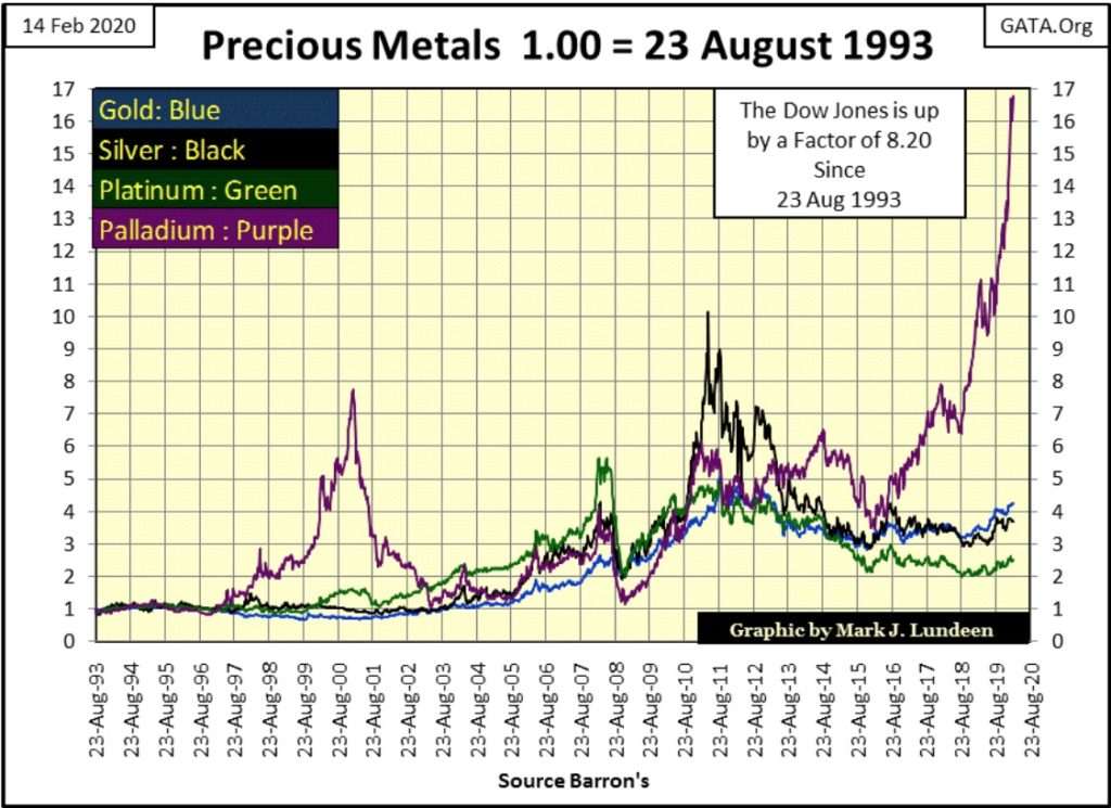
Palladium below (Purple plot) is still on the move. I keep looking at it weekly thinking it’s overbought and due for a correction. But since last August when it was at the 10 line, it has advanced some 68% and shows no sign of slowing down.
Oh; palladium will see a correction – but when? What fun it will be when I’m forced to ask the same question for gold and silver someday in the future – but when? Don’t you worry – someday.
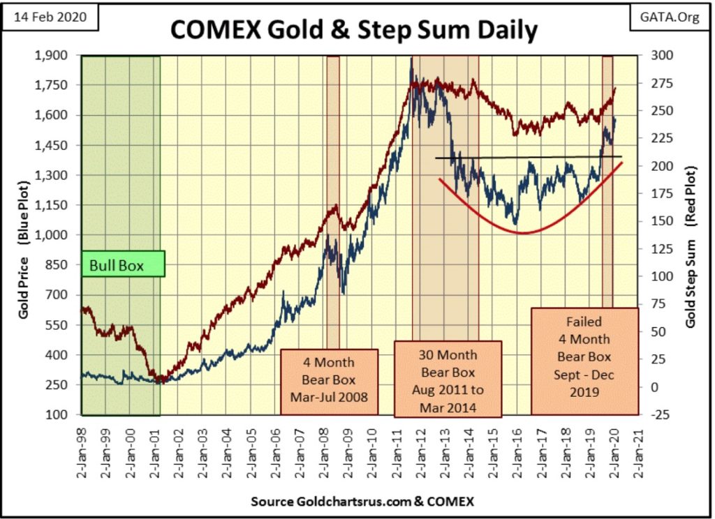
Below is gold’s step sum chart. Since the failure of the September to December bear box, gold’s price plot (Market Reality) and its step sum plot (Market Sentiment) have recoupled to the upside. The big bears on Wall Street have done their worst to the gold market, but now must find their stores of ammunition needed to drive the gold market down limited.
What to expect next? I’m looking at these two plots from 2001 to 2008 as a distinct possibility of what to expect in the coming years in the gold market; rising together to new all-time highs.
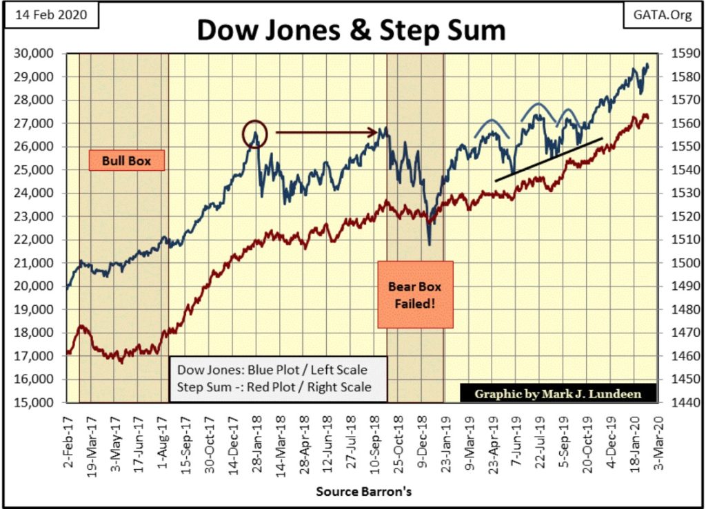
The Dow Jones in its step sum chart below also looks good. Dow Jones at 35,000 sometime in 2020? If the FOMC continues with its Not QE#4, it might do better than that.
But in February 2020, it’s wiser investing in gold and silver, both rising in their early stage bull markets than to risk money in the stock market, which by any measurement is in its mature stage of a massive bull market that began in March 2009, some 23,000 points ago.
In gold’s step sum table below, its step sum has increased by only four steps (net 4 positive daily closings) since January 10th. Still, the price of gold is up 1.40% in the past twenty-five trading days. Gold’s 15 count close the week at a +1, meaning it has worked off its overbought situation from late last year to late January when its 15 count was posting +7s and +9s.
The Dow Jones in its step sum table has also worked off its overbought situation. It continues making new all-time highs (Blue 0.00% rows). Meaning the Dow Jones is advancing in an orderly market, showing no sign of a market mania driving up the Dow Jones.
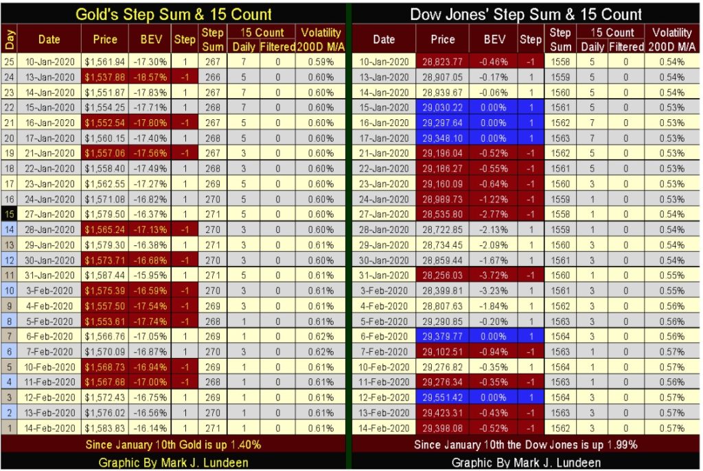
Both gold and the Dow Jones above are advancing, and showing no indication that anything bearish is heading their way.
I’m making time this week to cover the above 15 count for gold and the Dow Jones. A 15 count is the algebraic sum of the advancing days (+1s) and declining days (-1s) in a running 15 day sample. The breakdown of possible 15 counts are given in the table below; where a 15 count of +15 is equal to fifteen daily advances and zero daily declines, and a 15 count of -15 is zero daily advances and fifteen daily declines, and the table gives all the possibilities between these two extremes.
You can see these daily steps in action in the step sum table above as I always highlight the declining days (-1 steps) in red.
What’s useful in tracking a market’s 15 count is it provides a means of determining if a market is in an overbought or oversold condition.
Knowing a market is in an overbought condition (counts of +7 to +15) strongly suggests that maybe the bulls are getting ahead of a market advance, placing them at risk of a price correction.
Knowing a market is in an oversold condition (counts of -7 to -15) strongly suggest that maybe the bears are getting ahead of a market decline, placing them at risk of upward bounce in a continuing bear market.
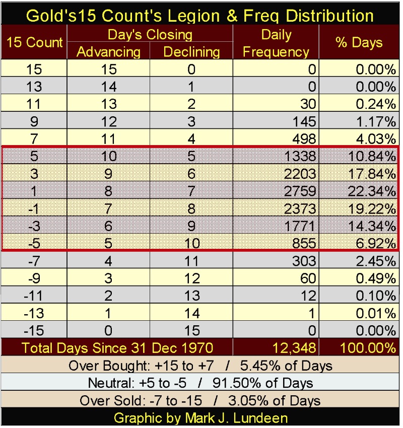
At the bottom of the above table I’ve listed at what counts a market is overbought, neutral or oversold.
Since December 1970 gold has been overbought for 5.45% of its total days. So seeing gold in an overbought condition isn’t a normal market condition. This is especially so for counts at or above +9. Since December 1970 gold has traded in a neutral condition for 91.50% of its trading days, and it’s been oversold for 3.05% of its trading days.
And yes, gold has advanced when its 15 count was ranging between -5 to -1, and declined as its 15 count was ranging between +1 and +5. So, when gold’s 15 count is ranging between +5 down to -5, I typically call it market noise and ignore it. It’s only when its 15 count breaks above +5, or below a -5 I pay attention to gold’s 15 count.
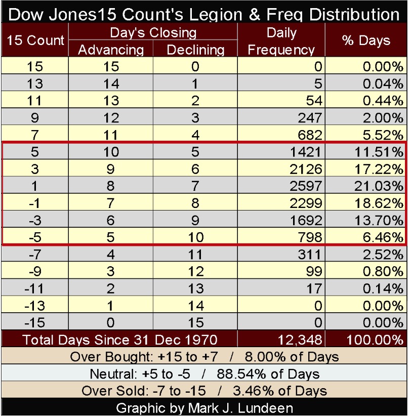
Next is the 15 count legion and frequency distribution for the Dow Jones, which is very similar to the comments above for gold.
But since 1970, neither gold or the Dow Jones has ever seen a 15 count of +15 or -15, so why a 15 count? Since 1970 silver (table not shown) has seen a single daily close with a 15 count of +15 and -15, with its single -15 count occurring in November 2015, a few weeks before its December 72% bottom. Fifteen consecutive down days; a 15 count of -15 is damn bearish market sentiment, exactly what one would expect at the bottom of a big market decline.
Let’s look at volatility for the old monetary metals; gold and silver, and I measure daily volatility by the percentage movement from one daily close to the next. Below I’ve plotted the 200 Day Moving Average for gold and silver’s daily volatility going back to 1970, and what quickly becomes apparent is volatility for gold and silver aren’t the same as it is for the stock market.
For the Dow Jones (my proxy for the broad-stock market) rising daily volatility (to above 1.00%) is never good, a sure sign Mr Bear is clawing back market valuations. For gold and silver that can also be true, but during bull market advances precious metals can also see increases in daily volatility. And peak volatility doesn’t always match up with gold and silver’s bull market tops or bear market bottoms.
The best way to think of volatility in the precious metals markets is to understand that rising volatility is an indication of funds flowing into or out of these markets. It could be a big move up in volatility (funds flowing in), or down (funds flowing out), but money is flooding into or out of the precious metals markets in a big way.
Looking at 1980 below, the year both gold and silver saw historic highs in volatility, both metals also saw historic high valuations – in the first few weeks of January 1980. At their January bull market highs gold’s volatility 200 Day M/A below increased to 1.65%, and silver’s to 2.31%.
Then as a two decade bear market began, their volatility continued rising until gold’s 200 Day M/A peaked at 2.60% in May, and silver’s peaked at 4.26% in June. But by May the price of gold had declined by 39%, while silver had seen its price collapse by 76%! Without a doubt, from late January to May 1980 money flooded out from the gold and silver markets faster than they flooded into them the year before.
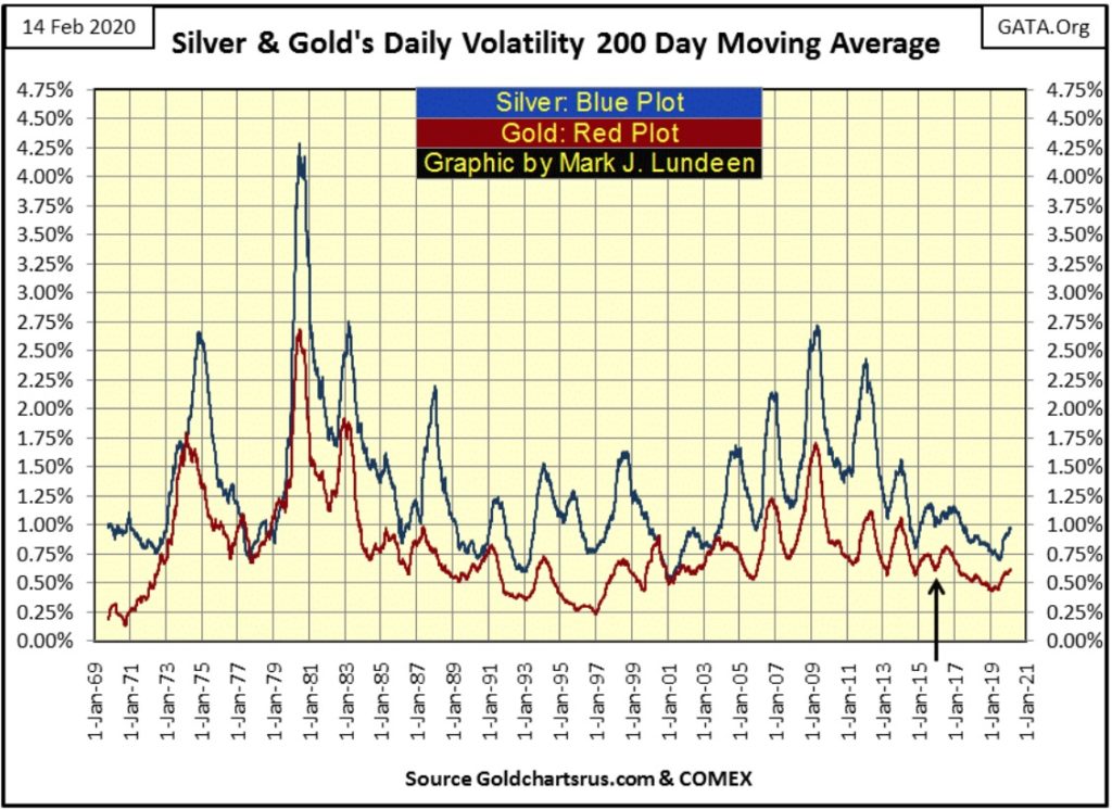
Currently, volatility for both gold and silver is not far above historic lows, indicating that there isn’t much in the way of flow-of-funds into or out of the these markets.
I placed an arrow marking the bottom of their August 2011 to December 2015 bear market decline. Since this important market bottom from three years ago, the price of gold has increased by 50% and silver by 26% as daily volatility trended downwards.
What this means is that while gold and silver are in bull markets, not many people care as the capital gains from the stock market and elsewhere are greater. But I’m anticipating this will change in a big way when Mr Bear pays Wall Street a visit and begins deflating market valuations in today’s glamor stocks such as Apple and Amazon. Should the bond markets also come under pressure, upward pressure on the price of gold and silver will become historic.
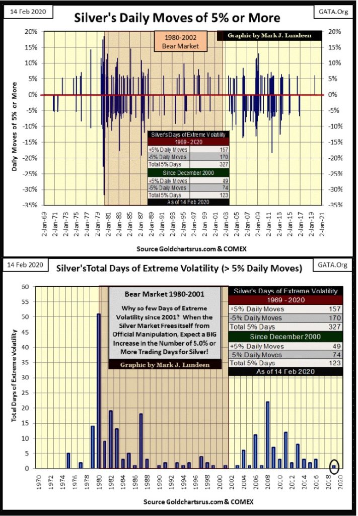
Next are charts for extreme daily volatility for gold and silver. A move of +/- 3% from the previous day’s closing price for gold, or +/-5% for silver is a day of extreme market volatility in these markets. These graphics contain two charts each; the uppermost plots the actual daily moves, the bottom chart plots how many days of extreme volatility occurred yearly from 1970 to 2020.
I’ve also included a table giving the breakdown of these days of extreme volatility from 1969 to 2020 and from December 2000 to 2020. In the past fifty years the gold market has seen 424 days of extreme volatility. That is an average of 8.48 extreme days a year. However, we see these extreme market events clustering during those times when the gold market is seeing large movements in its valuation, and note there are periods (years) when the market is free of them.
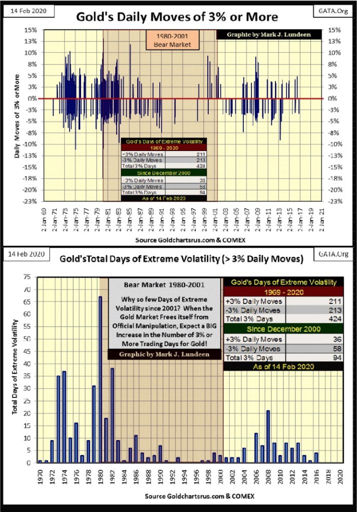
The gold market was free of extreme volatility for the three years of 1994, 95 & 96. This was at the end of the 1980 to 2002 bear market. The only other multi-year period the gold market was free from extreme volatility was from 2017 to today, a time where gold has advanced in price by 50%.
I’ve included a graphic of silver’s extreme volatility below, whose comments would be much the same as I used for gold above, except on September 3rd of last year silver saw a +5% day (5.96%).
The value of these charts isn’t in their ability to predict the future, as much as to tell us where the gold and silver markets stand with investors from year to year. Right now the precious metals markets are a backwater in the market place, meaning right now money prefers to be elsewhere. No matter, since December 2015 the old monetary metals have both trended upwards in bull markets.
This underperformance of gold and silver is all by design by the “policy makers.” These people have increased the supply of dollars in circulation by an obscene amount since 1971. They must contain the price of commodities as well as gold and silver, and maintain inflated financial market valuations if they are to retain their credibility in the financial system.
No monetary system based upon inflationary growth endures forever. When the current monetary system of inflation begins losing credibility in the financial arena, the incidents of extreme volatility in the gold and silver markets will increase and these charts will detect exactly when that happens.
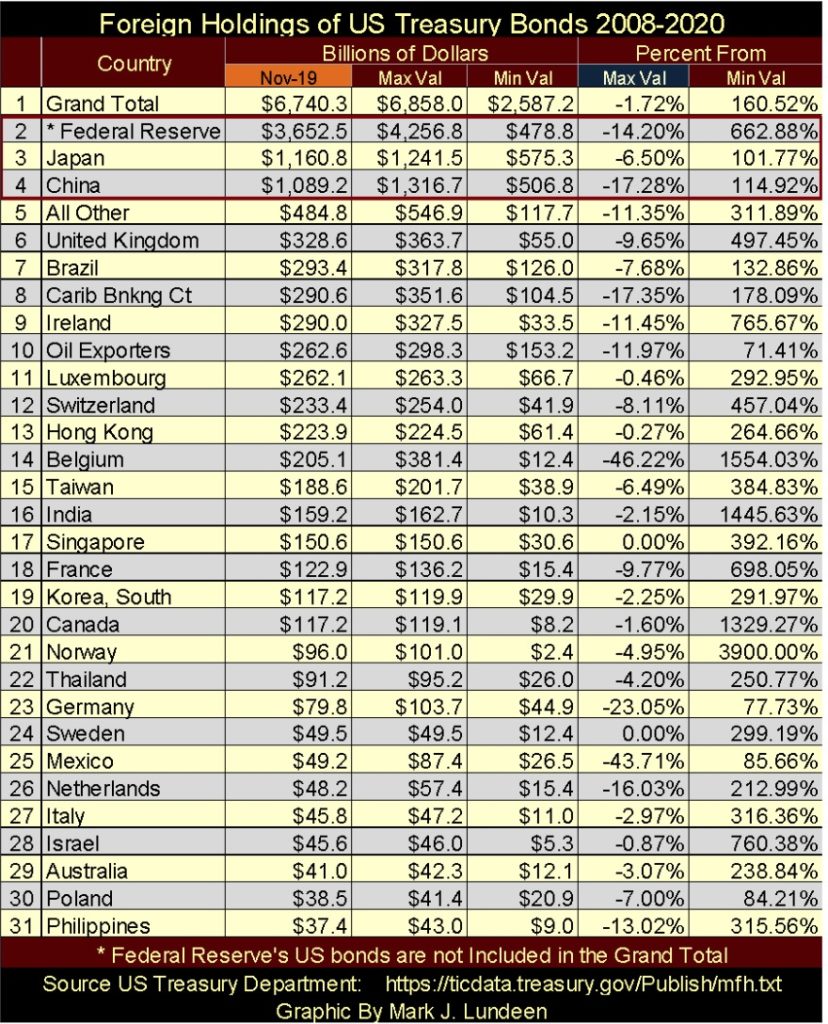
Let’s take a look at foreign holders of US Treasury Debt in the table below, data from the US Treasury, with November 2019 the latest data.
The big three holders are the Federal Reserve, Japan & China, but as noted in the table, data on the Federal Reserve is NOT included by the US Treasury in this data set. But I have it so I use it.
Looking at the Percent From / Max Val column I see quite a few double-digit percentages reductions in US Treasury Debt holdings. Think of this data like a Bear’s Eye View (BEV) of this data, because it is. So, one would never see a positive value, except for a 0.00%; which would indicate a new all-time high in a country’s holding of T-Debt, as Singapore (#17) and Sweden (#24) saw last November. Seeing the reductions in holdings of Treasury debt from #3 Japan down to #31 Philippines, I have a hard time believing the Grand Total (#1) is down by only 1.72%.
As the US Treasury in this report doesn’t report on every country holding US T-Debt, I have to assume this 1.72% reduction in the Grand Total is correct. But it looks very odd to me.
Here’s a chart plotting the holdings of US Treasury Debt by the big three in the table above: the Federal Reserve, China and Japan. When I first began compiling this data, both China and Japan held more of Uncle Sam’s IOUs than the Federal Reserve did in May 2008. Then the sub-prime mortgage crisis struck, and we see what Doctor Bernanke’s QE1-3 did to the Federal Reserve’s holding of US Treasury Debt.
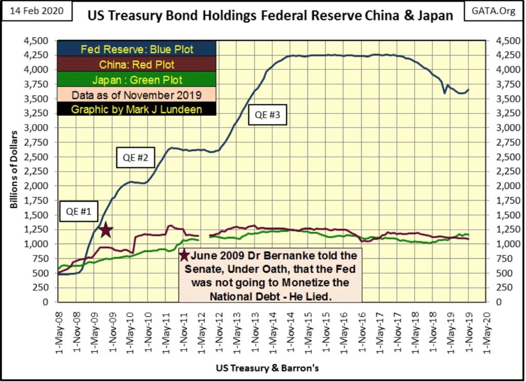
Should (when) another financial crisis strike, will the “policy makers” once again attempt to support deflating-market valuations with inflationary dollars as they did from 2008 to 2014 as seen above? In the coming crisis you know they will give it a try, and the main-stream media will attempt to provide cover for their massive flood of monetary inflation into Wall Street.
But a repeat of QE #1-3 from today’s level; an increase the Federal Reserve’s holding by a factor of 8.9, would drive up the Federal Reserve’s holdings of US Treasury debt to 32,516 billion dollars. This would be a problem when currently the national debt is only 23,274 billion dollars. Is the Powell Fed going to monetize the entire US National Debt, plus whatever else it can sink its meat hooks into?
Don’t bother asking them, as they will lie to you if the truth should be a problem maintaining their market credibility, as Doctor Bernanke proved in June 2009 before the Senate:
(When asked directly during congressional testimony if the Federal Reserve would monetize U.S. government debt, the Fed Chairman responded) “The Federal Reserve will not monetize the debt.”
Doctor Benjamin Bernanke: June 03, 2009
—
(Featured image by Linda Hamilton from Pixabay)
DISCLAIMER: This article was written by a third party contributor and does not reflect the opinion of Born2Invest, its management, staff or its associates. Please review our disclaimer for more information.
This article may include forward-looking statements. These forward-looking statements generally are identified by the words “believe,” “project,” “estimate,” “become,” “plan,” “will,” and similar expressions. These forward-looking statements involve known and unknown risks as well as uncertainties, including those discussed in the following cautionary statements and elsewhere in this article and on this site. Although the Company may believe that its expectations are based on reasonable assumptions, the actual results that the Company may achieve may differ materially from any forward-looking statements, which reflect the opinions of the management of the Company only as of the date hereof. Additionally, please make sure to read these important disclosures.


The World’s Largest Insurers Have ESG Blind Spots, According to ShareAction
The evaluation of the 65 insurance companies carried out by ShareAction confirms the need for constant evaluation of the sustainable...


Spending on R&D in Biotechnology Increased by 13% in 2022 and Reached 2.56 Billion
In 2022, spending on biotechnology Research and Development (R&D) increased by 13% to reach 2.56 billion euros. Company expenditure grew...


Consolidation in Sight in the Italian and European Crowdfunding Sector
The trend towards the creation of “super platforms” could materialize well beyond a single isolated case: according to the European...


JuicyFields – the Largest Investment Fraud in the Cannabis Industry
The JuicyFields case is a warning to investors around the world, illustrating the risks associated with attractive but unverified investment...


AI Will Revolutionize Mental Health, Generating 2.5 Billion in Spain
The AI boom extends to mental health, with startups emerging in Spain aiming to leverage technology for patient and professional...
 |
|
 |  |
 |
|
-

 Biotech1 week ago
Reig Jofre Invests 5.8 Million in Leanbio and Increases Stake to 24%
-
 Crowdfunding9 hours ago
Consolidation in Sight in the Italian and European Crowdfunding Sector
-

 Biotech2 weeks ago
Grifols at the Forefront of the Ibex 35
-

 Crypto6 days ago
Bitcoin Markets are Entering a Phase of Euphoria, According to Glassnode