Featured
How the coronavirus crisis caused a mini-crash in the stock markets last week
The coronavirus crisis is beginning to bite, sparking a panic sell-off this past week. Nothing was spared – stocks, gold, oil. Highly likely an intermediate top is in but too early to say a major top is in. The coronavirus may have been the spark but the reality is the market was grossly overvalued. During past recessions/market corrections/bear markets, bonds and gold were the best performers.

Having fun yet? Congratulations on being a part of a historic week. Yes, historic. Let’s quantify that.
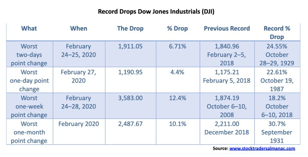
As bad as it was, it could have been worse. The records for the worst percentage drop remains intact. The big point drops came because of the high level of stock markets. As the markets move higher, these records are sure to fall again at some point. One can only hope that the record percentage drops remain intact. The year is still young, but one should keep in mind that the worst point drop in a single year was 2008 when the DJI fell 4,488.43 points. We almost tied that in one week. As to the worst percentage drop, that dishonor belongs to 1931 when the DJI fell 52.7%. As bad as 2008 was in percentage terms, it was only the third-worst year as the market lost 33.8%, tying with 1930. We are reminded that 2008 remains fresh in the memories of many of us.
Having been in the markets for a few years, I still have vivid nightmares about October 19, 1987. No, I wasn’t on an equity trading desk; instead, I was Chief Dealer on the International Money Desk of a major Canadian bank. Interest rates had been wild leading into the stock market crash with interest rates rising quickly while prices (that move inversely to yields) were falling.
Realizing there was potential trouble ahead, we were at our trading desks in Toronto at 5/6 in the morning. To protect positions, we were trying to purchase euro-dollar futures in the London market. Except in those days you had to phone as there were no online capabilities. (We know—old-fashioned.) The phone lines were jammed, and jammed, and jammed. Even the money brokers were having issues getting through. It was chaotic. Markets (euro-dollar futures) opened higher, and when markets finally opened in the morning it was utter chaos. The Fed cut interest rates to help stem the stock market collapse, sending euro-dollar futures even higher. It was a 300-basis point day, meaning a 3% drop in yields. Great if you were long, but a disaster if you were short. By PM closing, everyone was a nervous wreck. All that was left was to count the losses, which, as it turned out, were plentiful—everywhere at all financial institutions and for individuals, pension funds, mutual funds, etc. Fortunately, our long book was considerably larger than short positions in derivative trades.
The reason given for the mini-crash this past week was the coronavirus COVID-19. Yes, it was the trigger. Some are citing fear of Bernie Sanders being elected president as a reason as well. All of this overlooks the fact that the markets were considerably overvalued, negative divergences were rampant, and that despite the background of the coronavirus crisis, markets were overly complacent. News that a vaccine might be developed did little to calm the markets, but it did spook gold that had soared to fresh 52-week highs on the scare. Oil prices also plunged and are once again under $50, suggesting that they could move even lower towards $40 and even the 2016 low near $26. Meanwhile, bond yields, as represented by the U.S. 10-year treasury note, fell to a record all-time low at 1.13%. The 30-year U.S. treasury bond also fell to an all-time low at 1.65%. That’s interesting, considering inflation is officially at 2.50% giving a negative real return of 85 bp.
The coronavirus has, at last count, spread to 65 countries plus one international conveyance, the Diamond Princess cruise ship docked in Yokohama, Japan. Of deepening concern is the spread outside of China with South Korea, Italy, and Iran leading the way. The impact is being felt globally with tourism, airlines, and supply chains taking huge hits. China is being hit particularly hard, especially small businesses and restaurants. But these hits extend beyond China’s borders as well. Panicky tourists are even canceling trips to countries not particularly impacted by the coronavirus. And now we are learning that even events are being canceled in Switzerland, U.S.A., and elsewhere. Is there a whiff of panic in the air? No doubt.
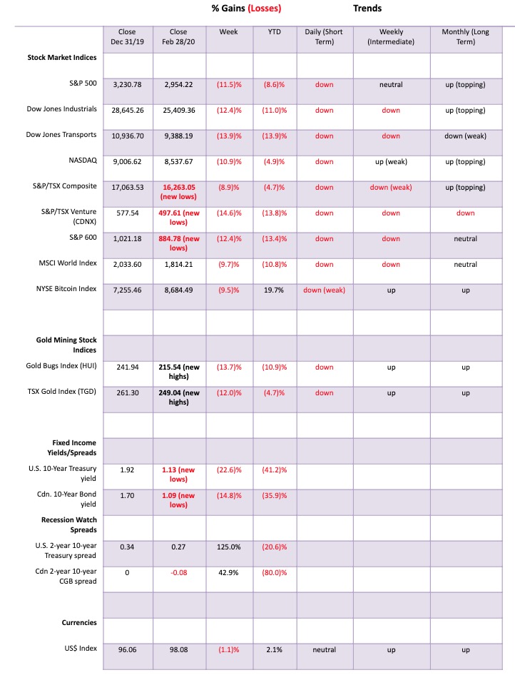
Is the COVID-19 our “black swan” event? The markets aren’t waiting to find out what the coronavirus will do. They just hit the sell button. The DJI lost 12.4% on the week, the S&P 500 fell 11.5%, the Dow Jones Transportations (DJT) dropped 13.9%, the NASDAQ 10.9%, and the S&P 600 (small cap) off 12.4%. The TSX Composite fell a relatively mild 8.9%, but the TSX Venture Exchange (CDNX) fell to a fresh 52-week low, losing 14.6%. Everything was on sale. Gold, the supposed safe haven, hit new 52-week highs, reversed, and fell 5.0% on the week. Silver lost 11.2% and the gold stocks were hit as well with the Gold Bugs Index (HUI) down 13.7% and the TSX Gold Index (TGD) dropping 12.0%. For both gold indices, that was after hitting new 52-week highs, an outside week key reversal. The energy was hammered with WTI oil down 16.9% and natural gas (NG) dropping 9.3%. The energy stocks were hammered down with the ARCA Oil & Gas Index (XOI) off 15.0% and the TSX Energy Index (TEN) down 12.6%. All hit fresh 52-week lows.
Overseas, the effects were felt as well with the MSCI World Index was down 9.7%, the London FTSE dropped 11.2%, the Paris CAC 40 down 12.4%, the German DAX off 13.0%, the Shanghai Index (SSEC) down 5.2%, and the Tokyo Nikkei Dow (TKN) dropping 10.0%. Bitcoin joined the down parade off 9.5%.
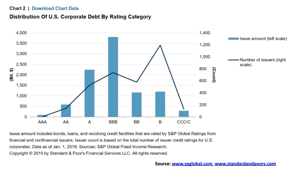
The big question is, what will be the knock-off effect on the banking system and the mountain of debt? We are already seeing the knock-off effect on airlines, restaurants, tour groups, etc. as cancellations soar, restaurants empty, planes empty, and the layoffs soar. That is the visible part. The invisible part is the mountain of debt, particularly corporate debt.
Spreads on BBB-related bonds have started to rise. BBB-rated corporate debt in the U.S. is the lowest-rated investment grade. Corporate debt in the U.S. represents some 48% of global corporate debt. BBB-rated debt represents almost 41% of all corporate debt. Only 72% of U.S. corporate debt that includes financial institutions is investment grade. If the economy deteriorates, much of the BBB-rated debt could be downgraded to speculative. Pension funds and others that can only hold investment-grade debt would be forced to sell. That is, assuming there is a bid. In a bad market, the market just goes “no bid.”
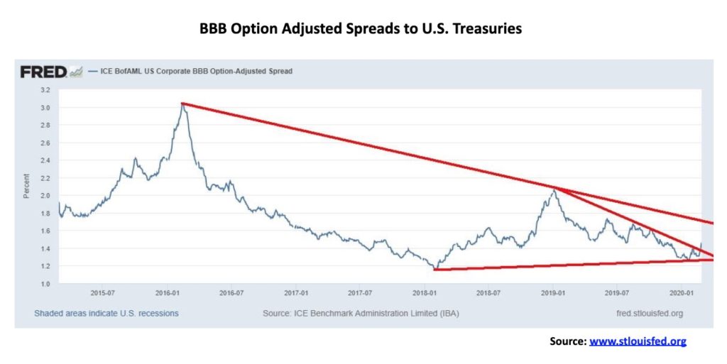
The second chart below shows the slow rise of BBB-related spreads. It has gone from a low of 1.27% over U.S. treasuries in January 2020 to 1.46%. Doesn’t seem like much until one notes that it has broken a trendline that has been in place over the past year. It should be noted that the sudden widening in spreads in 2016 did not cause a major problem. During the 2008 financial crisis, the spread widened to 8.00%. While the widening is concerning, it does not necessarily mean that we could suddenly be facing a raft of bankruptcies. Other conditions might be needed. If the bond market goes, the collapse in the stock market will be the least of our worries.
It is probably no surprise that we are now seeing calls for the Fed to cut interest rates. Fed officials are actually leaving the door open for rate cuts if the coronavirus risks rise further and the virus turns into an official pandemic. All the Fed can do is react to economic and monetary conditions. The coronavirus is an exogenous event that the Fed can’t solve. Markets were already expecting the Fed to cut rates at least twice this year. Now the odds have shifted to three Fed cuts this year. The first was most likely to be in June but could, instead, come by the March 17–18, 2020 FOMC meeting.
As we know, the Fed is already concerned about the banking system and a systemic risk due to a possible high-profile collapse. This is, we believe, was the real reason behind the repo program. A continuing crisis such as we are witnessing could exacerbate the problem, making a potential collapse more likely. Do we once again hear the phrase “quantitative easing”? That is all the Fed can do. But, as we all know, it is just about moving things around; it doesn’t actually accomplish much. But if it can make the stock market stop going down that is what they will do.
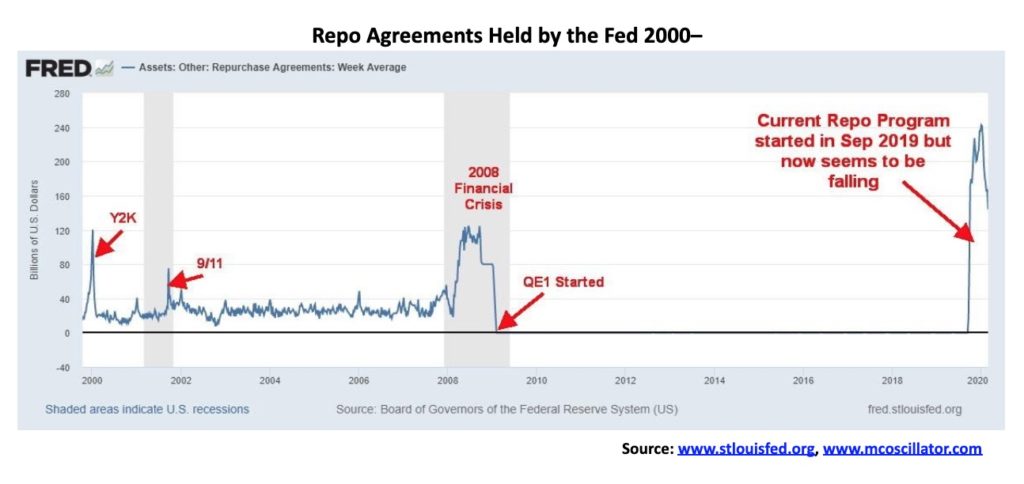
So, it was rather odd that we picked up some numbers this past week suggesting that the Fed had been slowly withdrawing from the repo program since early January. That translates into reduced liquidity in the banking system. Was the Fed deliberately reducing its repo program to cool the stock market? After all, that is where the funds were going.
Our chart below shows the repurchase agreements outstanding held by the Fed. Note the buildup before the financial crisis of 2008—except the Fed pulled back into the Lehman crisis. The program was replaced by QE1 by December 2008. Now we have had another huge buildup, even larger than we saw in 2008 or for that matter around the time of the Y2K crisis in 2000 and the 9/11 crisis in 2001. Now the Fed is pulling back again. Will this lead to an official QE4 program? China is already conducting its own repo program with loans to companies in trouble. We learned that in Hong Kong they were handing out money to everyone the equivalent of $1,200/each. Helicopter money anyone?
The collapse this past week is most likely a shock to many. There are few places to hide in this kind of market unless you were in cash in advance. A question we now have is, when will the recession start if it hasn’t started already? We haven’t had a recession since 2007–2009. That recession officially lasted one year and six months, making it the longest recession since the Great Depression of 1929–1933. It was also the steepest recession since the recession of 1945.
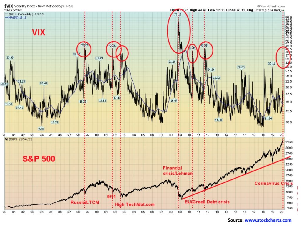
There has been a huge spike in volatility. The VIX volatility indicator soared to over 40 this past week. Since VIX was started in 1990 it has only been over 40 on six other occasions. They were: 1998—the Russian/LTCM collapse; 2001—9/11; 2002—high-tech/dot.com crash; 2008—financial crisis/Lehman collapse; and 2010/2011—EU/Greek debt crisis. All proved to be lows in the stock markets. This does not necessarily mean the current low is in. Lows are typically formed by a crash, a rebound, then a retest of the lows or even new lows before the market finds its legs once again.
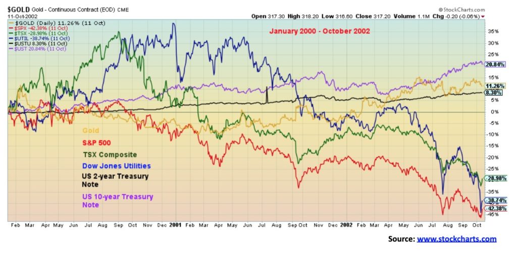
So, where does one hide if not in cash? We have a few charts below showing the performance of gold vs. stocks vs. bonds. Our first chart below shows the period from the stock market top in January 2002 to the bottom in October 2002. We compare gold, S&P 500, TSX Composite, Dow Jones Utilities, U.S. 2-year treasury note, and the U.S. 10-year Treasury note. The best performer during this period the U.S. 10-year treasury note with a return of 20.8%, followed by gold with a return of 11.3%. The U.S. 2-year treasury note also gave us a positive return gaining 8.3%. The rest were negative, with the Dow Jones Utilities losing 38.7%, the TSX Composite off 28.9%, and the S&P 500 down 42.4%. The message was— hold government bonds and gold. Government bond returns were before adding in the value of the coupon.
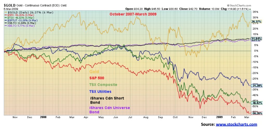
Our second chart covers the period from the stock market top in October 2007 to the bottom in March 2009. Gold was the leader, up 26.4% during this period. We substituted some Canadian bond ETFs for U.S. bonds using the iShares Canadian Short Bond Index ETF (XSB) for our short bond fund and the iShares Canadian Universe Bond Index ETF (XBB) for our longer-dated bond fund. The XSB returned 11.0% while the XBB was up 9.8%. Again, these were before any dividends in this case. The TSX Utilities Index was down 31.2% while the TSX Composite lost 46.8% and the S&P 500 dropped 56.3%. While not on the chart, one can note that the Gold Bugs Index (HUI) returned 64.1% during the 2000–2002 period and the TSX Gold Index (TGD) was off a small 0.2% during the period 2007–2009. The bulk of the gains for the two gold indices came in the latter part of the period as initially, they fell along with the stock markets.
The message appears to be that during periods of market volatility and falling markets one should hold gold and government bonds (note: not corporate bonds). We leave with one last chart. We look at the same group’s performance from January 2018 which is when stock markets topped and the Trump trade wars got underway.
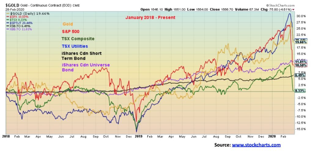
So far, the leader is the TSX Utilities Index, up 20.4%. Gold is not far behind, up 19.7%. This week has hurt the stock indices as the S&P 500 remains up 10.5% but the TSX Composite is up only 0.3%. Bonds continue to fare well with the XSB up 6.5% and the XBB up 11.8%. But this past week hurt everybody. Even the billionaires lost money as we learned that the 500 richest people dropped $444 billion this past week. Somehow, we don`t feel too sorry for them. The week vaporized some $6 trillion from global stocks. Certainly, a week to remember for all the wrong reasons.
Following our chart of the week, we decided to have a look at the big picture rather than our daily charts we usually show. We take a look at the S&P 500, bonds (represented by the U.S. 30-year treasury bond), the US$ Index, gold, silver, and, WTI Oil. Sometimes it is good to examine the big picture to get a better perspective on where we are and where we could be going. We conclude with our usual COT report for gold and silver.
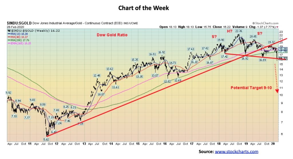
Is the Dow Gold ratio poised to break down in favor of gold? It appears to be the case. Once the Dow Gold ratio gets going, the trend tends to remain in place for months, even years. Huge run-ups in favor of stocks occurred in the 1920s. The ratio topped in September 1929 near 17. Then for the next few years, gold was favored over stocks as the ratio fell to a low of 2 in February 1933. The stocks cycle took over again but it took years for it to finally top in February 1966 at 29. Once gold was set free to trade in August 1971 the shift went back to gold as the ratio bottomed in January 1980 at 1. It took some time for it get going but then it rallied strongly once again in favor of stocks, topping finally in August 1999 at 44. The 2000s saw gold take over once again with a bottom coming in July 2011 at 7.5. Stocks have been favored the past number of years, but the ratio topped just over 20 in July 2018. It has been a slow decline since, but now the Dow Gold ratio appears poised to break down once again favoring gold overstocks.
The chart shows a possible head and shoulders top pattern forming over the past two years. The ratio has now been trying to break down under an abnormal downward sloping neckline and has also broken down under the 4-year MA. Potential targets are down to the 9 or 10 area. What could change this potentially bullish scenario for gold? A return back over the right shoulder would end any thoughts of gold rallying. That level is currently at 19.32. A re-test of the neckline can’t be ruled out once we breakdown. The neckline is currently near 16. The faster moving averages closing down below the slow-moving 4-year MA would also help. The 4-year MA is currently at 17.75. The Dow Gold ratio has tested the 4-year MA a few times over the past few years, but this is the first time since early 2013 it is firmly under that level. Now we need it to hold and gold continue to outshine the Dow Jones Industrials (DJI).
Note that this says nothing about the direction of gold and stocks. All the Dow Gold ratio is indicating is that in this case gold is outperforming the Dow, whether it be up or down for gold and the Dow.
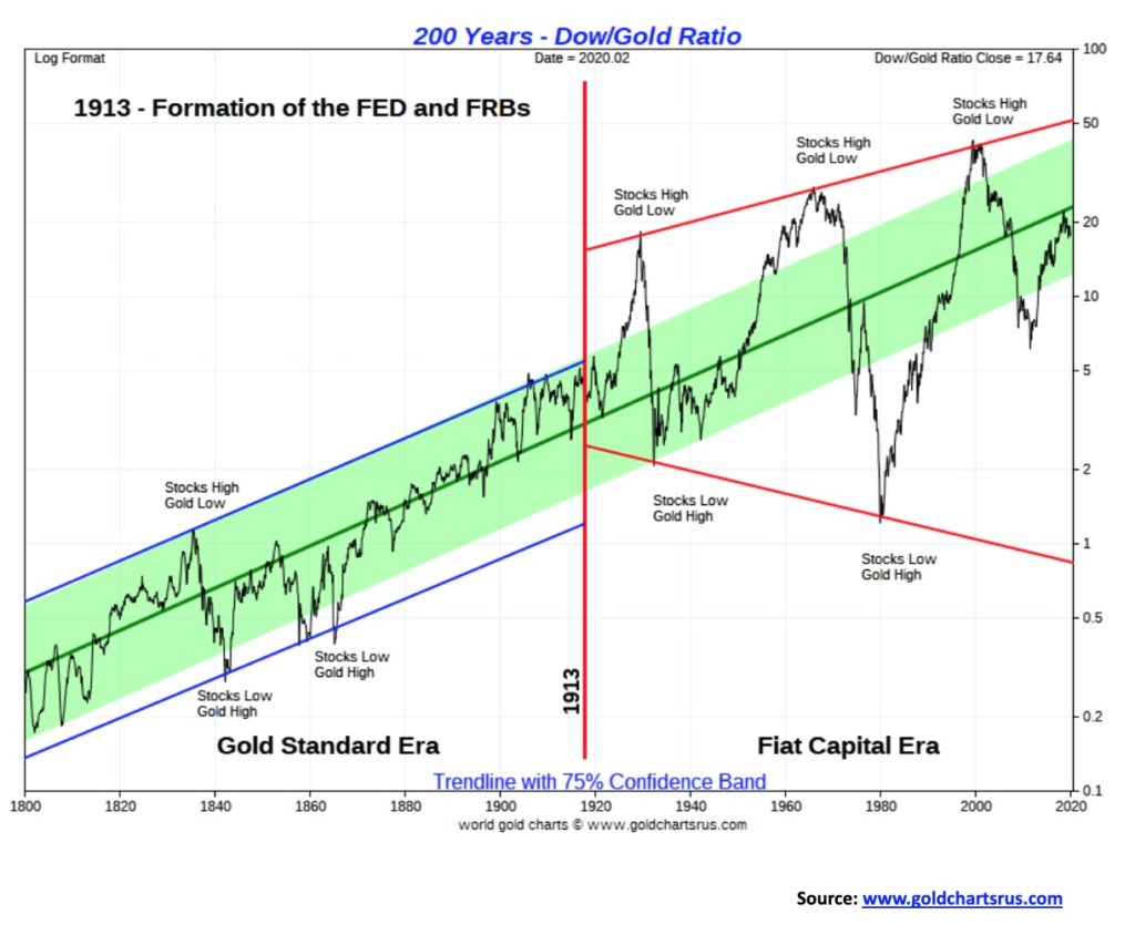
Our long-term chart of the Dow Gold ratio is also quite interesting. It is shown with a 75% confidence band. After breaking down in favor of gold it is not unusual to test the center line before either falling again or breaking through. After falling from 1999 to 2011 in favor of gold the Dow Gold ratio began to rise again in favor of the Dow. It rallied until it reached that center line and now appears to be turning down once again. It did that in 1974–1976 as well before returning to the downside, bottoming in 1980. Even before that the centerline acted as resistance, notably through the 1930s and 1940s, before breaking out in the 1950s and for years from roughly 1840 to 1900 once again before finally breaking out to the upside. It would be unusual, based on history, for the Dow Gold ratio to break through the center line on the first attempt. When the tide shifts, however, from the Dow being to favored to gold being favored the line has a tendency to just break right through to the downside.
Our long-term chart of the S&P 500 dating from 2000 is interesting in a number of ways. The breakdown in February 2020 broke through the uptrend line from the December 2018 low. That suggests to us that an intermediate top may be in. How deep this correction goes is another question. So far, we have fallen 12.6% from the top seen in December 2019/January 2020. The total decline so far has been 15.8%, putting this drop on par with drops seen in 2011, 2015/2016 but somewhat better than the decline in 2018. We have sliced through the 200-day MA, the 40-week MA, and the 21-month MA. Major support would be seen at the 4-year MA, currently at 2,773. The low this week was seen at 2,856. Based on this we have entered bear market territory but would need more work to the downside to qualify this as a bear market. Call it a mini-bear, not unlike the collapse in 2018.
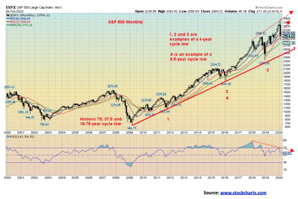
Lying further below is the uptrend line from the March 2009 low. This currently lies at around 2,500. A breakdown under that level could set up the market for a steep decline along the lines of 2000–2002 and 2007–2009. Both those declines resulted in falls of 50% or more for the S&P 500. A test this time around either or both the 4-year MA and the uptrend line from 2009 cannot be ruled out. A recovery back above 3,200 would suggest that the mini-bear is over and potentially new all-time highs lie ahead.
In terms of cycles, we are approaching a critical junction. The financial crisis collapse of 2008 was a historic 75, 37.5-, and 18.75-year cycle low. These long-term cycles are defined from studies from analyst Ray Merriman (www.mmacycles.com). The 75-year cycle dates from the Great Depression low in 1932 (77 years), the inflationary 1970s low of 1974 (35 years), and the 1987 stock market crash low (22 years). The 18.75-year cycle typically has a range of 15–21 years, so arguably one could also note the October 2002 low (15 years). What all this tells us is that we are now in the midst of a new 75, 37.5-, and 18.75-year cycle.
Merriman does identify shorter cycles, but we’ll note only two: the 4-year cycle (range 3–5 years) and the 6.5-year cycle (range 5–8 years). The 4-year cycle saw lows in 2011, 2015/2016, and 2018. The 6.5-year cycle had its low in 2016 with the 4-year cycle overlapping. The next 4-year cycle low is due in 2022 (2021–2023) and the 6.5-year cycle low is due 2022 (2021–2024). The 18.75-year cycle also overlaps as it is next due in 2021 dating from the 2002 low (range 2017–2023) or 2027 dating from the 2009 low (range 2023–2029). With so many overlaps, the next major cycle low should be an important one and, if correct, it should be a steeper decline than we saw in 2011, 2015/2016, and 2018. It could ultimately be as steep as the decline seen in 2000–2002 and 2007–2009.
Merriman identified a secondary collapse as not being unusual following the 75-year cycle low. That secondary collapse could come anywhere from 14 to 22 years after the 75-year cycle low. We call it the 90-year cycle low. Once again, we are now moving into that period. Our suspicions are that given the ferocity of the collapse seen this month, the current 4-year, 6.5 years, and the 18.75-year cycle has most likely topped, although we can’t rule out a rebound that takes us to slightly higher highs sometime later this year, an election year. In 2000, an election year, following the initial collapse into April 2000 the market found its legs and rebounded into September/October with some markets making new highs. We are also sure the Fed will do what it has to prevent a market collapse. Call it the Powell put. Or is it the Trump put as we are sure he’ll be tweeting all sorts of unwanted suggestions directed at Powell.
The last 90-year cycle low was 1932 (The Great Depression) and before that, there were important stock market lows seen in 1843 (The Hungary Forties Depression), 1761 (Stagflation, Seven Years’ War Depression), and 1672 (the “Disaster Years”). It is noteworthy that following the Great Depression low of 1932, there was a secondary depression in 1937–1938 plus important stock market lows seen in 1942 and 1946 before the stock markets finally began to climb.
Something to keep in mind going forward and especially to keep in mind if the market finds a low and starts a new upward leg. It is liable to be the final one before a larger collapse gets underway.
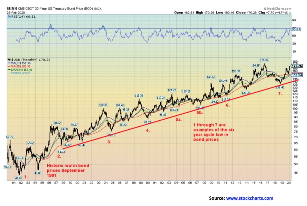
We are using the USB to define bonds as it uses price rather than yield. Yields move inversely to prices. This past week the yield on the U.S. 10-year treasury note fell to a record low of 1.09% while the 30-year treasury bond collapsed to 1.65%. The last time treasury yields were this low was in 1941 at the tail-end of the Great Depression and the start of the war years. We don’t have data on long-term bond yields. Merriman identifies a possible 18-year cycle of lows in bond prices. Beginning with the major low in 1981 we can identify our last major low in 2000 and another possible major low seen recently in 2018. If that is the case, then we are in the first phase up of a new 18-year cycle. The 18-year cycle usually breaks down into 3 cycles of six years. Again, from 1981 we saw lows in 1987, 1994, 2000, 2007, 2013, and more recently 2018. The range can be 5–8 years but usually comes in pretty close to 6 years. That makes the next low due sometime in 2024. So, in all likelihood, the current cycle has not yet topped (low in yield).
The 6-year cycle typically breaks down into two cycles of 3 years or three cycles of 2 years. If 2 years, then we should be topping now, but if it’s more likely it is 3 years then we still have time before we see the final top (low in yield) for this cycle. The question is, how high can we go (or, to put the other way, how low can we go in yield)? Regardless of whether the Fed cuts one, two, or three more times this year, it shouldn’t have a major impact on bond yields that have already fallen hard. The Fed rate impacts short rates while the market determines long rates. Already we are at significant lows in yields and it is questionable as to how much further rates can fall at the longer end of the yield curve.
That doesn’t imply that they can’t, just that we are already “pushing on a string.” With inflation rates currently over 2%, it could be difficult to hold these rates down for long given the negative return to bondholders. Normally negative real returns are good for gold, regardless of this past week’s downdraft in gold prices. Ultra-low rates encourage substantial borrowing. Trouble is with so much debt already outstanding one has to wonder how even more could possibly be borrowed by corporations and households in particular. It only takes a few large debt defaults to potentially trigger contagion.
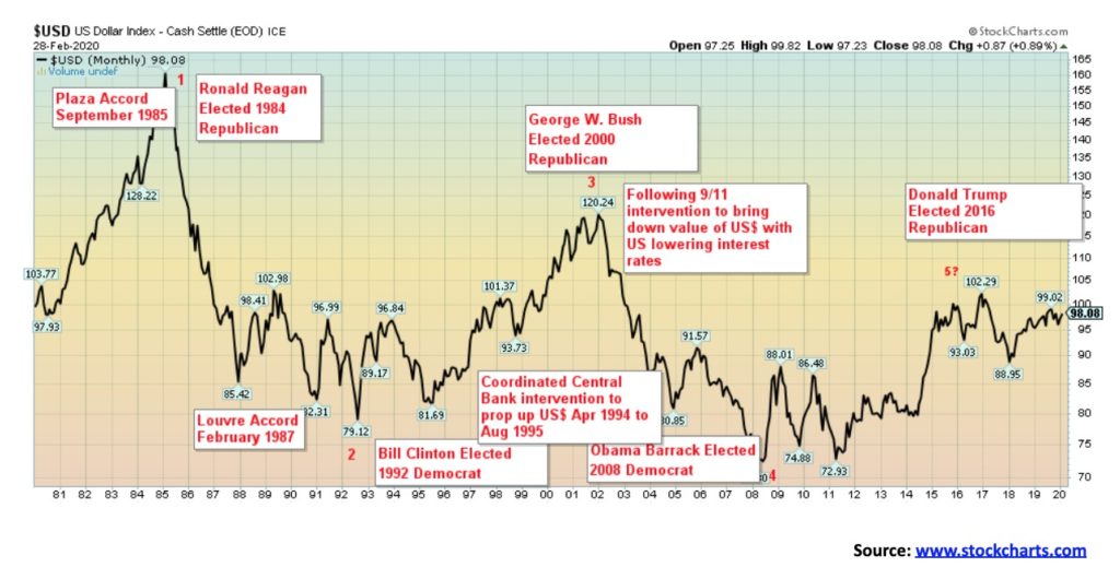
If there is one thing we have noticed, it is that when Republican presidents are elected it is not good for the U.S. dollar and when Democrat presidents are elected it is good for the U.S. dollar. Our data does not go back that far so it is difficult to say how the U.S. dollar fared before that. However, the election of Republican President Richard Nixon in 1968 eventually saw the closing of the gold window in 1971 and the setting of the world’s currencies to float against the U.S. dollar. The overvalued U.S. dollar went into a long swoon during the 1970s. That lasted until about 1979 when Fed Chair Paul Volker began his historic tightening which turned the U.S. dollar to the upside. The U.S. dollar got so strong it was hurting others and in September 1985 there was the Plaza Accord to bring down the value of the U.S. dollar. The U.S. dollar bottomed in 1992, coinciding with the election of Democrat Bill Clinton and an attempt to end the stress that was being caused in Japan by allowing the U.S. dollar once to rise. George W. Bush ended that, turning surpluses into deficits, alongside the 2000–2002 high-tech/dot.com collapse, 9/11, and the beginning of the endless wars. The dollar collapse lasted until 2008 when the 2008 financial crisis followed by QE strengthened the dollar once again, coinciding with the election of Democrat Barrack Obama. As if on cue, the dollar rally lasted until 2016 and the election of Republican Donald Trump. Yes, the U.S. dollar has been rallying back, but significantly it has yet to see new highs. It is being driven by capital flows fleeing negative interest rates in the EU and Japan and funds fleeing China as well—all seeking higher yields in the U.S. which has the strongest economy of the G7.
Merriman identifies these cycles as a 16.5 year “Presidential” Cycle. It often corresponds to U.S. elections and the party that is being voted in. If the chart is correct, then the current upswing in the U.S. dollar should once again fall, quite possibly with the re-election of Republican Donald Trump. Tops in the U.S. dollar were typically seen with the election of Republicans (1984, 2000, and 2016) and bottoms were seen typically with the election of Democrats (1992, 2008). If that is correct, then in 2024 we could see a U.S. dollar low and the election of a Democrat.
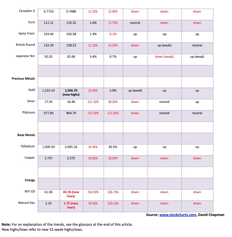
The U.S. dollar, as represented by the US$ Index, fell sharply this past week. The US$ Index was down 1.1% while the euro gained 1.6%. The Swiss franc was also up, gaining 1.3% and the Japanese yen was quite strong, up 3.4%. The pound sterling did not fare well, losing 1.1% and the Canadian dollar was also weak, off 1.2%. The US$ Index appears to be making major topping action and the next significant move should be to the downside.
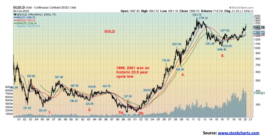
Gold, which is normally a safe haven when markets are falling reacted very poorly this past week. Gold made new 52-week highs at $1,691, then reversed and closed sharply lower at $1,567. In technical parlance, it was a key reversal week. It normally signals a top. Gold’s failure to hold above $1,600/$1,620 suggests to us that a top is most likely in and that we could go through a corrective period that could last into May/June and even July. The 200-day MA is currently down near $1,480 and that could be an ultimate target. If gold were to fall somewhat under that level, we could then test down to $1,440/$1,450. Resistance would be up to $1,620/$1,625. Note how during the great bull run from 2001 to 2011 that gold had constant pullbacks testing the 17-month MA and on occasion (2008) testing the rising 55-month exponential MA. On a positive note, we note that the rising 17- and 34-month MAs have crossed over to the upside over the 55-month exponential MA. At the moment, the uptrend remains intact despite the possibility of a corrective period.
Free-trading gold does not have a long history, only dating from the closing of the gold window back in August 1971. So, trying to determine cycles is tricky. But Merriman believes he has identified one long term cycle and some interim cycles. The long-term cycle is one of roughly 23.5 years that last bottomed with a double bottom in 1999 and 2001. The previous one was the 1976 August low, so the double bottom lows were respectively 23 and 25 years apart. If that is correct, then the next 23.5 cycle low could be due anywhere from 2022 to 2026. The 23.5-year cycle breaks down usually into three 7.83 cycles. We note the lows of 2008 (9 years from 1999, 7 years from 2001) and 2015 (7 years from 2008). The next 7.83 cycle low is due anywhere from 2022 to 2024. The 7.83 cycle usually breaks down into three cycles of 31.3 months. From the 2001 low, we note lows in 2003, 2006, and the final one in 2008. From 2008 there were lows in 2011 and 2013 and 2015. From the 2015 low, we’ve had one significant low in August 2018. So, we believe we are only in the second 31.3-month cycle with the next low due either later this year or into 2021.
The question is, when does the 7.83 cycle crest? It can crest in any one of the 31.3-month cycles. Since the second 31.3 month moved above the high of the first one it is possible that the current 7.83 cycle has crested. But we won’t know that unless we were to break down below $1,360. If that were the case, we would be on our way down for the low of the next 7.83 cycle and the 23.5-year cycle. The decline could, in a worst-case scenario, be a sharp one and take us down to test the low of 2015 near $1,045.
The fate of gold could be tied to the U.S. dollar. If it weakens but not substantially, we may never get a huge rally for gold as many seem to expect. As well, a rising Japanese yen is usually good for gold; however, this past week we had a falling U.S. dollar and a rising Japanese yen yet gold still refused to rise and fell instead. Not a positive sign. Rising trendline support is seen at $1,540. The RSI is falling, but it is not yet under 30. Right now, we need to regain above $1,600 just to suggest a move up to test further resistance in the $1,620/$1,625 area. We need to get above $1,640 to suggest a test of the highs. But more likely a top is in and gold will need some corrective work over the next few months.
Many are probably wondering why in the midst of crisis ideal for gold that it should fall. In a panic like we witnessed it seems even the good is thrown out with the bad or as an old saying goes when the police raid the bordello even the nice girls are arrested. It is also possible that in order to cover margin calls gold being quite liquid was easy to sell. But a reminder it wasn’t physical gold being sold. It was all paper gold. We have noted for months the abnormally large bearish commercial COT. That also played a role. There has been a big buildup in gold ETF’s and possibly some of that was blown off again to cover other obligations.
In 2008 gold and silver and especially the gold stocks were sold off along with the broader stock market. However, gold bottomed first and by the time the stock market made its final low in March 2009 gold had already surpassed its former high driven as it was by global liquidity injections through QE. During the 1929 stock market crash gold stocks were sold along with the stock market. But by the time the stock market made its final low in July 1932 down 89%, Homestake Mining representing gold stocks was up by some 400%. During the 1987 crash gold and silver held up but the gold stocks were hammered down more than the DJI. The 2000-2002 high tech/dot.com crash was a period when gold had already been beaten down for years. While the high-tech stocks were dumped gold and gold stocks were slowly rising. Initially, it may look bad for gold. But if we are right and the Fed comes in with interest rate cuts and starts a new round of QE gold should shine.
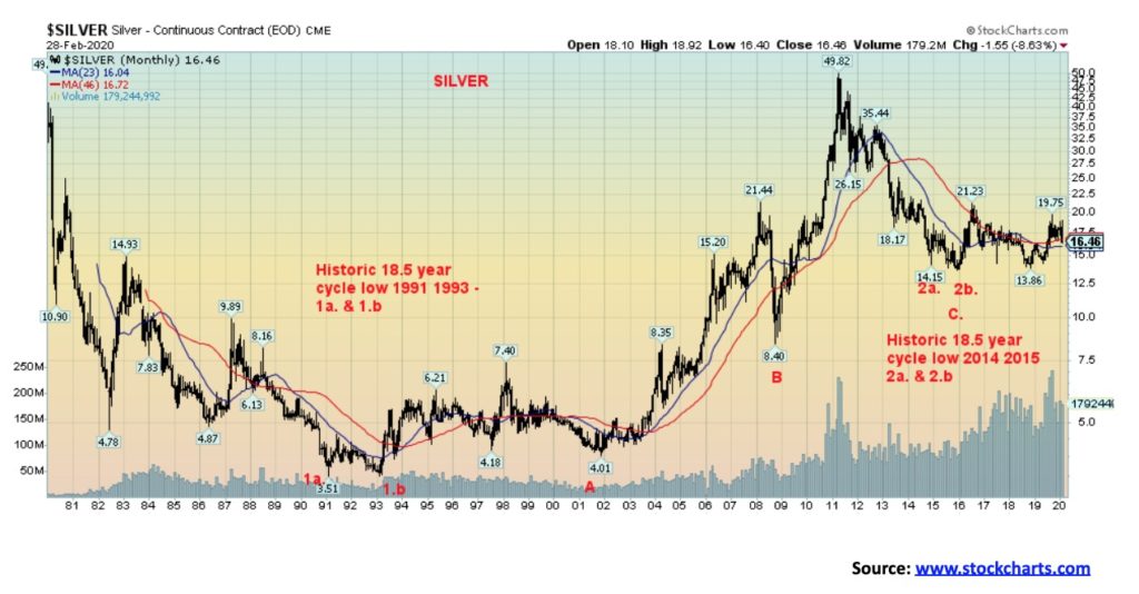
While silver generally follows gold, it is when it diverges that is usually troublesome. This time around we saw gold make new 52-week highs at $1,691 but silver only reached to $18.92, falling well short of its most recent 52-week high seen in September 2019 at $19.75. Further gold took out its 2016 high of $1,377 quite easily but silver remains well short of its 2016 high of $21.23. That divergence signaled a possible top and this week’s action confirmed it. As well, silver usually leads both up and down but this time around silver had been constantly lagging gold even as the market moved higher. A sign of weakness.
Merriman identifies silver’s cycles as slightly different than gold even though the two generally follow each other. Silver’s long-term cycle is one of 18.5 years. It was last seen with double bottom lows in 2014 and 2015. Before that, we saw a double bottom low in 1991 and early 1993. In between, silver’s 18.5-year cycle generally breaks down as three 6.2-year cycles. From the low of 1993, we saw a significant low in 2001, 2008, and 2015. The next 18.5-year cycle low is not due until 2033. However, there is a catch. If one uses the 1991 low as the start of the 18.5-year cycle then the 2008 low (17 years) fits better than the 2015 low as our 18.5-year cycle low. If that were the case then the next 18.5-year cycle low could be due a lot sooner, in 2026 or a range from 2023 to 2030. Silver has acted bearish from the 2015 low so it is possible that we should be counting from the 2008 low rather than the 2015 low; otherwise, we believe silver should be a lot more bullish. It hasn’t been.
In a bearish scenario, silver could go down and test the 2008 low near $8.40. Sounds crazy, but that is how it possibly looks. For us to confirm a more bullish cycle we needed to break out over the high of 2016 at $21.23. We didn’t get that nor could we take out the September 2019 high of $19.75. Gold took out all of its previous highs even as silver failed. So that’s potentially bearish. Silver fell hard this past week, losing 11.2%. That compares to gold only losing 5%. We closed below the 200-day MA currently at $16.96. In closing at $16.46, we took out the lows seen in November 2019. Support further below is at $15.60 and down to $14.90. Silver stocks got hit hard this week as well. Silver is nearing oversold levels so we could get a rebound, but resistance would come at $17 to $17.25. We need to regain $17.85 and especially $18 to even begin to suggest higher prices.
Silver is suffering mainly because of its association as an industrial metal. All industrial metals are suffering against the background of the coronavirus crisis. At 95 the gold/silver ratio is as high as we have ever seen it. The ratio bears little resemblance to the actual physical relationship between gold and silver. The last time the gold/silver ratio was at 95 was in 1991. That proved to be at the time a multi-year low for silver prices. At the market top in August/September 2011 the gold/silver ratio was at 32.
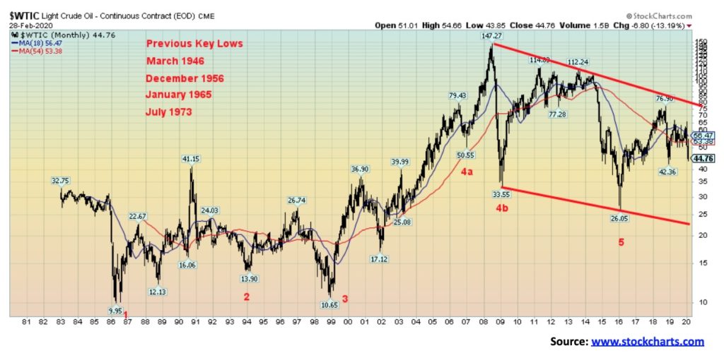
Given the coronavirus scare with tourism collapsing, events being shut down, and airlines empty it is no surprise that oil prices fell, and they fell sharply. WTI oil lost 16.9% this past week and there seems to be little near term hope that a rise might be seen soon. In looking at that chart a collapse to the bottom of the channel near $23 seems to be in the offing and not beyond the realm of being impossible. So what might save oil from such a collapse?
Merriman suggests that oil, like many others, has an 18-year cycle with the usual range from 15–21 years. Ideally, from a major low in 1946, we should have seen lows around 1964, 1982, 2000, and 2018. We had a significant low in 1965, but our next major low came in 1986 followed by a real early one in late 1998. Our last significant low came in 2016. So the next 18-year low is not due until 2031 to 2037. We should be in the up phase but here we are falling. As usual, the 18-year cycle can break down into two 9-year cycles and the 9-year down into three 3-year cycles. The next 9-year cycle would be due into 2025 while the three-year cycle low may have come in early with the low seen in 2018 at $46.36. We have now taken out that point so we could still be falling into the next 3-year cycle low due in 2021; however, it could come in sometime this year. With WTI oil taking out the last 3-year cycle low at $46.36 it suggests that this current cycle is quite bearish. What that means is we would not want to see WTI oil fall below the 2016 low of $26.65 but that is now a distinct possibility. We need to regain above $56 if we have any hope of rising. Even just regaining above $50 would be positive at this time. But the chart seems to be telling us otherwise.
Energy stocks are now in a free fall and it looks to be an area to be avoided. This past week the ARCA Oil & Gas Index (XOI) fell 15.0% and the TSX Energy Index (TEN) was down 12.6%. Both are now down over 20% on the year and gripped in a bear market with no easy solution.
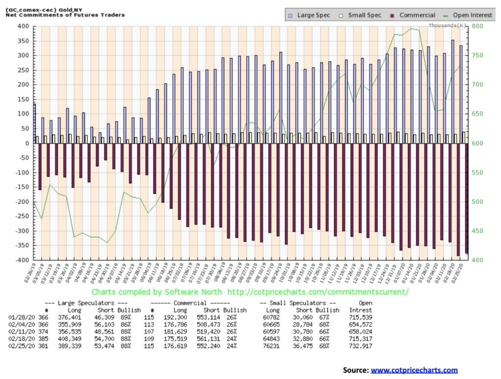
The gold commercial COT remains bearish at 24%. Short open interest did come off roughly 9,000 contracts even as long open interest rose about 1,000 contracts. But it was insufficient to give us a rise. The large speculators’ COT (hedge funds, managed futures, etc.) also remained unchanged at 88%, but they did reduce their long open interest by roughly 19,000 contracts and short open interest fell just over 1,000 contracts. All of this was before Friday’s washout, so hopefully we see further improvement next week.
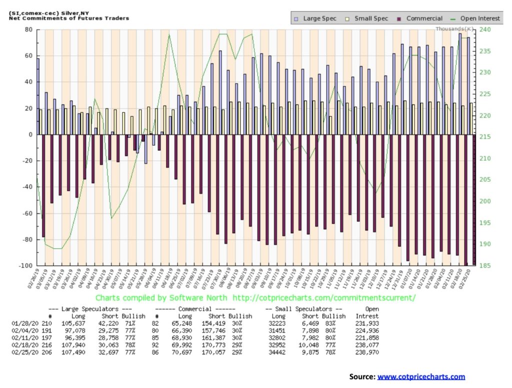
The silver commercial COT also remained unchanged at 29%. Long open interest rose under 1,000 contracts while short open interest fell about 700 contracts. The large speculators COT slipped slightly to 77% from 78%. As with the gold commercial COT, silver remains bearish.
—
(Featued image by Mark Finn on Unsplash)
DISCLAIMER: This article was written by a third party contributor and does not reflect the opinion of Born2Invest, its management, staff or its associates. Please review our disclaimer for more information.
This article may include forward-looking statements. These forward-looking statements generally are identified by the words “believe,” “project,” “estimate,” “become,” “plan,” “will,” and similar expressions. These forward-looking statements involve known and unknown risks as well as uncertainties, including those discussed in the following cautionary statements and elsewhere in this article and on this site. Although the Company may believe that its expectations are based on reasonable assumptions, the actual results that the Company may achieve may differ materially from any forward-looking statements, which reflect the opinions of the management of the Company only as of the date hereof. Additionally, please make sure to read these important disclosures.


Grifols Announces Positive Results from Fanhdi Phase IV Study
Grifols reports positive results from its Phase IV study of Fanhdi for von Willebrand disease (VWD) treatment, showing safety and...


Ecomill Authorized to Operate Under the New EU Crowdfunding Regulation
Ecomill joins authorized crowdfunding platforms under European Regulation. Dedicated to energy transition and sustainability, it enables capital raising for renewable...


Colorado Residents Can Purchase Cannabis License Plates
The cannabis license plate auction in Colorado is not only an opportunity to acquire a unique item, but above all...


Shiba Inu: $12 Million Funding Round for New Blockchain
In connection with TREAT, Shiba Inu mentions several times the goal of designing the project in accordance with legal regulations....


Soybeans and the Products Closed Lower Last Week
Reports of great export demand in Brazil provide some support. Reports indicate that China has been a very active buyer...
 |
|
 |  |
 |
|
-

 Crowdfunding2 weeks ago
Opstart Buys Majority Stake in BackToWork
-

 Business4 days ago
TopRanked.io Weekly Affiliate Digest: What’s Hot in Affiliate Marketing [LVBET Partners]
-

 Crowdfunding1 week ago
Fidovet, a Small Italian Multinational Pet Food Company Raises Money on Mamacrowd
-
 Crypto2 weeks ago
Will Bitcoin Now Break the $100,000 Mark? This Is What You Need to Know About Bitcoin Halving