Business
Is the Stock Market Expensive or Cheap?
At big-bear market bottoms, fear grips the market as brokers liquidate their margin accounts. But this liquidation phase eventually comes to an end, as margin debt stops going down, and yes, once again begins to grow. It is at such times where the market offers its best low risk, high probability of profitable purchases. Though few investors take advantage of buying at a bear market bottom, as they remain traumatized from the bear market decline.

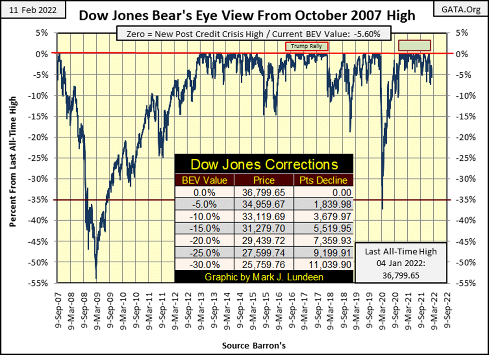
This week the Dow Jones closed within scoring position, or within 5% from the Dow’s last all-time high every day, until Friday, where it closed with a BEV of -5.60%. This isn’t necessarily bad, but it certainly isn’t good. For a year, from November 2020 to November 2021, the Dow Jones closed either at a new all-time high (BEV Zero), or within 5% of its last all-time high, in scoring position. And that has changed these past three months.
Since January 1st 2022, the Dow Jones has seen only two additional new all-time highs; on January 3rd & 4th. And as seen in the Dow Jones’ BEV chart below, the Dow Jones is closing below its BEV -5% line with increasing regularity.
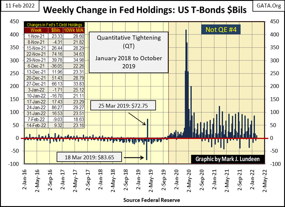
I call the current advance the Post March 2020 Flash Crash Advance, because it is. It’s a rebound off the panic lows of March 2020, a reaction to when the “policymakers injected” more than a trillion dollars into the financial system in just a few weeks’ time. And they continue “injecting” large quantities of “liquidity” into the market up to this week. Below, I’ve plotted the weekly changes in the Federal Reserves’ holdings of US Treasury debt. This is how they go about “stabilizing market valuations.”
In the past two years the Dow Jones advanced from 18,591, its lows of March 2020, to 36,799 early last month. But this didn’t just happen; it took the FOMC’s Not QE#4 seen below to make this happen. And now, the scuttlebutt at the Fed is they are going to stop these large “injections” of liquidity, and begin increasing interest rates.
Personally, I’m fine with that. However, this market has a monkey on its back. And the market’s monkey has come to expect low-interest rates and “ample flows of liquidity” from the FOMC. The idiot savants from the FOMC are expecting this monkey to go cold turkey on all the “liquidity” they’ve been “injecting” into him since Bernanke’s QE#1 in January 2009. But monkeys don’t like going cold turkey. Instead, when denied their drug of choice, they go absolutely APE.
If the idiots cut off the market’s monkey from what it needs to go from one day to the next, I’m anticipating another flash crash in the Dow Jones, as the financial markets are profoundly addicted to low-interest rates and unlimited “liquidity” flowing from the FOMC.
Here’s my Major Market Index BEV Value Table. It’s been a few weeks since we’ve seen a BEV Zero in the table below (0.00% / New All-time High). On Wednesday, eleven indexes closed in scoring position (within 5% of an all-time high). But by the close of the week on Friday, only four of these indexes managed to close in scoring position. As we move ever deeper into 2022, I detect growing weakness in the stock market. This is the type of situation where out of the blue, a big market event to the downside can catch most by surprise.
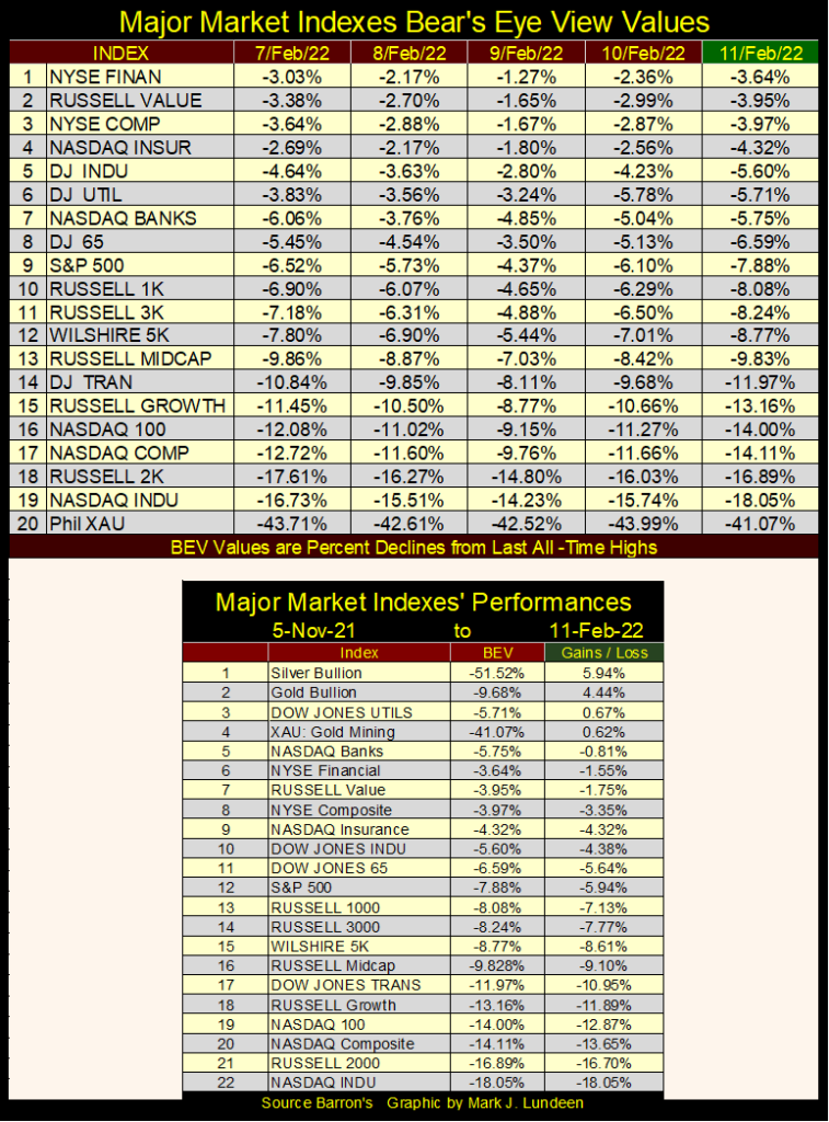
Look at the table above, which lists the gains / losses from 05 November 2021 to the close of this week. Why use November 5th? That was the week where these indexes, seen in the BEV table above, saw 63 BEV Zeros out of 100 daily closings. Quite a difference with what we see above.
The only advances in the table from November 5th are precious metal assets, plus the Dow Jones Utility Average. I expect this to be the next new trend in the markets; inflating valuations for precious metal assets, as stock and bond valuations continue to deflate. If the FOMC really does begin to raise interest rates and greatly reduces its bond buying, this new trend will become a daily reality.
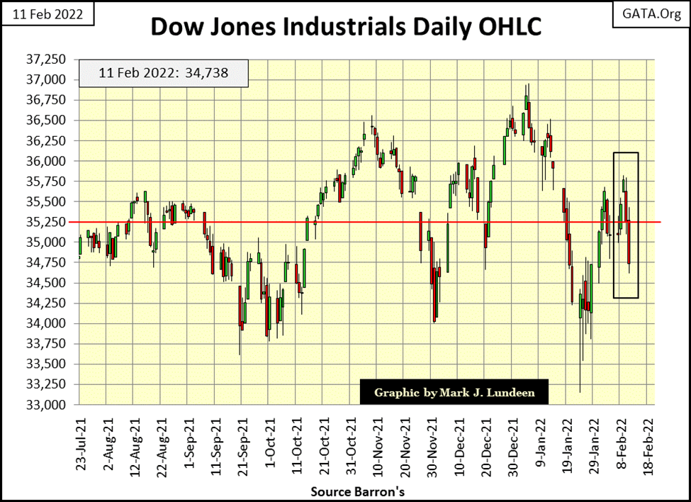
The Dow Jones in daily bars below is one ugly chart. No matter, I remain short-term bullish. The Dow Jones closed the week not all that off its last all-time high; a BEV of -5.60%, or 5.60% below its last all-time high. If next week is a good one for the market, the Dow Jones could easily close at a new all-time high.
But I don’t see that happening, as CPI inflation is becoming worse. Bond yields and mortgage rates are beginning to trend higher. President Flash/Bang (aka Joe Biden) is doing great damage to America’s global reputation. And his domestic covid mandates are causing great harm to the economy.
We always have problems. However, during bull markets, the big problems tend to work themselves out to the benefit of the bulls. But during bad economic times, these big problems can take down the market. When I look at the growing list of problems confronting the markets, economy, and general political situation here in the United States in February 2022, its increasingly difficult to remain bullish on the stock market.
So, why do I remain short-term bullish? I’m waiting for the Dow Jones to see two or three extreme days of volatility, the dreaded Dow Jones 2% days. Why they haven’t happened yet is a mystery to me. Of course, I’m still hanging on, but only because I’m OUT OF THIS MARKET. My only exposure to market risks in this market are in precious metal assets, which includes gold and silver mining shares.
A universally acknowledged rule-of-thumb in the market is one should first buy low, and then sell high. But how can investors know if something is cheap, and so a good buy, or priced dangerously high and so a good time to sell? I thought I’d go over a few technical indicators to show how I get insight when the market is cheap or fully priced.
The first technical indicator of whether the stock market is cheap or overpriced is the NYSE margin debt. Margin debt is credit supplied to brokers, which they then supply to their clients with a margin account to allow them buy a larger position than their cash positions could alone.
In the chart below I’ve plotted the Dow Jones in blue, and NYSE margin debt in red, going back to 1979. The first thing to note is the growth in the Dow Jones since 1979 is closely aligned to the growth in NYSE Margin Debt. Also, when NYSE margin debt peaks and begins to decline, the Dow Jones will soon follow. That was true in March 2000, just prior to the high-tech / dot.com bear market.
That was also true in July 2007, when margin debt peaked three months before the Dow Jones saw its October 2007 top in the sub-prime mortgage bull market. Over the next twenty months, the Dow Jones saw its second-deepest bear market bottom since 1885; a 54% decline.
Take a moment and study this chart. Growth in margin debt increases demand in the stock market for what is being sold in New York – stocks. Reductions in margin debt increases supply for what is being sold in New York – stocks.
Exactly why reductions in margin debt increases supply is easy to understand. All brokers have an agreement with their margined clients; should the stock market begin to sell off, the broker has the legal right to sell margin positions without the consent of their margined clients. Unlike their margin clients, the brokers aren’t looking for the best price the anticipated market rebound would offer. In a big market decline, the only thing on the brokers’ mind is; liquidation of down side risks to the brokerage.
This is why big-bear market bottoms are so terrifying, as brokers everywhere are liquidating stocks in their margin accounts at any price, to the horror of everyone.
Well, not everyone. If you take a moment to consider what’s plotted below, you’ll quickly understand that margin debt is actually an excellent indicator of market risk. Below, when margin debt is at all-time highs, the market is fully priced and due for a correction. Of course, most retail investors don’t see it that way. The higher the market goes; the more willing they are to pay top dollar at market tops.
At big-bear market bottoms, fear grips the market as brokers liquidate their margin accounts. But this liquidation phase eventually comes to an end, as margin debt stops going down, and yes, once again begins to grow. It is at such times where the market offers its best low risk, high probability of profitable purchases. Though few investors take advantage of buying at a bear market bottom, as they remain traumatized from the bear market decline.
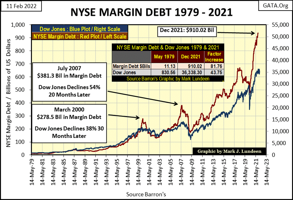
I didn’t note it in the chart above, but the March 2020 flash crash also happened in the context of a decline in margin debt. Since then, margin debt is once again at all-time highs; $910.02 billion as of December 2021 to be exact, making the current market an investment arena of extreme risk. Buying stocks in today’s market is like entering into a suicide pack with Mr Bear.
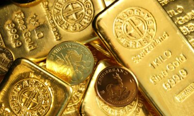
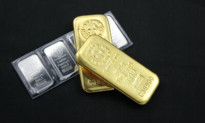
Of course, I’m not talking about precious metals assets; bullion and mining shares, assets that are unloved in this market.
Come the next major market decline, brokers have a lot of downside risk they’ll have to liquidate, and it won’t be pretty when they sell a good percentage of that $910 billion into a weak market. But this pending liquidation phase in the stock market has an expiration date, which will become apparent when margin debt stops going down. At the bottom, no one will tell investors that now is a historic opportunity to invest in the stock market, as “market experts” everywhere will also be in a state of trauma.
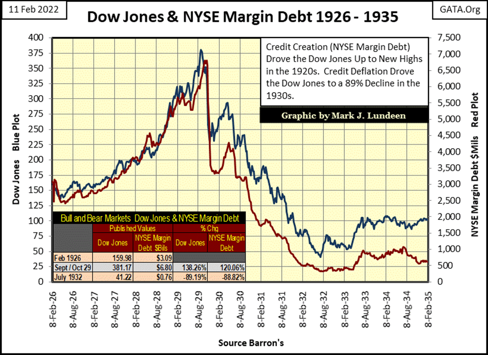
Next is a chart for the Dow Jones and NYSE margin debt from 1926 to 1935. During the 1920s, Wall Street allowed their margined clients to put down ten cents for every dollar of stock purchased on margin. Knowing that, it’s easy understanding why the increase in margin debt during the 1920s bull market fueled the advances for the Dow Jones, and why the liquidation of margin debt led to an 89% collapse in the valuation of Dow Jones in July 1932.
Another excellent technical indicator to gauge whether or not a market is at risk for a bear market decline is the Dow Jones dividend yield, or I should say it was before Alan Greenspan became Fed Chairman in August 1987.
Before Greenspan, bull markets can be identified below as the dividend yields for the Dow Jones decreased from something above 6% down to 3%. When the Dow Jones was yielding around 3%, it was time to go if an investor wanted to avoid the bear market that always followed such a low yield.
The bear markets can be seen below as the Dow Jones dividend yield increased from around 3% to something above 6%. At its July 1932 bottom, the Dow Jones was yielding over 10%. At the bottom of the Great Depression bear market, only a few stout-hearted investors were buying for pennies what others paid many dollars for in 1929.
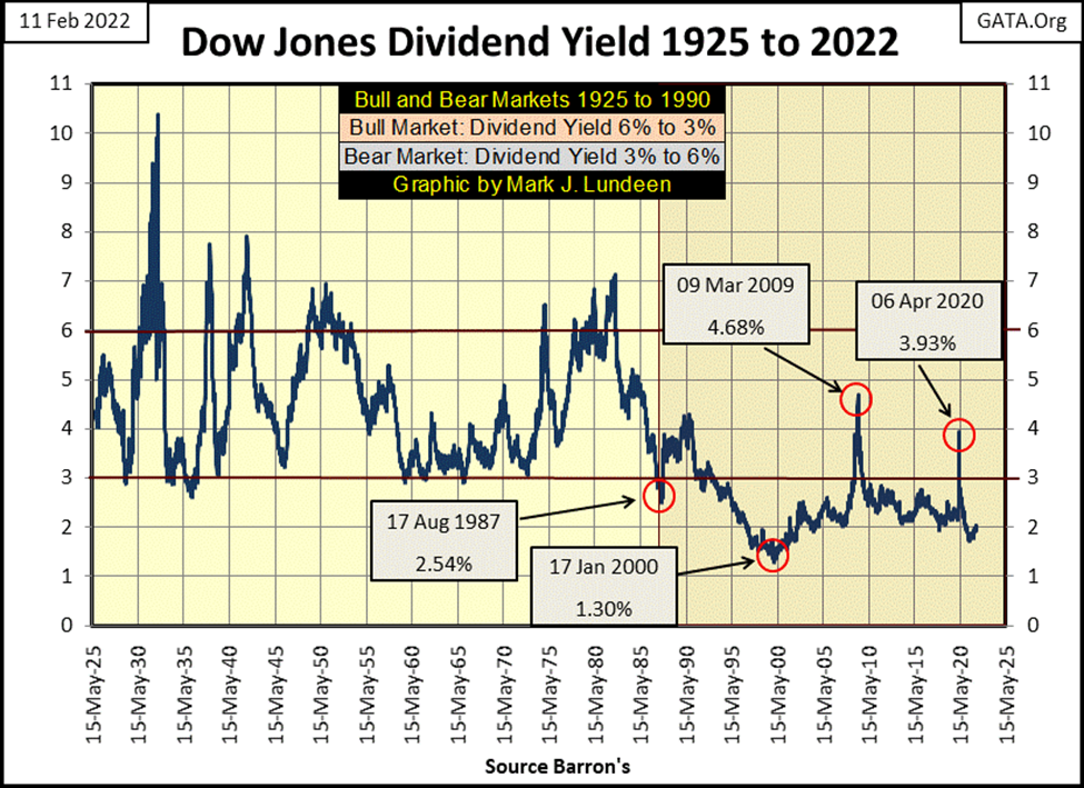
And so it went until August 1987, when Alan Greenspan decided not to allow Mr Bear to clean up the excesses of the 1980s with a bear market. With the Dow Jones yielding a historic low of 2.54%, the market was due for a big bear market decline. It just was. Instead, Greenspan manipulated the financial system with ever lower interest rates and “injections of liquidity” until on 17 January 2000, when the Dow Jones yielded a miniscule 1.30%.
During the following high-tech bear market, a 38% decline in the Dow Jones, its dividend yields never broke above 2%. At the bottom of the sub-prime mortgage bear market, the Dow Jones dividend yield peaked at 4.68%. It would have gone higher, but like Greenspan before him, Dr. Bernanke also refused to allow Mr Bear to clean up the excesses created during the sub-prime mortgage debacle. His three QEs flooded the market with cash, and he was successful in “stabilizing market valuations.”
During the March 2020 flash crash, Fed Chairman Powell with his Not QE#4 proved he was no slouch when it came to “stabilizing market valuations”. The dividend yield for the Dow Jones increased to only 3.93% at the bottom of the market decline, far from the 6% yield of the pre-Greenspan era.
In the chart above, it’s obvious since Alan Greenspan became Fed Chairman in August 1987, the stock market has been wildly overvalued in terms of Dow Jones dividend yields. Does that really matter? I believe it does, as stock market valuations for the past four decades have been unnatural, but only because they have been deftly manipulated higher. I’m very much impressed. But it’s not real, and so vulnerable to market trends such as rising CPI Inflation and bond yields and interest rates.
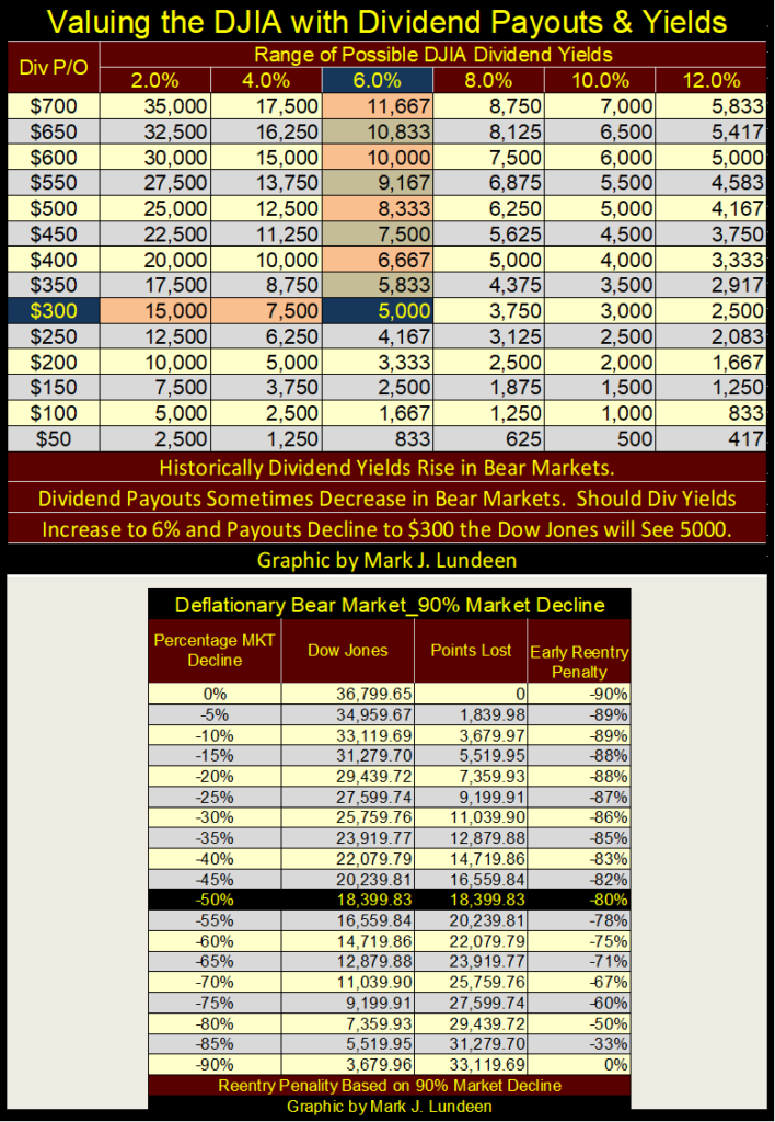
As promised, let us now see how to use Dow Jones’ dividends to establish whether or not the stock market is cheap or expensive in the table below. I’m going to cut to the chase and say that with a Dow Jones’ dividend yield of 2.0%, the market is very expensive. But I admit, since Alan Greenspan, the stock market has been expensive, but profitable.
I think the best use of the dividend table below is to see just how brutal the next bear market bottom will be when the FOMC idiot savants lose control over market valuations. How deep can the Dow Jones fall down when for the first time since the 1980s, it’s yielding 6% or more.
This week the Dow Jones closed with a dividend payout of $694.76, and a dividend yield of 2.00%. For the sake of keeping everything simple, we’ll call it a $700 payout and a yield of 2.0%, which would fix the Dow Jones at 35,000 in the table below. But should the coming bear market deflate the Dow Jones valuation until it yielded 6%, which happened all of the time before Alan Greenspan, that would be a close of 11,667; a 70% bear market decline.
And during big bear markets, dividend payouts are reduced as dividend yields increase. Should Dow Jones dividend payouts be reduced down to $300, as its yield increased to 6%, that is a Dow Jones close at 5000. That’s an 86.4% bear market decline in the Dow Jones from today’s inflated valuations. And historically, or I should say before Alan Greenspan, seeing the Dow Jones dividend yield something greater than 6%, or seeing its payout cut by 50% during a big bear market, was something to be expected.
Gold did really good this week. Especially on Friday when it closed above $1860 as seen in the Kitco.com gold chart below.
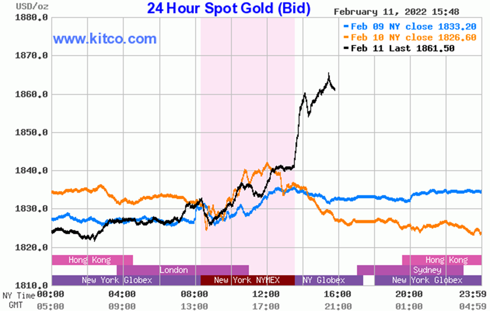
This week gold closed with a BEV of -9.68%, less than 10% away from making a new all-time high. In the past, a BEV of less than -10% proved to be a short-term top. But I have a hunch gold will soon be making a runup to a new all-time high.
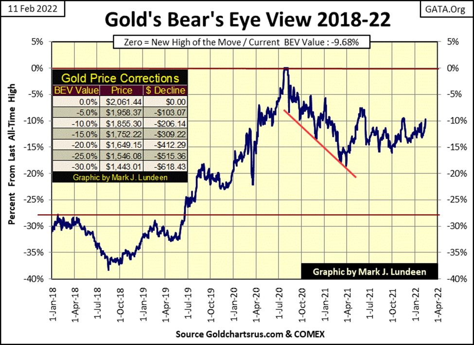
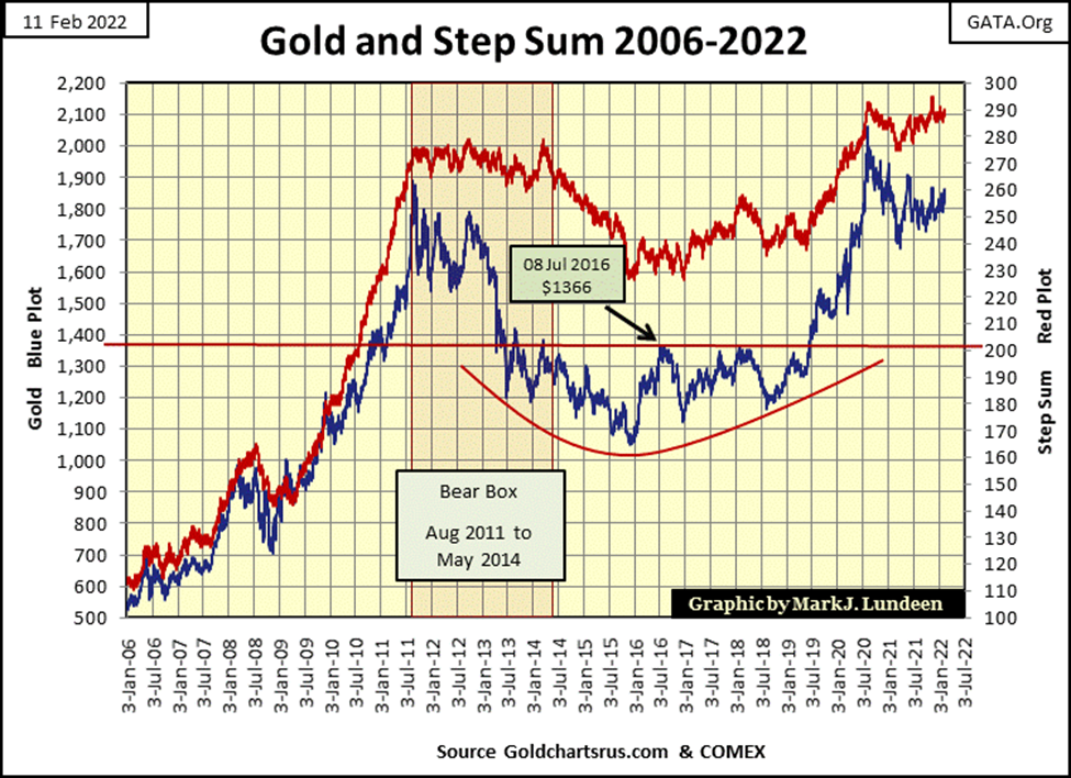
Gold and its step sum plots below are looking good. Not so much for what they’ve done, but for what they look capable of doing later this year; break out to the upside like they did from 2009 to 2011. It’s been over a decade since they’ve done something like that. I say its time for them to run up that hill once again.
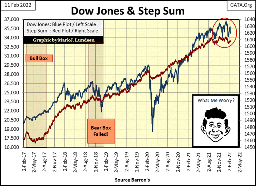
Looking at the Dow Jones’ step sum chart below, for the past six months, since last August, the Dow Jones hasn’t really done much for the bulls or the bears. But I note that in the red circle, the Dow Jones has made a head and shoulders chart formation, which is a bearish formation. Yet another reason to be bearish on the stock market as 2022 moves on from winter into spring.
I think I’ll close this week’s commentary here, but point out that gold, silver, and the mining shares are beginning to look more and more attractive, while the stock and bond markets have lots of problems coming their way that investors are going to have to deal with in 2022.
As for myself, I’m keeping myself seated high above in the market’s peanut gallery, a place where I have no market risks in the broad-stock market. But I do have a great seat to watch the coming war between the bulls and Mr Bear. It will be historic, and with it, everything will change, making the world a different, if not a better place.
__
(Featured Image by Adam Nowakowski via Unsplash)
DISCLAIMER: This article was written by a third party contributor and does not reflect the opinion of Born2Invest, its management, staff or its associates. Please review our disclaimer for more information.
This article may include forward-looking statements. These forward-looking statements generally are identified by the words “believe,” “project,” “estimate,” “become,” “plan,” “will,” and similar expressions. These forward-looking statements involve known and unknown risks as well as uncertainties, including those discussed in the following cautionary statements and elsewhere in this article and on this site. Although the Company may believe that its expectations are based on reasonable assumptions, the actual results that the Company may achieve may differ materially from any forward-looking statements, which reflect the opinions of the management of the Company only as of the date hereof. Additionally, please make sure to read these important disclosures.


TopRanked.io Weekly Affiliate Digest: What’s Hot in Affiliate Marketing [LVBET Partners]
If you wanna make some serious affiliate commissions, here's what you need to do. Step 1: Read our quick LVBET...


Skybound Entertainment Launches Crowdfunding Campaign to Create an Invincible Game
Skybound Entertainment launches a crowdfunding campaign on Republic to create a AAA game based on its Invincible comic. The campaign...


36% of Cannabis Users Report a Reduction in Alcohol Consumption
A Numerator survey found that 36% of cannabis users reported decreased alcohol intake since using cannabis products. Cannabis users, mainly...


Green Arms Raised Almost 1 Million in its Crowdfunding Round on CrowdFundMe
Green Arms, an innovative startup facilitating citizen and business participation in renewable energy projects, has nearly reached 1 million euros...


Vithas and MSD Join Forces to Train and Innovate in Oncology Matters
Vithas and MSD have formed an alliance to enhance patient care, especially in cancer treatment. The collaboration focuses on innovation,...
 |
|
 |  |
 |
|
-
 Crypto2 weeks ago
JP Morgan: Ethereum ETF Approval Could Become a Reality
-
 Impact Investing4 days ago
Environmentalists and Consumers Denounce Repsol for Greenwashing
-

 Impact Investing1 week ago
H&M and Inditex Question the Firm that Certifies Responsible Cotton Production
-

 Impact Investing2 days ago
The World’s Largest Insurers Have ESG Blind Spots, According to ShareAction