Featured
Market update for Late November 2020
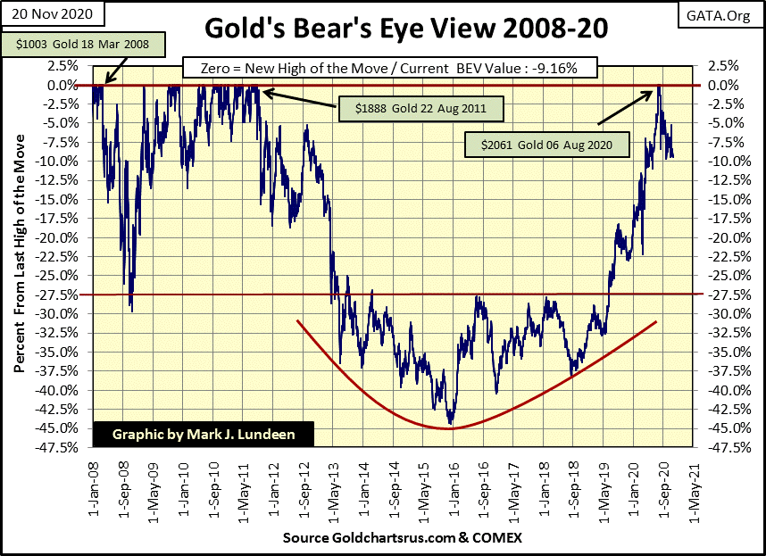
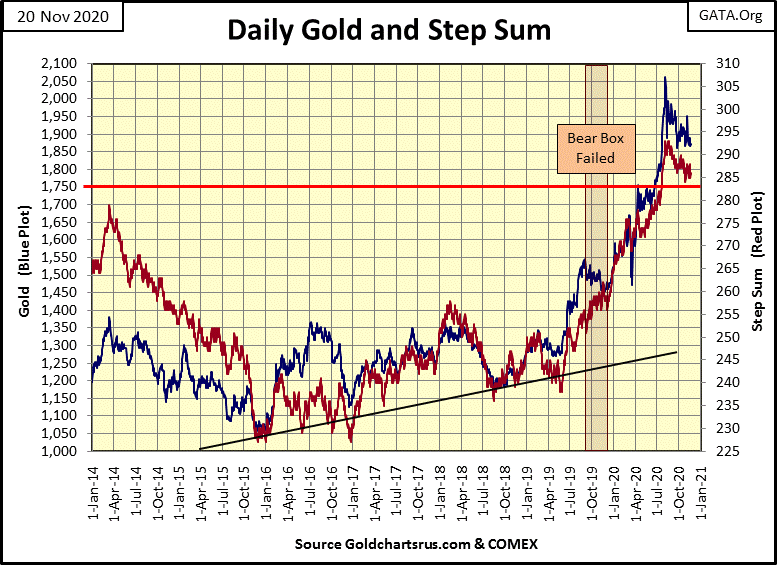
Looking at gold’s BEV values since October 19th, it has come close to breaking below its BEV -10% line, but so far the bulls have defended that line. Should it fall below this level (BEV -10%) there is no need to panic. In past times the gold bulls have stood firm, as they are doing now, only to capitulate suddenly to lower levels.
The governor is locking the state down due to the spread of CCP virus infections. As the CCP virus is the deadliest epidemic since the Black Death of the 14th century, he had no choice. So, there will be no Thanksgivings festivities for my family next week. Sadly, I’ll be taking next week off as I’ll be attending a funeral for our family’s favorite turkey. Tom was a good turkey, a loyal turkey, and our best guess is his head fell off because of global warming. We all loved Tom, and are planning to give him an Irish Wake next Thursday that will be long remembered. I’ll not be publishing an article next week.
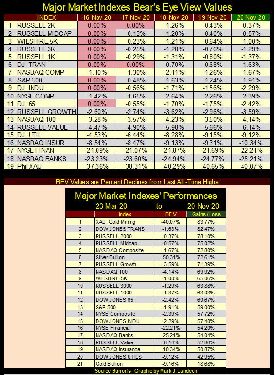
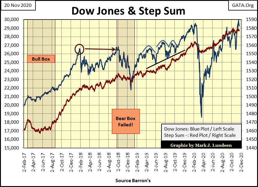
On Monday November 16th, the Dow Jones made its first BEV Zero in the Bear’s Eye View Chart below since last February, but fell short of taking out 30K by about fifty points. With four days left in the trading week, one could be forgiven to assume on Monday night we’d close this week above 30,000. But that wasn’t to be as the Dow Jones closed the week 687 points below Monday’s all-time high.
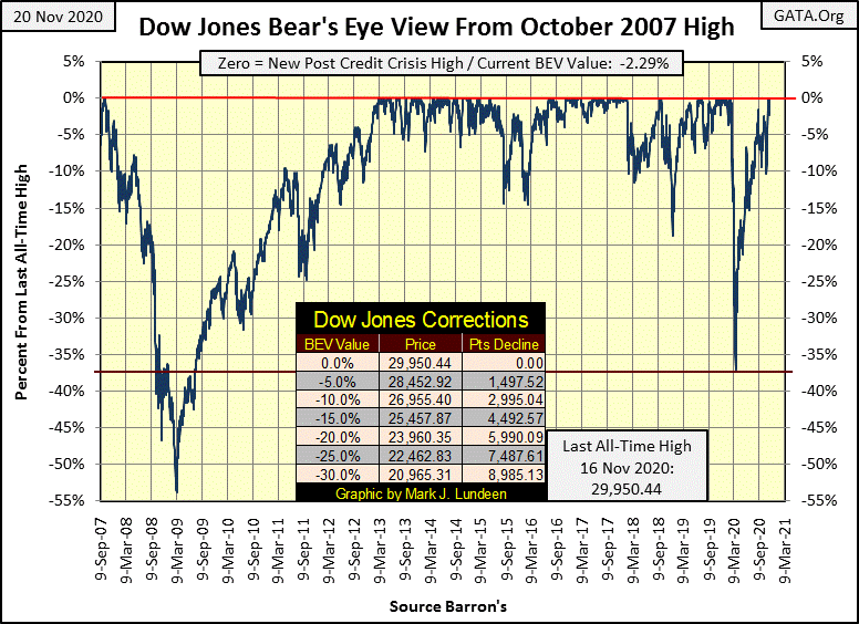
Are we to see Dow Jones 30,000 plus? I’d bet on it. As grotesque as the post August 1971 bubble is below, a visible consequence of the dismantling of the Bretton Woods $35 gold peg (Red Star), not seeing the Dow Jones inflate to levels far above 30K would somehow make the absurdity on display below incomplete.
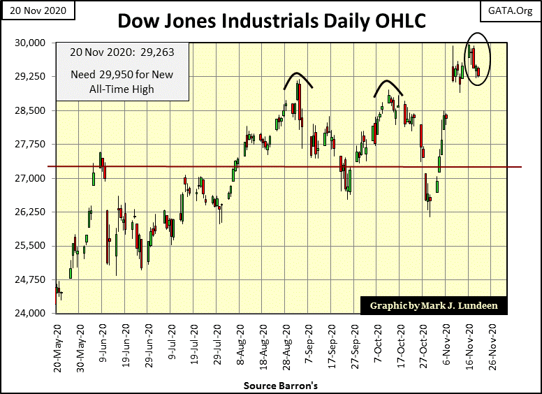
Looking at this week’s action in daily bars below, the Dow Jones on Monday made its move into market history, and then lost momentum as the week wore on. Maybe next week we’ll see the Dow Jones close above 30K.
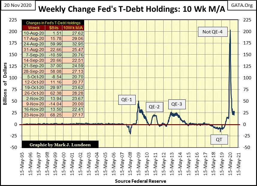
The bulls shouldn’t become discouraged just yet, because as we see below the FOMC is still “injecting” lots of “liquidity” into the financial system. Last week they “injected” $68.25 billion into the banking system. Though that may be far below what they were “injecting” last February & March, its far above the FOMC “injections” prior to October 2019, when Fed Chairman Powell began his Not QE#4, which is clearly seen below.
“Quantitative Tightening” (QT); when was the last time that was mentioned in the mainstream financial media? Looking at the chart below I’d say a little more than a year ago.
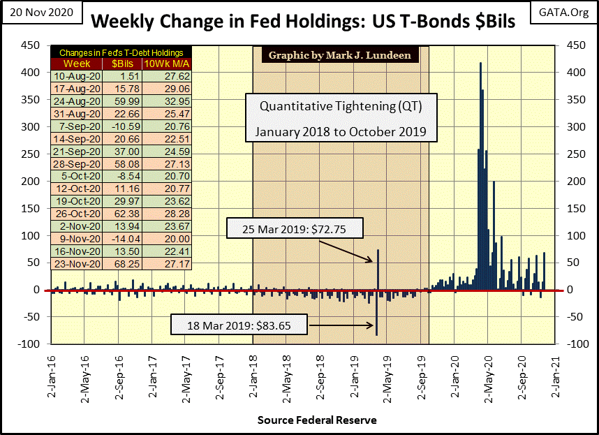
Below is another view of the data plotted above, its 10Wk M/A going back to 1995. I like both charts, but the chart below has more impact as it also includes the QEs #1-3.
Was it a coincidence following their pathetic QT, the FOMC was forced to “inject” more “liquidity” into the banking system in only a six month period than it had for its QEs 1-3? I think not. Another QT? Not any time soon.
By design, the financial system is extremely complicated to conceal its inner workings and relationships between banks and politicians, so no one outside the system can really say what is going on until those inside the system need a few tens-of-trillions of dollars for a bailout.
But outsiders, like us, can see how smoothly its gears are turning by how much grease is required to keep the machine moving forward. By that standard – the grease required standard – the inner workings of high finance have turned with difficulty since October 2019 as seen in the two charts above. But how close Wall Street is to being in a crisis is something we won’t discover until they can’t hide it anymore.
Here’s the Major Market’s BEV Values table. Monday saw lots of market history being made, but as the week went on these market indexes deflated from their early week highs.
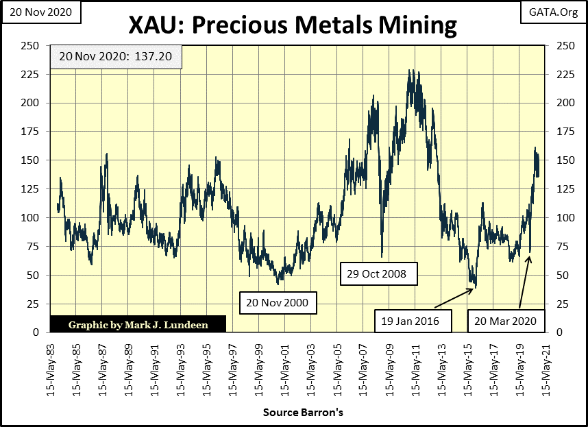
The gold mining index (XAU) is falling behind the NASDAQ Banking and other financial indexes. It’s discouraging, but my inclination to purchase the gold and silver miners doesn’t change.
My next chart plots every XAU daily closing since it first traded in 1983. At week’s close, the XAU is up about $30 from its first daily closing from thirty-seven years ago. If gold was still fixed to $35 an ounce, and the US national debt was still below one trillion dollars, and if the FOMC hadn’t “monetized” over $6 trillion dollars since 1983, this chart would make some sense.
As it is, in my opinion this chart illustrates how manipulated the financial system has been for decades. When the financial system finally breaks down, and the “policy makers” come to the point where no matter how much grease they “inject” into their machine, it just can’t move on any further, gold and silver miners are going to be fantastic assets to hold.
Until then, holding a gold and silver miner that pays a dividend most likely offers more income than money deposited in a bank. One could also invest in blue-chip stock like AT&T. But AT&T, like all too many mature blue-chip companies has taken on huge debts since the 2008-09 credit crisis to fund their share buyback and dividend programs. In the link below, AT&T has debts of $150 billion and is selling Fake News CNN to reduce its debt burdens. Good luck with that.
https://www.foxnews.com/media/cnn-att-trump-ratings-buy-debt-charlie-gasparino
Historically, mature blue-chip stocks have been a cash cow in times of financial troubles. I don’t believe that will be the case next time Mr Bear pays Wall Street a visit. It really does make sense to hold a good position in gold and silver mining.
In gold’s BEV chart below it still refuses to close below its BEV -10% line, going on now for over three months. The same was true for the Dow Jones, but when it did close below its BEV -10% line eleven days later it closed at a new all-time high. Could that happen to gold? It sure could!
But like my Governor who locked down the state for Thanksgiving, it seems the “policy makers” have locked down the financial markets to prevent any excitement from stressing their financial system for fear of what could happen.
Unlike when Alan Greenspan strode Wall Street like a colossus decades ago, being a central banker isn’t fun anymore.
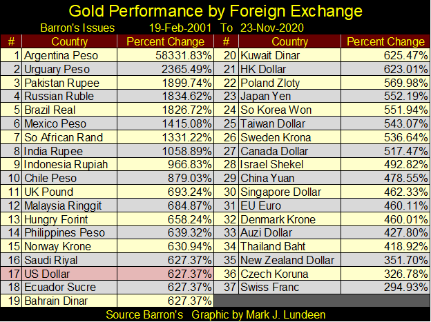
The table below, actually two tables below, lists gold’s performance by various foreign currencies. Keep in mind that an ounce of gold is just an ounce of gold. It’s people who assign it a market value in terms of one currency or another. Decades ago, by law an ounce of gold was worth $35. It was pegged to $35 an ounce because the US Treasury didn’t issue more than $35 in paper money for every ounce of gold it held. What that ounce of gold, or $35 purchased was determined by the market.
Following WW2, that didn’t last long as the US Treasury began issuing more dollars in paper than their gold reserves justified, as seen in the table below.
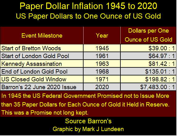
I didn’t update this table, but as of Barron’s 22 June 2020 issue, the US Treasury had issued $7483 paper dollars (CinC) for every ounce of gold it held in its bullion reserves. This increase in currency, and bank credit unchecked by a linkage to gold is inflation.
When inflation flows into stocks, bonds and real estate it’s called “Bull Markets”, until the bubble goes pop and people’s lives are ruined in the following bust. When it flows into consumer goods and cost-of-living items it’s called CPI inflation and people discover their income no longer covers their expenses.
This has been true for decades as the quote below from a 1957 Burns and Allen show illustrates:
“The real problem with retiring is money. Most people save their whole lives to retire in the same style they enjoyed when they were working, only to realize that they can’t live like they used to even while they’re still working. You see these ads for retirement and they always have fishing boats in the background. That’s because for $120 a month, fishing is the only way retired people can feed themselves.
– George Burns: Burns and Allen Television Show / Season 8 Episode 9, 1957
Keep in mind with the table below we’re looking at an ounce of gold. The Percent Change is due to a particular central bank’s “monetary policy.” That plus the price of gold in US$ is a manipulated valuation, manipulated lower so no one really knows what the price of gold, or silver would be if their dollar valuations were allowed to inflate in a free market.
There’s talk that President Trump is going to terminate the petro-dollar monetary standard, where all crude oil sold overseas is sold in US dollars. I don’t know anything about that, except to say that if he is, he hasn’t ended it just yet as all the Persian Gulf oil kingdoms plus Ecuador (an oil exporter) #16-20 remain pegged to the dollar #17.
Moving on to gold’s step sum chart, the correction that began on August 6th following its last all-time high of $2061 continues. I was expecting this correction would be over before the conclusion of 2020, but it’s increasingly looking like gold won’t see a new all-time high anytime soon. Don’t get discouraged, that is just how markets work; annoyingly until we get what we want from them.
In gold’s BEV chart above I’ve noted gold has yet to correct down to its BEV -10% line. That would be $1855 in this chart. I placed a red line at $1750 to highlight a 15% correction in the price of gold. I don’t think gold will make it down to that line, but it could.
In past times the gold bulls have stood firm, as they are doing now, only to capitulate suddenly to lower levels. I’d actually welcome that, a collapse down to the red line below as it may expedite gold’s next advance to new all-time highs.
As it is we really have nothing to complain about, not when we notice how gold since the summer of 2018 has increased from $1200 to over $2000 two years later. What will happen is going to happen. So it may be best to just accept that gold is in a correction for the foreseeable future, which may bottom somewhere above or below the red $1750 line, and leave it at that until it resumes its advance.
The Dow Jones in its step sum chart continues advancing off its March lows. It made a new all-time high this week but failed to close above its 30K line by only $50. I expect the Dow Jones will break above 30,000 next week or sometime soon.
Nothing exciting going on with gold’s step sum table below. Its step sum is down by two steps in the past twenty-five COMEX trading sessions. Its 15 count closed the week at a +1, or in the past fifteen trading days gold closed down seven days and up by eight for a net +1.
Looking at gold’s BEV values since October 19th, it has come close to breaking below its BEV -10% line, but so far the bulls have defended that line. Should it fall below this level (BEV -10%) there is no need to panic.
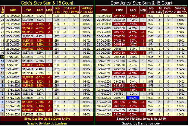
Looking at the Dow Jones’ step sum table, things are a little more exciting. The Dow Jones’ 15 count declined to a -5 on October 30th as it closed below its BEV -10% line. Since then it has seen more daily advances than declines, and hit a new all-time high on November 16th.
Here is one last chart for the week; the indexed values for the big four precious metals. What’s with palladium? Palladium is mostly used as a catalyst for automotive catalytic converters, and I’m sure it’s used elsewhere for it its unique chemical characteristics. It is also used in jewelry as it’s a pretty white metal that doesn’t tarnish.
But palladium has been advancing since early 2016, when gold and silver also bottomed. In the past five years palladium has left the old monetary metals far behind.
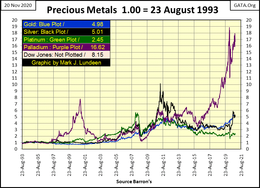
So is next big move going to take palladium down towards gold and silver, or is gold and silver going to play catchup with palladium? I’m an optimist. I believe in 2021 we’ll see gold and silver begin to catchup with palladium in the chart above.
__
(Featured image by Markus Spiske via Unsplash)
DISCLAIMER: This article was written by a third party contributor and does not reflect the opinion of Born2Invest, its management, staff or its associates. Please review our disclaimer for more information.
This article may include forward-looking statements. These forward-looking statements generally are identified by the words “believe,” “project,” “estimate,” “become,” “plan,” “will,” and similar expressions. These forward-looking statements involve known and unknown risks as well as uncertainties, including those discussed in the following cautionary statements and elsewhere in this article and on this site. Although the Company may believe that its expectations are based on reasonable assumptions, the actual results that the Company may achieve may differ materially from any forward-looking statements, which reflect the opinions of the management of the Company only as of the date hereof. Additionally, please make sure to read these important disclosures.


The World’s Largest Insurers Have ESG Blind Spots, According to ShareAction
The evaluation of the 65 insurance companies carried out by ShareAction confirms the need for constant evaluation of the sustainable...


Spending on R&D in Biotechnology Increased by 13% in 2022 and Reached 2.56 Billion
In 2022, spending on biotechnology Research and Development (R&D) increased by 13% to reach 2.56 billion euros. Company expenditure grew...


Consolidation in Sight in the Italian and European Crowdfunding Sector
The trend towards the creation of “super platforms” could materialize well beyond a single isolated case: according to the European...

JuicyFields – the Largest Investment Fraud in the Cannabis Industry
The JuicyFields case is a warning to investors around the world, illustrating the risks associated with attractive but unverified investment...


AI Will Revolutionize Mental Health, Generating 2.5 Billion in Spain
The AI boom extends to mental health, with startups emerging in Spain aiming to leverage technology for patient and professional...
 |
|
 |  |
 |
|
-
 Crypto2 weeks ago
Why the US Government Transferred $2 Billion Worth of Bitcoin
-

 Africa7 days ago
Burkina’s Economy on the Rise in February 2024, Report Shows
-
 Impact Investing2 weeks ago
A Seed Round Worth Over a Million for Amalia Care
-

 Biotech3 days ago
What Financial Impact Can the Health Sector Expect from the Metaverse Integration