Featured
Market volatility points to correction, not bear market
Markets continue to demonstrate extremes but so far they have held together and yes could go higher still. No decline in markets yet but there are signs that volatility could pick up and decline occur. But we view it as a correction not the start of a bear market – yet. As to extremes we highlight the Case Schiller Price Earnings Ratio known as the CAPE ratio as our ‘Chart of the Week’.

Are we approaching inflation hysteria? We’ve seen a number of stories of how inflation is about to engulf us, leading first to a euphoric boom, then followed by a devastating crash. Or fears that interest rates would have to be raised to astronomical levels, leading to a destructive recession or a catastrophic depression. Past examples of hyperinflation like the Weimar Republic, Zimbabwe, or Venezuela are tossed about. Hyperbole knows no bounds. Inflation fears are heightened by the stimulus programs brought in by governments to combat the pandemic and the employment assistance cheques sent out to the army of unemployed. In the U.S., some states are so upset by the unemployment benefits provided by the federal government that they are ending them early to push the unemployed into accepting those $7.25/hour minimum wage jobs that are apparently going unfilled.
Interest rates and inflation tend to generally move in tandem. As the chart of the Fed Funds rate and inflation shows below, when interest rates tend to lag inflation as occurred in the late 1970s, interest rates eventually catch up. We refer to that as a negative spread—interest rates are below the rate of inflation. This past month the inflation rate, as measured by the CPI, rose 4.2% year over year in April. The core inflation rate ex food and energy rose 3.0%. The producer price index PPI rose 6.2%. The effective Fed Funds rate is 0.07%. That implies a negative spread of 3.7% to the CPI, 2.3% to the core CPI, and 5.7% to the PPI. With the U.S. 10-year treasury note trading around 1.60% the spreads there are negative as well.
While negative spreads were common in the 1970s until the end of the decade, during the 1980s and 1990s the two changed positions. The effective Fed Funds rate tended to remain above the rate of inflation. We refer to that as a normal positive spread when interest rates are above the rate of inflation. However, the dot.com collapse in 2000–2002 started to change the equation and interest rates once again fell below the rate of inflation as was seen in the 1970s, creating a negative spread. When interest rates were hiked starting in 2004 from exceptionally low levels, that played a role in creating the financial crisis and collapse of 2007–2009. Since then, interest rates have almost exclusively been below the rate of inflation.
CPI (y-o-y change) and Effective Fed Funds Rate 1970–2021
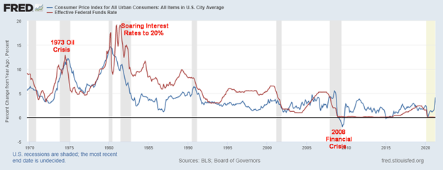
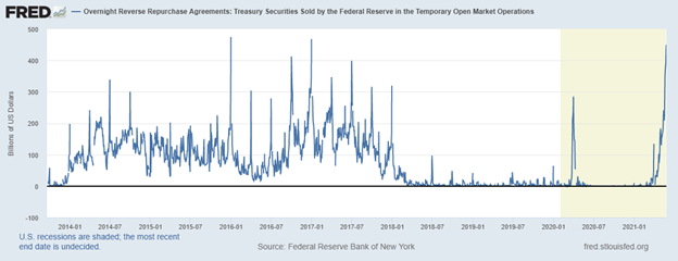
Today, the spread between inflation and the Fed Funds rate is as wide as it has been over the past decade, leading many to believe that the Fed will have no choice but to hike interest rates sooner rather than later. Along with hiking interest rates, tapering of QE would likely occur as well. The reality now is, because of QE and low interest rates, there is far too much money “sloshing” around in the financial system and the financial institutions do not know what to do with it. Loan lending is down sharply. The Fed, as a result, has been conducting reverse repos in the open market whereby they take funds out of the financial system.
Worse, these reverse repos are being done at 0%, leading some to think that rates could even go negative (note: occasionally they have). On May 25 the Fed did overnight reverse repos totaling $433 billion, the third highest on record. The next day they beat that, conducting $450 billion of reverse repos. Then on May 27, they topped it again, conducting $485 billion of reverse repos, a record. May 28’s $479.5 billion of reverse repos couldn’t top it. Normally reverse repos are conducted at a month-end, quarter-end, or year-end to help balance the financial system. Not this time. No wonder there are thoughts of whether official tapering could be far behind. Right now, the Fed appears to be giving with one hand (QE) and taking back with the other (reverse repos). The only thing we can conclude from this is either there is a problem out there or they really don’t wish to end or taper QE.
Overnight Reverse Repos Sold by the Fed ($ billions)
It is probably no surprise that the growing concern about inflation appears to be superseding the need to bring down the unemployment rate. With an official unemployment rate (U3) at 6.1% in the U.S. (higher in Canada at 8.1%; however, Canada’s labour force participation rate is higher at 64.9% vs 61.7% in the U.S.), the current official rate is still 2.62% above the rate of February 2020. That unemployment rate translates into 9,812,000 unemployed. When one considers the U6 unemployment rate that number climbs to 17,361,000, an additional 7,549,000 unemployed.
Of the ones employed, 16.6% are part-time with many of them wanting full-time employment. This past week initial unemployment claims fell again to 406 thousand, down from 444 thousand the previous week. They’re coming down but before the pandemic weekly claims were around 215 thousand. An estimated 43 million Americans (13% of the population) are on food stamps and over 36 million (11% of the population) live officially in poverty. At the other end, 724 individuals are billionaires. Yet the concern is inflation. There is considerable labour slack in the economy and that ultimately is deflationary, despite attempts to raise the minimum wage.
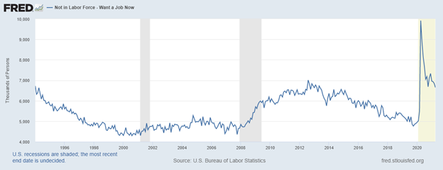
A number rarely looked at in the labour market is the number who want a job now but are not considered a part of the labour force. That number totals 6,647,000. Technically they are unemployed but are not considered a part of the labour force. That would bring the total unemployed to 24,008,000. An additional 2,953,000 are considered not in the labour force but marginally attached and have searched for work. Add that in and we are up to 26,961,000 that could be considered unemployed. That’s 13.1% of the working age population in the U.S. ages 15-64. The total of those considered not in the labour force is 100,534,202 but as we have noted in the past 55.5 million are retired and 9.6 million are disabled. That number also includes students and stay-at-home mothers.
What all this tells us is that is considerable slack in the economy because of the high number unemployed. Yet jobs apparently go unfulfilled. That suggests a skill mismatch. Or maybe there are many who are nervous about going back to work in what could be unsafe conditions.
Not in Labour Force-Want a Job Now
But could inflation already be peaking? Naturally, one report does not set a trend. And note that the year-over-year numbers we are seeing are from the deep (deflationary) hole of April 2020 during the peak of the first wave of the pandemic. Back then if one recalls, oil prices temporarily went negative. Today WTI oil is near $65, up roughly 10 times from an official low of $6.50 on WTI oil seen in March 2020. WTI oil has not made any new highs since early March, leading to thoughts that prices may have peaked. Production is up in the U.S. and the U.S. and Iran are trying to come to a deal which could put more Iranian oil on the market.
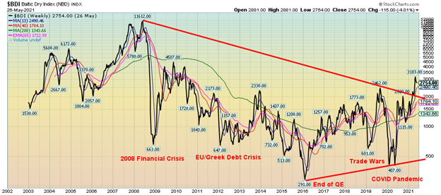
However, prices have been coming off their highs. Already wheat is down 16% from its recent high, corn is off 15%, cotton down 10%, soybeans off 10%, palladium down 9%, and lumber has seen the biggest drop, down 23% from its recent high. The recent inflation report could be a one-hit wonder. Bottlenecks are being overcome and supply chains are slowly being repaired, port traffic is starting to flow again. The Baltic Dry Index, a proxy for dry bulk shipping stocks, had recently surged again out of a deep hole seen a year ago. But it too has slipped recently from its highs, down 13.5% from its April high. So, is inflation surging? Or is the worst already behind us?
Baltic Dry Index 2002-2021
It is not surprising that many economic indicators showed surges year over year, given the deep hole of April 2020. But is this a trend? Or is it merely the natural occurrence of improvement coming from such a deep hole?
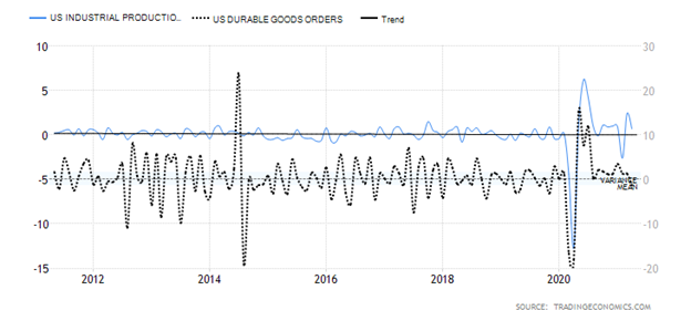
Despite the surge in some of the economic indicators, the longer-term trend remains down. Industrial production had a huge year-over-year surge in April but the monthly trends for both industrial production and durable goods are rolling over. Durable goods fell 1.3% in April month over month but industrial production rose 0.7%. Two months earlier IP fell 2.6%.
Industrial Production and Durable Goods Orders (monthly changes)
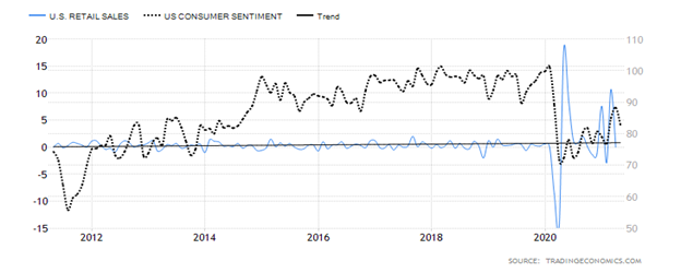
Retail sales were unexpectedly flat in April while consumer confidence had been rising but May’s consumer confidence came unexpectedly below expectations. How does that translate for May’s retail sales?
Retail Sales and Consumer Confidence
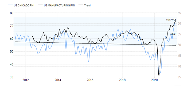
One area that has been good is manufacturing as seen by the Chicago PMI and the Manufacturing PMI. They have surged, but based on past results could they be peaking? That 10-year trend is still down overall. But again, they came out of a deep hole from a year earlier.
Chicago PMI and Manufacturing PMI
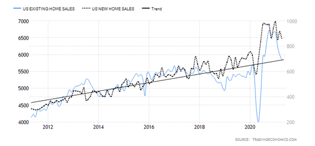
House prices have been surging, according to the Case Shiller Home Price Index that is at its highest level ever. So why have existing and new home sales been sliding? Maybe the prices are getting too high and buyers are now backing off? We could be seeing the same thing in Canada.
Existing Home Sales and New Home Sales
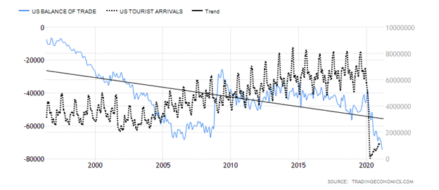
The U.S. trade deficit has never been so big (March trade deficit a record $74.4 billion). Trade deficits are a drag on GDP. So, what did the trade wars accomplish? A lack of tourists coming to America is not helping. Tourism has plunged and is barely bouncing back. Maybe it’ll improve. But unless international travel picks up it is not likely. The trend is down here for both and they should continue to be a drag on GDP.
U.S. Balance of Trade and U.S. Tourist Arrivals
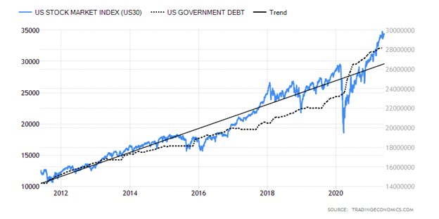
One thing for sure is that both government debt and the stock market have soared. Could they be connected at the hip?
U.S. Stock Market and Government Debt
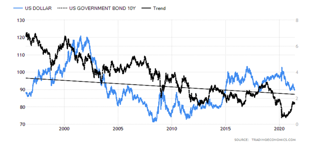
The long-term trend of both the U.S. dollar and the U.S. 10-year U.S. treasuries has been down. The 10-year has bounced back but the U.S. dollar has resumed its slide. Even the 10-year has now waffled off its recent high.
U.S. dollar and 10-year U.S. Treasury Note
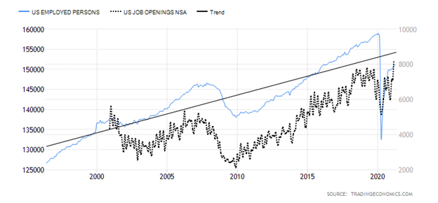
The number of people employed has improved sharply from the depths of the pandemic. But it remains sharply below pre-pandemic levels by over 7.5 million. Of those employed, over 16% are part-timers both voluntarily and involuntarily. Yes, there are over 8.2 million job vacancies but the trouble is matching skill levels. And with overall immigration down, bottom-rung jobs are harder to fill.
Employed Persons and Job Openings
The reality is, if inflation is to persist, we would need to see more reports not dissimilar to the April report. This is not to discount the possibility that we could well see further reports indicating inflation. Even we believe these reports are not necessarily one and done. With inflation up-ticking it could last a year or more. But we don’t expect it to be galloping inflation i.e., 10% annually or higher. But it could move from the current creeping inflation to at least walking inflation as it hits 5% or thereabouts. That would get the Fed to act. But that is still not expected until at least 2023.
With interest rates remaining at or near record lows along with QE our expectations are that, subject to periodic corrections, the stock market could continue to rise into 2022. However, we are unsure as to what 2022 could bring. The unknown is a “black swan” event. An example might be the collapse of a fund that is far bigger than Archegos Capital. With debt levels high and rising that will continue to be a drag on GDP as is the widening trade deficit. All of these should help mitigate rising inflation. Continued labour slack and high unemployment are also a continuing drag on the economy. Considering all this, we fail to understand the hysteria surrounding inflation and believe it may have just become a bogeyman. After all, inflation at around 3% can be considered beneficial. It is when it starts rising over 5% that it can start to become at least a small problem. But could we become a Weimar Republic, Zimbabwe, or Venezuela? No sign of it and highly unlikely.
The Pandemic Rages On!
The pandemic rages on. Just not as much as before. The 7-day MA is down to 508 thousand per day from a peak of almost 823 thousand daily. Deaths are down as well to just over 11 thousand daily from a peak of over 14 thousand in the January 2021 wave. The U.S. is now recording roughly 21 thousand cases daily a far cry from 255 thousand in January 2021. Deaths too down to roughly 550 per day from 3,500/day. In Canada the cases are down to 3,000/day from over 8,600/day and deaths down to 40/day from 160/day. Vaccines, warmer weather and lockdowns, masks and more have helped. The numbers are still high in India but even they are coming down from 388 thousand/day to 195 thousand day/day and deaths 3,800/day from 4,100/day. That’s the good news. The bad news is that indications are that the real numbers were much higher. The reason is that according to forecasts deaths even in the developed world have been much higher than what would be considered normal and the normal range. These additional deaths are unaccounted and are put down to other reasons. African countries are estimated to have been grossly under counted and deaths in India could actually have been upwards of 10 million. Such is the nature of pandemics. Will there be a fourth wave or is it a fifth wave? Historically pandemics are never one and done and they have tended to spread out over years coming and going even if less than the initial waves. But with vaccinations fans in the stands, going to the movies, theatre, galleries and more may soon be a reality again. Oh yes and tourism picking up. But will it return to pre-pandemic days? We doubt it. Oh, but as it subsides maybe we won’t do this page any longer.
Sunday May 30, 2021 – 13:54 GMT
World
Number of cases: 170,704,352
Number of deaths: 3,550,285
Cases per million: 21,900
Deaths per million: 455.5
U.S.A.
Number of cases: 34,035,405
Number of deaths: 609,421
Cases per million: 102,281
Deaths per million: 1,831
Canada
Number of cases: 1,376,734
Number of deaths: 25,478
Cases per million: 36,190
Deaths per million: 670
Source: www.worldometers.info/coronavirus
Chart of the Week
Shiller PE Ratio
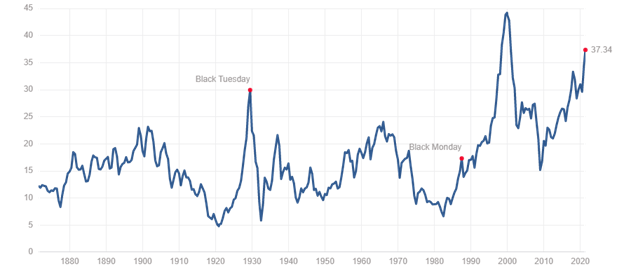
No matter how we look at things, we continue to see the stock market in a bubble. But we know that bubbles can go on longer than some shorts can stay solvent. So, no the markets aren’t about to crash tomorrow, but who knows about next week, next month, or next year. Already at 12 years up, this has been one of the longest uninterrupted bulls. Okay, there was March 2020 but in retrospect that now looks more like an October 1987 crash—a sharp, scary correction that was soon over and then the bull resumed. Longer-term bears are what we experienced in 2000–2009 or with the stock market in 1966–1982 and in 1929–1949. Note that even during a secular bear market there are some strong countertrend rallies.
One of the better indicators of a potentially dangerous market is the Shiller Cyclically Adjusted Price Earnings Ratio known as the CAPE Ratio. (Also noted recently by Jim Rickards, Strategic Investment, June 2021). The CAPE Ratio PE looks at earnings per share (EPS) over a 10-year period and adjusts for inflation. Its record high was at 44.19 seen in December 1999 at the height of the dot.com craze. In 1929 the ratio hit 30. But in October 1987 it was only at 19 which in historic terms was not that stretched. Before the 2008 financial crash it was at 27.
So today at 37.34 it is the highest it has been since the dot.com crash. The long-term average is only 16.82 and the long-term median is 15.83. The 2008 financial crash brought the CAPE Ratio down to only around 15. Maybe this is a new paradigm. We’re sure that’s what the bulls would like us all to believe. For the record, the S&P 500 PE Ratio is 44.73, also well above its long-term mean of 15.94 but definitely below its record high of 123.73 seen in May 2009.
But it goes on. The S&P 500 dividend yield is only 1.37% which is not far from the all-time low of 1.11% seen in August 2000 during the dot.com bubble. The all-time yield was 13.84% seen at the bottom of the Great Depression in 1932. The mean is 4.3%. All of this points to stocks in a bubble and overstretched by many measurements. It’s a warning. The longer these extremes go on, the more likely a crash of some magnitude could occur.
MARKETS AND TRENDS
| % Gains (Losses) Trends | ||||||||
| Close Dec 31/20 | Close May 28/21 | Week | YTD | Daily (Short Term) | Weekly (Intermediate) | Monthly (Long Term) | ||
| Stock Market Indices | ||||||||
| S&P 500 | 3,756.07 | 4,204.11 | 1.2% | 11.9% | up | up | up | |
| Dow Jones Industrials | 30,606.48 | 34,529.45 | 0.9% | 12.8% | up | up | up | |
| Dow Jones Transports | 12,506.93 | 15,750.31 | 1.8% | 25.9% | up | up | up | |
| NASDAQ | 12,888.28 | 13,748.74 | 2.1% | 6.7% | neutral | up | up | |
| S&P/TSX Composite | 17,433.36 | 19,852.18 (new highs) | 1.7% | 13.9% | up | up | up | |
| S&P/TSX Venture (CDNX) | 875.36 | 966.28 | 1.0% | 10.4% | up | up | up | |
| S&P 600 | 1,118.93 | 1,371.94 | 2.1% | 22.6% | up | up | up | |
| MSCI World Index | 2,140.71 | 2,341.14 (new highs) | 0.8% | 9.4% | up | up | up | |
| NYSE Bitcoin Index | 28,775.36 | 36,842.43 | (2.8)% | 28.0% | down | neutral | up | |
| Gold Mining Stock Indices | ||||||||
| Gold Bugs Index (HUI) | 299.64 | 318.83 | (0.4)% | 6.4% | up | up | up | |
| TSX Gold Index (TGD) | 315.29 | 332.33 | (0.3)% | 5.4% | up | neutral | up | |
| Fixed Income Yields/Spreads | ||||||||
| U.S. 10-Year Treasury Bond yield | 0.91 | 1.58% | (2.5)% | 73.6% | ||||
| Cdn. 10-Year Bond CGB yield | 0.68 | 1.50% | (3.2)% | 120.6% | ||||
| Recession Watch Spreads | ||||||||
| U.S. 2-year 10-year Treasury spread | 0.79 | 1.44% | (2.0)% | 82.3% | ||||
| Cdn 2-year 10-year CGB spread | 0.48 | 1.17% | (3.3)% | 143.8% | ||||
| Currencies | ||||||||
| US$ Index | 89.89 | 89.99 | flat | 0.1% | down | down | down | |
| Canadian $ | 0.7830 | 0.8274 | (0.2)% | 5.6% | up | up | up | |
| Euro | 122.39 | 121.93 | 0.1% | (0.4)% | up | up | up | |
| Swiss Franc | 113.14 | 111.14 | (0.2)% | (1.8)% | up | up (weak) | up | |
| British Pound | 136.72 | 141.90 (new highs) | 0.3% | 3.8% | up | up | up | |
| Japanese Yen | 96.87 | 91.03 | (0.8)% | (6.0)% | down | down | down | |
| Precious Metals | ||||||||
| Gold | 1,895.10 | 1,905.30 | 1.5% | 0.5% | up | up | up | |
| Silver | 26.41 | 28.01 | 1.9% | 6.1% | up | up | up | |
| Platinum | 1,079.20 | 1,182.40 | 1.1% | 9.6% | down | up | up | |
| Base Metals | ||||||||
| Palladium | 2,453.80 | 2,830.10 | 1.6% | 15.3% | neutral | up | up | |
| Copper | 3.52 | 4.68 | 4.5% | 33.0% | up | up | up | |
| Energy | ||||||||
| WTI Oil | 48.52 | 66.32 | 4.3% | 36.7% | up | up | up | |
| Natural Gas | 2.54 | 2.99 | 0.3% | 17.7% | up | up | up |
New highs/lows refer to new 52-week highs/lows and in some cases all-time highs.
As we move into the Memorial Day holiday (May 31) the markets have moved higher. Seasonally that was to be expected. This past week the S&P 500 gained 1.2%, the Dow Jones Industrials (DJI) was up 0.9%, the Dow Jones Transportations (DJT) up 1.8%, and the NASDAQ gained 2.1%. None of the indices made new all-time highs. We were a little surprised to discover, however, that one index did make all-time highs—the AMEX. The AMEX (XAX) is a capitalization weighted index of American Depository Receipts (ADRs) that trade on the NYSE. It is composed mainly of small cap companies.
In Canada, the TSX Composite did make new all-time highs up 1.7%. The TSX Venture Exchange (CDNX) gained about 1.0%. In the EU, the London FTSE was flat, the Paris CAC 40 keeps making records, up 1.5%, and the German DAX also made a new all-time high, up 0.5%. In Asia, China’s Shanghai Index (SSEC) enjoyed a good week, up 3.3% while the Tokyo Nikkei Dow (TKN) is making a sharp recovery, gaining 2.9%. A shift to Asia? The MSCI World Index also made new all-time highs, up 0.8%. Bitcoin (see below) fell as the NY Bitcoin Index was down 2.8%.
This market continues to hang in, defying expectations that we should at least have a pullback to ease some of the overbought conditions. So far, we are not getting it. Will it come in June? Hard to say. We could argue both ways here. Which, of course, is not ideal. Volumes have fallen off so we know this rally doesn’t have a lot of oomph behind it. But that doesn’t mean it can’t go higher. There is a lot of money sloshing around. Why else would the Fed be conducting reverse repo operations and then giving on one hand with QE while taking with the other with reverse repos (which are temporary). But where does money go? Banks are not being overwhelmed with loan demand. But they have a lot of money that has to be placed somewhere besides sitting in bank reserves. The wealthy have gotten wealthier through the pandemic even as there are 18 million unemployed. So where do they put the money if the stock market is getting pricey? Many others—collectibles, art, real estate—are getting pricey too. But not gold as it has been in a funk since last August although it is beginning to rise.
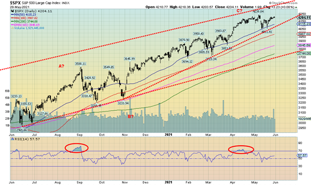
The market may be topping and if it is, the first break point is at 4,150. Below that the breakdown gets under 4,100. But if we are going higher, and there is room here, the top of the channel is up over 4,300.
If we look at just our old standby of the 4-year cycle troughs, we see from the major low in March 2009 a low in October 2011, February 2016, and the March 2020 low. All touched or went below the 48-month MA. So, in theory the next 4-year cycle low is not due until sometime between 2023 and 2025. However, our 6-year cycle last bottomed in February 2016 so we could have a low anywhere from 2021 to 2023 that could also coincide with the 6-year cycle low. The question, of course, is when is the top—now, or later in the year? Or not even until 2022? We say all of this against the backdrop of an extended market, one that has been fueled by ultra-low interest rates and trillions of dollars in QE and stimulus with potentially more to come.
A drop of 10% or so would be healthy for the market. That is a correction. Under 20% and it is considered a bear market. And a decline under 30% is considered a major bear market. There have been 14 of them since 1900 or one roughly every 8.5 years. Two of them, October 1987 and March 2020 were really short – 55 days and 40 days respectively. So, in some respects they hardly qualify. Both were proven to be merely pauses in a bull market albeit steep ones. Of the remaining 12 eight of them occurred before 1940. Since then, the remaining four were 1966-1968, 1973-1974, 2000-2002 and 2007-2009. Still including the two short ones 1987 and 2020 that is one every 9.2 years. If we are fortunate 2020 could prove to be the last one for a few more years.
We’ll continue to let the market tell us it has topped. Taking profits is not a bad idea, except where do you place the funds? Markets tend to (but not exclusively) go up and down together. We note under our energy commentary that there is some potential now for the energy sector to move higher. And the precious metals market has been starting to rise as well.
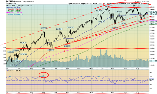
The NASDAQ continues to be the fly in the ointment. While other indices have made new all-time highs (although not this week), the NASDAQ saw its all-time high way back in February. Like the S&P 500 we can argue both ways here. With a relatively flat top and rising lows could we be making an ascending triangle? Naturally it breaks out above 14,250 and then could project all the way up to over 16,000. On the other hand, if we are making a top, the break point is at 13,250 and under 13,000 a steeper decline could get underway. Volume has been sliding for weeks even as the NASDAQ tries to come back. So, none of this is suggesting that we should break higher. Instead, the risk remains to the downside. But if we break out to new highs, then a melt-up could occur.
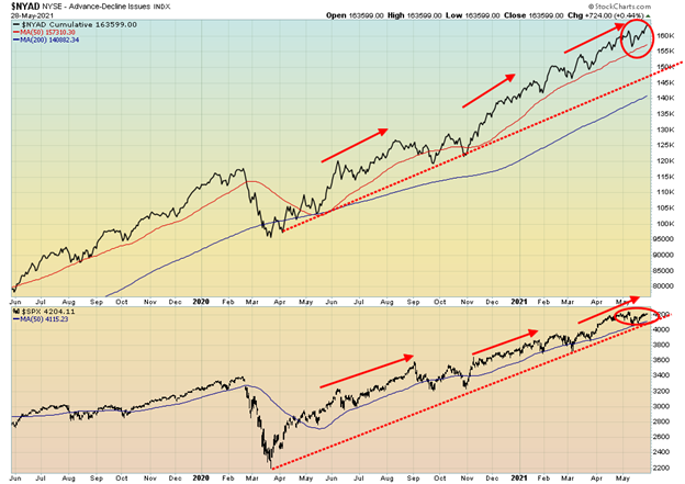
The bulls are probably elated as the NYSE advance-decline line powers its way to new highs. But, so far at least, the S&P 500 has not confirmed the move. A divergence? We would prefer it the other way around. And yes, we’ve seen this before and yes, it usually translated into the S&P 500 moving higher. And we look over at the percentage of stocks trading above their 200-day MA and see it is at 92.18, just off its record high of 94.79. And we see the S&P 500 Bullish Percent Index at 79. That’s not its high but it has remained persistently high. The bulls are not overly perturbed by these lofty numbers. But they should at least be cautious. We’d await better signals to suggest we have actually made a high. But extremes continue to dominate.
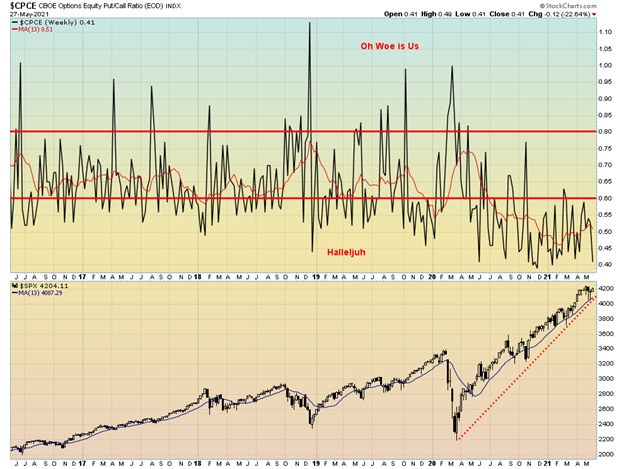
Wow! The put/call ratio is down once again to 0.41. The market remains extremely bullish. All we can say is that this is a warning, but again no suggestion that a high is in. Other factors have to come into play. But here we are once again at almost record lows for the put/call ratio. Are there any bears out there?
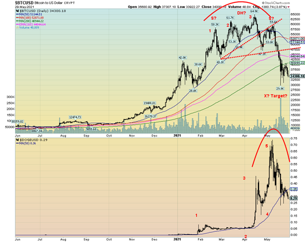
The cryptos could be starting the next wave to the downside. This past week Bitcoin (BTC) lost only 1.9% but it was repelled at $40,000/$41,000 and the 200-day MA. Dogecoin (DOGE) fell 7% and closed under 30 cents. We believe we are in the third wave down of a collapse that could take Bitcoin to $25,000 or lower and Dogecoin to 15 cents or lower. The crypto party, we believe, is over. And that has potentially negative connotations for the stock market as the DJI and Bitcoin have tended to follow each other with lags.
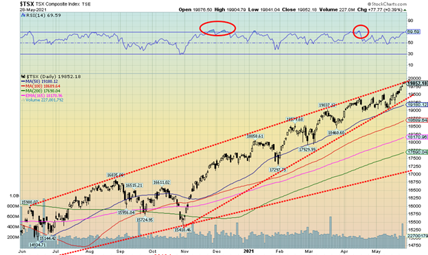
Celebration once again for the TSX Composite as it hits another all-time high this past week. The strange part was it was the only major one here in North America. The TSX also hit the top of the channel we drew connecting highs along the way. This past week the TSX rose 1.7%. The junior TSX Venture Exchange (CDNX) was up about 1.0%. Only two of the 14 sub-indices experienced losses on the week and those were both feeble declines. The TSX Gold Index (TGD) was off 0.3% and Utilities (TUT) was down 0.2%. Three made all-time highs—Consumer Staples (TCS) up 1.2%, Financials (TFS) up 1.5% led by the banks, and Telecommunications (TTS) up 1.1%. The leader on the week was Health Care (THC), up 9.0%. Industrials (TIN) gained 2.7% and Energy (TEN) jumped 2.8%. Consumer Discretionary (TCD) was the only other one up more than 2% with a gain of 2.1%.
New all-time highs are exciting but the TSX is getting extended up here although even higher extremes have been seen in the past. We are bumping up against the channel line so we’d have to firmly break above 20,000 to suggest to us that we could be going into a melt-up. A break back under 19,575 would suggest to us that a possible high is in. But only a breakdown under 19,400 would tell us that the high is in and the uptrend is over. It is a potentially bearish ascending wedge triangle that has formed. So be wary if we break down as the decline could be swift. Trouble under 19,200 and more trouble under 18,700.
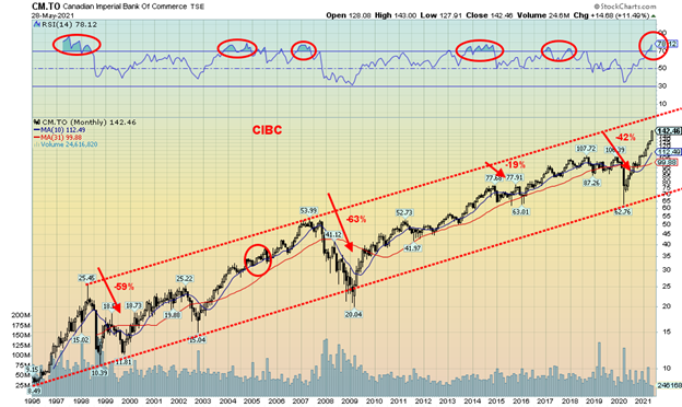
No, we are not trying to pick on the Canadian Imperial Bank of Commerce (CIBC) (CM-TSX). We are just using CIBC as an example of very overbought conditions being seen on the Canadian bank stocks. This is a monthly chart. The RSI is now over 70, currently at 78. The weekly RSI is at 88 and the daily 93. We’ve rarely seen them this high. The other Canadian banks are similar. It is not often that the RSI on the monthly chart goes over 70. Since 1996 it has occurred six times including the current one. No, it does not tell us a top is in. The market could still go higher. The RSI can remain over 70 for a few months as it has in the past. But it is a warning sign that the market could be vulnerable to a reversal and move to the downside. Gains from here could be grudging ones.
In 1998 CIBC fell 59%. The extremes in 2004 and 2005 didn’t amount to much more than a slow-rising consolidation before taking off once again. The top in 2007 resulted in a collapse of 63%. In 2015 CIBC went through several months of consolidation, falling in all 19%. Extremes in 2018 and 2019 were slow to develop but eventually it resulted in the March 2020 pandemic crash where CIBC fell 42%. In all, setting aside the consolidation in 2004/2005, CIBC experienced declines averaging over 30% following extremes at these levels seen in the RSI (and we note other indicators as well).
CIBC could still rise to the top of that channel currently near $165 another 16% from here. Or this could be it. As noted, the extreme RSI is a warning, not necessarily telling us it has topped. But given past experience it could eventually result in a decline of some magnitude. CIBC breaks down under $100. The steep upward trendline first breaks at $140 and again under $135. Under $128 a more substantial decline could get underway. As we always say, you can’t go broke taking a profit. One can always get back in.
U.S. 10-year Treasury Bond/Canadian 10-year Government Bond (CGB)
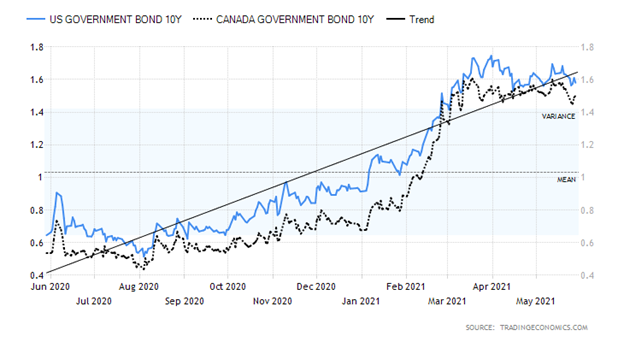
Since mid-March when the U.S. 10-year treasury note hit a high of 1.74% it has been in a downward drift. We cannot, however, say that we have seen a final top. Our first breakdown would be under 1.55% with a break under 1.35% probably confirming a top. After that, a decline to at least 1.20% should occur and possibly even down to 1.00%. New highs are needed to suggest we are on our next upside run towards possibly 2%. Right now, we continue to see yield weakness going forward. This past week the U.S. 10-year treasury note was off 2.5% down 4bp, and the Canadian 10-year Government of Canada bond (CGB) was down 5bp or 3.2%.
If there is one thing we can take away from this week, it’s that the bond market was not rattled by the CPI, PPI, and GDP numbers. The CPI year over year to April was up 4.2%, the core CPI was up 3%, the PPI up 6.2%, and the PCE price index was up 3.6% with the core up 3.1%. In Q1 GDP came in up 6.4% annualized following a 4.3% rise in Q4 2020. The Fed’s target for the core CPI is 2%. If the bond market wasn’t rattled by the inflation and growth numbers, then we suspect neither should we be. After all, the Fed believes the inflation is transitory. While we can’t say this for sure, we know the markets have been fueled by trillions of dollars of QE and stimulus packages. Bond yields are, however, often ahead of the curve. And what the bond market appears to be telling us is, don’t worry about inflation.
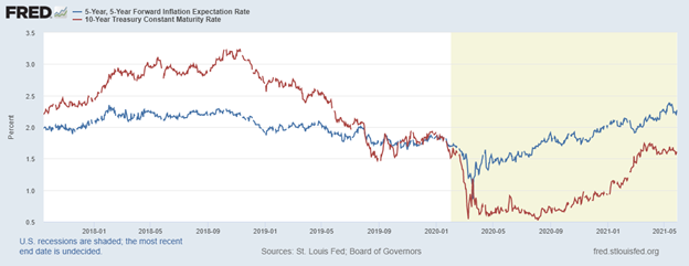
Our chart on the next page shows the 5-year, 5-year forward inflation expectations vs. the yield on the U.S. 10-year treasury note. Note how the yield on the 10-year peaked before the inflation expectations. Now the inflation expectations appear to be turning down as well. We note how, previously, inflation expectations were rising well in advance of the 10-year yield. And previously back in 2018 the 10-year also topped prior to the inflation expectations. If anything, these charts suggest we have seen the high for bond yields for this move. However, that remains to be seen. As we note, we need to break under at least 1.35% to begin to suggest a high is in.
5-year, 5-year forward inflation expectations vs. U.S. 10-year treasury note
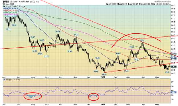
The US$ Index closed flat this past week (down a tiny 0.02%). There wasn’t a lot of movement in the other currencies, either. The Cdn$ didn’t make new highs this past week and actually slipped 0.2%. However, we can’t say it has topped yet. The euro was up just under 0.1%, the Swiss franc slipped 0.2% the pound sterling made new 52-week highs up 0.3% but the Japanese yen was down 0.8%. Since gold and yen often go hand in hand, that is a bit of a potentially negative warning for gold. However, the yen rebounded sharply on Friday after sliding, so this pullback could be just a retest of its recent lows. It has held those lows thus far. In looking at Friday’s action, was that a graveyard doji the US$ Index left on the chart? That is usually seen at highs, not at these levels. A graveyard doji occurs when the market opens, spikes to a high, and then comes all the way back to the lows and opening.
The US$ Index tried to rally but seemed to fail at the trendline that connected the early January 2021 low of 89.17 and the late February low of 89.68. Given the action we should see follow-through this week to the downside. Once we make new lows under 89.51 the recent low, we could then be set up to test the January 2021 low of 89.17. A solid break under 89.17 could see the US$ Index accelerate to the downside. Obviously 90.50 becomes important now on any rebound to the upside. A break above that level could suggest a low is in and the US$ Index would bee-line it to 91 and even up to 91.75 where resistance would be a lot stronger. The trend for the US$ Index is firmly to the downside; however, until we see new lows below 89.51 there remains the potential for some further consolidation.
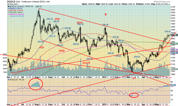
Gold finally made it over $1,900 with a high on the week of $1,915 and closing at $1,905. While we view this as positive there were also cautionary notes. Gold made new highs for the move, but silver did not. As we note next, open interest for futures fell on a week that gold was higher. The gold stocks, as represented by the TSX Gold Index (TGD) and the Gold Bugs Index (HUI), were down on the week that the precious metals saw gains. The close on the week was feeble, just over $1,900. We are going to need to see gold hold over $1,900 this coming week to convince us that we are going higher.
Gold was up on the week by 1.5%, silver gained 1.9%, and platinum jumped 1.1%. Of the metals with some precious metals’ characteristics, palladium was up 1.6% and copper jumped 4.5%. Gold was helped this past week with data showing inflation perking up. With the higher CPI and PPI, gold responded as a potential inflation hedge. The core CPI was now well over the Fed’s target of 2%. However, as we have noted this could be a temporary phenomenon, given how much the CPI contracted a year ago April as the pandemic got underway. As well, the U.S. dollar slipped slightly. Gold normally moves inversely to the U.S. dollar. Gold may also be responding positively to the seeming confusion at the Fed as they continue their QE program against the backdrop of conducting daily reverse repo operations to drain funds out of the financial system. The White House announced its $6 trillion program that targets infrastructure (much needed), education, and climate change. How much actually gets through the deeply divided legislature is anybody’s guess. Getting through Congress may well work but getting through the deadlocked Senate, subject to filibusters as we saw with the formation of the January 6 Commission, could be a no go.
Technicals are, so far, being supportive. This was the fourth consecutive weekly rise. Gold also is headed for the second consecutive monthly rise up 7.8% so far in May with only one day left. Gold has turned positive on the year (barely), up a feeble 0.5% now. However, given gold had been down for most of the year this is potentially a positive development. For the coming week we need to see gold hold above and close once again above $1,900. As well, the next band of resistance is up at $1,955/$1,965 near highs seen in November 2020 and January 2021. Only above $1,990 and preferably above $2,000 could gold suggest new highs above $2,089. To the downside we’d first prefer that $1,880 hold any pullback. A break under $1,860 would be negative and under $1,840 we’d question the entire rally. The final breakdown would come under $1,790. There is considerable bullish enthusiasm amongst gold writers. However, that has not spread to the larger investment community. There is some suspicion that as Bitcoin and the cryptos fall that some of those funds are finding their way into the gold market. So far, gold has recovered some 56% of the decline but there remains considerable work to do to convince us that this is nothing more than a rebound rally following a 20% decline in the gold price from last August.
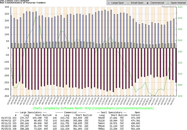
The commercial COT (bullion companies and banks) fell this past week to 23% from 26%. This could be a negative omen. Long open interest fell over 10,000 contracts while short open interest jumped just over 7,000 contracts. The large speculators COT (hedge funds, managed futures, etc.) leaped to 80% from 76% as their short open interest fell about 18,000 contracts even as their long open interest was also down but only by about 2,000 contracts. Overall open interest fell over 10,000 contracts on a week that gold rose. That could indicate a weakening market. Preference would have been that open interest rose this past week along with the gold price.
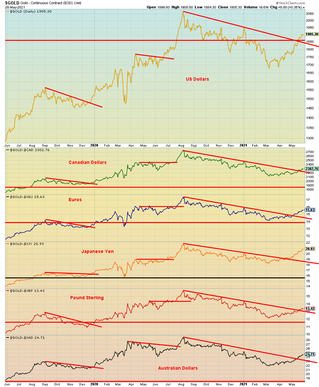
We couldn’t help but notice that gold has broken out against all major currencies. Some have barely broken out (pound sterling, Canadian dollar) while others appear to be gaining traction (Japanese yen). The breakout lines could now become support. We view gold rising in all currencies as confirmation that a bull move could be on its way.
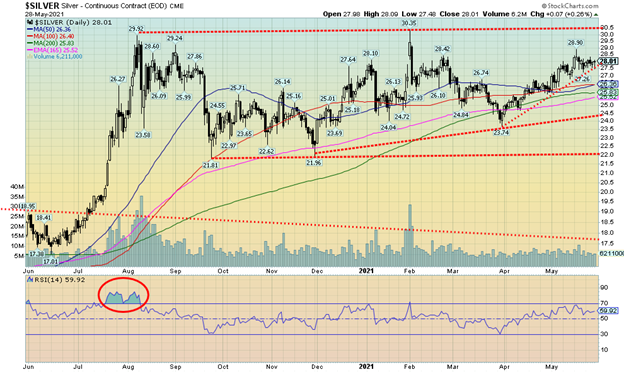
Silver prices had a fairly quiet week with a gain of 1.9% and closing just over $28. We appear to be holding an uptrend line that currently comes in near $27.60. We’d be concerned if silver broke under $27 again and under $26, we’d question the entire rebound. We still appear to be potentially making an ascending triangle although it is not a very clean one. We do have higher lows since December 2020 with a fairly flat top at around $30. What’s key is that silver recovers above $29 as that would suggest to us that the February high of $30.35 could fall. A breakout above that level could target us up to $39/$40. But lest we get ahead of ourselves it is going to be important that we continue to build some value above $28. Silver has struggled a bit here since making that high of $28.90 back on May 18. As well, gold this past week did make a new high for the move and a new high close. Silver did not. At this time that is only a minor divergence.
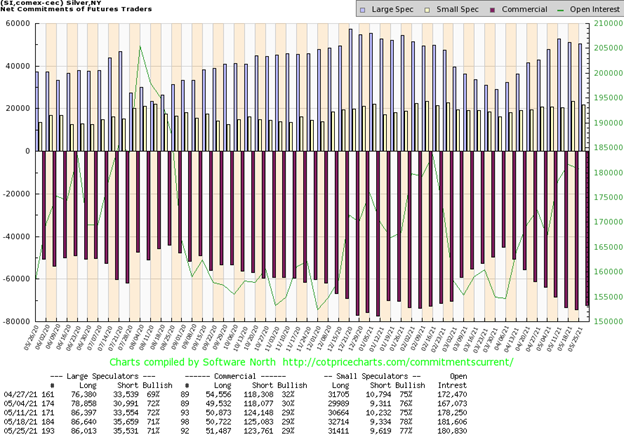
For the third week in a row the silver commercial COT was unchanged at 29%. There was little movement in open interest as long open interest gained less than 1,000 contracts while short open interest was down about 1,500 contracts. The large speculators COT was also unchanged at 71% with their open interest also little changed. We’d have to view the action as neutral or at best very mildly bullish. Total open interest was also largely unchanged on a week that saw silver up and closing barely over $28.
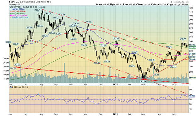
Gold stocks waffled this past week as both gold and silver struggled to find their own footing as to which direction, they might go in. For the past couple of weeks, the gold stocks have been largely sideways. This past week the TSX Gold Index (TGD) slipped 0.8% while the Gold Bugs Index (HUI) was off 0.3%. For them that is a quiet week. The gold stock indices did diverge a bit from gold and silver, both of which were up on the week. However, both indices jumped Friday when gold and silver rebounded, with gold managing to eke out a close over $1,900. Both indices remain up on the year with the TGD up 5.4% and the HUI up 6.4%. That’s a pretty good recovery as both were down earlier in the year. However, that low was seen back in early March. The TGD made its low at 267, down 36% from the August 2020 high. Since then, the TGD has regained 24%. The TGD has also broken above the downtrend line from the August 2020 high and has been closing over the 200-day MA. What needs to happen now is new highs above 341. Until then, some further downside could be seen. As long as we hold above 308/314, we should be fine. Our preference is that the TGD hold above 320 on any pullback. Gold stocks have caught a bid. The Gold Miners Bullish Percent Index (BPGDM) is at 70 so it is not too hot and has considerable room to move higher. No extremes are being seen in the indicators and all time-frames—short, intermediate, and long are pointed up. What we are looking for is a continuance of this rally that carries us into July for a possible top. What happens after that could be key. A corrective period into October would not be a surprise followed by a rally into year end. If we are still making new highs into year-end, it bodes well going into 2022. But the key could come as we get closer to the August 2020 high of 418. A failure to make new highs above that level would be a negative. The preference is we are there by July. That’s a gain of at least another 26% from current levels.
We’d be remiss if we didn’t mention that the biggest stories of the week for the energy markets were that three major oil firms faced pressure from shareholders and courts to reduce emissions. Shell Oil (RDS.A) lost in court, Exxon (XOM) lost to shareholders, and Chevron (CVX) lost a shareholder vote to cut emissions. As well, Total (TOT) the giant French energy firm is facing pressure and scrutiny from shareholders. The result of all of this might be to see more production cuts, thus putting upward pressure on prices.
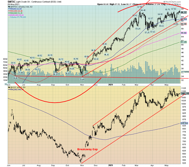
For the past few months WTI oil has been forming what might be a double top pattern. Now it is becoming increasingly apparent that, instead of falling, oil prices could be headed higher. The breakdown points never changed much. A break under $62 could send WTI down to $60 or lower. A break under $57 would confirm the breakdown as new lows would be seen. It hasn’t happened and with the news of the past week it is beginning to appear that instead of falling we could soon see new highs above $68.
This past week WTI oil rose 4.3% while natural gas (NG) was up a small 0.3%. The energy stocks enjoyed a good week with the ARCA Oil & Gas Index (XOI) rising 1.4% and the TSX Energy Index (TEN) up 2.8%. One of the drivers for lower prices was more U.S. oil coming online as prices had gone up and the potential for more Iranian oil on the market as the U.S. and Iran try to negotiate a (perilous) deal. Not sure how much more Iranian oil would impact the market; they have been getting it out anyway, despite sanctions, as it goes to China. Ships constantly sail under different flags of convenience.
Both WTI oil and the XOI continue to climb within the confines of a widening tunnel channel. The XOI’s break point is now under 1,050 with confirmation under 1000/1025. A move above 1,100 could start a new move to the upside.
The stories of the week may be a challenge to the companies involved but potentially good news for investors who, as a result, could see higher prices instead. Not so good at the pump, though.
__
(Featured image by Ken Teegardin CC BY-SA 2.0 via Flickr)
DISCLAIMER: This article was written by a third party contributor and does not reflect the opinion of Born2Invest, its management, staff or its associates. Please review our disclaimer for more information.
This article may include forward-looking statements. These forward-looking statements generally are identified by the words “believe,” “project,” “estimate,” “become,” “plan,” “will,” and similar expressions. These forward-looking statements involve known and unknown risks as well as uncertainties, including those discussed in the following cautionary statements and elsewhere in this article and on this site. Although the Company may believe that its expectations are based on reasonable assumptions, the actual results that the Company may achieve may differ materially from any forward-looking statements, which reflect the opinions of the management of the Company only as of the date hereof. Additionally, please make sure to read these important disclosures.
David Chapman is not a registered advisory service and is not an exempt market dealer (EMD) nor a licensed financial advisor. We do not and cannot give individualised market advice. David Chapman has worked in the financial industry for over 40 years including large financial corporations, banks, and investment dealers. The information in this newsletter is intended only for informational and educational purposes. It should not be considered a solicitation of an offer or sale of any security. Every effort is made to provide accurate and complete information. However, we cannot guarantee that there will be no errors. We make no claims, promises or guarantees about the accuracy, completeness, or adequacy of the contents of this commentary and expressly disclaim liability for errors and omissions in the contents of this commentary. David Chapman will always use his best efforts to ensure the accuracy and timeliness of all information. The reader assumes all risk when trading in securities and David Chapman advises consulting a licensed professional financial advisor before proceeding with any trade or idea presented in this newsletter. David Chapman may own shares in companies mentioned in this newsletter. We share our ideas and opinions for informational and educational purposes only and expect the reader to perform due diligence before considering a position in any security. That includes consulting with your own licensed professional financial advisor.


Loyal Is Working on a Drug to Extend the Life of Dogs
Loyal, a San Francisco biotech startup, aims to extend dogs' lives with injectable drugs LOY-001 and LOY-002, with FDA approval...


Portugal Exports 99.85% of its Medical Cannabis, Selling only 17 Kg on the Local Market
In 2023, Portugal exported 11 tons of medical cannabis, but only 17 kilograms were sold domestically. Despite legalization in 2018,...


Tariffs Have Been Imposed by the U.S. Against a Growing Number of Countries
Key stocks like Nvidia, the leader of the Magnificent Seven, is now down over 20% from their high. The definition...


Review of the Dow Jones in the Bear’s Eye View
In this review of the Dow Jones from 1885 to present, the Bear’s Eye View (BEV) perspective is emphasized. BEV...


Bananas Grow in Washington: Powell and FOMC Pinning for Rate Cuts
The Fed, led by Chair Powell, persists in discussing multiple rate cuts and slowing Quantitative Tightening despite inflation surpassing targets....
 |
|
 |  |
 |
|
-

 Crowdfunding2 weeks ago
Crowdfunding to Support the Grande Teatro di Lido Adriano Was Launched
-

 Fintech4 days ago
Starting from 2025, Expected Revenues Will Exceed Investments in the Fintech Sector
-

 Business2 weeks ago
TopRanked.io Weekly Affiliate Digest: What’s Hot in Affiliate Marketing [CamSoda Affiliate Program]
-
 Impact Investing19 hours ago
Loyal Is Working on a Drug to Extend the Life of Dogs