Featured
Market volatility rises again as Trump announces more tariffs for China
The Fed cut a quarter-point, then Powell threw cold water on the party. The next day, Trump imposed more tariffs on China. Volatility has returned as a result. Is this about helping the economy by lowering rates? No, it might be another shot in the currency wars. Meanwhile, negative yield debt is on the rise, negative spreads have widened and the U.S. job numbers for July are out with anomalies.

“Powell let us down,” the President tweeted. And so, the battle between the President and the Fed Chair continues. As was widely expected, the Fed cut the key rate by ¼% to 2.00–2.25% this past week. But then, in the aftermath, Powell indicated they may be one and done. Stock markets tanked. Gold sewered. The U.S. dollar soared.
So, why such a confusing message? Cut rates, but then soften them with a more bearish speech? The U.S. economy is doing comparatively well when compared to the EU, Japan, and a softening China. Unemployment is at a 50-year low. Then Trump piles on more tariffs against China. Trade wars on again. Stock markets tanked, again. Gold reversed and soared. The U.S. dollar went back down. And, should we add, bond prices leaped as yields fell. Boy, talk about confusion. And volatility. So, what’s going on?
Some have surmised this has nothing to do with a softening global economy and ongoing trade wars but is merely another salvo in the endless currency wars, wars that have been ongoing since 2010. If Trump wants a lower U.S. dollar, however, he has a strange way of going about it. What he probably wants is to see the U.S. dollar sink like the pound sterling. Talk about a currency that used to be the Big Kahuna. It is a stark demonstration of what years of falling off the perch and descending into an endless downward spiral looks like. If Boris Johnson is successful in dragging the U.K. out of the EU in October, the likelihood of the pound hitting a 34-year low is quite high.
Oh, How the Mighty Have Fallen: Pound Sterling 1971–2019

Instead, what Trump got was a falling stock market and a rising U.S. dollar. That the U.S. dollar rallied throughout July—despite rumors that the Fed would lower the key Fed rate, and with the ending of quantitative tightening—speaks to the power and lure of the U.S. dollar as the world’s reserve currency. No matter, whatever the Fed did wasn’t dovish enough for Trump. Trump doesn’t want to hear that this rate cut was only a “mid-cycle adjustment.” The question now is: will Trump try to find another way to push the dollar lower?
There is no argument that other countries are currently outpacing the U.S. in attempting to be ultra-accommodative with monetary policy. There are now some $14 trillion of negative rate bonds primarily in the EU and Japan. That so many are content to own bonds they have to pay for rather than receiving interest from is truly mind-boggling.
Trump does have potential use of the U.S. Treasury Department via the Exchange Stabilization Fund (ESF). But that arsenal is only about $94 billion. Not exactly an overwhelming amount to try and push down the U.S. dollar. Trump fears that unless he pushes the U.S. dollar and gets the U.S. trade deficit down it will hurt his re-election chances. Trump seems to want a race to the bottom.
Not surprisingly, a major beneficiary of the currency wars is gold. Even with a rising U.S. dollar, gold has been rising. Gold is rising in all currencies now. That’s a positive development, although many will not admit that gold itself is acting as a currency. When you can’t trust government monetary policies and other currencies, gold becomes the de facto currency of choice. What’s one to do? Switch to Argentinian pesos or Turkish lira?
The U.S. Dollar is Sinking as Well— Broad-Based U.S.$ Index, 1973–2019

Should it really be a surprise that two of the most powerful global currencies of the past two centuries have hit the skids? But the failure of the global reserve currency is the stuff of history books. A few years back, the World Bank did a study on the future of world currencies that included a study of dominant national currencies in history. It concluded that one national currency or no more than a few national currencies have played a global role throughout history.
So, what makes a global currency? A global currency is one that is widely traded and accepted in commercial transactions and is readily available. It is no surprise that whatever the global currency was at the time was also a global superpower. The dominant currency usually achieved reserve status. And it’s no surprise either that the country that was the dominant or reserve currency usually ran large trade deficits with the rest of the world. With their currency readily available around the world, it’s no wonder it became the dominant currency for trade.
Probably the first major global currency was that of the Greek Empire of the Classical Period, 480–323 BCE. Widely circulated outside Greece’s borders was the Athenian silver drachma. The gold stator was also widely circulated. A stunning Attica, Athens silver tetradrachm from 475–465 BCE is pictured below. That particular specimen sold for US$4,750, showing that even 2.5 millenniums later these classical coins actually surpass their value at the time.
Attica, Athens: Circa 475-465 BCE, AR Tetradrachm
But empires come and go and the next empire to dominate was the Roman empire from the 1st century BCE to the 3rd century AD. Like all empires, it eventually fell into long-term decline. Foreign wars, huge trade deficits with the rest of the empire, and fiscal deficits prevailed as emperors outdid each other in building monuments to the “Glory that was Rome.” It soon left them looking for ways to pay their armies in order to protect the empire. The result was a fall of the silver denarius as the silver content was gradually reduced to nothing. By the end of the 5th century, Roman coinage was just tossed away. The gold aureus evolved into the gold solidus and it was a dominant world currency through the Byzantine period from the 5th to the 12th century, although the gold solidus eventually had to share its status with the gold Arab dinar as the Moors dominated from about the 7th through the 13th century.
Our historical timeline below outlines the rise and fall of empires. Following the end of the Byzantine and Arab empires in the 14th century, one saw the rise of the dominant banking families out of Florence and Venice, Italy. That gave rise to Florence’s gold fiorino and the Venetian gold ducat as global currencies. By the 17th century, their influence waned and the dominant currencies soon became the Dutch gulden, followed by the Spanish doubloon and its silver dollar known as “pieces of eight.” As the Dutch and Spanish empires waned, the British rose and the pound sterling became the dominant currency of the 19th and early 20th century.
The British empire began to wane after WW1, as did the gold standard that the world had been on for so many centuries. Soon it was the rise of the fiat currencies as the U.S. dollar became the world’s reserve currency following Bretton Woods. By the 1970s, the era of the gold standard was officially over as fiat currencies—backed by nothing—dominated, led by the U.S. dollar. And now we are hitting another bump in the long history of dominant currencies. Will the U.S. dollar continue to dominate? Will it be supplanted by the Chinese yuan? Or will the world sub-divide into three major zones, each to be dominated by its own currency: the U.S. dollar, the Chinese yuan, and the euro?
History remains to be written. In order to show examples of the gold coins, we are spread over three pages below.
Historical Timeline of Dominant International Currencies
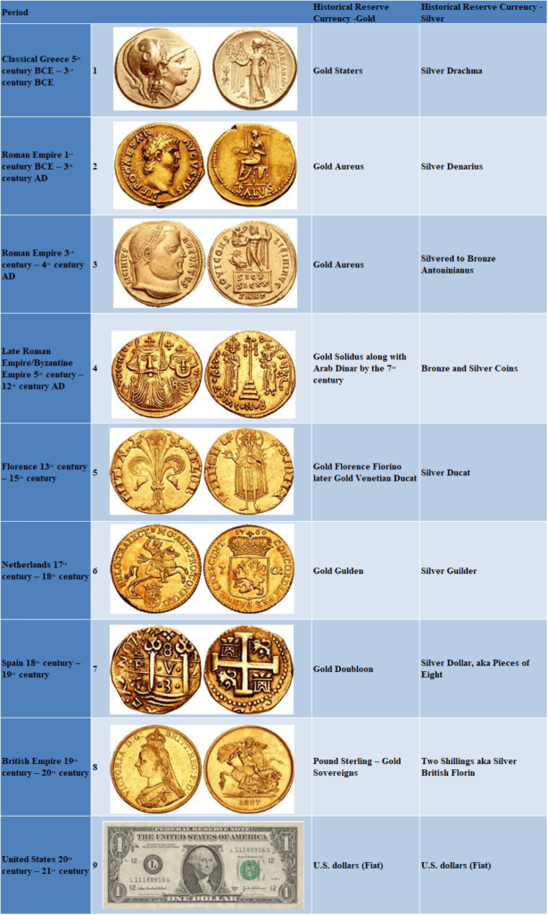
The coins:
Macedon, Kings of Alexander III, 336–323 BCE AV Distater
Nero, 54–68 AD, AV Aureus
Licinius 1, 308–324 AD, AV Aureus
Constans II, with Constantine IV, Heraclius, and Tiberius, 641–668 AD, AV Solidus
Italy, Firenze, Republica, 1189–1532 AD, AV Fiorino
- LOW COUNTRIES, Republiek der Zeven Verenigde Nederlanden (Dutch Republic). Utrecht, 1581–1795, AV Halve Gulden
Peru, Colonial, Felipe V, King of Spain, second reign, 1724–1746 AV 8 escudos
British Gold Sovereign, 1887
- U.S. one-dollar bill
Markets and trends

Martin Armstrong has called it “Knockin’ on Heaven’s Door.” With apologies to Bob Dylan, the S&P 500 (and the Dow Jones Industrials (DJI)) really have been knocking on heaven’s door as in the upper channel of what appears to be a huge broadening top. Add in a potential ascending wedge triangle and we appear poised for a fall breakdown. August and September are the two worst months of the year and if this chart is correct, then the markets could be in for a nasty fall. It’s a long way down to the bottom of the channel which would be an enticing target. For the S&P 500, that is a decline to around 2,200, a potential 25% decline from current levels. If we really have made a significant top, we could fall even further.
Markets took it on the chin this past week. Oh yes, the Fed cut rates, but why on earth are they doing so when stock markets are at a high and the economy is at least bumbling along? Sure, the global economy is slowing and Trump and his insistent tariffs are poised to dig into the U.S. consumer even more than they have already. And savers are hit again as interest rates on deposits drop. But mortgage rates might also fall as long-term interest rates decline.
This past week the S&P 500 fell 3.1%, the worst decline of the year. The DJI dropped 2.6%, while the tech-heavy NASDAQ fell 3.9%. The Dow Jones Transportations (DJT) continued to not confirm its big brother DJI, falling 3.7%. The small-cap Russell 2000 dropped 2.9%. Elsewhere, Canada’s TSX Composite fared somewhat better, losing only 1.6% and the TSX Venture Exchange (CDNX) was a winner, up 0.5%. Internationally, the Brexit-challenged FTSE 100 fell 2.2%, the Paris CAC 40 was off 4.2%, and the German DAX was down 4.2%. In Asia, China’s Shanghai Index (SSEC) fell 2.6% and Tokyo’s Nikkei Dow (TKN) dropped 2.6%. All in all, a lousy week for stocks.
It is intriguing that, so far at least, the S&P 500 was stopped by the top of the channel. All that is needed to make it fait accompli is a drop-down through 2,900 to confirm a potential top. The wedge pattern suggests the potential to fall all the way back to the December lows near 2,350 as a minimum. 2,200 is not that far away if we drop that far. The short-term trend has turned down. Another down week like this past week and the weekly trend should turn down. It has already weakened. Volatility has also returned as the VIX volatility indicator leaped. It won’t take much for it to take out the December 2018 high. The NYSE advance-decline also turned down with the market, albeit from record highs, and the McClellan Summation Ratio Adjusted Index dropped but remains above 500. The S&P 500 Bullish Percent Index turned down, failing to make new highs even as the index made new highs, a divergence. Put buying leaped, but it is not yet near levels that might suggest a bottom. Volume jumped, hitting levels of 13% above the 50-day MA for volume.
Interest rate cuts were supposed to help the stock markets. Trump’s renewal of tariffs on China sunk them instead. Somehow Trump thinks that by putting pressure on China it will force them to succumb. Except the Chinese don’t respond to threats—they hit back instead. Yes, China is hurting, but soon the U.S. is going to hurt even more. Instead of the market soaring, the market is poised to tank. And then Jerome Powell is going to get blamed, along with Democrats.
This past week has to be viewed as a colossal failure. All that is needed is the breakdown under 2,900 to confirm. Only new highs can stave off this eventual decline and that is appearing increasingly unlikely. Long-term weekly support is seen between 2,400 and 2,600. A break of 2,400 would officially end the uptrend from March 2009.
Wave-wise, we believe we could be starting a C wave down. However, some—including Elliott Wave International—believe this is merely an E wave of a larger corrective wave 4 pattern (Our wave count is labeled in red, Elliott Wave’s count in blue). If that’s correct, then the market could soar once again to new all-time highs once a significant low is found. Under our scenario, the market should fall through the bottom of the broadening pattern. The rebound rally will be impressive but should not make new highs.

Three different indices—three different potential topping patterns. The KBW Bank Index remains well off recent highs and also off all-time highs. KBW appears to be forming a large symmetrical triangle. Symmetrical triangles can be both a consolidation pattern and a top pattern. What’s more likely here is a top, given its failure to make new highs a divergence from the S&P 500. The S&P 500 is forming a broadening top pattern (bearish) and a potential ascending wedge pattern (bearish). The Semiconductor Index (SOX) appears to be forming a potential ascending wedge pattern (bearish). None of the patterns appear to be bullish.

It was noted that the NASDAQ appeared to break out when it went to new all-time highs. Given that the NASDAQ has now fallen back under the breakout line near 8,200, the odds are that it was instead a breakout failure or false breakout and the next move is down. There is support down to around 7,800, but under that level, the NASDAQ may be breaking down from an ascending wedge pattern. A breakdown under 7,550 would confirm. The ultimate target could be back to the December 2018 low of 6,190.

Falling margin debt may be the “kiss of death” for the stock market. Margin debt appears to have topped back in January 2018, coinciding with the stock market top at the time. Since then, margin debt has been falling even as the stock market has made new all-time highs. This is not unusual. In 2007, margin debt peaked for about three months before the stock market top in October 2007. The same thing happened in late 1999 a few months before the stock market top January/March 2000. Margin debt soared to record levels during the stock market run from 2009–2019. It is another warning sign that the market may have topped. We are just awaiting confirmation.

International indices took some hits this past week. The MSCI World Index (ex USA) appears to have broken down under rising trendline support. Confirmation would come with a breakdown under 1,800. The MSCI, like others, also appears to have formed a bearish wedge triangle over the past few months. The RSI is falling under 30 so it might suggest that at least a bounce is possible.

The TSX Composite appears to have topped. It is possible that the TSX is making a double top on the charts. The neckline would be near 16,000 and suggest a fall to around 15,400. The TSX may have also made a broadening top; however, it failed this time to reach the top of the channel. None of the sub-indices look particularly attractive at the moment. Utilities did make new 52-week highs this past week, albeit barely.

A recent edition of the Elliott Wave Financial Forecast – August 2019 pointed out a rather interesting comparison: that the DJI and Bitcoin appeared to top and bottom with each other. Not perfectly, but close enough to make the comparison interesting. Here is Bitcoin and the DJI. Note how Bitcoin appears to top and bottom just before the DJI. Bitcoin appears to have made a top and another decline under 10,000 would confirm that top. Another interesting comparison is Bitcoin with most other cryptos. While Bitcoin retraced 65% of its decline from December 2017 to its low in December 2018, numerous other cryptos barely budged off their lows. Many of them remain down 90% or more from their highs of late 2017 to early 2018.

With the Fed cutting the key rate by a quarter-point this past week to 2.00%–2.25%, it helped to send bond yields lower as well. The U.S. 10-year Treasury note fell to 1.86% from 2.05%. It was the lowest level for the 10-year since 2016. The all-time low was 1.37% seen in July 2016. All yields fell this past week with the 30-year falling to 2.38% and the 1-year dropping to 1.85%. The quarter-point interest cut was key as it reversed what the Fed did in December when they last hiked rates. Ironically, we learned that the Trump organization will save roughly a $1 million a year in making lower interest payments on its floating rate debt. It will save the U.S. government even more on its $22.5 trillion of debt. We estimate about $56.3 billion annually. Yields may have a bit further to fall. Potential targets appear to be around 1.79%. We appear to be falling in a 5th wave. If that is correct, then once this move is over rates could begin to rise once again. Now that would be a shock to everyone.
Recession watch spread

The 2-year U.S. Treasury note vs. the 10-year U.S. Treasury note spread has fallen to 14 bp, appearing to break support at 15. The low on the week was seen at 13, just short of 11 that was seen at the December 2018 low. This spread has still not turned negative, unlike most other spreads. Still, if it is a predictor of a potential recession then the direction is right.
Recession watch spread 2

Our other watched recession spread is the 3-month U.S. Treasury bill vs. the 10-year U.S. Treasury note. The spread fell to negative 20 bp this past week, the lowest since negative 25 bp seen in July. This spread has been negative since May. Historically, this spread has been negative for at least 6 months before the onset of a recession. We are now entering our third month. Ironically, the spread actually started to rise a good year before the 2008 financial collapse. Maybe we should be more worried about a rise than a decline to negative yields. However, pundits love to point out the negative yield as a precursor to a potential recession.

Fascinating that there is now more than $14 trillion of negative yield debt outstanding. That amount is 3.5 times greater than the GDP of the EU. 43% of global investment-grade bonds (ex U.S.) is now trading at negative yields vs. only 20% a year ago. As if things weren’t already mind-boggling, but Italy, yes Italy, just borrowed almost $20 billion in 50-year bonds with a yield of just 2.8%. All of the outstanding bonds of Germany, Denmark, Switzerland, and Sweden trade at negative yields. There are now 14 euro-based corporate junk bonds with negative yields. That is mind-boggling. As Elliot Wave International notes, the companies with the worst credit and the highest risk of default are now paid to borrow money. It is irrational but true. We suppose you could view it as—well, it’s a negative yield, but it could get even more negative. But what happens if interest rates rise? Well, someone is going to take a huge loss on their negative rate bond portfolio.
Euro Stoxx Bank Index

Negative yield bonds are playing havoc with bank profits. The EU banking sector is being hammered. Since peaking in 2007 the Euro Stoxx Bank Index has fallen some 82%. It is not that far from its low of November 1987, 32 years ago. A collapsing banking sector is a major problem not just for the EU but for the world. And as we noted with some $14 trillion of negative yield bonds, the question begs: what happens when interest rates rise as they inevitably will? This chart could go even lower.

The U.S. dollar refuses to die. This past week, despite the Fed cutting the key rate, the US$ Index rose rather than fell as many might have expected. It may, however, turn out to be merely a spike as after Trump announced his China tariffs the US$ Index fell. It ended the week up a small 0.1%. Taking it on the chin were the euro down 0.2%, the Canadian dollar off 0.4%, and the Brexit-challenged pound sterling down 1.9%. Both the euro and the pound fell to fresh 52-week lows. Benefitting from the falling euro and pound was the Swiss franc, up almost 1.2% and the Japanese yen gaining 2.0%. Something is amiss when the Swiss and the Japanese currencies are considered the safest play. The U.S. dollar appears to have subdivided into five waves, up from the January 2019 low. We labeled it ABCDE rather than 1,2,3,4,5. We remain well off a breakdown zone currently just above 95.50. With a spike to 98.70, it is the highest level the US$ Index has seen in the past few years. A falling U.S. dollar should be positive for gold; however, as we note, gold may have temporarily topped.

Has gold made a temporary top? It is possible as sentiment has reached high levels and there are numerous divergences. Gold had a wild week. Gold was disappointed that the Fed cut rates by a quarter-point only and Powell indicated that they may be one and done. Gold sold off sharply as the U.S. dollar rallied. Then Trump announced more tariffs on China and gold leaped as the U.S. dollar sold off. Volatility is the name of the game. Gold made fresh 52-week highs this past week, gaining 3.0% The high was seen at $1,461.90 (futures). Ideally, we’d like to see gold print between $1,480 and $1,490 as it would satisfy targets. But silver traded lower on the week and did not follow gold to new highs.
Silver was actually down on the week, losing 0.9%. Platinum and palladium fell as well, losing 2.4% and 8.5% respectively. Is it lonely at the top? Could be. Oddly, it was only about a week earlier when silver made fresh 52-week highs but gold did not. This past week they traded spots. A divergence? Or merely confirming each other? Preferably we’d like to see them making fresh highs together. We could argue that gold is making a rising triangle. If so, then once new highs are seen over $1,462 the target could be as high as $1,537. We had another ideal target of between $1,500 to $1,550 for this move.
Oddly, we read from Elliott Wave International that they believe gold is topping. We find that difficult to understand. The first major wave down from 2011–2015 was four years. The second wave lasted from 2015–2019, another four years. We’d be surprised to discover this one is over in a mere three months, as we’d expect at least two years. The last major low was in October 2008 and we believe that was a 7.8-year cycle low. It was followed by another major low in December 2015 roughly 7.2 years later. The next 7.8-year cycle low is due starting February 2023 to June 2024. The last 32-month cycle low was seen in August 2018. So, the next one is not due until sometime in 2021. From the December 2015 low this is only the second 32-month cycle, so following a low in 2021 thereabouts, there should be one more thrust before falling into the next 7.8-cycle low which would also be a 23- to 24.7-year cycle low from the dual lows of 1999 and 2001. Admittedly, that one could be a doozy.
However, seasonals suggest we could see a pullback now, and then a more powerful rally into 2020. We continue to have ultimate targets up to $1,725. Some believe even higher. Whether this particular rally has more left in it is difficult to say. A breakdown under $1,420 would signal that the rally is over for the time being.

The commercial COT is not supportive of much further in this gold rally. The commercial COT has fallen to 25% in the latest COT report, down from 27% the previous week. Long open interest fell over 34,000 contracts even as short open interest also fell over 34,000 contracts. The large speculators COT (hedge funds, managed futures, etc.) was at 84%, unchanged from the previous week. Overall, the COT report is becoming more negative, signaling the potential for at least a temporary top.

Silver prices fell 0.9% this past week even as gold prices rose. It was a significant divergence. We like the two precious metals to confirm each other. Silver may have touched up to a channel line the previous week as it made fresh 52-week highs. Silver’s high was at $16.68 on July 25. Silver is now down 2.5% from that high. Silver briefly fell under $16 this past week with a low of $15.94. Silver sentiment twice recorded over 91% bulls in the past week. That was the highest sentiment level seen in three years and usually signaled a top. Gold broke out to not only new 52-week highs but also new 6-year highs. Silver fell short of its highs of June 2018 at $17.35.
Another failure for silver when compared to gold. The gold/silver ratio remains at extremely high levels—currently at 89.55, an unprecedented level. Just to get it down to 80, silver should be over $18. The gold/silver ratio has never been so high and for such a long period of time as well. Usually in rallies, as we have experienced, silver leads. But this time its performance has been lagging badly. Nonetheless, the trend remains to the upside. The breakdown point doesn’t come until under $15.60. Silver needs to break out over $16.75 to convince us that higher prices are possible. From the low, at $14.27 seen in May, we note that this may be a 4th wave correction. So there still could be one more wave to the upside to complete this first wave up before a correction sets in. Targets should have been over $18 but minimum targets would be $16.65 (achieved) followed by a target of $16.95 or even $17.15.

Silver’s commercial COT fell to 32% this past week, down from 33% the previous week. It is the lowest level in over a year. Long open interest rose roughly 2,500 contracts but short open interest jumped over 10,000 contracts. The large speculators COT rose to 70% from 67%. The silver commercial COT is increasingly bearish.

With higher gold prices gold stocks enjoyed an up week. The TSX Gold Index (TGD) rose 1.3% while the Gold Bugs Index (HUI) jumped 0.9%. Despite gold making fresh 52-week highs the two gold stock indices failed to make new 52-week highs. The TGD had a wild week, falling sharply on Wednesday only to be followed by an even sharper rise on Thursday. Friday failed to follow through and the TGD actually fell about 0.4%. Given the TGD lengthy time with the RSI exceeding 70, a level often associated with tops, our suspicion remains that we may be at or near a temporary top. A break under 225 would confirm the top. The TGD still has room to rise against its channel with the potential to rise to 245. Oddly enough, the measuring gap seen on the charts on June 20, 2019, implied a target of 245.

The Gold Miners Bullish % Index has hit its highest level since August 2016. The indicator has now pushed into potentially topping territory. In July 2016 it hit 100. Yes, it has room to move higher, but it is also suggesting that one should be cautious about buying more gold stocks at these levels. Traders may be thinking of profit-taking.

If the global economy slows down, oil prices are probably destined to fall. If, however, things in the Gulf of Hormuz get dicier than they have already had, then oil prices could be poised to leap higher. We don’t like the looks of the chart where both WTI oil and the XOI Index have made lower highs. The result is, one has to watch which way they break. WTI oil breaks out over $62 but breaks down under $54. The XOI breaks out over 1,275 but breaks down under 1,200. For the TSX Energy Index (TEN) the index has been in a relentless downtrend and appears poised to make fresh 52-week lows under 127. This past week WTI oil fell 0.6% while the XOI was down 2.9% and the TEN off 2.5%. This is a classic case of us having to await a break to determine the next move. Meanwhile, natural gas prices just keep on falling off another 1.4% this past week and down 27.9% on the year. Natural gas prices made fresh 52-week lows.
Chart of the week

It must be that time of the month again. First Friday of the month and the U.S. employment numbers are out. The report this month was a mild disappointment. The nonfarm payrolls for July came in at 164,000 which was about in line with expectations. However, given downward revisions in previous months, the gain was more like 123,000. The headline unemployment rate (U3) came in at 3.71% up from 3.67% in July. The U6 unemployment rate came in at 6.99% vs. 7.23% in July.
The U6 unemployment rate is the Bureau of Labour Statistics’ (BLS) broadest measurement of unemployment as it includes short-term discouraged and other marginally employed workers as well as those working part-time who would prefer full-time employment. The U3 unemployment remains near a 50-year low. The Shadow Stats unemployment rate dropped to 21% from 21.2%. That number is U6 plus those long-term discouraged workers defined out of existence in 1994 and are no longer included in the BLS’s numbers. Those workers show up in the category “not in labor force.”
The total civilian labor force rose to 163,351 thousand in July from 162,981 thousand in June while the number employed actually fell to 151,183 thousand from 152,242 thousand. The labor force participation rate, as reported by the BLS, rose to 63.0% from 62.9%. That would help explain the small jump in U3. The civilian employment-population ratio rose to 60.7% from 60.6%. In May 2000 the civilian employment-population ratio was 64.4% while the labor force participation rate hit 67.3% in February 2000. If either of those numbers were at those levels today the actual unemployment rate (U3) would be considerably higher.
As noted, the long-term discouraged workers show up in “not in labor force.” That fell to 95,874 thousand in July from 96,057 thousand in June. Of that total 53.7 million are retirees and 10.1 million are disabled.
There were some strange anomalies in this month’s report. The BLS reported that from June to July the number of multiple jobholders jumped by 233,000. That is more than the rise 164,000 for nonfarm payrolls and more than the rise of 148,000 private-sector nonfarm payrolls. More people employed but holding multiple jobs? How do you count people twice? Well simple given that there is a household survey (call people) and an establishment survey (call companies). Since May the number of multiple jobholders has jumped 534,000.
If there was light in the employment report it was average hourly earnings that rose 3.2% from a year earlier, a level better than forecast. The three-month average for nonfarm payrolls was 140,000, the lowest level in almost two years. None of this will please Trump and his belaboring of Fed Chair Jerome Powell will no doubt heighten. As well, the call for further interest rate cuts at the September FOMC will also rise. Trump’s ongoing trade war with China won’t help as ultimately it is the U.S. consumer who pays the price with higher prices and not China as Trump maintains. That, in turn, will lower demand and lower demand would hurt China’s manufacturing sector. But, overall, the additional tariffs are designed by Trump to push China into a deal. The problem is, China cannot be pushed.
U.S. GDP growth came in at a less than robust 2.3% year-over-year in Q2. That was the slowest since Q2 2017 and a far cry from the almost 4% in Q1 2015. The current level is below Trump’s desire for 3% growth. Of course, 2.3% growth seems downright robust when looking at the Shadow Stats numbers. Their Q2 growth shows as negative 1.9%. Why negative? Shadow Stats goes back and calculates GDP as it was done back in the 1990s. It is caused by distortions in how to calculate inflation and a built-in upward bias in the numbers. According to Shadow Stats, the U.S. has been in continuous negative growth since 2000, except for a brief period in 2004.
The U.S. trade deficit for June narrowed slightly to $55.2 billion. In May the deficit was $55.3 billion. The market expected higher. While the deficit with China fell slightly to $30 billion, the deficit with Mexico widened to $9.9 billion. Despite all Trump’s tariffs the U.S. balance of trade has done nothing but rise since Trump took over in 2017 (see chart below).

U.S. balance of trade

Canada reports its job numbers next Friday.
__
DISCLAIMER: David Chapman is not a registered advisory service and is not an exempt market dealer (EMD). We do not and cannot give individualized market advice. The information in this article is intended only for informational and educational purposes. It should not be considered a solicitation of an offer or sale of any security. The reader assumes all risk when trading in securities and David Chapman advises consulting a licensed professional financial advisor before proceeding with any trade or idea presented in this article. We share our ideas and opinions for informational and educational purposes only and expect the reader to perform due diligence before considering a position in any security. That includes consulting with your own licensed professional financial advisor.


E-commerce: Sustainability Becomes a Key Purchasing Criterion in Large Emerging Countries
The report found that 31% of consumers evaluate sustainable packaging options when shopping online, while 30% consider sustainable shipping options...


Agadir Signs a Partnership to Boost the Horticultural Sector
A tripartite memorandum of understanding was sealed between Karim Achengli, president of the Souss-Massa Regional Council, Farid Lekjâa, director of...


MSD Gets Green Light from the European Commission for Keytruda, the World’s best-Selling Drug
MSD closed 2023 with a turnover of 55.5 billion euros, 1% more than in 2022, when it obtained sales of...


Konvex Created the First Universal API that Integrates Different ERPs in Latin America
The Konvex API offers numerous benefits so that companies and startups can take advantage of their time and effort in...


The French Real Estate Crowdfunding is Going through First Crisis
Crowdfunding platforms face an influx of repayment extension requests, delaying project completion. Investors like Guillaume report delays in seven out...
 |
|
 |  |
 |
|
-

 Cannabis1 week ago
Cannabis Legalization Reduces the Likelihood of Youth Using It
-

 Cannabis1 day ago
Cannabis Reform in Belgium: What Changes Does the Latest Report Propose
-

 Crowdfunding1 week ago
Consolidation in Sight in the Italian and European Crowdfunding Sector
-

 Crypto2 weeks ago
Bitcoin Markets are Entering a Phase of Euphoria, According to Glassnode