Featured
The High Yield Market Appears to be Breaking Down as the Stock Market Tries to Regain its High
Money makes the world go round and also makes the stock market and housing market go up. That’s good. But now prices are going up too and that’s not so good and everyone is crying. Didn’t hear them cry when stocks and housing were rising too fast. We look at money and the most insidious thing we saw is the loss of purchasing power. Our chart of the week looks at the high yield market that is rolling over.
Oh yes, money. What would we do without it? Money is just a means of exchange, payment for goods and services, and debts. Its functions are simple. It’s a means of exchange, a unit of account, and a store of value. And in a world of debt, it is the standard for deferred payments.
Today, while currency (notes and coins) circulate, money is mostly just blips on a screen or an entry into a ledger. Before they defined what money should be there was bartering. But that evolved and eventually, they had to come up with some sort of currency, whether it be animal skins, salt, weapons, shells, or whatever. Apparently, the Chinese were the first to issue early coins, sometime around 770 BCE. Before that, shell money was common, dating from the Neolithic Age which lasted variously from 10,000 BCE to 1,200 BCE. Initially, the coins weren’t even round, being shaped more like a knife or a spade. Coins could be made of iron, copper, lead, gold, and silver. Western coins began to appear dating back to the 8th century BCE. Electrum coins were issued, electrum being a naturally occurring alloy of gold and silver.
Below is an electrum coin from Ephesus (a city in Ancient Greece on the coast of Ionia in modern day Turkey) dating from 650–625 BCE. The obverse is a stag grazing right while the reverse is two incuse punches, each with raised intersecting lines. The electrum coins were the first official currency. They were stamped with pictures that acted as denominations.

The Chinese are also believed to have issued the first paper money, apparently during the Tang Dynasty (618–907 AD). The currency was privately issued in the form of bills of credit or exchange notes. It was used for upwards of 500 years before paper money began to catch on in Europe. The Europeans continued to use metal coins (gold, silver, bronze) up until the 17th century. The Chinese experiment with paper money eventually collapsed due to undisciplined printing, creating hyperinflation. Sound familiar?
The first paper currency issued by European governments was apparently issued by colonial governments in North America because it took so long for shipments of metal coins to arrive. The colonists ran out of coins so instead of using barter they issued effectively IOUs. One of the first instances was the French colony of New France in Canada. In 1685 they issued pieces of playing cards signed by the governor to use as cash as a substitute for coins from France. Paper money began dominate in the 18th century and remained that way up until the 20th century.
When paper money became more prevalent it was initially issued by private banks, although not all followed that route. The U.S Constitution of 1789 gave Congress the sole right to issue coin money and the power to regulate its value. Coins did not die out and continued to circulate. But the days of private banks issuing their own paper money was slowly coming to an end. In 1913 the Federal Reserve came in existence. But it wasn’t until the 1930s during the Great Depression that the banknotes issued by private banks came to an end and the issuance of currency was consolidated into the Federal Reserve. The Bank of Canada came into existence in 1935 and it was their responsibility to issue and distribute banknotes, ending the era of private banknotes.
At one time money was backed by gold. Between 1696 and 1812 the development and formalization of the gold standard began as the rise of paper money created its own problems. However, the gold standard was never hard and fast and in periods of war such as the American Revolution and the U.S. Civil War the gold standard was effectively suspended. Wars are costly. The switch from a gold standard to paper money usually resulted in a surge in inflation. Great Britain only adopted the gold standard in 1821, but by 1931 they had abandoned it. The U.S. followed in 1933. After World War II, in 1944, the Bretton Woods system was drawn up, fixing the U.S. dollar to gold as the world’s reserve currency at US$35/ounce. Like the gold standard before, it was designed to provide for a stable exchange rate system and encourage global trade.
Then came August 1971 and the U.S. ended the Bretton Woods system by ending the convertibility of the U.S. dollar to gold because of rising inflation sparked by the Vietnam War and social programs and the threat of a looming gold run. The problem was that the supply of gold had only increased marginally but the amount of U.S. dollars sloshing around in foreign central banks exceeded the amount of gold held by the Federal Reserve. The Bretton Woods system was facing collapse and the U.S. dollar as the world’s reserve currency was threatened.
By 1973, all remnants of the Bretton Woods system were gone as the world turned to floating exchange rates and fiat currency. Yes, fiat currency: a currency backed by nothing more than the government’s promise to pay. In other words, an IOU. No longer was money tied to anything but promises—government fiat.
This is a rather shortened history of money but there are numerous sources available for those interested in learning more. We note it because since 1971–1973 the world for the first time has moved to a 100% fiat system. Paper money along with bimetallic coins containing no gold or silver have an intrinsic value of zero. Money may no longer be a store of value irrespective of what governments say. Add in the rise of credit cards (first known one was issued in 1951), mobile payments—i.e., money transacted through a portable electronic device such as a cell phone, smartphone, or tablet—and the rise of virtual currencies, such as Bitcoin and the cryptos, and we are entering yet another phase in the history of money. There are movements about to end the era of cash (paper money and coins) and move to a 100% virtual system of money with credit cards, mobile payments, and possibly cryptos. The business and banking world is already on virtual a system of virtual currencies. Some $7 trillion of currencies is traded every day in the foreign exchange market. The forex market is the largest financial market in the world, dwarfing the stock markets.
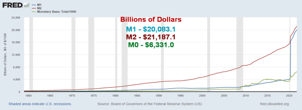
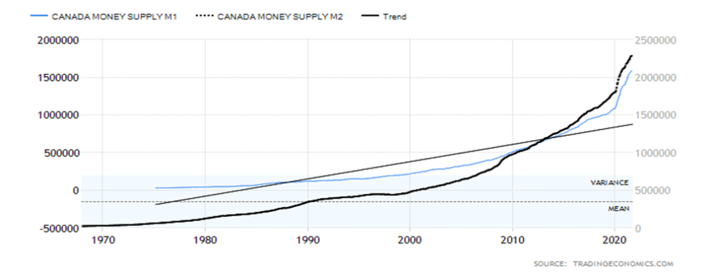
In moving to a system of fiat money it is probably no surprise that the amount of money has exploded. In August 1971 U.S. money supply M1 (physical currency, coin, demand deposits, travelers’ cheques, chequable deposits) stood at $225.6 billion. Today it stands at $20,083.1 billion, a virtual upward explosion. Most of that explosion of money has taken place since February 2020 and the start of the pandemic. In February 2020 U.S. M1 was $4,028.4 billion. That is an upward explosion of about 400% since then. In Canada it has been the same. In August 1971 Canada’s M1 stood at $31.4 billion. Today it is $2,202.9.0 billion which is itself a 40% rise since February 2020. Canada, by comparison to the U.S., appears to be constrained.
With nothing to constrain it, money has exploded. Money is just so many blips on a screen. Fiat money has no limit. Gold and silver are finite. The question that has been asked is, why hasn’t the explosion in the money supply resulted in hyperinflation? Many scream that the U.S., Canada, and others are on the road to massive hyperinflation like the Weimar Republic or Zimbabwe. By that measurement, Japan, who has been printing money and has been issuing debt since the Japanese financial crisis of 1990 should have collapsed by now. They haven’t. By printing money, the U.S., Canada, and others most likely avoided a depression. That was the case after the 2008 financial crisis and again following the 2020 pandemic.
Prices did rise following the 2008 financial crisis but they were modest. Despite the cries, the price rise since the pandemic has also been modest. What’s notable is that in both cases the economy didn’t collapse. Yes,
both times there was a recession. The 2008 financial crisis was dubbed the Great Recession. But, unlike Germany in the early 1920s and more recently Zimbabwe, their economies did not collapse.
U.S. Money Supply 1959–2021
As of October 2021
$Billions
Canada Money Supply 1975–2021
As of September 2021
$Millions
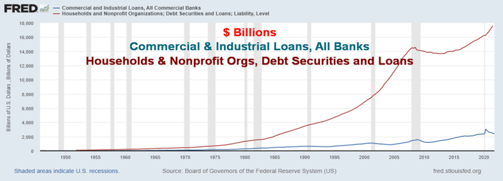
Following the 2008 financial crisis the banking system had a lot of bad loans on their books, thanks to the sub-prime mortgage collapse. Banks used the QE to shore up their balance sheets. Capital requirements were tightened in an attempt to quell another meltdown, as was seen in 2008. Bank balance sheets were in good shape before the pandemic. Since then, the banks have hoarded the money. Loan growth has been modest. Commercial and industrial loans at commercial banks are up a modest $74 billion since February 2020 and $836 billion since 2008. That’s only 3% and 52% respectively. Household and non-profit organizations have seen their loan growth up only $3.3 trillion since 2008 (23.6%) and $1.3 trillion since Q1 2020 (8.3%). By comparison to the growth in money supply, the gains are modest.
Commercial & Industrial Loans, All Commercial Banks and Households & Non-Profit Organizations Debt Securities and Loans – 1952–2021
Personal Savings, Treasury & Agency Securities, MBS, All Commercial Banks, Fed Assets 2003–2021
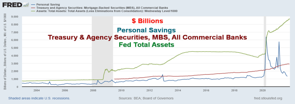
Money was also been hoarded as we saw with the huge jump in personal savings. Personal savings rose initially by $5.1 trillion from January 2020 to April 2020 or almost 400%, thanks to the fiscal stimulus of the increased unemployment payments and stimulus cheques. Since then, the money is being spent and personal savings are now up only modestly from January 2020. The rise in treasury securities, agency paper, and mortgage-backed securities (MBS) at commercial banks rose only modestly, gaining $782 billion or 37%. The balance sheet of the Federal Reserve rose sharply by comparison, up $4.5 trillion or 109% since February 2020. Money on the balance sheet of the Fed is not going into the economy. The Fed in that respect is hoarding.
It is only recently that the CPI has started to climb, thanks to increased demand for goods coupled with supply disruptions from the pandemic and even disruptions thanks to natural disasters such as floods and wildfires. If these disruptions continue, then inflation could become more than transitory. Even Jerome Powell and Tiff Macklem are acknowledging that inflation could last longer than they initially thought. If inflation persists and the economy weakens, then we would have stagflation: i.e., inflation + weak economy (high unemployment, stagnant demand).
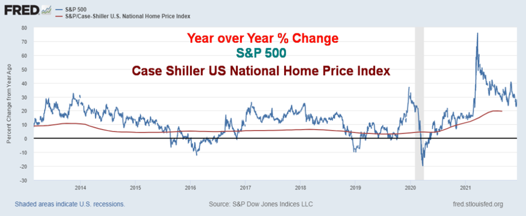
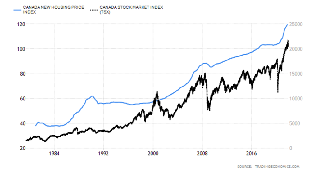
So where is all the inflation? Yes, prices are up modestly. Overlooked in all the inflation hysteria is that the prime inflation has been asset inflation—stocks and houses. Since March 2020 pandemic lows, the S&P 500 is up 113%, the TSX Composite has gained 87%, the Case Shiller US National Home Price Index has gained 26%, while the Canada New Housing Price Index has gained 15%. The U.S. CPI by contrast is up about 6.2% and the Canadian CPI is up roughly 4.8%. Inflation? Yes, inflation of stock and housing prices. Nobody is crying about that. Yet the cry is about the inflation in prices caused primarily by supply disruptions and increased demand following the pandemic. Worker shortages are also contributing to inflation.
S&P 500, Case Shiller US National Home Price 2013–2021
Year-over-year change %
Canada New Housing Price index, TSX Composite 1982–2021
Never in history has money exploded the way it has since the world came off the gold standard in 1971. For centuries, money had real value. Even when the world shifted to paper money it was for the most part tied to something real; i.e., the gold standard. But fiat money’s value is only what the government and central banks say it is. Before paper money, coins were debased by lowering the silver or gold content. It took a couple of centuries but the debasement of the Roman denarius eventually contributed to the collapse of the Roman Empire. The coins became worthless. As to paper money, they can’t debase it like coins but purchasing power has been falling for years, especially since the world moved to a central bank and a fractional reserve system of banking. If confidence was ever lost in government and the central banks, then there could be serious risk of hyperinflation.
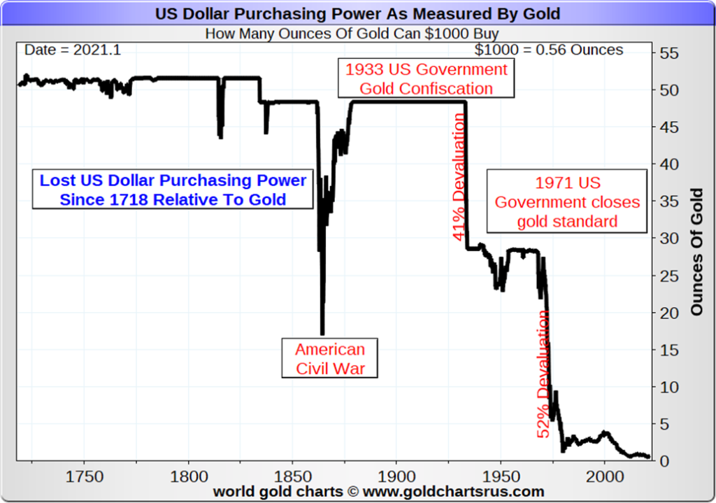
The loss of purchasing power for the U.S. dollar can best be measured in terms of gold. As per the chart below, since 1718 the purchasing power of the U.S. dollar has fallen 98.5%. The collapse has been most dramatic since the 1933 devaluation of the U.S. dollar vs. gold when they revalued gold up to $35/ounce from $20.86/ounce. The second big drop came following the end of Bretton Woods and the gold standard in August 1971. At one time a $1,000 would purchase over 50 ounces of gold. Today it purchases just over a half an ounce of gold.
The real problem is not the price inflation we have been witnessing as a result of the pandemic and supply disruptions. If anything, it may get worse before it gets better. The real problem is with the explosion in the
printing of money, resulting in too much money chasing too few assets, and creating bubbles in the stock and housing markets and everywhere else it seems. Is this time different? All bubbles end badly. The question is, what will be the trigger and when?
“In the absence of the gold standard, there is no way to protect savings from confiscation through inflation. There is no safe store of value.”
—Alan Greenspan, American economist, served five terms as 13th chair of the Federal Reserve 1987–2006, private advisor Greenspan & Associates LLC; b. 1926
Our second chart below puts the purchasing power of $1 in a different perspective, comparing it to the purchase of a package of goods dating from the onset of the Federal Reserve in 1913. The result is the same. The purchasing power of $1 has fallen roughly 98% since 1913. And it is still falling. Could money become worthless?
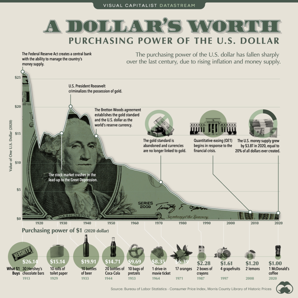
Chart of the Week
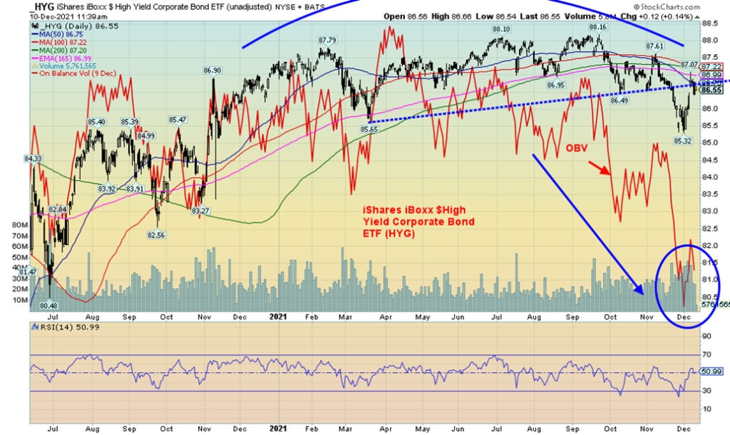
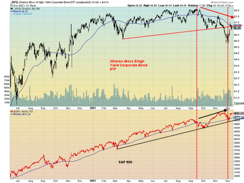
Are high-yield bonds sending a warning signal? Above is the iShares iBoxx $High Yield Corporate Bond ETF (HYG). The high-yield bond market has been acting more like the stock market. Since the lows in March 2020, HYG gained about 30% to its recent high in mid-September 2021. No, it was nowhere near its all-time high seen back in 2007 before the financial crisis of 2008. But the HYG did follow the stock market to the upside. Incidently, during the March 2020 pandemic crash the HYG fell about 24% while the S&P 500 lost 35%. Another divergence as the HYG may have been signaling that this collapse was overdone. Since then, the S&P 500 has gained 116% from the March 2020 lows. But what we are seeing now is that the HYG appears to be breaking down, even as the S&P 500 is recouping and could be headed once again to new all-time highs. Overall, the S&P 500 has outperformed the HYG by a wide margin. The key was that they were both moving in the same direction. But not any longer.
High-yield bonds trade more like stocks then do bonds. When things are good, money flows into the high-yield market. But if things start to weaken, then the high-yield market could suffer more than the stock market. The high-yield market saw its top back in mid-September while the S&P 500 continued to higher highs, topping most recently just before Thanksgiving. Since then, the S&P 500 has held its 50-day MA following a pullback, but on the subsequent rebound the HYG has only been able to come back to its 50-day MA. Volume has been rising on the decline for the HYG and the On Balance Volume (OBV) has been plunging since September. The OBV for the S&P 500, on the other hand, has been rising back to its recent highs, at least.
The high-yield market is like a canary in the coal mine. It often shows trouble ahead of the market. While the Fed is tapering, the one that seems to having the taper tantrum is the high-yield bond market. It’s a warning.
MARKETS AND TRENDS
| % Gains (Losses) Trends | ||||||||
| Close Dec 31/20 | Close Dec 10/21 | Week | YTD | Daily (Short Term) | Weekly (Intermediate) | Monthly (Long Term) | ||
| Stock Market Indices | ||||||||
| S&P 500 | 3,756.07 | 4,712.02 | 3.8% | 25.5% | up | up | up | |
| Dow Jones Industrials | 30,606.48 | 35,970.99 | 4.0% | 17.5% | up (weak) | up | up | |
| Dow Jones Transports | 12,506.93 | 16,404.67 | 2.7% | 31.2% | neutral | up | up | |
| NASDAQ | 12,888.28 | 15,630.60 | 3.6% | 21.3% | neutral | up | up | |
| S&P/TSX Composite | 17,433.36 | 20,890.62 | 1.3% | 19.8% | down | up | up | |
| S&P/TSX Venture (CDNX) | 875.36 | 908.99 | 1.3% | 3.8% | down | down | up | |
| S&P 600 | 1,118.93 | 1,377.61 | 2.7% | 23.1% | down (weak) | neutral | up | |
| MSCI World Index | 2,140.71 | 2,316.80 | 2.3% | 8.2% | down | down (weak) | up | |
| NYSE Bitcoin Index | 28,775.36 | 48,065.25 | (14.4)% | 67.0% | down | neutral | up | |
| Gold Mining Stock Indices | ||||||||
| Gold Bugs Index (HUI) | 299.64 | 242.04 | (1.6)% | (19.2)% | down | down | neutral | |
| TSX Gold Index (TGD) | 315.29 | 273.24 | (2.2)% | (13.3)% | down | down | neutral | |
| Fixed Income Yields/Spreads | ||||||||
| U.S. 10-Year Treasury Bond yield | 0.91 | 1.49% | 10.0% | 63.2% | ||||
| Cdn. 10-Year Bond CGB yield | 0.68 | 1.46% | 1.6% | 115.2% | ||||
| Recession Watch Spreads | ||||||||
| U.S. 2-year 10-year Treasury spread | 0.79 | 0.83% | 10.5% | 4.9% | ||||
| Cdn 2-year 10-year CGB spread | 0.48 | 0.48% | 17.8% | 0.6% | ||||
| Currencies | ||||||||
| US$ Index | 89.89 | 96.10 | flat | 6.9% | up | up | neutral | |
| Canadian $ | 0.7830 | 0.7857 | 0.9% | 0.3% | down | down | up (weak) | |
| Euro | 122.39 | 113.17 | 0.1% | (7.5)% | down | down | neutral | |
| Swiss Franc | 113.14 | 108.62 | (0.3)% | (4.0)% | neutral | down (weak) | up | |
| British Pound | 136.72 | 132.65 | 0.2% | (3.0)% | down | down | up (weak) | |
| Japanese Yen | 96.87 | 88.16 | (0.5)% | (9.0)% | up | down | down | |
| Precious Metals | ||||||||
| Gold | 1,895.10 | 1,784.80 | 0.1% | (5.8)% | down | neutral | up | |
| Silver | 26.41 | 22.19 | (1.3)% | (16.0)% | down | down | up (weak) | |
| Platinum | 1,079.20 | 934.20 | 0.9% | (13.4)% | down | down | neutral | |
| Base Metals | ||||||||
| Palladium | 2,453.80 | 1,749.80 | (3.5)% | (28.7)% | down | down | neutral | |
| Copper | 3.52 | 4.29 | 0.5% | 21.8% | down | neutral | up | |
| Energy | ||||||||
| WTI Oil | 48.52 | 71.67 | 8.2% | 47.7% | down | neutral | up | |
| Natural Gas | 2.54 | 3.92 | (5.1)% | 54.3% | down | neutral | up | |
New highs/lows refer to new 52-week highs/lows and, in some cases, all-time highs.
It was rebound week as dip buyers returned. We liked the headline in Bloomberg that read “Dip Buyers Scoring Historic Win in Stocks That Defy Bond Warning” (https://www.bloomberg.com/news/articles/2021-12-10/dip-buyers-scoring-historic-win-in-stocks-that-defy-bond-warning?srnd=markets-vp&sref=5lk0w2FC). Yes, we have noted that ourselves. But as fear of Omicron subsides, oil rebounds, and even the surging consumer prices have brought out the dip buyers. The S&P 500 gained 3.8% this past week. A startling jump. The Dow Jones Industrials (DJI) was up 4.0%, the Dow Jones Transportations (DJT) gained 2.7%, while the NASDAQ was up 3.6%. The S&P 600 (small cap) gained 2.7% while the S&P 400 (mid-cap) was up 2.9%. The Wilshire 5000 leaped 3.5%. The gain for the S&P 500 put it 0.7% away from new all-time highs. Of the major indices the S&P 500 is the closest to potentially making new all-time highs. It cannot be ruled out. But we’ll watch for divergences in the form of the indices not confirming each other. The DJI could make it this week. It remains 1.7% away from new all-time highs. But the DJT is 11% away from making new all-time highs. That sets up the potential for the DJI and the DJT to not confirm each other, a classic Dow Theory divergence. Bitcoin had a miserable week, falling under $50,000 and losing 14.4%. However, it looks poised to regain $50,000 this coming week.
In Canada, the TSX Composite gained 1.3%, while the TSX Venture Exchange (CDNX) was up 1.3%. The CDNX continues to keep its head above water for the year, but just. In the EU, the London FTSE gained 2.3%, the Paris CAC 40 was up 3.3%, and the German DAX gained 3.0%. Are they worried about the U.S./Russia/Ukraine conflab? Doesn’t appear to be the case. In Asia, despite Evergrande defaulting, China’s Shanghai Index (SSEC)
gained 1.6% while the Tokyo Nikkei Dow (TKN) gained 1.5%. The MSCI World Index gained 2.3% but continues to look quite weak.
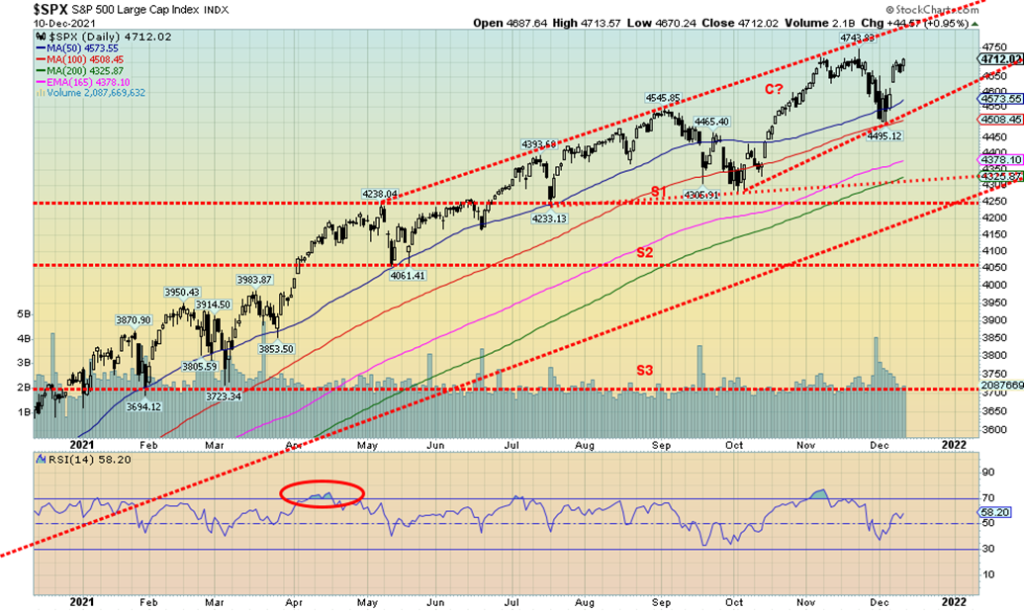
The stock markets gapped higher on Tuesday and maintained the gains on the week despite the inflation numbers on Friday. Buying seemed to be mostly in the big-cap popular names such as the FAANGs. No wonder breadth is fading. Volatility has picked up both the downside and upside. This week is the FOMC on December 14–15 and that could spark some further volatility. So far, the decline from the November top appears to be a three-wave decline, suggesting it is corrective only. So new all-time highs are possible. But will all them make it? The market appears to ignoring the fact that short term rates have been rising in anticipation of the Fed hiking interest rates in 2022. Two rate hikes of 25 bp are priced in and expectations are that there could be a third. Will the Fed speed up the taper? There is talk of that. Hence, this week’s FOMC could be key. Set aside the COVID variant, supply chain disruptions, and rising inflation. Dip buying is in as the market continues to expect higher and higher prices.
If the S&P 500 takes out 4,725 this week early on, then the odds rise sharply for new highs. The point where new highs are highly probable is at 4,685 and we’ve already passed that point. New highs are probable. There is a gap left between 4,612 and 4,631 so if that were filled and the S&P 500 broke back under 4,550, the odds of new highs diminish and the trend could return to the downside. Major support is at 4,500. And it’s over and a panic could follow under 4,300. Time, we believe is running out on this stock market.
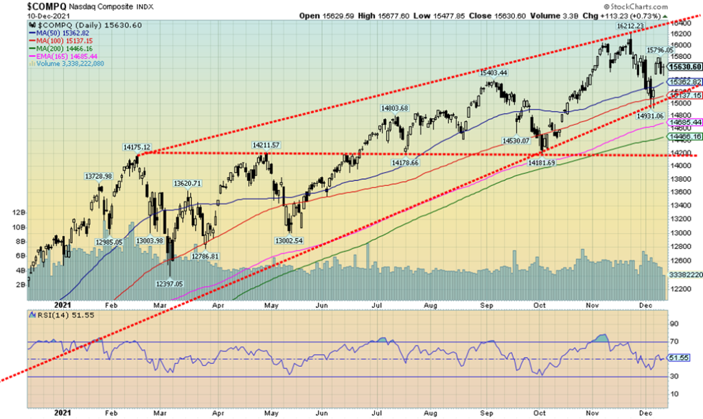
The NASDAQ gained 3.6% this past week, the strongest move of the major indices. We gapped higher on Tuesday but then spent the rest of the week treading water. The NASDAQ gained 0.7% on Friday following the inflation numbers. The gains were encouraged by the FAANGs who saw some good gains this past week. Leading the way was Apple who leaped 10.9% on the week to new all-time highs, the only one to do so. Meta (Facebook) was up 7.5%, Amazon 1.6%, Netflix 1.6%, Google 4.3%, Microsoft 6.1%, Tesla 0.2%, Twitter 8.3% Baidu 8.7%, and Alibaba 11.7%. Oh yes, there was a loser—Nvidia down 1.6%. The question is, is this the start of a move to new all-time highs once again or is this merely a rebound rally on low volume? We suspect the latter. A move back over 16,000, however, could change the scenario to up. The RSI is a neutral 51.5. A break back under 15,350 could set a more negative tone and see the NASDAQ fall to support near 15,150. Under 15,150 and especially under 15,000 the NASDAQ could fall further. Right now, we still have a lot of dip buyers. But if they soon find themselves under water the situation could change quickly. Despite the low volume, the decline appeared to be in three waves, so this may just be a B wave rebound before the C wave down. In the interim, however, we’ve seen B waves make new all-time highs before. So, it remains possible, especially if we regain 16,000. The strong performance from the FAANGs is encouraging as they are the ones leading the market as breadth is weak and the secondary and small cap stocks still look weak and are lagging.
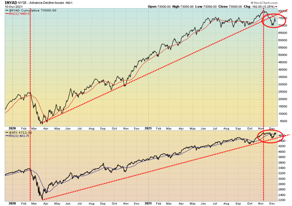
The NYSE advance-decline line rebounded with the S&P 500 this past week, but so far it has failed to rebound back over the 21-day MA. The S&P 500 did rebound over the 21-day MA and could be poised to make new highs. The AD line remains well off its highs so if the S&P 500 makes new highs it could set up a negative divergence between the two. Not encouraging for the bulls. The AD line also broke its uptrend line from the March 2020 low but the S&P 500 held its trend line for now. Another divergence.
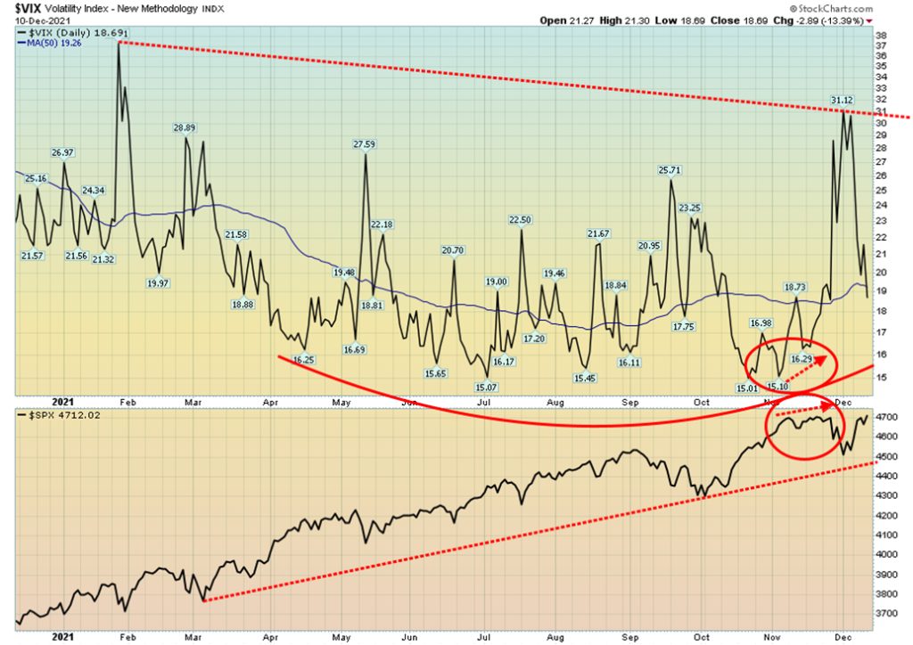
The VIX Volatility Indicator plunged this past week as the market rebounded. However, we note it just hit its 50-day MA, so that might be the low as it has bounced off that level in the past. The S&P 500 is approaching new all-time highs but the VIX remains above its lows seen in July/August 2021. Could we be setting up for another divergence between the VIX and the S&P 500?
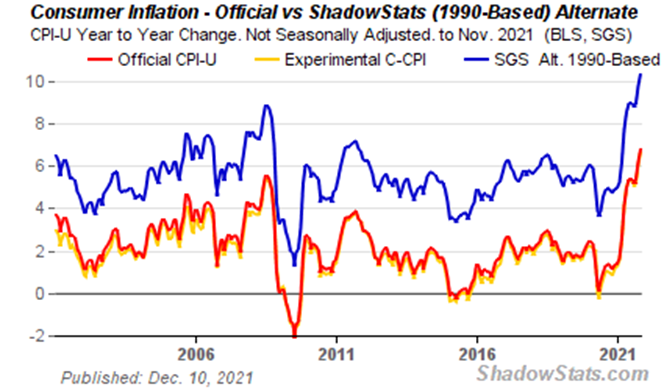
While many are committing hari-kari over the recent inflation numbers, they should keep things in perspective. Yes, the CPI year over year jumped to 6.8% in November, but it was still marginally better than the expected 6.9%. The core inflation (ex food and energy) rate year over-year was 4.9%, right on expectations. Last month the inflation rate was 6.2% and the core 4.6%. If the inflation worriers want to get really excited, then they should look at the Shadow Stats (www.shadowstats.com) inflation numbers. John Williams of Shadow Stats calculates an alternative inflation number based on how it was calculated in 1990. Methodological changes were made in the 1990s under the Clinton administration to put more emphasis on substitutes moving the measure of inflation away from a calculation of the cost of living to one of maintaining a constant standard of living. The old methodology saw the year-over-year inflation rate jump to 14.9% the highest level seen the late 1940s when Harry Truman was president. Back then, coming out of the war and depression the inflation rate jumped in 1947 to 17.6% in June 1947. During the 1970s the highest rate seen was 14.8% recorded in March 1980. So, this rate is the highest in 74 years. The official inflation rate of 6.8% is the highest recorded since 7.1% in June 1982. The focus is now on the FOMC on December 14–15. Will tapering accelerate? Will the Fed hint at more interest rate hikes? This week could prove interesting.
The hue and cry is over price inflation. We haven’t heard any hue and cry over asset price inflation in the stock and housing market other than warnings of irrational exuberance. And there is no huge hue and cry over the private debt explosion especially in the corporate market. The hue and cry on debt is largely confined to government debt. Yet without it the western economies would have plunged into an economic depression.
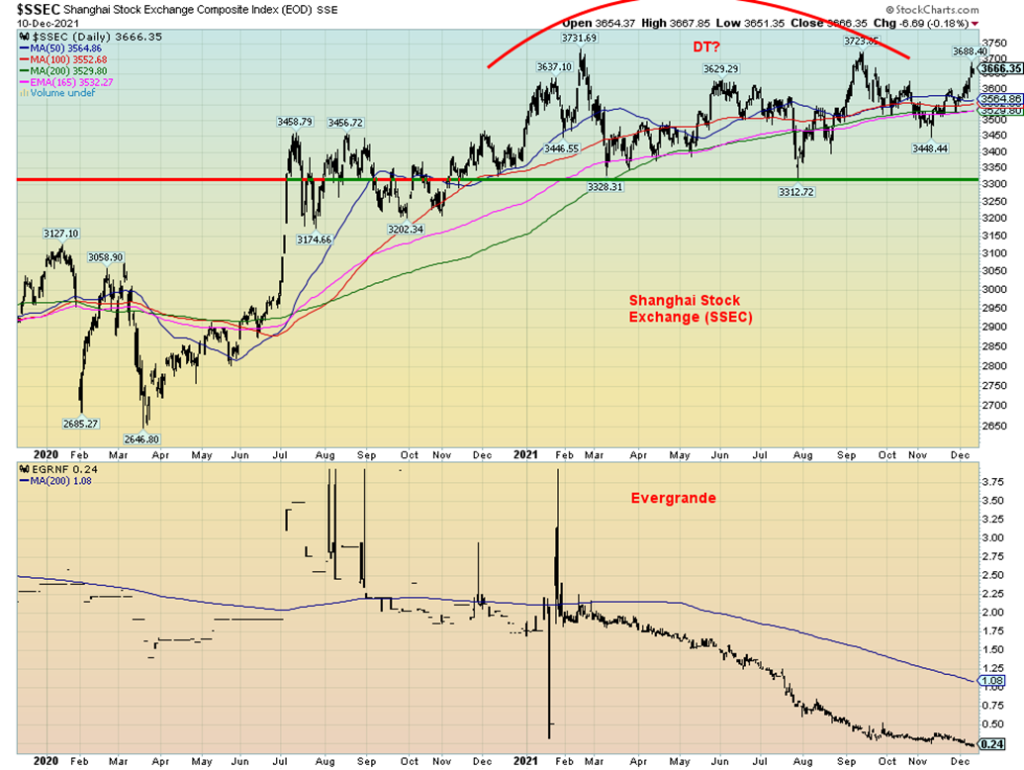
Bye, bye Evergrande? Evergrande, the huge Chinese property developer/holding company has been officially labelled as a defaulter. Evergrande has been cut to restricted default. Joining them is the Kaisa Group, another large holding company. Kaisa missed payment on a $400 million bond. So, why hasn’t the market collapsed like a Lehman Brothers moment? Well, PBOC and the Chinese government have wasted little time supporting this collapse so that it doesn’t turn into a monster. Evergrande is the world’s most indebted developer with an estimated $300 billion in loans/bonds and 200,000 employees. Evergrande is in the category of “too big to fail.” Chinese borrowers have already defaulted on $10.2 billion of offshore debt, primarily denominated in U.S. dollars. But the Chinese government has come in fast to cushion the blow, becoming involved in Evergrande’s restructuring. A disorderly collapse appears to be off the table. Evergrande’s stock has already fallen about as far as it could go without going to zero. It already trades here in North America on the Pinks where you will still find Lehman Brothers and Nortel trading. And China’s Shanghai Index (SSEC) rallied on the week. The result was this declaration of default by Evergrande caused barely a ripple. With the SSEC rising the odds of a double top are fading. Triple tops are rare.
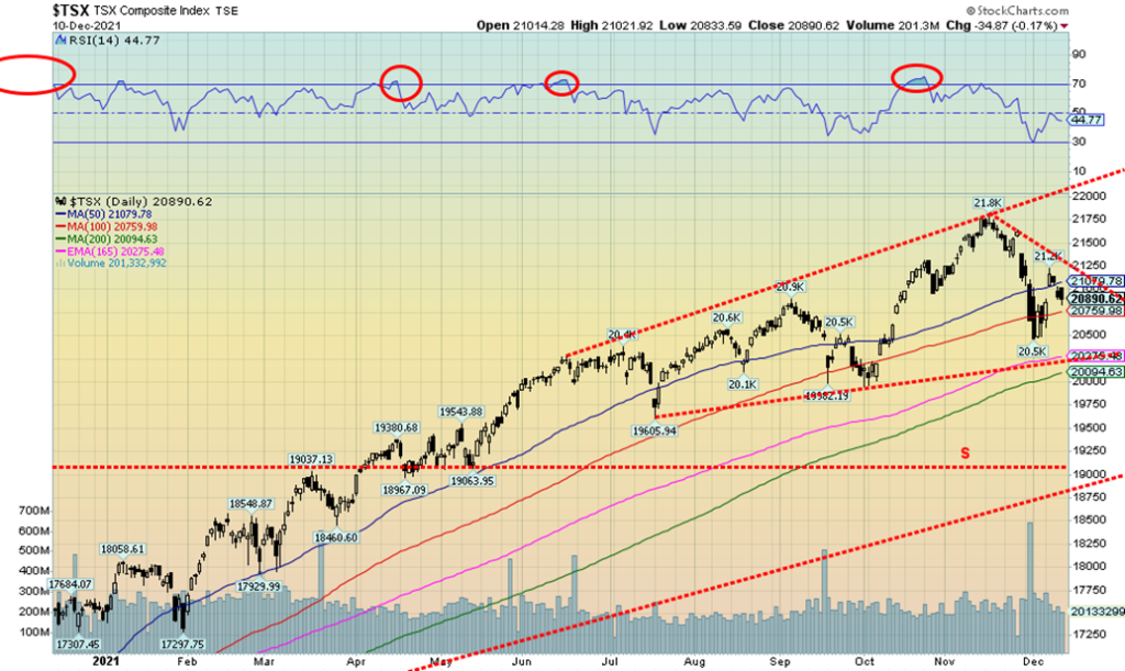
The TSX joined the ‘up’ parade this week, gaining about 1.3%. Three of the 14 sub-indices were down on the week led by Golds (TGD), down 2.2%. The other losers were Telecommunications (TTS), down 0.5% and Health Care, off 0.2%. The leader on the upside was Energy (TEN) up 3.7%. Other strong performers were Consumer Discretionary (TCD), up 3.3% and Consumer Staples (TCS), up 2.5%. Energy is a key component of the TSX. The recent decline saw a spike in volume as the TSX approached a support line near 20,275. The 200-day MA is also nearby at 20,100. The TSX rebounded strongly initially and then faded as the week wore on. Friday saw the TSX lose 0.2% as the rally that started appears to be fading quickly. No, not over yet. A break under 20,750 could suggest the rebound is over and the focus would once again turn to the downside. If a correction has started from the top in November near 21,800, then this is just a small b wave and not the start of a new upswing. However, given it is December and we traditionally have the Santa Claus rally, we could see some choppy back and forth action with a slight upward bias into early January. A breakout over 21,250 could set the TSX on a path to higher levels with the next level of resistance up at 21,500. But, overall, the rebound appears to us as corrective and not the start of a new upward move.
U.S. 10-year Treasury Bond/Canadian 10-year Government Bond (CGB)
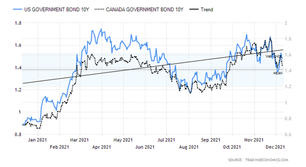
If inflation is such a worry, why is the U.S. 10-year treasury note falling in yield rather than rising? Yes, the 10-year did pop higher earlier this week, but following the release of the CPI on Friday the note rallied and yields closed the week at 1.4854% up 10.0% on the week. Overall, we believe the trend has turned down in yield (up in price as prices move inversely to yields). And the yield curve is slowly narrowing, although the 2–10 spread rose this week to 0.83% up 10.5% on the week. But again, the yield is more moving towards narrowing rather than widening. A narrowing yield spread is more indicative of the potential for recession rather than growth. The 1.40% remains the breakdown point, and if the 10-year falls under that level the next target could be 1.20%. Regaining above 1.60% could set the 10-year to higher yields. In Canada, the 10-year Government of Canada bond (CGB) also rose slightly on the week to 1.46% from 1.44%. The 2–10 spread widened to 0.48% from 0.41%. But the Canada bond, like its U.S. counterpart, still appears poised to move lower in yield.
University of Michigan Consumer Sentiment Index (Dec preliminary)
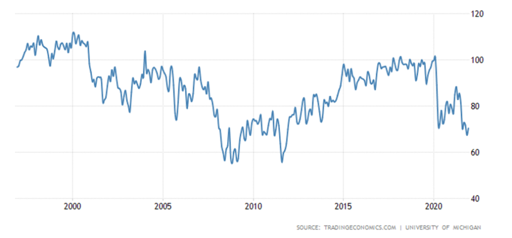
The Michigan Consumer Sentiment Index (December preliminary) came in slightly higher than expected at 70.4 vs. an expectation of 67.1 and November’s 67.4. The low in November was a 10-year low not seen since 2011. If the economy is supposed to be on the upswing, then why is consumer sentiment falling and not rising? Apparently, the rise was because of an improved outlook from the lower third of income earners that rose 23.6% while the middle fell 3.8% and the top third fell 4.3%. Seemed to be based on expectations of higher wages in the coming year. We are seeing some evidence of that as the minimum wage is raised. Still, the trend in sentiment remains down although we could see some temporary relief.
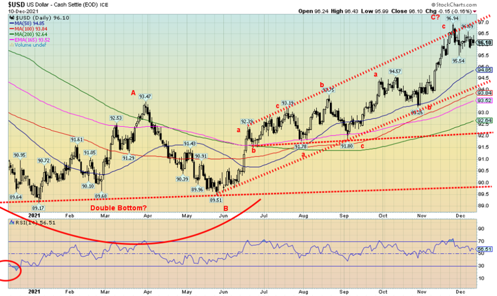
The US$ Index’s swift decline from the high of 96.94 to 95.54 appeared to us to fall in five waves, an impulse pattern. If that is correct, then it is possible that the US$ Index has topped. We viewed the recent action as an overthrow of the upper channel that had been forming since June 2021. Overthrows are not unusual. If it was a legitimate breakout, then the US$ Index would have only tested the breakout line before moving on to new highs. It didn’t and fell back under its channel line. Currencies were mixed as the euro was up 0.1%, the Swiss franc was down 0.3%, the pound sterling was up 0.2%, but the Japanese yen fell 0.5%. The Canadian dollar was up 0.9% as oil rebounded. On the week the US$ Index was flat for the second week in a row. This past week the U.S. dollar fell to its lowest level against the Chinese yuan since 2018. China has been buoyed by a stronger recovery from the COVID and, despite the political rhetoric, China has seen an influx of foreign investment. This is happening despite China’s desire for a weaker yuan to support exports. While PBOC has tried to mitigate the rise in the yuan, the yuan has persisted higher. What’s key might be the euro as it has been weak against the U.S. dollar. However, some resolution over the U.S./Russia/Ukraine stand-off might be positive for the euro. The US$ Index breaks down under 95.50 and then the next good level of support is down to 94.50. Only new highs could change the current scenario of a weakening US$ Index.
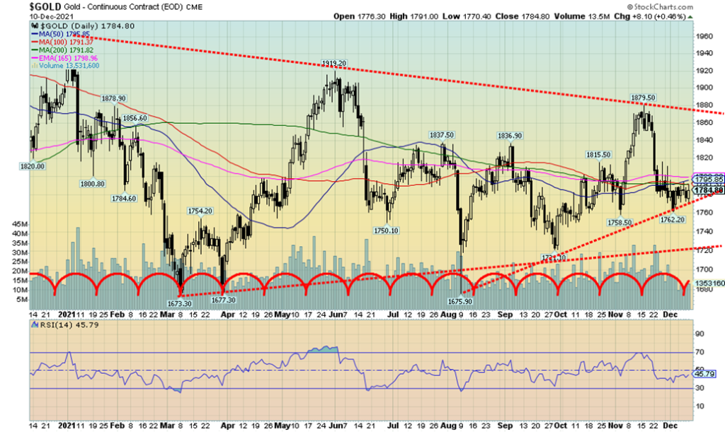
Gold responded positively to the inflation numbers and as a result salvaged the week with a small 0.05% gain. Gold, unlike silver that fell 1.3% on the week, did not see new lows for the move down whereas silver did. A potentially positive divergence. Gold has held its uptrend line from the August low near $1,676. However, it remains below resistance up to $1,800/$1,820 and seems of late to be caught between $1,760 support and $1,800 resistance. Resolution will come only with a break one way or the other. Volume has been low on this move down, suggesting it is all corrective action. First course is regaining above $1,800/$1,820 and the second band of resistance is at $1,850/$1860 with the final band at $1,900/$1920. Above that level the market could focus once again on the August 2020 high of $2,089. Other metals were mixed. While silver fell, platinum gained 0.9% on the week, copper was up about 0.5%, but palladium fell 3.5%. With the exception of copper, the precious metals are poised to close out 2021 down on the year. That’s unless gold has a rush before year end as gold is down only 5.8% at this point. Regaining $1,900 would at least put gold even on the year. What’s key is the US$ Index that fell on Friday. Given the US$ Index’s recent rush to new 52-week highs over 96, gold actually held in quite well. We found that encouraging. Seasonally, gold has often made lows in December followed by a decent rally into January/February. All eyes are now on the FOMC meeting this week on December 14–15. The inflation report wasn’t as bad as some had predicted and thoughts on a Fed hike are currently pushed into mid-2022. Expectations are for two or three rate hikes in 2022. What’s key right now is that gold continues to hold above $1,760.
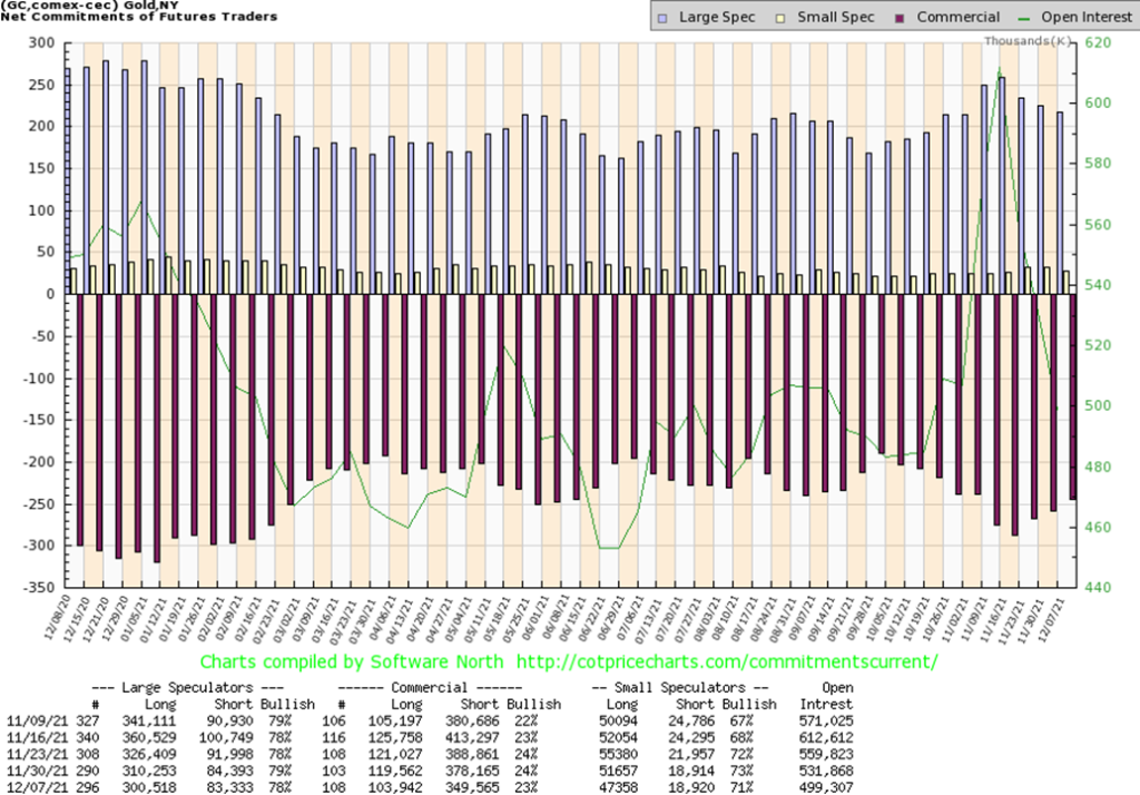
The commercial COT (bullion companies and banks) slipped to 23% this past week from 24%. However, both short and long open interest fell. Long open interest was down about 16,000 contracts while short open interest fell almost 29,000 contracts. The large speculators COT (hedge funds, managed futures, etc.) dropped to 78% as their long open interest fell about 10,000 contracts while short open interest was only down roughly 1,000 contracts. Overall, open interest fell over 32,000 contracts as longs and shorts both covered. In some respects, while the commercial COT fell, we were buoyed by the drop in short open interest, suggesting short covering. We view the improving COT as mildly positive.
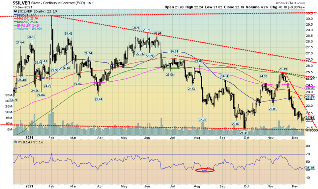
Once again silver dipped under $22 but seemed to find no major sellers. On the week silver fell 1.3%, continuing its recent downtrend. Are we setting up for a possible double bottom? Can’t say that, although Friday’s action was encouraging as prices fell below $22, then rebounded and closed up on the day, setting up a possible bottom signal. A move back over $22.50 would be positive, but the reality is we need silver to regain back above $25 to suggest we are putting the lows behind us. With silver falling to new lows on this move it was not confirmed by gold, a divergence. Confirmation between gold and silver is important in both uptrends and downtrends. The question is, will we get the start of a strong rally or merely a countertrend rally that takes us up to $23.50/$24 before turning down once again? A firm breakdown once again under $22 might see silver fall and take out the late September low of $21.41. That spells trouble as potential initial targets could be down to $18.
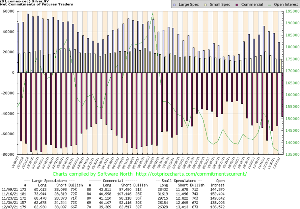
The silver commercial COT jumped this past week to 32% from 30%, a good improvement. Long open interest did slip almost 1,000 contracts but short open interest dropped almost 10,000 contracts. Possibly more significantly, the large speculators COT plunged to 66% from 72% as their short open interest jumped almost 9,000 contracts while long open interest was steady. Overall, open interest fell about 1,500 contracts on a down week. Commercials covering shorts and large speculators getting short. That is bullish for us. The commercial COT is now the best seen since October and that triggered at least a short-term rebound.
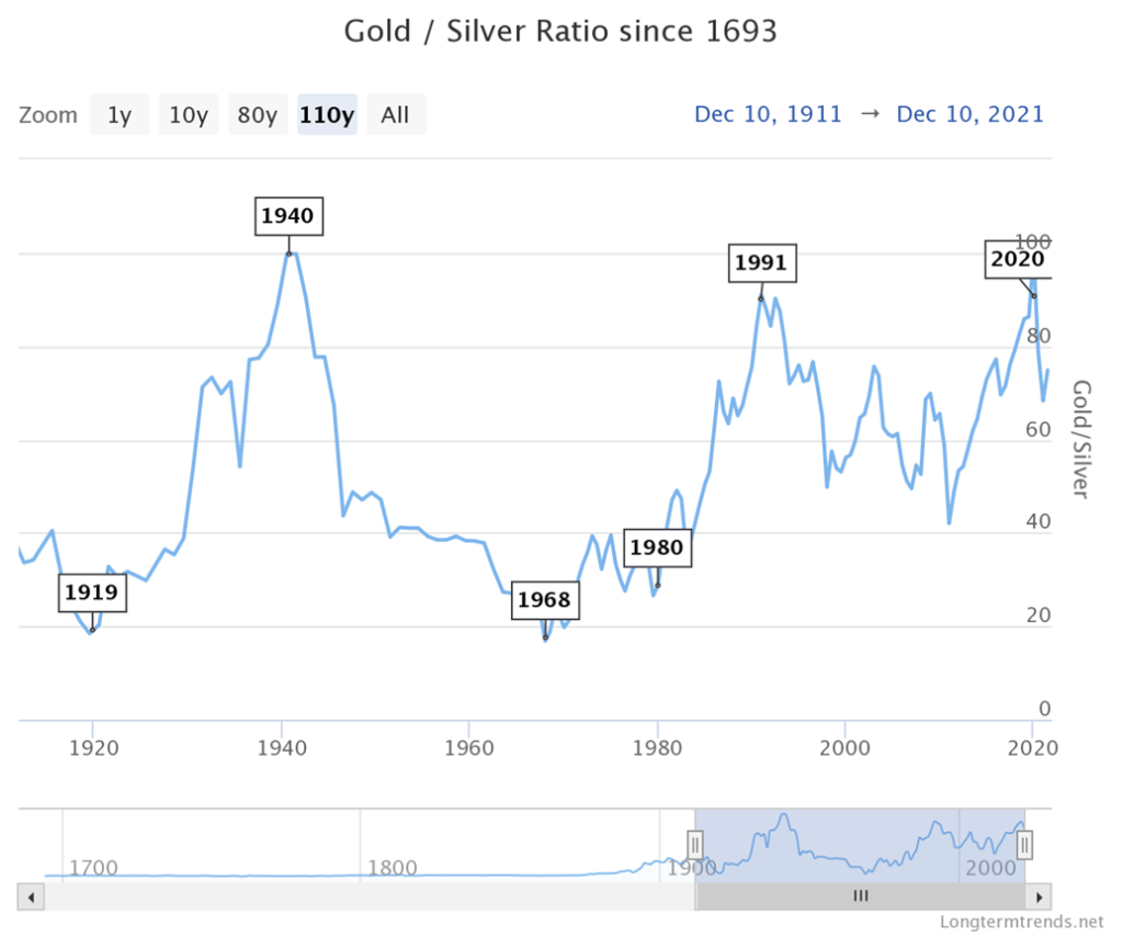
Here is a long-term chart of the gold/silver ratio dating back to 1900. For most of the 18th to 19th century the ratio was largely fixed at around 15:1 which is the naturally recurring ratio in nature. That changed in the 20th century. By 1940 it had leaped to almost 100:1. The ratio declined steadily into the 1960s when it bottomed out at about 17:1. The end of Bretton Woods signaled a new rise in the ratio but it didn’t really get going to the upside once again until after silver peaked at $50 in 1980. In 1991 it peaked again at 91 before another decline got under way. This time the bottom was seen in 2011 when silver once again hit nearly $50. The most recent peak was the March 2020 panic low when the ratio hit nearly 100. It turned out to be a spike peak. Since then, the ratio has been falling, although of late it has been consolidating between 75 and 82. Historically, that is still very high.
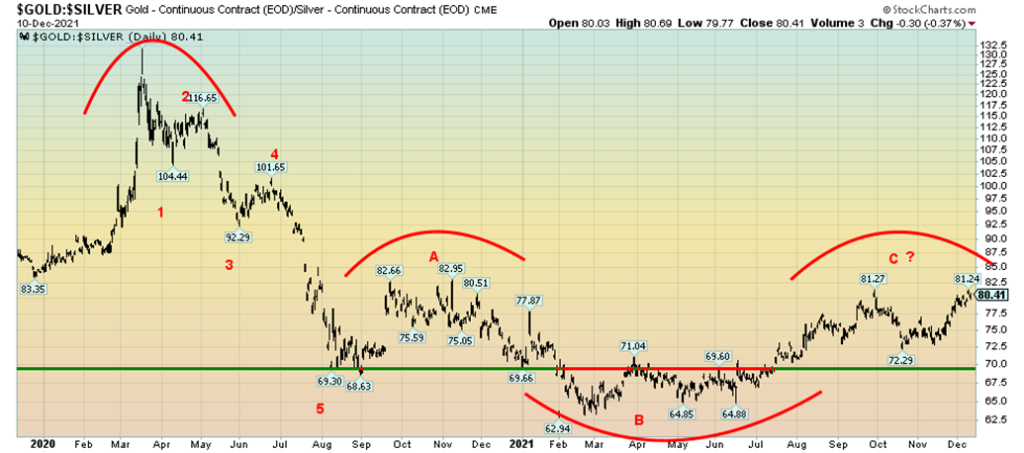
Here is a closer look at the gold/silver ratio, currently just above 80. After peaking in March 2020, the ratio appears to have fallen in five waves, suggesting that this was an impulsive wave to the downside. Since then, the ratio has gone through a series of ups and downs that is now appearing to us to be a corrective ABC-type pattern. Is it possible we could now be making a double top not only with the high in September just above 81 but a multi-year double top with the pattern that formed in late 2020 with a peak near 83? It is an odd-looking pattern with the possible B wave lower than the 5th wave down. However, it is not unusual. The neckline would be that series of lows made earlier in the year between 63 and 65. A breakdown under that level could in theory project the gold/silver ratio down to 45. A breakout above the November 2020 high of 82.95 would negate this scenario. New lows under the October low of 72.29, coupled with a breakdown under 70, would be very positive. The C wave portion of the gold/silver ratio could be forming a double top as well. Its breakdown is under 72.50 and could project down to 63.50. Overall, this pattern appears toppish leading us to suspect that the next move will favour silver over gold.
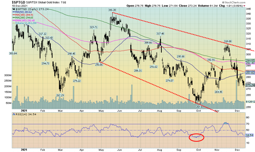
Admittedly, the gold stocks have been miserable. Another week, another down week. This time the Gold Bugs Index (HUI) fell 1.6% and the TSX Gold Index (TGD) dropped 2.2%. All told, the HUI is down 19.2% this year and down 35% from the August 2020 high. The TGD is down 13.3% in 2021 and down 34% from its August 2020 high. Bear markets all. Surprisingly, the Gold Miners Bullish Percent Index (BPGDM) is still at a rather neutral 30 and indicators are certainly down but not at levels deemed grossly oversold. That’s the bad news. The good news is that, so far at least, the absolute low on this move was the low seen in October near 258 for the TGD. The move down from the August 2020 high appears to be a series of zig-zags, suggesting that it is all corrective action and not the start of a major move down. There appears to be very good support for the TGD down to 250. However, a major break under that level would be very negative and suggest a possible test of the March 2020 panic lows near 173. On Friday, the TGD fell despite an up day for gold and silver. That’s rarely a good sign as preference is that the gold stocks lead. Resistance is seen up to 300/305. But over 305 we would be breaking the downtrend line from the August 2020 high and arguably starting a new uptrend. The gold/HUI ratio is currently at 7.4 which is not far from a recent high at 7.8. Any ratio over 5.5 suggests that gold stocks are cheap vs. gold. In that respect the gold stocks have been cheap for years as the ratio has been consistently over 5.5 for the most part since 2014. The last period of gold stocks expensive and gold cheap was seen from 2003 to 2008 when the ratio was consistently under 2.5. In the last seven years the low was seen in 2016 when the ratio fell to 4.8. If history is a guide, when the tide changes the move for the gold stocks could be dramatic. Current support for the ratio is down to 6.7, but the reality is we need to see it back under 5.5 to suggest we might have a strong bull going for the gold stocks. For the TGD now support is at 270 and below that 250. The RSI is at 34.5. Under 30 the TGD enters oversold territory.
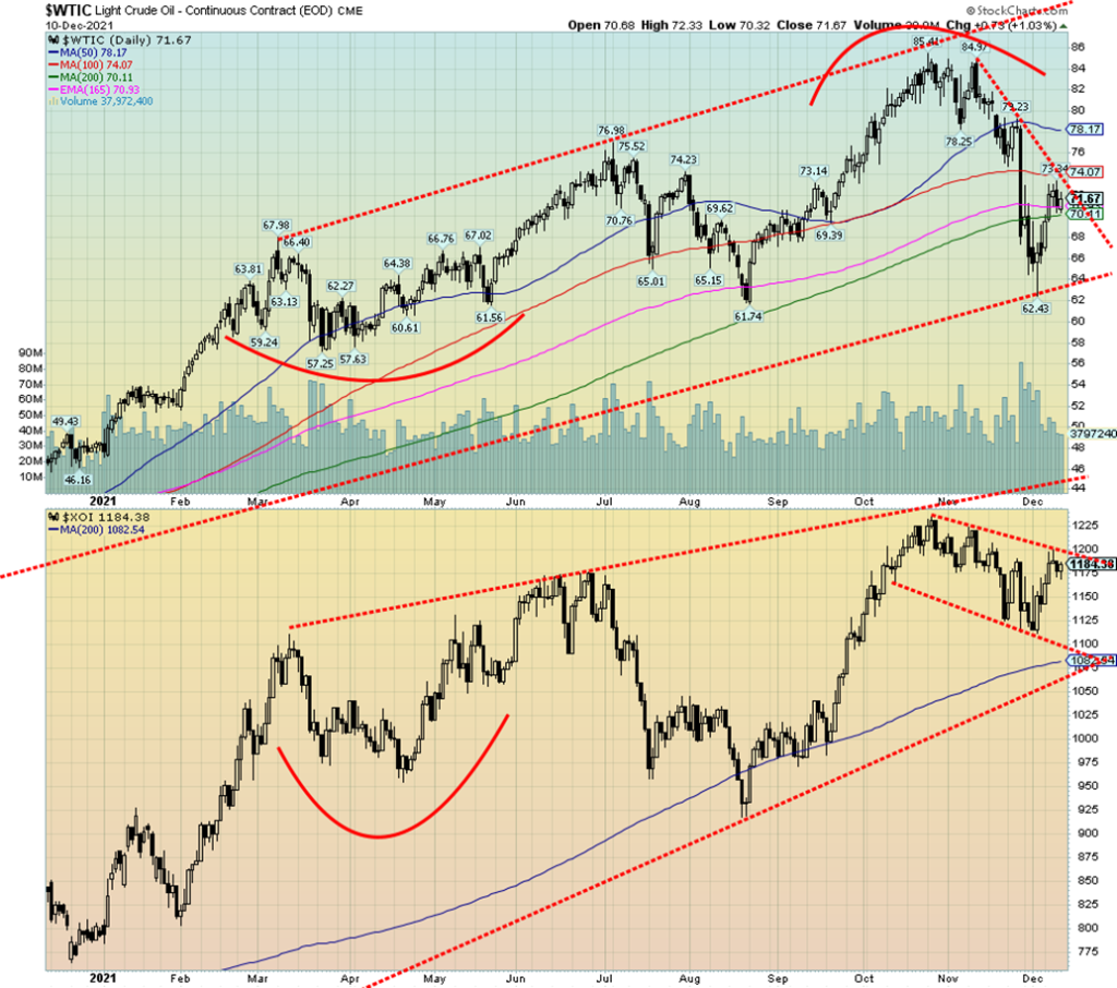
Just when you thought oil prices were going to collapse, they rebounded. Fears of the Omicron variant subsided and oil prices jumped 8.2% this past week. Natural gas (NG) didn’t fare as well, falling 5.1%. But the energy stocks followed oil as the ARCA Oil & Gas Index (XOI) rose 3.6% and the TSX Energy Index (TEN) rose 3.7%. WTI oil is now back over $70. It was the strongest week seen since August.
Maybe this past week was just a relief rally for oil as it had fallen over $20 at the recent low from the October top. Drivers were relieved as well as the price at the pump fell. However, it was bouncing back up again as the week wore on and oil prices rose again. However, oil prices are not out of the woods just yet.
Risks remain. Demand is stagnant. Chinese demand has softened as they deal with the fallout from the Evergrande and Kansa defaults. But U.S. inflation is bullish for oil so there are opposing forces. All oil prices have managed to do is rally back to the downtrend line from the highs. $74 is resistance and $78 is more significant resistance. Both need to be overhauled if we are to challenge the October highs.
However, oil supplies are tightening and that might act as a catalyst for higher prices. Because the U.S. has released considerable oil from the Strategic Petroleum Reserves (SPR), reserves have fallen to their lowest levels since 2003. Some speculation is rising that the U.S. might now try to rebuild those reserves. That in turn could help demand and help push prices higher.
Key for higher prices, however, is to get through $74 and then rise above $78. Otherwise, this is just a countertrend rally of the decline from $85 to $62. The decline appears to us as five waves down, suggesting that this rebound is merely a countertrend and once complete, we could fall to new lows. Long-term trendline support is seen at $64. The XOI is in a downtrend and has rallied back to the top of the channel. Only a firm break over 1,200 could turn the XOI up once again. Otherwise, the next move could be a decline to the bottom of the channel, currently near 1,000.
—
(Featured image by John Guccione via Pexels)
DISCLAIMER: This article was written by a third party contributor and does not reflect the opinion of Born2Invest, its management, staff or its associates. Please review our disclaimer for more information.
This article may include forward-looking statements. These forward-looking statements generally are identified by the words “believe,” “project,” “estimate,” “become,” “plan,” “will,” and similar expressions. These forward-looking statements involve known and unknown risks as well as uncertainties, including those discussed in the following cautionary statements and elsewhere in this article and on this site. Although the Company may believe that its expectations are based on reasonable assumptions, the actual results that the Company may achieve may differ materially from any forward-looking statements, which reflect the opinions of the management of the Company only as of the date hereof. Additionally, please make sure to read these important disclosures.
David Chapman is not a registered advisory service and is not an exempt market dealer (EMD) nor a licensed financial advisor. He does not and cannot give individualised market advice. David Chapman has worked in the financial industry for over 40 years including large financial corporations, banks, and investment dealers. The information in this newsletter is intended only for informational and educational purposes. It should not be construed as an offer, a solicitation of an offer or sale of any security. Every effort is made to provide accurate and complete information. However, we cannot guarantee that there will be no errors. We make no claims, promises or guarantees about the accuracy, completeness, or adequacy of the contents of this commentary and expressly disclaim liability for errors and omissions in the contents of this commentary. David Chapman will always use his best efforts to ensure the accuracy and timeliness of all information. The reader assumes all risk when trading in securities and David Chapman advises consulting a licensed professional financial advisor or portfolio manager such as Enriched Investing Incorporated before proceeding with any trade or idea presented in this newsletter. David Chapman may own shares in companies mentioned in this newsletter. Before making an investment, prospective investors should review each security’s offering documents which summarize the objectives, fees, expenses and associated risks. David Chapman shares his ideas and opinions for informational and educational purposes only and expects the reader to perform due diligence before considering a position in any security. That includes consulting with your own licensed professional financial advisor such as Enriched Investing Incorporated. Performance is not guaranteed, values change frequently, and past performance may not be repeated.


TopRanked.io Weekly Affiliate Digest: What’s Hot in Affiliate Marketing [LVBET Partners]
If you wanna make some serious affiliate commissions, here's what you need to do. Step 1: Read our quick LVBET...


Skybound Entertainment Launches Crowdfunding Campaign to Create an Invincible Game
Skybound Entertainment launches a crowdfunding campaign on Republic to create a AAA game based on its Invincible comic. The campaign...


36% of Cannabis Users Report a Reduction in Alcohol Consumption
A Numerator survey found that 36% of cannabis users reported decreased alcohol intake since using cannabis products. Cannabis users, mainly...


Green Arms Raised Almost 1 Million in its Crowdfunding Round on CrowdFundMe
Green Arms, an innovative startup facilitating citizen and business participation in renewable energy projects, has nearly reached 1 million euros...


Vithas and MSD Join Forces to Train and Innovate in Oncology Matters
Vithas and MSD have formed an alliance to enhance patient care, especially in cancer treatment. The collaboration focuses on innovation,...
 |
|
 |  |
 |
|
-

 Crowdfunding1 week ago
Opstart Buys Majority Stake in BackToWork
-
 Business5 hours ago
TopRanked.io Weekly Affiliate Digest: What’s Hot in Affiliate Marketing [LVBET Partners]
-

 Markets2 weeks ago
Fear and Consequence: Week’s Stock Market Theme
-

 Crowdfunding4 days ago
Fidovet, a Small Italian Multinational Pet Food Company Raises Money on Mamacrowd