Featured
2018 market predictions: Will it be as rocky as last year?
The US constitutional crisis, U.S. conflict with North Korea and other geopolitical issues are expected to affect markets.

Welcome to 2018. So far it looks the same as 2017. The President of the United States ended the old year and began the one with a barrage of tweets, including one threatening nuclear annihilation with the “Little Rocket Man” of North Korea. The world can only hope they keep it to each other and not involve the rest of us. Markets did well in 2017 as they have for the past eight years. Bitcoin did exceptionally well, gaining over 1,300% even as it was down 20% from its high. Most people should have seen their portfolios rise. It is not difficult making money in a rising market. The real test comes in a down market.
In our last missive of 2017 (December 18, 2017), we outlined a series of risks that could upend global markets. It was not surprising to see other analysts note many of the same risks. Political analysts in their predictions for 2018 managed to note more than a few that could upend global markets even though their focus was political, not economic or financial. One of the more interesting ones was given to us by Tony Burman, a former head of Al Jazeera English and CBC News writing for the Toronto Star who outlined “Ten international headlines you’ll read in 2018” (Toronto Star, December 30, 2017).
No, not all of Mr. Burman’s predictions pertained to markets but 5 of them stood out. Mr. Burman noted that of his 10 predictions for 2017 he got 9 of them right, more or less. So maybe he is on to something. We don’t predict but instead lay out the risks that investors should be paying attention to. The five that we noted (using Burman’s headlines) were as follows:
America’s constitutional crisis
Robert Mueller’s investigation into what is known as RussiaGate could lead to an investigation into Trump’s political and business empire. That, in turn, could trigger a constitutional crisis if Trump were to conduct a Nixonian “Saturday Night Massacre.” Trump and GOP representatives have been attacking the Mueller investigation as they have been taking cues from news organizations such as Fox News that has been calling it “a coup in America.”
Trump and others have also been attacking the U.S. Justice Department. Add into this mix the release of an insider book on the Trump administration where attempts are being made to prevent its release. We have noted that if the Mueller investigation were to break wide open it could shake the confidence of markets globally.
The Democrats roar back
Burman has noted all signs point to the likelihood of a Democratic “wave” in the November mid-terms. Democrats are well positioned to win the House of Representatives and possibly even the Senate. We noted how a turnover of the U.S. Congress and Senate could bring considerable pressure on the Trump administration including a drawn-
out impeachment process. Market confidence would be shaken.
Conflict with North Korea
For the past year President Trump of the U.S. and Kim Jong Un, the Supreme Leader of North Korea have waged a war of words involving mutual nuclear annihilation. North Korea could, if they feel threatened, once again resume nuclear testing. Many believe that the U.S. could conduct a pre-emptive strike on North Korea. But any strike
against North Korea could quickly draw in Russia and China, both of whom border North Korea and have made it clear that a strike against North Korea would be unacceptable. The result could be the world is drawn into something they don’t even want to think about. Anytime North Korea has hit the headlines, global markets have reacted negatively even as the threat seems to quickly dissipate.
China makes it move
Burman has noted that by Trump making “America First” he is inadvertently causing a boomerang effect, making “China First.” China, the world’s most populous country, will soon become the world’s largest economy. China has been making moves globally to strengthen its presence and by extension its power. China is calling for the end of the
US$ as the world’s reserve currency and has been pushing trade to be denominated in Yuan when dealing with China and even elsewhere in Asia. This has brought China into conflict with the U.S. both economically and militarily.
What Burman didn’t note and we did is its increasingly shaky banking system. A banking collapse in China would have global implications given the massive amount of global debt (current estimate $230 trillion) and a global banking system that still has some hangover from the 2008 financial crisis. The good news on that front is the Peoples Bank of China (PBOC) is in a much better position to bail out the financial system than the western central banks (U.S., EU, and Japan).
Countdown to war in Iran
the countdown to war with Iran seems to be marching ahead unabated. The urging for war is constant from two American allies—Saudi Arabia and Israel—who are both arch rivals of Iran. Everywhere we turn Iran is being demonized and a case against it is being constructed. There are accusations of Iranian agents operating in the West
Bank even as it was noted the U.S. gave the green light to Israel for the assassination of a top ranking Iranian General.
Iran is in Syria where they assisted the Assad government in defeating ISIS as well as taking on US-backed rebels. Syria borders Israel. Protests have been going on in Iran where the Iranian government accuses its enemies (read U.S., Saudi Arabia, Israel) of inciting the protests. While the attacks against Iran are not dissimilar to the attacks against Iraq leading up to the 2003 invasion, Iran is not Iraq. An attack on Iran could also quickly draw in global players such as China and Russia, both of who stood aside when the U.S. (and allies) invaded Iraq. An attack against Iran would shake global markets.
Mr. Burman’s other predictions could have a market impact in 2018 as well. We just do not see them in the same heightened risk that could negatively impact global markets as the above. Burman’s other predictions are:
• British Government collapses
• Europe is back on its feet
• Assault on free expression
• No hope for Kushner peace plan in the Mid-East
• A resurgent Palestinian cause
Politics, economics, and finance are all intertwined. All wars (political) are ultimately about economics and that in turn is about finance. The world is engulfed in debt—as we note, an estimated $230 trillion. The U.S. leads the way with $20.5 trillion and the U.S. as a whole (governments, corporations, and individuals) stands at $69.1 trillion. And that is what is officially reported. No wonder the U.S. is referred to as “the Empire of debt.”
It is estimated that since the 2008 financial crisis the balance sheets of the major central banks (U.S., EU, and Japan) have grown by $8.3 trillion (the Fed went from $800 billion to $4.4 trillion). Meanwhile, global GDP grew by only $2.1 trillion. It is also estimated that some $6.2 trillion went not into the “real economy” but into assets—stocks, bonds, real estate, and emerging market debt (as reported by Agora Financial, 5-minute forecast, January 3, 2018). And we wonder why we have a bubble in global stock markets and elsewhere.
Against this backdrop of a potential looming debt crisis, we have the global economy enjoying a good period of growth together—in the U.S., Europe, China, Japan, and other markets both developed and emerging. Corporation profits are at record highs. The U.S. economy has unemployment at a 17-year low. Inflation is low. Manufacturing is registering strong economic readings both in the U.S. and the EU. Technological innovation continues apace and new medical wonders continue to emerge. The U.S. administration just delivered what may be the biggest tax cut in U.S. history.
We have had 8 years of good news. But against this backdrop is too much debt and the central banks trying to take away the “punch bowl.” We had quantitative easing (QE) and now we have quantitative tightening (QT?). The Fed is slowly selling off its asset portfolio of Treasury debt and mortgage-backed securities (MBS). As well they are raising interest rates and have signaled that this should continue in 2018 on a quarterly basis. The EU has hinted strongly that QE will be ending as well. The world is leveraged and debt could come tumbling down. The most vulnerable are emerging market debt and the aforementioned mountain of debt in China but there are also problems with shaky Italian banks and in the US student and automobile loans.
While praises are being heaped on the Trump administration for its tax bill one tends to overlook, even by the GOP’s own estimates, indications that it could add $1.5 to $2 trillion to U.S. debt over the next decade. It’s probably no surprise the U.S. still needs to deal with the debt ceiling and ongoing funding, a reckoning that keeps getting pushed out. But they are running out of time with the next deadline looming this month and, once again, Trump threatening to play a game of chicken with Congress to get what he wants.
Debt is the Achilles heel. Since the 1970s, starting with the energy crisis and the Watergate crisis that triggered a banking crisis and a 45% to 55% collapse in global markets, the world has been through a series of debt and economic crises. The Latin America debt crisis, the Japanese asset bubble, the “crash” of 1987, the savings and loan crisis, the banking crisis of the early 1990s, the breaking of the Bank of England in 1992, the 1994 Mexican debt crisis, the 1997 Asian financial crisis, the 1998 Russian debt crisis, the Argentine debt crisis of 1999–2002, the busting of the dot.com/High Tech bubble resulting in an 80% collapse of the NASDAQ 2000–2002, the 2007–2009 financial crisis that followed the bursting of the housing bubble, the EU sovereign debt crisis of 2011, the Russian economic collapse of 2014, and the Chinese stock market bubble bursting in 2015.
The world has been through a series of economic, financial, and political crises over the past 40 years. But one thing was constant following each crisis. Each time, governments bought their way out of the crisis by sharply lowering interest rates and flooding the financial system with money. Following the 2008 financial collapse flooding the financial system with money became more or less permanent through quantitative easing (QE). Corporations obliged by also buying their way to higher stock prices through mergers and acquisitions and stock buybacks, usually by issuing more debt. And households kept buying more and pushed a consumer and real estate debt bubble.
Total U.S. debt has increased $19.2 trillion since 2008 or almost 39% vs. an increase of $6 trillion for GDP or 44%. That implies it took $3.20 of new debt to obtain $1 of GDP. Since 2000, U.S. GDP has grown by $10.3 trillion or 111% while total debt has grown $43.7 trillion or 172%. That implies it took $4.20 to purchase every $1 of GDP. Hard to believe the growth rate has actually subsided. If debt growth were to slow further it would have negative implications for GDP growth. The question is: what are the limits to debt? We may soon find out.
Nothing lasts forever and the next financial crisis could already be forming. Economics, finance, and politics—each feeds on the other, and all are intertwined.
Gold in 2018
Following 5 years of what can only be called a bear market, gold, and by extension silver, platinum and the gold stocks could be poised for a major move. One of the prime reasons we may be ready for a major move is cycles. Since gold became free trading in the 1970s, after the end of the Bretton Woods gold standard by former President Richard Nixon in August 1971, gold has followed what appears to be regular patterns.
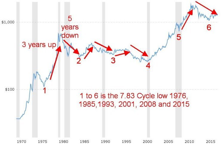
Raymond Merriman of Merriman Cycles has outlined one long-term cycle of what he believes is a 23.5-year cycle. Making it difficult for gold cycles is the lack of free trading history when compared to the U.S. stock markets. Merriman cites the major low seen in 1976 and again in 2001 as examples of the 23.5-year cycle (range could easily be 22 to 25 years).
Cycles can break down into halves or thirds. Merriman has cited a possible 7.83 cycle (range 7–9 years) a figure that divides the 23.5-year cycle by 3. Significant lows were seen in August 1976, February 1985, March 1993, April 2001, October 2008, and December 2015. Since the December 2015 low, we have seen gold slowly rise with higher lows being made in both December 2016 and December 2017.
With the effect of the 7.83 cycle lingering, coupled with its normal range of 7–9 years it may well be that this negative cycle has continued to impact the gold market negatively into 2017. With that cycle coming to an end we may be poised to for a sharp upward move as we enter the third and final phase of the 23.5-year cycle.
An interesting observation made Tom McClellan of McClellan Financial Publications was that, during what he called an 8-year cycle vs. Merriman’s 7.83-year cycle, gold tended to move up for 3 years than down for 5 years. With one exception this pattern has played itself out rather nicely. Starting from the August 1976 low, gold rose for roughly 3 years to January 1980 for what was then an all-time high. A 5-year bear market followed in February 1985.
The pattern continued to play itself out. Gold rose from February 1985 to January 1988 (3 years) and then fell into a low in March 1993 (5 years). Once again gold rose until February 1996 (3 years), topped, and then fell into a major low in April 2001 (5 years). Then came the exception. Gold rose steadily to a top in February 2004 (3 years). But the pause was brief and gold began an ascent that did not stop until March 2008. Following that top gold fell sharply 2008 financial crisis bottoming in October.
The pattern appears to have reasserted itself following the October 2008 low and gold rose sharply to its record high in September 2011 (3 years). While we have been making slightly higher highs to the December 2015 low, gold has continued to trade as if it remains locked in a bear market. That market has now lasted 5 years. If the previous patterns hold, not only should we be completing the 7.83-year cycle low but we should be embarking on what could be a 3-year bull market into 2020.
Merriman also cites a 34-month cycle with a range of 28–40 months. From the important October 2008 cycle low, we note an important low in December 2011, another one in December 2014, and finally the low now in December 2017. That the December 2015 low was lower than the December 2014 does not break the cycle—it may just be that even longer cycles were in play when the December 2015 low was made. Nonetheless, if the 34-month cycle holds the next one is not due until October 2020 +/- 6 months.
Other short-term cycles for gold are also turning up and we are entering a favorable seasonal period that could take us into February/March 2018. We could during this period take out the July 2016 high of $1,377. Potential objectives for this move are at least to $1,475 with a potential to $1,630. Objectives could be even higher, but at this stage, that is as high as we see. It might not necessarily happen in the first quarter 2018 but should later in the year and certainly into 2019.
© David Chapman
With evidence that supports a potential significant low in place, gold could be entering a bullish phase that lasts for at least 3 years. By extension, this would also be positive for both silver and the gold stocks, both of which should outperform gold as they usually do in both bull and bear markets. Given that markets have been through a strong bull phase for stocks and a bubble phase for Bitcoin and cryptocurrencies, a bull market for gold, silver, and the gold stocks could be overdue.
© David Chapman
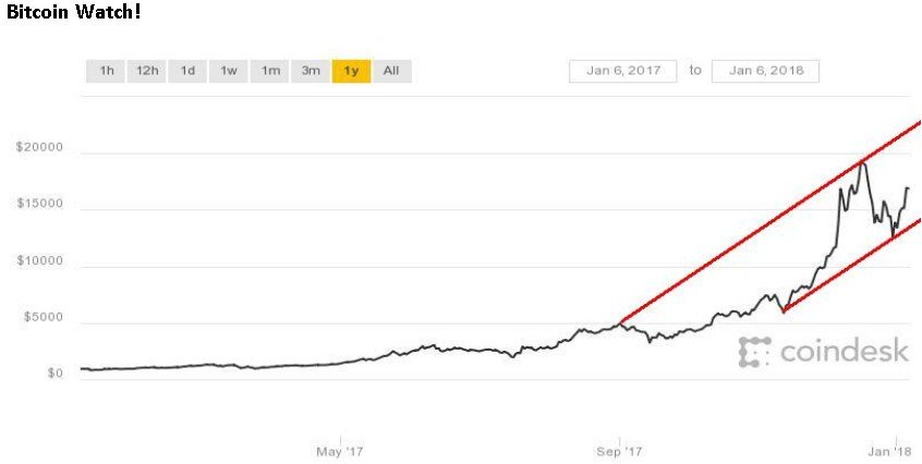
What a wild 2 weeks. Bitcoin hit a new all-time high on December 17, 2017, at $19,843. What followed was sharp up and down, with a couple of weeks that saw Bitcoin at one point to fall to $11,970 on December 22, 2017, a drop of 40% from the high. Since then Bitcoin has recovered and was recently at $16,475 but remains below its all-time high.
So, is the bloom off Bitcoin? Hardly, but there is a dent at least until we see new highs once again. It is, however, interesting to note that as Bitcoin rises (or falls) other cryptocurrencies fall (or rise). We were stunned when we looked at CoinMarketCap, a website listing cryptocurrency market caps that listed over 900 different cryptocurrencies.
The largest, of course, was Bitcoin with a market cap at the time of $278.8 billion (all quotes in US$). The second largest was a cryptocurrency called Ripple with a market cap of $120.2 billion. Rounding out the top 10 were Ethereum, Bitcoin Cash, Cardano, NEM, Litecoin, Stellar, IOTA, and DASH. Combined, they had a market cap of $626.3 billion. If you have never heard of most of these cryptos, don’t feel bad. Most people haven’t.
Number 901 on the list was a cryptocurrency called Bitcoin Unlimited which was actually futures. One of the most telling cryptocurrencies was CasinoCoin. Maybe that name says it all. It trades at around 50 cents with the name reflecting what this entire market is all about. That’s pretty good considering back in June 2017 it was trading at well under 1 cent. Ergo the explosiveness of cryptocurrencies.

Maybe one of the most scurrilous is Dogecoin, a cryptocurrency that may or may not even be real given it is a parody. Yet it now has a market cap of over $1 billion (not a typo), proving cryptocurrencies can “go to the dogs.” At one point it was trading at $0.0002. But don’t worry as you can still buy it for just over a penny. They have, after all, issued some 112.6 billion of these dogs vs. Bitcoin issuing only 16.8 million with an ultimate cap of 21 million.
For the uninitiated, Dogecoin is a cryptocurrency with a Dog on it. They haven’t released a software update in 2 years, yet as noted it has a $1 billion market cap. Most of its developers are volunteers and the guy that started Dogecoin, James Altucher, believes ultimately that most cryptos will go up in smoke. Thus, the insanity of this market.
We continue to see advertisements for this or that next big thing in cryptocurrencies. Become a millionaire. Actually, forget millionaire—the ads hint at billions or more. But act now before it’s too late. Japan has become the biggest roulette wheel for cryptocurrencies with other parts of Asia such as Korea, India, and even China not far behind. Regulators continue to tear their hair out trying to figure out how to get control of this madness. We keep reading stories about people locked out or hackers making off with millions, leaving the original owners penniless. We also learned that upwards of 20% of Bitcoin buying is occurring on borrowed money demonstrating the high level of speculation in the market. Nonetheless, the phenomenon continues to grow and survive.
Bitcoin appears to have survived its mini-crash and is forming a possible rising channel. If that is correct then Bitcoin could well return towards the $20,000 zone and move even higher. Momentum has, however, slowed. But the bloom has not come off.
© David Chapman
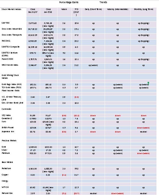
Note: For an explanation of the trends, see the glossary at the end of this article.
New highs/lows refer to new 52-week highs/lows.
© David Chapman
The relentless climb continues. If the first week of January is any indication, then 2018 promises to be a blockbuster year. Part of the January barometer is that the first 5 days act as an early warning system. Since 1950, of 42 first 5 days up the full year finished with gains 35 times for an 83.3% accuracy rate (Stock Trader’s Almanac 2018). In those 42 years, the average gain was 13.6%. However, if war breaks out then all bets are off. Of the 7 exceptions, 4 were related to war. Even if the first 5 days were down the odds still favored an up year. Of the 25 down first 5 days 14 of the years finished higher and only 11 actually were down. One caveat is that this year is a Mid-Term election year. And the record there is not so great. Of 17 Mid-Term years, only 8 followed the direction of the first 5 days.
Right now, there seems to be little in the way of knocking this market off its ascent. The tax cuts are still playing positively on Wall Street. Not even a below expectation nonfarm payrolls on Friday threw the market off as the market took it as meaning inflation will stay low and the Fed may proceed cautiously on hiking interest rates.
Given it is a Mid-Term election with some expectation that Congress could change hands the markets may not be quite as robust as the 25.1% gain seen for the Dow Jones Industrials (DJI) in 2017. The record showed that when the first year of the Presidential cycle was positive the Mid-Term year was not as strong. Still, the markets could show considerable strength in 2018 as long as the risks remain in the background and don’t come to the forefront. The strongest quarter tends to be the first quarter with the weak part seen in February. And right now, the market appears poised to move higher.
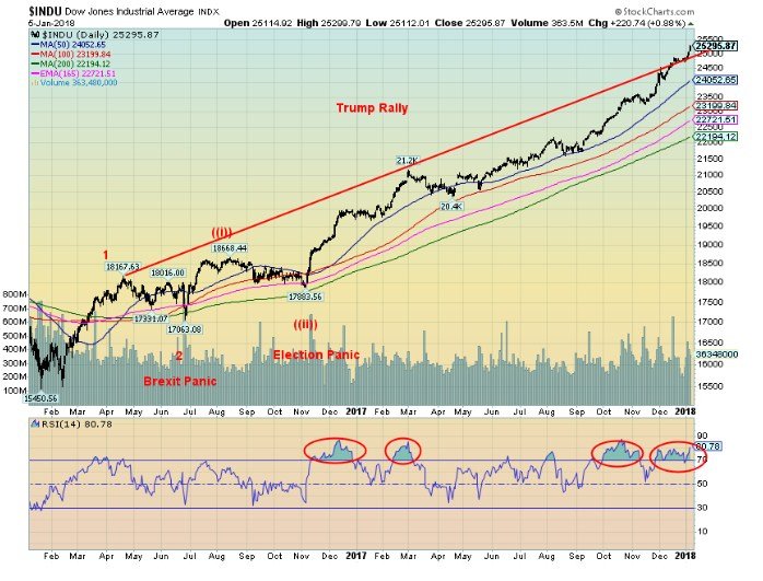
So just how high? Based on the 2015/2016 correction which is counted as intermediate wave 4 minimum objectives for the DJI were 21,250. That was achieved in June 2017. The next objective was 23,045 which was achieved by September 2017. Next up 25,945. Well, we have now surpassed 25,000 and closed the week at 25,295 so that objective may not be too far away. If that objective should fall then next one would be 28,845. We are now reading some optimistic forecasters saying the DJI will hit 30,000 in 2018 so maybe it is not too far-fetched. After all, it is only a 21% gain from the close of 2017.
All of this is being accomplished against the backdrop of record daily sentiment currently at 93% bulls. It is the highest level of trader optimism in 3 years. So, what does it say? Well, we could have a correction at any time but will it amount to much. The daily RSIs and numerous other indicators remain in consistently overbought positions, but the market doesn’t seem to care. NYSE margin debt is at record levels but does anyone care. Note the RSI indicator on the chart of the DJI has been above 70 five times in the past year. A corrective pullback occurred but the corrections were shallow. On the weekly and monthly charts, the RSI has been stuck over 70 since October 2017 and currently sits at a “mind-boggling” 88. Such is the nature of a bubble market.
The last good correction occurred at the time of the election mini-panic in November 2016. That correction was only 4.2% for the DJI. Since then the steepest has been the minor pullback seen in March/April 2017 when the DJI fell 3.8%. Labelling the DJI for Elliott waves has been tricky due to the lack of any serious pullback. We called the election mini-panic correction minute wave ((ii)). Elliott Wave International has labeled the mini-correction in March/April minute wave ((iv)). We are not so sure. If Elliott Wave International is correct then we are in the final fling to the upside.
However, any upcoming pullback may be more like the election mini-panic rather than anything earth-shattering. The debt limit and funding come up later this month and all indications are that Trump is going to play a game of chicken with Congress rather than quickly come to an extension deal as they have before. This may cause some fireworks and cause the markets to pause. Stay tuned.
© David Chapman
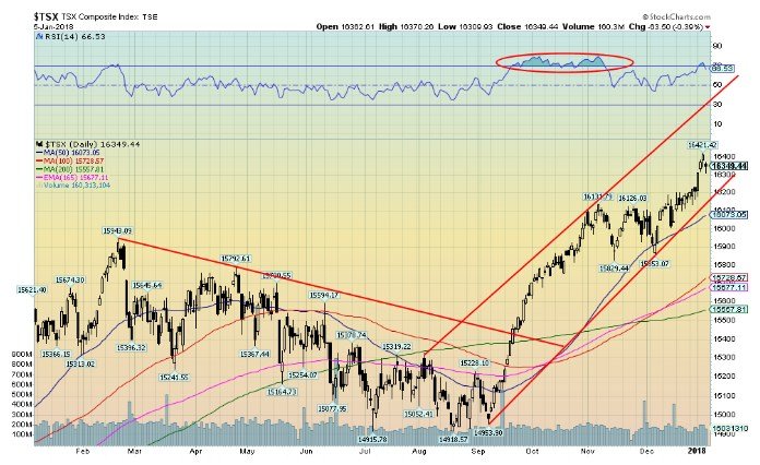
The TSX Composite is also enjoying the rise to new all-time highs. The TSX Composite put in a much more subdued gain of 0.9% this past week vs. the 2% plus gains seen for the major U.S. indices. The TSX Composite hit an all-time high back in February 2017 at 15,943 then spent the next 7 months largely to the downside as it pulled back roughly 6.5%. Since then the TSX has gained 9.6% led by consumer discretionary, financials, industrials, and technology.
With materials and energy showing life they may well help keep the TSX moving higher. Potential targets are at 16,970 but if that were to fall then we could move higher to the next objective near 17,600. A break back under 15,800 would be negative and suggest at least a minor corrective pullback. Only a break under the October 2017 lows of 14,915 would suggest that a more serious correction was underway.
© David Chapman
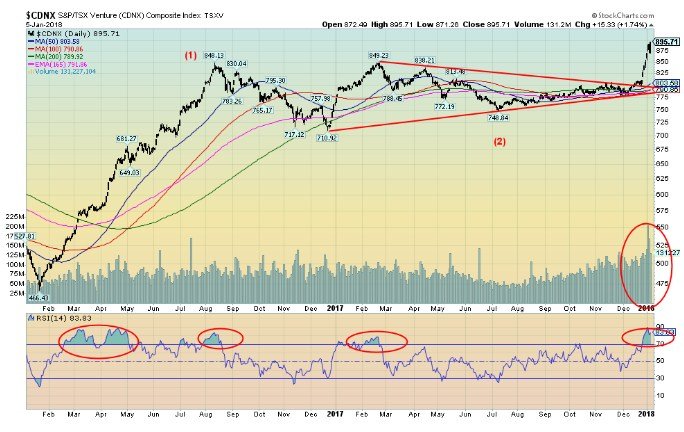
If there was a real star during the first week of 2018 it was the TSX Venture Exchange (CDNX) that leaped a nice 5.3%. The CDNX is dominated by junior mining companies, many of them gold miners. 50% of the index is from the materials sector with the next most represented sector being health care at 16%. Energy companies represent 11% of the index. There are roughly 500 companies represented in the CDNX. After rising from its depression levels of 466 back in January 2016 the CDNX jumped 82% in August 2016.
Since then the CDNX has been on what appears as a long corrective period. The index broke out in early December 2017. Potential targets for the index are up to at least 985 with further potential to 1,070. The CDNX can be volatile. From 2000 to 2007 the index rose 427%. The 2008 financial crash saw the CDNX fall 80%. The rise in 2011 saw the CDNX gain 263% before another long decline set in that saw the index fall 81% into the January 2016 low at 466.
Comparable gains this time around could see the CDNX rise to 1,700 and even to 2,500. Given the CDNX’s history of spectacular gains followed by an equally spectacular crash, we are encouraged that another rise appears to be underway. Volume has been rising as well which is an encouraging sign. What it tells us is that the early investors are getting in and most likely rotating out of the large cap indices.
© David Chapman
Friday saw the release of the employment numbers both in the U.S. and Canada. The U.S. registered a rather disappointing gain of 148,000 new jobs in December 2017. This was below the expectations of 190,000 new jobs. The November nonfarm payrolls were reported at 252,000 new jobs. In 2017 2.1 million new jobs were created vs. 2.2 million new jobs in 2016. The gains in 2017 were, therefore, a continuation of the growth seen in previous years and not the sign of a new trend. The pace is slowing, however, and that means that going forward the pace may slow further.
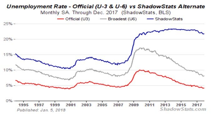
Job gains were primarily in health care, construction, and manufacturing. Part-time jobs dominated and altogether make up 17.5% of the labor force. The headline unemployment rate (U3) remained at 4.1% while the U6 unemployment rate ticked up to 8.1% from 8%. The U6 unemployment rate includes short-term discouraged workers and other marginally attached workers plus those working part-time because they cannot find full-time employment. The Shadow Stats unemployment rate was unchanged at 21.7%. The Shadow Stats rate is U6 plus long-term discouraged workers unemployed beyond one year and defined out of official existence in 1994.
The labor force participation rate remained unchanged at 62.7%. In January 2000 the rate was 67.3%. A level of participation like that now would cause the official unemployment rate (U3) to rise to 12% and add almost 14 million to the unemployment rolls. As fewer are actually counted as a being a part of the labor force (participation rate) this has the perverse effect of lowering the unemployment rate to levels that on the surface appear to be great. Currently there are 95.5 million not considered to be a part of the labor force. Of that 51.6 million are retirees, leaving 43.9 million not of retirement age but not considered a part of the labor force. Not all are stay at home mothers and students.
© David Chapman
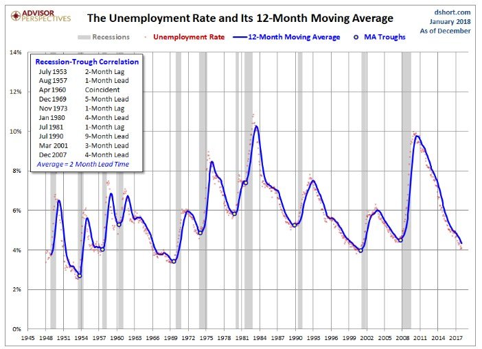
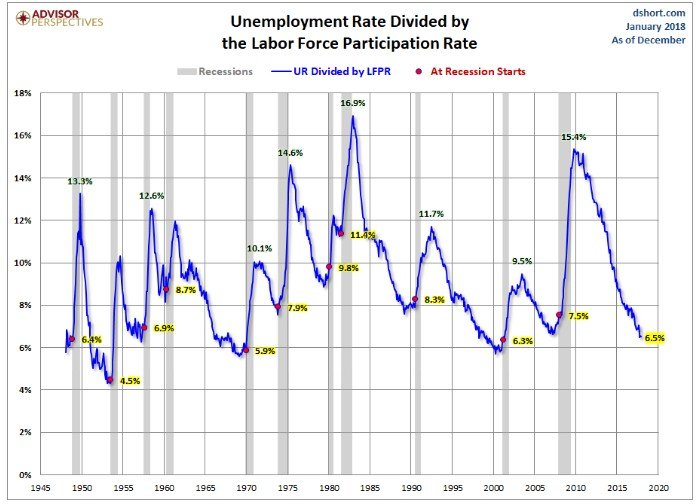
Advisor Perspectives puts out a number of interesting charts. This one caught our attention. This is a chart of the unemployment rate and its 12-month MA. What they note is what appears to be good correlation between MA troughs and the start of recessions. The longest one indicated is a 9-month lead seen in 1990. Naturally the trough of the current 12-month MA has not yet been determined but it is interesting to note that the MA is now down near the levels seen before previous recessions. And the MA does not take into consideration the labor force participation rate that remains at levels last seen in the 1970s.
© David Chapman
Here is the other perspective of the U.S. unemployment rate divided by the labour force participation rate. Like the 12-month MA the ratio is down near levels seen at previous troughs. Advisor Perspectives did not note the correlation with recessions, and like the 12-month MA it appears to be close. Something to keep in mind going forward.
© David Chapman
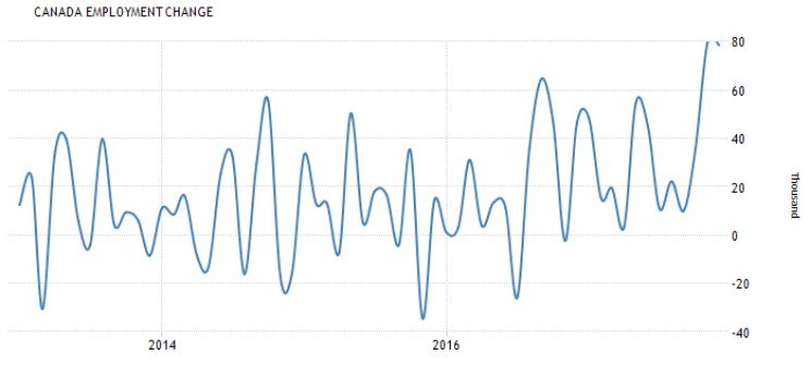
For the second month in a row Canada reported a gang-buster jobs report. Employment jumped 78,600 jobs in December following a gain of 79,500 jobs in November. This is Canada’s equivalent to the U.S. nonfarm payrolls. The unemployment rate fell to 5.7% from 5.9%, the lowest level since the 1970s. The labour force participation rose to 65.8% from 65.7% in December making the fall in the unemployment rate even more remarkable as more people were considered to be in the labor force. If there was a negative part of the report it was that 54,900 of the jobs were of a part-time nature. That was the second month in a row where part-time jobs dominated. With the Christmas season ending and the minimum wage jumping in January in a few provinces many of these part-time jobs could quickly disappear over the next few months. Nonetheless the jobs report was positive and has some calling for the BofC to hike interest rates at the monthly meeting in January.
© David Chapman
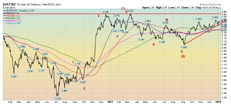
Yields on the 10-year U.S. Treasury note ticked higher this past week, gaining 7 basis points (bp) on the week. Friday’s below expectations nonfarm payrolls did not cause bond yields to fall. Instead, they rose 2 bp. The bond market was more concerned that U.S. payroll gains were stronger than expected (inflationary) offsetting the below expectations job report. As well the unemployment rate (U3) remained near multi-year lows (again ignoring the low labor force participation rate).
Overall it doesn’t change the economic outlook that is still expected to continue strong into 2018 (setting aside the risk factors we have continued to cite). The Fed is still expected to hike the Fed rate in March as they have previously announced. Major resistance for the 10 year is up at 2.60%. Any move above that level could set the 10 year on a path for 3%.
© David Chapman
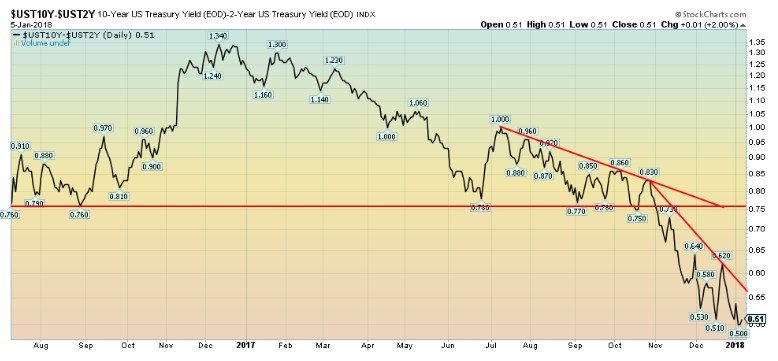
The 2-year–10-year spread remained unchanged this past week at 51 bp. At this level it is nowhere near levels that would hint at an upcoming recession. Before both the 2000–2002 and 2007–2009 recessions the 2–10-year spread was negative. Still the trend is down and the decline has steepened. We continue to watch the 2–10 year spread as a warning sign for an impending recession.
© David Chapman
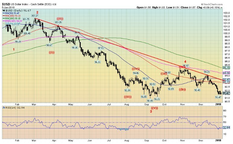
The US$ Index continues to fall this past week losing just under 0.4%. The Euro, the British Pound and the Cdn$ all gained against the US$ with the Japanese Yen off slightly on the week. The Cdn$, in particular, has been strong rising 1% this past week helped immensely by Friday’s strong job report. If the US$ Index is to recover it must start it soon. A drop under 91 would highly suggest that new lows below 90.99 lay ahead. The falling US$ Index is reflecting a crisis of confidence in the US.
While that crisis of confidence is not showing up in a falling stock market that could soon change. The crisis of confidence relates more to the fractured politics and the US’s growing isolationism. A minimum a bounce may be in store to ease some of the oversold position. The US$ Index needs to regain 93 at a minimum to suggest that higher levels are possible. Otherwise the trend has shifted once again to the downside a breaking 91 would confirm that downward trend.
© David Chapman
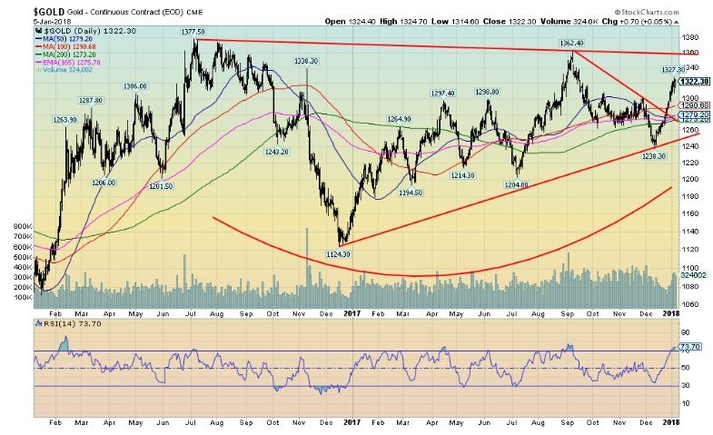
Gold enjoyed a 1% advance in the first week of 2018. This follows the 13.7% gain for gold in 2017. Since making what well may be an important 7.83-year cycle low in 2015 at $1,024 gold has managed to advance in both 2016 and 2017 and in the process make higher yearly lows (2016 the low was made in January at $1,070 while in 2017 gold opened and moved irregularly higher throughout the year). One could argue that gold has already begun a nascent bull advance. But as we noted in our commentary on gold in 2018 the effects of the 7.83-year cycle low coupled with a 34-month cycle may have helped keep prices depressed through 2017. If we are correct about this, then 2018 should see some of the strongest gains in years for gold.
Seasonally the period January to February/March is one of the best during the year. In 2016 the January/March rise was 21.9% while in 2017 gold gained 9.6% in the January/March period. In both instances, following pauses gold made further gains with the highs for the year coming in July 2016 and August 2017.
With a high thus far of $1,327 gold has taken out its October 2017 high of $1,308. This diverges with both silver and the gold stock indices that have not yet taken out their respective October 2017 high. Gold is also diverging in currencies. While gold is up in US$ and has taken out its October 2017 high, gold in other currencies such the Cdn$, the British Pound, and the Euro have not. On the other hand, gold has made new highs over the October 2017 in Japanese Yen and while just barely so far, Swiss Francs. The weakness for gold in other currencies is the result of the recent weakness for the US$ vs. the Cdn$, the Pound, and the Euro. Naturally, we would like to see gold making new highs in all currencies. But at least the trend is up in all other currencies.
Gold is struggling around $1,320 where we did expect some resistance. However, with a high thus far of $1,327, the expectation is that gold should move higher. Once through $1,330, there is some resistance at $1,340, but after that, it is the 2016 and 2017 highs at $1,377 and $1,362 respectively. New highs above those levels would suggest a move to $1,400. There is good support now down to $1,290/$1,300 and even if there is a pullback now we would expect that zone to hold. Only below $1,270 would be concerned about the rally. While all of the focus has been on the stock markets and cryptocurrencies, it is positive to see gold catch a bid. Our expectations are we should see further higher prices in the first quarter with some potential to reach $1,400.
© David Chapman
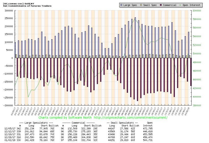
The commercial COT has fallen in the past week from 34% to 32%. While the commercials do not appear have trimmed their longs to any extent in the past four weeks they increased their short open interest by roughly 28,000 in the past week. The large speculators (hedge funds, managed money, etc.) increased their long open interest by roughly 39,000 contracts but they also increased their short open interest by about 11,500 contracts. One interesting aspect was that the large specs increased their long open interest by roughly 11,000 more contracts than the commercials increased their short open interest. You don’t see that happen often. We’d have to consider that a bullish sign.
For the record the silver commercial COT fell to 40% from 44% with the commercials trimming their long open interest by roughly 7,000 contracts and adding about 10,000 contracts to short open interest. The large speculators COT jumped to 59% from 52% but it was largely because they trimmed their short open interest by about 17,000 contracts. Long open interest rose only about 1,000 contracts. Overall, we don’t see the commercial COT as yet at levels that would suggest a sudden turnaround in the markets to the downside.
© David Chapman
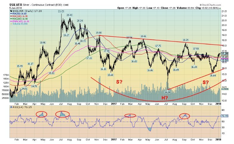
Silver gained about 0.8% in the first week of 2018 lagging gold’s 1% gain. Ideally in a bull market we want to see silver lead gold. Silver tends to lead in both up and down markets. For 2017 silver only gained 7.3% to gold’s 13.7% gain. Silver, unlike gold, has not taken out the high seen in October 2017. The high thus far for silver is $17.33 vs. the $17.50 high seen in October. This is a bit of a divergence as we prefer to see both gold and silver making new highs together. Nonetheless we continue to be encouraged by what appears as a huge head and shoulders bottom pattern for silver. The neckline is currently up around $18. A firm breakout over that level could project silver prices up to $22.65. That would be quite encouraging as that would take out the 2016 high of $21.23. Silver would have further potential to rise to $25.50. Silver is over the 200-day MA ($16.98) so $17 should act as support. Further support is seen down to $16.70. Only below $16.70 would we be concerned about the advance.
© David Chapman
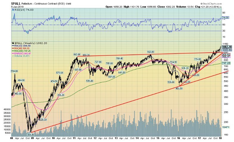
If there is one metal that has done exceptionally well over the past year it is palladium. Palladium gained 55% in 2017 and has moved to record highs. We would love to think that palladium is a leading indicator for the other precious metals. Palladium lives in a netherworld of not quite being considered a precious metal (although it is rare, hard to find, and its color is silvery-white) and being strictly thought of as an industrial metal. Palladium is heavily used in the automobile industry (accounts for at least 78% of demand) and the expectation is that the demand will just keep on growing. Palladium is also in supply deficits and has been for 6 of the past 7 years. That deficit is expected to persist until 2020 at least. Making palladium even harder to obtain, 80% of world’s supply comes from just one country—Russia. Much of the rest comes from South Africa. Canada does produce some. Russia has restricted supplies of valuable resources such as palladium. In a tight market that just means higher prices, especially if Russia were to restrict supplies further. Palladium also has some investment demand but it only accounts for roughly 1% of total demand. One can invest in palladium and it is considered diversification in precious metals. Palladium only recently broke out to new highs. The charts suggest that a potential objective could be up to $1,350 to $1,400.
© David Chapman
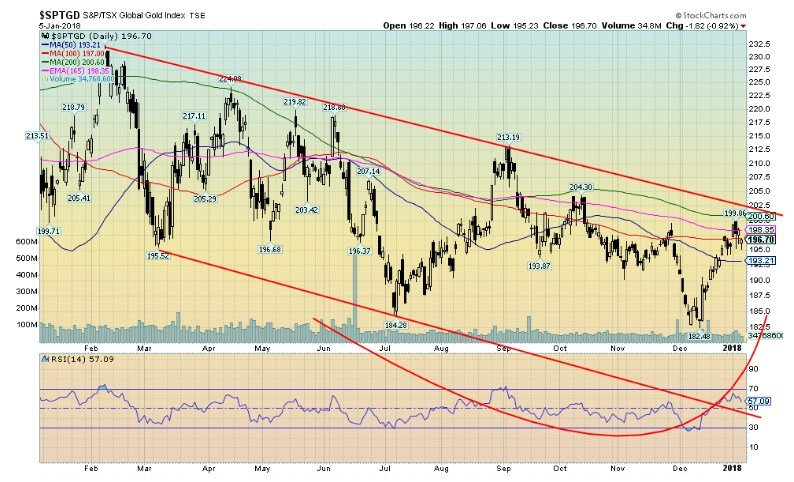
Despite a rally that has seen gold stocks as represented here by the TSX Gold Index (TGD) the gain from the December lows has thus far only been about 8%. The TGD remains below the October 2017 high a divergence with gold that has already taken out that level. The TGD has currently run into resistance at the 200-day MA (200.60). Further trend-line resistance is seen just above at 202 to 205. The TGD is also diverging somewhat with the U.S. based Gold Bugs Index (HUI) in that it is up 14% from its December 2017 low. The differential is caused by the different components of the two indices. The HUI has rallied just above its 200-day MA.
In a bull market we prefer to see the gold stocks leading gold and silver. The TGD needs to clear the 202/205 zone then further resistance between 214 to 230. What appears as a possible double bottom at 184 (July) and 182 (December) has potential for a rise to 233 once the TGD breaks out over 202/205. But the reality is we would like to see the gold stocks leading the way. There are no extremes being seen in the indicators for the TGD so there is room to move higher.
© David Chapman
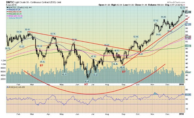
WTI oil prices have moved to their highest level since May 2015. However, oil prices remain well below their levels of 2010–2014 when WTI oil traded roughly between $100 to $114. The all-time high was seen in 2008 at over $147. Following that peak oil prices collapsed 77% in a matter of months during the 2008 financial crisis. Following the corrective wave that took WTI oil to a peak of $114.83 in April 2011 they once again began to collapse in September 2014.
The bottom didn’t come until February 2016 at $26.05, a collapse of 82% from the lofty 2008 peak. WTI oil prices have now begun what could be a nascent bull market given they have recently busted out to new highs. A potential head and shoulders bottom formed between February and September 2017 has potential to see prices rise to $62.80. Given we are now somewhat overbought at these levels WTI oil could be making a top or is close to it.
That President Trump just announced the opening of previously closed offshore zones for drilling is not going to do any favor to prices as it could increase supply. War in the Mid-East would, of course, change things dramatically but other than the ongoing conflict in Syria all else is just a war of words, particularly with Iran. There is decent support down to $58 but below that level, WTI oil could fall further to stronger support near $55 and $53. If WTI oil can firmly exceed $63 then odds favor higher prices with a potential to $71.
Trends:
Daily – Short-term trend (For swing traders)
Weekly – Intermediate-term trend (For long-term trend followers)
Monthly – Long-term secular trends (For long-term trend followers)
Up – The trend is up.
Down – The trend is down.
Neutral – Indicators are mostly neutral. A trend change might be in the offing.
Weak – The trend is still up or down but it is weakening. It is also a sign that the trend might change.
Topping – Indicators are suggesting that while the trend remains up there are considerable signs that suggest that the market is topping
Bottoming – Indicators are suggesting that while the trend is down there are considerable signs that suggest that the market is bottoming.
(Charts courtesy of Stockcharts, Dshort, CotPrice, ShadowStats)
_
David Chapman is not a registered advisory service and is not an exempt market dealer (EMD). We do not and cannot give individualised market advice. The information in this newsletter is intended only for informational and educational purposes. It should not be considered a solicitation of an offer or sale of any security. The reader assumes all risk when trading in securities and David Chapman advises consulting a licensed professional financial advisor before proceeding with any trade or idea presented in this newsletter. We share our ideas and opinions for informational and educational purposes only and expect the reader to perform due diligence before considering a position in any security. That includes consulting with your own licensed professional financial advisor.

-

 Markets2 weeks ago
Oil Shock Risks: How Conflict with Iran Could Impact Markets
-

 Cannabis3 days ago
Germany’s Medical Cannabis Market: Legal Reform, Falling Prices, and Rapid Expansion
-

 Impact Investing2 weeks ago
Net-Zero Asset Owner Alliance Introduces Transition Targets in Updated Climate Protocol
-

 Impact Investing6 days ago
ESG Funds Still Hold BP Despite Shift Back to Fossil Fuels








You must be logged in to post a comment Login