Featured
AI Stocks Powered the Market Higher
Too bad most of the market is still not following the trend of AI and high-tech stocks. And that includes the commodity stocks, especially energy, gold and metals who generally remain in the doldrums. So far, it’s only the NASDAQ and the S&P 500 that have climbed to fresh 52-week highs led by the NY FANG Index and its components. That has led pundits to declare that the bear is over long live the bull.

The Fed does love to toy with us. It was probably no surprise that the Fed paused at its June FOMC. Many had expected that to happen, even with a good minority looking for another rate hike. But then Fed Chair Jerome Powell surprised everyone, hinting that more hikes might be on the table at the July 25–26 meetings and even the September 19–20 meetings. The result was that markets were all over the place as they fell, then rallied.
The Fed, as is the Bank of Canada (BofC), is a master of obfuscation. In another life, I dealt with both the Fed and BofC while working in the treasury divisions of large financial institutions. One thing I discovered very quickly was that talking with the Fed or BofC was a one-way street. You talk, they listen—offering nothing or very little in return. I understand.
They want and need information on what the street is seeing and thinking; however, in return they are not going to reveal what they are going to do or what they are even thinking about. That said, they do throw out hints, and Jerome Powell and Tiff Macklem are merely the latest of Fed and BofC chairs who manage to talk a lot and say very little. It’s their job. Do they know where things are going? Probably no more than we do, but it is their job to react by lowering or raising interest rates or conducting market operations that add to the financial system (i.e., quantitative easing or QE) or take out of the financial system (i.e., quantitative tightening or QT).
It explains as well why they are largely “Johnny-come-latelies” by raising or lowering interest rates later than many believe they should react. All central banks are much the same with their responsibility for monetary policy (i.e., interest rates, foreign exchange) and the financial system (i.e., QE/QT overnight market functions, lender of last resort). They are also responsible for currency issuance, money supply, and funding of government operations, working closely in Canada with the Department of Finance and in the U.S. with the
U.S. Treasury. Central banks are standalone creatures with only advisory reporting lines to the government.
The government may appoint the head of the Fed or BofC, but the decision is made by the Board of Governors of the institutions. That allows the central bank to work independently of the government. The government cannot fire the head of either the BofC or the Fed. That’s the role of the governors as the central bank maintains its independence.
Fed Funds, CPI 1953–2023
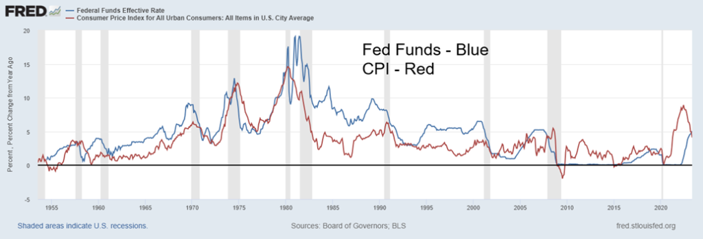
Note the long period where the Fed funds rate was above the rate of inflation, roughly from 1980 to 2001. This is what we refer to as a normal yield curve. Then, from roughly 2001 to 2021, the rate of inflation was above the Fed funds rate. This was a great period of monetary expansion and what we refer to as the negative yield curve. Money was cheap, encouraging a massive rise in debt and sharp increase in money supply. War, the fallout from droughts, the pandemic, and supply disruptions were huge contributors to a sharp rise in inflation, putting it well above the Fed funds (interest) rate. Belatedly, the Fed (and BofC) reacted and started raising interest rates.
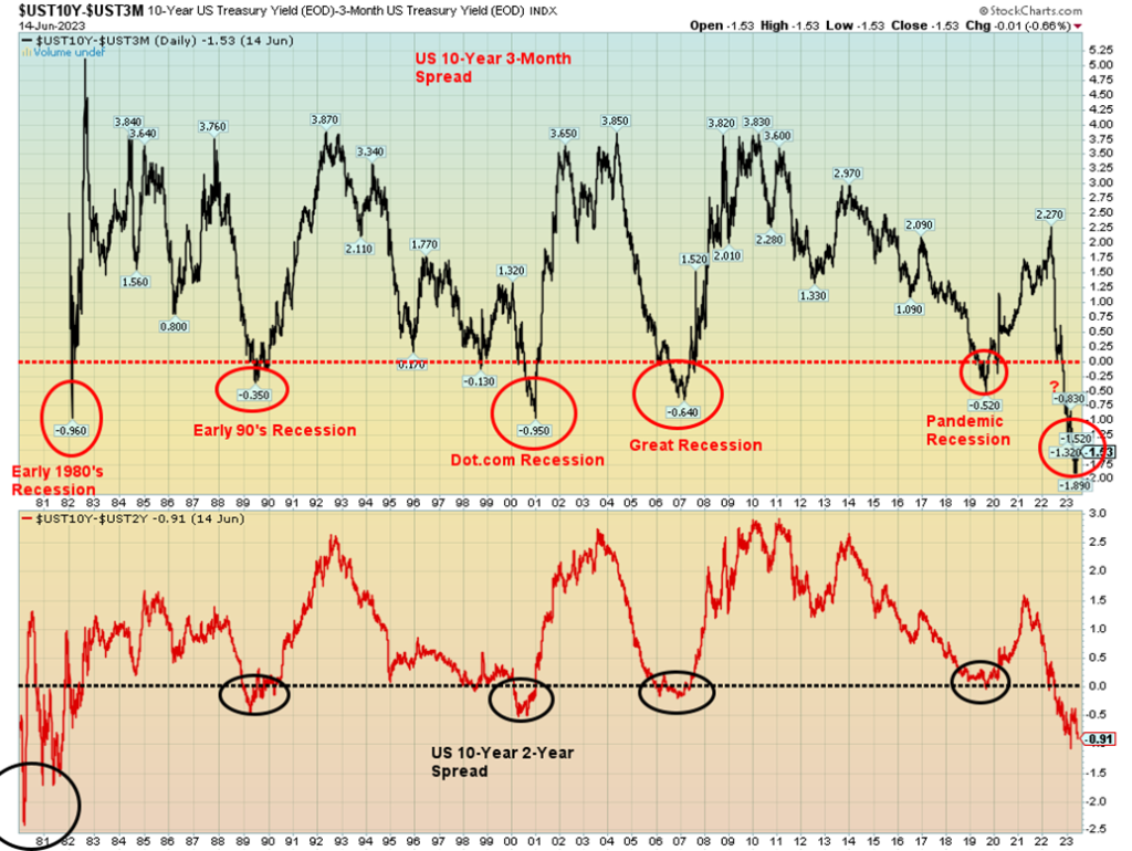
But that expectation of higher interest rates translates back into the yield curve and short rates rise faster than long rates as the expectation further out is that interest rates will normalize. In the interim, however, it has created the widest inverted yield curve we’ve ever seen. The chart below shows that the U.S. 10-year treasury note less the 3-month treasury bill is at record levels, while the 10-year–2-year spread is at the highest levels seen since the early 1980s, which triggered the 1980–1982 steep recession. The steep inverted yield curve has a long history of predicting U.S. recessions and, as well, the steep yield curve is putting stress on the U.S. and Canadian banking and financial systems, resulting in higher interest rates for loans, mortgages, etc. In turn, that has turned up the dial on delinquencies and defaults as most people were quite unprepared for a rise in interest rates. Both the commercial real estate market and the home mortgage market have suffered as result.
Our chart below shows the 3-month–10 year and 2-year–10-year yield curve inversions from the mid-1970s.
U.S. 10-year Treasury Note less 3-month Treasury Bills and 2-year Treasury Note 1976–2023
The Fed and the BofC are usually behind the curve. As a result, they start hiking later than they should, and will hike for longer than they should, even as inflation comes down. It was a mistake thinking inflation was transitory when history shows that inflation, once underway, can stick around for longer than most think. Witness the 1970s. Yes, inflation came down after the 1973–1975 recession, but it reared its ugly head again into the late 1970s and early 1980s before ultra-high interest rates sparked a steep recession and collapse of interest rates.
If the Fed and BofC are behind the curve, the European Central Bank (ECB) has been even more so. The ECB hiked rates again, as was expected, to 3.5% from 3.25% and ECB head Christine Laggard hinted about more to come. The trouble is, for the ECB, the bank rate is 3.5% while the EU inflation rate is 8.1%. A big difference. In the U.S., the inflation rate is last 4% while the Fed rate is 5%–5.25%. In Canada, the inflation rate is last 4.4% with the BofC rate at 5%.
Going the opposite way has been the People’s Bank of China (PBOC), who this past week lowered rates as youth unemployment hit record levels. It was the first time in 10 months that the PBOC had cut their key policy rate. It now stands at 2.65%. Inflation in China is last reported as a paltry 0.2%. China has been concerned about slowing economic growth.
Whenever we see interest rates starting to rise above the rate of inflation, our expectations turn to a potential recession as forecasted by the inverted yield curves. While many are expecting only a mild recession, the steeply inverted yield curve suggests to us that the recession is likely to be steeper than what many expect. Layoffs in the tech industry have already been high with, we suspect, more to come. Layoffs have also been seen in large investment banks such as Goldman Sachs. These are all high-end, high-paying jobs. Eventually that translates into the lower ends of the economy, such as leisure and hospitality. Difficulties with high interest rates in both commercial and consumer real estate lead to less construction and a rise in unemployment in the construction industry. That in turn reverberates back on other industries.
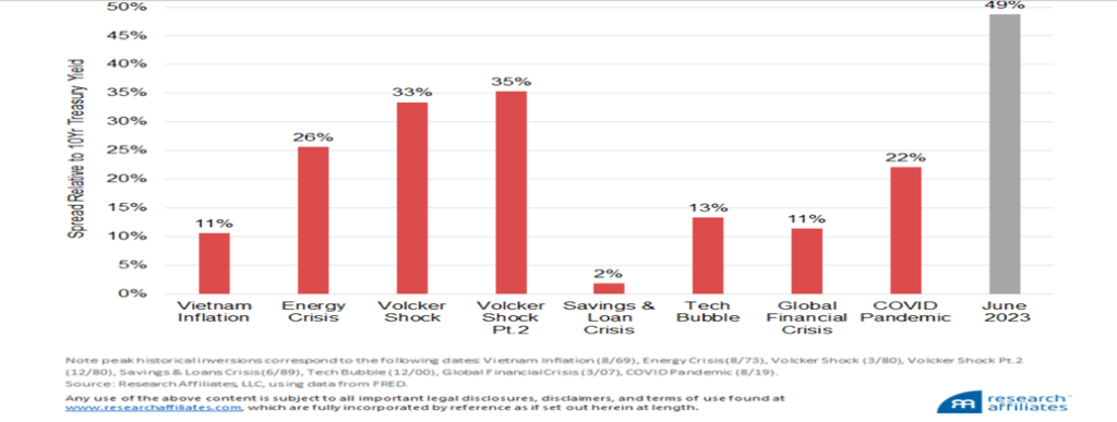
Sanctions and the threat of war, with a subsequent slowing of global trade and growing de-dollarization, also have a negative impact. Destructive storms—i.e., fire, floods, hurricanes—also have a negative impact, with communities destroyed and now insurance companies refusing to insure because of the rising dangers. All of these are pointing to the potential for a steep recession rather than a mild one. Here’s an interesting chart we found that shows the magnitude of historical inversions that preceded previous recessions.
Magnitude of Historical Inversions Preceding Recessions: 10-year Note minus 3-month T-Bill
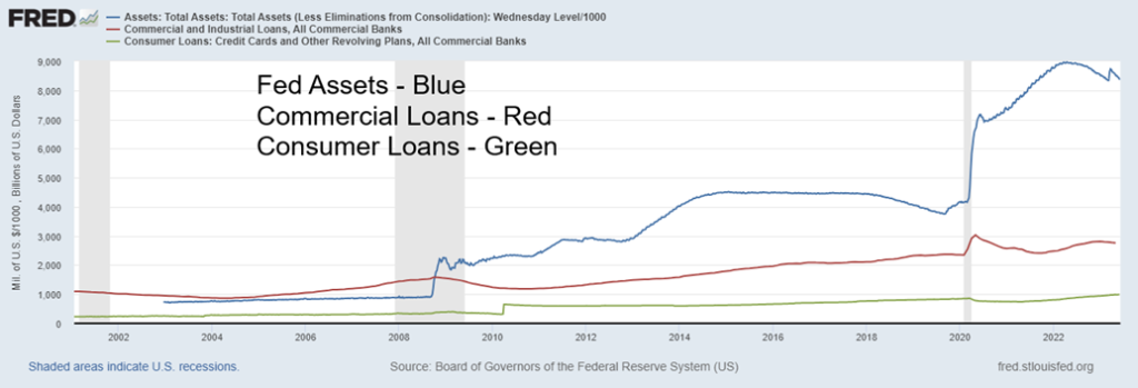
It is no surprise, then, that we are seeing the Fed’s balance sheet contracting (QT) and loans slowing with commercial banks. But consumer loans are still rising and herein lies vulnerability. Canada’s consumer has the one of the highest debt/GDP ratios in the world, at or higher than where the U.S. was before the Great Recession of 2007–2009. The U.S. debt/GDP ratio is down but remains high. Consumers are quite vulnerable. But with both the Fed and banks contracting, that is eventually poor for the economy as well as it is effectively a withdrawal of funds from the financial system. M1 and M2 money supply are also contracting. All bode poorly for the economy going forward.
Fed Assets Balance Sheet, Commercial Loans at Banks, Consumer Loans 2001–2023
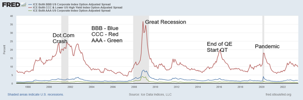
Despite what does appear as continued tightening from the monetary authorities, the market so far hasn’t reacted negatively to the massive amount of debt, especially corporate debt outstanding. If anything, they remain rather complacent. Our chart below of spreads over treasuries for AAA, BBB, and CCC credits reflects a complacent market rather than one that should be concerned. Of late, CCC credits, representing the lowest rating where most are junk bonds, are actually seeing the spreads decline. Most U.S. debt estimated at over 70% is rated BBB and lower.
At the other end, Bloomberg put out a chart that centers on commercial mortgage-backed securities and treasuries. Here the spread is rising. This is a subset of a larger market of BBB securities. This rise in the spread reflects the growing concern in the commercial real estate market, even as many believe they can work their way through the current decline.
The banking system remains vulnerable to shocks. Many believe the banking crisis is behind us. But the banking system has bled deposits as all bank deposits have fallen over $750 billion since May, while money market funds that are paying a higher yield have gone up a roughly equal amount in the latest quarter. There remain concerns as to whether all deposits would be covered by the Federal Deposit Insurance Corp. (FDIC) in the event of a bank failure.
Spreads to U.S. Treasuries for AAA, BBB, CCC Credits 1997–2023
Bloomberg US CMBS BBB Index Option-Adjusted Spread 2013–2023
Strong job numbers, reasonable retail sales even if it appears they are being financed with debt, and mixed manufacturing numbers all have, so far, kept the U.S. from falling into an official recession. While countries like Sri Lanka, Lebanon, Russia, Suriname, Zambia, Venezuela, and Zimbabwe are already in a recession (depression?) and debt default, many others remain on the verge of debt default and recession, if they are not already in one; i.e., Pakistan, Argentina. Eventually, what goes on in the emerging markets comes to haunt the developed markets. Germany is in an official recession and the U.K. is not far behind. However, others continue to show okay growth despite the lowest consumer confidence seen since the Great Recession and the steep 1980–1982 recession.
University of Michigan Consumer Sentiment 1977–2023
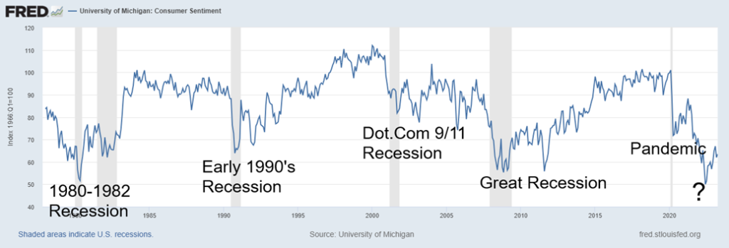
Pessimistic consumers, record levels of debt, declining global trade due to trade wars and sanctions, and threat of war, are all weighing on the consumer despite strong job growth, falling inflation, and steady, if not spectacular, retail sales. The latter, so far, is outweighing the former. But will it last? The hugely negative inverted yield curve with a long history of predicting recessions suggests to us that when the recession arrives it could be much steeper and last longer than most people expect.
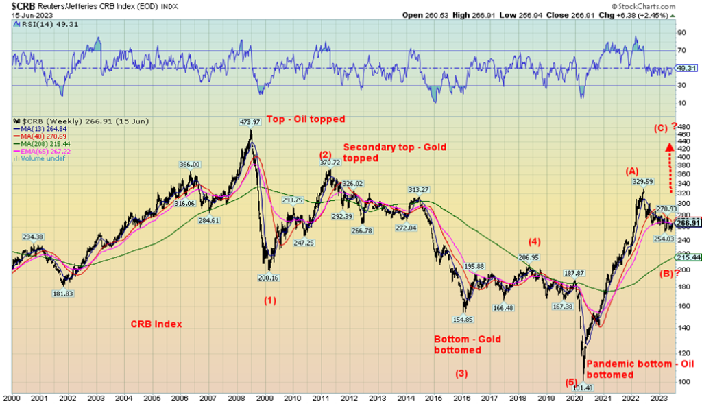
We have a very disjointed stock market where a few, such AI and high-tech stocks, are dominating and taking the markets higher, while commodity-based stocks are languishing, undervalued and overlooked despite the need for commodities. Falling commodity prices of late have helped push down the rate of inflation. But, as we have suggested, this appears to be merely a correction to the sharp run-up that commodities and commodity stocks had after the pandemic of 2020. If that’s correct, then this would be the B wave of a large ABC pattern or the second wave of a five-wave advance. We lean towards to the former. Regardless of this, another commodity boom could soon get under way as the switch out of the high fliers’ reverses.
Two more charts below. The first shows, once again, the CRB Index (Index of 19 commodities) from 2000. We note the five waves down from the top in 2008. The second chart shows the Baltic Dry Index, a measurement of price of moving goods (raw materials) by sea. It’s falling, reflecting a slowing global economy.
CRB Index 2000–2023
Baltic Dry Index 2002–2023
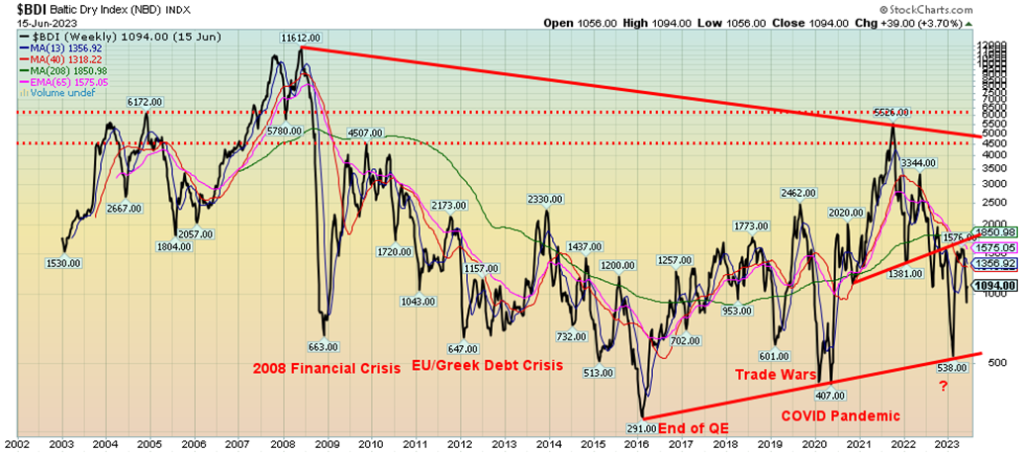
Chart of the Week
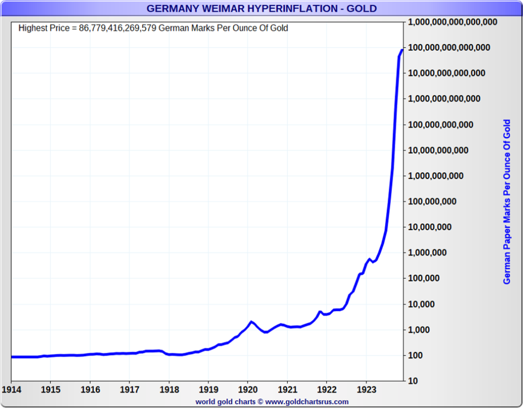
And we complain about inflation today. This has to be one amazing chart on inflation. And it is not even the worst case of inflation. The worst? Hungary, where the highest monthly inflation hit 13,600,000,000,000,000%. Germany Weimar Republic hyperinflation 1923, is ranked only number four, where the highest monthly inflation only reached a paltry 29,500%. Oh yes, number two is Zimbabwe, which in 2008 had the highest monthly inflation at 79,600,000,000%, and number three is Yugoslavia in 1994 where the highest monthly inflation reached 313,000,000%. To put all that in perspective, the highest monthly inflation the U.S. has experienced since inflation got underway in 2020 was April 2021 when the monthly rate hit 0.77% or an annualized 9.2%. Hungary’s inflation was so bad they actually issued a 100,000,000,000,000,000,000 (100 quintillion) pengo note.
The chart above shows how many German papiermarks it took to purchase an ounce of gold. At its peak, it was 86,779,416,269,579 German papiermarks to buy one ounce of gold. In 1914, when this chart started, it only took 92.9 German papiermarks. That translates as an increase of 9,341,164,291%. Ten years ago, it took US$ 1,232 to purchase an ounce of gold. Today it’s $1,958, an increase of only 59%.
The 1914 start date is important because it was then that the German government introduced the German papiermark, after the elimination of marking the mark to the gold standard. It was all designed to help pay for the war as they upped borrowings rather than using taxation to raise funds. But even after Germany lost the war, prices remained relatively stable, although they had doubled by 1919. War reparations demanded by the Treaty of Versailles forced Germany to pay with gold or a foreign currency equivalent instead of the German papiermark. The government could no longer inflate their way out of the problem but instead used government-backed papiermarks to purchase foreign currencies.
Germany became delinquent on its payments and, in turn, France occupied the heavily industrialized Ruhr Valley in January 1923 to demand payment in hard assets. These sparked strikes, making a bad situation worse. Germany’s economy imploded; hyperinflation soared. The story of taking wheelbarrows of money to purchase a loaf of bread became legendary. At its peak, it took 80 billion papiermarks to buy a one-pound loaf of bread. Papiermarks were used as logs to burn because it was cheaper than buying a log.
Germany cancelled the papiermark and issued a new currency, the rentenmark, to help stabilize the economy. The rentenmark was pegged at 4.2 to the U.S. dollar. While things did stabilize, Germany’s economy remained a mess and by 1933 the Nazis came to power, ending the Weimar Republic.
Inflation U.S. and Canada 2013–2023
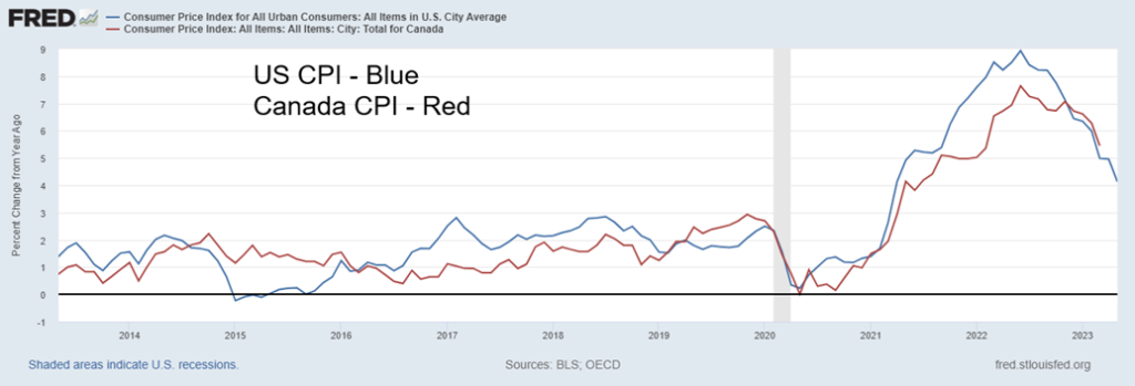
Today inflation is a global problem, averaging around 14%. There are no G7 countries that have an inflation rate over 10%. The five largest rates of inflation in the world are currently Venezuela at 436%, Lebanon 269%, Syria 139%, Argentina 109%, and Zimbabwe 87%. All five are also candidates for sovereign debt default. Inflation is a problem, but it is also important to keep things in perspective. By comparison, U.S. and Canada inflation is a sea of bliss.
Markets & Trends
| % Gains (Losses) Trends | ||||||||
| Close Dec 31/22 | Close Jun 16, 2023 | Week | YTD | Daily (Short Term) | Weekly (Intermediate) | Monthly (Long Term) | ||
| Stock Market Indices | ||||||||
| S&P 500 | 3,839.50 | 4,409.59 (new highs) | 2.6% | 14.9% | up | up | up | |
| Dow Jones Industrials | 33,147.25 | 34,299.12 | 1.3% | 3.5% | up | up | up | |
| Dow Jones Transport | 13,391.91 | 14,792.86 | 3.8% | 10.5% | up | up | up (weak) | |
| NASDAQ | 10,466.48 | 13,689.57 (new highs) | 3.3% | 30.8% | up | up | up (weak) | |
| S&P/TSX Composite | 19,384.92 | 19,975.37 | 0.4% | 3.1% | down (weak) | neutral | up (weak) | |
| S&P/TSX Venture (CDNX) | 570.27 | 613.82 | 0.6% | 7.6% | up | neutral | down | |
| S&P 600 (small) | 1,157.53 | 1,204.80 | flat | 4.1% | up | up (weak) | neutral | |
| MSCI World Index | 1,977.74 | 2,175.35 (new highs) | 2.5% | 10.0% | up | up (weak) | up (weak) | |
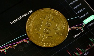
| Bitcoin | 16,535.23 | 25,389.43 | (4.7)% | 53.6% | down | up | neutral | |
| Gold Mining Stock Indices | ||||||||
| Gold Bugs Index (HUI) | 229.75 | 243.12 | 0.1% | 5.8% | down | up (weak) | neutral | |
| TSX Gold Index (TGD) | 277.68 | 286.77 | (1.8)% | 7.6% | down | up (weak) | up (weak) | |
| % | ||||||||
| U.S. 10-Year Treasury Bond yield | 3.88% | 3.77% | 0.8% | (2.8)% | ||||
| Cdn. 10-Year Bond CGB yield | 3.29% | 3.36% | (0.6)% | 2.1% | ||||
| Recession Watch Spreads | ||||||||
| U.S. 2-year 10-year Treasury spread | (0.55)% | (0.95)% (new lows) | (10.5)% | (72.7)% | ||||
| Cdn 2-year 10-year CGB spread | (0.76)% | (1.21)% (new lows) | (9.0)% | (59.2)% | ||||
| Currencies | ||||||||
| US$ Index | 103.27 | 101.84 | (1.6)% | (1.4)% | down | down | up | |
| Canadian $ | 73.92 | 75.98 | 1.4% | 2.8% | up | up | down (weak) | |
| Euro | 107.04 | 109.38 | 1.8% | 2.2% | up (weak) | up | down (weak) | |
| Swiss Franc | 108.15 | 111.83 | 1.0% | 3.4% | up | up | up | |
| British Pound | 120.96 | 128.26 (new highs) | 2.0% | 6.0% | up | up | neutral | |
| Japanese Yen | 76.27 | 70.47 | (1.8)% | (7.6)% | down | down | down | |
| Precious Metals | ||||||||
| Gold | 1,826.20 | 1,971.20 | (0.3)% | 7.9% | down | up | up | |
| Silver | 24.04 | 24.13 | (1.2)% | 0.4% | neutral | up (weak) | up (weak) | |
| Platinum | 1,082.90 | 987.30 | (2.5)% | (8.8)% | down | neutral | up | |
| Base Metals | ||||||||
| Palladium | 1,798.00 | 1,416.20 | 8.5% | (21.2)% | down | down | down | |
| Copper | 3.81 | 3.89 | 2.6% | 2.1% | up | neutral | neutral | |
| Energy | ||||||||
| WTI Oil | 80.26 | 71.93 | 2.5% | (10.4)% | down (weak) | down | neutral | |
| Nat Gas | 4.48 | 2.63 | 16.9% | (41.3)% | up | down | down | |
New highs/lows refer to new 52-week highs/lows and, in some cases, all-time highs.
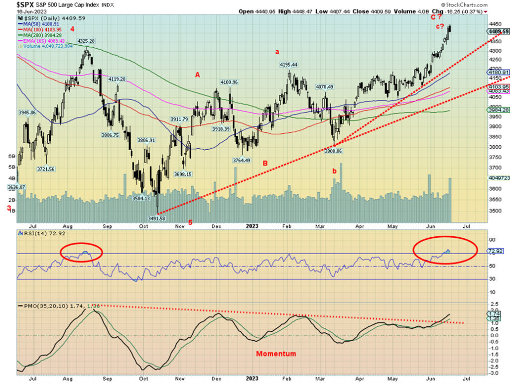
Onward and upward. That seems to the motto of the S&P 500 and the NASDAQ. Not so much everyone else. But Friday saw a reversal with a new 52-week high then a reversal and lower close. This only has meaning if we follow through this coming week. We note that our momentum indicator just broke out. So, is it telling us we are going even higher? That could happen for sure, but with a Daily Sentiment Indicator (DSI) at 90 and higher for the past week, we don’t have a lot of confidence that this up move could continue. Complacency reigns.
The S&P 500 gained 2.6% this past week and the NASDAQ was up 3.3%, both to new 52-week highs. The Dow Jones Industrials (DJI) was up 1.3% but remains below its previous highs and is not making 52-week highs. The Dow Jones Transportations (DJT) was up 3.8%, but it is also well off its previous highs and below its 52-week highs. The S&P 400 (Mid) gained 1.5%, but the S&P 600 (Small) was flat on the week. Both are seriously lagging. Not only are the indices diverging but the indicators are also diverging and/or not confirming. Last week we noted the VIX Volatility Indicator fell to new lows. It’s only now that the S&P 500 may be confirming the drop. The NY FANG Index hit 52-week highs, up 4.0% on the week.
Elsewhere in Canada, the TSX Composite continues to lag and this past week was up only 0.4%. The TSX Venture Exchange (CDNX) didn’t fare much better, up 0.6%. In the EU, the London FTSE was up 1.1%, the EuroNext gained 2.3%, the Paris CAC 40 jumped 2.4%, while the German DAX hit new 52-week highs, up 2.6%. In Asia, China’s Shanghai Index (SSEC) was up 1.3%, the Tokyo Nikkei Dow (TKN) continued its relentless climb to new 52-week highs, up 4.5%, while Hong Kong’s Hang Seng (HSI) gained 3.4%. The TKN is continuing its relentless climb to that 1990 high, but it is now quite overbought. Bitcoin continued its recent troubles, losing 4.7% and falling under 26,000, and was even briefly under 25,000. It continues to look lower. The MSCI World Index did hit 52-week highs, up 2.5% on the week. That’s interesting as the MSCI Index represents emerging markets.
Some markets continue to surge higher. But not all. The NASDAQ appears to be in a blow-off mode. The counter-trend rally is getting long in the tooth. The breadth is narrow. The Russell 2000, as an example, continues to be one of the weakest indices, even as ones like the NASDAQ and the NASDAQ 100 power ahead. Optimism has been surging despite the narrow breadth. Sentiment is as high now as it was for the top in November 2021 and January 2022. But to confirm a top we need to break to the downside and right now, despite Friday’s reversal, that is not a given. July tops have been seen in the past. We continue to focus on 4,200 first, then 3,900 as breakdown zones. A breakdown under 3,900 would break monthly support levels. The last major daily low was around 4,260 and the weekly low at 4,100. Under 3,800 it’s all over. Until these downside targets are taken out, the markets admittedly can continue higher. But this is no longer a market to chase.
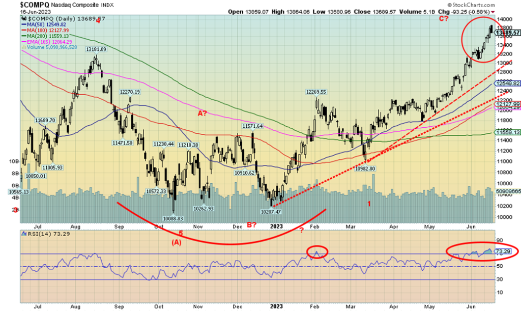
The NASDAQ steamed higher again this week, but something strange happened on Friday that may change the narrative. The market made new highs, then reversed and closed lower. No, it was not an outside day reversal but it was a reversal, nonetheless. We saw the same pattern on the NY FANG Index and on numerous FAANG stocks. Is the party over? We can’t say that yet. It’s the second reversal in the past couple of weeks. The first failed to follow through. Will this one?
The NASDAQ gained 3.3% this past week to new highs. The NY FANG Index was up 4.0%, also to new highs. Numerous FAANG stocks enjoyed an up week. Making new highs (sometimes all-time highs) were Meta, Apple, Netflix, Microsoft, Nvidia, and Advanced Micro. Happy days are here again. But, as we note, sentiment is at silly levels and the NASDAQ has been trading at an RSI over 70 for the past few weeks. Not a good sign. But no, no sell signal. Indeed, we won’t even get one until we break down under 12,800. Under 13,100 would be the first good sign of weakness. Volume has not been spectacular on this rise. Trying to interpret the pattern on this rise is tricky, but it continues to have all the earmarks of a spectacular ABC correction to the down wave from November 2021 to the bottom in October 2022.
The reversal on Friday needs to see follow-through. New highs negate the reversal.
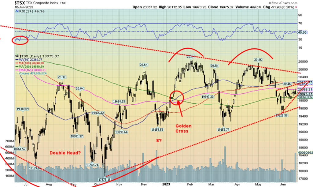
The TSX Composite continues to not follow the bullishness of the NASDAQ or the S&P 500. This past week the TSX gained a small 0.4%. The TSX Venture Exchange (CDNX) continues to struggle, but was up 0.6%. Of the sub-indices, seven were up, two were flat, and five were down. Leading the way up was Consumer Discretionary (TCD), gaining 3.4%. Both Metals & Mining (TGM) and Industrials (TIN) were up 2.0%. The downside leader was a tie between Income Trusts (TCM) and Utilities (TUT), both down 3.5%. Energy fell 2.5%, but the other large TSX component Financials (TFS) was up 1.5%. The interest-sensitive sectors were hard hit on expectations from both the Fed and the BofC that we could still see further rate hikes. We don’t think that will happen, but the perception is there and perception drives the market. We don’t like the chart of the TSX Composite. Not only do we appear to have a potential double top on the charts, but the recent action has the look of a bear pennant. A break of 19,900 breaks it and a break of 19,600 could see a further breakdown. The double top neckline is around 19,200 and, if that busts, then our downside targets could be to 17,500, a decline of some 13% from current levels. Interim support is seen around 18,600. Note how the 50-day MA is turning down, but hasn’t given a death cross. The 50-day MA is currently at 20,266 while the 200-day MA is at 19,890, just below where we closed Friday. Only a firm break above 20,400 and 20,500 could change this negative scenario.
U.S. 10-year Treasury Bond/Canadian 10-year Government Bond (CGB)
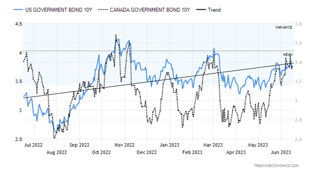
We continue to look at the chart of the U.S. 10-year treasury note and believe we are still in the throes of making a topping pattern. It may also be a descending triangle with that series of lower highs and relatively flat bottom. A breakdown under 3.35% could send us lower while a breakout above 3.85% and especially above 4.00% would send us higher. The still-hawkish Fed impacts the short rates, not the long end of the yield curve that remains highly inverted. This past week, the U.S. 10-year treasury note rose to 3.77% from 3.74%. The Canadian 10-year Government of Canada bond (CGB) fell to 3.36% from 3.38%.
Economic numbers were still favouring expansion. The CPI and PPI falling is good for the economy. Retail sales were higher than expected, coming in up 0.3% when they expected negative 0.1%. The NY Empire State Manufacturing Index was 6.6 when they expected negative 15.1. The Philly Fed Manufacturing Index was negative 13.7, about as expected negative 14. Industrial production year-over-year (y-o-y) was up only 0.2%, marginally better than the expected 0.1%. But the month-over-month (m-o-m) number was negative 0.2% when they expected a small gain of 0.1%. Finally, the Michigan Sentiment Index for June (not final) was 63.9, above the previous 59.2 and above expectations of 60. Better retail sales, better consumer sentiment. All good.
The next FOMC is July 25–26, then there are no more until September 19–20. Will they hike? That depends on the numbers between now and then, especially the June job numbers. This past week, the weekly claims were 262,000, above the expected 249,000 but in line with the previous week’s numbers. The weekly jobless number has been rising steadily as more layoffs are announced in the tech sector and even on Wall Street. These are all high-paying jobs. The lower end sees a lot of part-time jobs. The optimists might call all this the goldilocks economy—not too hot, not too cold. Higher interest rates are having their impact in slowing the economy, but it has not fallen into recession. Some believe it never will, while others are in the hard landing camp.
If there is anything that keeps us in the hard landing camp, it is the record inversion of the yield curve as we earlier noted. This past week the 2–10 spread and the 3-month–10 spread hit record lows at negative 95 bp and negative 157 bp (hit a low of 189 bp). Never, ever have we seen spreads this wide and we continue to believe it bodes poorly going forward.
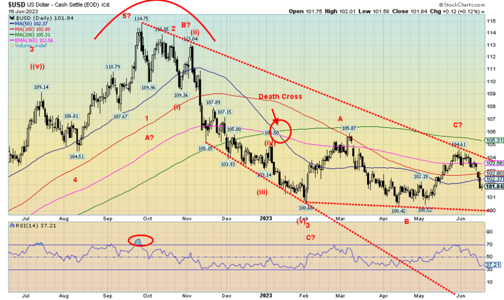
The US$ Index (USDX) fell, closing below our support zone of 102 this past week. However, it is not yet a convincing close so we’ll have to await this coming week to determine whether we are now in the throes of a US$ Index breakdown. A rebound to resistance near 104 cannot be ruled out. Our corrective wave which is labeled, so far, ABC could actually turn into a five-wave correction ABCDE. This would be a D wave. Eliminating it as the D wave requires us to break down under 100. USDX is being held up by a still-hawkish Fed and mixed economic numbers. But it is also falling on the Fed pause and some weak economic numbers. Which is it? Resistance is now at 104 and support is down at 100. Regaining above 102.40 would suggest to us that we have made a temporary low and are now making what could be the E and final wave to the upside. If that’s correct, even taking out 104 would not be a surprise as we often make these false moves at highs.
For the record, USDX fell 1.6% this past week, the euro was up 1.4%, the Swiss franc gained 1.8%, the pound sterling jumped almost 2.0% to fresh 52-week highs, while the Japanese yen fell 1.8%. Despite the Fed pausing, the ECB raised rates while the BOJ holds steady at low levels, thus keeping the yen down. The Canadian dollar jumped 1.4%.
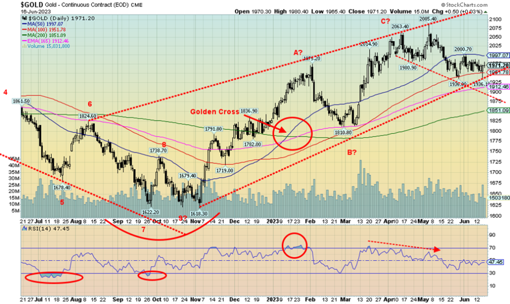
No traction for gold. Of late, we seem stuck between $1950 and $2,000. A still-hawkish Fed despite the pause and a weakening USDX are working against each other. That helps explain why gold seems stuck the past couple of weeks. This past week gold fell 0.3%, silver was down 1.2%, and platinum was off 2.5%. For the first time in a few weeks, palladium rebounded, up 8.5%, and copper was up as well, gaining 2.6%. The gold stocks? Not so much as the Gold Bugs Index (HUI) was up a tiny 0.1% while the TSX Gold Index (TGD) fell 0.9%. Watching the NASDAQ and S&P 500, along with the AI stocks, soar to new highs must be extremely frustrating for the gold bugs who, despite everything, remain bullish. Almost too bullish and that may be a part of the problem. The broader market, enamored as it is with AI stocks, is totally ignoring gold. Stories that money will come out of that sector and go into gold are just that—stories with little fact behind them. Gold’s day will come. Just not today or tomorrow.
At this point we can’t ignore that gold could still go lower first. There is support down to around $1,925, but below that, and $1,900 support is not seen until $1,875. Longer-term support is seen at $1,850. The March low was at $1,810, so there is no way we want to see that fall. We still muse as to our long-term cycle lows of 7.83 years and 23.5 years. We are not convinced the low is in. The November 2022 low of $1,618 is the last major low and it was early in the cycle. More ideal would be a significant low later this year into December.
Gold has been kept on edge by the still-hawkish Fed and economic numbers that still suggest growth. The recent decline in the USDX may just be a pullback, so another rebound could develop. The commercial COT is only somewhat friendly. Overall sentiment is rather neutral here, despite the pounding of the gold bugs. We don’t wish to dump gold, but it is also hard to buy it here as we still have an unfolding pattern that could go either way.
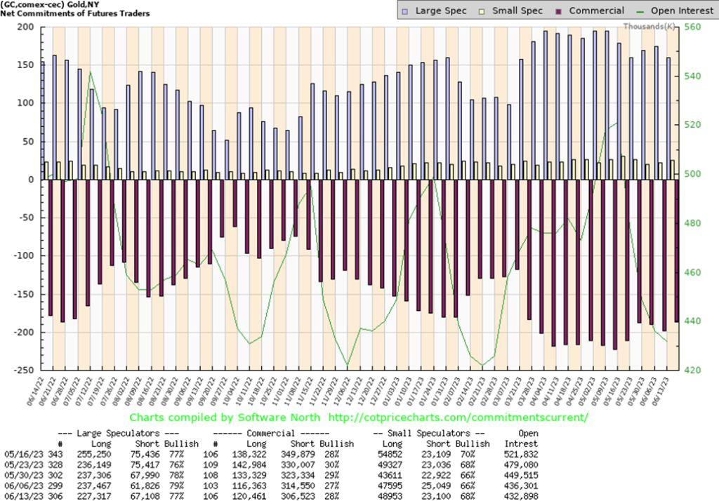
The gold commercial COT (bullion companies and banks) improved to 28% this past week from 27%. Longs rose over 4,000 contracts while shorts contracted about 8,000 contracts. The large speculators COT (hedge funds, managed futures, etc.) fell to 77% from 79% as they shed over 10,000 longs while adding almost 6,000 shorts. On paper at least, this bodes well for gold prices, but it is not overwhelmingly in favour of gold. We’d prefer to see the commercial COT well into the 30s. We’ll take the improvement where we can get it. All of it may suggest a pending rally but not an overwhelming one. Open interest was off slightly by less than 4,000 contracts.
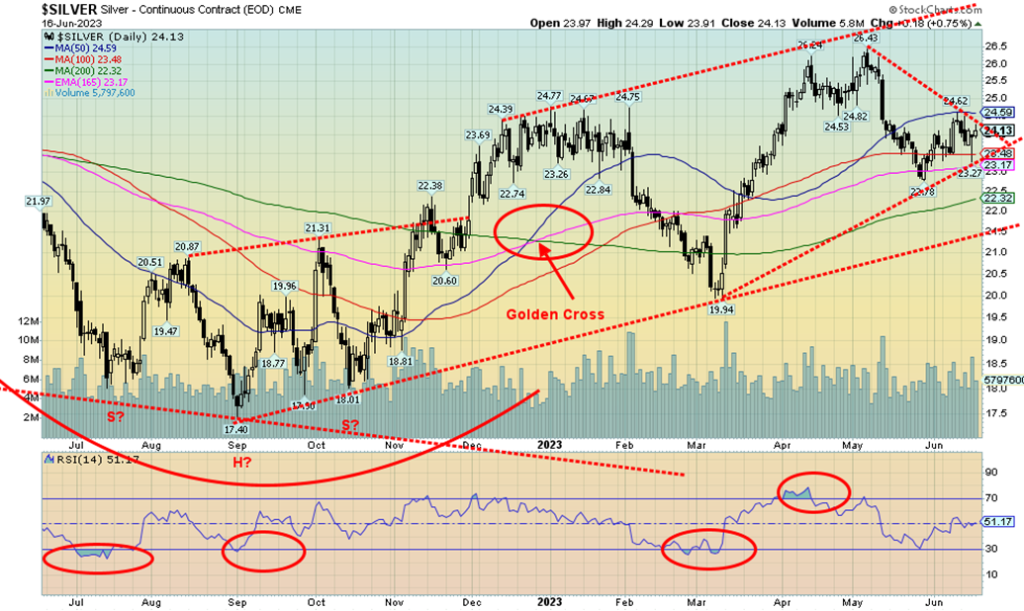
Silver didn’t fare all that well this past week, losing about 1.2%. Silver barely clings to a gain of 0.4% for 2023. It’s quite mixed here as to what next. We have options either way. The 50-day MA acted as a stopper and we have pulled back from that point currently at $24.60. An uptrend line from the March 2023 low comes in around $23.15. So, a breakdown under that level and especially under $23 could send us swiftly to $22 or even the second uptrend line near $21.50. Silver, like gold, is being bounced around by a still-hawkish Fed, even as USDX has been weak of late. We continue to be bothered by the fact that gold made new highs but silver remains nowhere near its highs near $50, seen way back in 2011. We’re not even near the February 2021 high of $30.35.
The potential good news is that the weekly chart shown next has what might be a forming head and shoulders bottom pattern. It’s not perfect by any stretch as the right shoulder went lower than the left shoulder. Usually, it’s the other way around. The breakout point is around $26 and projects up to $37/$38. None of this precludes silver still having another sharp leg down. If we fail to break above $26 on any subsequent rebound, then the downside has more potential. This current up wave may only be a B wave following the A wave down that bottomed at $22.78. Hence, the importance of holding above $23. Many silver analysts agree that silver needs to break above $26 to convince us that we are headed higher. Until we do, the downside remains in play.
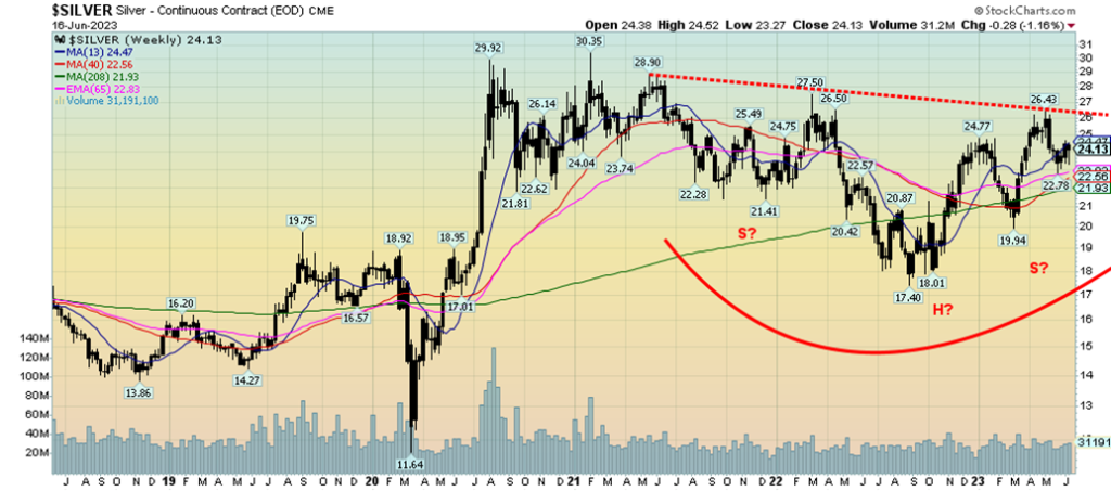
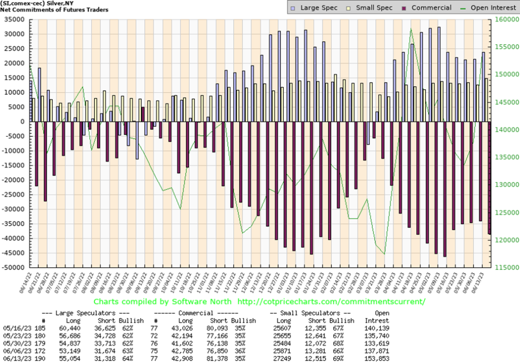
The silver commercial COT fell this past week to 35% from 36%. Not a great sign. Long open interest was essentially flat while short open interest was up almost 5,000 contracts. To see a potential sustained rally for silver, we need to see the commercial COT well up into the 40s. The large speculators COT rose to 64% from 63% as they added about 2,000 longs while holding shorts steady. Open interest leaped about 16,000 contracts on a down week.
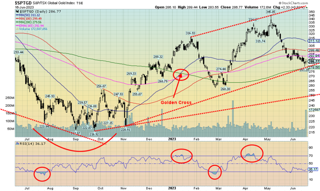
The woes continue for the gold stocks. This past week saw both the Gold Bugs Index (HUI) and TSX Gold Index (TGD) make new lows for their most recent move. The HUI gained a paltry 0.1% this past week while the TGD lost 0.9%. The TGD is now down about 17% from its recent highs but still up 3.3% on the year. The HUI is down over 14% but still up 5.8% in 2023. So far, both indices are doing nothing different than what we witnessed in the 2009–2011 run-up for gold, silver, and the gold stocks. A bigger concern comes if the TGD were to take out the March low at 260. For the HUI, the comparable point is 210. This past week the TGD tested the 200-day MA and bounced. Is that a bottom? Can’t confirm that. A break over 300 would go a long way to suggesting a bottom. Above 312, we’d have a bottom in place. Above 332, new highs are possible. Longer term support is seen for the TGD down at 250. The rebound off the low this week was on good volume, suggesting we may have seen a low. But we need to confirm it. The RSI and some other indicators are diverging positively with the price action, but again these divergences can remain for some time. For the junior gold mining market, it has been excruciating as many junior stocks are down 50% and more from recent highs. The mining-dominated TSX Venture Exchange (CDNX) is down only 5% or so from recent highs and up about 11% from lows in December 2022. But the high for the CDNX was in February 2021 and we are down 45% from that high. Many junior stocks are grossly undervalued, trading at levels sometimes not only below what they have in the ground but below cash value. These are conditions we’ve seen before and it usually signaled a bottom. We await confirmation of one.
Oil prices rebounded this past week, thanks to some Saudi cuts, plus signs that Chinese demand might bounce back. China announced higher import quotas as well as loosening monetary policy and cutting interest rates. The IEA is also looking at potential for increased demand out of India. Given that both China and India represent some 35% of global population, it has the potential to boost prices further. It does, of course, put potential upward price pressure on North American and EU gasoline prices.
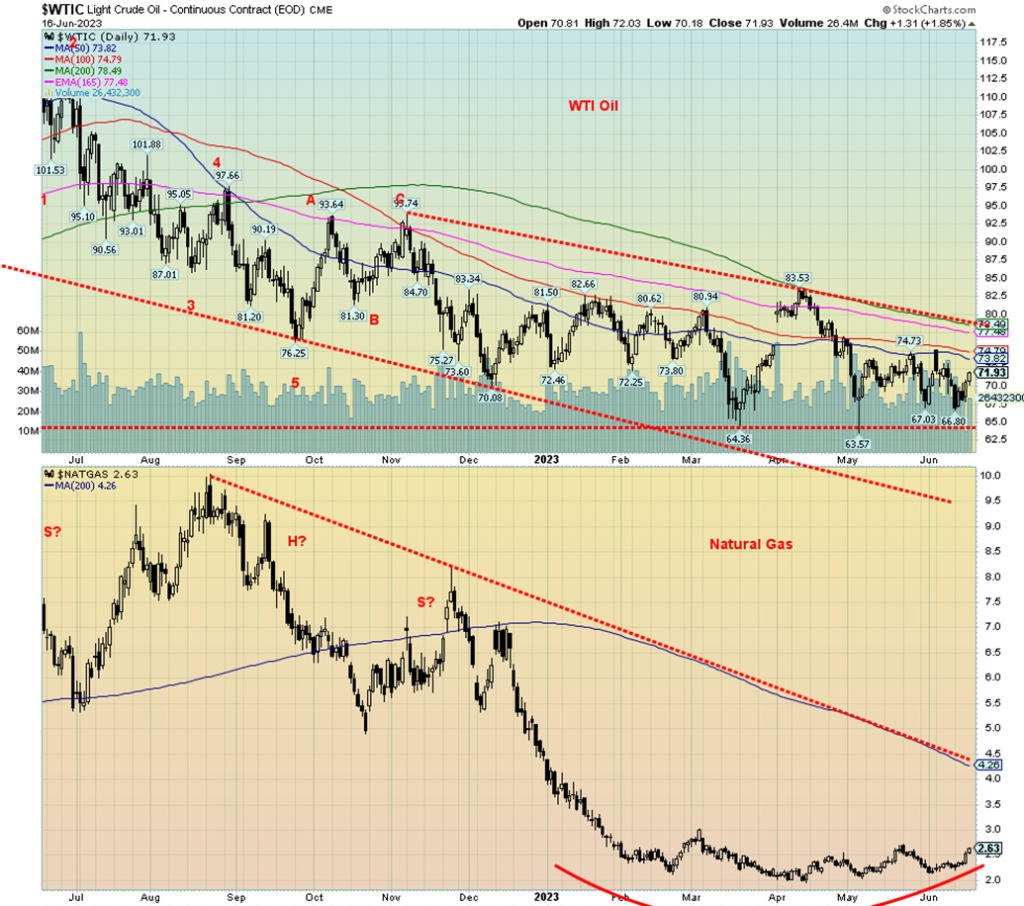
WTI oil rose 2.5% this past week or $1.76. Brent crude was up 0.8%. Natural gas (NG) prices are finally showing some signs of bottoming as Henry Hub NG was up 16.9% while the Dutch Hub in the EU was up 9.2%. Henry Hub NG is now at $2.6,3 still below what we consider a key breakout at $3.00. For the energy stocks, they were mixed/down. The ARCA Oil & Gas Index (XOI) fell 0.8%, while the TSX Energy Index (TEN) was off 2.5%. The fall in the energy stocks is seemingly at odds with the rise in both oil and gas prices. This week could help determine whether it is a one off or whether one of them wrong—the stocks or the commodity.
WTI oil continues to make what we believe could be a significant bottom. Our concern is that we are moving into the weak seasonals so oil would have to overcome that. The range trading continues, with $65/$66 the downside and $75 being the upside. A breakdown under $65 and especially under $63 would be negative and could take us lower. We continue to put better odds on an upside breakout. But even breaking over $75 is just a start. The next level is at $80. Above $84 we could be firmly into a bull run. Risks to oil prices continue, although the war in Ukraine seems to be firmly built into current prices. Rumours of Israel hitting Iran would stir oil prices but is unlikely, despite the rumours.
As noted, NG needs to break out over $3 to tell us we most likely have bottomed. The still growing, rounding bottom is compelling, just as the pattern on WTI remains compelling. We just need a catalyst for both to ignite higher prices.
__
(Featured image by Wance Paleri via Unsplash)
DISCLAIMER: This article was written by a third party contributor and does not reflect the opinion of Born2Invest, its management, staff or its associates. Please review our disclaimer for more information.
This article may include forward-looking statements. These forward-looking statements generally are identified by the words “believe,” “project,” “estimate,” “become,” “plan,” “will,” and similar expressions. These forward-looking statements involve known and unknown risks as well as uncertainties, including those discussed in the following cautionary statements and elsewhere in this article and on this site. Although the Company may believe that its expectations are based on reasonable assumptions, the actual results that the Company may achieve may differ materially from any forward-looking statements, which reflect the opinions of the management of the Company only as of the date hereof. Additionally, please make sure to read these important disclosures.
David Chapman is not a registered advisory service and is not an exempt market dealer (EMD) nor a licensed financial advisor. He does not and cannot give individualised market advice. David Chapman has worked in the financial industry for over 40 years including large financial corporations, banks, and investment dealers. The information in this newsletter is intended only for informational and educational purposes. It should not be construed as an offer, a solicitation of an offer or sale of any security. Every effort is made to provide accurate and complete information. However, we cannot guarantee that there will be no errors. We make no claims, promises or guarantees about the accuracy, completeness, or adequacy of the contents of this commentary and expressly disclaim liability for errors and omissions in the contents of this commentary. David Chapman will always use his best efforts to ensure the accuracy and timeliness of all information. The reader assumes all risk when trading in securities and David Chapman advises consulting a licensed professional financial advisor or portfolio manager such as Enriched Investing Incorporated before proceeding with any trade or idea presented in this newsletter. David Chapman may own shares in companies mentioned in this newsletter. Before making an investment, prospective investors should review each security’s offering documents which summarize the objectives, fees, expenses and associated risks. David Chapman shares his ideas and opinions for informational and educational purposes only and expects the reader to perform due diligence before considering a position in any security. That includes consulting with your own licensed professional financial advisor such as Enriched Investing Incorporated. Performance is not guaranteed, values change frequently, and past performance may not be repeated.


Ali G Makes Surprise Wimbledon Appearance with Cannabis-Themed Satire
Sacha Baron Cohen revived his iconic Ali G character at Wimbledon’s men’s final, blending satire with British high society. Dressed...


Medelon Shooting Club Restores Hall After Successful Crowdfunding Campaign
The St. Engelbertus Shooting Club in Medelon raised €10,260 through crowdfunding to renovate its shooting hall after unexpected dry rot...


Biotech Revival: Big Pharma Bets on Innovation and Acquisitions
After a downturn, biotechnology is regaining attention as major pharmaceutical companies invest heavily in innovative platforms to offset patent losses...


PAASIFEJ: Results-Based Financing Driving Inclusive and Sustainable Rural Growth in Morocco
Morocco’s PAASIFEJ program, funded with 2.4 billion dirhams, supports smallholder farmers, women entrepreneurs, and youth across seven regions while promoting...


Ecobnb Turns Sustainable Tourism Into Measurable Impact
Ecobnb’s sustainable tourism platform generated significant environmental and social impact in 2025, avoiding 58,207 kg of CO₂ and adding 583...
 |
|
 |  |
 |
|
-

 Biotech2 weeks ago
The New Biotech Act Targets Europe’s Funding and Innovation Gap
-

 Crowdfunding6 days ago
Avant Devices Moves Toward Electric Wheelchair Kit Production with New Funding Drive
-

 Africa2 weeks ago
Bank of Africa Launches SME Pact to Boost Business Growth
-
 Cannabis14 hours ago
Ali G Makes Surprise Wimbledon Appearance with Cannabis-Themed Satire