Business
Are We in the Early Stages of a Big Bear Market
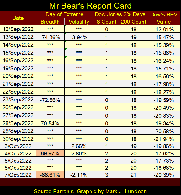
The Dow Jones’ 8-count close the week at a 3, or three of the past eight days were Dow Jones 2% days. The Dow Jones’ 200-count closed the week at a 21, or 21 of the past 200 days were 2% days. All the above items are to be expected in a bear market. That being the case, I believe we’re in the early stages of a Big Bear Market.

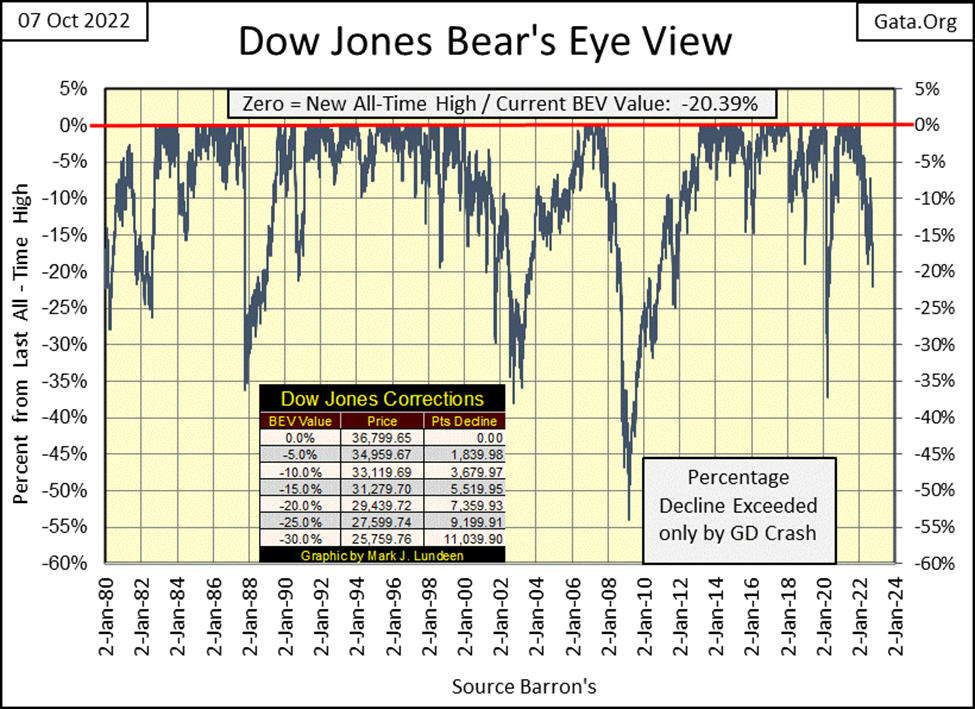
Last week I wondered if we were due for a bounce in the market. We were, but it lasted only to the close of Tuesday’s trading. From there it was all downhill for the rest of the week, the Dow Jones closing on Friday with a BEV of -20.93%, or 20.93% below its last all-time high of last January 4th (36,779).
In the table on the chart below I’ve placed the Dow Jones point values for the BEV values in 5% increments. A BEV of -20% is the Dow Jones at 29,439, a reduction of 7,359 points from its last all-time high, and this week closed with a BEV value just a tad (0.39%) under that.
Looking at the BEV values for the major stock indexes I follow in the table below, this week’s performance for the Dow Jones was mostly followed by the rest of these indexes. On Monday’s close, which for most was up nicely from last Friday’s close, we saw a nice advance, and then more of the same on Tuesday. But for the rest of the week, it was all downhill for these indexes.
It’s too early to say this week’s rally is over. It may resume in the days and weeks to come. But keep in mind; a market that refuses to go up, is a market that is likely to go down.
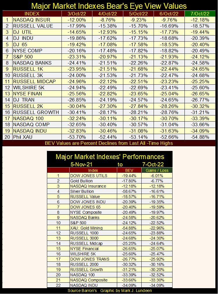
In the table above, I chose 05 November 2021 as a start date for these indexes, as it was on November 5th of last year when fifteen of these twenty indexes made new all-time highs on the same day. Just a week later, BEV Zeros were definitely thinning out, but continued coming to this group of indexes until January.
So, for this data set, I see November 5th of last year as its bull-market high. These stock indexes performance since then is disheartening. Lots of big double-digit percentage losses. The sole exception to that is the Dow Jones Utilities Average (#1). And what is #2? Why gold bullion is! And silver is looking better all the time, moving up to #4 this week.
At the beginning of August, silver was at #16. But if you go back and look at this same table eight weeks ago, you’ll see it’s not so much that silver has advanced, as much as the stock indexes have declined. Well, given the choice of an investment that hasn’t done much of anything, or one that has only lost money, I’d recommend taking the one that hasn’t done much of anything. So, a hearty Bravo Zulu to silver this week, coming in at #4 in the table above.
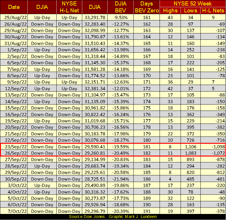
Moving down to NYSE 52Wk H-L Nets in the table below, in late September we saw a spike in 52Wk Lows, with two days seeing four-digit negative nets. Things have calmed down since, but this reprieve may be short-lived.
The problem I see for the bulls is there is bear sign (bear scat), all over Wall Street in Mr Bear’s Report Card below, extreme days of breadth and volatility that keep coming. During bull markets, Mr Bear’s Report Card sees nothing but *** in the extreme day columns. For the Dow Jones 2% Day columns; the 8-day count is usually at Zero for months at a time. The 200-day count, while maybe higher than seen below, is counting down.
What do we see below? Lots of days of extreme breadth; NYSE 70% A-D days. The market can go for years without seeing one of these extreme days, but we see three since September 12th. I included two 60% days in the list. While not technically 70% days, these were days with overwhelming Advances on Tuesday October 4th, and then overwhelming Declines on Friday October 7th. These extremes in market breadth, first in advances, then in declines just don’t happen in Bull Markets.
The Dow Jones’ 8-count close the week at a 3, or three of the past eight days were Dow Jones 2% days. The Dow Jones’ 200-count closed the week at a 21, or 21 of the past 200 days were 2% days. All the above items are to be expected in a bear market. That being the case, I believe we’re in the early stages of a Big Bear Market.
When Mr Bear gets really bad and nasty with the market, as when the Dow Jones breaks below a BEV of -40%, you’ll see what a trashy report card really looks like below.
Here’s the Dow Jones in daily bars. For three days this week, the Dow Jones closed above its lows of last June (black line). Friday changed all that.
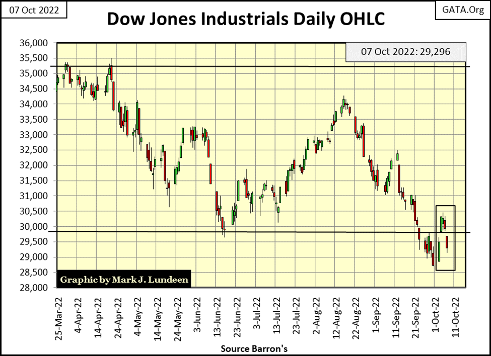
In the days ahead, should the Dow Jones break decisively below last Friday’s close (28,725), that would not be good. Especially if it does so with a negative NYSE 70% A-D day, and a negative Dow Jones 2% day. In bear markets, that’s how things sometimes go.
Bull and bear markets have an underlying theme. There was the 1924-29 Roaring Twenties Bull Market, followed by the 1929-32 Great Depression Crash. In the 1990s, there was the High-Tech Bull Market, followed by the 2000-02 High-Tech Bear Market. Soon thereafter we had the 2003-07 Sub-Prime Mortgage Boom, followed by the 2007-09 Sub-Prime Mortgage Bust.
Does this make any sense to you? From out of nowhere, financial market valuations Go Boom, only to then Go Bust. By why mommy? Maybe a better way of understanding this would by asking the question: where do bull markets come from? It’s a simple question, a question that proves difficult for many “market experts” to answer. Much like when a child asks their mother; “mommy, where do babies come from?”
I’m not really sure where the babies come from. Some questions are best asked of your own mommy, not directed to a market enthusiast such as myself. But I do know where bull markets come from; from Wall Street funneling “liquidity” flowing from the FOMC, to inflate market valuations far beyond the point of prudence in select areas of the economy / financial markets.
In the 1920s, the bubble inflated was in the New York Stock Exchange. In the late 1990s the bubble was in the NASDAQ, and in the 2000s it was in residential real estate. Currently, in 2022, the bubble is in everything, which places at risk investment valuations trading at the NYSE, NASDAQ, all bond markets and residential real estate.
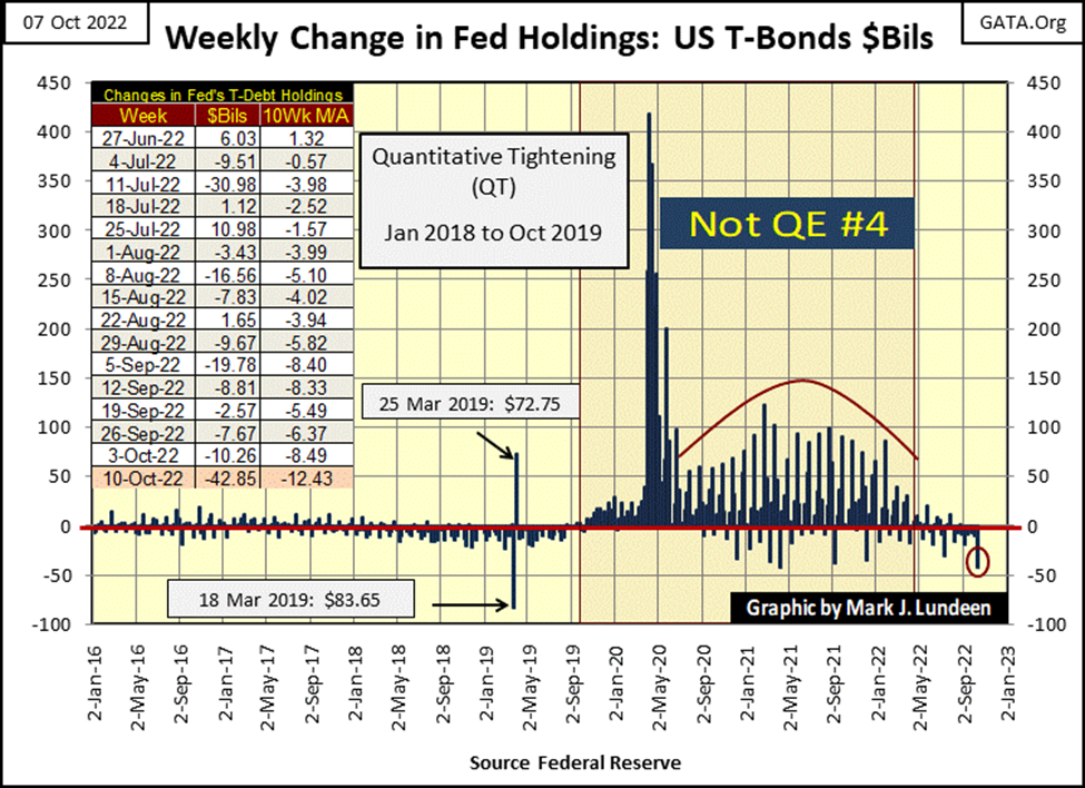
Below is exactly how our current all-encompassing bubble was inflated, with Fed Chairman Powell’s Not QE #4. Following the March 2020 Flash Crash, to the spring of 2022, Chairman Powell did that, what you see below, to reflate deflating market valuations. In response to this “stimulus”, or tsunami of dubious dollars flooding from the Federal Reserve, market valuations in stocks, bonds and real estate all went into historic bull-market highs.
Don’t giggle like a bunch of immature ivy-league students in their economic 101 class, but this almost pornographic graphic below, is how the FOMC and Wall Street makes bull markets. Yea-sure, a year ago seasoned investors looking at their bloated retirement accounts, may have suspected it to be only a cheap thrill, but it felt like love at the time. How could something like that be wrong? But the economy and its financial system now has a bun-in-the-oven, so the good times will soon come to an end.
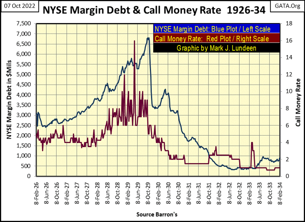
How are bear markets made? Bear markets are not separate and distinct from bull markets; they are the consequences of having a bubble inflated into the market. Here is what happened in the 1920-30 boom-bust cycle, looking at call money rates (Red Plot below) and NYSE margin debt (Blue Plot) as published weekly by Barron’s at the time.
The Dow Jones was advancing nicely with increases in NYSE Margin Debt (“liquidity” flowing from the FOMC). But in the summer of 1928, the “policymakers” were becoming concerned, as seen by their raising the Call Money Rate above 6%. As the Dow Jones continued inflating with increases in Margin Debt, the “policymakers” attempted to send a message to the leveraged speculators, to cool it, by frequent double-digit spikes of their Call Money Rates.
But no one was listening when in Barron’s 29 April 1929 issue, the Call Money Rate was spiked to 16%. Margin Debt peaked in the first week of October 1929. But the bun-in-the-oven, mentioned above, popped in the first week of September, and out came Mr Bear. By October 4th, 1929, Mr Bear had already clawed back 15% of the Dow Jones’ valuation before NYSE Margin Debt had peaked.
In the chart below, during the 1920s bull market, the Dow Jones followed margin debt up to its September 1929 top. During the Great Depression Crash, Margin Debt followed the Dow Jones down to their 1932 summer’s bottom. Or in other words; during the 1920s bull market, the “policy makers” knew they were in control. During the Great Depression Crash, the “policy makers” discovered during bear markets, it was Mr Bear who was in control.
But the 2020s are not the same as the 1920s. Many things have changed in the past one hundred years in the markets. But some things never change; flows of money drives market valuations. Money flowing in inflates market valuations. Money flowing out deflates market valuations. Right now, money is flowing out of the financial markets, as the idiot savants at the FOMC shrink the Federal Reserve’s balance sheet.
Let’s study the chart below. It’s a 10Wk Moving Average of the FOMC’s market operations; when the plot rises above the $0 bil line, the idiots are “injecting liquidity” into the financial system. When the plot falls below the $0 bil line, the idiots are “draining liquidity” from the financial system.
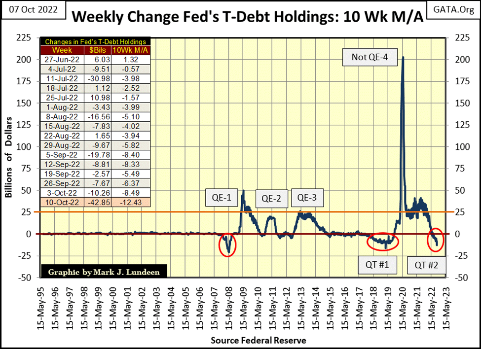
Looking at the chart prior to 2007, it appears the FOMC wasn’t actively “injecting” or “draining liquidity” from the financial system. But you would be wrong believing that.
It was just that before the top of the sub-prime mortgage bubble (2007), the economy and financial system would respond to much smaller “stimulus” / “injections” from the FOMC. After 2007, the economy and financial system would respond to “stimulus” from the FOMC, but only if the “injections” were of the massive scale seen below.
In the chart below, seeing the plot go below its $0 bil line has never been a good thing for the bulls, for whatever reason the plot slips below it. In early 2008 (left red circle), the plot fell below its –$20 bil line as the FOMC swapped its T-bond reserves for worthless mortgage assets sitting on the big Wall-Street Banks’ books.
The big banks needed to sell these mortgages for cash, but the word was out that Wall Street’s mortgage assets were worthless, so they couldn’t sell them. This situation in early 2008 was a crisis in the making. The idiot savants at the FOMC decided to trade the big banks’ totally worthless mortgage assets, at full-face value, for the FOMC’s T-debt used as monetary reserves for the US dollar.
Now that’s what I call “Monetary Policy!” Though truth be told, this corrupt act only delayed the inevitable collapse in the sub-prime mortgage market, one that almost took down the entire global banking system. But that is entirely another story in the sorry history of central banking, one not to be told here.
The second time the plot below fell below the $0 bil line was during the then promised Quantitative Tightening (QT), where the FOMC had promised to return their balance sheet back to “normal levels”; the pre-QE #1-3 era. This QT can be seen in the middle red circle.
Nothing good came from that QT. But the March 2020 Flash Crash, and Chairman Powell’s Not QE #4 did.
Then last March, this 10Wk M/A once again began approaching its $0 bil line. In the first week of July, it broke below the $0 bil line, and has not only stayed there for the past fifteen weeks, but went negative double-digit bil-of-dollars at the close of this week (see table in chart above). If a bunch of idiots wanted to pop a bubble in the financial system, what is happening in the chart above seems to be the way to go about that.
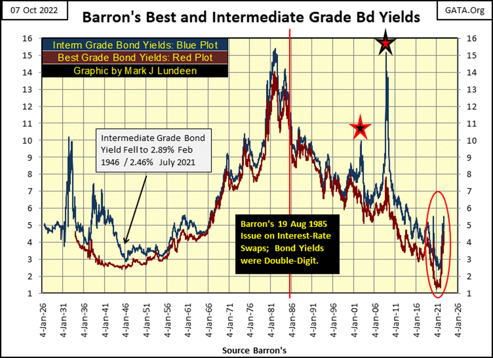
Bond yields this week continued rising, as seen in Barron’s Best and Intermediate Grade Bond Yields below. I note this week yields for both these series broke above their March 2020 flash crash highs.
Not shown this week, but T-debt yields from 1Yr to 30Yr were up this week too. For you bulls out there, I see nothing positive happening – anywhere.
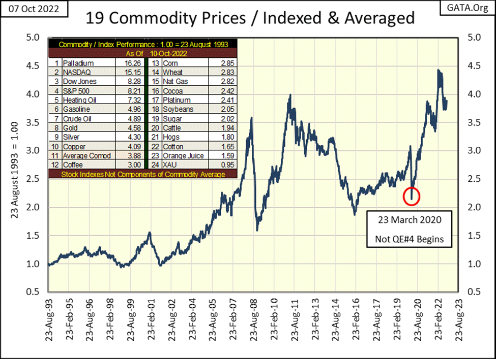
CPI inflation, as measured by my nineteen commodities below have stabilized.
But it’s an election year, a year where the resident in the White House has run down America’s strategic oil reserves by more than 50% to “stabilize” the oil market. He has also shut down new oil drilling on Federal Property, stopped the construction of new oil pipelines, and thoroughly pissed off the Persian Gulf’s oil sheikdoms, by resuming the Iranian nuclear deal talks President Trump killed in 2017.
Now President Joe Bite-me is surprised there is a shortage of crude oil in the market, and none of our friends, who he has stabbed in the back, will increase their crude oil production.
Then there is the gas pipeline on the floor of the Baltic Sea, connecting Russian gas to Western Europe’s economy that was taken out last week. What happens there? I don’t know. Who did that? I can’t say anything with certainty about that either. But I’d be surprised if President Joe Bite-me’s signature wasn’t on a piece of paper somewhere in Washington that made that possible. That is an act of war, against both Russia and the countries of Western Europe, and for what? Ukraine??
Considering the lunatics running this world, things aren’t going to improve any time soon. And it’s not only the loonies in Washington. Nothing like taking out a major gas pipeline for Europe could be done, without the prior approval of the EU and Klaus Schwab’s WEF (World Economic Forum). You can be sure of that. The European elite’s very low-key response to this wanton act of vandalism in the Baltic Sea, that will result in the suffering of tens-of-millions of Europeans is deafening!
If Europe’s elite really wanted to reduce Europe’s carbon footprint, and they do, taking out that pipeline was a mission accomplished. With a little help from America, their first step of many to come for “saving our planet.”
But then we Americans really are different from everyone else, because we are heavily armed, thanks to our Constitution’s 2nd Amendment. And that just pisses off the New World Order to no end.
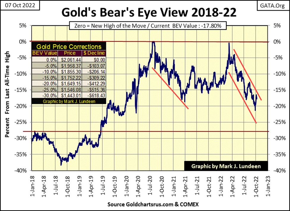
Nuff said on that, let’s look at gold’s BEV chart below.
Since gold’s last, but failed attempt to break into a new all-time high last March, it has declined in a clearly defined channel in the BEV chart below. If gold can close above its BEV -15% line, that will be a very bullish break out in the chart below. Can gold do that? Sure, it could. It could also break below its BEV -25% line, which would be a break out in what I consider to be in the wrong direction.
I’m making no prediction. Just noting I’d really like to see gold with a BEV of -14.99% or better.
Did you notice this week closed with gold closer to making a new all-time high than was the Dow Jones, whose BEV value at the close of this week was -20.39%? The farther the financial market deflate, the harder it will be to keep gold from breaking out, and doing some real down-field running well above $2000 an ounce.
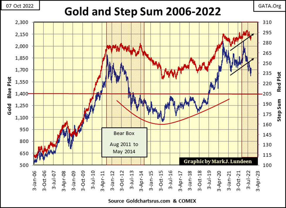
Not much changed this past week for gold and its step sum below. In the chart, it appears that gold’s step sum (market expectations) is breaking down. But on Wednesday, gold’s step sum closed at 290, which is not a breakdown number, that say 280 would appear to be in the step sum chart below
The price of gold, as seen above, is a better graphic than that of gold below. And at this week’s close, the price of gold (market reality) seems more likely to break up than down in the weeks to come. Seeing gold break upwards would be very unusual in a bear box.
Typically, in a bear box market reality (the price plot) continues breaking down, as its step sum, for as long as the bear box remains operative, refuses to follow the price plot down. That is what we see in the bear box below.
The next event to come with a bear box, would be for its step sum to begin breaking down. At that point the bear box ceases to exist, it becomes closed as the price and step sum plots both decline, once again together, until they both hit a bottom from which they both bounce off. At that point, the market becomes a VERY STRONG BUY.
That is how it should go. But with gold’s bear box below, we may see the price of gold reverse its current downtrend, and begin rising up towards its step sum plot. That would result in this bear box failing, which would be good for us gold bulls.
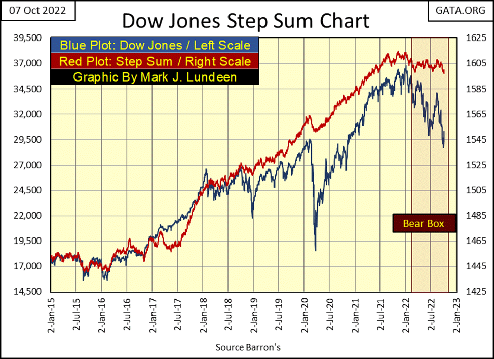
The Dow Jones too is in a bear box. It appears this bear box will play out as is typical for these step-sum boxes, with the Dow Jones to decline even more, as we wait for its step sum plot to come tumbling down with the price plot.
In their step sum tables below, we can see the inner workings of the bear boxes above. With gold’s price plot (market reality), closing this week almost where it was on September 2nd, same is true for gold’s step sum plot (market sentiment), closing the week at 288, exactly where it was on September 2nd. Gold’s bear box above will fail should these trends continue, and that would be good for us bulls.
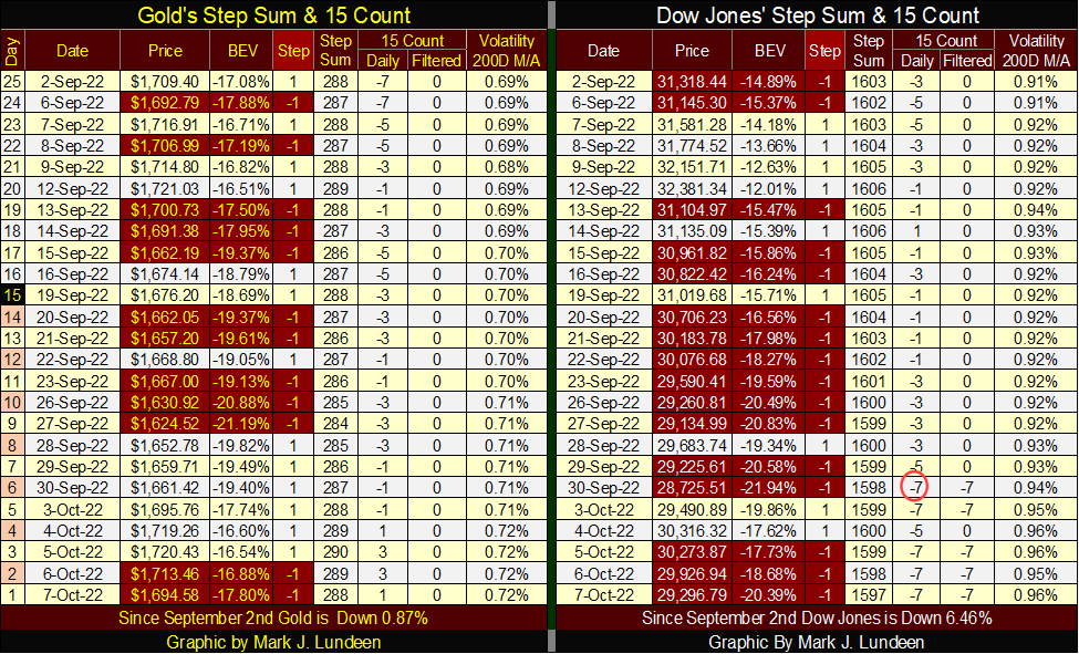
It’s a different story for the Dow Jones and its bear box. The price for the Dow Jones in the table above continues declining, down by 2022 points since September 2nd. As its step sum, after a pause of nine months is also beginning to go down, dropping by six steps in the past month. This is bad for the bulls.
The Dow Jones’ 15-count also closed the week, as it did last week, with a -7. Markets don’t like being oversold, which is what that -7 tells us, so maybe we are due for a bounce here. And then maybe last week’s two advancing days, October 3rd & 4th, are all the bounce this market is going to get.
__
(Featured image by AbsolutVision via Pixabay)
This article may include forward-looking statements. These forward-looking statements generally are identified by the words “believe,” “project,” “estimate,” “become,” “plan,” “will,” and similar expressions. These forward-looking statements involve known and unknown risks as well as uncertainties, including those discussed in the following cautionary statements and elsewhere in this article and on this site. Although the Company may believe that its expectations are based on reasonable assumptions, the actual results that the Company may achieve may differ materially from any forward-looking statements, which reflect the opinions of the management of the Company only as of the date hereof. Additionally, please make sure to read these important disclosures.


Blockchain Evolves Toward AI, Finance and Quantum Security
Blockchain is evolving beyond crypto into finance, AI applications, and digital markets, while security and regulation remain challenges. Quantum threats...


The Italian Crowdinvesting Market Faces Sharp Decline in 2026
Italian crowdinvesting market continued to decline in 2026, with fundraising falling 36.8% year-on-year to €164.19 million. Platforms and active campaigns...


Sartorius Stedim Biotech Maintains Growth Momentum in H1 2026
Sartorius Stedim Biotech reported solid H1 2026 results, with revenue reaching €1.527 billion and EBITDA rising to €479 million. Growth...


Bank of Africa Launches BOA MDM Network to Boost Diaspora Investment in Morocco
Bank of Africa launched the BOA MDM Network to channel diaspora remittances into productive investment, aiming to raise their share...


Switzerland’s Medical Cannabis Reform Advances Access, But Barriers Remain
Switzerland’s 2022 medical cannabis reform improved patient access by removing federal approval requirements, but challenges remain. MEDCAN highlights barriers including...
 |
|
 |  |
 |
|
-

 Fintech4 days ago
FinTech Matures as AI and Infrastructure Drive the Next Growth Phase
-

 Fintech2 weeks ago
Withings Achieves Profitability in 2025 with 90% Growth Since 2018
-
 Cannabis1 day ago
Switzerland’s Medical Cannabis Reform Advances Access, But Barriers Remain
-

 Biotech1 week ago
Emily.AI: Personalized Oxygen Therapy Earns Global AI Recognition