Business
A Look at Barron’s Bond Yields – 1934 to 2023
This inflation hurt the bondholders for both IG and BG bonds, those who lent dollars worth more, much more than the dollars they were paid back in. This is why bond yields increased; as bond buyers were demanding an inflation premium to compensate them for their anticipated loss in the purchasing power of their dollars over the term of the bond.
Hot off the press; by the skin of our teeth, RINO Republicans and Commie Democrats came together yesterday to save the United States from default, one more time.
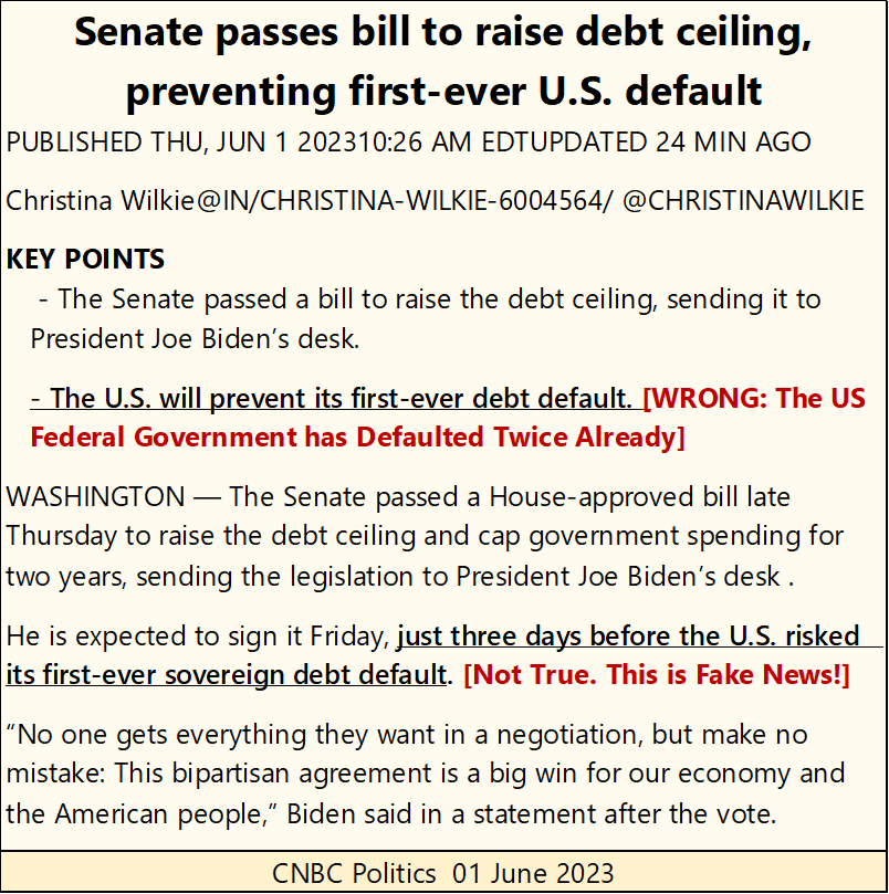
This drama of “raising the debt ceiling” is but a theatrical farce foisted on the gullible; those who believed there is someone in Washington who actually cares about the Federal Government’s big spending ways.
As far as the United States never defaulting, that is not true. The Federal Government defaulted on its dollar obligations twice;
- 1st; in March 1934, when it devalued the dollar from $20.67 an ounce of gold to $35,
- 2nd: in August 1971, when it completely removed the dollar from gold.
Should (when) the US Treasury / Federal Reserve issue its proposed cyber currency, I would consider that a third default by the Federal Government, though economists and “market experts” would surely not.
Now on to the Dow Jones BEV chart for the week.
The Dow Jones had a good week, with a huge advance on Friday, moving the Dow Jones up by 701 points, a 2.12% daily advance from Thursday’s close. This made Friday a day of extreme-market volatility, a Dow Jones 2% day.
A lot of excitement on Wall Street with Friday’s close, not that you would see a reason for such jubilation in the Dow Jones’ BEV chart below, as the Dow Jones remains outside scoring position; a BEV of something less than -5.0%.
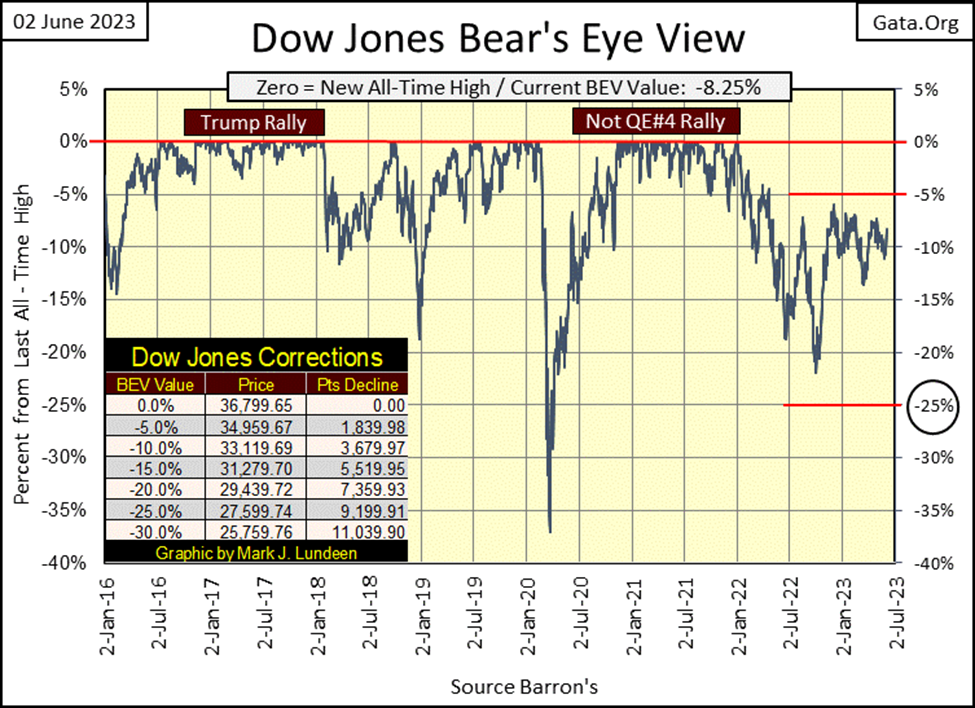
Come on Mark, stop being a killjoy and enjoy the moment while it lasts! Okay, for that, let’s look at the Dow Jones in the daily bars below. Ah, this is more like it. Forget those idiotic BEV lines above; this week the Dow Jones blasted through its 33,000 & 33,500 lines below.
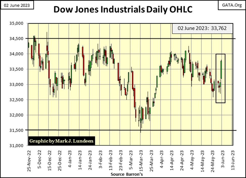
I admit it; the Dow Jones at the close of this week looks good, but I wonder what it will look like a month from now, or even next week, as there are dark forces at work against it as we speak.
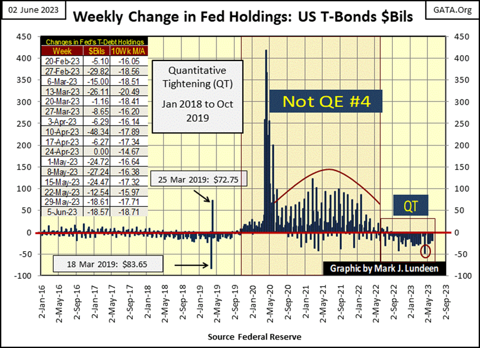
The idiots at the FOMC are still executing their QT below, as they weekly “drain liquidity” from the financial system, something they have done for the past year. A “policy” I suspect is the main reason the last time the Dow Jones made a new all-time high on 04 January 2022, a date which occurred before the idiots began their QT. Things really haven’t been the same since they began, plus they began raising interest rates a year ago.
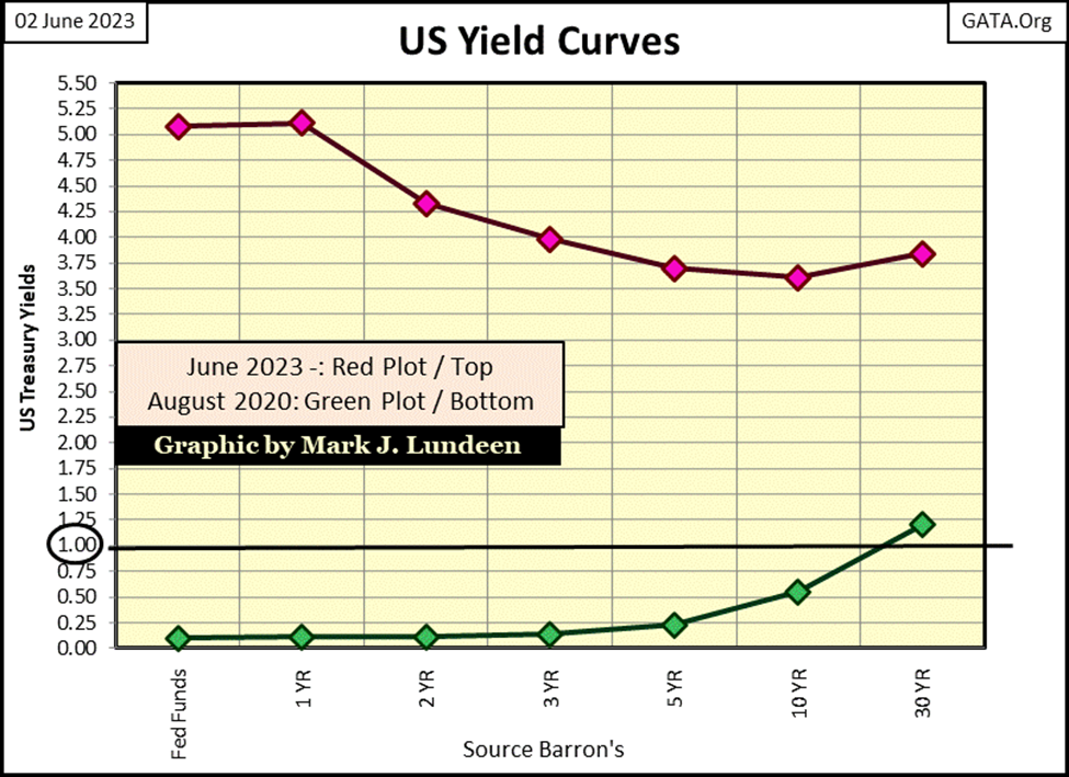
And then there is the little technicality of the US yield curve being inverted (Red Plot below). The Fed Funds rate is higher than the yield for the 30Yr Treasury bond and has been since the last week of November, six months ago. “Monetary policy” kept this tight, for this long, not that long ago would have guaranteed we’d be in a recession right now. With market valuations deflating in a recession, speaking ill of market bears would be out of fashion.
How out of fashion would that be? As out of fashion as speaking today of the 10Yr T-bond yielding about 50 basis points, as it was just three years ago (Green Plot below).
Comparing this week’s yield curve with August 2022’s, the ecosystem known as Wall Street, has seen more global warming in the past three years than Earth has in the past five-thousand years – Wow! Is that really true? If it wasn’t, would you be reading on the internet that it was?
Can this much global warming on Wall Street be good? It’s not likely the trends seen below will ultimately prove profitable for the bulls. More of the same; rising T-bond yields with the Fed-Funds Rate leading the charge towards double-digits, and Wall Street’s bulls will face an extinction event. Though I admit; the Dow Jones had a great Friday this week.
We should always keep in mind that Dow Jones is only an * AVERAGE * of the share prices of thirty large, dividend-yielding, blue-chip stocks, whose companies are picked by the publishers of the Wall Street Journal – Dow Jones Inc.
The stock market is more than that!
For decades, professional market watchers’ grudge against the Dow Jones was exactly that. So came the S&P500; an * INDEX * of the 500 largest companies trading on the stock market, by market capitalization / not share prices, to the joy of market watchers everywhere.
Truth be told, the Dow Jones is an average of the share prices, because when it began in February 1885, mathematics was only possible using a pencil on paper. They kept it simple as they had no other option in 1885. The S&P500 was created when market data became digital, and doing an index of the market caps of the 500 largest companies became possible. It’s really a brilliant idea.
The amazing thing is, if you index the Dow Jones and S&P500, and plot them together going back to the 1960s, there really isn’t much of a difference. So, at the end of this week, the Dow Jones is #1 in the table below, while the S&P500 is #4, with only 2.47% BEV points difference between these two superb measurements of the stock market.
But there are other market indexes’ BEV values listed below too, and more than a few aren’t keeping up with the Dow Jones and S&P500. What a change since the first week of November 2021. In this table then, most of these indexes were at a new all-time high (0.00%), the rest in scoring position; BEVs from -0.01% to -4.99%. The sole exception then was the XAU (#21), who a year and a half ago was down over 45% from its last all-time high of April 2011, where it closed yet again this week.
FYI: keep an eye out for the NASDAQ Banking Index (#20). Should it gap below its BEV -50% line, that would not be good.
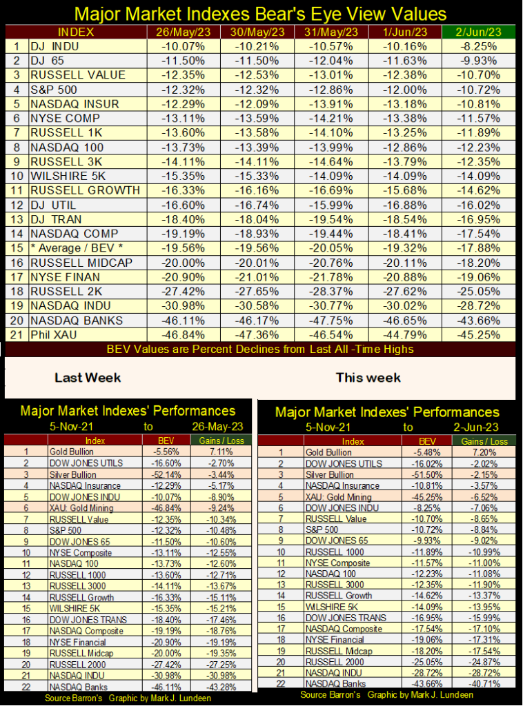
Gold, silver and the XAU in the performance tables above all advanced this week. And if you insist we focus on big advances in the market, my favorite gold and silver exploration company – Eskay Mining, put the Dow Jones to shame this week; advanced 12.71% today, a whopping advance of $0.054 today on good volume.
Hey, we’re not talking about General Electric here, Eskay Mining remains a speculation, and trades like one. But it seems, it’s not just me anticipating something good for Eskay Mining coming from this summer’s exploration program.
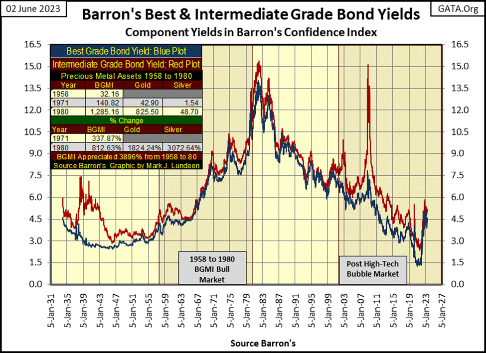
This week we’re looking at Barron’s Best Grade (BG bonds) & Intermediate Grade Bonds (IG bonds) yields, going back to 1934. Why? It’s market history that explains much of the current problems seen in today’s markets, problems that have been a long time coming.
Barron’s actually began this series in 1938. By looking at yields in their bond tables, which went back to 1934, I pushed back this data by another four years, an important four years in bond market history.
But before we go into that, first a little background on this data, what it tells us about the bond market, and some other things too.
- Bond yields and prices are inversely proportional; meaning if bond yields are going up, bond prices are coming down, and vice versa.
- Though both bond series are considered investment grade bonds. When the financial markets are in stress, IG bond yields will increase relative to BG bond yields, due to market concerns for lower-grade bonds – intermediate-grade bonds.
- During times of rising consumer price inflation (CPI inflation), all bond yields rise, as bond prices deflate. Rising CPI inflation is a toxin to the bond market.
From 1929 to 1932 (two charts down), the financial markets went through a crisis; the Great Depression Market Crash. A market event I don’t have bond yield data for, but wish I had! By 1934, once again the markets began to be normalized. However, in 1938, the second phase of the Great Depression began. We can identify exactly when that happened; when yields spiked in the intermediate-grade bonds (Red Plot / two charts down).
In late 1938, IG grade bonds were yielding 7.5%, because their valuation had declined significantly, as BG bonds’ valuation remained stable, yielding a consistent 3.0%. Investors who purchased IG bonds at a steep discount in 1938-39, made a killing in the market. When their bonds matured, they were paid back at par value (full face value of the bond), as they were paid a generous 7.5% each year they waited for their bonds to mature.
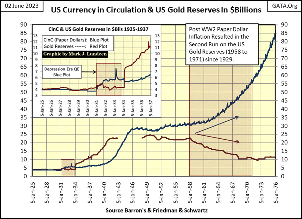
In 1947, yields for IG and BG bonds were once again about equal to each other, an indication nothing exciting was happening anywhere on Wall Street. Eleven years later in 1958, a run on the US gold reserves (Red Plot) began that didn’t stop until August 1971. (See chart below)
Had the $35 gold peg been honored by the US Treasury, gold reserves (Red Plot) and CinC (paper dollars in circulation / Blue Plot) would have overlayed, as was the case during the 1920s in the chart below. Had this been so (dollars paper = dollars gold), it is doubtful a run on the Treasury’s gold reserves would have begun.
As it was, when the run on America’s gold reserves began in 1958, in response to the decline in the dollar’s gold reserves, CinC (paper dollars-in-circulation) increased significantly, as “the policy makers” over-issued paper dollars for Washington to spend as they damn well pleased. That is why in August 1971, “Nixon closed the gold window.” As seen below, with data issued by the US Government, and published in Barron’s many decades ago, the US Treasury never took the Bretton Woods’ $35 gold peg seriously – never!
What is seen below is actually a crime scene. Has Congress overturned the Bretton Woods’ International Monetary Treaty of 1945? A treaty ratified by the US Senate, and so made the law of the land. I don’t believe it has, making the dollar’s $35 gold peg still a legal obligation of the US Treasury.
Not that Washington, Wall Street, or “esteemed professors-of-economics” from Ivy-League Universities cared then, or now how shamefully they’ve managed “monetary policy” for the US dollar.
So, what is to come from all this monetary inflation? John Maynard Keynes, the patriarch of Keynesian Economics, which contributed much to the above mess, wrote the following in 1920.
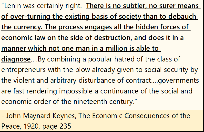
Unchecked monetary inflation, as seen above, will ultimately lead to chaos, from which a deluded self-selected few, believe they will be able to “build back better.”
A note on the chart above. I’ve seen that Elon Musk’s current net worth is about $220 billion dollars. In 1958, there were only 30 billion dollars in CinC. Having all these billionaires attending the WEF’s Davos meetings every year is a solid indication of the horrendous inflation the dollar economy has seen since WWII, and the average American wage earner isn’t richer for it.
But people today do carry much more debt than the banking system would have allowed in 1958. Actually, in 1958 banks didn’t extend credit to wage earners. People saved money at a bank to purchase big-ticket items sometime in the future. The immediate gratification from using credit cards was unknown in 1958, and that was a good thing.
So, the US Government was issuing paper dollars in excess of its reserves of gold, resulting in not only a run on its gold reserves but in rising CPI inflation. The bond market’s reaction to this policy of monetary inflation can be seen in the chart below – rising bond yields.
Note; though bond yields were rising, IG yields didn’t spike above BG yields from 1958 to 1981, as this mid-century bout of monetary inflation didn’t hurt the creditworthiness of corporations issuing IG bonds. It was actually beneficial to them, as they borrowed in dollars worth more, much more than the dollars they paid back to their creditors ten to twenty years later.
This inflation hurt the bondholders for both IG and BG bonds, those who lent dollars worth more, much more than the dollars they were paid back in. This is why bond yields increased; as bond buyers were demanding an inflation premium to compensate them for their anticipated loss in the purchasing power of their dollars over the term of the bond. Bonds during this multidecade bear market earned the moniker of: “certificates-of-confiscation.”
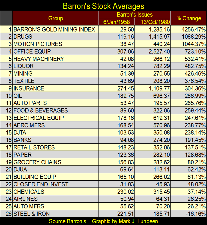
Note the table on the upper left-hand corner of the chart below for the bull market in the Barron’s Gold Mining Index (BGMI) and gold and silver themselves. Gold was officially fixed at $35 an ounce, and would be until 1968. But in 1958, the BGMI was at 32.16, and would rise to 140.82 by 1971, and to 1285.16 in 1980.
The reason I placed that table in this chart, was to prove, using data from old Barron’s issues, that a bull market in precious-metal assets can, and did happen during an extended period of rising bond yields and interest rates. A fact of market history that many “market experts” dispute, who claim rising bond yields make gold unattractive when compared to bonds.
However, from 1958 to 1980, only an imbecile would fail to have noticed rising bond yields went hand in hand with deflating bond valuations. The market’s acceptance of this reality made gold, and silver bullion, as well as precious metal mining companies very popular with the investing public.
How popular? From January 1958 to October 1980, shares in gold mining were that era’s glamor issues, as seen in the table below. A $1.00 invested in the BGMI in January 1958, became $42.56 in October 1980. From the data available to me, nothing else came close to gold mining during these twenty-two years.
Finishing with the chart above on Barron’s Bond Yields, from October 1981 to December 2021, bonds saw a forty-year bull market / forty years of declining yields. Note the two times yields for IG bond spiked above yields for BG bonds;
- NASDAQ Tech-wreck (2000-2002),
- Subprime Mortgage Crisis (2007-2009).
Note the “Post High-Tech Market Bubble,” is also the second bull market in gold, a gold bull market as bond yields declined. I believe future market historians will remark the predominant feature of this era of market history (2000 to today), was one of market manipulation at the highest levels of government.
In other words, though their current bull market began off gold and silver’s bear markets’ lows of 2001, twenty years ago, the bull market in gold and silver is still in its early phases. When bond yields once again begin to rise, as they did from 1958 to 1980, the bull market in precious metal assets will enter its primary phase.
This brings us to January 2022, where yields for both IG & BG bonds began increasing significantly. But note; IG yields have yet to spike above BG yields, so we may interpret the current rise in bond yields as the bond market’s reaction to rising CPI inflation, not a crisis somewhere in finance. Though I don’t doubt a crisis will someday come, and we’ll see a spike in IG bond yields once again, as we did in the late the 1930s, early 2000s and from 2007 to 2009.
Below are four charts for sovereign debt, all display rising yields and collapsing bond valuations, seen in US bonds since 2021. Deflating bond prices has been at the core banking defaults in the US. How much longer before we hear of news of similar bank failures overseas?
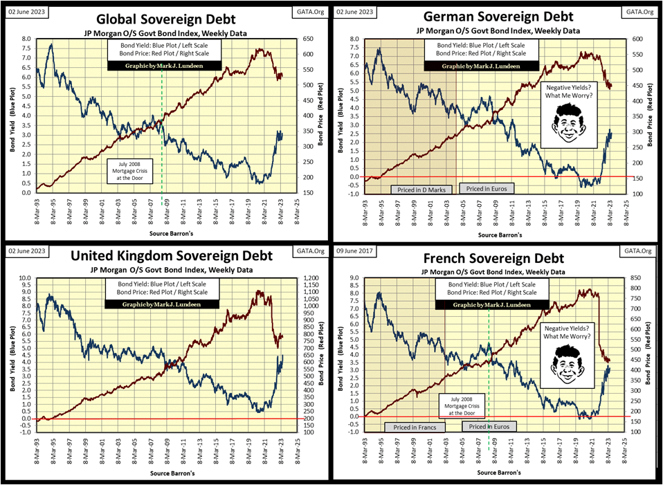
I placed a graphic of Alfred E. Newman in the chart for German and French bonds, as both saw their yields become negative. Exactly how that worked, with bonds paying a coupon, I could never figure out, or understand how anyone else with an 8th grade education in arithmetic could either.
How did that work? German government bond valuations went so high, the German government was no longer required to pay a coupon to the holders of their bonds. Rather, the owners of these German government bonds now had to send a coupon payment to the German government.
That doesn’t sound right. So how did these bonds’ yields become negative? I don’t know and don’t expect I ever will. Maybe that is why I’m not now, and never will be a “market expert.”
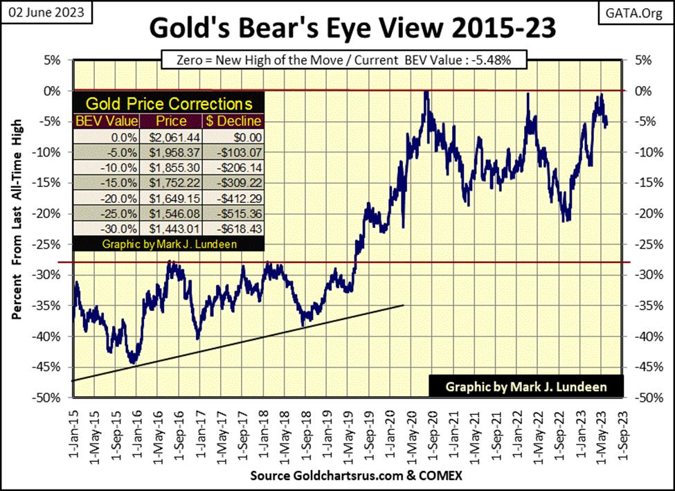
Time to look at Gold’s BEV chart. Gold closed the week as a disappointment, outside of scoring position. But that was Friday when the “market regulators” allowed the COMEX goons to run amuck in the futures markets. At Thursday’s close ($1977), gold’s BEV of -4.07%, was well within scoring position. As good a reason as any for the “regulators” to let slip their goons to prevent gold from getting any closer to a new all-time high.
No matter, gold’s BEV chart below remains very bullish.
Just how bullish a case I can make for gold is seen in the chart below. I mentioned above what happens when someone indexes the Dow Jones and the S&P500, and plots them together. Since the 1960s, one has advanced and declined about as much as the other, they perform remarkably similar to one another.
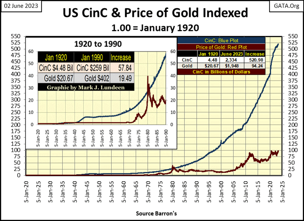
What happens when one indexes the price of gold with CinC (paper dollars in circulation), and plots them together?
First of all, why would anyone want to do that? That’s simple; before August 1971, the legal definition for the dollar was $35 paper dollars for every ounce of gold held by the US Treasury. Following WWII, Washington never kept to it, but the $35 gold peg was the legal standard the “policy makers” never kept to. So, there is a historical connection between the two; CinC and the price of gold.
During the 1920s, and before that, the US Treasury took this standard very seriously, back when anyone could take a $20 paper dollar bill to a bank, and exchange it for a $20 double-eagle gold coin, or a paper dollar and exchange it for coins minted in silver.
However, in the 1930s, FDR’s New Deal needed money, lots of money. Many more dollars than the old pre-March 1934, $20.67 gold peg would provide. So, the “policy makers” began disregarding any limits on their requirements for dollars. In March 1934 they instituted the $35 gold peg for the dollar. That was no different than this week, where Congress lifted the debt ceiling, because they must feed the beast, and the beast only feeds on dollars.
We see what resulted from decades of monetary inflation below; dollar production (Blue Plot / CinC) far out pacing the price of gold (Red Plot) for decades. There are many reasons why this is so. For most investors today, gold is old fashion, a relic from the distant past. They don’t want gold or silver; they like the stock market and real estate. To foster this bearish perception of gold, and silver too, the “policy makers” have for decades manipulated gold and silver prices downwards. I’m sure the same is true for agricultural and energy commodities.
When a nation takes on a policy of monetary inflation, it must ensure their inflation doesn’t flow into CPI inflation, as was the case from 1971 to 1981. As a matter of “policy,” it’s much better to have these flows of monetary inflation flow into financial asset valuations. Since 1981, the “policy makers” have been very successful in doing just that – one big party after another on Wall Street.
But no party lasts forever. Even the “policy makers” will one day discover that Elvis has left the building, and he isn’t coming back. We’ll know when that day arrives; when massive deflation in financial asset valuation, and rising bond yields, results in even more massive price inflation in gold and silver.
The last time these two plots met, was in 1980, at the peak of the 1969-1980 bull market in gold. The gap between CinC and the price of gold has only grown larger in the past 43 years. For gold to close this gap at week’s close, it would have to increase to $10,770 an ounce. Given time, it will do just that and more.
Below, on May 10th, as gold closed at $2036 and in scoring position, it’s 15-count saw a +7, making it an overbought market. Ten trading sessions later, gold closed outside of scoring position, with a BEV of -5.85% and a 15-count of -3. Has gold worked off its May 10th overbought +7 in only ten trading sessions?
Maybe it has. If so, we’ll soon see gold’s daily close of $1940, seen on May 25th, will hold, providing a strong floor in the market in the weeks to come. That done, then hopefully, gold will soon be making market history, with a close of something above the $2061 seen in August 2020.
For all the bearish drama gold has seen recently, at week’s closing it was only $114 from a new all-time high.
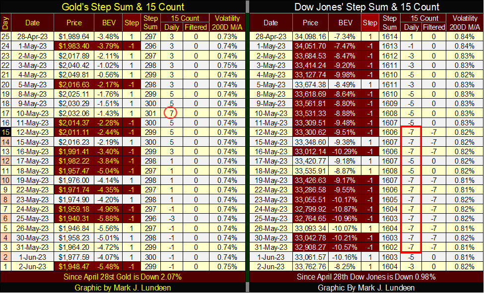
For the Dow Jones, look at all those 15-counts of -7. Is the market trying to tell us something? Since May 12th after all those daily declines, the Dow Jones has still advanced; UP 1.3%, or 462 dollars, or 1.26% BEV points. Go ahead and tell the bulls Elvis has left the building. They aren’t going to believe you for as long as the market continues trading like this.
__
(Featured image by pasja1000 via Pixabay)
DISCLAIMER: This article was written by a third-party contributor and does not reflect the opinion of Born2Invest, its management, staff, or its associates. Please review our disclaimer for more information.
This article may include forward-looking statements. These forward-looking statements generally are identified by the words “believe,” “project,” “estimate,” “become,” “plan,” “will,” and similar expressions. These forward-looking statements involve known and unknown risks as well as uncertainties, including those discussed in the following cautionary statements and elsewhere in this article and on this site. Although the Company may believe that its expectations are based on reasonable assumptions, the actual results that the Company may achieve may differ materially from any forward-looking statements, which reflect the opinions of the management of the Company only as of the date hereof. Additionally, please make sure to read these important disclosures.


Bank of Africa Launches SME Pact to Boost Business Growth
Bank of Africa launched the “SME Pact, BOA & Maroc PME” to support Moroccan MSMEs through financing, advisory services, partnerships,...


ECB Adds Climate Risk Factor to Collateral Rules
The ECB has introduced a climate factor into its collateral framework, applying additional haircuts to corporate bonds exposed to transition...


SpaceX Bitcoin Move Sparks Debate Amid Market Uncertainty
SpaceX’s recent small Bitcoin transfer sparked speculation about a possible future sale, though analysts view it as a test transaction....


Payhawk Reaches $100M ARR Milestone with AI-Driven Growth
Payhawk surpassed $100 million in annual recurring revenue, achieving rare “Centaur” status. Growth was driven by restructuring around autonomous AI,...


BIP Sells BIC Incubator to Innova, Refocuses on Core Innovation Areas
Biovalley Investments Partner (BIP) sold its entire stake in BIC Incubatori FVG to Innova, both Trieste-based firms and longtime users...
 |
|
 |  |
 |
|
-

 Biotech2 weeks ago
Eli Lilly Hits $1 Trillion Valuation Amid Strong Bullish Momentum
-

 Crowdfunding2 days ago
East Crema Coffee Launches €3.5M Crowdfunding Campaign
-

 Cannabis1 week ago
Tilray Acquires HelloMD to Expand Medical Cannabis Digital Platform
-

 Markets4 days ago
Rice Prices Rise as Supply Outlook Tightens and Demand Stays Mixed