Business
Barron’s Confidence Index Saw an All-Time High Last Week
I haven’t covered Barron’s Confidence Index (CI), for a while. As something odd happened with the CI last week, something that has never happened before, this is a good time to dig deep into Barron’s CI. The CI is one of those market metrics that once was taken seriously by many, say back before 1970. But in the past half-century, it has fallen out of favor with just about everyone.

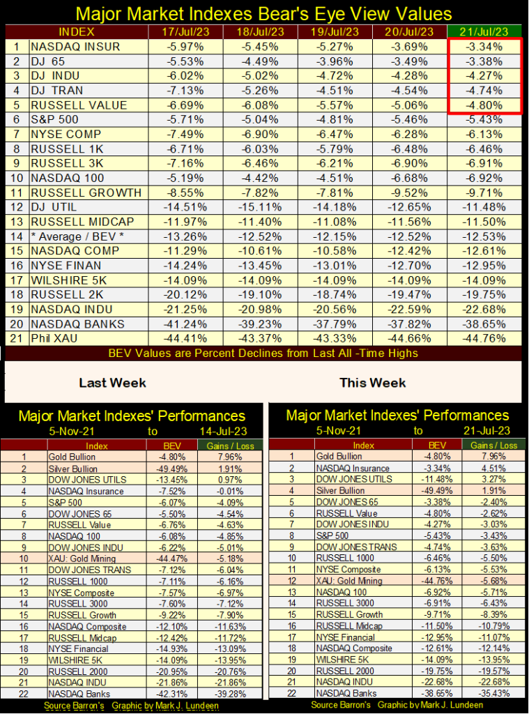
For the first time since April 2022, the Dow Jones closed in scoring position; a close of something less than a BEV of -5.0%. That is good, even if doesn’t change a thing about how bearish I remain on the market.
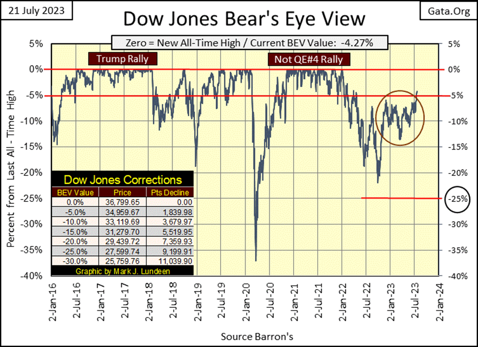
So why am I so bearish while others remain bullish? It depends on how one looks at the market. For instance, today the Dow Jones closed at a new 52Wk High, and only 4.27% from making a new all-time high. How bullish is that?
Looking at the chart below, there are plenty of reasons to be bullish on the market. Dow Jones at 40,000? Sure, why not?
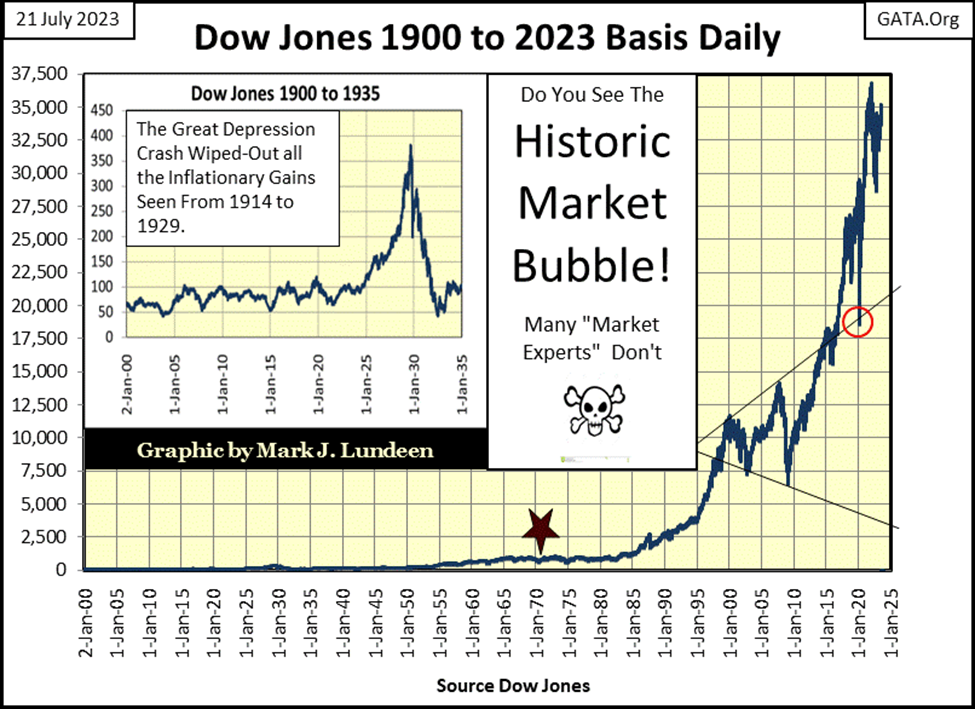
But my horizon of concern, my historical scope of the market goes back much farther than April 2015. I’m proud to say my horizon goes back to January 1900, a 123-year view of the stock market, as seen in the chart below.
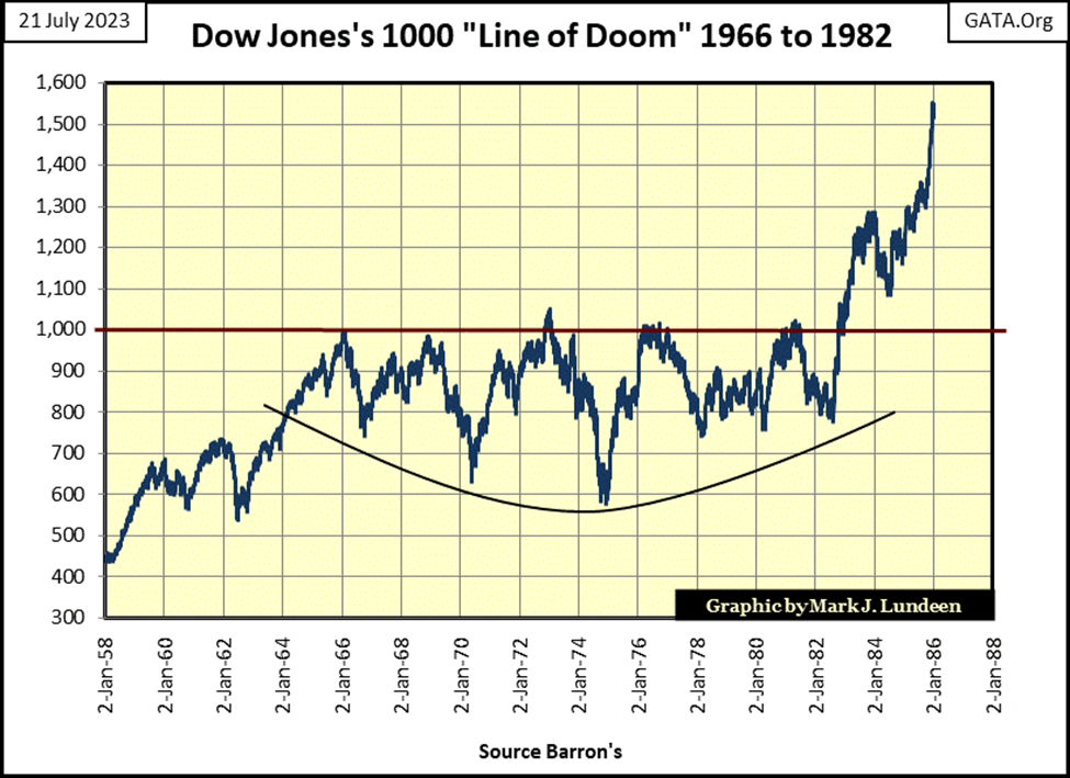
On 12 August 1982, the Dow Jones closed down at 776.92. Two days later, on exploding market breadth, the Dow Jones took off towards 1000 and kept going up. Wall Street has never been the same since, as it became an engine that drove share prices ever higher, no matter what. Like the 2007-09 sub-prime mortgage bear market, a 54% decline in the Dow Jones, the second deepest market decline in the Dow Jones since 1885.
Look at it in the chart below. Today, the #2 biggest bear market since 1885, looks like a simple correction in the forty-one-year, Dow Jones bull market advance. It took only a few years before the bulls totally forgot that bear market.
Same too for the March 2020 flash crash, where the Dow Jones was taken down 37%, from an all-time high in only 28 NYSE trading sessions. Since 1885, that has never happened before. But who cares, and why should they, when the Federal Reserve is on the side of the bulls?
The above quote was published in Barron’s at the absolute top of sub-prime mortgage bull market for the Dow Jones.
For years, it appeared Mr. Bary’s understanding of the stock market’s dynamics left something to be desired. But today in 2023, look at the chart below and then tell me Mr. Bary didn’t know what the Federal Reserve was doing – inflating a monstrous bubble in the stock market, come hell or high water.
Okay, so I’m not mainstream with my market opinions. Well, I don’t care. I’m just a market enthusiast, who for some odd reason enjoys publishing my personal views, and market graphics for public consumption.
And I admit it, I’m not a very smart market enthusiast, as I give it all away for free. The women in my life all wonder; what is wrong with Mark? Is he stupid or something, for doing all this for free? I get letters from long-term readers offering suggestions on how to best capitalize on my work. They all go away wondering, is Mark really this big of an idiot? Well, maybe I am. Maybe, it’s a mental-birth defect that forces me to send these articles out weekly – for free.
There are things my readers could do to help me. If all of you would just get the biggest shoe box you can find, stuff it with $100 bills, and send it to me, it would make a lot of women in my life happy. But $100 bills are only a suggestion. A shoebox stuffed with gold or silver eagles would be fine with the ladies too. As for me, a box of fine cigars or a couple of bottles of 100-proof bourbon would do the trick. And where are you to send these boxes to? I get enough junk mail already, so send your boxes anywhere but my house.
Well, we all have problems, and now you know mine; I’m one of the strange ones. But that doesn’t change my views on the market, as seen in the chart above. Not since Noah closed the door on his ark, and it began to rain, has the financial world seen such a potential for disaster, as the potential for disaster I see in the chart above.
Since 12 August 1982, when the Dow Jones closed down at 776.92, a bunch of idiots at the FOMC have inflated a monster of a bubble in the valuation of not just the Dow Jones seen above, but in everything.
That this bubble has endured for 41 years doesn’t change anything, as this bubble has one key attribute shared by all financial bubbles; eventually, they all go bust. When this one pops, it’s going to take down individuals, corporations, and governments; anything and everything that gets in the way of Mr Bear’s coming Day-of-Judgement will be swept away.
But nothing like that happened last week. In fact, five of the twenty indexes seen below closed the week in scoring position; less than 5% away from making a new all-time high. That may make some people feel bullish, but as you may have already guessed; not me.
I haven’t covered Barron’s Confidence Index (CI), for a while. As something odd happened with the CI last week, something that has never happened before, this is a good time to dig deep into Barron’s CI.
The CI is one of those market metrics that once was taken seriously by many, say back before 1970. But in the past half-century, it has fallen out of favor with just about everyone, except for a few old coots such as myself. Barron’s first published its CI in the first quarter of 1938, but I pushed it back to 1934 using bond yields published in Barron’s, something they began publishing in January 1934.
The CI is a weekly data series, which I believe uses Thursday’s closing data for Barron’s Best (BG), and Barron’s Intermediate Grade (IG) Bond Yields for its computation. This is true for Barron’s Gold Mining Index (BGMI). Below are the weekly data plots for the yields of these bond series; Best Grade blue plot, and Intermediate Grade red plot.
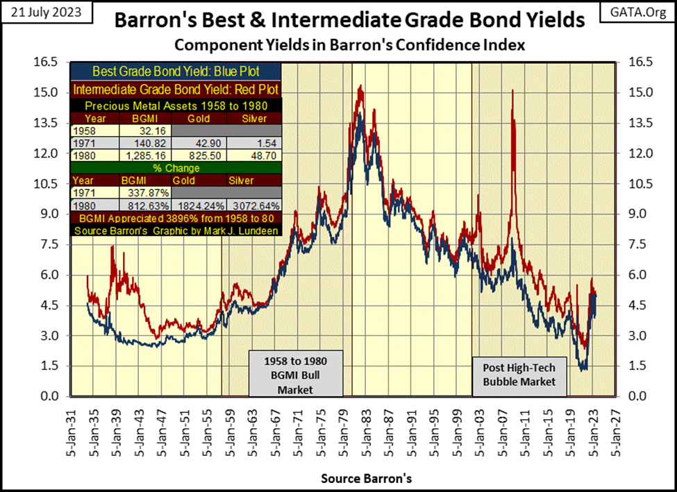
A quick scan of the plots for the bond yields above reveals something interesting; there are times when yields for Barron’s Best and Barron’s Intermediate Grade Bonds can be very close to each other. However, yields for IG bonds should never, and have never fallen below BG yields, or maybe I should say since 1934, so far haven’t. Then, there are times when a large gap opens between them.
When these bond yields are close to each other, the economy is prospering, and the bond market is confident in the ability of companies issuing lower-grade bonds (intermediate-grade bonds) to service their debts to maturity. At such times, the risk premium associated with lower-grade bonds greatly diminishes, so the plots almost overlay each other.
For someone actually in the bond market, at such times it’s an act of prudence to sell one’s intermediate-grade bonds and purchase best-grade bonds. Keep in mind, whether a bond is a BG or an IG bond, is dependent on a company’s balance sheet; how much debt it must service with the income it generates in the marketplace.
Best-grade bonds are issued by companies with small levels of debt compared to the income they generate, so there is little risk of default in good times and bad. Intermediate-grade bonds are issued by companies carrying a larger debt loading to their income-producing operations.
In a thriving economy, IG bonds offer little risks of default, and so their yields come down towards BG bonds. But things can, and will change quickly should the economy enter a recession, as happened in 2008 during the sub-prime mortgage crisis, where IG bonds saw a huge yield spike, as their valuations crashed in the chart above.
So, when IG yields are close to yields for BG bonds, it’s best to offload the risk potential IG bonds always have by selling them, and buying BG bonds, as bond investors are not being compensated for the potential risks IG bonds carry.
When a gap develops between BG and IG bond yields in the chart above, it’s because the economy has entered a recession, so the bond market has priced in a default premium in IG bonds. To do so, the valuation for IG bonds deflates to a greater degree than the valuations for BG bonds. The bondholders who previously sold their IG bonds to buy BG bonds, when the times were good, are now happy bondholders.
To become even happier bondholders, when a gap develops between best-grade and intermediate-grade bond yields, it’s appropriate to sell one’s lower-yielding BG bonds and purchase higher-yielding intermediate-grade bonds at discounted prices.
Since 1934, yield gaps between these two-bond series have always collapsed when the economy improves, when prices for IG bonds once again rise relative to the prices of BG bonds. This leaves the owners of IG bonds not only with higher levels of income from their intermediate-grade bonds but also with capital gains when their bonds mature.
This sounds so easy, but it’s not. Bonds are fixed income or contracts for debt. A company, say Widget International’s stock is typically the same; each share is a partial ownership in the company called Widget International. But each bond series Widget International floats out to the bond market usually has a unique contract, making the bond market a specialized market best left to the experts.
But Barron’s statistics department know their business when selecting the ten bonds that comprise their Best and Intermediate Grade Bond Yield Series. And since these bond series go back to 1938 (or 1934 with my addition), it makes sense to look at these eighty-nine years of market history to see what these bond yields reveal about the history of the American markets and economy.
The best way to do that is by using what Barron’s calls their Confidence Index (CI). The CI is simple enough, something that was possible with a pencil on paper back before computers were available. One simply divides Barron’s Best Grade Bond Yield by its Intermediate Bond Yield, and then multiply the quotient by 100. Should one do that for the 4,673 weeks since Barron’s 01 January 1934 issue this data is available for, and you’ll see the plot of Barron’s CI below.
Barron’s commentary on their CI simply put, says a CI trending higher displays rising confidence in the market, pointing to higher stock prices. It goes without saying a declining CI, then points to declining confidence in the market, pointing to lower stock prices.
Looking at the CI below, that is largely true, except for the CI’s homogeneous epoch spanning from 1963 to 2000. For these four decades, the CI didn’t do much, and quite possibly is the reason why the CI fell from grace in the world of technical analysis, and is no longer followed by most market watchers today.
In the 1930s, the CI caught the top of the July 1932 to March 1937 bull market advance; a 372% market advance in the Dow Jones during the Great Depression. The CI began declining in December 1936, three months before a major market top, and the 49% Dow Jones bear market that followed. However, this is only apparent using my data addition going back to 1934, as Barron’s only began publishing their CI in January 1938, only two months before the 31 March 1938, 49% Dow Jones bear market bottom.
I’m going to skip ahead to the first significant decline in the CI since the early 1940s; the decline in market confidence called the 2000 to 2002 NASDAQ High-Tech bust, whose CI’s bottom is marked by a red star in the chart below. Barron’s CI called the top of the NASDAQ High-Tech market bubble, and the bottom of the bear market that followed. Impressive!
As for the CI calling the 2007 top of the sub-prime mortgage bubble, that is harder to say. But in Barron’s 26 November 2007 issue, when the CI first broke below 80, on its way to 45 in Barron’s 22 December 2008 issue (Red Triangle), the CI provided a clear signal that something very wrong was happening in the market.
The same thing can be said for the CI with the March 2020 flash crash (Red Circle below). Following the CI’s first breaking below 80 in October 2019, when overnight repo rates went double-digits to the dismay of the banking system, until it bottomed at 47.30 in July 2020, the market did more than just lose confidence.
Everyone, including the idiots at the FOMC went into a full panic during this collapse in confidence, as the FOMC “injected” trillions of dollars of “liquidity” into the financial system with their Not QE#4, to “stabilize” the financial system.
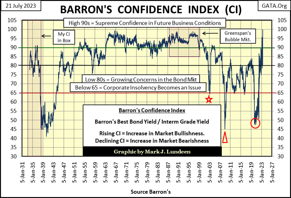
But as you can see above, off the CI’s lows from the March 2020 flash crash (Red Circle), market confidence has been rising, in almost a straight line in Godzilla like proportions. Last week (table below), the yield spread between these two-bond series was reduced to only 1 basis point (0.01%) difference between Barron’s best and intermediate grade bonds, leaving Barron’s CI at an unbelievable 99.8.
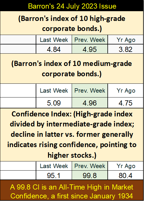
This is a historic high in the CI. The previous all-time high in the CI was in Barron’s 03 October 1966 issue, which recorded a CI of 99.3. That peak in confidence from 1966 didn’t prove to be a strong buy for either the bond or stock market. The bond market was a decade into a bear market, a bear market in bonds that wouldn’t bottom until October 1981.
For the stock market, 1966 was the first of five frustrating attempts for the Dow Jones to break above, and then stay above 1000. Something the Dow Jones failed to do until October 1982, in the chart below. So, what does a CI of 99.8 promise in July 2023, Is anything good?
In the chaotic world we live in today, I don’t see how the bond market can have this much confidence that all will be well for the future. A CI of 99.8 in July 2023? Whiskey, Tango, Foxtrot!
I think what the CI is telling us with its 99.8 from last week, is there is a flood of dumb money flowing into the bond market. There is no dumber money out there than that spent by the idiots at the FOMC, funding their ill-considered purchases with billions of dollars they create with a few keystrokes at a computer keyboard.
I doubt this interesting market statistic will ever be noted in the daily financial media, or in the history books to be written sometime in the future. But when I see a historic first in a data series that spans back to the Great Depression, especially one so counter-intuitive as seeing Barron’s CI reach an all-time high of 99.8, as the US national debt approaches $33 trillion dollars, well, I find that interesting, if unbelievable, and thought I’d share that with my readers.
What could last week’s CI of 99.8 promise market watchers? Possibly, watch out below!
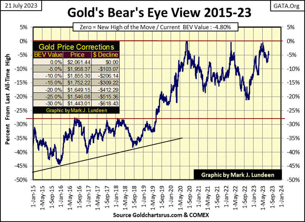
Here is golds’ BEV chart, gold closed the week in scoring position. Can it make a new all-time high (BEV Zero / 0.0%) in the next few weeks? Damn right it could. And then it might not, but begin trending down to its BEV -10% line.
Too bad gold and silver don’t have a friend in high places, like the stock market has with the Federal Reserve. The old monetary metals have to advance in the old-fashioned way; with bulls buying by using their own money, instead of funding their purchases with “injections of liquidity” from the FOMC.
Don’t lose heart, as gold is going to do what it must do; rise to historic valuations as the Federal Reserve System finally destroys the financial market after over 100 years of unending monetary inflation. Yep, what a bunch of idiots.
Looking at gold’s step sum table below, it closed in scoring position everyday this past week, and saw its 15-count rise to a +7, meaning gold is now an overbought market. Markets don’t like being overbought, so we may see a short period of down days overwhelming daily advances. What the gold market really needs here is a big increase in daily volatility, to get its 200D M/A trending to 1.00%, and then beyond.
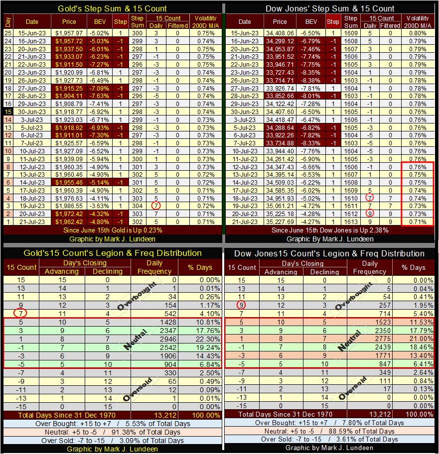
Look at the Dow Jones in its step sum table. Its last ten trading days closed as advancing days, driving up its 15-count to a +9, making the Dow Jones a VERY overbought market. And what is with the Dow Jones daily volatility’s 200D M/A collapsing down to 0.71%?
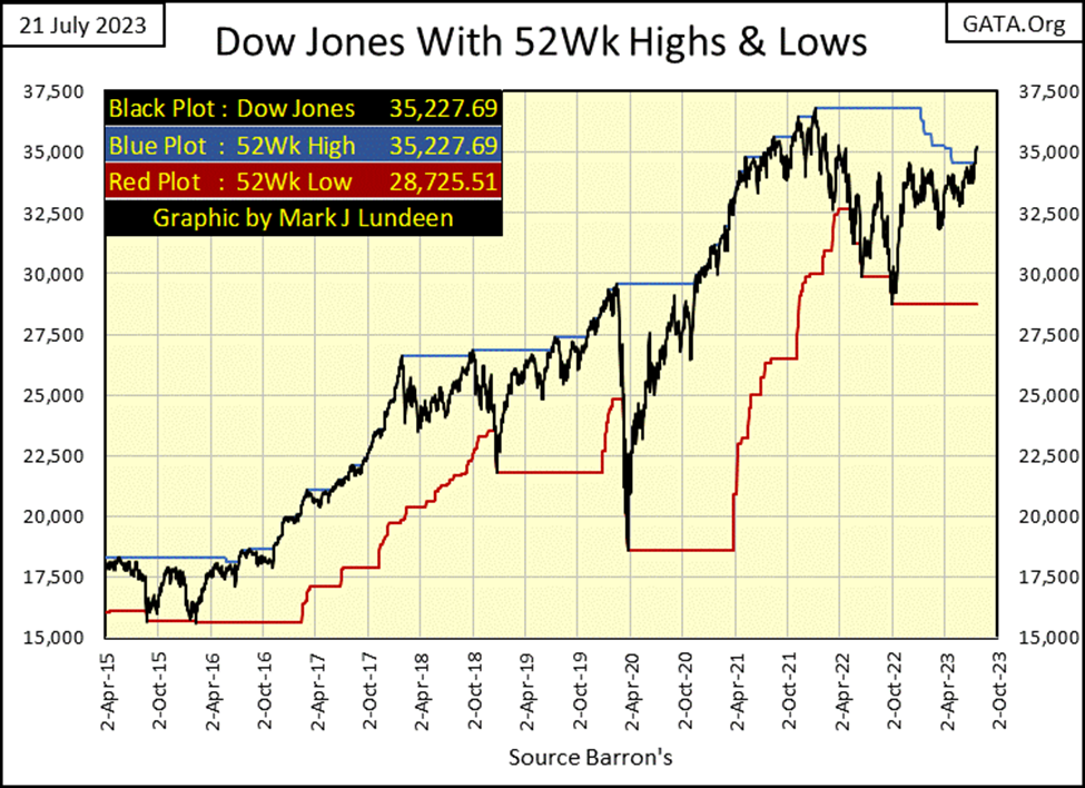
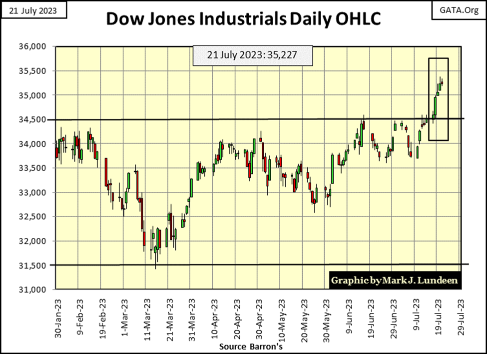
Markets don’t like being very overbought, so we may see a pullback from Friday’s close. Let’s see what the bears can do about getting the Dow Jones back below its 34,500 line in the chart below. Since last November, keeping the Dow Jones in its place; below 34,500 has been something the bears have been good at. Let’s see what they do now.
__
(Featured image by Scott Graham via Unsplash)
DISCLAIMER: This article was written by a third party contributor and does not reflect the opinion of Born2Invest, its management, staff or its associates. Please review our disclaimer for more information. This article may include forward-looking statements. These forward-looking statements generally are identified by the words “believe,” “project,” “estimate,” “become,” “plan,” “will,” and similar expressions. These forward-looking statements involve known and unknown risks as well as uncertainties, including those discussed in the following cautionary statements and elsewhere in this article and on this site. Although the Company may believe that its expectations are based on reasonable assumptions, the actual results that the Company may achieve may differ materially from any forward-looking statements, which reflect the opinions of the management of the Company only as of the date hereof. Additionally, please make sure to read these important disclosures.


Cannabis Regulation in Germany and Switzerland Shows Early Benefits of Legalization Models
Germany and Switzerland’s cannabis reforms suggest regulated access can reduce criminalization without increasing consumption. Germany saw fewer cannabis-related prosecutions, while...


Insight Foto Festival Launches €4,500 Crowdfunding Campaign to Support 2026 Edition
Insight Foto Festival in Varese has launched a €4,500 crowdfunding campaign to sustain its free 2026 edition. Organized by Gattabuia...


Vexuvo Secures €39M UniCredit Financing to Drive Agrivoltaic and Storage Expansion in Italy
UniCredit has provided €39.3 million financing to vexuvo to support four agrivoltaic plants totaling about 33 MW across Italy, advancing...


Alzheimer’s Study Reveals Immune Pathway Behind Women’s Higher Vulnerability and Potential New Treatment Approach
A CSIC-UMH study identifies heightened interferon signaling as a key factor in women’s greater Alzheimer’s vulnerability. Analysis of human brain...


Bitcoin Rally Faces Tests from Fed, ETFs, and Market Fear
Bitcoin rebounds above $64,000 after a short squeeze and whale accumulation, but remains far below its record high amid cautious...
 |
|
 |  |
 |
|
-

 Biotech2 weeks ago
Abivax Shares Surge as New Trial Data Eases Safety Concerns Over Ulcerative Colitis Drug
-
 Markets3 days ago
Quiet Markets Await a Catalyst as Jobs and Oil Support Sentiment
-

 Biotech1 week ago
Karyopharm Therapeutics: High-Risk Growth Play in Cancer Drug Development
-
 Crowdfunding12 hours ago
Insight Foto Festival Launches €4,500 Crowdfunding Campaign to Support 2026 Edition