Featured
Canada’s housing prices expand and encourage debt crisis
In hopes of creating a leverage to break even a debt crisis, Canada increases the interest rates of housing programs but finds financial disappointment.

Debt is in the news again. Did it ever leave? The Bank for International Settlements (BIS), the central bank of the central banks (owned by 60 central banks), has published a report highlighting the debt levels of Canadian households (The Globe and Mail, March 12, 2018, “Canada’s growing debt levels putting credit markets at risk, report says.”) The report went on to say Canada’s household credit-to-GDP gap and its total debt-service ratio are coded red, meaning they exceed a threshold that points to a higher risk of a banking crisis in the coming years.
There are two other measures: the debt service ratio for households and cross-border claims to GDP — Canada surpassed a lesser threshold, triggering amber alerts. Canada’s household debt levels remain at record highs. While housing prices remain elevated, particularly in Vancouver and Toronto, recent regulations and higher interest rates are starting to chip away at the rising prices.
What has been happening is, rising housing prices and the confidence that rising housing prices would continue have helped elevate borrowing. Instead, housing prices have stalled. Not all, of course, as condominium prices remain firm. Canada’s economy has been driven by the consumer and if the consumer falters the economy could also falter. As well, given rising debt levels, the banks tighten their risk management and borrowing guidelines, choking off the potential for future borrowing.
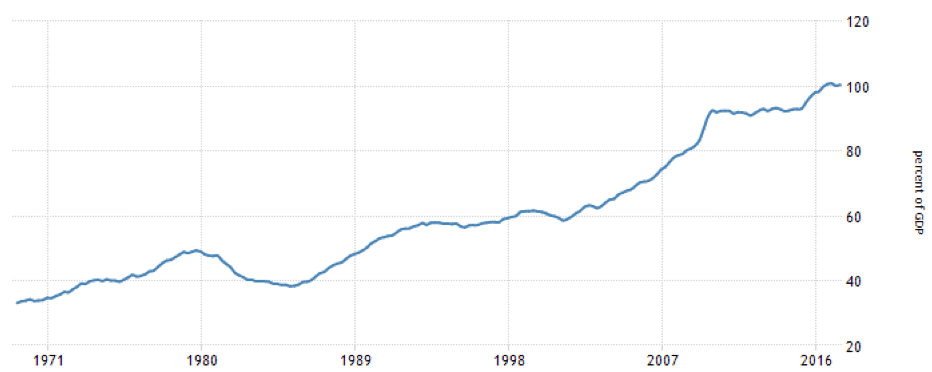
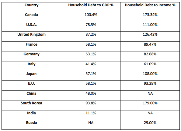
Surprisingly, or maybe not so surprisingly, Canadian consumers are the most profligate borrowers in the world. Canada’s consumer debt to GDP stands most recently at 100.40 (third quarter 2017). When Canada’s household debt is compared to gross income the ratio is a staggering 173.34 in October 2017. That means the average Canadian owes $173.34 for every $100 of income. That includes mortgages.
So how does Canada stack up against other G7 nations? Our table below compares the G7 nations plus the EU and some other nations on the basis of household debt to GDP and household debt to income (where available).
Canada Households Debt to GDP
© David Chapman
Household Debt to GDP and Income
© David Chapman
Outside of South Korea when it comes to household debt to income, Canada stands alone when it comes to household debt to GDP. Given rising interest rates, coupled with softening housing prices, is it a question of when, not if, Canada’s high debt ratios will become a problem for Canadians and for the banks?
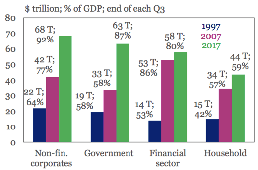
In a lot of respects, consumer debt while a problem is most likely not the major debt problem facing the world. The world, as we have pointed out in the past, is awash with debt. Global debt levels surged at least $92 trillion until 2017 from the time of the financial crisis in 2008. Total global debt according to the Institute of International Finance and the McKinsey Global Institute stands at least at $233 trillion. Record highs for non-financial debt were recorded for Canada, France, Hong Kong, South Korea, Switzerland, and Turkey.
One would think out of that massive amount of debt central banks would be reluctant to tighten financial conditions. But that is exactly what is happening as the U.S., in particular, is hiking interest rates and the Fed is purging its bloated balance sheet. But debt has surged as the chart below shows.
© David Chapman
Surprisingly, global debt to GDP has fallen slightly since 2016 as it sits last at 318%. Above potential growth has been noted for China in particular and even Canada. But the build-up in debt is causing problems and the potential for defaults, especially sovereign defaults (Venezuela), and bank defaults (Greece, Italy, Eastern Europe, China). But in the event of another downturn defaults could show up where one does not expect them. Japan and the United Kingdom, for example, both have a huge debt to GDP ratio of over 600%. Could unexpected defaults emanate from them? And where does it cause contagion?
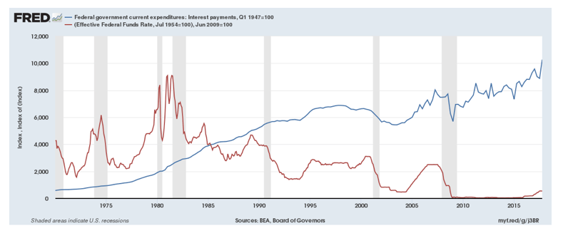
Rising interest rates are having an impact as delinquencies grow. In the U.S. the delinquencies are rising on credit card debt, auto loans, and student loans. But rising interest rates are causing interest payments on the huge U.S. government debt to rise as well as the chart below attests (note that interest payments are in blue, Fed funds rate in red). Since the Fed started hiking interest rates in the fourth quarter of 2015, interest payments on the U.S. Government debt have jumped $107 billion.
© David Chapman
According to data from the Federal Reserve, total U.S. debt of $69.7 trillion represents almost 30 percent of the total global debt. The U.S. national debt is $21.0 trillion while personal or consumer debt totals $18.9 trillion, state debt totals $1.2 trillion, and municipal or local debt is $1.9 trillion leaving $26.7 trillion for financial (banks, etc.) and non-financial (corporations) debt. That is up $19.7 trillion since 2008. The U.S. national debt has grown $11.1 trillion in that time with personal debt growing only by $1.8 trillion. State and local debt are up a small $0.6 trillion while financial and non-financial debt has grown by $6.2 trillion.
The world is awash in debt. A reminder that all major depressions have come about because of debt collapse. The history of debt collapses goes all the way back to the time of the Greek and Roman empires and most likely even beyond that. They always say “this time is different.” But it’s not different. The only thing different is the sheer size of the debt.
The week that was
Current events have an impact on markets. The firing of Secretary of State Rex Tillerson to be replaced by the former CIA head Mike Pompeo was stated as one of the reasons the stock market fell earlier in the week. In the first three days of the past week, the Dow Jones Industrials (DJI) dropped 2.7 percent. The firing of Tillerson was not the only reason the stock market fell as continued concerns over Trump’s tariffs and the fear of trade wars continued to haunt the market. Along with the appointment of Pompeo as Secretary of State, Gina Haspel, the former deputy at the CIA, was appointed to replace Pompeo. She is known as the “torture lady,” given her role in running what was known as CIA black sites.
The appointments still have to be approved by the Senate. Rumors continue there could be more firings with the most mentioned being Attorney General Jeff Sessions and National Security Advisor H.R. McMaster. It seems the revolving door of the White House continues to spin. At least 17 senior officials, many of them appointed by Trump, have left the White House since Trump officially took over in January 2017. There have been many other lesser officials fired/let go while many positions remain unfilled, particularly in the State Department, including ambassadorships.
A replacement was named for the Director of the National Economic Council Gary Cohn in Larry Kudlow, a former Bear Stearns Chief Economist and well-known U.S. conservative television personality. Kudlow was a former CNBC commentator for the Kudlow Report, and along with commentator Jim Cramer formed the team for the Kudlow & Cramer show, also on CNBC. That show spun off into Kudlow & Company and Mad Money hosted by Jim Cramer. Kudlow is also a syndicated columnist and has a well-known blog, Kudlow’s Money Politic$.
Leading up to the financial crisis of 2008, Kudlow was well-known for his bullish views that the U.S. economy was doing just fine and the Bush boom was alive and well. In 2015, a book called “Superforecasting” was published by University of Pennsylvania political scientist Phillip Tetlock. In his book, he outlined a long litany of forecasts that Kudlow got “consistently wrong.”
Kudlow is known for his outspoken views and long-time lobbying for a key position in the Trump administration. Kudlow is a believer in free trade and a strong U.S. Dollar which seems at odds with the President. Kudlow is a known cheerleader to “buy the U.S. Dollar and sell gold.” His outspoken views and the fact that he had his own TV show do put him on the same level as the President who also had his own TV show. His candidacy ought to be interesting.
The other big news story of the week was the attempted assassination of a former Russian spy and double agent in Salisbury, England. The attempt also included his daughter and a British policeman. The weapon of choice was a military-nerve agent. Despite no hard proof the UK expelled 23 members of the Russian embassy and began a war of words with Russia. Other countries followed with condemnation and some further sanctions. It is expected the war of expulsions will escalate as the Kremlin soon followed by telling 23 British diplomats to leave within a week. The London FTSE 100 is down 1.1% this past week with nervousness over the war of words with Russia being cited as one of the reasons.
A breaking story towards the end of the week was that Special Counsel Robert Mueller was subpoenaing Trump organization documents in the Russia probe. Some are wondering whether this crosses Trump’s red line. The Mueller investigation continues to get closer to the President. Rumours are flying that Attorney General Jeff Sessions could be fired. Many wonder if that will also follow is the firing of Mueller and the investigation turning this into a latter day “Saturday Night Massacre” ala Richard Nixon and the Watergate investigation. If that did happen it could have considerable potential to shake markets as it did some 45 years ago.
Also, as the week ended, FBI deputy chief Andrew McCabe was fired just days before he was to retire with his pension vested. McCabe believes he was singled out because of his role he played and actions he took with events following the aftermath of the firing of former FBI director James Comey. The DOJ had accused him of leaking information and misleading DOJ officials. The firing has become quite public with the President disparaging McCabe amid calls from other Trump aides to fire special counsel Robert Mueller. Trump would need to fire Jeff Sessions first. All of that could create an unprecedented constitutional crisis and would have a negative impact on markets.
Finally, the Stormy Daniels case gets murkier with lawsuits flying back and forth and Daniels having given an interview to “60 Minutes,” scheduled to air March 25, 2018, outlining her affair with President Trump. Whether all of this has an impact on markets remains to be seen. We live in interesting times.
The revolving door of the White House
It was difficult to ignore this table. It has been quite a year for the Trump White House with so many comings and goings. Note they have gone through three Communications Directors in just over a year. Awaiting number four. The markets, however, just shrug. But for how much longer? As the week ended Andrew McCabe, the deputy FBI director, was added to the list. And we are awaiting on John Kelly, H.R. McMaster, and Jeff Sessions, all rumoured to be on the chopping block.

© David Chapman
Bitcoin watch!
© David Chapman
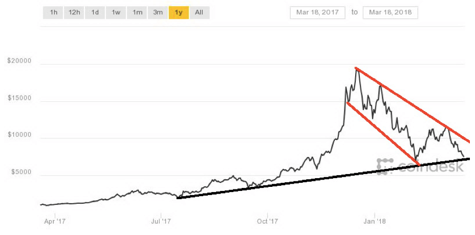
The cryptocurrency sell-off continues. After running into resistance near $10,000 Bitcoin tumbled this past week from a high of $9,834 before finding support just under $8,000, losing about 21 percent. The $8,000 zone has thus far proven to be a support zone as Bitcoin has bounced. It is still too early to call a bottom. As of writing, Bitcoin was breaking under $8,000. A break of major support just below should then see Bitcoin enter to new lows and fall to $6,000 and lower. A retest of $9,000 appears to have failed. It is not just Bitcoin as nearly all cryptocurrencies are down for the week.
There doesn’t appear to be any major reason for the sell-off. All one can note is the bloom is off cryptos and the speculators are getting out — while they can. We noted the U.K. crypto exchange was preparing to launch futures contracts. It was the launch of futures on Bitcoin that coincided with the top in December. Futures added a new element to Bitcoin and set up the potential for arbitrage games to take advantage of price differentials between the cash and futures markets. Probes of crypto exchanges are not helping as South Korea has launched raids on three crypto exchanges in an embezzlement probe.
Google (GOOG) also announced they would no longer accept ads for cryptocurrencies, ICOs, digital wallets, and trading advisors. Google joins Facebook (FB) in banning the ads. After that announcement, more than $60 billion was wiped off cryptocurrencies in barely 24 hours. Maybe it’s bad for now but in the end, it may be good as we have noted there are just too many cryptocurrencies (1,564 listed at www.coinmarketcap.com). Many if not most should just disappear forever. Google and Facebook say their reason for banning the ads is consumer protection. Certainly, too many of the ads have appeared as come-ons.
Elsewhere, the IMF was calling for global regulation of cryptocurrencies and the U.S. Congress also slammed cryptos at hearings. Cryptos are being battered everywhere. But we warned that eventually, the regulation would come to the market even as the price soared towards $20,000. The crazy prices being quoted by many are now just a distant pipedream.
MARKETS AND TRENDS
© David Chapman
© David Chapman
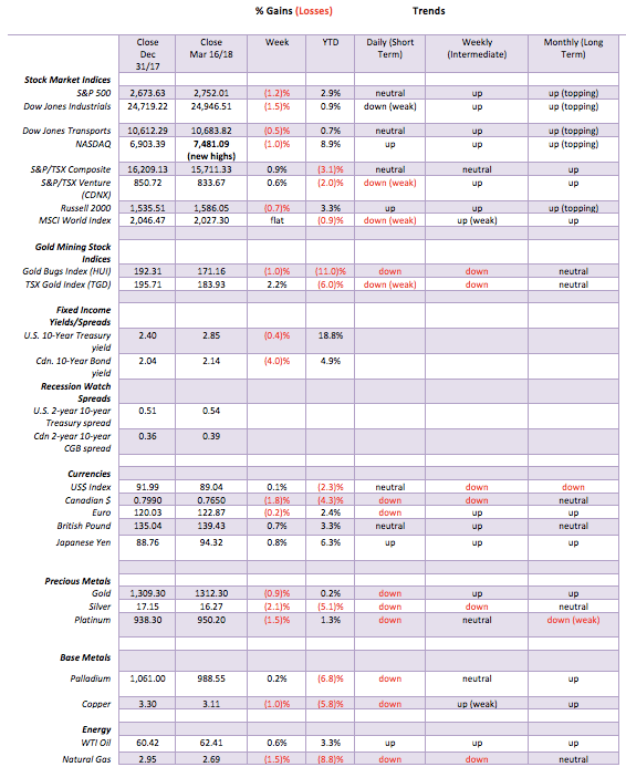
Against the backdrop of increased trade tensions and chaos in the White House, the markets fell this past week with the S&P 500 losing 1.2 percent. The blue-chip Dow Jones Industrials (DJI) dropped even more off 1.5 percent. The Dow Jones Transportations (DJT) was off less down 0.5 percent. The NASDAQ did a classic climax making new all-time highs then closing lower on the week down 1.0 percent. The small cap Russell 2000 lost 0.7 percent. Canada went against the grain as the S&P TSX Composite gained 0.9 percent while the junior TSX Venture Exchange (CDNX) was up 0.6 percent.
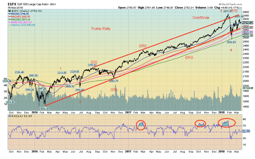
Despite the loss on the week, the S&P 500 remains up on the year by 2.9 percent even as it is down 4.2 percent from its all-time high seen on Jan. 26, 2018. It is noteworthy that the sell-off held at the 200-day MA. The index has now regained back above the 50-day MA, but it is struggling at that level. Ideally, the S&P 500 needs to regain above 2,830 to suggest new all-time highs.
Regaining above 2,800 would be a positive step in that direction. Volume was heavier on Friday, a down day. Not a positive sign for the bulls. Nonetheless, there is a bull-bear fight going on. Holding the 200-day MA tells us that the bull uptrend remains intact. A break back under 2,700 would start to give more credence to the bear case. Under 2,650 would be a sign that new lows could well lie ahead. Despite the raft of bad news that hit the market this past week, it is not necessarily bad news that triggers a top in the market. Oddly, it is often good news. With the Fed meeting this week, the wide expectation is another rate hike. But what if they did nothing?
© David Chapman
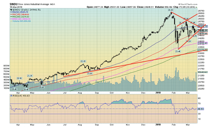
Here’s a closer look at the DJI. The DJI actually fared somewhat better, holding at the 165-day exponential MA and above its 200-day MA. The picture shows us the bull uptrend remains intact even from the short-term uptrend. Note again the uptick in volume on Friday, a down day. It does tell us the bears are trying to gain the upper hand here. Irrespective of this, that does not necessarily stop the market from rising as the final up move can come on sharply reduced volume. The DJI needs to regain the 25,300 level and preferably above 25,500 to suggest to us that the recent high near 25,800 should fall. Above 26,000 new highs are highly probable. It may be that, given the shape of the rising uptrend, we could be forming an ascending wedge triangle. Ascending wedge triangles are bearish. But this type of pattern is not unusual in the last leg of a bull market.
© David Chapman
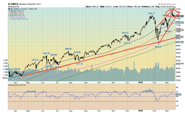
The NASDAQ made a classic selling climax this past week when it gained new all-time highs, then reversed and closed lower on the day. In technical terms, it is known as a key reversal. Naturally, the key reversal needs confirmation and that means the NASDAQ needs to continue to move lower even if irregularly. The NASDAQ also closed lower on the week making it a key reversal week. If the other markets were to recover and make new highs but the NASDAQ did not it would be another sign of a classic divergence. So far, only the NASDAQ has made new all-time highs recently. The key reversal pattern is not a guarantee. New highs would, of course, negate the pattern.
© David Chapman
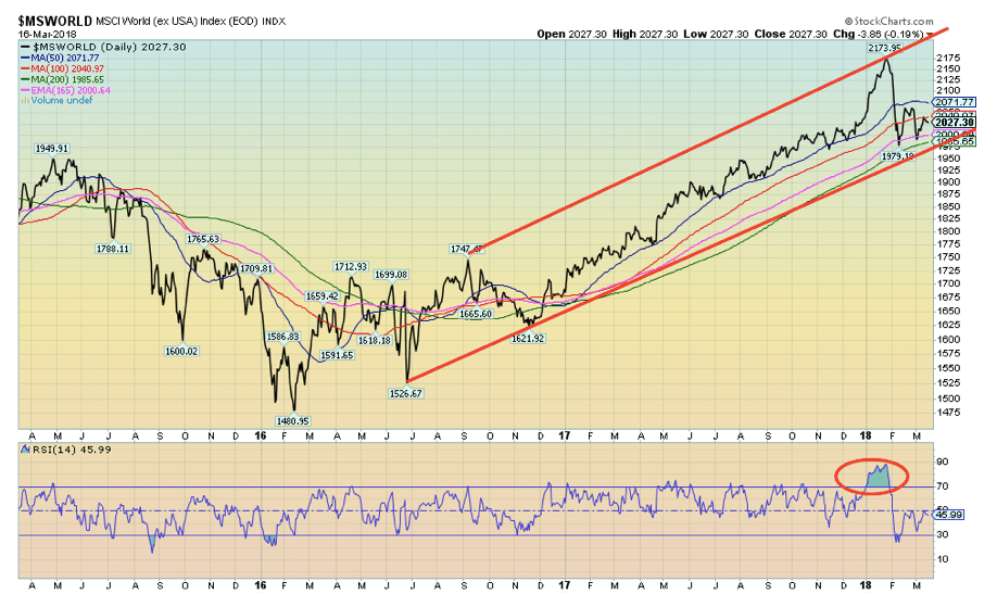
Along with the Canadian S&P TSX Composite the MSWORLD MSCI World Index managed a small up week. The MSCI has been somewhat weaker overall than the U.S. markets as it is down 6.7 percent from its all-time high. But it is only down 0.9 percent on the year. We like the uptrend that appears to be firmly in place from the lows of early 2016. This suggests to us that, going forward, emerging markets might do better than the U.S. markets. The MSCI is emerging markets ex USA markets.
Chart of the Week 1
© David Chapman
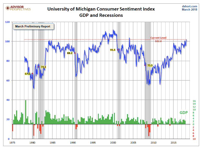
The Michigan Sentiment Index for March came in at 102, well above expectations. It was 2.3 from the 99.7 reading in February. Overall, however, the index remains below the highs seen in the late 1990s. The market had expected a reading of 99.3. This is remarkable given the background of trade wars and the chaos in the White House with comings and goings. But then low unemployment and an economy generally seemingly in good shape may be shaping consumer sentiment more than perceived threats. On the other hand, the consumer has a tendency to become the most optimistic just before trouble and recessions hit. Other consumer sentiment indicators reflect a similar level of optimism.
Chart of the Week 2
© David Chapman
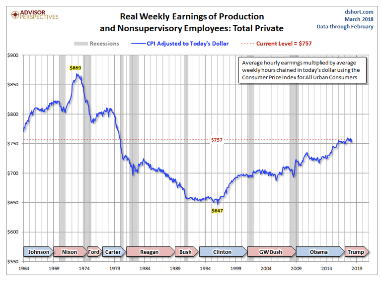
This chart is interesting. It clearly shows that while in nominal terms people are making more money in real terms they lag considerably. Real weekly earnings of production and non-supervisory employees today sits at $757 vs. $869 some 45 to 50 years ago. The peak occurred during the Nixon years. That is down 12.9 percent in real terms. Notice the big drop occurred during the Reagan years suggesting that supply-side economics was not particularly favorable to wage earners. It was during the Reagan years the gulf between the wealthy and everyone else began to rise substantially. The wages bottomed during the Clinton years and began to rise. After pausing through the Bush II years, wages rose again during the Obama years.
© David Chapman
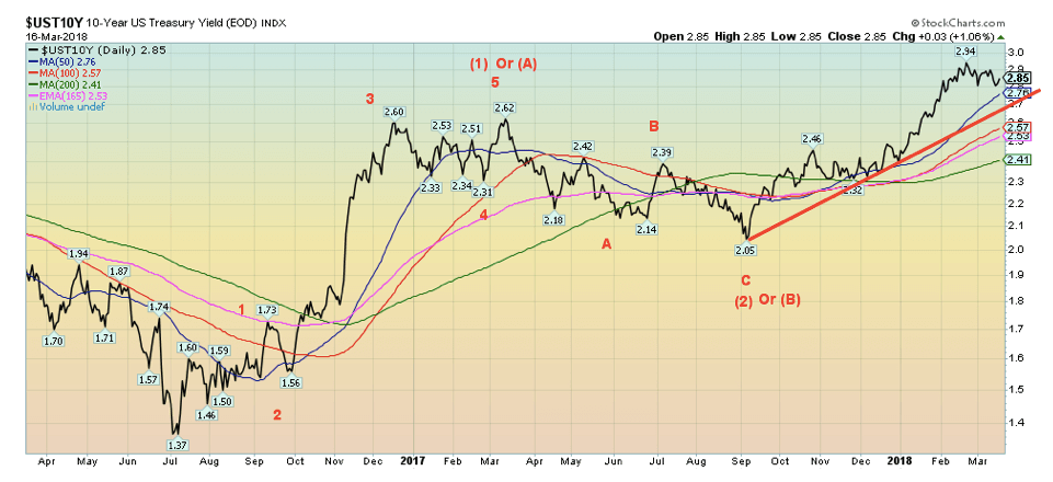
March 20–21, 2018 is the Fed meeting and the Fed is widely expected to hike interest rates once again by 25 bp. As a result, bond yields appear to be ending their recent downward correction and could be in the throes of moving to new highs. We continue to have potential targets of up around 3.20 percent for the 10-year U.S. Treasury note. It is possible that the recent pull-back in yields is not quite over. Until new highs are seen above 2.94 percent that possibility remains open. There appears to be solid support down to 2.75 percent and the 50-day MA. Canadian 10-year Government of Canada bonds (CGBs) also pulled back this past week. But the Cdn bonds may have been pushed by the weakening Cdn Dollar. Overall, the uptrend in yields remains intact.
Recession Watch Spread
© David Chapman
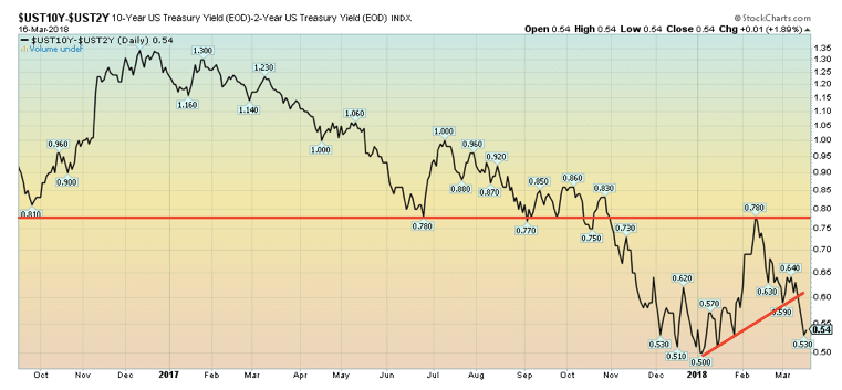
Even as the 10-year U.S. Treasury note bounced back this past week, the yields on short-term instruments and Fed Funds rose this past week, including U.S. Treasury bills and LIBOR related instruments. All appeared to be signaling that the odds are high that the Fed will hike rates once again this week. As a result of the rise in short-term rates the 2–10 spread narrowed on the week from 0.61 percent to 0.54 percent. The spread remains well above levels that would suggest a recession could be imminent. Nonetheless, the trend remains down. Note how the recent bounce-back stalled the yield at the former support level near 0.75–0.80 percent.
© David Chapman
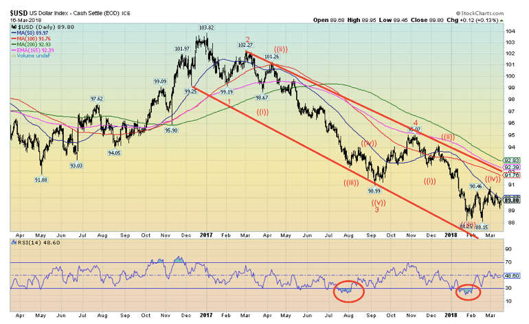
The US$ Index is approaching a crossroads. For the past few weeks, the US$ Index has repeatedly tested the 50-day MA without really breaking above it. Since the 50-day MA is pointed down the US$ Index has been trading along the declining MA with lower highs and lower lows. The definition of a downtrend. On the other hand, the US$ Index remains well above its recent low seen on Feb. 16, 2018, at 88.15. Helping to push the US$ Index up are rising interest rates and continued strength in the U.S. economy. Factors driving the US$ down would be increasing political instability and the potential for trade wars.
Currently, if the US$ Index can take out a recent high at 90.36 seen on Mar. 9, 2018, and especially the high on Mar. 1, 2018, at 90.89, then the US$ Index would most likely be on its way towards next strong resistance up at 92. On the other hand, new lows below 89.14 the Mar. 15, 2018, low would most likely mean the US$ is headed lower toward the February low. The Euro has been weaker of late and looks increasingly as if it could fall. However, the Japanese Yen is exhibiting strength and could offset some of the weakness in the Euro. The Euro makes up 57.6 percent of the US$ Index while the Japanese Yen is a distant second at 13.6 percent.
© David Chapman
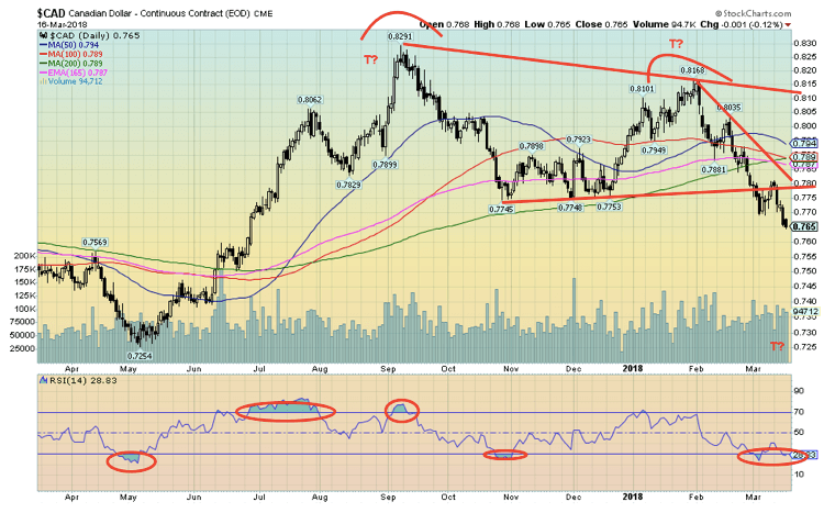
The Cdn$ is breaking down. Buffeted by the storms of Trump’s trade wars, rising U.S. interest rates, and fears that all of this could have a negative impact on the Canadian economy is helping to send the Cdn$ lower. Note that BofC Governor Stephen Poloz is holding off on any further interest rate hikes because of the uncertainty being caused by the U.S.’s trade stance. With the Fed likely to hike interest rates next week, that would widen the spread between U.S. and Cdn interest rates. Argumentatively, we could say that the Cdn$ has made a multi-month double top with the first high coming at 82.91 back in September 2017 and the second high at 81.68 in February 2018. The Cdn$ has now broken under what may be neckline of the double top pattern. Objectives would be a decline to around 72.50. Currently, the Cdn$ is oversold so a bounce could develop at any time but would most likely be stopped up near 78.00 as a best case.
© David Chapman
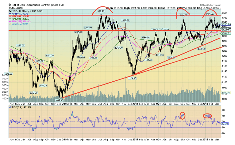
Gold continues to frustrate. Despite growing global trade tensions, growing geopolitical tensions, growing political instability in the U.S. gold has failed to make any traction and is now testing support down to $1,300. Under $1,290 gold could trade lower and test down towards $1,260 and $1,240. A breakdown under $1,240 could result in a further drop towards $1,200.
Gold has made three attempts to break up through major resistance that has developed largely between $1,350 and $1,375. Highs of $1,377 in July 2016 followed by a high of $1,362 in August 2017 and another high of $1,365 in January 2018 suggest gold could be making a multi-month triple top. Except triple tops are exceedingly rare. Further, gold has been making a series of higher lows starting at the $1,045 low in December 2015, $1,124 in December 2016, $1,205 in July 2017, and $1,238 in December 2017. Given the December 2017 low’s proximity with support at $1,240, it emphasizes the importance of that zone.
A series of flat tops and a series of rising lows is usually the definition of an ascending triangle. Naturally, what is needed is a breakout above $1,375 that could quickly send us to $1,400 and even higher. We have been maintaining that there are targets for gold at minimum up between $1,450 and $1,500. If the ascending triangle is correct then targets could be as high as $1,630. Naturally, it would require that $1,290 hold and especially $1,240, otherwise, it could negate that scenario and send gold prices sharply lower.
© David Chapman
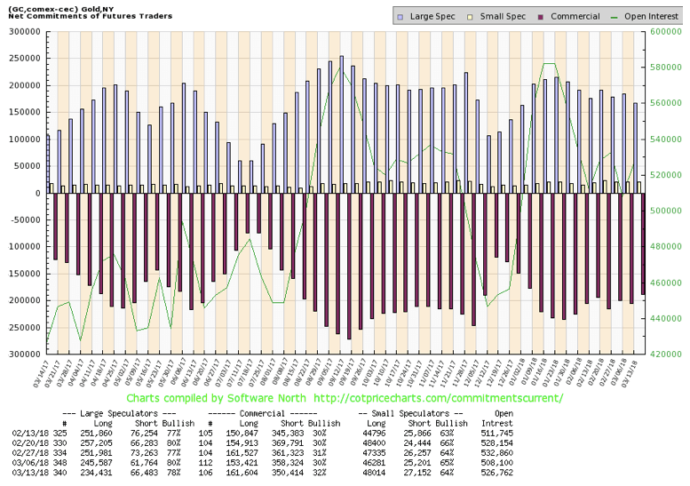
The commercial COT for gold continues to support an upside breakout for gold rather than a breakdown. This past week the commercial COT improved to 32 percent from 30 percent as short open interest fell roughly 8,000 contracts while long open interest rose roughly the same 8,000 contracts. The large speculators COT (hedge funds, managed futures, etc.) fell to 78 percent from 80 percent as long open interest fell about 11,000 contracts and short open interest rose about 5,000 contracts. The commercial COT is increasingly supportive of a rise in gold prices, not a decline. Sentiment, however, remains fairly neutral for gold here.
© David Chapman
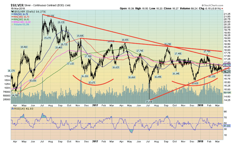
If gold is frustrating, silver has been even more frustrating. Silver prices fell 2.1 percent this past week to their lowest level since Mar. 1, 2018. Recent lows were seen in early February at $16.13 and the Mar. 1 low of $16.16. Silver has been diverging with gold given that silver failed to break out new highs recently even as gold did. Now, silver could be poised to make new lows. If silver were to make new lows below $16.13 while gold held above a comparable low at $1,304, then we could have another divergence. Both gold and silver have been coiling for the past few weeks, which suggests a breakout one way or the other. Other indicators continue to suggest the breakout should be the upside.
Silver has recently run into resistance up near $16.85 so that needs to be taken out and then there is further resistance up to $17.25. Over $17.25 silver starts to look a lot better and a bigger breakout could occur over $17.75. The potentially bullish large head and shoulders bottom pattern that silver appears to have formed would have targets up to $22.40 once silver was above $17.75. A breakdown under $16.13 would be negative but a breakdown under $15.63 the December 2017 low would be quite negative and suggest further declines towards $15 and even $14.
© David Chapman
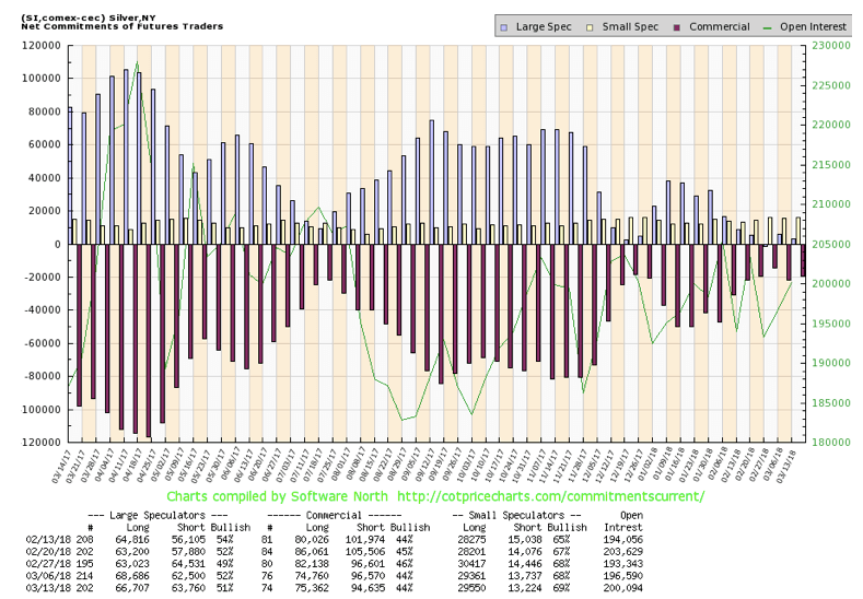
The commercial COT for silver continues to support a breakout to the upside for silver. The commercial COT for silver remains at 44 percent even as long open interest rose about 600 contracts and short open interest fell about 2,000 contracts. The large speculators COT slipped this past week to 51 percent from 52 percent the previous week as speculators added to their short position while cutting their long position. The silver commercial COT remains bullish at levels seen before other significant up moves in silver prices.
© David Chapman
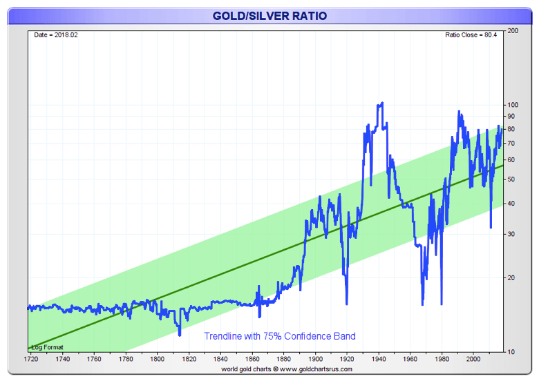
Here is an interesting long-term chart dating back 300 years of the gold/silver ratio. As the chart clearly shows, for upwards of 160 years the gold/silver ratio hovered around 15 to 16. That’s natural because in 1792 the U.S. fixed by law the gold/silver ratio to be 15:1. A ratio of 15.5:1 was adopted by France in 1803.
Many geologists put silver as being roughly 19 times more plentiful than gold so the ratios set back in the late 18th century bear some resemblance to gold and silver in nature. But since the onset of the 20th century, the gold/silver ratio has soared as high as 99.76 in 1991. Currently, it is around 80. A ratio of 15:1 is but a distant memory. If it were that today, silver would be trading at $87, not $16. Silver, by most measurements, remains grossly undervalued when compared to gold. As the chart shows, when the tide turns in favor of silver the move can be quite dramatic.
© David Chapman
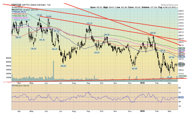
Despite weakness in both gold and silver prices, this past week the S&P TSX Gold Index (TGD) actually gained on the week 2.2 percent. This happened despite the U.S-based Gold Bugs Index (HUI) falling 1.0 percent. There are a couple of reasons why this happened. First, the falling Cdn$ was friendly to the Canadian-based gold stocks. Second, the components of the HUI are different than the TGD.
What is encouraging is the TGD has more than held its recent lows even as gold and silver threaten to make new lows. This is a potentially friendly divergence for gold and silver. Ideally, we have wanted to see the gold stocks leading the market. Not surprisingly, they have done anything but that as the TGD remains down 60 percent from its 2011 high and the HUI is down 73 percent from the same high. It is possible that the TGD has made a small double bottom. A breakout above 188 would be positive while a breakout above 192 could quickly send the index to resistance at 197. Major resistance remains up at 202 to 210. A big breakout over that level could send the TGD to potential targets up to 250 and even 265. This would be conditional on no new lows below 178 and especially below 174.
Special Chart of the Week
© David Chapman
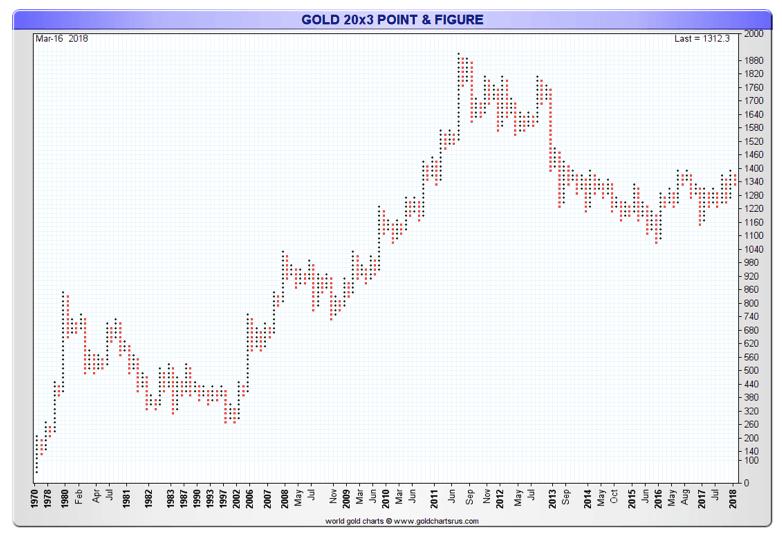
People rarely look at point and figure charts anymore. As a technical analyst, we are guilty too. Point and figure charts differ from traditional bar charts in that they view all trading as a continuous stream and ignore time. A point and figure chart is a series of x’s and o’s, or in this case, red dots and blue dots. Each blue dot represents a price move of a given magnitude called the box size. As long as prices continue to rise blue dots are added for each increment equal to the box size. In this case, it is 20 or $20. If prices decline by an amount equal or greater than the reversal size then a new column of red boxes is initiated. The reversal size is 3 or 3 boxes, which in this case would be $60.
As noted, time is ignored so a series of red boxes or blue boxes may represent a few days or months. This chart starts back in 1970 when gold was trading at $35 and just before former President Richard Nixon took the world off the gold standard in August 1971. What we appear to have are three waves to the upside peaking in 2011 and followed by a large down wave (wave 4?). The wave appears to be making a classic rounding bottom which suggests it should break to the upside and take gold prices to new highs above 2011 high. Gold enthusiasts are, of course, waiting patiently for this to happen.
—
DISCLAIMER
David Chapman is not a registered advisory service and is not an exempt market dealer (EMD). We do not and cannot give individualised market advice. The information in this newsletter is intended only for informational and educational purposes. It should not be considered a solicitation of an offer or sale of any security. The reader assumes all risk when trading in securities and David Chapman advises consulting a licensed professional financial advisor before proceeding with any trade or idea presented in this newsletter. We share our ideas and opinions for informational and educational purposes only and expect the reader to perform due diligence before considering a position in any security. That includes consulting with your own licensed professional financial advisor.

-

 Crypto1 week ago
Oil Surge and Iran War Lift Bitcoin as Crypto Sentiment Improves
-

 Cannabis5 days ago
Germany’s Medical Cannabis Market: Legal Reform, Falling Prices, and Rapid Expansion
-

 Impact Investing2 weeks ago
Net-Zero Asset Owner Alliance Introduces Transition Targets in Updated Climate Protocol
-

 Business4 hours ago
Global Markets on Edge as Iran Conflict, Inflation Pressures, and Financial Risks Intensify


You must be logged in to post a comment Login