Featured
Coronavirus crisis sparks stock market chaos
COVID-19 continues to roil markets with some of the highest volatility seen since 2018. The top performer is once again gold. With the world having a collective nervous breakdown (mass hysteria?) with lockdowns, cancellations and sporting matches without fans, the central banks led by the Fed have joined the fray slashing interest rates and the Fed is ramping up its repo program.

If anyone had predicted the recent chaos in markets, it was mostly well hidden. Martin Armstrong’s Economic Confidence Model (ECM) (www.armstrongeconomics.com) had pinpointed January 18–19, 2020 as a potential turning point for markets. Well, bang on; that is when we first became aware of the coronavirus. On January 22, 2020 the stock markets topped and there was a swift decline into the end of the month. Yes, the market recovered and new highs were once again seen. That ended on February 19, 2020 and then, poof, over the next seven days some $6 trillion evaporated as the markets fell roughly 13%, slicing through supposed support zones as if they were butter.
A few weeks ago, we noted the world appeared to be on the verge of the apocalypse brought to you by the four horsemen. Depending on your interpretation, the four horsemen brought you pestilence (coronavirus/COVID-19, plague of locusts, opioid crisis), war (endless wars in the Middle East—Syria, Libya; the nuclear clock set at 100 seconds to midnight), famine (millions threatened in Northern Nigeria, South Sudan, Somalia, Yemen and Syrian refugee camps due to the effects of war, climate change, and poor governance), and death (negative effects of climate change shown by fires, rising seas, rising frequency of tornados, hurricanes causing death and destruction). In a recent speech to the UN General Assembly, UN Secretary General Antonio Guterres noted the “four horsemen” as rising global tensions, climate change, global mistrust, and the dark side of cyberspace.
The past two weeks have been a wild ride. Last week saw records broken to the downside. This week it is records broken to the upside. On Monday, March 2, 2020 the Dow Jones Industrials (DJI) rose 1,294 points or 5.1%. As good as it was, however, it wouldn’t even make it to the top ten of best days by percent. The best day? That belongs to March 15, 1933 when the DJI leaped 15.3%. The celebration was short-lived as the DJI immediately plunged upwards of 2,000 points over the balance of the week. Normal? Hardly.
The COVID-19 crisis is easing in China. But it isn’t anywhere else, it seems, as the major growth is now outside China led by South Korea, Italy, and Iran. Surprisingly, we are seeing large percentage increases in the EU, particularly Germany and France and also in the U.S. The death toll is running about 3.4% of cases but in the U.S. the death toll rate is 4% so far. The COVID-19 has spread to, at last count, 104 countries and territories and one international conveyance, the Diamond Princess cruise ship, plus there is another cruise ship under quarantine and investigation for the virus.
There has, however, been one notable exception to reporting: North Korea. There are reports that North Korea is hiding the number of cases, which could be in thousands along with hundreds of deaths. The major concern now with the disease is that it is spreading faster outside China. Despite claims to contrary, the consensus remains that any vaccine or cure remains months away and more likely over 12–18 months away.
To put all this into perspective, the Hong Kong flu pandemic of 1968–1970 caused between 1 and 4 million deaths and the Asian flu pandemic of 1957–1958 caused upwards of 2 million deaths. In both instances, the stock market fell but there wasn’t the same kind of seeming panic and media coverage we are seeing today. Global travel was also not at the levels seen today, stadiums weren’t as packed, the world wasn’t as interlocked economically, the Asian Tigers were just beginning to stir (led by Japan), and Europe was still recovering from WW2. The U.S. also made up roughly 40% of the global economy. Today it is 25% and falling. The current COVID-19 has seen over 107,000 cases and over 3,600 deaths so far, which is small compared to previous pandemics. Yet its economic impact has been huge already.
The world now seems to be moving towards a nervous breakdown over COVID-19. This is not to understate the dangers of COVID-19 but, according to the CDC, the common flu killed 61,000 in the 2017–2018 season and 34,200 in the 2018–2019 season in the U.S. alone. However, the death rate for the flu or influenza B as it is known is only about 0.1% vs. 3.4% for COVID-19. And many more contract the flu than are currently contracting COVID-19. We should also note that more people are killed in car accidents every year than have died from COVID-19. Should we stop driving?
The reality is things are shutting down. In China, entire cities were quarantined and streets were empty; airlines are cancelling flights to China and elsewhere; conventions have been cancelled, not just in China but in the U.S. and elsewhere; Italy, Japan, and Greece have closed schools for a period, leaving upwards of 300 million children not going to school; Italy holds sports matches with no fans, and apparently some games of the upcoming March madness NCAA basketball tournament will be held without fans; Italy is now locking down entire regions; borders are being closed; global supply chains are being disrupted, interrupting everything from cell phones to hockey sticks; firms are issuing guidance for lower profits; airlines are estimated to lose $113 billion in revenue; Chinese restaurants are mostly empty, including in North America; retailers are being hit because of global supply disruptions; auto sales in China have “tanked”; the tourism industry is on the verge of collapse almost everywhere; oil demand has plummeted; and OPEC is cutting production as a response, or at least they were trying to until Russia balked; and, finally xenophobic attacks are rising. We’ve now learned about the first airline collapse when Europe’s largest regional airline Flybe, which operates out of the U.K. declared bankruptcy, leaving hundreds of passengers and staff stranded. A collective nervous breakdown or mass hysteria running rampant?
And now are the monetary and fiscal authorities panicking? The Reserve Bank of Australia cut its interest rate to a record low of 0.5%; the Fed, in a surprise move, cut the Fed rate 50 bp between FOMC meetings (the first time that has happened since 2008); and the Bank of Canada (BofC) followed with its own 50 bp rate cut. U.S. Congress announced an $8.3 billion emergency aid package to fight the coronavirus. As well, we learned that the IMF is providing $50 billion and the World Bank is providing $12 billion for aid programs to fight the disease. Japan has provided $2.5 billion and China has pumped ¥1.2 trillion (US$ 17 billion) into their economy. Hong Kong has handed out HK$10,000 (US$1,200) to every resident over 18—helicopter money. Rumour has it that it could happen in the U.S. too. China has sent aid to Iran to fight the disease and the U.K., Germany, and France have offered Iran €5 billion in aid (US$ 5.6 billion) to fight the disease. There could be more. Let’s call it “March Madness,” only it isn’t a basketball game.
Could the Fed cut again at the March 17–18, 2020 FOMC meeting? Rumour has it that they could. The U.S. 10-year treasury note has fallen to a record low under 1.00%. Interest rate cuts hurt savers but could spark another borrowing binge. With global debt at $255 trillion and counting, another borrowing binge would not be a wise idea as money will go further to heighten the housing bubble and it could also go into the stock market which in turn could be positive for Trump, aiding his re-election. What it won’t do is spur further investment in jobs as unemployment could rise as a result of layoffs relating to reduced economic activity. We say that despite the apparently robust job growth in nonfarm payrolls for February. Already the OECD is predicting that global growth could be cut in half in 2020 as a result of what many will call the “coronavirus recession.”
One chart has stood out for us that seems to speak to the coronavirus crisis. Below is China’s composite PMI for manufacturing and services. The PMI plunged to 27.5 in February from 51.9 in January as a result of company closures and travel restrictions. It is the steepest contraction on record in the private sector. New orders, new export orders, and employment all plunged to their lowest levels on record. It points to a potential recession in China. Given China’s importance in the global economy, this is sure to impact all major economies including Canada and the U.S.
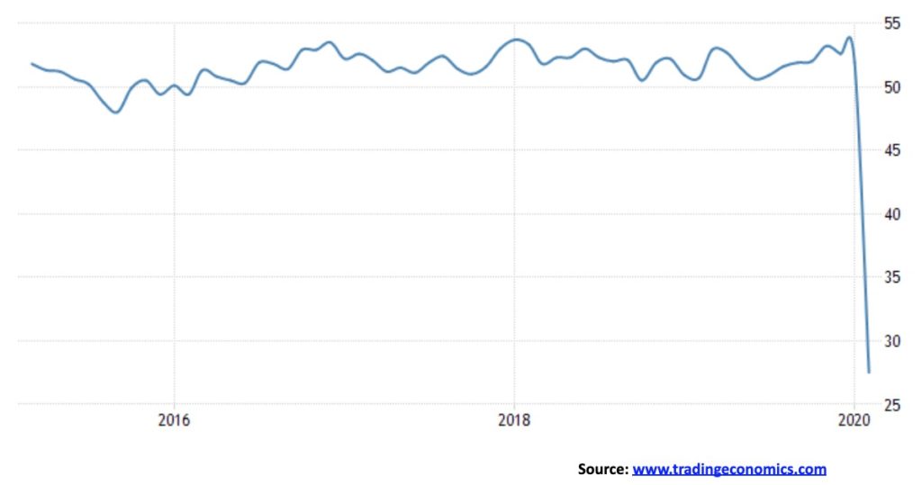
We might soon start seeing more charts that look like that. As to the markets, we have, we believe, seen an intermediate top. We discuss that further under our S&P 500 commentary. Given the huge volatility, it gives true meaning to the saying that March has come in like a lion. We can only hope that it does go out like a lamb.
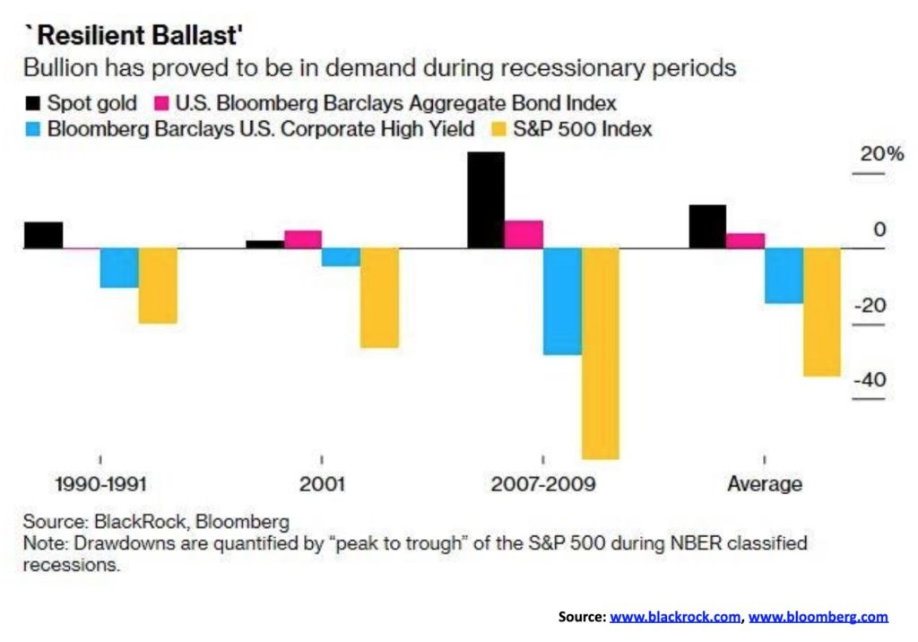
Here’s another look at the performance of gold during market drawdowns. The above chart came courtesy of Blackrock and Bloomberg. Measured were gold vs. the S&P 500, Bloomberg Barclays Aggregate Bond Index, and the Bloomberg Barclay U.S. Corporate High Yield Index. In all cases, 1990–1991, 2001, and 2007–2009 gold outperformed with average gains of 11.5% vs. a 34.1% on average decline in the S&P 500. According to Blackrock and Bloomberg, gold could still benefit despite being at 7-year highs. They also noted that gold held in exchange traded funds (ETFs), despite recent gains, only represents about 9% of global ETFs. That makes gold’s holdings in ETFs low compared to the universe of ETFs. They also estimated that gold probably makes up less than 2% of portfolios despite its history of being money and its negative correlation to stocks and bonds. Gold is also highly liquid and physical gold has no counterparty risk. Finally, gold does not rely on the management skills of any portfolio manager.
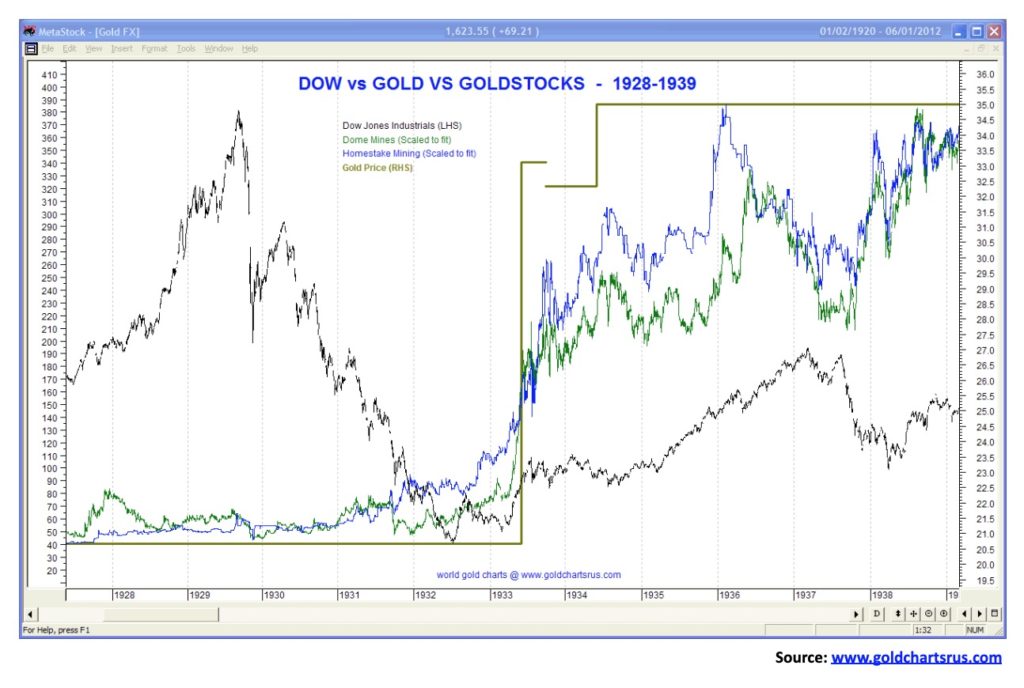
A reminder, however, that gold stocks are not a substitute for physical gold. Gold stocks are paper, just like regular stocks, even as they may be highly leveraged to the price of gold. It was, however, no surprise that during the Great Depression gold stocks hugely outperformed the stock market. As our second chart shows, gold and gold stocks outperformed the DJI by a wide margin. While the DJI was collapsing 89% in 1929–1932, gold stocks Homestake Mining and Dome Mines were rising upwards of 400%. Gold itself was revalued upwards in 1933 by 70% as it was fixed to $35/ounce from $20.67/ounce.
Gold remains an important part of any portfolio. Again, we emphasize that is physical gold and not paper gold.
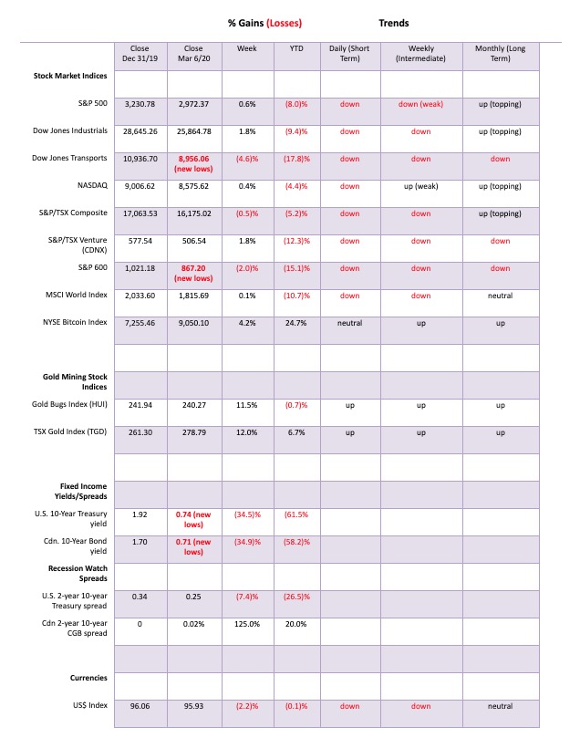
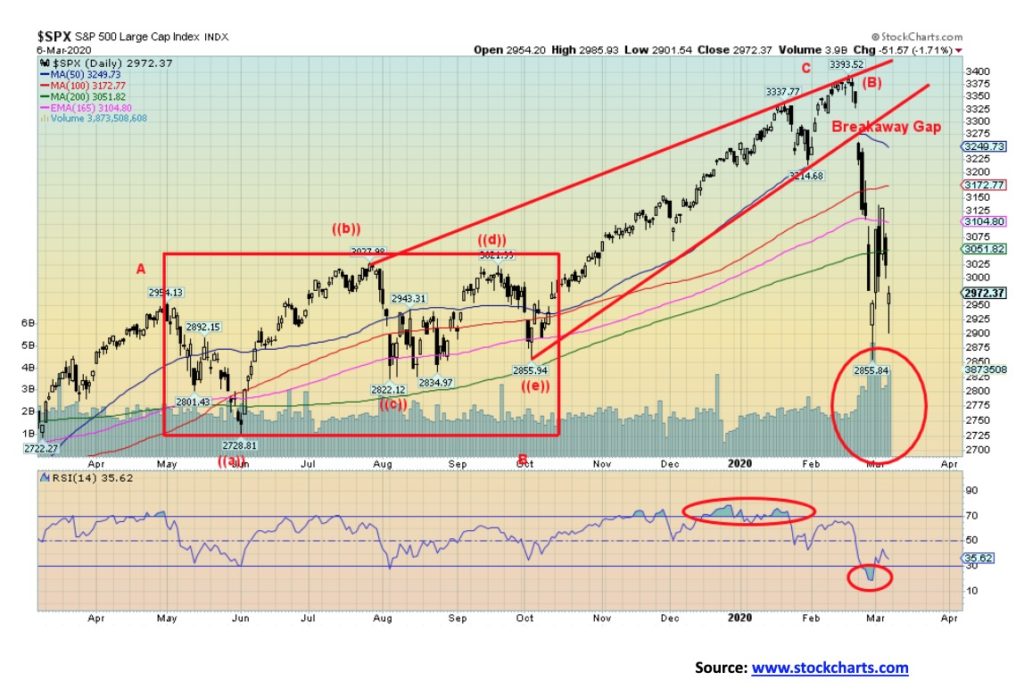
It was another wild and crazy week. Call it the coronavirus panic. Except, instead of falling to new lows, this past week the market tried to rebound and then failed. Thousand-point up-and-down days for the Dow Jones Industrials (DJI) seemed to be the norm this past week. The DJI did, as we noted, put in a record point up day on March 2. Despite all the wild gyrations, the S&P 500 did manage to gain 0.6% this past week. The DJI was up 1.8%; however, the Dow Jones Transportations (DJT) lost 4.6% and hit new 52-week lows. The DJT is being pummelled by airlines and cruise lines. The NASDAQ gained 0.4% but the S&P 600 small cap index lost 2.0% and also hit new 52-week lows.
Elsewhere, the TSX Composite lost 0.5% but the TSX Venture Exchange (CDNX) gained 1.8%; however, the chart still looks terrible. Overseas, the MSCI World Index was up a small 0.1%, the London FTSE lost 1.7%, the Paris CAC 40 was down 3.2%, and the German DAX was down 2.9%. In Asia, China’s Shanghai Index (SSEC) was a big winner, up a sharp 5.4% on hopes the COVID-19 is ending or at least slowing down there and they are trying to get China back to work even as they have had to strong-arm people, as has been reported. The Tokyo Nikkei Dow (TKN) didn’t fare as well, down 1.9%.
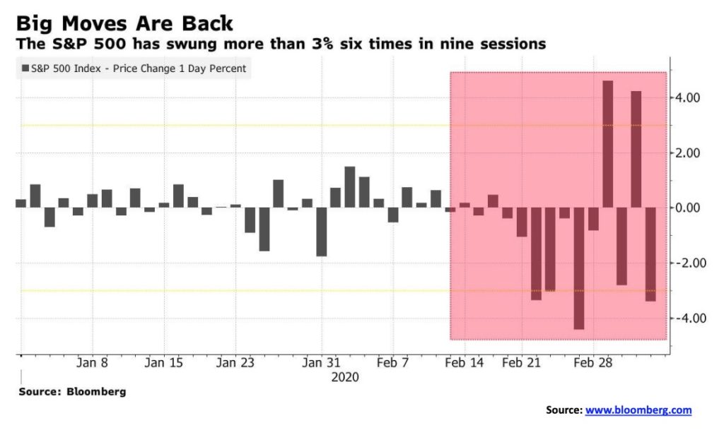
Friday’s job numbers did not play much of a role in the action as the stock market plunged and, once again, it looked like we could face another 1,000-point down day for the DJI; however, the markets bounced back by the close. The volatility has been huge with 3% swings up and down over the past couple of weeks. The chart on the next page attests to that. Other things that have been noted are that five of the past ten sessions have seen opening gaps up or down of at least 1.5%, the most seen since October 2008 and again (to the upside) in April 2009. Sentiment indicators are becoming somewhat bearish and, as we note, there are indicators suggesting that we could at least be soon at a temporary bottom.
As to a bottom that might take us to new highs, well, we wouldn’t place too heavy a bet on that but it is very possible. We believe we have seen a potentially important intermediate top and possibly a major top. If that is correct, then this would only be the first big wave down and, at this point, we can’t say the first wave down is complete. What follows is the rebound wave to the upside.
We saw that in both the 2000–2002 bear market and the 2007–2009 bear market. In 2000 the markets plunged into March/April 2000. What followed was a rebound rally that ended in August/September, just before the 2000 election. In 2007 the markets topped in October, then plunged into January 2008. The markets then staged a recovery into May 2008 before beginning the long collapse into October 2008. A key area is the 200-day MA. In 2000 the market struggled to regain the 200-day MA trading around it for a few months before giving way to the downside. In 2008 the market tested the 200-day MA but couldn’t get above it. Currently the 200-day MA is at 3050. We are currently only 2.5% below that level. In December 2018 we were almost 8% below the 200-day MA. So, we might have some more downside before this first wave down is complete.
Irrespective of any rebound rally, we believe we have started a major bear market that will last at least a couple of years and we could, in a worst-case scenario, see a 50% plus drop. Best case is for something between 20% and 30%. First, we have to find the bottom of this first wave down and then determine the top of the second or B wave up. It is an election year after all and we are sure the Fed will throw everything at this to try and prevent a meltdown—and help Trump’s re-election odds.
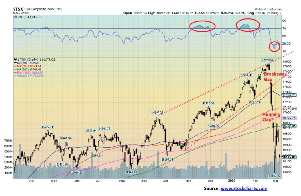
We confess: the TSX Composite chart is ugly. We see a breakaway gap at the top followed by what may be running gap. That’s the bad news. The good news is that the drop from February 27 to the low on February 28 largely equaled the decline from the high on February 20 to the low on February 26 just before what might be a running gap. They are supposed to be equal. So, it is possible that we have hit at least a temporary low. If we rise and fill the gap up to just above 17,000 and start printing over 17,400 a low would be in. This past week the TSX Composite fell 0.5%. As of the close on Friday Mar 6 the TSX Composite was down 10% from its Feb 20 all-time high. It was also trading below its 200-day MA, suggesting we may be entering a bear market. Just regaining above the 200-day MA currently at 16,745 would be positive.
It was a very mixed week for the sub-indices with some making stellar gains and others failing. Five indices closed down on the week while 9 indices were up. Leading the fails was the TSX Energy Index (TEN) down 11.4%. Others were Consumer Discretionary (TCD down 3.8%), Financials (TFS down 3.5%), Health Care (THC down 7.3%), and Information Technology (TTK down 0.8%). The big winners were Golds (TGD up 12%) followed by Utilities (TUT up 6%), Materials (TMT up 5.5%), Income Trusts (TCM up 4.4%) and Real Estate (TRE up 4.2%). Since energy and financials are two of the largest components of the TSX, they were the prime reason the TSX index was down on the week.
There are signs that the TSX could be hitting at least a temporary bottom. However, if one were to buy in at these levels the sectors that were positive this past week would most likely be the best. First the TSX Composite has to try and fill that gap. A failure filling the gap would suggest that new lows could lie ahead.
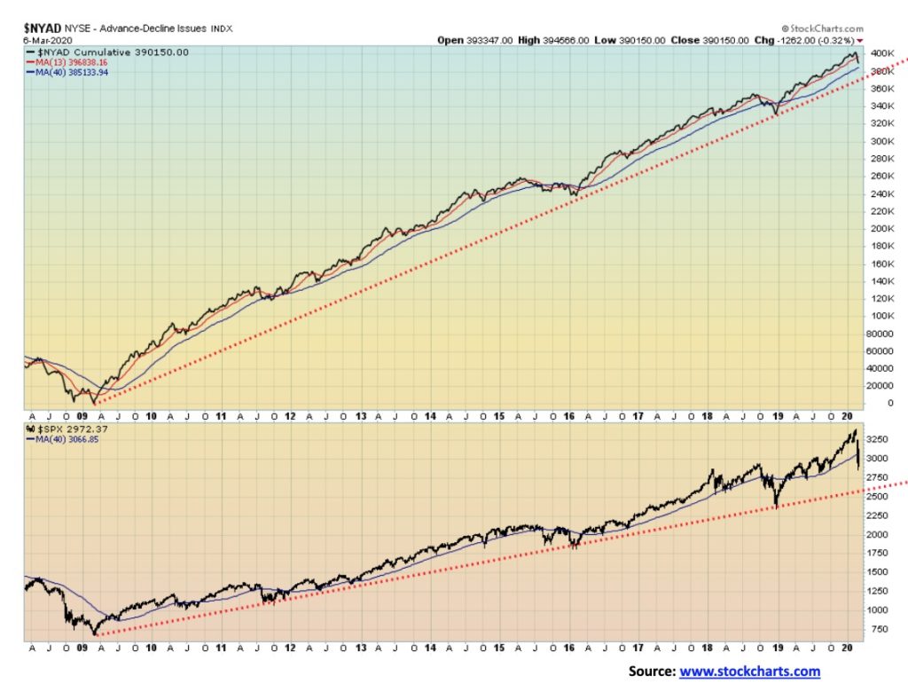
The bulls will continue to be excited about the NYSE advance/decline line. The A/D line has broken the 13-week MA, but it has not yet broken down under the 40-week MA. The S&P 500 has broken down under the 40-week MA suggesting that not only have we made an intermediate top but we are entering bear market territory. The bulls will cite the A/D line as evidence that one should stay the course. Other indicators are mixed. The McClellan Summation Index ratio adjusted (RASI) has not yet plunged into bear market territory but it’s getting there. The ARMS Index is fearful. Bullish Percent Indices are very bearish at levels usually associated with bottoms. The Put/Call ratio is heavily leaning towards puts, suggesting the market is fearful. And, as we note next, the VIX is at levels often associated with lows in the market.
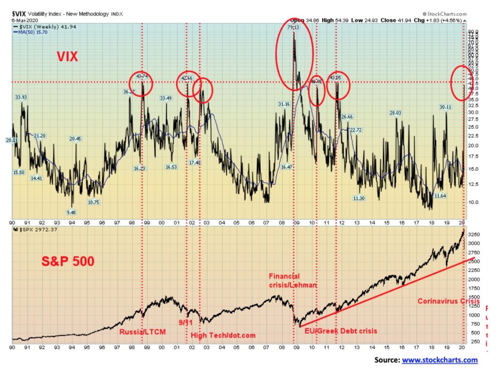
The VIX Volatility Index continues over 40, a level that has often been associated with bottoms in the stock market. The high of 79 was seen at the height of the 2008 financial crisis. The index is, however, an indicator, and it does not necessarily signal an actual bottom. The index could go higher as the stock market moves lower. But it is a warning sign.
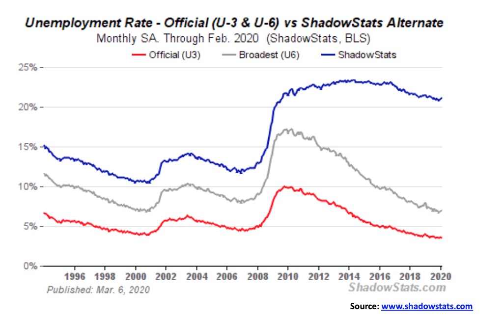
Friday saw the monthly job numbers come out and they were a surprise. Nonfarm payrolls came in up 273,000 when the market was only expecting 175,000. The unemployment rate (U3) was 3.52% vs. 3.58% the previous month. However, the Bureau of Labour Statistics (BLS) reported that the U6 unemployment rate was 6.96% vs. 6.88% the previous month. The U6 unemployment rate is U3 plus short-term discouraged and other marginally employed workers as well as those working part-time that prefer full-time. The Shadow Stats unemployment which is U6 plus long-term discouraged workers and those defined away out of the labour force in 1994 came in at 21.1% vs. 21.0% in January. Despite the drop in U3 the other measurements all rose. The labour force participation rate was unchanged at 63.4%. Average hourly earnings rose 3% year over year.
All of these numbers do not reflect what might be going on with the COVID-19 crisis. The widening U6 and Shadow Stats unemployment suggests that there is actually employment stress going on out there. Some poor trade numbers along with the COVID-19 could play havoc with Q1 GDP numbers and subsequently on employment. One should also beware revisions to 2019 numbers that are often announced on the bottom of the back page where few pay attention. Freight activity, as measured by the CASS Freight Index, has been plunging and global trade, which is already falling, could take a further hit from the COVID-19. We note that China reported a trade deficit in both January and February, a very unusual situation for a normally exporting country.
Despite the supposed big jump, we note that there were numerous revisions to 2019 numbers and they were always to the downside.
We also note that the stock markets don’t really care much about the job numbers when they are focusing on the COVID-19 crisis.
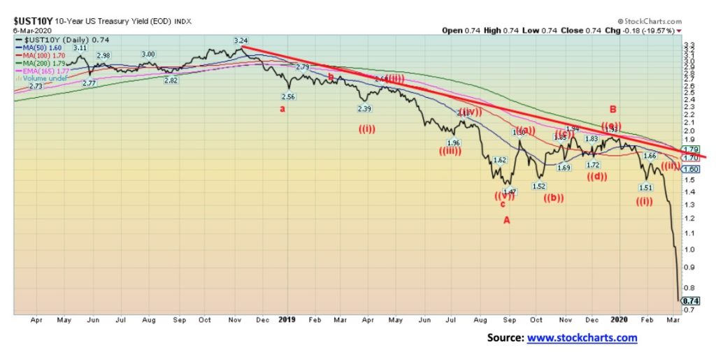
Down, down, down. That is the U.S. bond rates as the U.S. 10-year treasury note hit an historical low of 0.74% this past week and at one point fell under 0.70%. The U.S. 30-year treasury bond hit an historical low of 1.25%. Many are saying negative yields may not be far off. However, all we can note is that negative yields in the EU and Japan have been a disaster and they’ll be a disaster in the U.S. as well. There is little evidence to support that low yields have done anything for the economy and they punish bond buyers. It’s actually better to hold cash or buy gold than to purchase bonds if the yields are negative. The bond market shook off the stronger than expected U.S. job numbers and fell further anyway. ISM manufacturing numbers are hovering around 50 or slightly under, indicative of a potential recession. The services PMIs are somewhat stronger. The question now is, how low will this go?
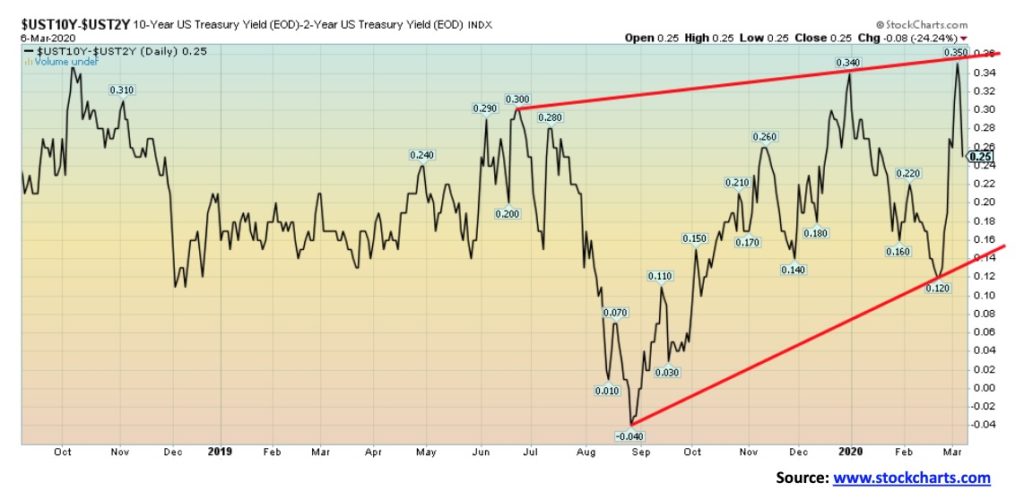
We were always firm that a negative spread between the U.S. 10-year treasury note and the U.S. 2-year treasury note was an early sign of an impending recession. As to when it might start, we noticed that it usually got underway once the spread turned positive again. Well the 2–10 spread never got hugely negative like the 3M-10 spread but the 2–10 spread has now turned firmly positive, once again hitting a recent high of 35 bp and closing the week out at 25 bp. Given what is going on with the COVID-19 scare, a recession might be soon underway. For the record, the 3M-10 spread hit a low of negative 52 bp back in late August 2019. It currently is at +29 bp after hitting a low of negative 20 bp on Feb 25. The clock is ticking on a recession.
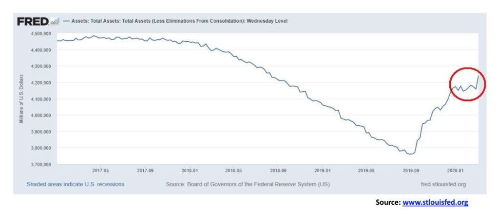
The repo market has heated up once again. The COVID-19 panic has the Fed once again very active in the repo market just as it appeared it might be dying down. The Fed pumped in a $100 billion in a single day this past week, not once but twice on March 3 and March 4. The result is that the Fed balance sheet is now over $4.2 trillion, the highest in 18 months. And we still don’t know why, nor do we know for any certainty who exactly is receiving the funds. Suspicions continue to fall on EU banks led by Deutsche Bank but also possibly Japanese banks. And now, what about Chinese banks? And why can’t the U.S. banks handle the repo market as they normally did in the past? Lots of questions—few, if any, answers. And now we hear from Boston Fed governor Eric Rosengren who said:
“We should allow the central bank to purchase a broader range of securities or assets. Such a policy, however, would require a change in the Federal Reserve Act.”
What? Buy stocks? Sadly, that would probably be music to Trump’s ears. Houston, we have a problem (popular, but erroneous quote from the film Apollo 13 (1995)).
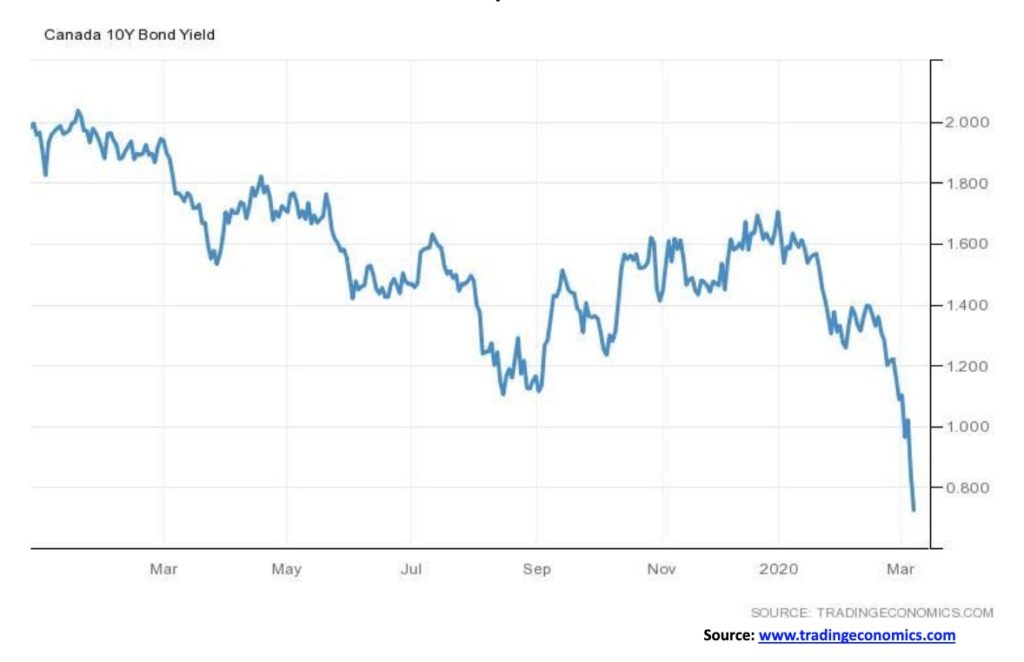
Canadian bond yields as measured here by the Government of Canada 10-year bond (CGB) fell to an historic low of 0.72% this past week. All of this against the backdrop of robust job numbers where it was reported that Canada created 30,300 jobs in February. The market had expected 10,000. Full-time jobs rose 37,600 while part-time jobs fell 7,300. Employment gains were seen in Quebec, Alberta, Nova Scotia, and Manitoba with little change in the other provinces. Given a rise in the labour force participation rate to 65.5% from 65.4%, the unemployment rate actually ticked up to 5.6% from 5.5%. Wages were up 3.4% year over year. As expected, the Bank of Canada (BofC) cut its bank rate to 1.25 or 50 bp following the cut by the Fed. A number of banks followed, cutting their prime rate. As the Canadian economy slows and, given the collapse in oil prices, one has to be concerned about the high level of debt in the country. Private debt to GDP is currently 266%. Some are worried that the cut in interest rates will spark another borrowing binge and result in further upward pressure on the overheated housing market. Too-high prices might put a damper on that if buyers decide it is just too expensive or if a recession begins to mount and job losses mount. Nonetheless, for the moment at least, we have historically low 10-year yields and so far, there appears to be no bottom.
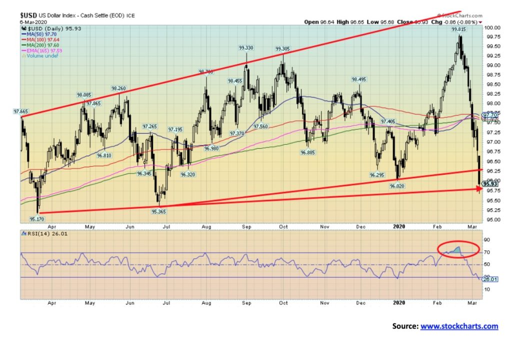
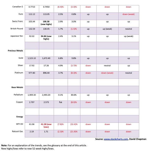
Is the U.S. dollar finally beginning its long-awaited collapse? This past week the US$ Index fell 215 bp or 2.2%. The US$ Index is now down 3.9% from its high of 99.82 seen on February 20. We suspect an intermediate top is now in and a dollar bear market could be underway. The US$ Index is oversold enough (RSI 26) that a rebound rally could get underway anytime. The US$ Index is also at trendline support of the rising pattern that has formed over the past two years. The Swiss franc benefitted the most this past week, gaining 2.9%, the euro was up 2.5%, the Japanese yen up 2.4%, and the pound sterling gained 1.7%. The Canadian dollar tends to get lumped in with the U.S. dollar as it fell 0.4%. Nonetheless, the decline this past for the US$ Index was impulsive, suggesting to us that we are starting a potentially significant move to the downside. Potential targets are down to 91 once we firmly break under 95.50, a level that is not that far off. A falling US$ should be positive for gold. Only regaining 98 might change our now bearish position on the US$.
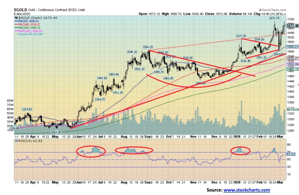
Gold appears to be on a mission to do it all itself. As we note under our silver commentary, the gold/silver ratio has rarely ever been this high. This past week gold continued its wild ride, gaining 6.8% on the week. Silver underperformed again, gaining 4.9%. Platinum is also underperforming, up 3.7% this past week. Of the more industrial metals, palladium is holding up but was only up 0.1% on the week and copper was flat against the backdrop of the coronavirus panic. A week ago, gold plunged $128 in a mere four days as someone unloaded a huge amount of April futures contracts on February 28, sparking the major part of the sell-off. Someone tried it again this Friday but they weren’t as successful. On Friday, gold spiked to an intraday high of $1,689. At around 10 am someone dumped a load of futures on the market and gold plunged $44. But instead of capitulating this time, gold recovered and around 3 pm gold had regained to $1,692 before eventually closing at $1,674. A wild ride day.
So, what next? Bullish complacency has returned although the huge drop a week earlier shook the market. Our long-held targets of $1,725/$1,750 remain in sight. Gold is benefitting from lower interest rates and the potential for the global economy to slide into a recession. Gold is also acting as a safe haven as the U.S. dollar plunges and the world has a nervous breakdown over COVID-19. When interest rates plunge as they have, the 10-year is trading at 0.74%, and with the potential for another huge round of QE, gold becomes quite attractive. Gold has been the best performer so far in 2020, up 9.8% compared to the S&P 500 down 8%.
Given the negative divergence with silver we are not complacent about the fact that gold could go through a corrective period. We are also well aware of the forecasts out there, with the bulls saying we are going to $2,000, $3,000, and higher while we also see bears forecast that once this up wave is finished gold will go through another historic collapse under $1,000. So, which is it? An excellent reason as to why one should not get too caught up in any euphoria. The low of February 28 becomes a stop-out at $1,564. Gold breaks down into a bear market under $1,445.
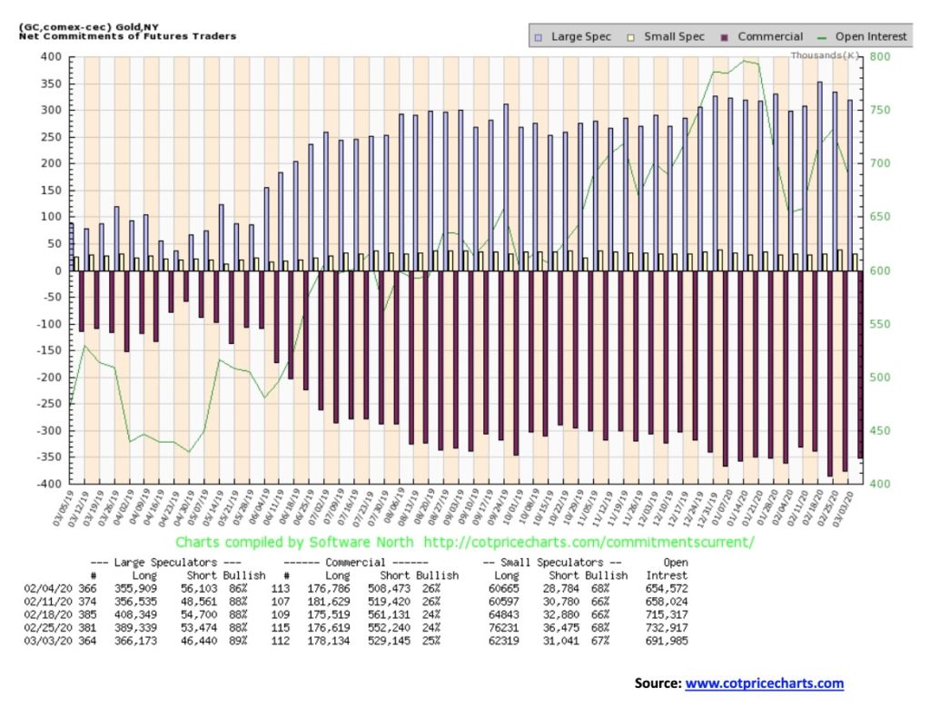
At last, some positive movement from the gold commercial COT. Well, okay, not much. The gold commercial COT improved to 25% this past week from 24%. Long open interest rose about 1,500 contracts and short open interest fell roughly 23,000 contracts. The action was all on short covering, not new longs. The large speculators COT rose to 89% from 88% as they cut both with long short interest falling a bit over 23,000 contracts and short open interest off about 7,000 contracts. Total open interest fell around 41,000 contracts. The week was mostly about short covering. At 25%, the commercial COT is still too negative for our liking but we’ll take the improvement.
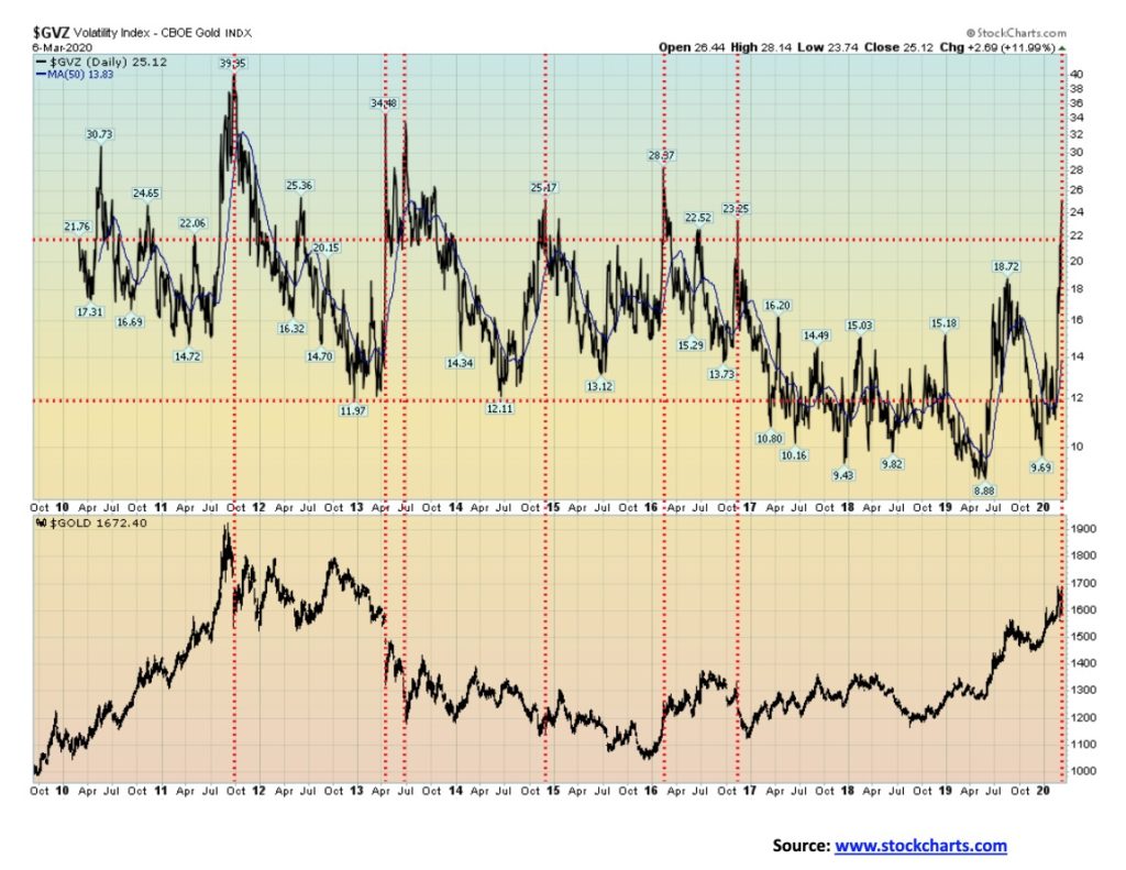
Gold volatility is on the rise as shown by the GVZ Volatility Index. At 25, it is at its highest level since 2016. The GVZ is somewhat similar to the VIX except for gold. We don’t believe it is quite as accurate, but it does serve as a bit of warning that we could be getting into a topping zone. Note the big divergence in 2019 with the GVZ making new lows but gold making a higher low. It may well have been presaging the recent rise.
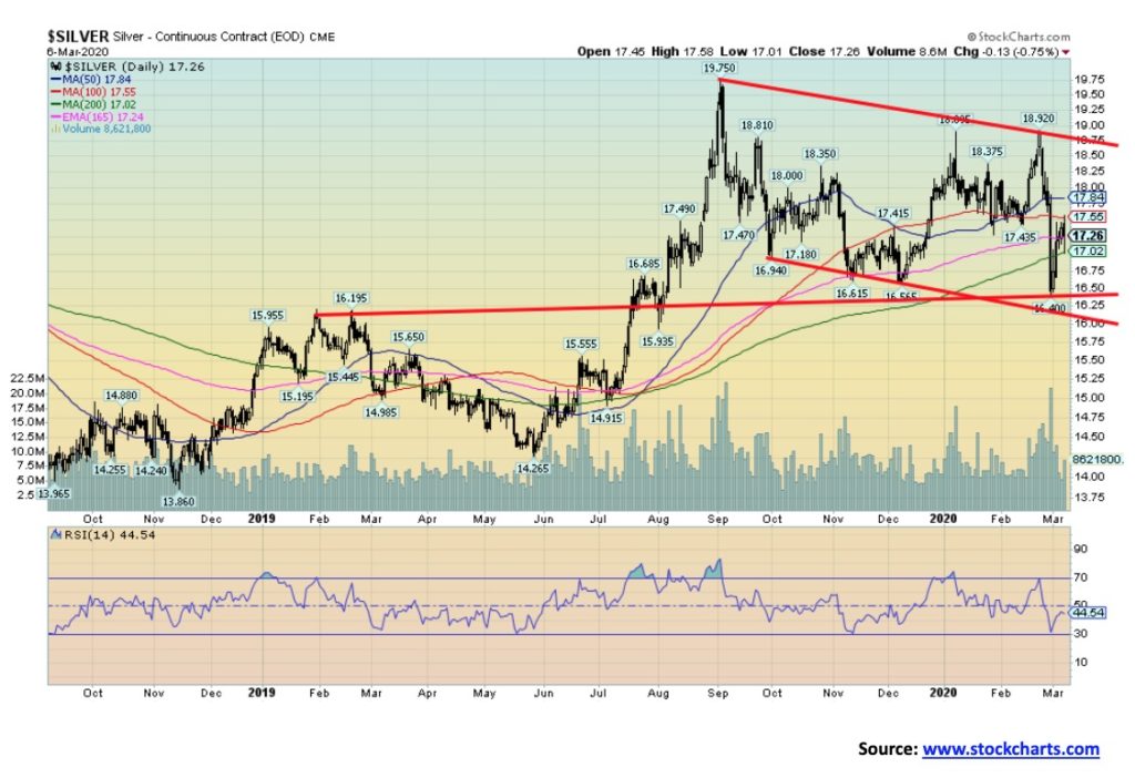
Silver continues to grossly underperform gold. The gold/silver ratio is currently at 97, an absolutely unheard-of level. The ratio peaked this past week over 100. While we talk about how cheap silver is compared to gold, the reality is even more concerning because these levels were never even contemplated. The gold/silver ratio in nature is about 17.5:1. The Romans set the ratio at 12:1. The U.S. set the gold/silver ratio at 15:1 in 1792 and France was similar at 15.5:1 in 1803. If those levels prevailed today, silver would be almost $100/ounce or conversely gold would be about $300/ounce. However, the level is not without precedence. In 1991 the gold/silver ratio reached 103:1. It proved to be an historic low for silver prices. On average, the gold/silver ratio has been around 47:1 throughout the 20th century. Even at that level silver would be trading at $35 not $17.
Nonetheless, the underperformance of silver is a concern. As with Dow Theory where one wants the DJI and DJT to act in unison making new highs and new lows together, the theory fits with gold and silver as well. Silver is nowhere near its recent high of $18.92 seen on February 24, let alone its high of $19.75 made on September 4, 2019. Silver never even made it near to its high of July 2016 at $21.23. Gold easily surpassed its comparable high of that date. The chart of silver suggests silver is locked in a downtrend. A breakdown under $16.50 could send silver crashing to potential targets near $13. At this point even we would not suggest that is impossible.
To suggest higher prices silver needs to first regain above $17.85 and more importantly above $18.35. Above that level new highs are possible. Given the circumstances of what has been going on we are not optimistic. A breakdown under $17 once again could send silver down towards $16.50 and a bigger breakdown.
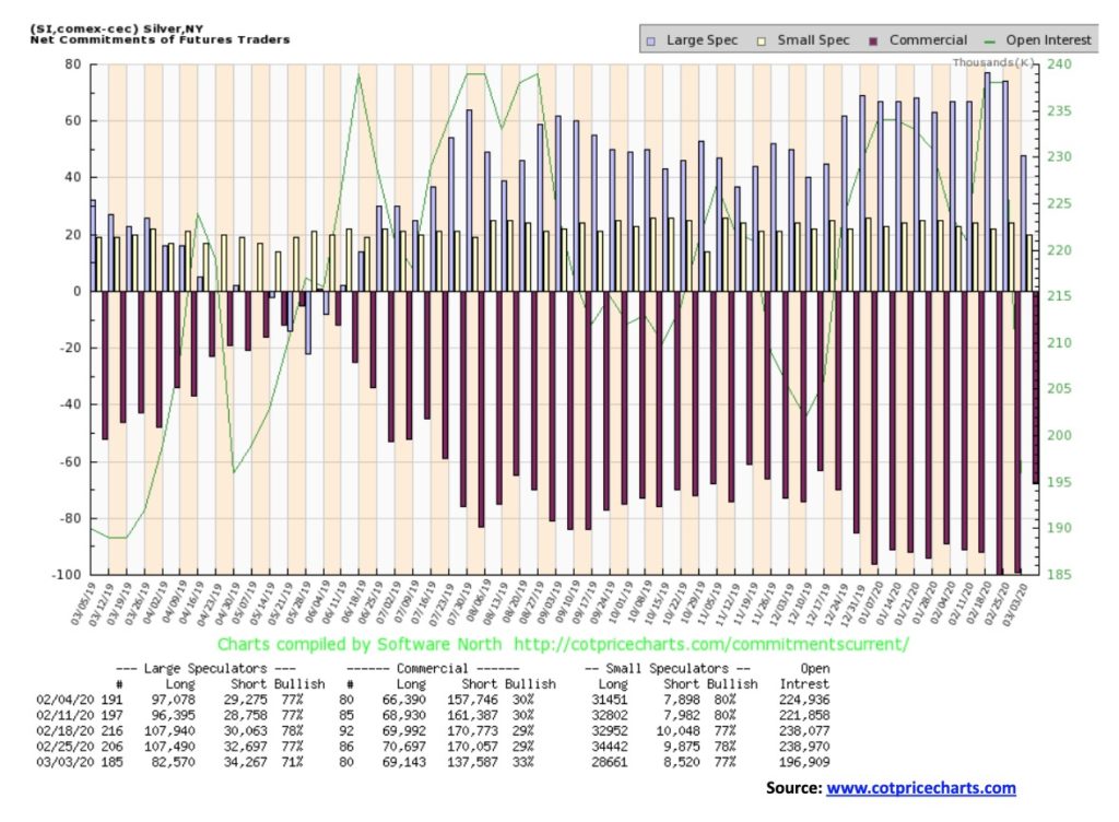
The silver commercial COT improved quite a bit this past week, rising to 33% from 29%. Long open interest fell over 1,500 contracts while short open interest dropped over 32,000 contracts. Again, as with gold, the emphasis was on short covering not assuming new longs. The large speculators also cut their position dropping to 71% from 77% as their long open interest fell almost 25,000 contracts even as short open interest rose slightly by about 1,600 contracts. Total open interest also fell down over 42,000 contracts. As with gold, it was all about short covering in the recent fast price drop. Still, it is an improvement but nowhere near levels where we could get bullish.
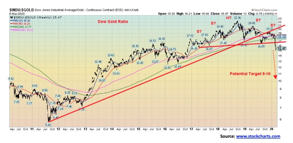
We featured the Dow Jones/Gold ratio the previous week and we are showing it again as the ratio is now firmly breaking to the downside in favour of gold. We also revised our look at the possible head and shoulders top and now note that it is more likely a head and double shoulder top. We rarely see that pattern, but it is an excellent predictor of direction once it breaks down (or breaks to the upside if it were a reverse pattern). The potential target zone of 9/10 remains the same. Keep in mind, though, that this is about physical gold and the DJI, not necessarily about gold stocks. As well, the DJI could be falling but gold just doesn’t fall as much. The message is the same, however, that holding physical gold is preferential to holding stocks.
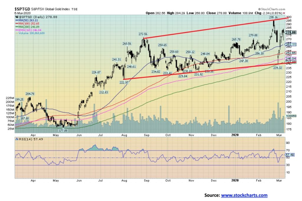
Gold stocks have been through a wild ride over the past two weeks, first rising and then collapsing 19% in the space of four days before rebounding once again. Since hitting trendline support and the 200-day MA on February 28, the TSX Gold Index (TGD) has rebounded almost 17% from the low and up 12% on the week. The Gold Bugs Index (HUI) has fared almost as well, gaining 11.5% this past week. This compares to the 6.8% gain for gold and the 4.9% gain for silver this past week. So, what’s going on? The gold stocks are merely following the patterns of gold and silver that took a huge hit late last week as we noted in our commentary on gold and silver. We note that volume spiked on February 28 with the collapse. In some respects, the gold stocks are just acting like the regular stock market given the wild swings. To date, the TGD has recouped 71% of the swift decline from February 24 to February 28. However, we need to regain above 282 to suggest to us that we could take out the 295 high of February 24. Silver stocks have been particularly weak, reflecting the underperformance of silver and they have played a role in dragging the TGD and HUI down. Given the wild volatility, the 239 low of February 28 now becomes quite important to the downside. We do not want to see that point taken out. Generally, the TGD achieved targets from the consolidation that occurred from late August to early December 2019. If gold were to achieve our ultimate targets of $1,725/$1750 then some profit-taking and lightening up may not be a bad idea. Gold stocks tend to be weak during the March to June period and after a run-up it would not be surprising to see that they were weak. Our first sign of trouble to the downside would be under 260.
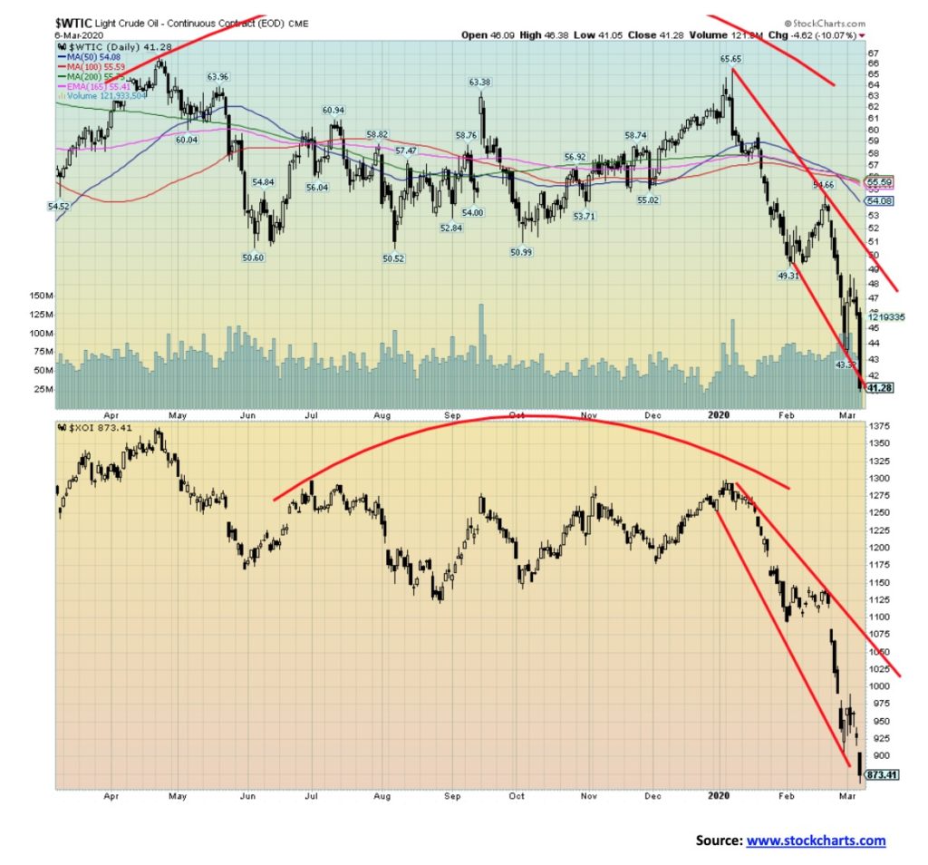
With Saudi Arabia and Russia falling out over oil production cuts there was only one way for oil to go and that was down. And down it went, falling 7.8% this past week to new 52-week lows. The collapse this past week took out the 2018 low. Is next up the early 2016 low of $26.05? Or how about even lower? We’ve have seen some predictions that oil could fall to the late nineties low near $10.
Apparently, the OPEC meeting broke up this past week in a very fractious mood. It could, instead of bringing production cuts, launch a price war in a world of falling demand. Great for drivers as drivers here in Toronto could soon see gas at under $1/liter. But devastating for producers, especially high-cost producers such as Alberta, and it would be a gut check for the U.S. shale industry. And that in turn could trigger more bankruptcies and loan defaults. The Saudis need high prices as well to pay for their bloated budget and all the arms they buy. It is estimated they need at least $80, and so do Alberta and shale producers.
Price wars are not pretty. In 1985–1986, Saudi Arabia launched a price war when they got fed up with being the only OPEC member to accept production cuts. Oil prices collapsed to 70% in a hurry to $10. It happened again in the late 1990s when Saudi Arabia got fed up with Venezuela also not adhering to cuts to deal with the Asian financial crisis of 1997. Once again oil fell in a hurry down 60% to about $11. Oil also crashed following the 2008 financial crisis, dropping from a high of $147 to $34 a 77% drop. Given the recent high at about $77, a 77% drop today would take oil to about $18. You have a perfect storm brewing—falling demand and overly high production. We could see the steepest drop in demand since the early 1980s. Saudi is desperate to keep oil price high, but Russia is in a better position to withstand a collapsing oil price. Alberta and the U.S. shale producers will be massacred in the crossfire.
Natural gas (NG) is no help either as it too is scraping multi-year lows. NG is already down 65% from a high in November 2018. Next up to collapse, a move that is already underway, are the energy stocks. The TSX Energy Index (TEN) dropped 11.4% this past week and is now down 30% on the year. Next appear to be lows of 2000, only another 13% drop away. The ARCA Oil & Gas Index (XOI) fell 8.3% this past week and is down over 31% on the year to date. The XOI is above its 2008 low but that low is only a 15% drop away.
Unless OPEC can get its act together, the only thing that will come out of this is economic chaos and a wave of producer bankruptcies and defaults, including even sovereign defaults from nations dependent on their oil revenues. Even oil giants such as Exxon and Shell are vulnerable. And the political wars will intensify as those dependent on oil revenues pull out all stops to prevent a collapse. That is quite evident in Canada where the pipeline debates are intensifying and the sides are hardening.
—
(Featured image by Pexels from Pixabay)
DISCLAIMER: This article was written by a third party contributor and does not reflect the opinion of Born2Invest, its management, staff or its associates. Please review our disclaimer for more information.
This article may include forward-looking statements. These forward-looking statements generally are identified by the words “believe,” “project,” “estimate,” “become,” “plan,” “will,” and similar expressions. These forward-looking statements involve known and unknown risks as well as uncertainties, including those discussed in the following cautionary statements and elsewhere in this article and on this site. Although the Company may believe that its expectations are based on reasonable assumptions, the actual results that the Company may achieve may differ materially from any forward-looking statements, which reflect the opinions of the management of the Company only as of the date hereof. Additionally, please make sure to read these important disclosures.

-

 Crowdfunding6 days ago
Peru’s Crowdfunding Sector Shrinks Amid License Revocation
-

 Crypto2 weeks ago
Ripple Collaborates with Mastercard on Blockchain Innovation
-

 Crowdfunding17 hours ago
Cyberpunk Trading Card Game Surges Past Goals on Kickstarter
-

 Markets1 week ago
Global Sugar Market Steady Amid Oil Price Surge and Iran Conflict


