Business
The Dow Jones 10 Utility Bond Average: A Tale of Woe from 1938 to 2002
Barron’s once published bond averages they began in 1938; the Dow Jones’ 10 Utility and 10 Industrial Bond Averages. Combining the two of them, they then had the Dow Jones 20 Bond Average. With each market series, they published both price and yields for sixty-four years of market history. For the Dow Jones to advance 30% from this week’s close, it would have to close at 50,215; that is an advance of 11,855 points.

The Dow Jones continues looking good in its BEV chart below. Since November 17th, the Dow Jones has either closed in scoring position (BEV Values from -0.01% to -4.99%), or at a BEV Zero (0.00% = new all-time high). So far in this advance (Red Circle), the Dow Jones has made nineteen new all-time highs, with its latest on Monday of this week.
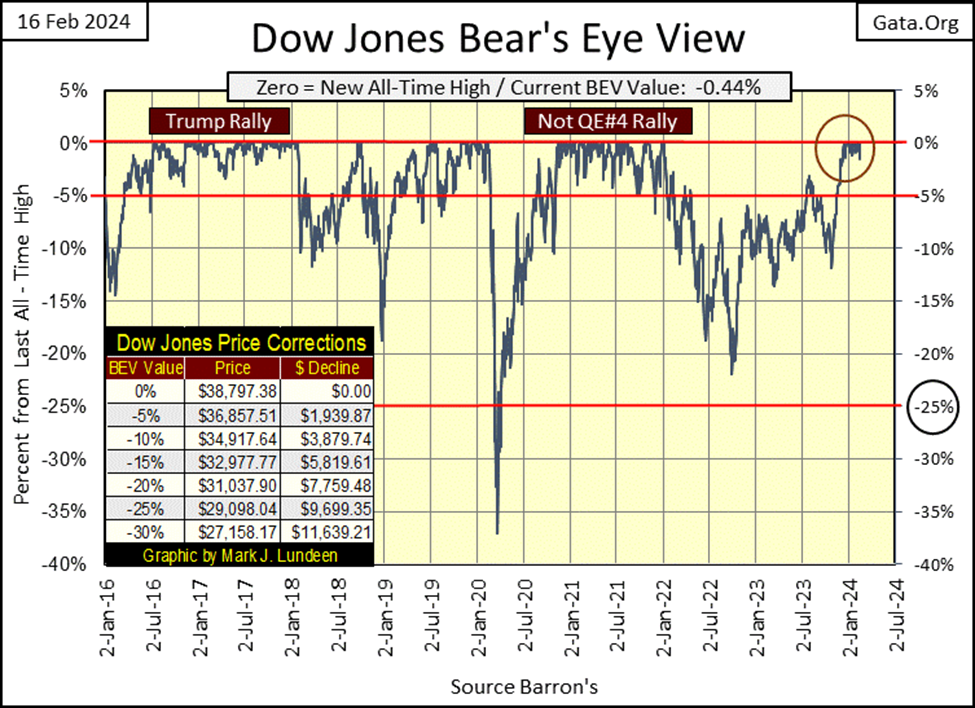
So, what happens from here? I don’t know, so I’m going to keep it simple and assume this advance continues until it stops. The best way to play this with a BEV chart is like this; as long as the Dow Jones doesn’t close below its BEV -5% line above, I going to assume the Dow Jones is in a market advance. But, when seeing what the Dow Jones did in its two previous rallies in this chart, having the Dow Jones close below its BEV -5% isn’t always fatal for a market advance.
I’d say at a market top, the real trip wire in a BEV chart would be its BEV -10% line.
The best way to exit a market advance within 10% of its top, would be to exit the market should the Dow Jones close below its BEV -10% line. Yes, the market could recover, and go on to new all-time highs. But after enjoying the gains of a significant advance, holding on after the Dow Jones closes below its BEV -10% line, is just being greedy. Take it from someone who has been greedy many times in the past; being greedy at the end of a big advance is not the best way to make money in the stock market. It just isn’t!
When the time comes, how far the stock market could go down in the pending market decline depends on what the idiots at the FOMC do. Look at the big 35% market decline in the BEV chart above for March 2020. From an all-time high, the Dow Jones deflated over 35% in only twenty-three NYSE trading sessions in Feb-Mar 2020. Since 1885, that never happened before. And to my eyes, it appears the Dow Jones in March 2020 was going to deflate far below its BEV -35% line before it found a bottom.
The market’s problems in March 2020 were bigger than just tumbling prices in the stock market. The entire corporate bond market was melting down – yields were spiking, valuation evaporating. These bonds were issued by the same companies whose stocks were trading at the NYSE and NASDAQ. If these companies began defaulting on their bonds, then these companies that couldn’t pay their bills, would soon see their share prices approach zero.
But that didn’t happen, as FOMC primate idiot; Jerome Powell, began “injecting” trillions-of-dollars of “liquidity” into the financial system in a matter of weeks with his Not QE#4 seen below, and kept “injecting liquidity” into the financial system for the next two years. Also, for the first time in history, the FOMC was “monetizing” (buying in the open market) corporate bonds by the many billions of dollars. That the FOMC had to “stabilize” the corporate bond market four years ago, suggests corporate finance remains in a sorry situation, a pending tale-of-woe in 2024.
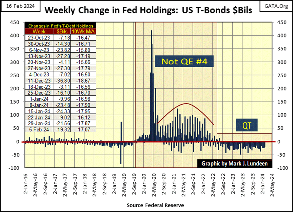
One can see the effect of that massive tsunami of “liquidity” flooding into the market in the Dow Jones’ BEV chart above; it placed a floor under the Dow Jones’ decline, and “stimulated economic growth” once again on the floor of the NYSE. Eight months later in November 2020, the Dow Jones was once again making new all-time highs.
That is what happened last time the stock market began shedding its market valuations in a big way; the FOMC came to the bulls’ rescue. Whether the idiots will do so again is a big question. The dollar, as a global reserve currency, may not survive a QE#5.
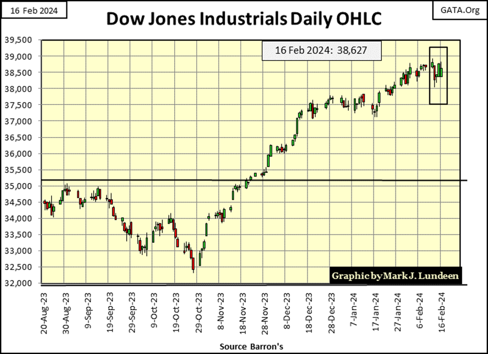
Looking at the Dow Jones in daily bars below, it’s obvious the Dow Jones is not in a roaring bull-market advance, but it is going up. It’s been going up since August 1982, when the Dow Jones saw its last daily closing of under 800, and it has advanced some 38,000 points in the past forty-two years.
For the Dow Jones to advance 30% from this week’s close, it would have to close at 50,215; that is an advance of 11,855 points. Good grief! I remember when seeing the Dow Jones approach 1,000, people exited the market for their fear of heights.
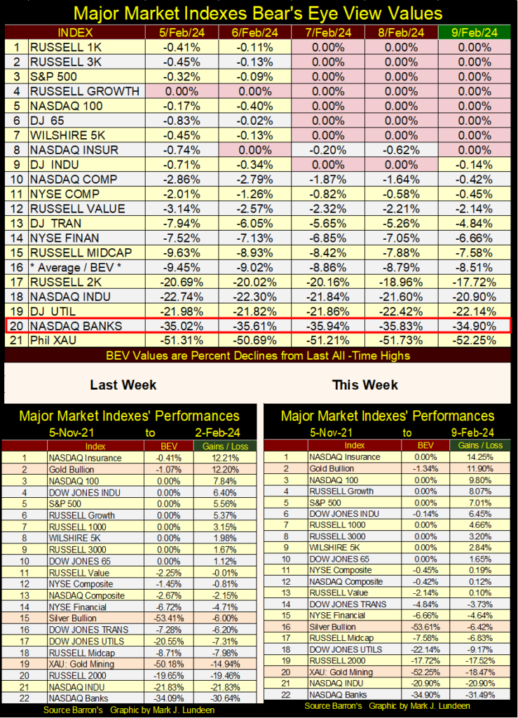
Next is my table for the major market indexes I follow using BEV values. We’re seeing BEV Zeros (0.00% = new all-time highs), and not just with the Dow Jones. The gold miners in the XAU remain at the bottom, as they’ve been since their last all-time high in April 2011. The NASDAQ Banking Index is next at the bottom. Seeing all those major indexes close the week above their BEV -10% lines (#1 to 15), and then seeing the banks closing the week below its BEV -30% line is odd, yes very odd.
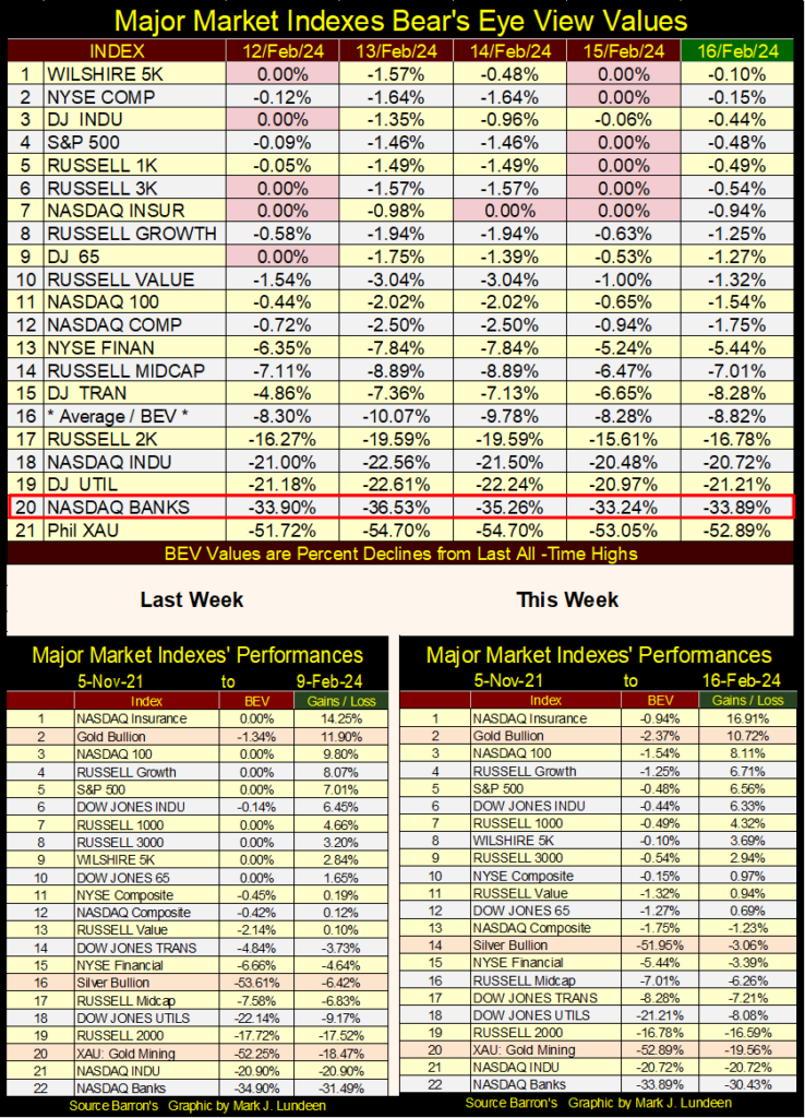
Looking at the performance tables above, it is also odd seeing gold at #2, with the XAU down at #20.
I missed last week, but I thought last week’s major market index table was interesting, so I’m including it below. What is interesting about it? For the first time since late 2021, last week these major market indexes began producing new all-time highs in volume. If this advance has legs to it, BEV Zeros will begin filling in the daily closes below.
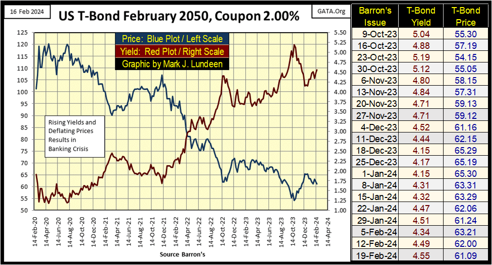
So, how is my T-bond that matures in February 2050 doing? Well, from October to December, yields were falling, and prices were rising. But for the past two months, once again yields are rising as prices are again going down.
Let’s look at the Fed Funds Rate (Blue Plot) and long T-bond yields (Red Plot) going back to 1954 below. Rising yields identify when the bond market is in a bear market, and below we see yields rising from 1954 to 1982, about thirty years. Declining yields identify when the bond market is in a bull market, and below we see bond yields declining from 1982 to 2020, about forty years.
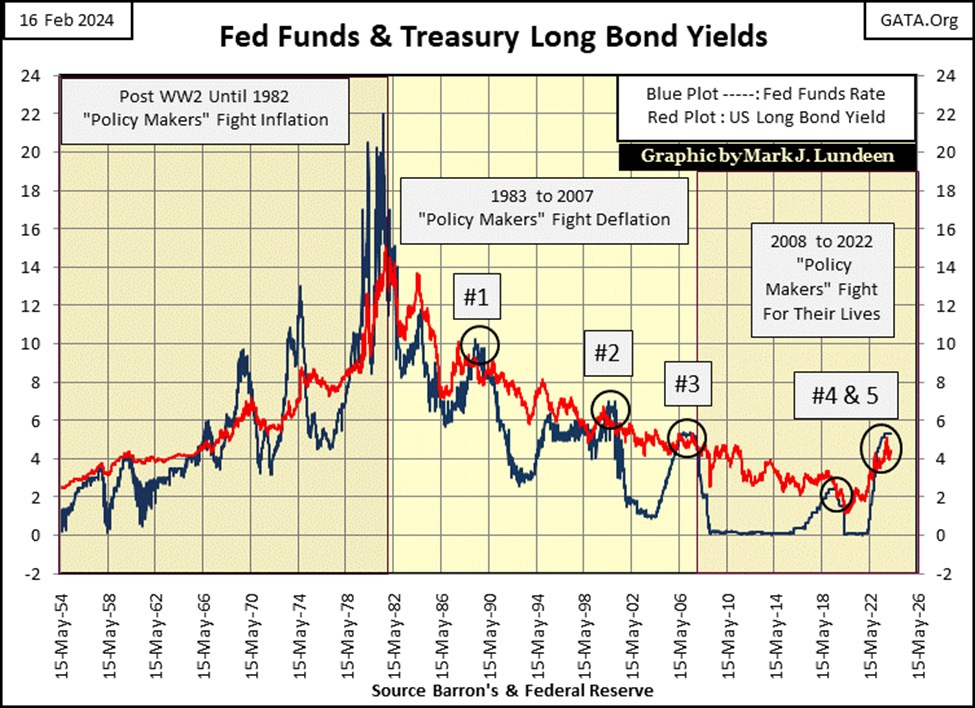
Since 2020, what have T-bond yields been doing for the past four years? Going up? That can’t be right. I’m not going to be the first to predict the debt markets are in the very early stage of a massive, multi-decade bear market. Oh no – not me!
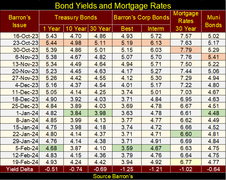
Bond yields haven’t yet increased to double-digits; not yet anyway as seen in the table of bond yields below. Yields peaked in October (Orange Tabs), and kept going down until January, with the green tabs showing the lows of the move. But these yields have been rising since.
I doubt rising bond yields will create a panic in the market anytime soon, as they did in March 2020. But looking at the chart above, I believe generational lows in bond yields were made in the early 2020s, and they have no place to go but up, maybe for decades to come.
Barron’s once published bond averages they began in 1938; the Dow Jones’ 10 Utility and 10 Industrial Bond Averages. Combining the two of them, they then had the Dow Jones 20 Bond Average. With each market series, they published both price and yields for sixty-four years of market history.
I don’t know why, but Barron’s discontinued publishing their bond averages in 2002. Most likely because by 2002, I and maybe ten others were the only people following these market series. But market data going back to the Great Depression, and if possible before, is exactly the stuff I’m interested in, historic data series going back decades.
It is what it is, and what it is, is plotted far below; in fact three charts below are the weekly values for Dow Jones 10 Utility Bond Average’s price and yields from January 1938 to April 2002.
First; what is a bond? A bond is fixed income / contract for debt. Someone with money wants income, a utility wants money for one purpose or another, so they come together and enter a contract. The investor lends his cash to the utility company for so many years, and each year the utility pays out coupon payments of so many dollars. After the term of the contract, the bond matures and the utility gives the investor their money back – no more, no less.
This same utility most likely also has shares trading in the stock market. Shares that before the 1960s paid a dividend to investors whose yield was most likely greater than a bond from this same utility company. So, why would anyone seeking income, buy a bond instead of a dividend yielding, blue-chip stock?
Owning the shares of a company makes one a fractional owner of a company, and a dividend payment is a profit-sharing program companies offers their owners. Dividends are not guaranteed – no profit / no dividend payout to investors. Dividends can be reduced, or eliminated entirely without any legal recourse by the company’s owners – the shareholders.
But bonds are contracts-for-debt, and as such cannot be cut or eliminated without the company declaring bankruptcy, and having its assets liquidated in a court for the benefit of the banks, and bond holders the company owed money too.
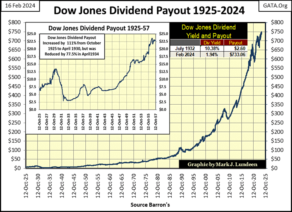
So, for people looking for income, why invest in the shares of a company, and not its bonds? Because, unlike bonds, shares are not * Fixed Income *. Yes, the dividend payout is not guaranteed; it can be cut or go down to zero. But it can also go up, as seen in the dividend payout for the Dow Jones in the chart below.
During the Great Depression’s market crash, the dividend payout for the Dow Jones was cut by 77.5%. It’s very likely money once intended for dividends, was diverted to make coupon payments for the bond holders and servicing banks loans. From 1929 to 1933, investors who owned bonds issued by dividend yielding, blue-chip companies that didn’t go bankrupt, and not these same companies’ stocks to earn income, were very happy with their choice of bonds over stocks.
Of course, during the Great Depression companies went bankrupt, and defaulted on their bonds. So, when I say bonds, I’m talking about bonds issued by companies that survived the depressing 1930s.
However, since the creation of the Federal Reserve in 1913, the four years spanning 1929 to 1933 was the only time holding bonds for income instead of stocks was the thing to do. Because since its creation, the Federal Reserve System introduced inflation, with a flexible money supply that expanded as the university professors employed by the Federal Reserve System deemed necessary. Which predictably, the Federal Reserve System has never employed those professors that deemed expanding the money supply unnecessary.
Below is a chart for the growth in earnings for the Dow Jones, with rising CinC (CinC = paper dollars in circulation). Note these two data series * Are Not * indexed, but as published in Barron’s;
- Dollars for Dow Jones earnings,
- Billions of dollars for CinC.
From 1929 to 1979, a billion dollars in CinC (Red Plot) resulted in one dollar of Dow Jones earnings (Blue Plot), or thereabouts as seen in the chart at the upper left of the graphic below. But following 1979, for the earnings for the Dow Jones to rise up to the Red CinC plot (4 Red Stars), resulted in a crash in Dow Jones earnings.
This is an interesting, if little known fact, seen only by those who bothered to compile this data from the dusty old pages of Barron’s.
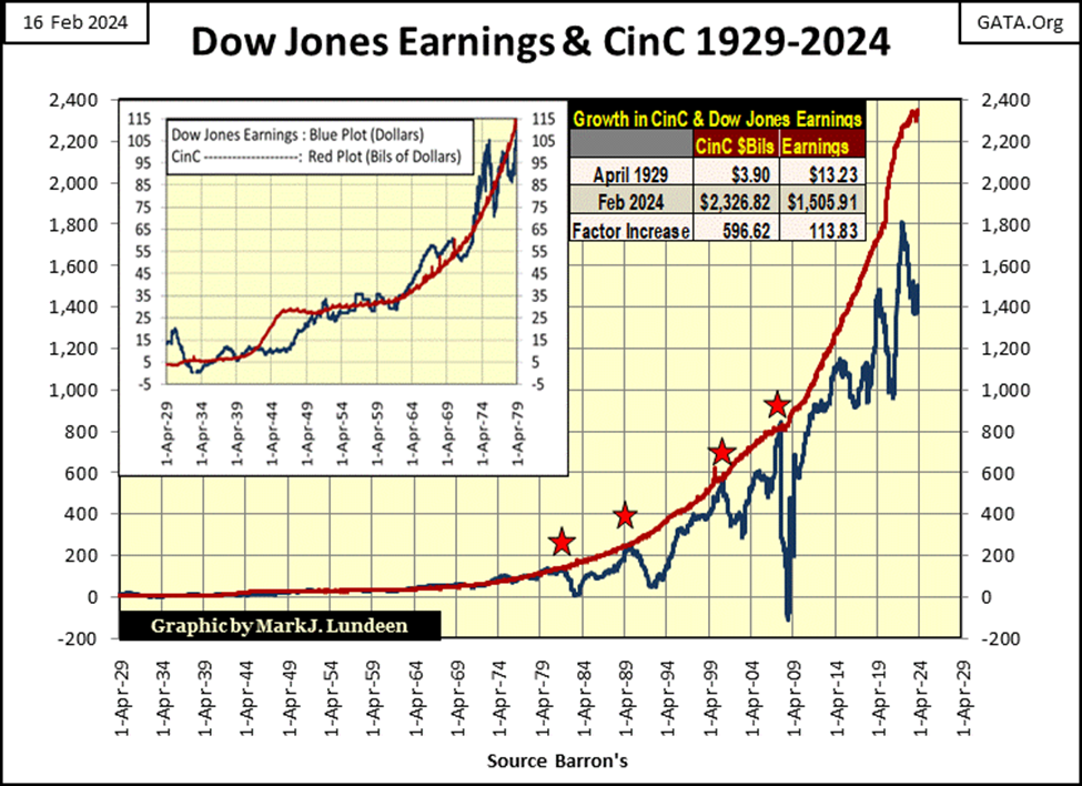
Since the 2007-09 sub-prime mortgage debacle, the last of the red stars seen above, since the FOMC began their regime of QEs in 2009, earnings for the Dow Jones have failed to rise to the red CinC plot. Currently, earnings for the Dow Jones are falling far behind inflation flowing from the Federal Reserve.
Why would that be? Maybe because inflation flowing from the FOMC is no longer flowing into the real economy as it once did, but primarily into market valuations trading on Wall Street, and CPI inflation in the economy? In 2024, both possibilities seem likely.
In any case, this chart above strongly suggests the bulls now running wild and free on Wall Street, are currently living in a land of make believe, as current market valuations are far above any economic justification to keep them there.
Bonds are a relic from a time when dollars were gold or silver coins minted at the US Treasury’s Mint, a time when money, as defined by law, was literally as hard as the coins a bond’s coupon payout was paid in.
A gold standard is deflationary, as growth in the money supply is fixed to whatever new gold or silver has been mined into existence from year to year, while the supply of things and services which money can buy tends to rise year after year, faster than the growth in the money supply.
For people receiving income from debt, deflation is good. In fact, for a nation of savers, deflation is wonderful as the dollars invested in debt from years ago, become more valuable as time passes by.
Bonds are * FIXED INCOME. * One would buy a 20Yr-bond for say $1000, and every year receive the coupon payment $50, for a 5% yield.
In the next twenty years the owner of this bond would have received $1000 in coupon payments, and their original $1000 back, because that was the contract. But unlike today, before the Federal Reserve System began managing “monetary policy” in 1913, the $1000 invested in a bond became more valuable after twenty years, purchasing more than it did twenty years before.
Now let’s look at the Dow Jones dividend payout (two charts above) – for the twenty years from October 2000 to October 2020. Dividend payouts are * NOT * fix income, but profit sharing for a company’s owners – the shareholders.
In October 2000, the Dow Jones was paying $176.32 annually in dividends. In the next twenty years, the Dow Jones dividend payout was increased to $615.04 annually in October 2020, a 348% increase in income over twenty years. Plus; from October 2000 to October 2020, the Dow Jones itself increased from 9,975, to 32,861, for a capital gains of 329% on the original investment.
No investment in fixed income could compare to that. Inflation flowing from the Federal Reserve System, flowed into the stock market, while the effects of this monetary inflation on the bond market was a chronic wasting away of the dollars bonds paid out in coupon payments, and the dollars returned to investors as bonds matured.
It’s been a while, but we’ve finally arrived at my chart for the Dow Jones 10 Utility Bond Average, every weekly data point from its first published values in Barron’s 03 January 1938 issue, to its last in Barron’s 08 April 2002 issue. The as published prices are seen in the blue plot, yields in the red plot. To show the effects of the sixty-four years of “monetary policy” by the idiots from the FOMC, I deflated the prices of these bonds with CinC, as seen in the green plot.
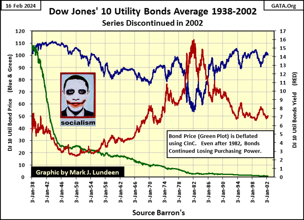
Exactly what does “deflating” these bond prices do for our understanding of the pernicious effects of “monetary policy” on the bond market, is best seen in the table below.
The top group of data shows the values published by Barron’s in January 1938, and in April 2002. Inflation, as measured by the growth in CinC, increased above the gains in the Dow Jones valuation. But note, the Dow Jones 10 Utility Bond Average actually lost $1.50 in nominal dollar terms over these sixty-four years.
To be fair to the bond market, buying, and holding bonds after their yields peaked in 1982, proved to be very profitable as yields continued to go down, bottoming in 2022. But buying bonds from 1954 to 1982, as yields increased to double-digits proved disastrous.
In the return on 1 Million Nominal Dollars Invested section of the table below, shows what $1,000,000 invested in 1938 in stocks and bonds became in 2002. A million dollars in the Dow Jones became $84,994,952. A million dollars in Utility Bonds (Fixed Income) became $985,479, or less than a million dollars.
A million dollars in 1938 represented an immense fortune. $20,000 bought its owner a penthouse overlooking New York’s Central Park, with the rest of this fortune providing the income a millionaire required to live the good life.
In 2002, a millionaire in New York City needed a day job to pay for a very middle-class existence, as that is what decades of monetary inflation did to a million dollars in bonds from 1938 to 2002. Much better to have invested a million dollars in the Dow Jones in 1938, and see the investment increase to over $84 million dollars in 2002.
Of course, as the Dow Jones inc. changed its make-up of the Dow Jones’ 30 companies in its average, there were taxes to be paid, so I doubt an investor would actually see $84 million in April 2002. But it would be a whole lot more that what the bond market did to a million dollars from 1938.
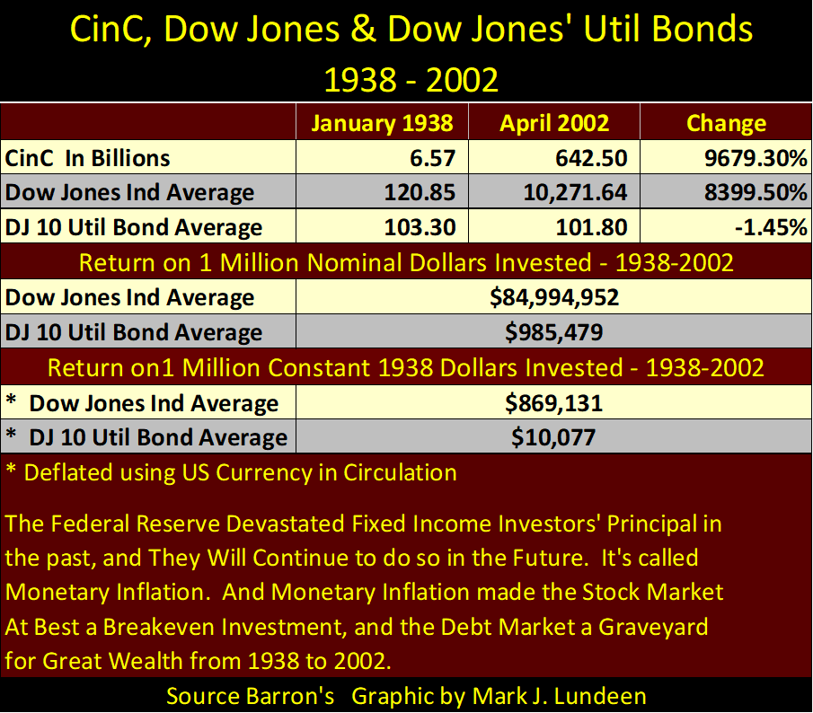
The bottom section of the table above shows the return on a million dollars in constant 1938 dollars, or dollars deflated by CinC, the green plot in the chart of Utility bonds above. In terms of 1938 dollars, the FOMC’s “monetary policy” confiscated $989,923, of the original $1,000,000 invested in these utility bonds by 2002.
There is a lesson to be learned here; absent a gold standard, investors in the bond market are the natural prey of bankers and the politicians they control. As bond yields have been rising since the early 2020s, in the years to come that lesson will once again be taught to investors of fixed income.
So, do I prefer dividend paying blue-chip stocks. If given no other choice than stocks or bonds, I would prefer stocks. But current valuations in the stock market are greatly inflated, and not suitable for my money. I like gold and silver bullion, and the companies that mine precious metals. Keep in mind; there are gold mining companies that pay a nice dividend. For reasons of income, forget bonds and dividend yielding blue-chip stocks, I’d look for income with the gold miners listed in the XAU. It goes without saying; do your own due diligence for what gold miner you want to invest with for income.
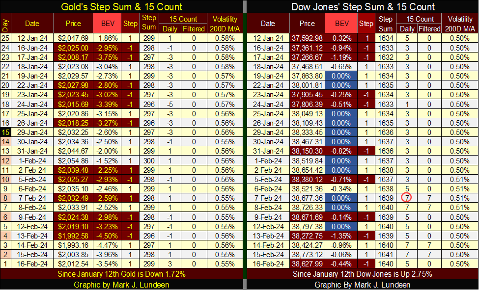
Looking at gold’s BEV chart below, as we did above for the Dow Jones, gold has closed in scoring position every day since November 13th, so we have to assume gold is in a market advance. But, and this is a * Big Butt *, where the Dow Jones has seen nineteen new BEV Zeros since last November, gold has seen only two, the last being on December 27th, almost two months ago.
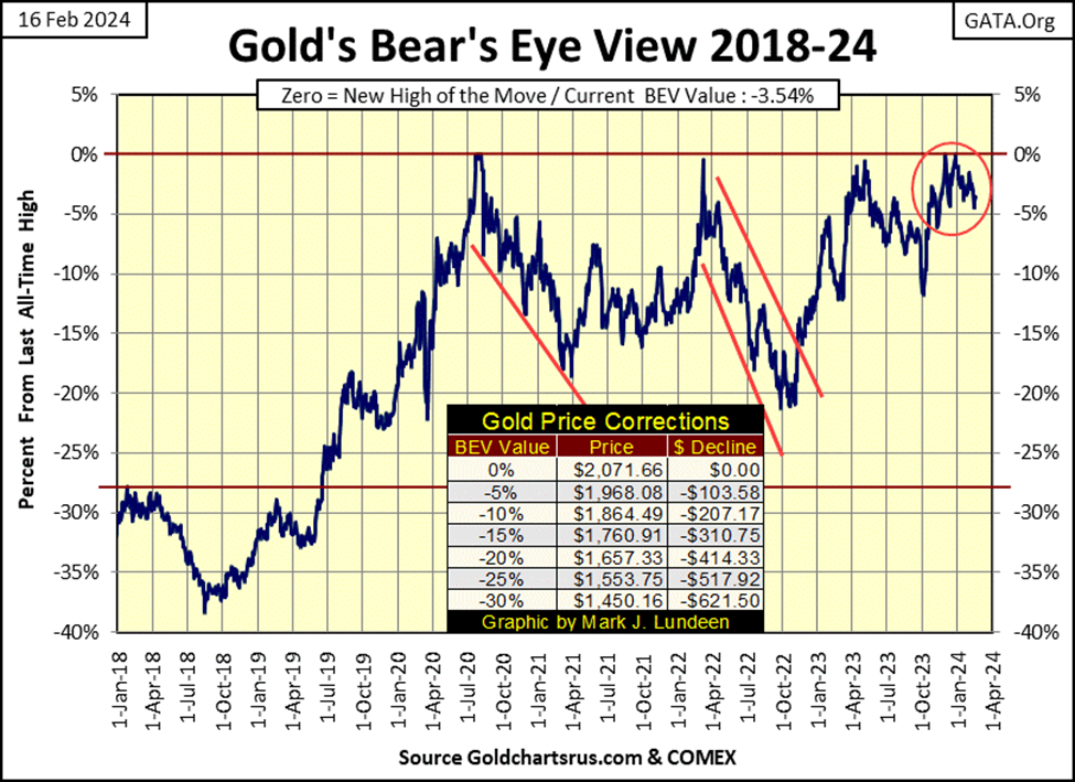
Look at gold and the Dow Jones in their step sum tables below, each with daily closes in scoring position as far as the eye can see in these tables. On the Dow Jones’ side of the table, look at all the pretty Blue BEV Zeros. But where are gold’s pretty Blue BEV Zeros on its side of the table?
The gold and silver markets are regulated by the US Government, and the government’s regulators are allowing investors in precious metal assets to be ripped off here, as they have been for decades. This graphic below really tells the story of how bad things are for the old monetary metals.
No doubt about it, when I send this out this week, I’m pouring myself a big tumbler of bourbon to ease my pain. Oh well, this too shall pass. Sometime in 2024? Why not? Tonight, when I refill my tumbler with even more bourbon, things will become even clearer.
__
(Featured image by Markus Spiske via Unsplash)
DISCLAIMER: This article was written by a third party contributor and does not reflect the opinion of Born2Invest, its management, staff or its associates. Please review our disclaimer for more information.
This article may include forward-looking statements. These forward-looking statements generally are identified by the words “believe,” “project,” “estimate,” “become,” “plan,” “will,” and similar expressions. These forward-looking statements involve known and unknown risks as well as uncertainties, including those discussed in the following cautionary statements and elsewhere in this article and on this site. Although the Company may believe that its expectations are based on reasonable assumptions, the actual results that the Company may achieve may differ materially from any forward-looking statements, which reflect the opinions of the management of the Company only as of the date hereof. Additionally, please make sure to read these important disclosures.


Bank of Africa Launches SME Pact to Boost Business Growth
Bank of Africa launched the “SME Pact, BOA & Maroc PME” to support Moroccan MSMEs through financing, advisory services, partnerships,...


ECB Adds Climate Risk Factor to Collateral Rules
The ECB has introduced a climate factor into its collateral framework, applying additional haircuts to corporate bonds exposed to transition...


SpaceX Bitcoin Move Sparks Debate Amid Market Uncertainty
SpaceX’s recent small Bitcoin transfer sparked speculation about a possible future sale, though analysts view it as a test transaction....


Payhawk Reaches $100M ARR Milestone with AI-Driven Growth
Payhawk surpassed $100 million in annual recurring revenue, achieving rare “Centaur” status. Growth was driven by restructuring around autonomous AI,...


BIP Sells BIC Incubator to Innova, Refocuses on Core Innovation Areas
Biovalley Investments Partner (BIP) sold its entire stake in BIC Incubatori FVG to Innova, both Trieste-based firms and longtime users...
 |
|
 |  |
 |
|
-

 Cannabis1 week ago
Tilray Acquires HelloMD to Expand Medical Cannabis Digital Platform
-

 Markets4 days ago
Rice Prices Rise as Supply Outlook Tightens and Demand Stays Mixed
-

 Cannabis2 weeks ago
Youth Cannabis Use in Colorado Is Falling — But the Full Story Is More Complex
-
 Biotech1 day ago
BIP Sells BIC Incubator to Innova, Refocuses on Core Innovation Areas