Business
Dow Jones Breaks 50,000 as Bull Market Surges Amid Caution and Volatility
Dow Jones surpassed 50,000, sparking excitement and anxiety about an inflation-driven market bubble. The author expects potential moves toward 55,000–60,000 but warns of future downturns. Markets remain strong in 2026, while gold miners stay volatile. Silver’s sharp pullback is seen as temporary, encouraging investors to hold rather than sell during declines and stay patient long-term.
It happened. I prayed it wouldn’t, but then it did. Since entering scoring position in November 2023, the Dow Jones closed this week with its 79th BEV Zero, a new all-time high at 50,115.67. The Dow Jones is now trading at over 50,000, and I can feel my heart throbbing inside my head, as the room spins around me. I need my medicine, a generous glass of Wild Turkey 101. And then an hour or so to sit in a room that is silent and dark, and all will be well again, maybe, hopefully.
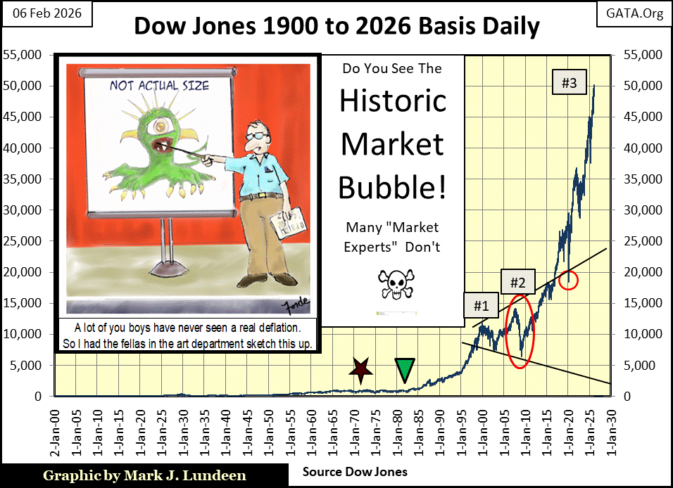
Geeze Louise; fifty thousand on the Dow Jones, and I keep telling myself; “Mark – take it easy, don’t do anything stupid, and for the love of God, don’t look down!” But I do look down, and feel a bit nauseated by the view, as I know someday, this will not end well for most people.
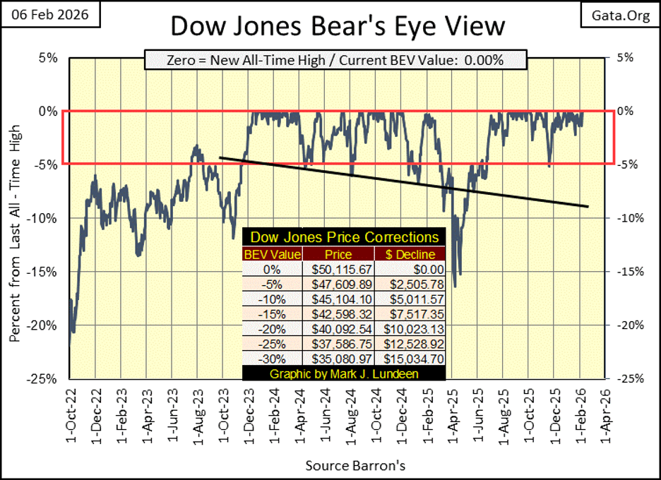
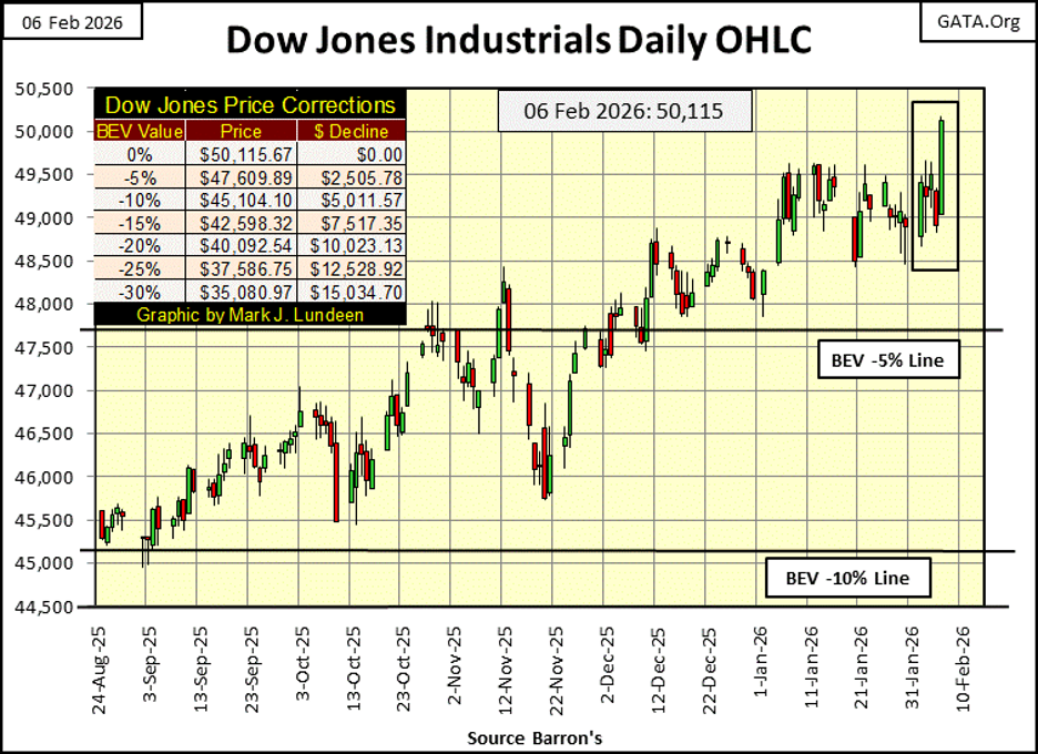
Below is another view of the Dow Jones this week, closing above 50,000. Actually, looking at the Dow Jones in daily bars is much better than looking at it in Bear’s Eye View format above.
For the past five weeks, the Dow Jones sometimes did trade above 49,500, but failed to close above 49,500. Until today, Friday, the last day of the past five weeks, when the Dow Jones surged, and then closed above 50,000, as seen in the chart below.
So, what is next? I don’t know, and I don’t like thinking about it unless I’ve self-medicated myself with at least two glasses of my medicine. Thinking of 55,000 as the next critical level of resistance for the Dow Jones to break above seems trivial. At today’s close, the Dow Jones is less than 900 points away from 60,000. That is only 19.72% away from today’s close of 55,115. So, that is my next threshold to break above for this inflationary lunacy in the stock market, a Dow Jones close above 60K, sometime in 2026.
Of course, the Dow Jones may never get there. And then again, why wouldn’t it? After all, this is a market that likes its numbers BIG, and 60,000 on the Dow Jones is a Very BIG Number.
Looking at the major market indexes BEV values below, this week saw a good number of new all-time highs, aka six BEV Zeros highlighted in pink below. Friday closes with six of these indexes closing at a new all-time high, and the next nine closing in scoring position, or closing within 5% of their last all-time highs.
So far in 2026, the stock market is showing no indication of seeing its current bull market advance stalling out. One of these days, this table will no longer indicate any of these indexes closing at a new all-time high (0.00%), but most will see BEV values below -30%, and much more from their last all-time highs. But when? That is a good question, I don’t have a good answer too.
Look who is at the bottom of the list; the XAU, which just a few weeks ago, was at the top of the list making new all-time highs, day after day. But the gold miners, like gold and silver bullion, is a volatile market, meaning that when it moves, it does so in large daily moves.
The XAU closed the week with a BEV value of -13.12%, or 13.12% below its last all-time high. In a good week, the XAU could move up by 15%, or more, so don’t think the gold miners in the XAU can’t break into record high territory in the weeks and months to come.
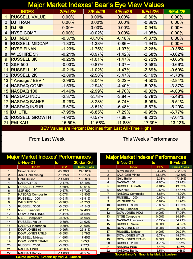
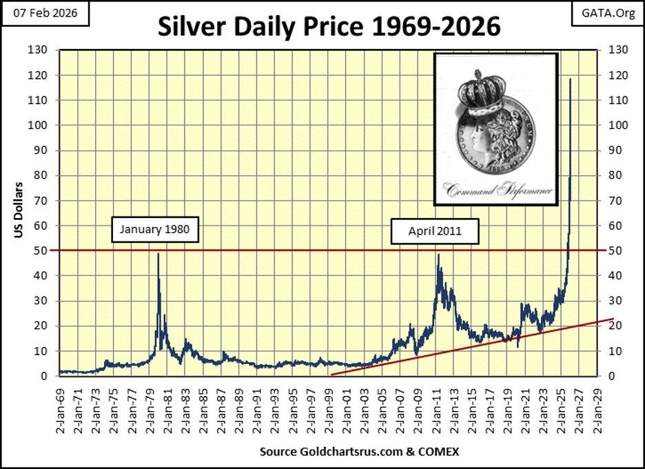
Looking at this week’s performance table above, silver, the XAU, and gold bullion remain in the top three spots, by significant factors too. Silver didn’t see a new all-time high, a BEV value of 0.00% since January 1980, until October 8th of 2025, not all that long ago. Since then, in the past four months, silver has made thirty-one new all-time highs, closed this week with a BEV of -34.24%.
A BEV of -34.24% means a close at $77.89, or 34.24% below silver’s last all-time high of $118.45, seen on January 28th, just seven trading days ago, ouch! In silver’s chart below, plotting silver in dollars, we cannot even see this seven-day, 34.24% retracement in the price of silver.
Should one sell? If you need some money for a good reason, sure. But this isn’t a time to sell silver for fear of further declines in price. Rather, the farther silver declines, the more attractive silver becomes as an investment. Don’t let this bull throw you off his back. So, hold on tight, and ride-em cowboy!
Do they still say that? That when it comes to stocks, bonds, really anything that trades in a liquid market; the higher risk, the higher the yield. What does that mean?
Years, decades ago, Barron’s and other publishers of financial data published prices and yields for liquid corporate bonds, corporate bonds that actively traded. Exactly as they still do today with companies’ shares trading daily at the NYSE and NASDAQ. It was understood the higher a bond’s current yield, the higher the risk a bond offered any money invested in it.
So, low yield = lower return, but safety for invested funds. Higher yield = higher possible return. But buying high yielding bonds, may prove be a bad speculation, where money could be lost.
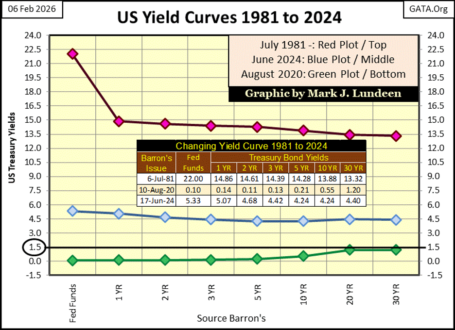
That is why Treasury bonds, have always yielded less than best grade corporate bonds. Though during the last half of 1981, when the entire yield curve was well above 10%, and the Fed Funds Rate was over 20% (Red Plot Below). There were a few issues of Barron’s from the early 1980s, where Barron’s Best Grade Bonds Index (corporate bonds) yielded a few basis points below the US Treasury’s long bond yield. For a few weeks in 1981, the bond market saw T-Bonds, as a higher risk to invested funds, than best grade corporate bonds.
Why was that? Because the US National Debt had then increased to something above $1 trillion dollars, and the financial markets from five decades ago were aghast that it did so. Today, the US National Debt is over $38 trillion dollars, without much being said about that in the financial media, or concern about that by the public. This complacency about Uncle Sam owing $38 trillion is not good.
But sometimes, high risk speculations pay off. In the early 1980s, in Barron’s corporate bond table, a company I never heard of called Navistar, had a bond trading whose current yield was 50%. As my eyes scanned the bond table, that got my attention. You could stake $100, and in the first year, and every year thereafter, this bond is sending you $50, for every Navistar bond anyone purchased for $100.
These bonds were deeply discounted! This was a long time ago, so my memory on the specifics for these bonds is not as good as they once were. But I recall, you could buy a $1,000 bond for less than $100. So, for a $1,000 invested, an investor could purchase ten Navistar bonds, and received $500 a year income. And when the bonds matured in a few years, these Navistar bonds paid back $10,000 for the $1,000 invested. Well, sign me up!
But long ago, why weren’t other people buying these bonds? Older, and now much wiser, I now know Navistar was the radioactive left overs of a once vast American industrial giant: International Harvester, IH. IH, was a manufacturer of farm equipment, a company that was as large as any of America’s automobile manufacturers. International Harvester was huge. In 1979, IH saw its most profitable year, see video below.

A few, and very hard years later, what was left of IH was rolled up into a new corporate shell called Navistar. A new company that everyone knew was going to go bankrupt too. And IH’s once low yielding, best-grade bonds, became Navistar’s junk bonds, deeply discounted, yielding over 50%, that the smart money in 1981 avoided.
Should my readers ever have the opportunity to time portal back into the early 1980s, and want to become rich beyond their wildest dreams. Buy every one of those Navistar bonds you can afford, as Navistar (the old International Harvester) survived, and made good on the principal and interest of all of those bonds. After that, wait until Apple Computer begins trading on the NASDAQ, and use the proceeds from Navistar to buy Apple. By 2000, a time traveler from 2026 won’t have to worry about paying rent anymore.
Navistar today is no more, the company changed its name to International, and is now a truck manufacturer. Good for them!
Okay, that was very interesting, but what is the point? The point was to highlight the fact that things can change, and change quickly over time. What the markets once believed was solid as concrete, can quickly change in to quicksand.
Case in point; in the past century, the risk profiles of the bond and stock markets have changed greatly, thanks to the many decades of “monetary policy” dictated by the idiots at the FOMC.
In the chart below, plotting Barron’s Best Grade Bond Yields (Red Plot), and the dividend yield for the Dow Jones (Blue Plot). From 1934 to 1958, yields for Best Grade Bond Yields were lower, than the dividend yield for the Dow Jones. Why? Because exposing money in the stock market, was risker than investing in best grade bonds.
Take a moment to study the plots below from 1934 to 1958, twenty-four years. There were times the Dow Jones dividend yield declined to where best grade bonds were yielding. Such times were called bull-market tops for the Dow Jones.
There were also times when the Dow Jones dividend yields spiked up, far above best grade bond yields. Such times were called bear-market bottoms for the Dow Jones.
Yields for best grade bonds didn’t change much, because come bull or bear market in the Dow Jones, valuations for these best grade bonds didn’t change much. That was why best grade bonds were known as; low yield, low risk investments. They may have been boring, but very safe.
Ninety years ago, investors could use yields in the stock and bond markets to time entry and exit points in the stock market. When the dividend yield for the Dow Jones was something over 6%, the stock market paid investors for accepting the higher risks inherited in stock ownership. And those times when the Dow Jones dividend yield was approximately the same as the yield for Barron’s Best Grade Bonds, investors were not compensated for the risks of owning shares.
Look at January 1938, the Dow Jones was yielding almost 8%, while best grade bonds were yielding about 3.5%. Why was the Dow Jones yielding so much more than best grade bonds? Because the Dow Jones had fallen 50%, lost half of its valuation from its highs of August 1937, when it yielded a bit below best grade bond yield. Buying stocks when the Dow Jones’ dividend yield was about the same as Barron’s Best Grade Bond Yields? Before 1958, not a good idea.
Before 1958, when the dividend yield for the Dow Jones approaches that of best grade bonds, it was a market top for the Dow Jones; sell the stock market and buy best grade bonds.
Which wasn’t hard, as one could sell the shares of General Electric (GE), and buy GE bonds instead. The yield for General Electric bonds and its shares was about the same in August 1937, when market risks for shares in GE made them unattractive. What did a 1930’s investor lose swapping GE stocks for GE bonds in August 1937? Nothing as far as the income from their investment in GE, except the possibility of losing half of their investment in GE shares, in the next seven months!
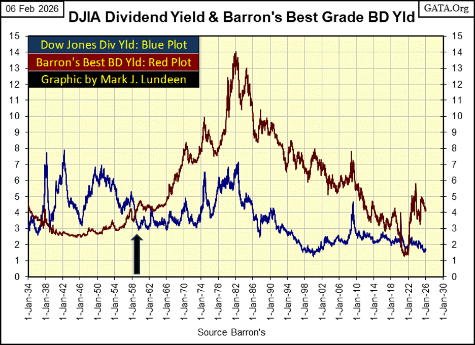
You can see the pre 1958 pattern above; sell best grade bonds, buy stocks when the dividend yield for the Dow Jones was over 6%. Sell stocks, buy best grade bonds when the dividend yield for the Dow Jones declined near the yield for best grade bonds. This system maximized income, while minimizing market risks inherited in the stock market.
That was an excellent mechanical system, for timing entry and exit points in the stock market, until 1958. As beginning in 1958, to this day, the yields for Barron’s Best Grade Bonds increased above those of the Dow Jones dividend.
Why would they do that? Because in 1958, best grade bonds ceased being a lower risk investment than the Dow Jones. In fact, best grade bonds became a machine, a meatgrinder for the destruction of personal wealth.
The Dow Jones once had a bond series for Utility Bonds, its 10 Utility Bond Average (DJ 10UBA), which Barron’s published from 1938 to 2002, when this bond series was discontinued by Dow Jones. Which was a shame, to stop publishing a historical financial series, as seen below.
Anyway, there is no better, safer bond than one issued by an electrical utility. Or so one would think. Below we see every weekly published value of the DJ 10UBA, from 1938 to 2002, both the price (Blue Plot), and yield (Red Plot). During these sixty-four years plotted below, the 10 UBA’s valuation went from 103 in 1938, to 101 when discontinued in 2002. A sixty-four-year loss of $2.00.
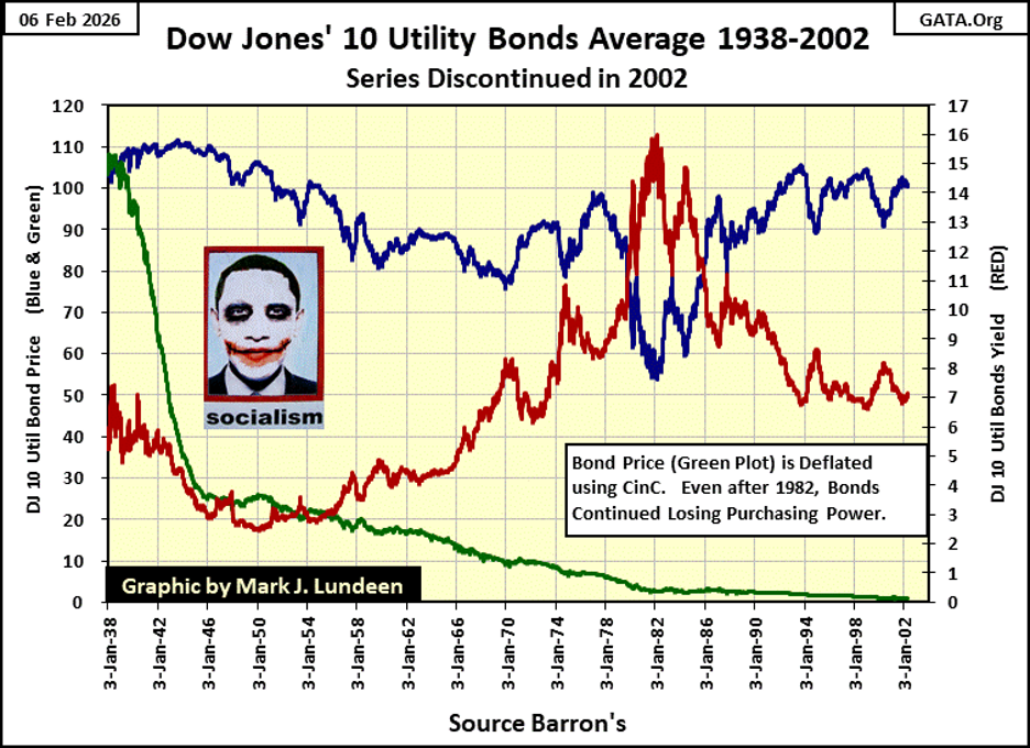
From the standpoint of wealth preservation, the sixty-four years seen above are alarming! For example, what happened to a fortune of a million dollars from 1938 to 2002.
In 1938, a million dollars was an astounding fortune. A million dollars invested in utility bonds yielding 3.5%, generated sufficient revenue ($35,000 a year), for a millionaire to live in a New York penthouse over looking Central Park, to be a world traveler, and enjoy the finest things life has to offer wealth. A million dollars invested in blue-chip, dividend paying stocks provided the same lifestyle, in 1938.
But what happened to a million dollars invested in best grade bonds, or the Dow Jones by 2002 is shocking, as seen in the table below. And what does an income of $35,000 today, provide a millionaire living in New York City today?
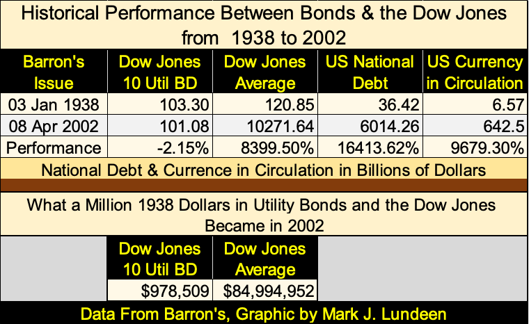
Above, we see a $1,000,000 invested in utility bonds in January 1938, became worth only $978,509 by April 2002, while a million dollars invested in the Dow Jones (blue-chip, dividend paying stocks) inflated its valuation to $84,994,952.
The problem with best grade bonds, was the dollars their prices and coupon payouts represented, lost most of their purchasing power from 1938 to 2002. This was because the US Government was inflating the money supply with an ever-increasing supply of inflationary dollars, as seen in the increases in the US National Debt, and CinC in the table above.
Today’s bond market is an anachronism, a relic from the days when the dollar was defined in terms of gold or silver. Governments and corporations love issuing bonds into the bond market. They receive today’s dollars from bond buyers, then service these debts with dollars that only lose value in the coming years and decades. Buying bonds that mature decades into the future, issued in units of inflation, like the US dollar, is a mug’s game.
I see that President Trump is selecting Kevin Warsh as the next FOMC Idiot Primate. Warsh is a former idiot at the FOMC. When he left the FOMC in 2011, he gave a speech at Stanford, that I took the quote seen below. Note his comments on bonds no longer being useful in analyzing market valuations.
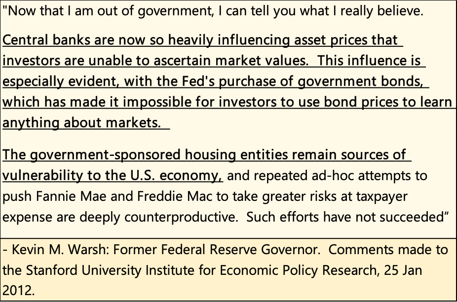
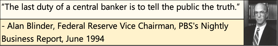
Now that he is back in the government, as FOMC Idiot Primate, Mr. Warsh will no longer tell us what he really believes. No doubt, our new Idiot Primate will take the hint of what a central banker should tell the public, from Alan Blinder below.
I don’t really know any of these people, the members of the FOMC. I suspect they are brilliant people, much smarter than I could ever be. But is that a blessing to them, or to the society they would claim to serve. Because they really do know exactly what they are doing whenever they “inject liquidity” into the financial system; they are stealing from everyone who makes a living by earning dollars. Be they the guys who weekly pick up my garbage, or affluent people who clip bond coupons as a source of income. Retired people, who live on fixed income, are these people’s natural prey.
Is that something a brilliant academic, someone who crafts “monetary policy” be proud of? I think not. I believe Kevin Warsh is one of the best of a bad bunch, the idiots at the FOMC. But the world was a better place before there was a FOMC to “manage monetary policy,” for the many decades from long ago, when the price of an ounce of gold was fixed by law at $20.67.
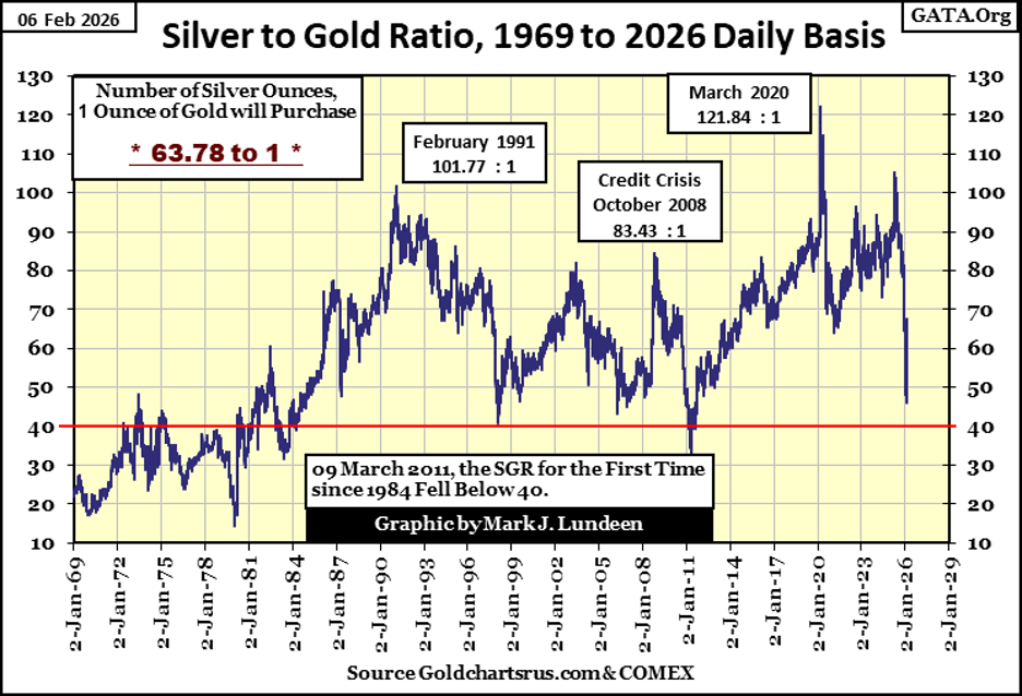
We saw some excitement in the gold and silver markets this week. The silver to gold ratio (SGR), chart below, last week broke down below fifty ounces of silver for one ounce of gold. That is what we expect to see during a bull market in gold and silver, that an ounce of gold will purchase fewer ounces of silver, as the precious metal bull market advances.
However, this week the SGR backed up a bit, to 63.78 ounces of silver, for one ounce of gold. Expect to see the SGR continue to trend downward as the gold and silver bull market continues, but there will be occasional retracements, as we saw this week, and possibly in the month to come.
I chose to publish a longer-term BEV chart for gold this week, so we could see what happened to gold following its last all-time high (BEV Zero) in August 2011 in the chart below.
Following gold’s August 2011’s last all-time high, it took fifty-two months for gold to bottom at its BEV -45% line; deflate by 45% from its last all-time high of August 2011. And this bear market in gold saw two bottoms. As gold once again broke down in late 2012 and early 2013, as this bear market entered its terminal decline, the price of gold saw some massive daily percentage declines, that ultimately shattered the moral of the gold bulls.
By the time gold saw its ultimate 45% bear market bottom in December 2015, being a bull on gold made one about as popular as a guy with a loathsome disease hanging around a singles bar.
But big market moves, be they up or down, end only one way; in exhaustion. Looking at gold’s BEV chart below, from August 2011 to December 2015, we see a lot of movement during those fifty-two months. But at the 45% bottom, the bears were exhausted, and it was time for gold to once again began to rise to new all-time highs. Though, that took over four years for that to happen, in August 2020.
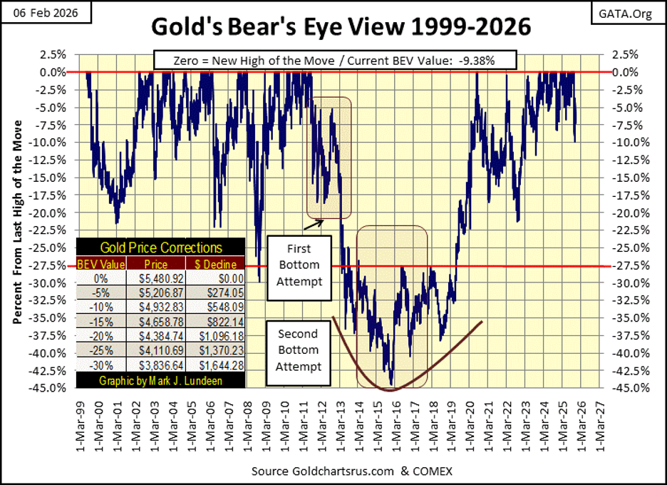
Looking at this BEV chart, from December 2015 to this week’s close, we see a massive move in gold to the upside. Since gold entered scoring position in November 2023, this advance in gold has generated 100 new all-time highs (BEV Zeros). That is a lot of new all-time highs!
Question: has this advance in gold, that began in December 2015, exhausted itself? It could have, but I doubt it. For one thing, no major market advance becomes exhausted, until the public becomes fully invested in it. It’s the stock market that has the public fully committed to it, not gold, silver, and their mining shares. For that reason, I’m much more concerned about the Dow Jones doing something shocking to the downside in 2026, than I am for gold.
That isn’t to say that precious metal assets won’t see corrections in valuations that will distress its bulls, or that the Dow Jones can’t inflate its valuation far above 60,000 in the year to come. Both may be true, and then maybe neither will happen.
Keep in mind; when you expose your hard-earned money into the market, you are exposing it to market risk. But in 2026, I believe the risk profiles for gold and silver, are much more attractive than for anything now trading in the stock market, unless that thing is a miner for gold and silver.
Looking at gold’s step sum table below, we see a sharp price correction following its last all-time high, seen on January, 28th. After all those other BEV Zeros seen since January 2nd, a sharp pullback in valuation is something to be expected.
Gold’s daily volatility’s 200D M/A is now above 1%. Good!
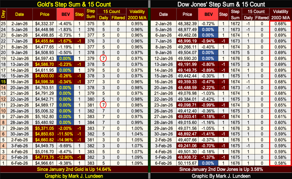
On the Dow Jones side of the step sum table above, the Dow Jones is generating new all-time highs, as seen at this week’s close. Daily volatility for the Dow Jones continues going down. From 0.68% on January 2nd, to this week’s close of 0.58%, which is very bullish for the stock market.
Is it just me? But this stock market advance is beginning to look like Dracula. This unholy thing is not going to die, until someone hammers a wooden stake into its heart. You can be sure that won’t be Kevin Warsh!
Is that something good? It could be, until Mr Bear returns to Wall Street with copious supplies of garlic and holy water, to first subdue this advance, before he does the required dirty deed to terminate this historic, forty-four-year inflationary bubble in the Dow Jones. That is something I’m not looking forward too!
But when? I don’t know. So, I’m expecting to see the Dow Jones trading over 60,000 before 2026 is over.
__
(Featured image by LeeLoo the First via Pexels)
DISCLAIMER: This article was written by a third party contributor and does not reflect the opinion of Born2Invest, its management, staff or its associates. Please review our disclaimer for more information.
This article may include forward-looking statements. These forward-looking statements generally are identified by the words “believe,” “project,” “estimate,” “become,” “plan,” “will,” and similar expressions, including with regards to potential earnings in the Empire Flippers affiliate program. These forward-looking statements involve known and unknown risks as well as uncertainties, including those discussed in the following cautionary statements and elsewhere in this article and on this site. Although the Company may believe that its expectations are based on reasonable assumptions, the actual results that the Company may achieve may differ materially from any forward-looking statements, which reflect the opinions of the management of the Company only as of the date hereof. Additionally, please make sure to read these important disclosures.


The TopRanked.io Weekly Digest: What’s Hot in Affiliate Marketing [++ KuCoin Affiliate Program Review]
X now allows people to block certain topics from their feed. This week, we're going to tell you how to...


Hotel Stay Project Supports Wildlife Conservation in Japan
Iwate Prefecture launched a project linking hotel stays to conservation through Morioka Zoological Park Zoomo. A themed room at Yunomori...

Bitcoin Leads Modest Crypto Rebound Amid Mixed Signals
Bitcoin rose 2 percent to above 77000 as ETFs saw 15 million inflows and April gains of 12.2 percent. Ethereum...


Major Pharma Advances: EU Approvals, Vaccine Progress, and Breakthrough Clinical Results
Johnson & Johnson has EU approval for nipocalimab for generalized myasthenia gravis, showing superior control and sustained benefits. Sanofi reported...


Agential Cannabis 2026 to Drive APAC Market Growth and Global Industry Collaboration
Agential Cannabis 2026 will take place September 23–24 in Bangkok, bringing global experts together to advance the APAC medical cannabis...
 |
|
 |  |
 |
|
-

 Cannabis2 weeks ago
Misiones to Close State Cannabis Firm to Cut Costs and Boost Efficiency
-

 Biotech2 days ago
Johnson & Johnson Expands U.S. Biomanufacturing Amid Policy Shifts and Rising Demand
-

 Crowdfunding1 week ago
Pelorias Sea Sound 2026 Launches Community-Driven Crowdfunding Campaign
-
 Markets4 days ago
Markets Rally Amid War Strains and Blockade Uncertainty