Markets
Dow Jones’ Bull Markets and the Bond Market
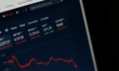
The Dow Jones has seen significant growth, advancing from 10,847 in 2006 to 41,198 in 2024, a 280% increase. However, the market is now experiencing a historic boom, with frequent new all-time highs since 1990. This suggests an inevitable bust in the future. Historical patterns show the market’s current behavior is unsustainable long-term.

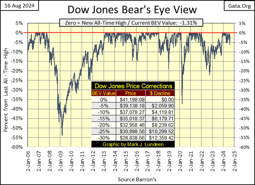
The Dow Jones, in its BEV chart below doesn’t much look like it, but it closed the week only 1.31% from its last all-time high. Something that didn’t seem likely on Monday August 5th, when the venerable Dow closed with a BEV of -6.06%, on a day when the global stock markets melted down on bad news of the unwinding of the Yen-Carry Trade.
Don’t think it couldn’t happen again, with the Dow Jones, and the rest of the global stock market continuing to deflate to deeper levels than just a 6% decline from their all-time highs. I can guarantee that someday this will happen; I just don’t know the day it will happen.
This BEV chart for the Dow Jones goes back to January 2006, almost twenty years of data. And just eyeballing it, the daily closings in scoring position (-0.01% to -4.99%) are about half of all daily closings since the end of 2005. Taking the Dow Jones up from 10,847 on 03 January 2006, to 41,198 on 17 July 2024; an advance of 280% in the past eighteen years. Not bad for a bunch of old-fashion, dividend paying blue-chip stocks, but far from the 680% the NASDAQ Composite has advanced, with its focus on high-tech during this same time.
But things as they are now, are far from where they used to be many decades ago.
The nice thing about a Bear’s Eye View (BEV) plot, where each new all-time high (aka; BEV Zero = 0.00%) registers only as a 0.00%, and every daily close not a new all-time high, registers as a percentage claw-back from its previous BEV Zero, allows one to construct a frequency table, as the two freq tables seen below.
Below is a record of every daily BEV closing for the Dow Jones since 02 January 1900 (124 years), but separated at the end of June 1990. Why June 1990? This was about when FOMC Idiot Primate; Alan Greenspan, began inflating his first, of three massive bubbles in the market, his NASDAQ High-Tech bubble.
On the left side, we see 25,025 Dow Jones’ daily closings, from the first NYSE-trading day of the 20th century, to 29 June 1990. To see how bullish any period of market history is with a freq table, we add the percent-of-days for the 0.00% and -0.0001% rows, because when any market is advancing into history, its daily BEV values accumulate in these two rows.
From 1900 to 1990, for ninety years the Dow Jones was either making new all-time highs (0% row), or closing in scoring position (-0.0001% row), for 19.79% of its daily closings. So, spanning from 1900 to 1990, the Dow Jones was either making a new all-time high, or daily closing in scoring position, where new all-time highs spring from, for one out of every five trading days.
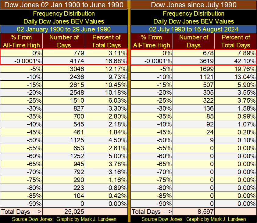
What a difference the next thirty-four years would be.
On the right side of the above table, we see the 8,597 daily BEV closings for the Dow Jones, from 02 July 1990 to the close of this week. Adding the percentages seen in the top two rows, since July 1990, the Dow Jones has either made a new all-time high, or closed in scoring position, for 49.99% of its 8,597 NYSE trading days. That is one of every two days since July 1990, the Dow Jones either closed at a new all-time high, or closed in scoring position. This is a huge difference in the Dow Jones, from before July 1990.
Looking at the tables above, I’ve concluded the stock market is currently in a historic market boom, a historic market boom that one day must be followed by an equally historic market bust, a market event I want no part of.
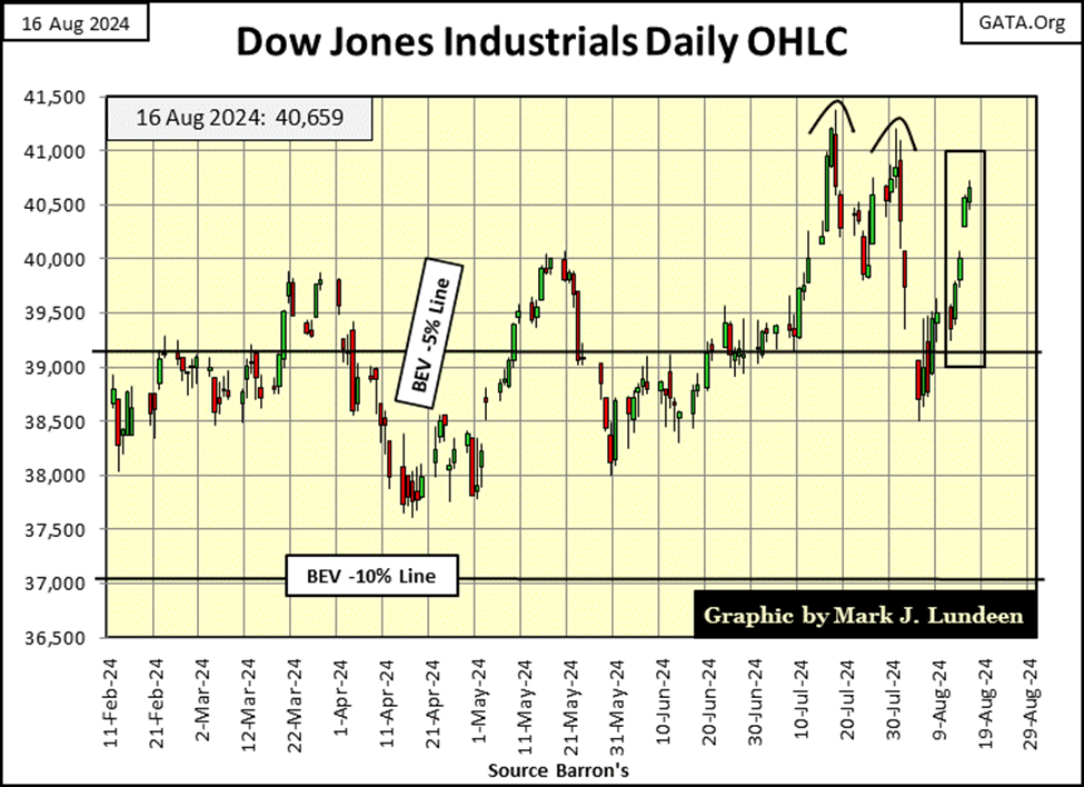
Next is the Dow Jones in daily bars. The Dow Jones has recovered nicely from its lows of August 5th. Will it now take out its high of three weeks ago, and then on to new all-time highs?
Let’s keep this simple; as long as the Dow Jones remains above it’s BEV -5% line (in scoring position), it’s best assuming it will continue making new all-time highs. That doesn’t mean it will continue rising without a few pullbacks from here, though it could.
We must keep the following in mind;
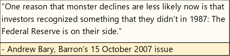
The one problem with the above quote is; Mr. Bary made this observation in the Barron’s issue that published the very top of the Dow Jones sub-prime mortgage bull market; 11,722. Still, he was nonetheless correct, as the Federal Reserve’s QE1 fourteen months later, placed the bottom under the second deepest bear market decline (54%) in Dow Jones history.
Until the idiots at the FOMC decide to leave the market to its own resources, we should expect they will continue keeping this market’s over inflated valuations – over inflated. What that will look like with the Dow Jones in daily bars below, will prove to be interesting. Dow Jones at 50,000? And then maybe not.
This week, the table listing the major market’s BEV valuations below, saw one new all-time high (BEV Zero) on Friday’s close, with the next ten indexes closing the week in scoring position. Taking a moment to study the gains from Monday to Friday, each index saw big gains this week.
In the performance tables above, gold remains at #1, with silver (#3) and the XAU (#8) up nicely from last week’s table. The question in my mind is; can they keep this up for the rest of 2024?
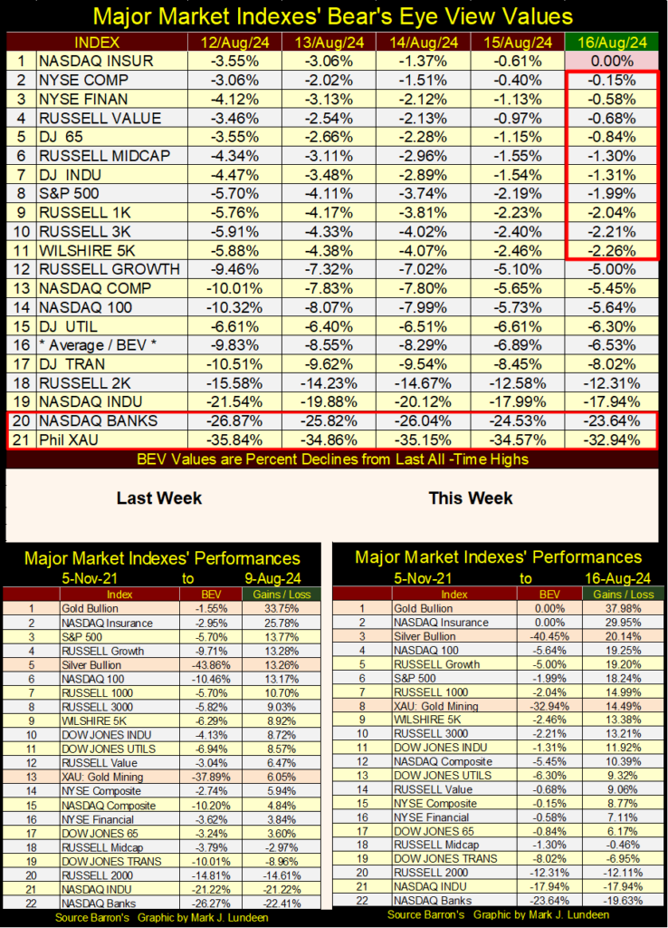
One problem this market has, is the banking stocks are so weak, #20 in the BEV table above, and #22 in the above performance tables.
Below is a chart for the banking indexes, using three different weekly-data series;
• Barron’s Stock Groups (1938 to 1988)
• Dow Jones Total Market Groups (1989 to 1996)
• NASDAQ Banking Index (1997 to this weeks close)
The top chart shows why long-term charts, using dollar values are so seldom used in market commentary; because the dollar as a unit-of-measurement, is a flawed one. After nine decades of being abused by a gaggle-of-idiots at the FOMC; what else would we expect? Remember the nickel Hershey chocolate bar from the 1950s & 60s? It’s still here, but now costs well over a dollar.
Looking at the top chart below, not until 1993, that in terms of dollars, before these banks have done anything, and that isn’t true.
Much better to look at these banks using my Bear’s Eye View (BEV) format; where each new all-time high is equal to a 0%, and never more. Each data point not a new all-time high, registers as a negative percentage claw-back from its last all-time high.
Using my BEV format, from 1938 to 1973, these banks never saw a claw-back greater than a BEV -35%. However, following 1973 (after the August 1971 termination of the Bretton Woods $35 gold peg), these banks have seen many weekly closes below their BEV -35% line.
That isn’t an accident of market history. Since the dollar was decoupled from its $35 gold peg, America’s banking system has become a source of market instability. The red circle above covers their most recent debacle, where banks in Silone Valley closed their doors, because bond yields were rising (bond values declining).
The banks have since recovered nicely, even if their financial situation hasn’t. But being the bear I am, I wonder whether they will next see a new all-time high (0.00%), their first since November 2021, or once again break below their BEV -35% line?
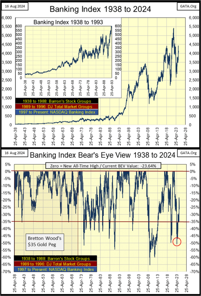
Below is a chart plotting Dow Jones earnings (in dollars), along with Currency-in-Circulation (CinC); the total issuance of paper US dollars (in billions of dollars). The amazing thing to note about this chart, from 1929 to 1979 (50 years), for every $1 billion dollar increase in CinC, the Dow Jones saw about a $1 increase in earnings.
These two plots weren’t bolted together for these fifty years, as seen in the chart’s insert, plotting these fifty years. Still, it’s evident, rising Dow Jones earnings were driven by monetary inflation flowing from the Federal Reserve.
For the next three decades (1980 to 2008), Dow Jones earnings became decoupled from CinC, though on three occasions;
• 1990; Top of Japanese Stock Market, and Real Estate Bubble,
• 2000; Top in NASDAQ High-Tech Bubble,
• 2008; Top in Sub-Prime Mortgage Bubble,
earnings for the Dow Jones caught up with CinC, if only for a short time at the top of these financial bubbles.
In the busts following these booms, earnings for the Dow Jones declined significantly. At the March 2009 bottom for the sub-prime mortgage bust, earnings for the Dow Jones went negative, for the first time since the 1929-1932 Great Depression Crash.
Since the 2008-09 bust in sub-prime mortgage bubble, earnings for the Dow Jones have made several attempts to catch up with CinC, failing at every attempt, with the earnings for the Dow Jones becoming increasingly decoupled from “liquidity” flowing from the FOMC.
Looking at the chart above from the viewpoint of the “policy makers,” using my totally inadequate understanding of whatever that could possibly be; for the fifty years spanning 1929 to 1979, their “monetary policy” was functioning as designed, with every $1 billion of CinC “injected” into the financial system, resulting in $1 in Dow Jones Earnings.
Fifty years is a long time. It’s difficult arguing this was an accident spanning over five decades, though if someone wanted to make that argument; have at it.
For the next three decades (1980 to 2008), Dow Jones earnings became decoupled from CinC. But three times merging with CinC at the top of a major bull market, indicates to me, that the system was breaking down. No longer was “liquidity” flowing from the FOMC, and earnings for the Dow Jones in a state of equilibrium; where $1 billion of CinC = $1 of Dow Jones earnings.
Since 2008; since the idiots at the FOMC have had to use Quantitative Easings (QEs) to manage asset valuations in the financial markets, CinC inflation and Dow Jones earnings have totally decoupled. That seems odd. I would have thought more of this monetary inflation would have flowed into the Dow Jones earnings. But in the chart above, that isn’t what has happened.
As time goes on, it seems reasonable, assuming CinC inflation will have less influence on Dow Jones earnings. For the stock-market bulls, can that be good?
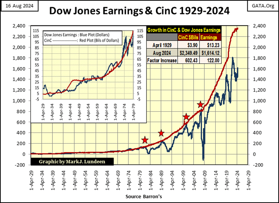
There is more to a bull market, for the Dow Jones than just its earnings. The bond market is also a significant factor in bull markets in the financial sector.
Why would that be? Let’s do ourselves a favor, and look at corporate bond yields going back to 1934, courtesy of Barron’s Best and Intermediate Bond Yields. Keep in mind;
• rising bond yields = bear market in bonds.
• falling bond yields = a bull market in bonds.
These two-bond series are both investment grade;
• Best Grade Bonds = Corporations with little debt load, that easily service their debts in good times and bad,
• Intermediate Grade Bonds = Corporations with heavier debt loads, that easily service their debts in good in good times, but struggle to service their debts in bad times.
During good economic times, both these bond series have similar yields, because during the good times, intermediate grade corporations have no problem servicing their debts. Go back to 1935 to April 1937 in the chart below, to see how this was so.
Then 1937 happened; what happened was the economy saw the second big contraction of the depressing 1930s, causing intermediate grade bond yields to spike. Best grade bond yields, issued by corporations that will prosper in good times and bad, continued declining for the next decade.
The way to have played this market was to recognize that with increased risk, should go increased reward. In 1935, with intermediate (higher risk bonds) and best grade bonds yielding about the same, the smart money was in best grade bonds, because owning intermediate grade bonds didn’t compensate their owners for the risks these bonds had.
By 1939, with intermediate grade bond now yielding 7.5%, following a huge decline in these bonds’ valuations, smart money was now in intermediate grade bonds, as owning these higher risk bonds, now paying out 4% more than best grade bonds, now made sense.
Then came 1946, where both bond series saw their yields bottom. From 1946 to 1981, both these bond series yields increased together, from around 3%, to double-digits in the early 1980s.
These bonds saw their yields increase, not because of economic recessions or a depression, but because the US government was inflating the supply of US dollars in circulation, resulting in CPI inflation.
Below is a quote by George Burns, from a popular TV program of the 1950s on how inflation squeezed people on fixed income, such as income from bonds.
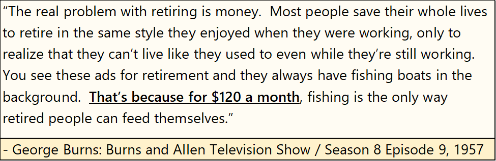
One hundred and twenty dollars a month? Back in 1957, people could retire on $1,440 a year? In 2024, $1,440 won’t pay for one month’s rent in a bad part of town, let alone food for the month. Don’t tell me about how the Federal Reserve fights inflation, when in fact * IT IS * the Great Engine-of-Inflation.
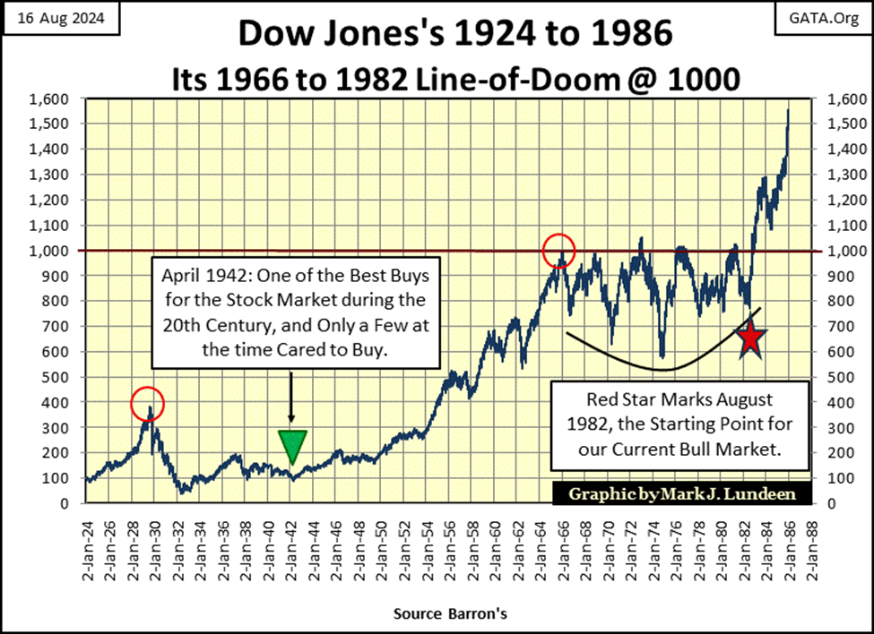
But back to the bond yield chart above. What did the Dow Jones do while bond yields increased from low single digits in 1946, to double digits in 1981? It did well, until 1966 when it first increased to 1,000 * AND * Barron’s Best and Intermediate Grade Bond Yields, both broke above 5%.
For the next sixteen years, as bond yields increased to double-digits, the Dow Jones below attempted to break above, but failed to stay above 1000 five times. Only after bond yields peaked in October 1981, and began to decline, did the Dow Jones finally broke above, and then stayed above 1000. In fact, since August 1982 (Red Star below), the Dow Jones has continued advancing to this day.
Keeping in mind what happened with bond yields, and the Dow Jones above, let’s now look at Barron’s Best and Intermediate Grade Bond yields below, from 2005 to this week’s close.
As in 1937, intermediate bond yields spiked during the 2008-09 sub-prime mortgage crisis, as best grade bond yields were affected to a much less extent. In other words, intermediate bond yields spiked because of an economic crisis, not because of monetary inflation flowing from the FOMC’s QE#1.
In January 2022, corporate bond yields bottomed. Then both best and intermediate grade bond yields began rising – together. This is the bond market reacting to monetary inflation flowing from the FOMC, exactly as they did from 1946 to 1981.
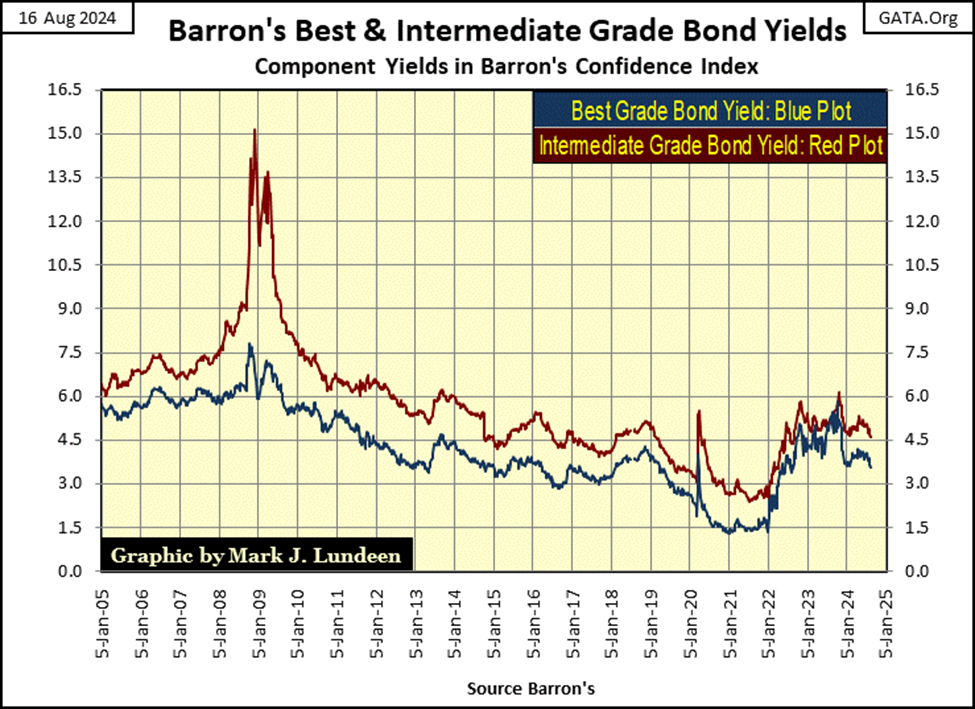
But, from 1946 to 1966, rising bond yields did not place a ceiling on the rising Dow Jones, until 1966, when both best and intermediate grade bond yields broke above, and then soared far above 5%.
Looking at the chart above, in 2023 both these bond series’ yields broke above 5%, and have since declined, but nowhere close to their lows of January 2022. It’s my opinion a massive bear market in corporate bonds began in January 2022, making the current decline in bond yields, only a correction in a continuing bear market.
During the 1946 to 1981 advance in bond yields (1946 to 1981 bear market in bonds), a 5%, and rising yield in 1966 placed a hard ceiling on the Dow Jones. Is there a similar bond yield somewhere in this bond-bear market (5% or a higher yield), that will stymie any further advance in the Dow Jones, my proxy for the broad market?
There must be. I can’t imagine the Dow Jones, with its current dividend yield of only 2.02%, continue rising to new all-time highs, should T-bond, and corporate bond yields rise to something over 8%, or maybe yields as low as 6%. To compete with the bond market as a source of investment income, the Dow Jones’ valuation would have to deflate, until it yielded something competitive to bonds.
As I pointed out last week, seeing the Dow Jones dividend yield rise to 6%, with its current dividend payout, would result in a valuation collapse in the Dow Jones of 65.61%. A decline greater than the Dow Jones saw during its sub-prime mortgage bear market; 54%.
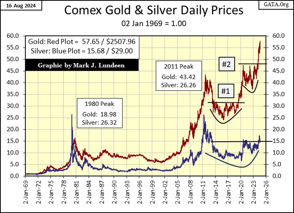
This week gold made a new all-time high (BEV Zero) in its BEV chart below. That would be $2,507.96 in dollar terms.
In the green text boxes posted below, I’ve given some dollar values for past BEV Zeros. Way back in March 2008, gold made a new all-time high, by rising to $1,003. But on a BEV chart, dollar values don’t matter. Below, we’re seeing only new all-time highs (0.0%), and percentage claw-backs from those all-time highs, like the nightmare, 45% market decline following the August 2011 BEV Zero ($1,888).
Such declines make excellent buying opportunities, which BEV charts excel at displaying. I remember the below BEV -45% bottom very well, and the e-mail I received from my readers. It was a dark and depressing time, which is exactly how markets feel at all important market bottoms. It takes guts buying, when everyone else is selling.
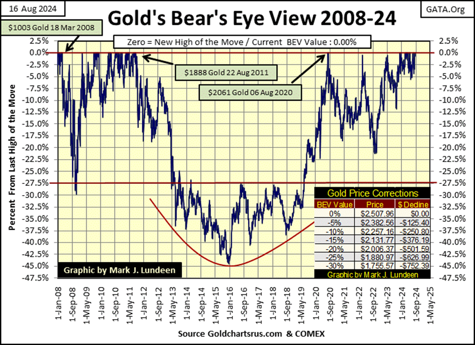
In the chart above, here is an important point to be aware of; since November of last year, gold has formed a cluster of BEV Zeros, with the 25th and 26th new all-time high of the current advance happening this week. Gold hasn’t seen a similar cluster of BEV Zeros since 2011, over a decade ago.
What should that tell you about gold? Looking at gold’s BEV chart above, it tells me the hard-times, and years of frustration gold bulls have had to endure for a very long time, are now best seen in the market’s rear-view mirror. Better times for gold and silver are just ahead of us.
Looking at gold and silver indexed below, with 02 January 1969 = 1.00, gold has nicely broken above its 47 ceiling, and closed the week with a factor of 57.65.
Silver on the other hand, has also broken above its ceiling of 15, but so far has failed to take the ball and run up-field with it.
Heck, silver’s last all-time high is still from January 1980! But I got this feeling, when silver finally breaks above its 20 line below ($37), it won’t be long before it rises to its 30 line ($56), a string of new all-time highs not seen for the past forty-four years. This isn’t a prediction, it’s just that I got this feeling.
I shared this chart, and my comments on silver with an internet friend of mine, someone who knows much more of the inner-workings of the market than I do. And B.#. said; “the powers that be need silver to be low. If it truly breaks out, we’ll see how ugly these people can be.”
Does that sound good to you? It didn’t sound good to me!
Somethings in the world, never get easy. I don’t care. I can’t care as silver is very cheap, and very cheap is very good, when one is buying. That a thousand things could kill you should you attempt to cross the street, isn’t a reason not to cross the street, if there is something you want and need on the other side. I still like silver more than gold.
Here is my graphic showing gold’s and the Dow Jones’ BEV plots since October 2022. It’s a market oddity seeing both these assets being in scoring position since last November. But for the past nine months, that is how things have been.
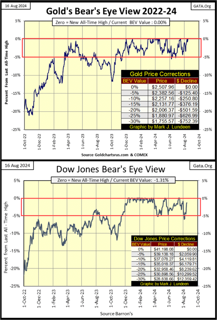
One of these days, one of these markets is going to slip below their BEV -10% line, and keep going down. I don’t believe it will be gold.
Gold in its step sum table below, with its 15-count of +3 isn’t overbought, and made two new all-time highs this week. When a market is producing new all-time highs, it’s good seeing down days between them, as seen this week with gold.
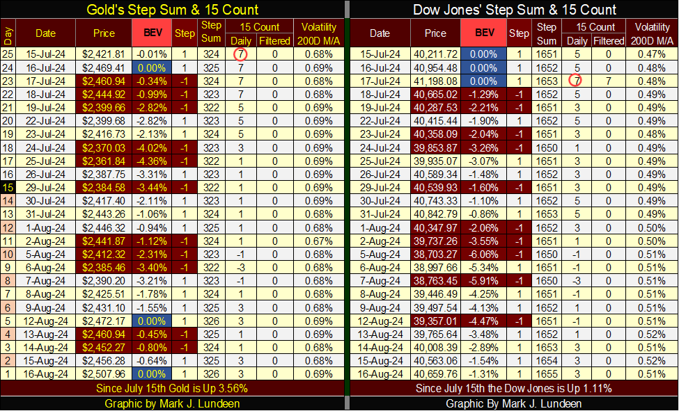
The Dow Jones in its step sum table is also looking good – except – its daily volatility’ 200D M/A continues to rise. It increased to 0.52% this week. Nothing terribly wrong with that for the bulls, except if this is a trend that will eventually take this metric up to, and then over 1.00%.
__
(Featured image by Adam Nowakowski via Unsplash)
DISCLAIMER: This article was written by a third party contributor and does not reflect the opinion of Born2Invest, its management, staff or its associates. Please review our disclaimer for more information.
This article may include forward-looking statements. These forward-looking statements generally are identified by the words “believe,” “project,” “estimate,” “become,” “plan,” “will,” and similar expressions. These forward-looking statements involve known and unknown risks as well as uncertainties, including those discussed in the following cautionary statements and elsewhere in this article and on this site. Although the Company may believe that its expectations are based on reasonable assumptions, the actual results that the Company may achieve may differ materially from any forward-looking statements, which reflect the opinions of the management of the Company only as of the date hereof. Additionally, please make sure to read these important disclosures.


The TopRanked.io Weekly Digest: What’s Hot in Affiliate Marketing [NiftyPM Affiliate Program Review]
As any marketer (affiliate or not) can tell you, the old "it's AI-powered" line has been a real champ when...


Fes-Meknes Drives Investment Growth with Diversified Sectors and Industrial Expansion
In 2025, Morocco’s Fes-Meknes region approved 444 projects worth 17.85 billion dirhams, creating over 18,500 jobs. Investment focused on energy,...


Peru’s Crowdfunding Sector Shrinks Amid License Revocation
Peru’s securities regulator revoked Inversiones Neurona SAC’s crowdfunding license at the company’s request, following compliance checks. Previously suspended for failing...


EU Biotechnology Law Aims to Boost Innovation and Cut Trial Delays
EU Commissioner Olivér Várhelyi proposed a Biotechnology Law to boost competitiveness, cut clinical trial times, and reduce fragmentation. Measures include...


BlackRock’s $94M Crypto Move Signals Rising Institutional Momentum
BlackRock transferred nearly $94 million in Bitcoin and Ethereum to Coinbase, signaling possible trades and rising institutional interest. Ethereum surged...
 |
|
 |  |
 |
|
-

 Africa4 days ago
Modernizing Traditional Commerce in Fes-Meknes Through Financial Inclusion
-

 Crypto2 weeks ago
Crypto Markets React as Trump Signals Iran War End
-
 Business2 days ago
The TopRanked.io Weekly Digest: What’s Hot in Affiliate Marketing [NiftyPM Affiliate Program Review]
-

 Biotech1 week ago
Novo Nordisk: Stable Growth and Defensive Biotech Stock for DACH Investors in 2026