Markets
The Dow Jones faces extreme market volatility
Days of extreme volatility are days where a market closes a predetermined percentage from a previous day’s close.

With the Dow Jones, clusters of 2% days identify bear markets. But in the silver market, clusters of days of extreme volatility (or 5% days) identify those markets that have a significant public participation in them, be they up or down markets.
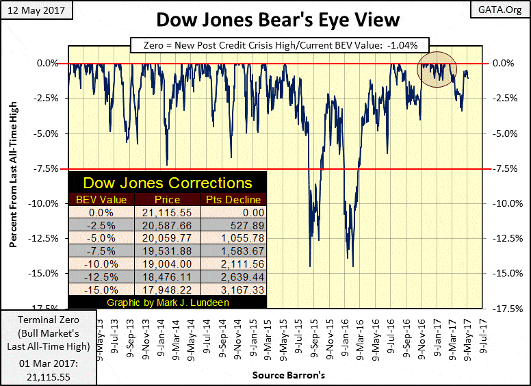
Since its last all-time high seen on March 1st, the Dow has yet to break lower than -3.5% from it or make a new all-time high. It’s a boring market. Something in me wants to see some excitement on Wall Street. But something else tells me I may not like it when I get it.
© Mark Lundeen
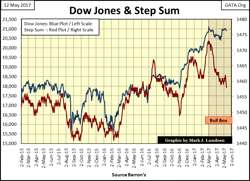
In the Dow Jones step sum chart below, market sentiment (Red Step Sum Plot) in the bull box is getting increasingly negative, while the Dow’s price plot is blissfully ignoring the terrible sentiment. This continues to be a very bullish set up for the Dow Jones for the weeks and possibly months ahead of us.
© Mark Lundeen
But step sum boxes do fail. Even if the Dow Jones bull box above doesn’t, what’s the potential for advancement from a successful resolution of the box? Dow Jones going up to 22K or 23K; maybe a 10% gain? After seeing the Dow Jones advance 14,568 points since March 2009, that’s not much. After this huge, eight-year advance, the potential for deep double-digit percentage losses at these levels should not be ignored.
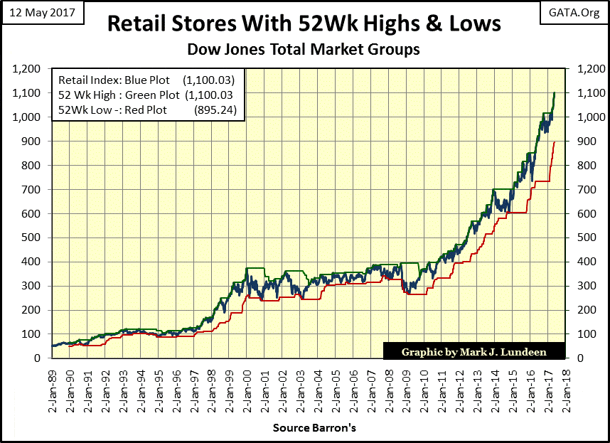
The market today has become the theater of the absurd. In today’s issue of the Wall Street Journal, they had an article on the blood bath in retail. Waves of store closings, collapsing sales; it read like news from the 1930s. Yet the Dow Jones Total Market Group (DJTMG)’s Retail Broadline Group ended the week at a new all-time high.
© Mark Lundeen
How is this possible? It’s a “policy thing.”
Ninety-five percent of retail outlets could close for business, but as long as retail stocks valuations continue rising there are those who will claim the economy is seeing “growth.” In truth, the rising valuations seen above are purely inflationary, destined to someday deflate far from where they closed this week.
The sad truth is that retail bulls in the stock market, will in the main, continue believing the economists and “market experts” claims of “growth.” They will continue to do so until Mr. Bear comes and shows them the error of their ways.
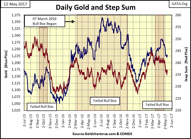
Gold’s bull box below failed, as noted last week. However, this week we didn’t see any follow-up to the downside in either the price or step sum plots in the chart below. Are the “policy makers” only toying with the bulls, or are they exhausted after all that selling since the first of March?
At this week’s end, it’s too early to say one way or the other.
© Mark Lundeen
But contriving financial asset valuations to ever higher levels is going to become increasingly more difficult in the future, as will be keeping the price of gold, silver and their mining shares down.
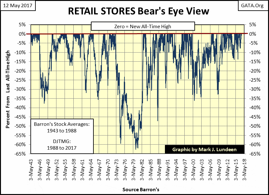
Let’s go back to the Retail Group, but this time to their BEV chart going back to 1943 to see how inflationary “monetary policy” has inflated the value of retail stocks far above where natural market forces would have them.
In the seventy-three years plotted below, has the retail sector ever seen so many new all-time highs in as short of time as since March 2009? Nope! And from 1943 to 2009, retailers used to see regular 30% corrections. But since 2009 the retailers, no matter how bad business has been, haven’t seen a proper 15% price correction in the past eight years.
© Mark Lundeen
This group (as are many others in the DJTMG) is historically overvalued and ripe for panic selling of their shares sometime in the future. The entire stock market will enter into a liquidation phase, and unless the FOMC thinks they can bail out Wall Street, this time with QEs of hundreds of trillions and keep any credibility, they’ll stand helplessly at the sidelines. Most likely the bond market will also see massive sell orders, possibility with many corporate and municipal bond issues going into no-bid conditions.
I’m only predicting what and pointing out why this is going to happen. Market valuations have been disconnected from economic reality by many decades of inflationary “monetary policy” implemented by the Federal Reserve.
Exactly when Mr. Bear returns to mark-to-market the entire economy and deflates the valuations of the assets trading therein I haven’t a clue. But a day is coming when there’ll be a tsunami of cash fleeing anything traded on Wall Street; that’s when we’ll see the appreciation in the old monetary metals and their miners match and then exceed those of bitcoin seen later in this article. Don’t expect this to happen next week or next month. But bad things happen in October, so maybe then.
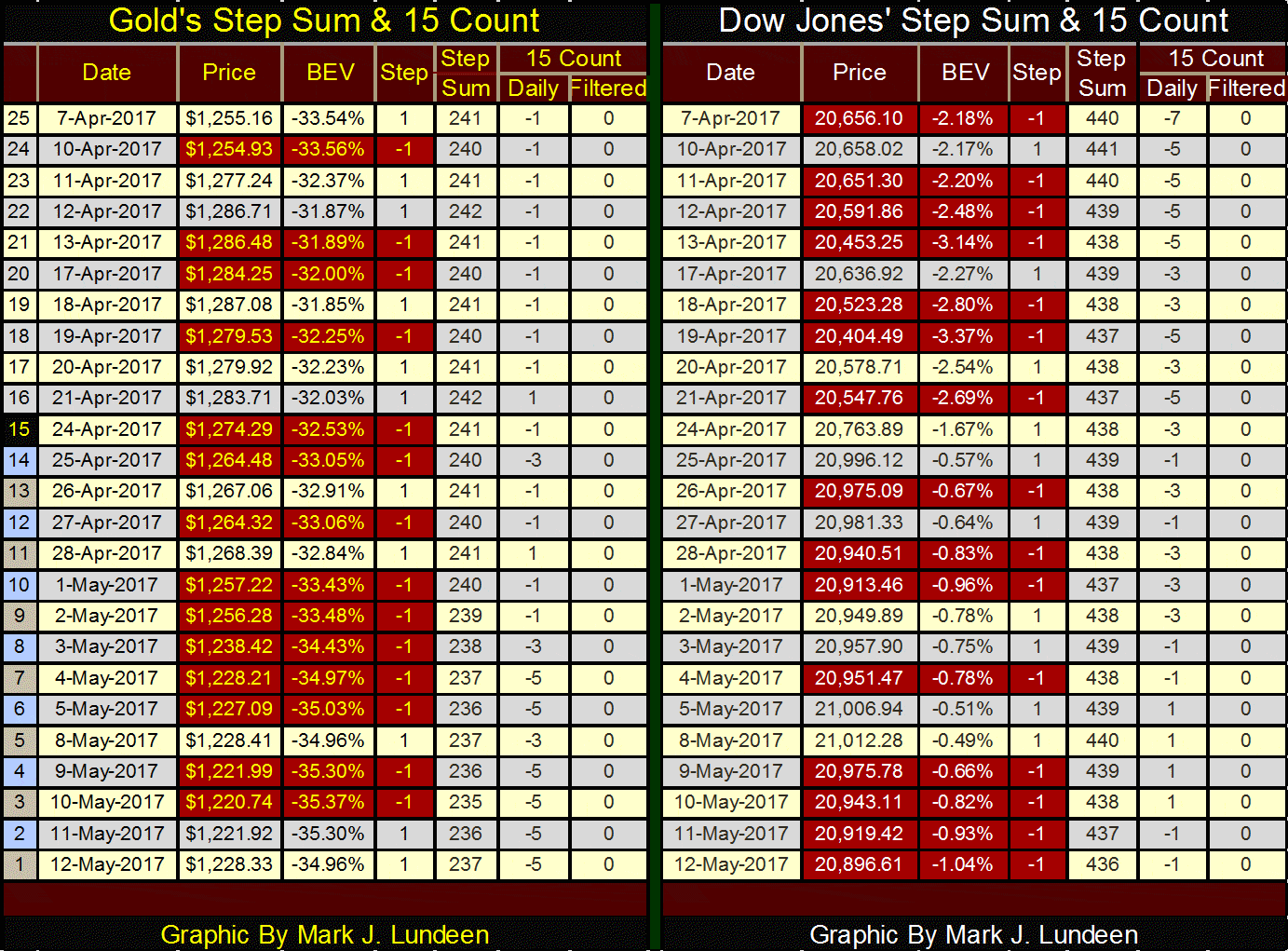
Here’s gold’s and the Dow’s step sum and 15 count tables. Look at all that red in the table for the gold market. The bears got the 15 count down to -5, yet the “policy makers” failed to break gold below $1200. At week’s end, it appears gold will hold above its lows of last December, seen in its step sum chart above.
© Mark Lundeen
The Dow Jones has seen a lot of selling too, though for most of the week its 15 count was a +1. No matter, since April 7th the Dow Jones is up over 220 points even after all those down days. Like gold, when these markets once again enter a period where advancing days dominate the declining days, we could see some nice advances in these two markets.
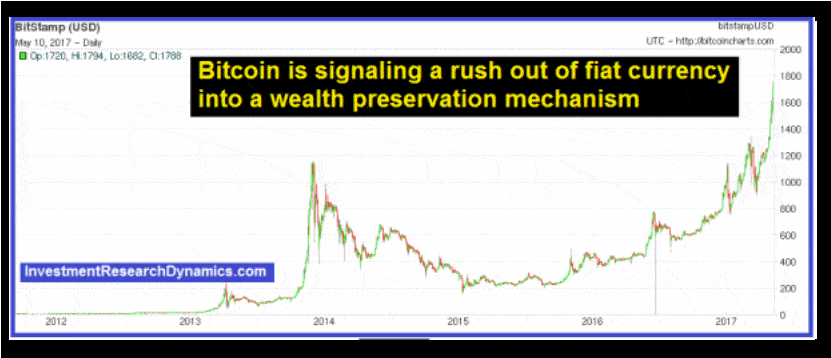
In the past five years. bitcoin (a cryptocurrency) has seen amazing appreciation. This chart plotting the price of a bitcoin for the past few years is making the rounds on the internet. Apparently, it has gone from around $50 in 2012 to over $1700 in May 2017.
(Source)
For one thing, bitcoin is only traded on a cash and carry, spot basis. Unlike gold and silver, one can’t take a purely speculative position on bitcoin in a future exchange or in the OTC derivate market. This makes a huge difference. Using a back of the envelope calculation, bitcoin is up by a factor of 34 since 2012. Take silver at its lowest point in its post-April 2011 decline below ($13.64 / Dec 2015) and give it a similar multiple of 34 and we’d see silver at $464 an ounce.
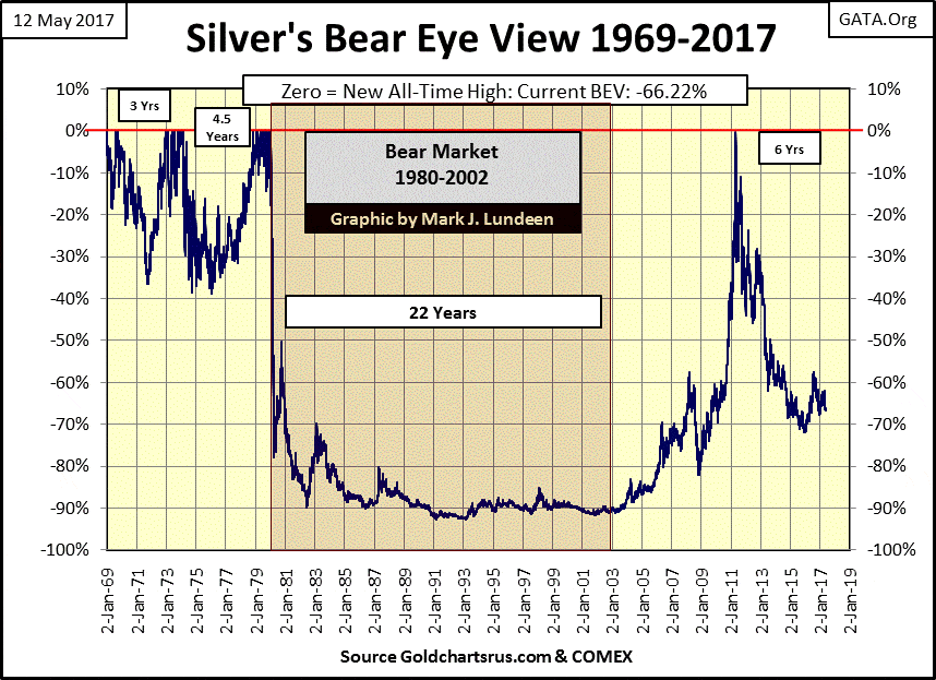
Instead, silver as seen in the Bear’s Eye View (BEV) chart below, is at week’s end down some 66% from May 2011.
© Mark Lundeen
The difference between bitcoin and silver is the ability of the big banks, in full view of our government regulators, “promise to deliver” years of global production in a few days, or even in a few hours of trading in the paper futures markets. This is something the big banks can’t do with bitcoin.
These promises to deliver silver that doesn’t exist are made by financial companies. These are institutions that neither explore, mine, refine, consume or market gold and silver. Apparently, the big banks only function in the precious metals market is to promise delivery what they can’t possibly obtain, to those who have no intention of ever taking delivery of hundreds and thousands of tons of silver and gold. Small wonder the price of gold and silver can’t compete with a cryptocurrency that didn’t even exist at the turn of the century.
I’ll tell you another difference between bitcoin and gold and silver; bitcoin is a mathematical conception stored somewhere in the cloud. No one has ever placed their fingers on a digital bitcoin! It’s only a matter of time before computer hackers contracted by the CIA, or other government intelligence organizations, find some way to bring ownership of bitcoins to grief. In the world we live in, this is how things are.
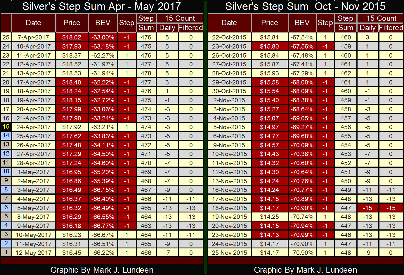
So how have things been going with silver? Damn brutal. Below is silver’s step sum and 15 count table for this week (left table), and for October / November 2015 when silver’s 15 count for the first (and only) time hit a -15. Had silver on April 24th not close $0.02 higher than it did on the 23rd, silver would have seen an absurd 17 consecutive down days in the past month. As it was, silver’s 15 count was driven down to -13.
© Mark Lundeen
Neither of the bouts of selling seen above is from price discovery by the suppliers and consumers of silver. Rather, we’re observing the “execution of policy” by the masters of “monetary policy” at the FOMC and their Wall Street minions as our government regulators look blindly on. In a world where the supply of dollars, euros, and yen is an embarrassment, maintaining the old monetary metals at an artificial low price has become a necessity.
Both these selling episodes occurred during the current market decline in silver, separated by eighteen months. One feature that stands out in both of the above selling episodes is how ineffective the selling actually proved to be. One expects such relentless and sustained selling to result in an October 1929 selling panic, in fact neither did.
In these tables, day 21 was the last advance before the selling programs were executed. In November 2015 the selling ended on day 6 with silver down only 11% after fifteen consecutive lower closings that took the 15 count down to a -15. In May 2017 the program selling terminated on day 4 (May 9th). Yet the big banks managed to reduce the price of silver by only 12.7% after all that.
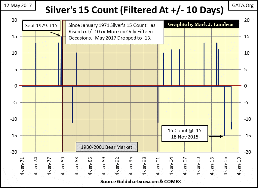
I’m out of the price trend predicting business. So, I’m not going to say or even suggest that after all this selling, silver in May 2017 is close to a cyclical bottom; though in fact, that did prove to be the case in November 2015. Instead, let’s look at the history of silver with its double digit 15 counts below.
Since January 1971 silver’s 15 counts has broken into (+/-) double-digits on only fifteen occasions, with only four events being negative. Notably, two of the four negative double-digit 15 counts have occurred in the past eighteen months, and that seems an important observation to make.
© Mark Lundeen
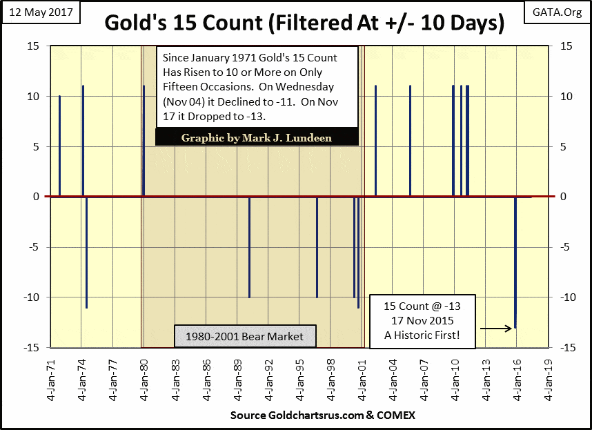
Next is gold’s double-digit 15 counts. A comparison between gold and silver’s 15 count charts shows how gold and silver do not trade identically with each other. But in both cases, it’s obvious how since 2001 gold and silver aren’t trading as they were during the 1980-01 bear market.
How long will it be before both markets once again see their 15 counts in the positive double digits? I can’t say. But when it does happen (and it will) expect seeing gold and silver at much higher prices than we see today.
© Mark Lundeen
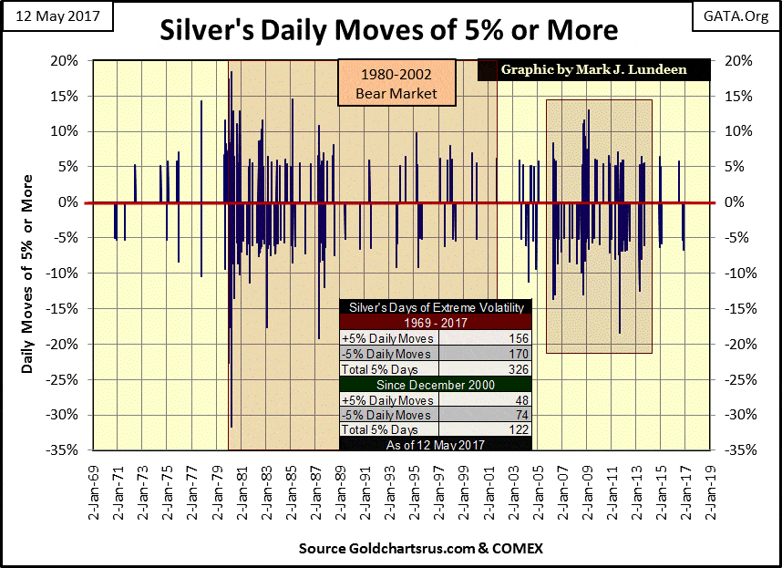
I haven’t covered days of extreme volatility in the precious metals for quite a while, so this seems a good time. Days of extreme volatility are days where a market closes a predetermined percentage from a previous day’s close. For the Dow Jones, I’ve assigned a (+/-) 2% move as a day of extreme volatility. But silver is a more volatile market, so for it, I’ve assigned a (+/-) 5% move from a previous day’s close as a day of extreme volatility.
With the Dow Jones, clusters of 2% days identify bear markets. But in the silver market, clusters of days of extreme volatility (or 5% days) identify those markets that have a significant public participation in them, be they up or down markets.
I placed a box over the years 2005-13 below; a period where the silver market routinely saw days that closed 5% or more from a previous day’s closing price. Since then, days of extreme volatility have become a rarity, most likely due to an exodus of the public from the silver market.
Go back and examine the daily declines seen in silver’s step sum tables above. During the selling episodes of November 2015 and May 2017 that took silver’s 15 count deep into negative double digits, there were no days of extreme volatility (a 5% day) in either of them. This tells me the public is out of the silver market. For us silver bulls, that’s good news, as one day to our profit they will return in a big way.
© Mark Lundeen
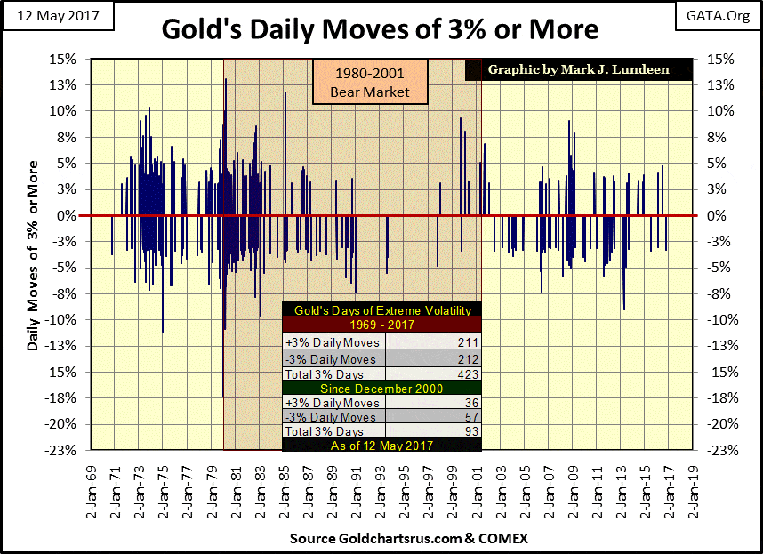
Here’s a chart plotting gold’s days of extreme volatility, or 3% days. My comments for silver’s days of extreme volatility are the same for gold and note how since 2013, 3% days in the gold market have also become a rarity.
© Mark Lundeen
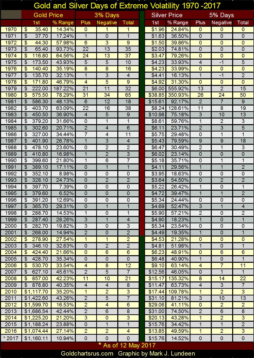
I’ve constructed the table below to highlight those years that saw extreme volatility in the gold and silver market. The 1980 to 2001 bear market is highlighted in a gray tone. The 1st column lists the first daily closing price of the year. The % Range column displays the annual price range by dividing the yearly high by the yearly low price and is always positive even in down years. 2017 is current up to 12 May 2017, and so far this year neither of the old monetary metals has seen a day of extreme volatility.
© Mark Lundeen
Note from 2001 to 2013, gold saw twelve consecutive yearly gains. This is something the Dow Jones has never done. Note also the % Range during the 1970 to 1980 bull market, and then compare those to what gold and silver have seen since 2001.
During the 1970s, years with large ranges also saw lots of days of extreme volatility; that wasn’t always true after 2001. Also, since 2001 gold has yet to see an annual range of over 50%, and silver’s 135.3% range seen in 2008 was muted when compared to what it saw in 1979 & 80. Given all the excitement the markets, global economy, and the international banking system have seen since 2001, these undersized annual ranges are more than a bit odd.
These post-2001 constrained ranges are just another fingerprint left behind by the “policy makers” in their usual business of manipulating market valuations. When the precious metal’s markets break free of their clutches, expect seeing historic annual price ranges in gold and silver in the years to come. I expect the above chart plotting bitcoin will prove to be the model for price appreciation for gold and silver.
—
DISCLAIMER: This article expresses my own ideas and opinions. Any information I have shared are from sources that I believe to be reliable and accurate. I did not receive any financial compensation in writing this post. I encourage any reader to do their own diligent research first before making any investment decisions.

-

 Markets1 week ago
Dow Jones Tests Correction Zone Amid Bullish Momentum and Bubble Concerns
-

 Crowdfunding6 days ago
Democratizing Farmland Investment: The Rise of Farm Fractions in Agritech
-

 Crowdfunding2 weeks ago
Cyberpunk Trading Card Game Surges Past Goals on Kickstarter
-

 Biotech13 hours ago
Biobanks Drive Progress in Rare Disease Research Through Collaboration and Ethical Practice


You must be logged in to post a comment Login