Markets
Dow Jones Strength Faces Risk From a Potential Yen Carry Trade Unwind
The Dow Jones remains bullish near year-end, trading within 5% of record highs and setting 17 new peaks. However, risks are emerging from a potential unwind of the yen carry trade. Rising Japanese yields, falling U.S. yields, or a stronger yen could trigger massive bond shifts, increasing volatility and pressuring global equity markets in the months ahead.

That makes this my last article for 2025. So, at the end of the line, what is the Dow Jones doing in its BEV chart below? Since late June, the Dow Jones has been in scoring position, trading within 5% of its last all-time high, making an additional seventeen new all-time highs, and $3027 in valuation in these past six months. And for as long as the Dow Jones remains in scoring position, it’s proper remaining bullish on the stock market.
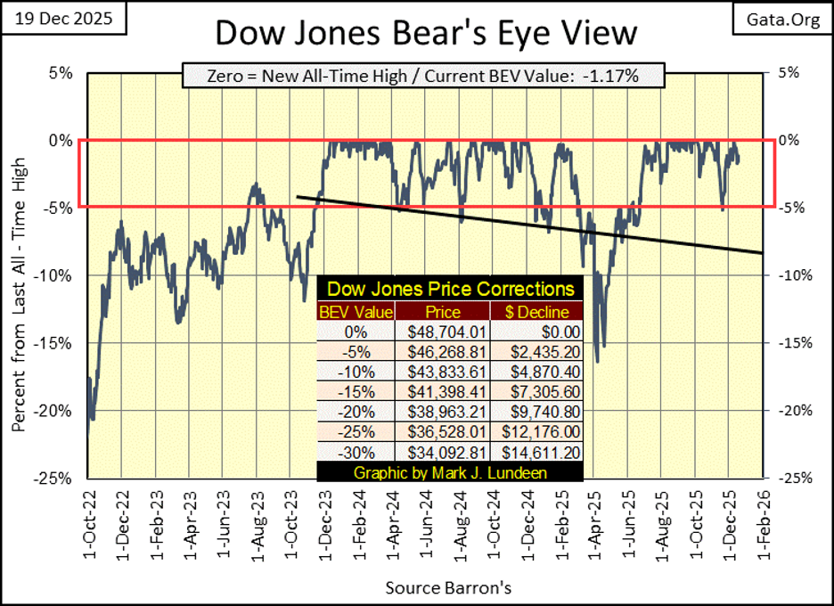
Of course, the day is coming when the Dow Jones will fall below scoring position in its BEV chart above, and continue deflating to levels most investors currently refuse to consider possible. What would cause that to happen? Lots of things. Currently, the big pin seen poking around the bubble the stock market is in, is the unwinding of the Japanese, Yen Carry Trade.
The Yen Carry Trade is where large financial institutions; banks, big money managers, borrow yen in Japan at rates lower, than the bonds being purchased by this debt in other markets, usually US Treasury Bonds. The sell Japan, buy US trade. The math is good; for example, borrowing Yen for 1.00%, to get paid 4.00% in the US Treasury Market, for a free payday of 3% on a few billion dollars annually, all on money that doesn’t belong to them. What is there not to like about central banking?
But this “monetary policy” driven gravy-train only works as long as the yields paid for Japanese Government Bonds remain below, the yields being received by this Yen Carry Trade. Rising yields in yen, or falling yields for US Treasury bonds, can reverse this flow of money. And then there are currency risks. A stronger yen can also reverse the flows of gravy in this trade. Instead of getting paid 3% on a few billion dollars, a financial institution may find they are now paying out 3% on a few billion dollars.
I’m beginning to see articles on the closing down on positions in the Yen Carry Trade, meaning possibility of trillions in US Treasury Bonds must be sold; which would raise T-bond yields, and an equal value of Japanese Government Bonds being purchased; lower Japanese Bond yields, as this currency trade closes out.
Is the Yen Carry Trade being unwound? Multiple trillions of dollars and yen flowing back and forth in the financial system being terminated? I’m not the guy to answer that question.
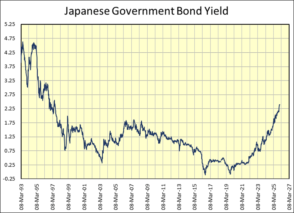
But I am the guy that will say as per the data I’ve compiled from Barron’s over the years, the yields for the Japanese Government Bonds have been rising since September 2019, over six years, as seen in the chart below. So far, rising Japanese yields haven’t popped any bubbles in North America that I’m aware of, and the rise in yield seen below are considerable.
However, as long as the Dow Jones remains in scoring position in its BEV chart above, rising Japanese yields haven’t yet popped the bubble the stock market is currently in. That might change by the time I come back in January, and then it might not. Personally, I don’t follow things like the Yen Carry Trade too deeply. I just don’t.
As a retail investor myself, I like keeping it simple. Simple like; for as long as the Dow Jones remains within 5% of its last all-time high (remains in scoring position) I’m bullish on the stock market. If there are big problems somewhere out there in the financial system, the Dow Jones will tell us all about that, by going down. Right now, the Dow Jones is going up.
That doesn’t mean I’m in the stock market, as I’m not. I’m looking at the stock market as a spectator sport, high above it in the peanut gallery. The only thing I’ll risk in this market, is a few beers and hotdogs up here in the peanut gallery.
Looking at the Dow Jones in its daily bar chart below, what do I see there? It was down from last week. But no matter, as I see the Dow Jones remains well above its BEV -5% line, meaning it remains in scoring position. So, I’m still thinking we’ll see 49K on the Dow Jones, before its valuation is inflated to 50K and beyond.
What could change my opinion on that? When I return in January, should the Dow Jones trade below 43,833 (it’s BEV -10% Line), I won’t be writing about 50K on the Dow Jones!
But for your information, up here in the peanut gallery, I’m betting a couple of beers and a hotdog that when I return in January, the Dow Jones will be trading above 49K in this chart below. Should my bullish readers want to stake a few million dollars on the stock market, based on my risking some beers and a hotdog on the Dow Jones at 49K sometime in the next month, more power to them.

Moving to my table of major market indexes’ Bear’s Eye View (BEV) values below, this week saw only two new all-time highs. Monday saw the NYSE Financial Index at a new all-time high, and on Friday the XAU closed at a new all-time high.
What is with this dearth in BEV Zeros (0.00%) in the table below? The stock market is currently in a bullish market advance, and during every bullish market advance, most days don’t close at a new all-time high, but in scoring position; within 5% of an indexes’ last all-time high. That is just the way it is.
And that was how things were at the close of this week’s trading. Look at all the indexes in the table below closing in scoring position; within 5% of their last all-time high inside the Red Rectangle. Rising Japanese bond yields may be giving some “market experts” the heebie-jeebies. But for the stock market itself, as seen below, so far no one cares about the Yen Carry Trade, if it is, or isn’t unwinding.
That may change next week, next month, next year. But at this week’s close, which is as far out as I care to see things, the current market advance is still intact, and I’m expecting more market gains in the coming weeks, months, and in the year to come.
Of course, should the average BEV value seen below (#15 in the table) deflate below -5%, on its way down to -10%, I’ll change my opinion on the market.

Look at silver, (#1) in this week’s performance table above, it’s up 22% from last week’s performance table. The XAU was also up nicely, while gold was up about 2% from last week. In fact, most of the major market indexes were also up from last week, but not by much.
Forget the stock market. It may continue going up, but its best days are best seen in the market’s read-view mirror. The place to be for the next few years is in the old monetary metals (gold and silver) and their miners. I got more than just beers and a hotdog in that bet!
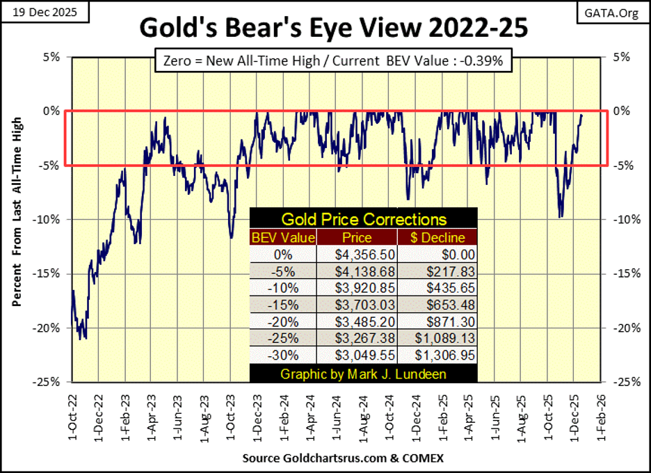
Moving on to gold’s BEV chart, can you guess what I think about gold? That’s right; gold closed this week in scoring position, just a sliver away from making a new BEV Zero, a new all-time high. What can I say; I like keeping things simple when looking at the market. So, I remain bullish on gold, silver and the XAU too.
My readers may be sick of my thinking of markets in terms of being in or out of scoring position. But simplicity in understanding the market is a blessing, especially if keeping it simple keeps one out of trouble, and in rising profits as time goes by. Which has been true for the Dow Jones in its BEV chart above, and for gold in its BEV chart below, since both entered into scoring position in November 2023.
Seeing both the Dow Jones and gold’s BEV charts in scoring position for the past two years, is something not seen since 1970, when the price of gold was first allowed to float in terms of US dollars for the first time since 1789, when the US Constitution made gold and silver money. When the price of gold was allowed to “float,” in the early 1970s, was recognition that gold and silver were no longer “money” in the constitutional sense of the term.
Gold, and silver too, became an economic parameter, a pressure gauge on the perceived health of the American fiat dollar, and the financial system.
In the chart below, I took the indexed values of the Dow Jones and gold, with 05 January 1970 = 1.00, and created a ratio of the two indexes; Dow Jones Index / Gold Index. As noted in the chart below;
• a rising ratio signals the Dow Jones (the stock market) is doing better than an ounce of gold,
• a declining ratio signals an ounce of gold is outperforming the Dow Jones.
The history of this ratio of the Dow Jones to gold, proves the Dow Jones and gold are counter-cyclical to each other, when one is doing good for the bulls, the other isn’t.

Then the ratio came to November 2023 (January 2024 in the chart above), when both the Dow Jones and gold entered into scoring position together, both making new all-time highs. But since January 2024 in the chart, the ratio has been declining, telling us gold has outperforming the Dow Jones. Since then, 01 November 2023;
• the Dow Jones has seen 73 new all-time highs, advancing the Dow Jones by 46.4%,
• an ounce of gold has seen 88 new all-time highs, advancing an ounce of gold by 119.45%.
Most people are unaware of how well gold has done, compared to the Dow Jones. Which for us bulls on gold, is a real blessing. Why? Because the public is always late coming to the party, as they are now with the bull market in gold. This lack of public interest in gold, silver and their miners, indicate we remain in the early phase of a massive bull market in gold and silver.
In the chart above, the Dow Jones to Gold Ratio is at risk of breaking below the Red Box I placed on the chart, from January 2014 to today. I placed this Red Box here because, for the first time since 1970, this ratio has no real trend to it.
For the past eleven years, this ratio has oscillated within the red box, which is a historical oddity. Take a moment to study this chart, and the red box in it. As investors, we should always be seeking historical oddities, as they note a time when something is changing, or outright wrong with a market. Historical oddities can go on for years, even decades, but they don’t go on forever.
When this breakout happens to the downside (to gold’s favor), maybe it will be because of something like the unwinding of the Yen Carry Trade. No matter what causes it, when it happens, things could get wild in the financial markets, and the old monetary metals’ bull market.
Now, for the last time in 2025, we look at gold’s step sum table below. Gold’s 15-count since November 21st, has been positive, indicating gold currently is seeing more advancing, than declining days. On December 15th, gold’s 15-count hit a +7, indicating the gold market became overbought. Markets don’t like being overbought, so declining days in the gold market increased some, and now its 15-count closed the week at a neutral +3, which is good.
All in all, gold’s step sum table at the close of this week is pretty boring, but in a bullish sort of way. Gold closed the week with a BEV value of -0.39%, less than ½ of a percentage point away from making a new all-time high. Gold making a new all-time high (BEV Zero = 0.00%), is something I’m expecting to happen sometime in the next month, as I’m away enjoying my holiday.
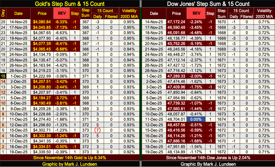
The Dow Jones’ step sum table, like gold’s, is closing 2025 in a boring, but bullish sort of way. Since its last all-time high (blue BEV Zero) on December 11th, the Dow Jones has seen declining days in the market overwhelm daily advances. But with all those daily declines, the Dow Jones hasn’t gone down all that much, closing the week with a BEV of -1.17%, or only 1.17% below its last all-time high.
One significantly bullish factor for the stock market is, the Dow Jones daily volatility’s 200D M/A remains low. And for the stock market, low Dow Jones’ daily volatility, is good daily volatility, as seen in the table below.
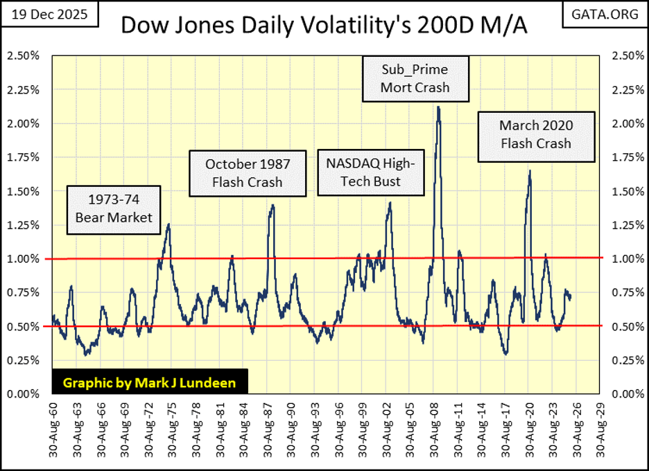
Since February 1885, when the Dow Jones was first published, rising daily volatility has been a precursor of bad things to come for the market bulls. In the chart above, every big market decline since 1960 can be identified by a big spike in daily volatility, and the bigger the spike, the bigger the bear market.
Seeing 2025 close with the Dow Jones daily volatility’s 200D M/A at 0.71%, is a promise, if not a commitment on the part of Mr Bear, not to pop any bubble now inflated in the financial system, as 2026 comes into view, just two weeks away.
__
(Featured image by Dimitri Karastelev via Unsplash)
DISCLAIMER: This article was written by a third party contributor and does not reflect the opinion of Born2Invest, its management, staff or its associates. Please review our disclaimer for more information.
This article may include forward-looking statements. These forward-looking statements generally are identified by the words “believe,” “project,” “estimate,” “become,” “plan,” “will,” and similar expressions, including with regards to potential earnings in the Empire Flippers affiliate program. These forward-looking statements involve known and unknown risks as well as uncertainties, including those discussed in the following cautionary statements and elsewhere in this article and on this site. Although the Company may believe that its expectations are based on reasonable assumptions, the actual results that the Company may achieve may differ materially from any forward-looking statements, which reflect the opinions of the management of the Company only as of the date hereof. Additionally, please make sure to read these important disclosures.


The TopRanked.io Weekly Digest: What’s Hot in Affiliate Marketing [PureVPN Affiliate Program Review]
This week, we're going to look at monetizing American freedom as affiliates. Specifically, we'll be looking at selling VPNs to...


Novo Nordisk: Stable Growth and Defensive Biotech Stock for DACH Investors in 2026
Novo Nordisk A/S (ISIN: DK0062498333) is a stable, growth-oriented biotech stock in 2026, driven by blockbuster drugs Ozempic and Wegovy....


Italian Banks’ Green Asset Ratio Reaches €50 Billion in 2024 Amid Growing Sustainable Lending
Italian banks’ green assets surpassed €50 billion in 2024, raising the Green Asset Ratio (GAR) to 2.8%. Results vary widely...


Ripple Collaborates with Mastercard on Blockchain Innovation
Ripple continues expanding its business with Mastercard partnerships, acquisitions, and a $750 million share buyback that values the company at...


Stagflation Fears Rise as Energy Shock and Iran Conflict Shake Markets
Rising oil prices and weak jobs data pushed stocks toward stagflation fears. Unlike classic monetary stagflation, this stems from an...
 |
|
 |  |
 |
|
-

 Impact Investing2 weeks ago
Green vs. Brown Stocks: Climate Policy, Capital Costs, and the Battle for Market Returns
-

 Africa2 days ago
Morocco’s Banking Shift: From Digital Adoption to Digital Expectation
-

 Africa1 week ago
Souss-Massa Council Approves Budget Surpluses and 417M Dirham Loan for Infrastructure and Water Projects
-

 Biotech4 days ago
AI and Liquid Biopsy Enable Personalized Immunotherapy for Lung Cancer