Business
Markets Review: Dow Jones Looks Good, as Does Gold
If you’re in the market and making money, you best have a plan when you intend to exit this historic bull market. That is why I placed the Dow Jones BEV -5% and -10% lines in our chart. As long as the Dow Jones continues to daily close above its BEV -5% line, the Dow Jones is in scoring position, and we should anticipate additional new all-time highs in the stock market.
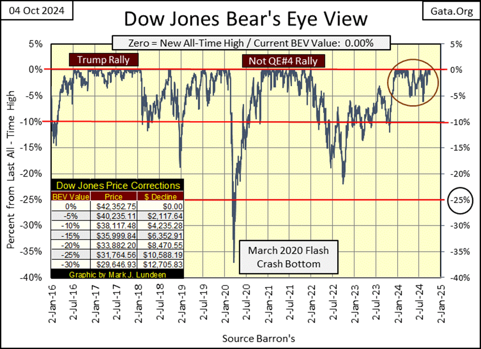
The Dow Jones this week made four new all-time highs, aka BEV Zeros, its 38th to 41st since entering scoring position (Red Circle below) last November. These 41 new all-time highs in the past eleven months, have taken the Dow Jones up by 7,201 points, or 20% since November 20th, when the Dow Jones first closed above its BEV -5% line, in the Red Circle below.
Of course, a Bear’s Eye View (BEV) chart ignores dollar valuations. Instead, it looks at markets like Mr Bear does; in terms of new all-time highs, and percentage claw-backs from those new all-time highs.
As Mr Bear looks at this market, the Dow Jones is currently enjoying an advance into record territory, and will continue to do so, for as long as it can daily close in scoring position; BEV values spanning between -0.01% to -4.99%.
No need to make it any more complicated than this; for as long as the Dow Jones in its BEV chart below remains above its BEV -5% line, it’s safe to assume additional new all-time highs are pending in this advance. Exactly as it was during the Trump, and Not QE#4 Rallies seen below. However, it’s only a matter of time before the Dow Jones once again closes well below its BEV -5% line. It would then be best to reduce one’s exposure to this market, as no advance goes on forever.
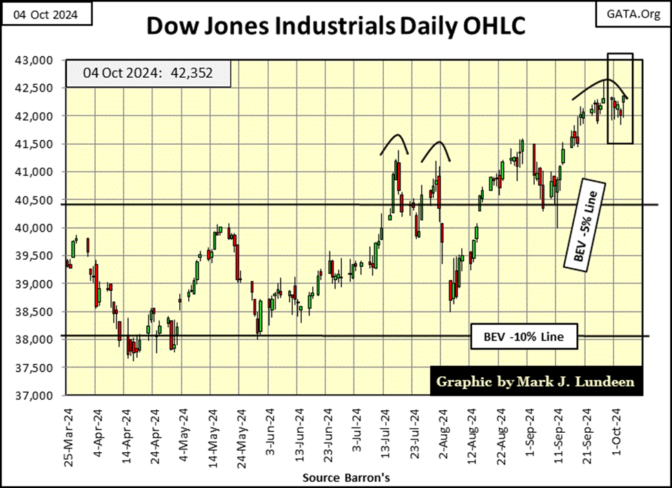
Next is the Dow Jones plotted in daily bars, and the venerable Dow Jones is looking good below. So, do I like this advance? Like it as what? As a pretty chart, the Dow Jones below looks beautiful. But as an investment opportunity, I think the Dow Jones, my proxy for the broad stock market stinks, as any market does when it approaches its ultimate market top.
Remember; at all market tops, an investor’s risk of losing lots of money approach maximum, as the potential for making a profit approaches zero. In other words, a pretty chart, can be a dangerous chart to a bull’s net worth.
Strangely, it’s just market history that as any market approaches it ultimate top, following a prolonged advance, the public becomes enthralled with that market, exactly as it becomes impossible to make a profit, and massive market losses become baked into the cake.
So, if you’re in the market and making money, you best have a plan when you intend to exit this historic bull market. That is why I placed the Dow Jones BEV -5% and -10% lines in the chart above. As long as the Dow Jones continues to daily close above its BEV -5% line, the Dow Jones is in scoring position, and we should anticipate additional new all-time highs in the stock market.
But when the Dow Jones begins closing below its BEV -5% line, investors need to think really hard about cutting their market risk, by selling a good percentage of their bull market positions.
When the Dow Jones begins closing below its BEV -10% line, my recommendation to investors would be to get out, and stay out of the market, until once again the Dow Jones has recovered above its BEV -5% line.
That bit of advice, assumes there is still a bit left to this advance. Should in fact the market begins a massive bear market when the Dow Jones breaks below its BEV -10% line, you’ll be glad you took your profits.
This week began with plenty of new all-time highs (BEV Zeros) for the major market indexes I follow in the table below. The week then ended with these indexes seeing a few more BEV Zeros. This is how it goes as the stock market continues advancing, to its ultimate, and last all-time high. What, and when that will be I haven’t a clue. I know only that as sure as night follows day, a bear market will follow this market advance that began long ago, in August 1982, when the Dow Jones last closed below 800.
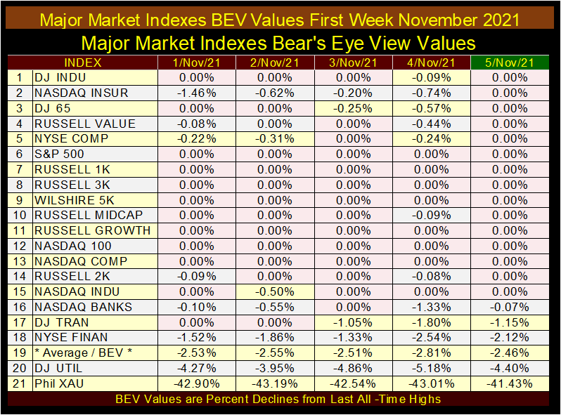
The two indexes I’m personally following closely are the NASDAQ Banking Index, and the XAU (#20 & 21 below). For the past decade, and more, the NASDAQ Banking index’s BEV value (percentage from its last all-time high) has been higher than the XAU’s BEV value. But the gold and silver miners in the XAU are catching up with the banks, and I believe will catch up before Christmas, and move above the banking index in the table below.
The table below is for these indexes’ Bear’s Eye View (BEV) values, or the percentage claw backs from these indexes’ last all-time highs. A new all-time high in a BEV chart is seen when the data series sees a 0.00%, aka: BEV Zero, or zero percent away from its last all-time high, which on Monday this week, these indexes saw nine new all-time highs.
But the last all-time high for the NASDAQ Banking Index was seen in November 2021, while the last all-time high for the XAU was seen in April 2011. Going by percentage claw-backs from last all-time highs, as seen below, the gold and silver miners in the XAU below are the worst performing indexes in my universe of stock indexes.
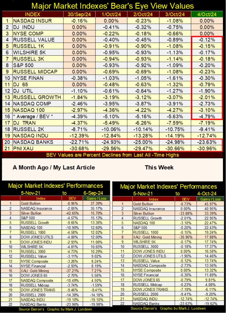
There is another way of looking at this data, looking at these indexes from 05 November 2021, or at the peak of the March 2020 Flash-Crash Recovery, as seen in the performance tables above.
Eighteen months following FOMC’s Primate idiot Powell’s injection of a few trillions of dollars of monetary inflation into the financial system (April – May 2020), to place a floor under that market crash, the stock market peaked on 05 November 2021 (table below), with every index closing the week at a BEV Zero, or in scoring position (BEVs of -0.01% to -4.99% / within 5% of their last all-time high).
That is except for the XAU, which three years ago was down by over 40% from its last all-time high from April 2011.
Looking at all those BEV Zeros from three years ago, highlighted in pink, made me want to run away from this market. Then in early 2022, the idiots at the FOMC said they were going to begin raising interest rates, as they began a new Quantitative Tightening (QT). That was almost a declaration of a market crash sometime in 2022-23. But that didn’t happen.
Now, three years later, the FOMC is cutting interest rates. That should send the stock market up, but who knows what is going on in the financial system these days? I sure don’t! So, I like to keep things simple; have a good position in gold and silver, and their miners, and remain bullish on the stock market for as long as the Dow Jones BEV value remains above its -5% line.
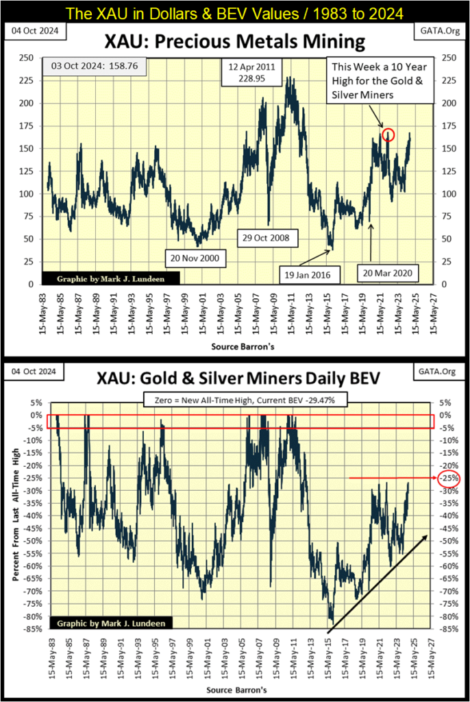
Next are my charts for the XAU, in dollars and Bear’s Eye View values. The XAU began trading in 1983, and this week closed not far from where it began trading forty-one years ago. During this same time, the Dow Jones’s valuation was inflated from 1,241.97, to over 42,000 dollars.
Why this difference in performance? The stock market has been in a bull market since August 1982, while the precious metal miners were not. So now in 2024, the miners of precious metals are not popular with the investing public, or managed money.
This is when bargains are to be found in the stock market; buying what few others want. But how long must one wait until once again, the investing public, and managed money will want to pay top dollar, for what can be purchased for pennies today?
That is a very good question, whose answer I don’t have. Still, it makes sense buying when something is cheap, as the XAU is below. Geeze Louise, looking at the XAU’s BEV chart, the XAU is coming off an 83% bear market bottom from 2016. As I see the market, the gold and silver miners are assets with compelling valuation, everyone should have at least some exposure to.
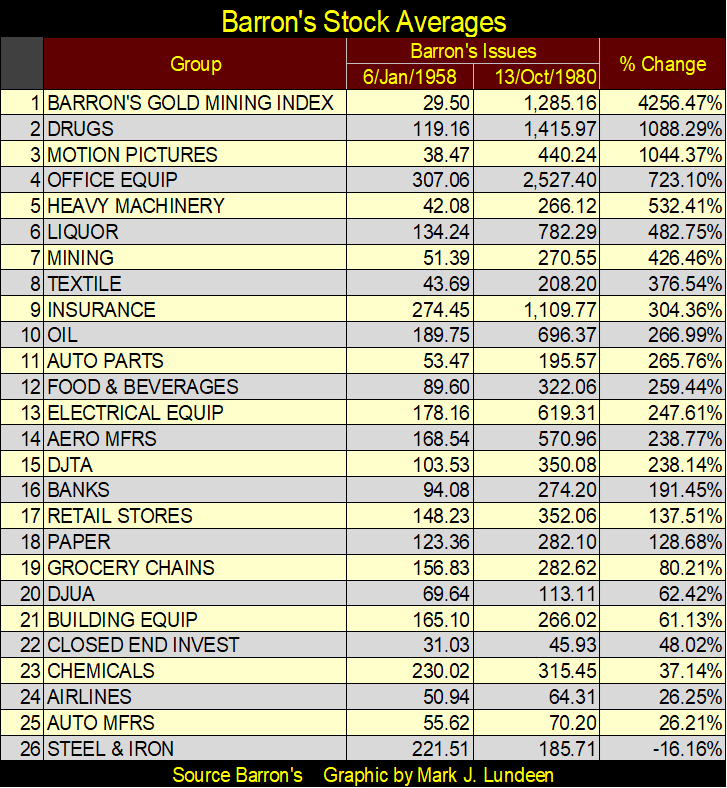
Today in 2024, it is hard to believe it, but there was a time when the precious metals miners were the most popular market group, as measured by the now discontinued Barron’s Stock Averages (1938 to 1988), seen in the table below. From 1958 to 1980, the Barron’s Gold Mining Index (BGMI) was the top performing market sector for twenty-two years, up 4256%, while the Dow Jones advanced by only 116% over these same twenty-two years.
Decades ago, what made the BGMI so profitable compared to the broad-stock market? Following World War II, the financial markets were concerned about the future of the US dollar, and monetary inflation flowing from the Federal Reserve System was inflating the cost of living.
Unlike today, the financial media from decades ago weren’t afraid to point out the Federal Reserve System, and what they were doing that made the dollar so weak, and consumer price inflation so high.
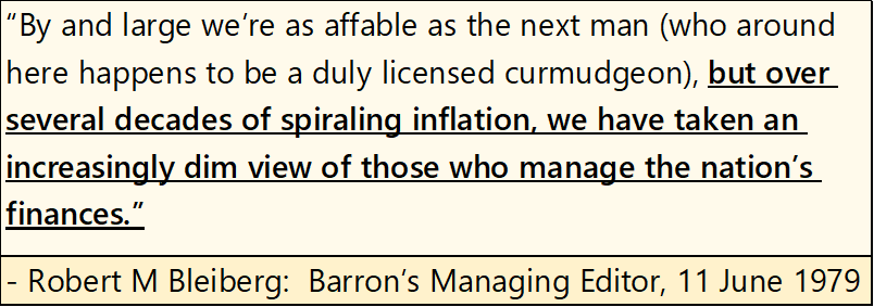
Below are some old Barron’s articles on the US dollar crisis, and monetary inflation from many decades ago. Articles such as these are no longer published by the financial media of the 21st Century, but they could be.
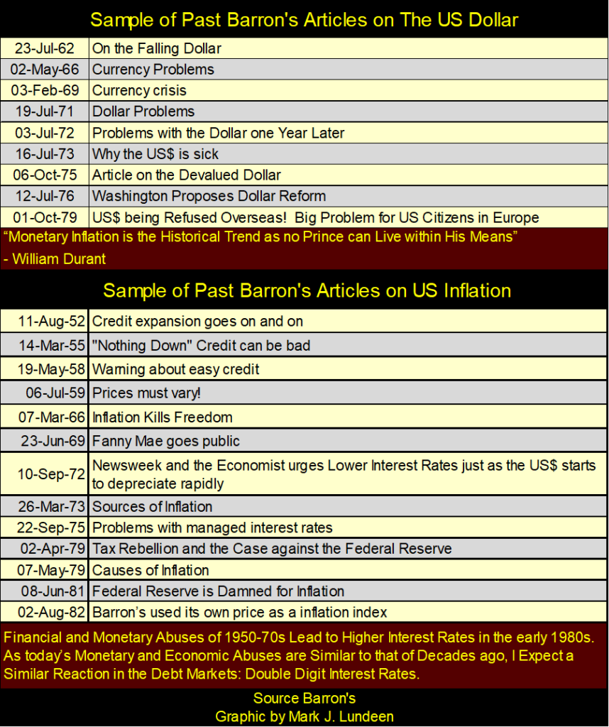
Why doesn’t our contemporary financial media recognize the dangers to the dollar and rising consumer prices, are only the predictable consequences of “monetary policy,” as dictated by the idiots at the FOMC? I don’t know. But the fact that today, almost everyone now has some college education, and college professors like what the Federal Reserve does; employ college professors to manage its “monetary policy.”
Let’s now look at the indexed values for Currency in Circulation (CinC: paper dollars in circulation), the Dow Jones, and the Barron’s Gold Mining Index (BGMI), with 05 January 1920 = 1.00.
This chart provides a unique history of the stock market. Looking at the green plot (CinC), it’s obvious that monetary inflation flowing from the FOMC, has been an ongoing process for the past 100 years. When monetary inflation flows into the Dow Jones (Red Plot advancing), Wall Street sees a bull market, and economists talk of “economic growth.” When it flows into the BGMI (Blue Plot advancing), consumer price inflation is a problem in the economy. We need to note too, there are times when the Dow Jones and the BGMI advance, or decline together.
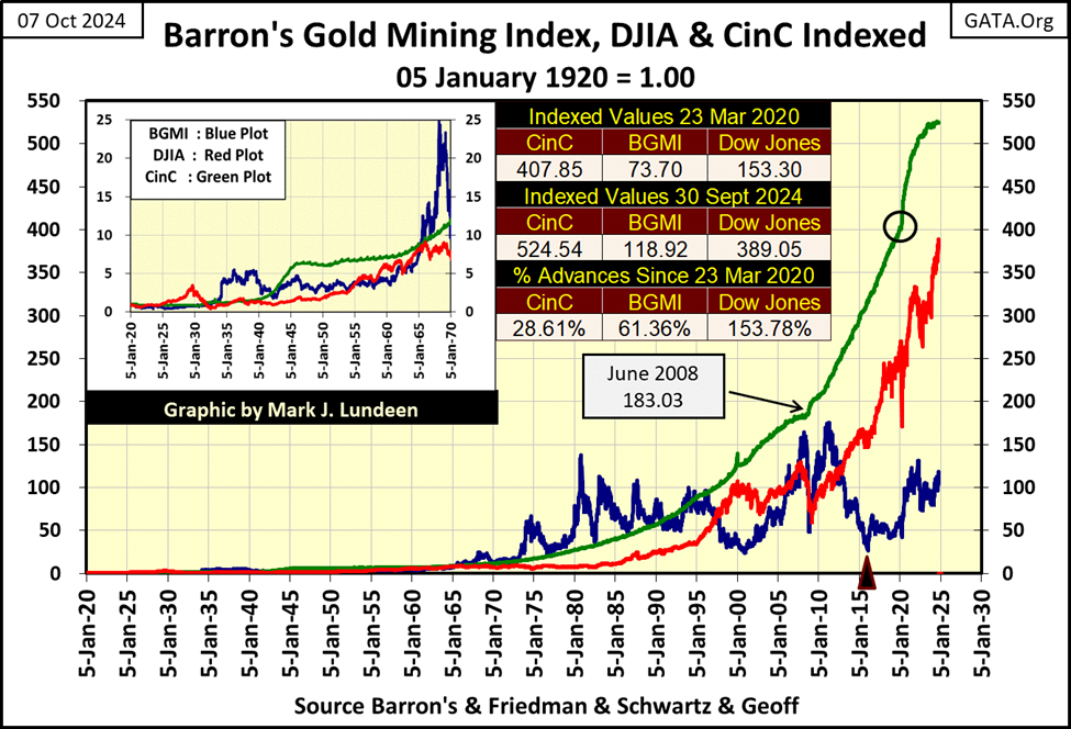
Looking at the BGMI above, before 1965 it didn’t do much. After 1980, the BGMI
has oscillated between 25 and 180. Also, the BGMI from 1970 to about 2011 apparently outperformed the Dow Jones in the chart above. But actually, it didn’t. What the BGMI was excellent at was spiking to new all-time highs, as in August 1980, and then slowly deflate away those gains over a decade or more.
To see a superior view of the BGMI since 1920, let’s look at it as Mr Bear does; in terms of new all-time highs and percentage claw-backs from those all-time highs, in the BEV chart below.
This is interesting; from 1920 to 1971, the BGMI saw most of its weekly closes above its BEV -40% line. After 1971, the BGMI saw most of its weekly closes well below its BEV -40% line.
What happened in 1971? Oh yeah, that was when the US Treasury took the dollar off of its $35 gold peg. One would think such a market event, that lead to a huge increase in monetary inflation would have been very beneficial for the gold and silver miners. But as you can see below, it wasn’t. At least not yet, as the idiots at the FOMC have been very successful in funneling their monetary inflation into the financial system, keeping it away from inflation hedges like gold, silver and mining shares.
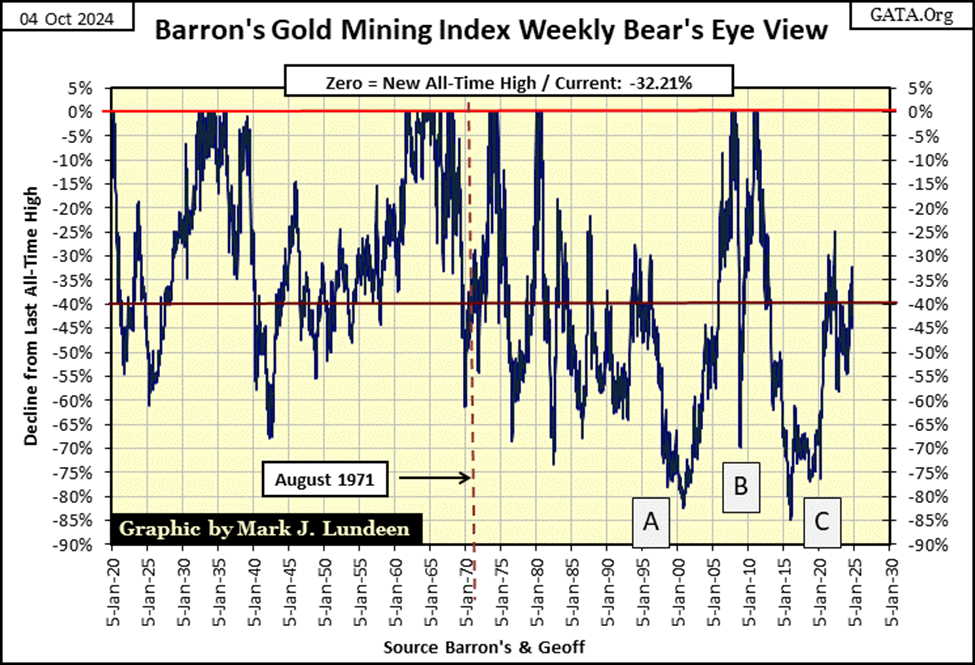
I see a massive bull market set up for the BGMI on the chart above. Since 2000, the BGMI has seen three massive bear market bottoms; boxes A-C in the chart above. These massive bear market bottoms have driven investors and managed money out of the gold mining sector, which makes the BGMI a very attractive sector in the stock market, for those willing to wait for the investors and managed money to return.
So, when will investors and money managers come back to the gold miners? I don’t know. But as the price of gold and silver bullion continues to rise, there will come a point in time where their miners will also become very attractive to the market, if for no other reason than their growing dividend payouts.
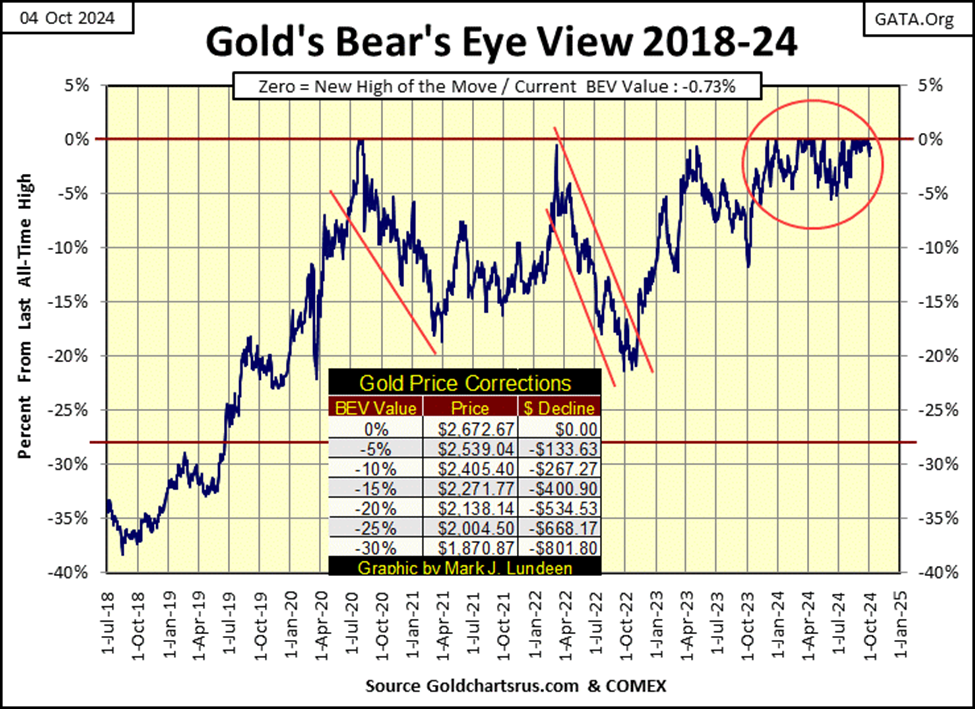
In gold’s BEV chart below, like the Dow Jones, gold too entered scoring position last November, making 37 new all-time highs, advancing gold by 36% in the past eleven months. By this same measure, the Dow Jones has advanced by only 20% in these same eleven months.
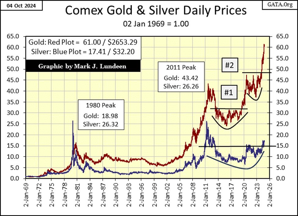
Silver is moving up too, not that one would notice in the chart below, where I’ve plotted gold and silver indexed to 1.00 = 02 January 1969. Silver is still far below its last all-time highs from January 1980, and currently stuck below its 20-factor line, as it has been for over a decade.
I continue seeing positive market commentary on the price of silver. But until I see some upward movement in silver’s blue plot below, I don’t take that commentary very seriously. I’m not saying this positive commentary on silver isn’t true. It most likely is true. It just that I’ve been following gold and silver for too many decades, decades where silver last all-time high is still from January 1980. When silver does close above $50 an ounce, I’ll finally have a reason to be excited about what is going on in the silver market.
But for someone who is buying precious metals for an investment, and as a hedge for what a gaggle of idiots at the FOMC are doing to the dollar, and America’s financial system, they have to like gold, but LOVE silver for what is seen below. At this week’s close, $2650 will purchase one ounce of gold, or over 82 ounces of silver? I think the 82 ounces of silver is the better buy.
Moving on to gold’s step sum table below, since my last market commentary (September 6th), gold has seen eight additional BEV Zeros. Gold’s 15-count had also increased to a +7 on September 24th, making gold an overbought market.
Markets don’t like being overbought, so it wasn’t a surprise seeing the number of down days in the gold market soon increasing in the table below. At week’s close, gold’s 15-count is now a neutral +1, so gold is no longer an overbought market. And I also note that though gold has seen five of the past six trading sessions decline, these overwhelming down days did little to drive the price of gold down.
So, when a market finds it easier to go up than down, as gold has in its step sum table below, expect further advances in the weeks and months to come.
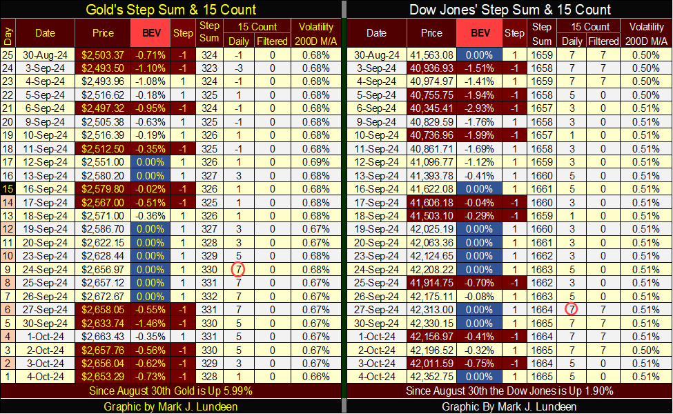
On the Dow Jones side of the step sum table above, it too is in a strong market advance, with daily advances overwhelming daily declines for the past five trading weeks, and nine new all-time highs. As of the close of this week’s trading, additional advances in the Dow Jones should be anticipated. But I believe the gold market is a better market to risk one’s money on, as we approach 2025.
__
(Featured image by sergeitokmakov via Pixabay)
DISCLAIMER: This article was written by a third party contributor and does not reflect the opinion of Born2Invest, its management, staff or its associates. Please review our disclaimer for more information.
This article may include forward-looking statements. These forward-looking statements generally are identified by the words “believe,” “project,” “estimate,” “become,” “plan,” “will,” and similar expressions, including with regards to potential earnings in the Empire Flippers affiliate program. These forward-looking statements involve known and unknown risks as well as uncertainties, including those discussed in the following cautionary statements and elsewhere in this article and on this site. Although the Company may believe that its expectations are based on reasonable assumptions, the actual results that the Company may achieve may differ materially from any forward-looking statements, which reflect the opinions of the management of the Company only as of the date hereof. Additionally, please make sure to read these important disclosures.

-

 Business1 week ago
The TopRanked.io Weekly Digest: What’s Hot in Affiliate Marketing [uMobix Affiliates Review 2026]
-

 Biotech2 weeks ago
Beeline Medicines Launches with $300M to Advance Precision Therapies for Autoimmune Diseases
-

 Crypto2 days ago
Crypto Markets Steady as US Bitcoin Reserve Plans and MegaETH Debut Take Focus
-

 Fintech1 week ago
Fintech Investment Rebounds in 2025 Amid Cautious Optimism for 2026


