Business
Dow Jones Near Record Highs Amid Bullish Momentum and Bearish Long-Term Fears
By mid-February 2026, the Dow Jones sits near record highs, repeatedly reaching new peaks since late 2023. Momentum remains, but the author sees an inflation-driven bubble and expects a future bear market. Despite possible gains toward 60,000, they avoid stocks, favoring gold and silver while staying cautiously flexible about short-term upside in the coming months.
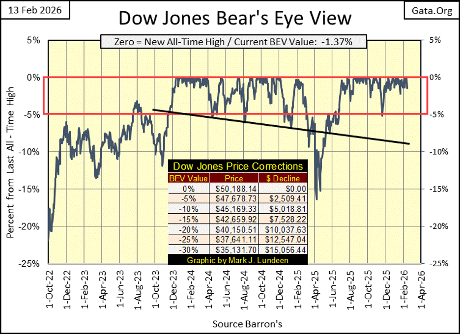
At February’s mid-point, in the year of our Lord 2026, what is there to know about the Dow Jones? To pierce the veil of that mystery, let’s take a peek at the Dow Jones’ BEV chart below.
Yep, just as I suspected; the Dow Jones closed the week with a BEV of -1.37%, only 1.37% below its last all-time high of 50,188. And for as long as the Dow Jones’ BEV values close daily within the Red Rectangle below, remains inside scoring position, within 5% of its last all-time high, the proper thing for an investor to do is; assume additional all-time highs for the Dow Jones are pending.
Since the Dow Jones entered into scoring position in November 2023, it has seen eighty-one new all-time highs, or BEV Zeros in the BEV chart below. From the first of these eighty-one new BEV Zeros, seen on 13 December 2023 (37,090), to its 81st new all-time high on Tuesday this week (50,188), this advance has advanced the Dow Jones by 13,097 points, or 35.3%.
Not bad for a bunch of dividends yielding, blue-chip geezers. Sure, the young whipper-snappers trading at the NASDAQ have done much better than these grey-haired old fogies these past two years, but they’ll also do much worse when Mr Bear comes to pay his respects to Wall Street.
Does that make me bullish on the stock market? Well, I guess it does. But I don’t have a dollar at risk in this stock market, as I believe the broad stock market is a huge inflationary bubble, inflated by the idiots at the FOMC. In February 2026, the best this stock market has to offer investors, can best be seen in the market’s rearview mirror.
To my way of thinking about the stock market in February 2026, next big thing for this market, will be a historic bust, a big bear market. I don’t know when this will happen. Maybe next week, maybe next year, maybe not until President Trump is out of office in January 2029. I just know, I don’t want any part of what Mr Bear has planned for this stock market, so I’m out of the stock market, and into gold and silver, and the companies that mine them.
- As you will see, I haven’t suffered from taking that stance in the market. *
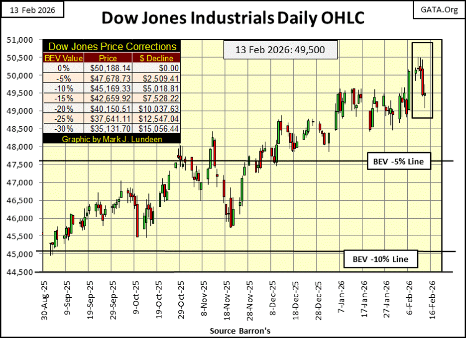
Here is the Dow Jones in daily bars. Tuesday of this week was the Dow Jones’ latest all-time high. But if you look at Tuesday in the chart below, the latest all-time high for the Dow Jones wasn’t much of a bellow from a raging bull. And then came the rest of the week. Well, call me bullish, but not enthusiastic about the Dow Jones’ prospects in the weeks and months to come.
But I’m flexible! I have to be if I’m someone expecting to see the Dow Jones trading over 60,000 before this advance is over. All it takes is a few strong weeks for the market, and I’ll be this bull’s biggest supporter, up to, and then above 60,000. Just don’t ask me to look out below. This advance began with the Dow Jones below 800 in August 1982. Now after forty-four years, it’s trading over 50,000. There is something so wrong with that.
Here are the Bear’s Eye View values for the major market indexes I follow, table below. This week saw some BEV Zeros, closing on Friday with only one, the Dow Jones Utility Average (#1). But this market advance is still intact. I know that by looking at all the indexes below closing the week in scoring position, in the Red Box. Don’t be shocked if a day comes with most of them closing at a new all-time high, sometime in the next month or so.
And so it will be, until these indexes seen below begin seeing their valuations deflate below their BEV -10% lines, like this week’s #21, the NASDAQ Insurance Index.
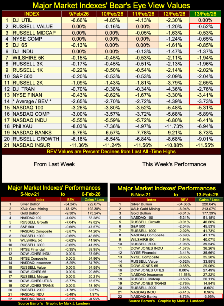
Now look at the XAU (#18). On Wednesday it closed in scoring position, with a BEV of -4.97%. The next day it was driven down to a double-digit BEV value, at -11.73%, to then recover on Friday with a BEV of -6.94%. What a wild ride these gold and silver miners had this week. But then, volatility is the name of game when it comes to precious-metal bull markets.
Looking at the performance tables above, they are a tale of two bull markets. At the top three positions, we have silver, the XAU, and gold. Silver is amazing. Its last all-time high was on January 28th ($118). This week it closed with a BEV of -34.66% ($77.40), meaning silver has lost 34.66% of that $118 it closed at a few weeks ago, AND STILL IT CLOSED THIS WEEK AT #1!
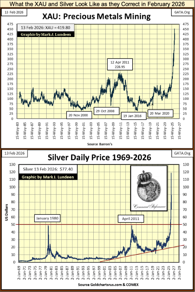
No bull market goes straight up. But seeing silver remain at #1 in the performance table above, following a significant, 35% correction is something one doesn’t see very often, if ever. I said we are looking at two bull markets above, everything precious at #1-3, and a bull market for everything else from #4 and below.
The NASDAQ Banking Index late last, and early this week, almost advanced back into scoring position; a daily close less than 5% from its last all-time high. The banks this week have closed with a BEV of -8.73%, still outside of scoring position. Their last all-time high happened in late 2021, over four years ago.
Looking at the performance tables’ BEV values above, since November 2021, every other major stock index has seen multiple new all-time high since 2021, except for the NASDAQ Banking Index. Are the banks telling us something about the stock market?
As I have banking stock data going back to 1938, let’s take a look at the banks, to see what, if anything has changed in these past ninety years.
First; my banking data is a compound of three banking stock series;
• Barron’s Stock Averages (1938 to 1988),
• Dow Jones Total Market Groups (1989 to 1996),
• NASDAQ Banking Index (1997 to Present).
Ideally, I’d use the Barron’s Stock Averages data from 1938 to present. But Barron’s discontinued this series of stock * AVERAGES * in October 1988, as they became an antique. Barron’s Stock Averages was a weekly data series, based on Thursday’s closing prices, because in 1938, each average was hand computed via pencil on paper. If they didn’t start computing on Thursday’s close, they wouldn’t have the time required to do all the stock averages’ calculations by the publication’s deadline on Saturday.
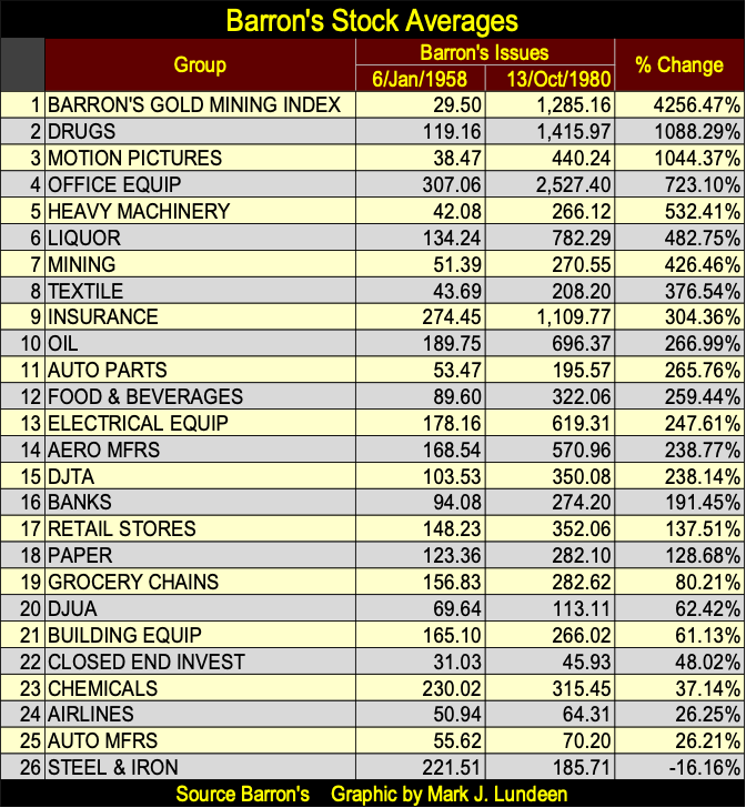
By 1988, when computers were widely available to most people, I doubt many people still followed this weekly data series. But in 1938, Barron’s with their stock averages (see table below) offered the investment world something no one else had; a view of the NYSE as a spectrum of industry groups.
Viewing the market as a spectrum of groups was a very powerful tool to analyze the stock market with. The table below, using the Barron’s Stock Averages, was constructed for a past article of mine. This data illustrates that from January 1958, to October 1980, the gold miners in the Barron’s Stock Averages, were the top performing group at the NYSE.
For your information; today’s Barron’s Gold Mining Index, is the only surviving member of the old Barron’s Stock Averages seen below. And today, it is still a weekly data series, using Thursday’s closing price as its basis. That is something I find very interesting. Thankyou Barron’s statistical department!
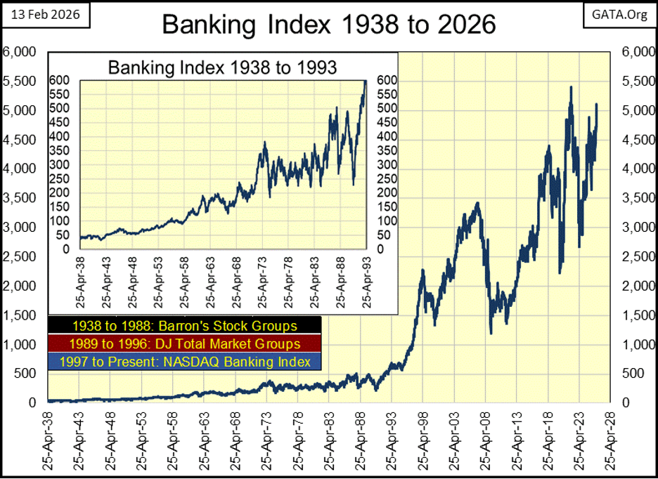
So much for that. Now on to the plot for the banking system, from 1938 to 2026, as seen below. In the chart’s upper left corner, I inserted a chart for 1938 to 1993, to better display the early decades of this data set.
For us today, there is little interest for this banking data, until our bull market began in last half of 1982, when for the first time in history, the Dow Jones not only closed above 1,000, but stayed above 1,000 for the past five decades. Looking at the banks below, they didn’t join the Dow Jones in its bull market, until 1985, or so.
So far, the 21st century has seen three historic market pull back in the Dow Jones, my proxy for the broad stock market;
• NASDAQ High-Tech Bear Market (March 2000 to October 2002)
• Sub-Prime Mortgage Debacle (October 2007 to March 2009)
• March 2020 Flash Crash (February to March 2020)
These three notables, 21st century market pull backs can be seen in the banking chart below.
Here is a point of interest in this data; since 1938, this banking index has increased by only a factor of 100, from 50 to 5000. Banks have not been the investors best friend when it comes to generating capital gains. Since May 1938, the Dow Jones has advanced by a factor of 414, four times that of the banking index.
Up to the 1980s, maybe the 1990s, banks got their capital, money to be lent out, from people like you and me, depositing our savings, not by the idiots from the FOMC, “injecting liquidity” into their balance sheet. Also, decades ago, banks primarily lent their depositor’s’ money to other businesses as lines of credit, for financing inventories.
Decades ago, bankers then being risk adverse, didn’t do personal loans, or much of anything else, other than create lines of credit for businesses to manage their inventories. If someone wanted money to start up a business, they best ask a rich uncle for the money. Bankers wanted safe, and dependable businesses for investing their depositors’ savings in.
In other words, banks long ago saw their loans as capital, money to make money with. If someone wanted to take a loan out for a once in a life’s time vacation, spending money with no possibility for a rate of return, banks didn’t do that.
What won’t a bank make a loan for today? If it appears that someone can service the loan in question with their wages, most banks are willing to lend them the money. That wasn’t always true, because banks decades ago, weren’t predators on America’s middle class, willing to take whatever they could from “consumers.”
Before the 1970s, people could ruin themselves by mismanaging their money. However, banks refused to leverage such foolishness by lending individuals money to be squander. That isn’t true anymore, how many credit cards does your family hold? Ask any college graduate that owes $70,000, or much, much more on a totally worthless critical-studies degree, that everyone at the bank that lent the money, and the college that took the money, knew would ruin the life of the student, that had to pay back the money, with interest.
So much for that. Now let’s look at the same dollar data plotted above, but in my Bear’s Eye View (BEV) format below, where each new all-time high registers only as a 0.0%, and any data point in the plot that isn’t a new all-time high, registers as a negative percentage claw-back from its last all-time high. In other word, the BEV format below, takes the dollar data seen above, and converts it into a range of only 100 possible percentages;
• 0.0% = New All-Time High.
• -100% = Total Wipeout in Valuation.
Looking at the banking data below, before the US Treasury took the dollar off the Bretton Woods $35 gold peg in August 1971, these banks never saw a market decline, from an all-time high, that was greater than a 35% claw-back. This was also the time, when banks use depositors’ saving to finance their operations, and their operations were basically loans to established businesses.
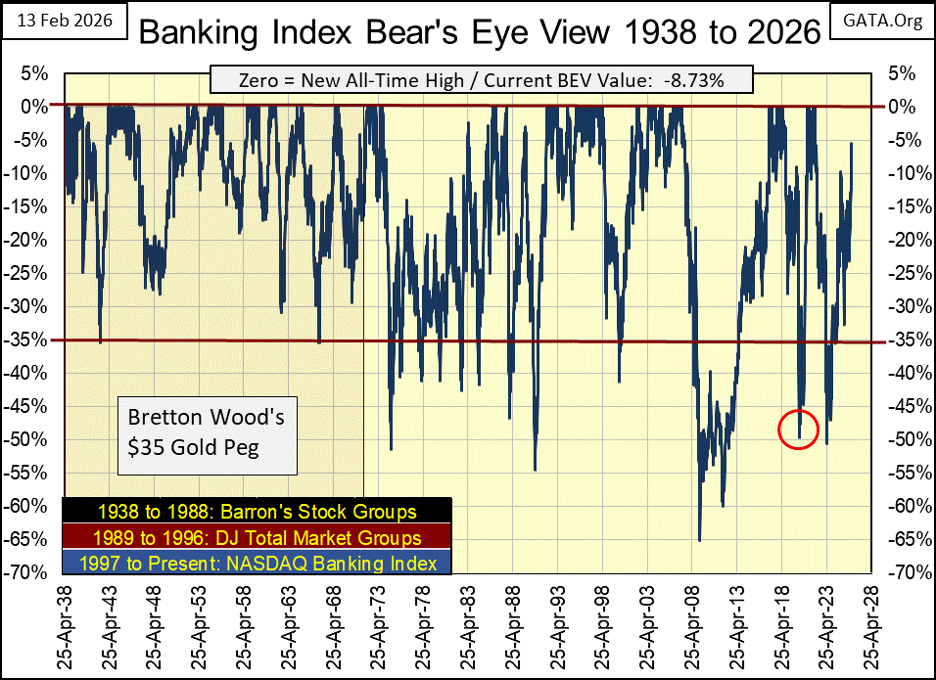
In the BEV data above, its easy seeing when the banking system became unstable; after August 1971, when the US Treasury decoupled the dollar from its $35 gold peg. Doing so allowed the US Treasury, to vastly increase the volume of paper dollars in circulation, and allowed the Federal Reserve to expand credit, far beyond what was considered prudent before August 1971.
The banking index seen above, began seeing BEV claw-backs in excess of 35%, in the aftermath of decoupling the dollar from its gold peg. Bear markets in banking no longer bottomed at a BEV value of -35%. Following 1971, banking began seeing 50% declines at bear market bottoms, and more.
The March 2009, 65% bear market bottom of the 2007-2009 subprime mortgage debacle would have been deeper, but the US Government bailed out the banking system with the Federal Reserve’s QE#1-3.
The 50% claw-back from the March 2020 Flash Crash (Red Circle), would have exceeded the 65% market decline seen in March 2009, had the idiots at the FOMC not “injected” trillions of dollars of “liquidity” into the financial system, with their Not QE#4, seen below.
Looking at a market series using the Bear’s Eye View, we can create a frequency table to see how many;
• new all-time highs (0% Row),
• closes in scoring position (-0.01% Row).
• and closes in 5% increments from last all-time highs, over many decades, as seen below.
The table on the left below, shows the banking index’s BEV values going back to 1938, for 4,582 weekly closings. The middle table shows the BEV values from 1938 to August 1971, when the dollar still had its $35 gold peg. For these 1,738 weekly closings, the banks never saw a claw-back in excess of 35%
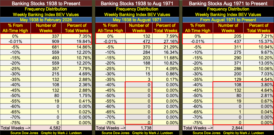
The right table gives the BEV values for the banks since August 1971. Two items to look at when comparing this data for the banks in the center table;
• the percent of total weeks in the 0% & -0.01% rows, the weekly closings at new all-time highs & in scoring position, weeks the banks were in a bull market,
• the volume of weeks closing below the BEV -35% lines.
Before August 1971 (center table) the banks were at new all-time highs, or in scoring position for 34.75% of all weekly closings. After August 1971 (right table), the banks were at new all-time highs, or in scoring position for only 22.58% of all weekly closings. Decoupling the dollar from its $35 gold peg, wasn’t bullish from the perspective of percentage of time the banks were advancing in bull markets.
Also, following 1971, as seen in the right table, bear market bottom became deeper, and the banking stocks remained below their BEV -35% lines for a considerable amount of time, or 340 weeks, 11.95% of the 2,844 weeks used in this sample.
Conclusion, the banking system in 2026 is not as stable as it was before 1971. Come the next bear market, expect additional quantitative easings to follow. Call it what it will be: the fifth quantitative easing since 2009 / QE#5.
The dollar will suffer for it. If investors aren’t protecting themselves from the engine-of-inflation, also known as the Federal Reserve, by buying gold and silver bullion, even at todays elevated prices, the day will come when they wished they had.
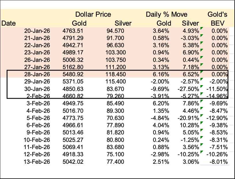
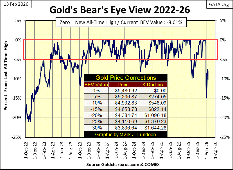
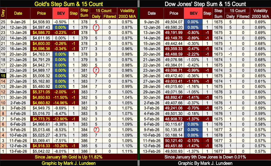
So, lets look at this week’s gold’s BEV chart below. Since gold’s last all-time high, $5,480.92 seen on January 28th, so far it’s seen a 15% correction in BEV chart below. This week gold closed with a BEV of -8.01%, so it has made up about half of that 15% correction. Let’s hope the bottom is in gold’s current correction, and will soon be making new all-time highs.
I think that is likely. Why I think that can be seen by how fast gold went from its last all-time high, to that 15% correction seen in the price table and BEV chart below. In the table, taken from my daily data file, look at how fast gold, silver too, went from their last all-time highs to a double-digit decline. Two days. Look at silver! On January 30th, and again on February 5th, it saw one day declines in excess of 20%!!
What is seen below, is not a normal market’s reaction to the supply and demand fundamentals in the gold and silver markets. We are observing a professional hit job on the gold and silver market. We’ve seen these hit jobs many times over the past decades. But in the past, they’d whack gold and silver, and they’d stayed whacked for years, like in 1980s and 1990s.
But it is different these days, gold and silver don’t stay whacked for that long anymore. I wouldn’t be surprised to see the old monetary metals making new all-time highs once again by April, or even before.
Back to gold’s BEV chart below. What do you think? Is gold next to break below its BEV -15% line, or above its BEV -5% line. Knuckles and Bugsy may not be finished with gold just yet, so I won’t rule out the possibility of seeing gold break below its BEV -20% line. But, I’m thinking the next big thing in gold’s BEV chart below, will be it breaking above its BEV -5% line. Maybe before March.
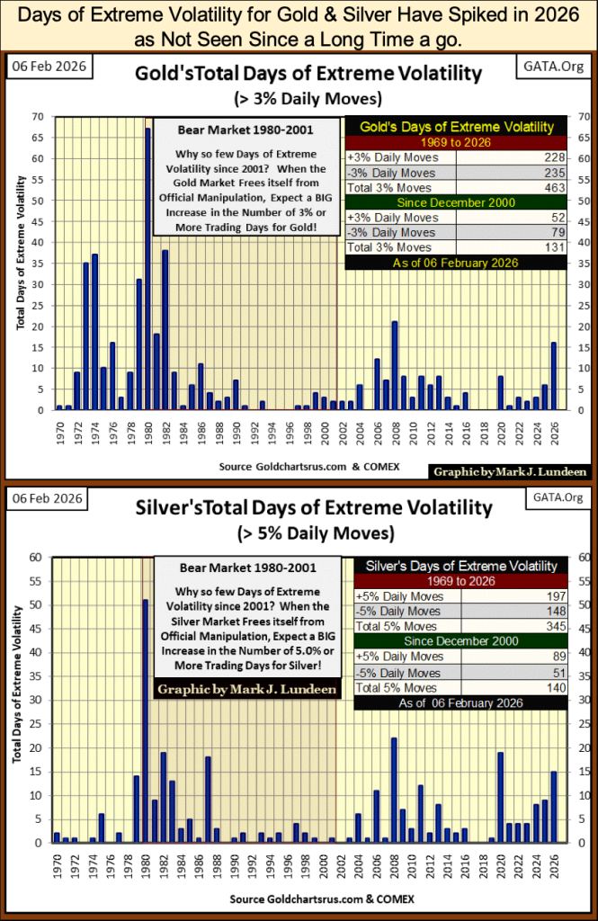
That 2026 is different for gold and silver, can be seen by the volatility spikes seen in their charts below. We’re still in the second month of 2026, and gold has already seen sixteen days of extreme volatility (3% days for gold), and silver has seen fifteen days of extreme volatility (5% days for silver).
Knuckles and Bugsy may be having their way with the old monetary metals now. But seeing gold and silver with so many days of extreme volatility so early in 2026, strongly suggests that someone, somewhere, has changed the rules in the gold and silver markets to the favor of the bulls. Only time will tell if I’m right or wrong, but I’m excited about what I’m seeing in this week’s charts.
Gold in its step sum table below, continues seeing advancing days in excess of daily declines. We can see that by gold’s 15-count refusal of going negative. In fact, this week gold became overbought, a 15-count of +7, for the third time since early January.
So, since January 28th last all-time high, gold has been going down with more daily advances than daily declines. Knuckles and Bugsy may be holding gold’s head under the water, but gold is fighting back.
However, gold’s 15-count has been positive since November 21st. That is almost three months of gold seeing advancing days in excess of daily declines. That is a long time for any market to maintain a positive 15-count. There is coming a time when gold will once again see daily declines in excess of daily advances, seeing a negative 15-count.
The price of gold can still advance with a negative 15-count, but will it? I can’t say if it will, or will not. But, we have good reason to believe gold is in a bull market. And what gold, silver too, does during a bull market, is over time advance to new all-time highs.
Look at gold’s daily volatility’s 200D M/A, it closed this week at 1.11%. Rising daily volatility for gold is a bullish indicator.
For the Dow Jones, this week it saw two new all-time highs, blue BEV Zeros above. The Dow Jones may be seeing more declining days than gold has, but that hasn’t halted its advance. I also note how the Dow Jones daily volatility’s 200D M/A has now decreased to 0.57%. But then, that is what the Dow Jones does during its bull market advances; it goes up, as daily volatility goes down.
Looking at daily volatility for the Dow Jones below, its 200D M/A is approaching the 0.50% line. If the past is a guide for the future, and it usually is, when Dow Jones’ daily volatility’s 200D M/A approaches this low level of volatility, whatever the stock market has to offer investors, it’s typically exhausted. In other words, the stock market soon tops out, before turning to the downside.
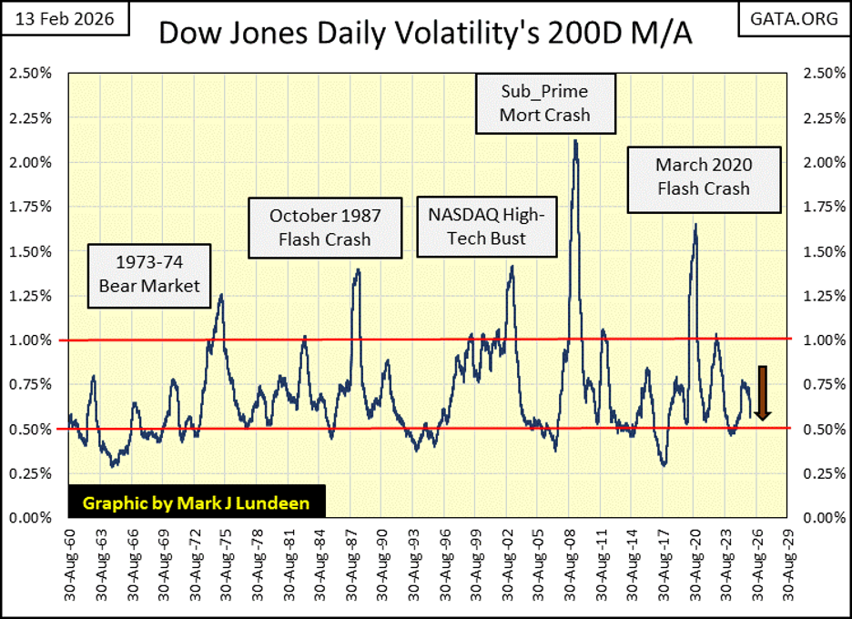
It will be interesting to see what happens this time. Will daily volatility for the Dow Jones once again bounce up, taking the Dow Jones down? We should know all about that, say by June.
But since 1960 in the chart above, Dow Jones bull markets top out when its daily volatility approaches that red line at 0.50%, as bear markets bottom when Dow Jones daily volatility spikes above its 1.00% line.
Looking at the past sixty-six years of market history above, this bull market advance is approaching its last all-time high. The market history seen above, strongly suggest what follows a market top, is a big bear market.
But when? I haven’t a clue. But as I’m out of this market, sitting in the market’s peanut gallery, guzzling beer and eating hotdogs, I am enjoying the show.
__
(Featured image by Arturo Anez via Unsplash)
DISCLAIMER: This article was written by a third party contributor and does not reflect the opinion of Born2Invest, its management, staff or its associates. Please review our disclaimer for more information.
This article may include forward-looking statements. These forward-looking statements generally are identified by the words “believe,” “project,” “estimate,” “become,” “plan,” “will,” and similar expressions, including with regards to potential earnings in the Empire Flippers affiliate program. These forward-looking statements involve known and unknown risks as well as uncertainties, including those discussed in the following cautionary statements and elsewhere in this article and on this site. Although the Company may believe that its expectations are based on reasonable assumptions, the actual results that the Company may achieve may differ materially from any forward-looking statements, which reflect the opinions of the management of the Company only as of the date hereof. Additionally, please make sure to read these important disclosures.


The TopRanked.io Weekly Digest: What’s Hot in Affiliate Marketing [++ KuCoin Affiliate Program Review]
X now allows people to block certain topics from their feed. This week, we're going to tell you how to...


Hotel Stay Project Supports Wildlife Conservation in Japan
Iwate Prefecture launched a project linking hotel stays to conservation through Morioka Zoological Park Zoomo. A themed room at Yunomori...


Bitcoin Leads Modest Crypto Rebound Amid Mixed Signals
Bitcoin rose 2 percent to above 77000 as ETFs saw 15 million inflows and April gains of 12.2 percent. Ethereum...


Major Pharma Advances: EU Approvals, Vaccine Progress, and Breakthrough Clinical Results
Johnson & Johnson has EU approval for nipocalimab for generalized myasthenia gravis, showing superior control and sustained benefits. Sanofi reported...


Agential Cannabis 2026 to Drive APAC Market Growth and Global Industry Collaboration
Agential Cannabis 2026 will take place September 23–24 in Bangkok, bringing global experts together to advance the APAC medical cannabis...
 |
|
 |  |
 |
|
-

 Biotech1 week ago
BB Biotech Accelerates Portfolio Overhaul and Outperforms NAV in Strong Q1 2026
-

 Impact Investing3 days ago
Flexibility Becomes Key as Renewable Energy Faces Pricing and Profit Challenges
-

 Business2 weeks ago
The Federal Reserve and War in Iran: Why It Matters to Your Money
-

 Fintech1 week ago
Lutech Acquires Talentomobile to Boost European Fintech Expansion