Markets
Dow Jones Near Record Highs Amid Inflation-Driven Market Optimism
Since mid-July, the Dow Jones has stayed within 3% of record highs, signaling continued bullish momentum. Having reached seventy new all-time highs since November 2023, it now sits near 47,706. Though optimism persists, critics warn rising valuations stem from Federal Reserve-driven inflationary bubbles, threatening future market instability despite short-term gains in equities and precious metals.

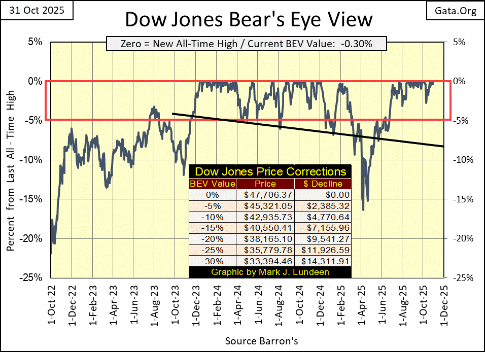
Looking at the Dow Jones in the Bear’s Eye View (BEV) below, since mid-July, the Dow Jones has daily closed either at a new all-time high (0.0% = BEV Zero), or within 3% of one. This week closed with the Dow Jones only 0.30% from its last all-time high. And for as long as the Dow Jones can maintain itself within the red rectangle, between its 0.0% and -5.00% lines, also known as Scoring Position, we should anticipate additional new all-time highs.
Since the Dow Jones entered into scoring position in November 2023, it has seen seventy new all-time highs, taking the Dow Jones up from 35,151 two years ago, to 47,706, its last all-time high seen on Tuesday this week. A very respectable two-year advance of 35.7%.
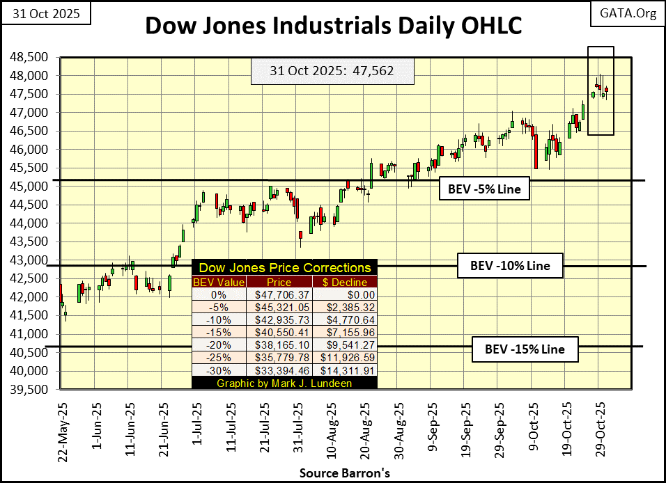
The Dow Jones in its daily bar chart below, took a break this week. Though as noted above, it did close at a new all-time high on Tuesday.
So, what is next? If you believe its BEV chart above, the Dow Jones is fated to generate additional new all-time highs in the weeks and months to come. That will be so until it deflates below, and stays below scoring position in its BEV chart. Will it soon be 50,000 on the Dow Jones? Though I personally find that thought repellent, for an index that used to trade well below 1,000 during my lifetime, I fear 50K on the Dow Jones is our destiny.
What is the problem with 50,000 on the Dow Jones? Simple; the Dow Jones is at risk of closing above 50,000, because the idiots at the FOMC are inflating a humongous, inflationary bubble in the stock market, and just about everything else, including my property taxes, and home insurance premiums.
The idiots are also inflating a bubble in the earnings for the Dow Jones, chart below. This week they increased to record highs. But all bubbles eventually go bust, as seen in the Dow Jones’ earnings below. During the sub-prime mortgage debacle, from a record high in October 2007, to negative earnings a year later in October 2008.
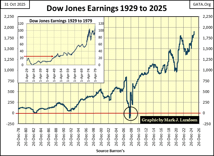
Earnings for the Dow Jones also went negative at the bottom of the Great Depression, and took two decades for them to once again become record highs. Not so for the Dow Jones’ crash in earnings of 2007-08. They rebounded to new all-time highs in less than three years.
Here is my table for the BEV values of the major market indexes I follow. The Bear’s Eye View compresses dollar data into a range of only 100 possible percentage points;
- 0.00% = new all-time high,
- -100% = total wipe out in valuation.
Monday saw fourteen new all-time highs in these indexes, and as the week moved on to Friday, BEV Zeros became increasingly rare market events. Friday closed with only one new all-time high. But on Friday’s close, fifteen of these indexes closed in scoring position, within 5% of their last all-time high. We should anticipate additional monetary-inflation flowing into the stock market, and additional new all-time highs this inflation causes.
One day, this bull market is going to end. But I doubt it will be next week.
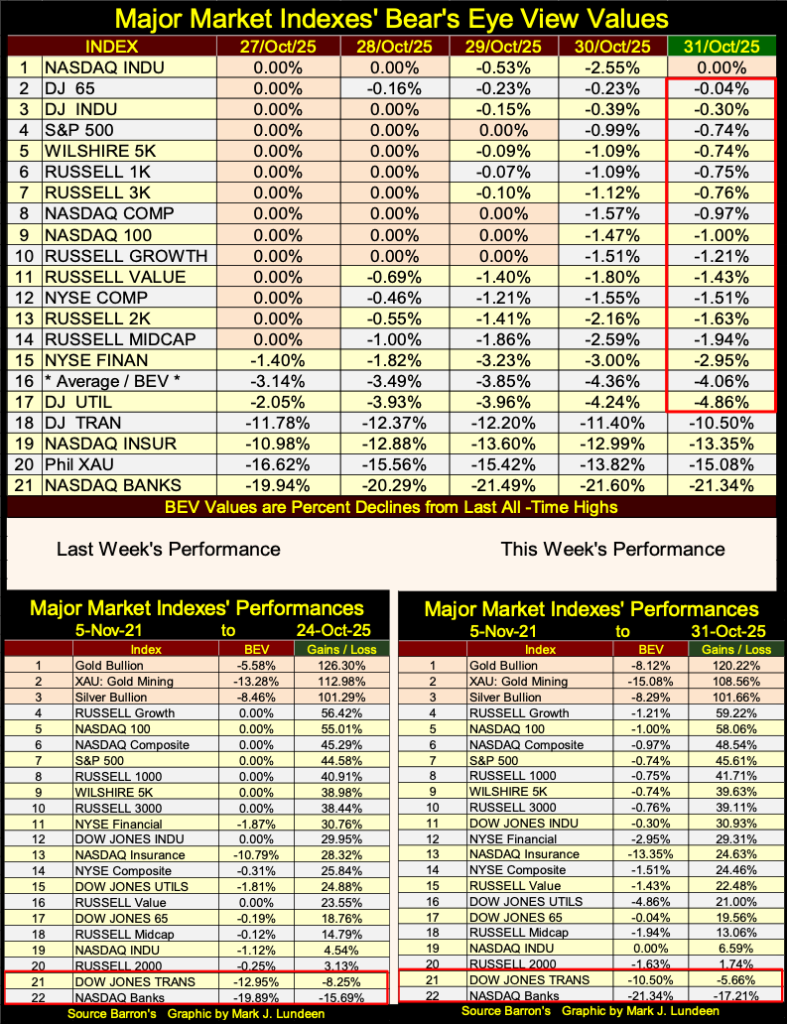
In this week’s performance table; gold, silver, and the XAU remained in the top three spots, with nothing else even close to them. When the advance in precious metal assets resumes, expect the gap between them, and everything else in the table to only increase.
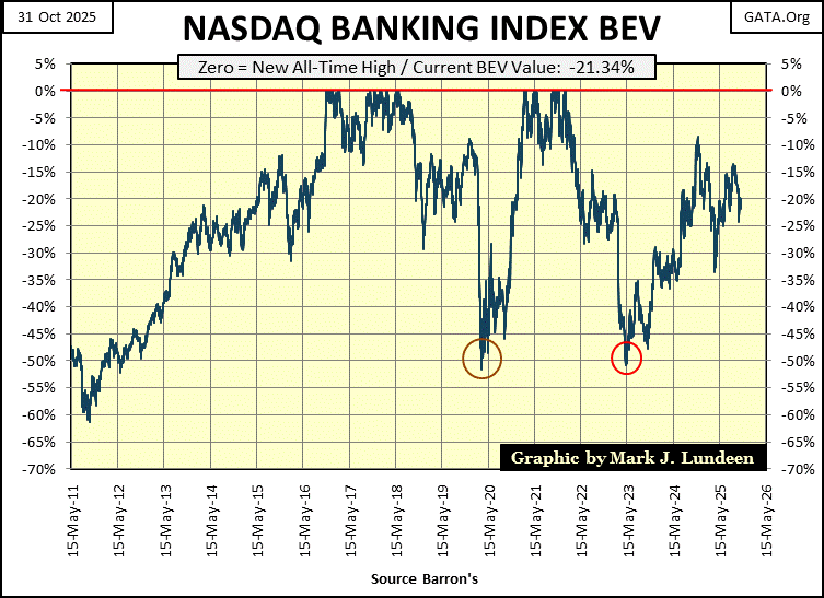
This week, the NASDAQ Banking index closed 17.21% from where it was on 05 November 2021, four years ago, and 21.34% from its last all-time highs, as seen in its BEV chart below. If the stock market is in a bull market, why are these banks doing so poorly?
When I drive around the town, I see empty strip-malls that were thriving businesses before the covid-vaccine scam. So, naturally enough, pending massive defaults in commercial real estate mortgages comes to my mind.
When was the last all-time high for the NASDAQ Banking Index? 14 January 2022, at the peak in the covid scamdemic. A time when the CDC insisted on locking down, and masking everyone, including the vaccinated. Those people, especially Dr. Fauci had their way with us. Like so many strip-malls, it looks like these banks have yet to recover, and maybe never will.
Each week, Eric King interviews Alasdair Macleod for his Weekly Market Wrap. Alasdair, I believe, is homeported somewhere in the UK. Between the two of them, King World News listeners receive an excellent overview of the financial markets, with a focus on gold, silver, and the miners of the old monetary metals.
Eric and his webmaster, Bryan have been subscribers to my weekly articles for years, and last week they published some very nice comments about my work.
I am honored to be included with people such as Alasdair Macleod, and James Turk by Mr. King.
For years, Eric has commented on how cheap the gold miners currently are, priced to where it would be hard believing they could get much lower, especially with gold and silver rising by multiples of where they were a decade ago. Plotting the ratio of the XAU to Gold, chart below, using end of month data, Eric refers to what he calls the “Devils Box.” The Green Box to illustrate how historically cheap the gold, and silver miners are, in terms of the gold and silver they mine.
Looking at this chart, I agree with Eric 100% on that! This ratio may have been below the chart’s 10% line since 2013, twelve years now, but this isn’t a permanent situation. A day is coming when this ratio will once again trend towards its 20% line, and beyond. What that will mean for current owners of gold and silver miners will be simply wonderful.
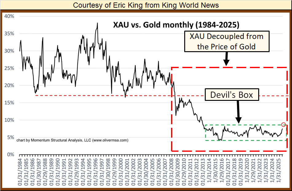
After studying this chart, I took the liberty of noting something else. Within the Red Box I placed in it, I’ve noted where the valuations of the XAU became decoupled from the price of gold.
This decoupling happened, at the beginning of a particularly dodgy episode of market history, the sub-prime mortgage debacle. Eyeballing this chart, I’d say about the time the now bankrupt Wall Street bank; Bear Stearns collapsed due to its holding of toxic sub-prime mortgage products.
Is there a connection between the sub-prime mortgage debacle, and this chronic undervaluation of the gold miners in the markets since early 2008? I can’t speak to that, other than saying that just looking at the chart above, there could be.
I have daily data on the XAU, and the price of gold going back to when the XAU first traded at the Philadelphia Options Exchange in December 1983. So, I thought I’d take my own look at this anomalous situation between the XAU and the price of gold, chart below, using the indexed values of gold and the XAU, indexed to December 1983 = 1.00.
For the first few decades, the relationship between gold and the XAU were closely correlated in this chart. Then something happened in early 2008, where the valuation of the XAU became decoupled from the price of gold. Could it be the March 2008 failure of Bear Stearns, when it choked on its own portfolio of toxic sub-prime mortgage assets? Maybe. But even if so, why has this situation continued for the past seventeen years?
It would take a real market expert to know the answer to that question, and I’m no “market expert.” One thing I can say with certainty is, since December 2023, when gold entered into what I call scoring position in my weekly Bear’s Eye View chart on gold, both gold and the XAU have turned up strongly, attempting to once again become; closely correlated in the chart below.
Mr. King’s chart was a ratio of the XAU to gold. So, in the chart above I thought I investigate what a ratio of gold to the XAU would do for us. Both ratios’ plots are quite similar, but inverted. So, with Eric’s chart, the lower the ratio, the more undervalued is the XAU in terms of gold. My chart above is the opposite; where the higher the ratio, the more undervalued the XAU is in terms of gold.
Currently, the ratio is around 4. Meaning should (when?) this ratio once again become closely corelated around 1, as it was before the failure of Bear Stearns in March 2008, the XAU will prove to be 400% more profitable than gold itself. That assumes our current bull market in gold and the XAU continues until this ratio once again become closely corelated, which I believe to be a safe assumption.
Unfortunately, the XAU only goes back to December 1983, so it lacks any insight into the 1969 to 1980 bull market in gold and gold mining.
Fortunately, I have weekly data on the Barron’s Gold Mining Index (BGMI), which Barron’s has published weekly since 1938. As the BGMI in 1938 consisted of only two gold miners;
- Homestake Mining,
- Juneau Alaska Gold,
a good friend of mine (Goeff), from down under in Australia, took the time to glean weekly data of Homestake Mining from the New York Times, from 1920 to 1938. I used Goeff’s data to reconstruct the BGMI back to January 1920.
* Thank You Goeff! *
Note on gold; from 1920 to 1971, gold was considered money, more so in 1920 than in 1971. I say that as in 1920, the US Government was still minting gold coins as money, but stopped that in 1933. From 1920 to March 1934, the price of gold was fixed by law to $20.67 by the US Government. The US dollar was devalued in 1934 from $20.67 an ounce of gold, to $35 an ounce of gold.
I say that as it is important to know that at this week’s close, the dollar has been devalued by the market to $4,002 per ounce of gold. Though economists and “market experts” would say that looking at the price of gold, is a rather primitive way of valuing the dollar, something just not done since August 1971. Well, call me a monetary-caveman.
Anyway, in the BGMI chart’s insert (two charts down), highlighting the data from 1920 to 1970, gold (Red Plot) does absolutely nothing, as its price was fixed by law. And that was so until August 1971, when the US Government decoupled the dollar from its $35 gold peg.
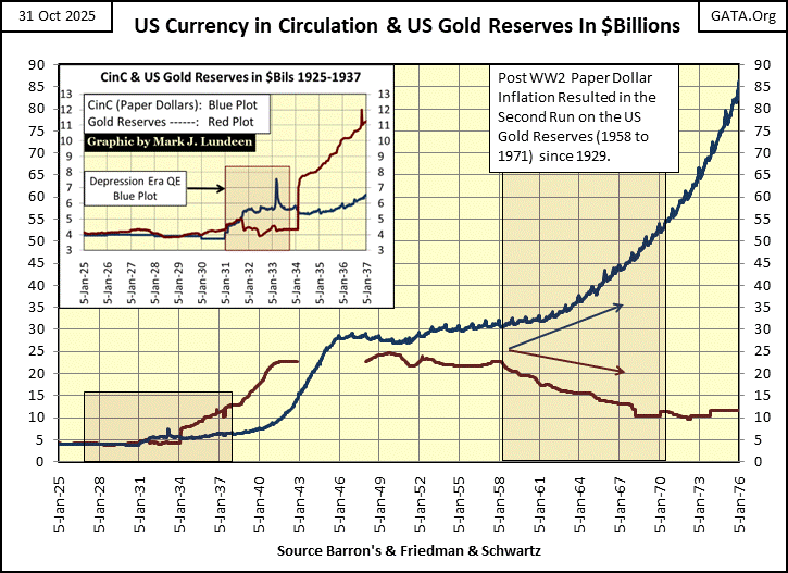
As above, with the XAU, both plots below (two charts down) are indexed, but now to 05 January 1920 = 1.00. From 1920 to 1934, they appear as if they lie atop each other. They actually don’t. But in the chart, the BGMI decoupled from the price of gold in 1934. Why? I believe it was because the US Government began implementing an unconstitutional “monetary policy” of monetary inflation, as seen below, plotting the US Government’s monetary gold (Red Plot) to its paper money; currency in circulation (CinC / Blue Plot).
Note in the chart insert below; it was during the Great Depression, that US paper money first became decoupled from the gold held at the US Treasury, legally required to back it. When in August 1971, the US Treasury announced that the dollar was being decoupled from its $35 gold peg (temporarily), it was actually a confession of the state of the dollar since 1931.
The chart below, data from the dusty old pages of Barron’s, speaks for itself. Blame President Nixon all you want for decoupling the dollar from its $35 gold peg in 1971. The unspoken fact is; since President Hoover in 1931 first printed paper money (CinC) in excess to the US Gold Reserves, every president since then, has abused the dollar for political purposes.
Sound money (gold and silver) has no friends in Washington, or on Wall Street, and hasn’t had for a long, long time!
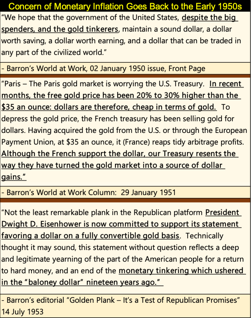
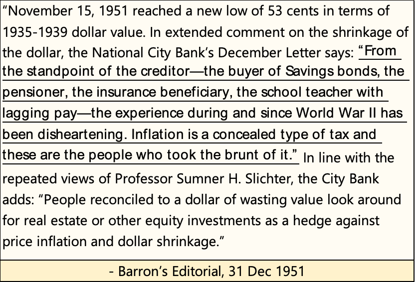
Above, paper money inflation began in earnest in 1940 (WWII), and had a huge impact on consumer prices by 1951, as seen in the quote below, from Barron’s 31 December 1951 issue.
The inflationary impact on people didn’t get any better in the years following 1951, as seen in the quote below from the Burns and Allen Television show, from 1957.
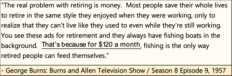
Amazing to think a retired couple in 1957, could provide for themselves with only $120 a month. How far the dollar has fallen. How much farther can it go down, and still remain money?
It took a while, but now we’ve finally come to my chart of the BGMI and the price of gold below. In the chart’s insert, we see the effect of the run on the US gold reserves that began in 1958; the valuation of the BGMI began to spike in the 1960s, far above the official price of gold.
Note too, volatility for the BGMI has increased greatly in the decades following the 1960s, up to this day. Investing in gold mining is not an easy bull for the faint-hearted to ride.
Also note that since the 1930s, the indexed values for the BGMI were always higher than the indexed value for the price of gold. That was until this past decade, when typically, the indexed value of gold was above that of the BGMI. As of last week’s close, the indexed value of gold was at 199, while the BGMI was at 178.71, a situation not seen in the chart below from 1934 to 2011; eight decades!
This inversion in these indexes speaks loudly of the current, relative cheapness of the gold and silver mining sector. That, plus when the full force of the coming bull market in gold mining once again takes force, indexes like the XAU and the BGMI, as well as the gold miners in investors’ portfolios, have a long way to run, both in terms of valuation and duration of the current bull market in gold mining.
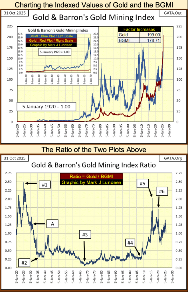
The chart above is the ratio of the indexed values of gold to the BGMI. Exactly the same as the chart Eric King provided at the beginning of this topic. Except his chart was the ratio of the XAU to gold, while above it is the ratio of gold to the BGMI.
So, in the above ratio of gold / the BGMI, the higher the ratio, the more undervalued is the BGMI to the gold these companies mine for the market.
I highlighted some points of interest to me, and I hope to my readers too.
#1: May 1925, this ratio increased to its all-time high of 2.46. Never again would the BGMI be so cheap compared to the gold these miners supplied to the market.
An interesting fact about May 1925, was also when the then new Federal Reserve extended an unprecedented line of credit to the Bank of England, of a massive $200 million. In 1925, $200 million was about 10 million ounces of gold. Today, 10 million ounces of gold at $4,002, is equal to about $40 billion dollars. Some economists argue this loan to the Bank of England was the inflationary spark that ignited the Roaring 1920s bull market on Wall Street. That sounds good to me.
#A; The September 1929 top of the Dow Jones, as it and the BGMI have been advancing since May 1925. From May 1925 to September 1929, the Dow Jones had inflated from 121.10 in May 1925, to 381.17, (an advance of 215%) at its September 1929 top. It was all downhill for the stock market after September 1929.
#2: The February 1936 top for the BGMI. The gold miners completely ignored the Great Depression Market Crash. From their May 1925 low of 3.77, by February 1936, the BGMI had increased to 50.97, an eleven-year increase of 1,252%, an advance that endured through the worse part of the Great Depression market crash.
#3: The London Gold Pool goes bust. The London Gold Pool was a central banker scheme to preserve the dollar’s $35 gold peg, in the face of the US Treasury’s unrelenting increases in the circulation of paper US dollars. See my chart above on US CinC and gold reserves.
#4: The March 2009 bottom of the sub-prime mortgage debacle.
#5: The January 2016 bottom of the 2011-16 bear market for gold, silver, and the BGMI.
#6: The March 2020 Flash Crash, where the FOMC “injected” two trillion dollars into the financial system in only two months, to “stabilize” the financial markets. Remember, in 1925 to bail out the Bank of England, the Federal Reserve only had to “inject” $200 million. How far the dollar has fallen.
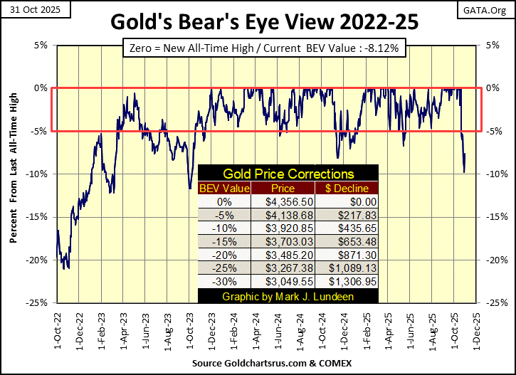
Next is gold’s BEV chart. Considering the massive advance gold has seen since it first entered into scoring position in the chart below in November 2023, seeing it now back off from its last all-time by something less than 10%, is something to be expected.
For us bulls, gold may continue going the wrong way for a while, maybe down to its BEV -15% line ($3,703.03). And then, maybe not. I’m not going to worry about the bull market in gold, not when the Dow Jones is now approaching 50,000! If someone wants something to worry about, do what I do, and worry about 50K on the Dow Jones.
My next two charts are indexes for gold and silver in the top chart, and for gold and the Dow Jones in the bottom chart.
These charts illustrate the current bull market in gold and silver are doing just fine. The advance in the price of gold since 2018 has been astonishing. In the above chart, from below 40 to now over 120 in only seven years.
A pullback from these levels is something to be expected. But should gold and silver refuse to pullback, their rise may prove to be a harbinger of bad things to come in the financial markets, a flight to safety from the pending massive deflation the stock and bond markets are one day going to have to face.
On gold’s side of the step sum table below, its 15-count since the end of September was an overbought +7 to +11 for most of its daily closings. Markets don’t like being overbought, especially an extremely overbought +11 for a 15-count. So, since October 23rd, gold has only seen one daily advance.
I expect for the next week or so, daily declines will continue dominating the gold market, as gold works off that +11 seen on October 15th.
Gold’s daily volatility’s 200D M/A has increased to 0.93% on Friday’s close. That is good. All and all, gold is currently working off all those blue BEV Zeros we see in its step sum table below. I’d be surprised if gold’s advance didn’t resume by the 1st of December. Maybe even sooner.
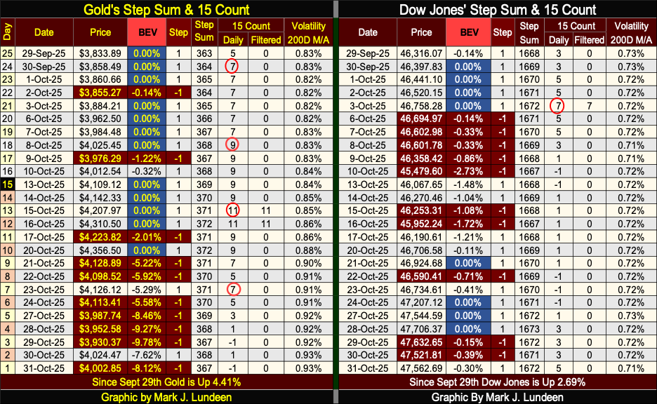
On the Dow Jones side of the step sum table above, it too is looking very good. One potential problem, is its 15-count closed the week at a neutral +5; which is okay, but only one step away from becoming an overbought +7. For the bulls, it would be good to see the Dow Jones close lower for a few days next week, to keep it from becoming overbought, and maybe see its BEV decline to something below -2% or so
__
(Featured image by Jakub Żerdzicki via Unsplash)
DISCLAIMER: This article was written by a third party contributor and does not reflect the opinion of Born2Invest, its management, staff or its associates. Please review our disclaimer for more information.
This article may include forward-looking statements. These forward-looking statements generally are identified by the words “believe,” “project,” “estimate,” “become,” “plan,” “will,” and similar expressions, including with regards to potential earnings in the Empire Flippers affiliate program. These forward-looking statements involve known and unknown risks as well as uncertainties, including those discussed in the following cautionary statements and elsewhere in this article and on this site. Although the Company may believe that its expectations are based on reasonable assumptions, the actual results that the Company may achieve may differ materially from any forward-looking statements, which reflect the opinions of the management of the Company only as of the date hereof. Additionally, please make sure to read these important disclosures.


Crypto Markets Volatile as Bitcoin Hovers, Solana Eyes AI Integration
Crypto markets remain volatile amid the Iran war, with Bitcoin near $70,000 and ETF inflows improving outlook. Ethereum faces declines...


Crowdfunding Evolves into Core Financial Infrastructure in Europe
European crowdfunding has matured under ECSPR, growing to 254 platforms by 2026 despite operational challenges. Key shifts include debates on...


DZ Bank Pioneers Blockchain Bond Issuance, Advancing Tokenized Finance
DZ Bank issued a bond via a public blockchain, marking a major step in tokenized bank bonds. The move could...


Ridemovi Secures Financing to Drive European Expansion and Sustainable Mobility Growth
Ridemovi, a Milan-based micromobility company operating bike, e-bike, and scooter sharing in Italy and Spain, secured bank financing led by...


Bank Al-Maghrib Launches Reforms to Boost Credit via Non-Performing Loan Market
Bank Al-Maghrib is advancing a secondary market for non-performing loans to free bank financing and boost credit. With Moroccan NPLs...
 |
|
 |  |
 |
|
-

 Crypto2 weeks ago
Oil Surge and Iran War Lift Bitcoin as Crypto Sentiment Improves
-
 Crypto10 hours ago
Crypto Markets Volatile as Bitcoin Hovers, Solana Eyes AI Integration
-

 Cannabis1 week ago
Germany’s Medical Cannabis Market: Legal Reform, Falling Prices, and Rapid Expansion
-

 Business3 days ago
Global Markets on Edge as Iran Conflict, Inflation Pressures, and Financial Risks Intensify