Business
Dow Jones Stalls Near Record Highs as Inflation-Fueled Rally Awaits Next Move
The Dow Jones remains near all-time highs in its BEV chart, lacking momentum since February 10’s record close. It’s holding around 49,500 without breaking higher or falling below key support. The author expects more highs soon, blaming Fed-driven monetary inflation for elevated valuations and suggesting 60,000 is possible before any eventual bubble bursts.

Week after week, the Dow Jones remains firmly inside scoring position in its BEV chart below. While that may be bullish, it hasn’t provided much excitement for the bulls in the stock market. The Dow Jones last made a new all-time high (BEV Zero = 0%) on February 10th, Tuesday last week. Since then, the Dow Jones hasn’t advanced. But as seen below, it hasn’t gone down either. It seems we are once again in that part of the market cycle, where we must hurry up, and wait.
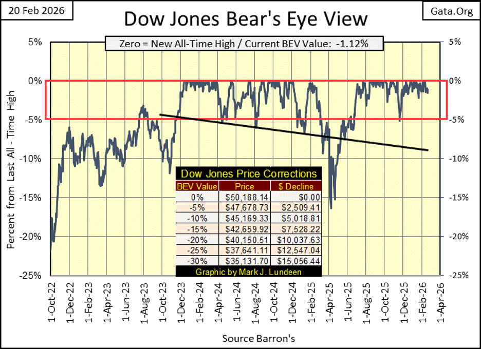
But wait for what; for additional new all-time highs, or seeing the Dow Jones above dive down below its BEV -10% line, at 45,169? I haven’t a clue which it will be. Still, I’m thinking it won’t be long before the Dow Jones resumes its bullish ways, and we’ll see a new series of all-time highs, hopefully before April.
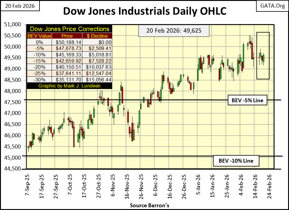
Next is my chart plotting the Dow Jones in daily bars. It’s hard seeing it, but last week on Tuesday, the Dow Jones’ saw its last all-time high, at 50,188, its third consecutive new all-time high since the Friday before. We should note, since Tuesday of last week, there hasn’t been any follow through to the upside. Instead, the Dow Jones quickly backed tracked down to its old line of resistance at 49,500. And so far this week, we see the market institutionalizing the Dow Jones at 49,500.
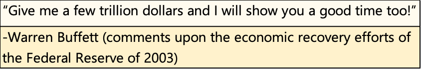
Why; fear of heights? Fifty thousand on the Dow Jones puts the fear of the Lord into me, but not everybody. We still see members of the Trump administration noting the rising Dow Jones, declaring this as proof positive the American economy is growing. It’s not. The inflating Dow Jones is only proof of what trillions-of-dollars of monetary inflation can do in the hands of a few idiots at the FOMC. As noted in 2003 by Warren Buffett below, following the 2000 – 2002 NASDAQ High Tech Market Crash.
The Bank of China understood in February 2011, what Bernanke’s QE would do to the dollar.
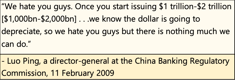
I remember what “market experts” said when discussing the above quote from the Bank of China. At the time, they thought it was funny, some actually laughed at it. Now in 2026, it’s not so funny anymore.
So Mark, do you still think 60K on the Dow Jones is possible in the next year or so? Sure, why not? The idiots at the FOMC know exactly what they are there for;
• inflating market valuations,
• maintain liquidity in the banking system.
They’ll not run out of inflationary dollars by the trillions anytime soon. When this inflationary bubble in the financial markets finally goes bust, it won’t be from the members of the FOMC, becoming responsible in their old age.
The idiots create “economic growth,” by creating bank credit, which banks then use to create debt for someone, or something to carry, to weigh them down like carrying a dead horse. At some point, the economic effort required to service the onerous interest and principal payments these many trillions-of-dollars of inflation have created, will become an impossible burden for individuals, municipal governments, and corporations to bear. That is when the system collapses.
But when? I don’t know, but I think we’ll see the Dow Jones close above 60,000 before it does. I might be wrong; I have been wrong before.
Moving now to my table listing the BEV values for the major market indexes I follow, this week we saw only four new all-time highs, with two of them on Friday’s close. But not every day in a bull market closes at a new all-time high. Most days in a bull market advance, close in scoring position, with BEV values from -0.01% to -4.99%, or within 5% of their last all-time highs. This is just how it is, and exactly what we see below.
So, to get a clue of where the stock market currently is, look at all the BEV values in the Red Rectangle, major market indexes closing the week in scoring position. I take that as proof positive, the current market advance remains intact. We should take particular attention to #16 / the XAU. It closed this week in scoring position, a BEV of -4.31%, following its recent 20% correction seen just two weeks ago.
Again, the performance table above is a tale of two bull markets. At the top (#1-3) is the bull market in everything precious. Followed by the bull market in everything else.
Look at silver at #1. It has a BEV value of -28.97%, or this week it closed 28.97% below its last all-time high of $118.45, and still silver is up 248.56% since November 2021! The Dow Jones (#12), has advanced by only 36.61% in the past four years. I’ll have to go deeper into silver, later in this article.
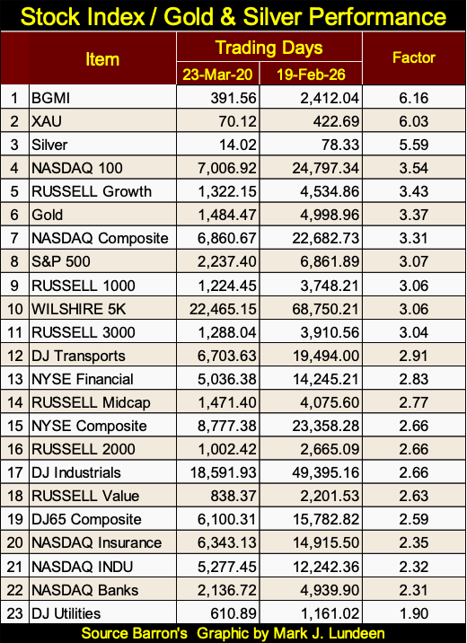
Next, actually a few graphics and pages down is another performance table, one using a different construction than the one I use above every week. The table below lists the actual price for each line item, the price for 23 March 2020, which was the bottom of the March 2020 Flash Crash, a market event that motivated the idiots at the FOMC to implement their multi-trillion dollar, Not QE#4. The other price is from this week’s Thursday’s close.
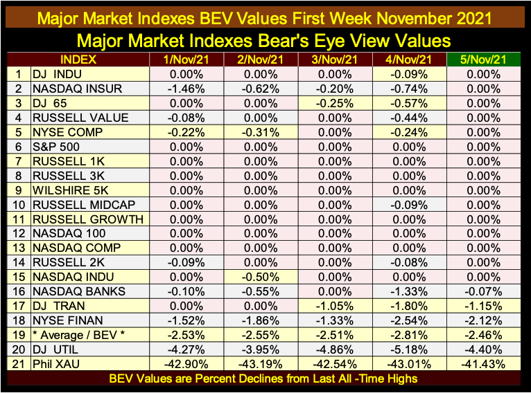
Why do I use 05 November 2021 in the performance tables above for a basis? Early November 2021 was the top of the advance, that the March 2020’s Not QE#4’s, trillions-of-dollars of “liquidity injected” into the financial system, had inflated market valuations. That seemed as good a basis date as any other.
Below is the table for my major market indexes BEV values for the first week of November 2021. For this entire week, every index was either at a new all-time high (0.00%), or closed daily in scoring position, less than 5% from its last all-time high. That is except for the XAU, which closed that week with a BEV of -41.43%, and had not seen a new all-time high since April 2011, for over a decade.
But those were the bad old days for the XAU. On August 7th, 2025, the XAU made its first new all-time high since April 2011, after fourteen years. In the past six months, the XAU has seen forty-one daily new all-time highs, and regular weekly closes in the top three spots in my weekly performance table above.
As silver, and the XAU have been the real show stoppers for the past six months, let’s take a quick, side by side look at them below. For decades, both did little to reward investors who risked their money in them. But that all changed in 2025, as both began a tremendous surge, seen below.
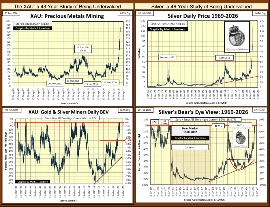
Take a moment to study the XAU and silver, in their BEV charts above. The XAU from 1983 to August 2025, saw only fifty-seven new daily all-time highs. 61.31% of the XAU’s daily closes, were 35% from their last all-time highs, or much, much lower, as seen in the XAU’s BEV Frequency Table below. Note: the data seen below is to this week’s close.
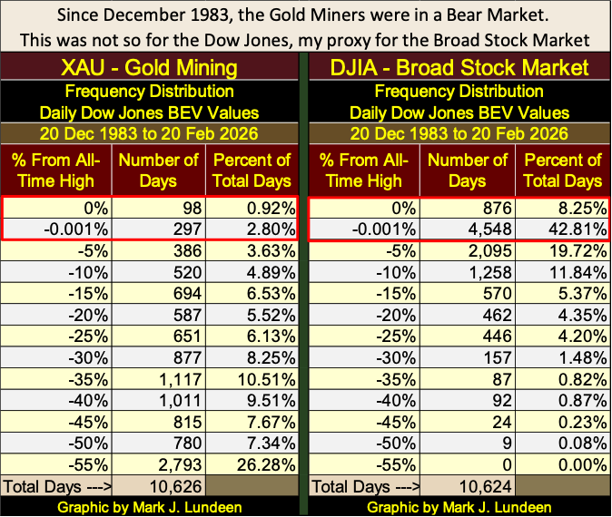
Compare that to the Dow Jones above. Since December 1983, 51.06% of the daily closes for the Dow Jones, have either been at new all-time highs (0% row above), or in scoring position (-0.001%). Only 2.0% of the Dow Jones daily closings since December 1983 were 35%, or more from their last all-time highs.
Since 1983, why would any rational investor risk money in gold and silver mining, when the big money was being made in the broad stock market?
Here is a little market wisdom to keep in mind; they don’t ring a bell when something changes in the market. That is so true. Still, looking at the XAU and silver above, I believe I heard a bell ring sometime in 2025 for precious metal assets.
Finally, we’re looking at the performance table below, using dollars, I see the advantage of using the Bear’s Eye View values seen above. Yes, it’s nice seeing the actual dollar values for these indexes below, but looking at these index’s actual valuations in terms of dollars, there is no connection from one index to another.
What connection does using their BEV values above give us? Which index closed at a new all-time high, closing at a BEV 0.00%, and if not a new all-time high, how far in percentage terms is each index, from their last all-time high.
From the viewpoint of looking at these indexes as a market, my performance table above using BEV values, is much more informative than the performative table below, listing these same indexes in their dollar valuations.
Still, looking at these indexes in their dollar valuations below, is still very relevant, as not every new all-time high, BEV Zero, is the same when it comes to making a profit investing in the market.
Since November 2023, both gold and the Dow Jones entered into scoring position. Since November 2023, both gold and the Dow Jones have been making regular new all-time highs. So far, gold has made 100 new all-time highs, while the Dow Jones has made only 81 new all-time highs, since entering scoring position in November 2023.
However, using the Bear’s Eye View fails to tell us one very important thing, something that can only be seen by looking at a market in dollars; which investment provided more in the way of profit to those who invested in it?
Looking at the table below, using dollars, gold (#6), increased by a factor of 3.37. Or a $1.00 of gold on 23 March 2020, became $3.37 worth of gold, on 19 February 2026. While for the Dow Jones (#17), a $1.00 of Dow Jones on 23 March 2020, became $2.66 worth of Dow Jones, on 19 February 2026.
Looking at this table, only two stock indexes outperformed gold since March 2020, the bottom of the March 2020 Flash Crash;
• NASDAQ 100 (3.54),
• Russell Growth (3.43),
but not by much.
Note how the gold miners in the Barron’s Gold Mining Index (BGMI #1), and the XAU (#2), as well as silver (#3) have outperformed not just the stock market, but gold bullion too, by significant factors these past six years.
But then, looking at these indexes in their BEV values for late March 2020 (not seen above);
• BGMI: BEV -76.05%
• XAU: BEV -69.37%
• Silver: BEV -75.15%
• Gold: BEV -22.07%
the miners and silver were trading with BEV values at Great Depression levels. While gold was down by only 22% from its last all-time high, a percentage decline from an all-time high, that is typically seen during a normal price correction. So, why would these depressing BEV values from years ago, cause the miners and silver to outperform gold, and the broad stock market today?
Because when any market is deflated to valuations of greater than 70% from its last all-time high, and is kept there for well over a decade, it becomes a hated asset, something that becomes repugnant in the market place. Like a cowpie in the middle of a dairy-pasture, such hated assets develop what is called a zone of avoidance around them, something responsible money managers, and the general investment public would rather not come into contact with.
So, when formerly repugnant assets once again begin making new all-time highs, and outperform the market, as silver and the precious metal miners have done since August 2025, eventually they catch the eyes of money managers, and individual investors. These people currently have no position in these formerly repugnant assets, but will soon wish they did.
By the time they bottomed in late December 2015, silver, and the precious metal miners’ had their market values, and market capitalizations deflated to levels, their bulls from years before would have believed impossible. As things are now, these are microcap markets, so it doesn’t take much money flowing into them, to generate oversized returns. But then, that is how it always is, early in any bull market advance.
I haven’t looked at bonds for a while, so here is a chart plotting the daily prices for the Dow Jones Corporate Bond Index.
What happened below; in the days spanning from 04 March 2020, to 18 March 2020? The March 2020 Flash Crash, as you see, also impacted the corporate bond market. This bond index’s valuation was deflated by 15%, in only ten trading sessions. That is something that is not supposed to happen, to assets widely held by widows and orphans.
As a market enthusiast, I have no specific knowledge on any market trading on Wall Street, but I remember March 2020 very well. It was the first time in history, where the FOMC monetized corporate bonds, by the billions-of-dollars. I know that, as the financial media reported that at the time.
Look at the collapse in bond valuations six years ago, to then recover so quickly. That is what a big “injection” of “liquidity” can do for a market in distress, as corporate bonds were in March 2020.
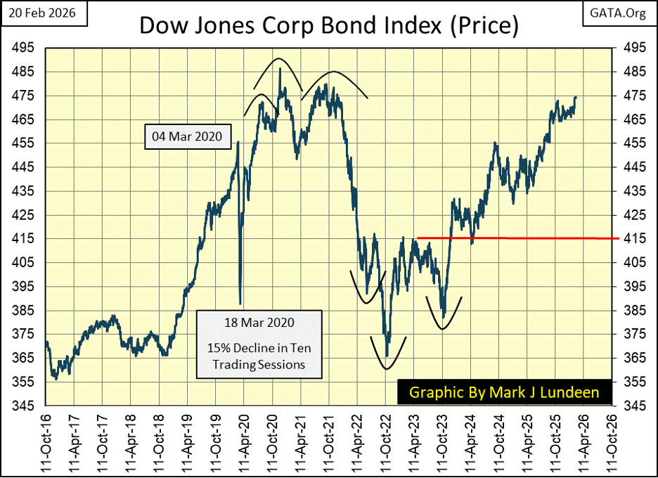
One thing never covered in the financial media in March 2020; was whose bonds were the idiots buying with their monetary inflation? Obviously, the bonds being sold off at deeply discounted prices, but exactly whose bonds we were never told.
One thing we were told, was in the aftermath of the 2007-09 sub-prime mortgage fiasco, when Doctor Bernanke was reflating market valuations with his QE#1-3, major companies were taking on massive debt, to fund their share buyback and dividend payout programs. ZeroHedge and David Stockman covered this story in detail, and I recall names like Microsoft, Apple and other huge companies mentioned.
At the time, that struck me as something really odd. As in the past, buying back shares, and paying out dividends to shareholders, were done with corporate profits * NOT * by assuming huge liabilities in the bond market. So, why did major American corporations trash their balance sheets, with debt that offered little in terms of providing a profitable return on investment?
Could it be, because it was one thing for FOMC Idiot Primate Bernanke to “inject liquidity” with his QEs into the banking system in 2009 – 2011. But to impact the economy, the banking system had to find someone, or something willing to accept that “liquidity,” as debt, and bear its burdens. Following this line of reasoning, could it be that come March 2020, the major American corporations that took on this debt from 2009-2011, began to stumble under the burden of servicing this debt, so the corporate bond market began to sell off, as seen above?
I’m not someone who could say with certainty, that this is so, or is not so. But I think of the many trillions of dollars of debt, that today must be serviced, by consumers, municipal governments, and corporations. The US government’s treasury now owes $37.74 trillion dollars in debt, and that doesn’t count its “unfunded liabilities.” The price distortions this debt is causing inside the economy, are enormous.
It’s obvious the reason rents are so high in the 21st century, is because they have to be, so the landlord can make his monthly mortgage payment. America’s homeless problem, is most likely the result of decades of “monetary policy,” of supplying as much “liquidity” into housing, as the market asks for.
How, and when this all comes to an end, I can’t say. But what I do know for a fact is, when this inflationary bubble goes bust, debt will become something much more, than just another very dirty, four-letter word.
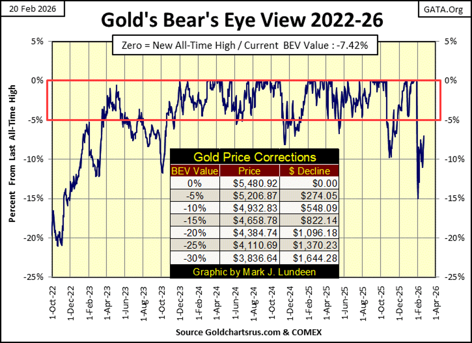
Let’s take a look at gold’s BEV chart. Gold, silver too, is an asset with no counter-party risk. If you really understood all I covered above, you’d not mind buying gold at $5000, or silver at less than $100 an ounce.
Last week I asked myself a question; was gold’s next move below its BEV -15%, or above its BEV -5% line. This week closed with gold moving towards its BEV -5% line, back into scoring position.
That gold saw a 10% correction in November, and now a 15% correction in February, could prove to be very positive developments in gold’s current advance to valuations far above $5500 an ounce. I expect to see some historic excitement in the gold market, before 2026 gives way to 2027.
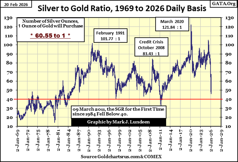
One very bullish metric for the bull market in gold and silver, is seeing the silver to gold ratio (SGR) drop like a rock, as seen below. From last April, when the SGR was 102 ounces of silver, for one ounce of gold, to 46 ounces of silver, for one ounce of gold just three weeks ago.
The SGR has pulled back a bit at the close of this week, to 60 ounces of silver for one ounce of gold. But nothing in the market moves straight up, or down without an occasional correction. Looking at the chart below, I’d say the next milestone for the SGR is 40 ounces of silver, for one ounce of gold. That suggest the latest all-time high for silver ($118.45), will soon be exceeded. But things like that, are what happens during bull markets.
Looking at gold in its step sum table below, it’s a market that continues seeing advancing days, overwhelm daily declines. It’s also obvious an elephant is sitting on it, to prevent it from advancing to new all-time highs. Following its last BEV Zero on January 28th, gold has closed in scoring position for only one day; January 29th.
I know markets aren’t like chemistry, so we don’t follow a market as if it were a science. There is nuance to be sought for in a table, such as we see below. And sometimes nuance can be rather stinky.
For example, following gold’s last BEV Zero on January 28th, with the exception of the daily decline of January 29th, every time gold saw a down day, it was only to push gold back down below its BEV -10% line. Then in February, as gold advances toward scoring position (a BEV value below -5%), it then sees a daily decline that pushes gold back below its BEV -10% line, with no follow through by the bears.
This is a very unusual pattern developing in the gold market. Let’s see what happens next week. Will gold continue creeping up towards scoring position, to then see a big down day, pushing gold back down below its BEV -10% line? Or will something else happen;
- such as gold closing at a new all-time high by next Friday,
- or close below its BEV -15% line sometime next week.
Personally, if given a choice, I’d favor #1. But if we see #2 instead, it doesn’t really change anything.
Gold has moved from $2,659 on 02 January 2025, to $5,480 a year later, an advance of $2,821, a single year percentage gain of 106%. If gold should take a well-deserved rest, somewhere below its BEV 5% line for a few weeks, or even a few months, that is how it goes sometimes. But between you and me, I’d still like to see #1 happen next week.
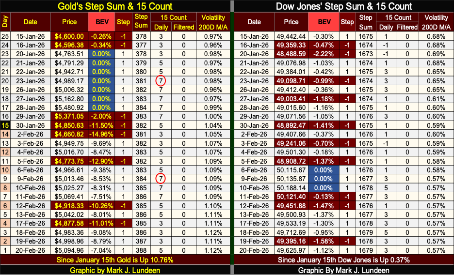
Looking now at the Dow Jones in is step sum table above, what is there to say? It’s seeing more declining days than gold is, yet since January 15th, the Dow Jones has managed to remain deep inside scoring position. In the past five trading weeks, the deepest decline the Dow Jones has seen from an all-time high was a BEV of -1.58%, seen on Thursday this week.
I’m expecting to see more BEV Zeros in the weeks to come. And so it will be, for as long as its daily volatility’s remains low. This week, the Dow Jones daily volatility’s 200D M/A closed at 0.57%. Looking at the chart below, we can infer the Dow Jones is approaching a market top, but obviously, we’re not there just yet.
__
(Featured image by Dimitri Karastelev via Unsplash)
DISCLAIMER: This article was written by a third party contributor and does not reflect the opinion of Born2Invest, its management, staff or its associates. Please review our disclaimer for more information.
This article may include forward-looking statements. These forward-looking statements generally are identified by the words “believe,” “project,” “estimate,” “become,” “plan,” “will,” and similar expressions, including with regards to potential earnings in the Empire Flippers affiliate program. These forward-looking statements involve known and unknown risks as well as uncertainties, including those discussed in the following cautionary statements and elsewhere in this article and on this site. Although the Company may believe that its expectations are based on reasonable assumptions, the actual results that the Company may achieve may differ materially from any forward-looking statements, which reflect the opinions of the management of the Company only as of the date hereof. Additionally, please make sure to read these important disclosures.


Bitcoin Slides, Ethereum EEZ Emerges, Worldcoin Hits Low
Bitcoin slipped to around $67,000 amid geopolitical tensions and ETF outflows, while high mining costs push miners toward AI deals...


Poland Proposes Cannabis Decriminalization: 15 Grams and One Plant Without Penalties
Poland’s Centre parliamentary group proposed a bill to decriminalize cannabis, allowing possession of up to 15 grams and one homegrown...

Markets Volatility, Geopolitics, and Signals of a Potential Trend Shift
Markets swung amid shifting statements from Trump and geopolitical tensions with Iran. Initial threats moved stocks, gold, oil, and yields...


Dow Jones Tests Correction Zone Amid Bullish Momentum and Bubble Concerns
The Dow Jones has slipped just below its 10 percent correction threshold after a two month decline, raising questions about...


TopRanked.io Weekly Affiliate Digest: What’s Hot in Affiliate Marketing [1xBet Affiliate Program]
If you thought nobody liked cricket, then this week, we're proving you wrong. And by the time we're done, you'll...
 |
|
 |  |
 |
|
-
 Crypto2 weeks ago
BlackRock’s $94M Crypto Move Signals Rising Institutional Momentum
-

 Biotech5 days ago
SPECT-CT: Advanced Imaging for Precise Cardiac Assessment
-

 Fintech2 weeks ago
Swiss Fintech Sector Enters Maturity as AI and Infrastructure Take the Lead
-
 Business3 days ago
TopRanked.io Weekly Affiliate Digest: What’s Hot in Affiliate Marketing [1xBet Affiliate Program]