Markets
Dow Jones Total Market Group saw 19 groups make new all-time highs
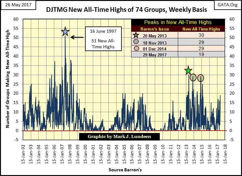
Last week the Dow Jones Total Market Group (DJTMG) saw 19 of the 74 groups make new all-time highs. We’ve not seen something like that seen since March 2015 when we saw 25 of 74 groups make a new all-time high.

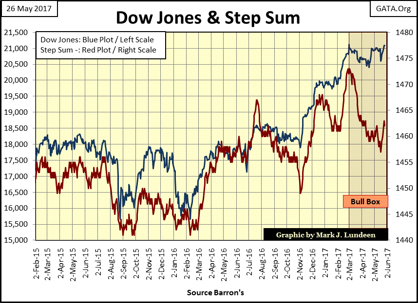
The Dow Jones closed the week just a whisker (35.27) from taking out its last all-time high from March 1st of this year. Looking at the Dow Jones and its step sum below, I expect we’ll see history being made next week or the week after.
When do I close the bull box? It’s not an exact science; so let’s say when the Dow Jones break above 21,500 and its step sum clears 1465. But that’s just me eyeballing the chart; you may have chosen other thresholds to the upside to close the box. The point is the Dow and its step sum in the bull box below did an excellent job identifying the underlying strength in the market that wasn’t readily apparent otherwise.
© Mark Lundeen
Where’s this strength coming from? You know I’m always going to blame the “policy makers” for “injecting liquidity” into the financial system, but only because that’s what they always do. However, the public is also returning to the market in a big way, as we see with the NYSE Margin Debt chart below.
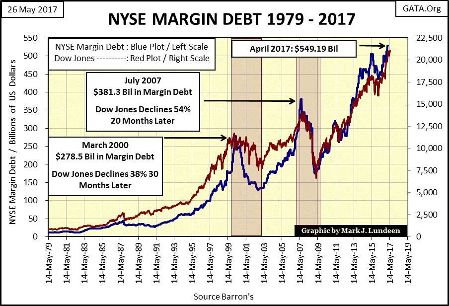
Decades ago, Barron’s published NYSE margin debt data on a weekly basis. Today it’s on a monthly basis and delayed by a month. Blame the NYSE for changing what they make available to the public for that. This week we discovered that the NYSE Margin Debt for April increased to another record high: $549 billion.
Seeing how the market performed this month when published by the NYSE a month from now, margin debt for May 2017 should also be another record.
© Mark Lundeen
Margin debt expansion is good in bull markets. However, as I highlighted in the chart above, during bear markets contraction in margin debt is a major source of forced selling during market declines. And that’s BAD!
There’s nothing in the chart above that makes me want to buy stocks in today’s market. Instead, I’m wondering how in the coming unpleasantness in the stock market, could the Dow Jones fail to suffer an even greater decline than it saw in March 2009 (-54%), when retail investors last deleveraged their margin accounts.
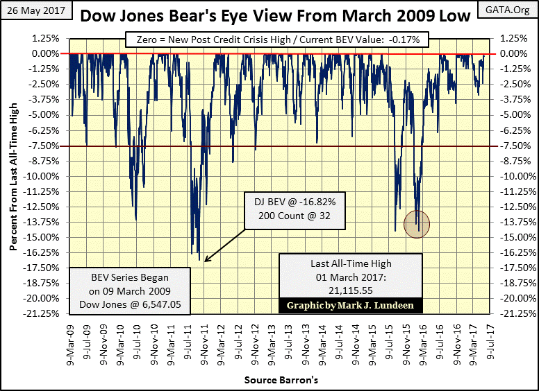
Next is a BEV chart for the Dow Jones starting at its March 2009 bottom. From March 2009 to February 2016 (Red Circle), the Dow Jones made frequent corrections to its BEV -7.50% line. However, I note that in the past fifteen months, this hasn’t been true. Actually, the corrections made by the Dow Jones have become increasingly shallow.
© Mark Lundeen
So, what does that tell us? I don’t exactly know, but it’s fair thinking that something is changing in the stock market. As I’ve been pointing out for over a year, bull market advances don’t go on forever; especially one that’s advanced 14,500 points in eight years.
If I was forced to speculate what to make of this, I would say that the next time the Dow Jones BEV plot above declines below its -7.50% line (a 1,584 point decline from Friday’s close), it would not be in the context of a bull market correction, but the early stages of a major bear market decline.
But who today is expecting a major bear market decline? This week the Dow Jones Total Market Group (DJTMG) saw 19 of the 74 groups I follow make new all-time highs. We’ve not seen something like that seen since March 2015 when we saw 25 of 74 groups make a new all-time high, and the top 20 rebounded back to 46, up from last week’s 44.
© Mark Lundeen
Here’s gold’s BEV chart going back to July 1999; the absolute bottom of its 1980 -2001 bear market. What a miserable market we’ve seen for gold and silver since 2011. The disaster seen below is all due to official sector manipulation in the paper gold futures market. Each time the metals catch a bid, the big banks flood the COMEX market with their worthless promises to deliver sometime in the future tens, or hundreds and on occasion thousands of tons of gold that they neither have nor could get. It’s all a fiction, but its effects on the price of gold and silver are very real.
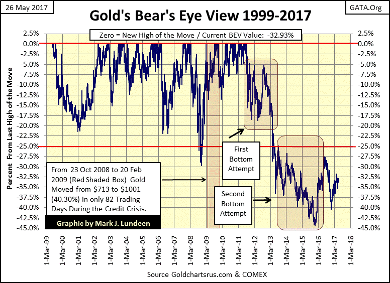
© Mark Lundeen
The old monetary metals markets are behaving so poorly that cryptocurrencies like Bitcoin are enjoying a fabulous bull market, a bull market that rightfully belongs to gold and silver. From just a few dollars a few years ago, bitcoin traded for over $2400 this week. But then bitcoin futures aren’t traded on the COMEX – anyway not yet.
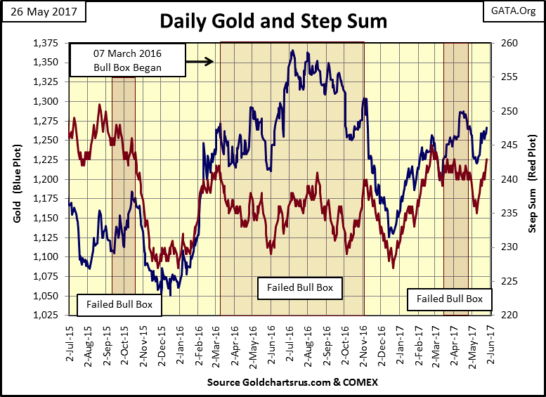
Gold’s step sum chart below remains promising. The step sum (Red Plot) is seeing a nice advance, but gold’s price plot is going up in baby steps with all those advancing days. What I’d like to see is a big breakout in the price of gold spanning a few days, something we haven’t seen in a few years.
So, maybe we’re due for a surge up to and beyond $1,300 in the coming weeks. What’s really needed is for gold to break above its highs of last summer. But I don’t know if that is possible as long as the stock and fixed income markets continue doing well.
© Mark Lundeen
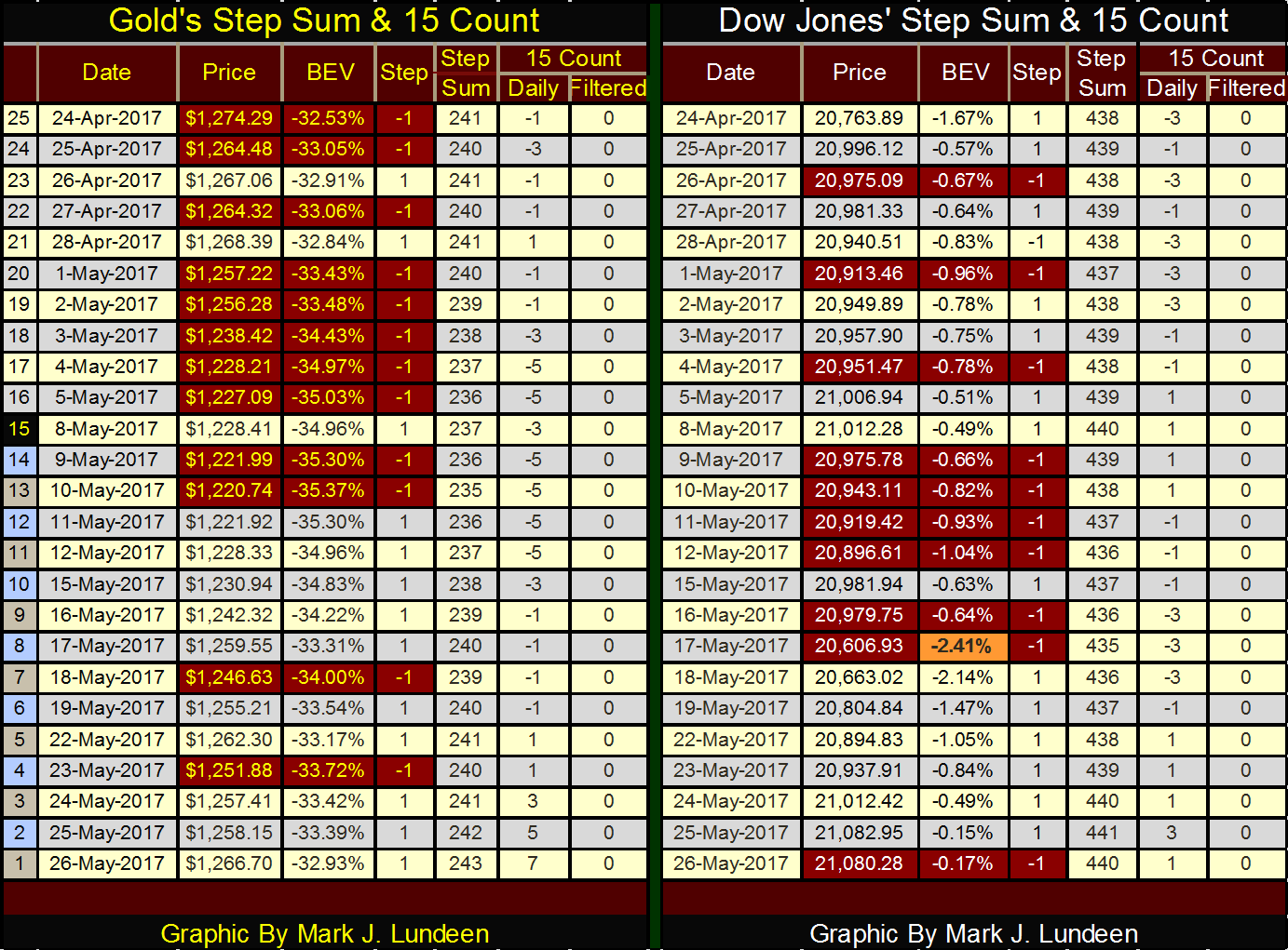
If gold is going to break out to the upside, things have to change in the step sum and 15 count tables below.
Gold ended the week with a 15 count of +7, and after all those advancing days its price is still below where it was on April 24th? The technical term for a market performance like that is STINK-O.
It’s the Dow Jones that has shown real market strength in the past month. Ending the week with a 15 count of +1 tells us that for the past 15 trading days the Dow Jones has seen just about as many down as up days. But on down days, its price declines are restrained, while on the up days the Dow Jones sees nice percentage gains.
This isn’t the market action of a bull market blow off, such as we saw in the high-tech shares in the late 1999 and early 2000. But for the time being the stock market is behaving as if it is in a bull market. Still, for the reasons I’ve pointed out above, I’m very happy watching the stock market from the sidelines and endure the trials and tribulations of exposing myself to the gold and silver markets.
© Mark Lundeen
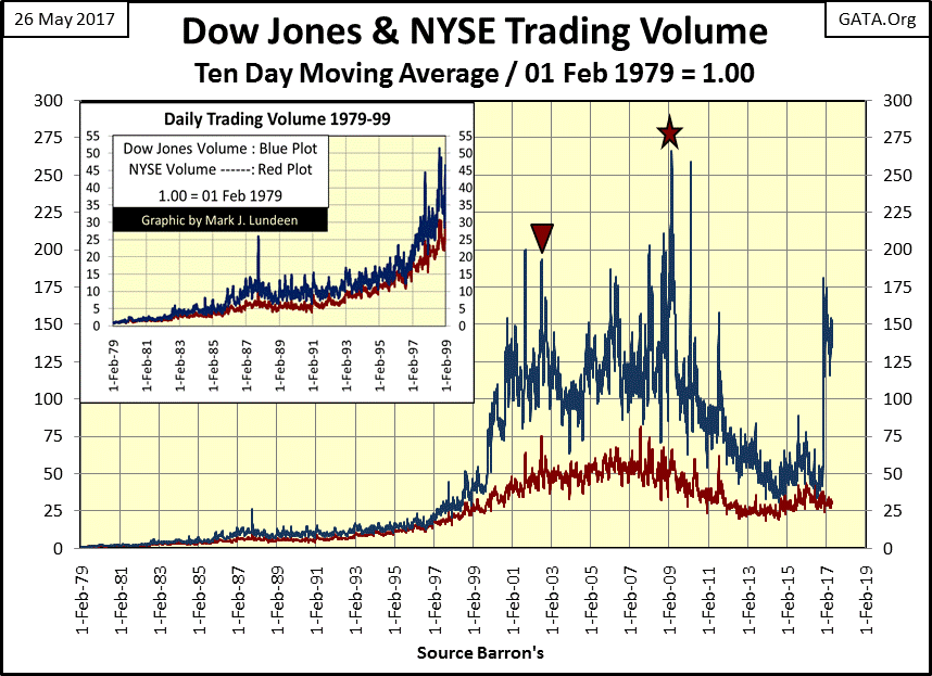
Dow Jones’ trading volume is still high, as it has been since the November election. Trading volume is demand for what Wall Street is selling: stocks. So, it’s no surprise seeing the Dow Jones at week’s end just a whisker from making a new all-time high. But that’s not how the stock market has worked since January 2000, as seen below.
From 1900 to 2000, a hundred years, bull markets saw trading volume expand as the public entered the stock market greedy for capital gains. Bear markets saw trading volume contract as the public exited after taking unexpected losses. For instance in the chart’s insert, during the 1982-2000 bull market, NYSE trading volume expanded by a factor of 30, while trading volume for the thirty companies comprising the Dow Jones expanded by a factor of 55.
In every 20th-century bear market, trading volume contracted as the public exited the stock market to cut their losses. But now look at what happened in the 21st century; the high-tech bear market bottom (Red Triangle) occurred on near record trading volume. The mortgage crisis bear market bottom, (Red Star – the #2 all-time bear market) occurred on all-time high trading volume.
What’s with that? This demand for NYSE stocks was artificial, originating from central banks, especially the Federal Reserve, funding these purchases with monetary inflation. During the sub-prime mortgage bear market of 2007-09, the Federal Reserve was actually monetizing abandoned mortgages held by Wall Street banks.
To support the stock market during the 2007-09 market decline, the “policy makers” actually “monetized” worthless mortgages, and then “injected” the resultant effluent back into the market. Does that sound like good market hygiene to you? Maybe not, but it’s how the Dow Jones began its current market advance, as seen in its historic trading volume under the Red Star below.
© Mark Lundeen
What happened after March 2009 is very strange too. From the Red Star in the chart above (March 2009) to October 2016, the Dow Jones advanced from 6,547 to over 18,000 as demand for the thirty Dow Jones stocks collapsed. This isn’t how a market should operate, seeing prices rise as demand collapses. How should we understand this? Just another fingerprint left behind by the “policy makers” as they manipulate the financial markets.
The post-October 2016 rise in trading volume is a bit of a mystery to me. For the first time in almost twenty years rising trading volume is occurring with a rising market. How much longer can the current expansion in trading volume continue is the question? What isn’t a question is that when it does end, it will end in tears.
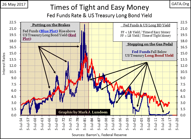
This week the FOMC said they were on track for more interest rate increases this year, also that they may contract their balance sheet. Exactly who they plan to sell their worthless mortgages to is still unknown. What that actually means is best seen below where I’ve plotted the Fed Funds Rate (Blue Plot) with the yield for the US Long Bond (Red Plot) from 1954 to this week.
From 1954 (actually since the beginning of WW2) to 1981, “liquidity” (monetary inflation) flowing from the Federal Reserve flowed into consumer prices. We know that was true as the bond market began demanding an inflation premium in bond yields to compensate bond buyers’ for losses in purchasing power from their coupon payments. Yields for the US Treasury’s long bond increased from below 3% to over 15% from 1954 to 1981.
In a vain effort to contain rising consumer prices, the “policy makers” at the FOMC would invert the yield curve, increasing their Fed Funds Rate above the yield of the US Long Bond. This would induce a recession in the economy. The theory being a recession would lower demand for consumer goods, thus checking rising prices in the cost of living. It didn’t really work that way. But that’s what college professors professed; that employed middle-class workers buying food and paying their rent, not the Federal Reserve’s inflationary monetary policy, was responsible for four decades of rising consumer prices.
Rising consumer prices became chronic in the 1960s & 70s. Beginning in the last half of the 1970s, double-digit annual percentage increases in consumer prices became annual events. Predictably (as seen below) the FOMC’s reaction was to invert the yield curve to ever greater degrees of tightness, making life ever harder for working people in their vain attempt to control consumer price inflation. In 1980, they actually increased their Fed Funds Rate eight percentage points above the yield of the US long bond.
© Mark Lundeen
Beginning in the early 1980s, the FOMC finally succeeded in directing their monetary inflation away from consumer prices into asset valuations. The effect of “liquidity” now flowing into the stock, bond and real estate markets on “monetary policy” seen above is dramatic.
Previously to the early 1980s, the stock and fixed income markets struggled with rising bond yields and interest rates, with sever yield inversions by the FOMC to check rising consumer prices. After the early 1980s, declining bond yields and interest rates was the rule as financial asset valuations become inflated by the new “monetary policy”, with yield inversions engineered by the FOMC minimal.
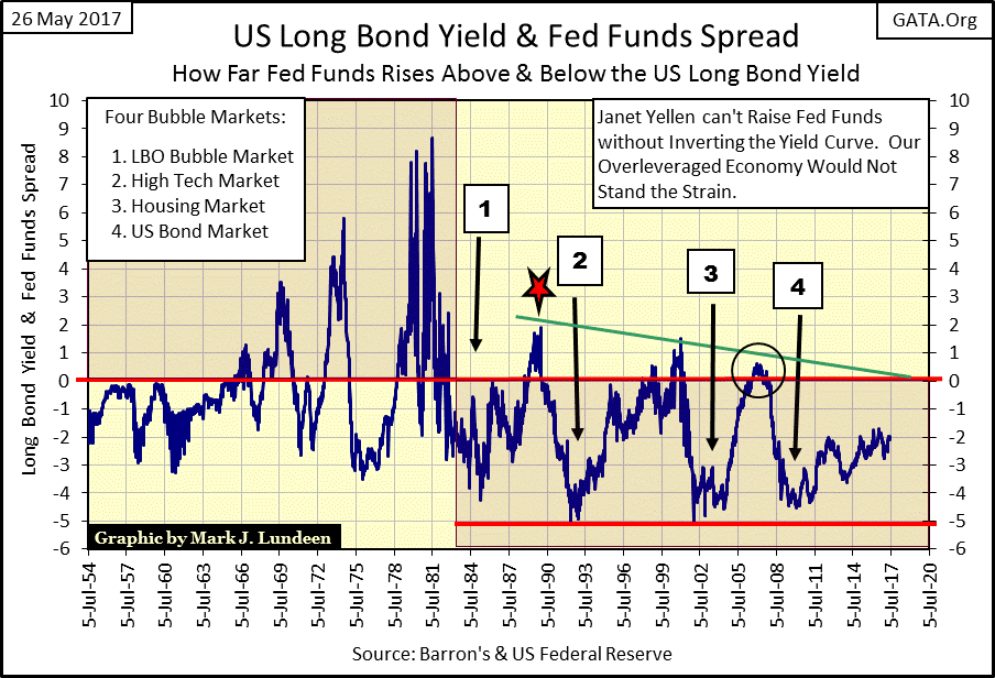
The Fed Fund, US long bond yield spread is plotted below; illustrating how many percentage points the FOMC has raised or lowered their Fed Fund rate relative to the US long bond yield.
Before 1983, when rising consumer prices were the problem, the FOMC would aggressively invert the yield curve. After 1983, when the FOMC’s “liquidity” flowed into financial asset valuations (aka / a bull market somewhere on Wall Street), the “policy makers” were very aggressive in “stimulating the economy” by lowering their Fed Fund rate far below the long bond yield, noted below by boxes 1-4. And just as significant, after 1982 the FOMC never again inverted the yield curve by more than 2%.
© Mark Lundeen
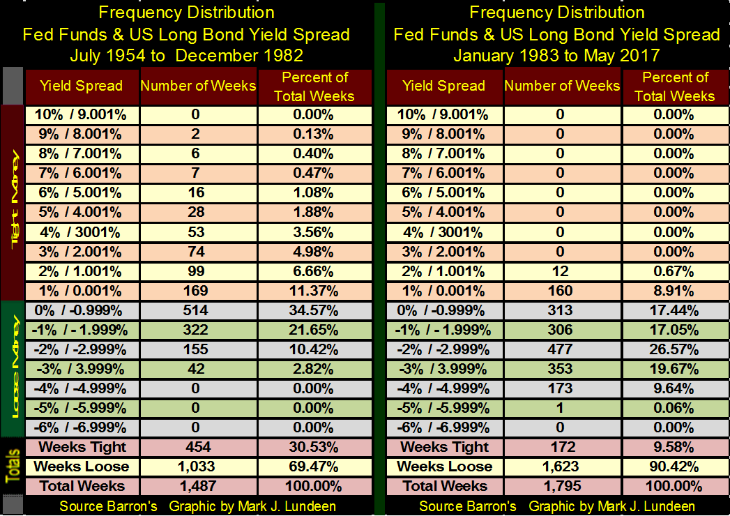
Next is a frequency distribution table for the data plotted above. What’s that? Well, what we are viewing above is how far above or below US long bond yields the FOMC has managed their Fed Funds rate from 1954 to May 2017. Below we are looking at how many weeks the spread seen above has been so many percentage points above or below bond yields.
I broke the table into two eras;
– When monetary inflation flowed into consumer prices
(Left Table 1954 – 1982)
– When monetary inflation flowed into asset valuations
(Right Table 1983 – 2017)
For an example, in the charts above look at 1981 when the Fed Funds rate was at 22%. That was a time when Fed Funds was 8% higher than the yield for the US long bond. Below, in the left table, the Federal Reserve had money this tight for only two weeks from 1954 to 1982, and never from 1983 to 2017.
© Mark Lundeen
In fact, after 1982 (Right Table) the Federal Reserve’s “monetary policy” had never increased its Fed Funds rate more than 2% above the long bond yield for fear of deflating a bubble somewhere in the economy.
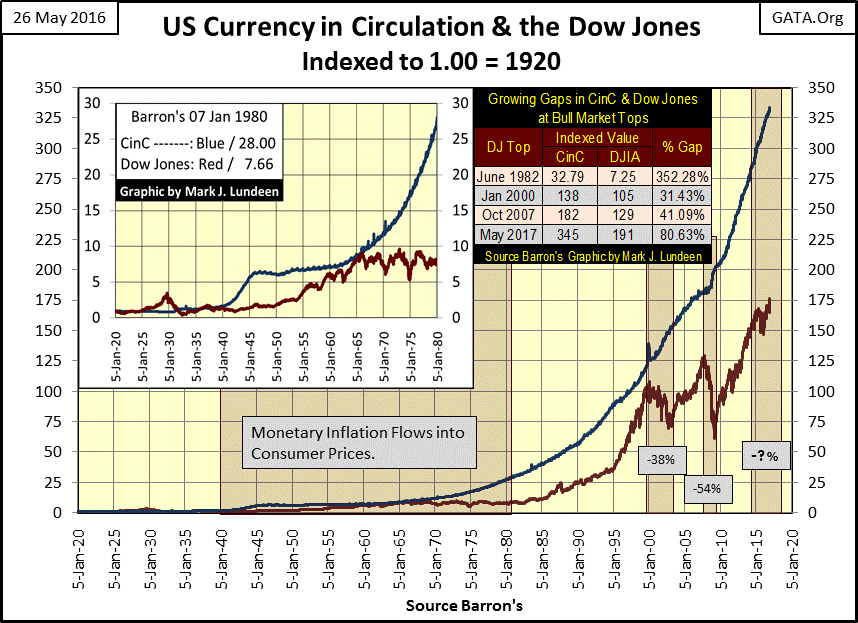
The FOMC has been distorting financial assets valuations for decades with their monetary inflation. In the chart below we see currency in circulation (Blue Plot / CinC) indexed to 1.00 = January 1920. In the past century paper dollars circulating in the economy has expanded by a factor of 345. Where those dollars flowed into over the past century is an important point to understand.
In the insert for 1920 to 1980, beginning in 1966 monetary inflation (Blue Plot) began to decouple from the Dow Jones (Red Plot), exactly when rising consumer prices forced the FOMC to invert the yield curve (1966) for the first time in the chart above. Logically, the monetary inflation seen after 1965 in the chart below was flowing into consumer prices, not the stock market.
© Mark Lundeen
Beginning in the summer of 1982, all that changed when monetary inflation from the Federal Reserve began flowing into financial assets, such as shares prices for the thirty blue-chip companies comprising the Dow Jones. This change is very evident in the chart above, where from 1980 to 2000 the Red Dow Jones plot almost catches up with the Blue CinC plot.
Note the table I placed over the plots. At the peak of the high-tech bull market (January 2000) there was a gap of 31% between the CinC and Dow Jones plots. This gap had widened to 41% at the October 2007 top of the sub-prime mortgage market, and currently, it’s at a whopping 81%.
What this suggests is that as happened in 1966, monetary inflation, if left to its own natural inclinations, would in 2017 rather flow into consumer prices than into the stock market. As someone who does his own shopping, I know my cost of living has increased considerably since 2007 when the CinC plot above began to outpace the Dow Jones in a big way.
The trends plotted above are unsustainable. Either the FOMC and their Wall Street minions find a more effective method of “injecting” their inflation into the stock market, with a mechanism to keeping it there, or we’ll see runaway consumer prices once again as we did in the 1970s.
With rising consumer prices will eventually come rising bond yields and interest rates, with or without the Federal Reserve’s permission, and a crash to remember in the Dow Jones and the fixed income markets.
For people with a historical perspective of markets under an inflationary monetary regime, now is the time to make a profitable exit from the stock and bond markets, and buy (and hold for the long term) gold, silver and the mining shares. What we see in the chart above is a managed economy and the markets operating within it drawing near to their end points. What happens after that isn’t hard to imagine.
Zero Hedge published an article that the Greek authorities are going to confiscate their citizens’ personal property. It seems the government needs the money to service the debts they’ve taken on since Greece joined the EU.
That’s not happening in the US. But President Obama did issue an executive order allowing the Federal Government to do exactly that should Uncle Sam find himself in a similar situation.
We have the best Congress money can buy. So, it’s only a matter of time before the Main Stream Media informs us why it’s necessary for the government to strip us of everything we own – they need so save the economy and the banking system that manages it. You heard it here first.
—
DISCLAIMER: This article expresses my own ideas and opinions. Any information I have shared are from sources that I believe to be reliable and accurate. I did not receive any financial compensation in writing this post. I encourage any reader to do their own diligent research first before making any investment decisions.

-

 Impact Investing2 weeks ago
Italian Unlisted Banks Lag on ESG Sustainability
-

 Business2 days ago
The TopRanked.io Weekly Digest: What’s Hot in Affiliate Marketing [LiveChat Affiliates Review]
-

 Crypto1 week ago
Euro Stablecoins Struggle to Compete with Dollar Dominance in Crypto Markets
-

 Cannabis4 days ago
Germany’s Cannabis Reform Shows Limited Risks but Calls for Regulatory Adjustments





You must be logged in to post a comment Login