Markets
Since November, the XAU and Silver Lead the Pack
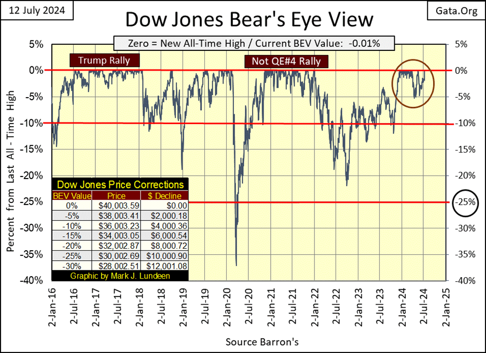
In the Dow Jones’ BEV chart, it rose into scoring position on 20 November 2023, and except for a few daily closes below a BEV of -4.99%, it has remained in scoring position, making twenty-six BEV Zeros, almost making number twenty-seven on Friday’s close This has taken the Dow Jones from 35,151 on November 20th, to 40,003 on May 17th, for a gain of 4,852 points, or a 13.80% advance.

This week, the Dow Jones closed short from making a new all-time high by only $3.60, or only 0.01% from a new BEV Zero in its Bear’s Eye View chart below. Don’t worry, I expect we’ll see the Dow Jones making more than just one new all-time high in the weeks to come.
Looking at the circle in the chart below, from last December through March, the Dow Jones was making a couple of BEV Zeros each, and every week, four months where the Dow Jones didn’t decline 2% from its last all-time high. Then came April, when something changed; the Dow Jones then tested its BEV -5% line, before making two additional BEV Zeros in May, and then tested its BEV -5% once again, and now is looking at making new BEV Zeros in July.
In the weeks and months to come, will the Dow Jones once again generate new all-time highs with the intensity it had from last December to April? Maybe, but I’ll have to see it to believe it.
All the same, this is good market action for the bulls, which I’m one, until the Dow Jones breaks below its BEV -10% line (36,003.23), or maybe even its BEV -7% line (37,200). I can’t not see it, how since August 1982 the Dow Jones has advanced by 33,200 points. How much more can we reasonably expect from this bull market?
It doesn’t matter how the Dow Jones’ valuation was inflated by this vast sum these past forty-two years. Whether this was done by ill-natured fairies and leprechauns, or a bunch of idiots at the FOMC, in July 2024, most of what this bull market is capable of giving its bulls, is now best seen in the market’s rear-view mirror. Though I’ve been saying that for years, it was nonetheless true then, as it is today.
All that is obvious, but what isn’t obvious is how closely gold has traded like the Dow Jones, since it too closed, and has remained in scoring position (BEV values ranging from -0.01% to -4.99%) since last November.
For the past eight months, the Dow Jones and gold’s BEV charts have traded remarkably similar to each other; rising to scoring position, stayed there for a long time as they produced new all-time highs. I’ve provided a Bear’s Eye View (BEV) chart for the Dow Jones and gold going back to October 2022 below.
In the Dow Jones’ BEV chart (upper), it rose into scoring position on 20 November 2023, and except for a few daily closes below a BEV of -4.99%, it has remained in scoring position, making twenty-six BEV Zeros (new all-time highs), almost making number twenty-seven on Friday’s close
This has taken the Dow Jones from 35,151 on November 20th, to 40,003 on May 17th, for a gain of 4,852 points, or a 13.80% advance. A very nice advance.
Gold first rose into scoring position on 14 November 2023, a week before the Dow Jones did. And like the Dow Jones, except for a few daily closes below -4.99%, gold has stayed in scoring position for the past eight months. Gold made its first BEV Zero on December 1st, making a total of twenty-three so far in this advance. And like the Dow Jones, almost closed this week at a new all-time high.
This has taken gold from $1,967.11 on November 14th, to $2,421.97 on May 17th, a gain of $454.86. A very nice advance of 23.12%, almost a doubling of the percentage gain the Dow Jones has seen since it first rose into scoring position. That is an important point not appreciated by most market watchers; since November, gold has advanced more than the Dow Jones, by no small amount.
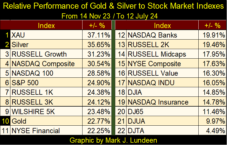
But I’m interested in more than just gold and the Dow Jones, so I constructed the table below, giving the performances of gold, silver and the XAU, relative to the major stock market indexes I follow. I was surprised seeing who was at #1&2. Since last November 14th, when gold first closed in scoring position, to the close of this week, the XAU and silver have been the market’s top performers, with gold down at #10, and the Dow Jones a distant #18.
I believe this is a demonstration that smart-money is now flowing into precious metal assets, creating a stealth bull market in gold, silver and the mining stocks. Should these trends continue, it will soon become public knowledge how well precious metal assets are doing, which will push this advances in gold, silver and the mining stocks to much higher levels.
But when!? Oh, I wish I was that smart, but I’m not. Still, given the trends seen below, seeing additional interest in the precious metal assets, and higher prices by October is reasonable.
In July 2024, the public and managed money isn’t coming yet coming into precious-metal assets. Looking at the same major stock market indexes seen above, but only at their BEV values (the market in terms of new all-time highs & percent claw-backs from those all-time highs) in the table below, this week saw many new all-time highs (BEV Zeros = 0.00%).
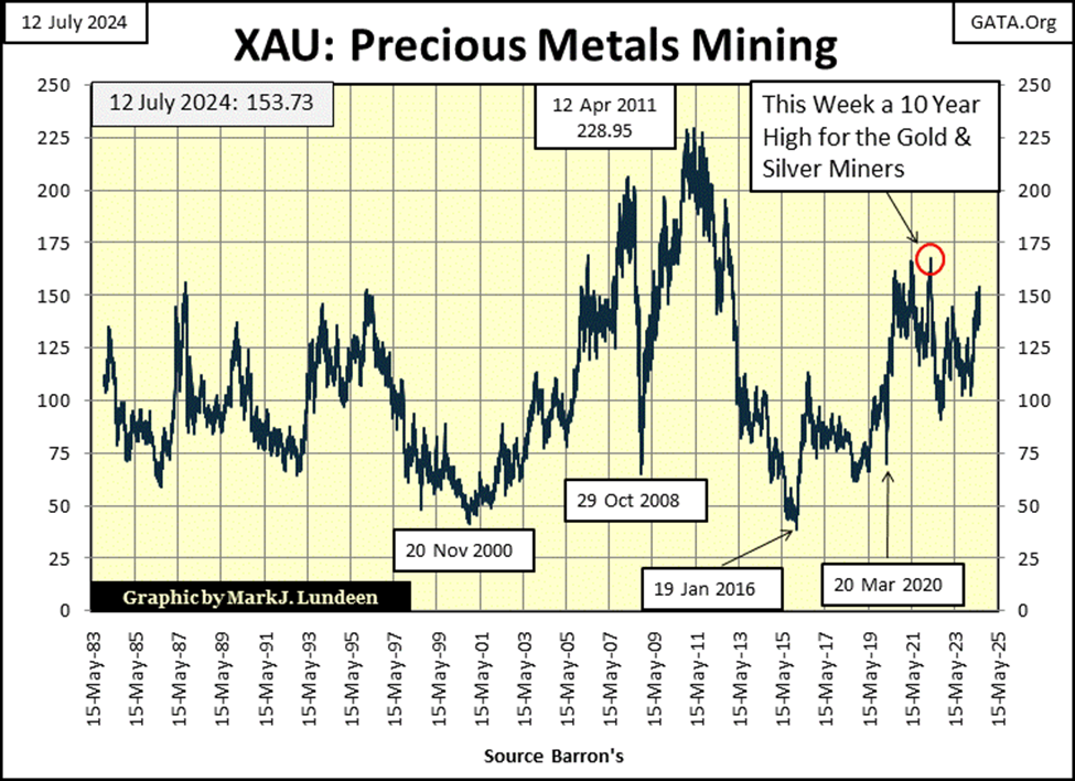
Where was the XAU at this week’s close in the table below? At the bottom; #21, still 32.85% below is last all-time high of April 2011. That is how the public and managed money still see the gold and silver miners; underperforming assets they want nothing to do with.
Until the XAU, and other precious metals mining indexes begin a series of new all-time highs, something they’ve failed to do since 2011, expect any excitement in this sector, muted by the financial media.
I can’t say I blame them. Most people don’t care to buy something at its bear-market bottom, like the XAU below saw in January 2016. They prefer buying something that is making new all-time highs, and there is a lot to say in support of that too.
These two tables provide different views of the market. I believe the table above is looking at the future, where the gold and silver miners will once again be a top performer, the markets’ must have sector. While the table below, with all its new all-time highs in it, is looking at the market at the top of a massive bull market that began in August 1982. A bull market that will continue for only as long as idiots from the FOMC continue “injecting” their “liquidity” into it.
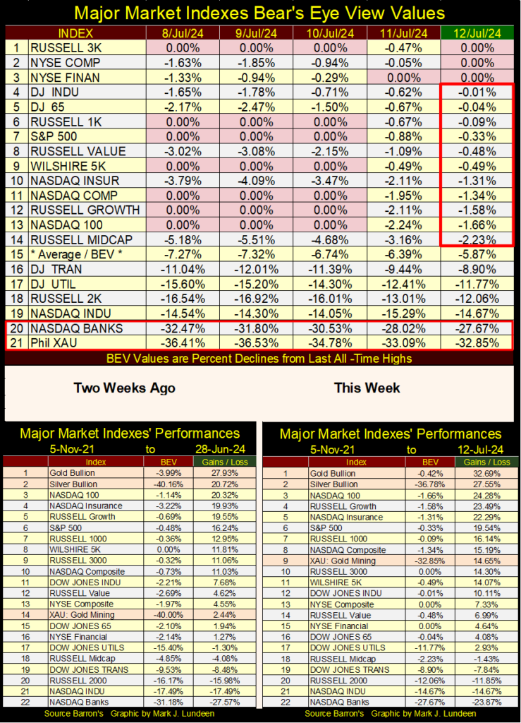
Looking at this week’s performance table above, compared to what we had two weeks ago, gold and silver continue holding #1&2 in the table, while the XAU has jumped up to #9 in the table. If you’re a precious metal assets bull, you have to like what is seen above.
These performance tables are based on these indexes’ close on 05 November 2021; why? Because on 05 November 2021, the stock market saw the top of the post March 2020 Flash-Crash recovery, a recovery enabled by FOMC Primate Idiot Powell’s Not QE#4, where he “injected” a few trillion dollars of inflation, in a few months (chart below), into the financial system, to yet again “stabilize market valuations.”
The Not QE#4 injection’s bullish effects maxed out on 05 November 2021, and in May 2022 (Red Circle below), the idiots at the FOMC began a QT, to drain some of their “liquidity” from the market. And every month since May 2022, looking at the FOMC’s data below, they’ve drained “liquidity” from the market by the tens-of-billions of dollars.
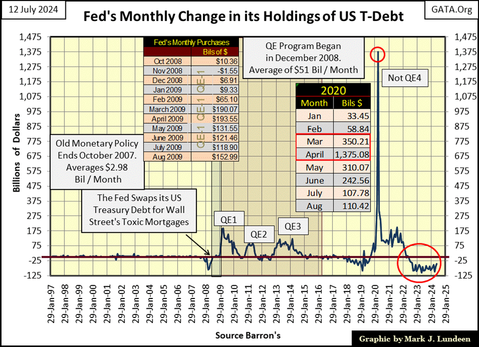
So, looking at this week’s performance table above, why are so many stock market indexes currently double-digit percentages above where they were on 05 November 2021, two years and two months into a massive Quantitative Tightening (QT) by the FOMC? This is very suspicious, and it shouldn’t be just me commentating on this.
If you really understand what this chart above is saying, and looking at the market’s actual response to this alleged, massive draining of “liquidity” from the financial system, why would anyone believe anything, anyone from Washington, especially by officers from the Federal Reserve System, would say about this, that, or anything else about the economy and financial markets?
These people are very comfortable with their lying to the public.
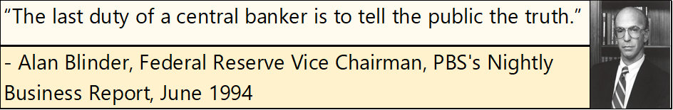
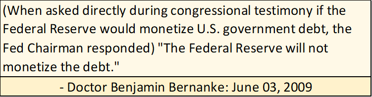
The truth be told, the Federal Reserve is no more truthful with Congress, though I suspect Congress expects to be lied to by officers of the Federal Reserve system, as this whopper of a lie from June 2009, as Bernanke’s QE1 was in progress (see chart above).
What are they lying about now? They aren’t draining “liquidity” from the market, though they say they are. I’m not stating that as a fact. But considering how market valuations continue rising, I’m just not gullible enough to believe they are.
Since its inception on Christmas Eve in 1913, the Federal Reserve has never been audited. Free from any adult supervision of what they do, and don’t do with the American dollar, even Congress is ignorant of what these idiots are doing.
And now, the “Policy Makers” want to have a digital dollar, controlled by these idiots. I get the heebie jeebies thinking about how I, and everybody else is going to be abused with a digital dollar, controlled by the FOMC. The digital dollar is a very, very bad idea.
I don’t want to miss publishing this week’s chart on the Dow Jones in daily bars, so here it is. As per the FOMC, this is what happens following a week where $8.94 billion dollars is drained from the financial system; the Dow Jones almost closes at a new all-time high. Yeah sure, you betcha.
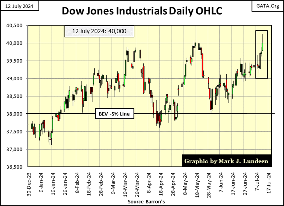
This nonsense could go on for a long time. The Dow Jones at 50,000? I won’t say it couldn’t happen, but that would be an advance of only 25% from this week’s close. And keep in mind, as the market continues to rise, so too do market risks, as the potential for possible rewards for assuming those risks, become ever smaller.
There will be consequences for all these inflated capital gains in the stock market. One way, or another;
• collapsing stock market,
• the destruction of the dollar itself,
• or most likely; both of the above,
Mr Bear is going to do things to this market, and people’s favorite investments, that small children should never see.
But when is that going to happen? I don’t know the when. I’m only painfully aware of what is going to happen following this market’s top.
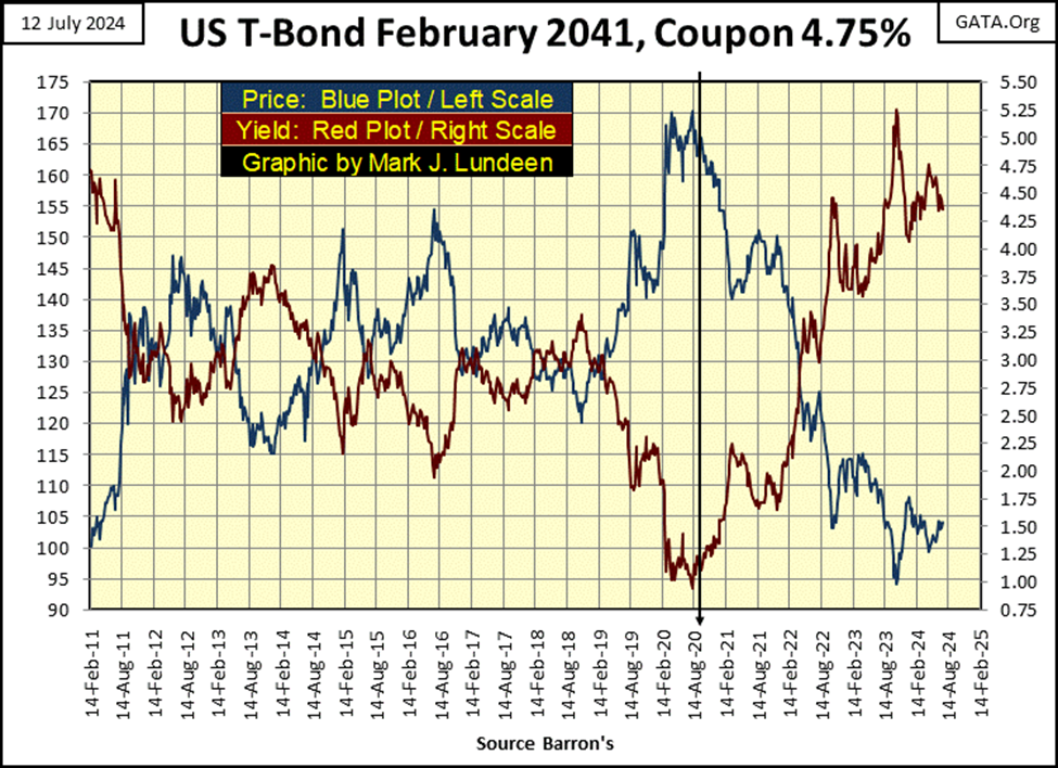
If you look at the Treasury Bond Market, it began a bear market in August 2020, four years ago. Seeing bond valuations deflate for four years, 38.23% for this T-bond at this week’s close, as stock valuations continue to rise, is a historical anomaly. So, who is seeing the future accurately? The stock or T-bond market?
Let’s look at commodities via their BEV values in the table below. On a weekly basis (Thursday’s closing price for my data, as I update this file on Thursday), gold closed at a new all-time high. Copper and cocoa have also seen a few weekly new all-time highs so far this year. But everything else I follow are still double-digits from their last all-time highs. So, why is CPI inflation so high? I haven’t a clue, but twenty bucks doesn’t go far at the grocery store, or at a restaurant anymore.
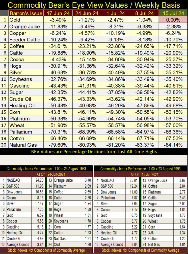
In the performance tables above, the stock indexes are still leading the pack, but the XAU is making its move up the list.
I was watching some YouTube videos of people visiting little towns and villages in the upper mid-west. Geeze Louise, single-family homes in North Dakota’s farming communities are going for over $200,000. That is how “liquidity” from the FOMC flows – it flows everywhere, even into rural North Dakota real estate.
My mother was raised as a farmer’s daughter in North Dakota during the dust-bowl days of the depressing 1930s. She never forgave North Dakota for the experience.
North Dakota has some of the nation’s lowest crime rates, the people are friendly, but its winters are brutal. There are no trees on the prairie, so when a blizzard comes, they have “white outs,” where outside, one can see nothing but the white of the blowing snow. Farmers would leave their houses to milk the cows in their barns, and get lost fifty feet from their home. They’d die from the sub-zero cold, and not be found until the spring melt.
This happened, but could this still happen today? I’m not the person to answer that question. So, if you purchase a home in rural North Dakota for over $200,000 today, as per my mother, you best tie a stout rope between your home and the barn, or garage between November 1st and April, so you don’t get lost in a blizzard.
Which brings us to my next topic; CNBC says there are too many homes on the market, but that isn’t necessarily bearish for the real estate market, as per CNBC. I don’t know what they are talking about. For years now, I haven’t seen a for-sale sign in front of a house in my neighborhood. Not much of a market for real estate, when rising mortgage rates have pushed most buyers out of the market.
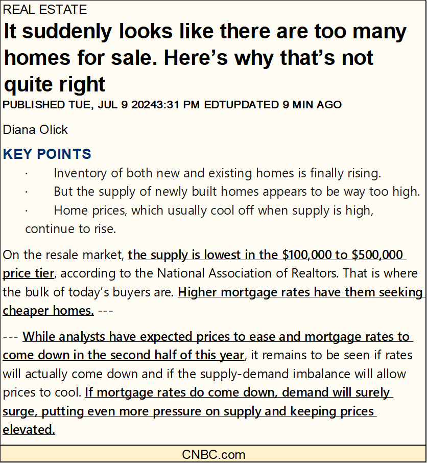
https://www.cnbc.com/2024/07/09/why-home-prices-are-still-rising-even-as-inventory-recovers.html
The Financial media today functions primarily as a cheering section for whatever bull market Wall Street has ongoing. But it wasn’t always that way.
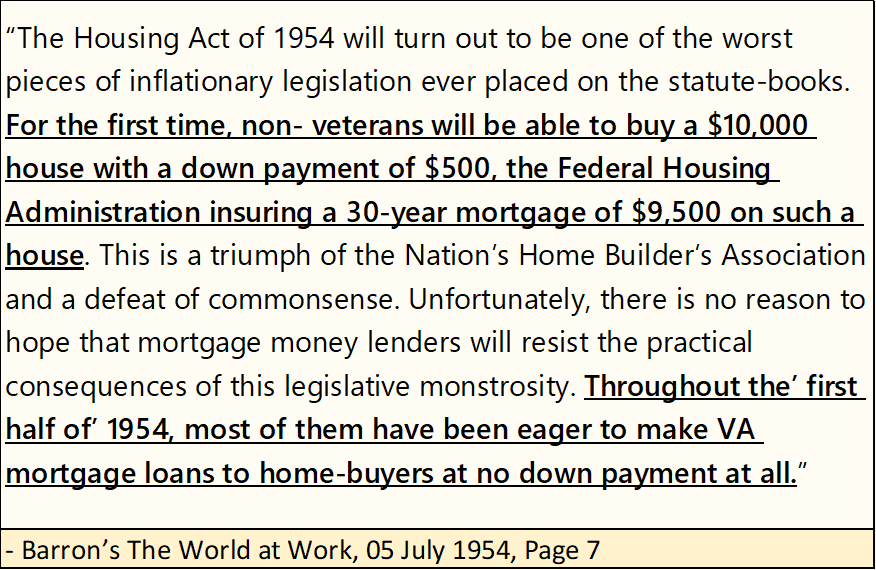
People look at the price of real estate today, and think nothing of homes going for hundreds of thousands of dollars. But many of these expensive palaces in 2024, were once only single-family housing units seventy years ago, selling for $10,000, as seen below in this quote from Barron’s from 1954. Long ago, Barron’s understood what was happening in the real estate market, and didn’t approve.
More on Naked Short Selling (link below.) For investors in precious metal assets, this is a major issue they should be aware of. On one hand it’s bad. But on the other hand, it’s good for bulls on gold, silver and their miners, as rising prices will force these naked shorts to cover, creating the conditions for panic buying when these naked shorts are forced to cover (buy back) their short positions in a rising market.
In the next year, don’t be shocked should you see gold, silver and the XAU spike up 10%, or more in a single day.
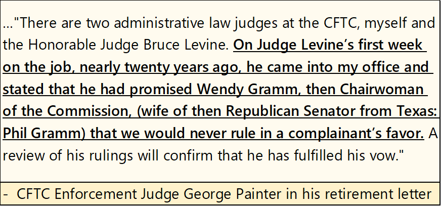
This situation for naked short selling is only possible because markets in the United States are “regulated markets.” Aren’t these market regulators supposed to protect the interests of the public? If you believe what CFTC Enforcement Judge George Painter said below, not always.
History has shown, a society can’t really be corrupt, unless that society has a big government to corrupt its civil institutions. America would do well if we just got rid of much of the bureaucracy, the deep state now entrenched in Washington DC, as they protect only themselves, at the expense of everyone else.
Here is gold’s BEV Chart. It can’t be denied, since November 14th when gold first closed in scoring position, and has stayed there since (Red Circle), something fundamental has changed in the gold market.
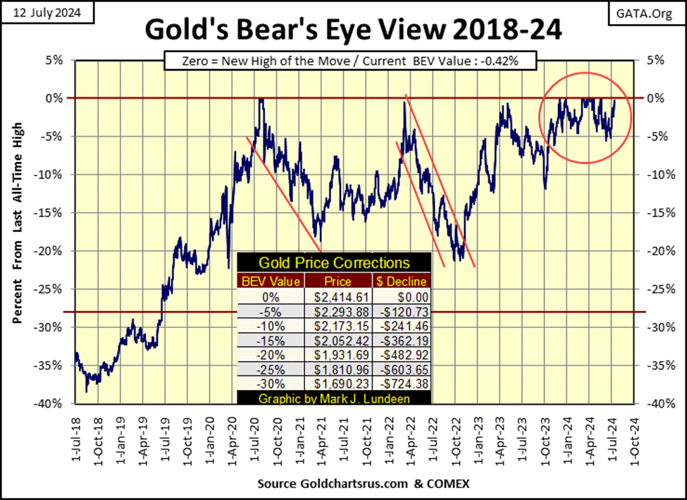
This is a good looking chart, and gold’s step sum table below is also positive. Twice since June 6th, gold tested its BEV -5% line (Green Tabs), and twice bounced off them, closing this week only $10 from a new all-time high. Like the Dow Jones, I’m anticipating a few new all-time highs for gold in the coming weeks.
Gold became overbought on July 10th, as its 15-count increased to a +7. Friday’s down day corrected that, which is good. Also, gold’s daily volatility’s 200D M/A has increased from 0.63% on June 6th, to 0.68% at this week’s close. Gold bull markets are exciting markets. As this stealth bull market in gold and silver become public knowledge, expect seeing this indicator for daily volatility, to rise well above 1.00%.
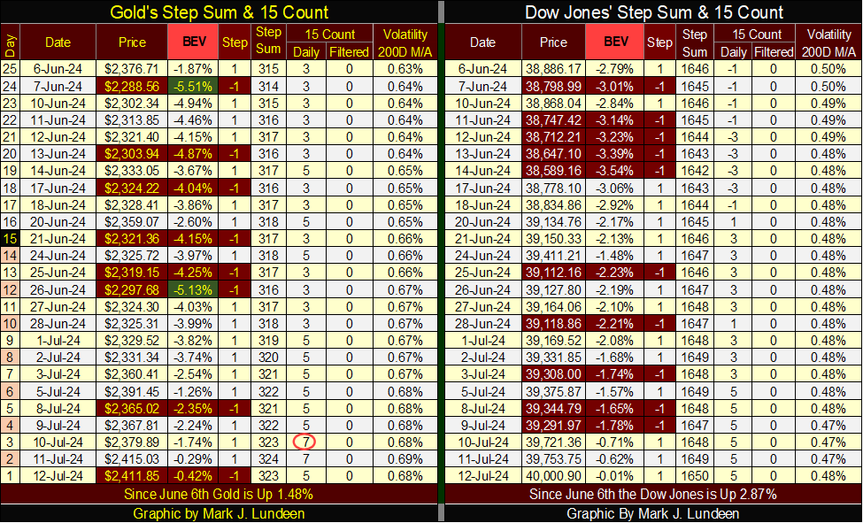
The Dow Jones’ side of the table above also looks constructive. I like how since June 24th, the Dow Jones has seen a few down days, yet has risen despite them. That is good market action. Also, the Dow Jones’ daily volatility’s 200D M/A has gone down. Declining daily volatility is a hallmark for stock-bull markets.
In fact, looking at this market metric of Dow Jones daily volatility in the chart below, since January 1900, 124 years of market history, all Dow Jones bull markets’ see their ultimate tops, when their daily volatility’s 200D M/A falls at, or below 0.50%. For these 124 years, there were no exceptions to that rule.
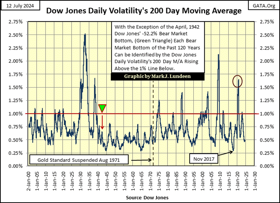
Looking at Dow Jones bear markets, for these 124 years, they bottom with the daily volatility increasing somewhere above its 1.00% line in the chart above. Dow Jones bear markets continue going lower, for as long as their daily volatility’s 200D M/A continues rising. Until daily volatility peaks, and begins declining in the chart above, signaling the beginnings of a new bull market on Wall Street. There is one exception to that rule; the April 1942 -52% bear market bottom (Green Triangle) above.
This bear market bottom happened while few watched, or cared about the stock market. After the Great Depression’s devastating -89% market crash, followed by the March 1938 -49% bear market bottom, and then the United States entering WWII following Pearl Harbor in December 1941, only a few cared, or noticed the Dow Jones was down 52% in April 1942.
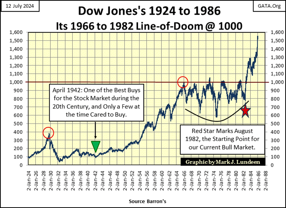
Much like precious metal investments today; in April 1942, only a few people more than ten miles away from the New York Stock Exchange, gave a damn about the Dow Jones. Too bad, as April 1942 was the start of the second-best Dow Jones bull markets in history, that saw the Dow Jones rise to 1000 by 1966. And what is the best bull market in Dow Jones history? The one that started in August 1982 (Red Star above), a bull market that continues to this day.
__
(Featured image by Chris Liverani via Unsplash)
DISCLAIMER: This article was written by a third party contributor and does not reflect the opinion of Born2Invest, its management, staff or its associates. Please review our disclaimer for more information.
This article may include forward-looking statements. These forward-looking statements generally are identified by the words “believe,” “project,” “estimate,” “become,” “plan,” “will,” and similar expressions. These forward-looking statements involve known and unknown risks as well as uncertainties, including those discussed in the following cautionary statements and elsewhere in this article and on this site. Although the Company may believe that its expectations are based on reasonable assumptions, the actual results that the Company may achieve may differ materially from any forward-looking statements, which reflect the opinions of the management of the Company only as of the date hereof. Additionally, please make sure to read these important disclosures.


TopRanked.io Weekly Affiliate Digest: What’s Hot in Affiliate Marketing [1xBet Affiliate Program]
If you thought nobody liked cricket, then this week, we're proving you wrong. And by the time we're done, you'll...


Tether Seeks Big Four Audit to Boost USDT Transparency
Tether, issuer of USDT, plans a full audit by a Big Four firm to address transparency concerns over its $184...


H&M Advances Sustainability and Cuts Emissions by 2025
H&M Group reported that by 2025, 91% of materials were recycled or sustainably sourced, with recycled content reaching 32%. Emissions...


NHS Funds Breakthrough CAR-T Therapy Breyanzi for Lymphoma Treatment in Spain
Bristol Myers Squibb announced NHS funding for CAR-T therapy Breyanzi, enabling its use from April 1st in Spain for lymphoma...


Crypto Markets Volatile as Bitcoin Hovers, Solana Eyes AI Integration
Crypto markets remain volatile amid the Iran war, with Bitcoin near $70,000 and ETF inflows improving outlook. Ethereum faces declines...
 |
|
 |  |
 |
|
-
 Crypto4 days ago
The Iran War Tests Bitcoin and Crypto Market Resilience
-

 Crypto2 weeks ago
Oil Surge and Iran War Lift Bitcoin as Crypto Sentiment Improves
-
 Crypto1 day ago
Crypto Markets Volatile as Bitcoin Hovers, Solana Eyes AI Integration
-

 Cannabis1 week ago
Germany’s Medical Cannabis Market: Legal Reform, Falling Prices, and Rapid Expansion