Featured
Fed Funds Rate to Increase: That’s Bad for the Stock Market
Two weeks ago, gold was only a few dollars from making a new all-time high. At this week’s close, it’s now below scoring position. But with all the problems Washington and Wall Street have to deal with today, I’m optimistic gold remains in a bull market, and will soon be making market history by this summer. If not, then this autumn.

The Dow Jones has improved its position in its Bear’s Eye View (BEV) chart below. The last time I published this chart, two weeks ago, the Dow Jones was a tad below its BEV -10% line. This week it closed at a BEV of -5.68%, making up about half its loss from its last BEV Zero (last all-time high) of January 4th.
So, should we all jump back on before the Dow Jones begins its next advance into market history? I think I’ll pass on that. The Dow Jones may see additional BEV Zeros as we go ever deeper into 2022, but the risks of the market entering into a massive bear market grows too.

A huge problem for the bulls running around Wall Street, is that interest rates are rising, with the blessings of the FOMC (see below). Ditto for mortgage rates. In January 2021 they bottomed at 2.65%. This week, a little more than a year later, the St. Louis Fed reported mortgage rates have increased to 4.42%. That is a big jump in mortgage rates in only fourteen months.
This is very deflationary, as seen in the table on the chart below. People like to think they can afford the houses they intend to purchase. But as the entire housing market is purchased on credit (mortgages), bankers look at affordability differently. To them, it’s whether or not a perspective “home buyer” is likely to make their monthly payment, specified in the mortgage contract, for the next 30 years. The market price of the house is a secondary consideration.
Assuming a young couple can make a $1,000 a month mortgage payment, the table below shows the principle such a monthly payment could make at different rates.
As seen below, declining mortgage rates since October 1981 have inflated the valuation of the nation’s housing inventory. But with mortgage rates now trending upward, a continuation of this trend of rising rates is very deflationary for the housing market. That wouldn’t be good for the “homeowners”, the banking system, or the stock market.

The chart below plots the Dow Jones in daily bars. Studying it gives me no indication of whether its next move will be to the up or downside. So, I’ll need more time before I can say anything bullish or bearish for the short term, say like before May of this year. If the Dow Jones continues the advance it began last week – call me a short-term bull. Should the Dow Jones break below 32,250 – call me a short AND long-term bear.
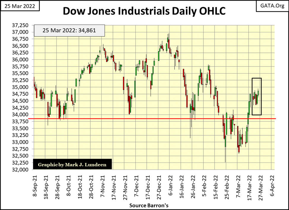
It’s a fact, investors don’t need to be in the market all of the time. Sometimes it’s completely appropriate to sit in the market’s peanut gallery, with no exposure to the market, and just enjoy the show.
Considering the huge inflationary advances since August 1971, when the US Treasury took the dollar off the Bretton Woods’ $35 gold peg (Red Star Below), concerns of massive deflation in market valuations in the years to come are completely justified.

Once again, the Dow Jones Utilities are making new all-time highs. But this week there are also a few indexes closing in scoring position (-0.01% to -4.99%). Why “scoring position”? Because when an index, or anything else is advancing into market history, making repetitive new all-time highs, they actually close more often in scoring position during the advance. This can be seen this week with the DJ Utilities.
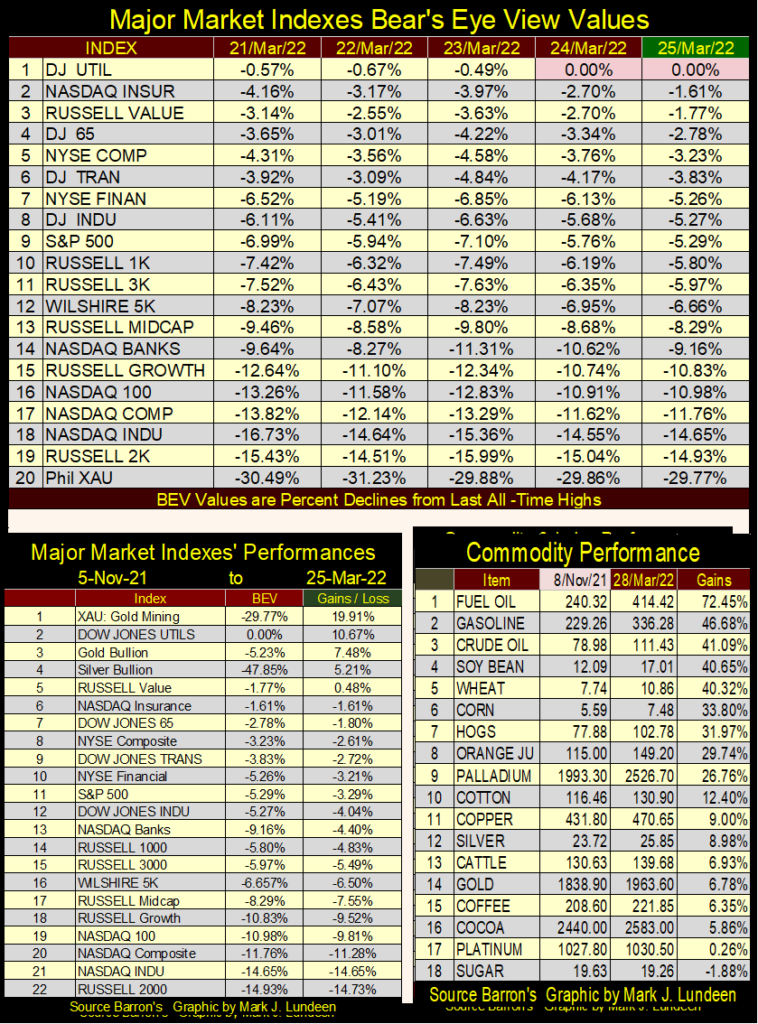
Looking at the table listing the major market indexes performances (Left Table), since the first week of November of last year, with the exception of the Dow Jones Utilities, or precious metals assets, they have all lost money. What hasn’t lost money are commodities, seen in the table on the right. In only the past four months, the first ten items in the commodities table have advanced by big double-digit percentages. Then seeing precious metal assets underperform crude oil and soybeans; well, it makes me pause to wonder.
After bumbling Joe Biden once again supported the nuclear deal with Iran, Saudi Arabia and the UAE both refuse to even pick up the phone to talk with the usurper sitting in the White House. But this is not so when Russia or China’s leaders call. In fact, the oil sheikdoms of the Persian Gulf may actually begin to sell their crude oil in Russian rubles and or Chinese yuan sometime in the future.
Bumbling Biden may have pushed the self-destruct button to terminate the petrol-dollar system, which would result in massive domestic inflation, as overseas dollars, no longer needed to purchase oil in the global market, return to the United States. As most of these dollars are held in the form of US Treasury debt, its hard seeing how the termination of the petrol-dollar system wouldn’t send domestic US interest rates, and bond yields soaring.
As it has been for decades, there are more dollars overseas than in the United States, because these sheikdoms demanded dollars for their oil. This is just one more item on my check list of why I’m not an optimist on the financial markets. The second bearish item, on my long list, is current “monetary policy’s” intention to raise interest rates.
As per CNBC, its official; the Federal Reserve will increase their Fed Funds Rate, anticipating six additional rate increases before New Year 2023.
At those times when the idiot savants at the FOMC announce they intend to increase interest rates, the financial media usually takes the news either as routine, or with a bit of optimism. But they know better than that, or should.
Since the top in the NASDAQ High Tech Bubble in early 2000, seeing the FOMC raising their Fed Funds Rate, would ultimately pop the bubble this same FOMC had inflated in the financial system. It can take over a year, or more for the bubble to pop. But the bubble does eventually pop.

https://www.cnbc.com/2022/03/16/federal-reserve-meeting.html
Let’s take a look at monetary history going back to 1954, at the interplay between long-term T-bond yields and the FOMC’s Fed-Funds Rate in the chart below. First a few comments on the plots. The FOMC controls the economy via the manipulation of their Fed Funds (Blue Plot) to longer term bond yields (Red Plot). Easy money stimulates the economy by making credit creation easy, while tight money contracts credit, slowing economic activity. Sometimes by a lot, as when the sub-prime mortgage bubble popped in October 2007.
- Easy Money: Fed-Funds Rate * Below * long-term bond yield. The farther below, the easier (the looser) is monetary policy.
- Tight Money: Fed-Funds Rate * Above * long-term bond yield. The farther above, the tighter is monetary policy.
As seen below, since 1981 “monetary policy” has never been tight. Each time the FOMC increased their Fed Funds Rate above the yield for the long T-bond, the stock market and economy began deflating. Which motivated the FOMC to drastically lower their Fed Funds Rate to reinflate the markets and economy.
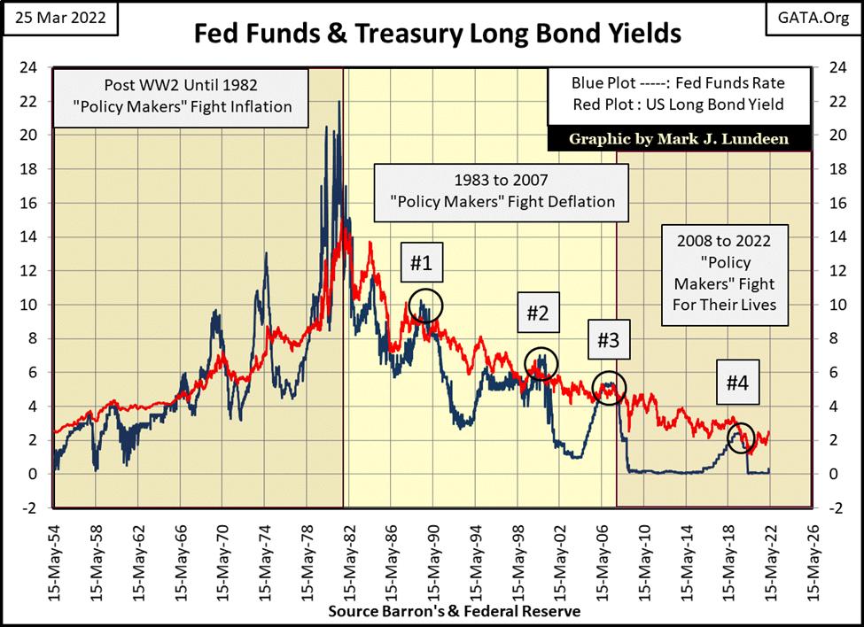
Since WWII, there has been three eras of “monetary policy”, as noted in the chart above;
- Policy Makers fight Inflation (1954 to 1982) / inflation flowing into commodities and CPI.
- Policy Makers fight Deflation (1983 to 2007) / inflation flowing into financial assets.
- Policy Makers fight for their lives (2008 to today) / inflation flowing into everything.
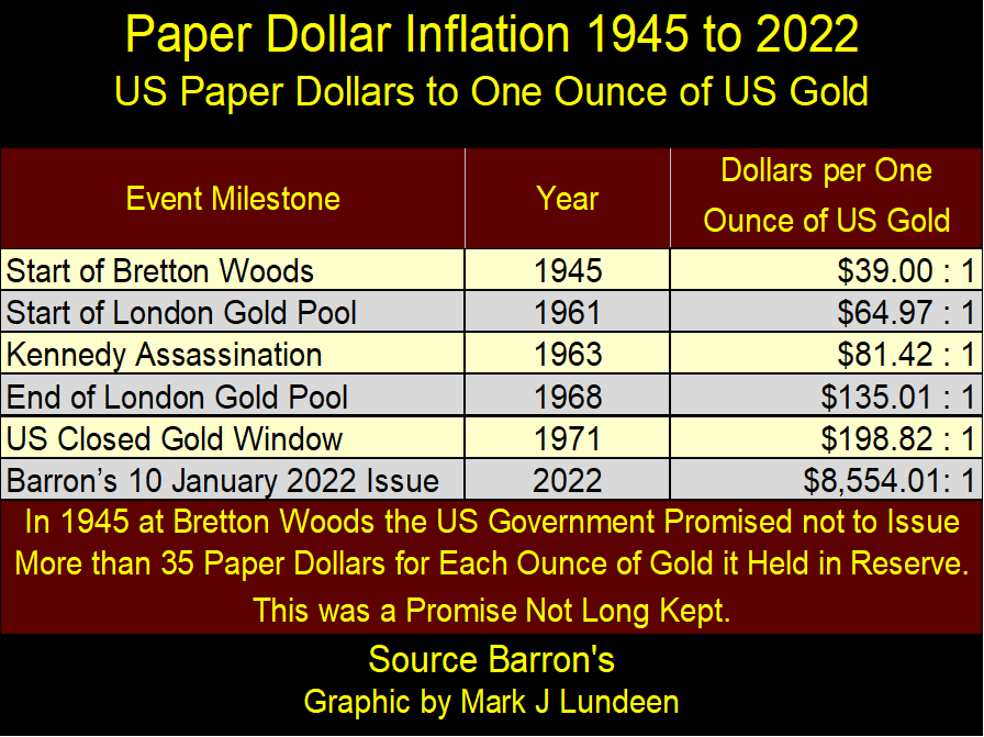
The need for the Federal Reserve to fight inflation, before 1982, was due to Washington issuing more paper dollars (CinC) than the US Treasury had monetary gold reserves to back them. In other words; with the US Dollar pegged to $35 gold, the United States shouldn’t issue more than thirty-five paper dollars for each ounce of gold held by the US Treasury. As seen in the table below, when the US Treasury took the dollar off the $35 gold peg, post war inflation in CinC eventually resulted in $198 paper dollars issued for each ounce of gold held by the US Treasury by August 1971.
There had been a run on the US gold reserves going back to 1957. By 1971, this gold-run became a flood, threatened to strip the US Treasury of all of its gold. So, the US Treasury closed its gold window to terminate the run on its gold, as it continued expanding CinC for the next half century. Two months ago, the US Treasury had issued $8,554 paper dollars for each ounce of gold it claims to hold.
Here’s a chart plotting the Federal Reserve’s balance sheet since April 1953. For every $1.00 in T-bonds held in 1953, today, seventy years later, the Federal Reserve now holds $356. It’s called “monetizing the debt,” something the Federal Reserve used to deny it was doing.

Since 03 June 2009, during QE-1 when Dr. Bernanke lied to Congress about “not monetizing the debt”, the FOMC has “monetized” an additional $7.38 trillion dollars of the national debt. How much longer can this continue? Who can say? But, if Christmas of 2022 isn’t very merry, the problem may be this corrupt system of chronic inflation is coming to its inevitable conclusion.
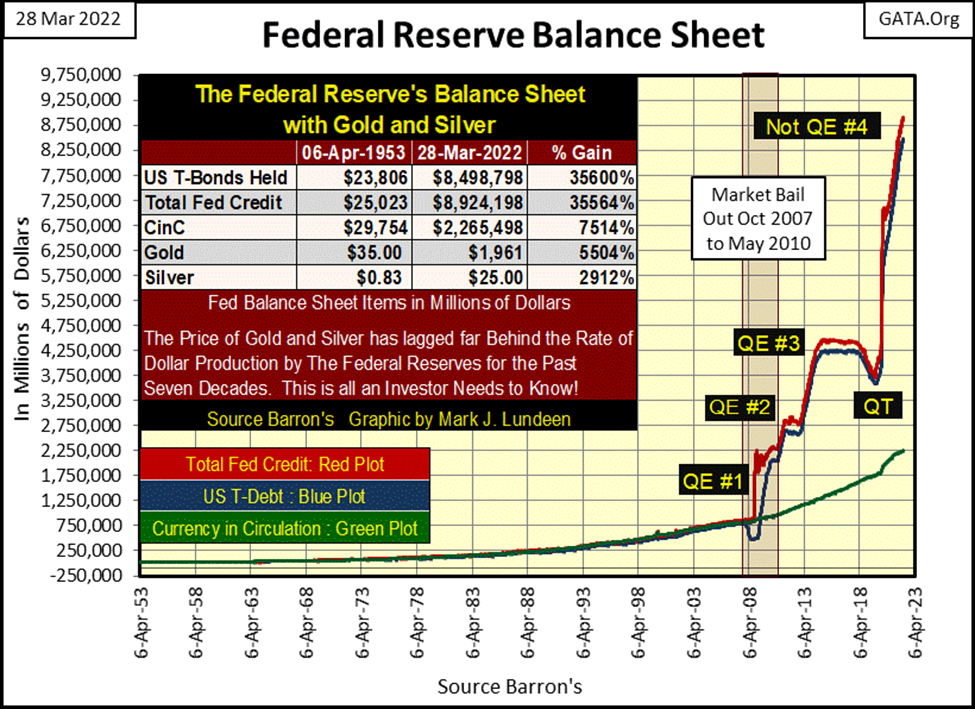
This isn’t how a responsible government manages its currency. However, if an evil villain, someone James Bond might do battle with, wanted to destroy a nation’s economy, and ruin its middle-class, as this villain’s loyal, and entrenched elite enriched themselves in the process; what is seen above in the Federal Reserve’s balance sheet is an excellent way to go about that.
Let’s return to the Fed Funds Rate and yield for the US Treasury’s long bond, but this time as a spread; Fed Funds – Long Bond Yield. Readers may find it useful to review my chart above plotting the actual values of the Fed Funds Rate and T-bond yields, from which the plot below is derived from.
In the chart below;
- Tight Money = Positive Values / the higher the value, the tighter the money,
- Easy Money = Negative Values / the lower the value, the looser the money
During the period of post WWII monetary history when the “policy makers” fought inflation (1954 to 1982), the FOMC’s flows of inflation flowed into commodities and the cost of living. At such times, making monetary policy tight is an attempt to reduce CPI inflation. Before 1981, the idiot savants at the FOMC didn’t fear to invert the yield curve (increase their Fed Funds Rate above T-bond yields) by as much, and more than 8%. The market bubbles they were inflating was in CPI inflation, not the stock and bond markets.
The second period of post WWII monetary history, when the “policy makers” fought deflation (1983 to 2007), the deflation they were fighting was deflation in the bubbles they inflated in the financial markets – stocks, bonds and real estate.
Since 1981, they never again inverted the yield curve by as much as 2%, because every time they did, a bear market began somewhere on Wall Street. I’ve labeled these market declines below
#1: The October 1987 flash crash on Wall Street,
#2: The 2000 to 2002 NASDAQ High Tech Bear Market,
#3: The 2007 to 2010 Sub-Prime Mortgage Bear Market,
#4: The March 2020 Flash Crash.
And now for the fifth time since 1981, the idiots have announced they’re going to again increase their Fed Funds Rate. The results for the pending #5 bear market won’t be any different this time, though it will take time before Mr Bear begins his festivities on Wall Street. Which is good, as that will provide time for investors to pull out of the stock market, in an orderly manner, rather than waiting to sell their positions during a selling panic on Wall Street.
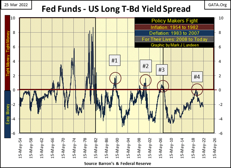
The third, and I believe the last period of post-WWII monetary history, where the “policy makers” are now fighting for their lives (2008 to today) began in the wake of the sub-prime mortgage debacle; #3 above.
Also, look at the chart above plotting the actual values of the Fed Funds and T-bond yields, as it displays a superior view of the problems the idiots currently have. Their Fed Funds have been at zero for most of this time, since 2009, for fear of what would happen should it rise.
The frequency tables below list how many weeks during these three eras of “monetary policy” had set their Fed-Funds Rate above and below the T-bond’s yield. The first step to analyze these three periods in monetary history, would be to first go down to these tables’ bottom and see how many weeks monetary policy was tight or loose during each era.
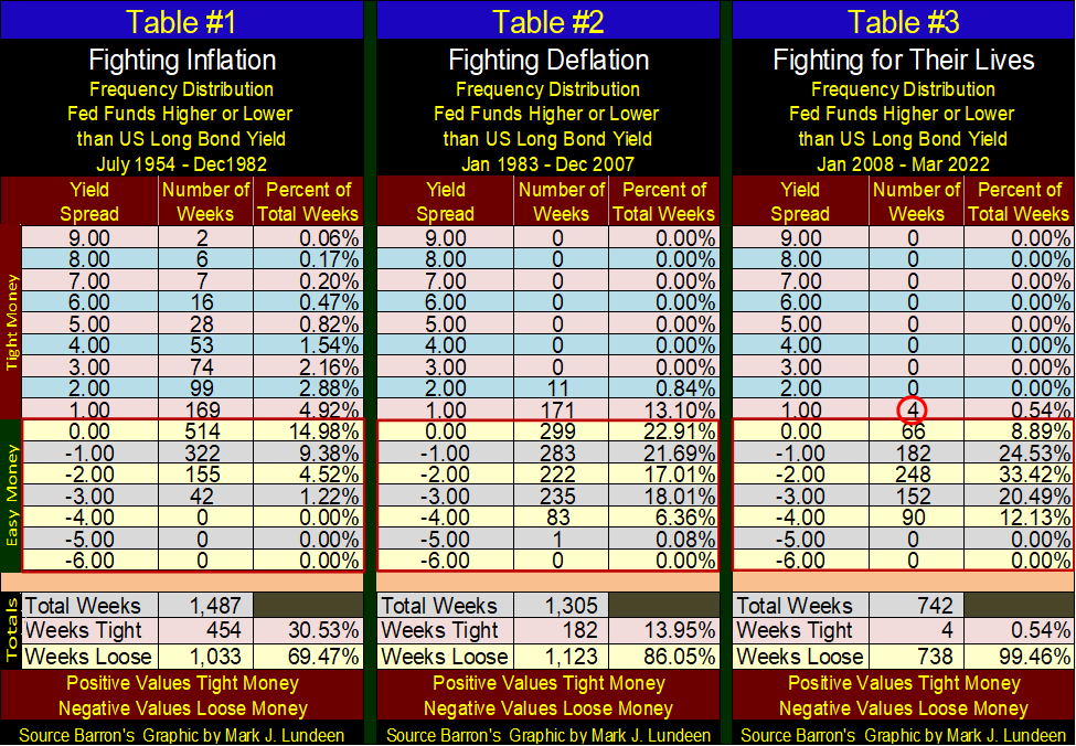
In above table #1, when they were fighting inflation, the FOMC maintained tight money for 30.53% of the 1,487 weeks during this period of monetary history. In table #3, where they have been fighting for their lives, the FOMC maintained tight money for only * FOUR WEEKS * of the 742 weeks during the period.
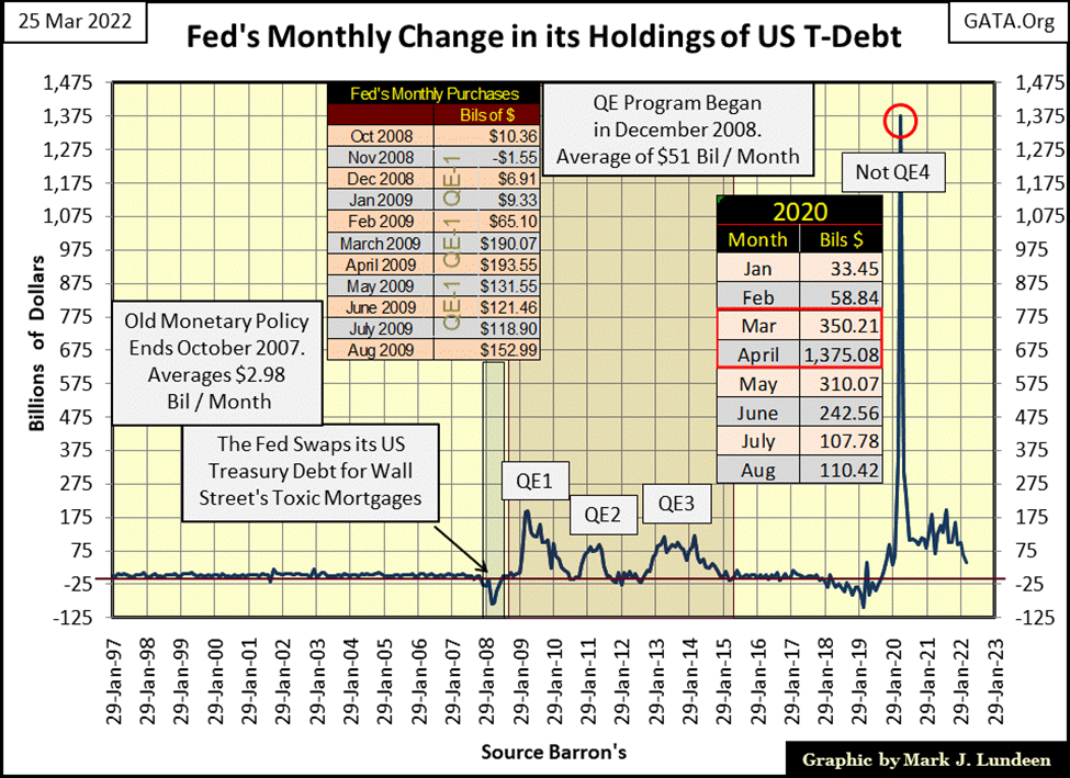
This is an interesting market factoid; these four weeks happened in August and September 2019. Two months later, in October 2019, the overnight repo market began spitting-up-blood when rates spiked deep into double-digits. Fed Chairman Powell terminated his QT, and began his Not-QE#4 as a response to this emergency.
Six months later the Flash Crash of March 2020 began. Chairman Powell, with his Not-QE#4 “injected” $1.37 trillion dollars, in a single month (April 2020), into the financial system to stop the massive deflation occurring.
With the idiots now promising to once again increase interest rates, and seeing their Fed Funds Rate now trending towards the yield of the Treasury’s long bond; I believe it’s prudent anticipating Wall Street will once again begin spitting-up-blood somewhere in its banking system sometime this year, or early 2023. That isn’t going to be a positive development for the stock market.
I want no part of this. So, I’ll remain as safe and comfortable as is possible in the market’s peanut gallery.
That sounds good, but for people with money, where do they take their dollars for safe keeping as the market melts down in the coming whirlpool of deflation?
I’ve said this before because it’s true; we live in a bad world. If the wicked people now trying to form a world government achieve their goal, they’ll be no better, and possibly much worse than Hitler or Stalin. With people like that in control of our coming digital world, dominated by artificial intelligence, even gold, silver, or mining shares won’t save you or me from what these evil people have planned for us.
Two weeks ago, gold was only a few dollars from making a new all-time high, aka a BEV Zero (0%) in gold’s BEV chart below. At this week’s close, it’s now below scoring position. But with all the problems Washington and Wall Street have to deal with today, I’m optimistic gold remains in a bull market, and will soon be making market history by this summer. If not, then this autumn.
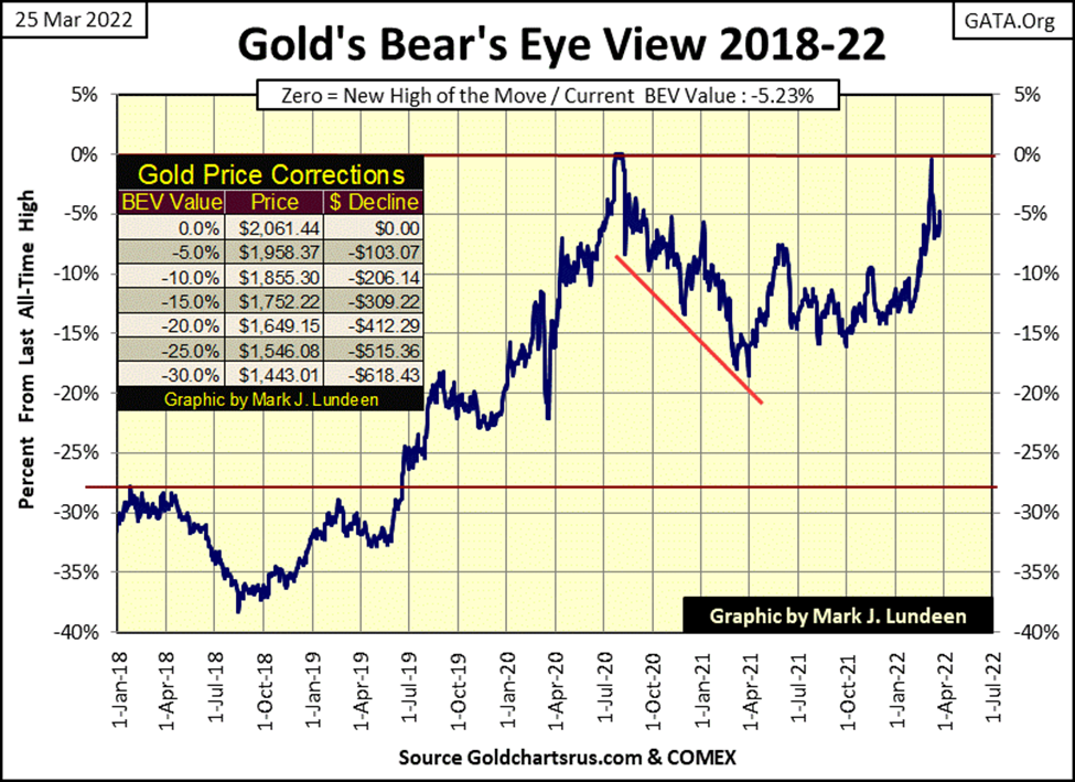
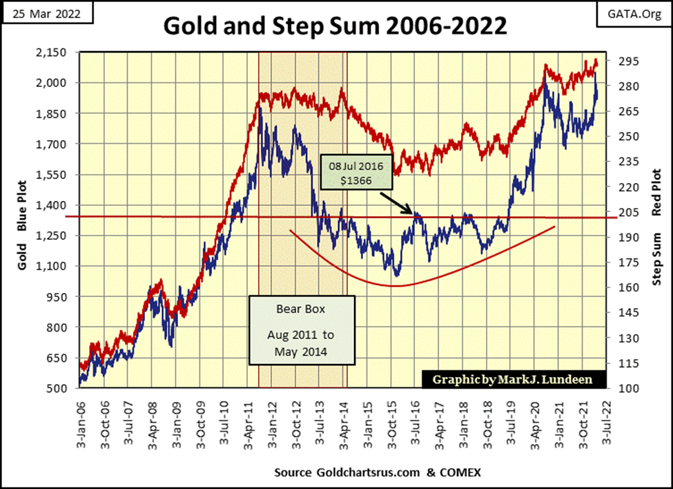
Gold’s step sum chart remains very bullish. I’d had liked if two weeks ago gold broke above its last all-time high of August 2020 ($2,061), and had moved on to $2,200. But these things proceed at their own pace. This is especially so when the bears have permission from their Federal Regulators to cheat, if that’s what it takes to keep gold from making a new all-time high.
With all the problems the US dollar, and financial markets have, as highlighted earlier in this article, the last thing the “policy makers” need is a bull market in gold and silver to catch the attention of the investing public.
Moving down to the next chart, the Dow Jones (my proxy for the general stock market) is at an inflection point. Maybe the Dow Jones’ lows of March 11th will hold, and we’ll once again see the Dow Jones making new all-time highs soon. But what if the Dow Jones once again begins trending down in the coming weeks? In the past, the “policy makers” had little difficulty in reversing market downturns.
But that was then, and this is now. In 2022, with the idiot savants at the FOMC raising their Fed Funds Rate in a vain attempt to corral rising consumer prices, Wall Street may soon become very interesting for those of us sitting in the market’s peanut gallery.

In gold’s step sum table below, on March 8th gold was short of making a new all-time high by only $9. The COMEX goons couldn’t let that happen; so, at the end of this week, gold was down about a $100 from its March 8th close. However, the fact that gold almost did make a new all-time high three weeks ago, tells us the goons are losing their grip on the gold market.
Gold closed the week with a 15-count of -1, a neutral value that indicates the gold market isn’t oversold or overbought, a good position for gold to resume its advance into market history – a daily close above $2,061. Gold’s daily volatility’s 200-day M/A continues to increase. Which for the gold market, is a positive factor.

On the Dow Jones’ side of the table above, it really doesn’t look all that bad. Apparently, the Dow Jones is on standby for its next big move, be that up or down. One negative factor to keep an eye on, its daily volatility’s 200-day M/A, like gold’s, is increasing. But unlike gold, rising volatility is a negative factor for the stock market.
__
(Featured image by tommao wang via Unsplash)
DISCLAIMER: This article was written by a third party contributor and does not reflect the opinion of Born2Invest, its management, staff or its associates. Please review our disclaimer for more information.
This article may include forward-looking statements. These forward-looking statements generally are identified by the words “believe,” “project,” “estimate,” “become,” “plan,” “will,” and similar expressions. These forward-looking statements involve known and unknown risks as well as uncertainties, including those discussed in the following cautionary statements and elsewhere in this article and on this site. Although the Company may believe that its expectations are based on reasonable assumptions, the actual results that the Company may achieve may differ materially from any forward-looking statements, which reflect the opinions of the management of the Company only as of the date hereof. Additionally, please make sure to read these important disclosures.

-

 Business1 week ago
The Federal Reserve and War in Iran: Why It Matters to Your Money
-

 Fintech1 week ago
Lutech Acquires Talentomobile to Boost European Fintech Expansion
-

 Africa2 days ago
Why Small Businesses in the MENA Region Struggle to Scale Despite Access to Finance
-

 Africa1 week ago
Middle East Crisis Threatens Africa’s Growth and Economic Stability


