Featured
Gold breaks above its BEV, looks ‘pretty good’ in the market
Gold is advancing nicely in the market while the Dow Jones is now struggling to hold on.

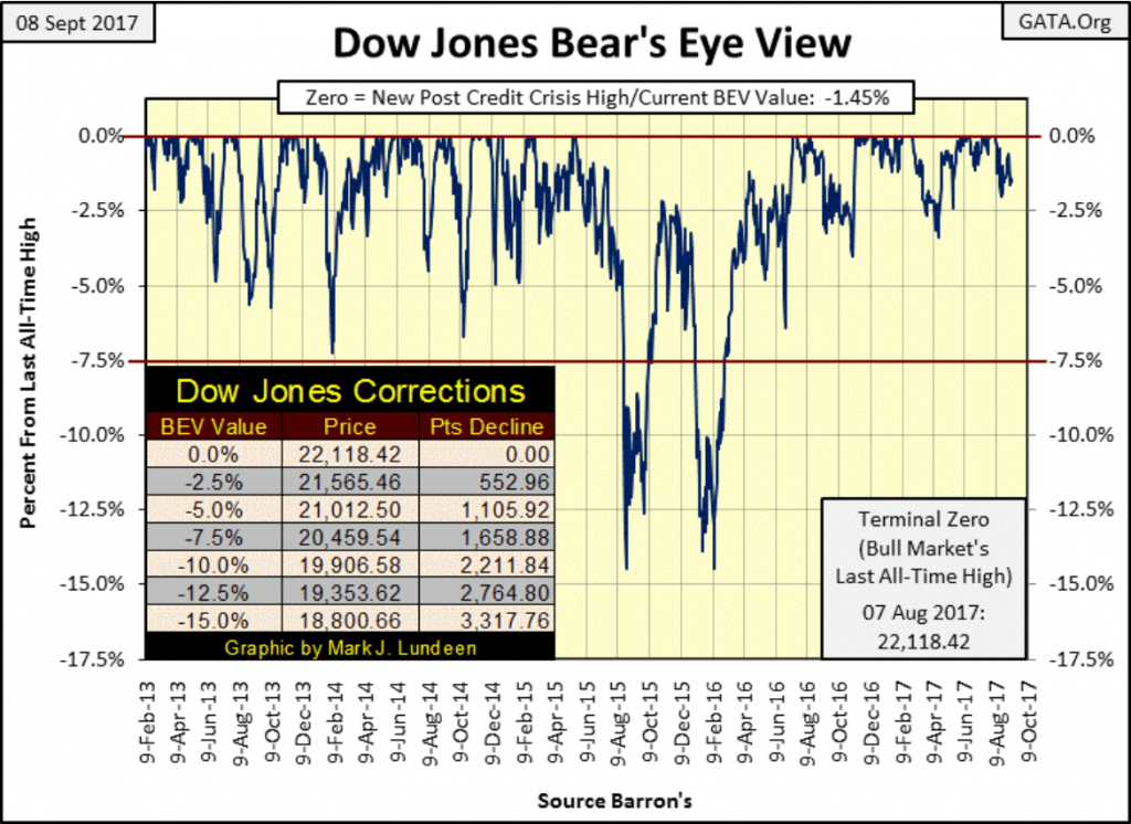
The Dow Jones’ last all-time high (BEV Zero) was on August 7, and as for much of the past year, the Dow continues refusing to correct more than just a few percentage points, if that.
Come this December, it will be two years since the Dow Jones has corrected anywhere near its BEV -7.5% red line in the BEV chart below, and that seems odd to me.
But maybe that’s just me worrying unnecessarily about excessive bullishness in this market.
Gallup’s poll of investors’ optimism is at a high not seen since September 2000, seventeen years ago. However, I suspect September 2017 will prove to be a good time to exit the market, as was September 2000, even if most investors seem to disagree.
Post-credit crisis world
This advance isn’t going to go on forever, but it may go on for longer than I believe it can.
This is especially true considering who the big bulls are in this market; central banks such as the Federal Reserve have a political interest in keeping this market near its all-time high.
It takes buying to make a market go higher, and buying takes money. And money is something central banks never have to worry about, or so most people believe.
What central banks worry about is the “credibility” of their “monetary policy.” As we rapidly approach 2018, apparently “credibility” is something the Federal Reserve isn’t concerned about.
© Mark Lundeen
In the post-credit crisis world, is it possible that the credibility of current “monetary policy” is now seen as the willingness of central banks to maintain the inflated values in the stock and bond markets? You know – keeping the party’s punch bowl full of “liquidity” no matter how obnoxiously intoxicated some people get, and damn everything else? You had best believe it is!
The US dollar and the debt limit
The US Debt limit has once again been increased, now to over $20 trillion dollars. This is something that has dire implications for the future purchasing power of the US dollar. Yet, the FOMC refuses to raise interest rates sufficiently to punish both politicians and market speculators for their irrational behavior, and I doubt they ever will until Mr. Bear forces them to.
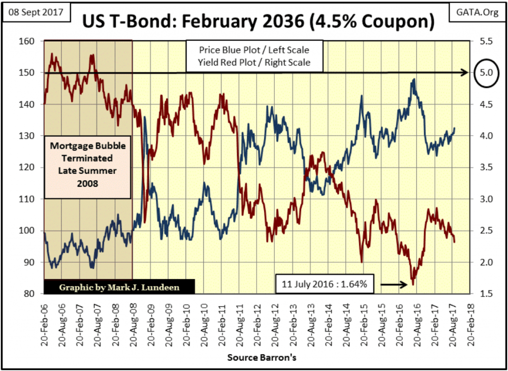
I’m just looking at the Dow Jones BEV chart above; the Dow Jones’ inability to have a proper correction, and the yield for the T-bond below where since last March its yield has declined 54 basis points, and all this just seems odd.
Why would anyone lend money to the US Government for a term of twenty years by buying this bond, while asking for less than a 2.5% yield? This is the irrational behavior I’m talking about.
It was just in October 2008 when the US National Debt increased to over ten trillion dollars, and now nine years later, it’s doubled to over twenty trillion dollars. Nine years from now, will the US Treasury be forty trillion dollars in debt? I don’t think so because this freight train of debt is going to derail long before that.
I can’t set a date for this but we’ll all know when it happens. This bond will then yield something in the double-digits when the markets finally recognize what the Republican and Democratic parties, and their creature the Federal Reserve, have done: made monopoly money out of the once all-mighty US dollar. And don’t expect these malignant narcissists to say, “I’m sorry” when it happens. Their first impulse will be to tell the voters not to panic as they declare martial law.
© Mark Lundeen
So why are the stock and bond markets doing so good today?
It’s because “monetary policy” and the participants in the financial markets have gone completely insane.
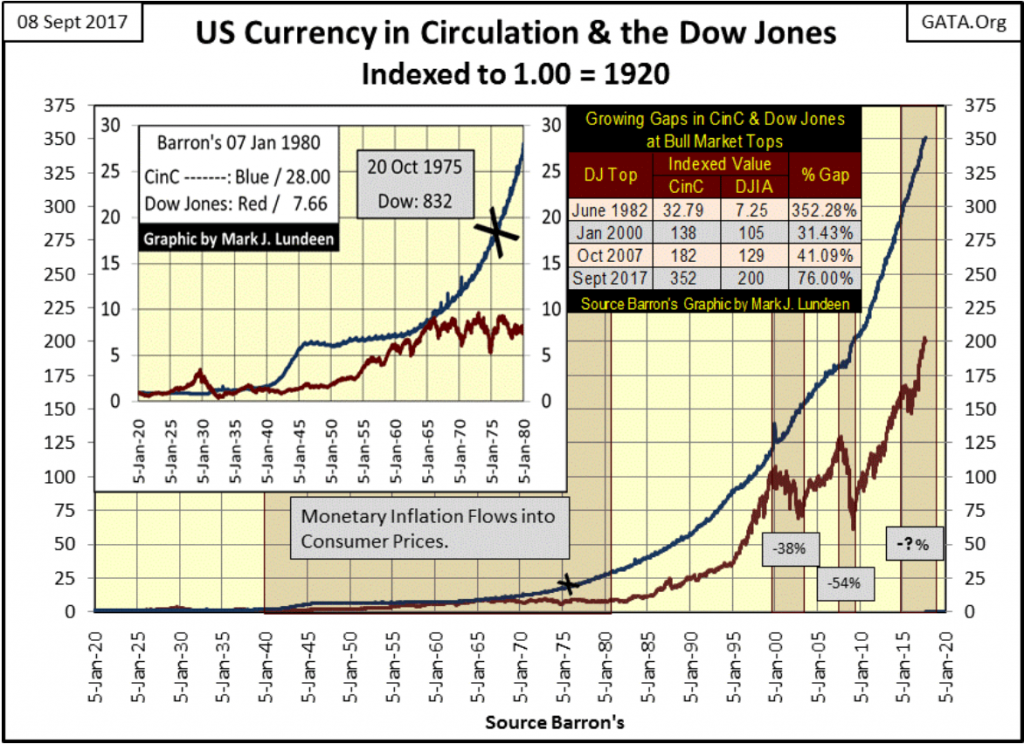
Look at the table and currency in circulation (CinC) chart below. Sure, the FOMC is maintaining current valuations and yields in the financial markets, but the rate of inflationary dollar creation by the idiot savants dictating this “policy” has become a runaway train in the global economy. I’m not picking on just the FOMC; this is true for every central bank in the world.

© Mark Lundeen
The chart below is plotting only the creation of paper money. However, the expansion of the Federal Reserve’s balance sheet since 2000 has been several times larger (see table above). Yet the Dow Jones hasn’t been able to see a double from its dot-com bubble top of January 2000. So, what kind of bull market are we now seeing?
Currently, the “policy makers” have been successful in keeping their ocean of “liquidity” from flowing into consumer prices and into financial asset valuations, but they won’t be able to continue that forever. And if you shop for your own groceries and clothing, you’d have every right to doubt that consumer prices haven’t been rising since the 2007 top in the markets, because they have been.
When the stock and bond markets begin deflating and the refugee dollars created by this insane “monetary policy” begins fleeing into real things, like into food and precious metals, all hell is going to break out in the economy and society.
“Monetary policy” has taken us to a national crisis before, as in the 1830s and again in the 1930s.
US currency in circulation and the Dow Jones
“We are in danger of being overwhelmed with irredeemable paper, mere paper, representing not gold nor silver; no sir, representing nothing but broken promises, bad faith, bankrupt corporations, cheated creditors and a ruined people.” — Daniel Webster / Senate speech, 1833
Look at this chart; since 1920 CinC has increased by a factor of 352 while the Dow Jones has increased by a factor of only 200, a 76% gap in their growth in the past century. This is one chart (the table above too) you’ll never see in Paul Samuelson’s textbook for Economics 101 classes, as it’s an embarrassment to the Keynesian quacks who now teach economics.
© Mark Lundeen
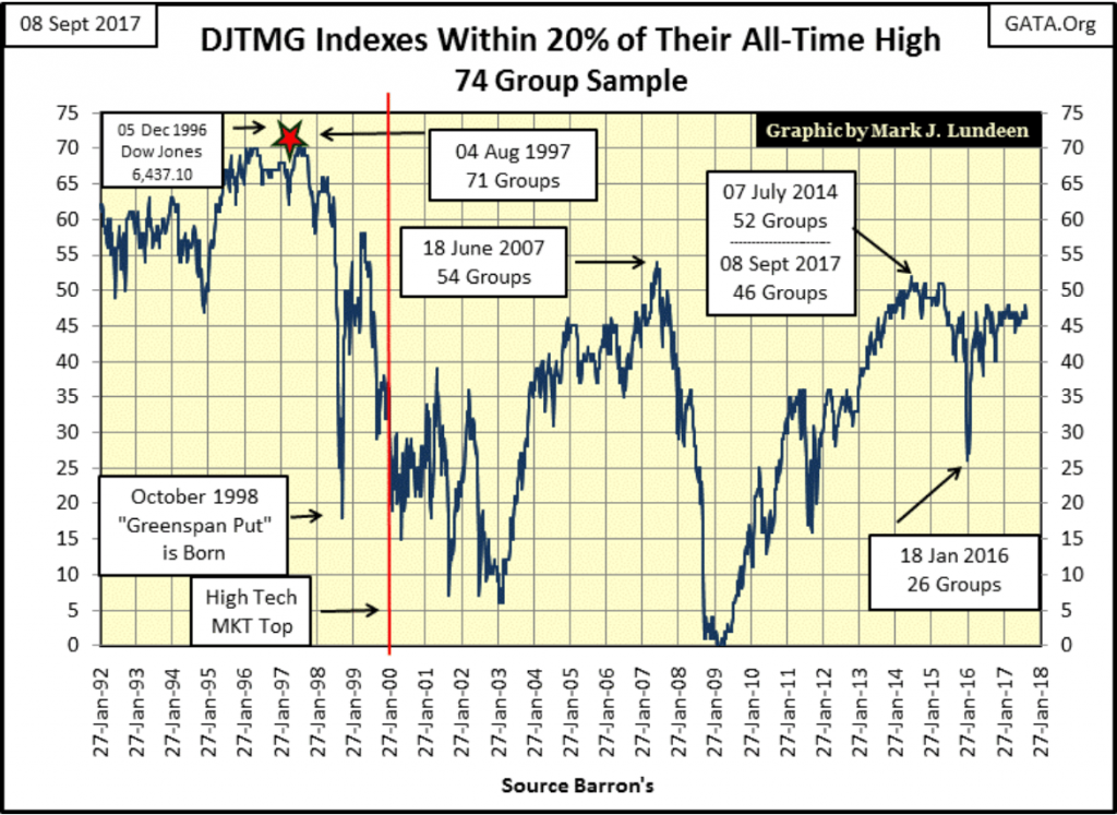
The Dow Jones Total Market Group’s (DJTMG) top 20 is still stuck in the mid-40s (chart below); the top 20 being the number of groups within 20% of their last all-time highs.
I like this data series as usually it is doing something that closely follows the bull and bear markets of the past three decades as it oscillates between 0 and 74. Look at it; since 1992 it’s either going up or down except for those infrequent periods where it has stalled, typically at market tops such as now.
The current advance in the stock market saw the top 20 peak at 52 in Barron’s 07 July 2014 issue, over three years ago. This week it closed at 46, and from the looks of the current trend in the plot, it isn’t going to break above 50 anytime soon.
© Mark Lundeen
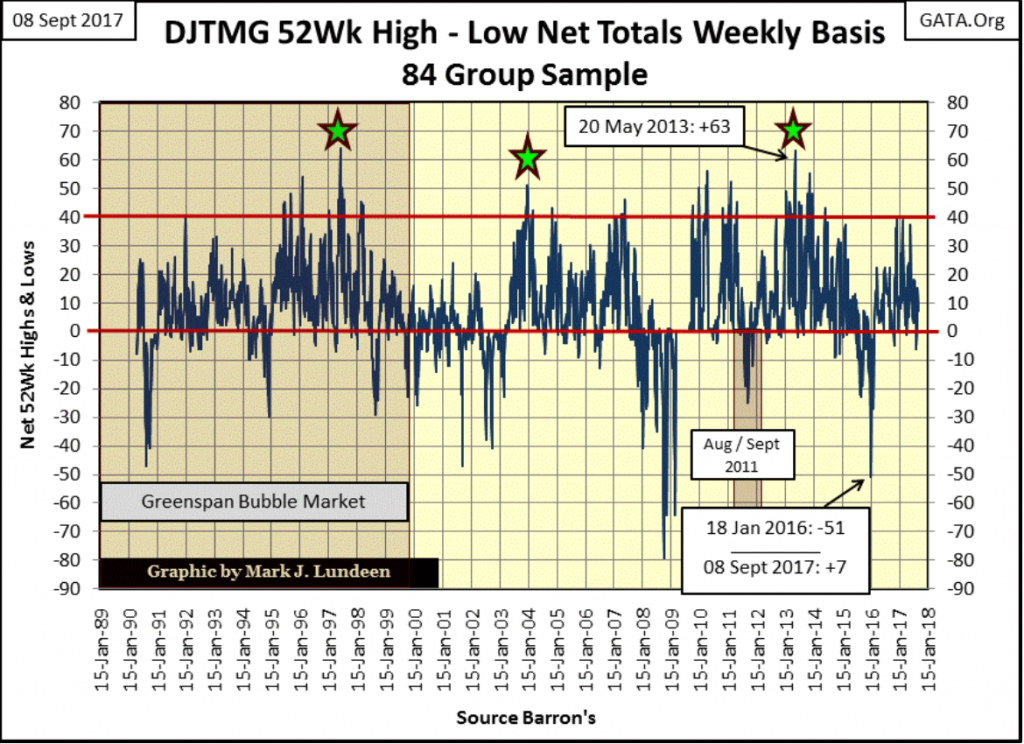
Looking at DJTMG’s 52Wk H-L Nets below, with the 52Wk H-L Nets spiking into the red 40 line we see the excitement of the post-November 2016 election. But apparently, that’s all over for now. The Nets haven’t spiked above 20 since early June and closed the week at a +7. Like I said, it takes buying to make a market go higher. Maybe it’s time for the FOMC to “inject” some more “liquidity” into the financial markets?
© Mark Lundeen
Take a moment to compare the three bull markets above:
- The High-Tech mania of the late 1990s;
- The Sub-Prime Mortgage madness of the first decade of the 21st century;
- And our current bull market.
Specifically, how many times the DJTMG’s 52Wk H-L Nets pierced the red +40 line in these three “liquidity driven” market events? Just eyeballing the chart above, the current (post-March 2009) bull market has seen the 52Wk H-L Nets pierce the 40 line more frequently than the previous two. I’m not sure why, but that seems an important observation, as is the failure of the post-November 2016 election advance in the Dow Jones to coincide with multiple DJTMG 52Wk H-L Nets deep into the 40s and low 50s.
The Dow Jones is only thirty stocks, while the DJTMG data above consists of thousands of listings trading at the NYSE and NASDAQ. Seeing the post-election advance fail to produce significant spikes in the DJTMG’s 52Wk H-L Nets suggests just how tired (contrived?) the current bull market is.
Gold’s bear’s eye view
“…an Iron Law of Economics, namely that at the end of booms, and especially at the end of long booms, the whole system is corrupt. The money was so easy, so plentiful, that sooner or later everybody stuck their hand into the cookie jar, and then once they were in that far, it became easier and easier to stick their whole arm in.” — Richard Doughty, aka “The Mogambo Guru”
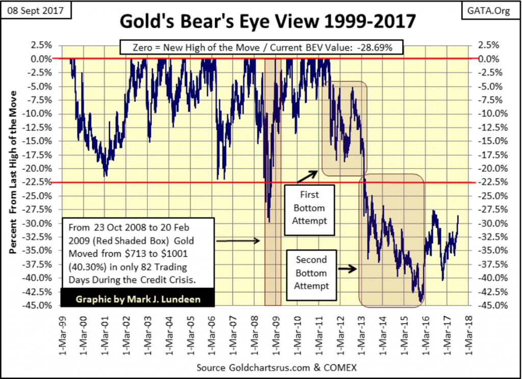
Gold in its BEV chart below broke above its BEV -30% line at the close of the week. If it can clear its -27.5% line in the weeks to come, it would have finally broken above its highs of last summer.
The Bear’s Eye View (BEV) displays a market by highlighting all-time highs (or highs of the move sometimes) and the percentage corrections from those peaks. And looking at gold’s BEV plot below, we can fully appreciate the vicious nature of the post-August 2011 correction.
When considering the potential damage inflicted to the dollar by Washington and Wall Street since August 2011 in the graphics above, seeing a four-year, two-stage 45% decline in the price of gold is totally irrational, which suggests an Ivy-League Professor of Economics is somehow involved here.
© Mark Lundeen
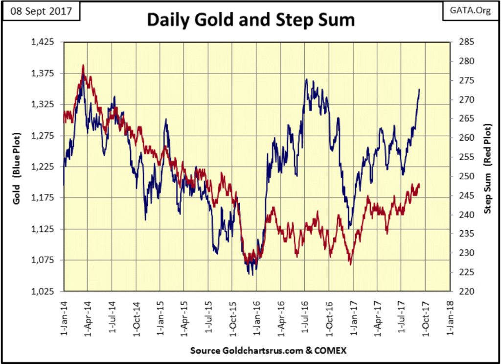
Gold (Blue Plot below) and its step sum (Red Plot) below are really looking good! Since early July, gold’s blue plot has seen a really nice advance, as its step sum has moved upwards, but not by much. I like that!
Now what should happen is that at some point the red step sum plot should make an effort to catch up with the blue price plot. When it does, we should see the price of gold enjoy a really nice growth spurt.
© Mark Lundeen
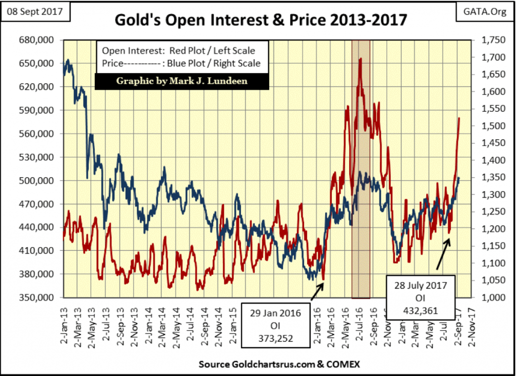
Okay, so gold is looking pretty good. But in the chart below it was looking pretty good last summer too (Blue Plot), until the big Wall Street banks flooded the COMEX market with as many tons of digital gold (Red Plot) as it took to break the back of the advance.
At gold’s 2016 peak, COMEX open interest (Red Plot /OI: the number of actively traded futures contracts) increased to over 650,000 contracts; each one for 100 ounces of gold, or 65 million ounces of gold “promised to be delivered” sometime in the future.
That was a huge increase from just six months before when COMEX gold OI was only 373,252 contracts when gold began its 2016 advance. As you can see, OI soon collapsed after gold peaked, and you can be sure most of the “promised” ounces of gold were never delivered.
© Mark Lundeen
Now in August/September 2017, gold is once again advancing nicely, but then so too is OI at the COMEX. A betting man familiar with the odds may hold on to his long position in the gold market. However, he would know that for decades rising OI at the COMEX heralded a coming correction in the gold market, so he’d be keeping an eye on the exits.
Still, all that doesn’t change the fact that what we are seeing above is a swindle on the gold market, and swindles, even those unofficially sanctioned by government can’t go on forever. So, if in the past gold’s OI increased until the price of gold collapsed, a day is coming when we’ll see OI collapse as the price of gold soars. It will be a sure sign that Mr. Bear just changed the rules the “policy makers” must play by, and don’t be shocked if this change is accompanied by rising disorder in the debt and stock markets.
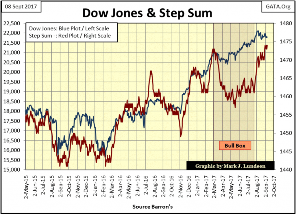
Maybe that’s what we are seeing below with the Dow Jones and its step sum. Look at what happened in the bull box below. The declining step sum (Red Plot) tells us that from early March to June the Dow Jones was seeing more daily declines than advances. The step sum action didn’t improve much until August. Still, the Dow Jones itself wanted to go up. With the leap in advancing days, a leap in the step sum, we should have seen a nice jump in the value of the Dow Jones itself—but that isn’t what happened.
Dow Jones and step sum
© Mark Lundeen
Comparing gold’s to the Dow’s step sum charts above, it’s very evident that gold is a market that now wants to go higher, rising COMEX IO or not, while the Dow Jones, blessed with abundant advancing days is a market now struggling to hold on to what it’s got.
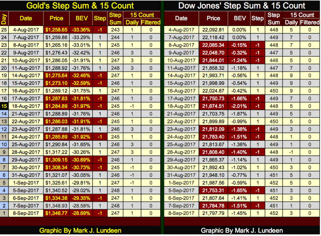
You can see that in gold’s and the Dow Jones step sum and 15 count tables below. Since August 4, both have seen their step sums advance by 4, but gold is up by 7% while the Dow Jones is down by 1.45%. Gold’s price trend is being defined by its strong advancing days; while the Dow Jones is being defined by its less numerous declining days.
© Mark Lundeen
Also, compare their 15 counts of the past 25 trading sessions. Gold has seen a few +3, but in the main, it’s a list of +1 with an occasional -1 in the count. Look at all the red days (declining days) on gold’s side of the table. The Dow Jones has no good excuse not to have made a new all-time high since August 7—not with all those advancing days. Since August 30, its 15 counts has been dominated with +5s & 3s.
It goes without saying that a week or a month from now all this could change. But at the close of last week, this is the lay of the land for these markets—gold, coming off a 45% correction bottom of two years ago is now heading up as the Dow Jones, after seeing 52 new all-time highs since last November’s Election, now struggles to keep what it’s got.
To my way of thinking this makes gold, as well as silver and the mining shares a much superior investment to the pending grief the broad stock market has to offer.
News on Hartford
Speaking of grief, Hartford Connecticut is in the news: “The state budget stalemate is a threat to many Connecticut cities, but has posed exceptional problems for Hartford.”
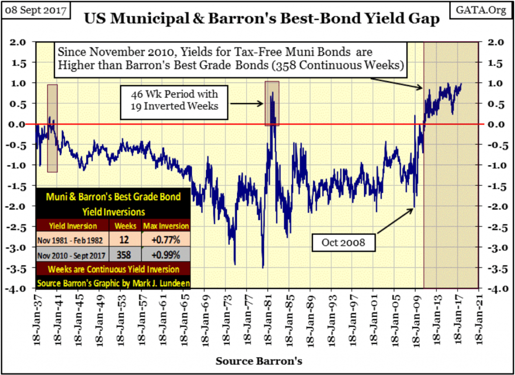
Yet another muni-bond issuer admitting it’s in danger of bankruptcy. But the spread between muni-bond and Barron’s Best Grade Bond yields below tells us that the muni-bond market has known growing problems since November 2010. That’s when tax-free muni-bond yields published by Barron’s first increased above those offered by best grade and taxable corporate bonds and have stayed there for the past 358 continuous weeks.
© Mark Lundeen
During all this time, so far the spread has yet to break above 100 basis points (1%). But this week the spread closed at 0.98%, and that isn’t far from 1%.
This headline from the Hartford Courant above could be used as a description for many American cities’ financial situation.
And why is the state of Connecticut having a budget stalemate? For the same reasons, Connecticut’s cities are: its politicians have been purchasing votes using tax money and selling muni-bonds since FDR’s New Deal of the 1930s, and all that is coming to an end now.
But not before states like Connecticut, California, Illinois and et al, first go to Congress, hats in hand asking for a bail out with the monopoly money the Federal Reserve has been passing out to Washington’s Politicians and Wall Street’s bankers.
What then? Well, we’ll all find out together, but you’ll be glad you own some gold, silver and their miners when we do.
—
DISCLAIMER: This article expresses my own ideas and opinions. Any information I have shared are from sources that I believe to be reliable and accurate. I did not receive any financial compensation in writing this post. I encourage any reader to do their own diligent research first before making any investment decisions.

-

 Cannabis5 days ago
Canada’s Cannabis Boom Grows as Alcohol Consumption Declines
-

 Crypto2 weeks ago
Ultimate Convenience: Why Consumers Expect Instant, Secure, and Borderless Payments
-

 Crypto3 days ago
BlackRock’s $94M Crypto Move Signals Rising Institutional Momentum
-

 Crypto1 week ago
XRP vs Solana ETFs: Retail Hype Meets Institutional Interest





You must be logged in to post a comment Login