Markets
Gold Is Being Driven by Growing Stagflation Concerns
Gold and money are closely linked, and we attempt to show that in our opening essay as we examine the explosion in money supply, debt, and deficits. Gold stocks make up a very small portion of global markets, yet they have remained ultra cheap for years in relation to gold. Could that narrative be about to change? Our chart of the week looks at that.

Oh, yes. Money makes the world go round. And since we came off the gold standard in August 1971, we’ve issued an awful lot of money. Fiat money, that is. Intrinsic value—zero. Just what the government says it’s worth. An I.O.U. U.S. money supply M1 has increased $17.8 trillion since January 1970. That’s a mind-boggling 87,516%.
The world has never seen such a monetary explosion. U.S. GDP has increased $26.8 trillion, implying it took 66 cents’ worth of new money to purchase $1 of GDP. But since Q1 2020, GDP is up $6.1 trillion while M1 has exploded, up by $13.8 trillion, implying it took $2.26 of money growth to purchase $1 of GDP. That is truly a sign of money making the world go round.
Since the Great Recession of 2007–2009, GDP has increased by $13.1 trillion, while M1 is up $16.7 trillion, again implying it took $1.27 of money supply to purchase $1 of GDP. A similar story has played out in other countries. It took a lot of money to increase GDP. But what if they hadn’t issued all that money?
U.S. Monetary Base, M1, M2 2000–2024
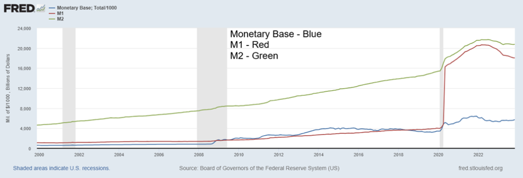
It wasn’t just money that exploded. The Fed’s balance sheet also exploded. In Q4 2007 at the outset of the financial crisis of 2008, the Fed’s balance sheet stood at about $882 billion. Today it is at $7,681 billion, after peaking at $8,965 billion—a massive increase of 870%. But it wasn’t just monetary expansion that helped keep the economies from falling into an even steeper recession; it was also budget deficits (fiscal expansion).
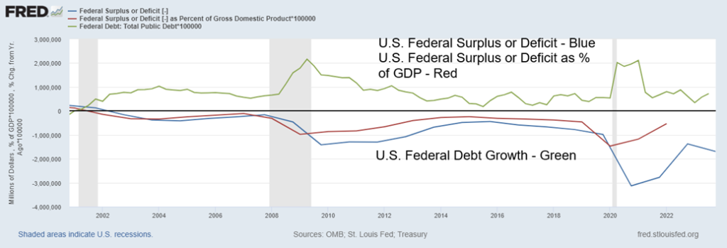
U.S. Federal Surplus or Deficit, % of GDP, Federal Debt Growth % 2000–2024
This didn’t play out just in the U.S. but also in the EU through the ECB, the U.K. through BOE, Japan through the BOJ, and Canada through the BofC. Governments, no matter what the stripe, did what they had to do after the Great Recession of 2007–2009 and the steep but brief COVID recession of 2020. The fiscal and monetary expansion after COVID was unprecedented. Without it, would the Western economies have fallen into an even steeper recession or even a depression?
The U.S. federal deficit soared from $983.6 billion in 2019 to $3,132.5 billion in 2020. It has since retreated to $1,746 billion. That put the deficit to GDP ratio at 4.57% in 2019, but it shot to 11.8% in 2020 and today is around 6.2%. Federal debt also exploded, soaring up $24.8 trillion since Q4 2007. It is the most incredible growth of U.S. debt in history. Almost half or $10.8 trillion has taken place since Q4 2019. As a percentage of GDP, it was 62.7% in Q4 2007, but today sits at 122.3%. It peaked at 133% in Q2 2020. Today the U.S. Federal debt sits at $34 trillion. The debt ceiling sits at $31.4 trillion but has been suspended until January 1, 2025. Debt ceiling wars and spending wars are a constant in the U.S. Congress. But failure to come to an agreement could risk pushing the U.S. into default. A U.S. default would have negative consequences through the global economy.
U.S. Federal Debt, M1, CPI % Change Y-O-Y 2000–2024
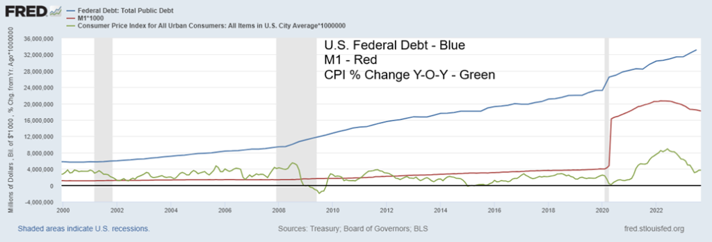
All that money, debt, and deficits translated into GDP growth, but it eventually sparked inflation. However, inflationary pressures weren’t just caused by monetary expansion or budgetary deficits, regardless of the country or political stripe. The deficits and monetary expansion contributed, but supply disruptions, droughts, wars, and more were even larger contributors. Nonetheless, as the chart shows, inflationary pressures picked up in 2008 but subsided substantially as the recession took hold.
The same was seen out of the COVID expansion of 2020, with an expansion of money and debt never seen before. Inflation began to pick up in 2021 but has peaked (so far) in June 2022. As money supply growth slowed, deficit financing also slowed, and it has generally coincided with inflation coming down. Still, that hasn’t stopped the federal debt from growing, having recently crossed $34 trillion. It’s the biggest federal debt in the world. No other country is even remotely close. In total, the U.S. debt (government – federal, states, municipal; corporate – bank, non-bank; consumers – mortgages, credit lines, credit cards, student loans, etc.) at $97.4 trillion is over 30% of global debt. No other country is remotely close.
It is said that the U.S. can get away with this since the U.S. dollar is the world’s reserve currency. While the use of the U.S. dollar in central bank reserves and in global trade still dominates, it has been coming down. Today,
U.S. dollar assets represent roughly 59% of central bank reserves, down from over 60% from a year ago. The U.S. dollar still makes up some 88% of global foreign exchange transactions, accounting for half of global trade, including three-quarters of Asia-Pacific trade. Despite challenges primarily from BRICS, the U.S. dollar remains dominant. However, the trend is moving away from the U.S. dollar and, led by China, as they continue to work on a new version of SWIFT, the international payments system dominated by the U.S. dollar plus new versions of the IMF and the World Bank. Again, both are dominated by the U.S.
But what about money growth and gold? Monetary expansion, debt growth, and budget deficits certainly have an impact on the economy by, at least, keeping the economy from collapsing. That appears to be working as economic growth, while slowing, is generally still positive and unemployment remains just above its lows. However, money growth has an interesting relationship with gold. When money is expanding, gold prices tend to rise and when money contracts, gold prices tend to contract. At least, that’s the theory.
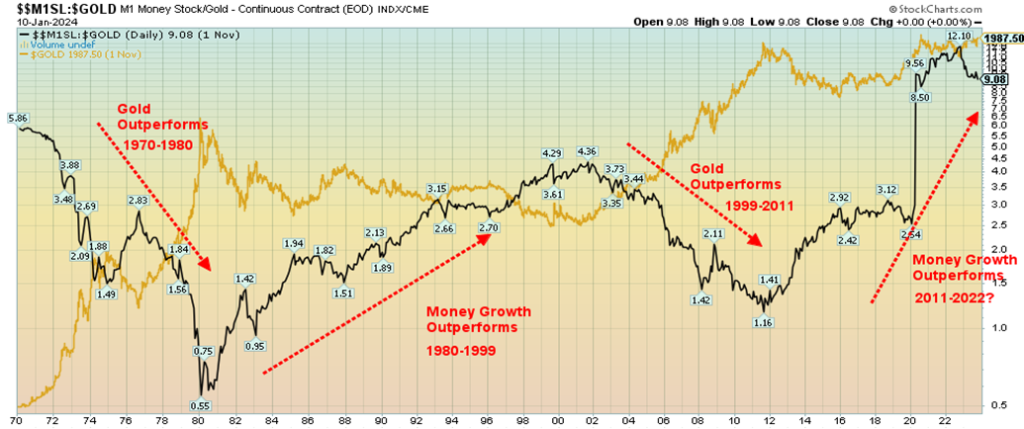
M1 and Gold 1970–2024
Our chart of M1 and gold shows how, as the money supply increases, gold prices also go higher. But when the money supply contracts or slows, gold is more likely to fall. Of late M1, while remaining elevated, has contracted somewhat from earlier highs. No surprise then that gold has been struggling, even as it remains elevated. $2,100 remains elusive.
Another way of looking at it is to show the M1/Gold ratio. From 1970 to 1980, the ratio was falling as gold soared from $35 to $875 in 1980. However, for the next twenty years, from 1980 to 1999, the ratio was rising as money supply growth outstripped gold’s rise. Gold struggled. Once again, that changed into the early 2000s
as, from 1999 to 2011, gold’s rise outstripped the rise in M1, even as M1 expanded. Gold rose from roughly $250 to over $1,900 during that period. Once again, the growth in money supply outstripped the rise in gold prices from 2011 to the present, although there is a chance that the ratio topped in late 2022. If that’s correct, we could be on the cusp of a new gold run that would be starting from much higher levels than previously.
M1/Gold Ratio, Gold 1970–2024
M1/GDP Ratio, Gold
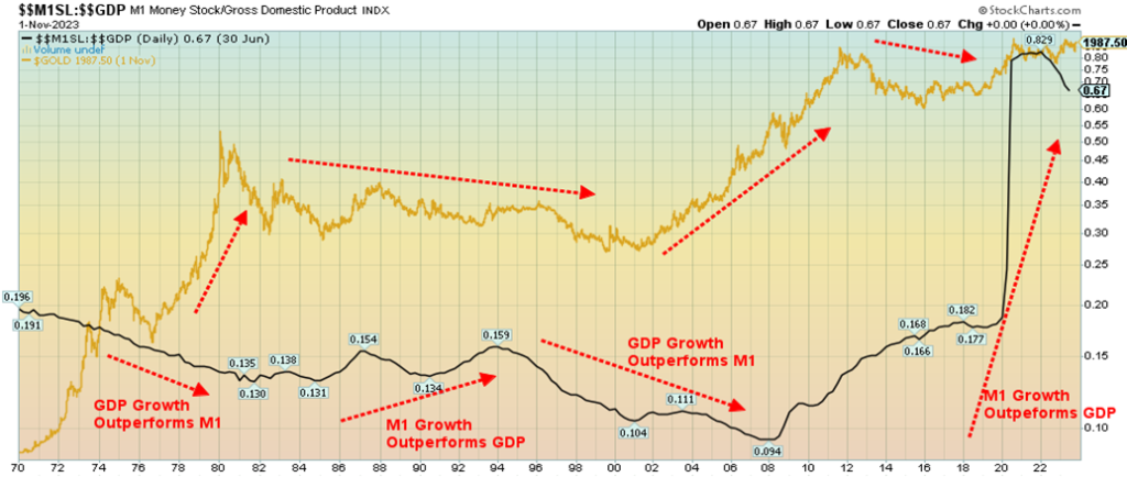
We tried looking at this from other perspectives. The above chart shows the M1 to GDP ratio (in black). One would expect with a massive growth in money supply that GDP should expand. That appeared to work well in the 1970s, despite a decade of high inflation and stock markets effectively going nowhere. Despite the constraints on GDP during the 1970’s GDP growth generally rose faster than money growth. During the 1980s it reversed and money growth outstripped GDP growth. Recovery from the early 1980s recession took considerable funds to lift the economy out of the doldrums.
Things changed again in the 1990s. That was the decade of the dot.com boom and growth, while not spectacular, outstripped the growth in money supply. From roughly 1995 onward, GDP growth outstripped money growth. That carried beyond 2000 and the dot.com recession of 2001. Then came the 2008 financial crisis.
Everything reversed once again after the financial crisis as the monetary authorities pumped money into the financial system to prevent a collapse as a result of the Lehman Brothers fall. QE (quantitative easing) became the new buzzword. That continued through the entire decade, even as gold topped out in 2011. The arrival of COVID in 2020 and the subsequent shutdown of the economy unleashed a torrent of money (QE, huge budget deficits, etc.) never seen before. The collapse was prevented, but at what future cost as debt soared and stock markets and housing markets swelled into bubble territory.
Huge money growth that outstrips GDP growth is eventually inflationary, even as the resulting inflation is not all caused by monetary growth and excess demand. As inflation picks up, however, the odds shift that gold would start to outperform money growth, as witnessed with earlier periods. With money growth now slowing, the odds appear good that GDP growth could start to outperform.
M1/CPI Ratio, Gold 1970–2024
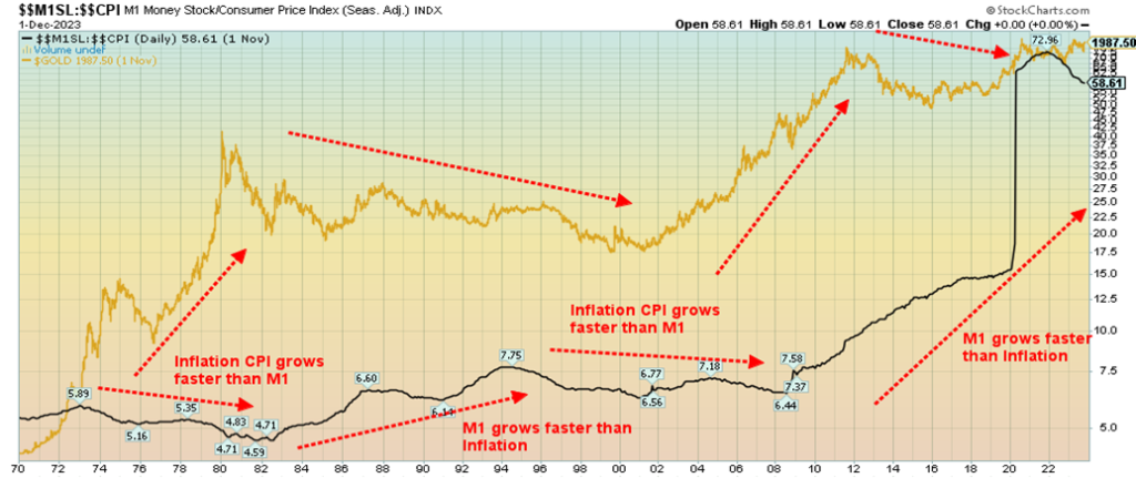
The final chart shows the ratio of M1 to the CPI. For most of the time, M1 growth and the rise in the CPI just traded back and forth. The inflationary 1970s saw the CPI grow faster than M1, but as inflation came down in the 1980s, M1 growth grew faster. The 1990s and early 2000s were a low inflation period. M1 grew, but at a slightly lower pace.
That all changed after the 2008 financial crisis and especially after the COVID crisis of 2020. M1 exploded. Inflation, for the most part, remained subdued and actually fell during the COVID crisis. Since 2022, the roles have started to reverse and as M1 growth slowed inflation has picked up. This should ultimately translate into a solid period for gold growth where the combination of slower money growth, a slowing economy, but continued high inflation is positive for gold.
Chart of the Week
Gold stocks are cheap. We have said that on many occasions. After we say it, they seem to get even cheaper. In the early part of the century, gold stocks did well. The run from 2000 to 2011 saw the Gold Bugs Index (HUI) gain 574%. The TSX Gold Index (TGD) was up 317%. Gold itself gained 440% all the while that the S&P 500 was losing 14.4%. Since then, it’s been the reverse as the HUI has fallen 54% from 2012 to today while the TGD is down 25%. Meanwhile, the S&P 500 is up 278% and the TSX added 75%. Gold did gain 30% while silver was down 17%. We add a quick note on the TSX Venture Exchange (CDNX) that is roughly 50% mining stocks. The CDNX gained over 100% during 2000–2011 but fell 63% from 2011 to today. Gold, silver, and gold stocks were great during 2000–2011 but since then have been a downer.
Things do go in cycles. Once gold came off the gold standard in 1971, gold, silver, and the gold stocks enjoyed strong runs from 1971–1980. That was a period that saw the broader stock market struggle and fall. That changed after 1980, and from 1980–2000 gold was not the place to be. The stock market climbed and then soared during the 1990s with the dot.com boom, and from 2000–2011 gold soared.
The stock market stumbled, highlighted by the dot.com crash and the 2008 financial crisis. Stock markets started soaring in 2009 and then swelled into a bubble from 2020–2022. While gold was up during the period, the gain for gold since that peak in 2011 has been negligible. Meanwhile, the gold stocks have been outright dogs or losers. The 1970s saw the Nifty Fifty collapse. And we may be about to witness the Magnificent Seven collapse. So, what will that do for gold and gold stocks?
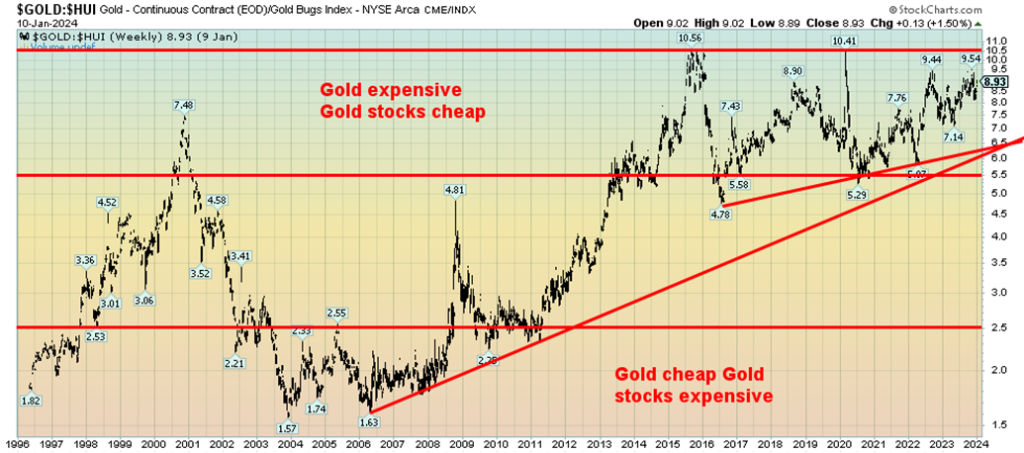
Our chart of the Gold/HUI ratio is telling. From roughly 2000 to 2011, gold stocks performed well. The Gold/HUI ratio actually hit its nadir in 2004 and double-bottomed in 2006. A strong performance from gold
raised the ratio and its last good low coincided with the 2011 top. Since 2013, gold stocks have been on a roller coaster with decent runs in 2016 and 2019/2020, but generally they have underperformed. And the Gold/HUI ratio has remained in roughly the same position throughout, showing gold stocks as considerably undervalued compared to gold. Today with a gold/HUI ratio of 8.93 it is not far off its high of 10.56 seen in 2015.
Selected Returns 2000–2024
| Index, etc. | Return 2000–2024 | Return 2009–2024 | Return 2000–2011 |
| Gold | 602.0% | 129.9% | 440.3% |
| S&P 500 | 223.7% | 426.6% | (14.4)% |
| TSX Composite | 149.3% | 133.3% | 42.1% |
| Gold Bugs Index (HUI) | 209.3% | (24.3)% | 573.8% |
| TSX Gold Index (TGD) | 213.7% | (13.3)% | 317.3% |
| Silver | 323.5% | 104.4% | 409.4% |
| 10-year U.S. Treasury Bonds (price) | 17.2% | (10.7)% | 36.4% |
| 3-Month U.S. Treasury Bills (yield) | 2.6% | 4,872.7% | (99.6)% |
Trying to find reasons for this underperformance is not particularly easy. Gold and gold stocks are grossly under-owned. The market cap of all gold stocks is estimated at roughly $300 billion. That would make them only about the size of Costco, which is listed as the 28th largest company in the U.S. The largest gold mining company, Newmont (NEM), has a market cap of only $44.0 billion. They rank number 408. Apple along with Microsoft, the largest companies in the world with market caps of $2.9 trillion, could buy all the gold mining companies 10 times over.
Yet when we read the gold web sites or gold bull boards, the pounding of the table that gold is headed for $5,000, $10,000, or higher continues. Gold conferences are usually well attended. This year’s Prospectors & Developers Association of Canada annual conference is held again this year in Toronto on March 3–6. The mining industry in Canada employs over 664,000 people and contributed some $132 billion to Canada’s GDP in 2021. Junior gold mining companies continue to raise funds despite the poor market, although there have been some struggles.
Despite the problems and underperformance in the broader stock market, gold and silver have actually been reasonably solid over the past decade. Not so much the gold stocks that have seriously underperformed. And this comes against the backdrop of gold not only hitting new all-time highs, but gold in other currencies also hitting all-time highs over the past year. The gold stocks seem to be signaling that the rise in gold prices is not sustainable.
Yet monetary, geopolitical, and domestic political conditions and more suggest that gold should be an asset of choice. Gold has a market cap of $13.6 trillion, silver $1.3 trillion. The U.S. stock market has a market cap of some $44 trillion. Global bond markets are estimated at $150 trillion. Gold is mere 0.5% of global assets, according to GoldChartsRUs (www.goldchartsrus.com). It seems to be shunned, even though gold is very popular in China and India. But they don’t buy gold mining stocks.
Other reasons given for the underperformance of gold stocks, as noted by Sprott Gold (www.sprott.com), include: 1. Dilution, given ongoing and constant share offerings; 2. The bull run from 2000–2011 triggered a surge of CapEx expenditures in 2012–2013 and when gold collapsed in 2013, the returns on capital collapsed, resulting in a huge cut in expenditures; 3. Risk—in numerous countries, particularly Africa and even parts of Latin America, political risk is high, leaving only safe places like North America and Australia; 4. A jump in costs, making gold mining more expensive; 5. A rise in the time it takes to build a mine as costs rise and
environmental regulations rise, and; 6. The rise in the ETFs that sucked money away from gold stocks to ETFs, such as the SPDR Gold Shares (GLD) or iShares Silver Trust (SLV).
https://sprott.com/insights/sprott-gold-report-gold-vs-gold-stocks-an-unresolved-incongruity/
Gold is nobody’s liability. A reminder, however, that gold stocks, like all paper assets are vulnerable to collapse. The central banks of the world hold more than 35,000 metric tonnes and continue to add to their reserves. But gold stocks are unloved and under-owned. The cycles seem to run in decades. After a miserable decade, is the tide about to turn?
Markets & Trends
| % Gains (Losses) Trends | ||||||||
| Close Dec 31/23 | Close Jan 12, 2024 | Week | YTD | Daily (Short Term) | Weekly (Intermediate) | Monthly (Long Term) | ||
| Stock Market Indices | ||||||||
| S&P 500 | 4,769.83 | 4,783.83 (new highs) | 1.8% | 0.3% | up | up | up | |
| Dow Jones Industrials | 37,689.54 | 37,592.98 (new highs) | 0.3% | (0.3)% | up | up | up | |
| Dow Jones Transport | 15,898.85 | 15,470.53 | (0.3)% | (2.7)% | up | up | up | |
| NASDAQ | 15,011.35 | 14,972.76 | 3.1% | (0.3)% | up | up | up | |
| S&P/TSX Composite | 20,958.54 | 20,990.22 (new highs) | 0.3% | 0.2% | up | up | up | |
| S&P/TSX Venture (CDNX) | 552.90 | 556.18 | 0.9% | 0.6% | up | down (weak) | down | |
| S&P 600 (small) | 1,318.26 | 1,269.90 | (0.1)% | (3.7)% | up | up | up (weak) | |
| MSCI World | 2,260.96 | 2,222.97 | flat | (1.7)% | up | up | up (weak) | |
| Bitcoin | 41,987.29 | 43,652.82 (new highs) | (0.1)% | 4.0% | up | up | up | |
| Gold Mining Stock Indices | ||||||||
| Gold Bugs Index (HUI) | 243.31 | 233.22 | 0.1% | (4.2)% | neutral | neutral | down (weak) | |
| TSX Gold Index (TGD) | 284.56 | 275.01 | (0.3)% | (3.4)% | down (weak) | down (weak) | down (weak) | |
| % | ||||||||
| U.S. 10-Year Treasury Bond yield | 3.87% | 3.94% | (2.7)% | 1.8% | ||||
| Cdn. 10-Year Bond CGB yield | 3.11% | 3.23% | 0.9% | 3.9% | ||||
| Recession Watch Spreads | ||||||||
| U.S. 2-year 10-year Treasury spread | (0.38)% | (0.21)% | 40.0% | 44.7% | ||||
| Cdn 2-year 10-year CGB spread | (0.78)% | (0.57)% | 27.9% | 26.9% | ||||
| Currencies | ||||||||
| US$ Index | 101.03 | 102.45 | flat | 1.4% | neutral | down (weak) | up (weak) | |
| Canadian $ | 75.60 | 74.70 | (0.3)% | (1.2)% | up (weak) | up (weak) | down | |
| Euro | 110.36 | 109.49 | 0.1% | (0.8)% | up (weak) | up (weak) | down (weak) | |
| Swiss Franc | 118.84 | 117.33 | (0.2)% | (1.3)% | up | up | up | |
| British Pound | 127.31 | 127.48 | 0.2% | 0.1% | up | up | neutral | |
| Japanese Yen | 70.91 | 69.01 | (0.1)% | (2.7)% | neutral | neutral | down | |
| Precious Metals | ||||||||
| Gold | 2,071.80 | 2,051.60 | 0.1% | (1.0)% | up (weak) | up | up | |
| Silver | 24.09 | 23.33 | flat | (3.2)% | down | down (weak) | neutral | |
| Platinum | 1,023.20 | 921.10 | (5.2)% | (10.0)% | down (weak) | down (weak) | down (weak) | |
| Base Metals | ||||||||
| Palladium | 1,140.20 | 978.50 | (5.7)% | (14.2)% | down | down | down | |
| Copper | 3.89 | 3.74 | (1.8)% | (3.9)% | down | neutral | down (weak) | |
| Energy | ||||||||
| WTI Oil | 71.70 | 72.68 | (1.5)% | 1.3% | neutral | down | neutral | |
| Nat Gas | 2.56 | 3.31 | 14.5% | 29.3% | up | up | down (weak) | |
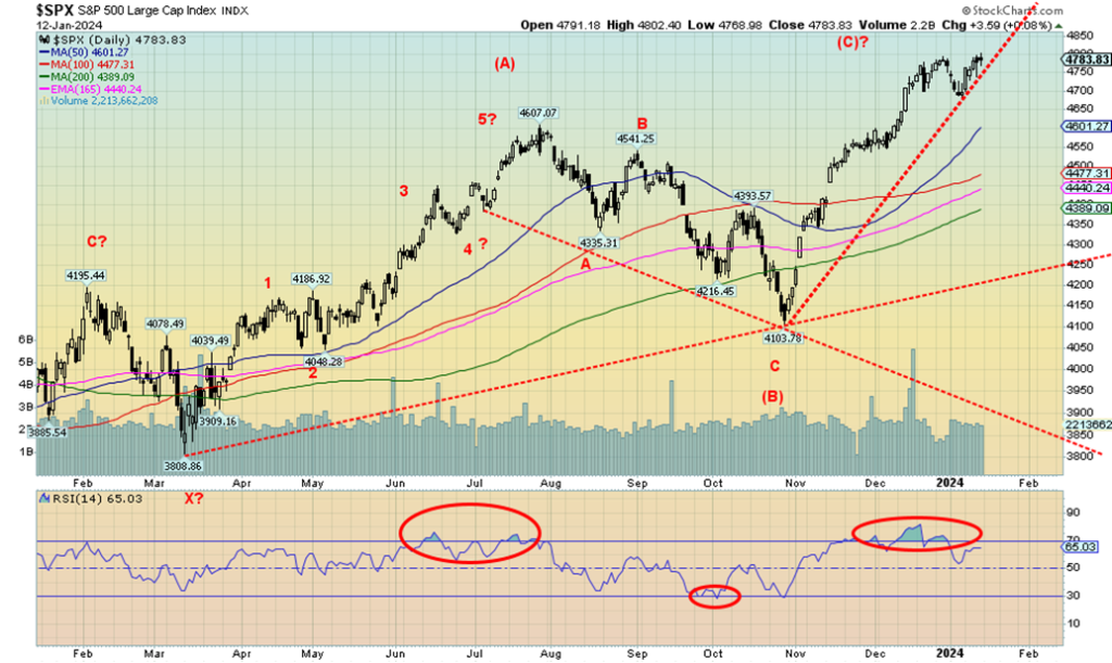
Two of the three January trifectas are over. We await number three—the January barometer. The Santa Claus rally and the first five days (FFD) indicators were mixed between the S&P 500 and the Dow Jones Industrials (DJI). So, we don’t want to jump to conclusions about the January barometer. However, we do have to wait until January is over to get the third leg of the trifecta. Interesting that, so far, after two weeks, the only index up in January is the S&P 500. Yes, the DJI, Dow Jones Transportations (DJT), and the NASDAQ are all down so far this month. Not a lot, but they are down. Noteworthy as well is that the S&P 400 (MID) and the S&P 600 (Small) are also down, so far, in January 2024.
On the week, the S&P 500 was up 1.8% to new 52-week highs but is still shy of all-time highs. The DJI was up 0.3% to new all-time highs, the only one to do so. The DJT fell 0.3%, diverging with the DJI while the NASDAQ, thanks to the FAANGs, jumped 3.1% but is still down in 2024 so far. The Mid rose 0.6% but the Small fell about 0.1%. The NY FANG Index rose 4.1% to new 52-week highs, diverging with the NASDAQ.
The S&P 500 Equal Weight was up 0.2% but did not make 52-week highs, a divergence with the S&P 500. Once again, the Magnificent Seven saved the day. Oh yes, and Bitcoin’s ETF was finally approved and Bitcoin immediately fell some 15% from its just seen 52-week high. On the week, Bitcoin fell only 0.1%. But it looks like the classic buy the rumour (it’s going to have an ETF) and sell the news (the ETF is here). Bitcoin now looks lower.
In Canada, the TSX Composite gained 0.9%, also to new 52-week highs, while the TSX Venture Exchange (CDNX) was up 0.9% and off to a reasonably good start for 2024. In the EU, the London FTSE was down 0.8%, the EuroNext was up 0.2%, the Paris CAC 40 was up 0.6%, and the German DAX gained 0.7%.
In Asia, China’s Shanghai Index (SSEC) was down 1.6%, Japan’s Tokyo Nikkei Dow (TKN) was up a healthy 6.4%, while Hong Kong’s Hang Seng (HSI) was down 1.8%. With the election of a pro-Taiwan president this weekend in Taiwan, could this have a negative impact on the Asian indices this coming Monday? The stars of China and Taiwan are not aligned as that dispute continues to simmer.
With so many divergences, especially the major Dow Theory divergence between the DJI and DJT, we are not hopeful for the markets going forward. Dow Theory states that the averages must confirm each other. But the DJI and the DJT are diverging and in the past when we saw that at highs it led to a down market. We await a break of recent lows.
Somehow, the stock markets fended off the goings-on in the Red Sea on Friday, but for how long as world trade begins to slow. The Houthis have vowed retaliation, potentially escalating this dispute. Air bombing does damage to them, but the reality is that boots on the ground are eventually needed. And that may be just what they want to bog down the Western powers. And, as with Gaza, avoid a humanitarian crisis. But the real risk is a rise in further tensions elsewhere, particularly with Iran as attacks on U.S. bases in Iraq and Syria continue.
The S&P 500 made 52-week highs again this week but is still short of the all-time high set in January 2022. The DJI also made new all-time highs. The DJI appears to be benefitting from money that is fleeing the EU, China, and elsewhere because of geopolitical concerns. Money is parked in blue-chip DJI stocks along with U.S. treasuries. Some also appears to be going into gold also as a safe haven.
Some have noted that there are some similarities between the stock market of late 2021 and into January 2022 and today’s market. Yes, there are some, particularly a low in October 2021 and again in October 2023, followed by a run to new highs in January 2022 and January 2024. It remains to be seen if the rest pans out. January 2022 was a down month as the trifecta signaled a down year (it was).
A break below the recent low of 4,682 could set off a downward thrust. Support doesn’t occur until 4,600 and 4,500 are reached. The S&P 500’s MACD indicator crossed over to the downside on January 2; thus, we are working on a sell signal. Further new highs would just highlight the growing negative divergences. The downside has more potential right now than the upside.
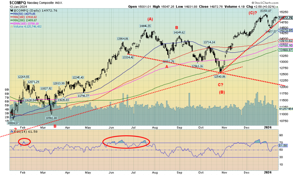
If we want to tout Dow Theory, then the NASDAQ is our poster child. While the S&P 500 and the DJI were making 52-week highs (DJI making new all-time highs), then with the NASDAQ falling short and the DJT not even remotely close, we have a potential Dow Theory sell signal. Still, the NASDAQ gained a healthy 3.1% as the FAANGs leaped, with some making 52-week highs. Making 52-week highs were Meta, Amazon, Netflix, Google, Microsoft, and Nvidia.
In a momentous move, Microsoft leaped over Apple as the world’s largest company by market cap $2.887 trillion vs. $2.874 trillion. All hail Microsoft. The world’s largest gold mining company is Newmont, with a market cap of $43.37 billion. Yes, that’s with a B, not a T, and, yes, MSFT is 66 times larger than Newmont. Indeed, as we’ve often pointed out, the entire gold mining market cap is only around $300 billion. What’s gold? Tech rules.
Grant you, the divergence with S&P 500 and DJI can only be confirmed once they break their previous lows. For the NASDAQ, that’s a break under 14,477. New highs above 15,150 would end the discussion. We see divergences with the indicators. We are even working on a MACD sell signal seen on January 2. A momentous week for the FAANGs.
Divergences, Dow Theory potential sell signals, and indicator sell signals all suggest that the next move should be down, not up. It wasn’t all rosy this past week for the FAANGs as Tesla was creamed, off 7.8%. The Chinese FAANGs were down with Baidu off 7.7% and Alibaba down 1.6%. A big winner was Nvidia, up 11.4% as noted to new highs. Advanced Micro gained 5.8% while Broadcom was up 5.6%. Is this the last hurrah for the FAANGs, with so many divergences?
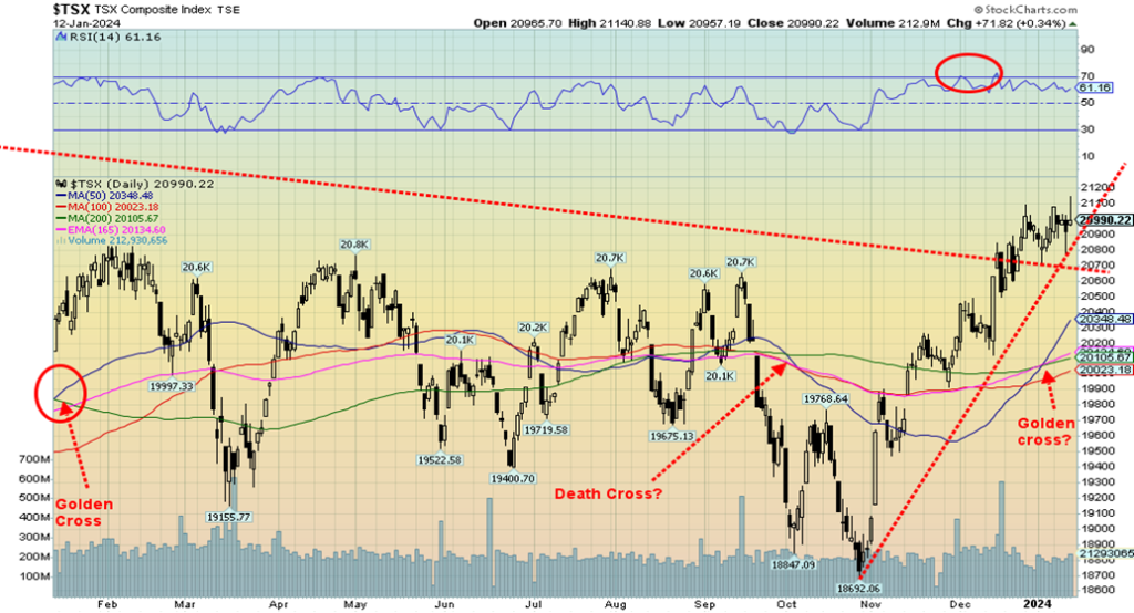
Since breaking out over that top trend line that had been in place since June 2022, the TSX appeared poised for a run to the upside. So far, the follow-through has been anemic and, with Friday’s jump of 0.3%, despite the goings on in the Middle East, the index finished closer to the lows of the day than the highs. Still, we’d need to break back under 20,700 and preferably under 20,600 to call the breakout a failure. On the week, the TSX Composite rose about 0.3% and made fresh 52-week highs.
Fresh 52-week highs seemed to be a theme this past week as Industrials (TIN), Information Technology (TKK), and the TSX 60 Index all made 52-week highs. On the week, seven sub-indices were up and seven were down. Leading the way down was Health Care (THC), off 2.6%, while Financials (TFS), the largest component, fell 2.0%. The upside leader was Information Technology (TKK), up 6.3%. Consumer Discretionary (TCD) gained 2.2%. Over at the TSX Venture Exchange (CDNX) the junior market gained 0.9% and so far, is up in 2024. A gain for the CDNX would be great for the long-suffering junior market.
If Friday’s action was some sort of topping action, the TSX needs new highs above 21,100 to lay to rest a potential downward move. We didn’t like how the index closed as it suggests possible losses this coming week. Our favourites for 2024 are last year’s dogs, namely: Golds (TGD), Metals (TGM), and Materials (TMT), with a nod to Telecommunications (TTS). If interest rates improve, then Utilities (TUT), Real Estate (TRE), and Income Trusts (TCM) could do better. Last year’s big winner Information Technology (TKK) could be the area to avoid in 2024. If oil (and gas) prices take off as we suspect they will, then Energy (TEN) should do well. Metals could do well as my colleague Mike Ballanger of GGM Advisory Inc. has been pounding the table for copper. Uranium has done well as witnessed by Cameco (CCO), making all-time highs.
U.S. 10-year Treasury Bond/Canadian 10-year Government Bond (CGB)
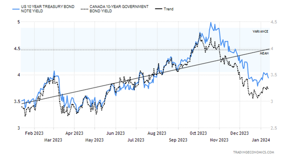
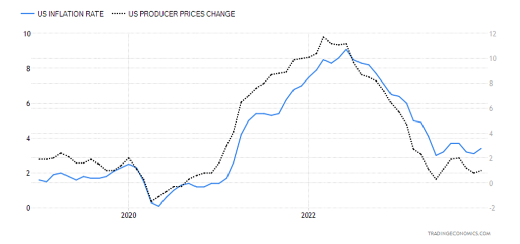
Interest rates fell slightly this past week, although initially they reacted to the upside following the higher-than-expected CPI numbers. Inflation for December came in at 3.4%, above the expected 3.1% and last month’s 3.1%. The core inflation rate was 3.9%, below last month’s 4.0% and on expectations. The PPI is suggesting that prices could soften further, as it came in at 1% as expected but above last month’s rise of 0.8%. Core PPI was up 1.8%, below the expected 2.0% and below last month’s 2%. Slightly higher CPI and slightly lower PPI helped push rates slightly lower, with the U.S. 10-year treasury note falling to 3.94% from 4.05% last week.
In Canada, the 10-year Government of Canada bond (CGB) fell to 3.23% from 3.26%. More telling, however, were our closely-watched recession spreads. The U.S. 2–10 spread fell to negative 21 bp from negative 35 bp, while in Canada the 2–10 spread dropped to negative 57 bp from negative 79 bp. The hint is we are getting closer to a recession that may start in Q2. There may be more bank layoffs, although one never knows, given that the weekly jobless claims came in at 202,000 below last week’s 203,000 and below expectations of 209,000. Continuing jobless claims were 1,834 thousand vs. the expected 1,853 thousand and last week’s 1,868 thousand. The labour market still appears strong, but then Citibank announced layoffs of 20,000.
Is the recent pop-back for the 10-year over? It’s hard to say until we see new lows (yield) below 3.80%. That is clearly possible. But the CPI numbers, while higher, were still rather benign. However, the activities in the Red Sea could push oil prices higher; that could translate back into the CPI and push yields up again.
The big number out this coming week is December retail sales, expected to be up 4.0%. Housing starts are also out, expected to be lower at 1.43 million. Some manufacturing indices are also out.
CPI, PPI Changes 2019–2023
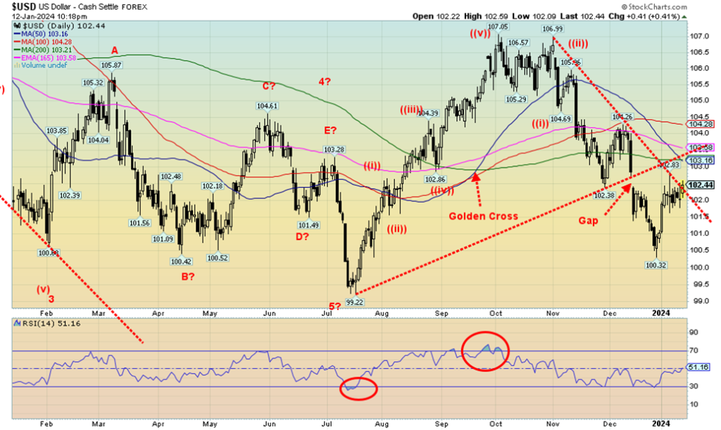
Will the US$ Index be successful in breaking above that downtrend line? Friday’s action saw the US$ Index penetrate the line, but then it closed on it. So, we might have a bit more as the US$ Index attempts to fill that gap that was created back in December. We could say that the US$ Index is forming an odd head and shoulders bottom with the neckline now around 102.85. That, in theory, could send the US$ Index up to 105.25. Resistance is seen at 103, and up to 104.30. A rise like that would not be good for gold. The US$ Index is benefitting from the U.S. dollar acting as a safe haven from the goings-on in the Middle East, higher interest rates in the U.S., and only small signs of a coming recession. Other regions—the EU, Japan, etc.—have lower interest rates and their economies are weaker than in the U.S.
This past week the US$ Index was flat, the euro was up a measly 0.1%, the Swiss franc fell 0.2%, the pound sterling rose 0.2%, while the Japanese yen fell 0.1%. The Cdn$ was down about 0.3%. A pretty dull week for the currencies. But it was the attack on the Houthis by the U.S. and U.K. that helped push the US$ Index up on Friday. Support for the index is now down to 101.50 and below that 101. Below 101 the odds of new lows rise.
What’s key now is up around 103. If that breaks, then the odds favour that we go higher.
The Houthis saved the day. Yes, the action in the Red Sea—with the U.S. and U.K. bombing the Houthis over their attacks on shipping in the Straits of Bab-El-Mandeb to the Red Sea and the Suez Canal—helped gold jump on Friday. That, along with fears of escalation. Thank goodness for geopolitical concerns that are always helpful for gold. But all Friday’s action did was save gold from a down week. Gold rose a small 0.1%, silver was flat, platinum was clobbered again, down 5.2%, palladium was clobbered more, down 5.7%, and copper lost 1.8%.
A save for gold and silver, but darts for platinum, palladium, and copper. The gold stocks weren’t much better, with the Gold Bugs Index (HUI) up 0.1% while the TSX Gold Index (TGD) lost 0.3%. With the CPI earlier in the week showing inflation perking up, that raised fears of higher interest rates in gold, so gold prices fell. Geopolitical concerns now trump higher interest rates. Although on Friday the Producer Price Index (PPI) came out and was somewhat weaker than expected. So, inflation indices are mixed.
Not sure we want to thank the potential for war as the reason for gold jumping, but geopolitical concerns and even domestic political concerns are reasons to hold gold as safe asset. For 5000 years, gold has always worth something. It has often been money and the currency of choice (and silver). Only since August 1971 have we been on a fiat currency system, with currencies backed by nothing but the good faith of the government.
See what that has brought to Venezuela, Argentina, Zimbabwe, Turkey, and many others. As we say, those paper bills in your wallet have an intrinsic value of zero. On the other hand, an ounce of gold is worth Cdn$2,750 today.
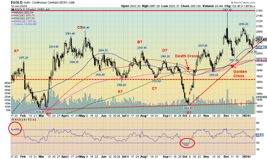
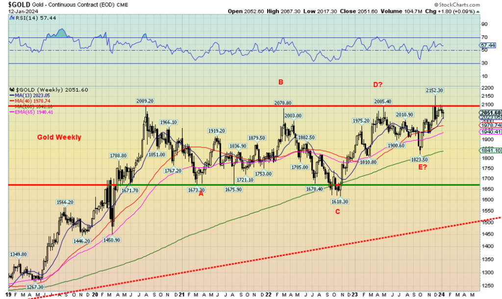
Gold continues to make a long-term consolidation pattern. The pattern appears to us an ABCDE corrective and a multi-year sideways consolidation pattern. The pattern could be a top or a bottom but we lean to a bottom or consolidation pattern. After all, we do remain in our 7.83-year cycle period with the possible absolute low occurring in November 2022 at $1,618. But the reality is, despite that little foray to $2,152—most likely a false start—we need to break out over $2,100/$2,120 to suggest to us new highs above $2,152.
A firm breakout over the long consolidation pattern suggests potential targets up to $2,575/$2,600. Similar patterns that suggest this is the handle of a much larger cup and handle pattern that also points to at least $2,500 as a target. That would warm the cockles of the gold bugs who constantly call for $2,500, $5,000, $10,000, and even higher. If the current U.S. gold holdings were to back the U.S. debt, we’d need a price for gold at $130,000. Okay, that may not be realistic, but one gets the picture. Gold is cheap.
The U.S. still carries gold on its books at the ludicrous price of $42. The U.S. holdings of gold are actually worth about $565 billion. The U.S. continues to have the largest holdings of gold reserves in the world, despite China continuing to add to its holdings.
As we note, gold needs to break above $2,100/$2,120 to start to suggest that new highs are possible. And, of course, hold above $2,000 and especially above $1,975.
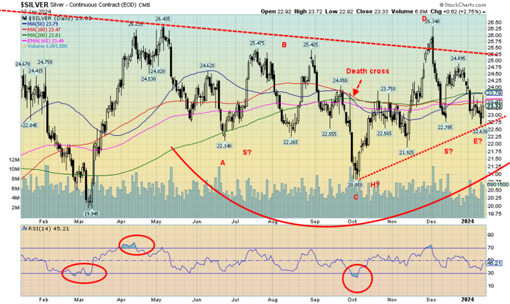
If we had a $1 for every time we said silver is grossly undervalued, we’d be very rich now. One of the most frustrating aspects of the precious metals markets has been the gross underperformance of silver relative to gold. Like the Gold/HUI ratio, the Gold/Silver ratio has remained at elevated levels for so long that it appears to be the norm. Gold went on to make new highs several times over the past few years while silver has never been anywhere near its highs of 1980 and 2011 near $50. Yet we consistently pick up reports that silver is going to $50. $100, or even $300. It all seems to be a pipe dream of the gold bugs with no bearing on reality.
Nonetheless, we see some positive signs in the chart of silver above. This past week silver prices were essentially flat, needing the action in the Red Sea to save the week from being a downer. But all that action has left some possible positive signs on the charts. First, after topping at $26.44 back in early May 2023, the corrective pattern appears to be an ABCDE-type correction. Second, silver may be making a potential head and shoulders bottom pattern with both shoulders being doubles.
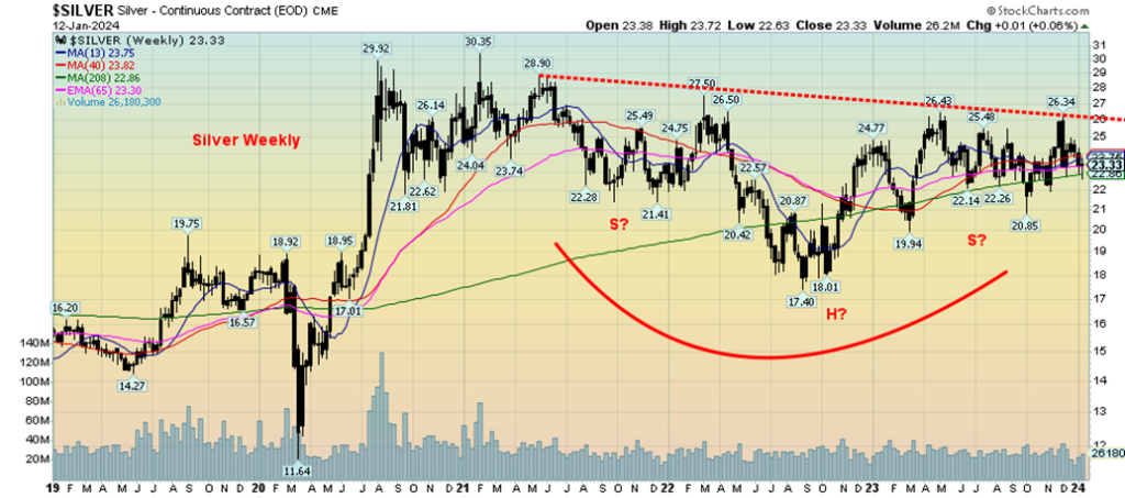
If that is correct, then silver could indeed go on a run to the upside. It needs to break out over $26.30 to suggest that the low is in. Potential targets are up to $31.75/$32.00. No, that is not $50, but that level is over the February 2021 high of $30.35. We could also say that silver is making a multi-year head and shoulders bottom with the head at the September 2022 low of $17.40 (see weekly chart next). That chart has potential targets up to $37.50, but again we must firmly break out over $26. Or, as we say, break out over $27 to confirm the breakout. We have some work to do, but the charts look encouraging.
For the record, the most recent commercial COT rose to 31.9% as the shorts were cut by 6,400 contracts and longs rose by about 400 contracts. That is encouraging.
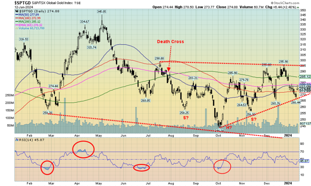
As our chart of the week points out, gold stocks are dogs. But we do see positives that could change the narrative. We haven’t had a good run for the gold stocks since that brief run last February/March. Before that we had a very good run in 2019/2020. Alas, they ultimately failed and gold stocks fell again, becoming major dogs. But now we appear to have an uptrend in place for the TSX Gold Index (TGD). Since that low at 244 in October, we’ve seen three more lows: first at 256, then just below 266 and just this past week just above 266.
Friday’s action in the Red Sea helped jump gold stocks as the TGD gained 2.4% on the day. But on the week the TGD actually lost 0.3%. The Gold Bugs Index (HUI) wasn’t much better, but at least it was positive, up 0.1%. Still, Friday’s gain did gap higher and that potentially bodes well for this coming week. The TGD still has the look of a head and shoulders bottom, but the reality means it must make a firm break above 295 to suggest it is in play. And, of course, not breaking back under 256. A firm break above 295 could see the TGD run to at least 350, just above that March 2023 high. In 2023 we had quite a sell-off into February and then the index ran up almost 34%. Volatility is the name of the gold stocks. The rewards when they run are good, but the grief when they don’t is just painful.
The bottom line is that gold stocks are going higher and should start to really move once they are over 295/300.
Geopolitical risk raised its ugly head once again. The conflict in the Red Sea, with the Houthis of Yemen attacking ships bound for the Suez Canal in support of Gaza, resulted in attacks by the U.S. and U.K. on Houthi positions in Yemen. WTI oil leaped to over $75 and Brent over $80 before both settled back. The Houthis have vowed a retaliation. The danger is that this escalates and spreads, bringing in more players such as Iran. The Red Sea/Suez Canal sees some 12% of global trade, 30% of container ship traffic, 7–8% of global oil and 8% of global LNG flows through, thus making the route one of the most important choke points in the world.
Prolonged blockage could negatively impact the global economy, as ships are forced to go around the Cape of Good Hope at considerable additional cost and time as freight rates and insurance costs rise. The risk now is that this escalates further, causing blockages in the Straits of Hormuz from the Persian Gulf to the Gulf of Oman where 30% of global oil flows through as well as 25% of global LNG. Under those conditions oil prices could explode to $150 and higher.
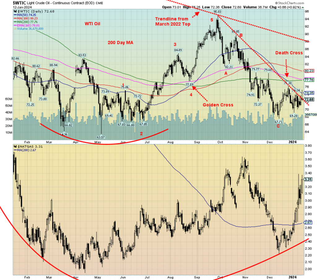
Despite all the fireworks, WTI oil remains rather subdued. This may be because of price cuts by the Saudis, as they are increasingly in competition with the U.S. as the world’s largest producer. WTI oil still fell on the week, off 1.5%. Brent crude was down about 0.5%. Natural gas (NG) also went through a wild week. Freezing temperatures in the U.S. sparked a jump in the Henry Hub NG as it rose 14.5%. But across the Atlantic warm weather plagues and NG at the Dutch Hub fell 7.4%. A tale of two countries. The energy stocks were just confused and as a result the ARCA Oil & Gas Index (XOI) fell 1.7% while Canada’s TSX Energy Index (TEN) dropped 1.6%.
WTI oil continues to make what appears to be a bottom pattern. We could argue a double bottom is forming at $67.71 and $69.29, but the gap is larger than usual. A close over $74 would be helpful, but the reality is WTI needs to regain above $80 for us to start to feel comfortable that oil is headed higher. A more major breakout could occur over $89/$90, all the while keeping the recent low of $69.29 in place. Given the action in the Red Sea, the odds of oil prices falling now are beginning to appear remote. Add in positive seasonals and the next major move should be to the upside.
NG is also destined to go higher, but some consolidation at these levels would be helpful. And, of course, more freezing weather. A move over $3.60 should start us towards $4. And we need to hold above $2.90 preferably, but absolutely above $2.70. The energy indices look positive and the stocks could go on another of their runs. Indeed, they never actually fell too far. Increase the conflict in the Red Sea and the Persian Gulf and energy stocks could soar.
__
(Featured image by Jingming Pan via Unsplash)
DISCLAIMER: This article was written by a third party contributor and does not reflect the opinion of Born2Invest, its management, staff or its associates. Please review our disclaimer for more information.
This article may include forward-looking statements. These forward-looking statements generally are identified by the words “believe,” “project,” “estimate,” “become,” “plan,” “will,” and similar expressions. These forward-looking statements involve known and unknown risks as well as uncertainties, including those discussed in the following cautionary statements and elsewhere in this article and on this site. Although the Company may believe that its expectations are based on reasonable assumptions, the actual results that the Company may achieve may differ materially from any forward-looking statements, which reflect the opinions of the management of the Company only as of the date hereof. Additionally, please make sure to read these important disclosures.
Copyright David Chapman 2024
David Chapman is not a registered advisory service and is not an exempt market dealer (EMD) nor a licensed financial advisor. He does not and cannot give individualised market advice. David Chapman has worked in the financial industry for over 40 years including large financial corporations, banks, and investment dealers. The information in this newsletter is intended only for informational and educational purposes. It should not be construed as an offer, a solicitation of an offer or sale of any security. Every effort is made to provide accurate and complete information. However, we cannot guarantee that there will be no errors. We make no claims, promises or guarantees about the accuracy, completeness, or adequacy of the contents of this commentary and expressly disclaim liability for errors and omissions in the contents of this commentary. David Chapman will always use his best efforts to ensure the accuracy and timeliness of all information. The reader assumes all risk when trading in securities and David Chapman advises consulting a licensed professional financial advisor or portfolio manager such as Enriched Investing Incorporated before proceeding with any trade or idea presented in this newsletter. David Chapman may own shares in companies mentioned in this newsletter. Before making an investment, prospective investors should review each security’s offering documents which summarize the objectives, fees, expenses and associated risks. David Chapman shares his ideas and opinions for informational and educational purposes only and expects the reader to perform due diligence before considering a position in any security. That includes consulting with your own licensed professional financial advisor such as Enriched Investing Incorporated. Performance is not guaranteed, values change frequently, and past performance may not be repeated.


Bank of Africa Launches SME Pact to Boost Business Growth
Bank of Africa launched the “SME Pact, BOA & Maroc PME” to support Moroccan MSMEs through financing, advisory services, partnerships,...


ECB Adds Climate Risk Factor to Collateral Rules
The ECB has introduced a climate factor into its collateral framework, applying additional haircuts to corporate bonds exposed to transition...


SpaceX Bitcoin Move Sparks Debate Amid Market Uncertainty
SpaceX’s recent small Bitcoin transfer sparked speculation about a possible future sale, though analysts view it as a test transaction....


Payhawk Reaches $100M ARR Milestone with AI-Driven Growth
Payhawk surpassed $100 million in annual recurring revenue, achieving rare “Centaur” status. Growth was driven by restructuring around autonomous AI,...


BIP Sells BIC Incubator to Innova, Refocuses on Core Innovation Areas
Biovalley Investments Partner (BIP) sold its entire stake in BIC Incubatori FVG to Innova, both Trieste-based firms and longtime users...
 |
|
 |  |
 |
|
-

 Fintech1 week ago
Swedish fintech Lysa is preparing to enter the European ETF market
-

 Biotech4 days ago
Circulating Tumor DNA Guides Chemotherapy Decisions in Colorectal Liver Metastases
-

 Africa2 weeks ago
BOAD Approves Major Funding Boost to Drive West African Development
-

 Fintech2 days ago
Revolut Updates Crypto Rules for Deposits and System Errors