Business
Gold Grows Stronger, as the Stock Market Continues to Deflate
Mr. Bear is back on Wall Street, signaling deflation and a potential downturn as the Dow Jones struggles below key BEV levels. While gold, silver, and especially the XAU are rising, most indexes weaken. The XAU’s stealthy climb hints at a long-awaited breakout after years of stagnation, largely unnoticed by media or investors.

In my mind, at week’s end, I have no doubt Mr Bear is once again roaming around lower Manhattan, Wall Street to be specific, and is clawing-back market valuations trading in the stock market.
That makes the Dow Jones’ BEV chart’s last all-time high of 04 December 2024 (45,014), the Terminal Zero (TZ) of this advance. From here on, I’m expecting deflation will dominate the stock market. Though, in every big-bear market, there are always tradable advances, that ultimately fizzle out.
Of course I could be wrong. All the market has to do to prove I’m wrong, is for it to rebound back above the Dow Jones BEV -5% line below, back into scoring position, and then make a few new all-time highs (BEV Zeros). If this is still a bull market, that isn’t asking for much.
I’m not holding my breadth waiting for that to happen. The best thing to do with this market is, to exit, to take profits, and wait, however long, for better days, and much lower prices to come.
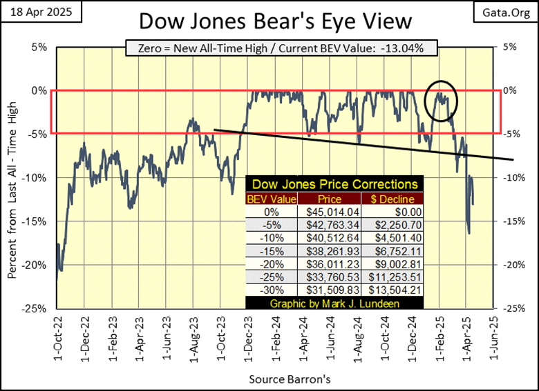
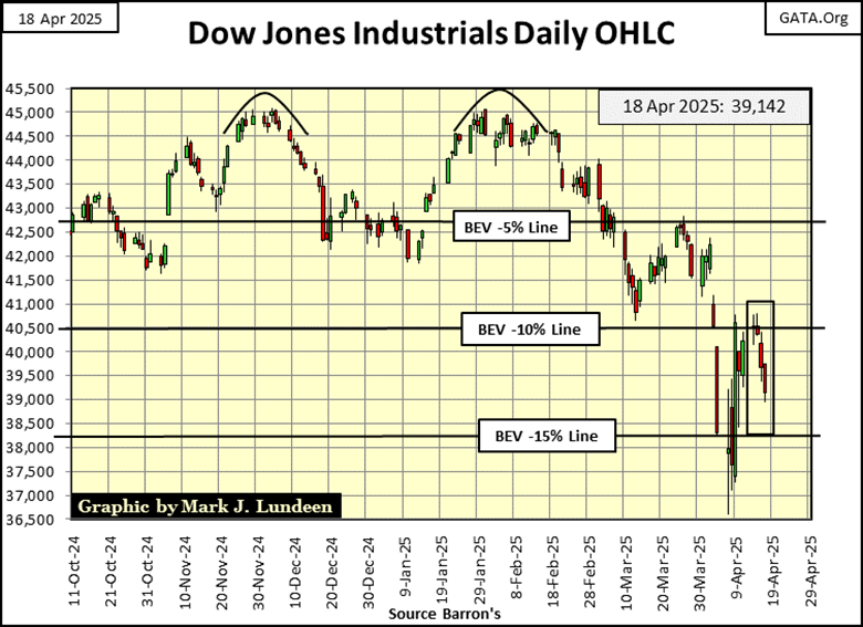
Next is my chart for the Dow Jones in daily bars. Last week, the Dow Jones broke below its BEV -15% line (15% below its last all-time high). It then rebounded towards its BEV -10% line. On Monday of this week, the Dow Jones closed above its BEV -10% line, with a BEV of -9.97%, but didn’t stay above it for long.
If the Dow Jones closes next week below its BEV -15% line (38,261), that augers further weakness in the weeks to come.
In my table for the Bear’s Eye View values for the major stock indexes I follow, this week, deflation was the order of the day. Not a massive sell off. But these indexes are struggling to maintain their current market valuations. Only four of them managed to close the week, with their BEV values above their BEV -10% lines.
I noticed the XAU closed the week at #14. As everything else is sliding down, farther and farther from their last all-time highs, the XAU is advancing towards its first BEV Zero since April 2011. Or so it seems to me.
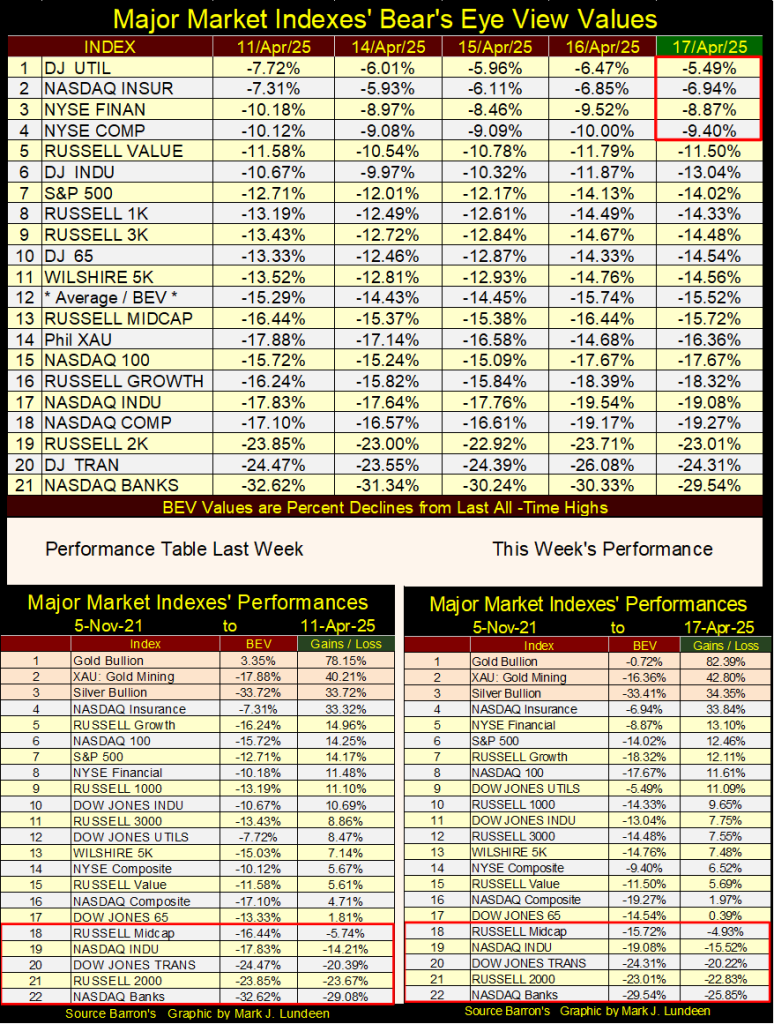
Once again, this week closed with gold, silver, and the XAU in the top three spots in the ranking, as each saw a nice advance this week. I’m really impressed with the XAU, after a very long time, since 2011, the XAU is finally making a move for a new all-time high.
The XAU began trading in 1983, forty-two years ago. That is a long time, during which the XAU didn’t do much but trade between 50 and 150 in the chart below. It attempted to break out in April 2011, when it closed at 228.95. Five years later, it closed at 38.84 in January 2016, a massive 83% collapse in valuation from its highs of April 2011. This is why, still today in the investment community, the gold and silver miners are about as popular as a loathsome disease.
But in April 2025, it appears the times they are a changing for the XAU. For over a decade, the XAU was tail-end Charlie in the BEV rankings table above (#21). This week it closed at #14, an advance that has occurred in just the past few weeks, all without catching much attention from the media or the public.
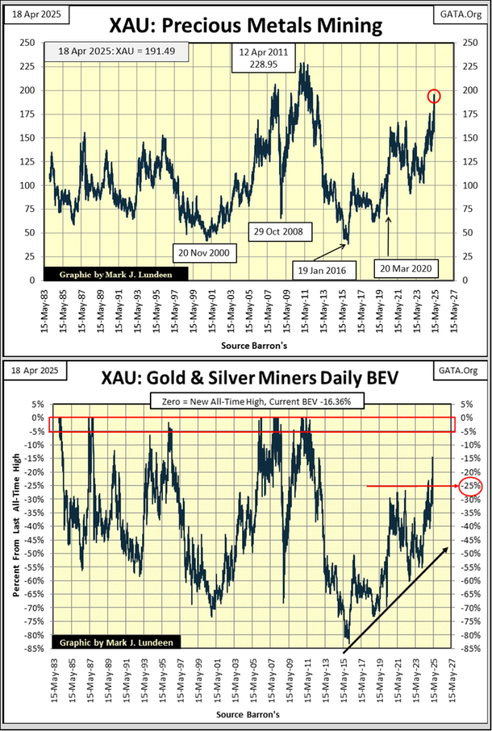
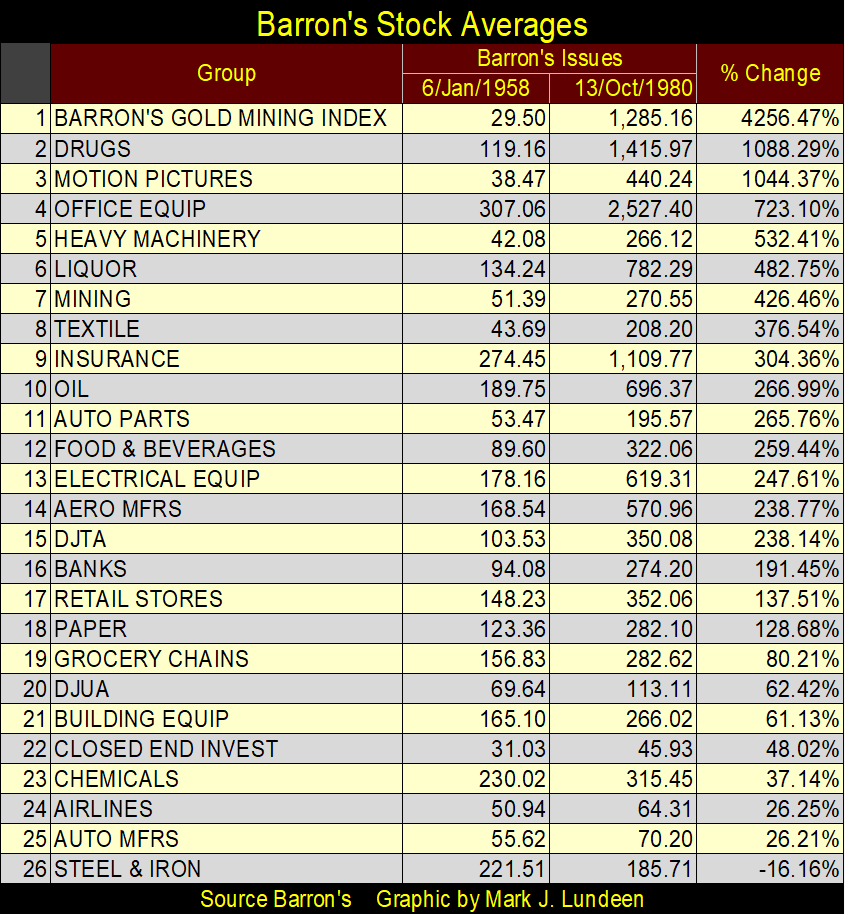
Should the XAU breakout to new all-time highs, there is lots of room to the upside for it to run, as flight capital from the deflating stock and bond markets once again discover the gold and silver miners. Yes, there was a time when the gold and silver miners were the top group in the stock market, as seen in the Barron’s Stock Averages, the table below. From 1958 to 1980, the BGMI advanced by a factor of 42.56, nothing else came close to the precious-metal miners.
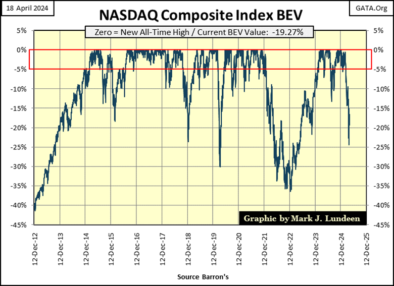
Compare the XAU above, with the NASDAQ Composite below. Its last all-time high was on 16 December 2024. In the next two months, the NASDAQ Composite remained in scoring position, but failed to make any new BEV Zeros. Then on February 25th, it fell below scoring position, below its BEV -5% line, and has continued going down since then. This is a very weak chart.
Of course, the NASDAQ Composite index has fallen to these levels before, only to rebound to new all-time highs shortly after. Will that happen again? Or will something else happen, such as falling down to deep bear market values, and then staying there?
If the NASDAQ Composite continues deflating to ever deeper BEV values, I suspect most people believe that is the most likely outcome; a bottom before a rebound. That is how it has always worked before with these high-tech companies. But why take a big loss before a bounce? Assuming that is what is to come with the NASDAQ Composite. Until then, the smart move just might be to invest in the gold and silver miners.
Reading the CNBC article below on the US Treasury Bond Market, apparently the T-bond market has seen a recent sell off. Looking at my bond yields, I don’t see that. But if this is so, it’s not as bad of a sell off as we saw in early 2023, when rising bond yields / falling bond prices were forcing banks to close their doors. Why would anyone sell such a “safe-haven asset,” as a T-bond, at a time like this? As per CNBC, what else? But because of Trump and his tariffs.
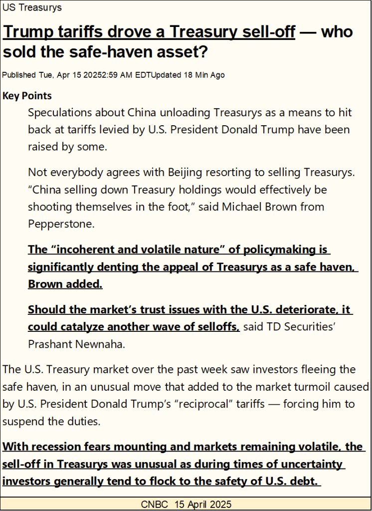
I liked the following; “the ‘incoherent and volatile nature’ of policymaking is significantly denting the appeal of the Treasurys as a safe haven, Brown added.
Should the market’s trust issues with the U.S. deteriorate, it should catalyze another wave of selloffs, said TD Securities’ Prashant Newnaha.”
These two guys must have both been to college, both receiving top grades in economics, as they know nothing about the root causes of why the T-bond market is having problems in 2025. They do know about the short-term issues, made known to everyone, by people and institutions who have been profiting from ripping off the public for decades.
The truth is; President Trump is the first president in the past 100 years, who is attempting to take this parasitic class’s rice bowl away from them, so they are doing their best to stop that from happening.
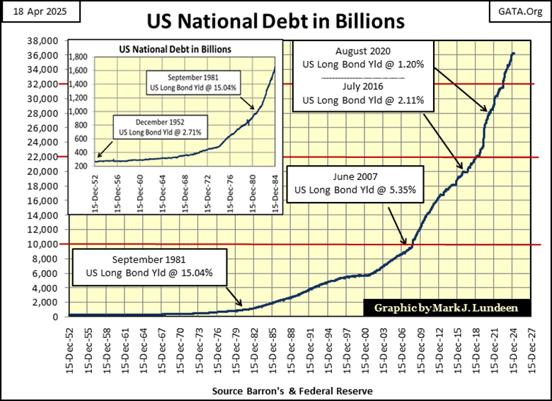
The chart below is a graphic consumers of the mainstream financial media’s news will never see, as it plots the US national debt since 1952. It illustrates the real reason the T-bond market is having problems; the US Federal government is servicing a massive level of debt, and shows no sign that its big spending ways are coming to an end.
What is amazing, it wasn’t until 2025, that our contemporary financial media has finally recognized there is a problem in the T-bond market. If Trump wasn’t president, the financial media would still not see a problem in the Treasury market.
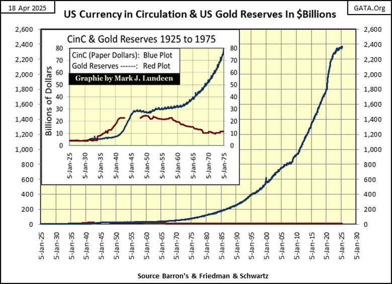
The chart below, plotting CinC (US paper money in circulation / Blue Plot), and dollars in gold (valued at $42.22 / ounce by the US Treasury / Red Plot), illustrates why inflation is a problem in 2025.
Looking at these two plots, from 1925 to 1930, they are almost equal to each other. That was the gold standard; where the government printed only as many paper dollars, as they have gold to back them. Back when someone with a $20 bill, could go to a bank and demand a $20 gold double eagle; $20 in gold.
In the chart below, it’s obvious when the United States went off the gold standard, when it began printing paper money, in excess to the gold reserves required to back its paper dollars.
Note; this inflation in paper dollars began long before August 1971, when we’re told that “Nixon took the dollar off the gold standard.” So, Nixon really didn’t take the dollar off the Bretton Wood’s $35 gold peg. He only made official, what had been the policy since 1950; the US Government’s monetary policy of unlimited paper-money inflation, a policy of monetary inflation that continues to this day.
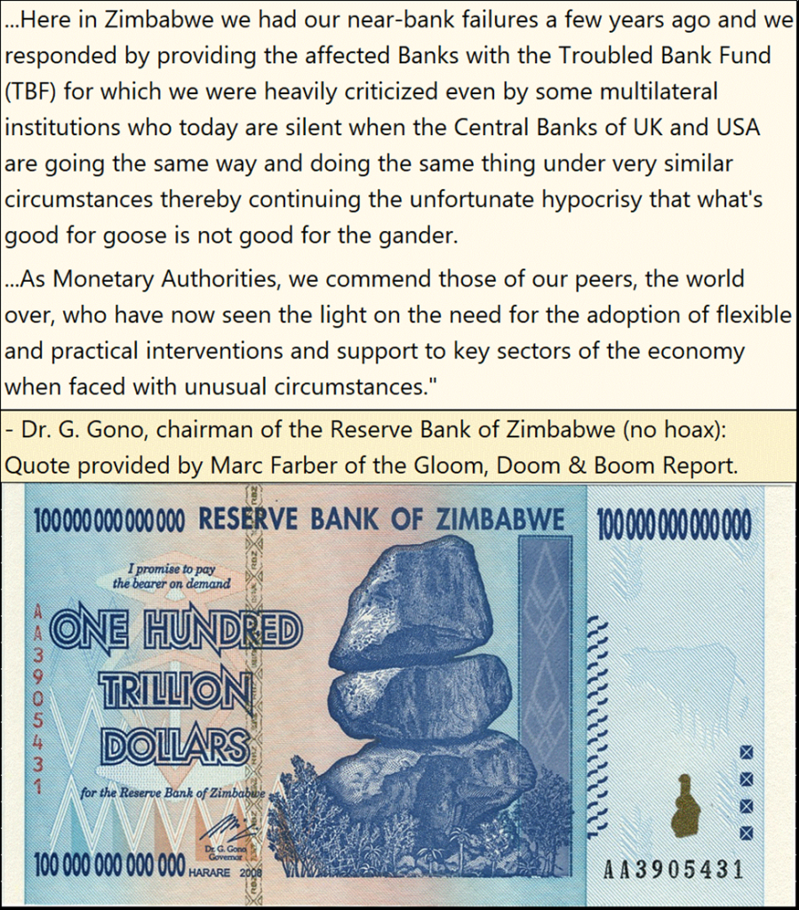
Monetary inflation has been with us since money was first invented, as no king will live within his means. Zimbabwe (former Rhodesia), had a historic bout of monetary inflation early in the 21st century. In the quote below, the Reserve Bank of Zimbabwe’s Idiot Primate, defends his destruction of the Zim-dollar.
So, holding a US Treasury bond, that matures in a few years, redeemable in a dollar that is guaranteed to lose purchasing power over the T-bond’s term, is a huge factor why yields for T-bonds, and all bonds have been rising since August 2020.
To protect their investment, bond buyers are demanding an inflation premium; higher yields = lower bond prices. This is why the T-bond market is selling off. What that has to do with Trump and his tariffs, no one can really say anything with specifics. But “market experts” continue to talk, and are paid damn well for doing so.
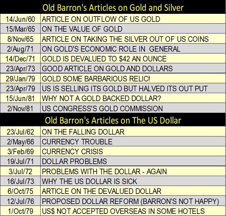
Here are some articles published in Barron’s in past decades, concerning gold and the US dollar. Washington’s mismanagement of the US dollar has been going on for a very long time.
Here is something to cheer everyone up; gold’s BEV chart. This week, gold saw its 64th new all-time high (BEV Zero = 0.00%), since gold entered into scoring position in November 2023, as seen in its BEV chart below. Sixty-four new all-time highs that has pushed gold up $1,370, up 72% in the past seventeen months.
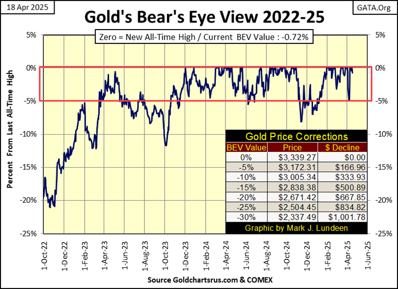
Gold’s BEV chart above, being a BEV chart, treats every new all-time high the same; as a big fat Zero, or 0.00%. A BEV chart ignores dollar values, so really can’t show the amazing advance in the price of gold since November 2023.
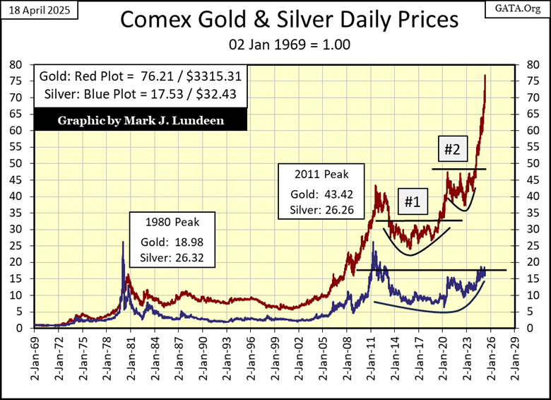
So, I’m including the chart below, plotting the indexed values of gold and silver below, where 02 January 1969 = 1.00. Below, we don’t see gold and silver in dollars, but by the factors they’ve increased since 1969.
At this week’s close, gold has advanced by a factor of 76.21 since January 1969. Much better than silver’s factor of 17.53. What is with silver’s poor performance compared to gold’s? Heck if I know. However, when silver does decide to take off, and break above its 20-line, its gains should be very impressive.
If this week, had silver also advanced by a factor of 76.21, how many dollars would that be? Well, on 02 January 1969, silver was trading at $1.85 an ounce. That multiplied by gold’s factor of 76.21 = $140.99 an ounce for silver. That is worth waiting around for!
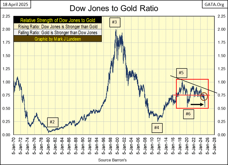
Keeping in mind, that valuation trends for the Dow Jones and gold are typically counter-cyclical to each other, where when one is advancing, the other is not. So, let’s look at the ratio of the Dow Jones to Gold in the chart below.
This plot is simple to understand. I take the indexed values for the Dow Jones, and gold, where 05 January 1970 = 1.00, and I divide the indexed value for the Dow Jones by the indexed value of gold to create this ratio.
One interesting thing to note about this ratio’s plot is, once this ratio’s trend changes direction, whether when it rises, as the Dow Jones is stronger than gold, or when it declines, where gold is stronger than the Dow Jones, this ratio’s directional change in trend can last for many years.
When this ratio breaks out of its red box, is that the beginning of a decade where gold, silver, and their miners in the XAU will outperform the stock market? I can’t say that for a fact. However, I’m thinking it.
Moving on to gold’s step sum table below, what a great table. Once again, this week, ten of the daily closings of the twenty-five seen, were daily closes at a new all-time high. Yet, gold’s 15-count closed the week at a very neutral +1, indicating that gold, hot market that it is, isn’t an overbought market, a market due for a pullback in valuation.
That happened on March 31st, when gold’s 15-count increased to an overbought +7. And what happened then? Gold pulled back some, down to its BEV -5% line for two days, and then took off once again. This is an amazing time in the history of the gold market. I expect there will be surprises in the weeks and months to come, with most of the surprises to the upside.
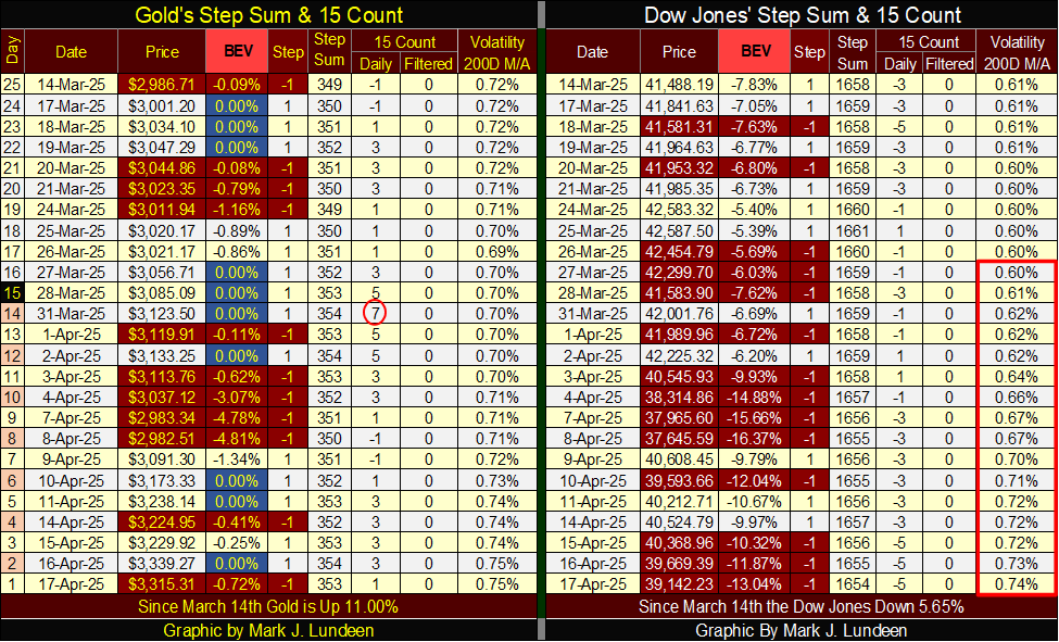
The Dow Jones is having problems on its side of the step sum table. One could be optimistic, and see all of those red down days taking the Dow Jones down by only 13.04% from its last all-time high at this week’s close. That the Dow Jones is up nicely from its lows of April 8th.
One fact that has been on my mind for a very long time, is the current bull market for stocks began in August 1982, forty-three years ago. How much more can people reasonably expect from this geriatric bull market?
Gold’s daily volatility’s 200D M/A closed the week at 0.74%, apparently on its way to somewhere over 1.00%. That’s where bulls get mauled by Mr Bear, until they learn once again, it’s no fun being a bull in a bear market.
__
(Featured image by Michael Steinberg via Pexels)
DISCLAIMER: This article was written by a third party contributor and does not reflect the opinion of Born2Invest, its management, staff or its associates. Please review our disclaimer for more information.
This article may include forward-looking statements. These forward-looking statements generally are identified by the words “believe,” “project,” “estimate,” “become,” “plan,” “will,” and similar expressions, including with regards to potential earnings in the Empire Flippers affiliate program. These forward-looking statements involve known and unknown risks as well as uncertainties, including those discussed in the following cautionary statements and elsewhere in this article and on this site. Although the Company may believe that its expectations are based on reasonable assumptions, the actual results that the Company may achieve may differ materially from any forward-looking statements, which reflect the opinions of the management of the Company only as of the date hereof. Additionally, please make sure to read these important disclosures.


The TopRanked.io Weekly Digest: What’s Hot in Affiliate Marketing [++ KuCoin Affiliate Program Review]
X now allows people to block certain topics from their feed. This week, we're going to tell you how to...


Hotel Stay Project Supports Wildlife Conservation in Japan
Iwate Prefecture launched a project linking hotel stays to conservation through Morioka Zoological Park Zoomo. A themed room at Yunomori...


Bitcoin Leads Modest Crypto Rebound Amid Mixed Signals
Bitcoin rose 2 percent to above 77000 as ETFs saw 15 million inflows and April gains of 12.2 percent. Ethereum...


Major Pharma Advances: EU Approvals, Vaccine Progress, and Breakthrough Clinical Results
Johnson & Johnson has EU approval for nipocalimab for generalized myasthenia gravis, showing superior control and sustained benefits. Sanofi reported...


Agential Cannabis 2026 to Drive APAC Market Growth and Global Industry Collaboration
Agential Cannabis 2026 will take place September 23–24 in Bangkok, bringing global experts together to advance the APAC medical cannabis...
 |
|
 |  |
 |
|
-

 Business2 weeks ago
Understanding the Bear’s Eye View: A Clearer Perspective on Market Trends
-
 Biotech10 hours ago
Major Pharma Advances: EU Approvals, Vaccine Progress, and Breakthrough Clinical Results
-

 Cannabis1 week ago
Cannabis Stocks Show Signs of Rebound as Policy Shift Sparks Optimism
-
 Crowdfunding3 days ago
Italy Extends SME Guarantee Fund to Crowdfunding with New 2026 Framework