Markets
Gold Signals Shift: Dow Stalls as COMEX Inventories Defy Bull Market Logic
This week, the Dow Jones saw low volatility but failed to rise, signaling weak bullish momentum. A new 52-week low marks continued bearish pressure. Most indexes gained slightly, led by XAU and silver. Gold inventories at COMEX, which once aligned with gold prices, now show anomalies—surging in 2020 and 2025 despite modest price increases.

At this week’s close, I’m wondering what the market has instore for the Dow Jones below. The Dow Jones closed above its BEV -10% line on April 29th, nine NYSE trading sessions ago, and has since managed only to keep above it, refusing to advance any closer to its BEV -5% line. That black trend line I placed in the chart below, has proven to be a strong line of resistance for almost two weeks now.
Something else I’m also looking at; the black circle noting late January / early February, when the Dow Jones came so close to making a new all-time high in its BEV chart. It missed doing so by only 0.29%, after a week of daily failed attempts at making a new BEV Zero.
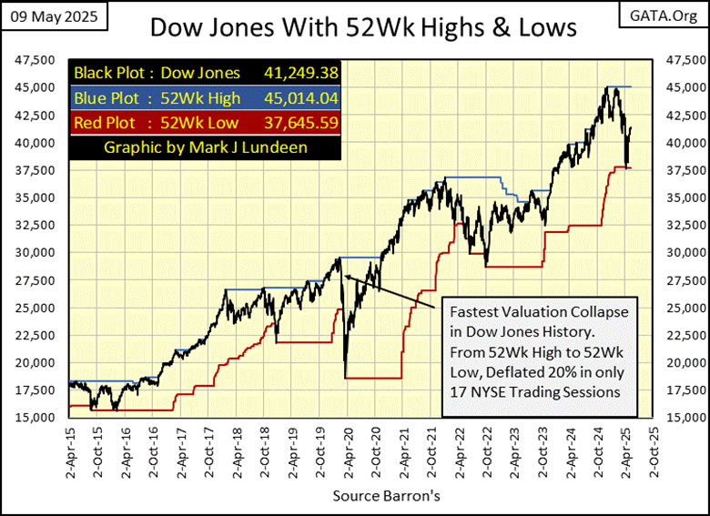
That was on January 30th, when the Dow Jones closed at 44,882. The current BEV Zero was on December 4th, when the Dow Jones closed at 45,014, only 132 points above its highs of a few months later. 132 Points; that’s nothing. Yet, the Dow Jones didn’t have the means of advancing 133 points to make a new all-time high a few months ago.
That is really lame, something to be expected at the END of a major advance in the market. And now, the Dow Jones is struggling to advance above its BEV -5% line above, a return to scoring position, forcing me to think bearish thoughts on the stock market.
It would be so easy for the bulls to prove me wrong. All they have to do to shut me up is, advance the Dow Jones back into scoring position, above its BEV -5% line in the BEV chart above, and then make a new all-time high. But until they do, I’m not holding my breath.
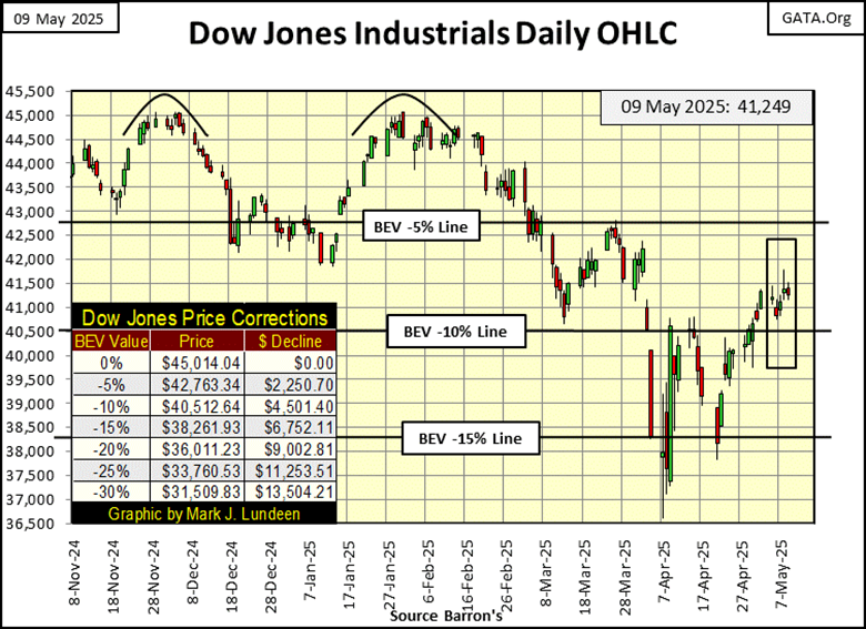
Another look at the Dow Jones’ lame market action for this week, is seen in its daily bar chart below. As I’ve often said, low daily volatility in the Dow Jones is bullish, and within the rectangle noting this week’s trading, daily volatility is much reduced from where it was a month ago.
So, why at this week’s close, did the Dow Jones close 68.05 points below last week’s close? Obviously, low daily volatility is bullish, only if something bullish results from it, which this week was notably absent in the Dow Jones. Maybe next week will be different.
Moving to the Dow Jones, with its 52Wk High and Low plots below, we see the progress of the current bear market, which I believe is now the market’s primary trend, a trend that ultimately will take the Dow Jones to much lower valuations.
On April 8th, for the first time in a long time, the Dow Jones pushed down its 52Wk line down by 89.52 points. Not a big push down, as happened during the March 2020 Flash Crash, but still a push down on the Dow Jones’ 52Wk Low line. That is something that isn’t supposed to happen during a bull market.
The push down seen on April 8th, is the first push down on the Dow Jones’ 52Wk Low line in this bear market. Its only one – so far.
Looking at my table with the BEV values for the major market indexes I follow below, three indexes closed the week inside of scoring position, above their BEV -5% lines. Eight of them closed the week below their BEV -10% lines.
The largest advance seen this week was the XAU (#18), advancing by 3.53 BEV points. The majority of the indexes advanced by less than a single BEV point, but all indexes managed to advance this week.
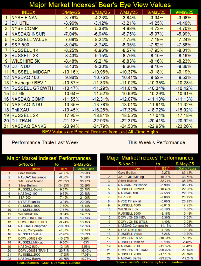
In this week’s performance table above, the XAU and silver bullion kicked out the NASDAQ Insurance Index from its #2 position, seen last week. I like it that way.
What is the difference between the big table above, and the two performance tables below it in the graphic? The top table is looking at these indexes from their last all-time highs, as that is what BEV values are; 0.00% = new all-time high. Less than 0.00% = percentage decline from those last all-time highs.
But when these all-time highs (BEV Zeros) happened can vary greatly in the top table. For the XAU, its last all-time high is from April 2011, while the Dow Jones last all-time high was last December.
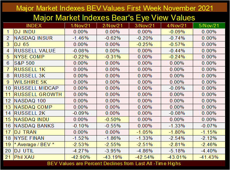
For the performance tables, they are based on where these indexes were on 05 November 2021. Why from November from three years ago? Because that week looked like this, as seen in the table below; where every index closed either in scoring position, or at a new all-time high. Except the XAU, at #21 in the table below. Yep, since November 2021, the XAU has come far. See table above.
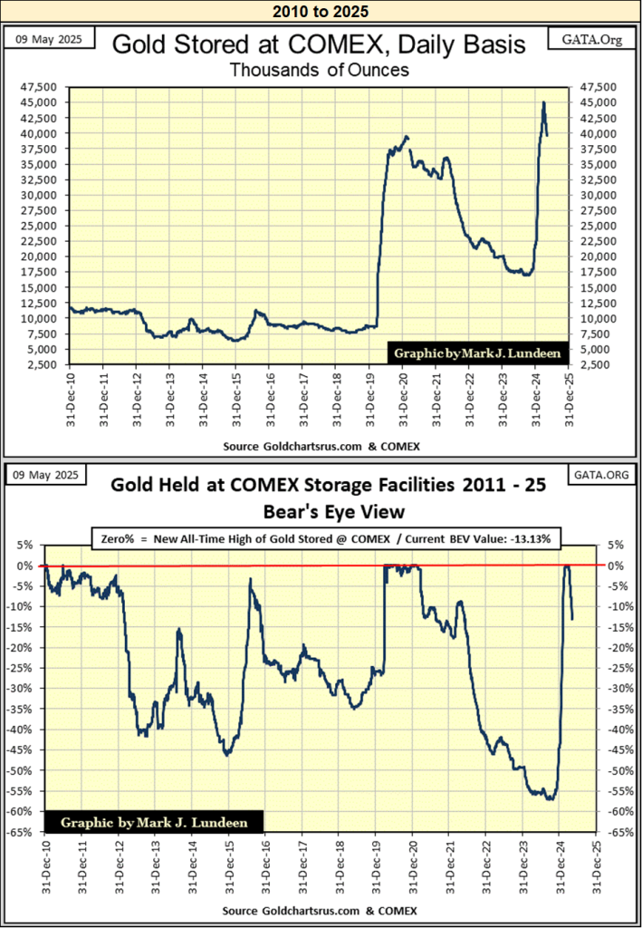
I haven’t covered the increasing inventories of gold bullion being stored at the COMEX storage facilities for a while, making this a good time to do so. Below, I have two sets of charts;
- gold bullion in thousands of ounces,
- Bear’s Eye View of those thousands of ounces of gold,
for 1974 to 2025, and 2010 to 2025.
Looking at the data for 1974 to 2025, during the 1969 to 1980 bull market in gold, storage of gold bullion increased as the price of gold increased. After the price of gold topped in January 1980 at $840, and began declining towards a 70% bear market bottom in 2001, so too did the inventories of stored gold at the COMEX facilities.
In 2001, as the price of gold began increasing once again, from its bear market lows of $253 an ounce in February 2001, once again, so did the storage of gold at the COMEX storage facilities. The price of gold peaked in August 2011, just before it began a 45% bear-market decline that bottomed in December 2015. As seen in the chart below, beginning in December 2012, inventories of gold bullion stored at the COMEX facilities, also began declining with the price of gold.
I think I’m beginning to see a pattern here;
- bull markets in gold, see rising inventories of gold bullion stored at the COMEX,
- bear markets in gold, see declining inventories of gold bullion stored at the COMEX.
This could be an important observation to keep in mind, as we now move to March 2020 in the chart below, when gold inventories at the COMEX Spiked from 8 million, to 40 million in the next nine months.
Whiskey, Tango, Foxtrot (WTF)! What happened to cause that? Did the price of gold spike to something over $20,000 an ounce in the next nine months? No. From its March 2020 lows of $1470, gold increased to $1896 in December 2020, a 29% increase in the price of gold, as gold inventories at the COMEX spiked by 500% during this same time period.
Weird.
Then from December 2020, to October 2024, the price of gold increased from $1896, to $2788, a 47% increase in the price of gold, as COMEX gold inventories collapsed by 55%. Wait a minute. Aren’t gold inventories supposed to go up during bull markets in gold? Well, they used to. Obviously, it’s that old saw on the market;
Then, once again gold inventories at the COMEX began spiking upward, from 17.5 million ounces of gold in October 2024, to over 45 million ounces of gold in early April 2025, as the price of gold continued rising in a bull market, but not by that much.
I’m beginning to suspect that since the March 2020 Flash Crash, when FOMC Idiot Primary Powell’s Not-QE#4 “injected” a few trillions of dollars of “liquidity” into the financial system in only two months, to “stabilize” it yet another time, the shifting levels of gold inventories held at the COMEX are driven by something other than the changing price of gold, come bull or bear market. But what could that be?
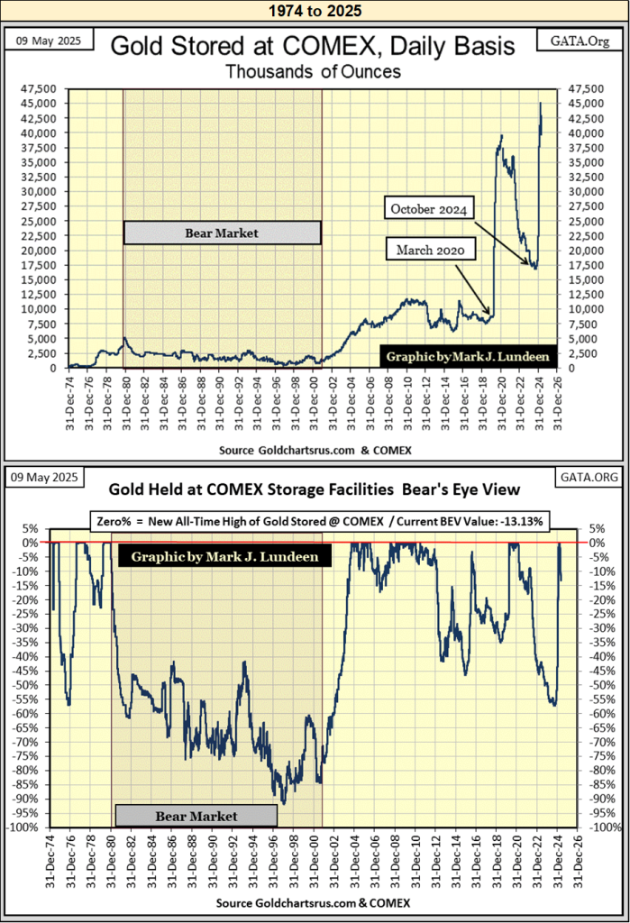
Above I have the COMEX gold inventories presented in the Bear’s Eye View format (BEV), with data for millions of ounces of gold, compressed into a range of only 100 possible percentage points, where;
- 0% = to a new all-time high of gold stored at the COMEX,
- -100% = a total wipe out in COMEX gold inventory levels.
What I like about the BEV view of the market, or in this case; gold inventories stored at the COMEX since 1974; reductions from peaks in inventories of stored gold, are seen in precise percentages declines. In those terms, the reduction in gold inventories seen during the 1980 to 2001 bear market in gold, were greater than those seen from December 2020 to October 2024. Though in total tonnage of gold leaving the COMEX, the post January 1980’s declines aren’t even close to those seen post March 2020.
What is this? As seen below, in the past month, 5 million ounces of gold has left the COMEX’s storage facilities. Or in BEV terms, a reduction of 13.13% in gold held at the COMEX in the past month.
What is up with all these many tons of gold moving from here to there, across the oceans wide? As per Martin Armstrong, at Greg Hunter’s USAWatchdog (link below), he said the gold is flowing into New York from Europe, because Europe (NATO) is going to war with Russia, whether the US agrees with NATO going to war with Russia, or not.
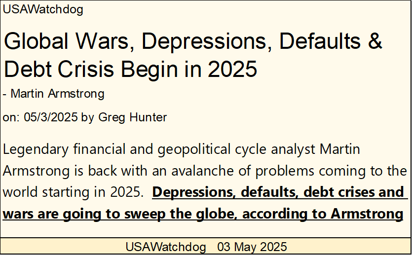
Why does Europe want to go to war with Russia? As per Armstrong, Europe is broke, and will soon find it impossible to fund their socialists’ pension funds and free healthcare.
Instead of being blamed by their populations for being incompetent in their managing Europe’s affairs, Europe’s “policy makers” want to blame their pending failure on Putin, by going to war with Russia. But damn it, every time they poke the bear with a sharp stick, the bear refuses to attack NATO.
Europeans who own this gold aren’t stupid. What they are, is afraid the coming war will bring capital controls, which will not allow the transferring of gold from Europe once they are imposed, to then be followed by direct confiscation of their gold, if it remains in Europe. This sounds logical. In fact, this has happened before.
In the chart below, data from Barron’s, the Red Plot is the US gold reserves in billions of dollars. The big vertical spike in 1934, was from devaluing the dollar from $20.67 to $35.00 an ounce. But the increases in the US’s gold reserves following that, is gold coming into the US, at $35 an ounce. I’m assuming this gold is from Europe, as the Nazis prepared for war.
Just in case you didn’t know, at the end of WWII in Europe (May 1945), any private wealth not belonging to Herman Goring, or Himmler, was long gone from anywhere in Europe occupied by Stalin’s Communists, or Hitler’s National Socialists. So, for wealthy Europeans, and Europe’s central banks in the 1930s, it was a smart move to transfer one’s gold to New York, and then open a bank account, to deposit the dollars received.
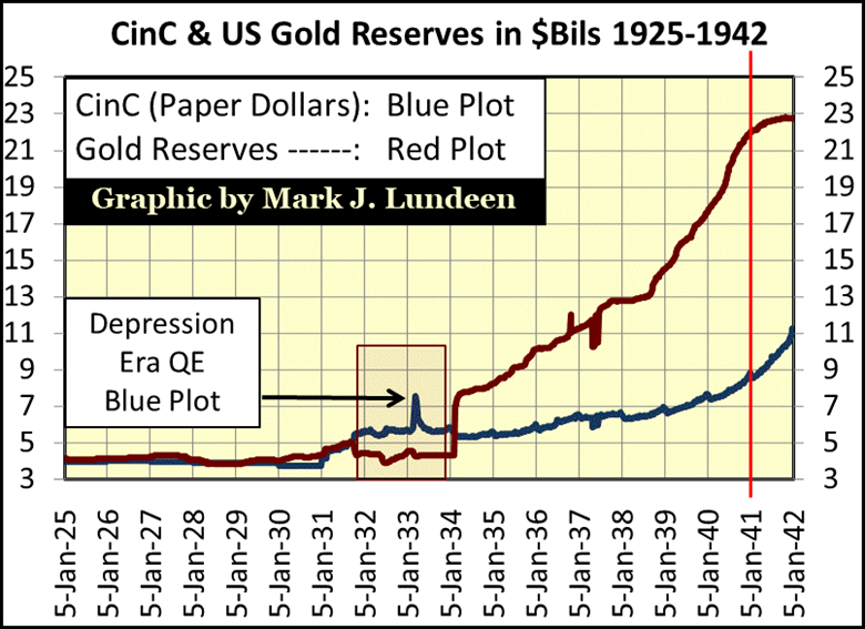
Note the inflow of gold from Europe happened following the 1934 dollar’s devaluation from $20.67 to $35 an ounce. Did these Europeans of a century ago, know something the average American didn’t? I believe they did.
Also note, this transfer of monetary gold ceased soon after 1941. Maybe all the gold that was going to be shipped from Europe, was already in New York. If so, that was good, as since late 1939, German U-Boats were prowling the Atlantic, sinking any ship they found.
So, our current inflow of gold from Europe, and elsewhere, is happening as a response to fears of a coming war? I don’t know that for a fact, but Martin Armstrong believes that to be true, plus that makes a lot of sense. And I expect the European fear of war, would be focused on the current war, a war without end in Ukraine.
God knows, the current European political structure sees itself as a latter-day version of the Soviet Union. They suppress free speech, and use the force of government to prevent their political opponents from tossing them out of office, as these same hypocrites extol the virtues of “democracy.”
If Trump took the US out of NATO, I’d be all for bring the boys, and girls back home. Far away from the psychos in Europe, who believe that war with Russia can somehow return a favorable outcome for them. When it comes to bears, its best to keep a respectable distance from them, and avoid poking them with sharp sticks. But some people can’t learn from the experiences of others, by studying Napoleon and Hitler’s war with Russia. If this is the best NATO has to offer the United States, we need to get the hell out of NATO.

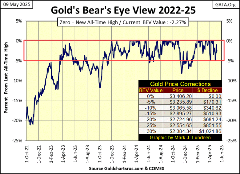
Let’s now look at gold’s BEV chart below. Twice since early April, gold tested its BEV -5% line. In April, gold went on to make several new all-time highs after failing to break below scoring position. Last week, gold once again attempted to break below scoring position.
Then came this week, where it bounced off its BEV -5% line, closing the week with a BEV of -2.27%, well within scoring position. Assuming gold is in a bull market, which I do, I’m going to assume gold will soon be generating some new all-time highs in the weeks to come. Looking at the table inserted in the table below, that would soon see gold closing above $3,406.20, its current BEV Zero.
In gold’s indexed valued chart below (Red Plot), where 02 January 1969 = 1.00, gold has seen some nice advances since it broke out of its #2 Bowl some time ago. Silver (Blue Plot) is a completely different story! It is sitting in a bowl that has lasted since April 2011, and can’t seem to find its way out of it.
But, I note how since January 14th, silver has traded within a very narrow range of values; $29.60 to $34.40, or 16.22% from top to bottom. And since April 8th, silver has traded between $30.92 to $33.58, or 8.60% from top to bottom.
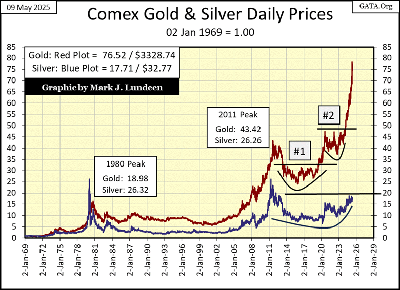
This tight trading range can’t go on forever. A day is coming when silver will break outside its lows, or highs of the past five months.
I can’t imagine seeing silver breaking decisively below its $29.60 low of this range, so I’m anticipating it will break above the high of this range; $34.40, on its way to advance to its first new all-time high since January 1980, by trading above $50.
But when? Don’t ask me. Every time I make a prediction, and give a time it will happen, the market makes a monkey out of me. This is especially so when I make predictions for the silver market. So, like me, my readers will just have to wait until it actually happens.
Moving on to gold’s step sum table below, there isn’t much new to say about it at the close of this week, other than noting gold continues looking good. Specifically; gold has seen no shortage of down days since April 4th, while it has generated a handful of BEV Zeros, or remained within scoring position, above its BEV -5% line the whole time.
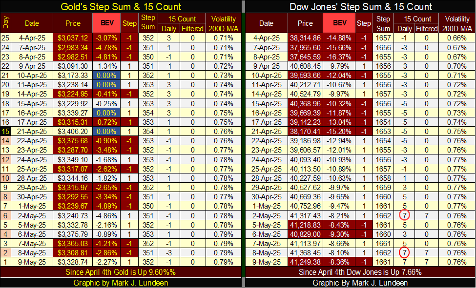
On the Dow Jones’ side of the table, it closed the week with its 15-count a +7, making the Dow Jones an overbought market, a market that should soon see some downward pressure on it. How far that could take the Dow Jones down is anyone’s guess, maybe not much at all. Then again, maybe a lot.
__
(Featured image by Jingming Pan via Unsplash)
DISCLAIMER: This article was written by a third party contributor and does not reflect the opinion of Born2Invest, its management, staff or its associates. Please review our disclaimer for more information.
This article may include forward-looking statements. These forward-looking statements generally are identified by the words “believe,” “project,” “estimate,” “become,” “plan,” “will,” and similar expressions, including with regards to potential earnings in the Empire Flippers affiliate program. These forward-looking statements involve known and unknown risks as well as uncertainties, including those discussed in the following cautionary statements and elsewhere in this article and on this site. Although the Company may believe that its expectations are based on reasonable assumptions, the actual results that the Company may achieve may differ materially from any forward-looking statements, which reflect the opinions of the management of the Company only as of the date hereof. Additionally, please make sure to read these important disclosures.


TopRanked.io Weekly Affiliate Digest: What’s Hot in Affiliate Marketing [1xBet Affiliate Program]
If you thought nobody liked cricket, then this week, we're proving you wrong. And by the time we're done, you'll...


Tether Seeks Big Four Audit to Boost USDT Transparency
Tether, issuer of USDT, plans a full audit by a Big Four firm to address transparency concerns over its $184...


H&M Advances Sustainability and Cuts Emissions by 2025
H&M Group reported that by 2025, 91% of materials were recycled or sustainably sourced, with recycled content reaching 32%. Emissions...


NHS Funds Breakthrough CAR-T Therapy Breyanzi for Lymphoma Treatment in Spain
Bristol Myers Squibb announced NHS funding for CAR-T therapy Breyanzi, enabling its use from April 1st in Spain for lymphoma...


Crypto Markets Volatile as Bitcoin Hovers, Solana Eyes AI Integration
Crypto markets remain volatile amid the Iran war, with Bitcoin near $70,000 and ETF inflows improving outlook. Ethereum faces declines...
 |
|
 |  |
 |
|
-

 Impact Investing2 weeks ago
Antarctica Warming Reshapes Global Atmospheric Circulation
-

 Business6 days ago
Anemic Labor Market and the End of Passive Money Flows
-

 Fintech3 days ago
DZ Bank Pioneers Blockchain Bond Issuance, Advancing Tokenized Finance
-

 Crypto2 weeks ago
Crypto Markets Now Steady as Fed Decision Looms