Markets
Gold Made a New All-Time High This Week
Gold closed at a new all-time high on a weekly and daily basis, and I suspect also on a monthly basis. It’s only a matter of time before silver and the XAU also close at a new all-time high. Though with silver closing the week with a BEV of -47.70%, and the XAU with a BEV of -45.06%, both would need about a double before they too see their new all-time highs.

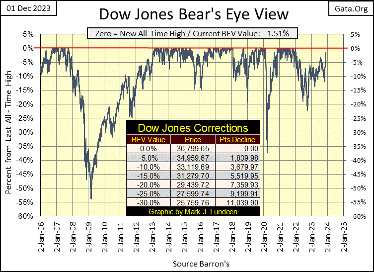
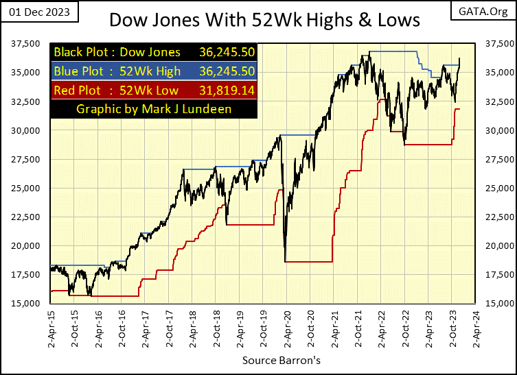
What a difference two weeks can make in the market! Not all that long ago, I was trashing the old-tired bulls on Wall Street for not having what it took to have the Dow Jones close in scoring position (BEVs from -0.01% to -4.99%). I take a week off, and in my next article the Dow Jones closed the week with a BEV of -1.51%, deep in scoring position as seen in the BEV chart below.
Can the Bulls take the Dow Jones to new all-time highs from here in the weeks to come? If they don’t do exactly that, they’ll look pathetic for not having what it takes to drive the Dow Jones up by the final 555 points from today’s closing price to make that happen.
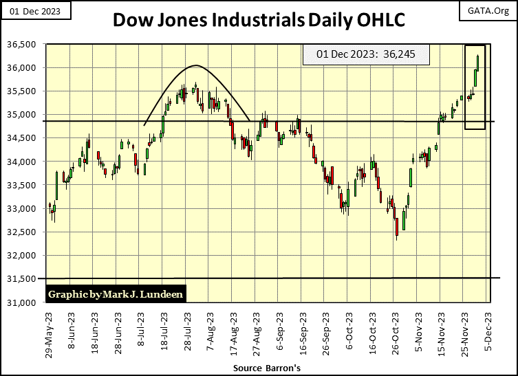
Here is the Dow Jones in daily bars below. Geeze Louise; look at those old geezers run up the hill this past week! I wish I could still do that.
I don’t want to be a party-poop, but with all the good times we’re now seeing on Wall Street, I have to wonder who is paying for all the liquor?
If you believe in the statistics published by the idiots at the FOMC, it isn’t them. As per the idiots, they haven’t “injected” any “liquidity” into the market since Barron’s 22 August 2022 issue, and that was only a tiny “injection” of $1.65 billion dollars. Since then, for the past fifteen months, they’ve drained $1,142 billion from the financial system.
For anyone who has studied the market for decades, seeing $1.14 trillion dollars withdrawn from the financial system in less than a year and a half, would have them believe the Dow Jones would be in a profound bear market decline. But no, this week the Dow Jones closed only 1.51% from making a new all-time high. What is with that?!
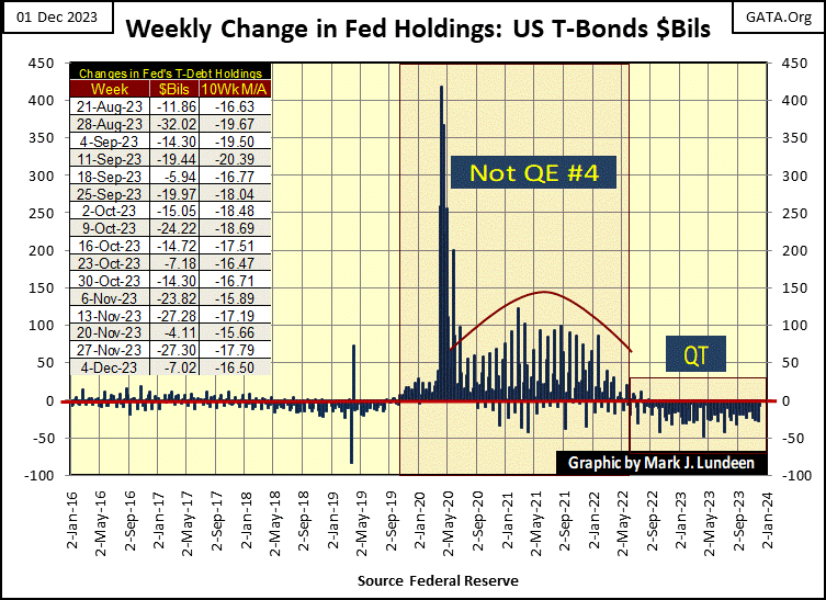
It is what it is. But what it is, it isn’t right. Meaning; the FOMC tells us they are still draining liquidity from the system with a QT they began in May 2022, as seen in the chart above. I don’t know how, but behind the scenes, I believe the idiots are somehow, someway doing something completely different; like supplying the booze and dancing girls for the party on Wall Street.
The party isn’t happening just in the stock market. Look at the 30yr T-bond below, a T-bond issued in February 2020. Since the end of October, “liquidity” has been flowing into the bond market too, enough to drop the yield for this bond by 67 basis points, and drive its valuation up 12.9%.
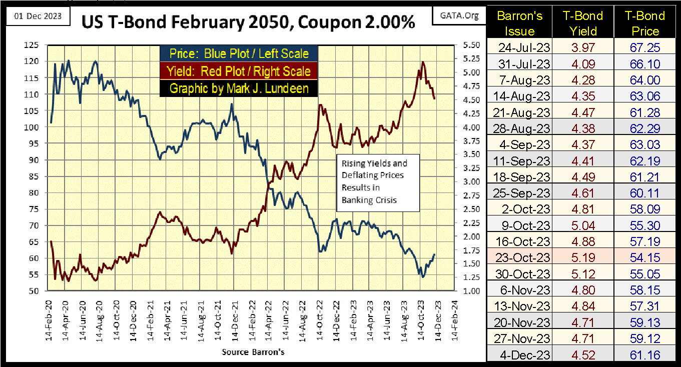
That isn’t a bad gain for a T-bond in only six weeks. But the big spenders in Washington are having massive deficits, which will only add supply to the Treasury Market, that at some point will overwhelm the market’s demand for Uncle Sam’s IOUs trading there.
This brings to my mind a quote from Barron’s World at Work in their 02 January 1950 issue, seen below.
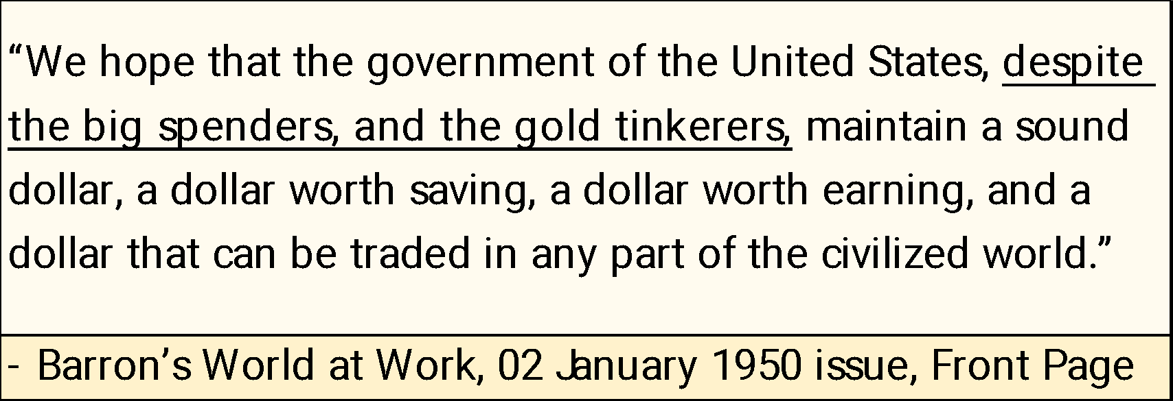
Seventy-three years later, we can now answer this question posed so long ago in Barron’s, and the answer is; nope. The big spenders and gold tinkerers have totally trashed the US dollar, and there is nowhere for formerly almighty buck to go, but down. Not that in 2023, anyone would hear anything about that in the financial media. It would be “irresponsible” for them to mention it, if in fact they were even aware of the plight of the dollar, a situation I suspect many “market experts” remain ignorant of.
The dollar’s demise won’t be good for bonds or stocks. On the dollar’s continuing decline to the infernal regions, there will be good weeks and months for stocks and bonds. But make no mistake about it; Elvis has left the building, and he won’t be coming back any time soon.
Not that Wall Street cares about that, not when the Dow Jones made a new 52Wk High on Friday’s close, chart below.
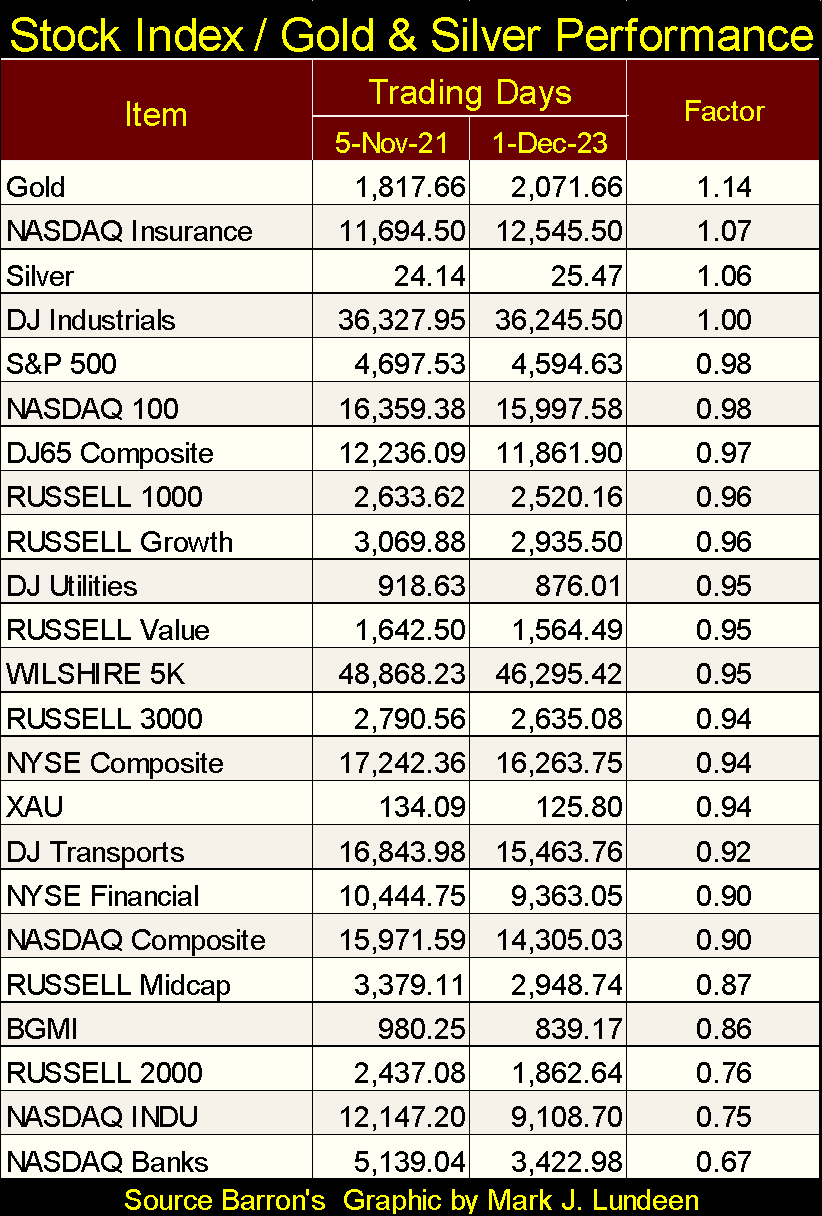
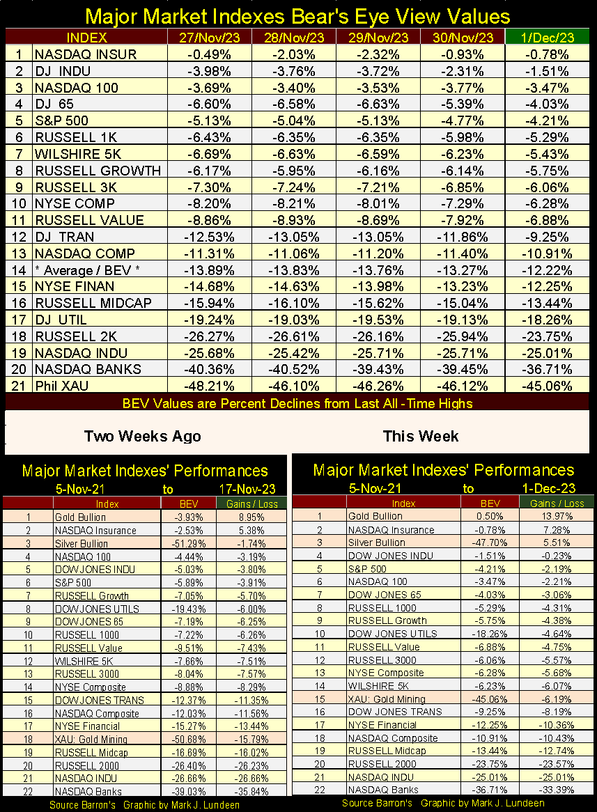
Here are the BEV values for the major market indexes I follow (Second table below). Bear’s Eye View (BEV) format expresses market valuation in percentage terms, with 0.00% being a new all-time high, and a -100% being a total wipeout in valuation. Converting the dollar valuations of these indexes below into percentage BEV terms, allow us to accurately compare one index’s performance with another, via all-time highs, and percentage declines from their all-time highs.
That is something that can’t be done when looking at these indexes in dollar terms, as obvious in the table below. If I didn’t provide a factor, dividing the value from December 2023 by the value for November 2021, the values for these indexes would have no connection with one to another.
It’s been a long time, but still no BEV Zeros (new all-time highs / 0.00%) this week in the table below, though the top five indexes closed the week in scoring position. I’m expecting we’ll see a growing number of 0.00% in this table in the weeks to come, not that seeing more all-time highs in the table below would make me bullish on the stock market.
In a big-bull market, and this big-bull began in August 1982, buying at the top always feels right, until Mr Bear shows you the error of your ways. Awe Mark, you’ve been saying that for years now. So, where is your big bad Mr Bear? Oh, he’s hanging around somewhere, exactly where I don’t know. But he’s thinking about all the bulls now running wild and free on Wall Street. We can be sure of that.
Moving on to the performance tables above, gold remains at the #1 position, and silver at #3. The XAU has shown some strength these past two weeks. If this move in gold and silver is for real, it won’t take the XAU at #15, long before it catches up with gold and silver, and maybe even take the #1 position in the table above.
Moving on to commodities in their BEV table (two graphics below), we’re looking at how far, in percentage terms, each commodity closed from their last weekly, all-time high. Weekly, when compared to daily all-time highs are not always the same. However, this week for gold they were, as gold closed at a new all-time high on a weekly and daily basis, and I suspect also on a monthly basis. It’s only a matter of time before silver and the XAU also close at a new all-time high. Though with silver closing the week with a BEV of -47.70%, and the XAU with a BEV of -45.06%, both would need about a double before they too see their new all-time highs.
Cocoa has seen BEV Zeros (0.00% / New All-Time Highs) at the close of the past five weeks, with orange juice closing at new all-time highs twice in the past five weeks. But everything else at this week’s close, were in BEV values of double-digits, by -20% and some by much more.
The energy complex items (#11, 12, 15 & 20) are all down by over 40% from their weekly all-time highs, with natural gas (#20) down over 80% from its last all-time high. Natural gas isn’t the only volatile component of the energy complex. As seen in the chart below, during the sub-prime mortgage credit crisis, crude oil collapsed by 74% in * ONLY FIVE MONTHS *, from July to December 2008. There was also the eighteen months, 69% collapse in crude oil prices from June 2014 to January 2016.
The price of crude oil, during the last two decades of the 20 th century, was stable, oscillating above and below $20 a barrel. Then came the 21 st century, a time of great financial upheaval, and the price of crude became just as volatile as NASDAQ’s glamor issues or real-estate.
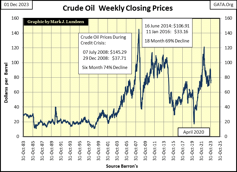
How much these collapses in the price for crude oil were from falling demand for energy during a financial crisis, or manhandled down by the “policy makers” to manage the market and “stimulate” the economy, I can’t say. But I note how during the March 2020 flash crash, crude oil collapsed from over $60 a barrel in November 2019, to below $20 in April 2020, in only five months.
Looking at the rest of the commodities in the table below, at this week’s close they are for the most part far from their last all-time highs, yet my cost-of-living expenses are all up significantly. How does that work?
Except for energy and the metals, which are produced by large corporations, the agricultural items are produced by farmers, who I’m assuming are also struggling with the same CPI inflation I am. As seen below, for the most part the farmers are not benefitting from rising prices, and that seems odd to me.
Maybe I shouldn’t be surprised. Since agriculture began, some say over 10,000 years ago in the fertile crescent, spanning from Egypt to Mesopotamia , farmers have always been the target of organized gangs, gangsters that eventually became governments, and central bankers.
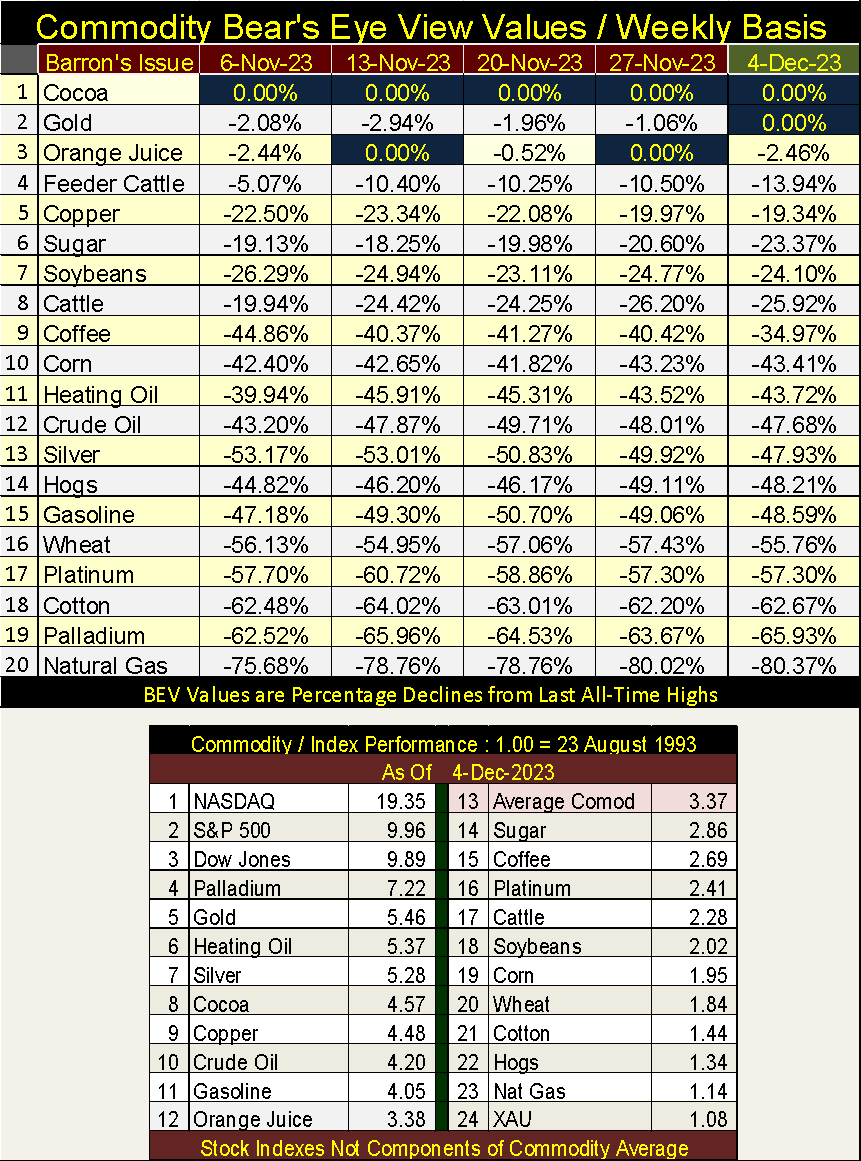
Looking at the performance table above, since August 1993, the major stock indexes remain the top performers at #1-3. The exception to that is of course the XAU at #24. The next best performing groups are the metals and then energy, going down to #11 in the table. Agricultural items (#17 to 22), food produced by American farmers, are for the most part little changed since August 1993, and that isn’t good; for the farmers or for you and me.
One looks at this data going back thirty years, and one wonders why food prices are now so high. Don’t blame the farmers for rising food prices at the supermarkets, they too are being squeezed.
Look at the charts for copper and wheat below. Since 1957 copper prices have risen nicely. Nowhere near the inflated price gains seen in the Dow Jones, but copper prices are up significantly, and the major copper miners are most likely profitable.
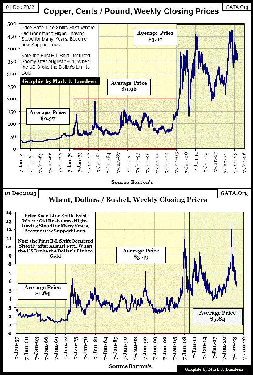
Compare copper prices with wheat in the chart above. Wheat prices are up too since 1957, but closed this week at prices seen in the early 1970s. When considering the price inflation for everything farmers must deal with;
- Farm land,
- Farm equipment
- Diesel fuel,
- Fertilizer,
I have to take my hat off in salute to any farmer in the American Mid-West, still in business in 2023.
Let’s move on to gold’s BEV chart. It’s been over three years since gold last made a new all-time high, with two close calls, one in March 2022, and another in May 2023. But this week on December 1 st 2023, gold once again closed at a new all-time high (BEV Zero / 0.00%) in its BEV chart below.
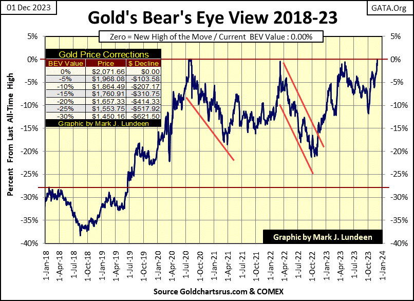
Below is gold indexed to 1.00 = 02 January 1969 (Red Plot). Looking at chart formation #2, it was only a matter of time with such a powerful technical pattern, for gold to take out its highs of August 2020.
But something I note in the chart below, and above, since its last all-time high of August 2011, when gold does make a new all-time high, it’s followed by many days, weeks and months where gold isn’t making new all-time highs. In other words; following any new all-time high, the gold market becomes a hit and run operation, with no follow through in the advance.
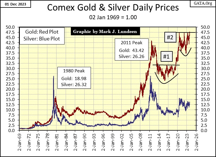
Is that what is going to happen again this time? I sure hope not! If this advance in gold is for real, in the weeks to come we should see gold pushing upwards, soon closing well over 2100, and I’ll have to adjust the upper limit of my X-axis in the chart above to 55 or even 60.
Today (Friday), I spent two hours listening to CNBC, to see if someone bothered to comment on gold making a new all-time high. Maybe someone did, but for the two hours I listened, I didn’t hear anyone say anything about gold, silver, or the mining shares.
What I did hear discussed on CNBC was what the Federal Reserve was going to do to keep the market advancing, and the idiots pending move to lower interest rates. Then there was the COP-28 Global Warming Conference happening in Dubai, contemporary “market experts” absolutely must keep current on that. There were other financial items too, but in the main, it was all fluff and nonsense being covered on CNBC.
These people, and their viewers are refusing to deal with reality. The US national debt increased to above $33-trillion dollars in Barron’s 25 September 2023 issue. It’s increased by $879-billion in the past ten weeks, and looks to soon be something above $34-trillion sometime in the next month or two. This is freaking me out. But the mainstream “market experts” don’t seem to notice, or even care much about the pending national bankruptcy of the United States of America.
One of these days, Mr Bear is going to come back, and I predict you won’t need me to tell you exactly when that day will be, when it arrives.
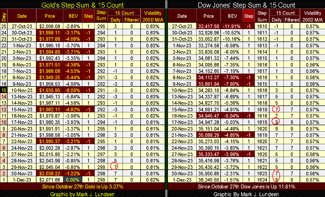
Looking at gold’s side of the step sum table below, once again the gold market is seeing more daily advances than declines, and gold is taking full advantage of all the daily gains seen below. Note the BEV Zero for December 1 st , highlighted in blue and gold.
I’m still a bit surprised that gold is at new all-time highs with its daily volatility’s 200D M/A so low. It’s just a fact that gold is a volatile market, whether gold is going up in a bull market or down in a bear market. It seems obvious that gold is now in a bull market, so where are all its days of extreme volatility, days where gold moves up or down 3%, or more, from a previous day’s close?
So far in 2023, gold has seen only two days of extreme volatility, one last March, the other in October. Seeing gold advance to new all-time highs in a boring market, such as 2023 has so far proved to be, is unusual.
Maybe the key to the gold’s low volatility, is the low daily volatility in the Dow Jones, which this week closed at 0.57%. Low volatility for the Dow Jones is * ALWAYS BULLISH * for the stock market, which make people, and the money they’ve invested in the stock market happy and contented.
But when the Dow Jones begins to see its days of extreme volatility, days the Dow Jones moves up or down by 2%, or more, from a previous day’s close, people are no longer happy and content with their money in the stock market, as rising daily volatility is *ALWAYS BEARISH * for the stock market.
With daily volatility rising in the stock market, capital begins fleeing from Wall Street, with some of these refugee dollars finding their way into the gold and silver markets, with a big impact on the old monetary metals’ valuation.
I haven’t updated these charts below, but nothing has changed since October 13 th , so I’m going with them as is. The top chart plots each day of extreme volatility since January 1969, which there has been 442 of them;
- 219 positive 3% days
- 223 negative 3% days
Note during the sub-prime mortgage crisis of 2007-09, gold saw daily advances of over 8% from one day to the next. In 1980, one day gold advanced over 13% from one day to the next. But that happened during the first few months of gold’s 1980 to 2021 bear market. So, seeing huge daily gains isn’t always bullish.
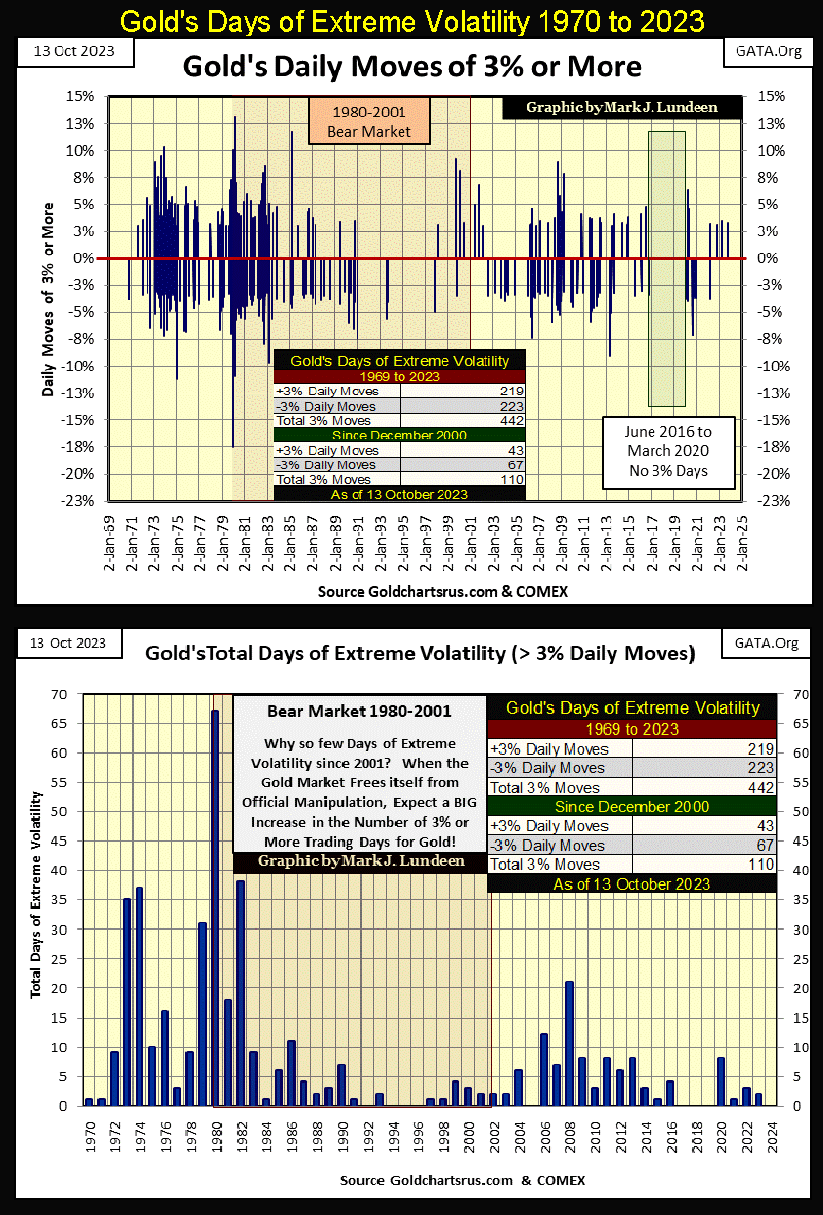
The bottom chart plots total 3% days, positive and negative, for each year since 1970. In 2024, if gold is really going to make a big run up in valuation, I’m expecting we’ll see its 3% days begin to stack up to something above 10 in the next year.
In a buying panic, as were seen in the late 1970s in the above chart, seeing over 30, or two or three days of extreme volatility for gold (3% days) per month can be expected. And that would be something CNBC would have to cover. The biggest stack of 3% days for gold was in 1980, with 67 days of extreme volatility. But 1980 was a very bearish year for gold, so rising volatility for gold isn’t always bullish.
__
(Featured image by Jingming Pan via Unsplash)
DISCLAIMER: This article was written by a third party contributor and does not reflect the opinion of Born2Invest, its management, staff or its associates. Please review our disclaimer for more information.
This article may include forward-looking statements. These forward-looking statements generally are identified by the words “believe,” “project,” “estimate,” “become,” “plan,” “will,” and similar expressions. These forward-looking statements involve known and unknown risks as well as uncertainties, including those discussed in the following cautionary statements and elsewhere in this article and on this site. Although the Company may believe that its expectations are based on reasonable assumptions, the actual results that the Company may achieve may differ materially from any forward-looking statements, which reflect the opinions of the management of the Company only as of the date hereof. Additionally, please make sure to read these important disclosures.


Cannabis Regulation in Germany and Switzerland Shows Early Benefits of Legalization Models
Germany and Switzerland’s cannabis reforms suggest regulated access can reduce criminalization without increasing consumption. Germany saw fewer cannabis-related prosecutions, while...


Insight Foto Festival Launches €4,500 Crowdfunding Campaign to Support 2026 Edition
Insight Foto Festival in Varese has launched a €4,500 crowdfunding campaign to sustain its free 2026 edition. Organized by Gattabuia...


Vexuvo Secures €39M UniCredit Financing to Drive Agrivoltaic and Storage Expansion in Italy
UniCredit has provided €39.3 million financing to vexuvo to support four agrivoltaic plants totaling about 33 MW across Italy, advancing...


Alzheimer’s Study Reveals Immune Pathway Behind Women’s Higher Vulnerability and Potential New Treatment Approach
A CSIC-UMH study identifies heightened interferon signaling as a key factor in women’s greater Alzheimer’s vulnerability. Analysis of human brain...

Bitcoin Rally Faces Tests from Fed, ETFs, and Market Fear
Bitcoin rebounds above $64,000 after a short squeeze and whale accumulation, but remains far below its record high amid cautious...
 |
|
 |  |
 |
|
-

 Markets1 week ago
Rice Prices Rise as Supply Outlook Tightens and Demand Stays Mixed
-

 Biotech6 days ago
BIP Sells BIC Incubator to Innova, Refocuses on Core Innovation Areas
-
 Markets1 week ago
Markets on Borrowed Time Amid Economic Cracks and Global Uncertainty
-

 Fintech2 days ago
Robinhood Chain Surges with Rapid Adoption and Billion-Dollar Trading Volume