Featured
How January can predict stock markets
The New Year has started off with a bang with some volatile moves this past week for oil and gold in particular and new all-time highs once again for the stock markets. All this despite the threat of war, impeachment, slowing economies and massive debt. January is a leader month in many ways as there is the “January Barometer”. We look at what it is, its remarkable performance, and more.

January; the barometer for the market. It does sound a bit “hocus pocus,” but there really is a January barometer. The January barometer was devised by Yale Hirsch, the founder and publisher of the Stock Trader’s Almanac in 1972. The January barometer states that as the S&P 500 goes in January, so goes the year. Since 1950, the barometer has an incredible 85.5% accuracy ratio with only 10 significant errors. Vietnam impacted 1966 and 1968; 1982 saw the start of a major bull market in August; two January rate cuts and 9/11 affected 2001; anticipation of war against Iraq pressured January 2003; 2009 saw the start of the current bull market; QE2 saved 2010; QE3 appears to have saved 2014; fears of slowdown impacted January 2016; trade tensions blew up January 2018. Interesting that of the 10 errors, five of them have occurred since 2009. Could the barometer be changing?
There is also what is known as the “Early Warning System.” January’s first five days act as an early warning. This is not as good as the January barometer, but it’s still interesting. The record is as follows: since 1950 there have been 44 up first five days and 25 down first five days. Of the 44 up, the year ended up 36 times for an 81.8% accuracy ratio. Of the 25 down days, the accuracy ratio was not as good as only 11 ended the year down and 14 up for a 44.0% accuracy ratio. Well, the first five days of 2020 are in and the S&P 500 was up 0.7%—so, it looks like 2020 is shaping up to be a good year. Okay, past performance is no guarantee of the future. Of the eight exceptions, three—1994, 2011, and 2015—were relatively flat, three were related to war years—1966, 1973, and 1990—while the final two were 2002 and 2018. Given that 2020 started off with a potential war, could this end up being a war year?
A final note on the January phenomena is what happens in presidential election years. For the “Early Warning System” there were 17 presidential election years. Of the 17, 14 followed the direction of the first five days. The three exceptions were 1956, 1988, and 2016. For the January barometer, the record wasn’t quite as good with only 12 of the 17 years following the direction of January in presidential election years. The five exceptions were 1956, 1968, 1984, 1992, and 2016.
Given the year started off with a bang and the threat of war, we wondered what the record was like during war years. As we saw, the threat of war and what actually happened drew two different responses. The threat of war in 2020 saw stocks plummet, gold leap over $1,600, and oil jump to about $66. But if you had left for a few days and came back, you would have wondered what the fuss was all about. At the height, it was if WW3 really was about start. But then, all of sudden, “all is well”—at least for the moment. The result is, the stock market says “back to normal: buy, buy, buy.” Gold and oil fell back to earth. Oh, and the stock market soared to new all-time highs. So much for any thoughts of a top. Instead, we had the leaders of two countries trolling each other.
War tends to be good for stock markets, but often not initially. World War I triggered a shutdown in global stock markets. From July 31, 2014 to December 15, 2014 the NYSE was closed. When it opened again for trading, it basically picked up where it left off. Before July 31, the market had been falling since the assassination of Archduke Ferdinand in June 1914. By February 1915, the market had found a bottom and then took off on an unparalleled bull market that didn’t top until November 1916 for a gain of 110%. War is good for business. The market did go into a tailspin when the U.S. entered the war and promptly lost 40% into December 1917. But as the war wound down and it appeared the Allies would win, the market started to climb again. Overall, the market gained over 40% during World War I.
World War II wasn’t a lot different. The market had been recovering from the 1937–1938 stock market crash when hostilities broke out in September 1939. Things initially did not go well. The German blitzkrieg of 1940 sparked a sharp sell-off and, with the U.S. entering the war in December 1941, the downdraft continued until April 1942. The decisive U.S. victory at Midway in June 1942 sparked the recovery and the market kept climbing until a peak in November 1945. The final peak of that bull-run came in May 1946. From September 1939 at the outbreak of hostilities to August 1945 when Japan surrendered, the Dow Jones Industrials (DJI) gained just over 14%. But that included the big drop into 1942. From the 1942 bottom to the top in 1946 the DJI was up about 129%.
The Korean War (1950–1953) barely caused a ripple in the stock market. Hostilities broke out in June 1950 and the armistice was signed in July 1953. The DJI gained 31.7% during that period. The market had peaked in December 1952 and July 1953 marked the start of the 1953–1954 recession, one that was actually short-lived and shallow. The post-World War II recovery was well on its way and the Korean War never garnered the same attention that World War II did.
Vietnam (1965–1975) was a long, dragged-out affair. The U.S. was actually involved before, starting way back in 1955, but it wasn’t until the mid-sixties that it was ramped up. The Gulf of Tonkin incident in August 1964 helped trigger the ramp-up of U.S. involvement in Vietnam. Major bombing was underway by February–March 1965. President Nixon signed the Paris Peace Accords in January 1973, ending direct U.S. involvement in Vietnam, but it wasn’t until the fall of Saigon in April 1975 that the U.S. completely ended its involvement. From February 1965 to January 1973 the DJI was only up 10.6%. But if we use April 1975 as the end of U.S. involvement, the DJI actually lost just over 9%. It was the inflationary 70s with the Vietnam War contributing considerably to the inflation. The stock market topped in January 1966 and after a series of ups and downs sparked by the Watergate crisis and the Arab oil embargo, the market made its final bottom in December 1974 as it lost 45% from the high in January 1973. The Vietnam War was not friendly to stock markets, but oil and gold did well.
The current war on terror has been going on since September 2001, a period of just over 18 years. It has become an endless war. Before that there was the short-lived Gulf war that lasted from August 1990 to February 1991. The outbreak of hostilities in August 1990 contributed to a sharp drop in the stock market and the eventual recession that followed. The stock market in the end gained roughly 11% from August 1990 to February 1991. The current long war on terror that includes the invasion of Iraq in 2003 the war against ISIS and others has become known as a never-ending war. The current iteration with Iran is merely an extension of it. That is the kind of war that prevailed during medieval times. The Thirty Years’ War (1618–1648) comes to mind.
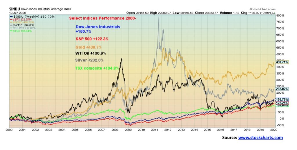
For the stock markets, the period has included the high-tech/dot.com bust of 2000–2002 and the global financial crisis of 2007–2009. As we have so often noted, only a massive financial rescue of QE1, 2, and 3, along with historically low interest rates and the biggest borrowing binge ever recorded, have kept the stock markets in positive territory. Since 2000, the DJI has gained just over 152%. But the gains were all made since 2009 as before that the returns were negative. The big winner through this period has been gold—up 439% since the beginning of the century. And that is despite the difficulties for the metal since the peak in September 2011.
The January barometer and the early warning system, all against the backdrop of potential war, should keep us guessing going forward.
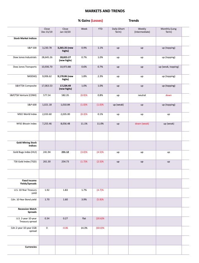
Who cares about missiles, oil turmoil, impeachment, divisive elections, assassinations or the threat of war as the stock market remains buy, buy, buy! The S&P 500 continued its winning ways this past week with another record high close. It is becoming a broken record—new high, new high, new high—also, who cares about overbought? The RSI hovered over 70 into late December 2019. It’s eased somewhat, currently about 68. The S&P 500 wasn’t the only one making new all-time highs. The S&P 500 gained 0.9% on the week, but joining the S&P 500 making new highs was the Dow Jones Industrials (DJI), up 0.7% and the NASDAQ, up 1.8%, led by a surging Apple (AAPL). APPL wasn’t the only FAANG making new highs as Facebook (FB) and Google (GOOG) did as well. Netflix (NFLX) and Amazon (AMZN) did not. Other indices joining the party included the NYSE Composite, the Dow Jones Composite (DJC), the S&P 100 (OEX), the NASDAQ 100, and the Wilshire 5000. Not joining the party included the Dow Jones Transportations (DJT), up 0.6% this week, along with the AMEX, the Dow Jones Utilities (DJU), the Value Line Index, the S&P 400 (mid-cap) and the S&P 600 (small cap).
Outside the U.S. the TSX Composite made new all-time highs, gaining 1.0% on the week. The TSX Venture Exchange (CDNX) is not even close to its all-time highs and lost 0.9% on the week. In the EU, the London FTSE was up 0.5% but did not make new all-time highs. However, the Paris CAC 40 did, even as it fell 0.1% and the German DAX did as well with a gain of 2.0%. In Asia, China’s Shanghai Index (SSEC) gained 0.3% and looks to go higher while Japan’s Tokyo Nikkei Dow (TKN) was up 0.4%.
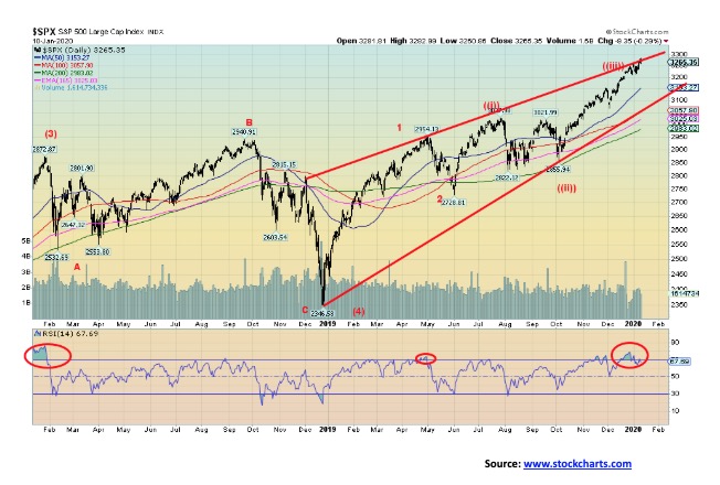
While the new all-time highs are great, we remain concerned that indices like the DJT are not confirming the highs. They should all be making new all-time highs. When they are not, something is usually amiss. We note the divergence between the S&P 500 and the S&P 600 below. We appear now to be right at the top of the channel of what might be an ascending wedge triangle. That remains to be seen, of course, but we would be hard-pressed to think that the coming week might be positive. The run since that low in October appears to us as a classic bubble move. A good comparison might be between the NASDAQ today and the NASDAQ of 20-odd years ago. Well, the comparison is weak in terms of the rise, but significant in terms of timing. In October 1999, a huge final rally got under way. From October 18, 1999 to January 24, 2000 the NASDAQ gained 52% and to the final high on March 10, 2000 the gain was 90%. Today, with the rise from the low on October 3, 2019 to date the NASDAQ is up a modest 18%. So, no comparison? Direction-wise yes; in terms of the actual gain, no. But one thing in common is very high bullish sentiment that nothing is going to stop this market.
The first break point for the S&P 500 is at 3,200 and the second is at 3,000. A break under 2,950 could be the start of a bear market. Friday saw an outside reversal day—meaning the high was higher than the previous day’s high, the low was lower than the previous day’s low, and the market closed below the previous day’s low. Given we were making all-time highs on Friday when this reversal occurred, it may be that it is a key reversal. Unfortunately, we can only confirm key reversals in hindsight—meaning we need further evidence and we have to break down under key points noted above. Follow-through to the downside will be important this week if the reversal is right. And of course, no new highs above 3,283.
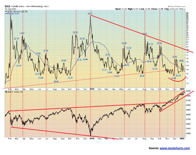
When we hit significant tops, we look for divergences between indicators and the indices. The major indices may be ignoring missile strikes, oil market turmoil, and high bullish sentiment but bearish divergences do appear. One of them is seen with the VIX Volatility Indicator which is not making new lows even as the S&P 500 makes new highs. No, it does not indicate a top in the offing. The NYSE advance-decline continues to steam ahead as if nothing is amiss and the McLellan Summation Index (RASI) has jumped back into positive territory, so both of them are signalling that all is well. But some indicators are trying to tell us another story. The VIX is one of them. Sentiment indicators are also quite high with the S&P 500 Bullish Percent Index at 80%, a level often associated with tops. As well, the put/call ratio overwhelmingly supports calls over puts, suggesting that there are few bears around. The VIX is merely one of a number of indicators. It is suggesting caution even as we march higher.
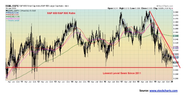
In a bull market, the small cap stocks tend to outperform the large caps. In a bear market, it is the other way around. But the S&P 600/S&P 500 ratio peaked way back in June–September 2018. Since then it has been falling, indicating that the large cap (S&P 500) is outperforming the small cap (S&P 600). That is what one would have expected in the latter part of 2018 when the trade wars’ mini-bear fell into a sharp low in December 2018. Since the market has largely been on a tear in 2019, one would have expected the small caps to lead the way—but, not so fast. Despite the S&P 500 being at record levels, the S&P 600 remains well off its all-time highs seen in August 2018. The ratio is at the lowest level seen since 2011. Back then, both the 500 and 600 were falling as the EU/Greek debt crisis was underway. We view this ratio as a sign that something is amiss and the S&P 500’s lofty heights are not sustainable.
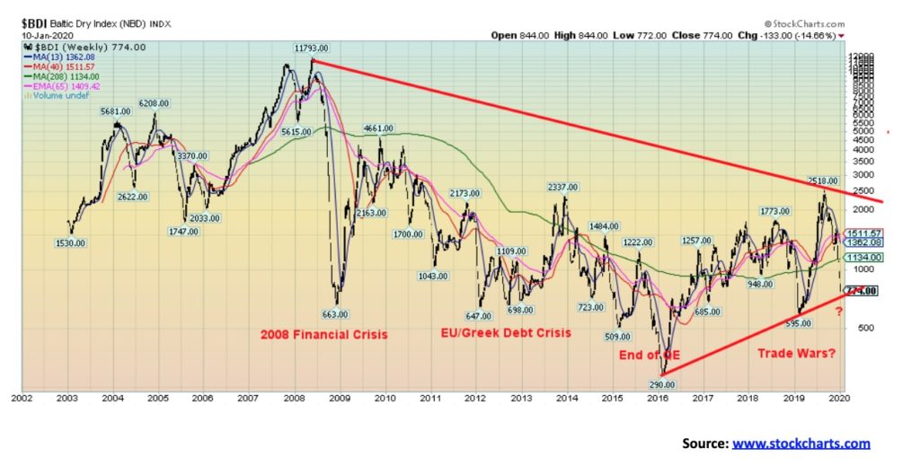
The U.S. and China may be signing their first phase of a new trade deal, but the Baltic Dry Index (BDI) has been falling sharply since peaking back in September. Since then, the index has fallen 69%. The Baltic Dry Index is a proxy for dry dock shipping stocks and general shipping so it is reflective of global trade. A falling BDI indicates a slowing of global trade. Note that all the previous declines coincided with various crises and also coincidently with a decline in the stock market even if it was delayed. The stock market may be rising, but the BDI is telling us that it may not be rising for much longer.
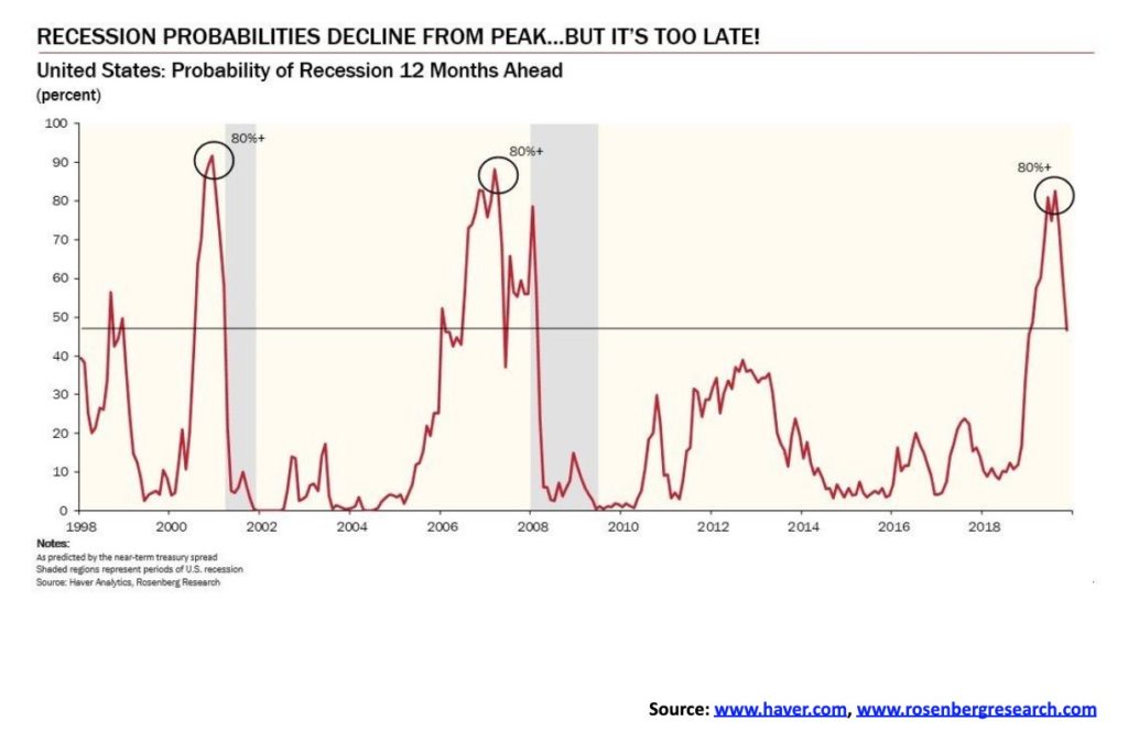
We loved this chart from David Rosenberg, Chief Economist and Strategist of Rosenberg Research and Associates. Mr. Rosenberg tweeted the chart recently @EconoguyRosie. Mr. Rosenberg defines this chart as a modified NY Fed Model. The model has receded sharply from the 80%+ level seen in the summer 2019. It is now sub 50%. All of this increases the odds that a recession could come sooner rather than later.
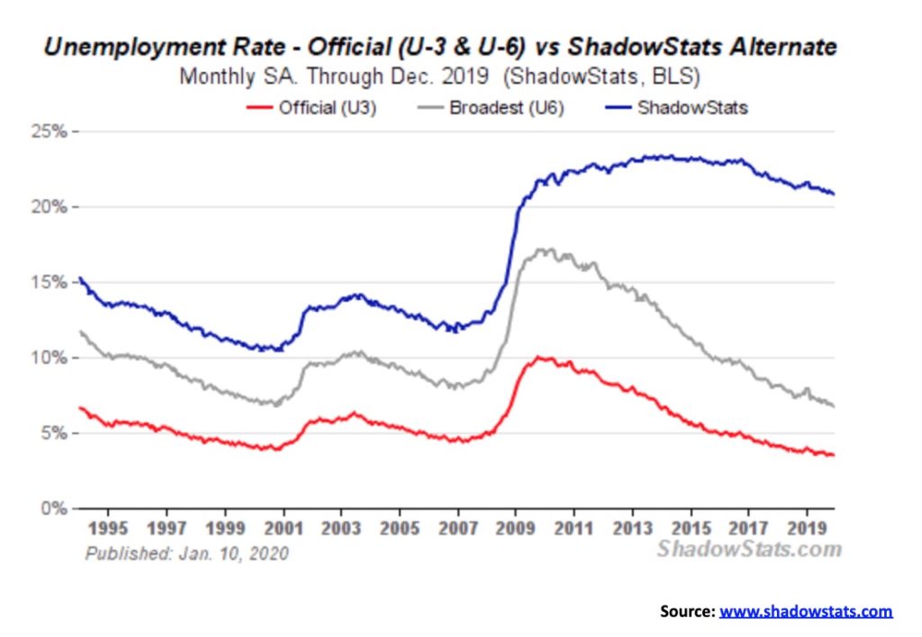
It’s that time of month and the U.S. job numbers are out. The nonfarm payrolls for December saw a gain of 145,000 vs. a gain of 256,000 in November. It was expected the number would drop because much of the November number was seasonal. The market, however, did expect a gain of 165,000 so it was a small disappointment. Most of the job gains were in the services sector. Manufacturing employment fell 12,000. The unemployment rate (U3) was 3.5% vs. 3.54%, the U6 unemployment rate (U3 + discouraged workers unemployed less than one year + marginally attached workers seeking full time) was 6.72% vs. 6.85%. The Shadow Stats unemployment rate was 20.8% vs. 20.9% (Shadow Stats is U6 + discouraged workers unemployed over one year and defined out of the labour force in 1994).
The civilian participation rate was unchanged at 63.2%, as was the civilian population-employment ratio of 61%. Of the 145,000 jobs created, 243,000 were in the private sector while the public sector lost 98,000. The official unemployed was 5.8 million, the same as the previous month. The actual unemployed is 10.6 million. The labour force size remained largely unchanged at 164.6 million. Not in labour force was also largely unchanged at 95.6 million. Of that, 54.2 million are retirees and 10.0 million are disabled. Numbers show that 36.7 million live in poverty and 28.2 million are without health insurance. Wage growth this past year was 2.9%, a level below expectations as the previous month was 3.1%. It’s the slowest wage growth in 18 months. 27 million are part-time workers—some 17% of the workforce.
While the U.S. services sector remains robust, the manufacturing sector has been declining for months. The outlook for 2020 is slower growth, but the U.S. is forecast to lead the G7 as the EU and the U.K. remain moribund, Canada is slowing, and Japan never picked up. Trade will again dominate as most agree that while the U.S. and China are signing a first phase this coming week it is largely non-effective. Numbers show that U.S. consumers and farmers have been paying a price for Trump’s trade wars. China is also negatively impacted as exports have slowed.
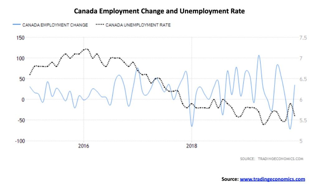
Canada bounced back from November’s poor job numbers with a gain in December of 32,500 jobs. This helped erase the sharp drop in November of 71,200 jobs. The unemployment rate yo-yoed back down to 5.6% after leaping to 5.9% the previous month. The participation rate remained largely unchanged at 65.6%, a level higher than the U.S. That helps explain why Canada’s unemployment rate is higher than the U.S.’s, because the more people participating helps raise the unemployment rate. Of the jobs created, 38,400 were full-time while part-time fell 5,900. However, the bulk of the jobs were in accommodation and food services, suggesting they were not high-paying jobs. Most of the jobs added were in Ontario and Quebec, with other provinces suffering losses. Some 200,000 jobs have been created in 2019, some 80% full-time. Canada’s unemployment rate has been on a downward trajectory for the past three years. However, the rate of growth for employment is slowing and potentially bodes poorly going into 2020.
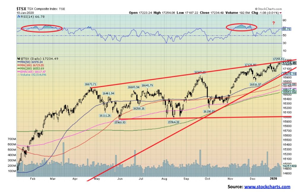
As with the U.S. indices the TSX Composite made new all-time highs this past week. It was a laboured new high as divergences are appearing on the charts between the price action and the indicators. The TSX Composite is also at the top of what may be an ascending wedge triangle. The breakdown point is roughly coinciding with the 50-day MA. A breakdown under 16,900 would most likely send the TSX down to test the still rising 200-day MA near 16,550. Under that level and especially under 15,950 a bear market could get underway.
The TSX gained a healthy 19.1% in 2019. However, when looking at the sub-indices the story is more mixed with some sub-indices performing very well while others performed poorly. Leading the way in 2019 was Information Technology and Telecommunications both up a robust 60.2%. At the other end Health Care was down 11.1% while Energy gained but only 5.9%. Using the old theory of “Dogs of the Dow” one might consider looking at Health Care and Energy stocks for 2020 while being very cautious on Info Tech and Telecommunications. Some sectors just kept on rising right into year end. Besides Info Tech both Utilities (up 31.6% in 2019) and Industrials (up 24.7% in 2019) were also rising making new all-time highs as we swung into 2020. Other sectors seem to be forming distribution tops so some caution is advised for Income Trusts (+23.7%), Consumer Discretionary (+13.6%), Consumer Staples (+11.4%) and Financial Services (+16.9%). Some sectors are rising coming out of bear markets or rising in a steady manner suggesting that more gains are possible. These sectors are Real Estate (+17.4%), Golds (+40.0%), Metals & Mining (+21.7%) and Materials (+22.1%). These sectors may act as a buffer for the TSX Composite although the heavy weighting of Financials could drag the TSX down.
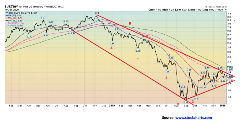
Bond yields continue to wiggle their way higher. Since making a low in September 2019 at 1.47%, the pressure has been to the upside. Rising interest rates are cited as one of the prime reasons the Fed embarked on the repo program. Rising interest rates in a debt-laden world could cause considerable problems; i.e., defaults. We continue to believe that the purpose of the repo program is because of financial problems in the banking system. Our suspicion falls on the EU banking system, led by Deutsche Bank. Still, the repo program has had similar effects as another round of QE, or QE4 as it is being called. Since September 2019 the Fed has added $389.6 billion to its balance sheet bringing it to $4,149.5 billion. At the current rate of add the Fed could add between $1.0 trillion to $1.2 trillion to its balance sheet by August 2020. That’s a lot of funds. The interest rate rise remains intact, but it has been a choppy rise. The U.S. 10-year treasury note does not break out until it is over 2.00%. Then the rise could begin to accelerate. A break back under 1.70% could suggest a test of the September low. A falling U.S. dollar could help push U.S. interest rates higher. While the 10-year might waffle around for a while longer and even test down to 1.70%, we suspect that once that move is finished another rise should get underway.
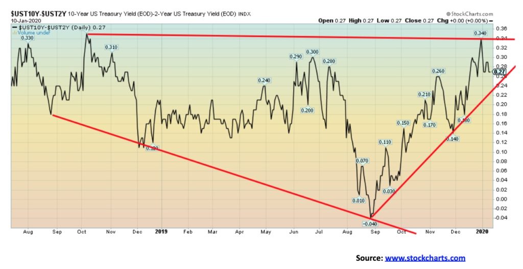
Our closely watched 2–10 spread (U.S. 2-year treasury note less the U.S. 10-year treasury note) was flat on the week at 27 bp. Another spread we watch is the 3-month treasury bill—10-year treasury note spread. It was at 29 bp this past week, also roughly unchanged on the week. The 2–10 spread has been climbing since September when it hit a low of negative 4 bp. The 3M–10 spread hit a low of negative 52 bp at the same time. A negative yield curve is supposed to be a precursor to a recession. However, as we have pointed out, the negative yield curve comes first and then the curve reverts to positive once again. It is when it turns positive once again that the odds of a recession rise the fastest. Could a recession hit this year? The simple answer is yes, but the more complex answer is maybe, maybe not—not this year anyway. But 2021? A shock to the system could swiftly change the picture. A shock would be outbreak of war that causes oil prices to rise sharply or a major default.
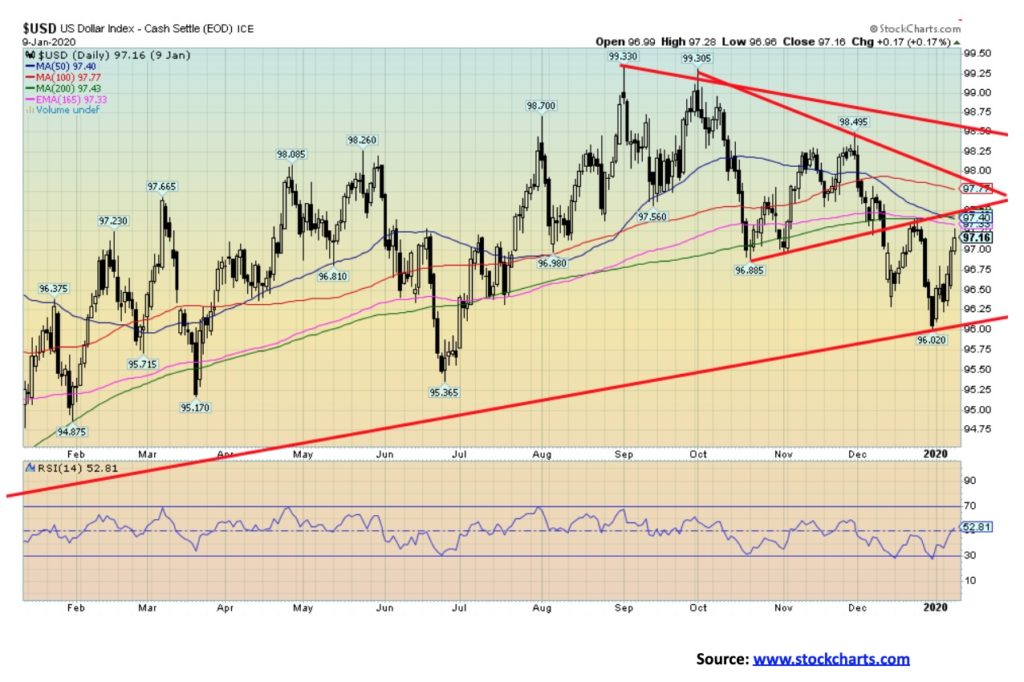
Given all the geopolitical noise in the background this past week, the U.S. dollar acted as a bit of safe haven (gold did better) and rose 0.6% on the week. Major currencies were weaker with the euro down 0.3%, the Swiss franc flat, the U.K. pound sterling down 0.2% and the Japanese yen off a sharp 1.3%. The Canadian dollar fell 0.5%. After breaking down from a triangular pattern back on December 11, 2019, the US$ Index fell to a low of 96.02 before the current rebound got underway. We note what appears to be a 5-wave decline from the high of 98.50 seen at the end of November. If correct, then this is a corrective upward wave that could have a bit more upside to resistance near 97.50. Above 97.50, further gains are possible. A breakdown once again under 96.50 could set up a break of the recent low of 96.02. Further potential is for the US$ Index to fall to the next major level of support near 95. Ultimate targets could be down to 90.
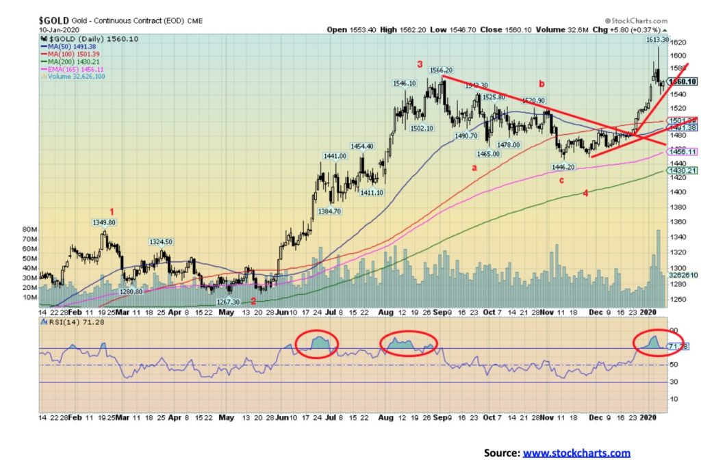
The week’s geopolitical events sent gold soaring to new 52-week highs as it peaked out at $1,613, then fell back to earth when tensions appeared to have eased. Still, it closed higher on the week by 0.5%. Silver by contrast lost a small 0.3%. Platinum was also down, but only a small 0.4%. Palladium soared once again to another record high, closing at $2,072 and gaining 6.0% on the week. It is the first-time palladium has been over $2,000. Palladium is being driven higher by supply shortages. Gold achieved what we considered to be our first target zone of $1,605 this past week. So, in that respect a pullback was somewhat expected. The problem was it achieved the target in overnight trading. A persistent RSI that had reached over 80 suggested that gold was due for at least a technical correction. If this is as we suspect, then gold should hold key levels. It is important to stay above $1,490/$1,500 on any pullback. A breakdown under that level could suggest a move down to $1,450 and lower. A breakdown under $1,425 would be considered potentially terminal. Regaining back above $1,610 would tell us that we are going higher, although we suspect we could get some consolidation here before another assault at higher prices. In following the gold community, forecasts for gold are invariably bullish to super-bullish, although we do read some negative reports, even dire negative ones, with gold falling back below $1,000. That would kill the gold mining market. Given fundamentals we don’t believe that is plausible at this time. Still, it has been only 6–7 months since gold broke out of a multi-year bottom formation over $1,370, so we believe it is unlikely to be over in such a short period of time. We have minimum objectives up to at least $1,725. But we are wary and aware of $1,425 as a line in the sand. The breakout over $1,370, coupled with fresh 52-week highs at $1,613, suggest to us that the current up cycle remains in place. We are well aware that the 23–25-year cycle low is due somewhere around 2023–2024. In the interim, we could see new all-time highs before gold falls into its major cycle low. We have achieved at least minimum objectives for this up cycle; however, given a weakening global economy, the negative geopolitical news, the potential for a major default in a debt laden world, the U.S. impeachment crisis and the looming election, we could be in for a volatile year.
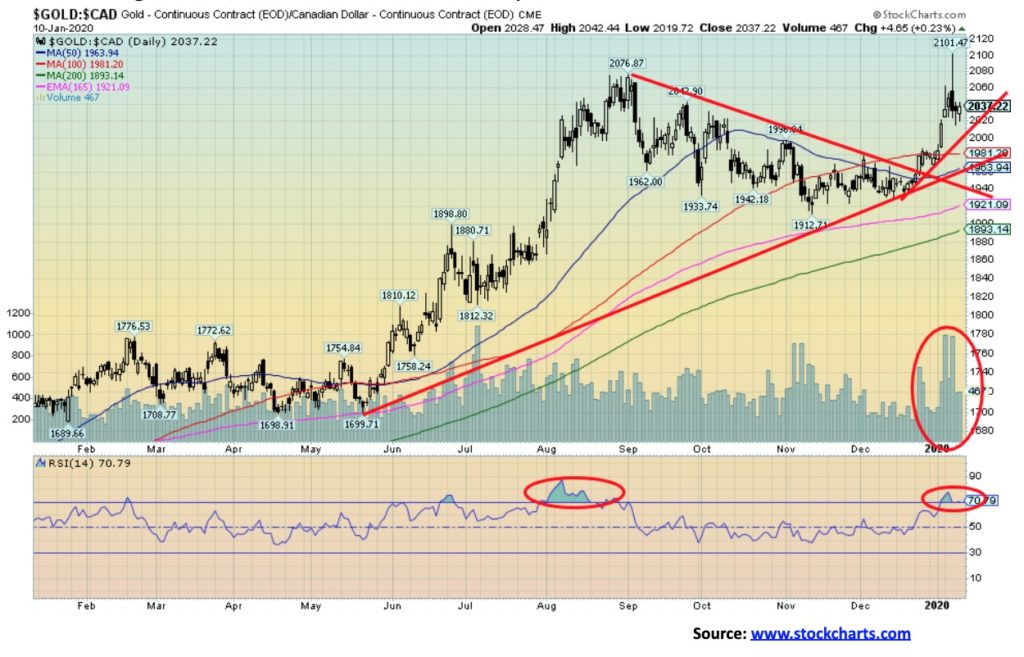
Gold in Canadian dollars gained 1% this past week, hitting new all-time highs in the process. Gold in Cad$ peaked at $2,101, surpassing the high of $2,067 seen back in August 2019. Volume was high. Still, gold in Cad$ closed some $64 off its high in what was a very volatile week. We’d be concerned if gold in Cad$ fell back under $1,960. A breakdown could be underway if gold in Cad$ fell under $1,890. First support comes around $2,020. As we have often noted, gold making new all-time highs in a host of currencies that includes not only Cad$ but also euros, Swiss francs and Japanese yen suggests that at some point gold should also make a new all-time high in U.S. dollars. The U.S. dollar has been high but, as we note, we believe it is in the early throes of a breakdown.
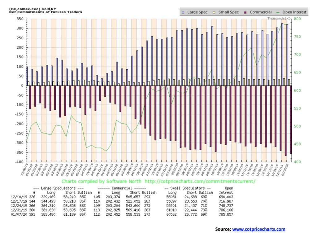
The gold commercial COT improved this past week to 27% from 26%. Short open interest fell by roughly 11,000 contracts while long open interest was flat. The large speculators COT (hedge funds, managed futures, etc.) fell to 86% from 88%. That should help ease some of the bullish speculation but, overall, the commercial COT remains bearish. We are reminded, however, that throughout the rise in gold prices from 2008 to 2011 the commercial COT became increasingly bearish even as the price rose. However, today’s levels are even lower than they were then. We can’t tell whether the drop in short open interest was because they covered shorts on the drop or they covered shorts because the market was going up against them. Maybe a combination of the two.
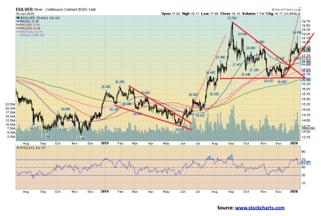
While gold managed to eke out a gain in a wild week, silver did not fare as well and fell by a small 0.3%. Silver broke firmly out of a triangle pattern on Dec 23, 2019 and then promptly put on a gain of almost 10%. The week’s action left silver down 4% from that high. The potential target on the triangle breakout is about $20.50. We haven’t changed our possible forecast on that one. Silver appears to have found support at an uptrend line up from the $16.57 low seen on Dec 6, 2019. A break of $17.75 could suggest further losses down to towards $16.50. The major line in the sand is there at $16.50. We would not want to see silver break that level. On the weekly charts silver is on the cusp of a potential major breakout, one seen earlier by gold but never confirmed by silver. Technically, we need to see new highs above the recent high of $19.75 to confirm the breakout. The breakout has potential measuring implications for silver to reach to $29–$30. But that is premised on silver not breaking back under $16.50 and especially under $16. Silver never got as overbought as gold did at the recent high and that should help it going forward. With a gold/silver ratio of 86, silver remains exceptionally cheap compared to gold. A more reasonable longer-term average since 2000 would be for the ratio to be around 63. If that level prevailed today, silver prices would be closer to $25. The ratio of silver to gold in the earth’s crust is estimated at 17.5:1. In Roman times it was set at 12:1 and when the U.S. was constituted the gold/silver ratio was set by law at 15:1. Not to get silver aficionados too excited, but that would translate into a silver price today of $104.
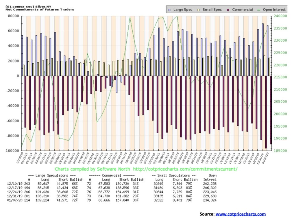
The silver commercial COT improved slightly this past week to 30% from 29%. Considering the kind of week it was, its improvement came as a surprise. Irrespective of this, overall it remains somewhat bearish. Long open interest rose roughly 2,000 contracts while short open interest fell about 4,000 contracts. The large speculators curbed their bullish position to 72% from 74%. The silver commercial COT remains bearish, but the improvement is welcome.
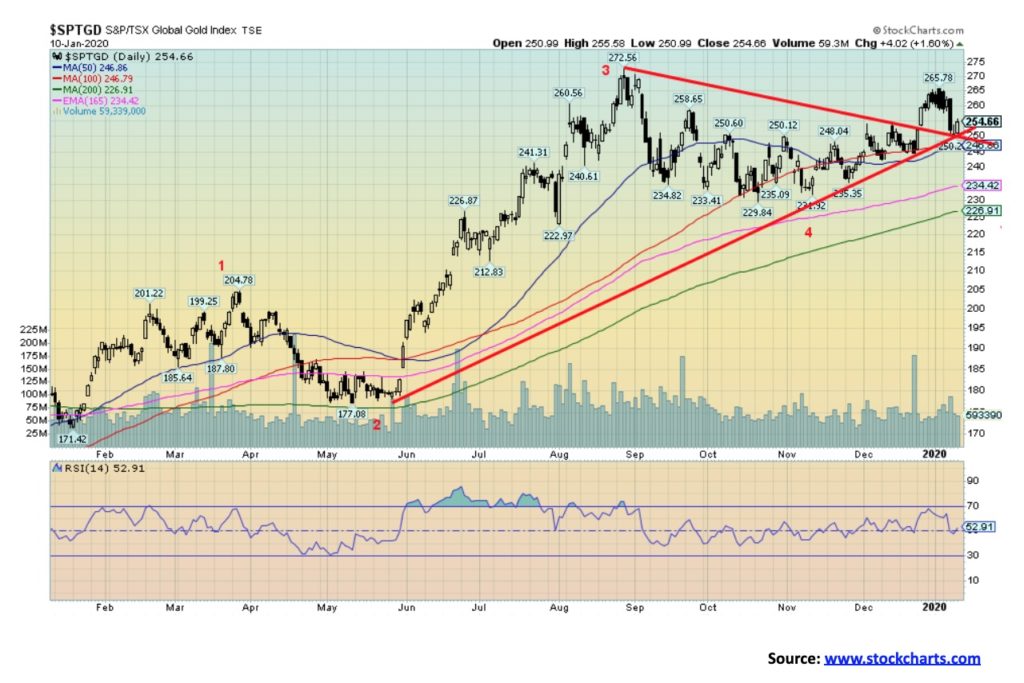
Despite a positive week for gold and only a small decline for silver, the gold stocks failed to respond as a wave of nervous profit taking took hold. The TSX Gold Index (TGD) fell 1.7% on the week while the Gold Bugs Index (HUI) took it even harder down 3.0%. Despite the weakness, we are not discouraged. If the breakout seen back on December 24, 2019 is correct, then this pullback is merely a test of the breakout line. It is noteworthy that the TGD pull right back to the breakout line and also the uptrend line from the lows seen in May 2019. Friday’s rebound after the swift decline on Wednesday came right on schedule in that respect. Follow-through to the upside is important now.
A breakdown under 245 for the TGD would not, however, be positive as it could lead to further declines. Important support comes in at 225 and under that level a bear market could follow. It is noteworthy that volume fell off on the decline this week, suggesting that this was corrective. Sentiment, however, is getting high as the Gold Miners Bullish Percent Index (BPGDM) is currently at a lofty 84 although down from a recent high at 88. That is as high as we have seen it since the index hit a 100 back in July 2016.
The BPGDM has a history of failure between 85 and 95 and hitting a 100 in 2016 was a rarity. It was the highest the index ever reached in its short history since 2008. By contrast the index hit zero in December 2015 and that proved to be the low. Sentiment does play a role and the gold market has a tendency to hit extremes both bullish and bearish. Currently, the index sits in a good place as most indicators are neutral here (RSI a benign 53). Even at the recent top, the indicators were not overly bullish, say, compared to gold itself. Gold stocks remain especially cheap compared to the price of gold and indications are they remain a positive accumulation.
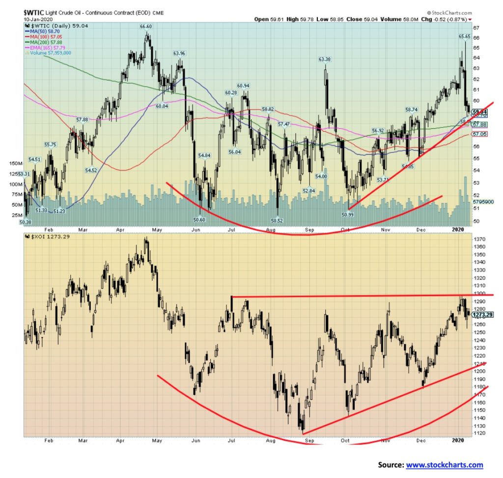
It’s up. No, it’s down. Oil prices went on a wild ride this past week with WTI oil hitting a peak of $65.65 on fears of a huge escalation in the Iran/U.S. conflict. Then, when it appeared that the conflict would end with a whimper rather than a bang, WTI oil collapsed to $59.15. That was all in one day on January 8, 2020. And with that, fear of war subsided and thoughts of a global oil glut returned in its place. Will this last? Not likely. Geopolitical risk premium is more likely to return than disappear.
It is noteworthy that WTI oil fell back to an uptrend line. So, we can say that if WTI oil were to fall through $58, then there could be further losses seen. A breakdown under $57 has the potential to return oil to a bear market. To keep the bull alive, we’d need a return back above $61. That could spark further gains. WTI oil wound up down 6.4% on the week. Quite dramatic considering all that was going on. Natural gas (NG) recouped a little up 3.3% on the week, but overall NG remains in the “dumpster.”
The energy stocks ended the week mixed—or maybe confused is the word. The Arca Oil & Gas Index (XOI) ended down 0.4% while the TSX Energy Index (TEN) eked out a gain of 0.3%. The XOI appears to have hit a barrier just under 1,300. A breakout over 1,300 would spark further gains. The TEN’s resistance is at 150. A breakout over that level would also spark further gains.
For those looking for higher oil prices, it is imperative that geopolitical concerns rule the day. Otherwise, forecasts of tepid global growth of 2.5% (World Bank) are more likely to see oil prices staying suppressed due to excess supply and withering demand. The World Bank, in its forecast for global GDP growth, cited the “unprecedented runup in debt worldwide.” It is not merely charlatans expressing alarm over the size of global debt. Emerging market debt grew to 170% of GDP in 2018, up from 115% in 2010. Here in Canada, Alberta oil continues to have major problems as prices fell again relative to WTI oil. Alberta’s problems are many and they may be forced into cuts again to help maintain the price. This past year there was the largest amount of oil and gas discoveries in four years. Some 12.2 billion barrels of oil were found, including 26 of at least 100 million barrels. As we noted, withering demand and rising supply. Unless, of course, the shooting war starts up again, an event which is likely.
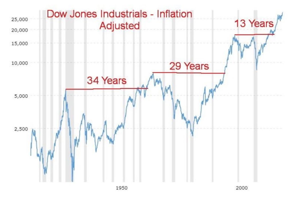
Ever wonder how long it takes a market to recover after a bear market? The most recent bear market that effectively lasted from 2000 to 2009 only took 13 years to recover its former level. Our chart of the Dow Jones Industrials (DJI) inflation-adjusted shows that by 2013 the DJI had regained its 2000 level. That was actually quite good. By comparison, it took the DJI 34 years to recoup the 1929 high (1929–1963) for what seemed to be for good. The DJI actually hit the former high mark a few years earlier in 1959 (30 years) but it failed to hold. It finally left the 1929 high behind in 1963, but the celebration was short-lived as the market topped out in February 1966.
It then took another 29 years to 1995 before the market recovered the 1966 top. It wasn’t until 1991 that the market recovered the 1929 high once again and then it took another four years to recoup the 1966 high. You put it all together and, on an inflation-adjusted basis, the market took 66 years (1929–1995) to fully recover. That`s a lifetime for some people. We recognize that everyone did not buy the 1929 high, but then again everyone did not buy the 1932 low either.
So, should we get excited that this time it only took 13 years to recover the 2000 high? Well, yes and no because, as we know, the market over the past ten years has been driven by historically low interest rates, QE1, 2, and 3 and now some are calling it QE4 plus the biggest debt binge in human history. Central banks printing money with the Fed alone inflating its balance sheet 500% over the past decade have translated into a sharply rising stock market, but one that is built on quicksand. Eventually, the ability to add more debt and print money runs out. The question is always, when! The Tokyo Nikkei Dow (TKN) made its all-time high back in 1990, 30 years ago. Today it is still not even close.
—
(Featured photo by Aditya Vyas via Unsplash)
DISCLAIMER: This article was written by a third party contributor and does not reflect the opinion of Born2Invest, its management, staff or its associates. Please review our disclaimer for more information.
This article may include forward-looking statements. These forward-looking statements generally are identified by the words “believe,” “project,” “estimate,” “become,” “plan,” “will,” and similar expressions. These forward-looking statements involve known and unknown risks as well as uncertainties, including those discussed in the following cautionary statements and elsewhere in this article and on this site. Although the Company may believe that its expectations are based on reasonable assumptions, the actual results that the Company may achieve may differ materially from any forward-looking statements, which reflect the opinions of the management of the Company only as of the date hereof. Additionally, please make sure to read these important disclosures.


XRP Under Pressure Amid Macro Forces, Fed Policy, and Regulatory Shifts
XRP remains under pressure despite easing geopolitical tensions, as macroeconomic factors and Fed policy dominate market sentiment. Liquidations and high...


Edison Accelerates Renewable Growth and ESG Impact in 2025
Edison reports strong 2025 sustainability progress, boosting renewable investments by 90% to reach 2.3 GW toward a 4 GW 2030...


New Gene Therapies Transform Rare Disease Care, but Gaps Remain
Gene therapies are transforming rare disease treatment, enabling normal lives for some patients. However, only about 6% of 7,000 rare...


Temotiva Launches Crowdfunding Campaign to Advance Preventive Mental Health
Temotiva Innovación Lab has launched a crowdfunding campaign through Santander X Explorer, marking a new phase for the University of...


Fed Policy Shift Raises Concerns Over Debt and Inflation Risks
The Federal Reserve is criticized for resuming balance sheet expansion through Treasury purchases despite expectations of tighter policy under new...
 |
|
 |  |
 |
|
-

 Africa2 weeks ago
Côte d’Ivoire Cocoa Price Crisis: Record Decision Turns into Market Breakdown
-
 Biotech22 hours ago
New Gene Therapies Transform Rare Disease Care, but Gaps Remain
-

 Business2 weeks ago
The TopRanked.io Guide to 2026’s Biggest and Best Affiliate Opportunities
-

 Fintech6 days ago
Fintech and AI: Adoption Grows, but Profits Favor Agile Innovators