Featured
How’s the Dow Jones responding to the crisis: a grotesque and nasty chart
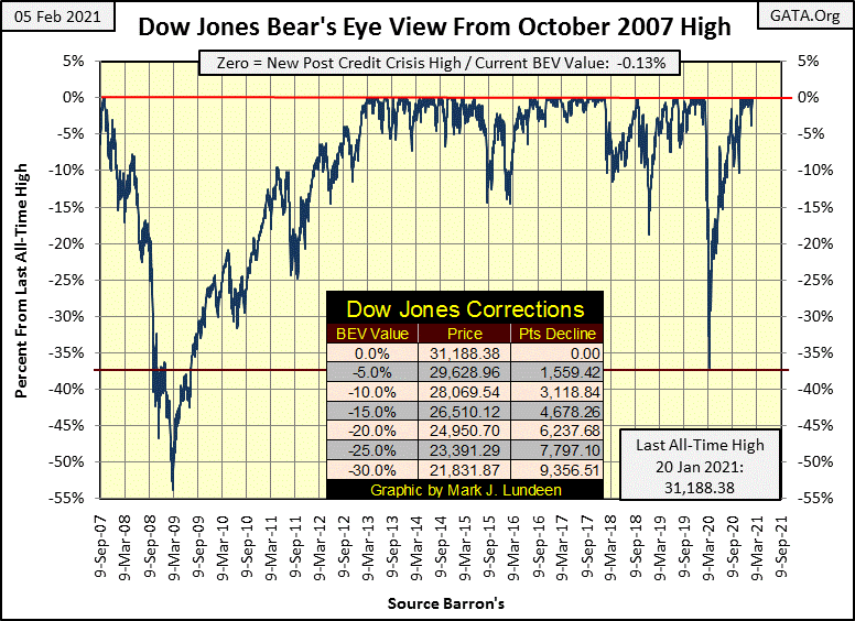
From a Dow Jones all-time high on February 12th to a -37% market correction in only twenty-eight NYSE trading sessions later is a market first. Then from the Dow Jones’ March 23rd market low to its next all-time high on November 16th, a full recovery from such a deep market decline so quickly is odd too! Don’t take my word for it; look at the chart below.
Last week, the Dow Jones closed down almost 4%, and I was seriously thinking of purchasing a few Russell 2K puts to profit from the coming double-digit percentage correction. This week closed with the Dow Jones just short of making its twelfth Post March BEV Zero, another new all-time high.
Note: a good friend of mine and true man-of-action in the markets, one Roger, liked this idea of puts on the Russell 2K, and informed me that though they exist, they are a thinly traded and illiquid market. Roger told me options on the big NASDAQ indexes were better indexes for buying puts. Thanks Roger, I’ll keep that in mind.
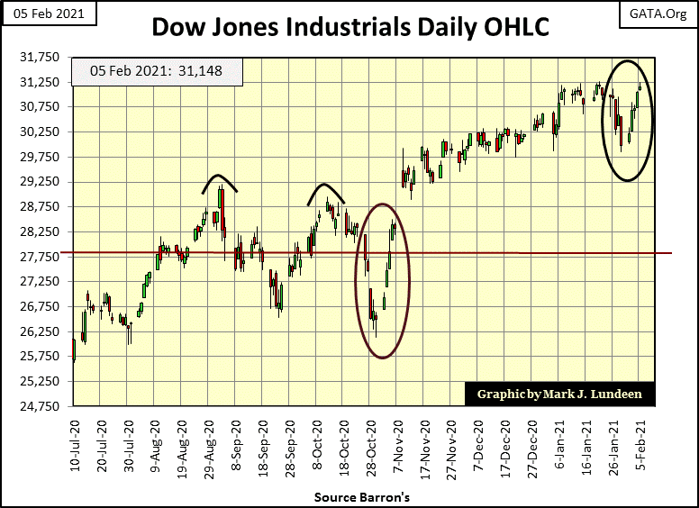
This week’s two week round trip (Black Circle below) isn’t the first time this has happened in the past year; a serious one week decline followed up by a full recuperation one week later. The same thing happened just after Halloween this year, as seen below (Red Circle) in the daily bar chart for the Dow Jones. This is really weird market action; one big down week followed by one big up week, which in both cases has the feel of bear-market interruptus by the powers-that-be, but who knows?
Oh don’t be coy Mark, yes the “policy makers” hands in action are seen in the two circles below, successfully preventing a market decline such as we saw last March.
Anyway, by the end of the week, the major market indexes I follow were once again making new all-time highs, or BEV Zeros as noted in red below. On Friday’s close, there were nine BEV Zeros, with seven more indexes within scoring position, or within 5% of making a new all-time high. It’s last week’s bearish market action canceled by command.
Am I still thinking about buying some puts in the market? They are certainly cheaper at the end of this week than they were last Friday! I also believe that if one were to purchase out-of-money puts that expire next August, there is a good chance they’d expire in-the-money within the next six months. But doing so now would be no better than placing a sucker’s bet at a craps table in Vegas.
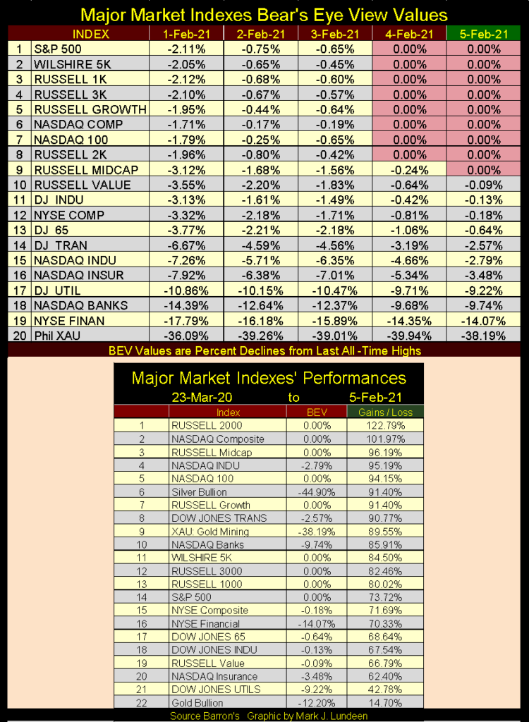
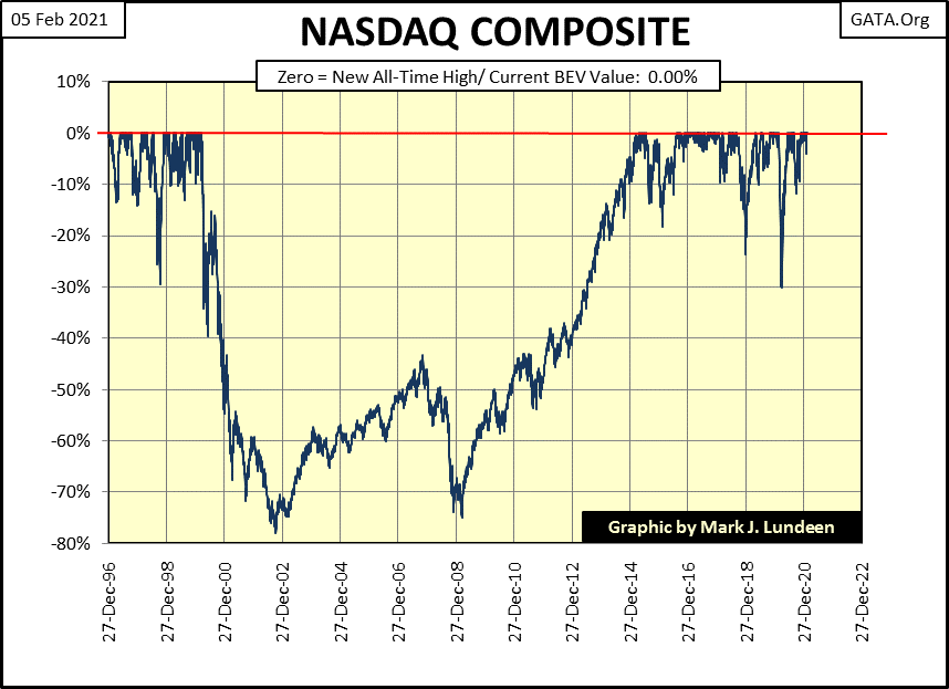
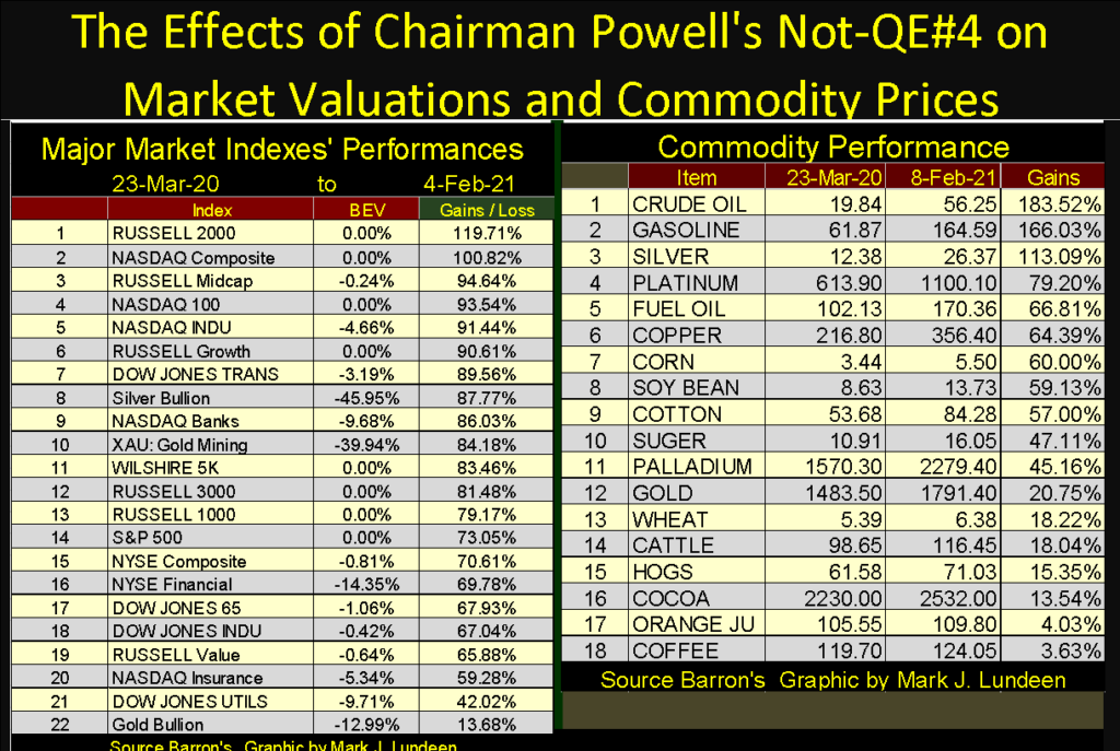
But look at how overvalued the stock market is in February 2021 in the table at the lower portion of the graphic above. This is how 2021 came in, with these major market indexes up 60%, and much more from their lows of last March. These are not normal advances, but the lingering consequences of last year’s massive reflation efforts of the FOMC with their Not-QE#4, and as such these gains are vulnerable to market gravity in the coming weeks and months.
Is Mr Bear going to allow this to continue for the entire year of 2021? I have to say no way Jose, which reclassifies the list above as low hanging fruit in the next market correction, or even coming bear market. I’m keeping Roger’s idea of purchasing a put or two on the NASDAQ Composite Index (#2 in the list above) close to heart as 2021 progresses.
As seen in the NASDAQ Composite BEV chart below, powerful market declines are not rare-market events for this index. If one gets the timing correct, lots of money can be made speculating on the NASDAQ Composite with puts. But getting the timing right is not that simple, as I, and many others have discovered in the past.
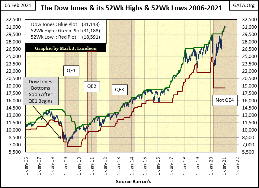
Here’s the Dow Jones with its 52Wk High and Low lines, along with the four Quantitative Easings the FOMC has “injected” into the markets. Last March’s 37% market decline, as well as its recovery to new all-time high in a little more than seven months are the stand out features in the chart below.
From a Dow Jones all-time high on February 12th to a -37% market correction in only twenty-eight NYSE trading sessions later is a market first. Then from the Dow Jones’ March 23rd market low to its next all-time high on November 16th, a full recovery from such a deep market decline so quickly is odd too! Don’t take my word for it; look at the chart below.
What is the FOMC’s next trick? I don’t know, but should the financial markets be left to their own resources, without the assistance of the “policy makers” and their minions’ massive efforts to “ensure market stability”, I wouldn’t be shocked seeing an even deeper Dow Jones decline than -37% in twenty-eight NYSE trading sessions time frame sometime before 2021 comes to an end.
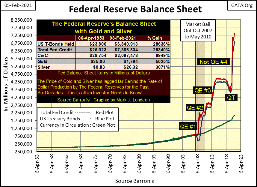
I like publishing a chart of the Federal Reserve’s balance sheet every few months, so here it is below, and what a grotesque and nasty chart it is too.
The Quantitative Easings; QE #1&2 reflated the financial system brought down low by Wall Street’s sub-prime mortgage fiasco. QE #3 seems a bit gratuitous, done only to further inflate market valuations. I say that because by January 2011 (two years prior to QE #3) Doctor Bernanke’s “policy” had already moved past the crisis and on to “economic growth” as seen in the CNBC quote below.
“Policies have contributed to a stronger stock market just as they did in March 2009 [March 2009 was the Dow Jones’ 54% bear market bottom], when we did the last iteration of this. The S&P 500 is up 20% plus and the Russell 2000, which is about small-cap stocks, is up 30% plus.”
– Doctor Benjamin Bernanke, CNBC Interview with Steve Liesman 13 Jan 2011 (1:40 PM).
Also apparent in the Fed’s balance sheet is their aborted Quantitative Easing (QT) of January 2018 to September 2019, the failed attempt to withdraw the “liquidity” they “injected” into the financial system by their QE #1-3. It was a nice try but —.
I’ve labeled QE-4 with the qualifier “Not” as instructed by Fed Chairman Powell himself who began it in October 2019. Chairman Powell then insisted that no one confuse his new program of “injecting” massive levels of “liquidity” into the financial system with the QE #1-3 seen below. As you can see he was right to do so.
To prevent my readers from confusing Powell’s QE #4 with Bernanke’s QE #1-3, I always qualify it with a “Not”, for example as follows: Damn; Powell’s Not QE #4 isn’t going to stop until the US dollar becomes toilet paper, and then what are these idiot savants going to do to us next?
Moving on to my chart plotting the weekly changes in the FOMC’s holding of US Treasury debt, the FOMC this week withdrew $15.64 bil from the financial system, as seen in the table on the chart below. What is up with that; like I would know?
Most likely it’s more of the same old / same old thing; in other words nothing new. Wait a few months and we’ll once again see much larger “injections” into the economy as the FOMC’s portfolio of T-debt continues expanding in the chart above (Blue Plot). Still, in the chart below plotting the weekly changes in the FOMC’s portfolio of US Treasury debt, over time we do see changes.
From January 2016 to January 2018 we see their post QE#3 “monetary policy”, with most data points above the red zero line, some below during these two years.
Then on January 2018 things changed as the FOMC began their Quantitative Tightening (QT), a vain attempt to withdraw their massive “injections of liquidity” during their QE 1-3. During this period of time most weekly changes in the FOMC’s portfolio T-debt were negative as they sold more T-bonds than they purchased. Then finally, there is the Not-QE#4 which continues to this day, though the financial media no longer talks of it as Fed Chairman Powell’s Not-QE#4 has become our new monetary normal.
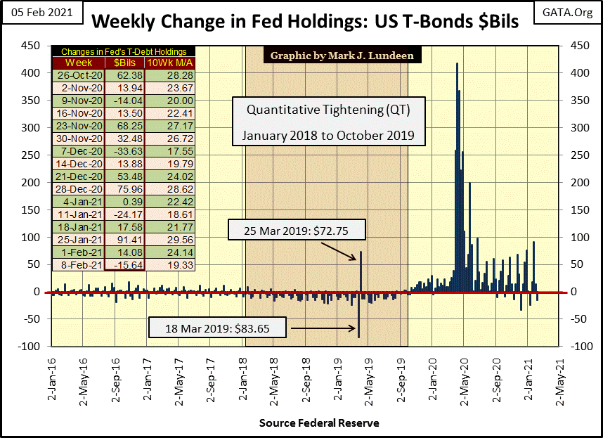
It’s been a little less than a year since the Not-QE#4 “injected” over $400 billion in a single week (Last Week March 2020) into the financial system (see chart above). Let’s take a look at what stock market valuations and commodity prices have done since then in the table below.
First some notes; stock market data is daily, while commodity data is close of week basis. I used March 23rd as my starting point as this was the bottom of the Dow Jones 37% market decline, as well as the bottom of many commodity price corrections. I also used Thursday Feb 4th as the end point because that was when I was writing the commentary.
In the past I’ve frequently mentioned how “injected liquidity” flowing into financial-market valuations is described as “economic growth” or “bull markets”, while “injected liquidity” flowing into commodity prices is called “Consumer Price Inflation” (CPI inflation).
As everyone who has been to college knows:
- Economic Growth and Bull Markets = Good
- CPI Inflation = Bad
though in fact both bull markets and CPI inflation are only the two sides of the same coin: monetary inflation flowing from the Federal Reserve.
Since the early 1980s, when all interest rates and bond yields were double digit (the 30yr T-bond yield peaked at over 15% in 1981), the Idiot Savants at the FOMC have been very successful in directing their flows of “liquidity” into financial-asset valuations, into what is now a forty year bull market on Wall Street. But the table below reveals, to anyone who cares to see, something is changing in their “liquidity’s” direction-of-flow. In the past year, commodity prices as well as financial-asset valuations have begun inflating.
What’s changed? I’m just an aging fleet-sailor; no “market expert” am I! But I’ve studied markets since the 1970s, and I’ve noted the Post WWII period of continually increasing CPI inflation (1945 to 1982) coincided with rising interest rates and bond yields. That plus the current era of “low inflation” economic growth and bull markets (1982-2021) coincided with declining interest rates and bond yields. What’s with that?
Until the Greenspan era of central banking began in 1987, trends in interest rates were driven by trends in CPI inflation. People today don’t realize it, but the post WWII economy was an inflationary economy, as documented by the following quote from Barron’s 31-Dec-1951 issue.
“November 15, 1951 reached a new low of 53 cents in terms of 1935-1939 dollar value. In extended comment on the shrinkage of the dollar, the National City Bank’s December Letter says: “From the standpoint of the creditor—the buyer of Savings bonds, the pensioner, the insurance beneficiary, the school teacher with lagging pay—the experience during and since World War II has been disheartening. Inflation is a concealed type of tax and these are the people who took the brunt of it.” In line with the repeated views of Professor Sumner H. Slichter, the City Bank adds: “People reconciled to a dollar of wasting value look around for real estate or other equity investments as a hedge against price inflation and dollar shrinkage.”
– Barron’s Editorial, 31 Dec 1951
So, rising consumer prices were features of the post WWII economy, as well as the rising bond yields (and interest rates) seen below. That makes a lot of sense. Bonds are “fixed income”, debt contracts where, unlike dividend payouts, the bond’s issuer is obligated to pay out only what’s stipulated in the bond’s coupon. What the dollars these bonds yield to their owners can purchase can vary greatly over time and impacts prices and yields in the bond market.
For example; a dollar in 1950 could purchase twenty nickel Hershey, six ounce chocolate bars. Where a dollar in 1960 could still purchase twenty nickel Hershey bars, however these bars now contain only three ounces of chocolate per nickel. The purchaser of a bond in 1960 knew exactly what was going on; monetary inflation was consuming future purchasing power available from the bond market.
The bond market began demanding an inflation premium on a bond’s yield with lower price bids on all bonds trading in the market. In other words; lower bond prices = higher bond yields.
This is evident in the chart below as bond yields increased (bond prices decreased) from 1950 to 1960. It was monetary inflation flowing into consumer prices; double-digit CPI inflation of the late 1970s to early 1980s drove bond yields seen below deep into double-digit yields as the bond market of this era continued demanding ever larger inflation premiums.
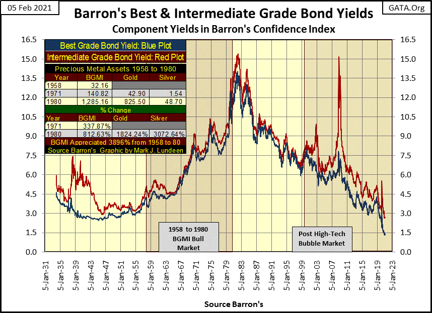
In the early 1980s, “liquidity” from the FOMC began flowing into financial asset valuations as a forty year bull market in stocks and bonds began. Consumer-price inflation eventually became a non-factor in the bond market, resulting in the bond market demanding ever smaller inflation premiums which drove bond yields down for the next four decades.
If you believe bond yields are sensitive to trends in consumer-price inflation; which I do, then you’ll be alarmed how since March 23rd of last year some commodity prices have increased more than hot major market stock averages. Go back and look at my table at how Powell’s Not QE#4 has impacted market prices above.
Seeing annual double-digit percent price increases for grains and meats is big. Seeing them over 18% (some over 60%) is huge. Are these consumer-price increases temporary? Maybe, but not if the massive “injections of liquidly” flowing from the FOMC has begun to actually leak into the commodity markets.
If these trends in consumer prices continue in the years to come, pressure in the bond market to once again demand an ever-larger inflation premium (ever rising bond yields) will return, just as it did from the late 1940s to the early 1980s.
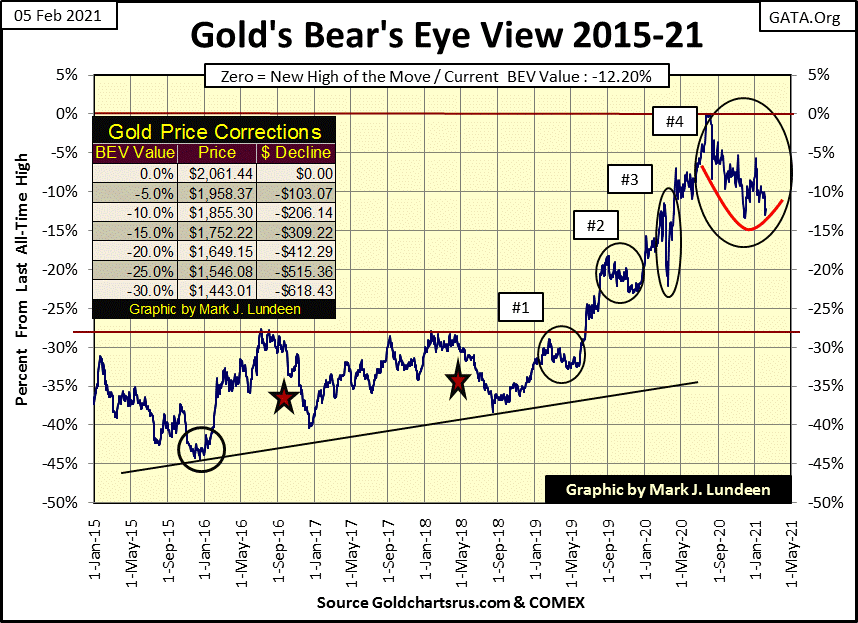
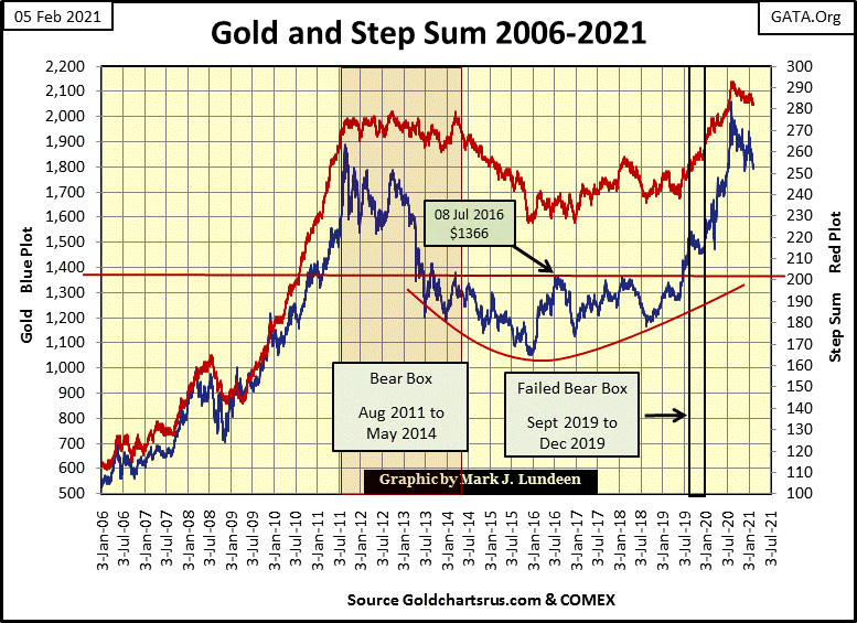
I’m expecting this to happen, which is a good reason to once again look at the Bear’s Eye View of gold below. Gold closed the week 12.20% from its last all-time highs of last August, which to my eyes tell me that the November 30th’s BEV of -13.44% has so far held in the little bottom formation (Red Curve) I’ve placed in the chart below.
But will the lows of last November hold in the weeks to come? Maybe not. But for the past six months, since last August the bears have failed to drive gold below its BEV -15% line, and until they do the burden of proof that they can is on them. And if they do take out the BEV -15% level, can they take gold below its BEV -20% line, which as you can see in the chart’s table would be $1649.
If this is a great concern to you, then dear reader you haven’t understood a single thing I’ve covered on the FOMC’s inflationary activities above. Let me recap my comments. Monetary inflation flowing from the Federal Reserve is beginning to flow into consumer prices. Should this continue, and I believe it will, at some future point bond yields will begin to rise in a dramatic fashion. At that point its game over for the “policy makers” as financial assets valuations begin to deflate and commodity prices (including gold and silver) rise mightily higher.
So, seeing gold below correct even to its BEV -30% level would only make it more attractive to rational people, of which there are plenty including central banks. However that’s a worst case scenario in my opinion. Most likely there are more than enough rational purchasers of gold to prevent it from deflating below its BEV -15% line ($1752). In the weeks to come we’ll see just how hard of a bottom last November’s BEV of -13.44% is.
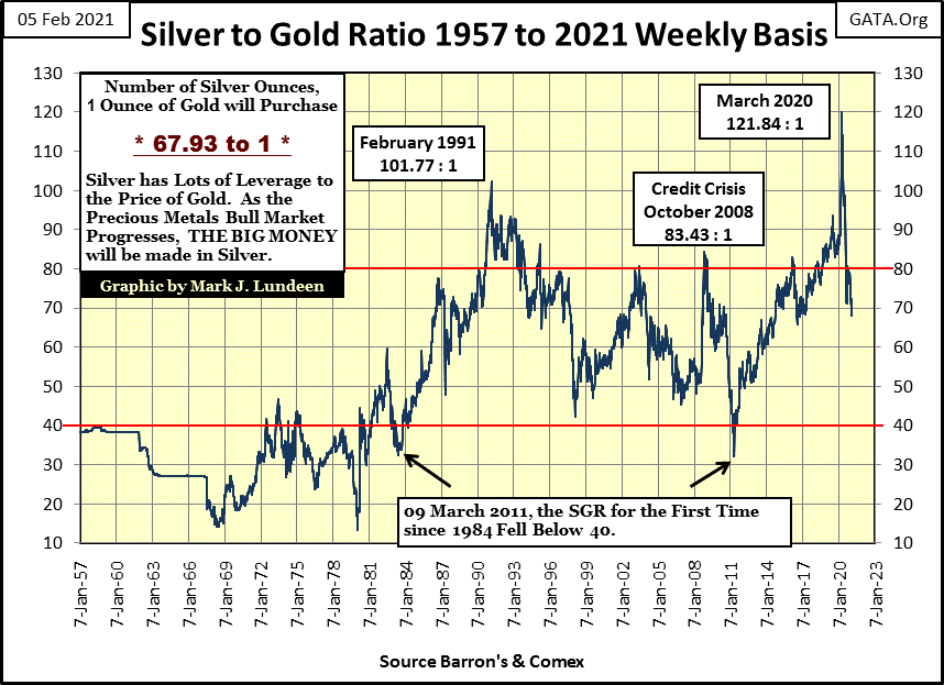
This week, even though the bears saw the price of gold and silver come down a bit from their recent highs, the Silver to Gold Ratio (SGR) finally declined below seventy ounces of silver for one ounce of gold for the first time in a long time. This is good for we precious metals bulls.
Here’s gold and its step sum. The correction that began last August as it broke above $2000 continues, but it won’t forever. Patience is required here.
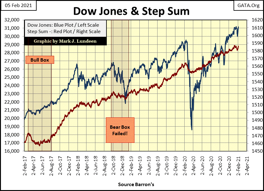
The Dow Jones and is step sum below appear ready to resume their advance into market history. I’m expecting additional new all-time highs in the weeks to come simply because the FOMC continues “injecting liquidity” into the financial system.
The only problem with that is if after forty years of unending “injections of liquidity” into the financial system by the FOMC, have commodity prices once again become a destination for monetary inflation flowing from the Federal Reserve?
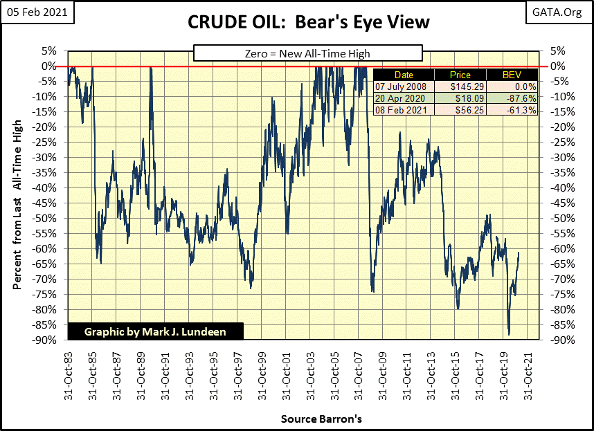
A good reason to suspect that this is so, is simply because in 2021, financial asset valuations are grossly overvalued. Overvaluation is a term that really can’t be applied to most commodity prices today. Take for example crude oil in the BEV chart below.
Crude oil’s last all-time high (BEV Zero) was in July 2008, when during the credit crisis it spiked to $145 a barrel. Twelve years later in April 2020 its price had collapsed to $18.09, an 87.6% decline in the price of oil. With Biden declaring war on domestic-energy development, one has to wonder what the next major price trend will be for the price-of-oil in the next four years;
- trend back down towards its BEV -90% line
- trend back up to its BEV Zero line
I’d say purchasing gasoline is going to become much more expensive in the next few years, most likely historically so. That won’t be good for financial asset valuations, but it should be for commodity prices.
Let’s take a quick look at gold’s and the Dow Jones’ step sum tables below. The price of gold continues correcting, but hasn’t made a new low for the correction since November’s BEV -13.44%. I’m watching to see if the bears have it in them to drive gold down below its BEV -15% level.
Gold’s step sum continues trending down. The big problem for the gold and silver markets as I see it is their lack of volatility. Gold’s volatility closed the week at a tepid 0.76%, down from last December’s equally tepid 0.83%. I expect the termination of this now seven month long correction will be heralded with the arrival of days of extreme volatility for gold (3% days) and silver (5% days). Until then I’m not expecting much excitement to the upside from the old monetary metals.
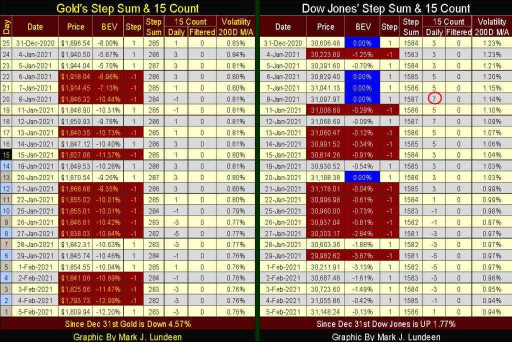
The Dow Jones is doing everything it needs to do to continue advancing; first and foremost its price is headed higher. It closed the week just a sliver away from making a new all-time high. Its 15 count, remaining below a +7 remains neutral, so it’s not overbought. Also the Dow Jones volatility continues to decline. This is a market that wants to go higher, but I still don’t like it.
Eskay Mining had a press release this week announcing the completion of last summer’s core sample assays, with eighteen of the twenty drill cores from their Jeff and TV targets showing significant precious metal mineralization.
https://eskaymining.com/news/news-releases/eskay-mining-drills-35-5-m-grading-9-50-gpt-au-and-2134/
The market has responded very positively to this year’s program. A year ago shares of Eskay Mining (NASDAQ: ESKYF) could be purchased for $0.10, sometimes less. This week Eskay Mining closed at $2.35 as the market is now pricing the company as a viable precious metals asset, no longer the high-risk speculation it was a year ago.
What’s to do next? First of all, if you purchased some shares at $0.10, you should pull out your initial investment AND THEN SOME to lock in some hard earned profits. Then maybe let the rest ride out next summer’s drilling program.
If Eskay Mining really has discovered the host body (aka: the mother lode) of the old Eskay Creek Mine, and that is a real possibility, the potential for making an absolute killing in the mining sector in 2021 is undeniable.
Here are some old internet links on the old Eskay Creek Mine and of course Eskay Mining you may find interesting.
John Kaiser on ESK 11:40 to 19:23

Eskay Mining 3:49 time

Eskay Creek Mine’s Hole 109
https://en.wikipedia.org/wiki/Eskay_Creek
That’s it for this week. The Good Lord willing I’ll be back next week.
_
(Featured image by Markus Spiske via Pexels)
DISCLAIMER: This article was written by a third party contributor and does not reflect the opinion of Born2Invest, its management, staff or its associates. Please review our disclaimer for more information.
This article may include forward-looking statements. These forward-looking statements generally are identified by the words “believe,” “project,” “estimate,” “become,” “plan,” “will,” and similar expressions. These forward-looking statements involve known and unknown risks as well as uncertainties, including those discussed in the following cautionary statements and elsewhere in this article and on this site. Although the Company may believe that its expectations are based on reasonable assumptions, the actual results that the Company may achieve may differ materially from any forward-looking statements, which reflect the opinions of the management of the Company only as of the date hereof. Additionally, please make sure to read these important disclosures.


Bitcoin Stalls Near $60K as Strategy Moves, ETFs Outflow, and EU MiCA Rules Take Effect
Bitcoin hovers near $60,000 with ETF outflows, while Strategy boosts reserves, sells BTC, and raises dividends to reassure investors. Ethereum...


Cannabis Dominates Global Drug Use: Trends, Risks, and Shifting Markets
Cannabis remains the world’s most widely used illicit drug, with 256 million users in 2024, surpassing all others combined. Growth...


Italy Approves First Hydrogen-Powered Train for National Rail Network
ANSFISA has approved Italy’s first hydrogen-powered train, the Alstom HMU214, for use on the Brescia–Iseo–Edolo line. Capable of 140 km/h,...


Cotton Market Weakness Persists Despite Brief Rebound
Cotton prices fell to new lows last week before a modest rebound. USDA data shows crop conditions remain worse than...


Eli Lilly Hits $1 Trillion Valuation Amid Strong Bullish Momentum
Eli Lilly stock hit a record high, surpassing $1 trillion market value after strong product demand. Shares surged over 7%,...
 |
|
 |  |
 |
|
-

 Crowdfunding2 weeks ago
Temotiva Launches Crowdfunding Campaign to Advance Preventive Mental Health
-
 Crypto7 days ago
Bitcoin Holds Steady as Microtransactions Surge and ETF Inflows Continue
-

 Biotech2 weeks ago
AseBio 2025 Report Highlights Growth and Future Potential of Spanish Biotechnology
-
 Cannabis5 days ago
Tilray (TLRY) Falls as Bearish Momentum Persists Despite Marketing Push