Business
Inflation Is Insidious: But How Has It Impacted the Stock Market, Gold and More?
Everywhere we have all-time highs. Stocks, gold all hit them again this past week. But the stock market is plagued with numerous negative divergences so while it may be rising it is becoming increasingly dangerous. Gold meanwhile is breaking out sensing the chaos that is being unleashed. Our chart of the week looks at the S&P 500 and gold on an inflation adjusted basis.
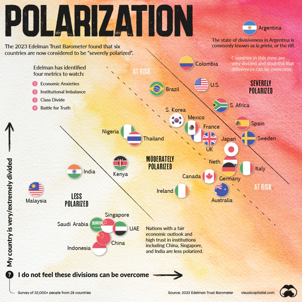
The Edelman Trust Barometer is a global online survey of the general population, designed to measure numerous metrics that make up a society. Its four top metrics include: economic anxieties, institutional balance, class divide, and battle for truth. It’s no surprise that, the more polarized a country is, the more imbalanced it can become, with a negative impact on economics, class divisions (inequality), trust in mainstream media, and trust in institutions.
Using those metrics, Edelman has identified six countries that are deeply polarized, where there are doubts as to whether the country can stand and these differences can be overcome. The ones identified as severely polarized included a couple of surprises. The six are Argentina, Colombia, South Africa, the U.S.A., and—the two surprises—Spain and Sweden. We show the Edelman chart below.
When a country is deeply polarized, this can have a negative impact on its economy, media, democratic institutions, and groups within society. In a worst-case scenario, it can lead to social disintegration and civil war. Yet today there are countries, as noted, that are severely polarized while others are at risk of becoming so. Oddly enough, China and India were included amongst those that are less polarized, despite problems in both countries including economic malaise and severe wealth inequality.
It’s also no surprise that both South Africa and Colombia are listed amongst the top 10 of the Gini Coefficient, with South Africa being number one. The Gini Coefficient is a measurement of income inequality in a country where 0 is absolute equality and 100 is absolute inequality. Yet Sweden ranks amongst the lowest on the Gini
Coefficient scale along with other Nordic countries. The U.S.’s Gini Coefficient is listed at 41% (though studies say it is as high as 48%), ranking them with Turkey and Haiti.
Yet when it comes to economic growth, the U.S. sits at the top of the G7 countries and ranks in the middle of OECD countries (which include China and Russia). The U.S. also ranks well when it comes to unemployment (U3). But, as we have often noted, using Shadow Stats’ (www.shadowstats.com) methodology for unemployment, U.S. unemployment is quite high, leading to income inequality.
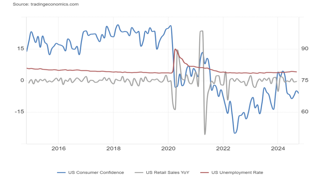
Retail sales, while not red hot, remain robust, thanks primarily to consumers taking on more debt and using their savings. American consumers love to buy. Retail sales in September were up 0.4% when they only expected a gain of 0.3%. House prices, while pausing recently, are at their highest level ever, according to the Case Shiller House Price Index. Disposable personal income is also at its highest level ever and wage growth remains robust. Inflation has come down to levels that are near the best levels of this century.
Yet when it comes to sentiment in the U.S., as we have previously noted, it is terrible—down at levels seen closer to the 2008 financial crisis or the severe recession of 1980–1982. You’d think the U.S. (and Canada too) were in a recession, but that is not the case, even as there are signs that the economy is slowing. But that negative sentiment towards the economy translates into a political divide, where one half somehow equates the previous presidency with good economic times.
Yet a quick check of some numbers from January 2017–January 2021 shows that U.S. debt increased about $8 trillion, almost as much as it increased from 2009–2017, and Incidently has grown again by about $7 trillion under the current administration. Unemployment rose from 4.7% to 6.4%, GDP fell from 2.2% growth to negative 1% growth, money supply (M1) grew by $14.7 billion, and federal debt to GDP went from 108.5% to 126.3%.
That measurement has eased to 122.3%. The rise in unemployment and fall in GDP can be attributed to the COVID pandemic. Yet it was also during this period that differences grew in society, particularly related to COVID vaccines, and it was also the period that witnessed an insurrection at the Capitol on January 6, 2021 against the government of the U.S., due primarily to an unwillingness of the former president to accept the results of the election.
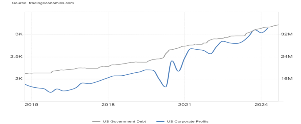
As U.S. federal debt grew, so did corporate profits. U.S. GDP also rose, even after it dipped sharply during the COVID pandemic, but shot up sharply once the monetary authorities dropped interest rates to zero and flooded the financial system with huge amounts of liquidity (quantitative easing or QE) to stave off a very steep recession or worse. U.S. debt exploded, but after a dip in 2020 U.S. corporate profits soared again.
Yet against this background there were also numerous high-profile bankruptcies, particularly in the retail sector. Banks failed as well, particularly in 2023 when four went under, led by Silicon Valley Bank (SVB). One failure was recorded in 2024: Republic First Bank. None of this was like what happened from 2008 to 2011 when 414 banks went under as a result of the global financial crisis 2007–2009.
Sinking Consumer Sentiment, Steady Retail Sales, Slightly Rising Unemployment 2014–2024
U.S. GDP and U.S. Corporate Profits Both Up 2014–2024
The U.S. is the most indebted country on the planet. Its federal debt ($35.8 trillion) represents roughly 11% of all global debt and its total debt ($102.3 trillion, which includes government, corporations, and consumers) represents some 32% of all global debt. Yet it consistently gets away with this this as U.S. treasuries have the highest demand in the world and the U.S. dollar remains the world’s reserve currency. Some $8.6 trillion of U.S. federal debt is held by foreign entities, primarily central banks.
Another $12.1 trillion is held by intragovernmental agencies such as Social Security and Medicare. The cost of servicing all this debt is now at or over $1 trillion. U.S. government spending represents some 7.7% of GDP, one of the highest in the world. U.S. spending on defense/war exceeds $935 billion, an amount that’s more than the next nine countries combined, including China and Russia who are second and third highest respectively.
The U.S. trade deficit is some $1.1 trillion, the highest in the world. That represents some 3.8% of GDP. At the other end of the spectrum is China, has the highest trade surplus in the world or some $550 billion.
U.S. GDP represents roughly 25% of global GDP. Tellingly, its debt is considerably higher than its GDP, currently at 356% of GDP. Japan is the highest at over 600%. Debt is a major problem for all developed G7 countries. It has been said that debt growth is unsustainable; however, so far, we are not seeing any strong signs of weakening amongst the developed countries, even as much of the EU is sliding into recession.
The question is, have we reached the limits of debt? All of the EU along with the U.S., Canada, Australia, and Japan are the most indebted nations in the world. But all are very polarized to some degree or other. Ultimately it leads to economic instability, not only for the country but also for the world. It also could lead to societal breakdown and global war. As history shows us, it is not as if this hasn’t happened before.
It’s a deeply polarized world. And that has negative consequences which are difficult to calculate. There are deep divisions and mistrust of institutions, media and even democracy itself. Battles have been fought over vaccine mandates, climate change and science itself. In a deeply polarized world, the United Nations is fraying at the edges and at risk of becoming totally irrelevant.
But before the U.N. the world fought two world wars and over 100 million lost their lives and economies were shattered left in ruins. Today wars threaten to expand into world wars and there is little power to stop them. Globalization was supposed to bring prosperity to the world but today sanctions, trade wars and more have put globalization on watch of becoming extinct.
The negative impact of severe storms, wildfires, and more have cost billions even trillions yet the thought that climate change even exists is a deeply divisive subject. Result this division adds to the economic costs. The world is overpopulated and over polluted. Inflation, economic stagnation, and wars dominate.
The question is then why is the stock market soaring to new heights against this backdrop? Gold is also soaring to new heights as well but as we say gold smells a rat. It’s insurance against an increasingly polarized world.
Chart of the week
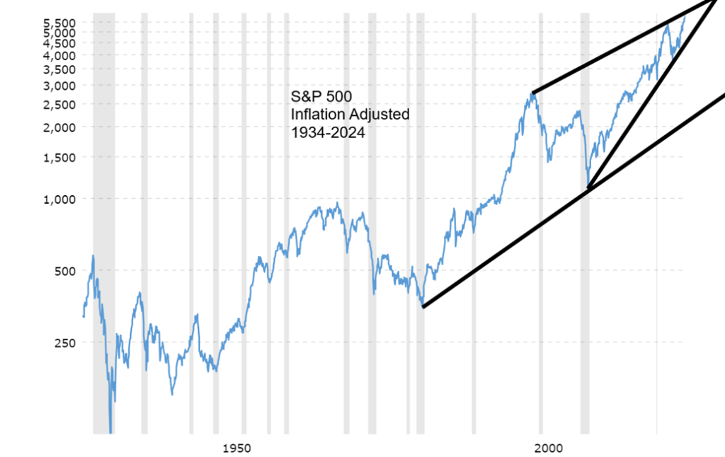
An inflation-adjusted chart of the S&P 500 provides us with a more accurate picture of the real performance of the index. It is also no surprise that the S&P 500 has made all-time highs in both nominal and inflation-adjusted terms. What’s interesting about the chart are a few things:
- That 1982 low in inflation-adjusted terms took the market down to levels last seen in 1954 and 1937. It’s a sign of how inflation eats away at performance and it also confirms that the 1970s bear market in stocks was one of the worst.
- The 2008 financial crisis almost took the S&P 500 back to the levels last seen in the 1960s.
- What’s most disturbing is the clear ascending wedge triangle that has formed, based off the 1999 high connecting with a more recent high in 2021 before the correction of 2022. That formed the upper channel. The lower channel was formed from the low of 2009 connecting to the low of the 2022 correction. What formed was this huge ascending wedge triangle. Note that the S&P 500 appears to be at the top of the channel, suggesting that gains from here could be extremely limited.
Investopedia (www.investopedia.com), describes the characteristics of a rising wedge pattern:
The rising wedge is a chart pattern used in technical analysis to predict a likely bearish reversal. it is characterized by a narrowing range of price with higher highs and higher lows, both of which are enclosed by upward sloping trendlines. However, the slope of the support line is usually steeper than that of the resistance line, leading to a convergence of the two lines over time.
This formation is one of the most bearish we’ve ever seen. The last bearish ascending wedge triangle formed with the top of 2000 that connected to a top in 1968. The lower channel was formed from the 1982 bottom and rose sharply through 1994–2000. When it broke, we had the worst bear market since the 1970s.
The pattern shouldn’t be taken lightly, given that we also have a very overvalued market coupled with the Fear & Greed Index registering “extreme greed”. The pattern breaks when the S&P 500 breaks below that lower line, currently around S&P 500 4,800. Naturally, all patterns are just that: potential patterns that, if fulfilled, could take the S&P 500 back to that gentler upward sloping line currently near 2,000–2,500—a potential drop of 65% from current levels. Breaking to the upside (not expected) would bust the pattern and confirm that we are headed higher.
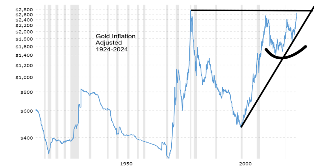
A completely different picture is seen with the inflation-adjusted chart of gold. Unlike the S&P 500, gold is still waiting to make new all-time highs on an inflation-adjusted basis. That high in 1980 on an inflation-adjusted basis is at $2,748. Currently we are near $2,730, so new all-time highs on an inflation-adjusted basis are close.
That low in 2001 took us back to levels seen in 1972 and 1947. The ravages of inflation. The pattern forming since that high in 2011 is bullish, suggesting that potential targets for gold could be up to around $3,050. This is premised on gold having already taken out the highs of 2011 on an inflation-adjusted basis. The chart is pointed higher for gold.
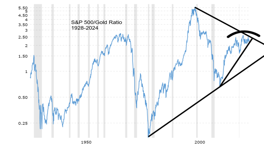
The chart of the S&P 500/Gold ratio also appears to confirm this. The ratio is very similar to the better-known DJI/Gold ratio. Important highs were seen for the ratio in 1929, 1966, and 1999 before significant reversals. Important bottoms were seen in 1932, 1982, and 2011. However, the rebound in favour of the S&P 500 over gold appears to have fallen quite short of the previous high in 1999. It is possible it was merely a correction to the drop in 1999–2011. We are very close to a breakdown that could see the ratio fall to the gentler uptrend line.
The S&P 500 is very high and appears poised to enter a period of a major correction. Whereas, on the other hand, gold appears to be pointed higher to new all-time highs. Central banks are buying gold to substitute for the U.S. dollar. Gold protects against currency deflation.
Gold is nobody’s liability. Gold can be a defense against both inflation and deflation. It is a portfolio diversifier. It is a store of value and a hedge against political, geopolitical, and macroeconomic uncertainty. Gold stocks are not gold. They are stocks and like all stocks (and bonds) they have liability, unlike gold bullion. However, gold stocks are a well-known way to leverage the price of gold.
Markets & Trends
| % Gains (Losses) Trends | ||||||||
| Close Dec 31/23 | Close Oct 18, 2024 | Week | YTD | Daily (Short Term) | Weekly (Intermediate) | Monthly (Long Term) | ||
| Stock Market Indices | ||||||||
| S&P 500 | 4,769.83 | 5,864.57 (new highs)* | 0.9% | 23.0% | up | up | up | |
| Dow Jones Industrials | 37,689.54 | 43,275.91 (new highs)* | 1.0% | 14.8% | up | up | up | |
| Dow Jones Transport | 15,898.85 | 16,383.13 (new highs) | 0.9% | 3.1% | up | up | up | |
| NASDAQ | 15,011.35 | 18,489.55 | 0.8% | 23.2% | up | up | up | |
| S&P/TSX Composite | 20,958.54 | 24,822.54 (new highs)* | 1.4% | 18.4% | up | up | up | |
| S&P/TSX Venture (CDNX) | 552.90 | 621.67 | 2.7% | 12.4% | up | up | down (weak) | |
| S&P 600 (small) | 1,318.26 | 1,435.16 | 1.6% | 8.9% | up | up | up | |
| MSCI World | 2,260.96 | 2,442.53 | flat | 8.0% | neutral | up | up | |
| Bitcoin | 41,987.29 | 68,601.40 | 8.9% | 63.4% | up | up | up | |
| Gold Mining Stock Indices | ||||||||
| Gold Bugs Index (HUI) | 243.31 | 344.56 (new highs) | 7.9% | 41.6% | up | up | up | |
| TSX Gold Index (TGD) | 284.56 | 407.41 (new highs) | 8.2% | 43.2% | up | up | up | |
| % | ||||||||
| U.S. 10-Year Treasury Bond yield | 3.87% | 4.08% | (0.5)% | 5.4% | ||||
| Cdn. 10-Year Bond CGB yield | 3.11% | 3.15% | (2.8)% | 1.3% | ||||
| Recession Watch Spreads | ||||||||
| U.S. 2-year 10-year Treasury spread | (0.38)% | 0.12% | (14.3)% | 131.6% | ||||
| Cdn 2-year 10-year CGB spread | (0.78)% | 0.06% | (60.0)% | 107.7% | ||||
| Currencies | ||||||||
| US$ Index | 101.03 | 103.48 | 0.6% | 2.4% | up | neutral | neutral | |
| Canadian $ | 75.60 | 72.42 | (0.3)% | (4.2)% | down | down | down | |
| Euro | 110.36 | 108.67 | (0.6)% | (1.5)% | down | neutral | neutral | |
| Swiss Franc | 118.84 | 115.63 | (0.9)% | (2.7)% | down | up | up | |
| British Pound | 127.31 | 130.44 | (0.2)% | 2.5% | down | up | up | |
| Japanese Yen | 70.91 | 66.88 | (0.2)% | (5.7)% | down | neutral | down | |
| Precious Metals | ||||||||
| Gold | 2,071.80 | 2,730.00 (new highs)* | 2.0% | 31.8% | up | up | up | |
| Silver | 24.09 | 33.23 (new highs) | 4.7% | 37.9% | up | up | up | |
| Platinum | 1,023.20 | 1,024.50 | 3.0% | 0.1% | up | up | up (weak) | |
| Base Metals | ||||||||
| Palladium | 1,140.20 | 1,084.90 | 1.4% | (4.9)% | up | up | down | |
| Copper | 3.89 | 4.38 | (2.5)% | 12.6% | neutral | up (weak) | up | |
| Energy | ||||||||
| WTI Oil | 71.70 | 68.69 | (9.1)% | (4.3)% | down | down | down | |
| Nat Gas | 2.56 | 2.26 | (14.1)% | (11.7)% | down (weak) | up (weak) | down | |
Years ago, a group called The Fifth Dimension had a hit song called Up, Up and Away (1967). It asked, “would you like to ride in my beautiful balloon?” We’re guessing that the S&P 500 and the Dow Jones Industrials (DJI) are feeling that groove. New all-time highs have become a habit, apparently the 47th this year.
Euphoria. In the late 1990s, it was the high-tech/dot.com stocks. This time it has been the MAG7 and friends. Oh, there are a few other indices that have new heights including the S&P 100 (OEX), the Value Line Arithmetic Index, the AMEX, the S&P 400 (Mid), the Wilshire 5000, the Russell 1000 and 3000, the Dow Jones Composite (DJC), and the Dow Jones Utilities (barely). But not the NASDAQ or NASDAQ 100.
So, it’s a party. On the week, the S&P 500 (SPX) was up 0.9%, the DJI +1.0%, the Dow Jones Transportations (DJT) +0.9% and new 52-week highs but, no, not all-time highs, the NASDAQ was up 0.8%, the S&P 400 (Mid) was up 1.4%, and the S&P 600 (Small) up 1.6%. In Canada, the TSX Composite made all-time highs, up 1.4% while the TSX Venture Exchange (CDNX) had a good week, up 2.7%.
In the EU, the London FTSE was up 1.3%, the EuroNext fell 0.1%, the Paris CAC 40 gained 0.5%, while the German DAX did make all-time highs, up 1.5%. In Asia, China’s Shanghai Index (SSEC) gained 1.4% on rumours of more stimulus, the Tokyo Nikkei Dow (TKN) gained 1.0%, but Hong Kong’s Hang Seng (HSI) fell 2.4%. The MSCI World Index was flat while Bitcoin is trying to go back over $70,000, based on Trump’s claim that, if he wins, he’ll make the U.S. the crypto capital of the world. Bitcoin was up 8.9% to $68,600.
We’ve cited how the markets are overvalued, now overbought, and negative divergences exist across all time frames—dailies, weeklies, and monthlies—short, intermediate, and long term. But that’s a state and doesn’t tell us when we will fall. However, fall it will once things become unglued. The VIX Volatility Indicator is often a clue.
Our chart below shows the VIX is currently at 18. Usually, when the market is complacent, the VIX falls under 15 and even as low as 10. But it hasn’t. This is warning sign that something is amiss as the VIX is at higher levels while the S&P 500 is making all-time highs. A significant divergence.
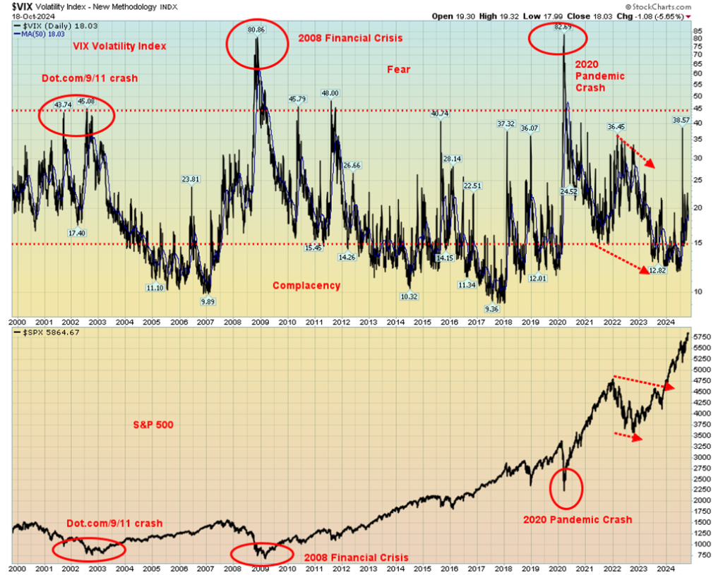
So, what is causing the VIX to go higher when it should be a lot lower? (The VIX moves inversely to the S&P 500.) Reasons cited are concerns over the global geopolitical situation and the domestic political situation where Trump has declared that unless he wins, he will not accept the outcome. There is a real fear of violence around the election. Both the geopolitical situation (Iran/Israel) and the domestic political situation (election) could trigger liquidity events.
As one pundit noted, Trump is in a must-win situation, given his legal problems. November 5 is shaping up as a potential volatile election unless there is a clear winner, and even that may not be enough.
We live in dangerous times. If you’ve been in the stock markets, you’re dancing to the bank. But for how much longer?
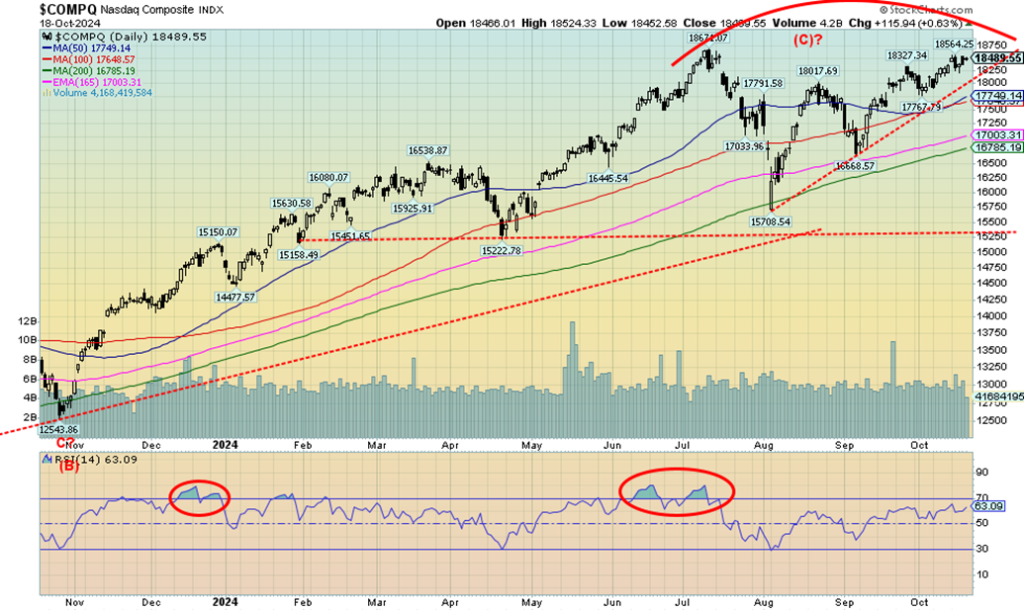
Once again, the NASDAQ failed to join the all-time high party. Oh, it is tantalizingly close but, as they say, close only counts in horseshoes and hand grenades. The NY FANG Index that has helped drive the NASDAQ is also shy of new all-time highs. That didn’t stop a few FAANGs, or is it MAG7 stocks, from making all-time highs. Apple and Netflix did it. And so did Snowflake, but only barely. All the others remain shy.
The Chinese FAANGs fell with both Baidu and Alibaba down 9.1% and 7% respectively. Advanced Micro (AMD) also fell 7.1%. With the NASDAQ flirting with all-time highs, we have to watch below and a breakdown under 18,000 spells trouble. Under 17,775, a top may be in and under 16,650 a top is probably in. Right now, it looks like a potential double top, but the confirmation of the double top doesn’t come until under 15,700. Meanwhile, the upside is wide open and only 0.1% away at 18,671. There is still a chance we will do it this week.
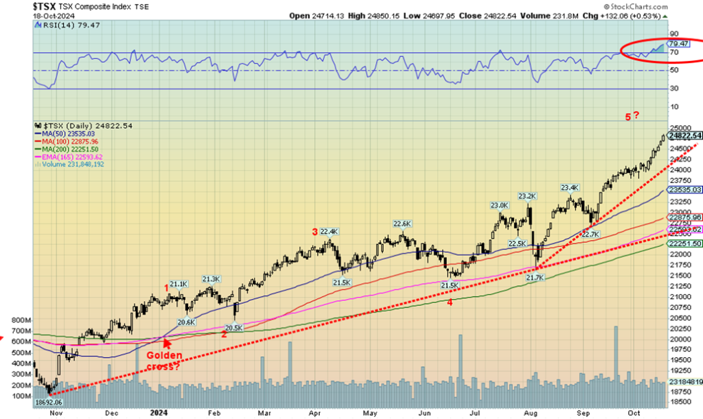
Once again, the TSX Composite hit all-time highs. This past week, the run-up was due primarily to the strong performance of Materials, including gold and metals. The TSX Composite gained 1.4% while the TSX 60 was up 1.5%, also to new all-time highs. But it was Materials (TMT) up 4.6%, Golds (TGD) up 8.1%, and Metals & Mining (TGM) up 3.1% that drove the market higher. Both TGD and TGM made 52-week highs.
But they weren’t completely alone. Utilities (TUT) was up 5.0% to new all-time highs, Income Trusts (TCM) gained 3.9%, and Health Care (THC) was up 3.4% to 52-week highs. Consumer Discretionary (TCD) +0.8% and Financials (TFS) +1.9% made new all-time highs. Were there any losers? Yes, Energy (TEN) fell 4.5%, thus stifling the gain for the TSX, while Industrials (TIN) was off a much smaller 0.3%. Information Technology (TKK) was flat.
The trend is up. There is no sign yet of a top. No distribution pattern forming. However, by many measurements we are considerably overbought with an RSI at 79.5. In other words—frothy. But no breakdown could be seen until we are at least under 24,250. We don’t start getting confirmation until we are under 22,700. Under 22,250 we are most likely headed to a bear market or, if the area holds, it will turn into a bottom. Others are entering the overbought area, including TGD, TGM, TMT, and TUT.
TFS is in the very overbought region. None of this is to suggest we are about to collapse. The Materials (gold & metals) all still look higher. If the market is to crack, it would most likely be Financials, which in turn could bring down others. But the reality is, straight up moves are not likely sustainable without at least a correction. And as we note, even if we have a correction, it doesn’t mean the rally is over. We’ll need more evidence.
U.S. 10-year Treasury Note, Canada 10-year Bond CGB
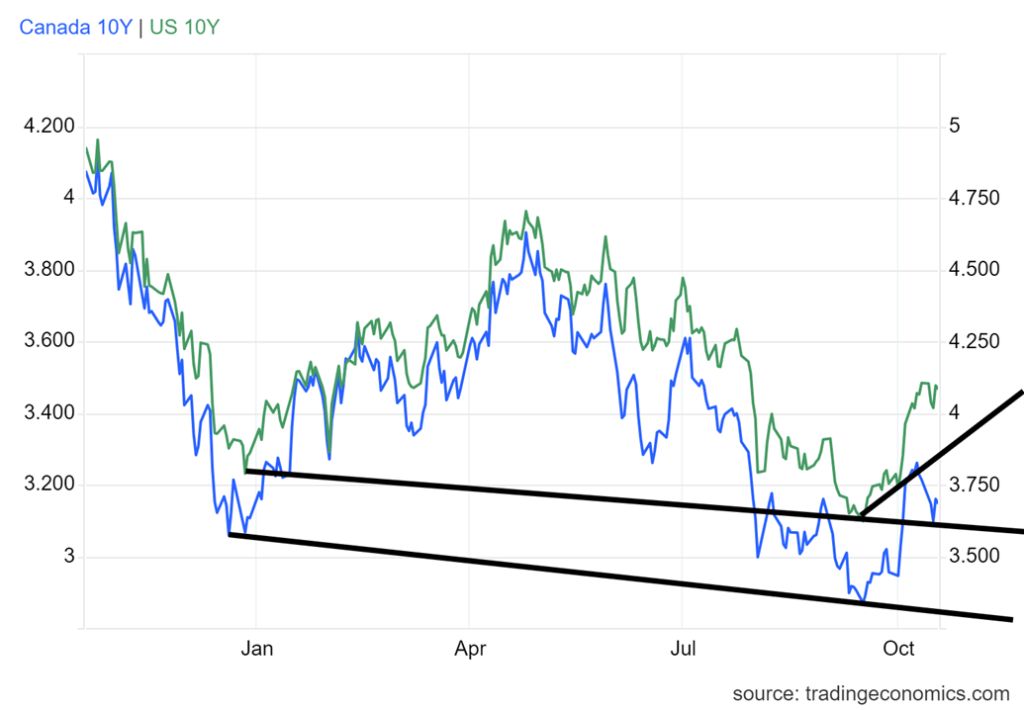
Could bonds be the canary in the coal mine? The Fed cut rates and the bond market, instead of going down, backed up. Yields on the 10-year U.S. treasury note that hit a low of 3.62% on September 16 are now at 4.08% after hitting a recent high of 4.18%. That’s a 12.7% backup in rates. Canadian rates have also backed up, despite the constant cutting of rates by the BofC.
The Canadian 10-year Government of Canada bond (CGB) is now at 3.15% after hitting a low of 2.87% on September 16, a backup of 9.8%. Short rates have fallen because of rate cuts by the BofC and the Fed. But long rates are now higher. What are long rates concerned about? Well, inflation for one.
We’ve noted before that the 1970s inflation was two-pronged. A peak in November 1974 and a low in November 1976, then inflation rose again, peaking at a higher level than November 1974 with the top in April 1980 at 14.42%. The Fed hiked rates over 20% and the U.S. fell into a steep recession in 1981–1983, the worst since the Great Depression. Inflation fell back to 1.4% by 1987.
So, another rise in inflation would not surprise us. The bond market appears to be telling us so. Incidently, the 10-year started rising in front of the rise in inflation in 1976 as well. There is a correlation. On the week, the 10-year US fell slightly by 0.5%. The Cdn 10-year fell 2.8%. This narrowed the 2–10 spread as the U.S. 2–10 went to +12 bp from +14 bp while the Cdn 2-10 fell to +6 bp from +15 bp.
Both are still suggesting that the U.S. and Canada are headed for a recession. The question is, will it be a soft landing or a hard landing? We remain in the hard landing camp, but it may not start to become visible until sometime in 2025.
This past week Canada did see its inflation fall to 1.6% year over year (y-o-y), down from 2.0% and a forecast of 2.0%. There weren’t a lot of numbers this past week, but retail sales remain robust in the U.S. as they rose 0.4% above the expected +0.2%. The Philly Fed was 10.4 vs. an expectation of 4. But industrial production weakened, down 0.6% vs. an expectation of a gain of 0.4%. U.S. housing starts weren’t much of a factor, off slightly.
There aren’t a lot of numbers this coming week. We’ll be keeping on an eye on the Conference Board’s leading indicators, expected to be down 0.1%, and the final University of Michigan Sentiment Index, expected at 68.9 vs. 70.9 in the previous reading.
But the backup in rates despite the Fed (and BofC) cutting rates is a concern. Is this the canary in the coal mine, warning that trouble lies ahead?
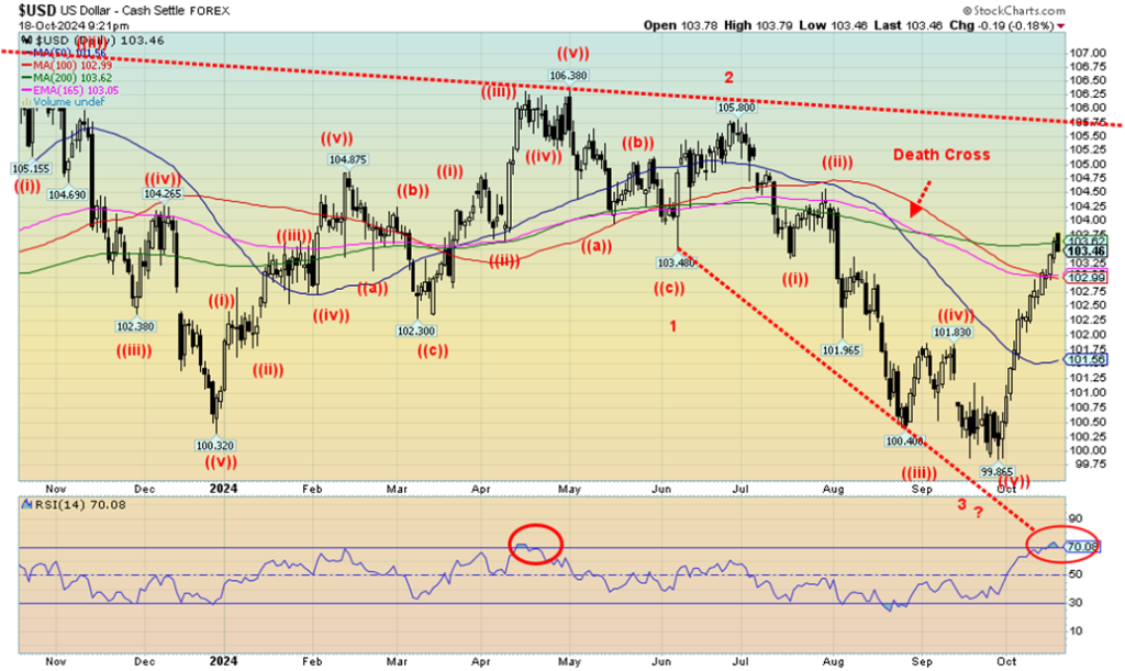
The rise of the US$ Index continues, except on Friday where the US$ Index made new highs, then reversed and closed lower. It was not an outside day reversal so this may just be a pause. However, notably the reversal point came at the 200-day MA, an area of potentially strong resistance. The rise has also been straight up with barely a pause. Usually rises like this are unsustainable. With an RSI over 70 we are in overbought territory.
On the week, the US$ Index was up 0.6%. That means other currencies fell with the euro down 0.6%, the Swiss franc off 0.9%, the pound sterling down 0.2%, and the Japanese yen also down 0.2%. The Cdn$ fell 0.3% and its daily, weekly, and monthly trends remain down. The weak Cdn$ has allowed gold in Cdn$ to soar. It is now at Cdn$3,763, up 37.5% in 2024 vs. a gain for gold in US$ up 31.8%. Gold acts as a hedge against currency devaluation. Notably, the Cdn$ is down 4.2% in 2024.
As we note, a sharp rise like this is usually unsustainable. The first sign of trouble would be breaking back under 103. Under 101.50 the rally is officially over and under 100.75 new lows potentially lie ahead. We might have a pullback here with another attempt at the highs before this is finished. But the entire wave, while spectacular, is usually not sustainable and is just a sharp correction following a fall.
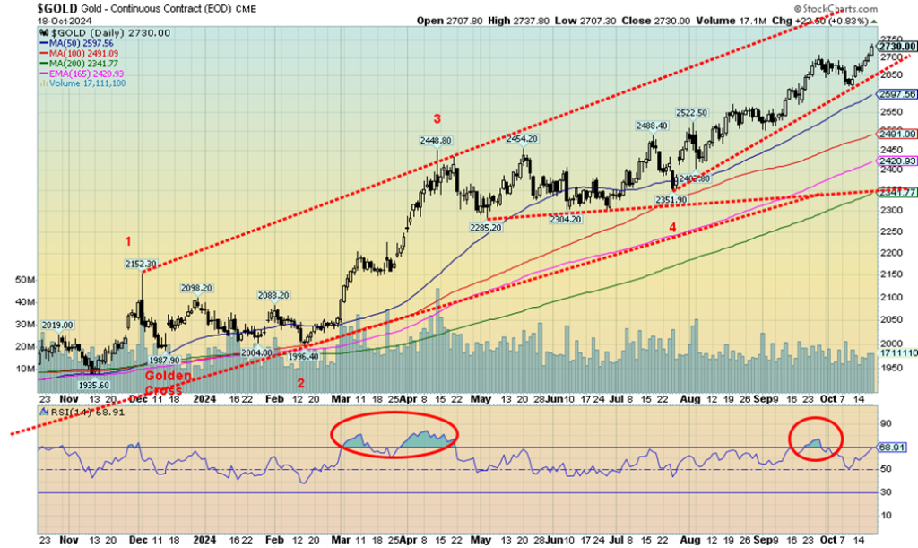
Once again gold made all-time highs, closing at $2,730 after hitting $2,730.80 as the high. On the week, gold gained 2.0%. Silver was even better, up 4.7% to 52-week highs. Platinum showed some life, up 3.0%. Of the near precious metals, palladium gained 1.4% but copper fell 2.5%. We prefer to see copper and gold go up together so copper’s weak performance could be a signal of an impending correction. Global uncertainty is driving up the price of gold as a safe haven.
Geopolitical concerns are rife, particularly what is going on in the Middle East between Israel and a host of actors. Hezbollah has threatened to up the war and, regardless of the death of the Hamas leader, both sides appear to be dug in, with a cease fire nowhere in sight. As well, there are threats with Iran and now even Syria. The Israeli economy is under growing stress and its debt was downgraded by Moody’s to Baa1, the same as the S&P’s BBB+ rating. That is three levels above junk status.
Domestic political concerns are also growing as we near the November 5 election. Trump has already declared that if he loses, the results will not be accepted. No word from the Harris camp; however, the odds of them accepting Trump are slim to none. Potential political violence looms. And as we already know, the world is laden with debt and gold is responding to that.
A lesser concern, even though it too is a threat, are the severe storms, wildfires, etc. that we are experiencing because of global warming, a term that is highly politicized and has caused clashes. The world is unstable politically, environmentally, and economically, and gold as a safe haven responds to that.
Noteworthy is that gold funds and ETFs are seeing an increased influx of funds. This is a bullish development. As well, we are seeing increased recommendations to hold gold from the normally “gold, who cares about gold” crowd on Wall Street. We view both these developments as, again, bullish for gold. Finally hedge funds and other funds are starting to snap up the undervalued, under-owned, and under-followed junior gold miners.
These stocks, which trade for the most part on the TSX Venture Exchange (CDNX), have been ignored for eons, such that for some, the cash they have in the bank is more than where their stock price is. They are highly leveraged to the price of gold.
Once through $2,700 successfully, $2,800 is next. Targets are up to $3,050. Many are stating considerably higher targets, except at this stage there is little evidence to support that. With an RSI of 69 we do have room to move higher. A breakdown under $2,650 would be a sign of weakness. Stronger support lies below at $2,600.
However, as we have seen on this rally, it has been a steady rise with pullbacks that get bought suggesting this rally is strong. We are headed higher. The recent rise in the US$ Index does not seem to have adversely impacted rising gold prices.
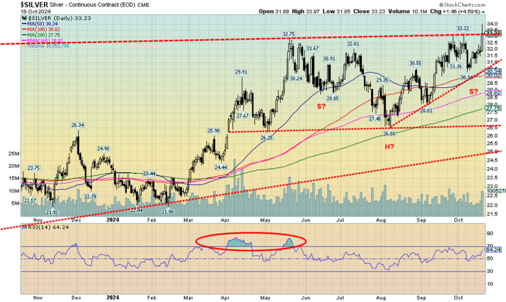
Silver appeared to break through this past week, spiking over $33 and closing over that level. The market spiked to 52-week highs at $33.97 before falling back to earth and closing at $33.23. Still, it all allowed silver to close up 4.7% this past week. Despite the gains, silver remains considerably undervalued. As well, in closing at $33.23 it is at that line that connects the May high of $32.75 and the recent high of $33.22. We’ll need to successfully get over $33.50 and over $34 now to confirm we should be on our way to long-held targets at $39/$40.
With an RSI of 64, silver has considerable room to move higher. Silver stocks did quite well this past week with ones like Endeavour Silver (EDR/TO) up over 10%. Silver stocks, like gold stocks, are leveraged to the price of silver. While silver’s action was encouraging this past week, we are not yet out of the woods. A fallback under $31.50 would be a sign of weakness. Under $30.25 we could break down. The reality is, progress has been good, but now we need to break above $34 to convince us we are headed higher.
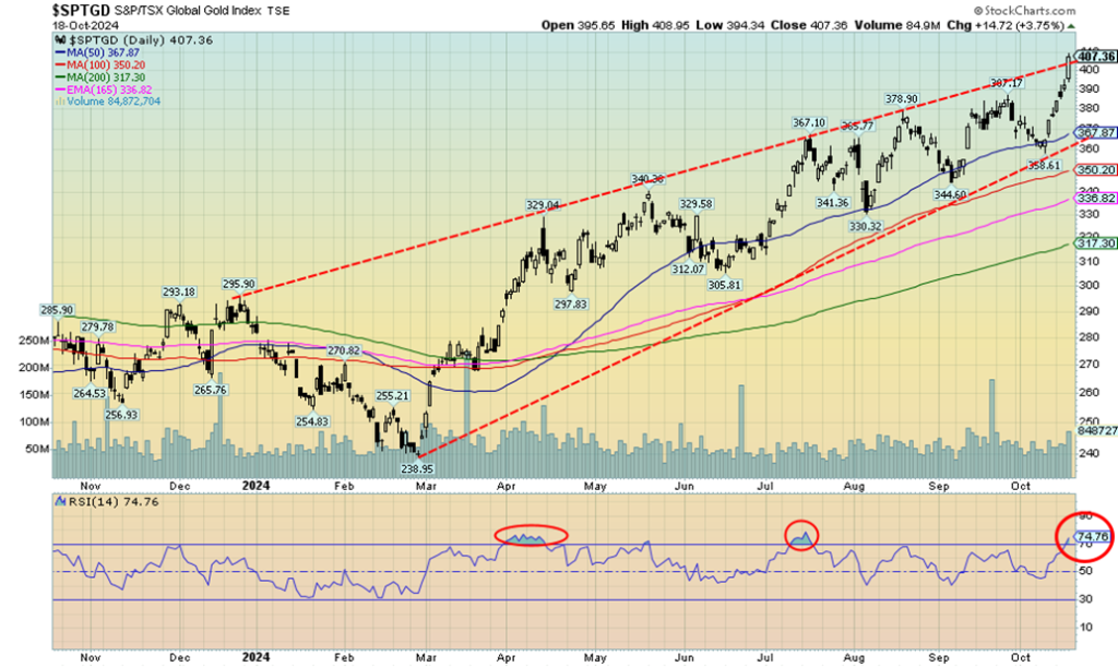
The gold stocks were on fire this past week with the TSX Gold Index (TGD) up 8.2% while the Gold Bugs Index (HUI) gained 7.9%. The two indices are now up 43.2% and 41.6% respectively on the year. A stellar performance. But a reminder that the sector is volatile and corrections could come at any time. A reminder as well that the TGD remains down around 10% from its all-time (nominal) high. The HUI is even worse off, down 46% from that 2011 high. At least the TGD is close. But if we want to be picky, the TGD is down 42% from an inflation-adjusted top. We have a way to go.
We also appear to be overthrowing the upper channel. Is it a breakout, or are we reaching at least another temporary top before a pullback? We are up some 13% from that last low about 10 market days ago. We are also overbought with an RSI at 74.7. Yes, in a strong market we can stay overbought for a considerable period. If that’s the case, we need to see follow-through to the upside come Monday. But as the market moves higher, profit-taking is the order of the day. Nonetheless, there are a lot of reasons this market is doing well as funds are now coming into the gold market.
While gold stocks are not the same as gold bullion, funds prefer the leverage they offer. Even the junior market is showing some life. The TSX Venture Exchange (CDNX), which is dominated by junior mining companies, gained 2.7% this past week. That market, however, remains undervalued, under-appreciated and under-owned. The CDNX is close to 52-week highs, but remains down over 80% from its all-time highs seen in 2008. And that’s without adjusting for inflation. We’re even down some 44% from that 2021 high.
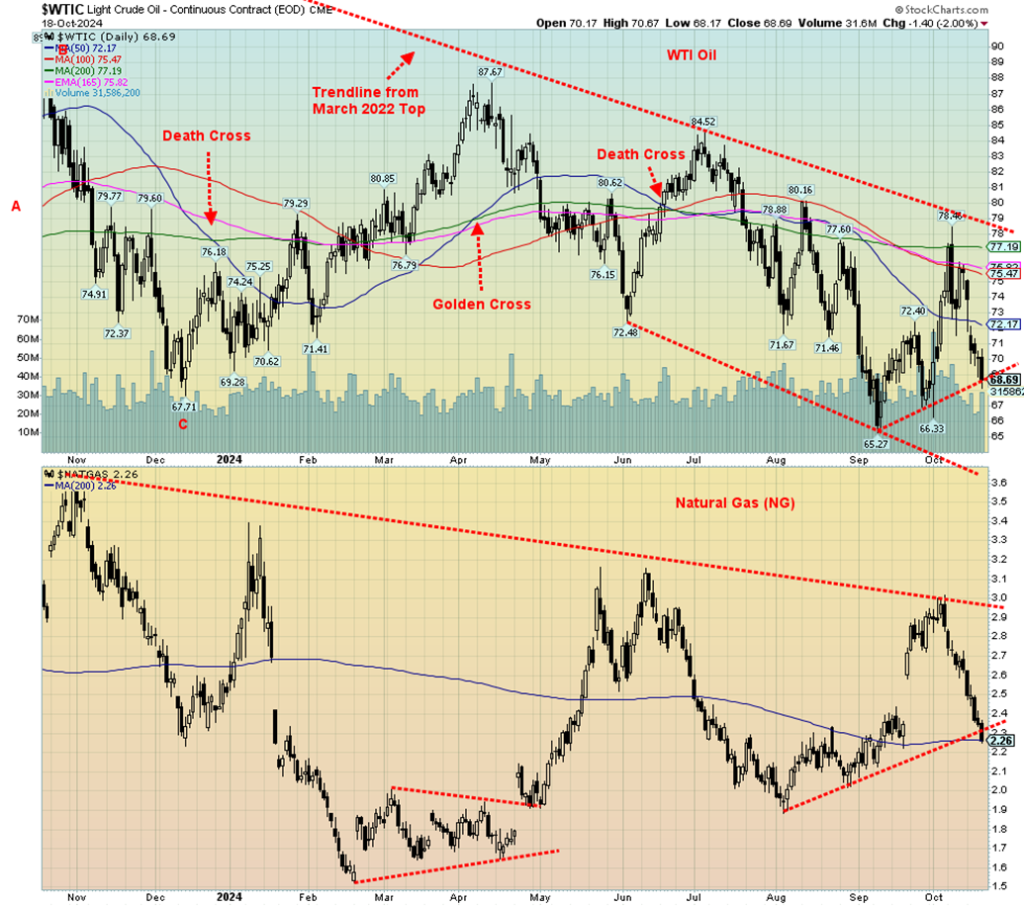
No news on the Israel/Iran front is bad news for the global oil market that is plagued with oversupply. Geopolitical risk is one of the key drivers of oil prices. If the risk lessens, oil prices fall. And even if Israel does strike Iran and in a worst-case scenario the Straits of Hormuz are shut down, oil is a considerably less of a factor today to the global market than it was in the 1970s. On the week, WTI oil fell 9.1% while Brent crude dropped 7.2%.
Natural gas (NG) also fell, losing 14.1% as warm weather lessened demand, the hurricanes did not impact production in the Gulf, Chinese demand has softened due to their economic problems, and forecasts are for a mild winter. EU NG at the Dutch Hub fared a little better, losing only 0.9% as they have concerns about geopolitical disruptions. NG fell to support at its 200-day MA but also appears to have broken an uptrend line.
WTI oil could be poised to better test that September low of $65.27. As well, OPEC, led by Saudi Arabia, is threatening to pump more oil, setting off possible price wars. High-cost producers like Canada with the oil sands would then be squeezed as prices would fall to untenable levels, causing them to lose money and potentially shutting down production.
WTI oil is currently at or near a support zone. But a further break under $68 could suggest that new lows below $65.27 lie ahead. This coming week could be telling for oil prices.
__
(Featured image by Giorgoi Trovato via Unsplash)
DISCLAIMER: This article was written by a third party contributor and does not reflect the opinion of Born2Invest, its management, staff or its associates. Please review our disclaimer for more information.
This article may include forward-looking statements. These forward-looking statements generally are identified by the words “believe,” “project,” “estimate,” “become,” “plan,” “will,” and similar expressions, including with regards to potential earnings in the Empire Flippers affiliate program. These forward-looking statements involve known and unknown risks as well as uncertainties, including those discussed in the following cautionary statements and elsewhere in this article and on this site. Although the Company may believe that its expectations are based on reasonable assumptions, the actual results that the Company may achieve may differ materially from any forward-looking statements, which reflect the opinions of the management of the Company only as of the date hereof. Additionally, please make sure to read these important disclosures.
Copyright David Chapman 2024
David Chapman is not a registered advisory service and is not an exempt market dealer (EMD) nor a licensed financial advisor. He does not and cannot give individualised market advice. David Chapman has worked in the financial industry for over 40 years including large financial corporations, banks, and investment dealers.
The information in this newsletter is intended only for informational and educational purposes. It should not be construed as an offer, a solicitation of an offer or sale of any security. Every effort is made to provide accurate and complete information. However, we cannot guarantee that there will be no errors. We make no claims, promises or guarantees about the accuracy, completeness, or adequacy of the contents of this commentary and expressly disclaim liability for errors and omissions in the contents of this commentary.
David Chapman will always use his best efforts to ensure the accuracy and timeliness of all information. The reader assumes all risk when trading in securities and David Chapman advises consulting a licensed professional financial advisor or portfolio manager such as Enriched Investing Incorporated before proceeding with any trade or idea presented in this newsletter. David Chapman may own shares in companies mentioned in this newsletter.
Before making an investment, prospective investors should review each security’s offering documents which summarize the objectives, fees, expenses and associated risks. David Chapman shares his ideas and opinions for informational and educational purposes only and expects the reader to perform due diligence before considering a position in any security. That includes consulting with your own licensed professional financial advisor such as Enriched Investing Incorporated. Performance is not guaranteed, values change frequently, and past performance may not be repeated.


The TopRanked.io Weekly Digest: What’s Hot in Affiliate Marketing [++ KuCoin Affiliate Program Review]
X now allows people to block certain topics from their feed. This week, we're going to tell you how to...


Hotel Stay Project Supports Wildlife Conservation in Japan
Iwate Prefecture launched a project linking hotel stays to conservation through Morioka Zoological Park Zoomo. A themed room at Yunomori...


Bitcoin Leads Modest Crypto Rebound Amid Mixed Signals
Bitcoin rose 2 percent to above 77000 as ETFs saw 15 million inflows and April gains of 12.2 percent. Ethereum...


Major Pharma Advances: EU Approvals, Vaccine Progress, and Breakthrough Clinical Results
Johnson & Johnson has EU approval for nipocalimab for generalized myasthenia gravis, showing superior control and sustained benefits. Sanofi reported...


Agential Cannabis 2026 to Drive APAC Market Growth and Global Industry Collaboration
Agential Cannabis 2026 will take place September 23–24 in Bangkok, bringing global experts together to advance the APAC medical cannabis...
 |
|
 |  |
 |
|
-

 Business1 week ago
The Federal Reserve and War in Iran: Why It Matters to Your Money
-

 Fintech1 week ago
Lutech Acquires Talentomobile to Boost European Fintech Expansion
-

 Africa2 days ago
Why Small Businesses in the MENA Region Struggle to Scale Despite Access to Finance
-

 Africa1 week ago
Middle East Crisis Threatens Africa’s Growth and Economic Stability