Markets
The History of Inflation: What Does Well in Inflationary Periods
Periods of high inflation in U.S. history often coincide with wars, like the Revolutionary War, Civil War, World Wars, Korean War, Vietnam War, and recent conflicts. Increased money supply to prevent financial crises typically precedes inflation spikes. The pandemic’s massive liquidity injection led to inflation in 2022, aggravated by the Russia/Ukraine war.

We’ve seen the word hyperinflation tossed around a bit recently. We’ve also seen the word depression tossed around, but more often than not it is hyperinflation that is mentioned. However, there is also inflationary depression, meaning a period of severe economic contraction accompanied by high inflation. The worst of both worlds. One could say that the hyperinflation of the Weimar Republic in Germany in 1923 also contributed to a collapse in economic activity and rising unemployment. In other words, an inflationary depression.
As bad as Germany’s inflation was, it wasn’t the worst of the 20th century. That honour belongs to post-World War II Hungary where inflation reached the unlikely, unheard-of level of 41.9 quadrillion % in July 1946— effectively a doubling of prices every 15.3 hours. It seems that even the inflation in Zimbabwe fell below the Hungary inflation. The worst inflation registered today is Argentina where it was last reported at 289% annually. Makes the U.S. and Canada’s last reported inflation of 3.5% and 2.7% look rather puny. Grant you, that is just the headline inflation rate. John Williams of ShadowStats (www.shadowstats.com) reports U.S. inflation at 11.4%. Maybe that’s why so many are feeling the pinch. It’s reported officially as 3.5%, but reality has it at 11.4%.
In U.S. history, periods of high inflation are usually marked by periods of war, both during and after. Inflation rose during the American Revolutionary War (1775–1783), the War of 1812 (1812–1815), the U.S. Civil War (1861–1865), World War I (1914–1918), World War II (1939–1945), Korean War (1950–1953), Vietnam War (1955–1975), the 1970s oil shock (1970–1980), the Iraqi invasion of Kuwait and Desert Storm (1990–1991), rising gas prices in the 2000s due to sharply increased demand in Asia, particularly China (2000-2008), and the invasion of Afghanistan and Iraq (2001–2021). Today’s rise in inflation generally coincided with the outbreak of the Russia/Ukraine War, followed by the Israel/Hamas War. But the conditions were set before the outbreak of war.
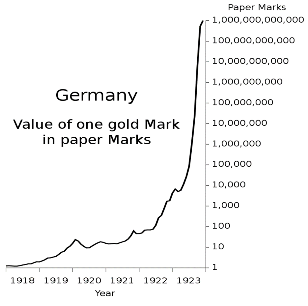
Germany’s Hyperinflation: Value of One Gold Mark in Paper Marks 1918–1923
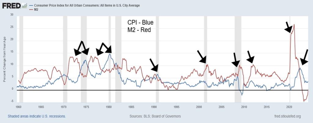
Usually accompanying a rise in inflation is a rise in money supply (M1, M2) as the Fed and other central banks flood the financial system with liquidity to prevent a financial meltdown. The trouble is, it has taken an increasing amount of money to purchase an additional dollar of GDP. The chart below shows that periods of inflation are generally preceded by a rise in money supply (M1, M2). This is not always the case, as the jump in money supply after the dot.com crash in 2000–2002 resulted mostly in benign inflation as did the jump in money supply after the financial crisis of 2007–2009.
However, the massive injection of liquidity after the pandemic of 2020–2021 did result in a jump in inflation, starting in 2022. Was it just coincidence that the Russia/Ukraine war also got underway in 2022? The Russia/Ukraine war broke out in February and the first rate hike was in March 2022. The outbreak of war resulted in more expenditures from the U.S. treasury to finance Ukraine in its war against Russia and Israel in its war with Hamas. Generally, however, a rise in money supply (some call it money printing) is generally followed by a rise in inflation.
In 2020, at the height of the pandemic, the U.S. had the highest budget deficit ever at $4.2 trillion. It represented 14.7% of GDP. That percentage of GDP was surpassed by wartime budget deficits that reached 26.9% of GDP in 1943. In 1943 it really was war. War and budget deficits are not unusual. But it took a pandemic to reach the highest budget deficit ever.
Four years after the pandemic budget deficit, the U.S. budget deficit in 2024 is expected to reach at least $1.8 trillion and as high as $2.0 trillion. The combination of budget deficits and rising money supply is directly correlated to a rise in inflation—too much money sloshing around. But inflation is not necessarily always price inflation. It is also asset inflation as money was poured into the stock market and the housing market, thanks, as well, to ultra-low interest rates. This is what took place after the 2008 financial crisis and was accelerated after the pandemic.
CPI and M2 1959–2024 % Annual Change
Rising inflation is eventually followed by rising interest rates as the monetary authorities try to dampen inflation. But fiscal spending is the responsibility of the treasury. The result is the two can actually work against each other, irrespective of how high the monetary authorities (Fed, BofC, ECB, etc.) hike interest rates to combat inflation. No wonder there are those that say Western economies are on an unsustainable path. In the event of another 2008 financial crisis, we might no longer have bail-outs, but instead bail-ins.
The authorities are trapped as any massive turn-off of the fiscal spigots could result in rising unemployment and falling GDP. It’s how a recession could turn into a depression. Add in the rise of sanctions and trade tariffs that are beginning to predominate, no matter who is in charge, and we could have a deadly combination that sparks a sharp downturn, resulting in falling currencies. Falling currencies of the fiat kind are often accompanied by increased inflation. Nor does it necessarily signal the end of inflation, although inflation did fall and turn negative during the Great Depression.
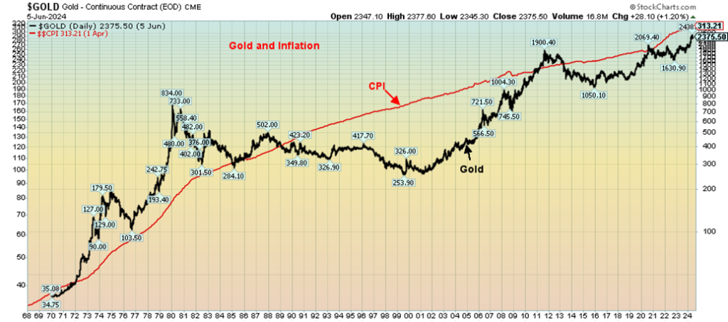
Gold and inflation are often linked. The correlation is supposed to be that as inflation rises gold rises as well. Gold, is therefore, known as an inflation hedge. Inflation also means a decline in the value of fiat currencies. Gold (and silver) are proven to be money throughout the centuries. But that positive correlation between gold and inflation works best when inflation is rising sharply. When inflation subsides, gold often falls as well.
During the inflationary 1970s, as the CPI rose gold rose as well. But from around 1980 to 2001, inflation subsided and gold went through a long period of underperformance. That perked up in the 2000s as inflation picked up and gold once again soared. But once again, when inflation subsided through the 2010s, the price of gold also slumped.
Gold and Inflation 1968–2024
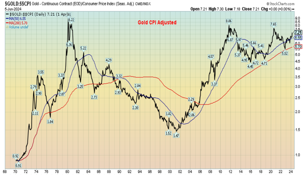
Gold is also correlated to the debt and money supply. As debt increases and as the money supply increases (M1, M2), gold tends to rise as well. Despite the positive links for gold to inflation, money supply, and debt, the inflation-adjusted price of gold remains below its peak seen in 1980. Gold today would have to rise above $2,700 to equal the highs of 1980 on an inflation-adjusted basis. With silver, the spread is even more as silver would have to rise to $144–$150 to equal the 1980 high. Yet gold has helped maintain purchasing power, even as currencies fall, debt rises, money supply rises, and inflation rises.
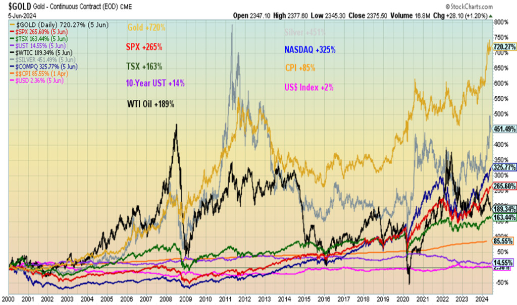
It seems strange to note that gold in 1971, before the closing of the gold window, was trading at $42/ounce. Today that would be only $325. Gold today is trading around $2,325. Since 2000, gold has been the best-performing asset (setting aside Bitcoin and cryptos), with a gain of 720%. Closest is silver, up 451%. The S&P 500 is up only 265% and the TSX even less, up 163%. The same holds true from 1970 where gold is up 6,672% vs. the S&P 500 up 5,715%. The big winner, however, is the NASDAQ that has gained 16,426%. Today, gold is under-owned and unloved, except, of course, in Asia or by the central banks—both have been buying gold. For whatever reason, gold does not hold the same cachet in North America as it does in Asia, particularly India and China.
Gold CPI-Adjusted 1970–2024
Gold and Others’ Performance 2000–2024
Western economies have no history of hyperinflation, outside of the previously mentioned hyperinflation that occurred after World War I in Germany and France as well. It is amazing how the German mark went from one mark to purchase one gold mark in 1918 to needing one trillion marks in 1923. No wonder they needed barrels of money just to purchase a loaf of bread. But what was most interesting about the German hyperinflation is that purchasing an ounce of gold in 1918 would have been more than sufficient to maintain purchasing power. Gold is a hedge against inflation. But, as with anything, there is a time to own it and a time not to.
With gold, we are referring to bars, coins, etc. Gold stocks offer leverage, but like all stocks they have their own liability. Eventually the under-owned and more unloved junior resource exploration stocks will wake up. They offer the most leverage to the price of gold (and other commodities). With ongoing deterioration in geopolitics, domestic politics, money printing, debt accumulation, and climate disasters, gold will eventually prove its mettle. And, unlike cryptos, gold is real, not virtual.
Chart of the Week
U.S. Job Numbers
U.S. Employed Persons, Unemployed Persons 2019–2024
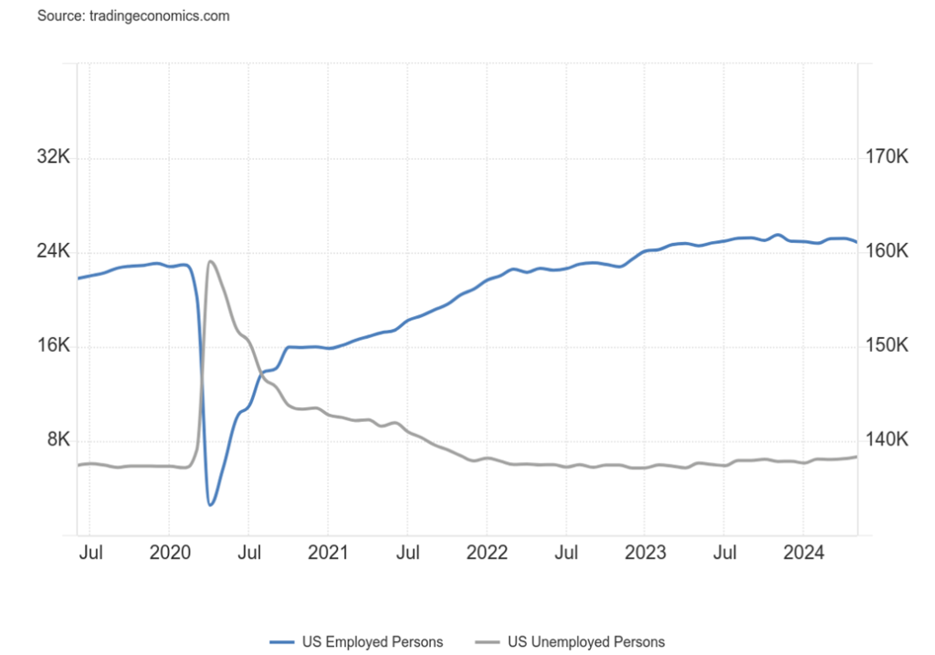
Well, so much for rate cuts in the U.S. The nonfarm payrolls completely surprised everyone, reporting 272,000 new jobs in April when the consensus was for only 180,000/190,000. So, what happened? The stock market wobbled, bond yields rose, the US$ Index rose sharply, oil rose, and gold and other commodities were clobbered.
But as we always say—hold on a minute. There are some unanswered questions (and, no, we don’t have an answer, either), like, how could the nonfarm payrolls rise so much (+272,000) when the civilian labour force fell 250,000? Not rise, the civilian labour force fell. Yet the eligible working population rose by 182,000, but then we look over at the not in the labour force category and it also rose by 433,000.
The civilian employment level as reported by households fell an astounding 408,000. None of this, as we say, equates. Grant you, there are two different surveys as nonfarm payrolls is the establishment survey (Bureau of Labour Statistics (BLS) to business directly), whereas the other numbers are the household survey (BLS to individual households).
The labour force participation rate also fell to 62.5% vs. 62.7% in April. Also, the employment population ratio dropped to 60.1% from 60.2%. More jobs, but fewer people participating in the labour market. That’s a headscratcher. But what about those jobs? Full-time employment fell 625,000, but part-time employment rose 286,000. The employment level, meaning all those eligible to be employed, as noted also fell by 408,000.
The unemployment rate (U3) rose to 4.0% from 3.9%. However, the U6 unemployment rate (U3 plus all persons marginally attached to the labor force, plus total employed part time for economic reasons, as a percent of the civilian labor force, plus all persons marginally attached to the labor force) was unchanged at 7.2%. At time of writing we didn’t have the Shadow Stats www.shadowstats.com numbers.
Earlier in the week, the weekly claims were reported as 229,000, up from 221,000 the previous week and above the consensus of 220,000. The ADP employment was up 152,000, below the expected 170,000 and April’s 188,000. Grant you, ADP employment and nonfarm payrolls rarely agree month to month but over time tend to equal out.
So, where were all the jobs? Mostly in health care, government, and leisure and hospitality. Private nonfarm was up 229,000 while government nonfarm was up 43,000. Earnings rose more than expected, up 0.4% on the month above the expected 0.2% and year over year (y-o-y) up 4.1% vs. expected 3.9%. But we note that average number of weeks unemployed rose to 21.2 weeks, up from 19.9 weeks. And those unemployed 27 weeks or longer rose by 62,000. However, the median weeks unemployed fell to 9.3 weeks from 10.5 weeks.
The unemployment rate of 4% is the highest in since November 2021 but remains at historically low levels. According to the household survey, the cohort 16–25 saw job losses but the core 25–54 age group saw gains. Also, the core 25–54 age group had the highest labour force participation rate in 22 years at 83.6%.
The report sounds rosy. But dig deeper and suddenly it is not so rosy. As usual, there are discrepancies between the two surveys that don’t add up. So, what does it mean? Well, it will keep interest rates up. The odds of a Fed rate cut at the June 11–12 meeting is about zero. The next meeting is July 30–31. At this point, calling for a rate cut then also seems remote.
According to Fed futures, all they are indicating now is one rate cut later this year. So, the likelihood that the Fed will follow the Bank of Canada (BofC) and the European Central Bank (ECB) in cutting rates, as both did this past week, has fallen off dramatically. All in all, good for fixed income investors, bad for borrowers; i.e. households, corporations, government. And, at least for the moment, bad for precious metals investors.
Canada job numbers
Canada Employed Persons and Unemployed Persons 2019–2024
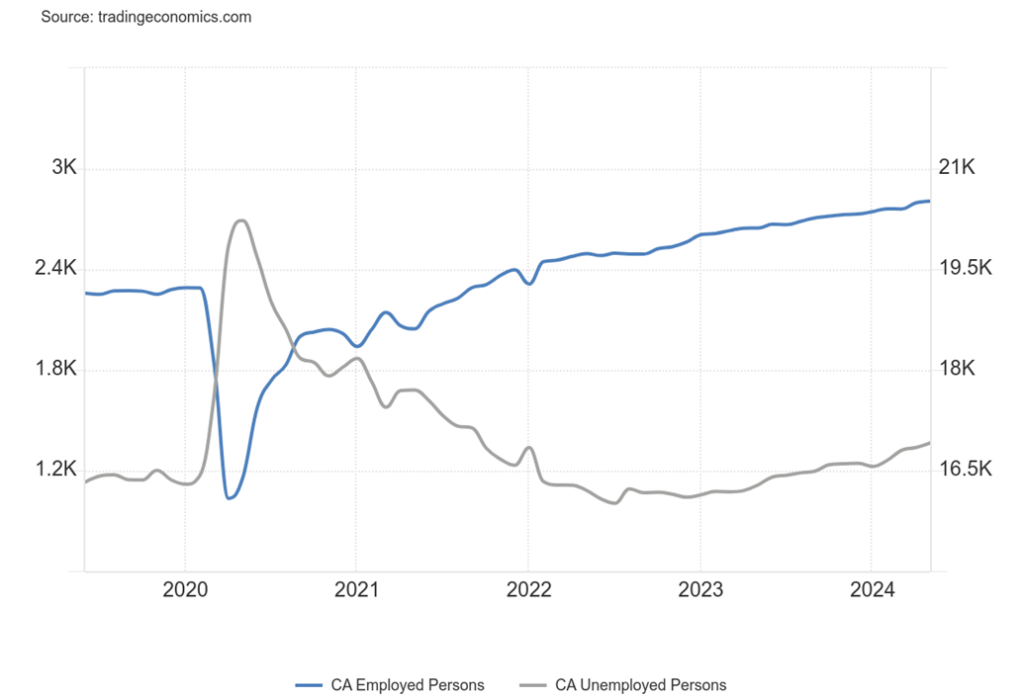
Canada surprised with its job numbers as well, although not quite as dramatically as the U.S. In May, Canada gained 26,700 jobs, down sharply from the gonzo April number of 90,400 but still above expectations of 22,500 new jobs. But, as usual, suspicious numbers. Part-time employment rose by 62,000 jobs, but full-time employment fell by 36,000. The number of people unemployed rose by 28,100, even as employed persons also rose by 73,200. The unemployment rate rose to 6.2% from 6.1% (it’s different than the U.S. unemployment rate as it is calculated differently). The R8 unemployment number, the highest calculated by Statistics Canada (www.statcan.gc.ca) (plus discouraged searchers, waiting group, portion of involuntary part-timers) rose to 8.5% from 8.4%.
The labour force participation rate remained the same at 65.4%. Average hourly earnings rose by $1.77 while average weekly earnings were up $6.2. Average hourly earnings were up 5.2% year over year (y-o-y) vs. 4.8% in April. As with the U.S., most of the jobs were in health care and leisure and hospitality.
Markets & Trends
| % Gains (Losses) Trends | ||||||||
| Close Dec 31/23 | Close Jun 7, 2024 | Week | YTD | Daily (Short Term) | Weekly (Intermediate) | Monthly (Long Term) | ||
| Stock Market Indices | ||||||||
| S&P 500 | 4,769.83 | 5,346.99 (new highs)* | 1.3% | 12.1% | up | up | up | |
| Dow Jones Industrials | 37,689.54 | 38,798.99 | 0.3% | 2.9% | up | up | up | |
| Dow Jones Transport | 15,898.85 | 15,022.85 | (1.4)% | (5.5)% | down | down (weak) | up | |
| NASDAQ | 15,011.35 | 17,133.12 (new highs)* | 2.4% | 14.1% | up | up | up | |
| S&P/TSX Composite | 20,958.54 | 22,007.00 | (1.2)% | 5.0% | up | up | up | |
| S&P/TSX Venture (CDNX) | 552.90 | 588.25 | (3.7)% | 6.4% | neutral | up | down | |
| S&P 600 (small) | 1,318.26 | 1,296.43 | (2.5)% | (1.7)% | neutral | up | up | |
| MSCI World | 2,260.96 | 2,396.76 | 1.8% | 6.0% | up | up | up | |
| Bitcoin | 41,987.29 | 69,041.12 | 2.2% | 64.4% | up | up | up | |
| Gold Mining Stock Indices | ||||||||
| Gold Bugs Index (HUI) | 243.31 | 263.12 | (5.8)% | 8.1% | neutral | up | up | |
| TSX Gold Index (TGD) | 284.56 | 311.51 | (4.0)% | 9.5% | down (weak) | up | up | |
| % | ||||||||
| U.S. 10-Year Treasury Bond yield | 3.87% | 4.44% | (1.6)% | 14.7% | ||||
| Cdn. 10-Year Bond CGB yield | 3.11% | 3.49% | (4.6)% | 12.2% | ||||
| Recession Watch Spreads | ||||||||
| U.S. 2-year 10-year Treasury spread | (0.38)% | (0.46)% | (21.1)% | (21.1)% | ||||
| Cdn 2-year 10-year CGB spread | (0.78)% | (0.54)% | 3.6% | 30.8% | ||||
| Currencies | ||||||||
| US$ Index | 101.03 | 104.91 | 0.3% | 3.8% | down | up (weak) | up | |
| Canadian $ | 75.60 | 72.77 | (0.8)% | (3.7)% | down | down | down | |
| Euro | 110.36 | 108.02 | (0.4)% | (2.1)% | up | up (weak) | down (weak) | |
| Swiss Franc | 118.84 | 112.41 | 1.4% | (5.4)% | up | neutral | neutral | |
| British Pound | 127.31 | 127.21 | (0.2)% | (0.1)% | up | up | neutral | |
| Japanese Yen | 70.91 | 63.82 | 0.4% | (10.0)% | down | down | down | |
| Precious Metals | ||||||||
| Gold | 2,071.80 | 2,325.00 | (0.9)% | 12.2% | down (weak) | up | up | |
| Silver | 24.09 | 29.44 | (3.3)% | 22.1% | neutral | up | up | |
| Platinum | 1,023.20 | 971.10 | (6.8)% | (5.1)% | neutral | up | up (weak) | |
| Base Metals | ||||||||
| Palladium | 1,140.20 | 923.60 | 1.2% | (19.0)% | down | down | down | |
| Copper | 3.89 | 4.48 | (2.6)% | 15.2% | down (weak) | up | up | |
| Energy | ||||||||
| WTI Oil | 71.70 | 75.53 | (1.9)% | 5.2% | down | down | down (weak) | |
| Nat Gas | 2.56 | 2.92 | 12.7% | 14.1% | up | up (weak) | down (weak) | |
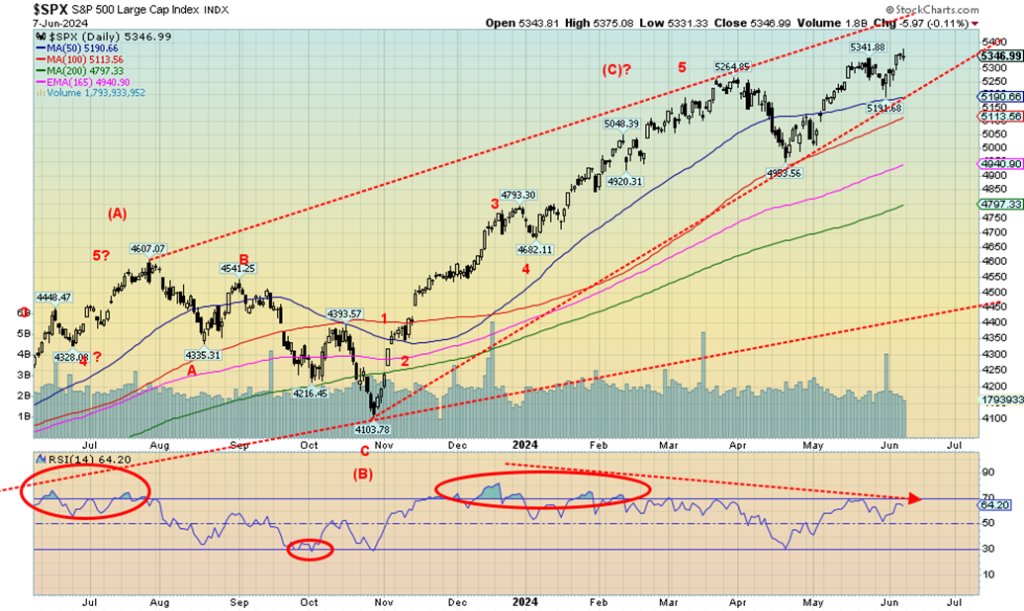
Once again, new all-time highs happened in the stock market. Well, at least for some. Not everyone joined the party and others, rather than rising on the week, fell instead. Making new all-time highs were the S&P 500 and the NASDAQ. The NASDAQ was pushed by the FAANGs as the NY FANG Index also made new all-time highs, despite only one FAANG of significance making new all-time highs. Yes, that would be Nvidia that is pushing Apple as the second largest corporation in the world. Microsoft leads with a market cap of $3.15 trillion, Apple with $3.02 trillion, and Nvidia with $2.97 trillion. These companies are so big they pale most countries. All three rank with the U.K., the world’s sixth largest economy. They’d be number 6, 8, and 9 if they were countries.
Nonetheless, divergences are popping up everywhere, it seems. On the week, the S&P 500 (SPX) gained 1.3% but the Dow Jones Industrials (DJI) failed to make new all-time highs, up 0.3%. The DJI is down 3.2% from its all-time high. The Dow Jones Transportations (DJT) continues to diverge widely with the DJI and fell on the week, losing 1.4%.
As noted, the NASDAQ made all-time highs, up 2.4%, and the NY FANG Index gained 3.0% to new all-time highs. The S&P 400 (Mid) fell 2.1% while the S&P 600 (Small) was also down, off 2.5%. More telling was the S&P 500 Equal Weight Index that also fell off 0.8%. Unlike its weighted partner, the SPXEW is down 3.4% from its March 2024 all-time high. Divergences.
Another way of looking at divergences is the NYSE Advance/Decline line. Even as the SPX was making all-time highs, the NYSE AD Line was not making new highs. The last time we saw that was late 2021. What followed was the 20%+ decline in 2022. Divergences.
As well, numerous indicators, including the RSI, MACD, and more, are diverging on a daily (short-term), weekly (intermediate term), and even monthly (long-term) basis. None of that is a positive sign as we head towards the second half of the year. The one positive is that usually in an election year the stock market does well. But, given the current deep divisions in the country before the November election, even that is not guaranteed.
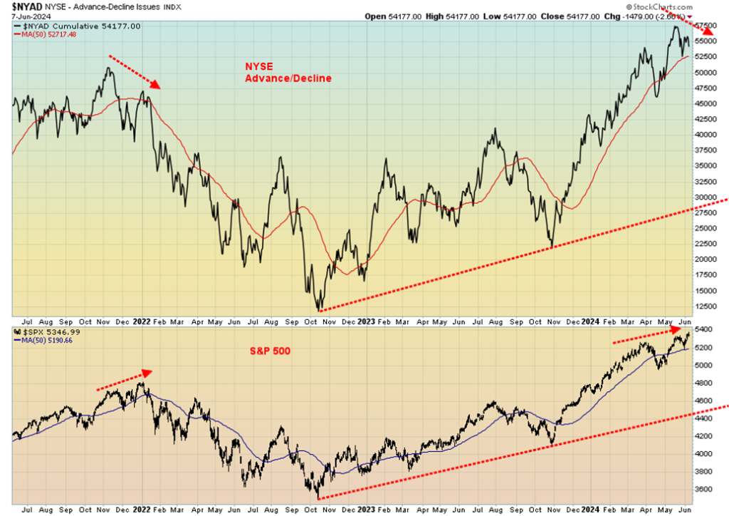
Friday’s action on the SPX left it with what we call in Japanese candlestick terms an evening star. That’s a longish body with a small real body. It usually looks like a small cross. On Friday, the SPX opened at 5,344, hit a high of 5,375, a low of 5,331, and closed at 5,346. A range of 44 points but only 2 points separated the open from the close. It’s a potentially bearish sign. We’ll see what happens in the coming weeks.
In Canada, the TSX Composite fell 1.2% and the TSX Venture Exchange (CDNX) continued its woes, down 3.7%. Seven sub-indices were down, led by Energy (TEN), down 5.9%, six were up, led by Consumer Staples (TCS), up 2.4%, and one was flat—Consumer Discretionary (TCD). In the EU, the London FTSE fell 0.4%, the EuroNext gained about 0.7%, the Paris CAC 40 was up 0.1%, and the German DAX gained 0.3%.
In Asia, China’s Shanghai Index (SSEC) was down about 1.2%, the Tokyo Nikkei Dow (TKN) was up 0.5%, but Hong Kong’s Hang Seng (HSI) was down 0.3%. The MSCI World Index gained 1.8%, suggesting that gains were in emerging markets. Bitcoin jumped 2.2% but remains below $70,000 and its all-time high.
Divergences, divergences everywhere. This is leading us to believe that we may be witnessing a top. Confirmation would come when the SPX breaks under 5,200. Better confirmation comes with a break under 5,000. The S&P 500 and the stock market in general is still overvalued with P/E multiples well above the long-term mean and median. Price to sales is also well above its long-term mean and median while the earnings yield remains well below its long-term mean and median.
At this point we can’t confirm a top. We await better signals.
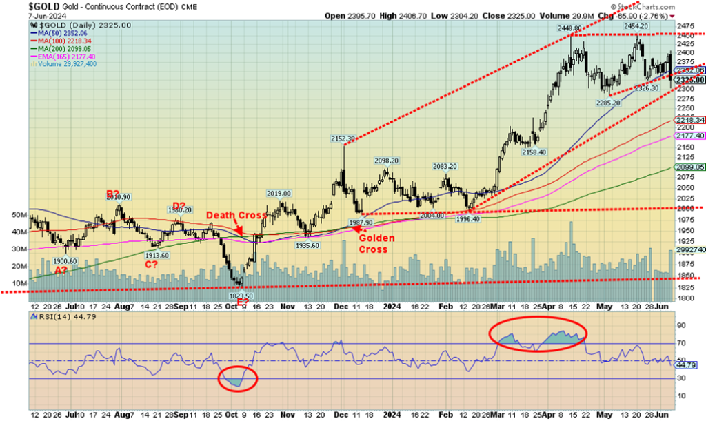
Friday, June 7 almost had the feel of Friday, April 12, 2013. On that day, gold plunged $80. On Monday, April 15, 2013 it got even worse as gold was slaughtered, falling $129. Two days that will live in gold infamy. Two days and gold fell $209. The gold crash of 2013 is etched in gold bugs’ minds. Percentage-wise, the plunge on April 12 was 5%. The two-day plunge was just over 13%. On Friday, June 7 gold fell $65 in the futures market. In the cash market that continued trading after futures closed, gold closed down $83. But the drop in the futures was only 2.8%. Still, it all came as a bit of a shock. In 2013, the market was already sliding and when key support at $1,500/$1,525 gave way it was turned into a rout.
Arguably, the conditions that were present in 2013 are not here today. Friday’s plunge was triggered by the stronger than expected nonfarm payrolls. As a result, bond yields rise and thoughts of a Fed rate cut this coming week went up in smoke. The headline nonfarm might have been have seemed rosy, but a closer examination, as we note in our commentary on the U.S. job numbers, was that the numbers actually revealed rot.
The employment level fell by 408,000, making the nonfarm gain of 272,000 seem suspect. Full-time jobs plunged 625,000 while part-time jobs jumped 286,000. The unemployment rate rose. Bond yields did rise Friday, but on the week, they were actually lower. The US$ Index jumped, but ended the week rather flat.
Naturally, a breakdown under $2,300 might send us tumbling further to support near $2,200 or even $2,100. That would still leave gold up on the year, albeit damaged. The thought behind Friday’s plunge was that, given the strong job numbers, a Fed rate cut was off the table and the Fed would not be joining the BofC and the ECB in cutting rates. It’s misplaced, as elsewhere we are seeing signs of a slowing economy. Then there is the astronomical debt, the geopolitical concerns, domestic political dysfunction, and weakening fiat currencies. All are music to gold’s ears.
On the week, gold fell 0.9%, largely because of a strong two-day rally the two previous days to Friday. Silver was dumped under $30, losing 3.3%, while platinum was clobbered, down 6.8%. Of the near precious metals, palladium actually gained, up 1.2%, while copper, which is in increasingly short supply coupled with increased demand, fell 2.6%. The key gold stock indices that were seriously clobbered on Friday ended the week in the red with the Gold Bugs Index (HUI) down 5.8% and the TSX Gold Index (TGD) down 4.0%. The junior exploration stocks that are already under-owned and unloved remained in that sorry state.
We’ve continually noted that gold is typically weak in May/June. This year appears to be no exception. The question is, when will it bottom and how low will we go? A bottom could be formed as early as this coming week, but we suspect no later than the first week of July. Gold could still fall further to no worse than $2,100, but a test under $2,300 would not be surprising. Silver has plunged under $30, the previous breakout point, but as a worst case we believe $28 should hold. Gold needs to regain $2,400 to suggest a low is in and silver above $32.
Cycles remain positive. The last major low was October 2022 at $1,618. That low fit well with our 7.8-year cycle (+/- 8 months) that previously bottomed in December 2015. The cycle turned up when gold broke above $2,100 the previous high. If that is correct, then the next cycle low is not due until sometime in 2029–2031. A shorter 31-month cycle saw a low in August 2018 which was 32 months from the December 2015 low.
The next low of significance was a possible double bottom low in March 2021 and August 2021 (31 months and 36 months from the 2018 low). Yes, the October 2022 low was even lower, but instead that may have been a half-cycle low. Using the 2021 lows, the next 31-month cycle low is due October 2023. Sure enough, there was a low that month. We may have already seen our 31-month cycle low. The next one isn’t due until around May 2026.
Gold closed under the 50-day MA on Friday. As noted, there is trendline support at $2,300, but the 100-day MA support is down closer to $2,200. If we break $2,300, then the odds increase that we could test $2,200. Silver confirmed a breakout when it closed over $30. So, this appears to be test of the breakout zone. But a test of the 50-day MA near $28.70 can’t be ruled out. The gold stock indices need to see the HUI break above 300 and the TGD above 340 to suggest we are headed higher.
The HUI is showing support at 260, but next good support doesn’t come until 250. Similarly, the TGD is testing support at 310, but next good support doesn’t come in until 290. The miserable junior gold mining exploration stocks continue to overwhelmed by preferred speculation in cryptos as funds pour into the Bitcoin ETF. Yet many of these juniors are undervalued, given their potential and resources. Majors need new product and many of the juniors are potential takeover targets, but at much higher prices.
Oil continues to be somewhat oversupplied, despite continued cuts by OPEC+. Russia is finding ways of getting its oil to market. The ECB rate cut helped, but Friday’s nonfarm helped dampen thoughts of the Fed following until at least September. On the week, WTI oil fell 1.9% and Brent crude was down 2.7%.
Natural gas(NG) continues to be positive as we go into the summer with NG at the Henry Hub gaining 12.7% as the EU NG at the Dutch Hub fell 4.1%. The energy stocks had a poor week, with the ARCA Oil & Gas Index (XOI) down 4.0% and the TSX Energy Index (TEN) off 5.9%. Seasonally, oil tends to be weak as we move into summer.
__
(Featured image by rc.xyz NFT gallery via Unsplash)
DISCLAIMER: This article was written by a third party contributor and does not reflect the opinion of Born2Invest, its management, staff or its associates. Please review our disclaimer for more information.
This article may include forward-looking statements. These forward-looking statements generally are identified by the words “believe,” “project,” “estimate,” “become,” “plan,” “will,” and similar expressions. These forward-looking statements involve known and unknown risks as well as uncertainties, including those discussed in the following cautionary statements and elsewhere in this article and on this site. Although the Company may believe that its expectations are based on reasonable assumptions, the actual results that the Company may achieve may differ materially from any forward-looking statements, which reflect the opinions of the management of the Company only as of the date hereof. Additionally, please make sure to read these important disclosures.
David Chapman is not a registered advisory service and is not an exempt market dealer (EMD) nor a licensed financial advisor. He does not and cannot give individualised market advice. David Chapman has worked in the financial industry for over 40 years including large financial corporations, banks, and investment dealers. The information in this newsletter is intended only for informational and educational purposes. It should not be construed as an offer, a solicitation of an offer or sale of any security. Every effort is made to provide accurate and complete information.
However, we cannot guarantee that there will be no errors. We make no claims, promises or guarantees about the accuracy, completeness, or adequacy of the contents of this commentary and expressly disclaim liability for errors and omissions in the contents of this commentary. David Chapman will always use his best efforts to ensure the accuracy and timeliness of all information. The reader assumes all risk when trading in securities and David Chapman advises consulting a licensed professional financial advisor or portfolio manager such as Enriched Investing Incorporated before proceeding with any trade or idea presented in this newsletter. David Chapman may own shares in companies mentioned in this newsletter. Before making an investment, prospective investors should review each security’s offering documents which summarize the objectives, fees, expenses and associated risks. David Chapman shares his ideas and opinions for informational and educational purposes only and expects the reader to perform due diligence before considering a position in any security. That includes consulting with your own licensed professional financial advisor such as Enriched Investing Incorporated. Performance is not guaranteed, values change frequently, and past performance may not be repeated.


The TopRanked.io Weekly Digest: What’s Hot in Affiliate Marketing [++ KuCoin Affiliate Program Review]
X now allows people to block certain topics from their feed. This week, we're going to tell you how to...


Hotel Stay Project Supports Wildlife Conservation in Japan
Iwate Prefecture launched a project linking hotel stays to conservation through Morioka Zoological Park Zoomo. A themed room at Yunomori...


Bitcoin Leads Modest Crypto Rebound Amid Mixed Signals
Bitcoin rose 2 percent to above 77000 as ETFs saw 15 million inflows and April gains of 12.2 percent. Ethereum...


Major Pharma Advances: EU Approvals, Vaccine Progress, and Breakthrough Clinical Results
Johnson & Johnson has EU approval for nipocalimab for generalized myasthenia gravis, showing superior control and sustained benefits. Sanofi reported...


Agential Cannabis 2026 to Drive APAC Market Growth and Global Industry Collaboration
Agential Cannabis 2026 will take place September 23–24 in Bangkok, bringing global experts together to advance the APAC medical cannabis...
 |
|
 |  |
 |
|
-
 Crowdfunding3 days ago
Italy Extends SME Guarantee Fund to Crowdfunding with New 2026 Framework
-
 Markets2 weeks ago
Markets Rally Amid Uncertainty and a Widening K-Shaped Economy
-
 Crypto8 hours ago
Bitcoin Leads Modest Crypto Rebound Amid Mixed Signals
-
 Crypto1 week ago
Bitcoin Strong as Market Sentiment Turns Bullish Amid Industry Developments