Business
Is the market near an important bottom for gold?
Doom, gloom, doom. That’s the names of three esteemed economists known as Dr. Doom – 2 of them and Dr. Gloom. Are they just contrarian Cassandras? Or will they prove to be spot on. We look at some bubbles (tears of joy) and what always followed was just tears as the ensuing collapse wiped out upwards of 90%. Gold continues to struggle so our chart of the week takes another look at gold’s cycles and where we are in the current cycle.

Gloom Boom & Doom Report is the odd title of Marc Faber’s market commentary reports (www.gloomboomdoom.com). Mr. Faber (b. 1946), a Swiss born and educated economist, is known for his somewhat controversial contrarian views and market calls that includes big hits as well as spectacular misses. He is either affectionally or derisively known as Dr. Gloom.
Henry Kaufman (b. 1927) is not to be confused with the two (yes, two Dr. Dooms). Mr. Kaufman is the original Dr. Doom. Mr. Kaufman rose to fame as chief economist for Salomon Brothers during the 1970s. He was noted for his caustic criticisms of government economic policies and for his market calls that were often spot on. His best call came in August 1982 when he predicted that the markets had bottomed out. It was the beginning of the long bull market (1982–2000) that ended with the dot.com crash of 2000–2002.
The second and junior Dr. Doom is Nouriel Roubini (b. 1958), an American economist and professor at New York University’s Stern School of Business and his own economic consulting firm. During his career he acted as senior economist of the Council of Economic Advisors in the administration of President Clinton and later the U.S. Treasury Department as senior advisor to Timothy Geithner, the treasury secretary under President Obama. Roubini was one of the few who predicted the housing bubble crash of 2007–2008 that led to the financial crash of 2008. At the time it earned him the moniker of Dr. Doom—not to be confused, however, with the original Dr. Doom Henry Kaufman.
Drs. Doom, Gloom, and Doom! There are many others who also might be worthy of the name. Some call them perma-bears. However, one shouldn’t assume that all are perma-bears as there are others who are worthy of the title perma-bulls. Even perma-bears are bullish about something.
While many of the views and market calls of the above group of gentlemen can be controversial, contrarian, and often not generally accepted or even known by many, they should not be ignored, either. We have learned a lot from all of them without necessarily buying into all of their views, which as we noted, can be controversial. Many of the things they have talked about we saw and observed ourselves during our 50 years in the financial world of banking and capital markets.
I was a junior in capital markets not yet out of my 20s when we hung on every word that Henry Kaufman uttered back in the 1970s. I can still remember the awe I felt when I first set foot on the trading floor of Solomon Brothers, New York, a firm that was immortalized in Michael Lewis’s 1989 book, Liar’s Poker and the inspiration for Tom Wolfe’s 1987 book, The Bonfire of the Vanities. Solomon Brothers, which became a part of Phibro Corp. in the 1980’s as Solomon Inc., was taken over by Travelers Group in 1998 following a series of treasury bond scandals in the 1990’s. Traveler’s eventually was absorbed into Citicorp which in turn became a part of Citigroup, last noted as the 13th largest banking conglomerate in the world. Solomon Brothers, where the expression “Big Swinging Dick” was born.
We have our pick of doom and gloom themes—whether it is the mysterious workings of the Federal Reserve (the Fed) or our own Bank of Canada (BofC); the bubbles in the stock, bond, collectibles, cryptocurrencies, and real estate markets; the massive amount of global debt for governments, corporations, and households; the dangers of rising income and wealth inequality; the environmental degradation of the planet, including the negative effects of climate change and over-population; global geo-political tensions between the U.S/China/Russia that could lead to World War III; the political polarization in the Western nations, particularly in North America and the eurozone that could, in the extreme, lead to civil wars or attempts at coup d’états, the rise of populist parties and the demise of democracy; and a pandemic that has not yet run its course that has already had far-reaching effects. Many of these themes have run through our own commentaries and are present today.
It may be shocking to learn that the S&P 500 is trading at 36 times trailing 12-month net income. Normal, or at least what is considered to be normal, is as we understand it around 20. That would put the S&P 500 down around 2,800 to 3,000, not the current near 4,200. That’s a cut of almost 30%. The PE ratio is 42.75 when the historical mean is around 15. Other indices like the Russell 2000 are even worse. Yet the market doesn’t seem too perturbed by it all and many are calling for the markets to move even higher.
When the Fed has your back, the market has no fear. We see that in the now falling VIX Volatility Index, which continues to go down as the market moves higher. Everyone knows the Fed can’t raise interest rates as the cost to the economy would be too great. The Fed is trapped as is every other central bank. Everyone knows the odds are low that the Fed will cut its bond buying program of $120 billion/month, $1.44 trillion/year; this program is not going to end anytime soon as it would disrupt the markets. And everyone knows that there is no such thing as “crowding out” in the bond markets as the Fed purchases a high proportion of the Treasury bond issues. With Janet Yellen, the former Fed Chairman (2014–2018), as Secretary of the Treasury, everyone knows or at least suspects that the Fed under Jerome Powell and the Treasury are joined at the hip. It’s not quite as cozy in Canada as the BofC reports directly to Parliament, not to the government of the day. The BofC continues to purchase a high proportion of the Government of Canada bond issues, so no “crowding out” in Canada either.
None of this says that the market can’t have periodic corrections. However, history tells us that bubble markets are more likely to end in tears—and not tears of joy. The chart below is just a sample of bubbles seen since 1900. Note that most of them took place after 1970, coinciding with the end of the gold standard in August 1971 and the beginning of fiat currencies. Historically, fiat money has failed time and time again. However, a fiat currency will never go to zero as long as its users trust that they can exchange it for goods and services and that they can continue to do so into the future. If that trust is lost, the currency will fail. Sound assets such as gold have survived since time immemorial. Gold, along with silver, has been used as money dating back to at least 800–750 BCE.
Bubbles and Crashes 1900—Present
| Bubble | Tears of Joy % | Crash | Just Tears |
| Dow Jones Industrials “Roaring Twenties” 1921–1929 | 467% | The Great Depression 1929–1932 | (89)% |
| Gold 1970–1980 | 2,276% | 1980–1982 | (64)% |
| Silver 1971–1980 | 3,099% | 1980–1982 | (88)% |
| Taiwan TSEC 1982–1990 | 2,786% | 1990 | (82)% |
| Japan TKN 1972–1989 | 1,873% | 1989–2003 | (80)% |
| Bre-X 1995–1996 | 13,305% | 1996–1997 | (100)% |
| NASDAQ dot.com bubble 1990–2000 | 2,748% | 2000–2002 | (83)% |
| China SSEC 2005–2007 | 502% | 2007–2008 | (72)% |
| SP Homebuilders – Housing Bubble 1990–2005 | 2,944% | The Great Recession 2005–2009 | (88)% |
| Bitcoin 2014–2017 | 4,631% | 2017–2018 | (84)% |
| S&P 500 2009–present | 527% | ? | ? |
| Bitcoin 2018–present | 1,946% | ? | ? |
| Netflix (NFLX) 2009–present | 9,186% | ? | ? |
Note: To present means that they are still rising and could still go even higher.
Dr. Doom junior Nouriel Roubini recently wrote that this market will end in tears. People are chasing rainbows with things like GameStop (GME) and the cryptocurrency craze (Dogecoin, anyone? – currently up 4,167% since January 28, 2021 and at its peak was up 6,278%). He is concerned about massive wealth inequality where the bottom 50% of the population (U.S.) holds less than 1% of assets while the top 10% holds 88% and the top 1% holds 51.8%.
Over the past thirty years the following names (partial list only) have disappeared forever: Merrill Lynch, Solomon Brothers, Drexel Burnham Lambert, Bear Stearns, EF Hutton, Lehman Brothers. Over 5,000 banks have disappeared or failed since 1999 when Glass-Steagall was repealed. Glass-Steagall was an act created in 1933 at the height of the Great Depression to separate commercial and investment banking activities and preventing securities firms and investment banks from accepting deposits. Commercial banks were limited in what they could do in securities and investment banking. It was designed to prevent concentration and hopefully avoid another Great Depression.
Today, the U.S. is dominated by four banking behemoths: JP Morgan Chase, Bank of America, Wells Fargo, and Citigroup. Well behind them but still very significant are Goldman Sachs and Morgan Stanley. In Canada, the four pillars— banking, brokerage including investment banking and securities trading, trusts, and insurance—have largely disappeared (since the 1980s) into the big five banking behemoths: RBC, TD, BNS, BMO, and CIBC, and to a lesser extent NBC.
Today, in the U.S. at least, they are looking at the rising rate of vaccinations, declining COVID cases, plus trillions of dollars in government spending and an accommodating Federal Reserve that has indicated they won’t change their tactics until the economy reaches full employment. The U.S. reported Q1 GDP growth at 6.4% annualized, above the consensus of 6.1% and above Q4 2020 4.3%. Happy Days are here again. Bring on the “Roaring Twenties.” The stock market went up, the U.S. dollar went up, and bond yields went up. Expectations are growing that the GDP growth for 2021 could be as high as 7%, according to Goldman Sachs. Not even expected tax hikes on the wealthy and corporations will stop it. Party like it’s 1999.
Meanwhile, the minimum wage has been $7.25 in the U.S. since 2009. Today that is less than it was at any time since 1950 on an inflation-adjusted basis. For example, in 1980 the minimum wage was $3.10. Today’s minimum wage of $7.25 would be equivalent to $2.26 in 1980 adjusted for inflation. A minimum wage earner today would need at least $10/hour to be as well off as they would have been in 1980.
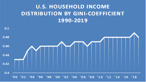
The U.S. has one of the highest Gini coefficients in the world, about on par with Guatemala and higher than any developed nation in the G7 or the OECD. The Gini coefficient is a measurement of the distribution of income across a population measuring both income and wealth inequality. A Gini of 1 would be absolute inequality while a Gini of 0 would be absolute equality.
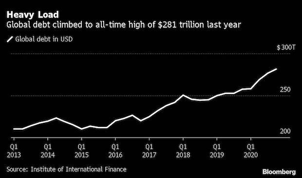
Global debt has been on the rise, especially since the onset of the pandemic. Over the past year, global debt has soared to $281 trillion (governments, corporations [financial and non-financial], and households) to Q4 2020. It is expected that at least $92 trillion might be added in 2021. The global debt to GDP ratio is now 356% and will rise. Over the past few months, yields have been rising, pushing some borrowers potentially to the edge. Debt to GDP ratios have jumped considerably in France, Greece, Spain, China, Turkey, and Korea. More than 50% of corporate debt in the U.S. is rated BBB or lower. Non-financial corporations have become reliant on government bailouts during the pandemic, making them ultimately more vulnerable or at risk of becoming zombie companies. High debt ratios were recorded in Peru, India, and South Africa. The risk of sovereign defaults is rising. Huge amounts of debt denominated in U.S. dollars has accumulated in the developing world, leading to potentially more problems as their currencies fall against the U.S. dollar.
Non-financial private sector debt is now 165% of GDP. Many economists are calling this to be untenable. Government debt globally is 105% of GDP, up from 88% in 2019. It could be even higher at the end of 2021. Households, particularly in countries like Canada, have been taking on increasing amounts of debt as they push the housing market higher in price, risking a housing market crash.
High debt levels are a drag on growth everywhere. It has taken increasing amounts of debt to purchase an additional $1 of GDP. The question is, where is the limit and what happens when everyone “runs out of track”? The U.S.’s federal debt to GDP is now at 130%. It is now almost higher than it was at the end of World War II. Even the CBO is predicting that the U.S. growth over the next decade will be largely below 2%, despite the rosy projections for 2021. Depressions are all about debt collapse.
Drs. Doom, Gloom, and Doom may be Cassandras—and if so, we’d be wise to heed their thoughts.
The Pandemic Rages On!
India appears to be in complete meltdown. Routinely the world officially records over 800 thousand new cases every day with half of them coming from India. India’s health care system is in collapse. Undercounting is not new nor is it unusual but some modeling puts India’s real number of cases and deaths at 2 to 5 times higher than what is being officially reported. Five times higher would put India’s daily caseload closer to 2 million every day 24/7. Some have even postulated that it is upwards of 30 times higher. Crematoriums are overloaded 24/7. The global 7-day average is about 880 thousand and 13,500 dead. Here in North America the U.S. appears to have things somewhat under control with the 7-day average now only about 55 thousand vs. 255 thousand in January. Daily deaths are about 700 vs. close to 3,500 daily back in January. But could there be a deadly fourth wave? It is possible. In Canada cases may have peaked having the seven-day average falling from around 8,600 daily to under 8,000 daily. Daily deaths are about 50 well under the 7-day average of 160 daily seen in January.
Sunday May 2, 2021 – 14:24 GMT
World
Number of cases: 152,990,870
Number of deaths: 3,209,245
U.S.A.
Number of cases: 33,147,007
Number of deaths: 590,721
Canada
Number of cases: 1,227,035
Number of deaths: 24,261
Source: www.worldometers.info/coronavirus
Chart of the Week
All indices, commodities, stocks, and more exhibit cycles. Business and economic cycles have long been identified by economists. Technical analysts of various stripes have examined cycles in stock markets, commodities, and more. One of the first to bring observations on cycles in a book was Nicholas Kondratiev, a Russian economist (1892–1938) who was tasked to study Western capitalist economies in 1920s Russia. His study theorized that capitalist societies went through cycles of boom and bust over 50–60 years. His study gained recognition both in the Soviet Union and elsewhere. But his studies were largely rejected by mainstream economists and the Russian leaders didn’t quite agree with his study because it showed that communist societies also went through similar cycles. As a result, he was condemned and sent to the Gulag in 1930 and in 1939 he was executed.
But his studies lived on and many more have improved on them while others have come up with their own take on cycles. Martin Armstrong (www.armstrongeconomics.com) is an economic cycles forecaster best known for his Economic Confidence Model whose models are based on the number π. Pi is defined as the ratio of a circle‘s circumference to its diameter, and it also has various equivalent definitions.
Armstrong’s theory is that at the end of each cycle there is a crisis, after which the economic climate improves. His cycle is based on 8.6 years (π * 1,000 = 3,140 days). Armstrong’s study concludes that the wave of 8.6 years goes through 6 waves, giving a long wave of 51.6 years a number intriguingly close to Kondratiev waves. The 51.6 years wave combines itself to make 6 long waves or 309.6 years. Armstrong believes that we are nearing the end of the 6th long wave dating (1,857.6 years) from the early days of the Roman Empire. At the end of each wave there are depressions and even major societal changes. Armstrong’s model is an economic model and not necessarily a stock, bond, or commodity model.
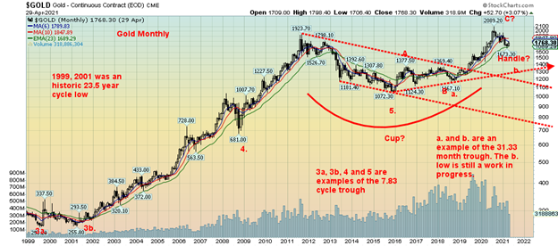
We have often noted gold’s cycles. We first saw these particular cycles from Ray Merriman (www.mmacycles.com) who has his own work on cycles of stock markets, bonds, currencies, and commodities. Gold has only been free trading since 1971 when the world came off the gold standard. There are, as a result, not a lot of observations. There are few examples of a long cycles, but Merriman has determined that gold’s longest cycle is one of roughly 23.5 years. So far, one was observed in 1976 followed by a double bottom in 1999 and 2001 (labeled 3a and 3b on the chart above). That puts the next one due from 2023 to 2025 with a wider range of 2020–2027. All cycles are measured trough to trough or low to low. Peaks tend to skew either left, right, or centered.
Cycles tend to break down into halves or thirds. The 23.5-year cycle breaks down into either three 7.83-year cycles or two 11.75-year cycles. It is not unusual to observe both. The 7.83-year cycle has a range of 7–9 years while the 11.75-year cycle would have a range of 10–13.5 years. We do observe important lows in 2008 and 2015. The first low in October 2008 was roughly 7.7 years from the 2001 low. The second low in December 2015 was roughly 7.2 years from the October 2008 low. There was also an important crash low in June 2013 which just happened to be 12.3 years from the 2001 low. That suggests to us that the next 7.83 cycle low is due sometime between February 2023 to June 2024 and that one should also be our 23.5-year cycle low.
The 7.83-year cycle low breaks down into three 31.3-month cycle lows (range 26-37 months) or two 47-month lows (range 42–52 months). Again, it could be both. An important low was seen in August 2018 which was roughly 32 months from the December 2015 low. This appears to fit with a 31.3 month low. A second important low was seen in March 2020 which was 51 months from the December 2015 low. This appears to fit well with the 47-month cycle low. A 31.3-month low is next due April 2021 +/- 5 months. We have been in that range for the past five months. Once this low is determined, another strong rally should get underway.
That low may already be in place as long as the $1,673 low seen on March 8, 2021 remains in place. Since we are not as yet out of the range of the 31.3-month cycle low, a retest or a double bottom of the March low could still take place over the next few months. As long as $1,673 holds the low is probably in although not yet confirmed. As we note in our gold commentary, the low will be confirmed once we fully clear above $1,860 and preferably above $1,900.
Major support now lies down at $1,700 with important support at $1,750. Very long-term support is down at $1,290/$1,300. If the cycles are correct, we should see a strong rally into the second half of the year. The question is, how high? Once new highs are seen above the August 2020 high of $2,089, potential targets are up to $2,500 with a minimum target of just under $2,200. A failure below $2,089 would be quite negative and tell us that the 7.83-year cycle has crested. What could follow would be the steepest drop for gold since 2013.
MARKETS AND TRENDS
| % Gains (Losses) Trends | ||||||||
| Close Dec 31/20 | Close Apr 30/21 | Week | YTD | Daily (Short Term) | Weekly (Intermediate) | Monthly (Long Term) | ||
| Stock Market Indices | ||||||||
| S&P 500 | 3,756.07 | 4,181.17 (new highs) | flat | 11.3% | up | up | up | |
| Dow Jones Industrials | 30,606.48 | 33,874.85 | (0.5)% | 10.7% | up | up | up | |
| Dow Jones Transports | 12,506.93 | 15,347.00 (new highs) | 1.4% | 22.7% | up | up | up | |
| NASDAQ | 12,888.28 | 13,962.68 (new highs) | (0.4)% | 8.3% | up | up | up | |
| S&P/TSX Composite | 17,433.36 | 19,108.33 (new highs) | flat | 9.6% | up | up | up | |
| S&P/TSX Venture (CDNX) | 875.36 | 955.26 | 2.7% | 9.1% | neutral | up | up | |
| S&P 600 | 1,118.93 | 1,345.54 | (0.3)% | 20.3% | up | up | up | |
| MSCI World Index | 2,140.71 | 2,277.01 | (0.6)% | 6.4% | up | up | up | |
| NYSE Bitcoin Index | 28,775.36 | 56,208.60 | 13.0% | 95.3% | neutral | up | up | |
| Gold Mining Stock Indices | ||||||||
| Gold Bugs Index (HUI) | 299.64 | 274.99 | (5.3)% | (8.2)% | neutral | down | up | |
| TSX Gold Index (TGD) | 315.29 | 294.49 | (5.9)% | (6.6)% | neutral | down | up | |
| Fixed Income Yields/Spreads | ||||||||
| U.S. 10-Year Treasury Bond yield | 0.91 | 1.63% | 4.5% | 79.1% | ||||
| Cdn. 10-Year Bond CGB yield | 0.68 | 1.55% | 2.7% | 127.9% | ||||
| Recession Watch Spreads | ||||||||
| U.S. 2-year 10-year Treasury spread | 0.79 | 1.47% | 5.0% | 86.1% | ||||
| Cdn 2-year 10-year CGB spread | 0.48 | 1.25% | 5.9% | 160.4% | ||||
| Currencies | ||||||||
| US$ Index | 89.89 | 91.27 | 0.5% | 1.5% | down | down | down | |
| Canadian $ | 0.7830 | 0.8140 (new highs) | 1.5% | 3.9% | up | up | up | |
| Euro | 122.39 | 120.25 | (0.6)% | (1.8)% | up | up | up | |
| Swiss Franc | 113.14 | 109.49 | flat | (3.2)% | up | down (weak) | up | |
| British Pound | 136.72 | 138.22 | (0.4)% | 1.1% | neutral | up | up | |
| Japanese Yen | 96.87 | 91.49 | (1.3)% | (5.6)% | neutral | down | down | |
| Precious Metals | ||||||||
| Gold | 1,895.10 | 1,767.70 | (0.6)% | (6.7)% | up | down | up | |
| Silver | 26.41 | 25.87 | (0.8)% | (2.0)% | neutral | up (weak) | up | |
| Platinum | 1,079.20 | 1,205.20 | (2.3)% | 11.7% | up | up | up | |
| Base Metals | ||||||||
| Palladium | 2,453.80 | 2,959.60 (new highs) | 3.4% | 20.6% | up | up | up | |
| Copper | 3.52 | 4.47 (new highs) | 3.0% | 27.0% | up | up | up | |
| Energy | ||||||||
| WTI Oil | 48.52 | 63.58 | 2.3% | 31.0% | up | up | up | |
| Natural Gas | 2.54 | 2.93 | 3.9% | 15.4% | up | up | up |
Source: www.stockcharts.com, David Chapman
New highs/lows refer to new 52-week highs/lows and in some cases all-time highs.
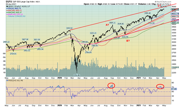
Sell in May and go away. That’s the old saying. The worst six months of the year are supposed to be May to October. The average return since 1950 for the S&P 500 is 0.6% vs. 7.2% for the best six months November to April. 43 of 70 years were up May to October vs. 55 of 70 for November to April. May doesn’t exactly rank high, being the 9th best month of the year for the DJI and 8th best month for the S&P 500. The NASDAQ fares better, given it’s the 5th best month. A choppy month might be our expectations. Given all the good economic numbers of the past week (reviewed later) and the huge stimulus package, we might be forgiven for expecting the markets to respond positively. Well, they didn’t really. The S&P 500 hit a new all-time high but closed flat; the Dow Jones Industrials (DJI) didn’t make a new all-time high and closed down 0.5%; the Dow Jones Transportations (DJT) diverged a bit, hitting new all-time highs, and closed up 1.4%; the NASDAQ finally made new all-time highs (barely), then closed down 0.4%. The small cap S&P 600 saw no new highs and closed down 0.3%.
In Canada, the TSX Composite hit new all-time highs but also closed flat. The TSX Venture Exchange (CDNX) gained 2.7% on the week, the week’s best performer. In the EU, the London FTSE gained 0.6%, the Paris CAC 40 hit a new all-time high, gaining 0.2%, but the German DAX fell 0.9% with no new highs. In Asia, China’s Shanghai Index (SSEC) was down 0.8% and Japan’s Tokyo Nikkei Dow (TKN) continues to roll over, down 0.7% on the week. The MSCI World Index did not make new highs and fell 0.6%.
Was there a star this past week? Well, yes: Bitcoin recovered, gaining 13.0% to $56,208, once again threatening to make new all-time highs. Dogecoin recovered to 37 cents up 47% on the week. We’ll keep watching to see if they make new all-time highs again or roll over and fail.
Given all the great numbers this past week—GDP, income, spending, etc.—we’d have thought the markets would just soar. Nope. Instead, it appears it became “sell on news.” And it was announced there is another spending plan called the America Families Plan of an additional $1.8 trillion in spending. The program would improve medical and health care spending, including Obamacare as well as free tuition for community college for two years. Will it pass? That remains to be seen.
Technically, the market is in a position to move once again to new highs, given that April closed above March. But it is tenuous, given the sell-off in the face of all this positive news. So, we’ll see. Irrespective of this, even if we did make a new high in May, we could still see a correction set in going forward. We are wary here. We are just too close to upper channels or at them to justify any strong advances from here. One thing all the good news has helped is the U.S. dollar which rebounded this past week (although it remains down) and bond yields which jumped this past week. It is all about capital flows and right now with a strong U.S. economy it attracts funds from elsewhere.
The S&P 500 still appears to be within a potential ascending wedge triangle but the bottom of the triangle is down near 3,975, a 200-point drop from here. That also pretty well coincides with the 50-day MA. Once below that, the drop should then continue towards the 200-day MA, currently near 3,655, a 12.5% decline from current levels. Will we fall that much? Not necessarily. There is interim support at 3,700 and 3,800. A breakdown under 3,600 could spark a panic. We saw a small 6% correction in March. Our expectations are that the next correction might be a bit steeper. New highs are possible but any decline from new highs would be about the same no matter what. We note that we closed above the March high leaving the potential for another new high in May open. The high this past week was 4,219.
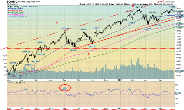
The NASDAQ finally did it. New all-time highs, barely. The high was 14,211 vs. 14,175 back in February. It didn’t last long. The NASDAQ reversed and closed the week lower by 0.4%. The FAANGs were a mixed bag. Facebook soared 8.0% to new all-time highs after reporting strong profits. But Apple fell 2.1% while Amazon gained 3.8% to new all-time highs. Netflix recovered gaining 1.6% and Google jumped 4.1% to new all-time highs. Microsoft also hit all-time highs but reversed and closed the week down 3.4%. Tesla reversed and closed lower by 2.7% and Twitter took a big hit, down 17.6%. The big value stock Berkshire Hathaway also hit new all-time highs, gaining 0.9% on the week.
Hitting a new all-time high was great, but then to reverse and close lower was not so great. Is the high in? Hard to tell just yet. The first sign would be a break under 13,700. But things don’t get worse until the NASDAQ breaks under 13,100. That would break the uptrend from September. Given the reversal and lower close on the week the NASDAQ needs to quickly recover and go to new highs above 14,211. Otherwise, a top might be in.
GDP and M2 % Change Year Ago
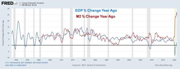
U.S. advance Q1 GDP jumped 6.4% following a 4.3% jump in Q4 2020. It beat market expectations of 6.1%. GDP has now advanced 2.3% from a year ago Q1, the best advance since Q1 2020. So, is the recession over? Well, they haven’t called it over just yet as the official definition is two successive quarters. We need to see another advance in Q2. The advance should be no surprise as M2 has leaped 21.2% from a year ago. GDP has now hit $22.1 trillion while M2 is at $20.3 trillion. U.S. Federal debt has reached $28.3 trillion. The advance in GDP has helped lower the Federal Debt/GDP ratio to 127.7% from 130.0%. To put all this in perspective, keep in mind it took M2 to rise $3.6 trillion in the past year, federal debt to rise $5.0 trillion for a gain of less than $0.5 trillion of GDP. In other words, it took $7.20 of M2 and $10.00 of Federal debt to produce $1 of GDP. That is not sustainable. No wonder Fed Chair Jerome Powell said “we still have a long way to go.” Jobs are still shy 8.4 million pre-pandemic. And that is despite record spending, record M2, and record debt. M2 jumped the largest seen since 1960.
Personal Income, Personal Spending % Change Year Ago
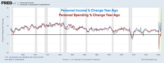
Thanks to stimulus cheques of the American Rescue Plan, personal income leaped 21.1% month over month in March. That was up from the revised 7% drop seen in February. The market had expected a rise of at least 20.3%. It was the highest jump in personal income seen in the past 60 years. The 7% decline in February was also the steepest drop seen in the same period. That left personal income up 29% from the depths of a year ago March. Personal spending also rebounded sharply in March, up 4.2% following a 1% decline in February. Personal spending is now up almost 11.0% from a year ago March. Both income and spending were coming out of a deep hole. Don’t expect these kinds of numbers to persist. The reason it all looks so impressive is because the hole created last year was the steepest seen in 60+ years. More telling will be how it looks going forward. Total personal income hit $24.2 trillion in March, a record, while real disposable personal income hit $19.3 trillion, also a record. That helped send real disposable personal income per capita to $58,405, also the highest ever. Personal consumption expenditures also hit a record of $15.4 trillion, but again that was coming out of a deep hole a year ago. All of this was spurred on by the biggest bail-out in U.S. history, with promises of more to come.
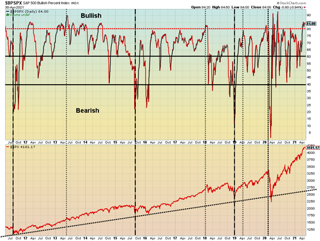
The markets still seem to be quite bullish. Above is the S&P 500 Bullish Percent Index. It is currently at 84. That’s below its highs of 92.8 seen in June 2020 as the U.S. came out of the first wave. But the S&P 500 is a lot higher now, so in some respects it is a divergence, given the S&P 500 went on to new highs.
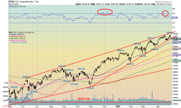
The TSX Composite once again hit a new all-time this past week at 19,439, then reversed and closed the week effectively flat with a miniscule gain of 0.03%. The TSX Composite now sits on what appears to be the cusp of a breakdown of a potential ascending wedge triangle. A firm break under 19,100 would do it and a break under 18,800 would confirm. Potential targets might be the 200-day MA near 17,400. On the other hand, the TSX Venture Exchange (CDNX) rose on the week by 2.7%. It was in some respects a surprise for the junior small cap exchange. The CDNX is now up 9.1% on the year, still shy of the gain for the TSX of 9.6%. Only four of the 14 sub-indices saw gains on the week, led by Energy (TEN) that jumped 4.2%. Health Care (THC) was up 2.8% with the other two gainers being Financials (TFS) +0.4% and Telecommunications (TTS) +1.0%. Financials hit a new all-time high as did Consumer Discretionary (TCD) -1.3% and Real Estate (TRE) -0.4%. Leading the way down was Golds (TGD), off 5.9%. Other big losers were Metals & Mining (TGM) -3.7%, and Materials (TMT) -3.9%. The TSX Composite appears poised for a breakdown. Only new highs above 19,439 could change this scenario.
U.S. 10-year Treasury Bond/Canadian 10-year Government Bond (CGB)
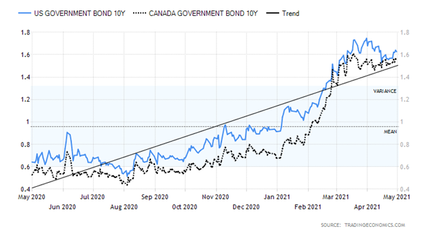
Bond yields started back up this week, thanks to a number of good economic numbers as shown previously. We have already noted GDP, personal income, and personal spending. The U.S. 10-year treasury note saw yields rise to 1.63%, up from 1.56% the previous week, a gain of 4.5%. Canadian yields also jumped as the Government of Canada 10-year bond (CGB) rose 2.7% to 1.55% from 1.51%. Besides the previously noted GDP, personal income and spending numbers the week started off with March durable goods up 0.5% month over month (MOM) with durable goods ex transportation up 1.6% MOM. The previous month had seen durable goods fall 0.9% and ex transportations off 0.3%. Despite that, it was below expectations for durable goods but right on ex transportations.
Case-Shiller home prices rose 1.2% in February MOM and were up 11.9% YOY. House prices were up 12.2% in February. The consumer confidence index came in at 121.7, above expectations of 113 and above the March number of 109. Vaccinations and openings are certainly helping. Initial weekly jobless claims rose to 553 thousand, down from 566 thousand the previous week but above expectations of 549 thousand. Pending home sales for March rose 1.9% and year over year up 23.3%. The PCE price index YOY was up 2.3% vs. the previous month up 1.5%. Core PCE price index was up 1.8% vs. 1.4%. MOM, it was up 0.4% vs. 0.1% and expectations of a gain of 0.3%. Finally, the Michigan Consumer Sentiment Index came in at 88.3 vs. 84.9 in March and expectations of 87.4. All of this went to helping to push bond yields up in April. They do remain below their recent high of 1.74%.
Next Friday is the biggie: nonfarm payrolls are expected to be up 978 thousand in April vs. a gain of 916 thousand in March. The unemployment rate is expected to fall to 5.7% from 6.0%. Given that the U.S. is still short 8.2 million jobs pre-pandemic, that still leaves them a long way to go.
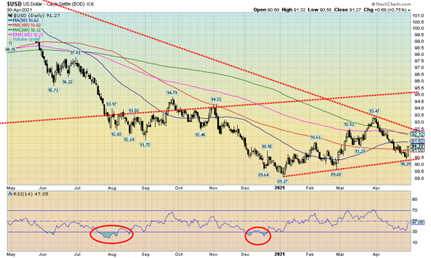
A big jump in personal income and continued signs of an improving U.S. economy as they open up and get vaccinated helped push the US$ Index higher this past week as it gained 0.5%. Most of that gain was on Friday following release of the personal income numbers. On Friday the US$ Index rose 0.68 or 0.8%. Currencies fell but not the Canadian dollar as it jumped 1.5% to its highest level since 2017 at 81.40, hitting 82 at one point. The euro fell 0.6%, the Swiss franc was flat on the week, the pound sterling was off 0.4%, and the Japanese yen took the biggest hit, down 1.3%. It is noteworthy that the US$ Index bounced off a lower trend line, hitting a low on the week at 90.39 but failed to break under 90 and take out the 89.68 low seen in late February. The most recent low was 89.17 seen in early January. This suggests that the US$ Index could rise once again towards 92. Resistance is seen at 92.50. A rising US$ Index has negative implications for gold. A break back down under 90.50 would, however, tell us that the US$ Index is headed lower. The U.S.’s stronger economic performance coupled with rising bond yields and vaccinations is encouraging capital flows out of the EU and Asia to the higher yields in the U.S.
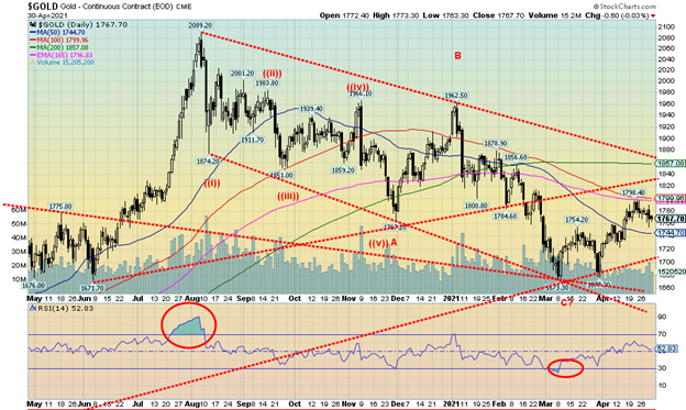
With the U.S. dollar and bond yields higher this past week plus some positive economic numbers, gold took the easy way and fell this past week, losing 0.6%. The gold stocks didn’t like the week as the TSX Gold Index (TGD) dropped 5.9% while the Gold Bugs Index (HUI) dropped 5.2%. Silver lost 0.8% while platinum dropped 2.3%. But the industrial metals with some precious metal’s elements roared. Palladium tested above $3,000, gaining 3.4% to new all-time highs. Copper also roared, jumping another 3.0% on the week to 52-week highs but still a bit short of the all-time highs. With the gains for both palladium and copper we’d like to view the past week positively, despite both gold and silver off on the week. Both copper and palladium are facing supply shortages. Palladium is useful in EV vehicles and other green technology so its rise is both demand-driven and supply deficit-driven. Where copper goes, gold usually follows. Gold briefly bounced this week after the Fed spoke with promises of no “tapering.” However, that wasn’t enough as stronger than expected economic numbers helped to push the dollar and bond yields higher. Naturally, gold fell as a result. Gold has failed, so far, at our next resistance level of $1,800/$1,825. That is not the end of the world as it is not unusual to test resistance zones and then back off before making another attempt to break through. Gold has support down to $1,745/$1,750 but a break under $1,740 would be negative, sending prices lower towards $1,700 and key support. A breakdown under $1,700 would be quite negative and suggest new lows lie ahead. The recent high is at $1,798 and obviously it is now key that gold overhaul the $1,800/$1,825 zone if it is to go higher. Above that, further resistance can be seen from $1,840 to $1,860. A breakout above $1,860 would be quite positive and confirm the $1,673 low. Above the December high of $1,962 would put the August high of $2,089 in sight.
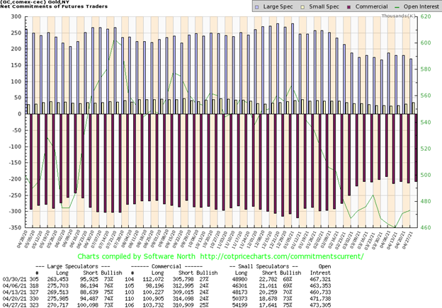
The gold commercial COT (bullion companies and banks) improved slightly this past week to 25% from 24%. Long open interest rose about 3,000 contracts while short open interest fell just over 3,000 contracts. The large speculators COT (hedge funds, managed futures, etc.) slipped to 73% from 74% as they went the opposite way, shedding about 5,000 contracts of long open interest while adding about 6,000 contracts to short open interest. Unusually bearish for the large speculators. Overall open interest rose just under 2,000 contracts on a down week for gold. We are encouraged by the improvement in the commercial COT and baffled by the slide in the large speculators COT as they are usually the most bullish. We’ll try and take this as a positive sign.
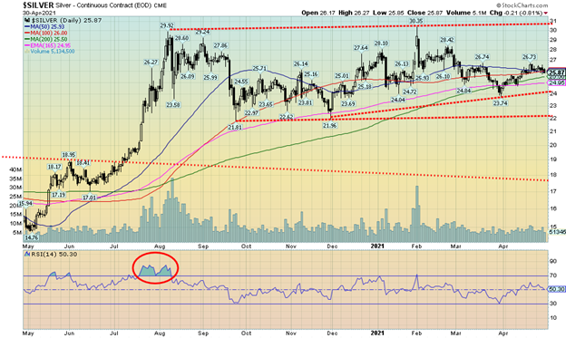
Silver joined gold to the downside on Friday, losing 0.8%, with the result that silver closed the week under one of our support zones at $26 and also lost 0.8% on the week. That’s the bad news. The good news is that silver is still clinging to its 50/100-day MA, but the hold is tenuous. A drop under $25.50 would send silver down to $25 and possibly lower. Major support can be seen near $24 so we would not like to see silver break that. The recent high for silver was at $26.73 so if silver is to go higher, we need to regain that level. Silver improves above $26.40, but only new highs can end this short-term bearishness. Silver’s uptrend is still intact, but it is slipping, given the rolling over this past week. Hence our note that only new highs above $26.73 will end this downswing and put us on the path upward once again.

The silver commercial COT was unchanged this past week at 32%. Long open interest did rise about 1,000 contracts but short open interest rose more, up just under 4,000 contracts. The large speculators COT was also steady at 69% despite a small rise of just over 1,000 contracts of long open interest. Short open interest was largely unchanged. Total open interest rose about 3,000 contracts this past week, a down week. That is somewhat negative going forward, suggesting we could see more downside for silver going forward.
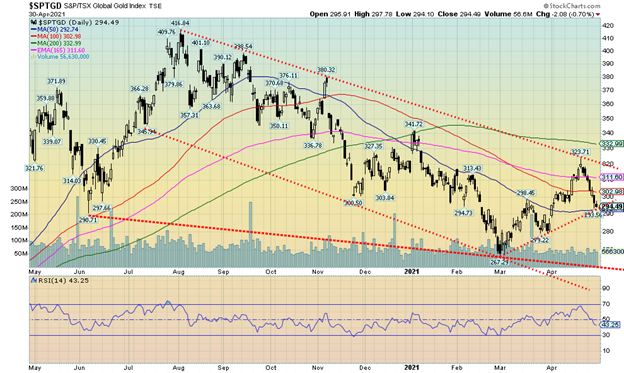
Gold stocks continue to struggle. The TSX Gold Index (TGD) fell 5.9% this past week while the Gold Bugs Index (HUI) dropped 5.3%. It was, however, only the second decline in the past nine weeks. The problem was that the TGD failed at a potential breakout line below the 200-day MA and also failed just below the 40-week MA. A shooting star (Japanese candlestick pattern) was seen on both the daily and weekly charts. A shooting star is best described as a candle with a long upper stick-like body but a small filled-in body at the bottom. When markets open the next day or week the market usually just falls away. Falling away is exactly what the markets did this past week. At best we can say a short-term high is most likely in. Follow-through to the downside this coming week would confirm that. The TGD closed at trendline support and 50-day MA support. A break now under 290 would be negative and suggest a potential move down to 280. Under 280 would set up the potential to test the low at 267 or even see new lows. The weekly MACD indicator has turned up. A drop to new lows could set up a strong positive divergence on the weekly charts. The daily MACD indicator has turned down. Long-term support for the TGD can be seen at 250/260. Only a return to the upside and breaking out above 324 could end this somewhat bearish, albeit short-term bearish, scenario. Overall, the gold stocks are pretty neutral here as the Gold Miners Bullish Percent Index is at 47. One positive note for the gold miners was the fact that the TSX Venture Exchange (CDNX) closed higher on the week and we noted a number of small junior players actually had an up week, albeit a small one. A merger this past week was Fortuna Silver Mines (FVI) and Roxgold (ROXG) as Fortuna acquired the smaller player. The market didn’t receive it well as Fortuna fell on the week even as Roxgold closed higher. A number of analysts liked the deal but the market appeared to give it the thumbs-down.
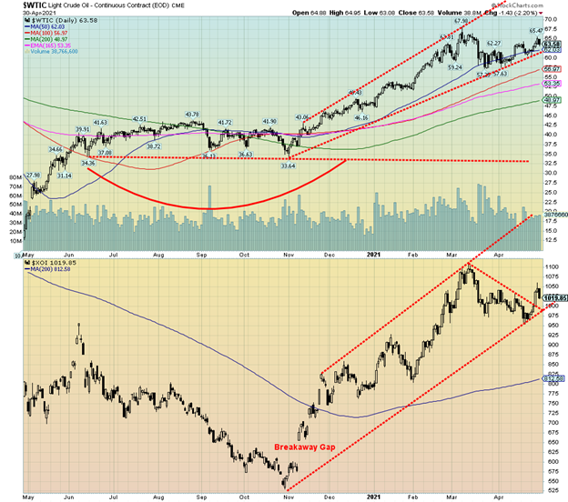
With the U.S. economy showing signs of improvement and some potential pick-up in demand for oil, WTI oil shot up $1.44 or 2.3% this past week. Natural gas (NG) also rose up 3.9%. That helped the energy stocks as the ARCA Oil & Gas Index (XOI) rose 4.2% as did the TSX Energy Index (TEN).
It wasn’t all roses, of course. The rising count in India finally put a damper on prices by Friday and oil fell 2.2% or $1.43. The energy stocks were hit. None of this changed the technicals too much. The XOI broke above a downtrend line, suggesting it could be starting a new up leg. WTI oil now appears to be crawling along its 50-day MA.
While everything looks rosy on the surface, there is a risk here that all oil prices are doing is priming for a double top scenario. Profit-wise, many companies are reporting excellent results. Exxon (XOM) reported a Q1 profit of $2.7 billion. Chevron (CVX) posted a profit of $1.4 billion. Shell (RDS.A) reported $3.2 billion for Q1. They also hiked their dividend by 4%. And good news, at least for many of the current producers, is that shale companies are being very cautious about ramping up their production once again. Shale producers need higher prices to be profitable on a consistent basis.
A cautionary note for the oil industry was news that EV sales soared 41% last year even as overall automobile sales fell in 2020. With policies encouraging EV sales, these could rise further in 2021. That puts downward pressure on fuel-driven automobiles and could result in lower demand for oil. We have to continue to watch India as well to see if the COVID-ravaged country has an impact on overall global demand. India is the world’s third largest importer and a decline in demand there could put further downward pressure on oil prices.
WTI oil breaks down under $62 and a breakdown under $57.75 could trigger the double top scenario and a possible decline to $47/$48.
—
(Featured image by James Mathews via Flickr)
DISCLAIMER: This article was written by a third party contributor and does not reflect the opinion of Born2Invest, its management, staff or its associates. Please review our disclaimer for more information.
This article may include forward-looking statements. These forward-looking statements generally are identified by the words “believe,” “project,” “estimate,” “become,” “plan,” “will,” and similar expressions. These forward-looking statements involve known and unknown risks as well as uncertainties, including those discussed in the following cautionary statements and elsewhere in this article and on this site. Although the Company may believe that its expectations are based on reasonable assumptions, the actual results that the Company may achieve may differ materially from any forward-looking statements, which reflect the opinions of the management of the Company only as of the date hereof. Additionally, please make sure to read these important disclosures.
David Chapman is not a registered advisory service and is not an exempt market dealer (EMD) nor a licensed financial advisor. We do not and cannot give individualised market advice. David Chapman has worked in the financial industry for over 40 years including large financial corporations, banks, and investment dealers. The information in this newsletter is intended only for informational and educational purposes. It should not be considered a solicitation of an offer or sale of any security. Every effort is made to provide accurate and complete information. However, we cannot guarantee that there will be no errors. We make no claims, promises or guarantees about the accuracy, completeness, or adequacy of the contents of this commentary and expressly disclaim liability for errors and omissions in the contents of this commentary. David Chapman will always use his best efforts to ensure the accuracy and timeliness of all information. The reader assumes all risk when trading in securities and David Chapman advises consulting a licensed professional financial advisor before proceeding with any trade or idea presented in this newsletter. David Chapman may own shares in companies mentioned in this newsletter. We share our ideas and opinions for informational and educational purposes only and expect the reader to perform due diligence before considering a position in any security. That includes consulting with your own licensed professional financial advisor.


The TopRanked.io Weekly Affiliate Marketing Digest [The Top VPN Affiliate Programs Roundup]
Want to be let in on a little secret about two massive affiliate opportunities you can take advantage of today?...


Sustainable Finance Faces Hurdles as Green Asset Ratio Reforms Fall Short of Full Transparency
The Green Asset Ratio (GAR) measures banks' alignment with the EU Taxonomy but remains low due to methodological flaws and...


XRP Hits New All-Time High Amid U.S. Crypto Policy Shift and Ripple’s Expansion
XRP surged past its 2018 all-time high, reaching $3.65 amid renewed political support for crypto in the U.S. under Trump....


Germany Moves to Curb Medical Cannabis Abuse, Sparking Access Concerns
Medical cannabis imports in Germany have surged, but health insurance-covered prescriptions remain low. Easy online access raises concerns about abuse...


JPMorgan’s Data Fees Shake Fintech: PayPal Takes a Hit
JPMorgan Chase will charge fintechs for customer data, threatening business models reliant on free access. PayPal’s stock plunged 5.7% after...
 |
|
 |  |
 |
|
-

 Africa3 days ago
Surging Expenditures Widen Morocco’s Budget Deficit Despite Revenue Growth
-

 Markets2 weeks ago
Soybean Market Reacts to Trade Hopes, High Stocks, and Global Price Pressure
-
 Cannabis12 hours ago
Germany Moves to Curb Medical Cannabis Abuse, Sparking Access Concerns
-

 Cannabis1 week ago
Switzerland Advances Cannabis Legalization with Public Health Focus