Featured
Market rebounded on 50-year low unemployment rate
Weak economic numbers gyrated the markets lower this past week, but they rebounded by week’s end as the unemployment rate (official U3) hit a 50-year low. The recession spreads are still weak, but they are not signaling a recession any time soon. Maybe next year sometime? Still, the S&P 500 fell from what appears as an ascending wedge triangle (bearish). Gold fell then bounced back.

He’s at it again. Okay, he tweets incessantly. Apparently, at least 11–12 times a day. But then it can vary. Fed Chair, Jerome Powell is one of his favourite punching bags. All this comes against the backdrop of a falling stock market and an impeachment inquiry. Yet he still took time out to attack Powell. So where was the US$ Index when Trump took over? Well, 100.69. And where is it today? 99.05! Lower but not by much.
The US$ Index was actually falling during the early part of Trump’s presidency. It topped as Trump was taking over. Throughout the first year of Trump’s presidency the US$ Index was falling. The US$ was falling against the Chinese yuan as well. The yuan is not a part of the US$ Index. So, what changed things? The US$ Index bottomed as did the US$ against the yuan in January 2018. Both began to rise, coinciding with Trump’s trade wars launched in January 2018. That also coincides with the weakening of the EU, Japanese, and Chinese economies. The result is, the US$ rose against other currencies. Trump can tweet-attack Powell, but as we have noted, the Fed Chair does not serve at the pleasure of the president; therefore, they cannot be dismissed by the president.
Our chart below shows the yuan vs. the U.S. dollar. Note how the yuan topped roughly near the beginning of 2017 when Trump took over, and how the yuan bottomed around January 2018 when Trump triggered the trade war. The yuan is now lower (U.S. dollar higher) than it was when Trump officially became president in January 2017. (January 2017 – high US$1 = ¥6.99; March 2018 – low US$1 = ¥6.24; Today – US$1 = ¥7.13).
Chinese Yuan (US$1 = ¥ 7.13)

Besides dealing with his impeachment, the president should probably pay attention to what is going on in the repo market. However, we would forgive him if he didn’t know. For the vast majority of the population, the workings of the repo and money markets are probably a mystery. But to those of us who have worked in money markets and traded repos, gyrations in interest rates and the entry of the central bank into the market as a major provider is a sign that something has gone amiss. It is not something to dismiss with an “oh, well.”
There is actually little focus on the repo market except by money market traders and some analysts who follow these things. But the repo market is quite important in facilitating the flow of cash and securities throughout the financial system. The repo market also supports liquidity in cash markets and ensures the efficient allocation of capital to reduce funding costs. Central banks play a role as lenders of last resort.
Normally the market is left to the financial institutions (banks, investment dealers, brokerage firms, insurance companies, etc.). During periods of financial stress, the central banks become involved. As we have noted, the last time the central banks became involved was before and during the 2008 financial crisis.
Since September 1, 2019 the Federal reserve balance sheet has expanded $185 billion. Ok, that is less than the $599 billion the Fed’s balance sheet expanded in the same period in 2008. But it is still significant. During the periods of QE1, 2, and 3 the Fed balance sheet expanded roughly on average about $47 billion/month. So, is this QE4? And if so, why?
Our suspicion has centered on possible cash crunches and liquidity problems in the eurozone that could spread into the U.S. banking system. Some have noted Deutsche Bank. The eurozone is also plagued with negative interest rates, which act almost like a tax on money. We have read suggestions that instead of buying negative interest rate bonds or putting your funds in the bank at negative rates, investors are buying gold or, in some cases, purchasing cash and storing it. It is actually cheaper (meaning they lose less) for an institution to purchase cash and store it than it is to place funds in negative yield securities. The 10-year German bund currently carries a rate of negative 0.59%. There are some $17 trillion of negative rate securities, primarily in the eurozone and Japan.
No wonder we hear that there are moves afoot in the eurozone to ban cash. The new head of the ECB, Christine Lagarde, the former head of the IMF, is a fan of ending cash. The bulk of cash being stashed away is in U.S. dollars (especially $100 bills) and primarily outside of the U.S. If it is cheaper to stash your savings under the mattress than it is to put it in the bank, people will go for the mattress. Negative interest rates supposedly also encourage financial institutions to lend. But if people are uncertain of what is coming, they probably don’t borrow.
But this could set up arbitrage plays or, as they call them, “carry trades” whereby one borrows in a low interest rate depressed currency market and invests in higher yielding strong currency market. Borrow euros at negative rates, convert to U.S. dollars, and invest in the high yield strong currency U.S. market. But what happens when the U.S. dollar falls and rates start rising in the eurozone? Well, then the carry trade falls apart and there is a rush to unwind it. We have seen that story before with what was known as the yen carry trade and the gold carry trade.
Given some weaker U.S. economic numbers, the rumours are rising that the Fed will cut rates again at the October FOMC Oct 28–29. The cut would be another quarter point. Following that, there is some expectation that the Fed would cut again before year-end.
Recent economic numbers point to at least a slowdown—some believe, to a recession. The weak numbers are coming against the backdrop of exceptionally low employment numbers and continuing positive signs that the consumer is still spending, even if it is not robust spending. The most recent unemployment numbers (U3) have hit a 50-year low at 3.5% (see “Chart of the Week”). The stock market fell this week following the release of the ISM manufacturing PMI that fell below 50 to 47.8 for September vs. an expectation of 50.1. The Chicago PMI was also a disappointment, falling to 47.1 vs. 50.4 in August vs. market expectations of 50.2. The ISM Non-Manufacturing Index also disappointed, coming in at 52.6 vs. an expectation of 55.3 and 56.4 in August. The fall in the ISM Manufacturing Index suggested that the weakness in the manufacturing sector was bleeding into the broader economy.
All of this sparked an 800-point drop in the Dow Jones Industrials (DJI) over two days this past week, with concerns over a recession and the ongoing drama in Washington over the possible impeachment of President Donald Trump. The job numbers didn’t help on Friday as the nonfarm payrolls came in below expectations as well (136,000 vs. expectations of 145,000).
Our chart below of the ISM Manufacturing Index shows that this is the third time since the 2007–2009 financial crisis that the index has dipped below 50. Both previous times (2012 and 2016) saw mild pullbacks in the economy but no recession. So, what is the expectation this time? Well, more of the same. Unless we face a financial meltdown similar to the one in 2008, the market probably faces a 20–25% drop over fears of a recession and the ongoing impeachment drama. The impeachment drama is taking on the tone of a potentially serious constitutional crisis that promises to become increasingly ugly.
ISM Manufacturing Index

One thing we note is that when economic optimism is low, stock markets have tended to rise. On the other hand, when optimism is high the stock market starts to falter. Our chart below of the U.S. Economic Optimism Index vs. the Dow Jones Industrials (DJI) shows a rising stock market through the period of 2009–2016. Optimism turned positive in 2017 and the stock market initially kept on rising. However, since 2018 the stock market is faltering even as optimism remains positive. Optimism was also quite positive before the 2007–2009 financial collapse but turned negative as the market turned down.
Economic optimism dipped in September to 50.8 from 55.1 in August. Economic prospects are also falling as to how everyone feels about their finances. Cash levels are starting to rise. While the stock market may be poised to go through another downdraft, it could set up another low followed by another sharp rise. One thing that may change the sentiment is a trade deal between the U.S. and China. While Trump has thrown considerable rhetoric and tariffs against China and even recently against the EU, Trump also wants to make a deal and get elected again in 2020. Call it the Trump put? A push to lower interest rates, step-up of QE (a Powell put?) followed by a deal with China in 2020 could be the ticket to get the stock market started again. But then there is the potential of the growing impeachment crisis.
The concern is that the action in the repo market is telling us that there is a potential financial problem out there. There is nothing normal about the current action in the repo market. Our suspicions are that the problem is actually in the eurozone and if it did happen it could spark global contagion as in 2008. That, in turn, would spark a far more serious stock market crash. Something to keep in mind as we move forward.
US Economic Optimism Index/Dow Jones Industrials

Markets and Trends
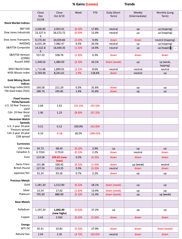

The stock markets plunged this past week on fears of a recession and weakening economic conditions. At one point the Dow Jones Industrials (DJI) fell some 800 points in two days. Then came Friday’s employment numbers which the market viewed positively, believing that the Fed might cut interest rates once again at the October 28–29 FOMC. A rate cut is rated at 79% for another quarter point. Despite the sharp bounce-back over Thursday–Friday, the S&P 500 ended down 0.3% on the week. It was the third consecutive weekly decline.
Markets were generally weaker this past week. The DJI fell 0.9%, the Dow Jones Transportations (DJT) took a 3.0% hit, the Russell 2000 (small cap) lost 2.3%, while the NASDAQ actually eked out a 0.5% gain. In Canada, the TSX Composite fell 1.5% while the TSX Venture Exchange (CDNX) continued its woes, falling 1.9%. The world MSCI Index was down 2.2%. In the EU, the London FTSE was down 3.1%, the German DAX lost 2.1%, and the Paris CAC 40 fell 1.9%. In Asia, China’s Shanghai Index (SSEC) fell 1.2% and the Tokyo Nikkei Dow (TKN) dropped 2.1%. Hong Kong`s beleaugered Hang Seng Index fell, surprisinglly only 0.5%. It is actually holding at roughly 200-day MA support. Still, the Hang Seng appears poised to fall further.
Markets were responding negatively to the ISM numbers that generally showed a weakening eoncomy. As well, stock markets were reacting negatively to the growing impeachment crisis in Washington. There are other things that should also concern the market including Brexit, negative bond yields, the going-ons in the repo market, the inverted treasury yield curve, growing bearish sentiment, and high valuations. But offsetting that are what many believe is a Trump and Fed put. Simply stated, the Fed is prepared to lower interest rates and bring back QE (through the repo operations as we have noted). Trump doesn’t want the market to fall as it could hurt his re-election chances. Forget about the impeachment goings-on. Some believe that Trump will strike a deal with China so that he can brag he got the deal and the markets will rejoice. Call it the Trump trade war put. Strong job numbers help the consumer, and the consumer remains 70% of the economy. With low interest rates, what else are you going to put your money into? Stocks remain the best alternative. The result is, there are lots of reasons for the markets to go up and not down. But first the markets may have to go down before they go up again.
The S&P 500 broke what appears to be an ascending wedge triangle this past week. The market initially gapped down although the action at the end of the week has filled that gap. The S&P 500 is failing just below what we believe is a broadening channel. The next move should be a decline to the bottom of the channel. That is currently way down around 2,200 and falling. It is a pattern that could play out into year end or early January just as the market did the same in 2018. After the down move is complete, a significant rebound rally should get underway. At least that is the scenario. As the market falls, one or more of those puts we noted should come into play.

We continue to monitor the divergence between the DJI and the DJT. Even in the recent run-up, the DJI almost made new all-time highs once again. The DJT wasn’t even close as it continued to make lower highs. Dow Theory says the averages must confirm each other, which they are not. According to Dow Theory we should be seeing a significant decline. These divergences usually only occur at significant tops or bottoms.

The VIX volatility index acts as a sentiment indicator for the stock market. As the stock market falls, the VIX rises. But also, as the stock market falls, bond yields tend to fall too, although this is not always the case. So, setting the VIX/10-year U.S. Treasury note ratio as a sentiment indicator should tell us whether we prepared to jump for joy (bullish) or jump out of a window (bearish). Extremes are seen at tops and bottoms. Right now, the ratio is trying to cross into “jumping out of the window” territory. That would seem to suggest that the market is getting too bearish. It could be, but the ratio also has room to move higher before hitting highs seen in 2009 or even in December 2018. It is possible on a short-term basis the market has become too bearish but what we see here is that it is incomplete. The recent decline actually took the ratio higher than what was seen at the December 2018 low even though we did not see new lows. A divergence? It may be signaling that we should see higher levels for the VIX/10-year ratio before this is over.

It probably should come as no surprise that commodities are cheap vs. stocks. The above chart shows the S&P 500/CRB Index ratio from 1970. This chart is not the same as the S&P 500/Gold ratio (or, for that matter, the DJI/Gold ratio). The CRB commodities index is broad-based that includes 19 different commodities. Gold and silver are a part of the CRB. Energy or petroleum products make up 33% of the index. The current ratio is currently at 0.06. That’s as low as it has ever been since 1970. Odds do not favour it remaining this low forever.

The McClellan Summation Index (ratio adjusted) known as the RASI is rolling over. Yes, it is still in bull territory but it wouldn’t take much to push it under 500 once again. Note that most every time the RASI fell under 500 the market was turning down. Usually the RASI was breaking down in advance of a market decline. Twice in the past few months it broke under 500 but failed to hold that level. It made lower highs even as on at least one occasion the S&P 500 made higher highs. The market internals continue to deteriorate. It is, according to the RASI, a question of when not if the market has another significant decline.

For all of 2019 the small cap stocks have been underperforming the large cap stocks. The S&P 500/Russell 2000 ratio reflects the relative performance of large cap stocks vs. small cap stocks. Normally in a bull market our expectations are that the small caps will lead. Not this past year as the S&P 500 moved to new all-time highs following the low in December 2018. It was the large cap stocks that led the way higher. This suggests to us that the move up from December 2018 has been countertrend only and another decline should soon be seen. Nonetheless the large cap stocks (S&P 500) should continue to lead the way.

We are showing here the TSX Composite with the TSX Financials/TSX Composite ratio below. This past week the TSX Composite fell 1.5%. The TSX Financials fell 2.5%. What can be taken from this is the underperformance of the TSX Financials. Normally the financials are leaders. Instead, they have been lagging. While the TSX Composite was making a bottom in December 2018 and embarking on a sharp rise the financials sub-index was underperforming. While the TSX Composite made new all-time highs, the financials struggled back to their previous high. Nonetheless, the underperformance of the financials is noted and suggests that one should probably be under weight the financials. The TSX Composite failed at the top of a channel and turned down. A breakdown under 16,000 would confirm that a more serious breakdown is underway.

Weak economic numbers this past week, especially for the ISM Manufacturing PMI, helped push the 10-year U.S. Treasury note down to 1.52%. That’s a pretty sharp decline from the recent high of 1.90%. We are now not far from the 1.47% low seen in early September 2019. It is possible that we could see new lows ahead so we wouldn’t dismiss that just yet. Regaining back above 1.70% would tell us that the pullback is over and a new uptrend could be underway. Rising interst rates would be a surprise to many as the wide expectation is that interest rates would stay low forever. The pattern that we labeled as ABC could be a 1,2,3,4,5 down pattern and the recent run-up to 1.90% was the 4th wave. We are now working on the 5th wave. Valuations on bonds are ridiculous and then, of course, there the $17 trillion-worth of negative interest rate bonds, primarily in the eurozone as well as Japan. The last thing people would expect is for rising bond yields (falling prices as prices move inversely to yields). But that remains a distinct possibility. Still, with the last significant high in yield/low in prices seen in November 2018, we expect the next signifcant low (price) would not occur until late 2020.
Recession Watch Spread

The recession spread known as 2–10 spread (2-year U.S. Treasury note less the 10-year U.S. Treasury note) rose to 12 bp this past week, up 100% from the previous week’s 6 bp. The 2–10 spread only went briefly negative back in August. Overall, the 2–10 spread is not a strong indicator of a recession and if one is coming, we are probably now looking at the latter part of 2020.
Recession Watch Spread 2

Our second recession spread 3M–10 spread (3-month Treasury bills less the 10-year U.S. Treasury note) remains negative at 0.19%. The spread has been negative since May. As we have pointed out before, it is not unusual for this spread to remain negative for a number of months. The potential for a recession only comes when this spread starts to turn positive and widen again. That hasn’t happened so, as with the 2–10 spread, we think a recession is not imminent and probably won’t occur until later in 2020.

There wasn’t much movement for the US$ Index this past week. Weak economic numbers helped push the US$ lower, but Friday’s employment numbers steadied the US$. Overall, the US$ Index fell 0.3% this past week. The euro gained 0.2% after once again making a new 52-week low, the Brexit-challenged pound sterling gained 0.3%, the Swiss franc was down 0.5%, while the Japanese yen was up 0.7%. The Canadian dollar fell 0.5%. Nothing has changed here for the US$ Index. It remains in a rising channel with potential to rise to 99.70. A firm breakout above that level could see the US$ Index rise to 100.80. A rising US$ Index would be negative for gold, but it would be positive for rafts of tweets from President Trump attacking Fed Chair Jerome Powell about the high U.S. dollar. Trump should realize that a high dollar reflects a U.S. economy that’s performing better than the EU and Japan and, on a relative basis, outperforming China’s economy. The US$ Index has considerable room to move higher in the current channel. A breakdown comes under 98, but a major breakdown would not occur until under 96. It is possible that the US$ Index topped at 99.31, but we wouldn’t be able to confirm that until the US$ Index breaks down under 98.

Gold prices plunged to $1,465 this past week before rebounding to close at $1,512. On the week, gold lost about 0.15%. Gold appeared to be breaking a possible head and shoulders top pattern this week when it broke under $1,490. The subsequent rebound has thrown the breakdown into some doubt. But as long as gold stays below the right shoulder high at $1,543 the breakdown remains valid. The head & shoulders breakdown implies that gold could fall to around $1,415. The 165-day exponential MA is currently at $1,407 and it is not unusual to test that zone in a bull market. The 200-day MA is down at $1,366. Could we test that zone? Yes.
During the 2008–2011 bull market gold went through two significant corrections. The first one saw gold pull back 14% and the second one saw gold fall 15%. Both silver and the gold stocks were hit even harder. Other than those two, gold generally only saw shallow pullbacks under 10% after February 2010. Gold rose from $681 in October 2008 to a high of $1,923 in September 2011 for a gain of 182%. A 15% pullback now would see gold test its 200-day MA near $1,366 (about a 13% decline from the $1,566 high). It could even dip a bit lower towards $1,330.
We follow Elliott Wave International and can’t help but note that they believe that gold has made a very significant top completing a possible C wave. What could follow is for gold to fall and test if not go below the December 2015 low of $1,045. While something like that is possible, we don’t believe the C wave is finished just yet. A C wave could, in theory, go all the way back to the 2011 high of $1,923 and even higher and still qualify. We have previously noted that when gold broke out of its 6-year base (2013–2019) breaking above first $1,370 and secondly above $1,434 the 2013 rebound high that targets were up to $1,725. Final targets could, as many believe, be even higher. If the 2015 low was a 7.8-year cycle low as we suspect, the next one is not due until February 2023 to June 2024 if it remains consistent with other 7.8-year cycles. That would also be a 23.5 cycle low. A shorter cycle is the 50-week or 11-month cycle. It has a range of 11–13 months. The last significant low was seen in August 2018. But that was only 8 months from a low in December 2017. There was a slightly higher low seen in November 2018 so that one fits better. If that’s correct, then the next 50-week cycle low might be seen anywhere from September to November 2019. More likely it will now be November for the low. A test of the major breakout zone of $1,370 would not be unusual before another leg up gets underway.

The gold commercial COT improved this past week to 26% from 24%. Long open interest was flat and short open interest fell about 42,000 contracts, suggesting that the commercials were busy covering their shorts on the plunge this past week. The large speculators COT (hedge funds, managed futures, etc.) was unchanged at 86%. That was despite a drop of almost 48,000 for long open interest while short open interest only fell about 4,000 contracts. The managed futures contracts still need to fall further. They hit record highs here recently. The large speculators have a strong tendency to get too bullish at tops and too bearish at bottoms. Overall, while the commercial COT improved, it remains quite bearish.

Silver prices fell 1.6% this past week. The low for the week saw silver prices dip briefly under $17 hitting $16.94. It was a volatile week as, following the low, silver rebounded hitting a high of $17.84 only two days later. Still, silver is now down about 11% from its recent high. As we have done to put this in perspective, during the run from October 2008 at $8.40 to the April 2011 high at $49.82 silver went through three corrections before it even broke out over $20. The three corrections saw silver lose 20%, 24%, and 25% respectively. The final low was seen in February 2010 and after that silver went literally straight up. So, this is the first significant correction seen since the May 2019 low. A 20–25% correction would therefore not be unusual. A correction of that magnitude would take silver back to a possible low between $14.80 to $15.80. Note the 200-day MA is down at $15.84. A test of the 200-day MA is not unusual and even dipping below it is not unusual in corrections. Only regaining above $18 would give us some optimism for higher prices. Above $18.80, new highs are possible. Ideally, we’d like to see the RSI fall to 30 or lower before considering re-entry.

The silver commercial COT was flat this past week at 33%. There was little shift in long and short open interest with long open interest falling roughly 1,000 contracts and short open interest down about 2,800 contracts. The large speculators COT rose slightly to 69% from 68% even as they dropped their long open interest by roughly 4,000 contracts. Offsetting that was a decline of roughly 3,000 contracts of short open interest. Our conclusion on the silver commercial COT is that it remains bearish even as overall it is showing some improvement.

Gold stocks bounced back this past week with the TSX Gold Index (TGD) gaining 1.6% and the Gold Bugs Index (HUI) rising 0.3%. The gain came despite the two indices making fresh lows earlier in the week. The TGD has run right into the 50-day MA, currently at 248. The TGD needs to take out 248 and especially break out of the triangle pattern where resistance is currently at 253. Above 259 new highs are possible. But the pattern appears as a possible head and shoulders top. The breakdown zone is at 235 and implies a decline to 185. That would be an “ouch” if fulfilled as it would imply a total 32% decline from the late August high at 272. There is considerable interim support from 208 to 228. To put things in perspective, the bull run from October 2008 at 151 to the final top in August 2011 at 455 (201% gain) saw three significant corrections of 25%, 26%, and 21% respectively. Even a 25% correction now would take the TGD down to 200–205. Sharp corrections in the gold stocks are not unusual. The pattern appears bearish and we are in a weak period for gold.

WTI oil took a big tumble this past week, losing 5.5%. Natural gas did not fare any better, falling 3.7%. The energy stocks, as represented by the Arca Oil & Gas Index (XOI) and the TSX Energy Index (TEN), were down 3.3% and 6.3% respectively. Weak economic data, Saudi coming back on line, easing of tensions with Iran (well, mostly nothing happening), and weak employment numbers (despite a near record-low unemployment rate) all helped to push WTI oil prices lower. Oil now appears poised to break down under $50. It that happens, potential targets are down around $34. A temporary low may have been seen on Thursday but the reality is oil needs to regain back above $57 to suggest higher prices. Thursday and Friday saw a bounce-back as the employment report suggested that the Fed might not cut rates at month end as many expect. As long as employment holds up, the perception is that the consumer will keep spending and driving, helping to keep demand up. The low this past week was $50.99, just short of the previous two lows of $50.60 and $50.52. It appears as a potential triple bottom, but triple bottoms (and tops) are very rare. But—and it is definitely a but—if it is a triple bottom, then the current neckline is way up at $62 and would imply a move to $78. We don’t believe it will work out that way, but we do have to keep it in mind. The market is certainly giving options.
Chart of the Week

It’s that time of month again. The monthly employment numbers. The nonfarm payrolls for September came in at 136,000 new jobs vs. an expectation of 145,000. August nonfarm payrolls were revised upward to 168,000. While the number was below expectations, one should keep in mind that we are late in the cycle, so it is probably only natural that employment growth should slow. The unemployment rate (U3) fell to a 50-year low at 3.52% vs. 3.69% the previous month. The U6 unemployment rate (U3 plus discouraged workers unemployed less than one year and those working part-time wishing for full-time employment) fell to 6.91% vs. 7.24% in August. The Shadow Stats unemployment number (U6 plus discouraged workers unemployed more than one year and displaced workers no longer counted in the Bureau of Labour Statistics (BLS) calculations) was at 20.9% vs. 21.2% in August.
All looks good! Year-to-year payroll growth remains below potential and is close to levels seen before the 2007–2009 financial collapse. There was some dislocation because of Hurricane Dorian, but that was contained on the East coast. The BLS’s labour force participation rate was at 63.2%, the same as in August. In September 2007, before the start of the 2007–2009 recession, the labour force participation rate was 66.0%. The higher the labour force participation rate, the higher the unemployment rate. In September 2007 the unemployment rate was 4.7%. In August 1969, the last time the unemployment rate was at 3.5%, the labour force participation rate was 60.3%.
There are some other interesting comparisons. The employment-population ratio for September was 61.0% vs. 60.9% in August. In August 1969 it was 58.1%. Those listed as not in the labour force is currently at 95.4 million. Of that total 54.0 million are retired and almost 10.0 million are disabled. Average hourly earnings were flat in September after rising 0.4% in August. Year-over-year average hourly earnings are up 2.9% vs. 3.2% previously. What that says is we have almost record-low unemployment but wages are not growing much beyond the rate of inflation. Since 1950, one has to go back to 1953 to find an unemployment rate so low. In June 1953 the rate hit 2.5%.
So far in 2019 the average job creation is 161,000 vs. 218,000 in 2018. The U.S. economy needs 150,000 each month just to keep up with population growth. The job creation machine is slowing but it’s not yet a disaster. No recession on the horizon immediately, that’s for sure. An interesting number is that 82.8% of Americans aged 25–54 are working. But that level is below the 1990s and below the levels seen in the 2000s before the 2007–2009 recession. If there should be a real concern, it is the Shadow Stats numbers. Shadow Stats calculates the unemployment like they did 40 years ago. That is how much they have fooled around with the unemployment rate to make things look better than they really are. Nonetheless, Fed Chair Jerome Powell said that the U.S. economy is in a good place and that it was “our job to keep it there as long as possible.”
__
DISCLAIMER: David Chapman is not a registered advisory service and is not an exempt market dealer (EMD). We do not and cannot give individualized market advice. The information in this article is intended only for informational and educational purposes. It should not be considered a solicitation of an offer or sale of any security. The reader assumes all risk when trading in securities and David Chapman advises consulting a licensed professional financial advisor before proceeding with any trade or idea presented in this article. We share our ideas and opinions for informational and educational purposes only and expect the reader to perform due diligence before considering a position in any security. That includes consulting with your own licensed professional financial advisor.


The TopRanked.io Weekly Affiliate Marketing Digest [The Top VPN Affiliate Programs Roundup]
Want to be let in on a little secret about two massive affiliate opportunities you can take advantage of today?...


Sustainable Finance Faces Hurdles as Green Asset Ratio Reforms Fall Short of Full Transparency
The Green Asset Ratio (GAR) measures banks' alignment with the EU Taxonomy but remains low due to methodological flaws and...


XRP Hits New All-Time High Amid U.S. Crypto Policy Shift and Ripple’s Expansion
XRP surged past its 2018 all-time high, reaching $3.65 amid renewed political support for crypto in the U.S. under Trump....


Germany Moves to Curb Medical Cannabis Abuse, Sparking Access Concerns
Medical cannabis imports in Germany have surged, but health insurance-covered prescriptions remain low. Easy online access raises concerns about abuse...


JPMorgan’s Data Fees Shake Fintech: PayPal Takes a Hit
JPMorgan Chase will charge fintechs for customer data, threatening business models reliant on free access. PayPal’s stock plunged 5.7% after...
 |
|
 |  |
 |
|
-
 Markets2 weeks ago
The Big Beautiful Bill: Market Highs Mask Debt and Divergence
-

 Africa2 days ago
ORA Technologies Secures $7.5M from Local Investors, Boosting Morocco’s Tech Independence
-

 Markets1 week ago
A Chaotic, But Good Stock Market Halfway Through 2025
-

 Business4 days ago
The Dow Jones Teeters Near All-Time High as Market Risks Mount