Featured
Market update for late April 2021
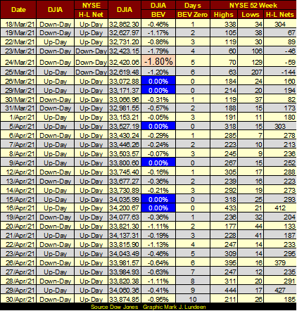
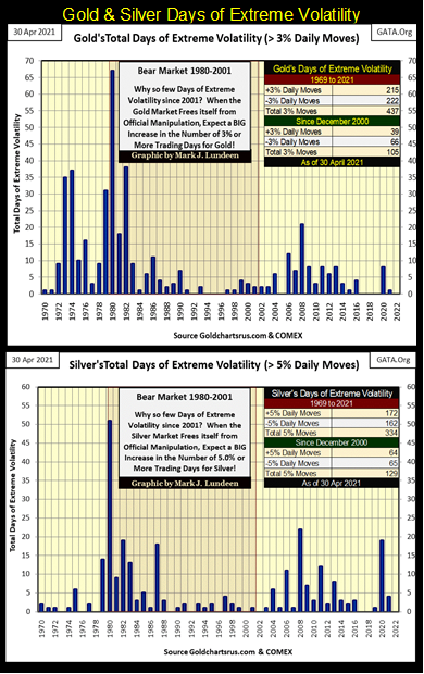
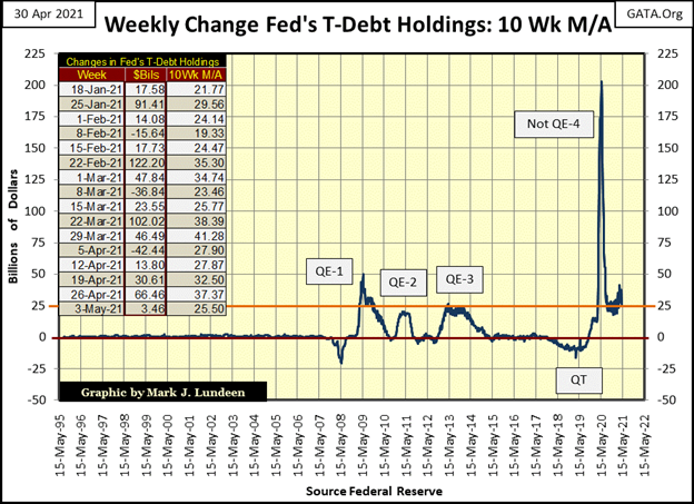
Twice this week the NYSE saw its 52Wk H-L Net break above my threshold level of +300, on Monday and Thursday. And though we’ve not seen a new BEV Zero since April 16th (ten trading days ago) we’ve not seen the Dow Jones break below the BEV -1.80% seen on March 24th either. So far in 2021 gold has only seen one day of extreme volatility, and silver only four days of extreme volatility.

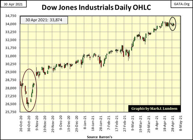
The Dow Jones lacked one important item last week; a little excitement. In fact, that has been true for the past two weeks. That’s how it goes sometimes.
The Dow Jones in daily bars below is a better chart to show the market’s quiescence. I circled the five trading days for this week. Last week saw higher intraday movement, which still took the Dow Jones nowhere.
But we’ve seen this last December, so based on what we see below I don’t believe anything fundamental has changed in the market. So, I see further gains for the stock market in the weeks and months to come.
Twice this week the NYSE saw its 52Wk H-L Net break above my threshold level of +300, on Monday and Thursday. And though we’ve not seen a new BEV Zero since April 16th (ten trading days ago) we’ve not seen the Dow Jones break below the BEV -1.80% seen on March 24th either.
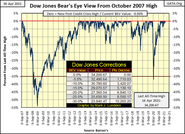
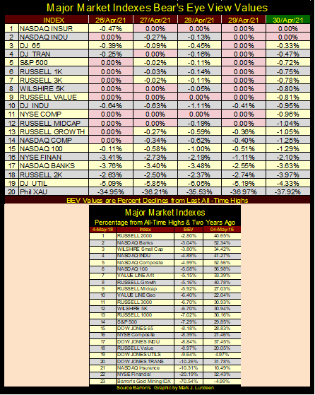
Here are the major market indexes BEV values below; this week saw plenty of BEV Zeros. As with last week, all the indexes closed Friday either with a BEV Zero or in scoring distance from one (< 5% from a BEV Zero).
As seen below, so far in 2021 gold has only seen one day of extreme volatility, and silver only four days of extreme volatility, and they all occurred before February 3rd. By this time in 2020 (April 30th) gold and silver both had six days of extreme volatility. Until this changes, until market volatility in the gold and silver markets increases, the excitement we’re all waiting for in the old monetary metals will be postponed until further notice.
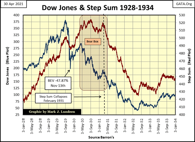
It’s a slow week everywhere in the markets, as if all of the bulls and bears are waiting for something to happen. What could that something be? No one talks about it anymore, but just before the banking system became catatonic during the credit crisis of 2007-09, October 2008 to be exact, the state of its reserves was an illiquid mess.
Following the 2007-09 credit crisis, the state of the banking system’s reserves didn’t improve. But with the FOMC “injecting” untold trillions-of-dollars of “liquidity” into the financial system, the banking system currently can function as if all is well.
But the banking system isn’t well. We know that because if it was the FOMC wouldn’t be “injecting” massive levels of “liquidity” into the financial system, seen in the chart below.
Sometime in the future, I expect something is going to happen in the financial system that will compel the public and financial media to once again focus on the health of the big banks. At that time, we’ll most likely see more market excitement than you or I will want to deal with, so enjoy the current peace and quiet in the market.
I keep a daily series for something I call the Dow Jones / Gold Step Sum Symmetry Plot that uses these market series’ step sums for inputs. I don’t look at it every day, but after a couple of months sometimes I see something of interest to note, as I did this week when I looked at it for the first time since last October. But before I go on to the symmetry plot itself, first a little review of the step sum and then on to the symmetry table below.
A step sum is a single item A-D line that uses the daily advances and declines of a market series, such as the Dow Jones or gold, as its input. Plus 1 for a daily advance, -1 for a daily decline.
It’s an amazing fact, but come bull or bear market, a market series sees about as many daily advances as it does daily declines. But common sense, and market history proves during a bull market advance, a market series sees slightly more daily advances then it does declines, so a market’s step sum typically advances with its price series. During a bear market decline, a market series typically sees slightly more daily declines than it does advances.
But not always. There are times during a bull market advance the market sees more daily declines than it does advances. As during a bear market decline, a market may see more daily advances than it does declines. For this reason, I see a market series’ step sum as a sentiment indicator, where the step sum either agrees with its price plot by trending alongside of it, or disagrees by decoupling from its price plot’s trend.
At such times, the price plot (Market Reality) has proven to be a superior predictor of the future than has the step sum plot (Market Expectation).
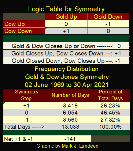
Here’s the Dow Jones (Blue Plot) and its step sum plot (Red Plot) from 1928 to 1934 (chart below). From January 1928 to late April 1930, the Dow Jones and its step sum advanced and declined together. However, after late April 1930 they decoupled, forming a Step Sum Bear Box. It’s a “bear box” because the Dow Jones was in a bear market, even if the market bulls refused to see it that way, as seen in the decoupling of the step sum from its price plot below.
Inside a bear box, bulls see daily declines as buying opportunities. After a big daily decline, the bulls come back into the market to “scoop up” all the bargains.
But it’s a bear market, so the “bargains” are only going to get cheaper as time goes by. So, at some point the bulls must surrender to the market’s primary trend, which during the Great Depression Crash was bearish.
The point where the bulls surrendered to Mr Bear is seen at the point when the Dow Jones’ step sum once again recouples (downward) with the Dow Jones price plot. In the chart below, that was around March 1931; the point where the step sum plot turned down. This is when the bear box is said to be closed, or completed. From this point on bulls become former bulls as they stop seeing daily declines as buying opportunities; instead, they begin seeing daily advances as opportunities to exit the market.
One nice feature of a bear box, such as this, it provides a clear, unambiguous signal the bottom is in. That the massive bear market selling is over, as seen in the upward reversals in both the price and step sum plots off their July 1932 bottoms.
Massive bear boxes, as see above are rare, but do occur. Gold saw a big multi-year bear box during its bear market of 1980 to 2001, as it did again during its last bear market decline from August 2011 to December 2015.
Now the symmetry plot for the Dow Jones and gold; keep in mind the step sum plot for any price series is a sentiment indicator. So, we are comparing the sentiment indicators for the Dow Jones and gold, two market series that are not always, but frequently counter cyclical to each other.
To generate the daily data points, the logic table below is used.
- 0 = both the Dow Jones and gold closed up or down together,
- -1 = Dow Jones closed up as gold closed down,
- +1 = Dow Jones closed down as gold closed up.
Using the logic above, a declining symmetry plot is the result of more advancing days for the Dow Jones than for gold. A rising symmetry plot is the result of more advancing days for gold than for the Dow Jones.
It goes without saying that a declining symmetry plot is bullish for the stock market, while a rising symmetry plot is bullish for gold, silver and the precious metal mining stocks. But like so many things in technical analysis, not always.
The lower portion of the table above lists how many days since 02 June 1969 the various inputs to the symmetry plot have been generated. In the past fifty-two years, the Dow Jones has seen 141 more net daily advances than has gold, or it might be said that gold saw 141 more net daily declines than has the Dow Jones.
Here is the chart plotting my Gold & Dow Jones Step Sum Symmetry plot.
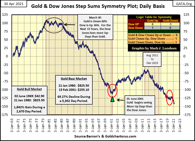
Take a few moments to study the above chart;
- from January 1969 to January 1980, with gold advancing 1842% the symmetry plot advanced about 100 more daily advances for gold than for the Dow Jones.
- from January 1980 to March 1985 the symmetry plot trends sideways, because the gold bulls refused to accept gold was in a bear market,
- from March 1985 to February 2001 the symmetry plot drops over 200 steps during the 1980 to 2001 bear market in gold,
- from February 2001 to August 2011 the symmetry plot advances over 60 steps as gold rises to new all-time highs,
- from August 2011 to December 2015, gold declines by 45% as the symmetry plot drops by fifty steps,
- from January 2016 to August 2020 gold once again rises to new all-time highs (2nd Red Circle) AS THE SYMMETRY PLOT CONTINUES TO DECLINE.
That’s the anomaly I wanted to point out to my readers this week; how since January 2016 (five years ago), for the first time since 1969, the Gold / Dow Jones Symmetry Plot continued to decline as the price of gold went on to new all-time highs.
What should we make of this? I think of this anomaly as another of those finger prints left behind on the market by the “policy makers” as they manhandle market valuations to their own liking. But this decline in the symmetry plot is an anomaly that won’t be tolerated forever by the markets.
When the financial markets once again break free from the “policy makers” malignant fingers, I’m expecting the Gold / Dow Jones Symmetry Plot will once again break to the up side with the rising price of gold, and I’ll tell my readers when it does.
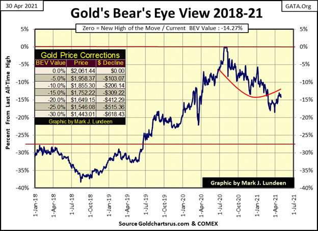
Moving on to gold’s BEV chart (below), so far gold has refused to break below its BEV -15% line. So, what does that tell us about next week? Nothing really, but with our world’s “monetary authorities” issuing paper and digital money as never before seen in human history, the gold market is pregnant with bullish possibilities.
We should acknowledge that reality and not fear what may happen should gold break below even its BEV -20% in the coming month. But I don’t see that as a likely possibility. So I have my eye on gold’s BEV -10% line ($1855) in the chart below.
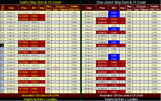
I’m skipping the step sum charts for gold and the Dow Jones this week as they’ve remained the same for quite a while. But I’d like to point out something in gold’s step sum table below. On April 21st gold’s 15 count reached a +7, or overbought. That’s when the “policy makers” sent in their goons to bludgeon the gold bulls into submission. But while we see lots of red following April 21st, the bulls were standing firm. On Wednesday this week gold was less than $10 below where it was on the 21st. I find that encouraging.
If someone really studies the markets since the turn of the century in January 2000, seeing the booms & busts in the market place that followed, as well as the tsunami of inflation flowing from the global central banking system to reflate market valuations after each bull-market bust, you just know something is wrong.
And it’s not just the financial markets. Since 911 the United States has been bombing someone, somewhere for reasons not really made apparent by the “policy makers” to the tax payers.
—
(Featured image by Tumisu via Pixabay)
DISCLAIMER: This article was written by a third party contributor and does not reflect the opinion of Born2Invest, its management, staff or its associates. Please review our disclaimer for more information.
This article may include forward-looking statements. These forward-looking statements generally are identified by the words “believe,” “project,” “estimate,” “become,” “plan,” “will,” and similar expressions. These forward-looking statements involve known and unknown risks as well as uncertainties, including those discussed in the following cautionary statements and elsewhere in this article and on this site. Although the Company may believe that its expectations are based on reasonable assumptions, the actual results that the Company may achieve may differ materially from any forward-looking statements, which reflect the opinions of the management of the Company only as of the date hereof. Additionally, please make sure to read these important disclosures.


Eli Lilly Hits $1 Trillion Valuation Amid Strong Bullish Momentum
Eli Lilly stock hit a record high, surpassing $1 trillion market value after strong product demand. Shares surged over 7%,...


BOAD Approves Major Funding Boost to Drive West African Development
At its 151st session in Lomé, BOAD approved eleven operations worth 344.577 billion FCFA, raising total financing since 1973 to...


Oil Surges on U.S.–Iran Tensions as Global Markets Show Diverging Trends and Rising Risk Fears
Rising U.S.-Iran tensions expose a fragile agreement, likely pushing oil prices higher while pressuring stocks and gold. Markets show mixed...


Dow Jones Near Highs Signals Strength Until Volatility Returns
The Dow Jones stayed below all-time highs all week, signaling continued strength while it remains in “scoring position.” Since November...


PayPal’s Slowdown: From Fintech Leader to Low-Growth Dividend Stock
PayPal has shifted from fintech leader to low-growth, value-style stock, losing over 25% in market value and trading at a...
 |
|
 |  |
 |
|
-

 Africa6 days ago
Moroccan Bond Market Shows Mixed Signals as Primary Eases and Secondary Pressures Persist
-

 Markets2 weeks ago
Corn Prices Slip Amid Strong Crop Conditions and Favorable Weather
-

 Fintech4 days ago
Talentir Secures €4M to Transform Global Payouts
-

 Cannabis2 weeks ago
WNBA Removes Cannabis From Banned Substances List in New CBA