Business
Market Volatility for the Dow Jones & Gold
This week the Dow Jones closed with a BEV value of -6.89%. That would be outside of scoring position – not within 5% of the Dow Jones’ last all-time high. That has happened only a few times since November 2020. Should the Dow Jones continue to drift below scoring position in the days, weeks, and months to come, that would be a bad trend in the market.

I thought I’d use the Dow Jones BEV chart plotting the entire bull market spanning from 1982 to the close of this week. In the past forty years, the Dow Jones has risen from around 700 in August 1982 to 36,799 just a few weeks ago. What does that mean in BEV Terms? Let’s look at the frequency table below the chart.
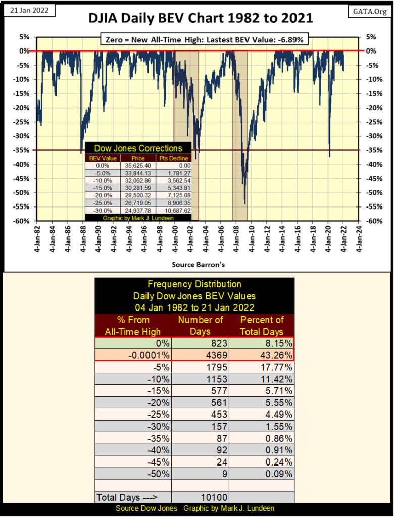
Since January 1982, the Dow Jones closed either at a new all-time high (0.00% row), or within scoring position (-0.0001% row) for 51.41% of its 10,100 daily closes (see Red Box above), even though in the past forty years the Dow Jones deflated below its BEV -35% four times. This is really a remarkable four decades of market history.
Unfortunately, since the first time the Dow Jones declined below its BEV -35% line in October 1987, when then Fed Chairman Alan Greenspan promised to provide “ample liquidity” to “stabilize the financial markets”, the stock market in many ways has been more like a clown show than a bull market.
And how is that? I’ll tell you; every time the Dow Jones declined below its BEV -35% line in the BEV chart above, the idiot savants at the FOMC put on their clown suits, and performed antics and hijinks on CNBC as they “stabilize market valuations” with “injections” of “liquidity.” Don’t think it won’t happen again the next time the Dow Jones approaches its BEV -35% line in the chart above, quite possibly this year.
This week, where did the Dow Jones close in the above chart? With a BEV value of -6.89%. That would be outside of scoring position – not within 5% of the Dow Jones’ last all-time high. That has happened only a few times since November 2020. Should the Dow Jones continue to drift below scoring position in the days, weeks, and months to come, that would be a bad trend in the market.
Looking at my table of BEV values for the major market indexes I follow, it wasn’t just the Dow Jones sinking below scoring position. The NASDAQ Bank index (#9) saw a new all-time high last Friday. A week later these banks closed down 8.39% just four trading days later. That caught my attention! And it wasn’t just the NASDAQ Banks that were down big; down by 5% or more during the holiday shorted week. It was a bad week for the NASDAQ and Russell indexes below.
It’s just a thought; but this week the XAU, while not going up, didn’t go down either. If the other indexes continue deflating in the weeks to come, I expect seeing the XAU, and gold and silver too, to begin moving up.
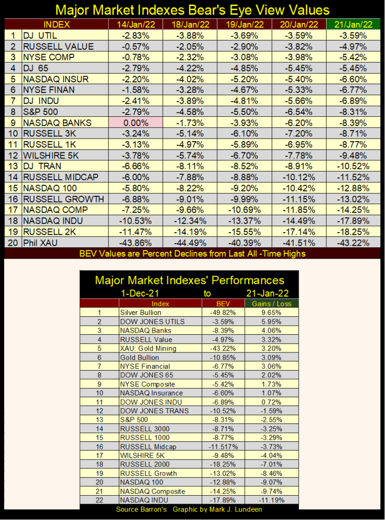
In the major market performance table above, I’m just looking at the gains/losses since the first of December, the last two months. Only the first eleven in the table have seen advances, and I note that silver bullion is #1, followed by the XAU at #5, and gold bullion at #6. I also note how all the hot indexes for the past twenty-two months have seen declines since December 1st. Like I said before, recently it’s been hard times for the NASDAQ and Russell indexes.
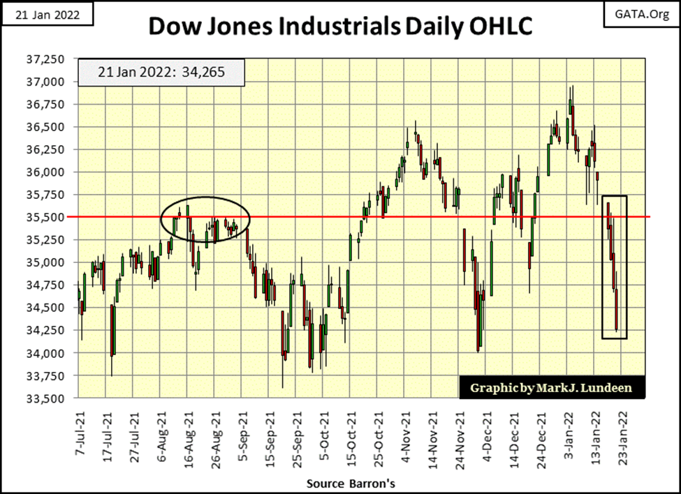
Here’s the Dow Jones in daily bars, and what an ugly chart it is. So far, 2022 hasn’t been kind to the stock market.
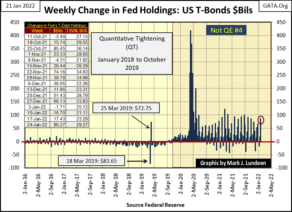
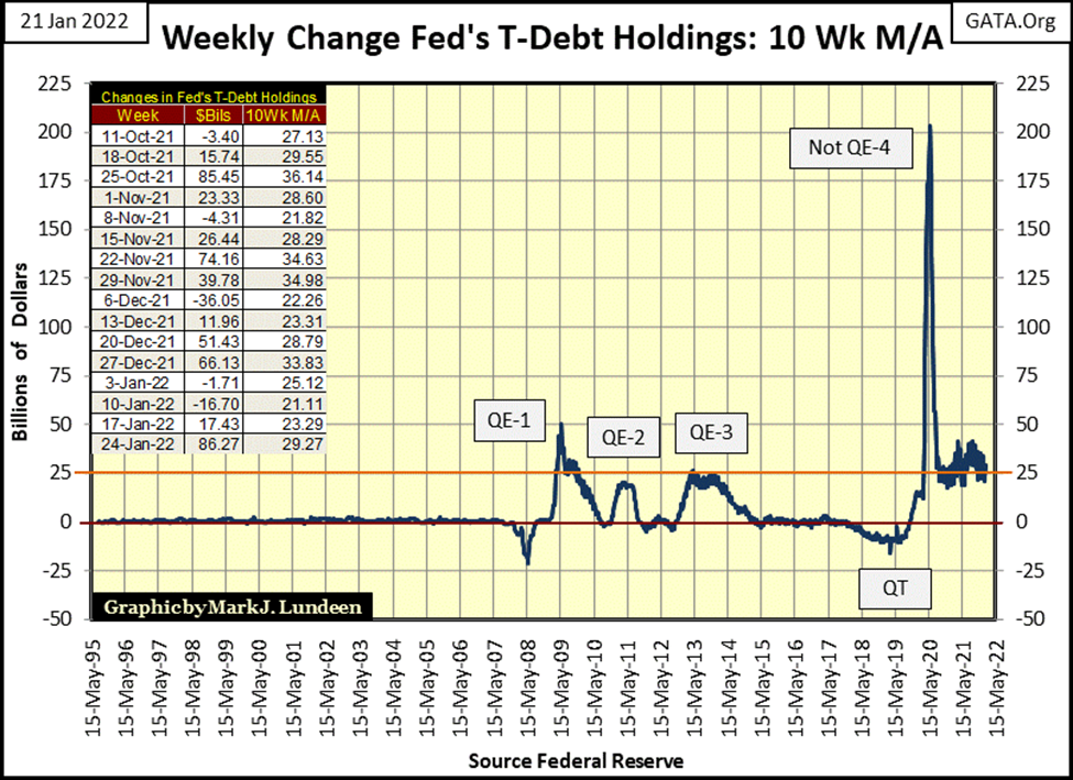
Am I ready to switch sides and become short-term bearish? I am NOT. Why not? Because this week the FOMC “injected” an additional $86 billion dollars into the market, as seen in the chart below (Red Circle and table).
That $86 billion “injection” didn’t do much. But I can guarantee you that if market valuations continue deflating, the idiot savants are more than willing to do whatever it takes to “stabilize” these markets’ valuations. During the March 2020 flash crash, they “injected” over $400 billion into the market in a single week. They could do that, and more if they have to. After all, modern “monetary policy” has become a clown show, and the “investment public” demands no less.
With “monetary policy” as it has been since Alan Greenspan became Fed Chairman in August 1987, I wouldn’t bet the Dow Jones won’t see more new all-time highs as 2022 rolls along. It may first deflate below its BEV -35% line for the fifth time since 1982. But look what the FOMC did the last time that happened (Not QE#4 / chart below).
Over at the New York Stock Exchange (NYSE), 52Wk Lows are dominating its 52Wk Highs (H-L nets column – table below). Yes, there are still days where there are more 52Wk Highs than Lows. But as seen in the H-L Nets column, the positive nets are only double-digit, except for the 109 positive net on December 30th. Then since December 13th, there are plenty of triple-digit negative nets, and this week closed with a triple-digit net of -517.
Still, with all of that the Dow Jones did manage to make three new all-time highs (BEV Zeros) at the end of December. That will be hard to do again unless the FOMC does something about the growing number of NYSE 52wk lows seen below.
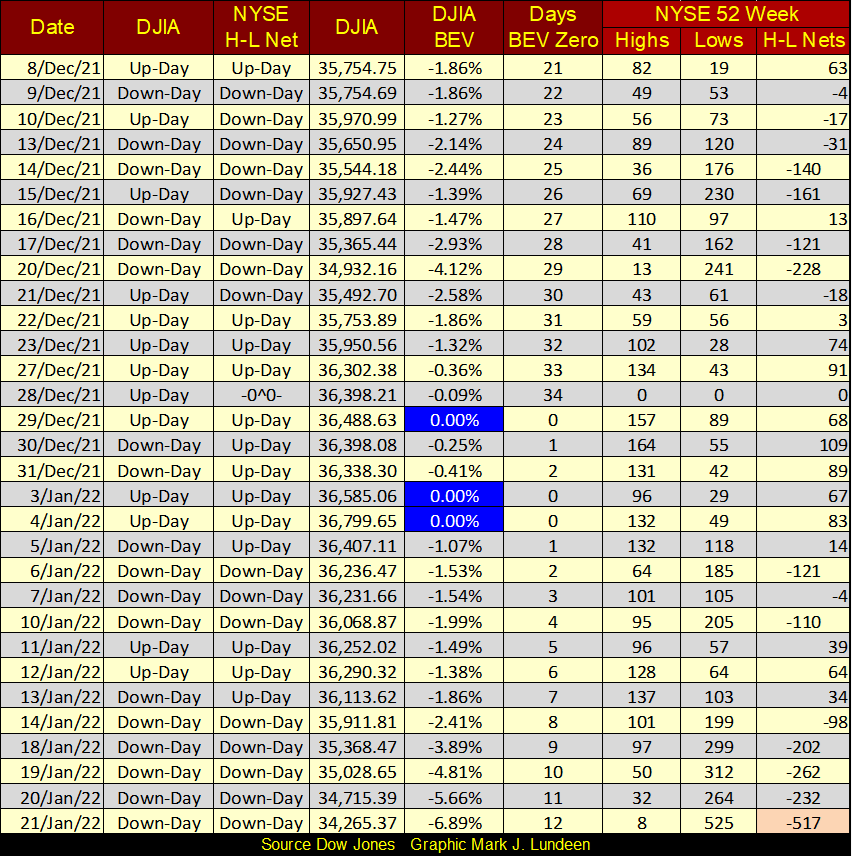
As seen above, there is no shortage of bad news concerning the stock market. So, am I still a short-term bull?
My personal hang up preventing me from becoming short-term bearish is the lack of extreme daily volatility. We’ve not seen any of the dreaded Dow Jones’ days of extreme volatility – the Dow Jones 2% days for months. The last one was on last July 19th when the Dow Jones declined 2.09% from its previous daily close, a market event still to be seen in the far-left side of the Dow Jones daily bar chart above.
From its current valuation, how much does the Dow Jones have to advance or decline to produce a 2% day? A daily move of up or down 700, or more points from a previous day’s close would do it. That’s a big move. It’s rare seeing such big moves in bull markets, but become common daily occurrences when valuations in the stock market are being clawed back by Mr Bear.
Next is a chart plotting every Dow Jones’ 2% day since January 1900. I use the term 2% day as a threshold value, so a Dow Jones daily move of 5% or more is considered to be a Dow Jones 2% day in this discussion.
These 2% days appear common in the chart below, but in total there have been only 1,896 of them in the past 122 years. 1,896 days of extreme volatility during the past 32,979 NYSE trading sessions. That is 5.7%, or 1 for every 18 trading days on average. They form in clusters during market declines, becoming rare market events during market advances.
Note also when the Huge Daily Advances occur for the Dow Jones; during the big bear markets. So, seeing the Dow Jones ADVANCE 3%, 4% or 5% or more from a previous day’s close is a poor reason to become bullish on the stock market. During the Great Depression Crash, the Dow Jones was seeing daily advances of 10% and more.
During the March 2020 (twenty-seven NYSE trading sessions), 38% flash crash, the Dow Jones saw a daily advance of 11.37%, almost at the absolute bottom of the flash crash. As it turned out, that was a good time to become bullish on the stock market. It was also when Powell’s Not QE#4 was “injecting” trillions of dollars into the stock market. Had Powell’s FOMC not done so, seeing the Dow Jones advance 11.37% from one day’s closing price to the next would NOT have been bullish. Very much the opposite.
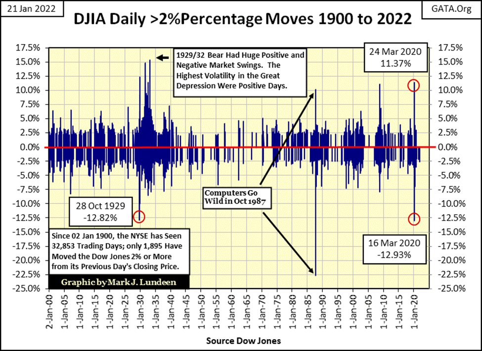
The above chart is interesting, but it’s also noisy. The two charts below present the raw data seen above into a more intelligible visual of Dow Jones’ market volatility.
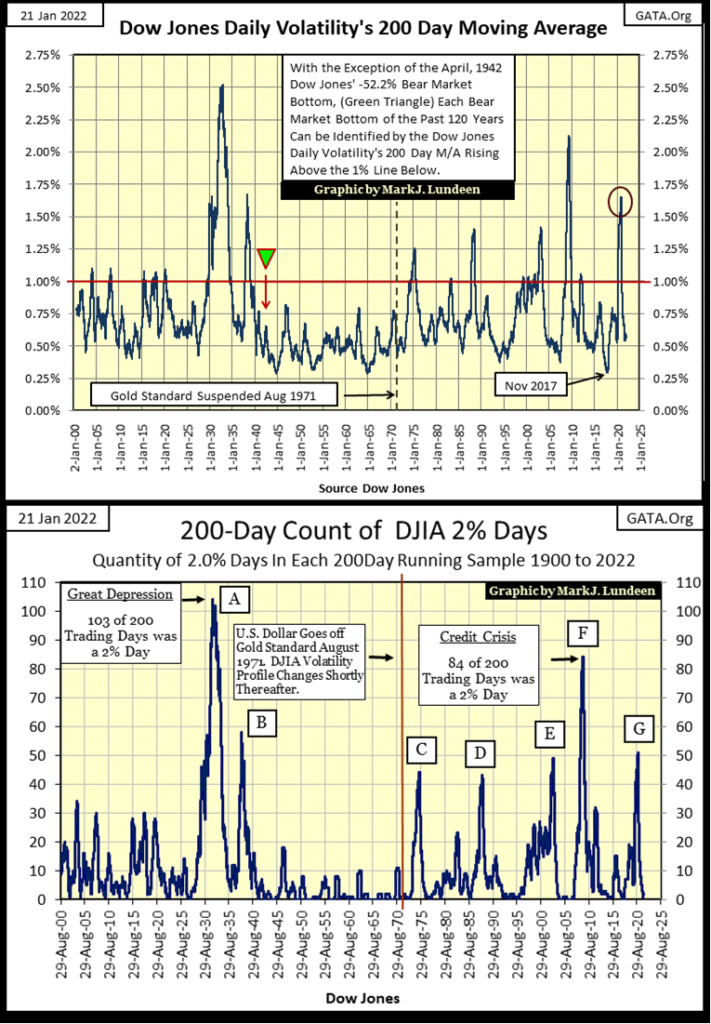
Go down and take a quick look at the upper chart, a simple 200 day moving average of daily volatility for the Dow Jones, the same data series I publish weekly in my Dow Jones Step Sum Table. Understand this is a 200-day moving average, so the actual market tops and bottoms most likely will occur weeks or even months before these percentages bottom in bull markets, or see their associated percentage spike peak in Bear Markets.
I placed a red-line at the 1.00% level, as typically when the Dow Jones daily volatility’s 200-day M/A rises above this level, the stock market’s valuation is deflating. And the higher this 200-day M/A rises above 1.00%, the deeper the market has declined.
Currently, this 200-day M/A is at 0.58%, which historically signals the Dow Jones is advancing. However, as investors, this is NOT the correct way to understand this data. Rather, seeing this 200-day M/A at 0.58%, tells us the Dow Jones (my proxy for the general stock market) is at a market top. From the historic standpoint of risk and reward, seeing the Dow Jones daily volatility’s 200-day M/A at 0.58% tells us this market is a high-risk market, offering investors little prospect for reward for the risks assumed.
This is why I’m sitting high up in the stock market’s peanut gallery, enjoying the show between the bulls and bears below. What could trigger my re-entry into the market is also seen below; seeing this 200-day M/A spike up over the red 1.00% line would be a good start. Such an event would signal that much of the risk of losing money during a bear market has been eliminated, as market valuations have been significantly clawed back by Mr Bear.
So, what percentage valuation should we see as a re-entry point? The heck if I know!
Since the US Treasury took the dollar off the $35 gold peg, the Dow Jones has never traded the same as before. Since 1971 the stock market began a series of boom-bust cycles. Bear market bottoms seen as volatility spikes in the chart, with bull market tops occurring as the plot bottoms well below the red 1.00% line. As noted below, a volatility spike in this 200-day M/A of 1.25% suggested a good reentry point back into the market. Or so it did before the sub-prime mortgage bear market, which saw daily volatility spike to 2.15% at its bottom.
Currently, I remain short-term bullish. But I’m a GRIZZLY BEAR when it comes to this market’s long-term future. This week the FOMC “injected” an additional $86 billion into the financial system, yet at the close of this week, the Dow Jones lost 2,534 points since its last all-time high seen on January 4th. How long before the FOMC has to “inject” over $100 a week, week after week to “stabilize” market valuations?
In my opinion, this “bull market” has been a mug’s game since Dr. Bernanke’s FOMC began its first QE during the sub-prime mortgage bear market. Yes, the Dow Jones has advanced by an incredible 30,252 points off that March 2009 bottom, a percentage gain of 462%. But these gains aren’t real. They’re only market manipulation via monetary inflation, courtesy of the idiot savants at the FOMC. Mr Bear is going to deflate most, and likely more than just those 30,252 points away before he is through with Wall Street in the coming unpleasantry.
I can’t see into the future, but I can fear it. What I’m afraid of, is seeing another Great Depression, or possibly a GREATER DEPRESSION Bear Market. In the early 1930s the Dow Jones’ volatility 200-day M/A increased to 2.50%. I’m prepared to remain in the market’s peanut gallery until I see the coming percentage spike in daily volatility rise up to, and possibly beyond 2.25%. In 1932, the Dow Jones’ valuation had to deflate 89% to achieve the percentage spike seen below. If I’m correct, what would a percentage spike of 2.25% mean in BEV terms for Dow Jones? I’m sure something greater than a BEV value of -75%.
The chart above plots the Dow Jones’ 200-Day Count; the number of Dow Jones’ 2% days in a running 200-day sample from January 1900 to the close of this week. It looks remarkably similar to the chart above, plotting the 200-day percentage moving average. The current 200-count for the Dow Jones is 2, and very stale 2% days they are, with the most recent being from last July.
When Mr Bear comes calling on Wall Street, expect seeing the Dow Jones 200-count above once again spiking upward, as Dow Jones’ 2% days become daily occurrences, as is typical during big-bear markets. The question in my mind is; where will this plot peak in the pending bear market? Will it peak above or below the Great Depression’s 103 of 200 days, or below the sub-prime mortgage bear market peak volatility of 84 of 200 days. Or maybe somewhere in between?
Let’s now move to gold’s days of extreme volatility, or 3% days. Why 3% days? It just seems to work. Using a 2% day for gold and silver (5% days for silver) just produces too many days of extreme volatility in the chart below.
While rising volatility is ALWAYS BAD for the stock market, and has been since 1885, precious metals can see rising volatility in both bull and bear markets. Rising volatility in gold and silver is an indication of big inflows of money into, or out of these markets.
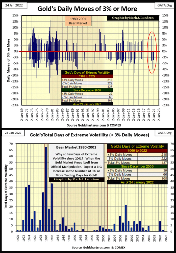
The chart above plots the volume of gold’s 3% days (positive and negative) by year. The first post Bretton Woods bull market for gold (1970 to 1980) saw many more days of extreme volatility than the current bull market (2001 to 2022). I blame this on market manipulation in the precious metals’ futures markets, though most “market experts” would disagree.
Currently, I’m waiting for market volatility in the gold and silver markets to increase, resulting in a nice spike in gold’s 3% days (5% days for silver), hopefully in 2022. Gold’s last 3% day happened last January, over a year ago.
Here is gold’s BEV chart going back to 1999, the beginning of the second post Bretton Woods gold bull market. Lots of BEV Zeros from 2001 to 2011, with one decline down to the BEV -30% line. And then came August 2011, where from a BEV Zero gold collapsed down to its BEV -45% line four years later in December 2015. A very painful four years as I recall. I’m sure that many gold bulls in August 2011 have yet to return to the gold and silver markets, even though gold saw a new all-time high in August 2020. That is too bad for them.
As expected, following the break out above gold’s BEV -27.5% line in June 2019, and subsequent new BEV Zero in August 2020, gold had a correction down to its BEV -17.5% line, and is now pausing for its next attempt for a new all-time high.
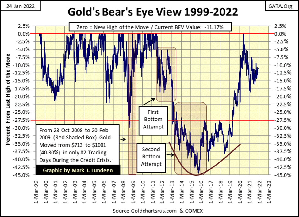
I know the big banks and their paid goons at the COMEX futures markets are making this process as painful as they can. But even so, gold’s BEV chart above looks very bullish to me. Unlike the stock market, the bull market in precious metal assets offer a much higher opportunity for rewards for assuming current market risks. Or so it appears to me.
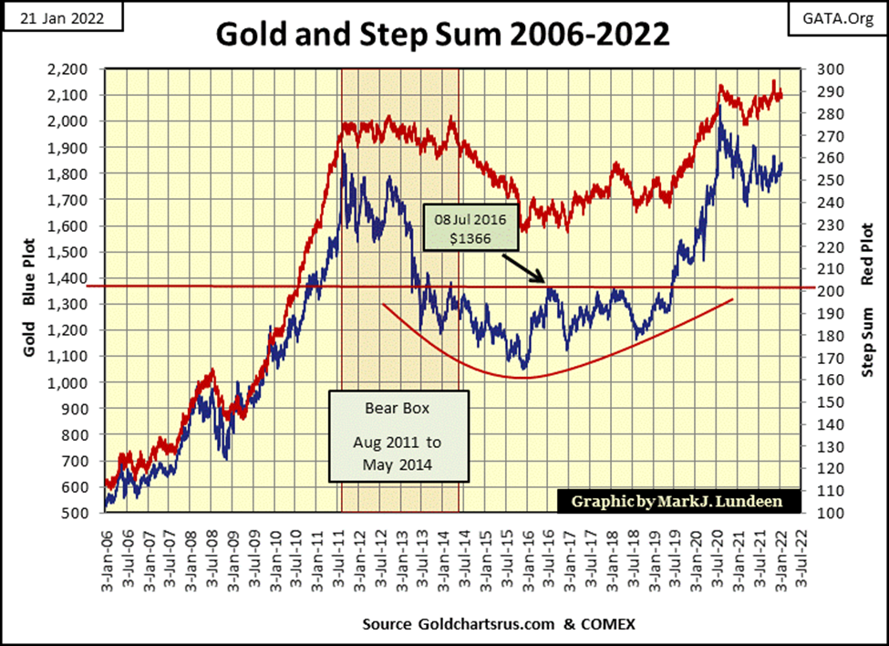
In gold’s step sum chart below, gold’s (Blue Plot / Market Reality) made a move up towards its step sum plot (Red Plot / Market Expectations). Gold closed the week at $1831. With the price of crude oil, and other commodities soaring, it would be hard for the bears to drive gold back into the $1700s. Hard, but not impossible. Still, I think the path of lease resistance for the old monetary metals is upward.
Sometimes investors just have to make a stand on a market and declare whether they are bullish or bearish. After all the gold market has been through since 2011 in these charts, and seeing CPI inflation breaking out around the globe, I believe now is the time to become a big bull on precious metal assets. Don’t forget the miners!
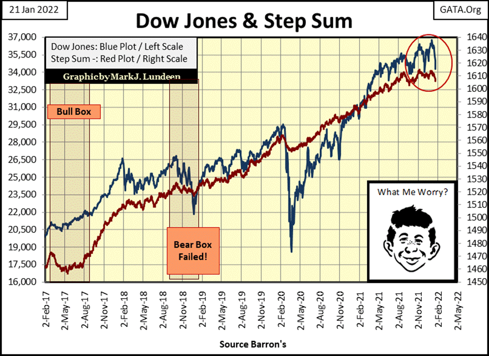
Alfred below still isn’t worried, but should the Dow Jones break below 34,000, maybe he should. Seeing both the Dow Jones and its step sum plots turn around to the downside below isn’t a good thing to see if you’re a bull in the stock market.
So, am I getting bearish yet? Not yet! Unlike YOU – I still have total faith in the idiot savants at the FOMC. As seen in the chart below, should the Dow Jones break below its BEV -35% line for the fifth time since 1982, those clowns will “inject liquidity” with an enema bag up the bull’s tukus if that’s what it takes to “stabilize” the financial markets.
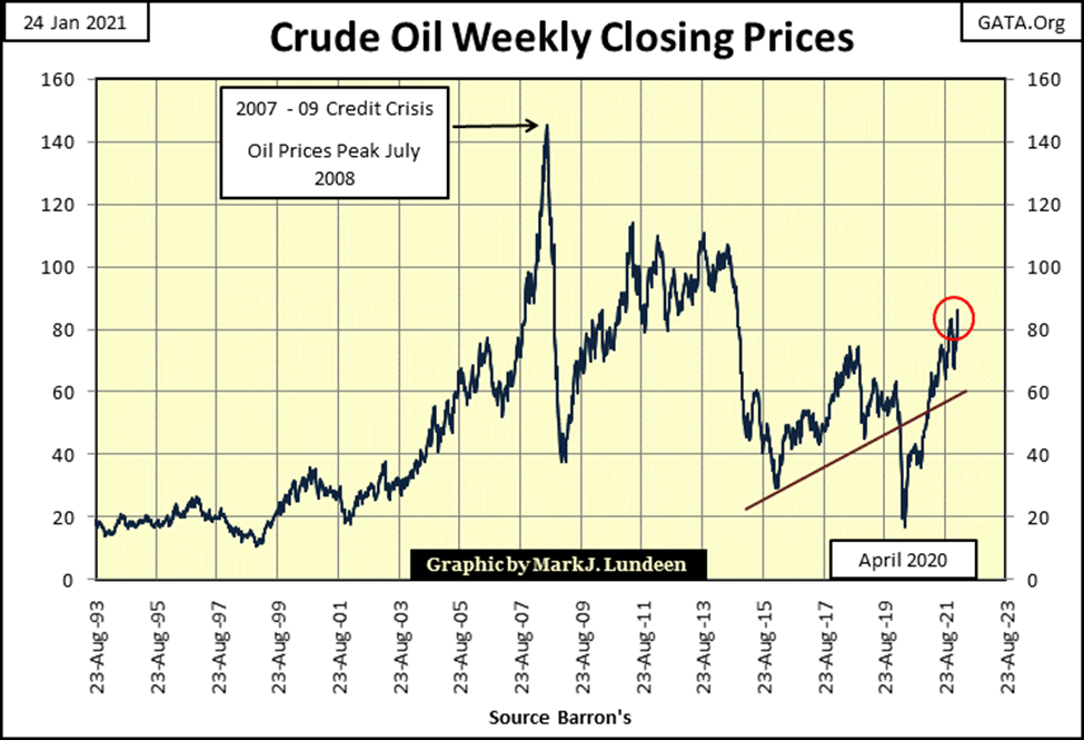
But what about the inflating price of crude oil and other commodities? I admit, that is a problem. Maybe my faith in the idiots should be something less than total, should commodity prices continue increasing by double-digit percentages.
This week Excel was giving me problems with my graphics. I wanted to highlight some items in the table below, but gave up after I concluded it wasn’t worth the effort.
The first item not highlighted can be seen on gold’s side of the table (left side). On January 12th gold closed at $1,825 as its 15-count hit a +5, which is neutral but up there. A good indication the gold market was due for a few down days. Which happened on January 13-18. On January 18th, gold’s 15-count declined to a -1 as the price of gold closed at $1,811, down by $14 in the past three days.
The next day (January 19th) gold closed up at $1,839, with its 15-count at a +1. In these four days gold worked off its almost over-bought condition (15-count from +5 to +1) as it advanced $14 from its close on January 12th – impressive. The next two days gold closed down, but not by much, leaving the gold market with a 15-count of -1 for the week.
I like this market action; more declining days than advancing, yet the market advances. It’s like James Dines used to say; “it’s a game fish that swims upstream.” I believe we have a good setup for gold in the coming week.
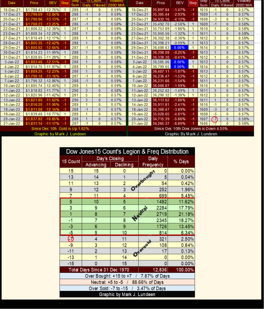
The second un-highlighted item was the Dow Jones became oversold on January 20th when its 15-count declined to a -7. The table above is a frequency table for the Dow Jones 15-count going back to December 1970. Markets don’t like being oversold. The Dow Jones’ 15-count saw a -7 in only 321 daily closes (2.50% of 12,836 daily closes) in the past fifty-one years.
The Dow Jones may next see a 15-count of -9. But market hate being this oversold even more, as seen in the table above. If you go back and look at the chart of the Dow Jones in daily bars above, it looks very bad. With the Dow Jones closing the week with a 15-count of -7, I’m expecting a relief rally, more advancing days than decliners, to bring the Dow Jones’ 15-count back to neutral as the Dow Jones bounces off this week’s lows.
The Dow Jones closed the week with a BEV of -6.89%. Less than 7% from its last all-time high, which really isn’t much of a decline from an all-time high in a bull market. In this relief rally, how many BEV points can the Dow Jones take back from Mr Bear? If in the next few weeks, the Dow Jones finds itself deep into scoring position, or even makes a new all-time high, that’s a good reason to remain bullish on the stock market.
But, if the Dow fails to advance into scoring position (less than 5% from its last all-time high), it could be big trouble for the bulls. In the market’s peanut gallery, I’m betting a nickel the idiots at the FOMC will make things right for the bulls.
__
(Featured image by Austin Distel via Unsplash)
DISCLAIMER: This article was written by a third party contributor and does not reflect the opinion of Born2Invest, its management, staff or its associates. Please review our disclaimer for more information.
This article may include forward-looking statements. These forward-looking statements generally are identified by the words “believe,” “project,” “estimate,” “become,” “plan,” “will,” and similar expressions. These forward-looking statements involve known and unknown risks as well as uncertainties, including those discussed in the following cautionary statements and elsewhere in this article and on this site. Although the Company may believe that its expectations are based on reasonable assumptions, the actual results that the Company may achieve may differ materially from any forward-looking statements, which reflect the opinions of the management of the Company only as of the date hereof. Additionally, please make sure to read these important disclosures.

-

 Impact Investing2 weeks ago
ESG Funds Still Hold BP Despite Shift Back to Fossil Fuels
-

 Biotech25 minutes ago
NHS Funds Breakthrough CAR-T Therapy Breyanzi for Lymphoma Treatment in Spain
-

 Impact Investing1 week ago
ITAS Mutua Reports Strong 2025 Growth and Sustainability Progress
-

 Markets3 days ago
Cocoa Markets Steady as Weak Demand and Rising Supply Signal Potential Surplus


