Featured
“Monetary Policy’s” Engine-of-Inflation
Last Jan. 26, the Dow Jones market closed at 0 followed by a -10 percent on Feb. 8. Investors remain on edge as inflation spikes become more unpredictable.

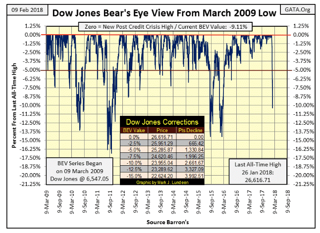
Two Friday’s ago, (Jan. 26) the Dow Jones made its latest BEV Zero, new all-time high. Nine trading days later (Thursday, Feb. 8), it broke below its BEV -10 percent line in a very dramatic fashion.
The BEV plot seen below begins at the absolute low of the October 2007 to March 2009 -54 percent bear market. The post credit-crisis advance took the Dow Jones up over 20,000 points in nine years. But you wouldn’t know that by looking at the Bear’s Eye View (BEV) chart below.
What we see below is the advance as seen in the eyes of Mr. Bear; each new post credit-crisis high in the Dow Jones is equal to a Big-Fat Zero (0.00 percent) as that’s how Mr. Bear sees them. What the big furry fellow wants to see is how many percentage points he can claw back from each of the bulls’ new highs. And that’s exactly what we see below; new highs (BEV Zeros) and percentage declines from each BEV Zero since Mar. 9, 2009.
Since March 2009, the Dow Jones has seen deeper corrections from a BEV Zero. But this was the first double-digit percentage decline that took only nine trading days. That’s got to make us wonder if something is different this time.
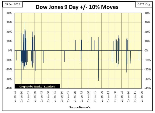
So I took a historical look at those times the Dow Jones moved +/- 10 percent (or more) in only nine days in the chart below. And yes, such moves and much greater ones are common, if not always frequent occurrences — IN BEAR MARKETS.
The latest nine-day -10 percent move occurred on Thursday last week. Is this an isolated spike in volatility occurring outside the context of a bear market? There are a few of these seen below, but not many. Or are we seeing the first volatility spike in a bear market cluster yet to be formed?
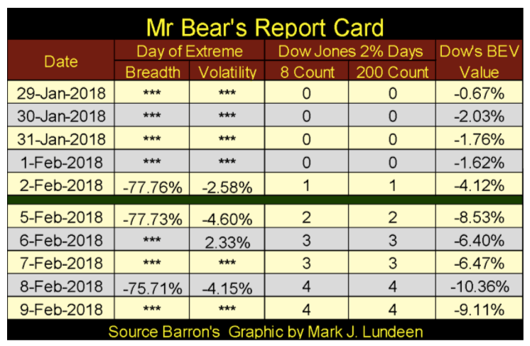
The past week has seen more than its fair share of excitement. In Mr. Bear’s report card below, we see seven extreme days, three NYSE 70 percent A-D days (extreme breadth), and four days of extreme market volatility. From a market that refused to correct a simple 5 percent in the past 18 months, it has now collapsed by over 10 percent in only nine NYSE trading sessions. This makes me suspect something has changed in the past two weeks. Historically, such concentration of extreme days doesn’t happen unless something ugly is bubbling beneath the surface of the market.
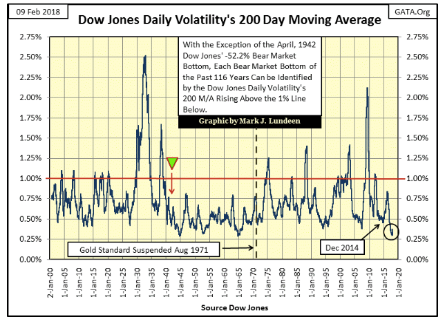
Again, this week I searched my files for old charts I haven’t published for a while and came across one plotting the Dow Jones daily volatility’s 200 Day M/A, using the absolute value of each day’s percent movement from the previous day’s closing price. Its resemblance to the Dow Jones’ 200 count, the number of Dow Jones 2 percent days (four seen above) in a running 200-day sample, is remarkable.
With rare exception, seeing the Dow Jones daily volatility’s 200 Day M/A spike above the 1 percent line marks a bear market bottom, and the degree to which it rises above the 1.0 percent line indicates the severity of the market decline. I marked the April 1942 -52.2 percent bear market with a green triangle, as this massive bear market is one of those exceptions, a huge bear market that few people paid any attention to.
After the market catastrophe of 1929-32 and the 1937-38 bear market — both events were clearly seen in the chart below — the public was out of the market and would not return until a generation with no personal memories of the trauma of the 1930s came into adulthood. Hey baby boomers, I’m talking about us and our retirement funds invested in the stock market. At present, my generation is very exposed to the ups and downs of Wall Street, but I’m digressing from the April 1942 -52.2 percent bear market bottom.
After the depressing 1930s, my parents and grandparents’ generation were more concerned about the return of their money than the return on it and kept their savings in the bank. In truth, for them, it wasn’t a bad decision. But today, that option isn’t available to us baby boomers.
Decades ago, deposits from savers were essential for the banking system, so they encouraged people to save money and banks offered competitive interest rates for deposits. But banks today get their money from the Federal Reserve (at the Fed Funds Rate) so banks don’t need deposits from savers or have to pay a decent rate of return on saver’s deposits. In fact, the banking system finds people who want to save money annoying. Rather, they encourage people to bury themselves in consumer debt and to invest for “the long term” in the stock market to fund their retirements. What could go wrong with that?
At the time of writing this article, the “policy makers” have fixed interest rates for savings accounts at an annual return of 0.14 percent and the five-year US Savings Bond (Series EE) pays only 0.10 percent. Junk bonds yielding over 6 percent (what banks used to pay) looks pretty good in comparison to income-starved retirees.
But back to April 1942 in the chart above, considering the public was out of the stock market, and a World War the United States entered just four months before, I’m not surprised this -52 percent decline in the Dow Jones was mostly ignored as people had more important things on their minds. But that April 1942 bottom was the beginning of a huge bull market that didn’t peak until 1966.
The next three decades saw little volatility, until after August 1971 when the US Treasury officially severed the dollar’s link to the Bretton Woods’ $35 gold peg. The effects on market volatility were soon to come. Two years later began the January 1973 to December 1974, -45 percent bear market, the first 40 percent decline in the Dow Jones since April 1942. Note also how from August 1971 to this day, the Dow Jones’ daily volatility’s 200 Day M/A rarely declined below its 0.50 percent line, a level of volatility the Dow Jones frequently found itself below from 1942 to 1971.
Which brings me to the next point I want to make about this chart. In the past year, daily volatility (Black Circle) in the Dow Jones had declined to levels not seen since 1945 and 1966. This is only the third time since January 1900 daily volatility for the Dow Jones has been this low. Is that good or bad? For someone who entered the market in past years, and got out today, I’d say this low volatility was good. The question in everyone’s mind is, will it continue being good for people who remain in the stock market for the “long term?”
The point to keep in mind with this chart going back to January 1900 (118 years) is how bull markets terminate, and bear markets originate at volatility troughs (bottoms) seen in the chart above. With the Dow Jones once again seeing frequent days of extreme volatility (2 percent days), the case that an important market top is now behind us can be made and should be respected by investors. This is not the time to fall in love with the stock market.
Of course, today’s big bulls are central banks, whose ability to fund purchases with monetary inflation is theoretically unlimited. So, we may still see the Dow Jones making additional new all-time highs in the months to come, with more than just a little help from the Plunge Protection Team (PPT). Here’s a clipping from John Crudele covering Monday’s day of extreme volatility:
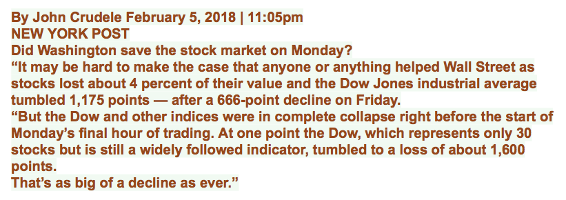
Of course, the “policy makers” came into the market. They’ve been doing exactly that since October 1987 when Alan Greenspan turned around a market meltdown.
However, should bond yields continue rising, even the global central banking cartel will find it impossible to resist Mr. Bear. But with or without the PPT’s interference, I believe the party on Wall Street is over. There will be more pain than pleasure to be had in staying in the market for the next few years. It’s time to go. If not into gold and silver related assets, then into short-term US Treasury bills currently yielding about 1.5 percent for protection of principle.
In Mr. Bear’s report card above, we also saw three new NYSE 70 percent Days, or days of extreme market breadth. These are computed as follows.
Advancing Shares – Declining Shares / Total Shares Traded that Day.
I find the number of shares trading that day by adding the advancing + declining + unchanged shares listed for the day.
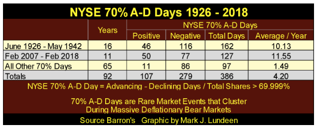
Should this ratio break above +69.999 percent or break below -69.999 percent, the NYSE just saw a day of extreme market breadth, a NYSE 70 percent A-D Day, and these are rare market events. Since 1924, there have only been 386 such days, with the bulk of them occurring during the depressing 1930s and again since the beginnings of the sub-prime mortgage crisis. I highlighted these two clusters of extreme market breadth in the chart below.
It’s a point of interest how during the Greenspan Fed (August 1987 – March 2006) the NYSE only saw 11 days of extreme market breadth as he first inflated a massive inflationary bubble in the high-tech shares, and then into the retail real estate market.
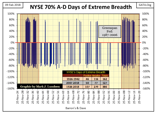
The table below gives the specifics. In the 1930s cluster, they occurred at a rate of 10.13 a year. In our current cluster they have occurred at a rate of 11.55 a year. During the 65 years spanning these two clusters (1942 to 2007), they occurred at a rate of only 1.49 a year.
Our cluster of extreme market breadth began in February 2007. Three months later, Fed Chairman Dr. Bernanke began uttering total nonsense to a gullible media.

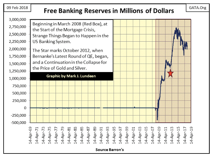
Eleven years later, we all know how that worked out. In the following year, the global financial system almost collapsed, and would have, had not the global central banking system entered into the financial system in a manner it had never done before. The explosion of reserves in the banking system below in the wake of the sub-prime mortgage crisis is shocking. One doesn’t need a Ph.D. in economics to realize the Federal Reserve was forced to “inject” massive amounts of “liquidity” into the banking system in response to the mortgage crisis.
This chart also puts to rest the false belief that price movements in gold and silver are driven by trends in monetary inflation. There’s enough inflation seen below to drive the old monetary metals to prices that are simply not believable, yet prices in gold and silver continue to be in a funk.
No, I still stand by my belief that bull markets in gold and silver are driven by deflation in financial assets whose valuations were first inflated by the “monetary policy” seen below. So, if you want higher gold and silver prices, you’re just going to have to wait until the stock and bond markets are deflating once again. It’ll happen; we just have to be patient.
If I were forced to say why I believe our current cluster of NYSE 70 percent A-D days has continued to grow since February 2007, I’d say it’s because for the past 11 years, the “policy makers” have found it necessary to continue managing the financial markets as they never had to before February 2007, because for the last decade the financial markets remain dangerously unstable.
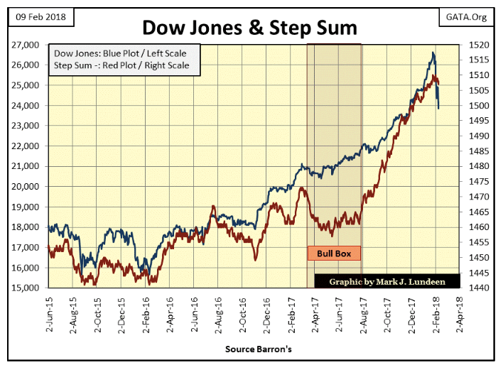
The Dow Jones (Blue Plot) in the step sum chart below seems to support that view of the market. Markets priced at fair value simply don’t see their valuation evaporate by 10 percent in just nine trading days, as we see below.
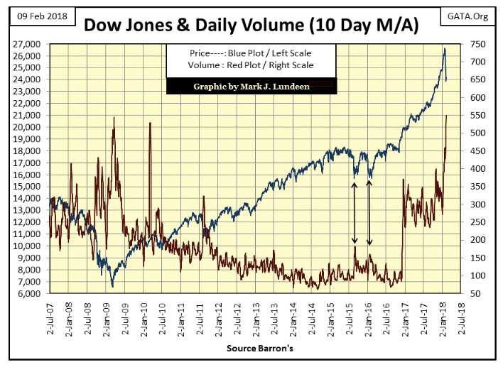
Also, trading volume (Red Plot chart below) for the Dow Jones once again exploded on the current decline. As with the sub-prime bear market (2007-09), we all know who is selling — the public. The question is, who’s buying? I believe it’s the “policy makers” doing their “market stability” thing one more time.
So how is gold doing? Considering the big drop in the COMEX open interest (Red Plot below), actually pretty darn good! The big banks on Wall Street ramp up OI as the price of gold advances, and then dump their contracts to drive the price of gold down. Well, we can all see the big decline in OI in the chart below. However, though the price of gold did decline, its decline doesn’t seem proportionate to the decline in OI.
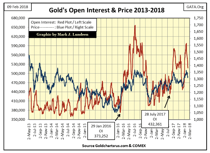
So we know how, beginning at the end of January, the gold cartel has activated yet another assault on the price of gold. However, so far it hasn’t really taken down the price of gold as much as they must have wanted it to go. But then there is always next week.
The “policy makers” still have control over the gold and silver markets. I say that because the Silver to Gold Ratio (SGR below) remains very high. It closed the week at 80.49 ounces of silver for one ounce of gold. That makes the price of gold cheap and the price of silver ridiculous.
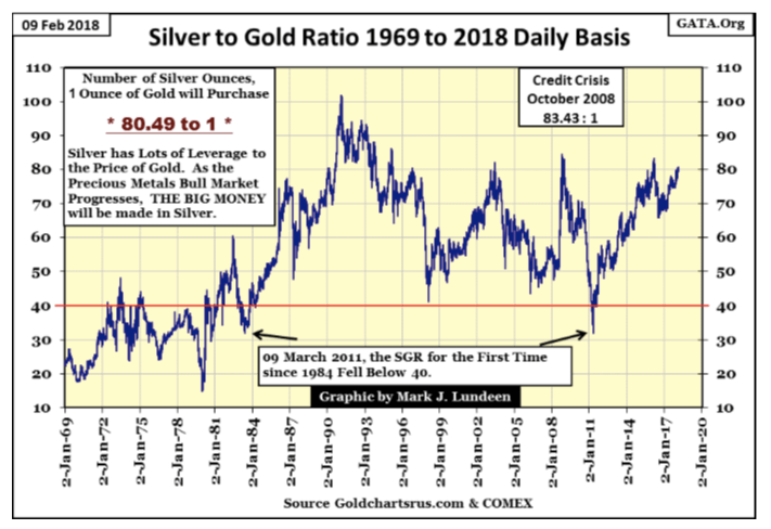
We’ll know when the grip of their malignant fingers begin to slip off the valuations of the old monetary metals, by seeing the above ratio beginning to decline, as seen from October 2008 to April 2011. Seeing the SGR once again below 40 should set the “policy makers” into full panic mode of operation, as it did in 2011.
But the next time, will they be able to put the old monetary metals back into their box, as they did in 2011? Well, in 2011, bond yields were still declining and stock valuations continued to advance. Since then, interest rates have bottomed and have been advancing for the past few years, if not by much, as seen with mortgage rates below.
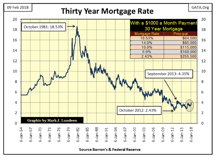
Rising mortgage rates is yet another example why higher bond yields and interest rates will cause huge problems for the “policy makers” efforts in controlling the valuations of the old monetary metals. In past weeks, I’ve mentioned how rising bond yields will trigger Wall Street’s interest-rate derivative neutron bomb. But it’s no different for real estate (mortgages).
Look at the table in the chart. Using an amortization table, I computed the size of the mortgage principle (house price) for the maximum and minimum mortgage rates since 1964, and for three other mortgage rates. Homeowners tend to focus on how much a house (mortgage principle) they can afford. This isn’t so for the banks writing their mortgage; they focus on how large a mortgage the prospective house buyers’ MONTHLY PAYMENTS will afford.
And that is exactly what is seen in the chart’s table, the principle afforded to a $1,000 monthly payment on a 30-year mortgage. There are lots of variables in why a house goes up in price, but seldom mentioned was the decline in mortgage rates from 1981 to 2012. In fact, you can see how Dr. Bernanke from November to December 2008, during the mortgage crisis, drove down mortgage rates from 6% down to 4% in just a couple of weeks to reflate the deflating real estate market.
Imagine what happens when this monetary engine-of-inflation goes into reverse when mortgage rates once again begin to rise in earnest. For example, a $255,500 home purchased in October 2012 when mortgage rates were at 2.43 percent may still have lots of prospective buyers who can afford a $1,000 monthly payment. But should mortgage rates increase to where they were before the mortgage crisis, 6 percent, a $1,000 a month mortgage payment will only be able to afford a $168,000 mortgage.
And that’s the best case scenario. Who believes in a massive bear market, which I’m assuming is coming our way, where the pool of perspective homeowners who can afford a $1,000 monthly payment isn’t going to do anything but shrink? The deflationary implications of rising interest rates and bond yields on real estate, stocks and bonds are huge!
Given this deflationary situation in financial assets, I can’t imagine where gold and silver, assets with no counterparty risk, won’t benefit from the flight of refugee dollars, fleeing the previously mentioned financial asset valuations “monetary policy” had grotesquely overinflated.
So let’s take a look at gold (Blue Plot) and its step sum below. I don’t know what it will look like next week, but at the end of THIS week, gold looks good. It could be better, but as it is gold came very close to making a new high in an advance that began in December 2015 and is now correcting — period.
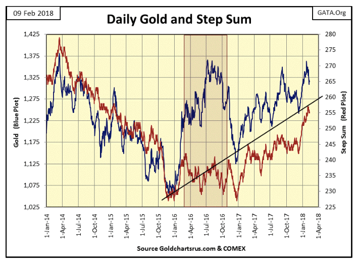
One thing is certain, when the Dow Jones dropped 10 percent in nine days, gold itself only lost 2.31 percent over those same days as Wall Street did everything to support the Dow Jones and to undermine the price of gold. As James Dines used to say: it’s a game fish that swims upstream!
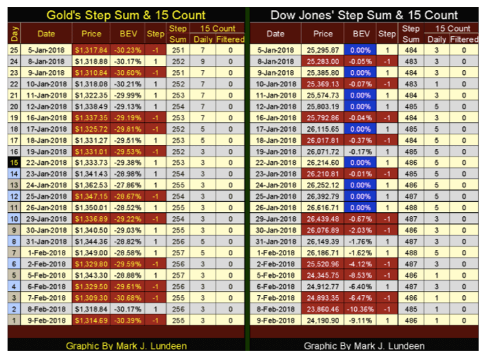
The difference between gold and the Dow Jones can be seen in their step sum tables below. In the past 25 trading days, gold’s step sum has advanced by a net of four advancing days while the Dow Jones only +2. And then the Dow Jones from Jan. 5 to 26 went up 1,321 points (5.22 percent). That sounds like irrational exuberance to me, just before the Dow Jones sheds 10.36 percent on Feb. 8. All in all, gold is looking much better than the Dow Jones in the tables below.
As I’ve said before, I’m out of the market-prediction business. I do all this work researching the market, from which I make a prognostication of what is going to happen next week, next month, and then the market makes a monkey out of me.
Well, to hell with that. But I’m willing to dive into the possibilities of what the future may hold for us by reading the market’s tea leaves. And I expect we’ll see both gold and the Dow Jones going up in the following weeks, but with a difference.
Gold will be advancing within the context of an extended bull market that began in December 2015. The advancement in the Dow Jones as a dead-cat bounce back towards its last all-time high. Though I have to say that the Dow Jones could make a new all-time high if the dudes at the FOMC make the effort, but the days where they have that option are numbered.
—
DISCLAIMER: This article expresses my own ideas and opinions. Any information I have shared are from sources that I believe to be reliable and accurate. I did not receive any financial compensation in writing this post. I encourage any reader to do their own diligent research first before making any investment decisions.

-

 Crypto1 week ago
Crypto Markets Now Steady as Fed Decision Looms
-

 Biotech4 days ago
Italy’s Pharmaceutical Sector Drives Innovation, Sustainability, and European Leadership
-

 Markets2 weeks ago
Oil Surge Sparks Market Turmoil and Shadow Banking Fears
-

 Crowdfunding1 day ago
Crowdfunding Evolves into Core Financial Infrastructure in Europe


You must be logged in to post a comment Login