Markets
A Monetary System of Unrelenting Inflation
While the Dow Jones is sitting near record highs, it’s starting to show signs of weakness after recent declines, suggesting the market may be near a top. Adding to this, the Federal Reserve’s monetary policies have left us with long-term, structural inflation. Meanwhile, gold has shown relative strength compared to the Dow Jones and could soon outperform, given the current climate.

Last week, July 25th, closed with the Dow Jones only 0.25% away from making a new all-time high, only $112 from its last all-time high of December 4th. This week, with its five consecutive daily declines, put an end to that possibility, for a short time anyway. Keep in mind, the Dow Jones on this week’s close, closed inside scoring position, or within 5% of its last all-time high (above its BEV -5% line), indicating this advance in the Dow Jones isn’t exhausted, just yet.
Looking at the Dow Jones BEV chart below, it entered into scoring position (inside the red box) in early November 2023. In the next thirteen months, it made fifty-five new all-time highs, or BEV Zeros (0.0%) in the chart below. These new all-time highs pushed the Dow Jones up by over 8,400 points (23%), in a little more than a year.
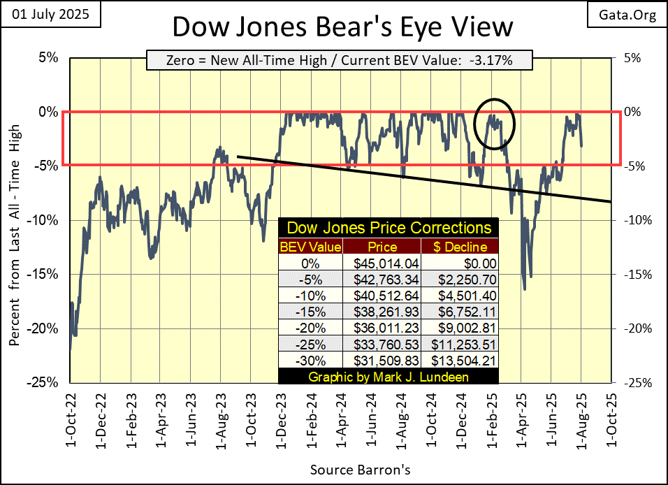
But since its last BEV Zero on December 4th, eight months ago, the Dow Jones has been out of scoring position, as much as it has been in it, as last December’s last all-time high of 45,014, has yet to be bested. Is the Dow Jones (my proxy for the broad stock market) taking a well-earned break, a correction before it resumes an advance that it began in November 2023?
That is a possibility. However, should (when?) the Dow Jones close below its declining trend line in the chart above; call it a BEV of -8%, I’m going to have to become more bearish on my outlook on the stock market. And should (when?) the Dow Jones break below its BEV -15% line, below its lows of last April, for those who refuse to leave the party after Elvis has left the building; don’t look to me for any bullish encouragement.
Remember; at market tops, risks to invested funds increase to maximum, while the possibility of profiting from exposure to the market approaches zero. That is just how things work at a market top.
So, the question we all should be asking ourselves; are we near a top in the market? I believe we are, making this a good time to totally exit from the stock market, and not come back until the Dow Jones is trading far from where it closed this week. The exception to that, would be the gold and silver miners.
Next is my chart for the Dow Jones in daily bars. This week’s market action looks awful! Seeing five consecutive down days, as we see below, doesn’t happen very often. So, I’m anticipating we’ll see some days in the weeks to come, where the Dow Jones advances very nicely. You know, some big daily advances.
But, as far as I’m concerned, that doesn’t change anything, as every time since last December, the Dow Jones has attempted to close above 45,000, it has failed in the attempt. So, what if in the next month or so, the Dow Jones does close above 45,000? That would make no difference to me, as I’m out, and I’m staying out of this market. Successful investors realize there always comes a time, a point in any advance, where the smart thing to do is get out, and stay out.
Last week, in my table (below) listing the BEV values for the major market indexes I follow, the market was generating many new all-time highs (BEV Zeros = 0.00%). On Tuesday this week, that came to an end, with the exception of the Dow Jones Utility Average, which closed this week at #1.
This week closed with thirteen of these indexes in scoring position, with their BEV values between -0.01% and -4.99%, but look at how far they fell from their close of Monday. This was a hard week on the bulls. Will next week see a bounce, or will the market continue deflating market valuations? I haven’t a clue, but next week should provide some entertainment for those of us sitting in the market’s peanut gallery.
The NASDAQ Banking Index remains fixed to the table’s lowest position, closing 22.31% below its last all-time high, seen in November 2021. From the standpoint of general-market health in the stock market, seeing a banking index at the bottom of this list, is not good. Seeing the NASDAQ Banking Index at #21 below, is yet another reason to lower one’s exposure to the stock market.
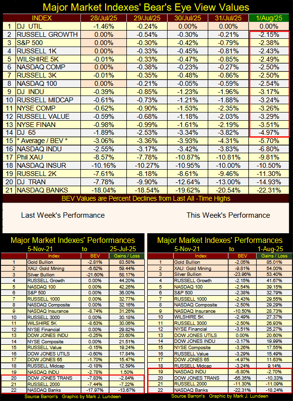
Taking a quick look at this week’s performance table above, except for gold, everything else was down from last week. This week closed with four indexes (#19 to 22) below their highs of 05 November 2021. If we are at the start of another market decline, we’ll see additional indexes entering the red box seen above.
An issue I have with the media’s reporting on economic items, such as inflation, is the coverage of the topic at hand is always superficial. For instance, the current discussion of inflation now in the financial media, speaks of inflation in terms of lowering interest rates (to “stimulate” the economy), or keeping them where they currently are, or to actually increase interest rates (to fight inflation).
Lowering interest rates will “stimulate” the economy. To lower interest rates, the idiots at the FOMC must first purchase Treasury debt with monetary inflation, using newly created dollars, by the billions, or even by the trillions the idiots can, and do create with a computer key board. If you or I did this, we would be prosecuted for counterfeiting. But when the idiots at the FOMC do this, it’s called “monetary policy.”
These new dollars of monetary inflation are “injected” into the banking system, when the FOMC purchases Treasury debt on the books of one of the big banks on Wall Street. These banks are also known the Federal Reserve’s “primary dealers.”
These purchases of Treasury debt by the FOMC from a primary dealer lowers interest rates. Interest rates are only the cost of money. Lowering the cost of anything, including the cost of money, comes from increasing the supply of whenever. When the FOMC buys T-debt from a primary dealer, this increases the supply of dollars in the banking system, thus lowering the cost of money, to be used for making loans by the banking system.
To “fight inflation,” the idiots at the FOMC sell some of the Treasury debt on their balance sheet to a primary dealer, who pays for these bonds with dollars to the FOMC. This makes interest rates go up, because as you remember, interest rates are only the cost of money, and whenever the supply of something goes down, including money, the price of that something goes up.
By selling Treasury debt to a primary dealer, the FOMC pulls dollars from the banking system, shrinking the supply of dollars in the banking system, which increases interest rates.
This “fights inflation,” as rising interest rates forces the economy to cut back on spending, if for no other reason than unemployment goes up when the FOMC raises interest rates. It is just a fact, the unemployed purchase less than the employed, thus lowering demand for goods and services within the economy.
None of this is difficult to understand. But all of it is, in the main, unknown to most people. Even to college graduates with degrees in economics, as it is obviously a corrupt way of managing the economy, and its financial markets, via manipulating the supply of dollars within the banking system.
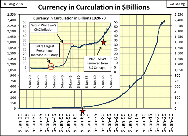
And the inflation of the supply of dollars (CinC = cash dollars) since 1920 has been significant, as seen in the chart below. This chart will never, EVER be published in the financial media, or in a college text book on economics.
In 1920, there were about $5 billion dollars circulating in the American economy. This week, the FOMC reports that there are now $2.4 trillion dollars in circulation. This is an increase in the supply of paper dollars in circulation, by three orders of magnitude in the last century.
Since the Federal Reserve was created by Congress in 1913, the United States truly has a monetary system of unrelenting inflation, because that is what the idiots at the FOMC do; expand the volume of dollars in circulation.
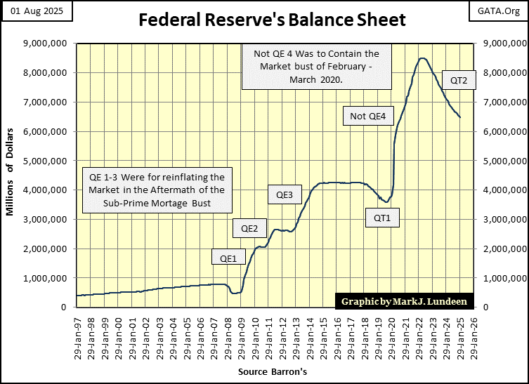
Next is a chart of the Federal Reserve’s actual balance sheet, its reserves backing the US dollar. Note the massive inflation from the FOMC’s QE #1-3, to “stabilize market valuations” in the aftermath of the 2007-09 sub-prime mortgage debacle. Then the Not QE#4 in 2020, used to place a floor on the market meltdown in March 2020.
Why do I call the FOMC’s 4th QE, a Not QE? Because that is what FOMC Idiot Primate Powell called it in October 2019, when he terminated its QT. To assure everyone that the new phase of buying (monetizing) Treasury debt would be nothing like that seen in the QE #1-3, Powell said it will * NOT * be a QE, like QE #1-3. Which if you look at the chart below, was a promise he kept.
“Market experts” blamed this March 2020 meltdown on the covid pandemic. But the fact is, in October 2019, before the covid pandemic became a thing, overnight repo-rates spiked into double-digits, hinting that maybe, there were big problems in the financial system.
I’m no “market expert.” So, I can’t claim any insight into the specific problems the market had in March 2020. But I can look at the Not QE#4 below, and can infer that whatever they were, they were massive enough to motivate the idiots at the FOMC, to “inject” a few trillion dollars of “liquidity” into the banking system, in a matter of weeks, to once again “stabilize market valuations.”
The point of all the above is, what “inflation” actually is; the increase in the supply of dollars, is never dealt with in today’s financial media. Rather, the effects of “inflation” is the topic always being debated; rising consumer prices (CPI Inflation).
Trump now notes “inflation is contained,” consumer prices are not rising as fast as they were during the Biden mis-administration. So, he is demanding the idiots at the FOMC begin to purchase more Treasury debt, with their monetary inflation to lower interest rates. Which actually is inflationary. This action will “stimulate the economy,” by motivating already heavily indebted consumers, corporations, and local governments, to mire themselves even deeper into debt.
This while FOMC Idiot Primate Powell, does not want to expand the FOMC’s balance sheet, with additional purchases of Treasury debt.
So, this is the actual fight between President Trump, and the FOMC’s current Idiot Primate, Powell; Trump wants the FOMC to increase its purchases of Treasury debt, Idiot Primate Powell does not want to.
What is the correct thing to do in 2025? Don’t ask me, as I haven’t a clue what should be done with the US dollar. After over a century of the dollar’s abuse by politicians, bankers and academics, whatever ails the dollar is now terminal.
Well, if inflation today is expressed in terms of rising consumer prices, let’s take a look at some prices over the past decades. Rising consumer prices, have had a major impact on people for longer than I have been alive. Here is a quote from George Burns, from the Burns and Allen Show from 1957.
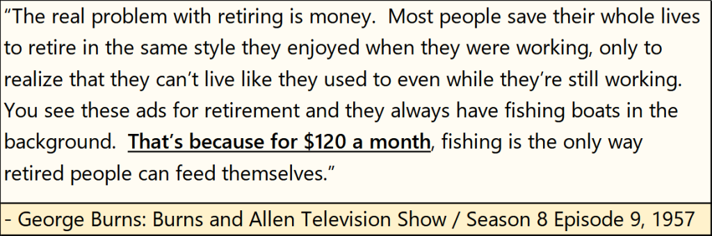
Retired people could live on $120 a month in 1957, pay for their food and shelter, and everything else one needs to cover living expenses. I’m assuming the $120 a month was what social security provided in 1957. But most people back then were thrifty. Meaning retired people had no debt, and saved money over their working lives, and so had some interest, and possibly dividend income too, to support them after they no longer worked for a living
So in 1957, for blue collar workers, banks were places to deposit their savings, for earning interest income. Today in 2025, for blue collar workers, banks are places where they go to get loans to pay for everything they need. In exchange for providing them with loans, people today now pay their banks interest.
This is actually a very ugly situation, one that ultimately will have terrible consequences for an aging population.
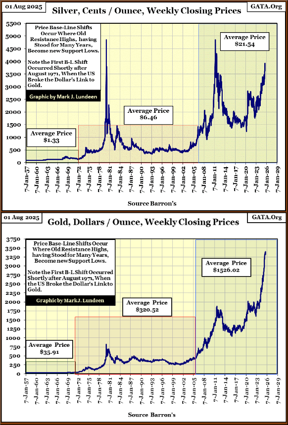
Since I used a George Burns quote from 1957. How has the price of corn, cattle, and the old monetary metals; gold and silver, changed after all the inflation seen above, since 1957? For that, I made some charts below for your consideration.
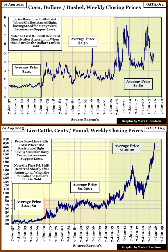
One thing to notice about all of these price charts, is how they all had a price shift shortly after 1971, when the US Treasury took the dollar off its Bretton Woods’
$35 gold peg.
Note too, that following 2009, when the idiots at the FOMC implemented their QE #1-3, once again prices in these charts saw an upward shift in price. And when was FOMC Idiot Primate Powell’s Not QE#4 implemented? March 2020. What happened to the prices of these commodities after March 2020?
Could it be, because the US dollar’s “monetary policy” has been dictated by a gaggle of idiots for over a century, no one in 2025 can now live off of $120 a month?
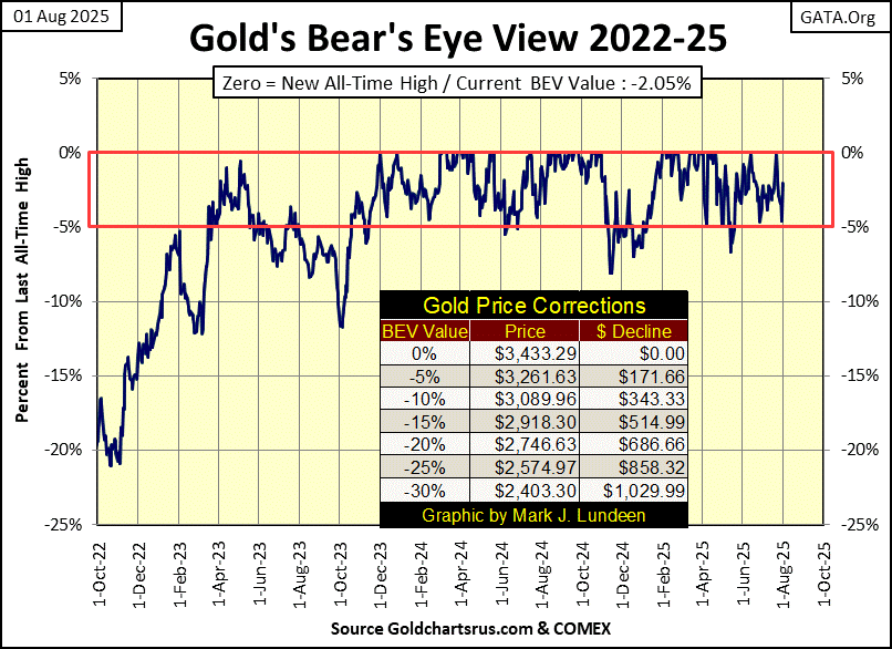
Let’s look at gold’s BEV chart next. This week, gold saw a very nice bounce off its BEV -5% line, closing the week only 2.05% away from its last all-time high. Something seen in the table inserted in the chart below; 0% (last all-time high) = to $3433.29.
Unlike the Dow Jones’ BEV chart, which since last December has been out of scoring position, as frequently as it has been in scoring position, gold below has remained solidly in scoring position since November 2023. For that reason, I really think the future prospects for gold is much better than for the Dow Jones.
Also, gold’s last all-time high in the BEV chart below, its sixty-sixth since entering scoring position in November 2023, happened less than two months ago, on June 13th. Not eight months ago, as with the Dow Jones.
This is a good time to take a big picture view of the market, using the Dow Jones to Gold Ratio chart below. Since 1970 or so, when price of gold was allowed to trade in the market, no longer fixed at $35 an ounce, gold has traded counter-cyclical to the Dow Jones, as seen in the chart below.
Below, a rising ratio indicates the Dow Jones is outperforming gold. A declining ratio indicates gold is outperforming the Dow Jones, and so it was from 1970 to 2019. But since 2019, this ratio has traded within the red box. Since 2019, both the Dow Jones and gold have seen nice advances, but neither is outperforming the other, and that is a historical anomaly.
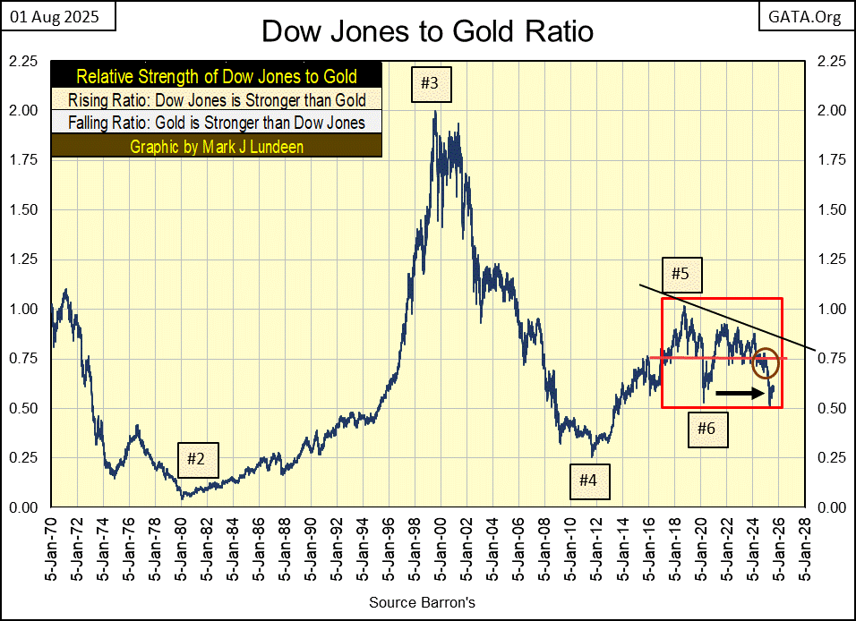
Historical anomalies don’t stay abnormal for long. So, in the plot above, a day is coming when the plot of this ratio will break out of the red box, it has been contained in since 2019.
Should it break out above the red box, that would indicate the Dow Jones is outperforming gold. If it breaks out below the red box, that would indicate gold is outperforming the Dow Jones.
Looking at the red box above, and the world as it is in 2025, I believe the day is coming when gold will once again outperform the Dow Jones by a good measure. We’ll know when that happens, when the Dow Jones to Gold Ratio seen above, breaks below the red box it currently is trading in.
In gold’s step sum table below, on July 22nd, gold closed less than $4 (BEV of -0.04%) from making a new all-time high. Someone obviously didn’t like that, so gold sold off in the next four trading days, down to a BEV of -4.60% on July 30th.
But since then, gold has seen a very nice rebound, closing the week with a BEV of -2.05%. I’m anticipating additional new all-time highs for gold in the weeks to come.
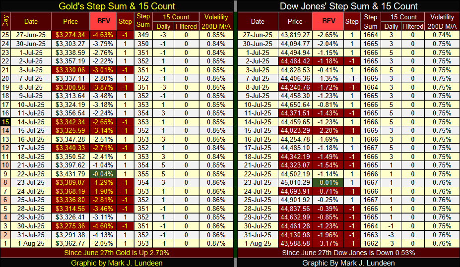
For the Dow Jones in its step sum table, it too looks very positive. But this table is only looking at the market since June 27th, so lacking the less than positive details seen in the longer-term charts above. But it is what it is; and after seeing the Dow Jones sell off for five days, and seeing it remain in scoring position in the table above, the Dow Jones looks very good at this week’s close.
One factor supporting the current strength in the Dow Jones, is its daily volatility’s 200D M/A remains low, significantly below 1.0%. When Mr Bear once again pays Wall Street a visit, we’ll know exactly when that is, as we’ll once again see the Dow Jones experiencing days of extreme volatility, days the Dow Jones moves +/- 2%, or more from a previous day’s closing.
The Dow Jones hasn’t seen any days of extreme volatility since last spring, when in its BEV chart (first chart of this article), it broke below its BEV -15% line. Until the Dow Jones once again sees a significant increase in daily volatility, we may not see it make any new all-time highs, but we won’t see any panic selling in the market either.
__
(Featured image by ngin_Akyurt via Pixabay)
DISCLAIMER: This article was written by a third party contributor and does not reflect the opinion of Born2Invest, its management, staff or its associates. Please review our disclaimer for more information.
This article may include forward-looking statements. These forward-looking statements generally are identified by the words “believe,” “project,” “estimate,” “become,” “plan,” “will,” and similar expressions. These forward-looking statements involve known and unknown risks as well as uncertainties, including those discussed in the following cautionary statements and elsewhere in this article and on this site. Although the Company may believe that its expectations are based on reasonable assumptions, the actual results that the Company may achieve may differ materially from any forward-looking statements, which reflect the opinions of the management of the Company only as of the date hereof. Additionally, please make sure to read these important disclosures.


The TopRanked.io Weekly Digest: What’s Hot in Affiliate Marketing [LiveChat Affiliates Review]
Quick Disclosure: We’re about to tell you how LiveChat Affiliates run a top-notch affiliate program. And we really mean it....


German SMEs Face Tighter Bank Lending, Turn to Alternatives
Access to bank loans for German SMEs is tightening despite strong financing needs. About 37.8 percent face restrictive lending, driven...


Bitcoin Stalls as Geopolitical Risks and Crypto Industry Tensions Persist
Bitcoin is moving sideways near $72,000 amid ongoing Iran tensions, while ETF inflows remain strong. Quantum security debates continue. Ethereum...


Geopolitical Tensions and Trade Disruptions Reshape Global Commodities Markets
Geopolitical tensions and disrupted trade routes, especially around the Strait of Hormuz, are reshaping global commodities markets. Agriculture faces supply...


Germany Sees 413 Cannabis Cultivation Clubs Two Years After Partial Legalization
Two years after partial cannabis legalization in Germany, 413 cultivation clubs have been established nationwide. Lower Saxony leads in clubs...
 |
|
 |  |
 |
|
-

 Fintech5 days ago
Toss Explores Blockchain Mainnet to Power Next-Generation Financial Services
-

 Cannabis2 weeks ago
Poland Proposes Cannabis Decriminalization: 15 Grams and One Plant Without Penalties
-
 Africa2 days ago
Geopolitical Tensions and Trade Disruptions Reshape Global Commodities Markets
-

 Fintech1 week ago
Credibur Scales Rapidly: €2 Billion in Structured Debt Facilities in Six Months