Business
Now is NOT the Time to Lose Hope for Gold & Silver
Gold and silver might seem like unprofitable investments compared to the sharply rising tech stocks, or even the rapidly rising rest of the Dow Jones. But if you look a little deeper, and compare the current trends to their historic counterparts, you can quickly see why precious metals might just be the smartest, and safest, investment of all. Lets dive into the data and see why.
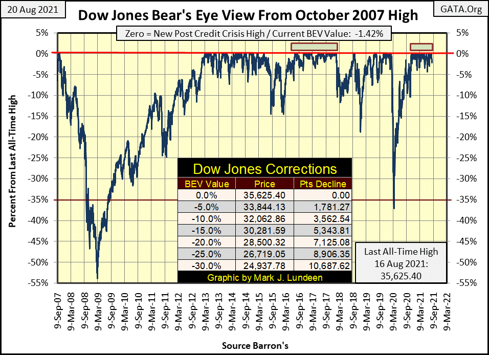
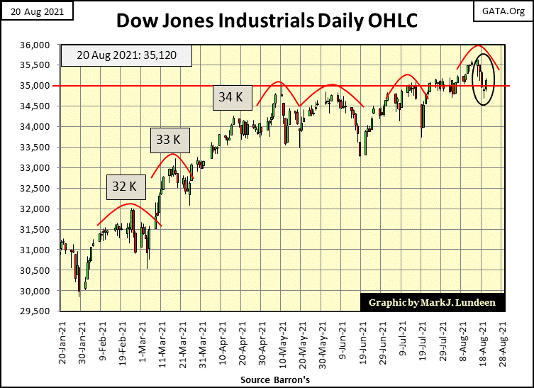
All is well with the stock market, as per the Dow Jones’ BEV chart below. Exactly like every other daily closing since November 4th of last year, where the Dow Jones has closed either at a new all-time high (BEV Zero) or in scoring position of making one (within 5% of its last BEV Zero). At Friday’s close, the Dow Jones closed only 1.42% from its last all-time high, which was on Monday of last week, the Dow Jones’ 42nd BEV Zero since November 4th.
The Dow Jones’ current relentless advance won’t continue forever. A day is coming when it will close outside of scoring position, a day when we’ll see the Dow Jones with a BEV of -5.00% or more. But this could go on for many months to come, as it did in 2017-18, as seen below.
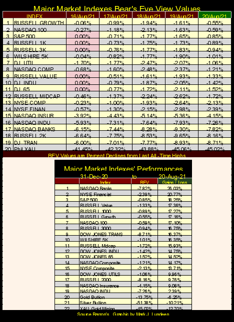
Looking at the major market indexes BEV values below, Monday saw six of these indexes close at new all-time highs, then for the rest of the week, they deflated a bit before bouncing back at Friday’s close.
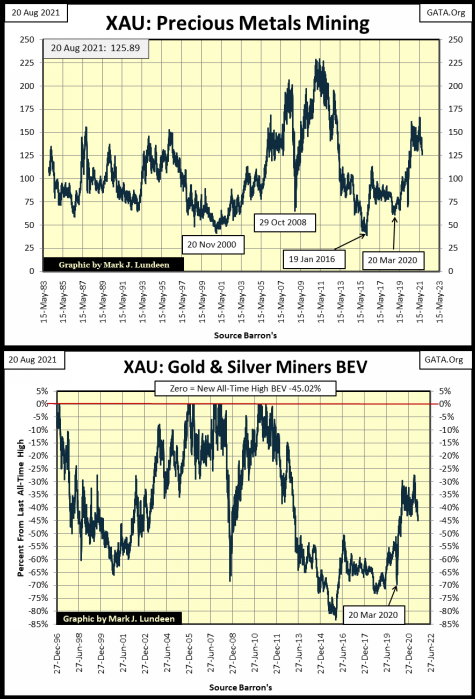
The exception to this is the XAU, the index for gold and silver miners; they lost almost 4% this week. That plus their last BEV Zero happened in April 2011, and since then they’ve carried a BEV value of something well below a -50% BEV for most of the past decade.
Let’s take a closer look at the precious metal miners in their price and BEV charts below, containing every daily closing since the XAU first traded in Philadelphia. The first thing to note in the charts is since 1983, precious metals mining has never been a must-own – glamor market sector. But before 1983, that wasn’t true.
Here’s a table from the old, but now discontinued Barron’s Stock Averages (1938 to 1988). For the four decades spanning the 1940s to the first year of the 1980s, the Barron’s Gold Mining Index (BGMI) was #2 in performance. Office equipment was #1 because that was where Barron’s placed computers in their data set; as office equipment, along with pencil and stapler manufactures.
How the world has changed since 1980.
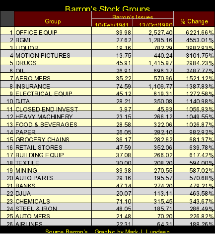
The point to take from the table above is, gold and silver mining were once top performers in the stock market, and that was true for many decades. Had Barron’s published this data in the 1930s, their BGMI would have left everything else far behind during the depressing 1930s. But during the Roaring 1920s’ Bull Market on Wall Street, the BGMI did little for investors, exactly as has happened to the XAU since 1983.
Here’s the lesson to take away from market history; during those times when bulls run wild and free on Wall Street, maybe it’s best to keep away from gold and silver mining and run with the bulls. But when the world is going to hell in a hand basket, investors just may find safety deep inside a gold mine.
In our world of overvalued financial assets, gold mining shares, as seen below, at present certainly aren’t one of them. At the XAU’s January 2016 bottom, it had deflated by 84% from its last BEV Zero of April 2011. That’s the stuff of a great depression market crash, and the precious metal miners have yet to recover. For those who like to buy at deep discounts, this is an important point to keep in mind.
One method to gauge whether the stock market is expensive or cheap, overvalued or undervalued, is to follow NYSE Margin Debt; how many billions of dollars the banking system has lent to speculators who purchase shares on margin.
The upper chart (below) plots the Dow Jones (Blue Plot / Left Scale) and NYSE margin debt (Red Plot / Right Scale) during the Roaring 1920s Bull Market and the market collapse that followed.
We see how the Federal Reserve inflated stock-market valuations in the 1920s, by extending credit to leveraged speculators via their brokers; aka margin debt. Before the crash, the banks would allow speculators to purchase shares with only 10% down, with credit from the Federal Reserve supplying the other 90% of these purchases. Then came the crash, and the Dow Jones deflated as the banking system withdrew its “liquidity” (NYSE margin debt) from the market.
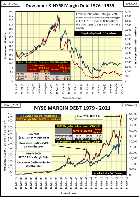
Looking at NYSE margin debt for today (latest data as of July 2021), I can see a big problem for the bulls, but first, let’s study this data.
From 1979 to 1999, these plots were coupled, almost to a 1:1 basis. Then the market topped in early 2000, almost a year after margin debt began declining. In October 2002 the Dow Jones fell 38% from its highs of 2000.
In the sub-prime mortgage bull market (October 2002 to October 2007), these plots decoupled. The stock market received much more demand for stocks in the form of margin debt, but the Dow Jones didn’t fully benefit from it as it had in previous years. That plus, when the Dow Jones did bottom during this bear market, it had deflated by 54% from its bull market highs of October 2007. That was the second deepest percentage decline the Dow Jones has seen since 1885, exceeded only by the Great Depression Crash’s 89% decline.
The March 2020 flash crash, where the Dow Jones deflated 38% in only twenty-seven NYSE trading sessions, also happened in the context of a build-up and decline of margin debt. Since then, NYSE margin debt has increased almost vertically in the chart above. What is worse is the degree of separation between these two plots. Leveraged speculators are taking huge positions in the market, but market valuations aren’t responding to this inflow of funds, as it had in the past.
Come the next bout of deflation in the market, when the Dow Jones closes somewhere deep below its BEV -10% line, these leveraged speculators are going to have to sell. Either that or their brokers will provide that service for them, with or without their permission.
I expect the next major market decline will be brutal when the leverage seen above is unwound. Too many sellers asking prices no one, except maybe the FOMC, will be willing to pay.
But that will be then; as for now I remain short-term bullish. First, and I think most important, the Dow Jones isn’t seeing any 2% days. Then looking at the Dow Jones in its daily bar chart below, the Dow Jones has closed the week above 35,000 for the third week in a row. As things are today (no 2% days), I’m expecting the Dow Jones to make a move to its 36,000 level in the weeks to come.
I admit I can change my market opinion in a New York minute, but right now, nothing is happening in the market that places this sixteen-month advance that is at the risk of terminating. Should we see a big pick up in daily volatility, and or NYSE Margin Debt begins to gap down, the market becomes a different place.
This week the FOMC “injected” an additional $98.71 billion into the financial system (chart below). This chart gives me the heebies jeebies. Since the FOMC terminated its quantitative tightening (QT) in October 2019, six months before the March 2020 flash crash, the FOMC have “injected” massive amounts of “liquidity” into the economy.
And for the first time in decades, significant amounts of this “liquidity” is spilling over into the real economy; flowing into consumer prices instead of financial asset valuations, where they want their “liquidity” to go.
Go back up and look at the NYSE market debt and the Dow Jones. Since March 2020, $403 billion has been “injected” into the stock market via margin debt, and market valuations haven’t benefitted as they once would have. As this market advance began in August 1982, when the Dow Jones first closed above 1,000, and then stayed above 1,000, this advance has become geriatric in nature. Now, thirty-nine years later, the venerable Dow is closing above 35,000. Much like me, this old-tired bull is getting a bad attitude and doesn’t cooperate as it once did with the “policy makers.”
Be-that-as-it-may-be, the activity of the FOMC, since the termination of their QT in October 2019, as seen below, is proof positive the “policy makers” are having huge problems maintaining “market stability.”

Looking at the Fed’s balance sheet below, it becomes obvious that everyone associated with the Federal Reserve’s “policymaking” is either a quack or a swindler. I look at this data every week, and it’s never comforting. Actually, it’s quite frightening. I should add a second line to this chart’s title, something like “Be Afraid – Be Very Afraid.”
Does anyone in the mainstream financial media ever report what’s going on with the Fed’s balance sheet? Maybe they do, but I doubt the producers of CNBC will ever allow this chart to air during their programming. Following the mainstream financial media is a total waste of time.
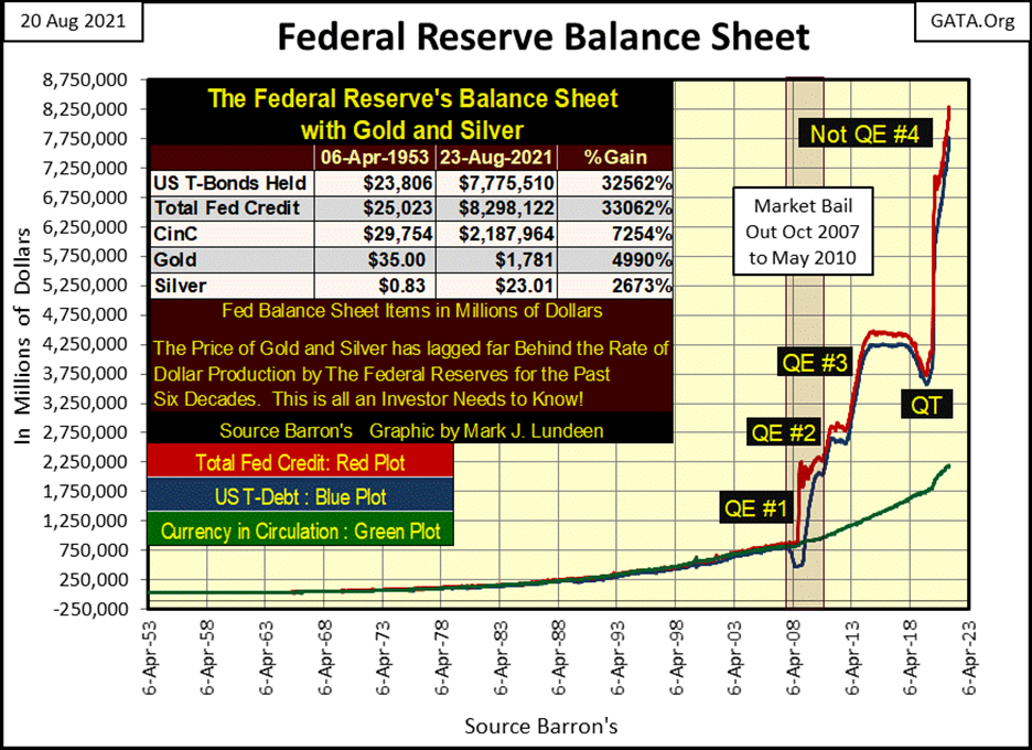
Time for something good to look at, something like gold’s BEV chart. Lots of people are upset by the market action of both gold and silver, and for darn good reasons! I don’t blame them for their views on the old monetary metals, but investors have to keep in mind what is plotted above in the Fed’s balance sheet; the pending demise of the US dollar as an economic asset of global standing.
The dollar is doomed, and with it will be the demise of financial assets, such as stocks and bonds that are denominated in dollars. Maybe not next week, but sometime well within the lifetime of most readers, possibly beginning sometime in 2022. Gold and silver have no counterparty risk, that plus they have a 5,000 year history of being money.
Gold and silver mining companies do have significantly greater risks than do gold and silver bullion. But in a general selling panic of the type I see coming, no one is going to care about that as they flee deflation in the financial markets, and seek shelter in real assets, such as commodities or the old monetary metals. This is precisely what happened in the depressing 1930s.
So don’t get too upset about the crummy market action in the precious metals markets, because the “policy makers” are making it possible for you to purchase gold and silver far below their true market values. If you’re buying, the FOMC is doing you a great favor.
That said, this week gold once again closed above its BEV -15% line in its BEV chart below. That is good. But what if gold once again drops below its BEV -20% or even its BEV -25% lines; what should you do? Do what I do; I have the chart of the Fed’s balance sheet above taped on the door to my liquor cabinet, and I give it a good look, just before I pour myself a stout glass of cheer.
But one doesn’t need liquor to get beyond this trying time. Just get your precious metals positions in, and stop watching the mainstream media, especially their financial media, and go away for a year or so, as this too shall pass.
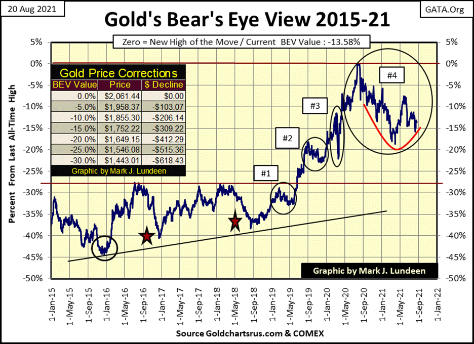
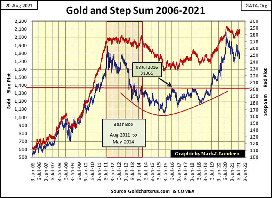
Gold’s step sum chart remains very positive. In time, gold and its step sum will again advance into history in the chart below. I’d say more. But as with gold’s BEV chart above, for weeks now nothing exciting, on either the up or down side is happening.
So, like myself, my readers have to look at gold’s blue plot in the charts above and below and decide what is gold’s primary trend in August 2021. Is it gold’s advance off its December 2015 bottom, which would make its current decline from last
August’s all-time high simply a correction in the bullish primary trend? Or is the decline from last August’s all-time high, its new and bearish primary trend.
I continue believing the current decline off last August’s all-time high is a correction in gold’s continuing bullish-primary trend. When gold once again advances, and breaks above the high of last August, we should see some real excitement in the precious metal markets.
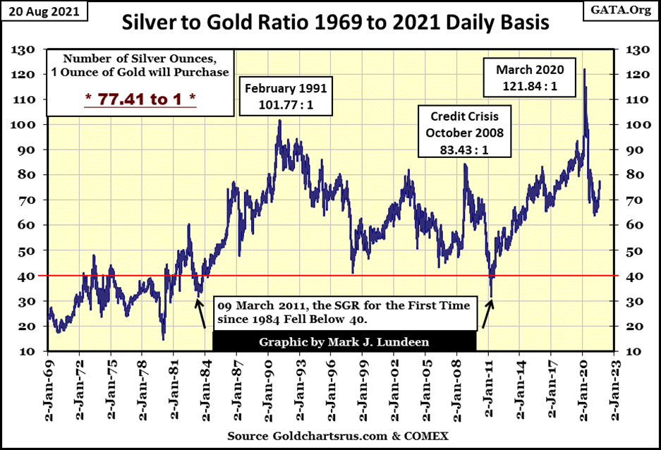
The Silver to Gold Ratio (SGR), or how many ounces of silver one ounce of gold can purchase is approaching 80. In precious metal bull markets, the SGR tends to decline, as with bear markets in gold and silver the SGR increases.
The current advance in the SGR is no more than a correction in the ratio. Once the bull market resumes, the SGR should once again decline below 40.
I’m going to skip the Dow Jones’ step sum chart this week, as it’s another chart that’s stagnating from one week to the next, and move on to the step sum table below.
Nothing much happening on gold’s side of the table. What gold and silver need now is a big jump in their daily volatility’s 200-day M/A. Life for us gold and silver bulls will be much better when this 200-day M/A increases to something above 1.00%. Its current 0.68% is the real reason everybody is so grumpy in the trenches.
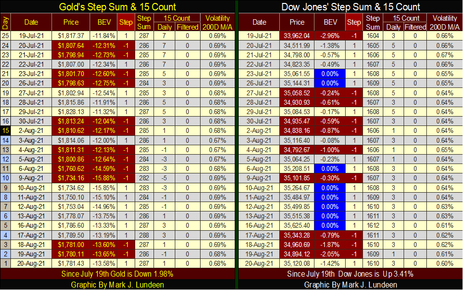
The Dow Jones made a new BEV Zero on Monday this week, and its daily volatility’s 200-day M/A declined to a very bullish 0.60% at the close of the week. What’s there to say but Go Bulls Go, because in the stock market, that’s what the bulls are doing. Be patient, as with time I’ll be able to say the same for gold and silver.
—
Featured image by PublicDomainPictures via Pixabay
DISCLAIMER: This article was written by a third party contributor and does not reflect the opinion of Born2Invest, its management, staff or its associates. Please review our disclaimer for more information.
A majority of the source material for this article was obtained via BBC. In the case of any discrepancies, inaccuracies, or misrepresentations, the source material will prevail.
This article may include forward-looking statements. These forward-looking statements generally are identified by the words “believe,” “project,” “estimate,” “become,” “plan,” “will,” and similar expressions. These forward-looking statements involve known and unknown risks as well as uncertainties, including those discussed in the following cautionary statements and elsewhere in this article and on this site. Although the Company may believe that its expectations are based on reasonable assumptions, the actual results that the Company may achieve may differ materially from any forward-looking statements, which reflect the opinions of the management of the Company only as of the date hereof. Additionally, please make sure to read these important disclosures.


Bitcoin Stalls Near $60K as Strategy Moves, ETFs Outflow, and EU MiCA Rules Take Effect
Bitcoin hovers near $60,000 with ETF outflows, while Strategy boosts reserves, sells BTC, and raises dividends to reassure investors. Ethereum...


Cannabis Dominates Global Drug Use: Trends, Risks, and Shifting Markets
Cannabis remains the world’s most widely used illicit drug, with 256 million users in 2024, surpassing all others combined. Growth...


Italy Approves First Hydrogen-Powered Train for National Rail Network
ANSFISA has approved Italy’s first hydrogen-powered train, the Alstom HMU214, for use on the Brescia–Iseo–Edolo line. Capable of 140 km/h,...


Cotton Market Weakness Persists Despite Brief Rebound
Cotton prices fell to new lows last week before a modest rebound. USDA data shows crop conditions remain worse than...


Eli Lilly Hits $1 Trillion Valuation Amid Strong Bullish Momentum
Eli Lilly stock hit a record high, surpassing $1 trillion market value after strong product demand. Shares surged over 7%,...
 |
|
 |  |
 |
|
-

 Africa1 week ago
Moroccan Bond Market Shows Mixed Signals as Primary Eases and Secondary Pressures Persist
-

 Markets2 weeks ago
Corn Prices Slip Amid Strong Crop Conditions and Favorable Weather
-

 Fintech6 days ago
Talentir Secures €4M to Transform Global Payouts
-

 Cannabis2 weeks ago
WNBA Removes Cannabis From Banned Substances List in New CBA