Markets
Primer on NYSE 70% A-D Days, Days of Extreme Market Breadth
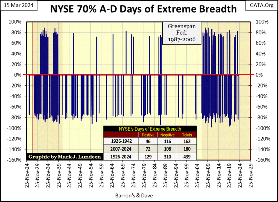
These 70% A-D days are rare market events. Since 1924, there have been only 439 of them during the 26,453 NYSE trading sessions, or one 70% day out of every 60.2 NYSE Trading sessions. Note how during the Greenspan era; an era of upside market manipulation spanning from 1987 to 2006, the NYSE saw less than ten of these extreme-market events during these nineteen years.
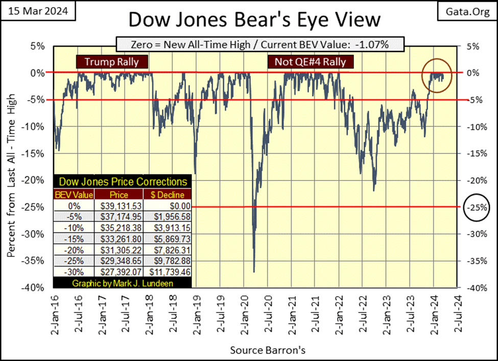
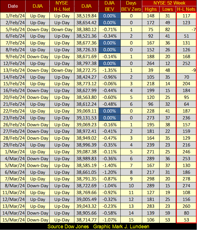
Once again, no BEV Zeros / New All-Time Highs this week for the Dow Jones, and there haven’t been for almost a month, since February 23rd. So, is the advance over? To answer that question, I’m going to look at the Dow Jones’ BEV chart below, and I see since last November, the Dow Jones has daily closed in scoring position; BEV values of -0.01 to -4.99%, within 5% of its last all-time high.
So no, as long as the Dow Jones remains in scoring position, I’m going to assume the Dow Jones’ advance remains intact, that more BEV Zeros should be anticipated in this advance. Of course, the BEV Zero of February 23rd could be the last new all-time high of this advance – this advances’ Terminal Zero (TZ). But until the Dow Jones below breaks below its BEV -5% line, it’s too early to think of that.
Even with the Dow Jones closing below its BEV -5% line, which someday it most certainly will, that wouldn’t make me bearish on the stock market. There could be more new all-time highs to come. But at that point, the best part of this advance may best be seen in the market’s rearview mirror. So, maybe seeing the Dow Jones close below its BEV -5% line would be a good time to sell a percentage of one’s positions, to lock in some profits.
However, should the Dow Jones break below its BEV -10% line; I’d be out of the market, which is something I can’t do, as I’ve been out of this market for years.
Why have I been out of the stock market for years? Because this advance is a colossal cluster – f***, made manifest by a bunch of idiots, each with a doctoral degree in economics, hired guns paid by the Federal Reserve System to interfere with the natural order of things in the financial markets. There is no “economic growth” seen in the rising stock market, just inflated market valuations via the FOMC. It’s a massive bubble in market valuations, and all bubbles eventually pop, to the ruin of many.
What these people have been doing since Alan Greenspan was FOMC Chief is very wrong, and they know it too. The world will suffer for what these people have done to the American dollar and its financial markets, and I want no part of that, so I’m out.
That is how I see this market, so I’ve been in precious-metal assets, which so far haven’t been as rewarding as I had hoped they would be. Someday, hopefully soon, that will all change.
The Dow Jones hasn’t seen a new all-time high since late February. However, as seen below with my table of the Major Market Indexes’ BEV values, this week there were other indexes making BEV Zeros.
What is with the NASDAQ Insurance Index (#1)? Like the NASDAQ Banking Index (#20), these insurance companies are full of bonds purchased years ago when yields were far below where they are now. A year ago, banks in California were giving up the ghost, closing their doors because the bonds they had purchased years ago lost 30% to 50% of their valuation due to rising bond yields. It’s hard believing these insurance companies aren’t having the same problem with their bond portfolios.
Maybe the difference between the banks and insurance companies is when they are required to sell their bonds. Banks have to raise cash (sell bonds) when their depositors want their deposits back. When a bank’s reserves have been cut by 30%, that is a problem. An insurance company doesn’t have to raise cash unless an insurable risk (that’s what you and me are to an insurance company), gets sick, gets sick and then dies, has an auto accident, or their home catches on fire. Realizing that, do you really want your insurance company to send you a check, forcing them to sell their loser bonds?
I sure don’t. Still, I’m happy sending my insurance company their premiums, as in our uncertain world, I like being insured should something unfortunate happens to me. And I think that is the reason the insurance companies are #1 in the table below, while the banks are way down at #20.
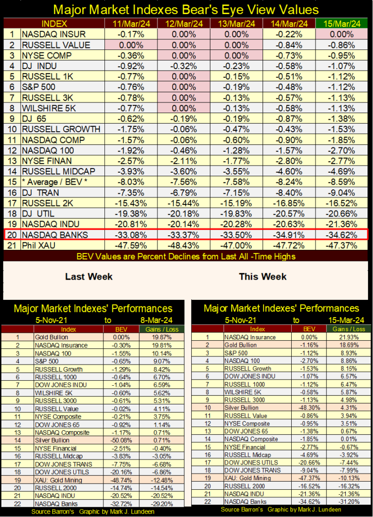
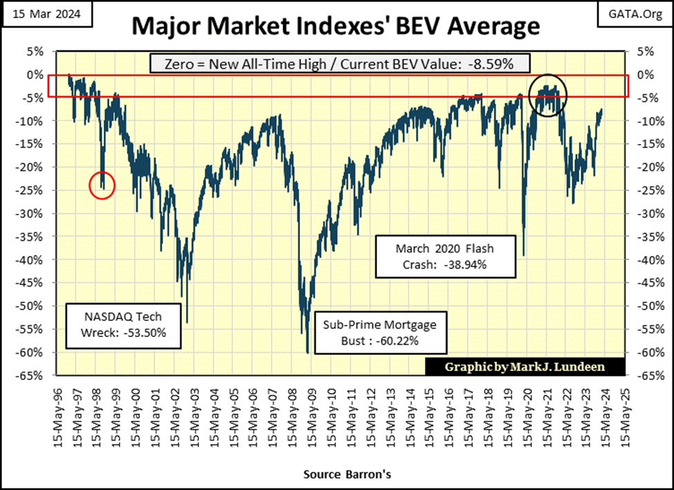
Let’s look at the Major Market Indexes’ Average Value (Chart below / #15 in top table above). This average closed the week with a BEV of -8.59%, moving up nicely since it fell below its BEV -25% line in September 2022. Being an average of the indexes above, it can’t see a BEV Zero, unless each, and every index above closes at a BEV Zero. That is something that isn’t going to happen.
So, should this average close somewhere above its BEV -5% line, that would be not just impressive, but maybe a bit scary?
I’m looking at the sub-prime mortgage debacle, bear market bottom of March 2009, a 60% decline in this average as the beginning of this advance. Since then, there have been three QEs and one Not QE to provide this market with the rocket fuel required to move this market upward to where it closed this week. How long can this go on? And when it stops, how far can this average fall in the chart below, before the idiots at the FOMC initiate yet another of their QEs?
And if they do initiate another QE, what happens to the dollar, and the bond market? The US Treasury isn’t going be happy should the idiots’ “monetary policy” drive T-bonds yields up towards, and then above 10%. Such a move in the corporate bond market would force many well-known names now trading at the NYSE to close their doors. Unemployment at levels not seen since the 1930s would be in the news once again.
We may be facing a repeat of the Depressing 1930s, and for the same reason; in 1913, Congress passed the Federal Reserve Act, which then President Wilson signed into law. Oh, what pleasant day-dreams Mr Bear must now be having about our future.
Yep, I’m out of this market, and in precious metal assets.
In this week’s performance table above, gold fell to #2, but it still looks good just below #1, the NASDAQ Insurance Index. The XAU remained at #19, but advanced the week by over 2%, while most of these major market indexes are down by 1% or more for the week. Then there is silver, with a big move up to #10 in the table, advancing by almost 4% for the week.
Let me do a little calculating on this. I have silver closing the week at $25.18. If for the next 52 weeks, should silver advance by no more, or no less than 4%, a year from now silver will close at $193.54.
I’m all for that, but maybe I’m being a bit too optimistic. Though should Wall Street find itself in a panic sometime in the next twelve months, where flight capital begins fleeing massive deflation in the financial markets, and it could, who knows what gold, silver and the mining companies in the XAU above will find themselves next March?
But today, in March 2024, dollars now circulating in Wall Street aren’t going nowhere. You can see that by looking at the NYSE 52Wk H-L Nets below. Only two days in February saw more 52Wk Lows than Highs, and they were single-digit negative nets. The rest of the nets below are all positive, with most of them triple digit positive nets.
The bulls now running around Wall Street, wild and free, are fat, dumb and happy, as 2024 moves into April. How long can that last? Longer than I would like to see. So, as a coping mechanism, I’ll just think of silver advancing by 4% a week for the next year. However as unlikely as that is to happen to silver, I doubt the stock market will be free from the ravages of Mr Bear in the next twelve months too.
Here is the Dow Jones in daily bars, and has been the case for the past month; 39,000 remains a level of resistance for the Dow Jones. As I see it, in the weeks and months to come, the Dow Jones will overcome this resistance level, just as it did the 37,500 line-of-resistance earlier this year.
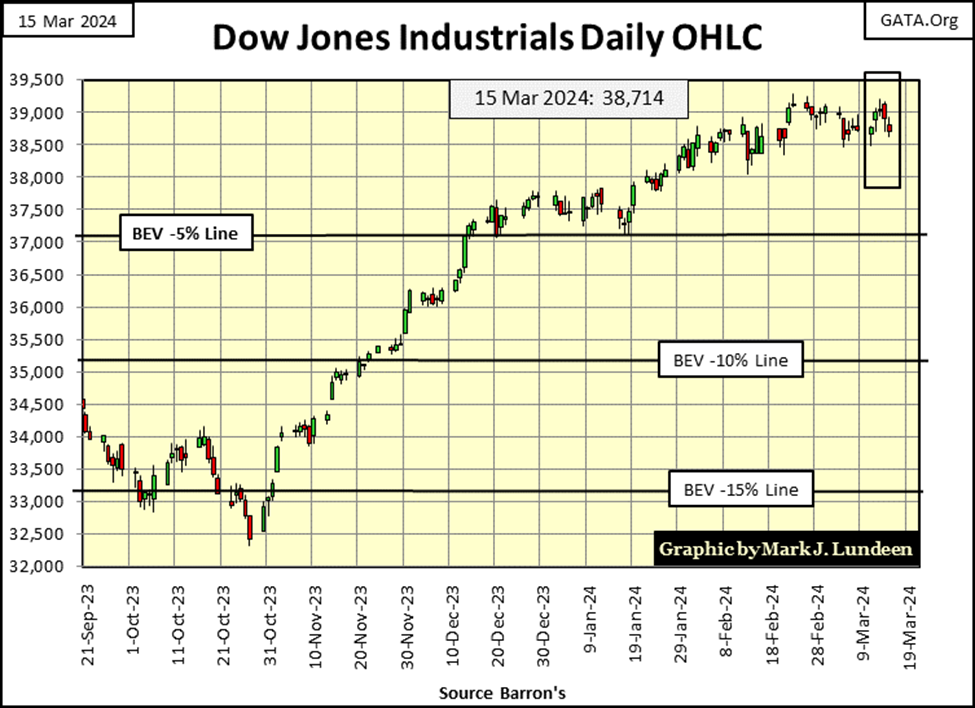
How can I be so bullish on the Dow Jones when looking at this chart, but extremely bearish with my comments above it? That is easy, I’m flexible! For the chart above, I’m just looking at it, and at the end of this week, it looks bullish, which is fine with me. But come the day the Dow Jones deflates below its BEV -5% level noted in the chart, or worse yet, its BEV -10% line, or horror of horror, its BEV -15% line, I’ll be a changed man.
I’m no “market expert.” I’m just a guy who is fascinated by the markets. Long ago, I remember reading in Barron’s the comments of a market expert way back in the 1970s, discussing a market he was studying. It was obvious he knew his stuff, and the technical work on following this market was amazing. I thought I hit paydirt; for $0.50 a week I’d just follow this guy in Barron’s!
I soon learnt the truth – the markets are about making money. Market experts then, just as “market experts” today, typically share their hard-earned knowledge with the public to make known what they have to offer perspective-paying clients, to then disappear from the prying eyes of a freeloader like me.
As an enlistedman in the Navy washing dishes for eight-hundred sailors and marines for their three daily meals, steaming somewhere around in the Sea of Japan, the prospects of me becoming one of these market experts’ paying clients were pretty slim.
No matter, Barron’s still had lots to offer me. To this day, my favorite article I remember reading in Barron’s was from the late 1970s, on market experts themselves. With considerable detail covering decades, I recall Barron’s pointed out that at market turns, both at market tops and bottoms, the majority of market experts are almost always wrong. As a group, at market tops they tended to recommend buying when they should be recommending selling, and at market bottoms, they are slow in telling their clients to re-enter the market. For some strange reason, I found comfort in knowing that, that even experts can be wrong.
A perfect example of that can be found in Barron’s Round Table Issue of 1973, the Round Table being an annual event by Barron’s, allowing “market experts” to expound their views on the market for the coming year. For their January 1973 Round Table, the Dow Jones itself had just made a new all-time high of 1,051.70 just days prior to the Round Table (Black Circle, BEV Chart Below), its first since 1966. Everyone was excited about that!
The header for the article proclaimed “Not a Bear Among Them” in a big bold font.
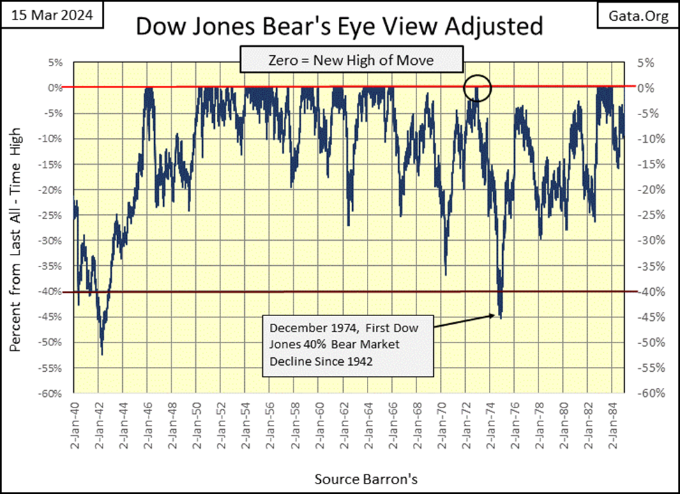
Just days following this issue of Barron’s hitting the streets, the biggest bear market since 1942 began, with the Dow Jones ultimately deflating by a massive 45%. From 1,051.70 in January 1973, to 577.60 twenty-three months later.
Today, with the Dow Jones closing over 39,000, we’ve come to accept 40% declines in the Dow Jones as mere corrections in a perpetual bull market that knows no end. But back in December 1974 it was different; that 45% Dow Jones bear market resulted in dark despair, a time when market experts began questioning their self-worth. Late 1974, and early 1975 was a time when “BUY” became just another dirty four-letter word.
I doubt many “market experts” were bulls at this bottom. Warren Buffet was. He said, and I paraphrase here; in late 1974, he felt like a young man with no cloths on, wandering in the Sultan’s harem, for all of the compelling values to be had in late 1974.
When I got out of the Navy, I figured I could be as wrong as any “market expert” could ever be. But they had one thing I didn’t have; data for all their fancy tables and charts. So, I literally spent years at libraries, compiling data from the dusty old pages of Barron’s no one cares about anymore. That done, I began analyzing it. Doing things any high-school graduate could do with a spreadsheet. I believe I’ve come to a sound understanding of the financial markets, using data, and market insights Barron’s has been publishing for over 100 years.
And what did I learn? That bull markets don’t advance, or bear markets decline forever. In other words, in any bull market there comes a time to sell, or to buy in a bear market.
That at market tops; risks are maximum, while the potential for reward approaches zero as the public finally comes into the market. At bear market bottoms, risks approach zero, while the potential for rewards become maximum, as the former bulls proclaim there is no hope for making money in the market. If you buy at the bottom of a bear market, as you should, you’ll do so alone.
As far as the stock market is concerned, bull markets are low volatility markets, rising to their ultimate peaks in tiny daily advances and declines. While bear markets are high volatility market events, with frequent days of extreme volatility, days the Dow Jones moves +/- 2% or more, possibly much more than 2% from one daily closing to the next.
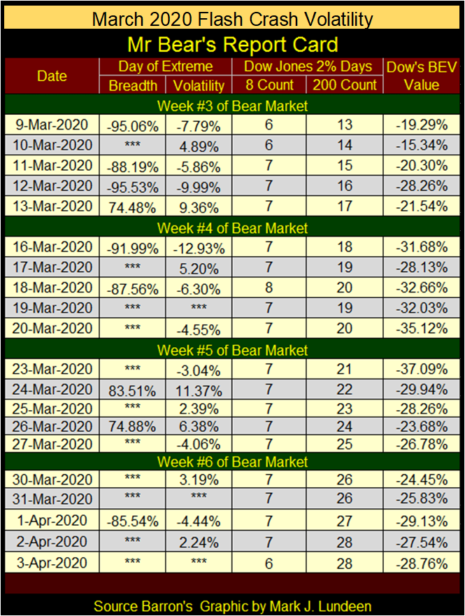
These I covered last week, the Dow Jones 2% days, or days of extreme market volatility using the table below for the March 2020 Flash Crash. But the other bear market extreme, days of extreme market breadth, the NYSE 70% Advance – Decline Days seen below were not covered last week. So, I’m going to do that this week.
NYSE 70% A-D Days, days of extreme market breadth are computed from the NYSE’s daily advance and decline data. This data is published daily, courtesy of the nice people at the Wall Street Journal, see link below. Take a quick look at it. In the table we’re looking at the;
- Issues traded – number of companies traded at the NYSE that day,
- Advance – number of companies closing higher than the day before,
- Decline – number of companies closing lower than the day before.
https://www.wsj.com/market-data/stocks/marketsdiary
Each day, every issue (company) trading at the NYSE either advances or declines from the day before. On daily advances for the Dow Jones, there can be many companies trading at the NYSE that are down for the day, as they may be up on days the Dow Jones goes down. During bull markets, I’ve found nothing outstanding in this pattern of companies advancing, or declining at the NYSE with the Dow Jones.
However, when Mr Bear is paying a visit to the NYSE, this changes, as during bear markets, we’ll find extreme days in market breadth, where most companies advanced or declined with the Dow Jones. These extreme days of market breadth (NYSE 70% Days) are computed as follows;
Advancing Days – Declining Days / Issued Traded That Day
When the solution to the above formula is = +/- 70%, or greater, the NYSE just had a day of extreme market breadth, a 70% A-D day.
These 70% A-D days are rare market events. Since 1924, there have been only 439 of them during the 26,453 NYSE trading sessions plotted below, or one 70% day out of every 60.2 NYSE Trading sessions. Clusters of these NYSE 70% A-D Days, are markers for bear markets. Note how during the Greenspan era; an era of upside market manipulation spanning from 1987 to 2006, the NYSE saw less than ten of these extreme-market events during these nineteen years.
But like the Depressing 1930s, beginning on 27 February 2007 with a NYSE 70% A-D Day of -70.90%, a cluster of these extreme days began, and continues accumulating to this day. The last was a -82.28% A-D Day, just a month ago on February 13th.
Looking at this chart below, it’s obvious the clusters of NYSE 70% days during the late 1920s and in the 1930s were not omens of prosperity. Note the relative absence of these extreme days of market breadth during the Greenspan Bubble era. Following Greenspan, began the most massive cluster of extreme market breadth in this data set, that began, and has continued since cracks in the sub-prime mortgage bubble became public in early 2007.
What does all this mean? Aw shucks, I’m just an old retired Navy Chief Petty Officer; what do I know? But if someone were to put a gun to my head, and demand my opinion on this cluster, I’d tell them it seems like the magma beneath the American financial system is shifting, and has been for years, and that is something that can’t be good.
The chart above plotting the 439 days of Extreme Market Breadth since 1926 is a bit overwhelming. So I broke this data down in the two chart below, plotting these extreme market events from 1926 to 1943, skipping the next thirty-four years, and plotting the data from 1977 to the close of this week.
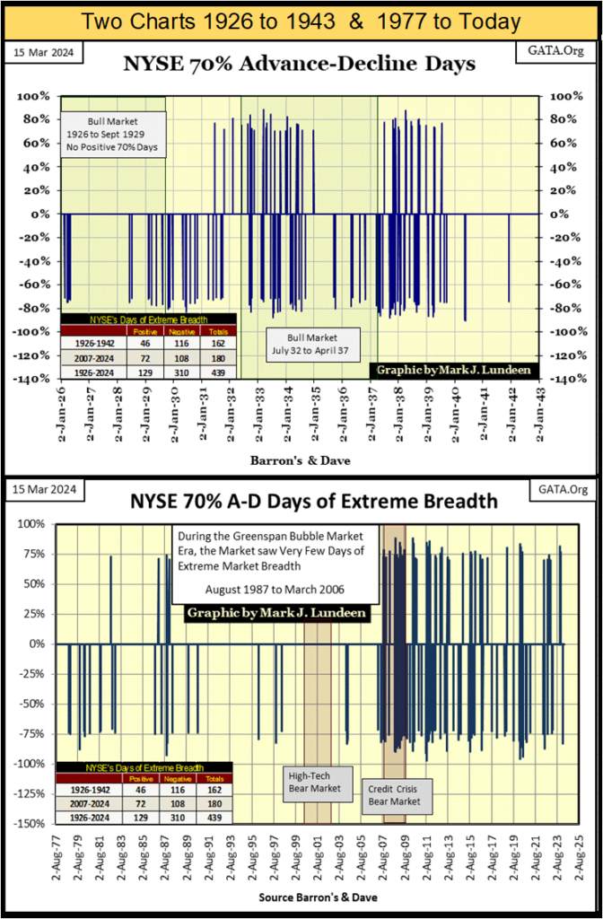
These charts are a facinating study of market breadth at the NYSE for the past 98 years. And I’m proud to say, my readers will find this data nowhere else but with my weekly market commentary.
When we once again see extreme market events in the market; Dow Jones’ 2% Days, and NYSE 70% A-D days in aboundance, you can be sure Mr Bear has once again begun mauling Wall Street, which I’ll follow with my Mr Bear’s Report Card. Until then, given the Dow Jones remains in scoring position, I’ll remain bullish on the stock market.
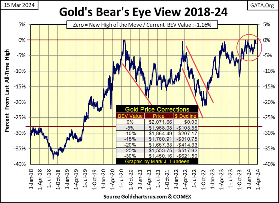
What did gold do this week? In gold’s BEV Chart below, it made a BEV Zero on Monday, but just closed in scoring position for the following four trading days. After gold made six continious new all-time highs in the past two weeks, everything is good for the bulls.
In gold’s step sum table below, its step sum has increased from 298 to 306 at week’s close, meaning since February 9th, gold has seen more daily advances than declines. Gold’s daily volatility’s 200D M/A bottomed at 0.54% a few weeks ago, but bounced a bit in the last week, closing the week at 0.55%.
Not much of a bounce. For the gold bulls, the world will become an exciting place to be when gold’s daily volatility once again rises above 1.00%. Of course, before that happens, I’m expecting the financial markets current bloated valuations will deflate some, and maybe a lot. Something that isn’t happening now.
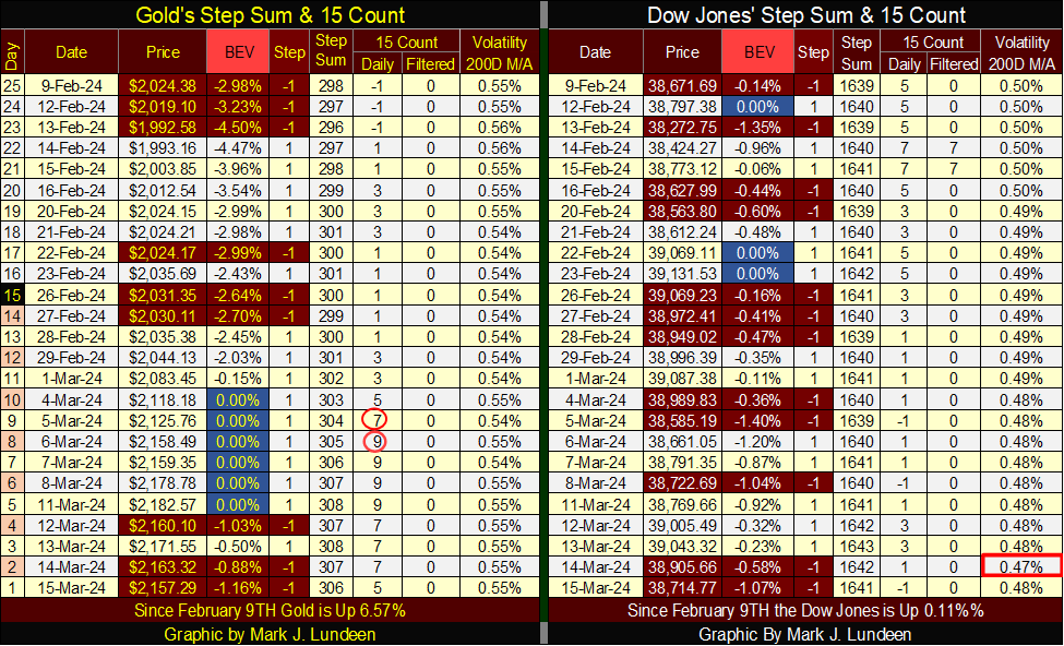
Same old, same old for the Dow Jones in its step sum table, but I note on this week’s Thursday close, the Dow Jones volatility’s 200D M/A declined to 0.47%, before it bounced back to 0.48% on Friday. As long as Dow Jones’ daily volatility continues to decline, it’s a good reason not to get too bearish on the stock market.
But when the stock market is hit with incoming waves of days of extreme volatility, Dow Jones 2% Days, and days of extreme market breadth, NYSE 70% A-D days, watch this 200D M/A for Dow Jones daily volatility begin to rise faster than it came down.
__
(Featured image by Tomas Eidsvold via Unsplash)
DISCLAIMER: This article was written by a third party contributor and does not reflect the opinion of Born2Invest, its management, staff or its associates. Please review our disclaimer for more information.
This article may include forward-looking statements. These forward-looking statements generally are identified by the words “believe,” “project,” “estimate,” “become,” “plan,” “will,” and similar expressions. These forward-looking statements involve known and unknown risks as well as uncertainties, including those discussed in the following cautionary statements and elsewhere in this article and on this site. Although the Company may believe that its expectations are based on reasonable assumptions, the actual results that the Company may achieve may differ materially from any forward-looking statements, which reflect the opinions of the management of the Company only as of the date hereof. Additionally, please make sure to read these important disclosures.


Switzerland’s Medical Cannabis Reform Advances Access, But Barriers Remain
Switzerland’s 2022 medical cannabis reform improved patient access by removing federal approval requirements, but challenges remain. MEDCAN highlights barriers including...


Swisscanto Launches Catastrophe Bond Fund for Portfolio Diversification
Swisscanto launches a Luxembourg UCITS catastrophe bond fund, giving qualified investors access to insurance-linked securities tied to extreme natural events....


AI Agents Transform Payments as Visa, Mastercard, and Qonto Tackle Trust, Liability, and Regulation
Visa and Mastercard are advancing AI-driven autonomous payments, shifting focus to trust, liability, and regulation when agents act without real-time...

Bitcoin ETFs Lead as German Stock Exchange Debuts Mining ETF
Bitcoin and Ethereum remain largely flat, with BTC near 66,600 and ETH around 1,920, while ETFs see steady inflows. A...


Ali G Makes Surprise Wimbledon Appearance with Cannabis-Themed Satire
Sacha Baron Cohen revived his iconic Ali G character at Wimbledon’s men’s final, blending satire with British high society. Dressed...
 |
|
 |  |
 |
|
-

 Fintech2 weeks ago
Payhawk Reaches $100M ARR Milestone with AI-Driven Growth
-

 Africa2 days ago
PAASIFEJ: Results-Based Financing Driving Inclusive and Sustainable Rural Growth in Morocco
-

 Impact Investing1 week ago
Italy’s Startup Ecosystem Shrinks but Becomes More Digital and Specialized
-

 Africa7 days ago
Senegal’s Debt Strategy: Choosing Between Restructuring and Financial Innovation