Business
Primer on Step Sum Theory & Bear Boxes
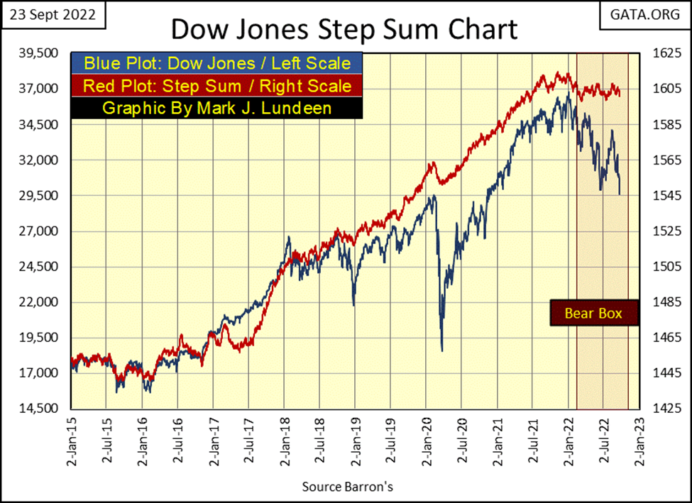
The Dow Jones is down by 12.21% since August 19th, as its step sum is down 6 steps. The bulls are still in the market, fighting for their positions. I think it’s a losing battle they’re fighting. But the bulls don’t see it that way, as the Dow Jones step sum hasn’t yet begun to collapse. I believe that is only a matter of time.

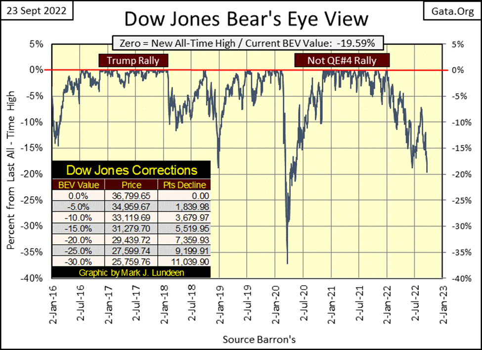
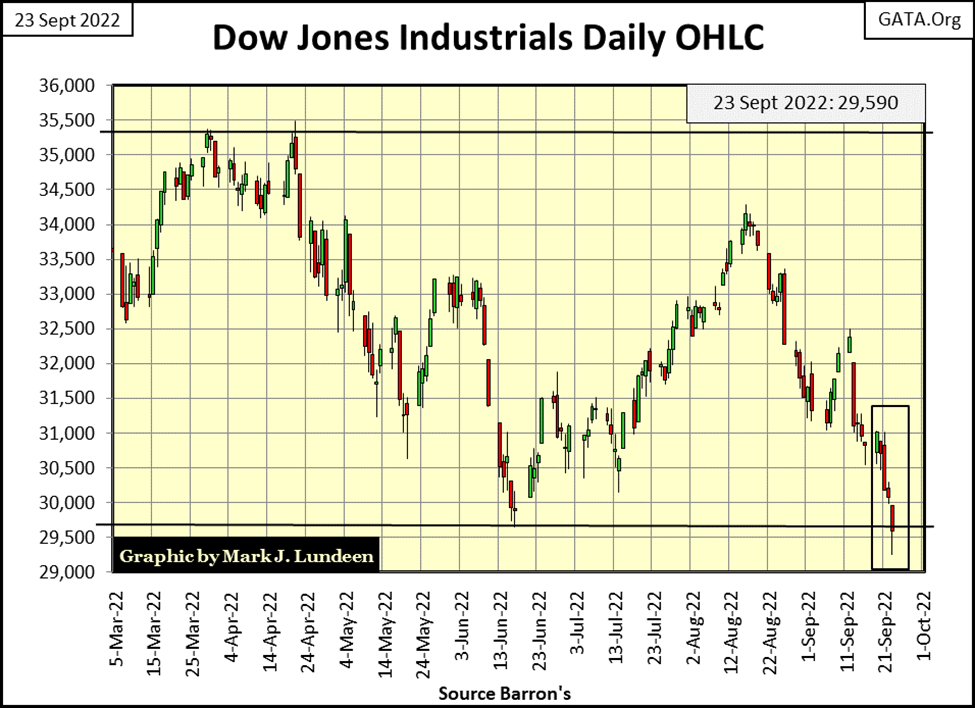
The Dow Jones this week took out its lows of last June, as seen in its BEV chart below. How much further will the Dow Jones go in its current decline? I can’t say with certitude, and no one else can either. But looking around, seeing how bond yields and mortgage rates continue rising. That plus the FOMC increased their Fed Funds Rate to over 3% this week and promised more of the same for the rest of 2022. I wouldn’t be surprised should the Dow Jones deflates below its lows of the March 2020 Flash Crash in the first half of 2023, or in late 2022.
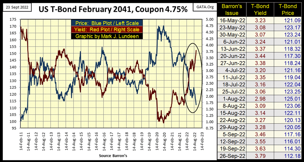
Let’s look at the T-bond market, using a 30-year bond issued in February 2011. The data plotted below is weekly, and not since Barron’s last issue of July has its yield declined, or price advance. If this bond is doing this, we can assume every T-bond trading, with a few years still on them before they mature, are doing the same.
What is the capitalization for the T-bond market? I don’t know, but I know it’s a whole lot less than what it was in August 2020 when the price of this bond peaked at 170. At this week’s close, that’s a loss of 34% taken by this bond’s holders.
When considering the US National Debt at the close of this week was $30.9 trillion dollars, and seeing how the T-bond market saw fit to discount that by 34%, about $10 trillion dollars since the market’s top in August 2020. I’m really happy I don’t have any of these turkeys in my portfolio.
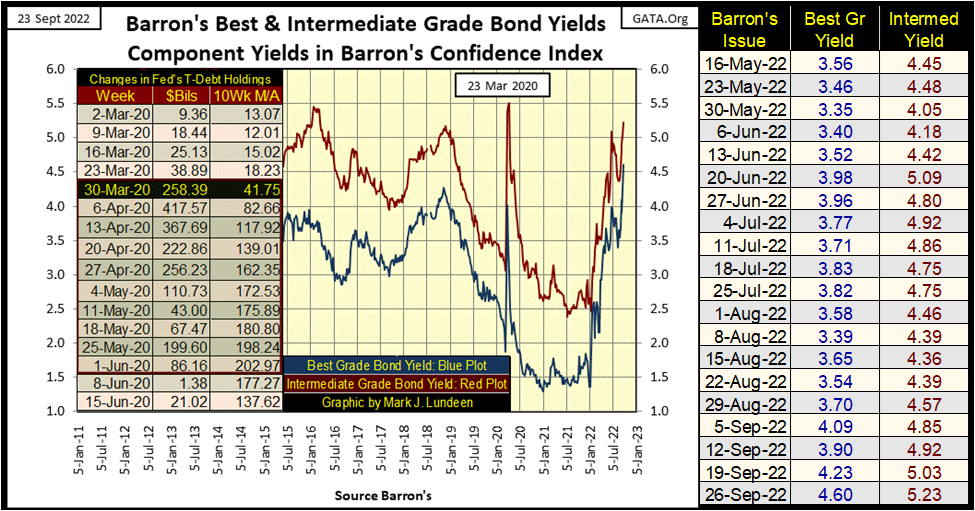
Corporate bond yields have been rising since the first of the year, as seen in Barron’s Best & Intermediate Grade Bond Yields below. In 2021, a bond buyer could receive a full 100 basis points more income by buying lessor-grade corporate bonds (intermediate grade bonds). But this gap in bond yields has shrunk greatly since last January, down to 63 basis points at the close of this week.
The difference between these two bond yields is how the bond market prices the risks these two bond groups – best and intermediate-grade bonds, have for their owners. The greater the risks, the higher the yield. So, it goes without comment that intermediate grade bonds are riskier investments, than are best grade bonds, as their yields are higher.
But, with the spread between these two bond groups shrinking since January 2022, what is the bond market telling anyone willing to listen to it? That intermediate-grade bonds are less risky than previously thought? Or maybe that best-grade bonds are riskier than previously thought?
How about; for anyone who owns any of this corporate garbage in their investment holdings, they’ll soon wish they hadn’t!
Below, we see the price action for the Dow Jones Corporate Bond Index. It’s a bear market in fixed income, and the bottom is nowhere in sight. Though it hasn’t yet done so, deflating valuations in the stock and bond markets will ultimately provide the rocket fuel to drive gold and silver upward to prices currently not believable. But when? I wish I knew.
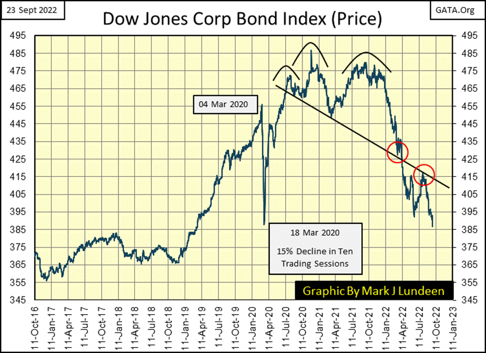
The companies issuing the above bonds trading in the bond market, are the same ones whose stock issues also trade in the stock market.
Is it possible for the bonds of these companies to enter a huge bear market, while these same companies’ stocks prosper in a bull market? Wouldn’t that be nice. Yes, it would be. But in this world of ours, it’s really not possible, as seen in my table of BEV values (below) for the major market indexes I follow.
I haven’t actually checked it out, but I believe most, if not all of the below major market indexes below, have taken out their lows of last June. Ignoring the XAU (#20), five of these indexes have deflated below their BEV -30% lines. I think its only a matter of time before they deflate below their BEV -40% lines, leading the other indexes on their way down to the bottom of a massive bear market.
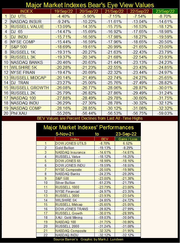
I didn’t save it for a quote. But someone, somewhere in the mainstream media this week said gold and silver lost their safe-haven status in the market. Looking at the list above, where gold is #2, and silver #10 (up 1 from last week), how can someone make such a claim?
It’s not that this “market expert” wasn’t thinking. He knows the truth. But Wall Street pays a lot of bills for the mainstream financial media via advertising, something gold and silver bullion, and their miners don’t do. It’s in the establishment’s interest keeping retail investors from selling stocks and bonds, and shifting these funds into precious metals investments.
Precious metal markets are so insignificant, when compared to the dollar valuation of the markets’ financial assets trade in, it’s frightening to think what would happen should only 5% of the market cap for stocks and bonds move into gold and silver-related assets. This must be a recurrent nightmare for those at the top of Wall Street’s current food chain.
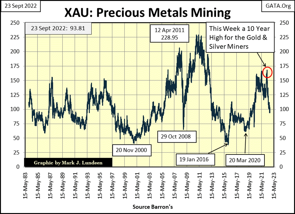
Another way to look at precious metal assets, for example the XAU; the market index for gold and silver miners, chart below, is whether they are over, or undervalued.
This data begins in 1983, to this week’s close. In this same time, the Dow Jones inflated from around 1000, to 36,799 just last January. For years, I’ve weekly made the case the Dow Jones, and the other major stock indexes seen in the table above are overvalued, at great risk of having their valuations greatly reduced.
But look at the XAU below. On the first day of its trading, it closed a bit above 100. At the close of this week, the XAU closed a bit below 100.
You can say anything you like about the gold and silver miners. Since 1983, many things have been said about them that I don’t care to repeat before polite society. But one thing no one could say about the precious metal miners for the past forty years is that they are overvalued.
For decades, since before 1983, market valuations for stocks, bond, and real estate have been inflated ever upwards by the FOMC. Now in 2022, these financial assets’ overinflated valuations are coming down. In late 2022, there is something comforting about the XAU, where this week it closed below its first day’s trading in 1983.
This week the Dow Jones in its daily bar chart below closed below its lows of last June, and then stopped right on the critical 29,500 level.
A month ago, I was speculating the Dow Jones would be at new all-time highs before the November election. A month ago, that seemed like a real possibility. Five week’s later I realize I must have been a madman when I thought that.
So, please excuse me if I don’t get too specific on what I think is going to happen between now and the end of 2022. But it can’t be something good, not with rising bond yields and mortgage rates, and the monumental incompetence now dictating “policy” from Washington. The Biden mis-Administration has created a situation where once again, nuclear armed rockets are being used to argue one’s position in a new and totally unnecessary cold war between the US and Russia.
What the hell; why are we in Ukraine anyways?
The same American politicians who have pledged the US to safeguard Ukraine’s sacred border with Russia, have left our own southern border open to mass migration and drug smuggling.
But there isn’t any need to concern yourself with nuclear detonations coming from over the horizon. Not when this week closed with the NYSE seeing 1,106 new 52Wk Lows.
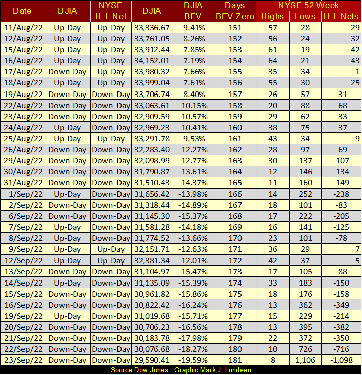
A few more negative four-digit NYSE 52Wk H-L Nets, as we’ve seen at the close of this week, and we may find the market at a short-term bottom, and a possible bounce from it.
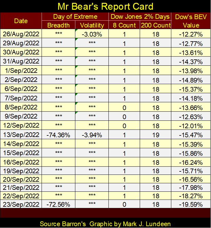
One thing arguing for a still deeper decline before we find a bottom to our current market decline, is seen in Mr Bear’s Report Card below. Bottoms in the market typically produce lots of extreme days; NYSE 70% A-D days (days of extreme breadth) and Dow Jones 2% days (days of extreme volatility). But that hasn’t happened just yet, where we see two to four of each happening in a single week.
But you won’t need to look at Mr Bear’s Report Card below to know when such a week is happening. Watch CNBC. When their “market experts” perspire heavily, as they reassure retail investors, warning them not sell in a panic as the stock market is in meltdown mode. You can be sure extreme days of volatility and market breadth are piling up in Mr Bear’s Report Card below. Some things just never change.
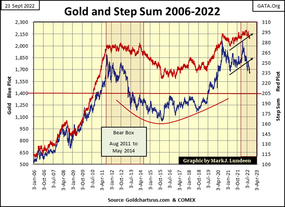
As both the Dow Jones and gold entered a step-sum bear box since the first of this year, the Dow Jones after its last all-time high of January 4th, and gold after its March 8th failure to make a new all-time high, this week would be a good time to review step sum theory.
However, before I go into a step-sum bear box, I should first go over what is the step sum. The step sum is a single item Advance – Decline Line, whose inputs are the daily advances and declines of the single item, for example, the Dow Jones or the daily price action for the gold market. At the end of every article, I have a step sum table for the Dow Jones and gold, showing the last twenty-five days of the market, including the daily ups and downs for their step sums.
Looking at the Dow Jones, on Wednesday, September 21st, its step sum was 1603. How that was derived is shown in the table below, where since 02 January 1900, the NYSE has seen 33,145 trading sessions. The Dow Jones advanced in 17,374 of those while declining in 15,771. The step sum is the net of the Advancing – Declining trading days: 1603.
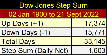
The amazing thing is, when you study the Dow Jones’ step sum (or any other), you’ll discover come bull or bear market, the Dow Jones advances about as much as it declines in both bull or bear markets. As seen in the table above, in the past 122 years of trading for the Dow Jones, taking the Dow Jones from 68.13 on 02 January 1900, to 30,183.78 on 21 September 2023, the Dow Jones has seen a net of only 1603 advancing days, as it has advanced by over 30,000 points.
The step sum is a market-sentiment indicator of the most important people in any market; those who actively trade on a daily basis; market professionals who trade for a living. Like everyone else, these traders buy today because they believe they can sell at a higher price sometime in the future. As they sell today because they believe the market will be at a lower price sometime in the future.
It’s accurate saying the market closes higher on days when these professionals, as a group are buying, as it will decline when these professionals, as a group are selling. For that reason, I call the step sum plot in any step sum chart; “market expectations.”
The price plot in a step sum chart, is what I call “market reality”, because (from past personal experience), I may have bullish expectations on the market, so I buy. However, if market valuations are going down, the market reality is I’m losing money.
Typically, in a step sum chart, market expectations (step-sum plot) and market reality (price plot) are coupled together. Coupled together, not bolted or welded together. So, there are times when they diverge, one rises as the other declines. But the vast majority of such decoupling of a market’s expectation from reality are short-lived market events, less than a month, maybe two, market events best ignored.
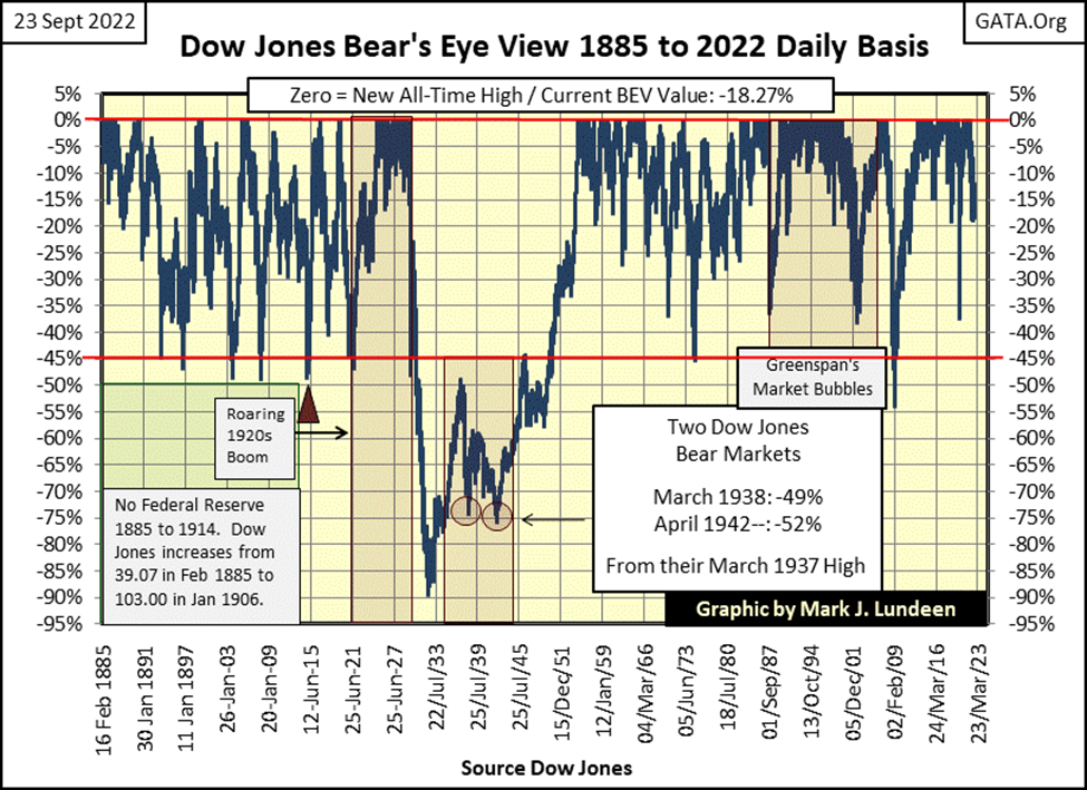
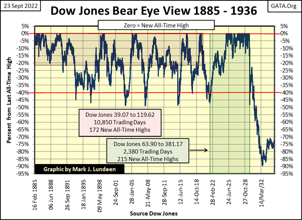
As a required sidebar to the Great Depression Crash, and the bear box that formed during it, I need to go over the Dow Jones in its Bear’s Eye View format.
The Bear’s Eye View (BEV) is the view of a market as Mr Bear sees it; with each new all-time high worth only 0.00% / a big fat Zero, aka a BEV Zero. All other daily closes, not new all-time highs register as a percentage claw back from their previous all-time high.
The Bear’s Eye View of a market compresses a market’s price data into a range of only 100 possible percentages, with each new all-time high as 0.00%, NEVER MORE, and total wipeouts in valuation at -100%. The BEV view of the market allows us to directly compare market action from one decade to another. Or for the Dow Jones, from one century to another.
The BEV chart below spans the 137-year history of the Dow Jones. For someone who bought the Dow Jones at any of its market tops (BEV Zero), then seeing the BEV plot declined to its BEV -40% line, indicates they have sustained a 40% loss of their invested funds. That is true whether we are looking at a BEV plot for 1885, when the Dow Jones was less than 50, or in 2022 with the Dow Jones now over 30,000.
Looking at the Dow Jones via its BEV chart below reveals something else not widely known. From 1885 to 2022, buying stocks after the Dow Jones BEV plot deflated to its BEV -40% line, was a solid, and time-tested, bear-market bottom buy signal!
The only exception to that rule was during the Great Depression Crash, when reentry into the market when the Dow Jones first fell below its BEV -40% line in October 1929, would prove fatal, as the bottom beneath Wall Street became a quagmire that swallowed all who dared to “buy at the bottom” of a bottomless market decline.
Here’s a shorter-term BEV chart for the Dow Jones, more suited for studying the Great Depression’s bear box. Key point to keep in mind; before January 1930 the Dow Jones had never seen a 50% decline from one of its many all-time highs, in its previous forty-five years of trading history, as seen in the BEV chart below.
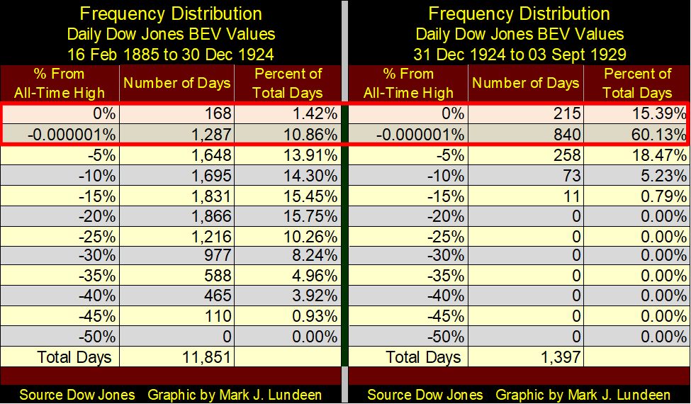
But, and it’s a BIG BUT, before 1913 there was no Federal Reserve. However, the Federal Reserve was actively engaged in credit creation during Wall Street’s 1920s boom, as seen in the extreme frequency of BEV Zeros seen below from 1925 to September 1929 in the frequency tables below.
From 1885 to December 1924, the Dow Jones saw a new BEV Zero (0.0% / all-time high) in only 1.42%, and closed within “scoring position” (less than 5% away making a new all-time high, the -0.00001% row) 10.86% of those 11,851 NYSE trading sessions. These two rows (within the red box) in the freq table below contain only 12.28% of the Dow Jones daily closes from 1885 to 1924.
How different the next five years would be, where the Dow Jones closed at a new all-time high, or within 5% of one, for 75.52% of these 1,397 NYSE trading sessions. This didn’t just happen. The Federal Reserve, directing credit towards Wall Street made this possible.
Following the boom of the 1920s, came the historic bust of the 1930s. The following Dow Jones’ BEV chart is arguably the best chart you’ll ever see illustrating the first boom/bust cycle made manifest by the idiot savants at the FOMC; the Roaring 1920s Bull Market boom, and the bust that followed; the Great Depression Crash.
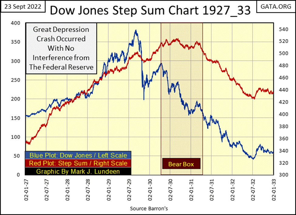
Let’s look at the step-sum bear box that formed during the Great Depression Market Crash in the chart below; step sum plot/market expectations Red Plot, and the Dow Jones Price plot/market reality Blue Plot.
All during the Roaring 1920s Bull Market, the Dow Jones and its step sum were coupled together. This was also true during the initial phase (September 1929 to April 1930) of the Great Depression Crash. So, in April 1930 as market valuations (Market Reality / Blue Plot) for the Dow Jones began collapsing towards their July 1932 lows, why did its step sum (market expectations / Red Plot) decouple from market reality until late winter of 1931?
Look at the BEV chart above. Until October 1930, the Dow Jones had never crossed below its BEV -50% line. As expected in a bear box, the bulls of 1930 were wrong believing the down days in the market were opportunities to scoop up bargains in the market.
And the bulls continued buying the dips in the market until they realized they were in deep trouble. That point in time, when the bulls finally began selling, to exit the Great Depression Market Crash, can be seen as the point where the step sum (market expectations) began collapsing toward market reality, the Dow Jones valuation blue plot below.
So, exactly how bad was the Great Depression Market Crash, seen in the blue plot above from September 1929 to July 1932? Using the Dow Jones as my market proxy, the answer to that question can be seen in the table below.
If one bought at the last all-time high (0.00% / 03 September 1929), and stayed in to the very bottom, they lost 89.19% of their investment.
But what if someone came in when the Dow Jones fell below its BEV -50% line in October 1930, and stayed in to the very bottom? Well, they lost 78% of their invested funds, and so it went on until the July 1932 bottom.
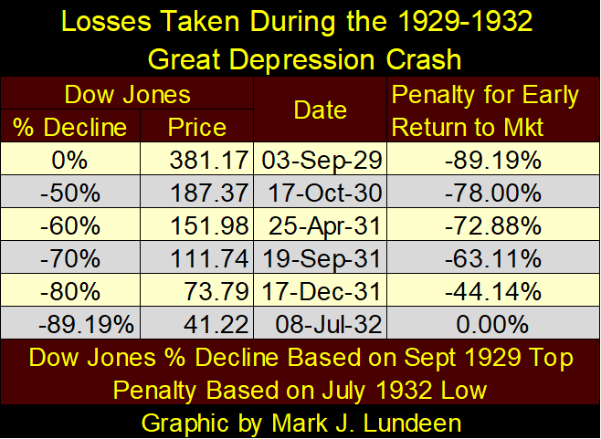
So, knowing when the bottom of the Great Depression Crash was in was a very difficult thing to do. And even if you came back in when the Dow Jones was down by 80% in December 1931, as per the table above, you still saw a loss of 44.14% at the July 1932 bottom. So how, during a massive deflationary bust in the market, can anyone know when it was safe to come back in to buy?
Again, look at the step sum chart above. Note how in the summer of 1932, both the now recoupled Dow Jones’ market sentiment (the step sum plot) and its market reality (price plot), bounced up together.
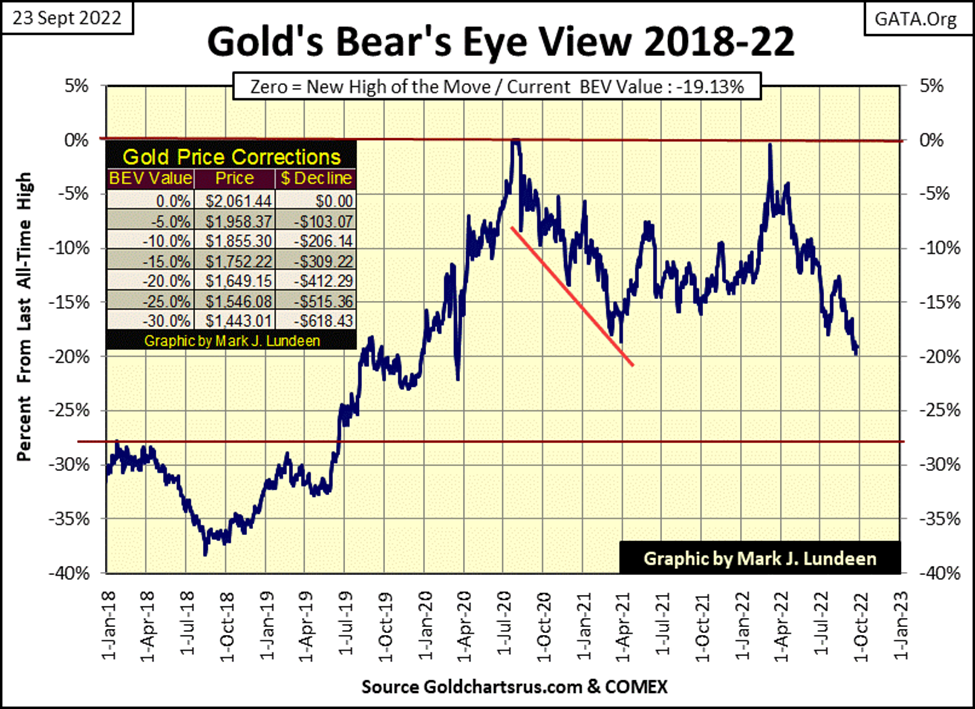
Let’s move on to gold’s BEV chart. This week gold remained above its BEV -20% line, but unless we see a nice bounce in gold next week, I’m expecting it will close next week below its BEV -20% line. A close at gold’s BEV -25% line in the weeks to come? Looking at the table, that would be a dollar close in gold at $1546.08.
That seems excessive, but a part of me really doesn’t care how far the price of gold goes down. Don’t think I enjoy seeing gold go down, I don’t. Still, I have no intention of selling because if I do, I may not be able to get my position back.
What I want to know, but won’t until after it happens, is how much time before gold sees that bottom. Like everyone else; I’m so tired of this stuff. Waiting for this bottom to pass us by, and having to read stuff by “market experts” on how gold lost its safe harbor status is so annoying!
Looking at gold’s step sum chart below, it seems market expectations are finally breaking down, recoupling with market reality. This is good unless one’s exposure in the gold market is being long by leveraged futures contracts at the COMEX.
But that isn’t me, as I have no leverage in this market. I’ve accepted this market is going down, and I’m waiting for when it bounces off that bottom and continues rising to new all-time highs in the chart above and below.
Two things the bulls in the gold market have going in their favor are, the rising yields in the debt market, as well as the current bear market in stocks. The same Wall Street firms attempting to stall the bear market in financial assets, are the same ones manipulating valuations in precious metal assets down. This game of supporting one market, while opposing another is a game they can’t continue playing forever.
Here is a note on bear boxes in general; as gold’s step sum below begins recoupling downward to market reality, market psychology for the gold market, including the mining stocks could become very bleak, dark, and nasty. But then, all big bear market bottoms feel like that, where the emotion dominating the marketplace is one of despair.
The last time the bulls in the gold market felt hopeless was in November 2015 – February 2016, in the step sum chart below. It was a good point to reenter the market.
Moving on to the Dow Jones step sum chart below. After studying the above, what do you see in it? I see the market reality of deflating valuations in the Dow Jones, as the bulls refuse to get out of Mr Bear’s way. We’ll know when the bullish market sentiment gives way to market reality when the step sum begins declining from 1600.
At that point, the box is then closed, as the bull’s pent-up selling begins, which collapses the step sum plot. The bottom will be in when both the valuation for the Dow Jones (market reality), and the step sum (market expectations), hit a bottom, and then bounce up together.
A perfect example of the workings of a bear box, from start to finish can be seen in gold’s August 2011 to May 2013 bear box in the chart above.
It’s late, and this article is much longer than I intended it to be. I have other step-sum box charts I wanted to publish, but I think it best to do that in the weeks to come. But before I go, here are the step sum tables for gold and the Dow Jones.
For gold, since August 19th, it has fallen by 4.58% as its step sum is down by 4. The bulls are still fighting to get gold back above $1700. But a bear box is typically a situation where the bulls fail. I’m expecting to see gold’s decline to accelerate as its step sum begins to collapse. But that may not happen for weeks or months to come.
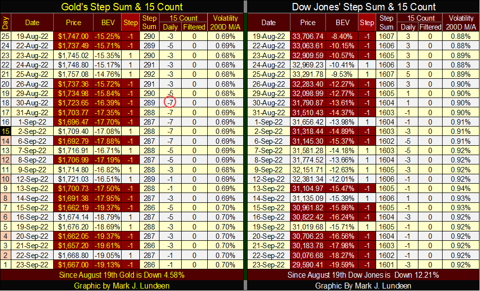
The Dow Jones is down by 12.21% since August 19th, as its step sum is down 6 steps. The bulls are still in the market, fighting for their positions. I think it’s a losing battle they’re fighting. But the bulls don’t see it that way, as the Dow Jones step sum hasn’t yet begun to collapse. I believe that is only a matter of time.
__
(Featured image by OleksandrPidvalnyi via Pixabay)
This article may include forward-looking statements. These forward-looking statements generally are identified by the words “believe,” “project,” “estimate,” “become,” “plan,” “will,” and similar expressions. These forward-looking statements involve known and unknown risks as well as uncertainties, including those discussed in the following cautionary statements and elsewhere in this article and on this site. Although the Company may believe that its expectations are based on reasonable assumptions, the actual results that the Company may achieve may differ materially from any forward-looking statements, which reflect the opinions of the management of the Company only as of the date hereof. Additionally, please make sure to read these important disclosures.


Blockchain Evolves Toward AI, Finance and Quantum Security
Blockchain is evolving beyond crypto into finance, AI applications, and digital markets, while security and regulation remain challenges. Quantum threats...


The Italian Crowdinvesting Market Faces Sharp Decline in 2026
Italian crowdinvesting market continued to decline in 2026, with fundraising falling 36.8% year-on-year to €164.19 million. Platforms and active campaigns...


Sartorius Stedim Biotech Maintains Growth Momentum in H1 2026
Sartorius Stedim Biotech reported solid H1 2026 results, with revenue reaching €1.527 billion and EBITDA rising to €479 million. Growth...


Bank of Africa Launches BOA MDM Network to Boost Diaspora Investment in Morocco
Bank of Africa launched the BOA MDM Network to channel diaspora remittances into productive investment, aiming to raise their share...


Switzerland’s Medical Cannabis Reform Advances Access, But Barriers Remain
Switzerland’s 2022 medical cannabis reform improved patient access by removing federal approval requirements, but challenges remain. MEDCAN highlights barriers including...
 |
|
 |  |
 |
|
-

 Biotech1 week ago
Legend Biotech: Growth Driven by CAR-T Innovation and Carvykti Expansion
-

 Crowdfunding4 days ago
Medelon Shooting Club Restores Hall After Successful Crowdfunding Campaign
-

 Biotech2 weeks ago
Alzheimer’s Study Reveals Immune Pathway Behind Women’s Higher Vulnerability and Potential New Treatment Approach
-

 Crowdfunding1 week ago
Avant Devices Moves Toward Electric Wheelchair Kit Production with New Funding Drive