Featured
The BGMI explains why gold is no longer the hedge it once was
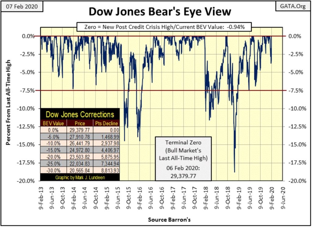
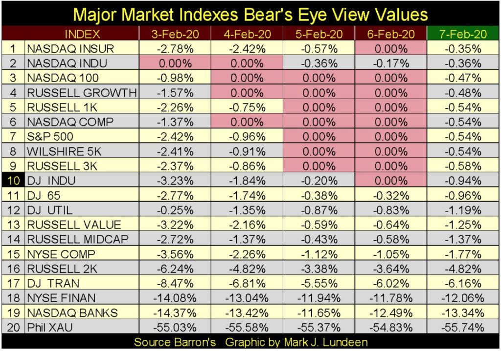
Last week the Dow Jones closed 3.72% down from the last all-time high of January 17th. The Federal Reserve has increased its balance sheet by an additional $11.99 billion dollars. Sixteen of the major indexes closed the week within 5% of their last all-time high price. Another indication the financial market would be having problems would be a surging price of gold.

In BEV terms, last week found the Dow Jones closing 3.72% from its last all-time high of January 17th, or down 1,092 points. In my mind the stock market had the makings of a new correction, or at least a period of rest for the bulls. This was not to be as by Thursday the bulls took the Dow Jones up by 1,124 points from last Friday’s closing, making a new BEV Zero as they did. Following a surge of upward momentum like that I’m not surprised that on Friday the Dow Jones was down by almost 1%.
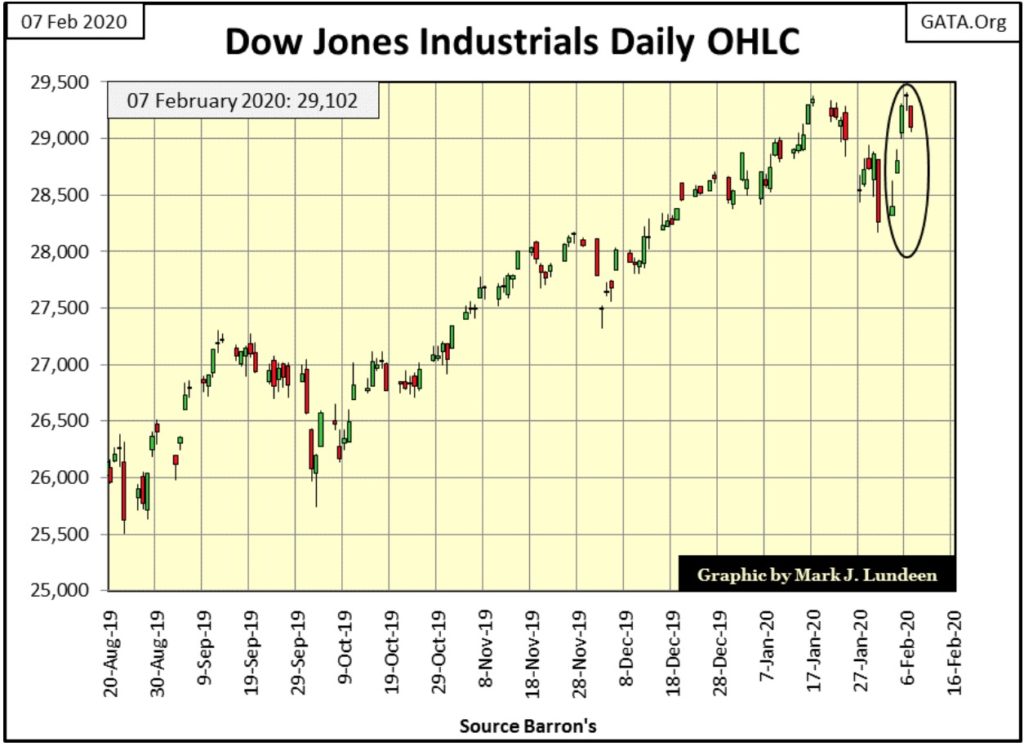
Below is the Dow Jones in daily bars, in which I’ve circled last week’s trading days. The market action seen from Monday to Thursday is something seldom, if ever before seen; very peculiar. If I had to explain what enabled thirty of the largest blue-chip stocks trading on Wall Street to leap into the air like a flock of sparrows, what would I say? Could it be the Tooth Fairy? Possibly.
But more likely this week’s amazing performance for the Dow Jones came from the usual suspect “injecting liquidity” into the financial system yet again. So I looked to see how much of the US national debt the FOMC had “monetized” this week, and found they had increased the Federal Reserve’s balance sheet by an additional $11.99 billion dollars (see chart below). They’ve been monetizing the national debt in a big way since the end of last September.
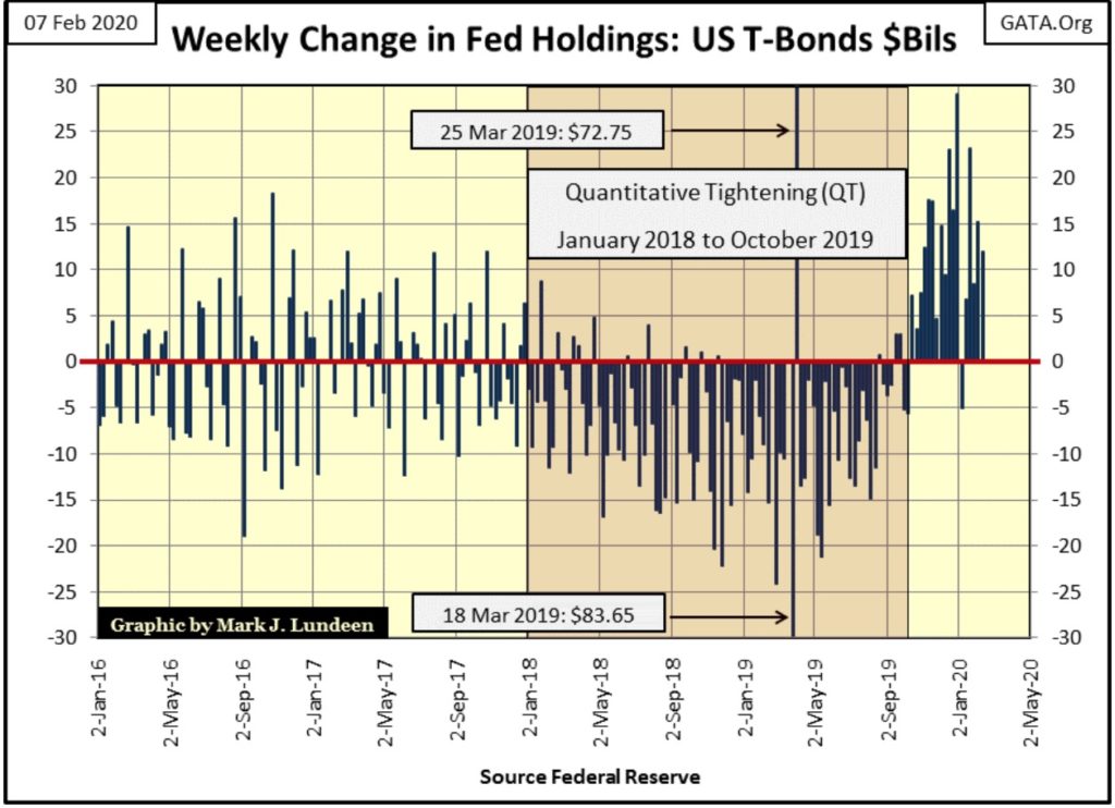
Fed Chairman Powell this week said the FOMC will continue growing its balance sheet through April of this year, which isn’t the same thing as saying he intends to stop at the end of April. Still, he assures us that this series of purchases of T-debt in the open market isn’t a new round, a fourth round of quantitative easing. Heavens no; they just want to make sure the financial system’s supply of reserves remains “ample.”
“Ample supply of reserves?” The market’s supply of “reserves” have been “ample” since these same people decoupled the dollar from the Bretton Woods $35 gold peg in August 1971. You think not? Look at the following chart – the Red Star marks when they started the clock’s countdown on the dollar’s demise.
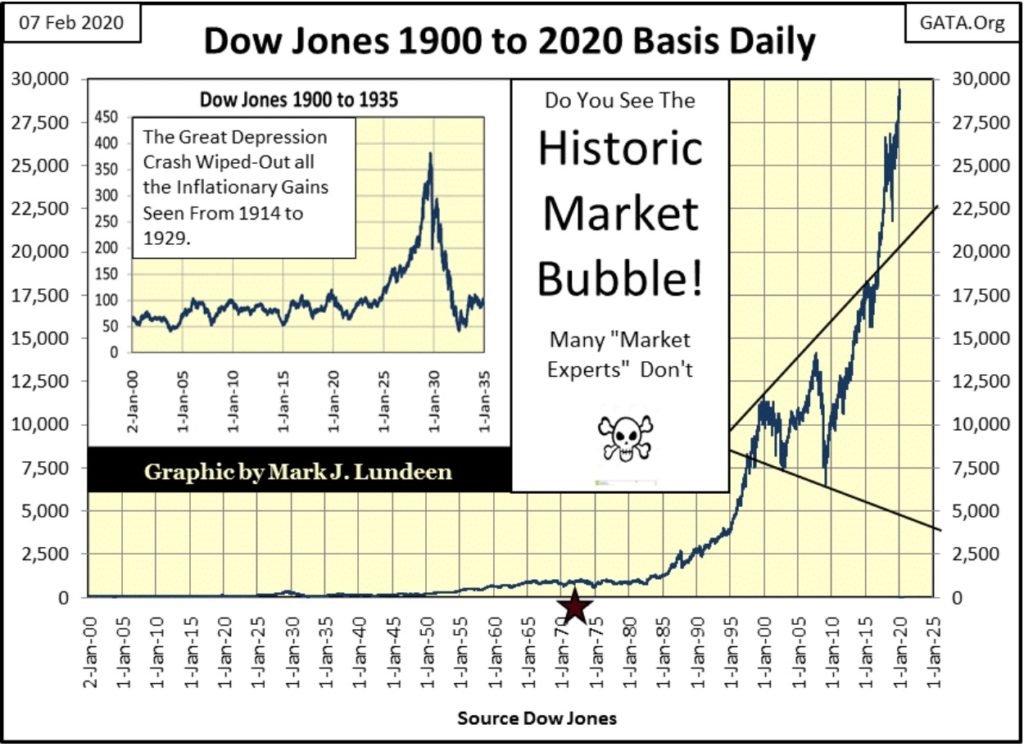
It takes a lot of “liquidity injections” to drive the Dow Jones from below 1,000 five decades ago to just under 30,000 at the close of this week. In a market that saw the Dow Jones this week advance 1,124 points in just four trading sessions at the NYSE, I wouldn’t be shocked seeing it break above 35,000 sometime in 2020. But then I wouldn’t be shocked seeing the Dow Jones break below 20,000 either.
I’m not making a prediction here. I’m just following the market on a day by day basis. But like Roger, my silver-trading friend always reminds me – the trend is your friend. Right now the stock market’s trend is trending upward, so I’m bullish. And it’s best assuming this will continue to be the case until Mr Bear begins clawing back valuations from the Dow Jones. Let’s give this percentage claw back a threshold value; say should Mr Bear claw back the Dow Jones in the BEV chart above down below its -10% BEV line, difficulties sustaining market valuations are becoming problematic for the FOMC.
At the Dow Jones’ current all-time high, that would take the Dow Jones down to 26,442. I think that would signal that the bulls in the FOMC are having problems keeping the stock market’s valuation inflated.
But this week that wasn’t so, as the various major market indexes I follow began seeing BEV Zeros in increasing numbers until Friday (table below). With sixteen of them closing the week within 5% of their last all-time high price, they remain in scoring position for making additional BEV Zeros in the weeks to come.
Another indication the financial market would be having problems would be a surging price of gold. At the close of this week, we really couldn’t say the price of gold was surging, but it’s not collapsing either.
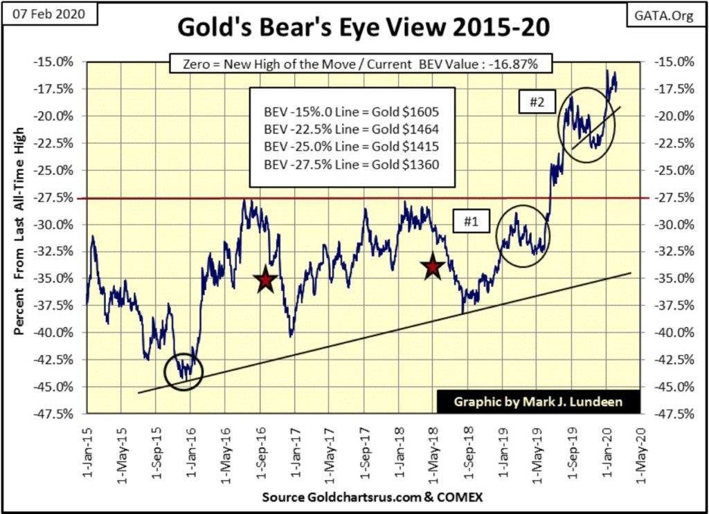
Let’s take a look at gold’s BEV chart below, and see how gold has behaved since its December 2015 bottom. I’ve placed various stars and circles in the chart. The December 2015 bottom is marked by a circle, as are two corrections in the price of gold I’ve labeled #1&2. The two red stars are also price corrections.
The thing that jumps out to me is how since December 2015 price corrections in the gold market have decreased in intensity. Though truth be told, correction #2 was larger than #1. But not by much, and correction #2 happened above the BEV -27.5% line ($1,360), a level gold hasn’t traded at since 2013.
Just take a moment to study these post December 2015 corrections in the gold market and then look at what gold has done since the first of this year; for the past six weeks gold hasn’t been advancing, but it hasn’t been correcting either.
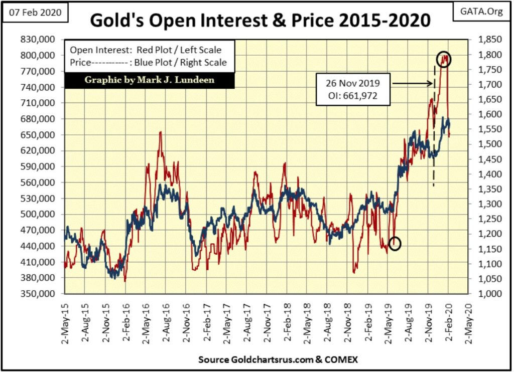
But if you’d look at open interest in the COMEX gold market (chart below) how it surged to historic levels from late November to late January, and then seeing OI collapse 154,000 contracts in the past three weeks, maybe the price of gold should have corrected – but it hasn’t, not yet anyway.
Decades ago there was an old rule-of-thumb concerning the market and investing that was popular; that about the time you understand the rules in the market, someone goes and changes them on you, and they don’t ring a bell when they do. Like the current and very popular rule that the stock market always goes up, we can be sure that someday, this someone is going to change that rule, and as always this someone, whoever that is, isn’t going to ring a bell when they do.
But the reason I’m bringing this up is because as I’m looking at the chart above, plotting gold and its COMEX open interest, it appears that someone has changed the rules at the COMEX. I’d like to follow these trends in open interest and the price of gold for another month, possibly two before I can speak with certainty, but at week’s close it appears that the bulls are going to win this battle at the COMEX.
The chart above plotting the price of gold and its COMEX open interest is worth watching. Again I’m NOT making a prediction, rather I’m reporting on a situation now developing in the gold market. And it’s exactly from a situation as we see above that gold could see a major and very significant breakout to higher levels.
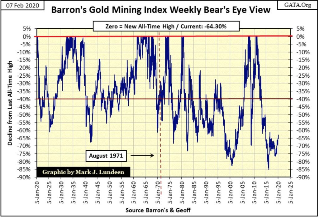
I haven’t covered the Barron’s Gold Mining Index (BGMI) for a while, so let’s look at its Bear’s Eye View (BEV) chart below.
I’ve noted August 1971 in the chart. Why do I keep doing this? Because this was an important date in market history, a date when everything changed and nothing was ever the same again. This is THE BIG PICTURE VIEW of the market that I believe everyone should have in 2020.
Look at the 100 year history of the BGMI, before and after August 1971. The BGMI didn’t see a crash in valuations during the Great Depression. Actually during the 1930s the BGMI enjoyed a bull market advance that was greater than the one the Dow Jones saw during the 1920s. But from February to October 2008 (sub-prime mortgage crash) the gold miners crashed by 70% in the BEV chart below. Odd, very odd the gold miners should see such a drastic decline during a growing panic in finance. Then like silver, the BGMI was trading at new all-time highs in less than two years from this 70% crash in its valuations.
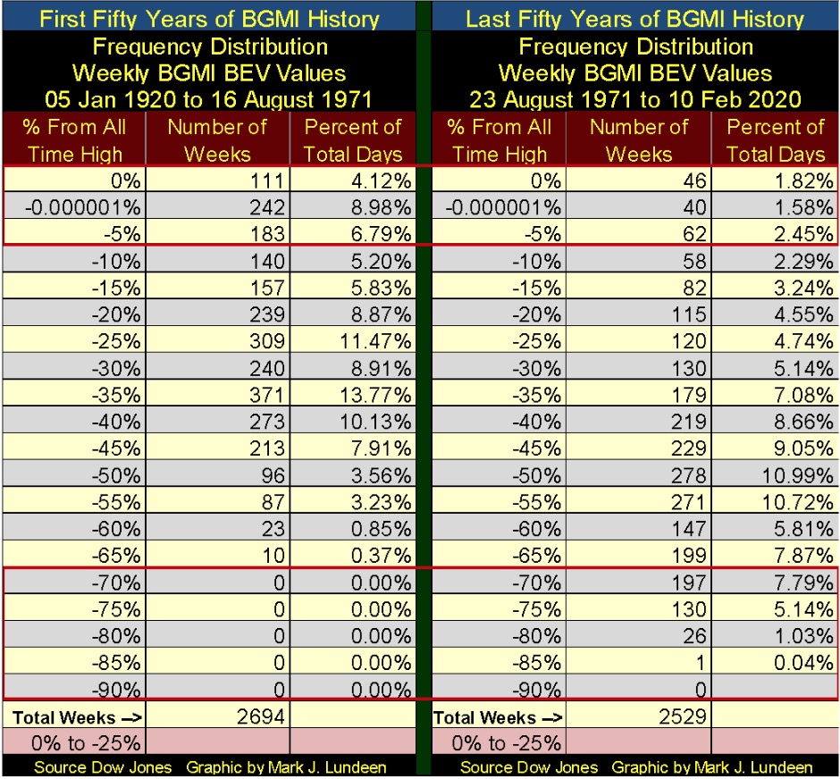
From 1920 to 1971 in the frequency distribution table below, the BGMI never saw a 70% crash in valuations. After 1971 14% of its weekly closings were actually below its BEV -70% line. This makes no sense as the growth in CinC was much greater after 1971 than before.
Now look at how often the BGMI saw a weekly close within 10% of its last all-time high: Rows 0% down to -5%. Before 1971 the BGMI saw 19.89% of its weekly closings at or within 10% of a new all-time high. After 1971 this number was reduced to 5.58% of its weekly closings.
Next is plotted the indexed values of the Dow Jones (Red Plot), the BGMI (Blue Plot) & Currency in Circulation (CinC Green Plot: paper dollars in circulation). Before 1970 the BGMI proved to be a much superior hedge against monetary inflation than was the Dow Jones. After 1995 investing in gold mining proved to be a mug’s game. Note too how the Dow Jones itself has failed to keep up with CinC inflation since 1966.
At week’s close CinC has increased by a factor of 400, while the Dow Jones itself has increased by only a factor of 260. I can’t deny that in 2020 the Dow Jones has outperformed the BGMI by a wide margin. But from 1965 to 1996 the BGMI out performed both the Dow Jones and CinC. In an era of quantitative easings and zero to negative bond yields, why has gold mining performed so poorly?
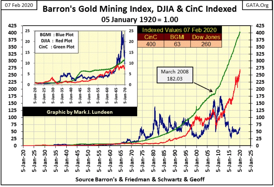
So, why at week’s close has the BGMI increased by a factor of 63 since January 1920? I think of it this way; what we’ve been seeing for decades now is yet another one of those finger prints left on the market by the “policy makers” as they impose their “policy” on the financial markets.
If you’re a believer of the statistical law of reversion to the mean: that what’s gone up must come down, or what’s been held down must one day go up, then what is displayed in the chart above is the promise of BIG gains to be had for the gold and silver miners sometime in the future.
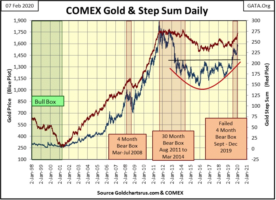
Let’s move on to gold’s step sum chart. This is one very nice chart to look at. The bowl gold formed from 2013 to last summer when it finally broke above $1,360 is an extremely strong base that can support much higher valuations in the months to come. And market sentiment (as measured by gold’s step sum) is positive, and I believe for good reasons.
All that plus seeing the bear box that began last autumn fail is a big positive for the gold market too.
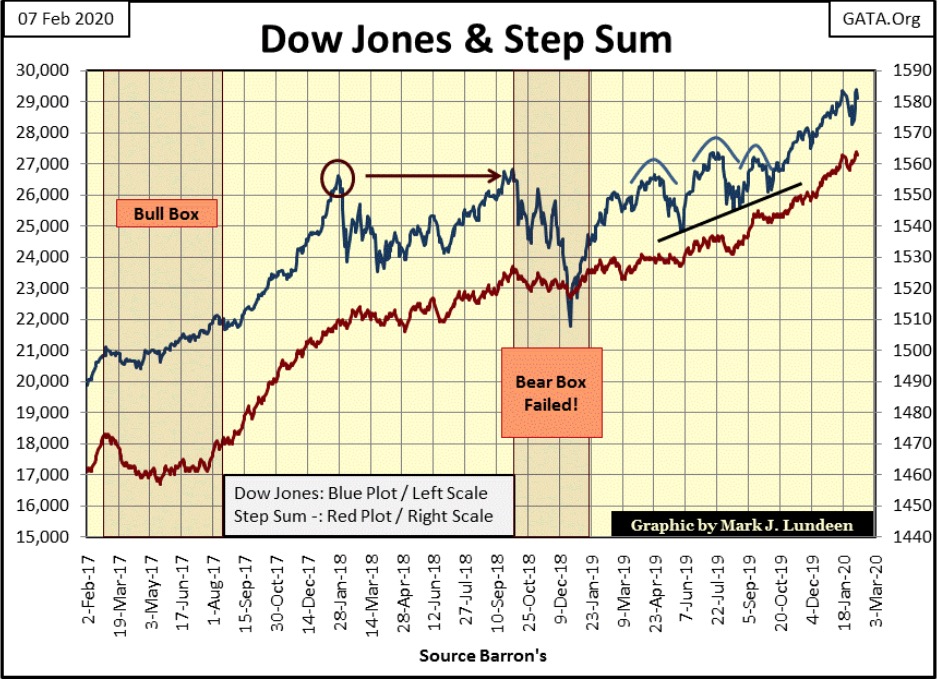
Moving on to the step sum chart for the Dow Jones below, everything is in place for further gains in the stock market. Dow Jones at 35,000 before New Year’s 2021? That may be a bit ambitious, but sure why not? The only thing I see that could spoil this party would be the Federal Reserve terminating their program of “injecting” additional “reserves” into the financial system. But you can be sure that there are others lurking somewhere yet unknown out there.
Below is gold’s and the Dow Jones’ step sum tables. Both markets saw high single digit 15counts recently (+7 & +9), which is the market’s way of telling us it is overbought and due for a correction. If you look at the daily closings for the past five trading weeks (twenty-five trading days) both these market did in fact see a mild correction off their highs of late December and early January.
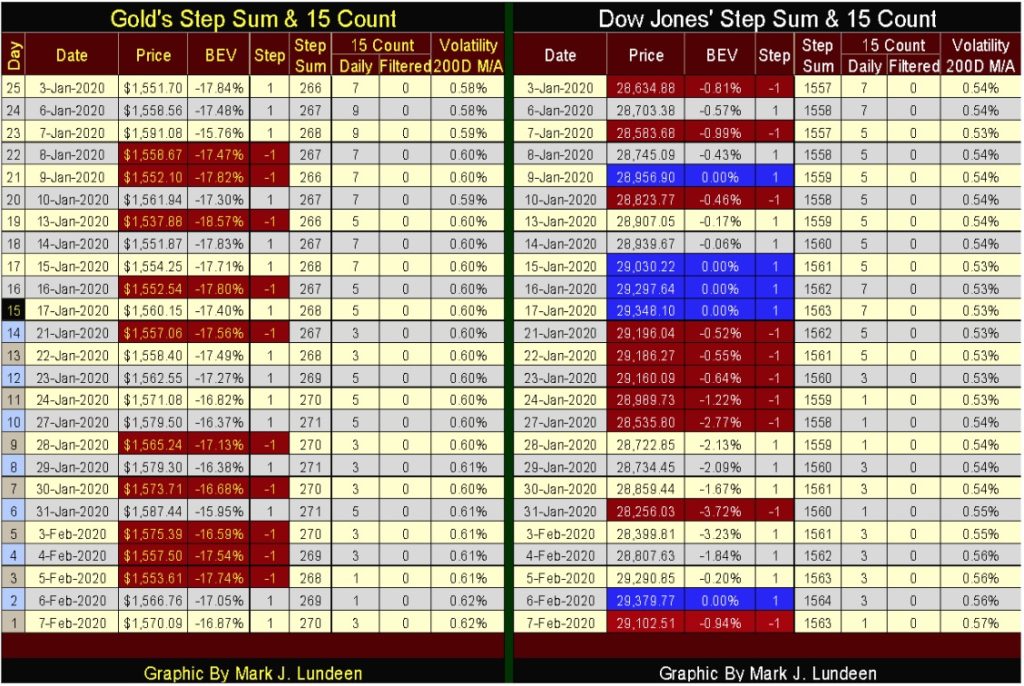
Currently the 15 counts for both markets are in the low positive values, so they are no longer overbought markets.
—
(Featured image by Ahmad Ardity from Pixabay)
DISCLAIMER: This article was written by a third party contributor and does not reflect the opinion of Born2Invest, its management, staff or its associates. Please review our disclaimer for more information.
This article may include forward-looking statements. These forward-looking statements generally are identified by the words “believe,” “project,” “estimate,” “become,” “plan,” “will,” and similar expressions. These forward-looking statements involve known and unknown risks as well as uncertainties, including those discussed in the following cautionary statements and elsewhere in this article and on this site. Although the Company may believe that its expectations are based on reasonable assumptions, the actual results that the Company may achieve may differ materially from any forward-looking statements, which reflect the opinions of the management of the Company only as of the date hereof. Additionally, please make sure to read these important disclosures.

-

 Business2 weeks ago
Understanding the Bear’s Eye View: A Clearer Perspective on Market Trends
-

 Biotech10 hours ago
Major Pharma Advances: EU Approvals, Vaccine Progress, and Breakthrough Clinical Results
-

 Cannabis1 week ago
Cannabis Stocks Show Signs of Rebound as Policy Shift Sparks Optimism
-

 Crowdfunding3 days ago
Italy Extends SME Guarantee Fund to Crowdfunding with New 2026 Framework


