Featured
Rising gold prices mean higher future bond yields
This week the Dow Jones Transports became news worthy as its earnings have collapsed 68% since mid-December 2019, with about half of these losses since early May. Gold prices have been rising for the past two decades in anticipation of massive counterparty failures in the debt market and in the massive OTC derivative market.
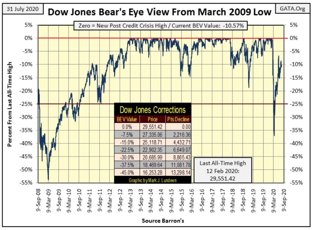
The Dow Jones continues in an annoyingly tedious manner, where it refuses to go up or down as it hugs on to its BEV -10% line for dear life in the BEV chart below. It’s been this way for over a month. So we continue watching the Dow Jones’ BEV -5% and -15% lines, to see which the Dow Jones crosses through first.
I haven’t any more to say about the Dow Jones, so let’s move on to the major markets’ BEV values for the past week, a graphic I’ve made a change to this week by including a performance table at the bottom.
This week, on Friday’s close two of my major market indexes made new BEV Zeros, or all-time highs. But seeing two out of these twenty breaking out to new all-time highs as the Dow Jones itself #11 (but was #9 last week) does nothing isn’t inspiring the bull within me to come out.
Something that does inspire bullishness in me is seeing the XAU (#19) close the week about 8% above the NASDAQ Banking index, and just short of rising above the NYSE Financial Index too. For years the XAU was at the bottom of this list, but is now making a move, and a big move at that.
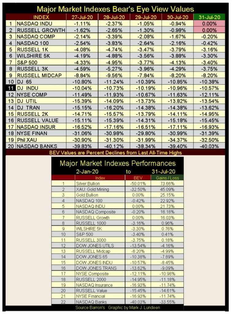
You can see my addition to this table at its bottom (above), a performance table which I’ve included gold and silver bullion, listing these indexes’ BEV values and their percentage advances and losses, in this case from the first trading day for the year; 02 January 2020.
Who came in 1st place on the list? Why the perennial loser of the investment universe – silver bullion with a sizzling advance of 73.66% so far this year. Had I used data from the market’s March 23rd low, silver would have advanced 102% in the past four months. The gold miners in the XAU came in second while gold came in third place.
We haven’t seen these three in win, place or show positions in this horse race since the first half of 2011. Also, the NASDAQ Banking index is now coming in last place, with Mr Bear clawing back over a third of its valuation since the first of the year. This is concerning, because as we discovered in 2008-09, when the banking system is at risk of failing, so too is the global payment system. And nothing does good when that goes down, except maybe gold, silver and the mining shares as was the case in 2008-09.
This week the Dow Jones Transports (#16 in table above) became news worthy as its earnings have collapsed 68% since mid-December 2019, with about half of these losses since early May.
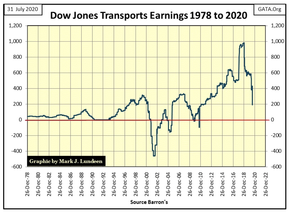
On an all-time high basis (BEV) here are the declines in corporate earnings:
- Dow Jones Industrials: 26.03%
- Dow Jones Transports: 89.17%
- Dow Jones Utilities: 21.76%
- S&P 500: 28.51%
If one believes market valuations are driven by earnings growth, which wasn’t true before Alan Greenspan became Fed Chairman in 1987, but certainly was after, seeing these declines in earnings are a concern.
Six months after the CCP virus pandemic came to North America, I believe most of the fears it inspired have been greatly overstated for those in good health. But one CCP virus-related fear that has been downplayed is its effects on the economy, as governors and majors shut down business within their jurisdictions. That can’t be good for the stock market, though I believe the full impact of the CCP virus quarantine on corporate earnings has yet to be fully realized.
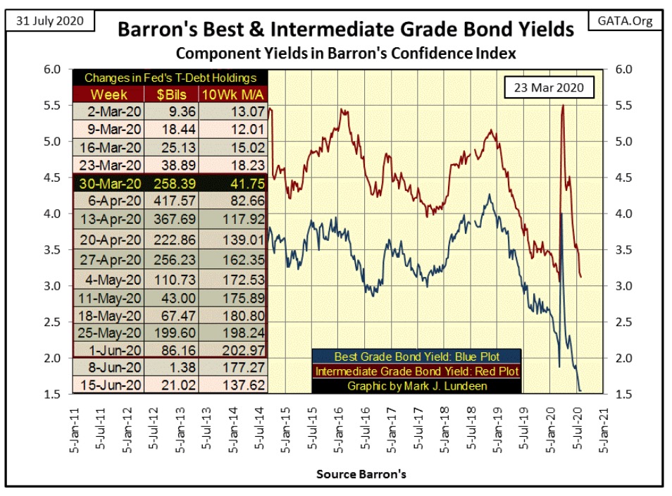
These economic factors’ effects on the financial markets may take a while to be seen as the FOMC is so heavily involved in “supporting market valuation.” Look at what the FOMC has done in the corporate bond markets below. The bond market saw a BIG spike in yields from February to March 23rd of this year as bond valuations deflated.
Since the 2009 market bottom, corporate America has been swapping company equity for debt in the bond market to fund their companies’ share buybacks and dividend programs. Rising market valuations benefitted these corporations’ officers’ options plans. In early 2020 the bond market began a panic selloff of these AAA rated junk bonds, as seen in the yield spikes in the chart below
Then on March 23rd Fed Chairman Powell announced the FOMC was beginning a program to “support” corporate bonds. Bond prices began reflating as bond yields for Barron’s Best Grade Bonds quickly collapsed from their 4% spike in late March down to 1.55% at the close of this week.
Once again the Federal Reserve has implemented its Operation Bear-Market Interruptus, but now in the corporate bond market thwarting Mr Bear’s best efforts to deflate grossly overinflated market valuations. Once again the FOMC proved to be the winner in their struggle with Mr Bear. But one day this game isn’t going to work.
Let’s look at bond yields for the past three-quarters of a century in the chart below. US Treasury Long-Bond Yields in August 1971 were around 5.90%, which were considered high at the time as twenty years earlier they were about 3.0%. US Long Bond Yields would peak ten years later in late September 1981 at 15.04%.
During this period (1952 to 1981) US T-Bonds earned the moniker of “Certificates-of-Confiscation”, as did all bonds and other fixed-income financial instruments. During these three decades buying bonds only generated capital losses for their owners. These losses were even greater when considering the rising rate of consumer-price inflation of this period, as rising bond yields were always below the then ever rising rate of consumer-price inflation.
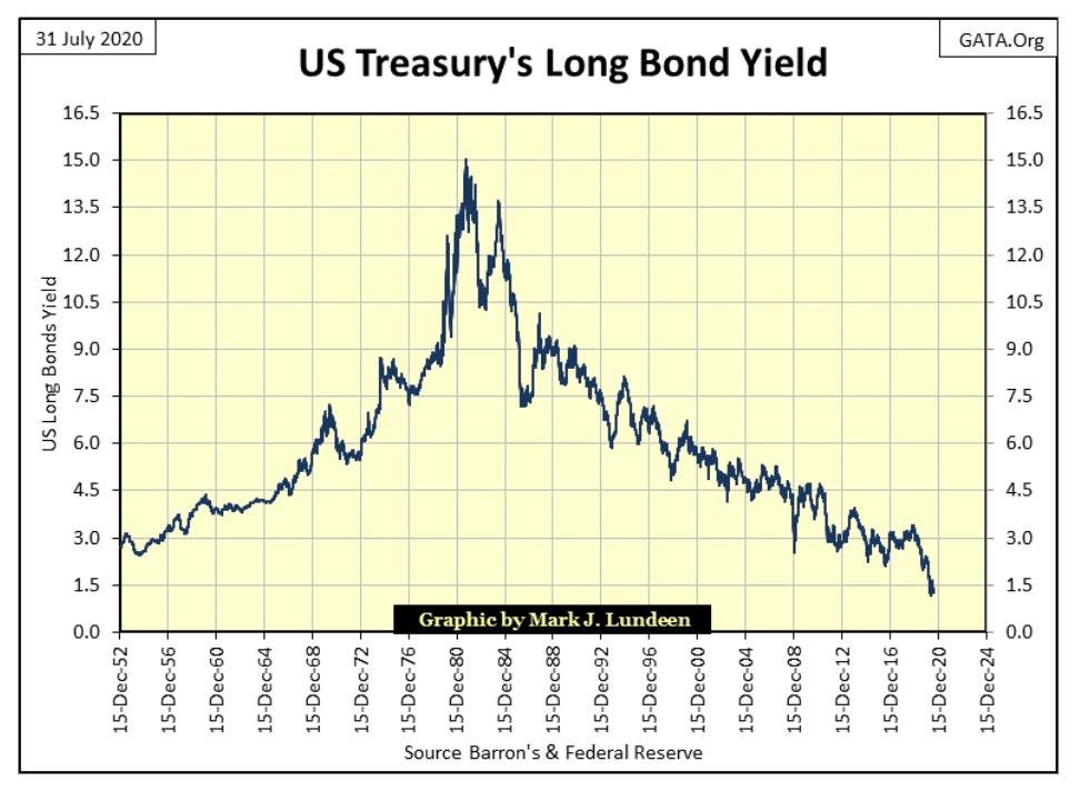
Since September 1981 bond yields have collapsed to just half of what they were in 1952. This is odd as in 1952 the US national debt was only $267 billion, while today the national debt has increased to over $26,000 billion as Treasury Long-Bond Yields have collapsed down to 1.24%.
What’s going on here? Well, it’s not market forces driving down yields and hasn’t been for a long time. Look at September 1981 in the chart below. In 1981 there was great concern by market watchers the US Treasury was crowding out capital formation by business in the debt markets. This assumes at any given moment of time, the economy has only so much money available for loans, and the concern was that the US government was hogging it all. This would certainly be true under a gold standard, but all that changed after the creation of the Federal Reserve in 1913.
Note Treasury Long-Bond Yields peaked at 15.04% as the US national debt went over $1 trillion dollars in the early 1980s. Unlike today, in 1980 a trillion of anything was a lot of something. When thinking of the US National Debt in terms of trillions, forty years ago people had second thoughts of the wisdom of lending money to the US Treasury. It took a 15% coupon on a 20-year T-bond to lure bond buyers back into the market as everyone knew the US Treasury could never pay back money lent to them.
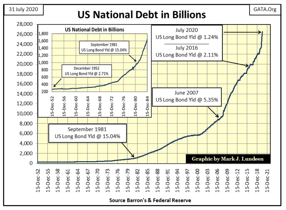
If market forces were ever allowed to operate in the US Treasury market during the Federal Reserve era, it was only up to this point. In the following four decades as long-bond yields declined to half of what they were in 1952, the US national debt increased by a factor of 26 as of this year. Bond buyers have stopped worrying whether the US Treasury can pay back the money lent to them in the T-bond market. Default risk and a profitable rate of return have become moot points in the bond markets. But why?
Today market watchers no longer concern themselves about Washington crowding out the industry in the debt market. In March of this year, as the Dow Jones crashed and corporate bond yields spiked, Chairman Powell of the Federal Reserve announced the FOMC had begun supporting valuations in the corporate bond market. In the next six weeks, he’d “inject” $1.63 trillion dollars into the financial system to get those bond valuations back up, and bond yields down, and no one freaked out when he did.
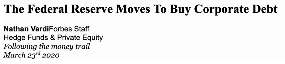
“In an unprecedented U.S. action, the Federal Reserve moved on Monday to buy corporate debt, one of several actions the U.S. central bank took in a massive start-of-the-week intervention to support credit markets amid the * dramatic economic impact of dealing with the coronavirus.”*
It figures; Forbes blamed the coronavirus for eating corporate America’s homework.
Let’s take a good look at gold (Blue Plot / Left Scale) and long-term US Treasury Long-Bond Yields (Red Plot / Right Scale) for the past fifty years (chart below).
The data is close of week. I indexed these data sets to facilitate their plotting together in the same chart. I also used a ten week moving average to smooth out the volatility to better reveal the underlying trends in these markets since the US Treasury decoupled the US Dollar from the Bretton Woods $35 gold peg in August 1971.
Gold in August 1971 traded at $42.9 an ounce, but since April 1933 US Citizens could go to jail for trading their dollars for an ounce of gold, so it wasn’t Americans buying this super cheap gold. It wasn’t until 31 December 1974 before US Citizens could legally own gold, but by then gold was trading at a then all-time high of $195.
No doubt many Americans rushed in to buy gold as 1974 turned into 1975. They would soon regret it as gold then began a 47% bear market that bottomed in August 1976. The timing of this bear market is very suspicious, as it occurred just as Americans could once again purchase gold.
This was not the last time the “policy makers” would make life miserable for anyone who dared seek safety from their pernicious “monetary policy” by purchasing gold and silver. This is exactly what happened to gold and silver from 2011 to 2015.
Below are plotted gold and long-term T-Bond yields, and the prediction for future bond yield derived from these plots is profound.
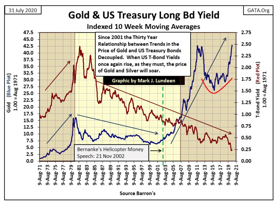
From 1971 to January 1980 gold was in a bull market as inflation flooding from the Federal Reserve flowed into consumer goods. Bond yields increased (bond prices declined) as bond buyers demanded a yield high enough to compensate them from these inflationary losses.
The gold market during this time, and up to 2001, was a leading indicator for bond yields. When the price of gold increased or decreased, bond yields soon followed as both markets were driven by consumer-price inflation. But all that changed in 2001. As gold in the 21st century began to rise, bond yields continued declining to where they are now half that of where they were in 1952.
Considering what is seen above, before and after 2001, I have to ask myself what changed? What changed is both fundamental and profound for the future of the financial markets. Try as hard as they might, since 2001 the FOMC could no longer dictate valuations in the gold market, but to our current day still have the ability to manage bond yields. But for how much longer is the question?
Gold prices have been rising for the past two decades in anticipation of massive counterparty failures in the debt market and in the massive OTC derivative market. In other words, the day is coming when the Federal Reserve will also lose its ability to manage bond yields, a day when default risk and a profitable rate of return becomes something more than a moot points in the bond markets.
It almost happened last March when the FOMC needed to come to the rescue of the corporate bond market.
Today “derivatives” aren’t much talked about, but in the late 1990s they were a hot topic for the financial mainstream media, who actually promoted them as a means to:
“DISTRIBUTE MARKET RISKS TO THOSE BEST ABLE TO BEAR THEM”
Remember that zinger on CNBC? Who comes up with these marketing slogans for the banking system? They’re worth every Federal Reserve Note paid to them!
In 1999 Congress held hearings on derivatives, with testimony by Alan Greenspan and then Treasury Secretary Robert Rubin; both promised derivatives would reduce market risk with little downside to tax payers and consumers. Well they lied, and they knew they lied. Six years later Alan Greenspan said:
“Innovation [such as interest-rate derivatives] has brought about a multitude of new products, such as subprime loans and niche credit programs for immigrants. With these advances in technology, lenders have taken advantage of credit-scoring models and other techniques for efficiently extending credit to a broader spectrum of consumers. These improvements have led to rapid growth in subprime mortgage lending . . . fostering constructive innovation that is both responsive to market demand and beneficial to consumers.”
Alan Greenspan (At the Federal Reserve System’s Fourth Annual Community Affairs Research Conference, Wash D.C. April 8, 2005
The sub-prime mortgage market imploded in 2008. This was a multi-trillion dollar market as fake as the derivatives that “hedged” quarter-million dollar mortgages written to perpetual deadbeats and the chronically unemployed.
This was when we discovered who was “best able to bear” Wall Street’s multi-trillion dollar market risks for sub-prime mortgages; the US Treasury and the Federal Reserve. And who went to jail? No one; what a farce!
Having gold advanced since 2001 (chart above) as bond yields continued to decline to the point of absurdity for the past twenty years is only a temporary situation. As valuation trends in gold were a leading indicator for bond yields before 2001, I believe gold’s now two decade advance, with gold once again trading at record highs, points to where future bond yields must trend: into double digits.
The FOMC may delay this inevitable market event, as they did last March in the corporate bond market. But in the long term, a day is coming when Mr Bear will overwhelm the “policy makers” best efforts to manage bond yields. The resulting slaughter of the innocents (retail investors) in the financial markets won’t be pretty.
So what is someone to do? I’m no one’s investment advisor, but investing in the three best performing assets since the beginning of the year, as seen above seems appropriate:
- Silver Bullion / up 73.66%
- XAU (Gold & Silver Mining) / up 45.09%
- Gold Bullion / 25.15%
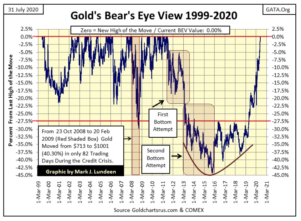
Let’s look at gold’s BEV plot below. Gold since last week has made five new all-time highs. But in the Bear’s Eye View below, each is worth only a 0.00% as any new all-time high is only a Big Fat Zero to Mr Bear. How large a percentage can he claw back from any BEV Zero is the only thing he’s interested in, and so far he hasn’t been able to claw back anything from this current series of BEV Zeros in the gold market.
However, given sufficient time Mr Bear will claw back the gold-bulls’ gains by double digit percentages. These retreats from all-time highs are called bull market corrections, and as seen in gold’s BEV chart below all bull markets have them.
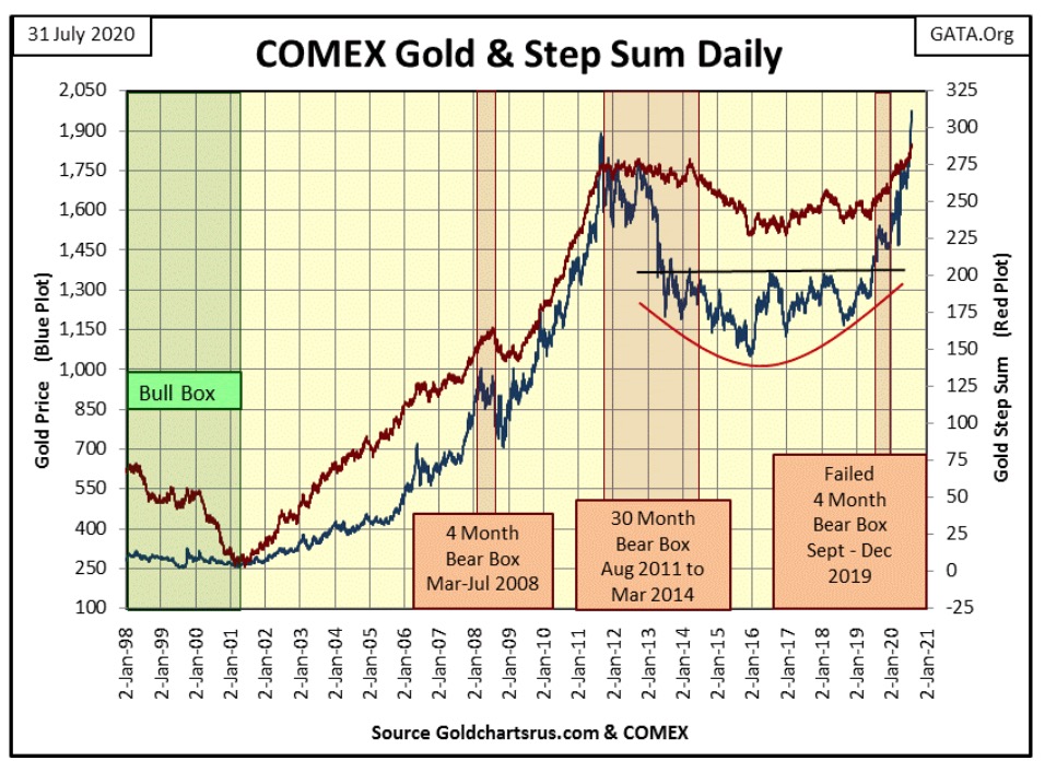
Here’s gold, plotted in dollars with its step sum. The bulls have taken gold far above its highs of August 2011 as its step sum follows faithfully along for the ride. This powerful advance off a solid base gold formed from 2013 to 2019 could go on for a good time and many hundreds of dollars from Friday’s close of $1975.
You can be sure there are people who want in, but are waiting for a pullback in the price of gold, and silver too before they buy. I’m not making a prediction here, but looking at this chart, they may have to wait until gold goes above $2200 or more before they get their pullback from this advance.
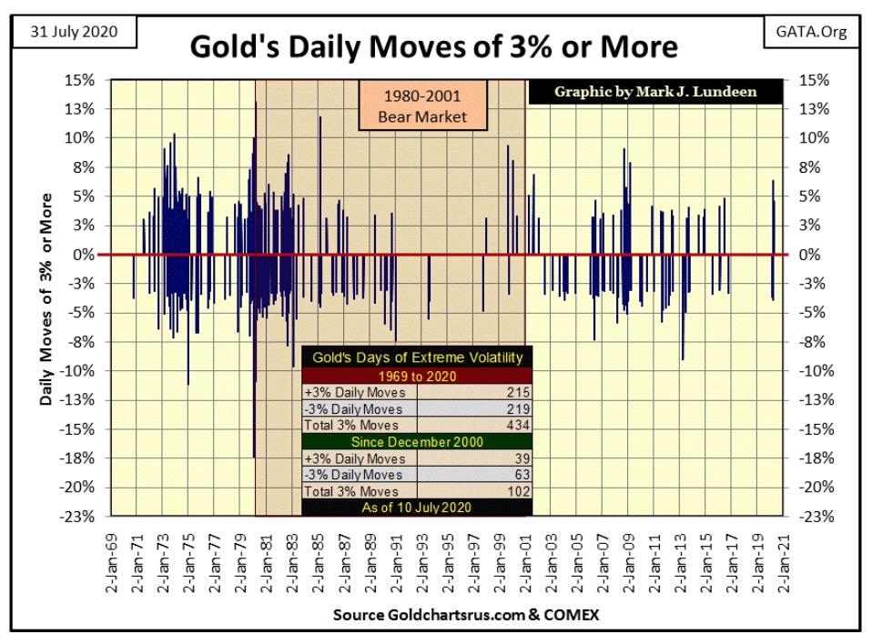
One thing we must anticipate is a BIG increase in daily volatility as this bull market in gold and silver develops. Below is a chart plotting every daily move of plus or minus 3% or more in the gold market since 1969.
Rising volatility in the stock market is always bad, but it’s different for gold and silver. When gold or the silver markets are making a BIG MOVE, bullish or bearish, daily volatility increases. So with our bullish advance now coming on-line, remember this; real cowboys and cowgirls aren’t thrown from the back of their bull market just because the price of gold fell sharply by 5% or more in a single day. They know with patience they’ll soon see a big plus 5% day.
It’s going to get crazy in the coming months and years. You don’t believe me? Look at the huge daily moves in the chart below. So far daily volatility in the gold market has been much reduced since 2000, as compared to what it was during the bull market of 1970s and early 1980s. This will change when Mr Bear begins deflating the stock, bond, and real estate markets.
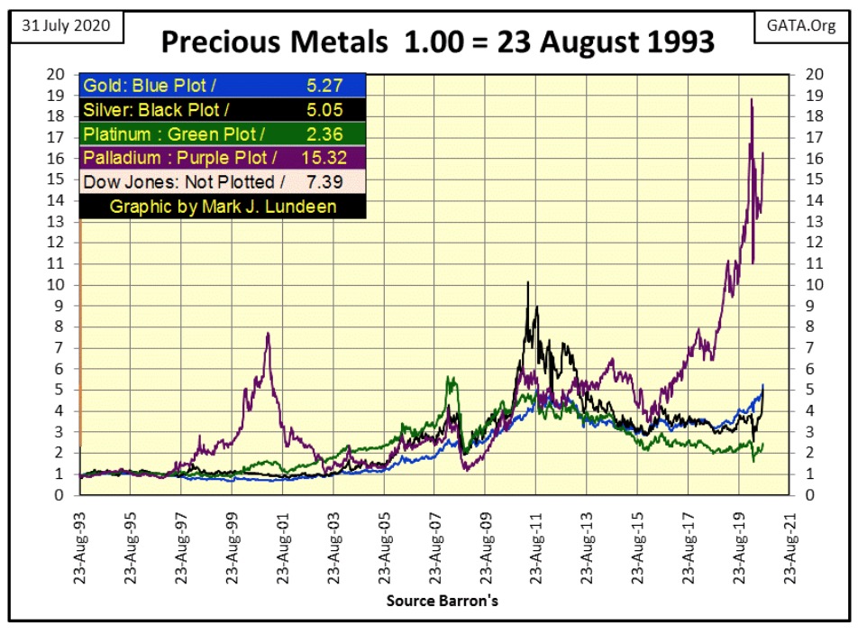
Here’s a chart plotting the indexed values for the four major precious metals. So far palladium is the clear winner. Of the four PM plotted below, which of them has a larger industrial demand element than palladium? None of them! So, you “market experts” out there talking about how silver’s industrial demand is somehow a negative factor in its current market advance – stop it.
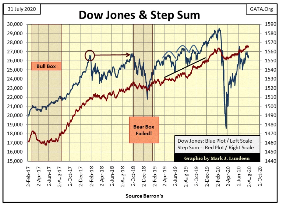
Here’s the step sum chart for the Dow Jones. As I’ve said before little has changed for the Dow for the past month.
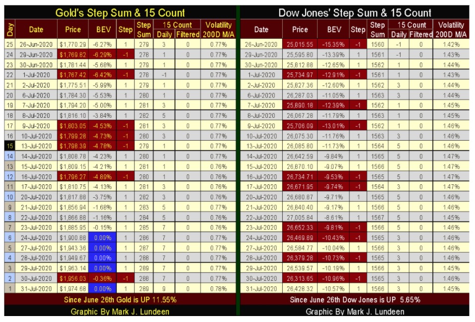
Next is gold’s step sum table. Since June 26th gold has advanced by 11.55% as its step sum has advanced by a net of ten advancing days, from 279 to 289. One negative is gold’s 15 count closed the week in an overbought condition, at a +9. But gold has been overbought since July 23rd when its 15 count increased to a +7.
Overbought markets are markets due for a correction. But gold and silver have been suppressed since 2011. As these markets are now breaking free from their controllers’ grasping hands, maybe we should not get too dogmatic and insist the old rules of overvaluation should apply here.
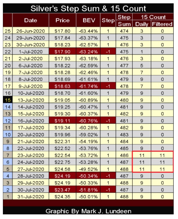
I’ve included silver’s step sum table under gold and the Dow Jones’ table below.
Silver has been overbought since July 7th, when its 15 count increased to a +7, and went double-digit (+11) three days in the past week. Normally, I’d be concerned the silver market is due for an overabundance of daily declines at this point. However, after being stuck in a cage for the past nine years, maybe we should just enjoy seeing gold and silver running around wild and free for a while.
As far as the Dow Jones goes, everything about it and the stock market bores me. This will be true until the Dow Jones either makes a run up towards a new all-time high or breaks below its BEV -15% line, or 25,118 in points. Until then, I have my fingers crossed we’ll continue enjoying advances in the precious metals markets.
—
(Featured image by markusspiske via Pixabay)
DISCLAIMER: This article was written by a third party contributor and does not reflect the opinion of Born2Invest, its management, staff or its associates. Please review our disclaimer for more information.
This article may include forward-looking statements. These forward-looking statements generally are identified by the words “believe,” “project,” “estimate,” “become,” “plan,” “will,” and similar expressions. These forward-looking statements involve known and unknown risks as well as uncertainties, including those discussed in the following cautionary statements and elsewhere in this article and on this site. Although the Company may believe that its expectations are based on reasonable assumptions, the actual results that the Company may achieve may differ materially from any forward-looking statements, which reflect the opinions of the management of the Company only as of the date hereof. Additionally, please make sure to read these important disclosures.


Temotiva Launches Crowdfunding Campaign to Advance Preventive Mental Health
Temotiva Innovación Lab has launched a crowdfunding campaign through Santander X Explorer, marking a new phase for the University of...


Fed Policy Shift Raises Concerns Over Debt and Inflation Risks
The Federal Reserve is criticized for resuming balance sheet expansion through Treasury purchases despite expectations of tighter policy under new...


AI Adoption in Italian Retail Stalls Despite Strong Experimentation
A survey on AI in Italian large-scale retail trade shows companies are increasingly adopting artificial intelligence, but only 1.4% have...


Crypto Market Stays Stable as Bitcoin and Ethereum See Mild Declines
The crypto market remained stable despite slight declines in major coins like Bitcoin and Ethereum. Bitcoin held near $64,362, while...


WNBA Removes Cannabis From Banned Substances List in New CBA
WNBA removed cannabis from its banned substances list in a new CBA running 2026–2032, aligning with NBA policy and allowing...
 |
|
 |  |
 |
|
-

 Business6 days ago
SpaceX IPO Sparks Déjà Vu as Market Risks Loom and Gold Bulls Stay Hopeful
-

 Business2 weeks ago
Dow Jones Rally Faces Uncertainty Amid NASDAQ Reversal
-

 Crowdfunding4 days ago
Wyrmgold Launches Crowdfunding Campaign for Believe in me! (please)
-

 Biotech2 weeks ago
The German Biotech Industry Faces Funding Crunch Despite Market Stability