Business
Something Doesn’t Smell Right on Wall Street
Regular readers know I’m always looking for extreme-market events to signal bad things are coming for the Dow Jones, my proxy for the broad-stock market. One of those extreme market events are Dow Jones 2% days, or days of extreme-market volatility. A 2% day happens whenever the Dow Jones moves 2%, or more, from a previous day’s close, and this 2% move could either be a positive or negative move in the Dow Jones.

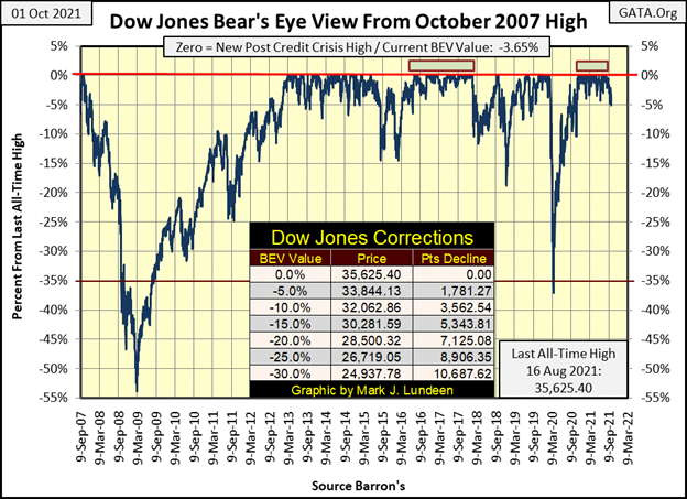
The Dow Jones since November 4th of last year, has closed at a new all-time high (0.00% = BEV Zero); forty-one times in the Bear’s Eye View chart below, or in scoring position; closing within 5% of a BEV Zero. That is until Thursday of this week when the Dow Jones closed with a BEV Value of -5.00%, which is outside of closing position for the first time in eleven months. A day later, Friday today, the Dow Jones closed with a BEV value of -3.65% which is within scoring position.
On Thursday, when the Dow Jones close outside of scoring position; the sky didn’t fall, or mountains tumble down to the sea. Still, this is a significant market event as it indicates that – SOMETHING IS CHANGING IN THE MARKET. With the financial market valuations inflated as they have NEVER been before, I don’t believe this change will be good for the bulls now running wild and free on Wall Street.
I think the big date that everything today revolves around is Monday, March 23th 2020, a day the Dow Jones had deflated by 37% from an all-time high in only 27 NYSE trading sessions. This was an absolute selling panic, and left to itself, the market would have continued going down.
The only reason this huge market event didn’t scar the living memories of everyone is, because on Friday, March 20th, Fed Chairman Powell announced the FOMC, for the first time in history, begin “monetizing” corporate bonds, because — well Chairman Powell really didn’t say why. Maybe something about adding “liquidity” to the corporate bond market. But I know why; the corporate bond market in March 2020, like the stock market, was also in a free fall.
A month later the FOMC had “injected” over a trillion dollars of “liquidity” into the financial system, and the horrors of March 2020 were soon seen as through a pleasant haze. By late April, it was as if March never happened as bulls once again ran wild and free on Wall Street.
Am I overstating these events of a year and a half ago? Let’s examine the BEV chart below and see.
The Sub-Prime Mortgage Bear Market’s 54% crash, seen on the left side of the BEV chart below, was the second deepest percentage decline for the Dow Jones since 1885. Only the Great Depression’s 89% crash saw a greater percentage decline. For the Sub-Prime Mortgage Crash, it took a full year (12 months / 52 weeks) before the Dow Jones deflated 35%. In March 2020, the Dow Jones took only 27 NYSE trading sessions to accomplish the same – Jeeze Louise!
What about the 1929 to 1932 Great Depression market crash? It took 48 NYSE trading sessions, almost twice as long before the Dow Jones deflated 35% from its September 3rd 1929 last all-time high.
For the record, how overvalued is today’s market, or was it before the March 2020 flash crash? Here’s a table listing the top market caps for October 1975 and January 2020. The market cap for Verizon (#20 Left Side) is greater than all the top twenty largest market caps for 1975. And note the date for the data seen on the left side; January 2020. If the market deflated 37% in only 27 NYSE trading sessions two months later in March 2020, maybe it was because the top three public corporations on the list had a combined market cap of over $3.4 trillion dollars.
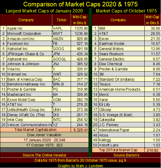
I haven’t updated the market cap data seen above. It takes time, time I’ve used for other things. Maybe I will in the weeks to come. But the question in everyone’s mind, including mine, are market caps for today larger than where they were in January 2020? I think they are.
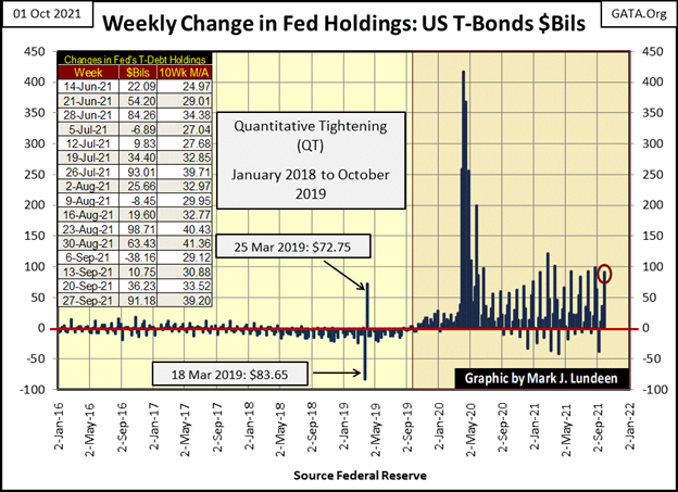
Below is a chart plotting the FOMC’s weekly “liquidity injections” since 2016. You can see the FOMC’s reaction to the panic of March 2020, and its subsequent “monetary policy” following the panic of March 2020.
Are the top 20 market caps for October 2021 larger than they were in January 2020? I don’t know, but after seeing the “liquidity injected” into the financial system since February 2020 in the chart below, they should be.
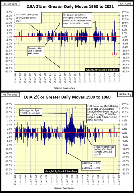
Regular readers know I’m always looking for extreme-market events to signal bad things are coming for the Dow Jones, my proxy for the broad-stock market. One of those extreme market events are Dow Jones 2% days, or days of extreme-market volatility.
A 2% day happens whenever the Dow Jones moves 2%, or more, from a previous day’s close, and this 2% move could either be a positive or negative move in the Dow Jones. If the percentage move is greater than 2%, or even 10%, I call such a day a Dow Jones’ 2% day, as the 2% is a threshold value, which if exceeded denotes a day of extreme volatility.
Below is a frequency distribution table for the daily percentage moves of 32,899 daily closings for the Dow Jones since January 1900. I’ve identified those rows where the Dow Jones has produced a day of positive or negative extreme volatility, and these extreme days are rare market events.
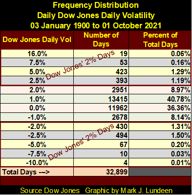
Days of extreme market volatility are not just rare market events, but rare market events that occur almost exclusively during big bear markets, as seen in the chart below plotting the data used in the frequency table above. Bear markets below can be identified by clusters of Dow Jones 2% days. The January 1973 to December 1974, 45% Dow Jones bear market below can be fixed in the chart by a cluster of extreme market volatility, as can the;
- October 1987 Flash Crash,
- 2000 to 2002 High-Tech Bust,
- October 2007 to March 2009 Sub-Prime Mortgage Bust,
- March 2020 37% Flash Crash.
Ignoring the October 1987 Flash Crash, as it was a one-time computer programing error, examine the other post 1960 market declines listed above in terms of longevity and intensity of their extreme volatility. The March 2020, 37% market decline was the smallest percentage decline for the Dow Jones listed above, the duration of its cluster seen below was from January to November 2020, not even a full year. But this market decline saw extremes in daily volatility not seen since the Great Depression. In my opinion, had the FOMC not implement its Not QE#4, the 37% flash crash of March 2020 would have developed into another Great Depression market event.
Look at the volatility for 16 March 2020 (Red Circle); the Dow Jones deflated 12.93% from one day to the next. This exceeds the largest down day the Dow Jones saw during its September 1929 to July 1932, Great Depression 89% market crash; a -12.87% decline on 28 October 1929.
I’m a Christian, a servant of my Lord Jesus. Someone who today thinks and speaks only in terms as pure as the driven snow. But I’m also a retired fleet-sailor, someone who served on six of Uncle Sam’s Man-of-Wars; who formerly talked in terms, and about subjects that would have shocked my 4th-grade teacher; Sister Mary Clair. Oh – I was really bad when I sailed the 7 Seas. And what’s worse – I enjoyed it too. But those were the bad old days, everything is different now and I’m happier for it.
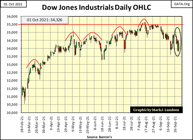
However, I have to admit that salty talk sometimes does have value when describing reality, such as why the Dow Jones since May of this year (chart below) has found it so difficult to get above 35,000, and then stay above 35,000 for the past five months? Maybe because the idiot savants at the FOMC have finally discovered that even they, with all their powers of dictating “monetary policy”, can stack shit only so high before it starts to fall down.
Possibly the best way to describe the next phase of the market is to keep it simple; look out below, it’s going to get stinky.
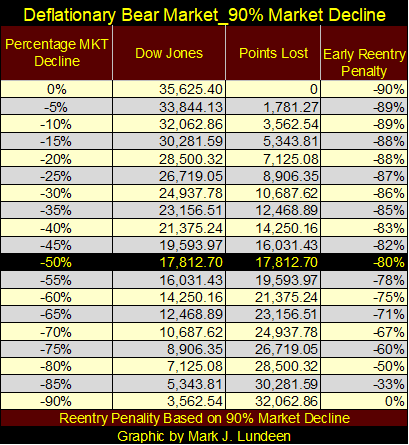
How stinky could it get? I’m anticipating another Great Depression market event, with the Dow Jones deflating by 90%; possibly more.
Below is a table listing the steps of a 90% bear market for the Dow Jones from its last all-time high of 35,625 in steps of 5%. I’m not predicting this. I’m only acknowledging that after the huge inflation “injected” into the financial system’s market valuations for the past three decades, a massive deflationary event is something that can’t be rejected out of hand.
The mathematics of a massive deflationary bear market are quite grizzly. Should the Dow Jones’ next bear market actually see a 90% bear market bottom, don’t be clever and begin buying when the Dow Jones has deflated by its first 50%. That’s because invested funds at the 50% level are still exposed to an 80% market decline in a 90% bear market, as seen below.
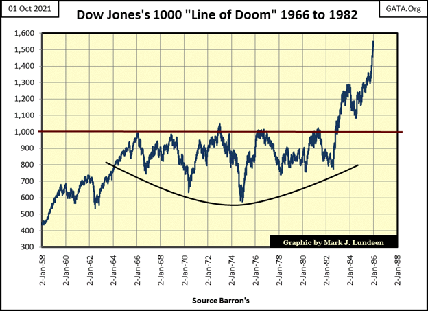
FYI: The Great Depression market crash wiped out all the Dow Jones gains from 1914 to 1929. Should Mr Bear take back all the Dow Jones gains since August 1982, when this bull market actually began, Mr Bear and his clean-up crew will deflate the Dow to at least 1,000.
In October 2021, it’s hard to believe that for the best part of two decades (1966 to 1982), a 1,000 Dow Jones was an impossible dream, as seen below when 1,000 on the Dow Jones was a signal that one should sell and short the market.
In October 2021, it’s hard believing Mr Bear and his clean-up crew are going to give their best effort sometime in the future to make 1,000 Dow Jones once again a market reality. Are they going to succeed? I don’t know, but like I said, during the Great Depression crash. Mr Bear and his wrecking crew wiped out all the gains the Dow Jones saw from 1914 to 1929, so I wouldn’t bet against it either.
So much for that. Let’s look at my Major Market Indexes BEV Value table below. This is the third week this table has seen no new BEV Zeros, new all-time highs. On Friday there were twelve indexes that closed in scoring position (within 5% of their last all-time high). But on Thursday there were only six that closed in scoring position, and the Dow Jones (#5) wasn’t one of them, closing Thursday with a BEV of -5.00%.
It’s been a year and a half since the market lows of March 2020. It would be foolish to believe the next year and a half will be like the last.
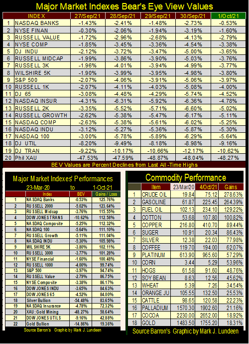
One thing working against the bulls is commodity prices (upper table / right side) are being inflated by the FOMC’s “injections of liquidity.” Eventually, inflation in consumer prices will drive bond yields higher (bond prices lower). Should the bond market begin to deflate, or maybe I should say WHEN valuations in the bond market begin to deflate, so will valuations in the stock market.
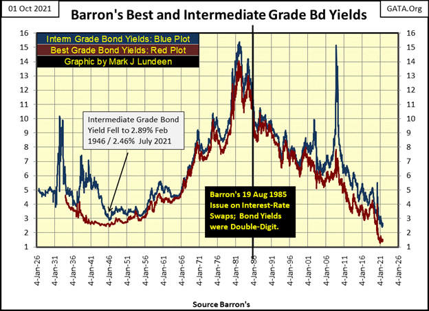
Looking at corporate bond yields for the past 100 years (chart below), it’s obvious bond yields bottomed in the past year, if for no other reason the idiot savants at the FOMC can stack shit only so high in the bond market too.
The bond market’s selling panic of March 2020 is evident below; the March 2020 yield spike in corporate bonds. In October 2021, I have many anticipations concerning the financial markets. Another one is seeing another yield spike in corporate bonds sometime in the foreseeable future. And like in March 2020, such a yield spike will negatively impact the Dow Jones.
What are we waiting for? Maybe for China’s Evergrande to finally default on their $300 billion in financial obligations? If not that, it will be something else. In October 2021, there are so many tens-of-trillions of dollars, yen, yuan, pounds or euros, owed by so many to so few that never will, that never can be paid back. And when the big default happens, can the idiots at the FOMC put Humpty Dumpty back on his wall a second time? Maybe not, but they’ll give it their all trying.
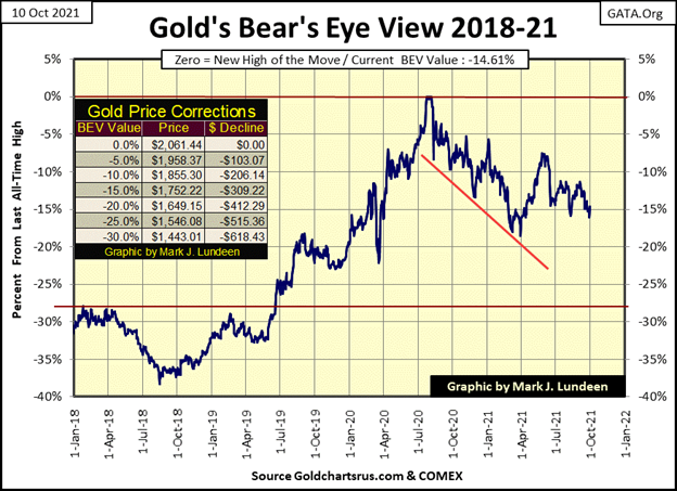
Time to move on to gold’s BEV chart. Since September 22nd, gold has closed below its BEV -15% line for four daily closings. However, gold doesn’t like being below this key level in the gold market, and that has been true since early April of this year.
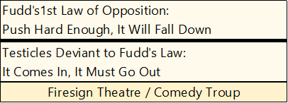
I’m looking at the action for the gold market since April above, and something from my youth came to mind: Fudd’s 1st Law of Opposition, and its Testicles Deviant.
I believe the market action for gold since April, has confirmed Fudd’s 1st law (above) while universal, is not absolute in all domains of time and space, such as during trading hours at the COMEX futures market for gold. For six months, since early April, COMEX goons have pushed plenty hard on the price of gold. Yet gold has not fallen below, and then stayed below its BEV -15% line above.
Does this mean Fudd was clueless about how the real-world worked? So, it seems at the COMEX since April. And then maybe not, as Fudd’s Deviant Testicles may yet stand the test of time; when the “liquidity injected” into the financial market by the FOMC idiots comes rushing out of it, and begins flowing into precious metal valuations.
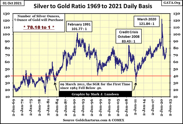
Here’s the Silver to Gold Ratio (SGR), or how many ounces of silver one ounce of gold can buy. Declines in the SGR are precious metals bullish, advances in the SGR are precious metals bearish. And since late February when the SGR was at 64.41, it increased to 80.32 on Wednesday this week, before closing the week at 78.18.
What should we make of this? I can’t really say. But I’m feeling optimistic, and I’m very willing to believe last Wednesday’s SGR of 80.32 is a top in the current correction in the gold and silver markets. Should the SGR continue declining in the weeks and months to come, it will be very good for the bulls in the gold and silver markets.
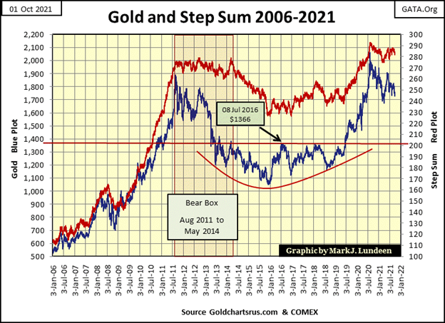
Next is gold’s step sum chart. Nothing new to say about it, so I’ll repeat what I’ve said for many months now; gold is currently in the final phases of a massive ten-year cup with a handle chart formation. This chart is extremely bullish. We continue to wait for gold to break above its last all-time high of August 2020, possibly in a violent fashion.
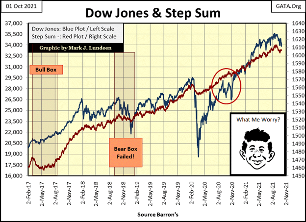
My last chart for this week is the step sum chart for the Dow Jones. A year ago (red circle) the Dow Jones had a three-month correction as its step sum continued rising. I didn’t note it in the chart, but in step-sum analysis that is an example of a failed bear box.
Compare that to what’s happening now, a year later; from their highs of August 2021, the Dow Jones’ valuation (Market Reality) and its step sum (Market Expectation) have both turned downward. This could be a correction in a continuing market advance for the Dow Jones. And then it could be something else, something like the start of a big bear market.
If what the Epic Economist (below) has to say about the global supply chain is true, seeing the Dow Jones decline by 90% may prove to be optimistic.

As with so many other problems the economy is now struggling with; problems with global logistics are self-inflicted, the consequences of having politicians and bureaucrats do what they are trained to do; destroy everything they touch.
We’ll know more in the weeks and months to come.
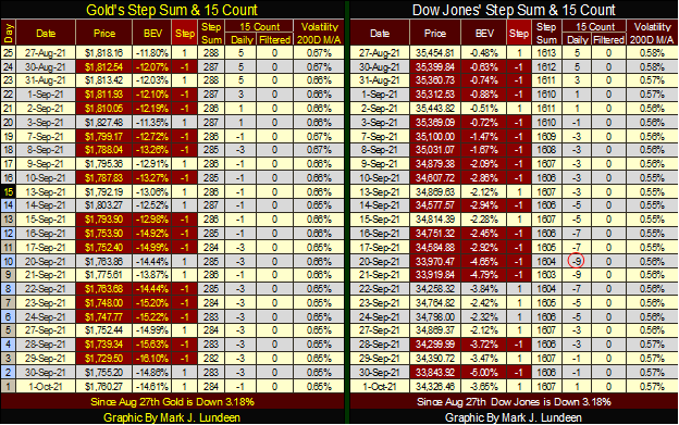
I’m not commentating on gold’s and the Dow Jones’ step sum tables below, as not much has changed from last week.
__
(Featured image by Yiorgos Ntrahas via Unsplash)
DISCLAIMER: This article was written by a third party contributor and does not reflect the opinion of Born2Invest, its management, staff or its associates. Please review our disclaimer for more information.
This article may include forward-looking statements. These forward-looking statements generally are identified by the words “believe,” “project,” “estimate,” “become,” “plan,” “will,” and similar expressions. These forward-looking statements involve known and unknown risks as well as uncertainties, including those discussed in the following cautionary statements and elsewhere in this article and on this site. Although the Company may believe that its expectations are based on reasonable assumptions, the actual results that the Company may achieve may differ materially from any forward-looking statements, which reflect the opinions of the management of the Company only as of the date hereof. Additionally, please make sure to read these important disclosures.


PayPal’s Slowdown: From Fintech Leader to Low-Growth Dividend Stock
PayPal has shifted from fintech leader to low-growth, value-style stock, losing over 25% in market value and trading at a...

Tilray (TLRY) Falls as Bearish Momentum Persists Despite Marketing Push
Tilray (TLRY) fell 3.32% to $4.44, remaining below key moving averages and signaling continued bearish pressure. Despite a £1 million...


ESG Gap Persists as Firms Struggle to Link Sustainability to Financial Value
KPMG’s Global Survey shows a major gap between ESG awareness and financial integration. While 72% of managers understand sustainability strategies,...


Bitcoin and Ethereum Slide as Market Pressure Builds Amid Strategy Concerns and Layer 2 Disruptions
Bitcoin fell below $60,000 with heavy ETF outflows, pressured by concerns over Strategy’s finances and its STRC stock decline. Ethereum...


AI Venture Builder Launches €600K Crowdfunding Round to Scale Secure AI Solutions
AI Venture Builder, an Italian-British firm developing AI applications and vertical startups, returns to CrowdFundMe with a equity campaign. After...
 |
|
 |  |
 |
|
-

 Biotech4 days ago
Galicia Launches €805M Biotechnology Strategy to Drive Innovation and Competitiveness (2026–2030)
-

 Crypto2 weeks ago
Bitcoin and Ethereum Markets Steady as Strategy and Bitmine Expand Holdings Amid World Cup Crypto Activity
-
 Impact Investing1 day ago
ESG Gap Persists as Firms Struggle to Link Sustainability to Financial Value
-

 Crowdfunding1 week ago
Temotiva Launches Crowdfunding Campaign to Advance Preventive Mental Health