Markets
Stagflation Is Good for Commodities but Bad for the Stock Market
Stagflation. A word we really haven’t heard much of since the 1970’s is becoming a real potential. This week’s GDP reports coupled with inflation reports known as PCE saw GDP reported lower than expected and inflation reported higher than expected. Stagflation – low even negative growth accompanied by higher inflation and potentially rising unemployment but not necessarily.
“At its deepest level, stagflation is one of the most difficult economic environments for central banks and policymakers to combat, in part because definitions are imprecise. Most experts agree that it includes high inflation combined with low economic growth. And typically, stagflation includes high unemployment, though not always.” —an economist, 2022
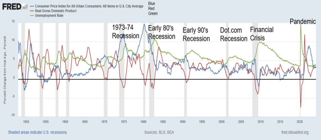
CPI, Real GDP, Unemployment 1948–2024
Could stagflation return? There are signs that it could. As described above, stagflation is a condition where the inflation rate is high and could be increasing, economic growth is slowing, and unemployment is rising, although that’s not always the case.
Stagflation didn’t become a term until the latter part of the 1960s. It became a household word in the 1970s. A British MP, Iain McLeod, of the Conservative Party and later Chancellor of the Exchequer coined it in 1965 while complaining about the U.K.’s propensity for inflation on one hand and low, stagnant, or even negative economic growth on the other. One thing that economists, including John Maynard Keynes, agreed on was that a period of inflation accompanied by recession was hard to eradicate. Keynes didn’t call it stagflation, but what he was describing was stagflation.
Then came the 1970s. One could actually trace its roots to the late 1960s with the Six-Day War in 1967 between Israel and Arab countries that resulted in Israel seizing the Sinai right up to the Suez Canal. Egypt shut down the canal, resulting in shipments needing to be re-routed around the Cape of Good Hope in Africa. Oil prices crept higher. Then came the 1970s shocks. Egypt tried to take back the Sinai, triggering the Yom Kippur War of 1973. That was followed by the Arab oil embargo after President Richard Nixon pushed through significant funding for Israel. Oil prices went from $3.50 to over $10.
Earlier, in August 1971, Richard Nixon had taken the world off the gold standard, signaling the beginning of the end for Bretton Woods. Currencies began to float rather than pegging to the U.S. dollar which in turn was pegged to gold. As a result, gold and oil became volatile. Currencies also became volatile and money supply started to surge.
M2 surged 73% from 1969 to 1975, the consumer price index (CPI) was up 48%, while Fed funds peaked at 12.92% in July 1974. In 1967, Fed funds was 3.80%, surging after a bout of inflation that came after the Six-Day War and peaking at 9.15% by 1969. It fell back to 3.30% by 1972 before surging once again to 12.92%. Gold prices, after the end of the gold standard in August 1971, went from $42 to $195 by the end of 1975, an increase of 364%.
However, that wasn’t the end of it. The Iranian hostage crisis and Russian invasion of Afghanistan sparked oil prices to surge again. They peaked near $40 in July 1980. M2 surged another 50% from 1975 to 1980, gold exploded upwards after a corrective period in 1976, peaking at $873 in January 1980 a gain of almost 800%, while Fed funds peaked near 20%, also in 1980. Unemployment rose, peaking at over 9% before coming down after the 1973–1975 recession. It then surged again into the early 1980s recession, peaking at 10.8% in 1982. Unemployment is a lagging indicator, tending to peak after the others peak. It is also telling that the 10-year U.S. treasury note peaked at 15.8% in 1981, almost tripling where it was in 1969.
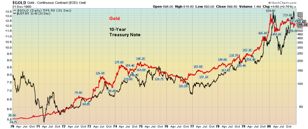
GDP and the stock market stagnated. GDP did grow, up 216% 1969–1981 but real GDP grew only about 40%; inflation rose 150%; the S&P 500 gained only 14.5% in the 1970s on a nominal basis, while on an inflation-adjusted basis it lost 42%. That sums up the stagflation of the 1970s. GDP stagnated, inflation rose, unemployment rose, oil prices rose, gold soared. Bond yields also soared during the period with the 10-year treasury note yield going from a 5.38% low in 1971 to a high of 13.65% in 1980. Our chart shows how bond yields and gold prices largely followed each other during that period.
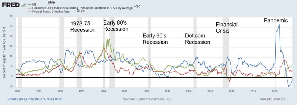
M2, CPI, Fed Funds 1960–2024
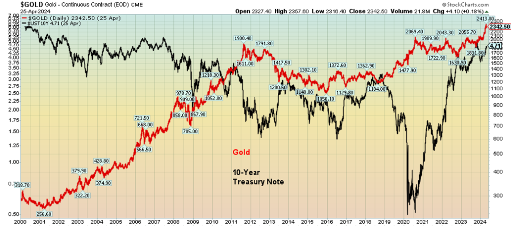
Gold and 10-Year Treasury Note Yield 1970–1980
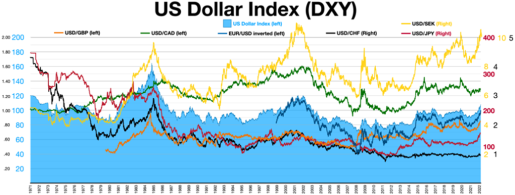
Currencies also became more volatile in the 1970s. The end of the gold standard brought an end to Bretton Woods and fixed exchange rates to the U.S. dollar which in turn was pegged to gold at $35/ounce. By the end of the 1960s, with the Vietnam War surging, the U.S. dollar became overvalued. When Bretton Woods ended, it also signaled the start of the era of floating exchange rates, with the U.S. dollar down relentlessly during the 1970s. The US$ Index (or its equivalent at the time) was at 109 in 1973. By 1979 it had fallen to 84.
Fast forward to today. The pandemic, supply disruptions, droughts, floods, severe weather, wars (Russia/Ukraine, Israel/Hamas or Iran?) have played havoc with inflation. Inflation peaked at 9.1%. It’s now at 3.5%, but that’s up from the previous month’s 3.2%. Is inflation about to rise again?
Unemployment (U3) hit a low of 3.4%. It’s now 3.8% and showing signs of rising. GDP plunged during the pandemic, hitting a low of negative 28% in Q2 2020. Then it shot up to plus 34.8% in Q3 2020. It’s last at 1.6% Q1 2024 and has been steadily falling now for a year on a quarterly basis. As a result, persistent inflation is threatening to rise, unemployment is creeping higher (it tends to peak after the recession), and GDP is creeping lower. However, it’s not a recession—yet. The huge inverted yield curve has been pointing to the inevitability of one at some point. The inverted yield curve signal has never been wrong.
Fed funds, which hit a low of 0% during the pandemic, are now 5.5%; the 10-year U.S. treasury note that also hit a low during the pandemic of 0.54% is now 4.71% and climbing as U.S. treasuries auctions are slow with diminished bidding and countries such as China shedding their holdings of U.S. treasuries; gold that hit a low under $1,500 during the pandemic is now near record highs, over $2,300; M2 shot up $5.4 trillion since the pandemic while U.S. federal debt is up $15.2 trillion (GDP is up only $8.0 trillion).
The annual budget deficit is currently $3.6 trillion, about what it hit at the depths of the pandemic. It has been rising and annual interest payments are now over $1 trillion. Oil prices, that fell sharply during the pandemic, hitting a mind-blowing low of $6.50, are now over $82, up almost 1,200%. Wars could push oil prices over $100.
Thanks to the massive liquidity injections (QE or quantitative easing), coupled with ultra-low interest rates, the stock market soared after the pandemic. The S&P 500 is up 130% from the lows of the pandemic, but it is now down roughly 4% from the highs. That’s not much, but a top may be in. However, we have no confirmation.
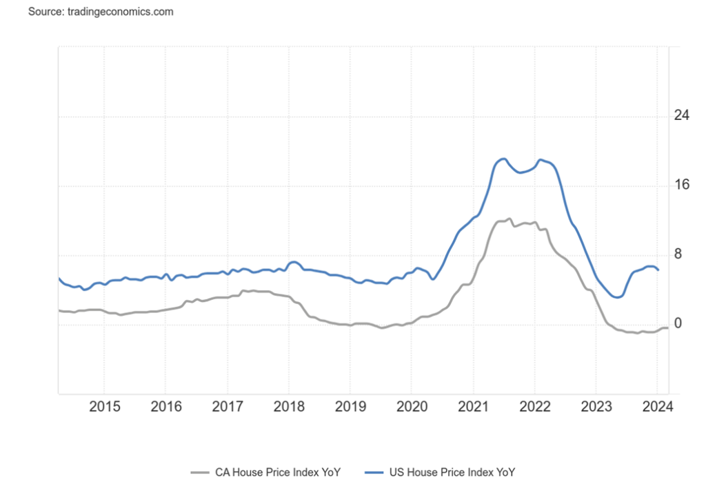
Housing prices also soared, pushed by plenty of liquidity and ultra-low interest rates. Canada’s housing index soared 21% from March 2020 to August 2022 before leveling off and declining slightly. The U.S. housing index leaped over 38% in the same period and, following a pause, it’s still rising. In all instances, today’s housing indices are well above peaks in 2006 before the sub-prime mortgage collapse and financial crisis of 2008.
U.S. New House Price Index, Canada New Housing Price Index % Change Y-O-Y 2014–2024
The U.S. federal debt is expected to hit over $34 trillion by year end. Running huge deficits while GDP is slowing cannot go on forever. A 10-year U.S. treasury yield over 5% is now within sight. And, as we saw in the 1970s, gold and the 10-year seem to go up and down together, although the correlation is not quite as clear as it was in the 1970s. However, our period of stagflation may just be getting underway.
Gold and 10-Year Treasury Note Yield 2000–2024
High interest rates persist and many economists are cutting their forecasts for a rate cut in 2024 to possibly only one in Q4. Persistent inflation would put the Fed on pause and could even put pressure on further hikes. Consumers, business, U.S. states, and municipalities are all feeling the impact of higher interest rates. It is particularly true in the commercial real estate market where there are many empty or partially occupied buildings as vacancy rates soared following the pandemic. Numerous regional banks are also on watch lists. In 2023, five regional banks fell, including the second, third, and fourth largest regional banks in the U.S.
A number of countries are having problems. A sovereign debt collapse remains a possibility. A large collapse that shakes the markets is not impossible. Debt downgrades have been taking place. There is also fear of expansion of the wars (Russia/Ukraine, Israel/Hamas). Despite a current lull, the pause is not expected to last long and could soon involve other players including NATO and the West. A world war? WW3?
It’s not over, with the worst potentially yet to come. Falling growth, rising interest rates, inflation staying sticky, unemployment creeping higher—the potential for stagflation is rising. But if the past is any guide, gold could soar.
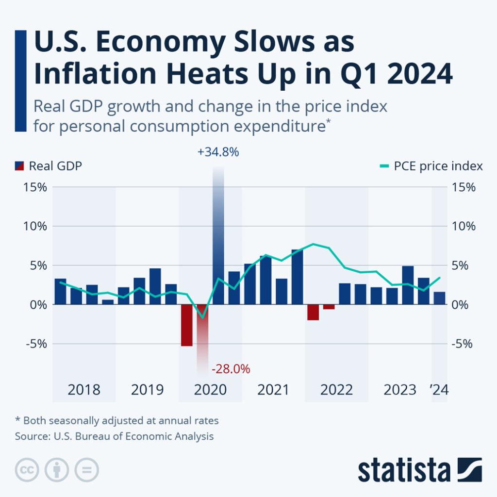
Chart of the Week
Net Savings as a % of Gross National Income, Personal Savings Rate
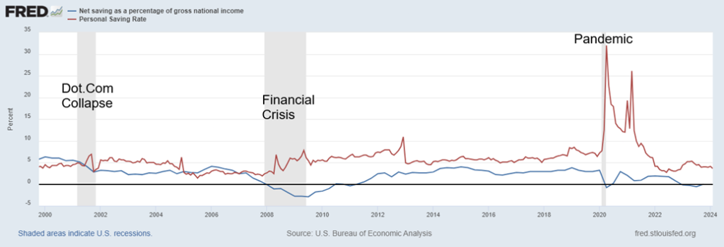
We were struck by the fact that net savings, as a percentage of gross national income and personal savings, were on a downward trajectory. Net savings have turned negative while personal savings are at a low ebb. With ongoing U.S. budget deficits exceeding private and foreign savings, it creates what is known as negative net national savings (NNNS). It is a big problem according to Lacy Hunt, economist with Hoisington Investment Management. (www.hoisington.com)
Mr. Hunt’s two recent articles from Q4 2023 and Q1 2024 outline this problem, along with a decline in global liquidity. The articles, which are somewhat technical, are here:
Note: the articles were originally seen at Mauldin Economics (www.mauldineconomics.com), from Senior Economic Analyst Patrick Watson
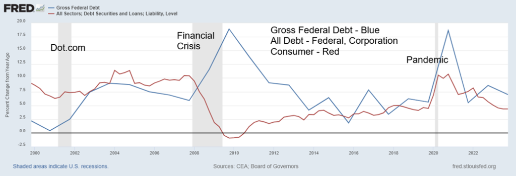
What they say is that, while debt can be a positive contributor to growth, it also becomes a drag on the economy as more debt is added. Diminishing returns is what they call it. Another dollar of debt does not equal another dollar of GDP. GDP growth is below debt growth. Since 2000, it has taken the U.S. $1.60 of debt to purchase $1 of GDP. When government debt exceeds 80%–90% of GDP, it impedes and slows economic growth.
U.S. government debt is currently at 122% of GDP. No, it’s not the highest in the world—that honour belongs to Japan at 264%. No wonder the Japanese economy has seen nothing but extremely low growth, including periods of negative growth, for over 30 years. Japan has also had ultra-low interest rates, including negative rates. However, that is starting to change as inflation creeps into the Japanese economy.
If one combines the debt with negative savings or at least a very low savings rate, then it becomes a drag on the economy. Consumers and corporations are also burdened with debt. The U.S. has the largest debt in the world by far (government – federal, state, municipal, corporations, consumer – mortgages, credit), representing over 30% of all global debt.
Real 10-Year Interest Rate, CPI % Y-O-Y, 10-Year Interest Rate, GDP % Y-O-Y 2000–2024
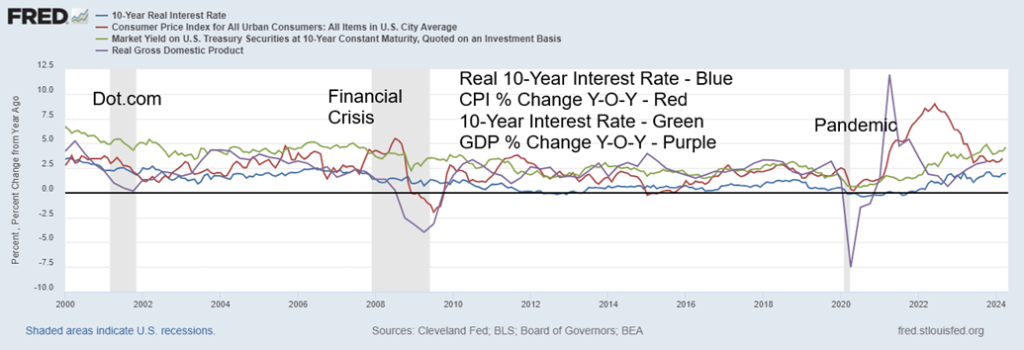
Given growing budget deficits, in particular to finance wars in Ukraine and Israel, it’s unlikely that debt growth is going to slow down. Growing demographics can help growth and, combined with growth in natural resources, it may help in cutting down the budget deficits. Real interest rates are rising, which could act as a drag on the economy. Until net national savings turn positive, the expectation is that growth will remain sluggish. And the U.S. has the best GDP growth rates in the G7. With persistently higher interest rates vs. the other G7 members, this attracts capital. In turn, that puts upward pressure on the U.S. dollar.
Real interest rates are rising, even as inflation appears to be coming down. But war is inflationary. Add in the potential for other disruptions because of sanctions and trade wars, that in turn could contribute to the inflation woes. And that could translate into higher interest rates instead of the lower interest rates that many are expecting. All this could spark low growth with continued higher inflation—i.e. stagflation.
Percentage Change Y-O-Y Federal Debt, All Debt 2000–2024
Markets & Trends
| % Gains (Losses) Trends | ||||||||
| Close Dec 31/23 | Close Apr 26, 2024 | Week | YTD | Daily (Short Term) | Weekly (Intermediate) | Monthly (Long Term) | ||
| Stock Market Indices | ||||||||
| S&P 500 | 4,769.83 | 5,099.96 | 2.7% | 6.9% | down | up | up | |
| Dow Jones Industrials | 37,689.54 | 38,239.66 | 0.7% | 1.5% | down | up | up | |
| Dow Jones Transport | 15,898.85 | 15,170.88 | 0.6% | (4.6)% | down | down (weak) | up | |
| NASDAQ | 15,011.35 | 15,927.90 | 4.2% | 6.1% | down | up | up | |
| S&P/TSX Composite | 20,958.54 | 21,969.24 | 0.7% | 4.8% | neutral | up | up | |
| S&P/TSX Venture (CDNX) | 552.90 | 586.55 | 3.4% | 6.1% | up | up | down | |
| S&P 600 (small) | 1,318.26 | 1,284.03 | 2.4% | (2.6)% | down (weak) | neutral | up | |
| MSCI World | 2,260.96 | 2,285.34 | 0.9% | 1.1% | down | up | up | |
| Bitcoin | 41,987.29 | 63,901.53 | flat | 52.2% | down | up | up | |
| Gold Mining Stock Indices | ||||||||
| Gold Bugs Index (HUI) | 243.31 | 269.13 | 2.4% | 10.6% | up | up | up | |
| TSX Gold Index (TGD) | 284.56 | 320.69 | 2.0% | 12.7% | up | up | up | |
| % | ||||||||
| U.S. 10-Year Treasury Bond yield | 3.87% | 4.66% | 0.7% | 20.4% | ||||
| Cdn. 10-Year Bond CGB yield | 3.11% | 3.85% | 2.1% | 23.8% | ||||
| Recession Watch Spreads | ||||||||
| U.S. 2-year 10-year Treasury spread | (0.38)% | (0.34)% | 5.6% | 10.5% | ||||
| Cdn 2-year 10-year CGB spread | (0.78)% | (0.52)% | 1.9% | 34.6% | ||||
| Currencies | ||||||||
| US$ Index | 101.03 | 106.09 | flat | 5.0% | up | up | up | |
| Canadian $ | 75.60 | 73.29 | 0.7% | (3.1)% | down | down | down | |
| Euro | 110.36 | 106.94 | 0.4% | (3.1)% | down | down | down (weak) | |
| Swiss Franc | 118.84 | 109.36 | (0.4)% | (8.0)% | down | down | neutral | |
| British Pound | 127.31 | 124.90 | 1.0% | (1.9)% | down | down (weak) | down (weak) | |
| Japanese Yen | 70.91 | 63.28 (new lows) | (2.2)% | (10.8)% | down | down | down | |
| Precious Metals | ||||||||
| Gold | 2,071.80 | 2,347.20 | (2.8)% | 13.3% | up | up | up | |
| Silver | 24.09 | 27.25 | (5.5)% | 13.1% | up | up | up | |
| Platinum | 1,023.20 | 922.10 | (2.3)% | (9.9)% | neutral | neutral | down (weak) | |
| Base Metals | ||||||||
| Palladium | 1,140.20 | 958.30 | (6.6)% | (16.0)% | down | down | down | |
| Copper | 3.89 | 4.57 (new highs) | 1.6% | 17.5% | up | up | up | |
| Energy | ||||||||
| WTI Oil | 71.70 | 83.85 | 2.0% | 16.8% | up (weak) | up (weak) | up (weak) | |
| Nat Gas | 2.56 | 1.92 | 9.7% | (25.0)% | down | down | down | |
New highs/lows refer to new 52-week highs/lows and, in some cases, all-time highs.
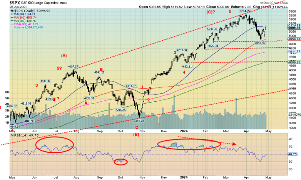
It was bounce-back week for the stock markets this past week. Strong earnings from Alphabet (Google) and Microsoft helped fuel the rally. We note that Google gained 11.5% this past week while Microsoft was up 1.8%, but it recovered from what could have been a down week. The S&P 500 has now bounced back to the 50-day MA near 5,125. After failing to break down under 4,900, which was our next break point, it is no surprise that it rebounds and tests the previous breakdown point near 5,100. Above 5,200 new highs are possible.
This week the S&P 500 gained 2.7% but, tellingly, the Dow Jones Industrials (DJI) lagged up only 0.7%. The Dow Jones Transportations (DJT) was up 0.6% but the NASDAQ, thanks to the FAANGs, gained 4.2%. The weakness in the Dow indices indicates that the market may not be as strong as this past week’s gains suggest. The S&P 400 (Mid) was up 2.1% while the S&P 600 (Small) gained 2.4%. The NY FANG Index gained 6.1% while the S&P 500 Equal Weight was up 1.7%, lagging the S&P 500 where the weighting of the Magnificent Seven helped overcome the equal weighting of the S&P 500 Equal Weight Index. Bitcoin was flat on the week, which was unusual for the cryptos.
In Canada, the TSX Composite was up 0.7% while the TSX Venture Exchange (CDNX) recovered, up 3.4%. In the EU, the London FTSE leaped to a new all-time high, up 3.3%, while on the continent the EuroNext was up 1.2%, the Paris CAC 40 gained 0.8%, and the German DAX was up 2.4%. In Asia, China’s Shanghai Index (SSEC) was up 0.8%, the Tokyo Nikkei Dow (TKN) was up 2.3%, and Hong Kong’s Hang Seng (HSI) gained 6.5%. The MSCI World Index was up 0.9%. All in all, a good week for global stock market indices.
However, this still could be only the beginning of a more significant sell-off as one can’t keep going up as interest rates rise and the Fed is still not accommodative. This coming week starts “sell in May and go away” where the next six months are the weakest, with an average gain of only 0.8% since 1950. On the other hand, the best six months of November to April have an average gain of 7.3%.
The worst six-month May to October was 2008 with a drop of 27.3%, followed by 1974 with a drop of 20.5%. We have a lot in the background with the tensions of war (Russia/Ukraine, Israel/Iran/Hamas) and a potentially divisive election that could turn violent. With demonstrations rising because of the Gaza war, 2024 is shaping up to be a very volatile year. And add in the potential for unexpected default that could shake the financial system.
Given everything going on, it would be understandable if the markets packed up and went away. The saviour could be the commodity markets that continue to heat up and look attractive.
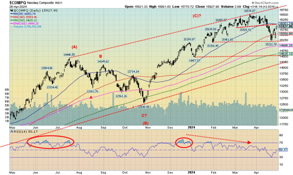
Thanks to a big week from the FAANGs, the NASDAQ jumped 4.2% this past week. The NY FANG Index rose 6.1%. That move up is thanks to Google, leaping to new all-time highs, up 11.5%, Nvidia leaping back up 15.1%, and Tesla recovering, up 14.4%. Broadcom also leaped, up 11.6%. Offsetting that was a bad week for Meta, down 7.9%. Continuing the good week was Snowflake, up 8.7%, and AMD up 7.3%.
As the FAANGs go, so goes the NASDAQ (and S&P 500). If the NASDAQ can recover above 16,227 which is not that far away from Friday’s close, the NASDAQ could challenge the high of 16,538 and put in new all-time highs. Otherwise, a breakdown under 15,200 would signal that a sell-off is underway. The rebound this week was insufficient to change the current daily trend, which is down. We are at or near resistance of 16,050. If the follow-through from this week’s gain doesn’t materialize, we would return to the downtrend.
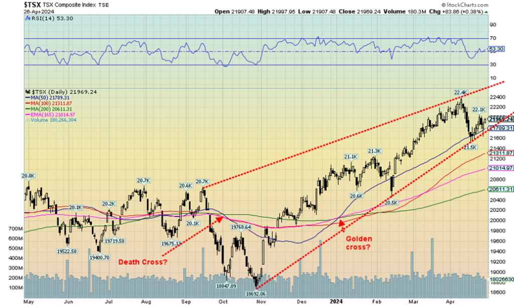
The TSX Composite rose 0.7% this past week as the index followed the U.S. indices up. The TSX Venture Exchange (CDNX) recovered, gaining 3.4%. The CDNX, however, remains unloved and under-owned. Of the 14 sub-indices, only two were down: Industrials (TIN) off 1.4% and Telecommunications (TTS) down 0.9%. Leading the up parade was Consumer Staples (TCS), up 2.4%. Energy (TEN) was up 2.1% while Golds (TGD) gained 2.0%. The TSX continues to hold the uptrend line from the October 2023 low. However, what appears to be forming a upward wedge ascending triangle continues.
That doesn’t rule out new highs above 22,400. A firm break now under 21,900 could start a down market. Under 21,500 as sell-off would be underway. Golds, energy, metals, and materials continue to look to be the best places to be, while the interest rate sensitive sectors of Income Trusts (TCM), Financials (TFS), Real Estate (TRE), and Utilities (TUT) look suspect. Oddly, the focus seems to be more on the sectors other than the commodities. When that shifts, the commodity sectors will soar. Tellingly, Income Trusts (TCM), Telecommunications (TTS), and Utilities (TUT) are the ones down on the year.
U.S. 10-year Treasury Note, Canada 10-year bond CGB
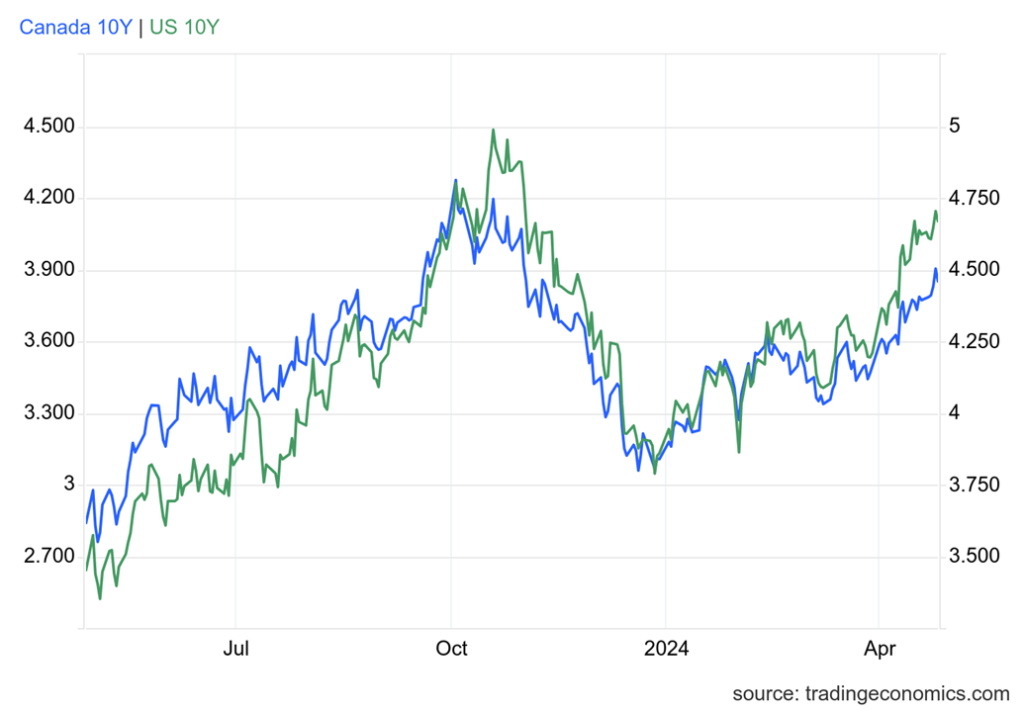
Bond yields continue to rise. This past week, thanks to the higher-than-expected PCE prices (discussed next) the U.S. 10-year treasury note rose from 4.63% to 4.66%. That’s not much, but it keeps the uptrend alive. In Canada, the Government of Canada 10-year bond (CGB) rose to 3.85% from 3.77%. The inverted yield curve, which persists, narrowed a bit to negative 34 bp in the U.S. and negative 51 bp in Canada. However, that’s not yet at recession levels, which would put the inverted yield closer to 0.
We’ve had a steady uptrend in place during 2024. A yield over 5% could soon be in the cards. The bond auctions this past week were poorly received and the sell-off by foreigners continues. Overall, foreign holdings of U.S. treasuries rose $20 billion in February (latest available), China fell another $22 billion, but Japan piled in, adding $16 billion. Foreign holdings are up $637 billion in the past year but U.S. federal debt is up $3 trillion. A big chunk of it was taken up by intragovernmental departments, but more was taken by public sources such as banks and pension funds.
The treasury market seemed to shrug off the weaker than expected Q1 GDP. The global manufacturing PMI also came in under 50, suggesting a recession. New home sales, however, rose 8.8%. Durable goods also came in a bit better than expected.
For this coming week, the job numbers are due out on Friday, May 3. Nonfarm payrolls are expected to be up 190,000 with the unemployment rate remaining unchanged at 3.8%. As we all know, it is a number subject to revisions and surprises. April’s nonfarm for March came in at 303,000, but it was virtually all part-time jobs.
CPI Inflation, Core Inflation, PCE Prices 2014–2024
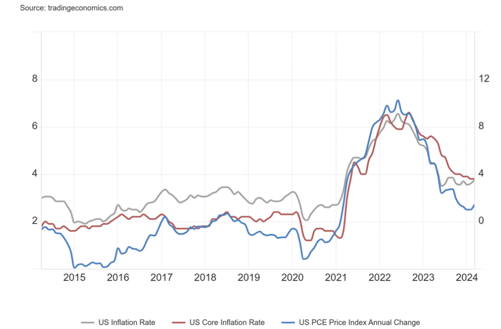
PCE prices (or the long name, personal consumption expenditures prices) jumped 2.7% in March 2024. That was the highest in four months. For the previous month it was only 2.5% and the expectation was for a 2.6% rise. Combining that with the write-down of Q1 GDP to 1.6% from 3.4% and even below the expected 2.5% raises, as we have noted, the spectre of stagflation.
PCE prices are the Fed’s preferred indicator of inflation because they remove the rent component from the CPI. PCE remains above the Fed’s target rate of 2% and has sent everyone scrambling to revise their thoughts about rate cuts. The core PCE surprised completely with a reading of up 3.7% in Q1. That was a big change from the 2% reading in Q4 2023 and, no doubt, caught the eye of the Fed.
Reading about forecasts of rate cuts is one thing, but depending on them to make decisions could be a trap, particularly if the consensus changes. In this case we have been moving from rate cuts in March (didn’t happen) to rate cuts in June (probably won’t happen) to maybe September, or maybe not even until December. Forecasters get egg on their face if they are too optimistic (which they usually are), and then reality hits them in the face. Then the markets, believing one thing, have to adapt to the new forecast. In this case, overoptimism has faded to oops, we miscalculated. Everybody got hit, even if they did bounce back later. Then we’ve always noted that nothing goes straight up nor straight down. That holds true, not for just the stock market but also PCE prices.
Maybe this is just a blip. We await next month’s figures. The chart also compares PCE prices with the CPI rate and the core inflation rate. Everybody is curling up once again. Hence, our thoughts on stagflation.
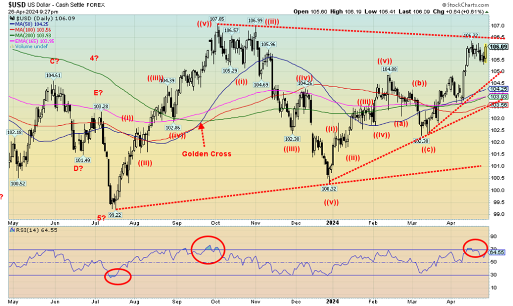
The US$ Index slid earlier in the week but bounced back on Friday after the release of PCE prices. Expectations of higher interest rates, already the highest in the G7, sent fund flows to the U.S., chasing the higher yields. On the week, the US$ Index was flat, thanks to Friday’s strong bounce-back. The euro was up 0.4%, the Swiss franc fell 0.4%, pound sterling gained about 1.0%, while the Japanese yen, with the lowest interest rates of all the G7, fell once again to new 52-week lows, losing 2.2%. The falling yen is becoming a problem for the BOJ.
The Cdn$ was a star, up 0.7%, bouncing back from the recent sell-off. The US$ Index remains below a potential breakout zone at 106.50. Above that level, new highs become possible above the September high of 107.05. Despite the strong US$ Index, gold, that usually trades inversely to the US$ Index, is actually rising with it, although not completely as gold fell this past week. The relationship between the two is actually more complex as it involves supply/demand, investment demand, central bank reserves, interest rates, and inflation.
While the US$ Index is approaching a potential breakout, until it does it’s possible this bounce-back is just temporary and the small downtrend that started a week or so ago may continue. A break of 105.50 should send the index lower. A bigger break occurs under 104.50 and the trend is completely broken under 103.50. This coming week could be telling for either the bulls or the bears.
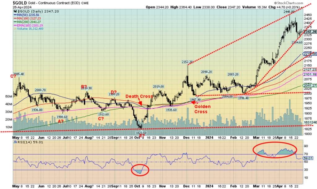
Gold finally took a pause, falling 2.8% this past week. A correction was overdue, given the persistently high readings of RSI, well over 70. It was thanks to the higher-than-expected PCE prices over calling the fear component for gold. Nonetheless, it leaves the uptrend intact unless we were to break under $2,300. Then we’d shift to a slightly deeper correction and for maybe a bit longer. Still, a more significant sell signal would not come until we are under $2,150. After that there is further support down to $2,025/$2,040. Not that we expect to get that low, but knowing where the key points are helps with decision-making.
Silver took a hit, down 5.5%, platinum dropped 2.3%, and of the key near precious metals palladium fell a sharp 6.6%. However, copper rose to new 52-week highs, gaining 1.6%. Copper has been getting some attention lately, particularly with the attempted takeover of Anglo American by BHP. BHP is the world’s largest metals company with a market cap of about $143 billion.
Anglo American is the 13th largest with a market cap of $44 billion. No wonder they thought the $39 billion offer from BHP was insufficient. If successful, it would create a metals behemoth, particularly in copper. Copper demand is rising and there just isn’t enough of the metal around. The focus now is on the large metal companies, but later it shifts to the junior market as companies need or want to add resources.
The gold stocks rose this past week despite the fall in the metals. The Gold Bugs Index (HUI) gained 2.4% while the TSX Gold Index (TGD) was up 2.0%. The gold stocks leading is a positive development and keeps our thoughts of higher gold/silver prices intact. Regaining $2,400 would set our sights on $2,500. Above $2,420 new highs are clearly possible. We saw forecasts this week for gold $8,000 from analyst AG Thorson. However, that is over the period to 2030. He’s basing it on the big breakout from the long 12-year consolidation period before the breakout that led to the 2005–2011 run-up from $450 to over $1,900. A similar run today could take gold from under $2,000 to potentially $8,500. But not overnight. (https://www.gold-eagle.com/article/gold-forecast-bull-run-gold-miners-just-starting)
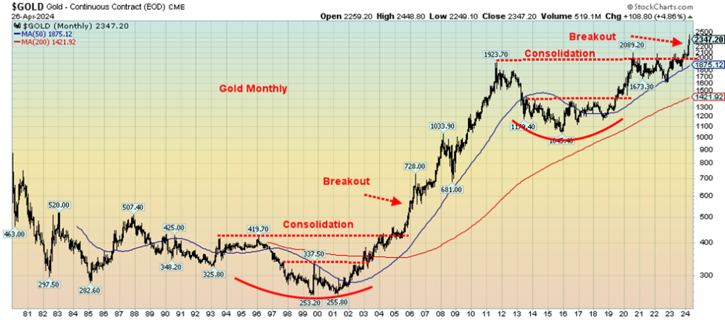
A run of that nature would certainly lift silver and gold stocks as well. After a long, frustrating period of consolidation, gold bugs may soon have their moment in the limelight. It’s early as well. Could we be wrong? It happens, but we’d have to break back under $1,700 to really confirm that. Given today’s conditions, that is not likely to happen. Got gold?
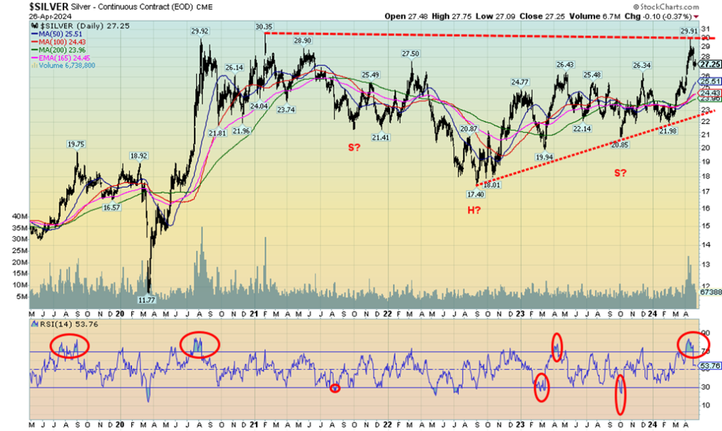
Silver, after jumping 36% from that low in February 2024 took a pause this past week, falling 5.5%. Seems like a lot, but when placed against the 36% gain it is only 15% of the gain. It’s important to note that, so far, $26.50 is holding. We’d be more concerned if we broke back under that level. Silver is now up 13.1% in 2024. The run-up from the February low unfolded in five waves, suggesting to us that we could be making a primary up move. It’s no surprise that $30 is resistance as that was the high back in February 2021 ($30.35).
Our expectations of $39/$40 targets remain, once we get past the February 2024 high. The breakout over $26/$26.50 suggests that target. We also have the interesting-looking head and shoulders reversal pattern that favours the move to our noted targets. With gold prices trading at record levels, a lot people will shift their focus to silver, the poor man’s gold, as an alternative. Unlike gold, silver remains a long way from its highs of 2011 near $49. On an inflation-adjusted basis, the high was actually seen in 1980, which could imply a price of $145 to $160 on an inflation-adjusted basis. The charts suggest that higher silver prices are ahead. A break over $30 should set us on our way.
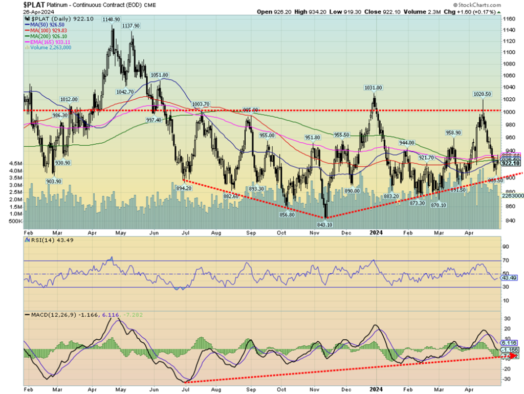
We found this chart of platinum rather compelling. There is a potentially fascinating bottom pattern forming. Another breakout over $1,000 could do it. At one time, platinum traded over double gold prices. Now it’s way below. Platinum getting back to par with gold is not beyond impossible. If we successfully break out over $1,000 and make new highs above $1,031, then the potential to rise to over $1,200 is there. We can’t say the pattern is finished just yet, but given we are down near support it is probably low-risk entry at these levels.
The indicators are not making new lows supporting platinum. A rise is a matter of when, not if. Platinum, sometimes is mistakenly known as white gold. White gold is gold 75% mixed with palladium 25%, but platinum’s lustrous colour mistakes it for white gold. Nonetheless, calling it white gold is not wrong, either, due to its white colour. The metal is rare, rarer than gold. Platinum is heavily used in industry but also exists as jewelry. Platinum coins are also rare.
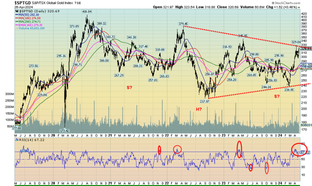
Gold stocks were up this past week, despite both gold and silver having a down week. We view that as positive. The TSX Gold Index (TGD) was up about 2% while the Gold Bugs Index (HUI) gained 2.4%. Both remain below recent highs. Initially, the gold stocks plunged along with gold and silver on their big down day (corrective, as we noted), but recovered well afterward. Gold stocks remain cheap, under-owned, and unloved, despite the recent rise.
The huge reversal pattern on the TGD still looks compelling and once we break above 330, we could be on our way to potential targets up to 450 to 500. That would be new all-time highs for the TGD. Support came in at 300 this past week so we now need to hold above that level. Under 275 would mean it’s all over and we’re headed to testing the lows. The head and shoulders pattern, while compelling, is still awkward as we don’t normally see the right shoulder below the left shoulder. Nonetheless, it looks good. It breaks down completely under 240. The pullback has helped work off any overbought indicators. But until we successfully clear 330, the risk remains mildly to the downside.
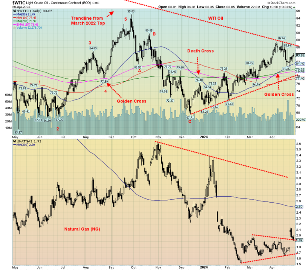
WTI oil popped this past week as inventories turned down a bit and tensions continue in the Middle East. The market seemed to fool itself, thinking the Middle East situation was cooling down. It’s not and threatens to flare up again. Falling oil stocks may only be a blip. Of bigger concern are falling gasoline stocks. All this resulted in a pop for WTI oil this past week that gained about 2%. Brent crude approached the psychological $90 level but faded in the end to close at $88.21, up 1.1% on the week. Natural gas (NG) at the Henry Hub jumped higher, even as it faded at week’s end closing at $1.92, the best in weeks. However, continued forecasts of milder weather could drag NG down once again and this jump is just temporary. EU NG at the
Dutch Hub didn’t fall for the Henry Hub’s jump and closed down on the week. NG at the Henry Hub gained 9.7% while at the Dutch Hub it fell 4.5%.
NG has been hanging around lows seen numerous times over the past 35 years. Not exactly of course, as the actual low can vary. But these plunges have an eery similarity about them. Regaining above $2.50 would be quite positive. Above $3.75 and we can think about challenging the highs.
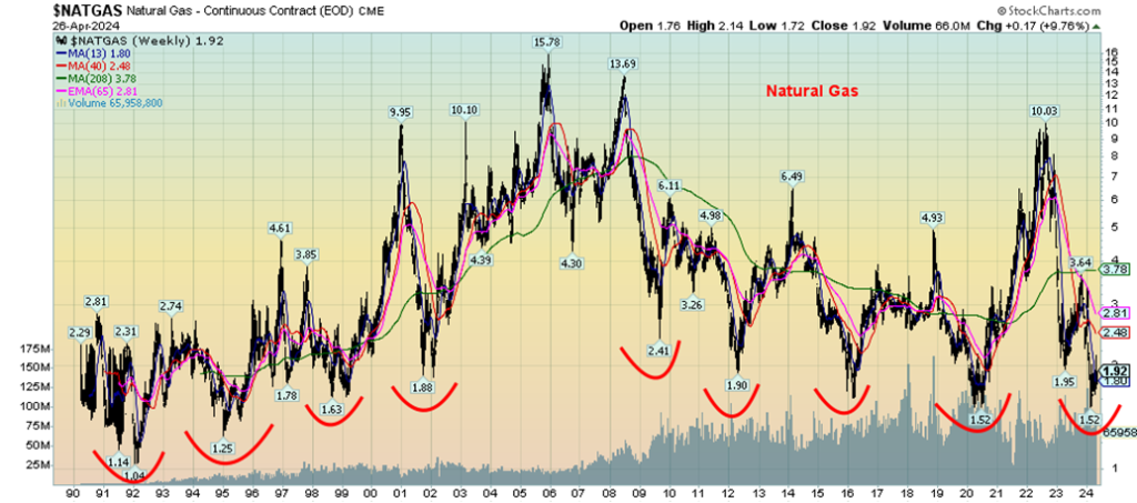
Technically, WTI oil still looks positive but we need to regain back over $86 and, more importantly, over $90 to convince us we’re headed higher. Once over $90 we can refocus on potential targets up to $110. The events in the Middle East are the most likely drivers. To the downside, we must continue to hold above $81/$82. Below $77 it’s all over. NG gapped higher this past week, then faded. That gap down to $1.80 is tempting. If it gets filled, then NG may be headed lower. But if things hold here, a breakout over that bottoming triangle could be validated. If the breakout is validated, then targets could be up to $2.40. Above $2.50 we take out the 200-day MA. That zone could also be stiff resistance.
Oil prices are most likely headed higher, primarily on the basis of events in the Middle East. Ukraine bombed Russian oil refineries, despite the U.S. asking them to stop as that negatively impacts the price of oil. Stopping is most likely not in the cards. That also remains a negative, or in this case positive, for oil prices.
__
(Featured image by frycyk01 via Pixabay)
DISCLAIMER: This article was written by a third party contributor and does not reflect the opinion of Born2Invest, its management, staff or its associates. Please review our disclaimer for more information.
This article may include forward-looking statements. These forward-looking statements generally are identified by the words “believe,” “project,” “estimate,” “become,” “plan,” “will,” and similar expressions. These forward-looking statements involve known and unknown risks as well as uncertainties, including those discussed in the following cautionary statements and elsewhere in this article and on this site. Although the Company may believe that its expectations are based on reasonable assumptions, the actual results that the Company may achieve may differ materially from any forward-looking statements, which reflect the opinions of the management of the Company only as of the date hereof. Additionally, please make sure to read these important disclosures.
Copyright David Chapman 2024
David Chapman is not a registered advisory service and is not an exempt market dealer (EMD) nor a licensed financial advisor. He does not and cannot give individualised market advice. David Chapman has worked in the financial industry for over 40 years including large financial corporations, banks, and investment dealers.
The information in this newsletter is intended only for informational and educational purposes. It should not be construed as an offer, a solicitation of an offer or sale of any security. Every effort is made to provide accurate and complete information. However, we cannot guarantee that there will be no errors. We make no claims, promises or guarantees about the accuracy, completeness, or adequacy of the contents of this commentary and expressly disclaim liability for errors and omissions in the contents of this commentary.
David Chapman will always use his best efforts to ensure the accuracy and timeliness of all information. The reader assumes all risk when trading in securities and David Chapman advises consulting a licensed professional financial advisor or portfolio manager such as Enriched Investing Incorporated before proceeding with any trade or idea presented in this newsletter. David Chapman may own shares in companies mentioned in this newsletter. Before making an investment, prospective investors should review each security’s offering documents which summarize the objectives, fees, expenses and associated risks. David Chapman shares his ideas and opinions for informational and educational purposes only and expects the reader to perform due diligence before considering a position in any security. That includes consulting with your own licensed professional financial advisor such as Enriched Investing Incorporated. Performance is not guaranteed, values change frequently, and past performance may not be repeated.


UCITS Funds Drive Casablanca Market Activity in Q1 2026
Casablanca Stock Exchange activity in Q1 2026 was dominated by UCITS funds and Moroccan legal entities, which accounted for 65.5%...


Legal Cannabis Generates $28.4B in U.S. State Tax Revenue
U.S. states with legal recreational cannabis have collected over $28.4 billion in sales taxes, with 2025 reaching a record $4.57...


The New Biotech Act Targets Europe’s Funding and Innovation Gap
Facing declining biotech financing and competitiveness, the European Commission has proposed the Biotech Act to boost investment, streamline regulation, and...


Milione Secures €80M EIB Financing to Drive Venice Airport’s Green Transformation
Milione spa, parent of SAVE spa, secured €80 million EIB financing to boost Venice Airport’s sustainability and efficiency. The deal...

Crypto Platforms Expand Stock Perpetual Trading
Crypto platforms are increasingly attracting stock traders by offering perpetual contracts for assets like stocks, commodities, and pre-IPO companies. Exchanges...
 |
|
 |  |
 |
|
-
 Cannabis2 weeks ago
Tilray (TLRY) Falls as Bearish Momentum Persists Despite Marketing Push
-
 Cannabis18 hours ago
Legal Cannabis Generates $28.4B in U.S. State Tax Revenue
-

 Biotech1 week ago
Abivax Shares Surge as New Trial Data Eases Safety Concerns Over Ulcerative Colitis Drug
-

 Markets2 weeks ago
Commodity Markets Pause as Oil Falls, Metals Correct, and Grains Show Mixed Signals