Featured
Stocks remain volatile, gold may push for a bullish market
Over the past weeks, Dow Jones had its highs and lows but never took a side of the curve. On the other hand, gold stocks are dependent on dollar inflation.

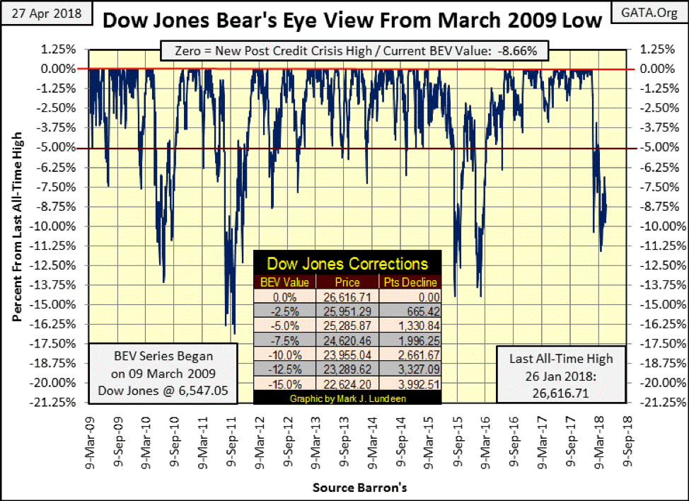
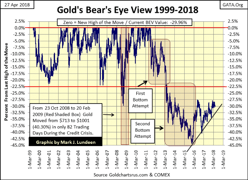
The stock market saw some action this week. On Tuesday, the Dow Jones moved over 3 percent intraday but closed only -1.74 percent from Monday’s closing price, so I didn’t count Tuesday as a day of extreme volatility. Other than that, it was a fairly boring week, with the Dow Jones staying well within an eight-week trading range. In the BEV chart below, this range spans from February 26th’s -3.41 percent (25,709) down to March 23rd’s -11.58 percent (23,533). This week’s close at -8.66 percent (24,311) places the Dow Jones well within this range.
So what’s next? I’m expecting more of the same in the weeks to come. The problem is the market doesn’t operate as it once did. There was a time, long ago, when the big players in the market were sharks looking for prey. They’d circle each other looking for any indication of weakness. If they sensed vulnerability in someone’s financial position—they’d attack! Here’s a little history of Jay Gould and Jim Fisk from the late 19th century. These guys were real stinkers!
Teddy Roosevelt (the Trust Buster) did much to domesticate the wild spirits running amuck on Wall Street, as did Franklin Roosevelt decades later. Today, the big players are like pampered pussycats; fat, dumb and happy not to rock the boat. With a few hundred trillion dollars in derivatives at risk of coming into the money should the financial market see sufficient volatility, professors of economics applaud today’s “stability.”
But the flip side to this coin is when animals like Jay Gould and Jim Fisk were allowed to operate in the markets as they saw fit, no one did anything as stupid as over-leveraging their positions as is common today, with cheap credit and derivatives, for fear of shark attack.
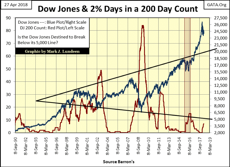
Here’s the Dow Jones with its 200 count. Is the Dow Jones taking a well-deserved break before it once again rises up to make history? Seeing its 200 count rise up to a seven since early February argues against that, but who knows what tomorrow brings?
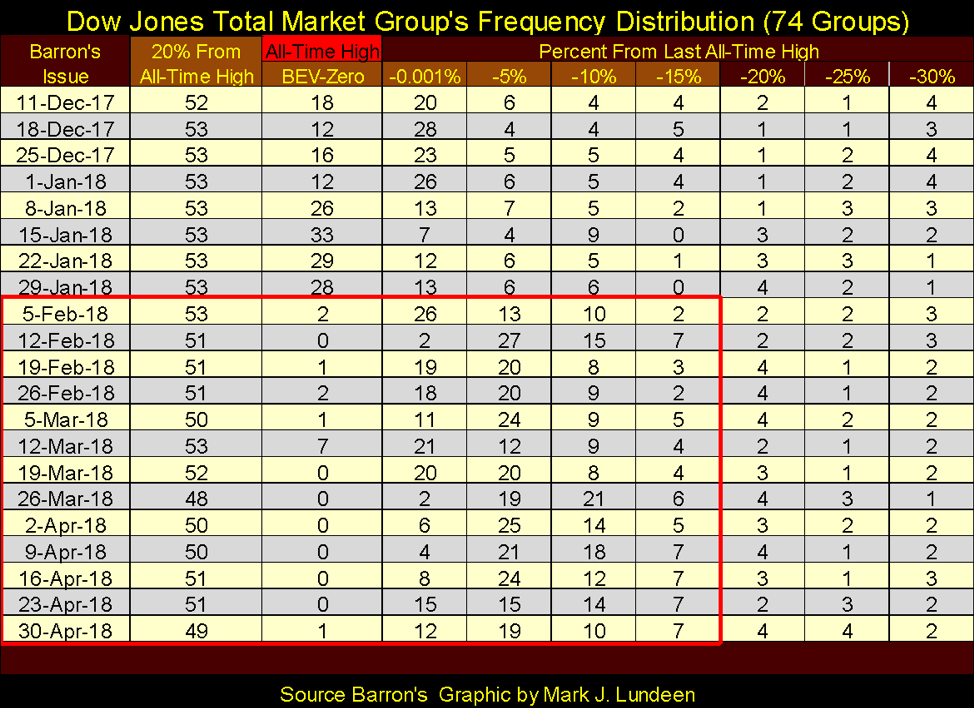
One point arguing against the bulls’ case is the Dow Jones Total Market Groups’ top 20 is trending down. It closed the week at a 49 in the table below. A point this table makes is since Barron’s January 29th issue, the broad market hasn’t recovered from the mauling Mr. Bear gave it three months ago. However, after the post-November 2016 election advance, I’m surprised the market hasn’t corrected more—the top 20 declining deeper than it has below.
These corrections can last longer than investors would like them too. Go back to the BEV chart for the Dow Jones above. The last correction began in May 2015 and continued until July 2016, during which the Dow Jones twice declined 14 percent. On the first 14 percent decline (August 2015) the top 20 dropped to only 40, on the second (February 2016) the top 20 bottomed at 26 (see chart below).
Note: the Dow Jones and the DJTMG’s top 20 seldom bottoms, or tops in the same issue of Barron’s.
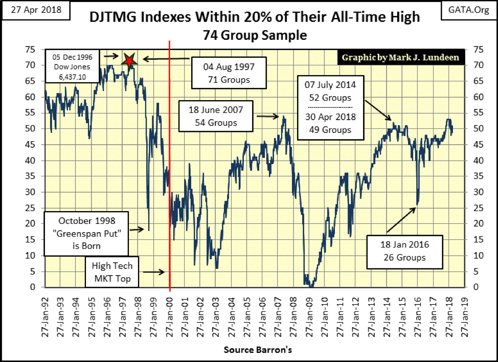
There’s a big-bad bear market somewhere over the horizon, but in April 2018 I can’t say if January 26th’s last all-time high in the Dow Jones is the final all-time high of a bull market that actually began in August 1982. Three months after the January top in the Dow Jones, seeing the DJTMG’s top 20 above close this week at 49 tells me this isn’t a stock market that’s in a big hurry to go down. Rather, right now it just doesn’t want to go up.
This can change very quickly, where in a week or two we’ll see the top 20 drop ten or more as market valuations begin deflating. When that happens we’ll have to assess whether or not we are in a correction in a bull market, or if Mr. Bear is once again feeding on Wall Street. In either case, the current decline in the DJTMG’s top 20 has a way to go, so don’t be in a hurry to scoop up any cheap stocks as they may get even cheaper in the months to come.
Let’s move on to gold. Like the Dow Jones, nothing much has happened to gold in the past week.
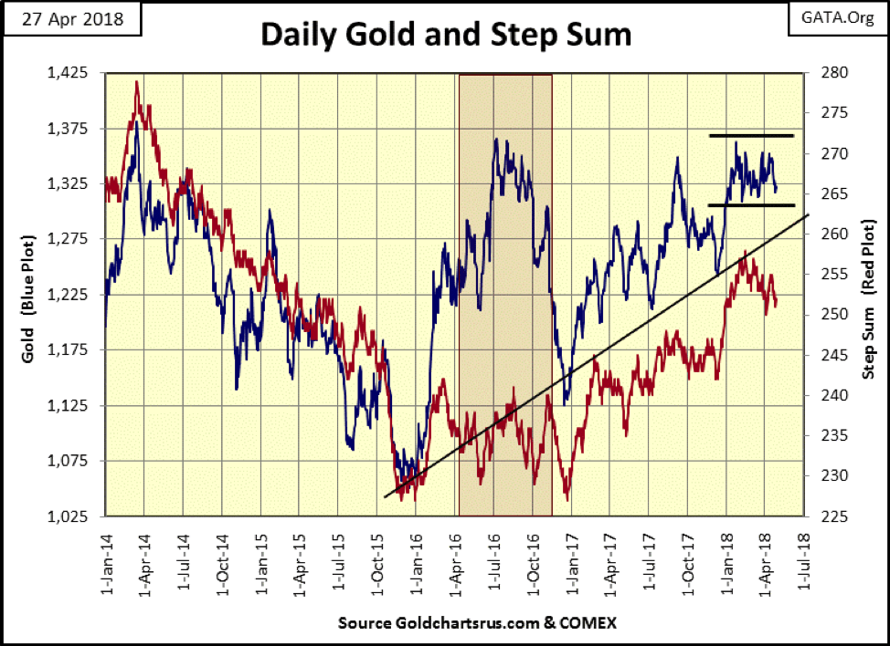
Here is something to note about gold; it’s been doing nothing much since the beginning of the year as it refused to break above or below the two trend lines in the step sum chart below. The red step sum plot (market sentiment) is turning sour.
That’s actually a positive for the gold market. I’d like the step sum plot to make new lows for the year as the price of gold continues refusing to break below its lower trend line. That’s one way a bull box is formed. The other is seen in the highlighted area for the summer of 2016 below, where the price of gold takes off despite the less than enthusiastic action in the red step sum plot.
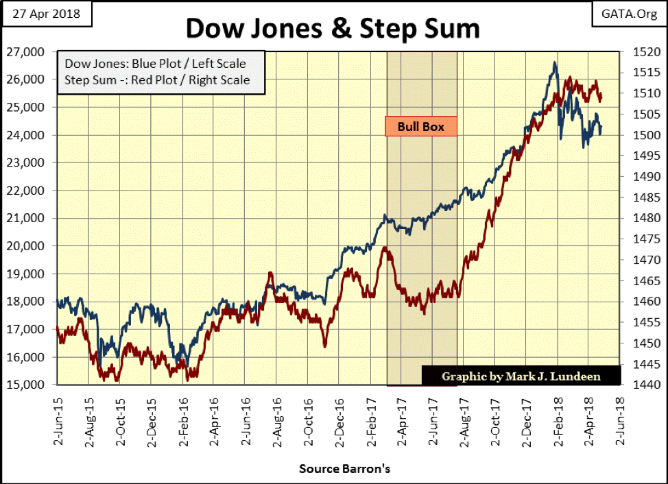
The Dow Jones (Blue Plot) below is looking weak. Should it break below its current 2018 low of 23,533, it will be a continuation of a bearish pattern of lower highs and lows it began after its top in January. Its step sum (market sentiment) is trending down too. But unlike the Dow Jones’ valuation plot, its step sum plot hasn’t developed a pattern of lower highs and lows.
No matter, the step sum doesn’t become interesting until its trend decouples from the valuation’s trend for a couple of months, as seen in the bull box below. Most of the time a market’s valuation and step sum trends are in sync with each other, as they are now.
Here are the step sum tables for gold and the Dow Jones, both step sums haven’t done much in the past 25 trading days, which tells us that there have been about as many advancing as declining days these past five weeks. That will change as gold and the Dow Jones moves upwards or downwards as 2018 moves onward towards 2019.
The Dow Jones Volatility 200 Day M/A ended the week at 0.57 percent. During March, this metric was climbing fast but has slowed down since the beginning of April. Rising volatility is a slayer of market advances. If this indicator reverses and begins to go down, it will be a real positive for the bulls.
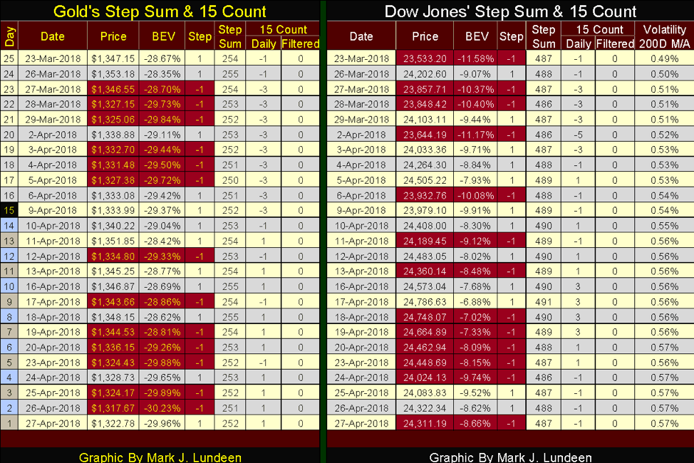
If you study these tables along with gold’s and the Dow Jones’ step sum charts above, one thing is obvious: when a market is seeing a strong advance, or is deflating in a serious manner, the step sum’s trend strongly validates the valuation’s trend. That is also true in markets, such as gold and the Dow Jones now find themselves in, where for months now we don’t know whether the next big move will be up or down. The information offered to us from the data above is not as insightful as I would like it to be.
So I looked at the chart below plotting the Barron’s Gold Mining Index (BGMI / Blue Plot), the Dow Jones (Red Plot) and US Currency in Circulation (CinC / Green Plot) going back to 1920 to get a sense of where we now stand in April 2018.
CinC is the number of paper dollars and base-metal coins “injected” into the economy by the Federal Reserve. Unlike the Dow Jones or the BGMI, CinC never has, or ever will go down in a meaningful way, nor will it until the US dollar ceases to be a financial asset.
Looking at the Dow Jones and BGMI in relationship to CinC, note how the Dow Jones during its “Roaring 20s” bull market (chart insert) actually increased above the CinC plot. Then in 1966, the Dow Jones touched the CinC plot (chart insert). But since then the Dow Jones has failed to keep up with the flows of inflation flooding the economy from the Federal Reserve, though it came close to the CinC plot at the 2000 top of the Dot.Com, high-tech bubble. However, in the past 18 years, the Red Dow Jones plot has been losing ground to CinC’s green plot in the chart below.
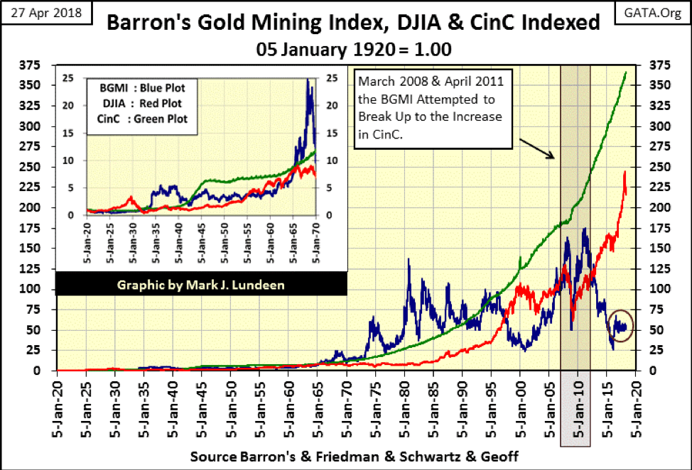
Examining BGMI’s blue plot with CinC’s green plot above, note during the 1930s the BGMI enjoyed a bigger bull market in the Great Depression than did the Dow Jones during the Roaring 1920s (chart insert).
In 1966, when the Dow Jones touched the green CinC plot, the BGMI broke far above it, and from 1966 to 1996 (three decades) the BGMI was either above the rate of inflation (CinC plot), or very near to it. The late 1990s was a bad time for anything that wasn’t “high-tech”, so not surprisingly the BGMI declined by 80 percent from 1996 to its bear market low of 2001.
Now compare the Dow Jones red plot to BGMI’s blue from 2001 to 2011. From its 2001 bottom, the BGMI almost touched the green CinC plot in 2008. And after a seven month, 70 percent decline (March to October 2008), once again the BGMI attempted to break above CinC’s green plot in 2011. Unlike the Dow Jones, the BGMI was a dog that wanted to hunt! So, what changed after 2011?
The gold mining sector is a very small segment of the stock market. From the source below, the largest gold miner in the world is Newmont Mining with a market capitalization of only $18.56 billion as of 2017. The top four gold mining companies have a total market capitalization of only $55.2 billion.
In a financial system that daily has flows of hundreds-of-trillions of dollars circulating in it, it’s not hard for Washington’s “market regulators” to manhandle the gold miners’ puny market capitalization. But this will only be for as long as the markets’ regulators can keep those hundreds-of-trillions of dollars circulating in the debt and stock markets, and they will only be able to do that for as long as bond yields stay low, and the yield curve doesn’t invert.
For the past two years, the BGMI has remained in a very tight range (circle in the chart above). One of these days, dollars by the trillions are going to flee the financial markets, seeking an asset class that isn’t actively deflating, or better yet finding one that is actively inflating.
When that happens, the Dow Jones plot in the chart above will drop like a rock as trillions of dollars begin fleeing deflation in the financial markets. This will be when the BGMI once again breaks above the green CinC plot as decades of dollar production attempts to squeeze into the gold mining industry’s tiny market capitalization. The same will be true for gold and silver bullion. I don’t know when this is going to happen, only that it will be quite a sight to behold, and for patient investors, the wait will be worthwhile.
Barron’s in the late 1930s began publishing bond yields for muni-bonds and its best-grade corporate bonds. Muni-bond coupon payouts are tax-free from the IRS, and the tax authorities from the state the bonds are issued from. It goes without saying that if someone from New York invests in California muni-bonds, they shouldn’t expect any tax benefits from New York for investing in California. Corporate bonds are taxable.
Traditionally, the bond market was used by governments and corporations to finance long-term infrastructure projects; muni-bonds for schools, water projects and roads, corporate bonds for new factories and capital equipment. However, like so much else in finance in the past few decades, past practices and standards have slipped. Local governments have issued bonds to finance current expenses such as pension obligations, and corporations for financing their share buyback programs. These abuses will one day come back to haunt the bond market—if not today.
The yield gap between the two is plotted below. Negative values indicate those Barron’s issues where muni-bond yields were lower than best-grade bonds. Unsurprisingly, for the bulk of Barron’s issues published since the late 1930s muni-bond yields were lower than best-grade corporate bonds, and for good reason. Muni-bonds are financed by local government (city, county and state) tax base, which during times of prosperity or economic recession are stable when compared to corporate revenues which fund the coupon payments for corporate bonds.
However, since November 2010 when the plot below increased above its zero line, investors have shown a distinct bias towards taxable corporate bonds over tax-free income from muni-bonds, but why? If what we were taught in economics 101 is true, that higher rewards come with higher risks, it’s because the bond market is finally pricing in the risks of lending money to big-city politicians and states who refuse to live within their means.
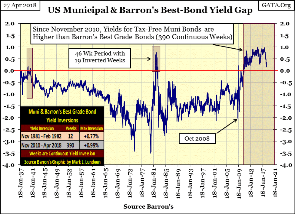
However, since last September the yield gap between muni and corp bonds have narrowed; this week’s gap was only sixteen basis points. Has the bond market begun to reassess the risks in muni-bonds? Maybe, but if this horror story from Chicago is the coming trend in civil finance, I don’t see how that‘s possible.
There’s no shortage of past news articles on the pending problems local governments are having making ends meet, and the risks these problems pose for individual investors in the muni-bond market. However, I could never have expected the problems in the muni-bond market would sprout tentacles to snatch private citizen’s automobiles off the roads! If you must go to Chicago, you best be sure your brake and blinker lights are working!
The chart below plotting the actual yields of corporate and muni bonds tells the story; corporate bond yields since last September have increased to just below four percent from three percent while municipal bond yields have remained around four percent. This is more than just a bit odd as even T-bond yields have risen in the past two years, so why are muni yields so stable?
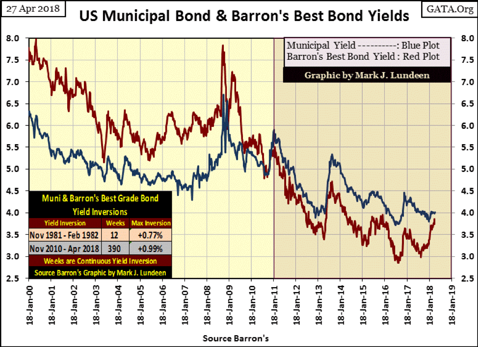
I’m sure I don’t know why. What I do know is there are plenty of responsible muni-bond issuers who deserve low yields. But for investors, even holding bonds of the highest quality during a bond-bear market, a financial market where interest rates and yields are increasing can be a painful experience. Also, investing in bonds—fixed income—denominated in a unit of exchange managed by a central bank, such as the Federal Reserve poses hazards of its own.
The table below lists the published values for:
– Currency in Circulation (CinC)
– Dow Jones
– Dow Jones 10 Utility Bond Average (DJ-10UBA)
From Barron’s 03 January 1938 issue, the first issue publishing the DJ-10UBA, and from Barron’s 08 April 2002 issue when Barron’s discontinued this bond data series. I also included data for CinC and the Dow Jones from these issues for a performance comparison between investing in blue-chip stocks and utility bonds during a period where the Federal Reserve inflated CinC by almost 10,000 percent.
In these two issues of Barron’s, separated by 64 years, the Dow Jones in April 2002 increased to 10,271 from only 120 in 1938, while the DJ-10UBA actually lost $1.50 in nominal dollar terms. That’s not small change when you look at what a million dollars in nominal dollars invested returned in the period between these two issues of Barron’s in the table’s center section.
A million dollars in 1938 afforded its owner the best of everything; including a penthouse view of New York’s Central Park, leaving most of the $1,000,000 to be invested in dividend yielding blue-chip stocks (the Dow Jones) or “safe” high-quality utility bonds to support the lifestyle of the rich. But for the million dollars invested in “high quality” utility bonds in 1938, the next sixty-four years were very unkind.
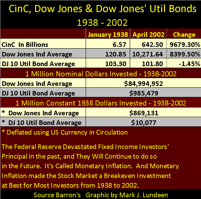
Thanks to inflation flowing from the Federal Reserve, a million dollars invested in utility bonds wasn’t even a million dollars anymore. The Dow Jones, on the other hand, absorbed enough inflation to inflate a million dollars invested in blue-chip stocks in 1938 to become worth $85 million during these same 64 years, while paying dividend income to their owners.
However, note how even the Dow Jones failed to keep up with the production of inflationary dollars flowing from the Federal Reserve. When priced in constant 1938 dollar terms, a million 1938 dollars invested in blue-chip stocks lost $130,000 in Barron’s 08 April 2002 issue. But look at what happened to the million dollars invested in the bond market. In 1938, dollar terms it had been reduced to only $10,077.
I’m anticipating the next ten years will see bond yields increase drastically higher, and the declining purchasing power of the dollar will once again squeeze the bond market as we saw above.
I pointed out the importance of the yield curve in the financial market. When short-term interest rates rise above longer-term bonds, bubbles are popped in the markets.
Below is a chart displaying two inverted yield curves with the yield curve from this week’s close.
The top YC (Blue) is from July 1981, where not only did the Fed Funds rate soared to over 21 percent, but the bond yields found themselves ever lower as they went out in time. This is what it took for then Fed Chairman Volcker to slay the double-digit consumer price inflation that plagued the economy of the late 1970s and early 1980—a yield inversion in a Treasury bond market yielding double-digits along the entire curve.
What bubble did this yield inversion pop? The 1969 to 1980 bull market in gold, silver and the BGMI.
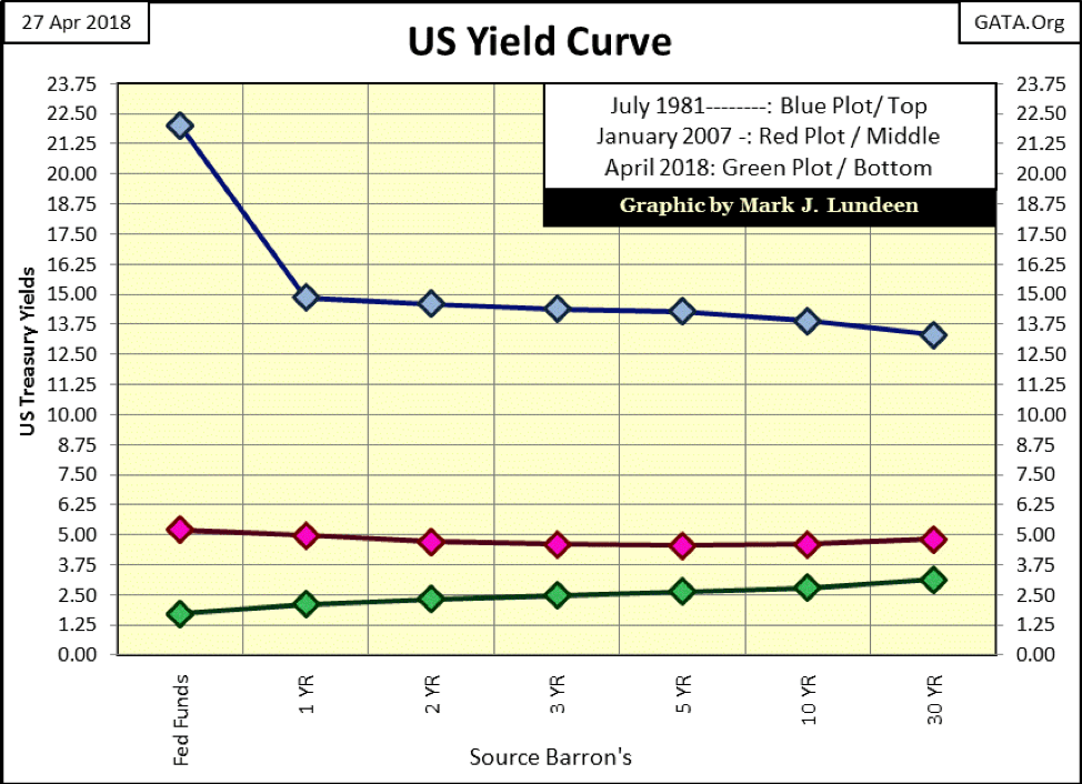
The next inverted YC (Red) was the one that popped the subprime mortgage bubble. Not much of an inversion of the Fed Funds Rate over the various T-Bond yields, but it was enough to trigger the second deepest decline in the Dow Jones since 1885.
The last YC (Green) is from the close of this week, and this is an YC at risk of investing in the months to come. If, or when it does, Wall Street will see some historical excitement that ultimately will reignite the bull market in gold, silver and precious metals assets like gold mining companies.
—
DISCLAIMER: This article expresses my own ideas and opinions. Any information I have shared are from sources that I believe to be reliable and accurate. I did not receive any financial compensation in writing this post. I encourage any reader to do their own diligent research first before making any investment decisions.

-

 Crypto2 weeks ago
Crypto Markets Volatile as Bitcoin Hovers, Solana Eyes AI Integration
-

 Biotech6 days ago
Advances in LDL Cholesterol Management for Familial Hypercholesterolemia: From Statins to Innovative PCSK9 and CETP Inhibitors
-

 Business2 weeks ago
Global Markets on Edge as Iran Conflict, Inflation Pressures, and Financial Risks Intensify
-

 Business3 days ago
TopRanked.io Weekly Affiliate Digest: What’s Hot in Affiliate Marketing [Bovada Affiliate Program]


You must be logged in to post a comment Login